



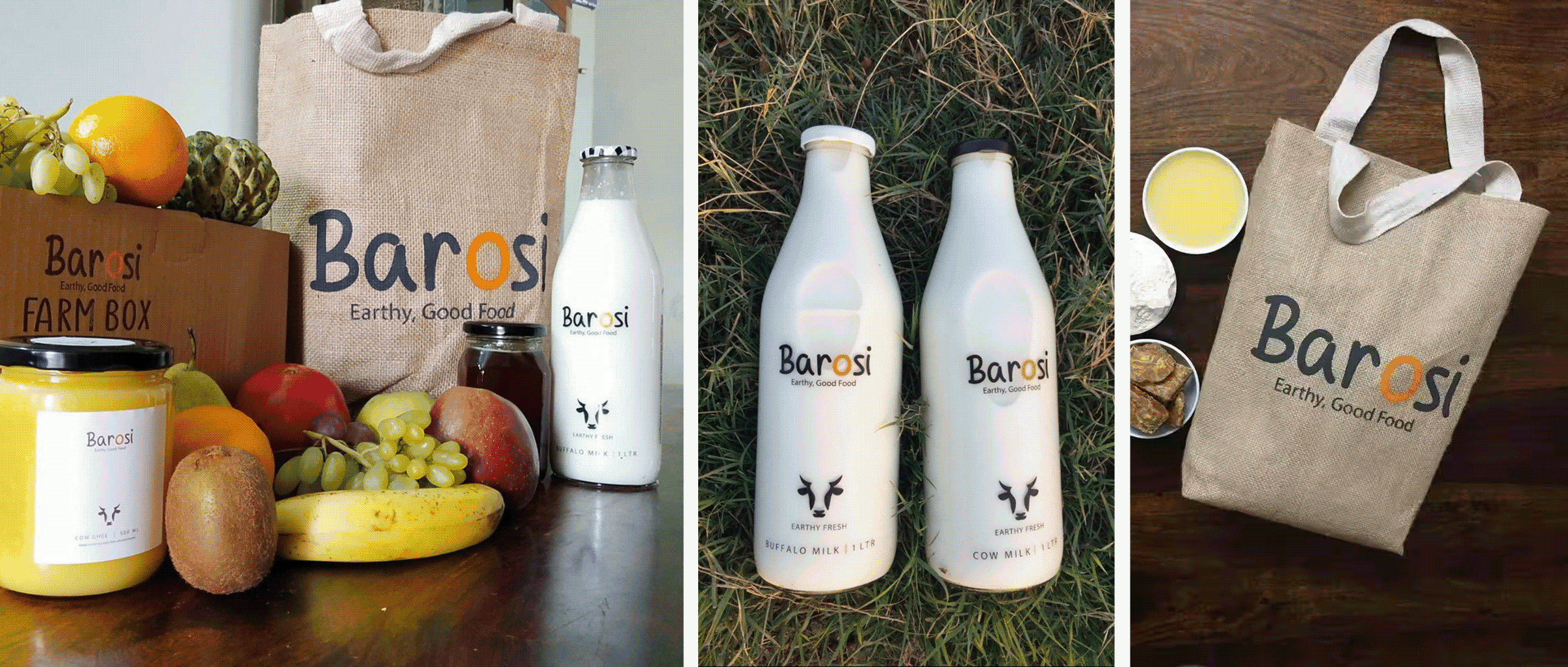
Coming from a rural background, Durlabh, the founder, always wanted to keep a connection with where he was from. Working in the city showed him what urban demand could do for the farmers he grew up around. That’s when he founded Barosi.
He wanted urban India to take a step back and enjoy the simple times of rural India through his products.
Barosi works with farms across rural India, making fresh and wholesome products rooted in local tradition and culture, brought to your kitchen in the most authentic way. So, why did it need a rebrand?
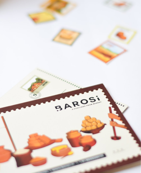
We wanted the identity to carry more than a name. Inspired by handwritten postcards and journeys across India, every visual element reminds consumers where their food comes from and who made it.
The moving dot becomes a symbol of that journey, connecting Bharat with India, while keeping Barosi’s roots visible at every touchpoint.
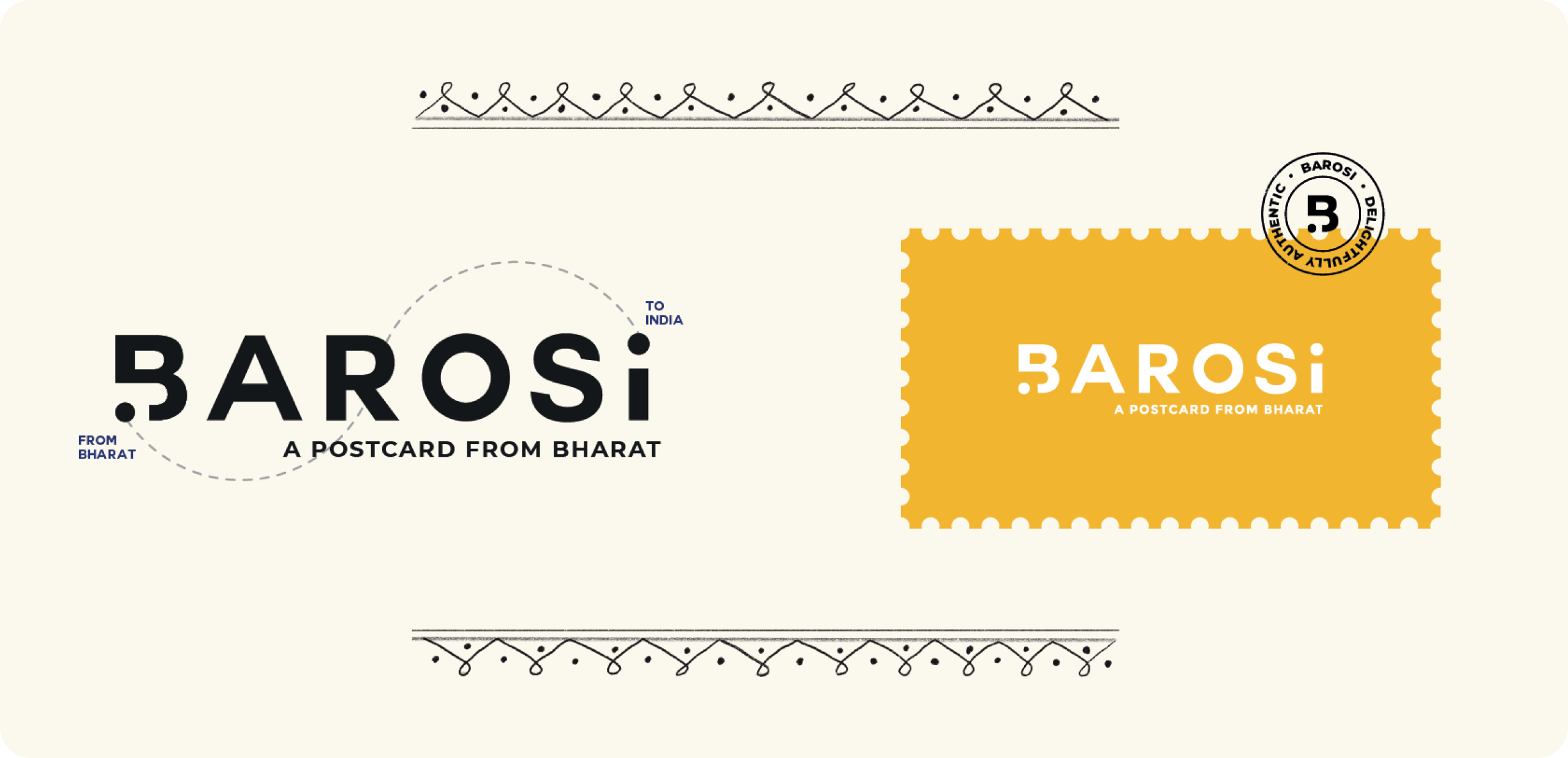
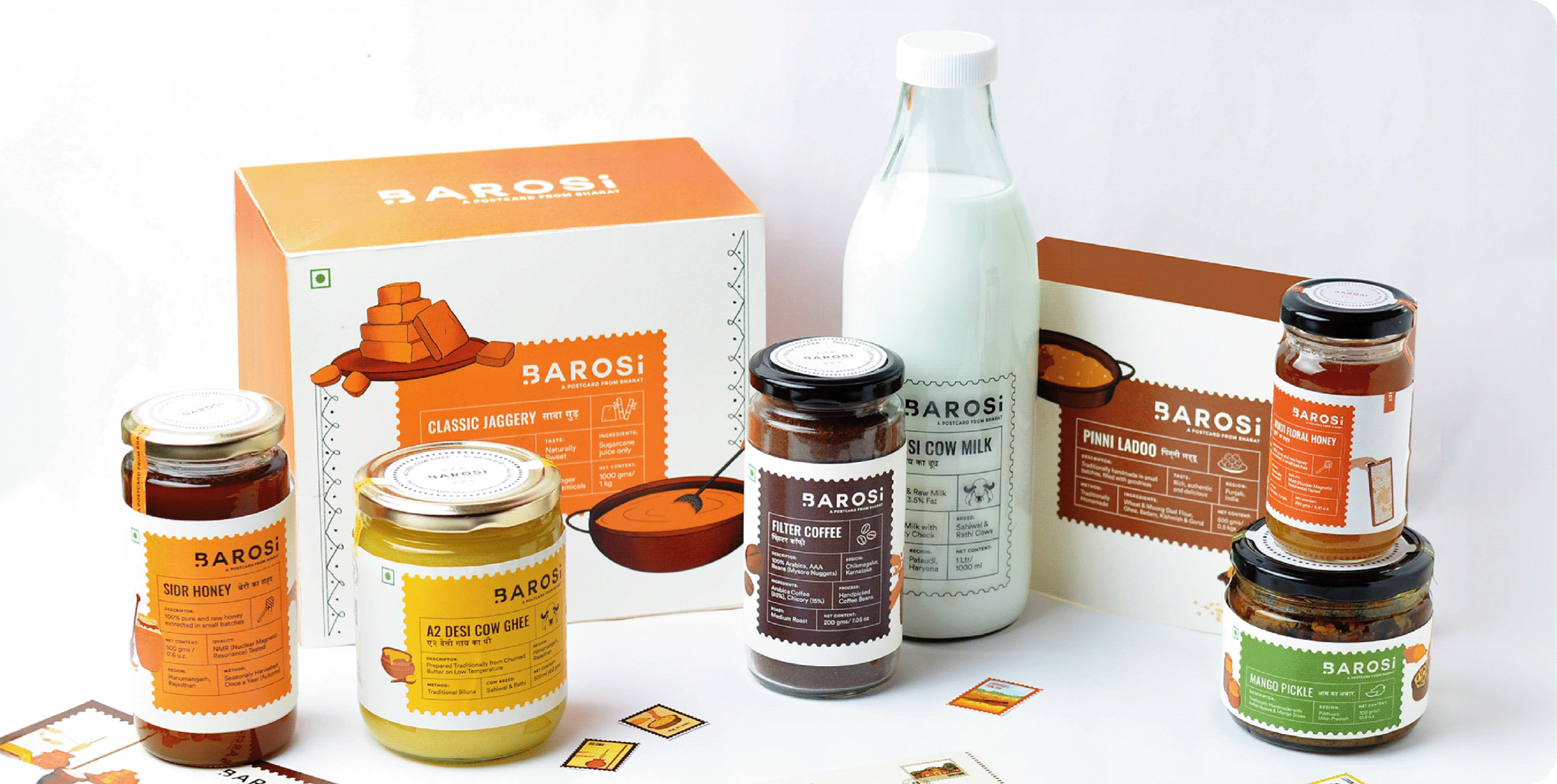
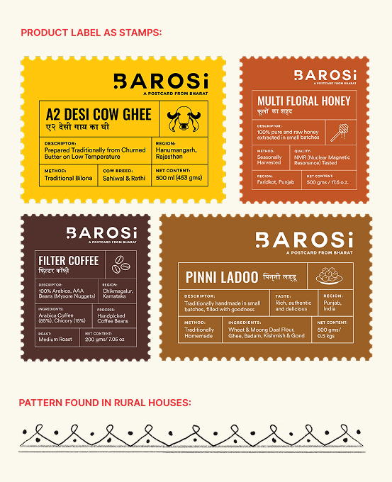
We built the entire brand around the idea of A Postcard From Bharat. Every product becomes a postcard, carrying stories, traditions, and flavours from a different corner of India, thoughtfully delivered by Barosi.
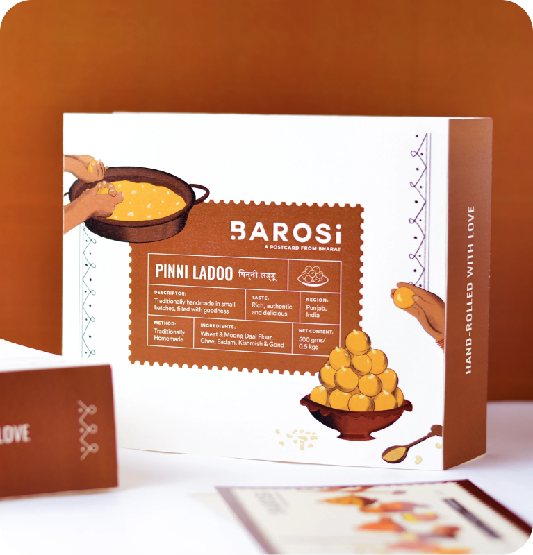
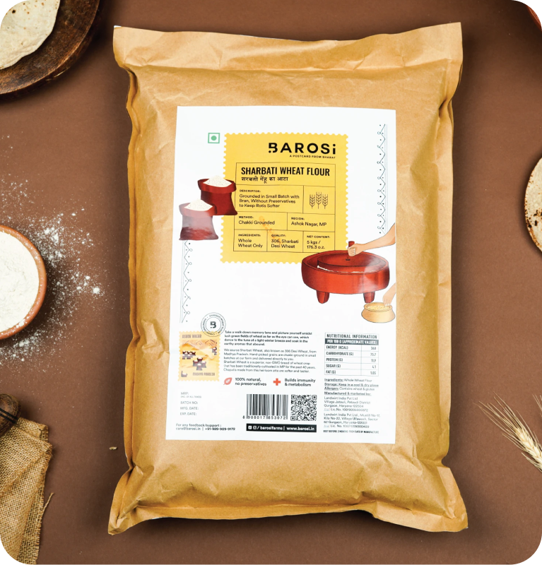
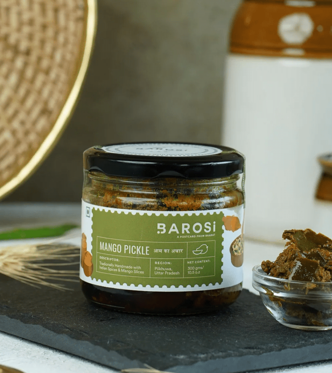
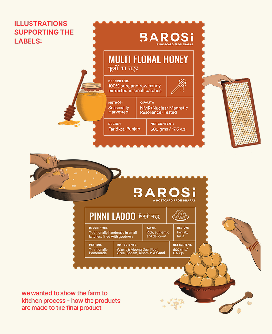
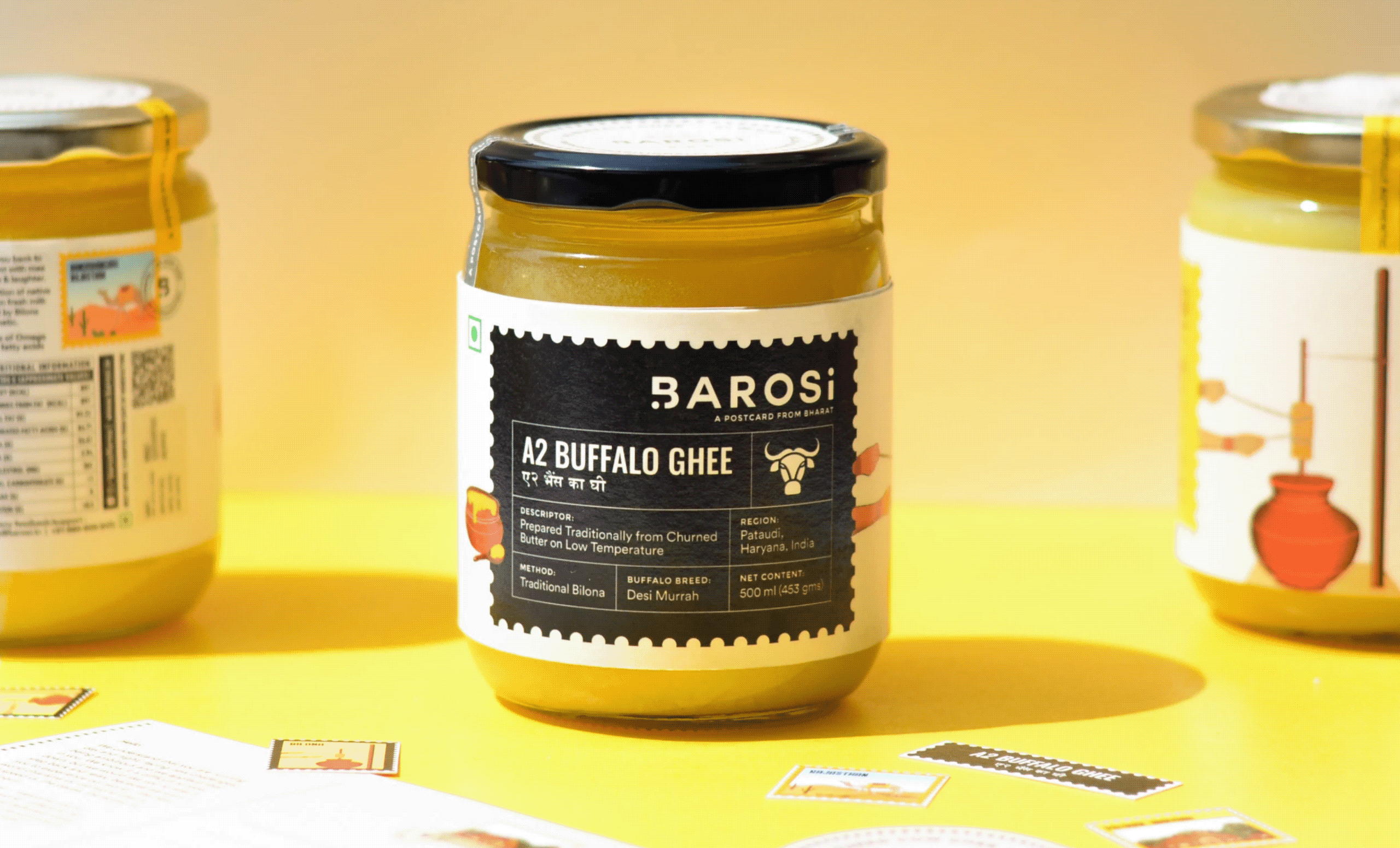
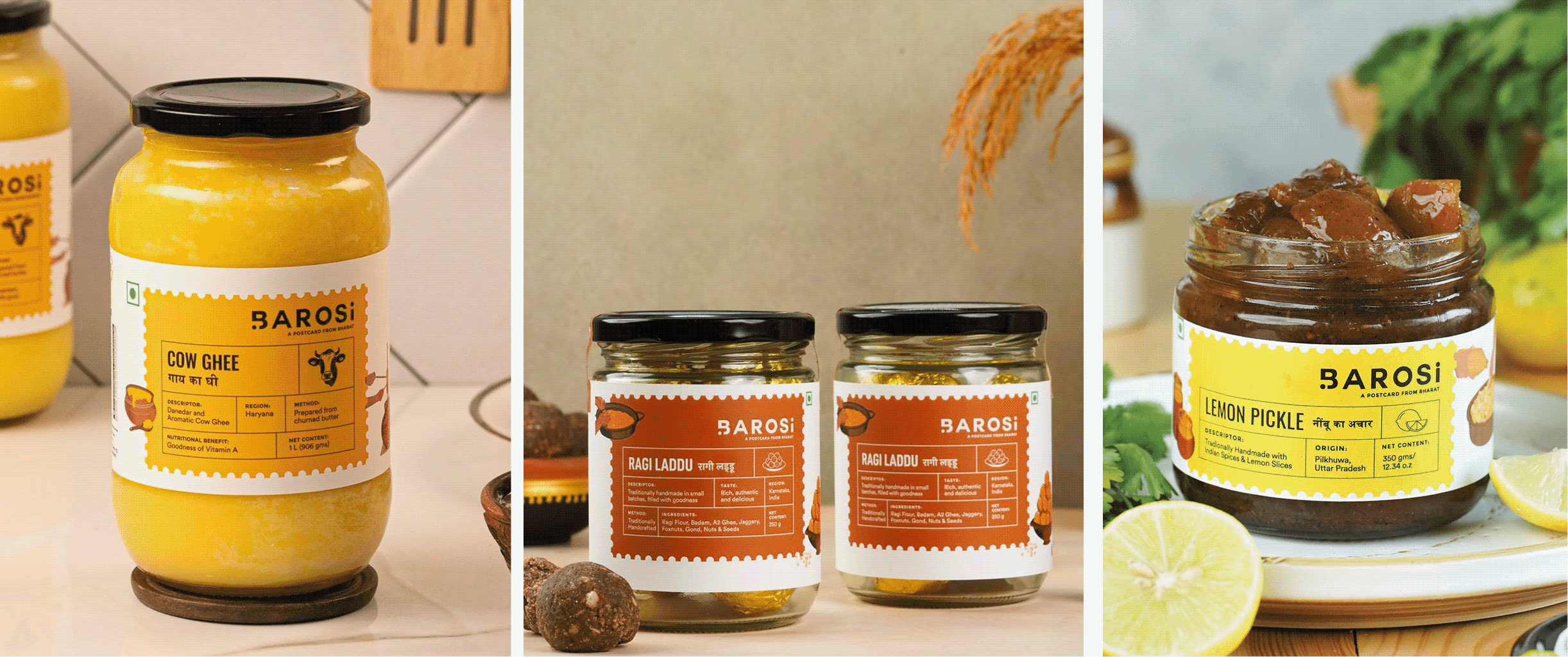
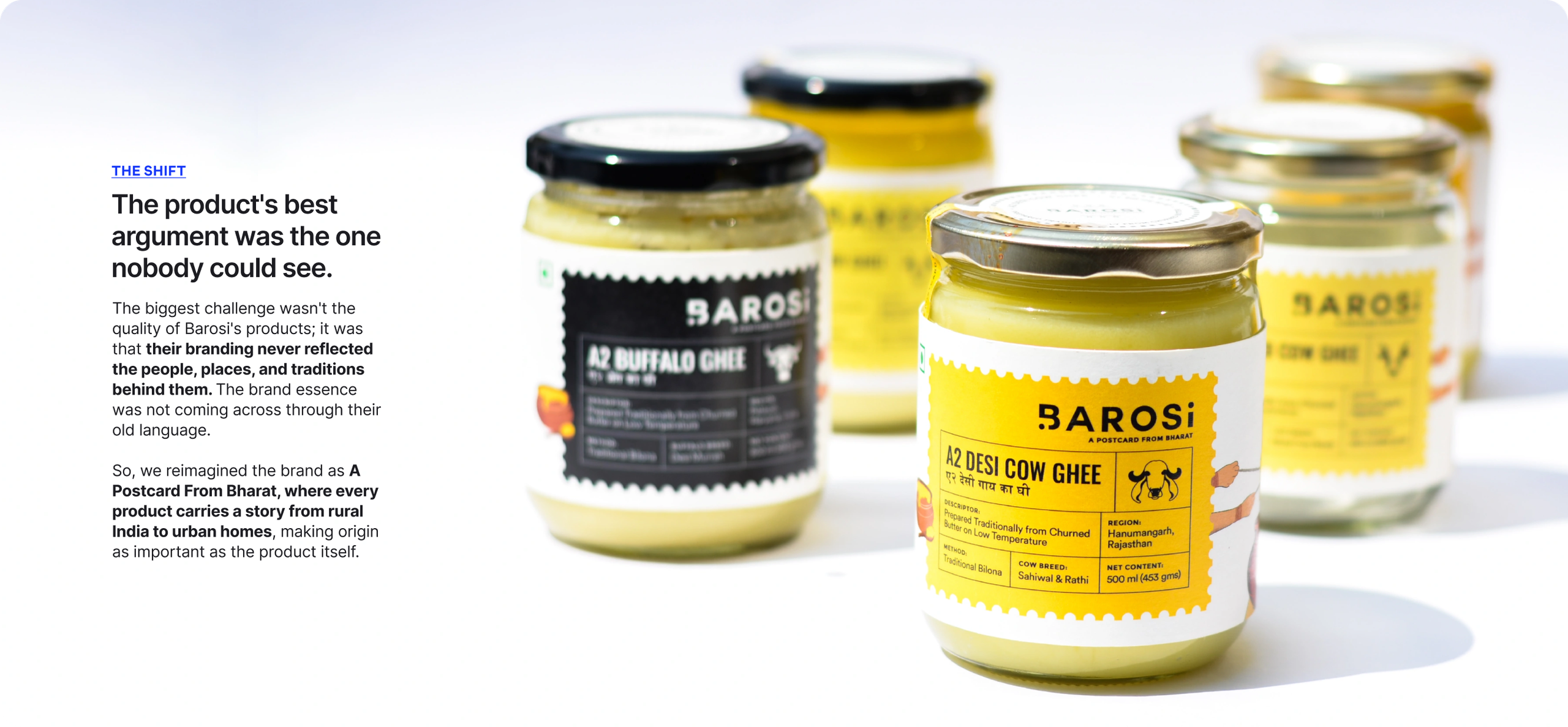
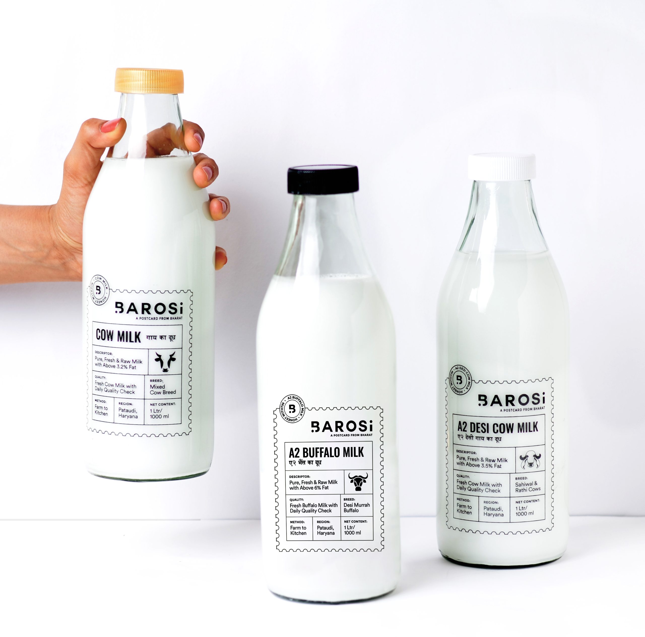
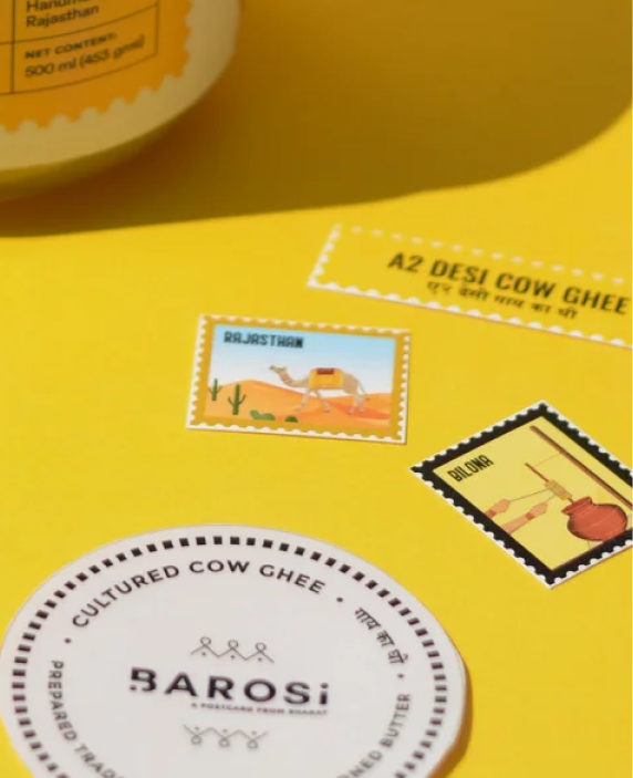
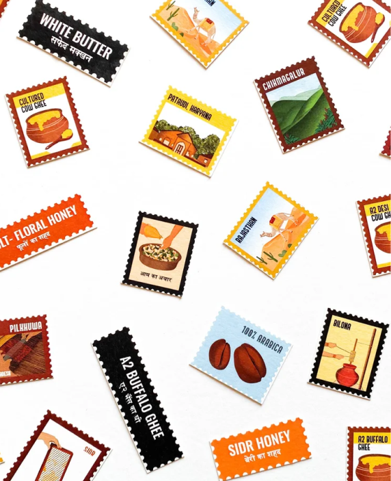
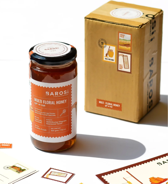
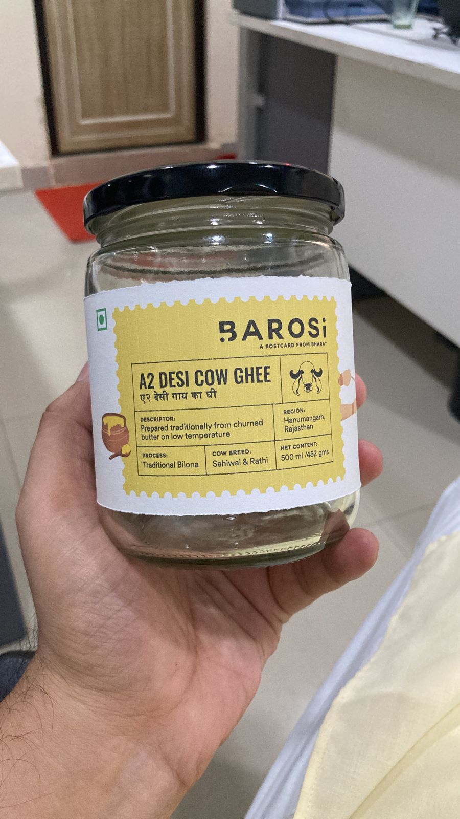
The packaging comes alive through postal stamps, traditional patterns, postcards, and origin labels. Every pack traces its roots, sharing where the product comes from, how it’s traditionally made, and the stories behind it.
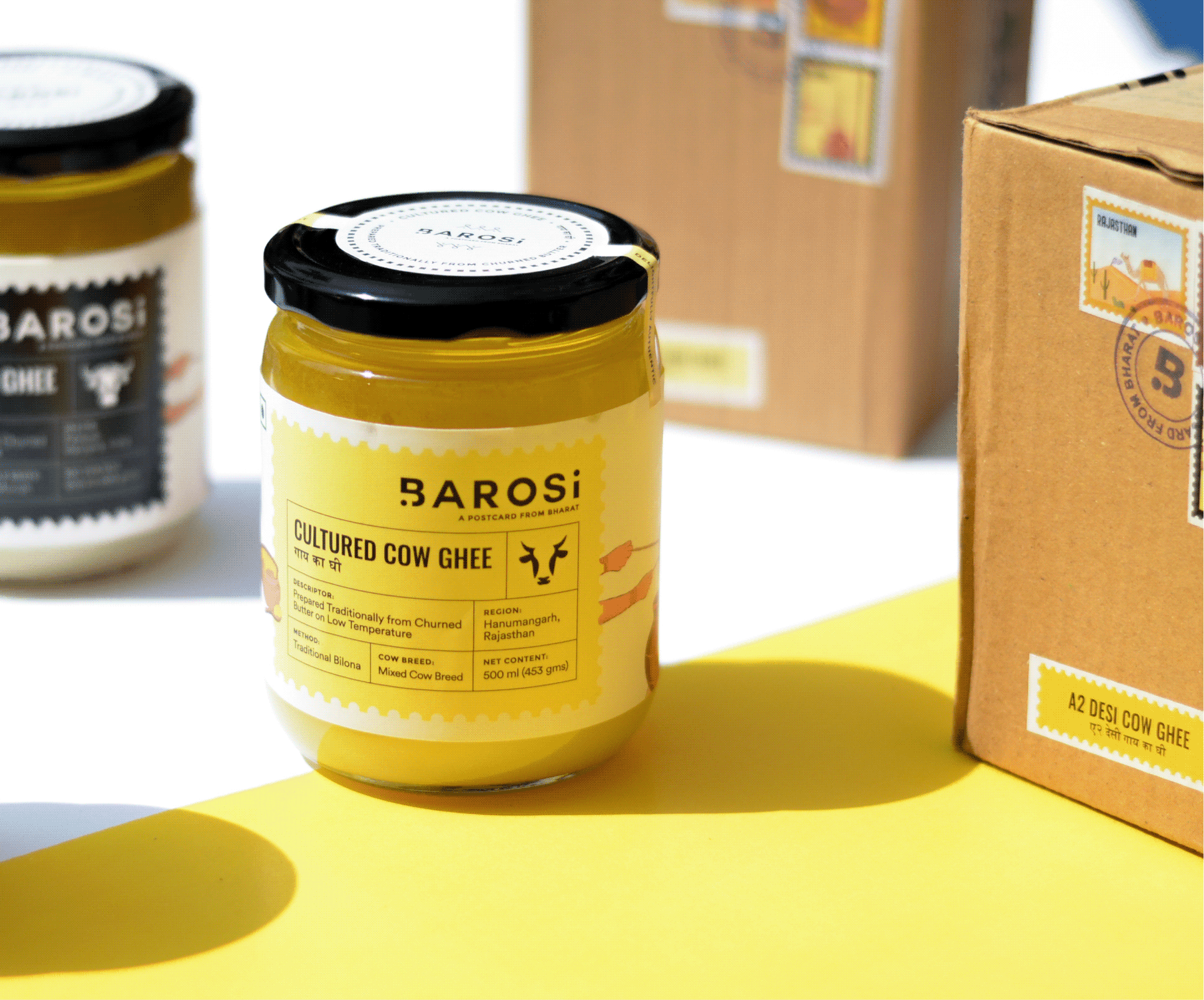
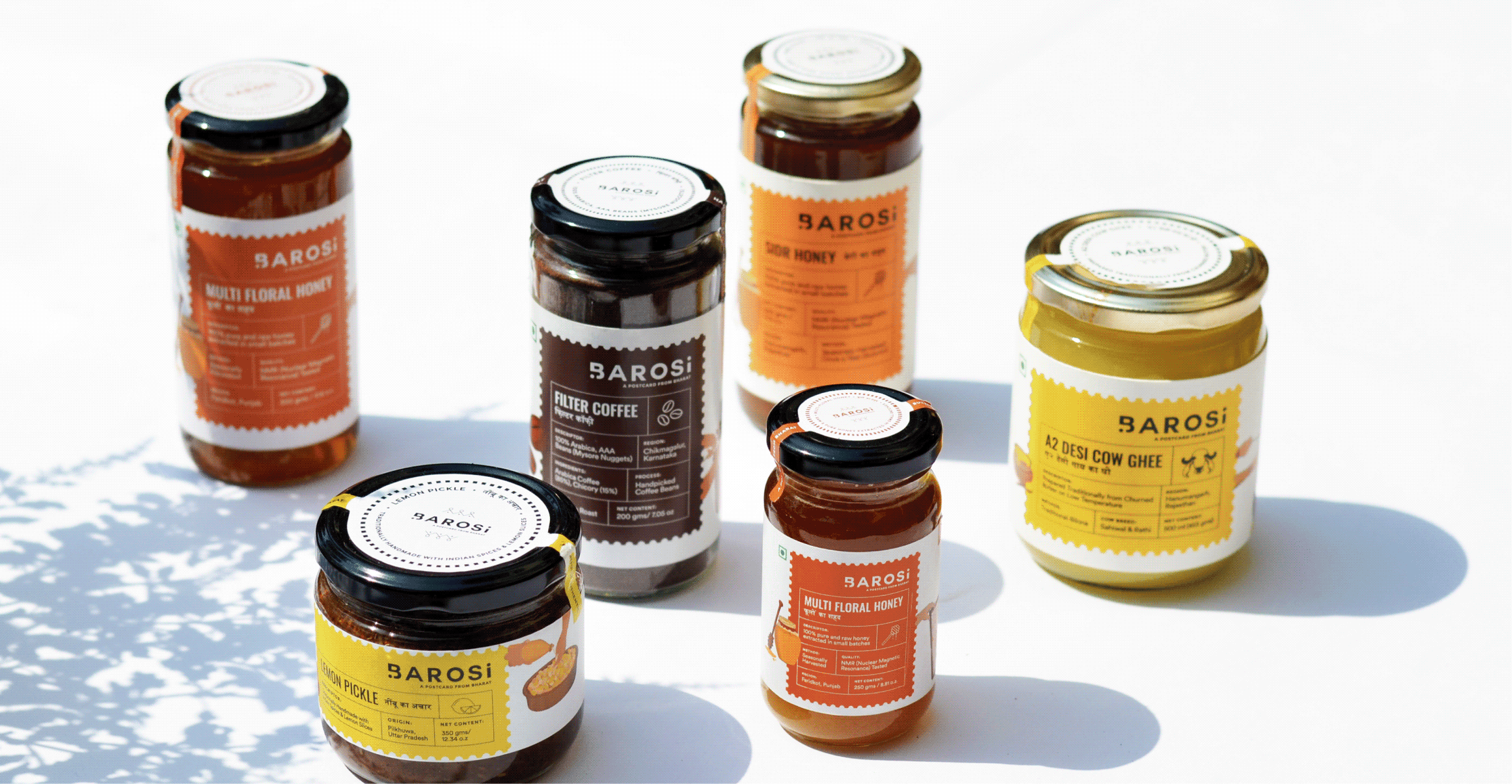
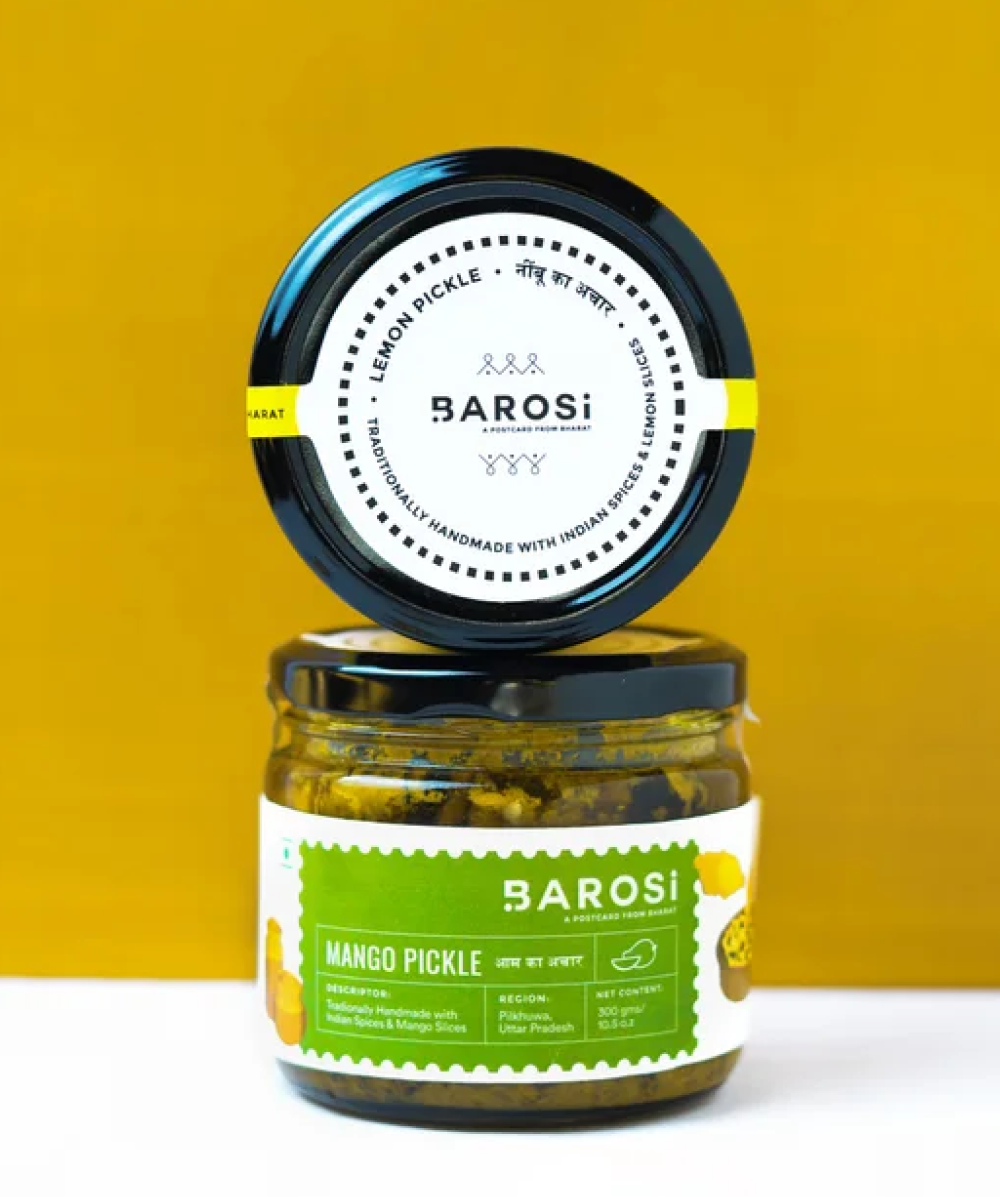
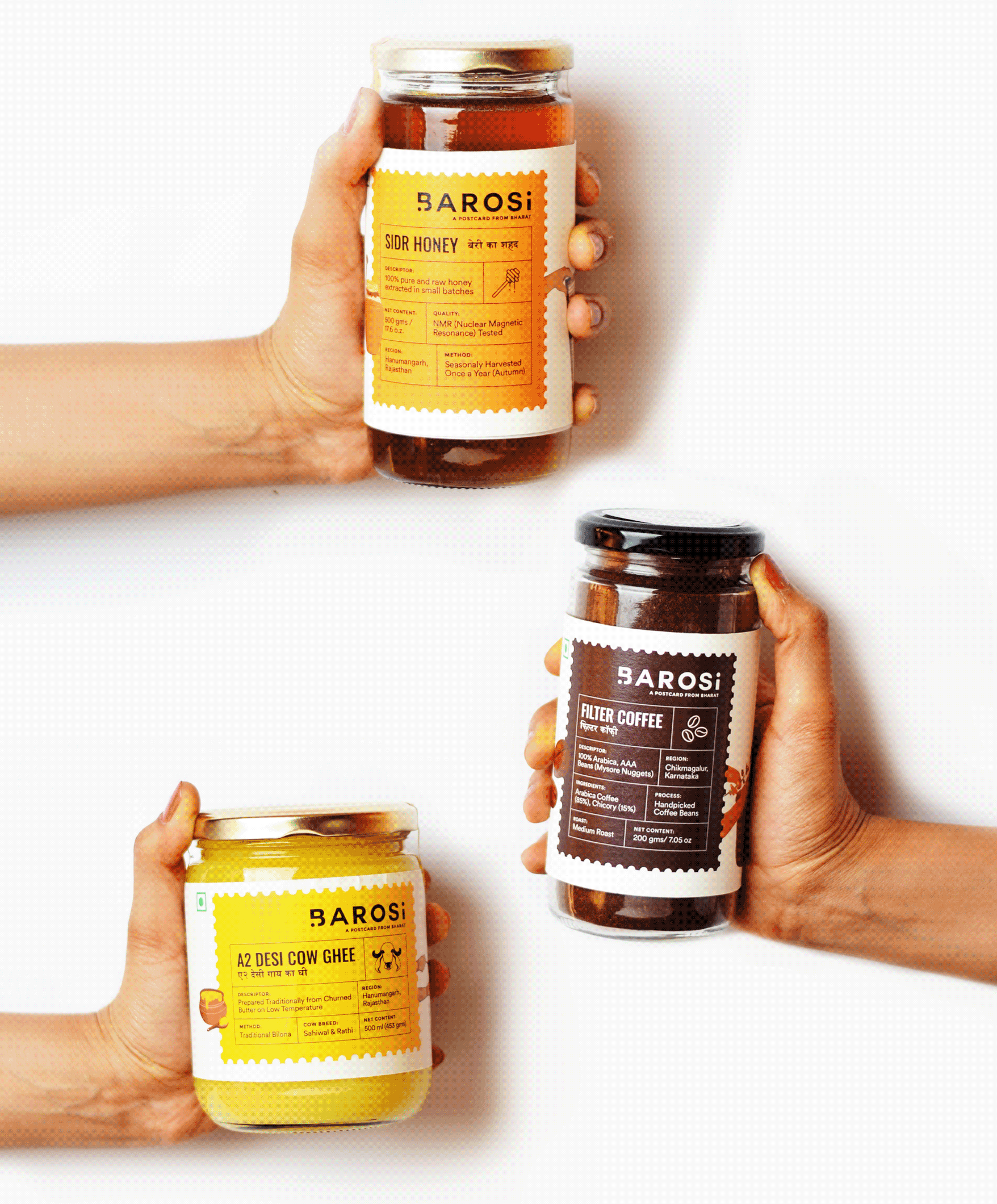
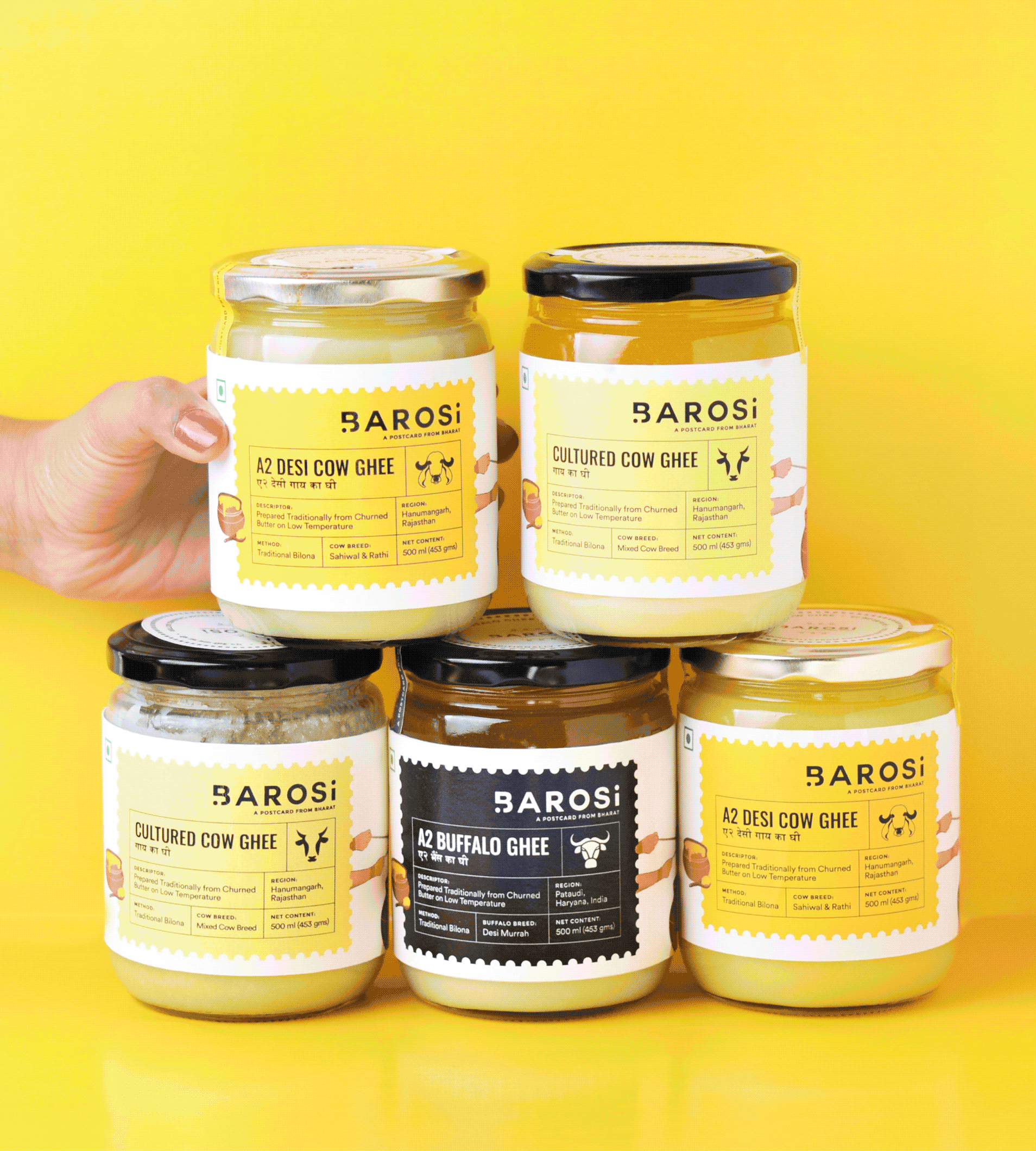
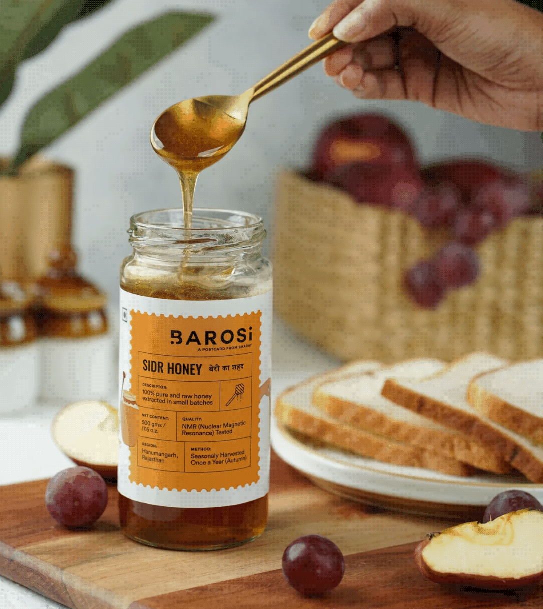
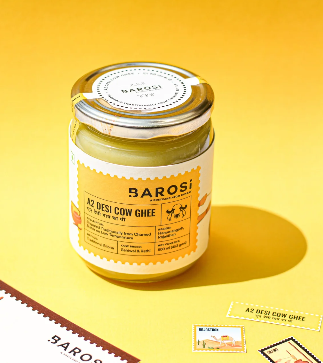
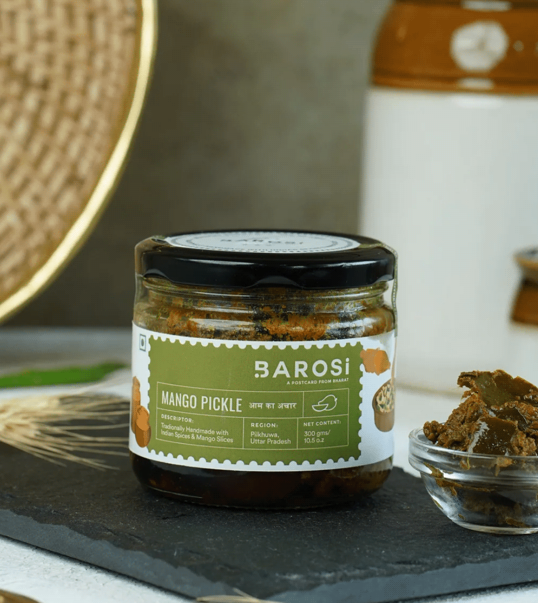
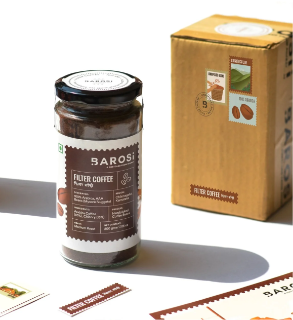
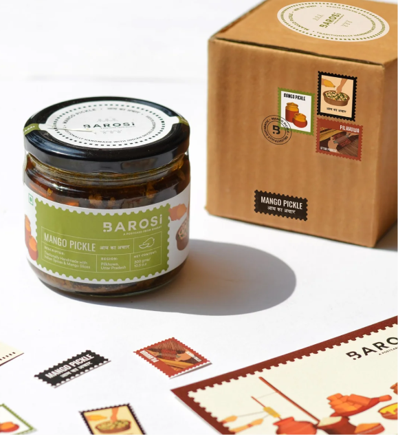
We want a sustainable approach for Barosi’s packaging. The products are packed in reusable glass jars and zero plastic is used. Since the brand only had the bandwidth to do brown carton boxes, we wanted to add something more to create a better experience.
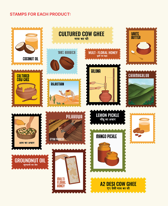
So, we designed four different stamps for each product: one for the origin, one for the product, one for how the product is made, and one with the product name. Each box had a different look but the same experience. Our goal was to create a thoughtful hand-crafted brand with a truly memorable consumer experience.
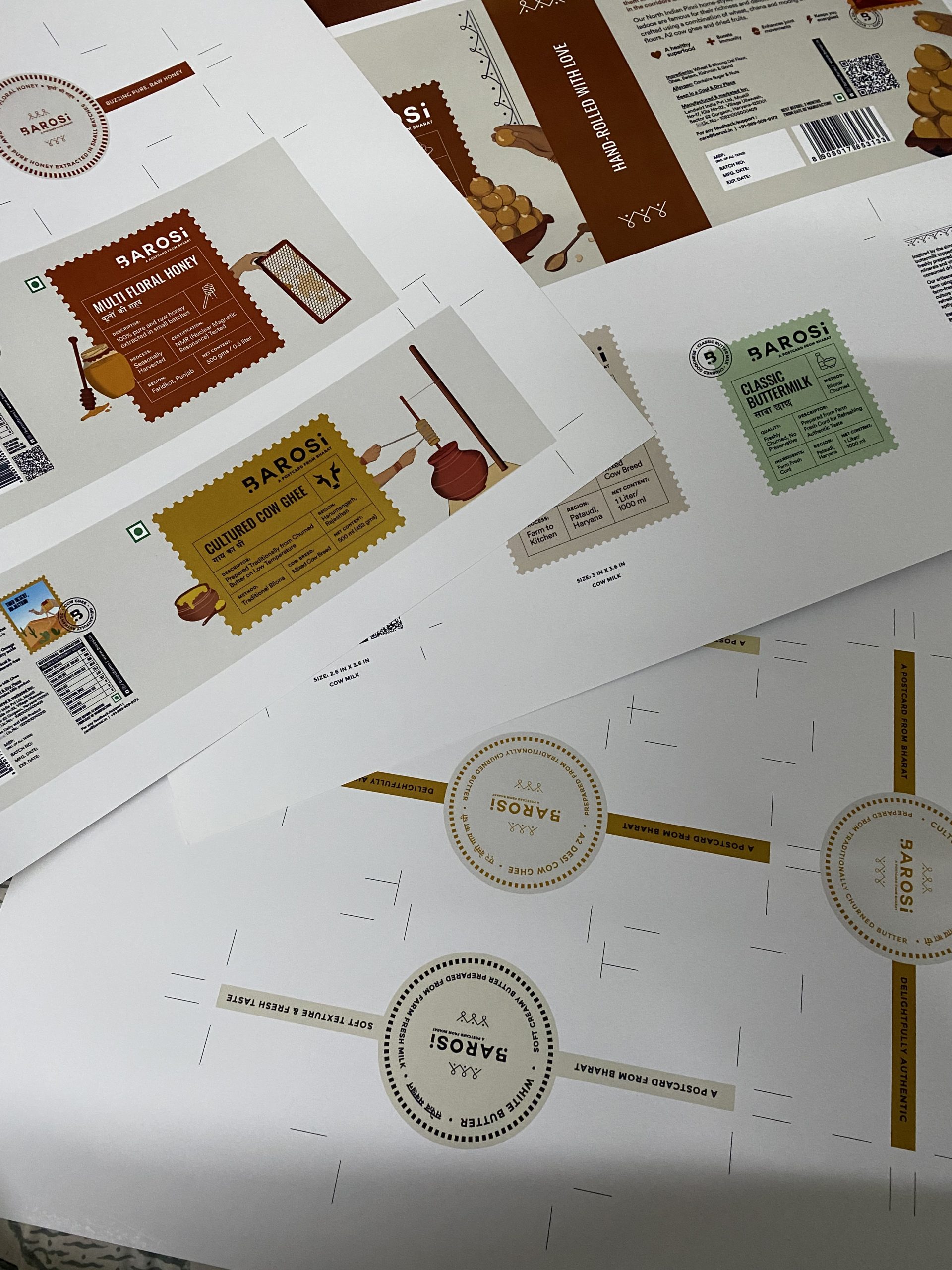
Print trials before production.
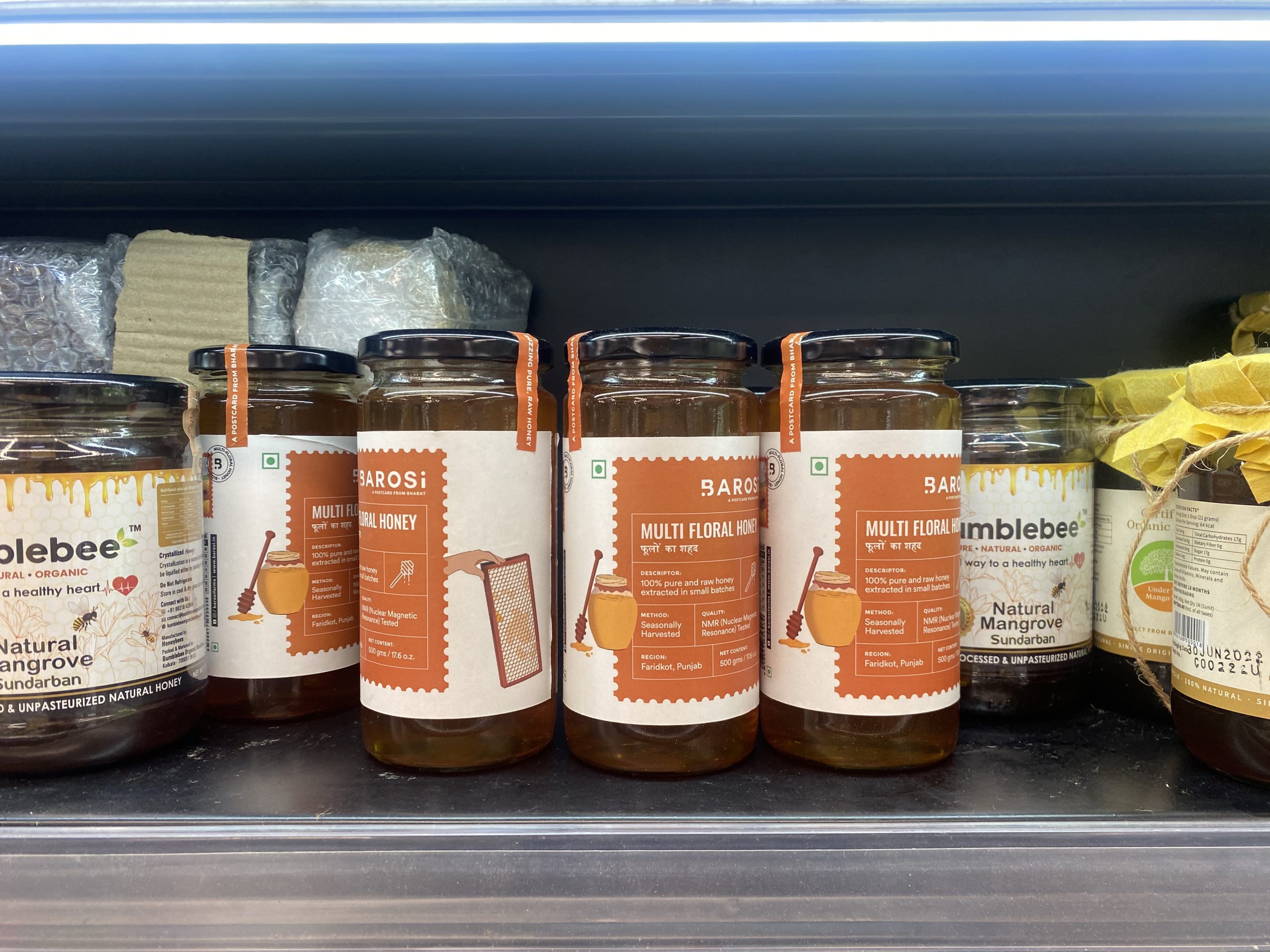
Seeing our work on the shelves.
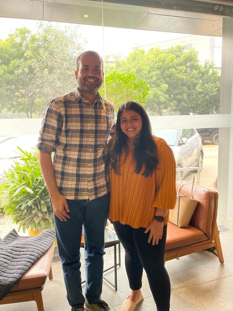
With the founder, Durlabh.
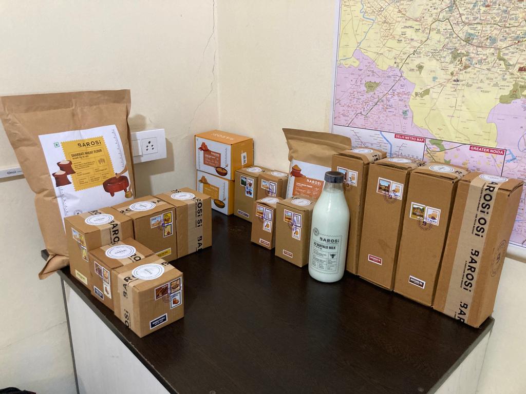
Seeing all the SKUs together (19SKUs).
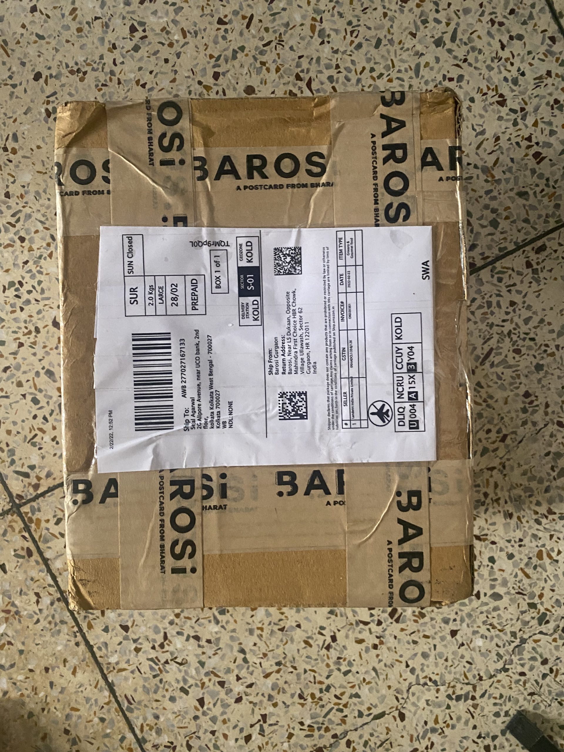
Happiness in a box.
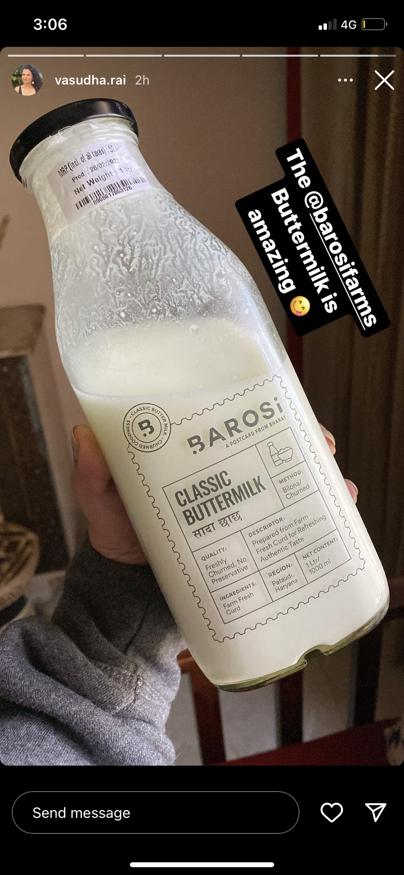
Seeing our work in the wild.
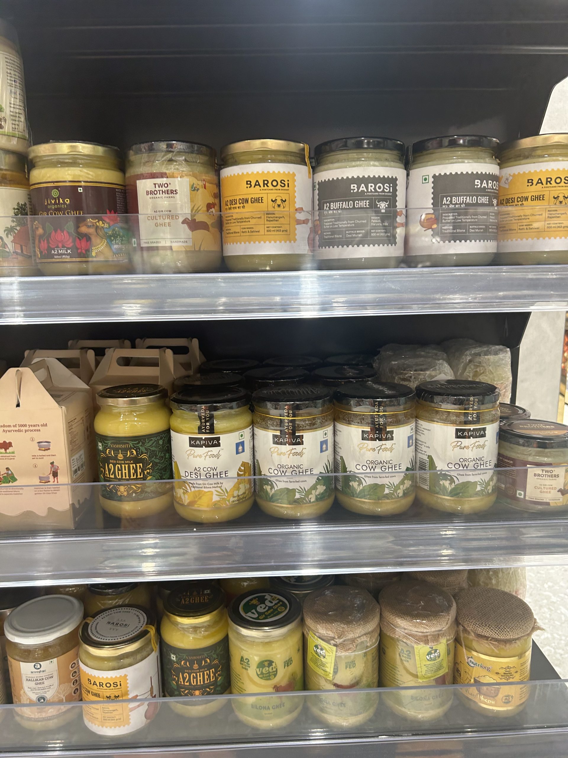
Does Barosi stand out to you?
Sizing trials before production.