The Crown Jewel Of Reliance

The Crown Jewel Of Reliance

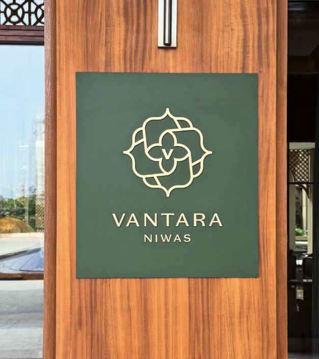
Brand Identity & Visual Extension for Vantara

Fostering Education With Zipply

Fostering Education With Zipply

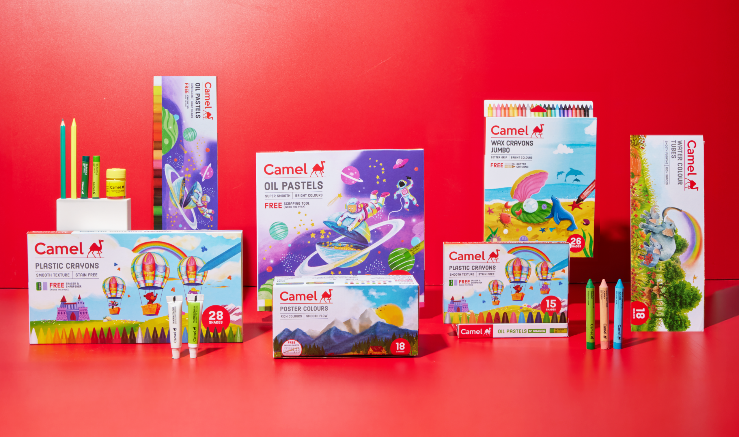
Brand Identity & UI For Zipply Platform

Smart Co-Working With 1Excel

Smart Co-Working With 1Excel

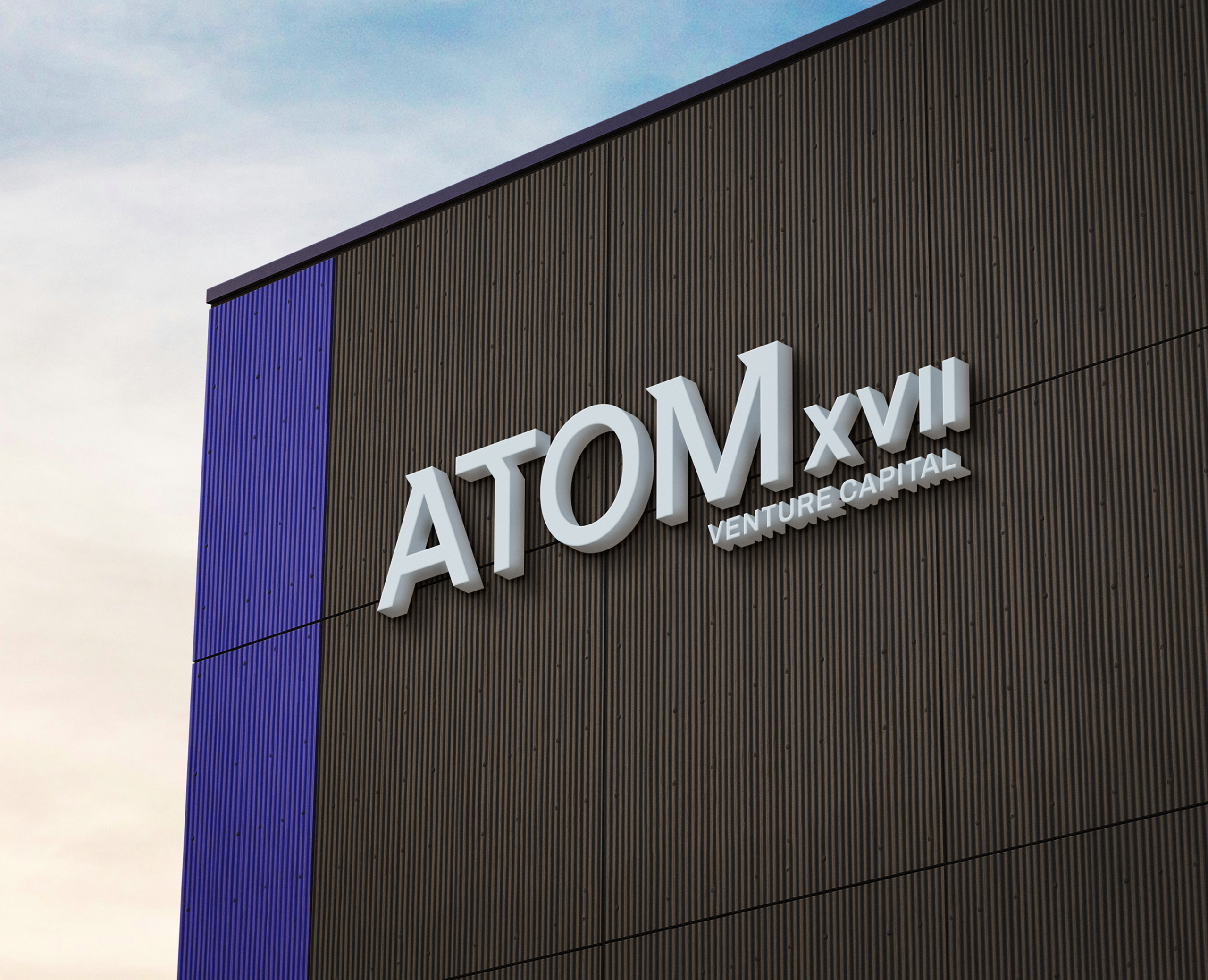
Identity & Visual Extension For A Co-Working Space

How do you give a luxury hotel a true sense of place?

Scope Of Work: Strategy, Brand Identity, Signages, Visual Extension and Packaging.

Do luxury hotels often promise the same things? Heritage, detailing, elegance, exceptional service? If every hotel destination looks luxurious, what truly gives it a sense of place?

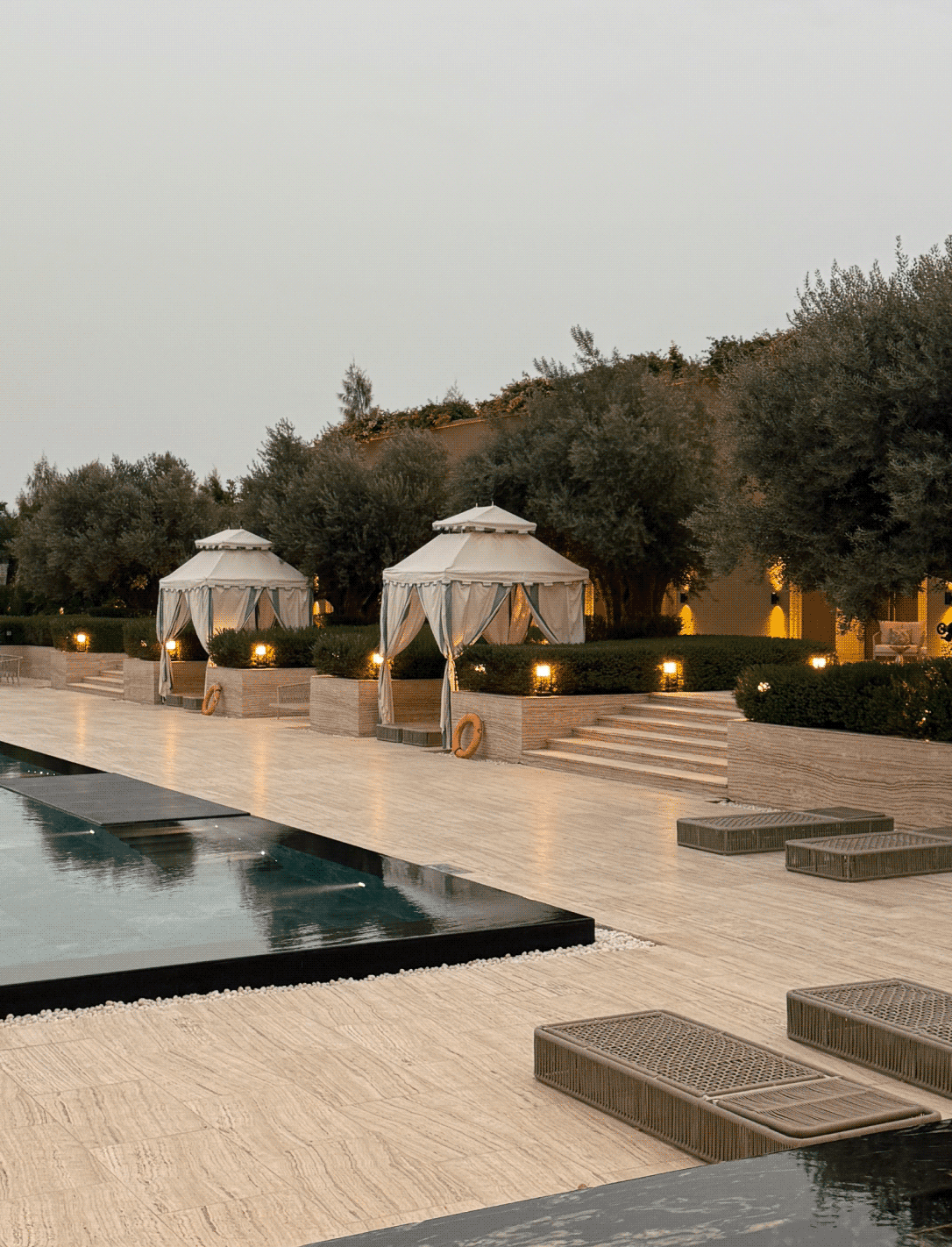
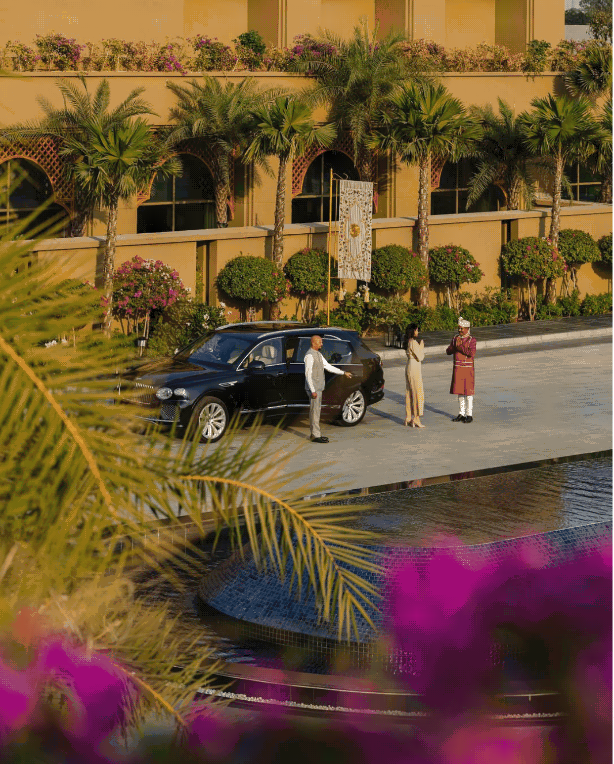
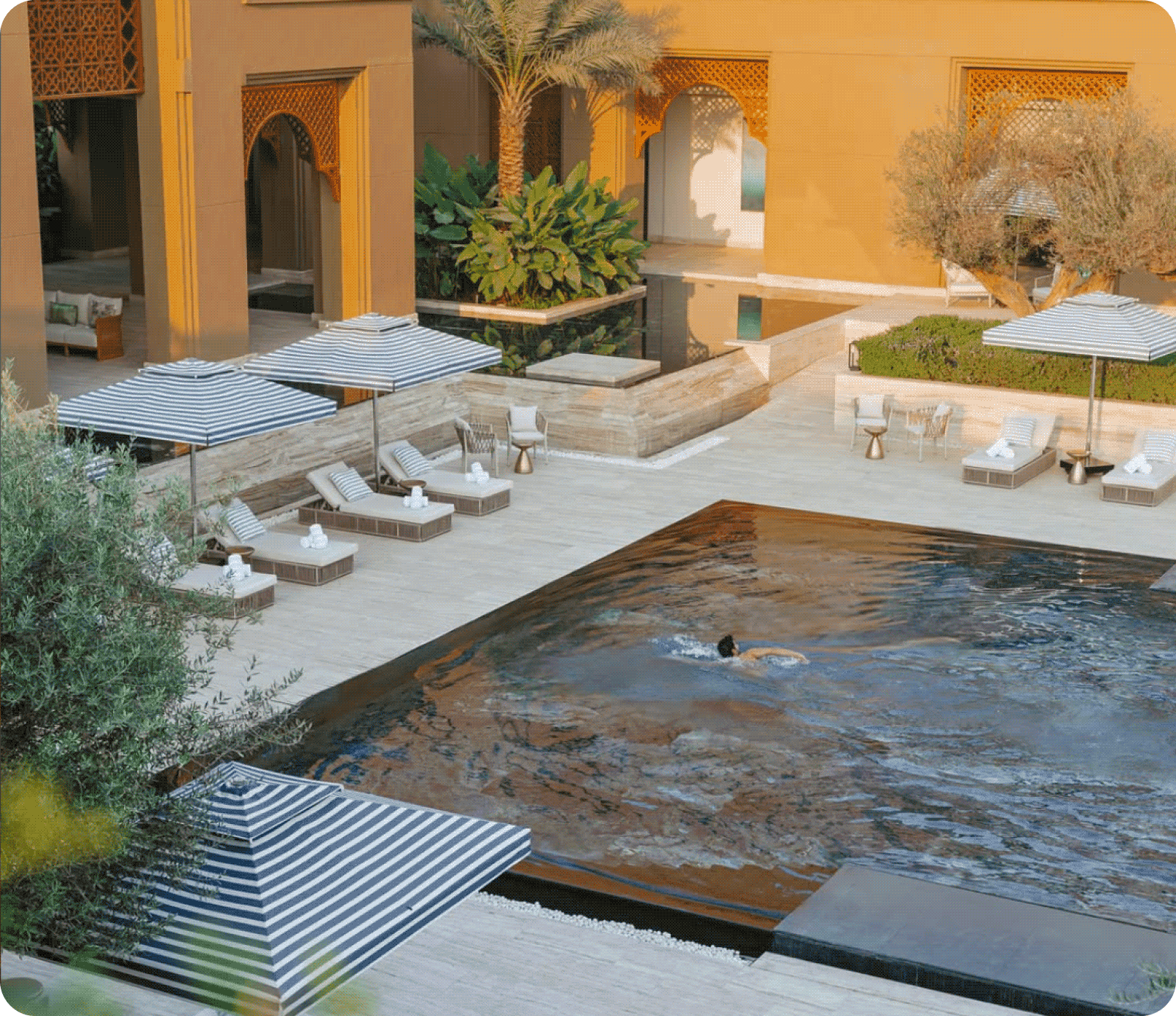
We explored this question with the team behind Vantara Niwas. Inspired by the Saurashtra’s architecture, cultural richness and craftsmanship, the opportunity was to design a brand that felt deeply connected to its surroundings.

The goal was to build an identity rooted in context rather than convention. We started by studying the region’s history and visual language to create a luxury experience that truly belongs and does justice to its place.

THE BRAND

A name rooted in nature. Refined through design.

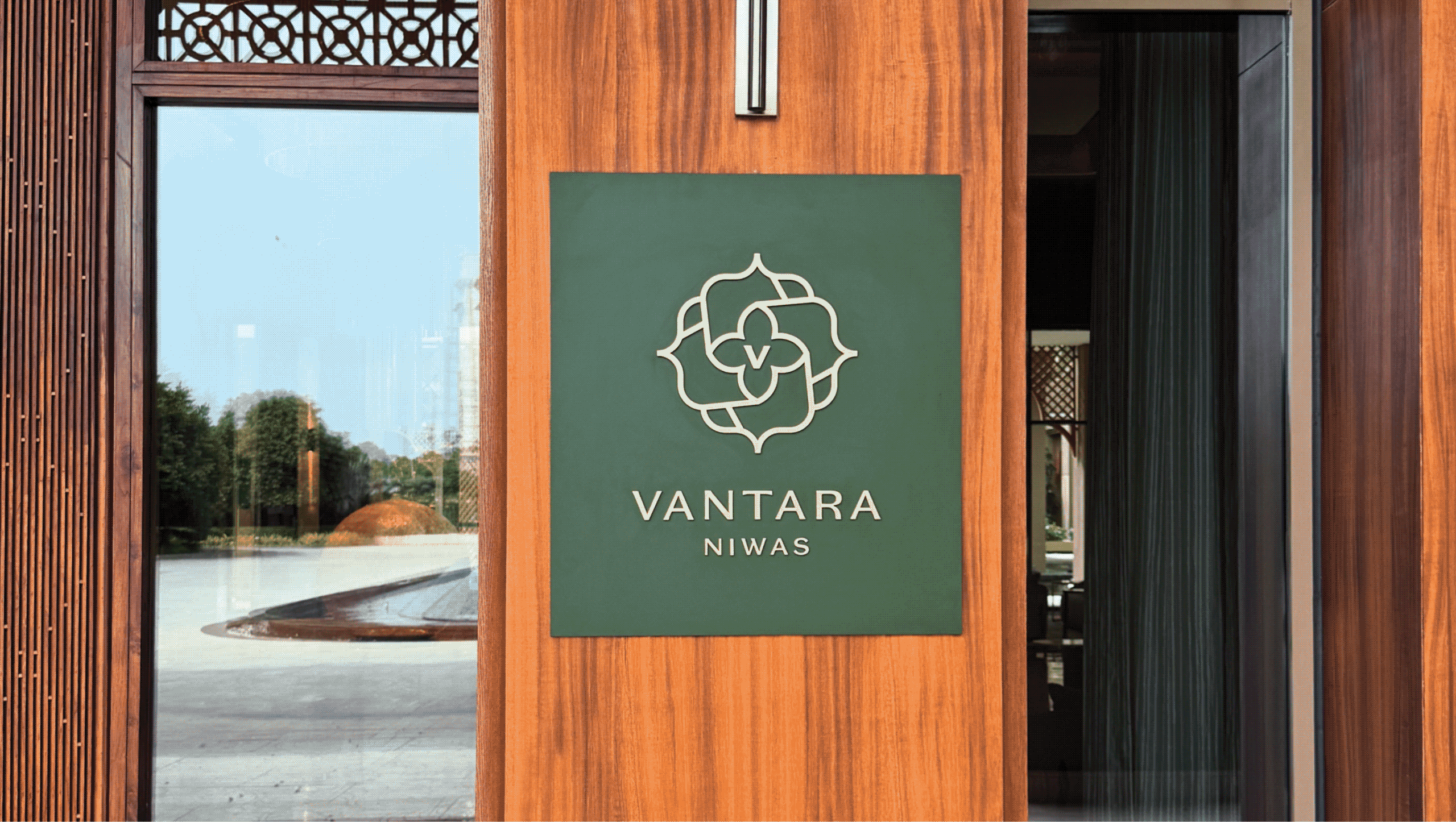
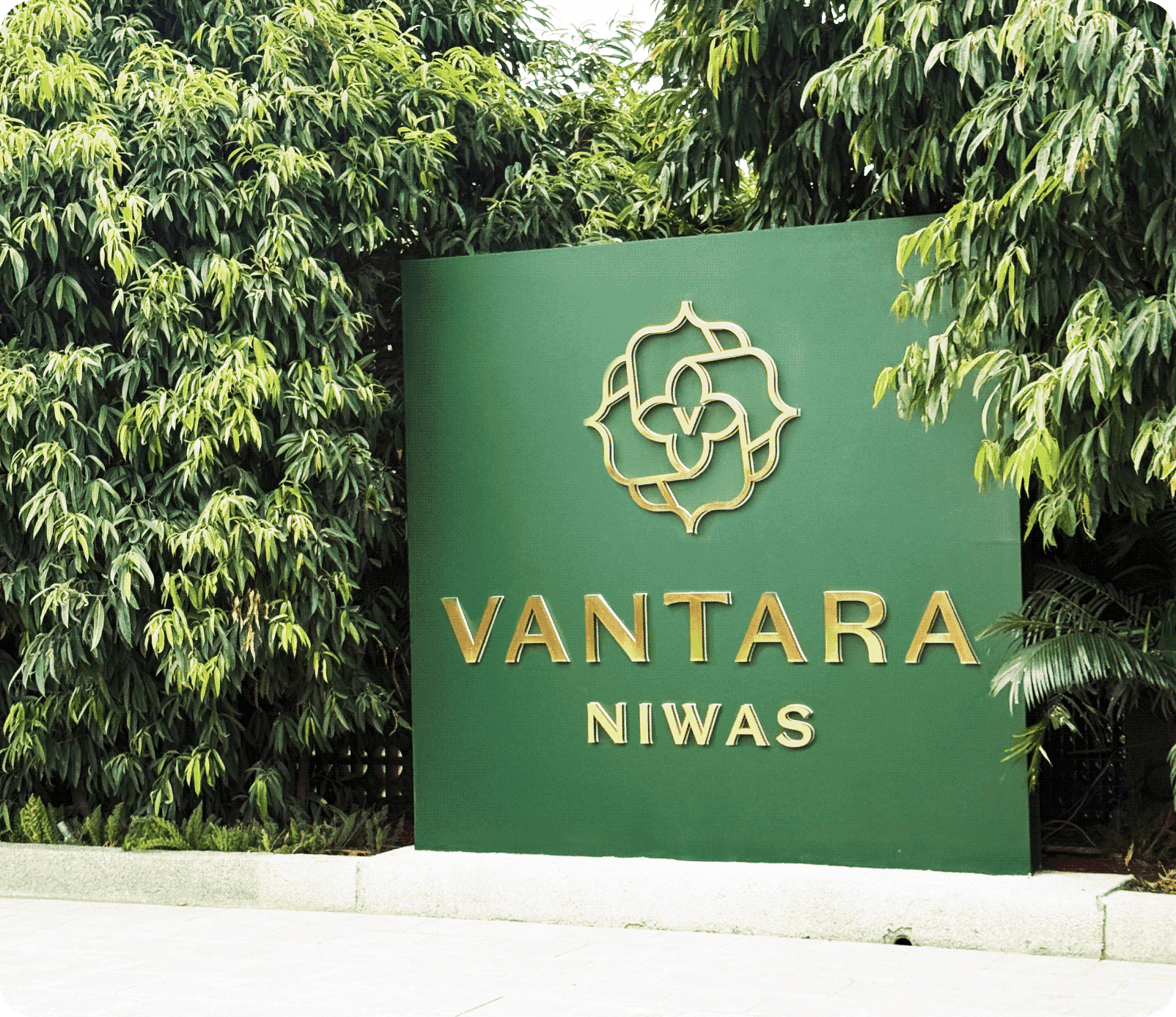
Vantara Niwas draws from the township’s wildlife conservation centre, Vantara. The word mark combines classic serif typography with clean lines and contemporary refinement.

Elegant proportions and carefully considered details create an identity that feels timeless, confident, and effortlessly luxurious.
THE BEST PART

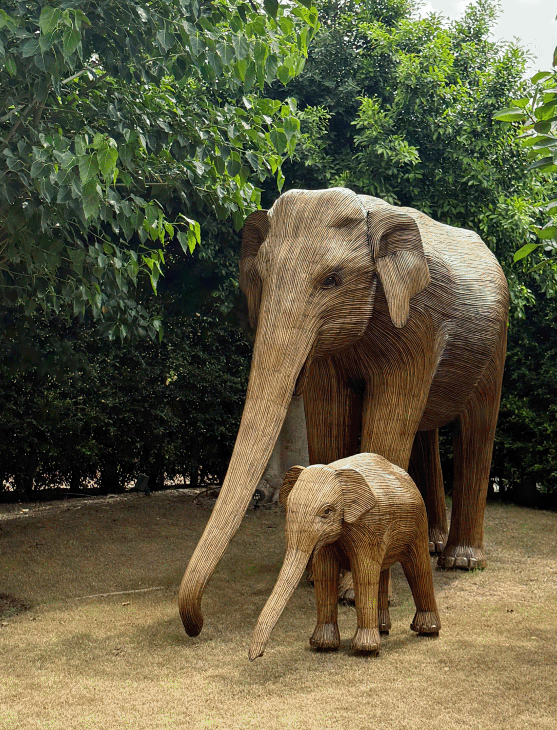
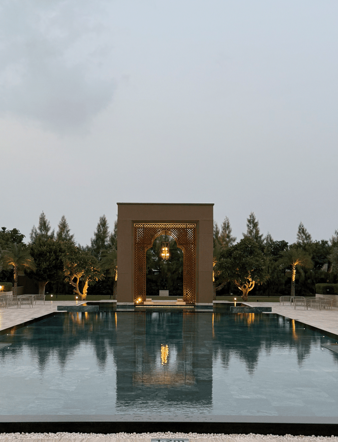
Nature is not applied to the property, it is what the property was arranged around.

Vantara reflects a larger vision where luxury and the natural world hold together.

Nothing competes with what is already there: Indian motifs and commissioned art carry the interior vocabulary, rooms open outward to the forest, sound therapy and Ayurveda extend it past the visual, so the property is felt as much as seen.

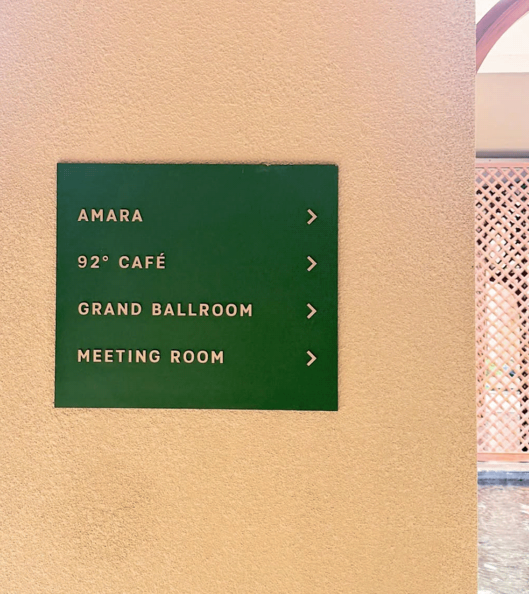
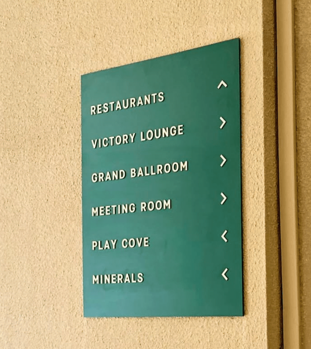
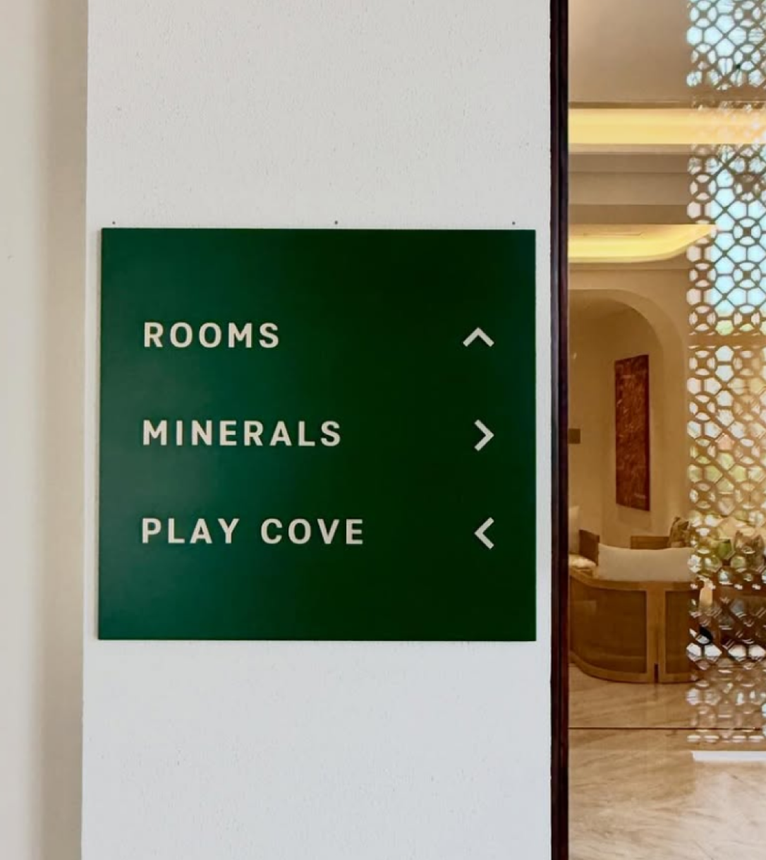
Clean type, minimal wayfinding, nothing that announces itself before the forest does. The walkthrough is built as a sequence rather than a lobby: guests arrive through the landscape, not past it.

THE EXTENSION

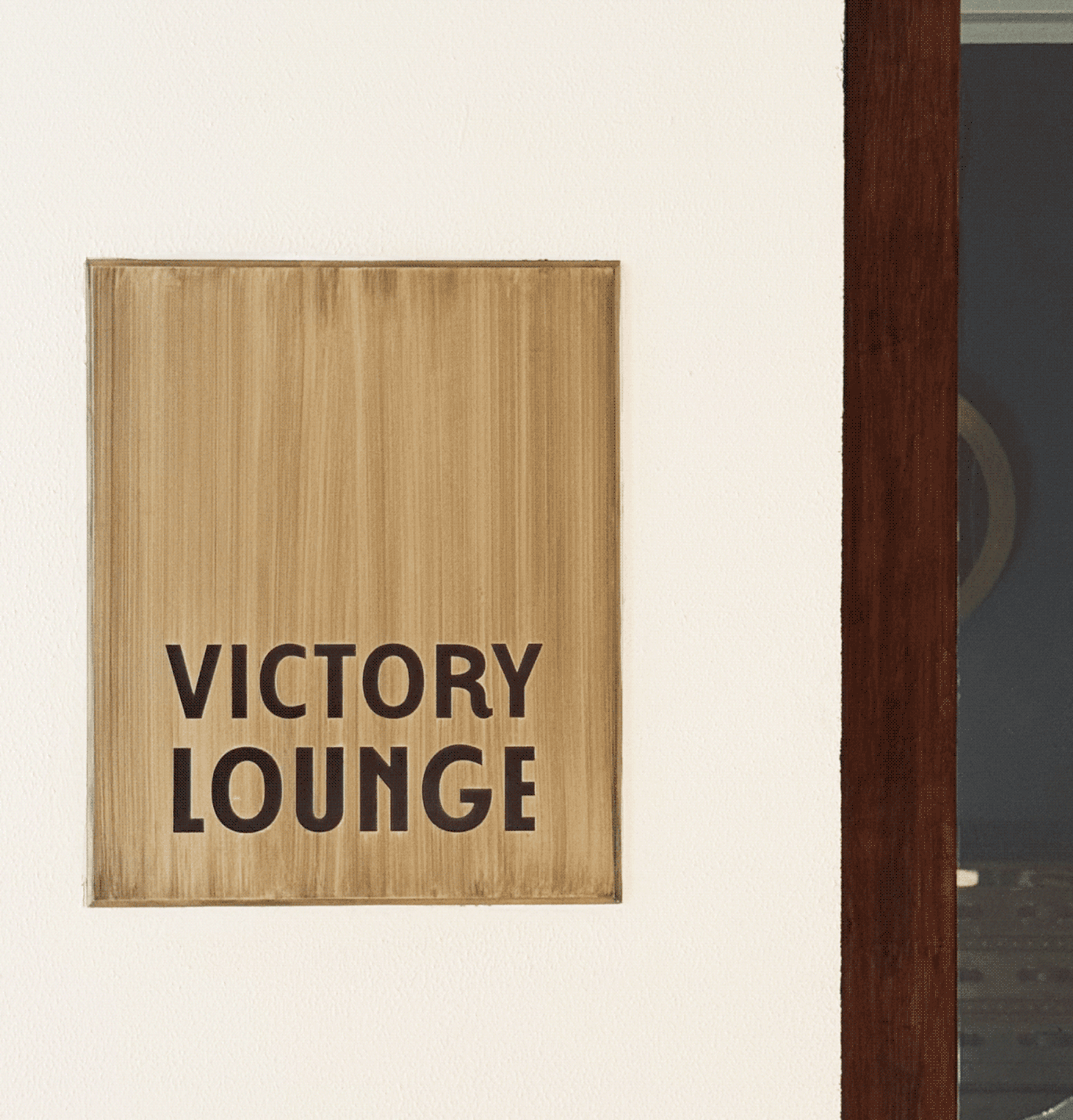
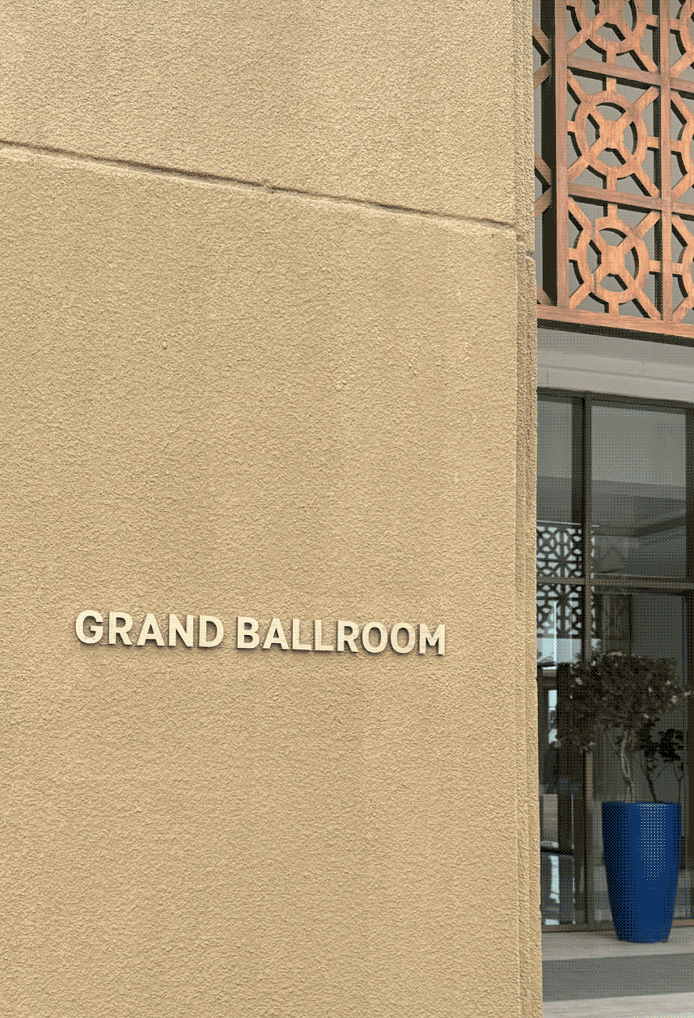
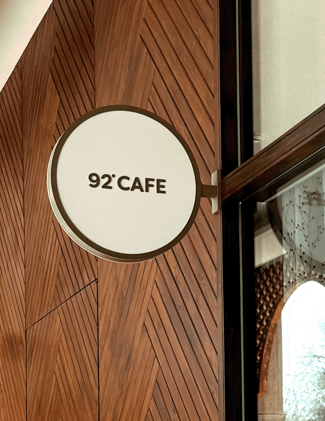
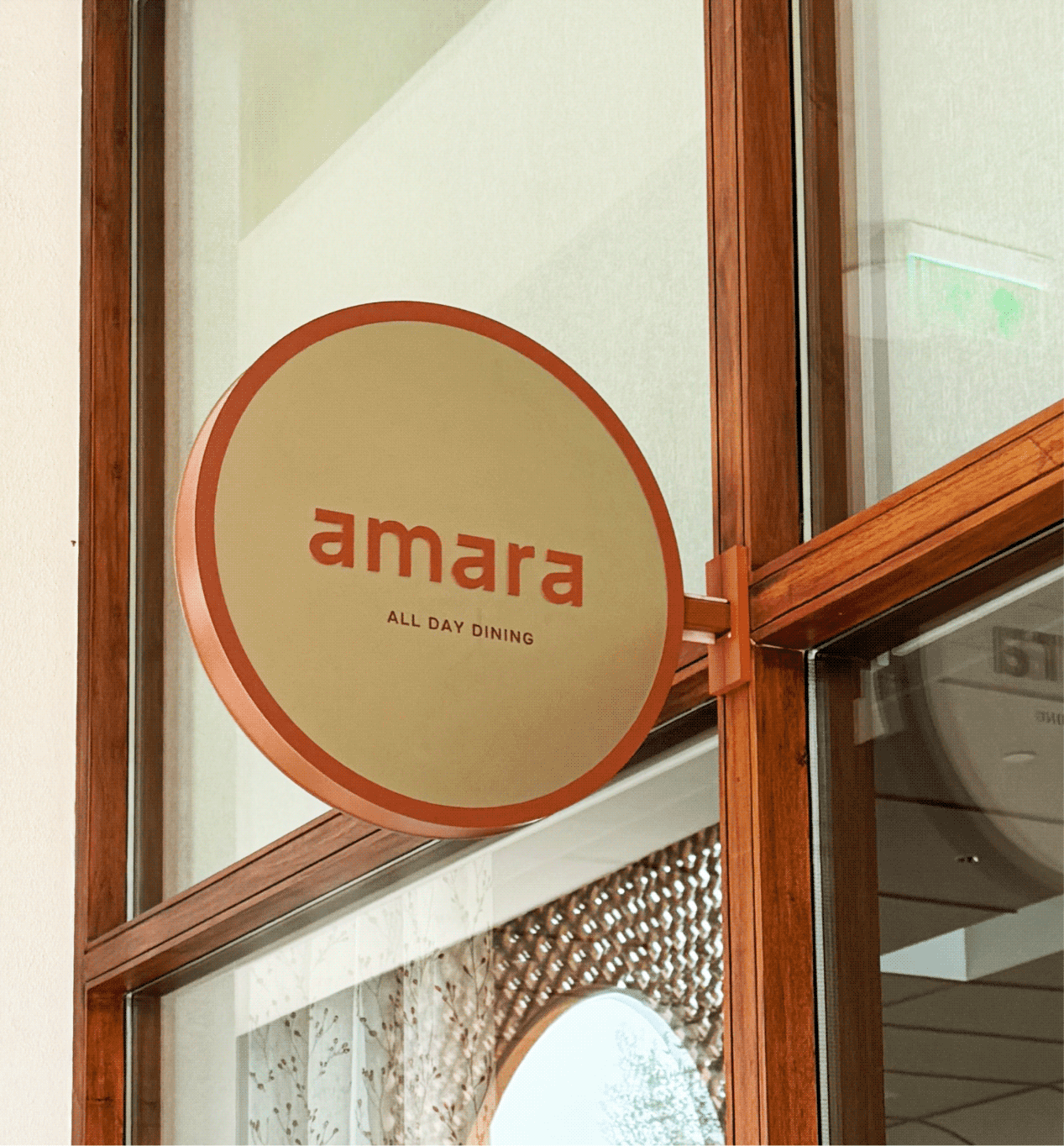
How do four restaurants become one hotel experience?

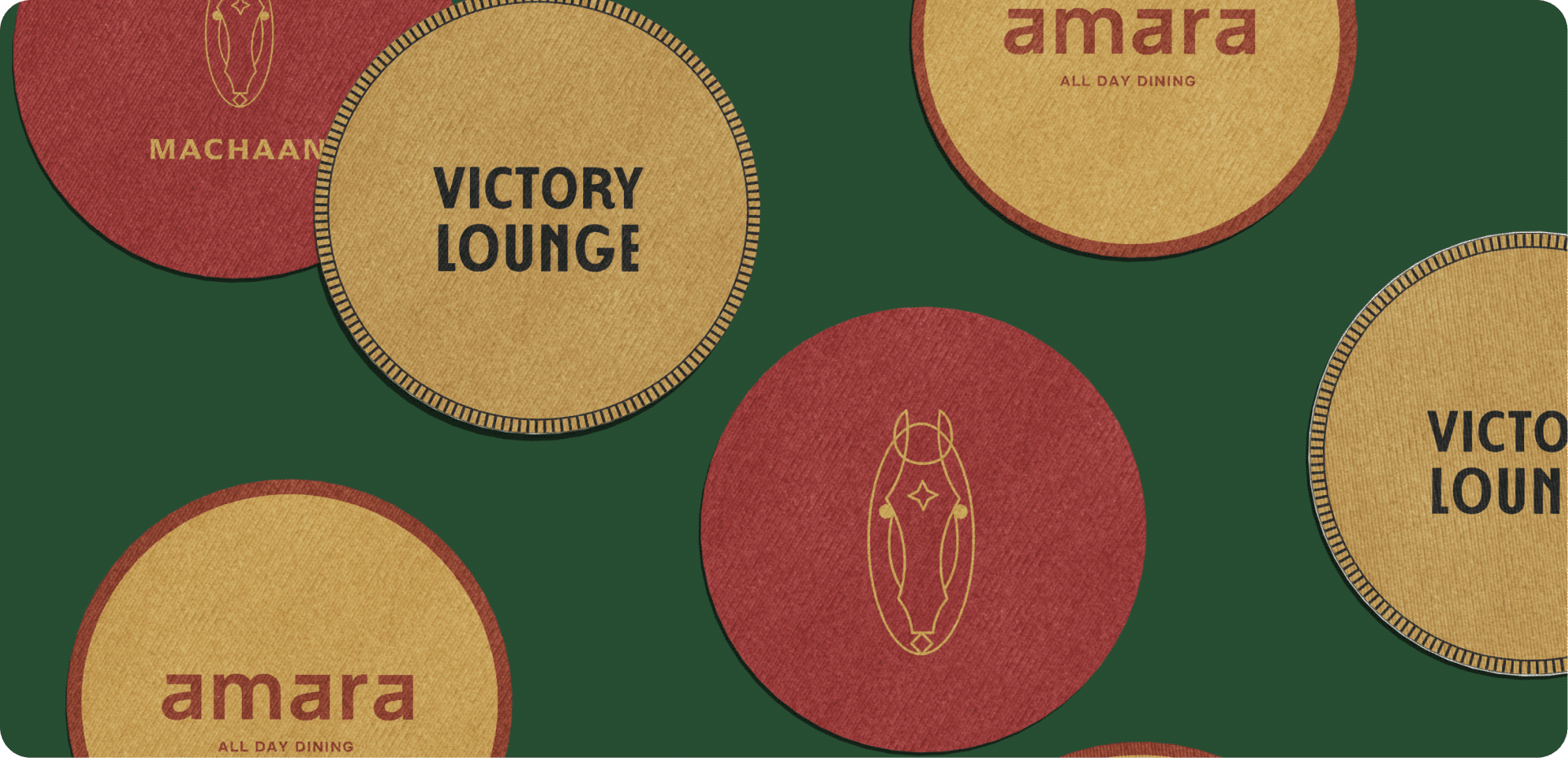
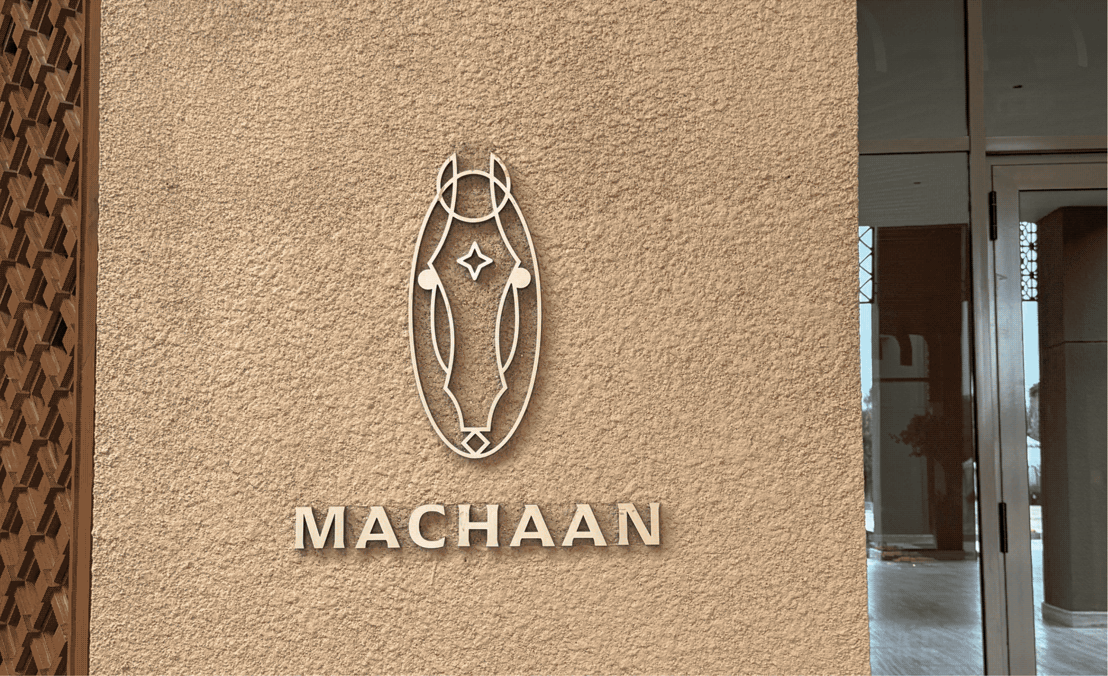
Each restaurant draws from a different narrative, from the Kathiawadi horse and Mumbai cricket culture to relaxed all-day dining and café experiences. We translated these stories into distinct identities while grounding them in the hotel’s architectural language.

The recurring star motif, drawn from the identity system, creates continuity, allowing the brand to feel deeply integrated rather than simply applied. Together, they create a seamless experience.

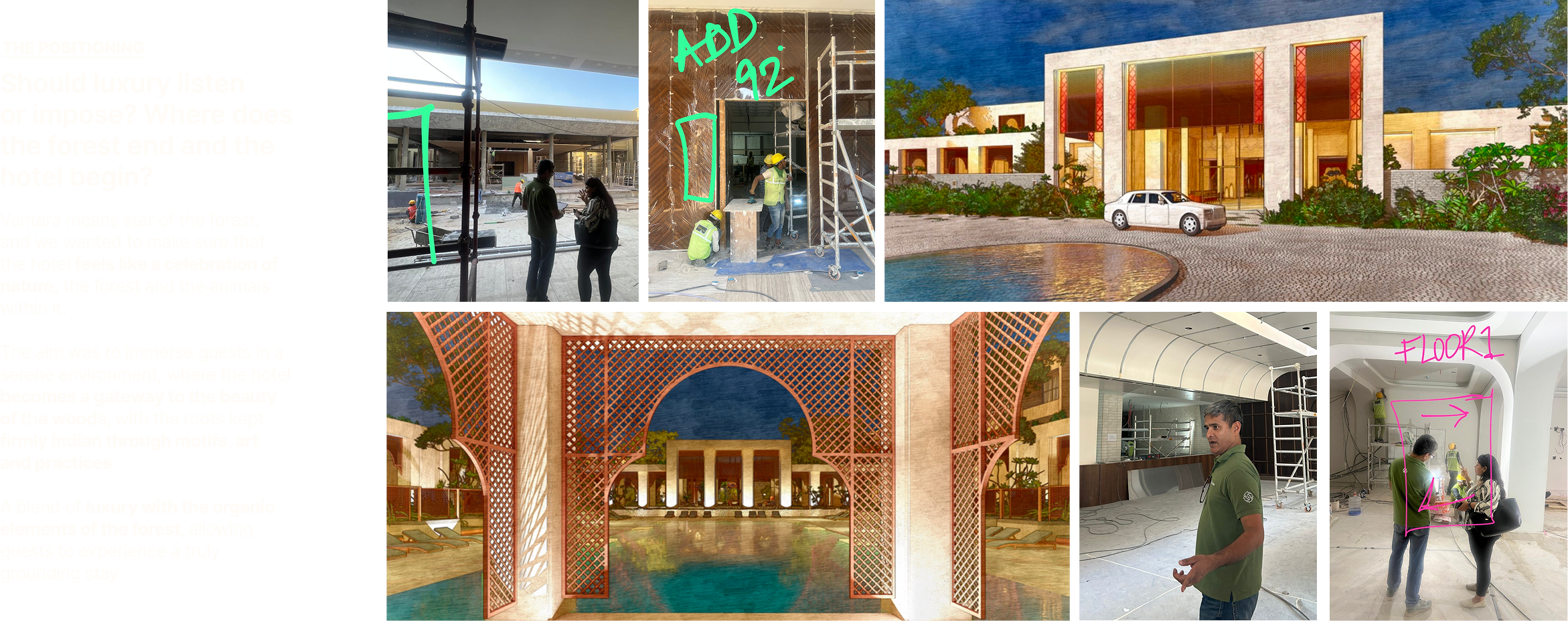
The messy, the fun, the not so pretty part of the project!

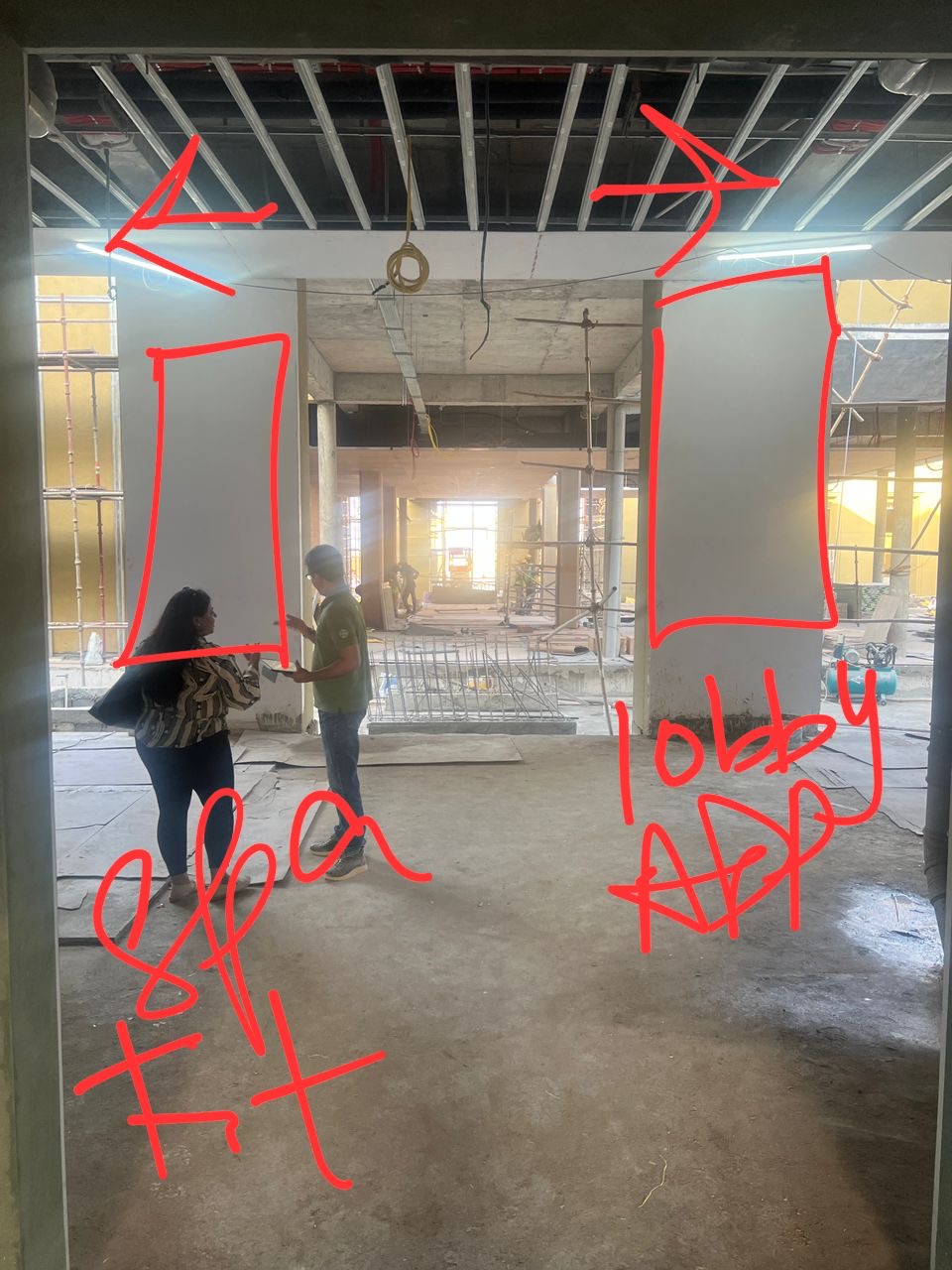
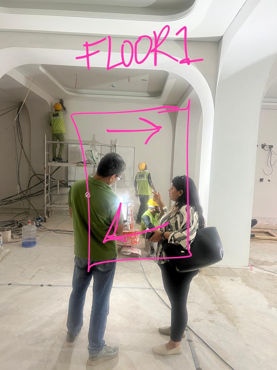
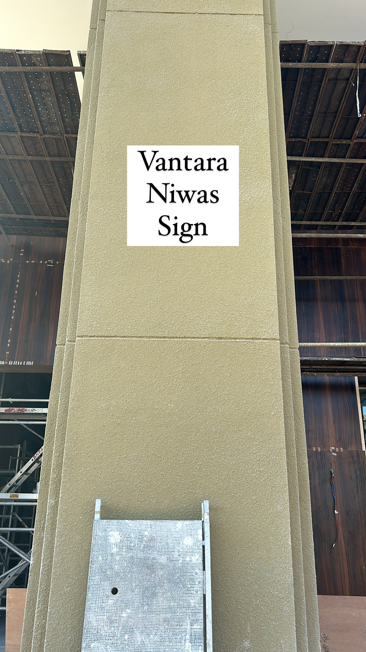
Planning the hotel signages!

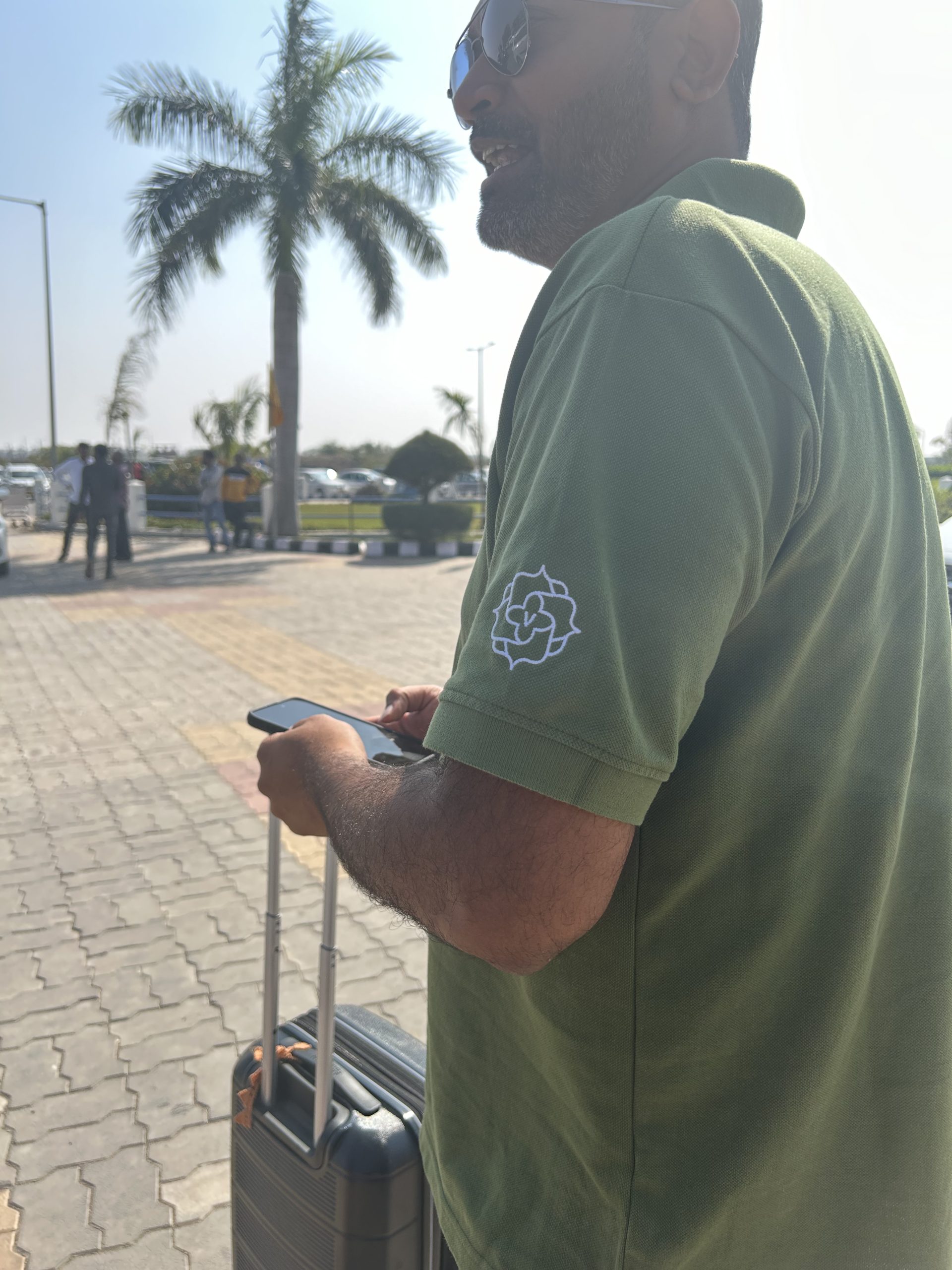
Spotting our logo during WIP trips!

Marking each signage in person

Sizes, Shapes & Material Planning

Admiring the details!

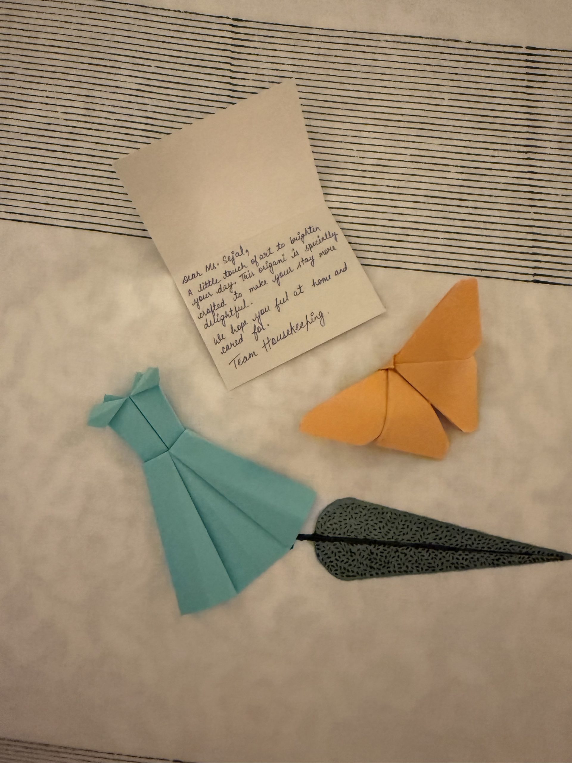
Ensuring the detailing goes beyond architecture!

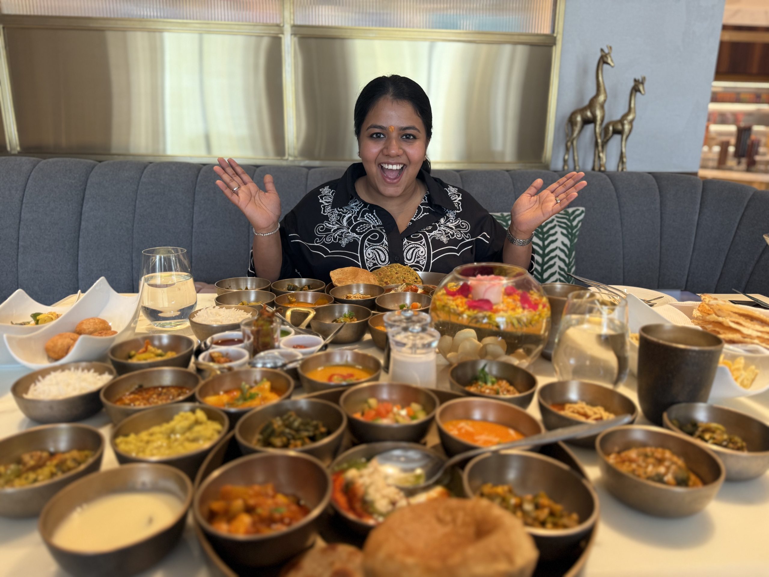
Blown away by the F&B team's hospitality