After years in venture capital, Harsh kept seeing the same pattern. Pedigree and conventional signals of success carried more weight than the idea itself.
He wanted to build a fund that looked beyond credentials and focused on what mattered most: the smallest idea with the potential to become something extraordinary.

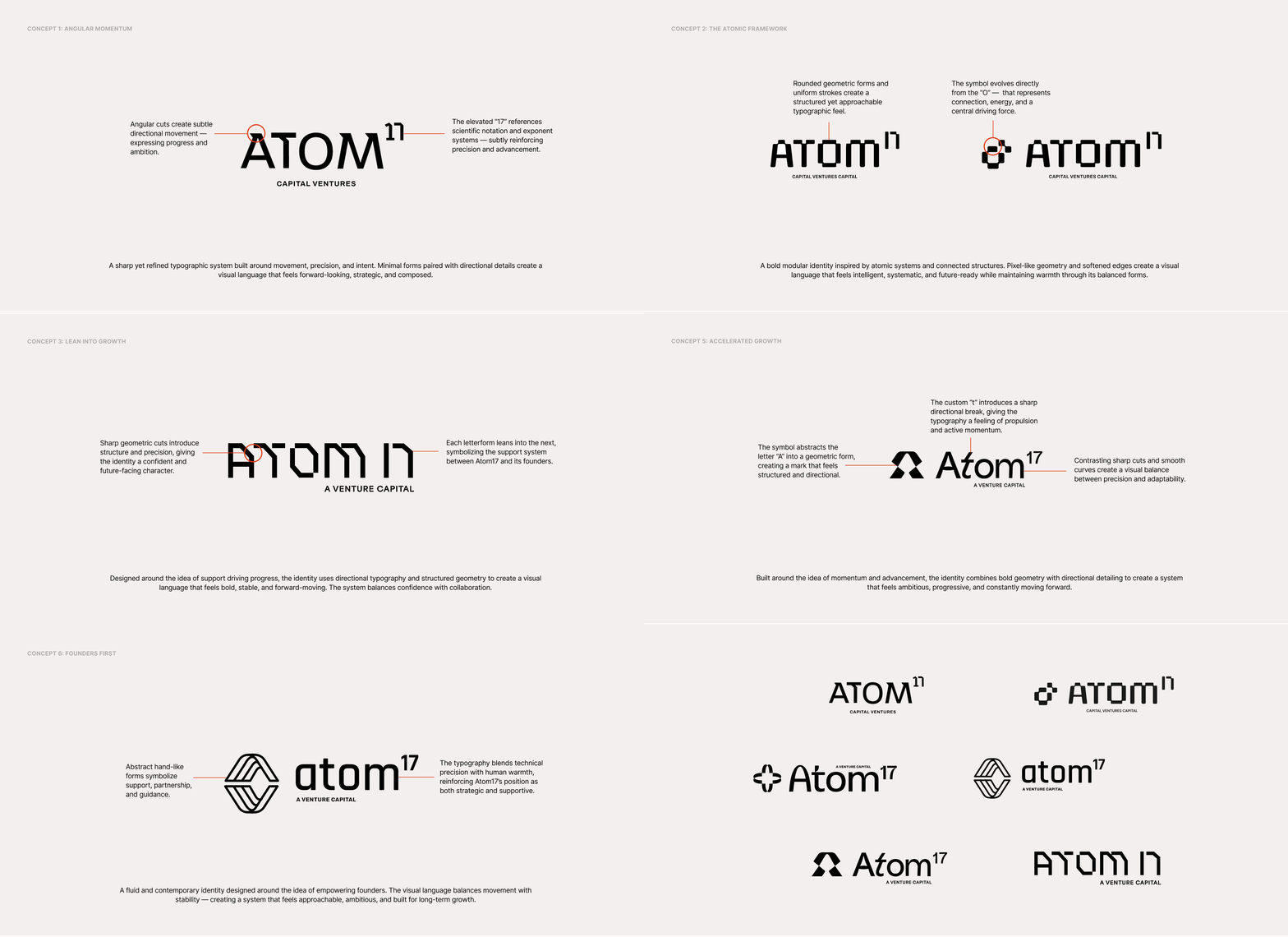
The identity had to balance structure with movement, precise without turning cold.
We explored visual directions that balanced structure with movement to capture clarity, momentum, and quiet confidence.
A venture capital firm built to back founders early, on conviction rather than credentials.
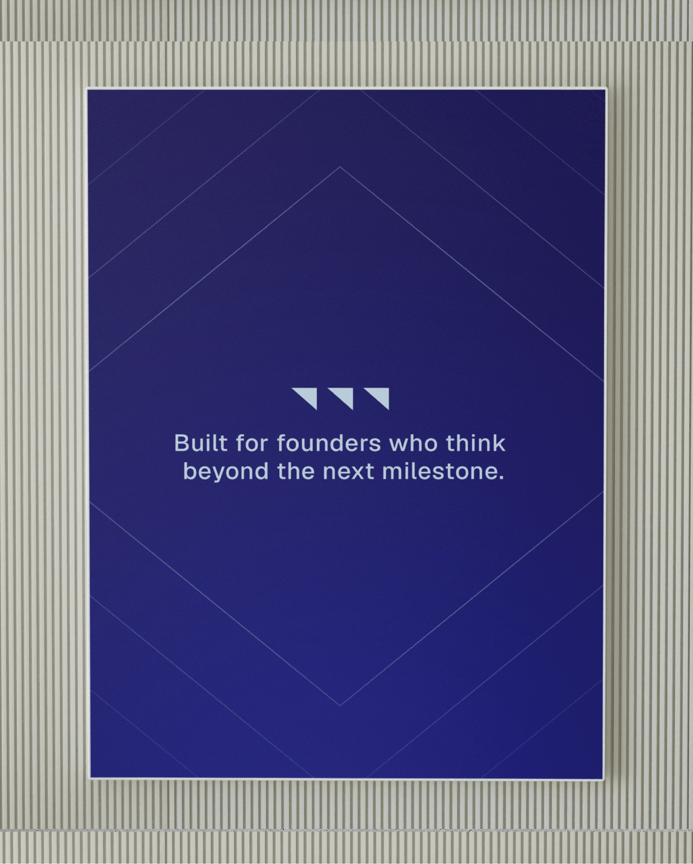
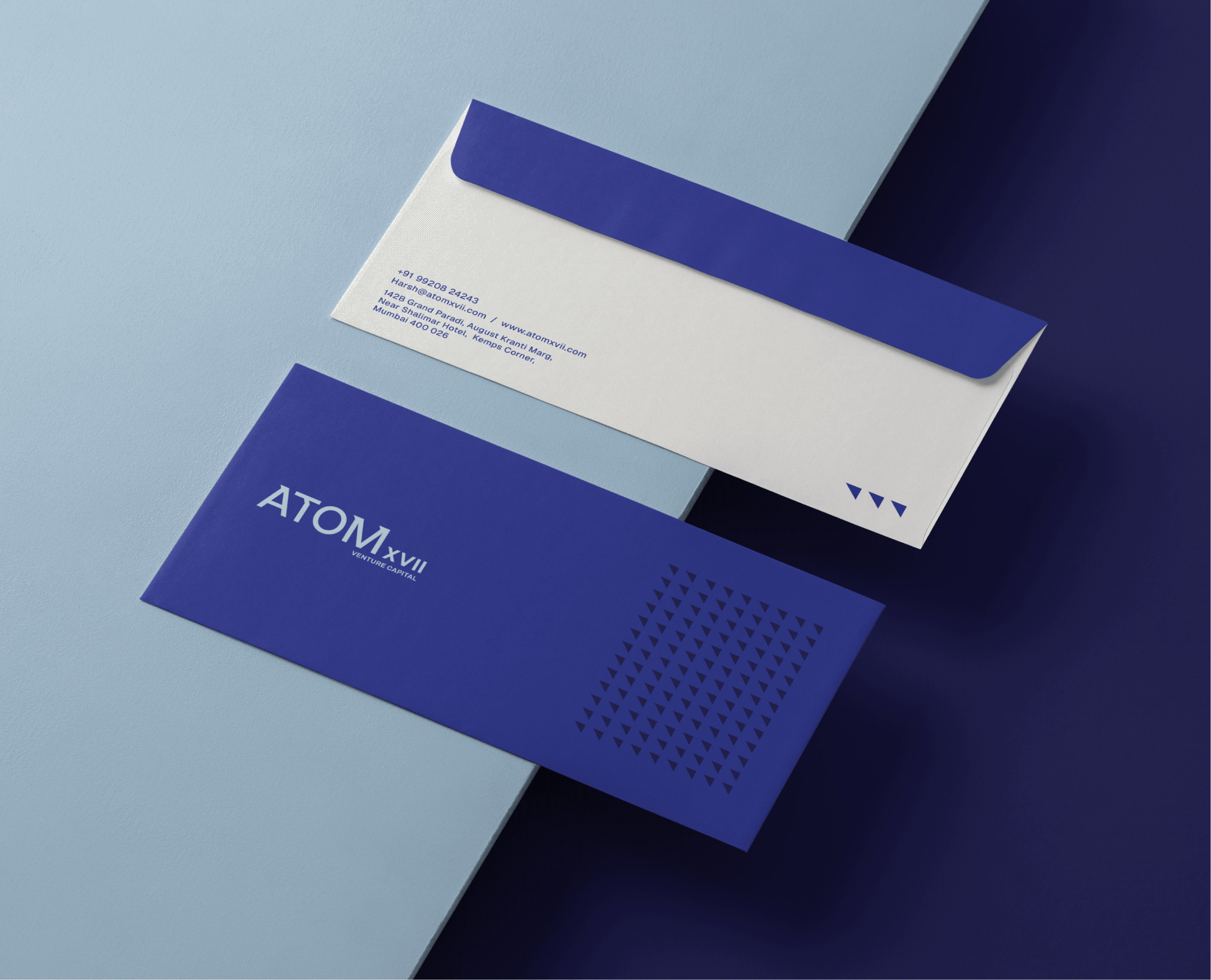
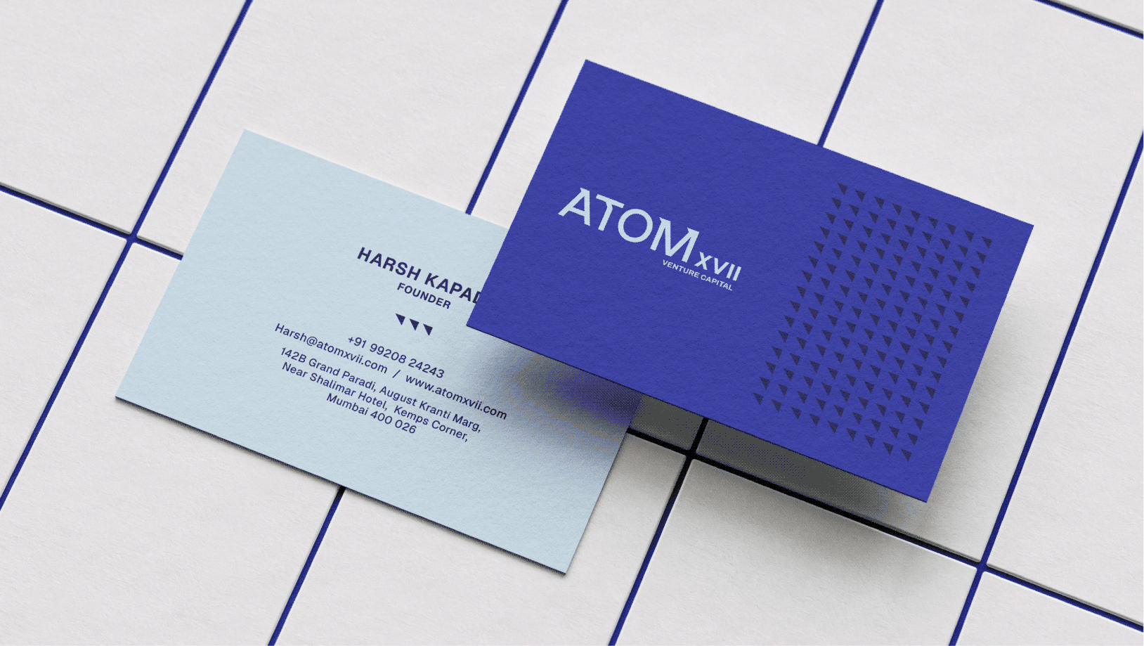

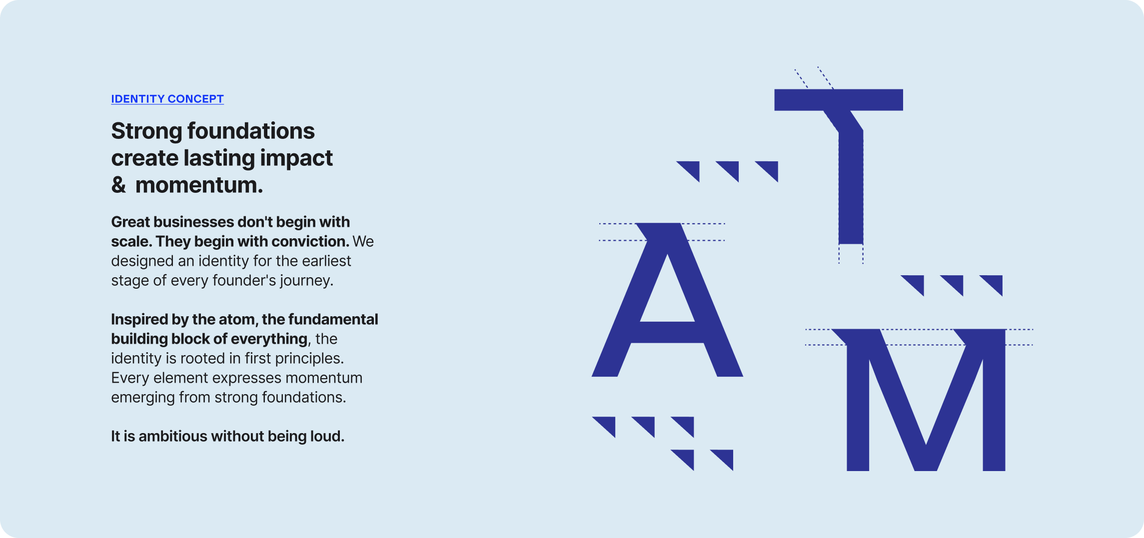
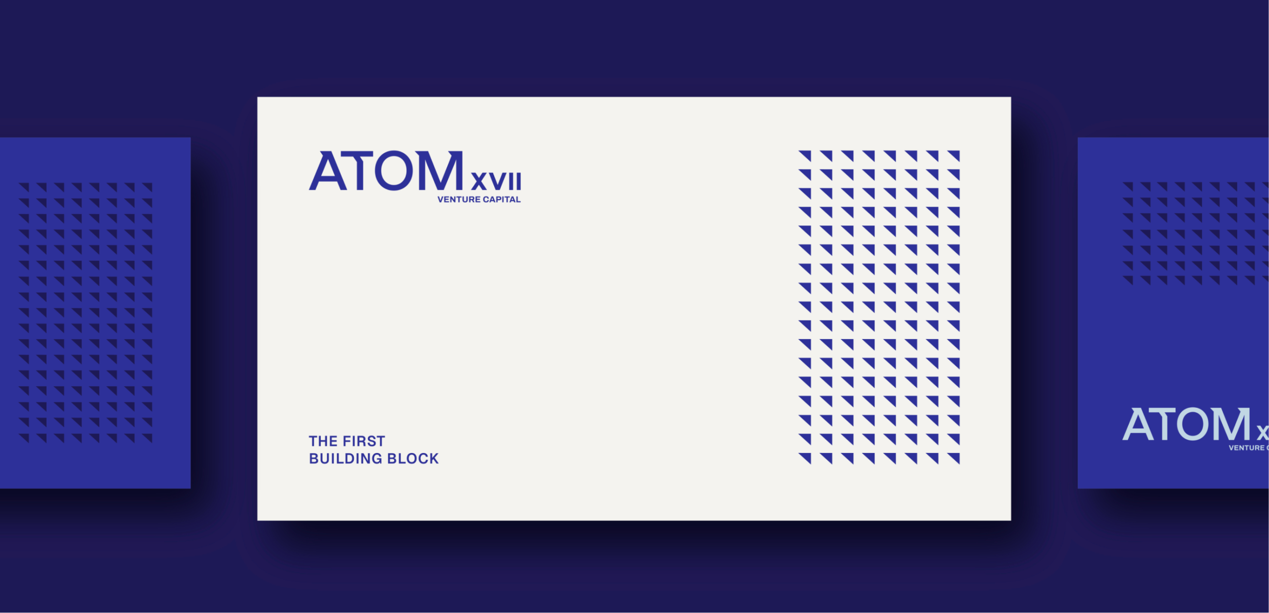
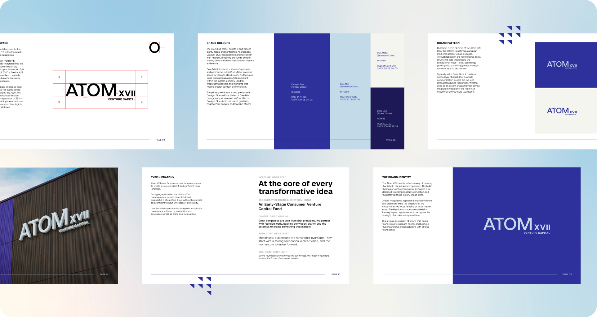
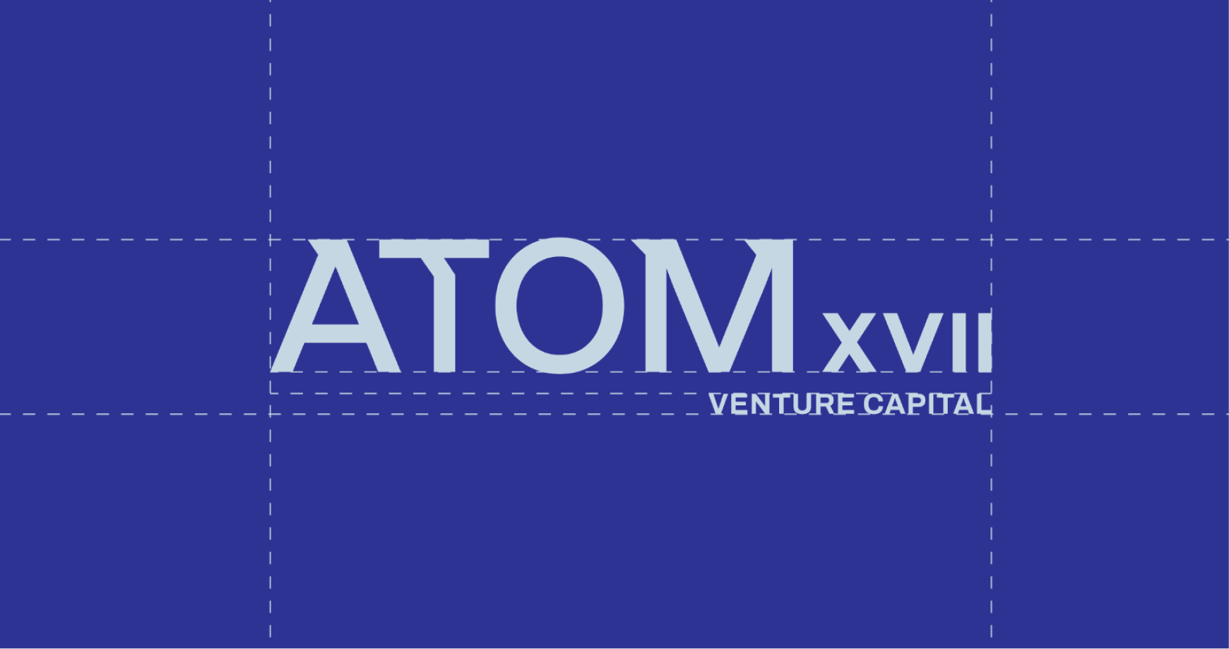
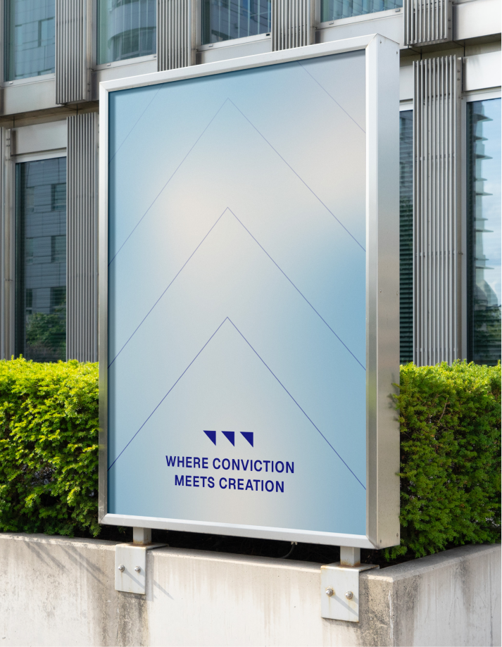
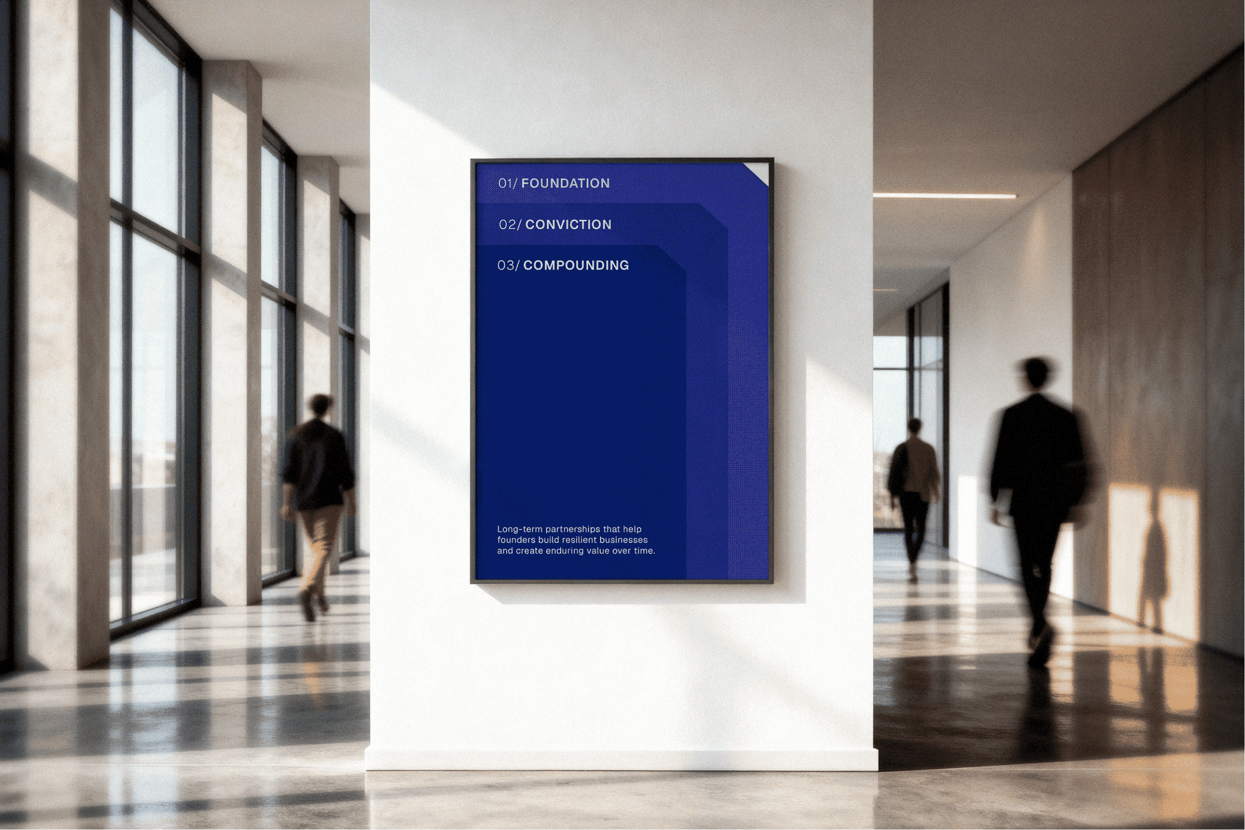
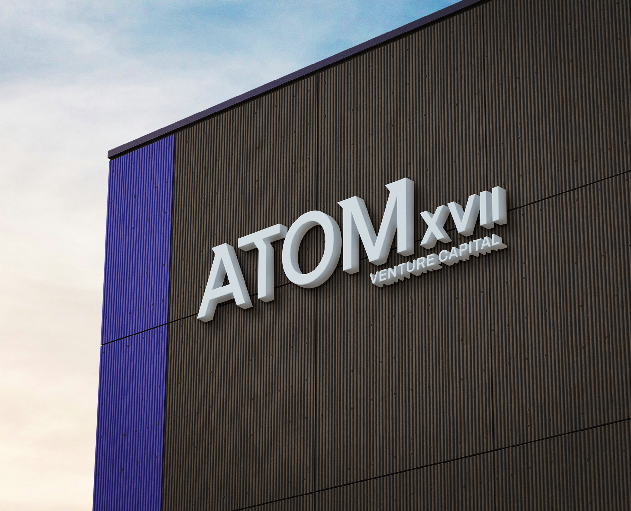
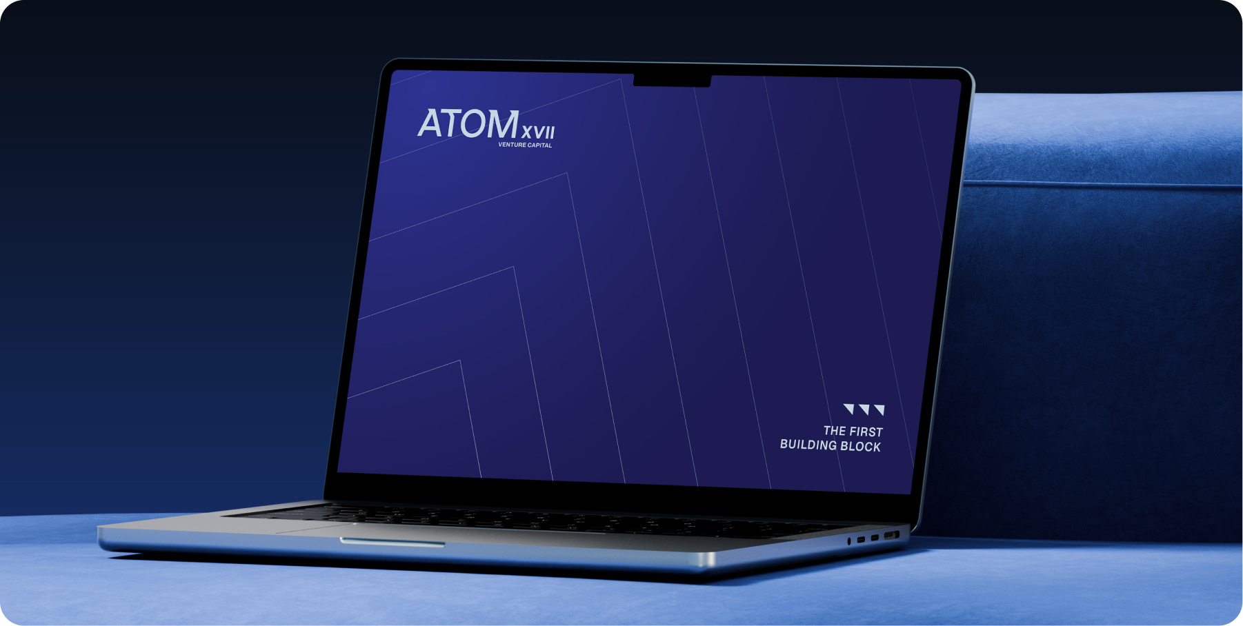
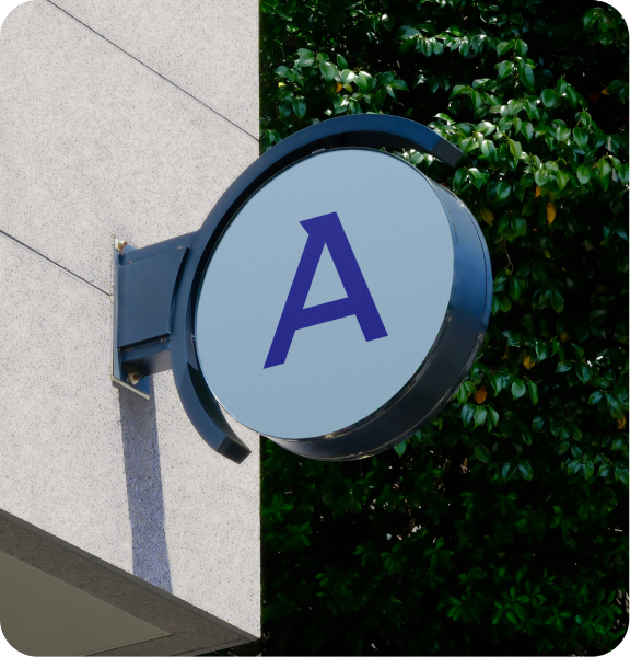
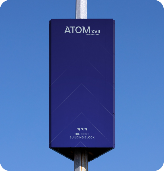
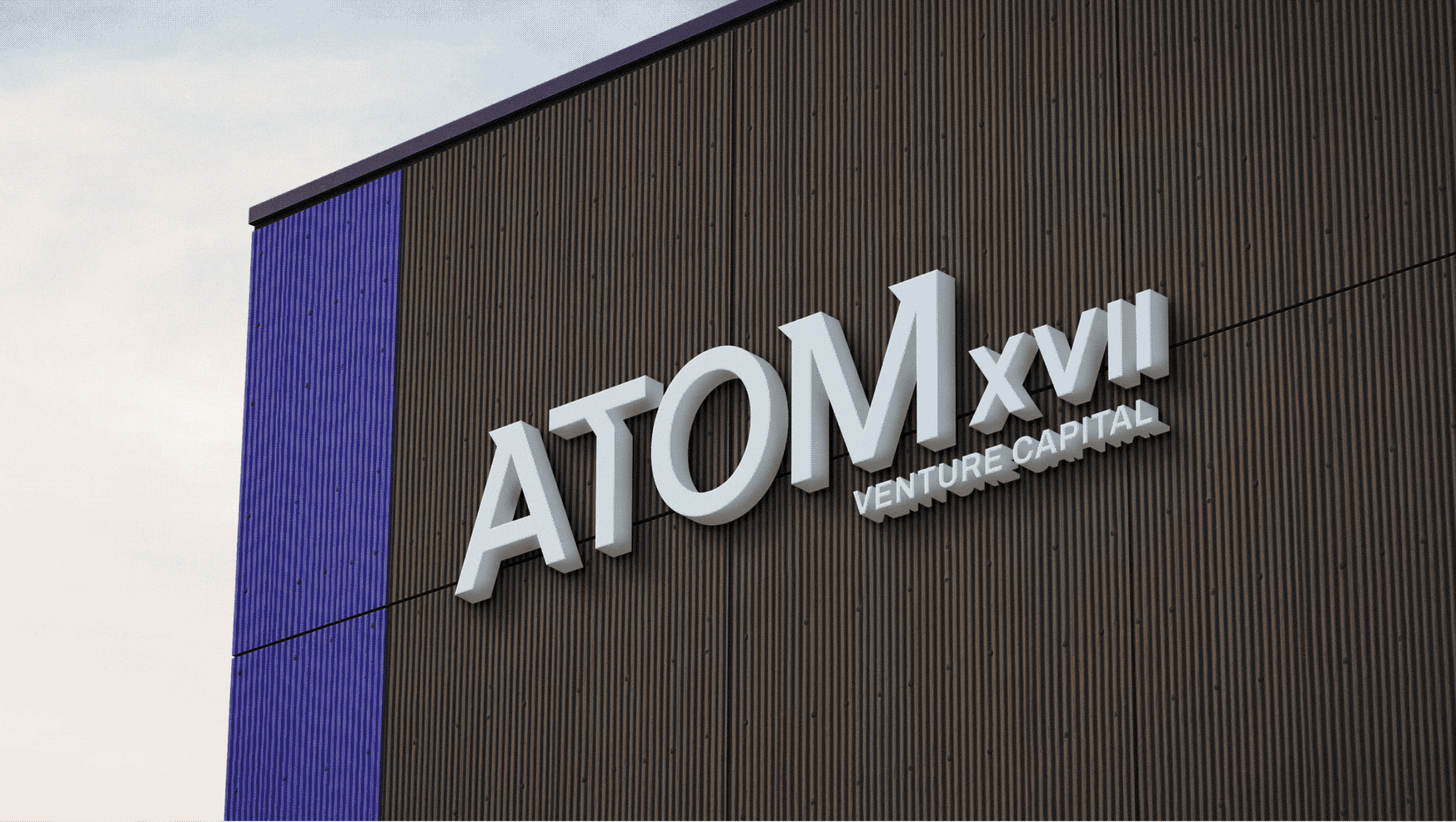
Rather than designing separate assets, the system came out of the logo itself. The smallest detail became the starting point for everything after it.
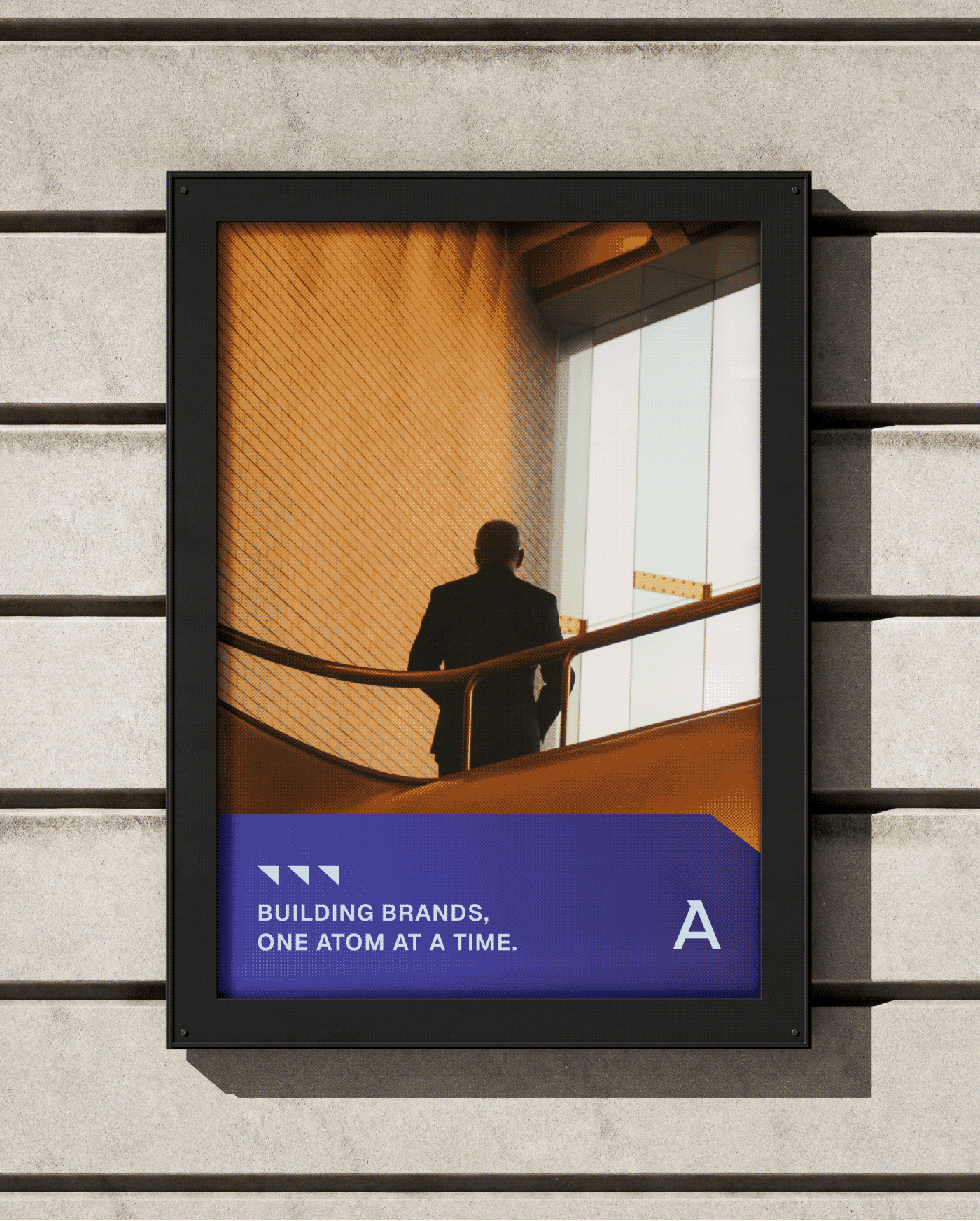
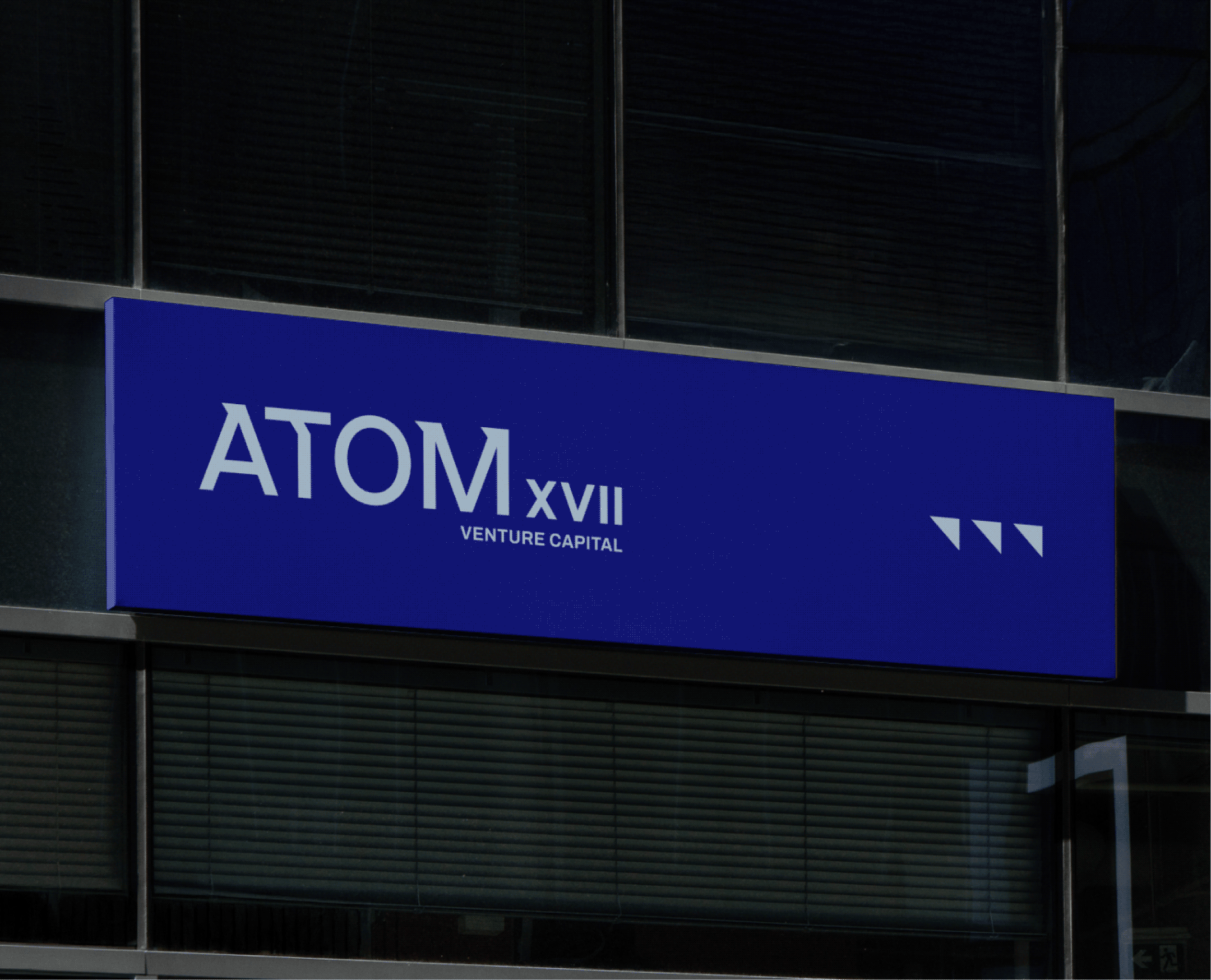
Extracted from the word mark, the triangular form expands into a flexible visual language. It creates rhythm, guides layouts, and reinforces the idea that meaningful growth begins with one strong foundation.