



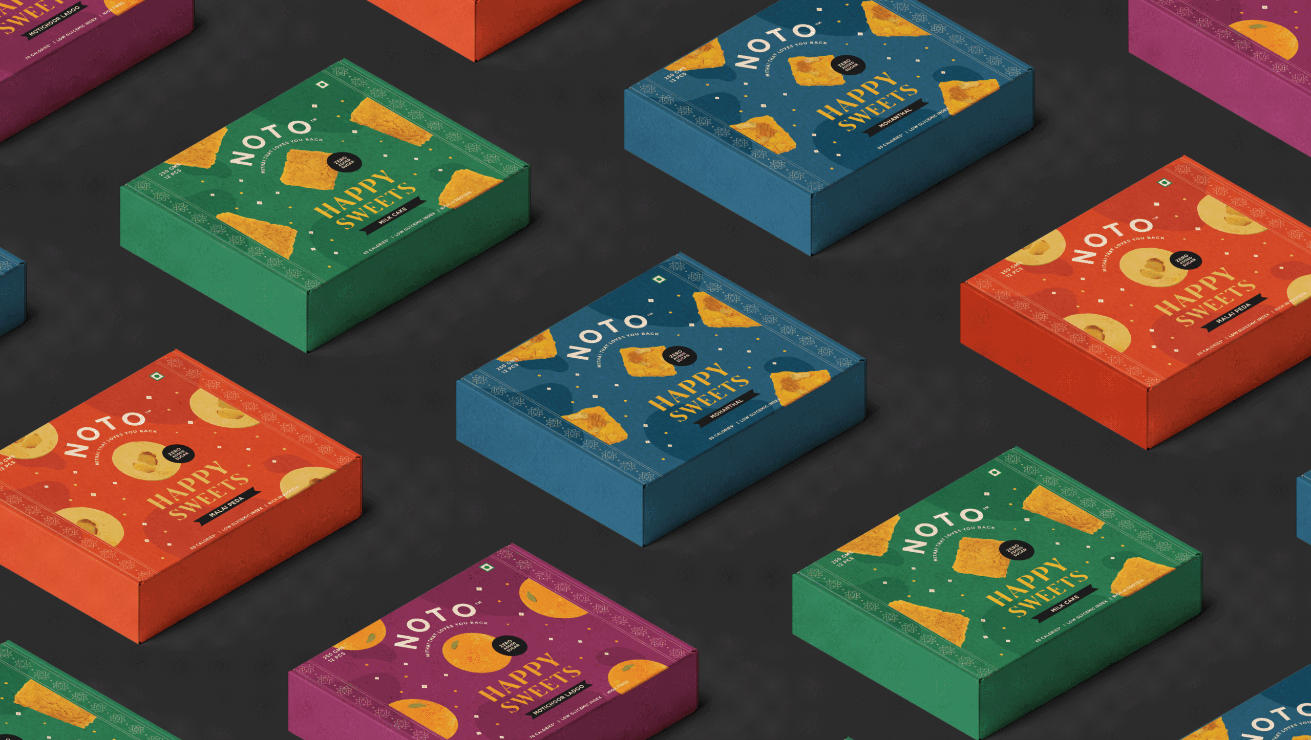
Healthy desserts have always been judged against the originals. Low-calorie ice cream. Sugar-free mithai. Most people expect them to compromise on taste long before they take the first bite.
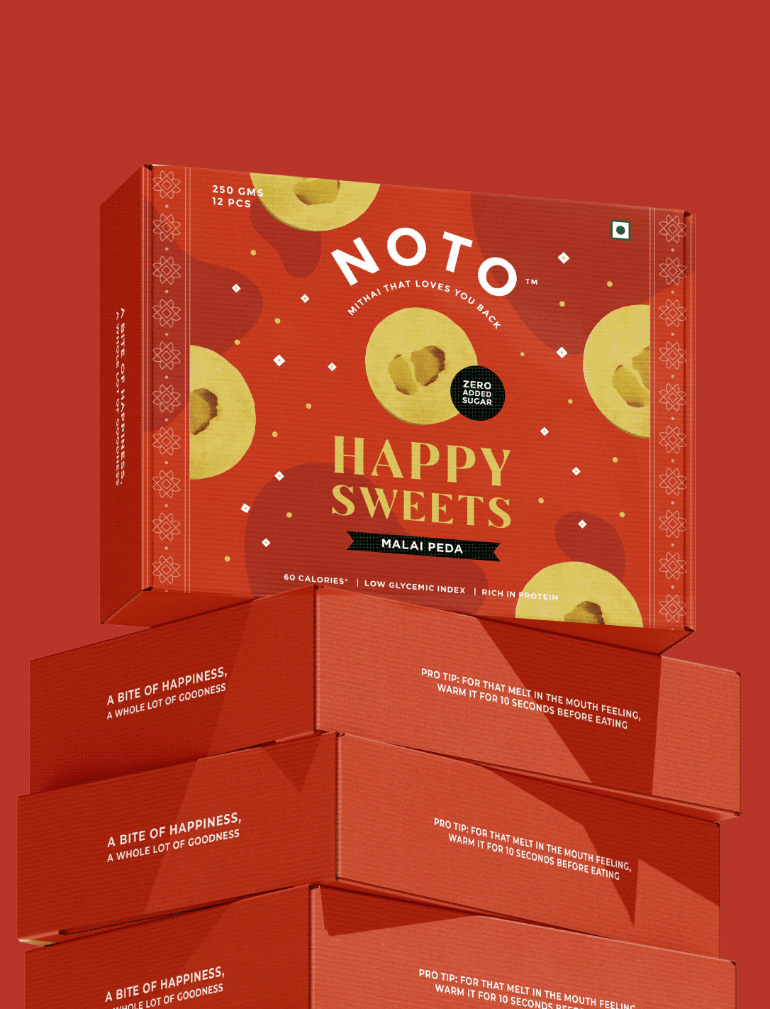
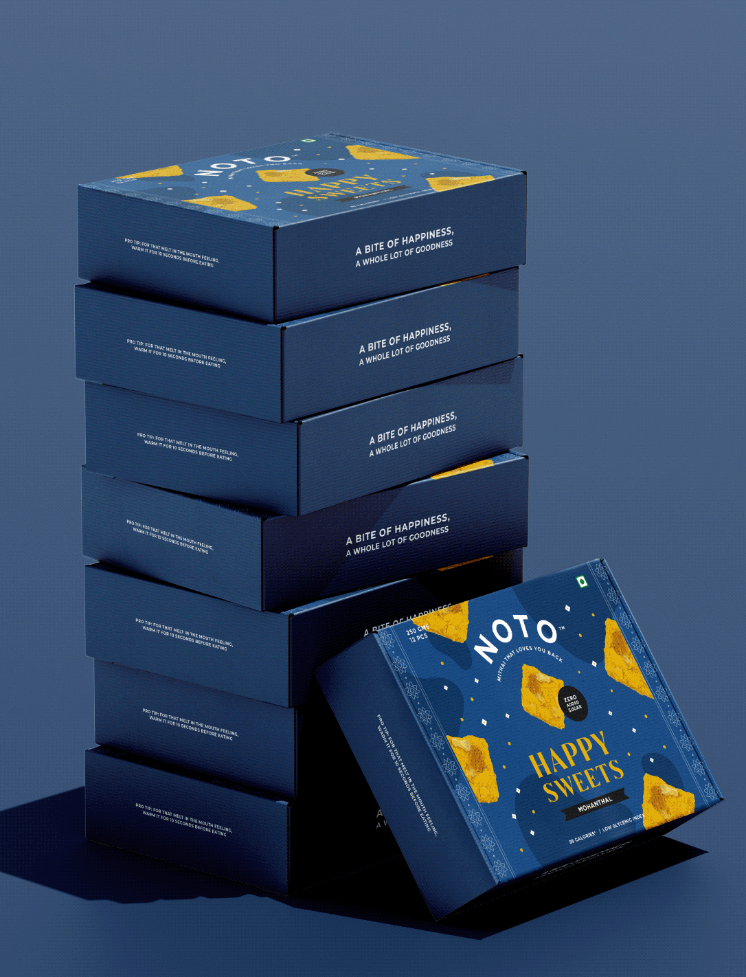
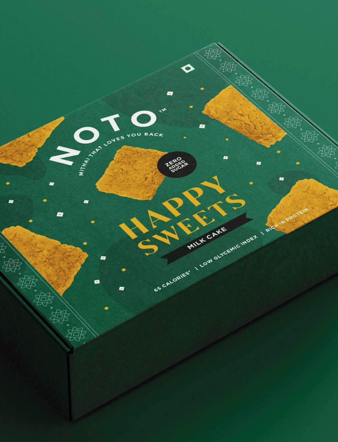
We explored this question with Varun and Ashni while designing packaging for Noto’s growing dessert portfolio. From indulgent ice creams to a guilt-free range of Indian mithai, every product challenged the idea that healthier choices had to feel like lesser ones.
The goal was to build packaging that celebrated flavour first and health second, making every dessert look just as irresistible as it tasted
VISUAL STRATEGY
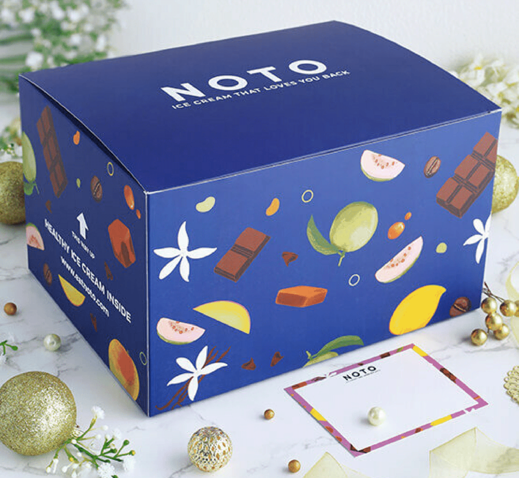
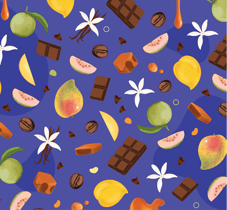
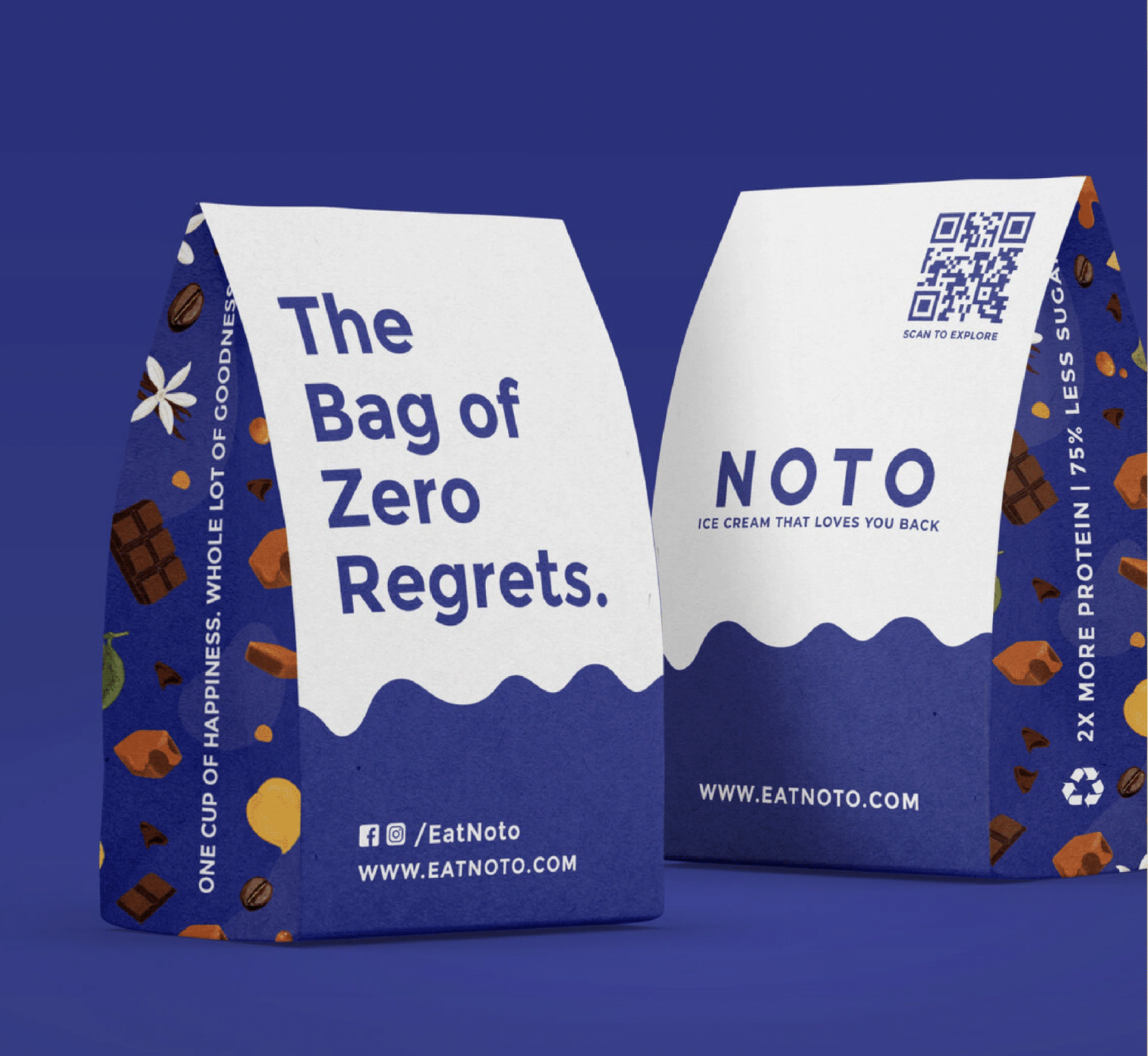
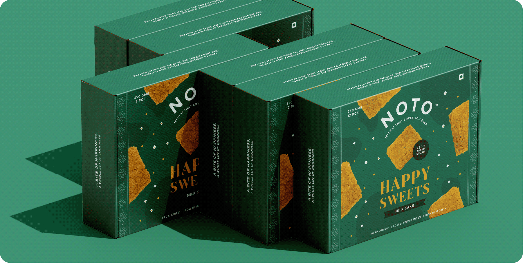
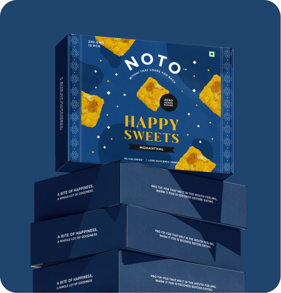
Rather than making health the hero, we made indulgence the hero, using bold typography, expressive details, and appetising visuals to make Noto feel irresistible first, and healthier second.
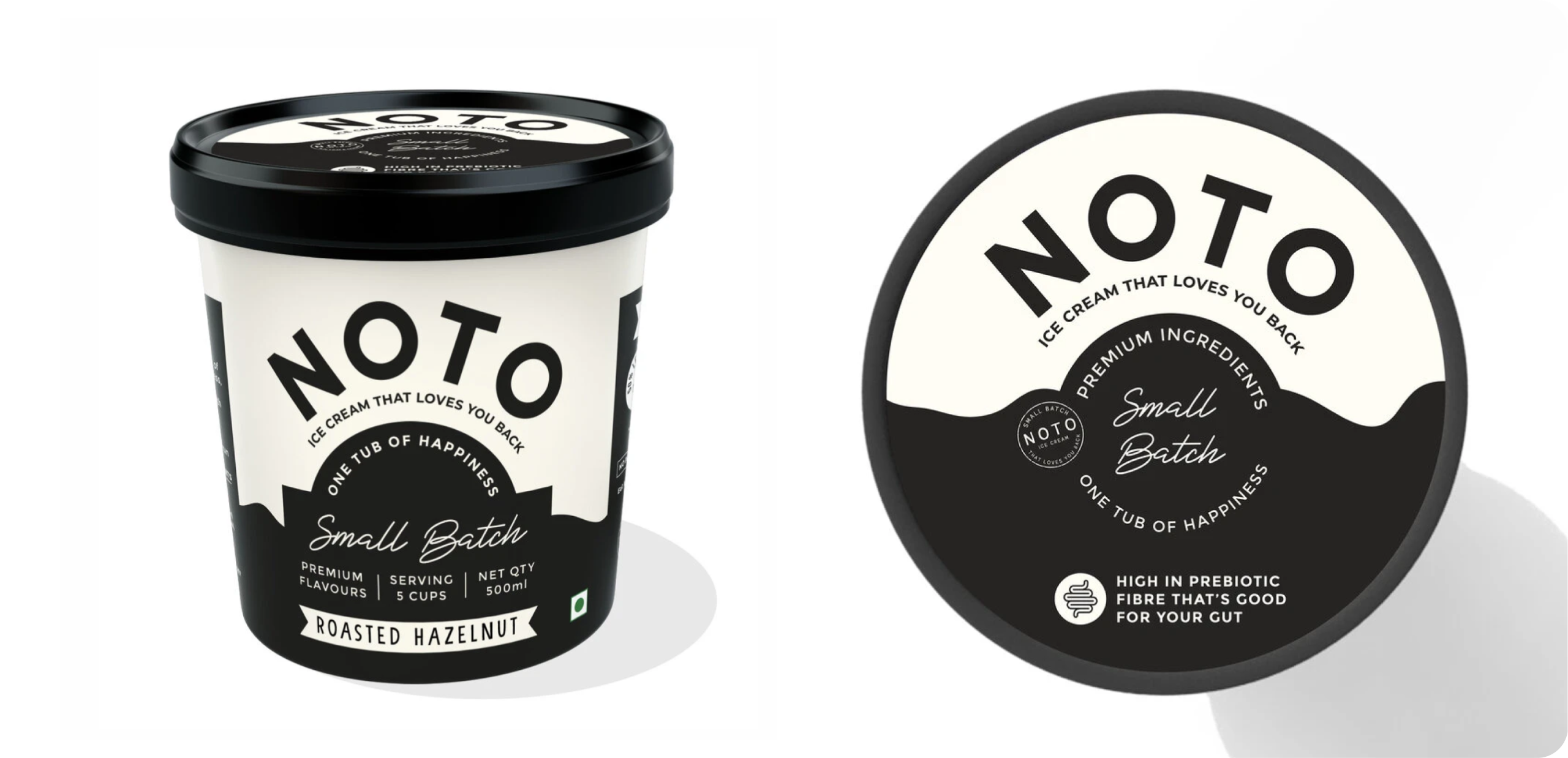
Noto later introduced a limited-edition range featuring roasted hazelnut and pistachio. The flavours were new, the packaging had to stay unmistakably Noto.
We retained the signature black-and-white foundation, introducing subtle handcrafted details like stamped accents to give the range a more artisanal, exclusive feel without losing brand familiarity.
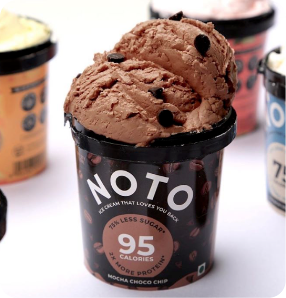
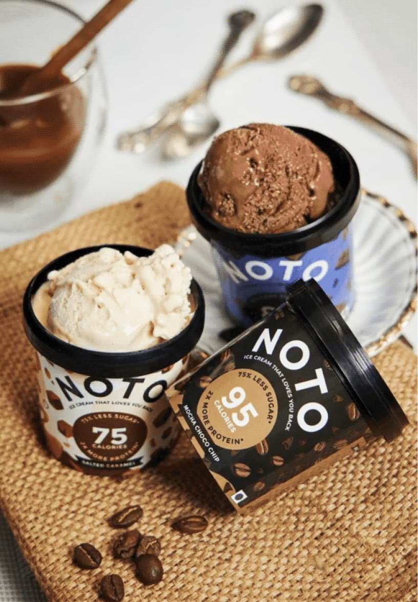
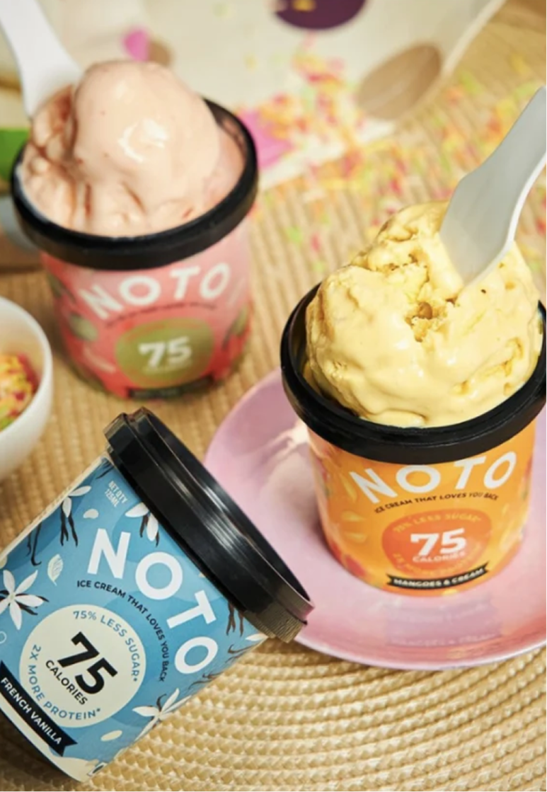
We designed the original range of Noto ice creams at Studio Glyph. The objective was to build a brand language that pushed the boundaries of perception of healthy foods within the consumer’s minds.
We started with the nomenclature, tagline and also developed their Identity and packaging for their six different flavours using rich colours and icons to convey the main aspects of the products.
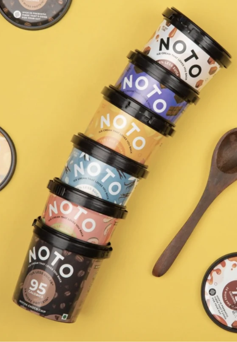
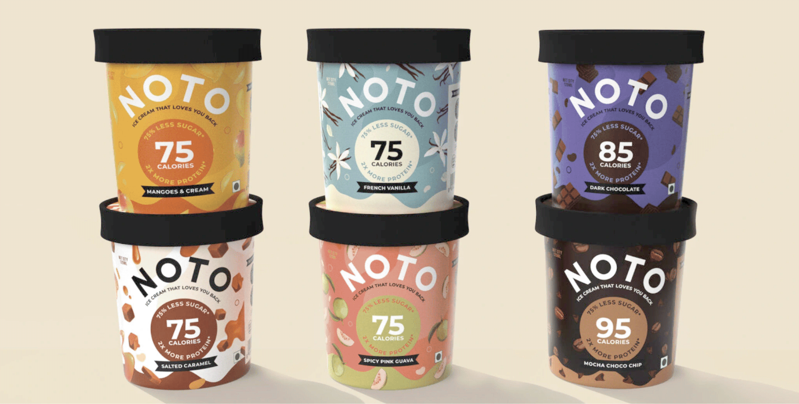
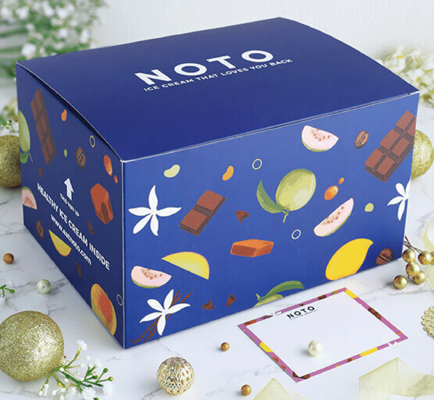
We carried the same visual language into the secondary and gifting packaging, ensuring every interaction with the brand felt cohesive and instantly recognisable.