
The Crown Jewel Of Reliance

The Crown Jewel Of Reliance

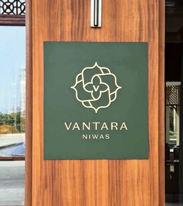
Brand Identity & Visual Extension for Vantara

Fostering Education With Zipply

Fostering Education With Zipply

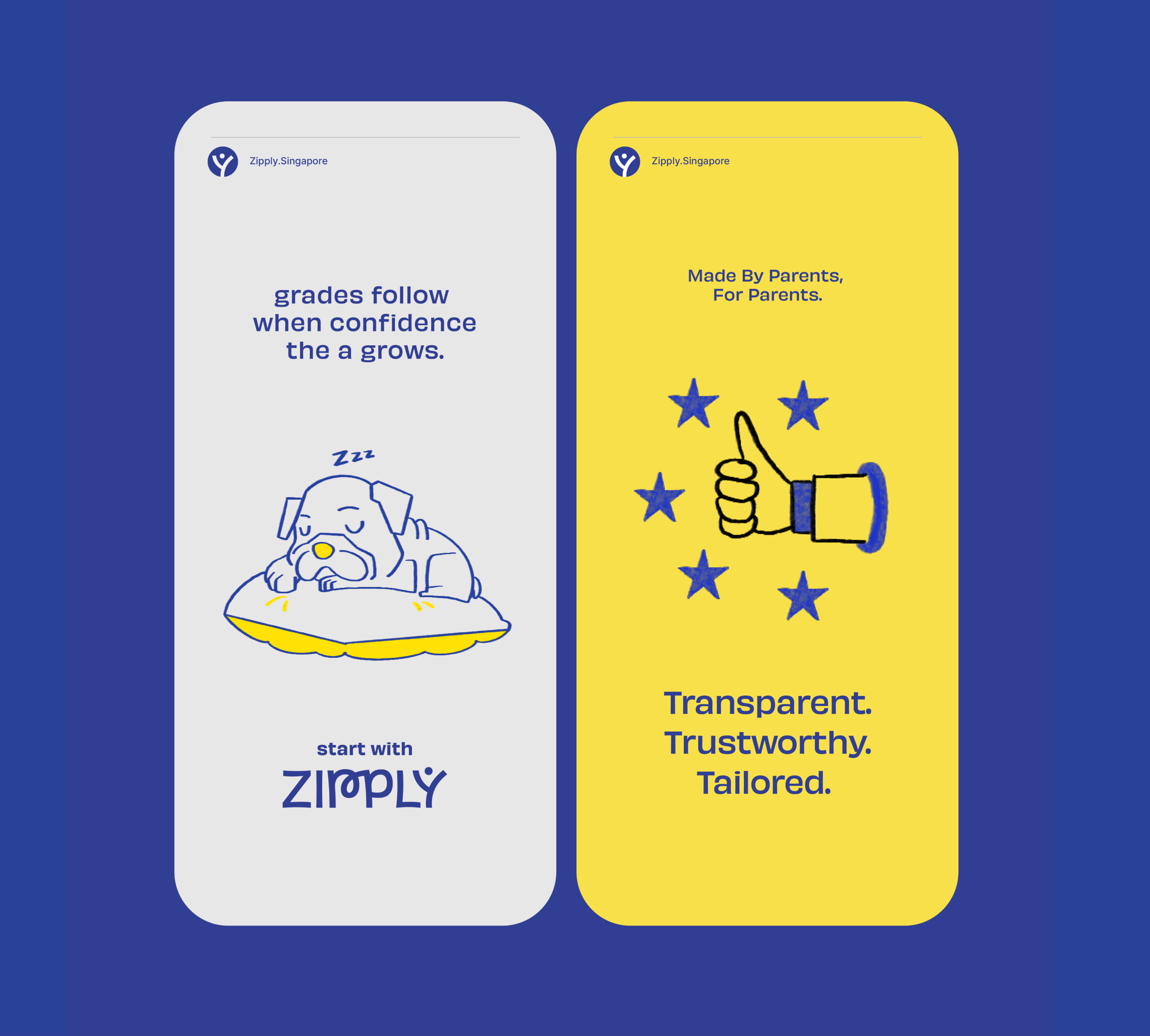
Brand Identity & UI For Zipply Platform

Smart Co-Working With 1Excel

Smart Co-Working With 1Excel

Identity & Visual Extension For A Co-Working Space

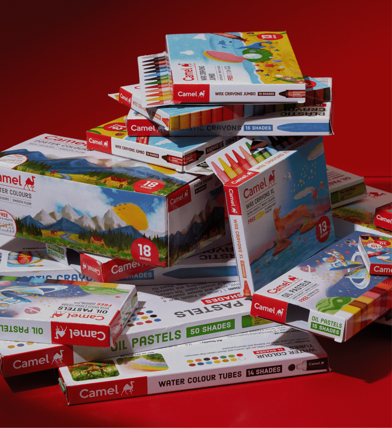
Inside A Child’s Mind With Camlin

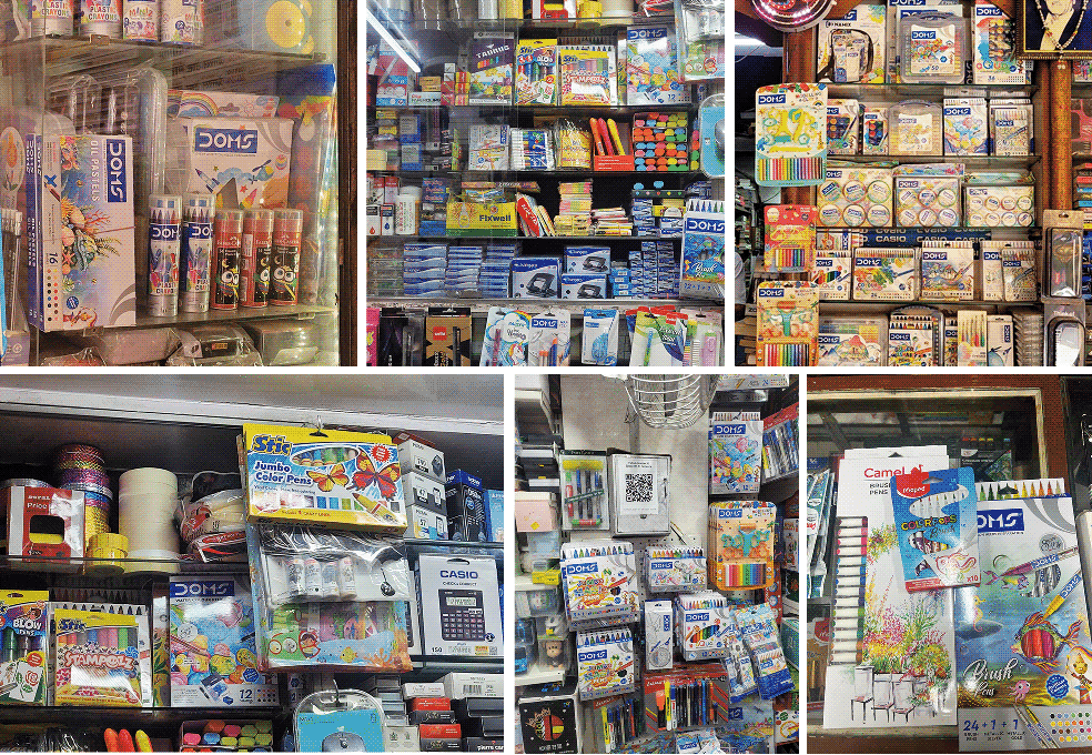
What makes a child pick a certain crayon pack vs the other?

Scope Of Work: Market Research, Brand Strategy, Understanding Consumer Psychology, Product Packaging.

Kokuyo Camlin is a legacy brand that has defined what stationery means to multiple generations of Indians. Everyone has some memory or association with it. So when Kokuyo Camlin’s CMO, Rishi Kakar, reached out, it was a dream come true for CC.

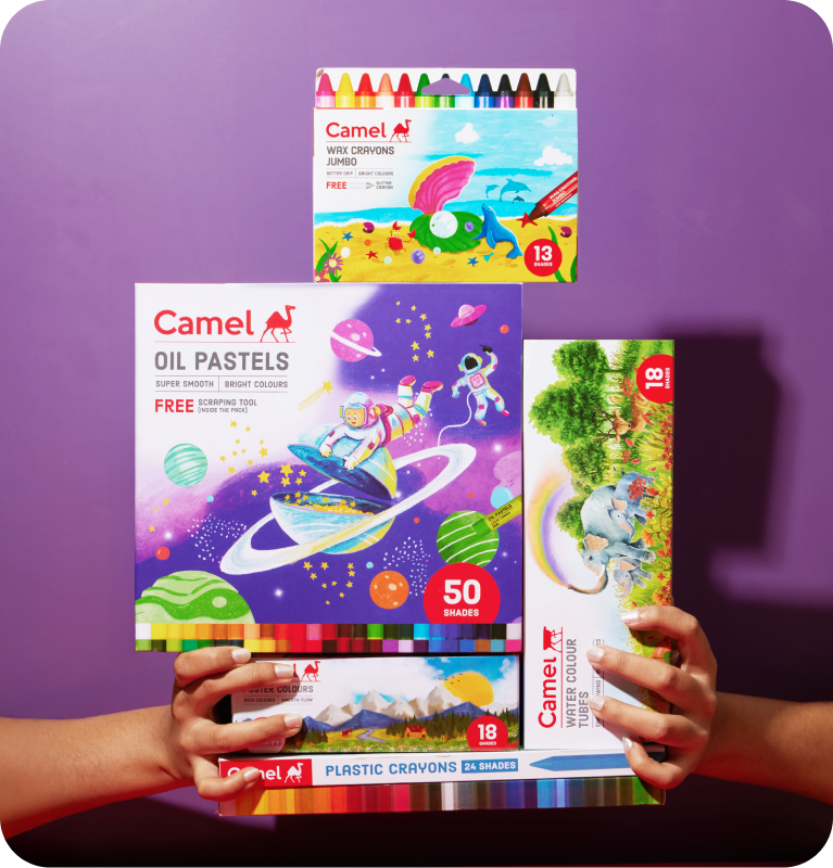
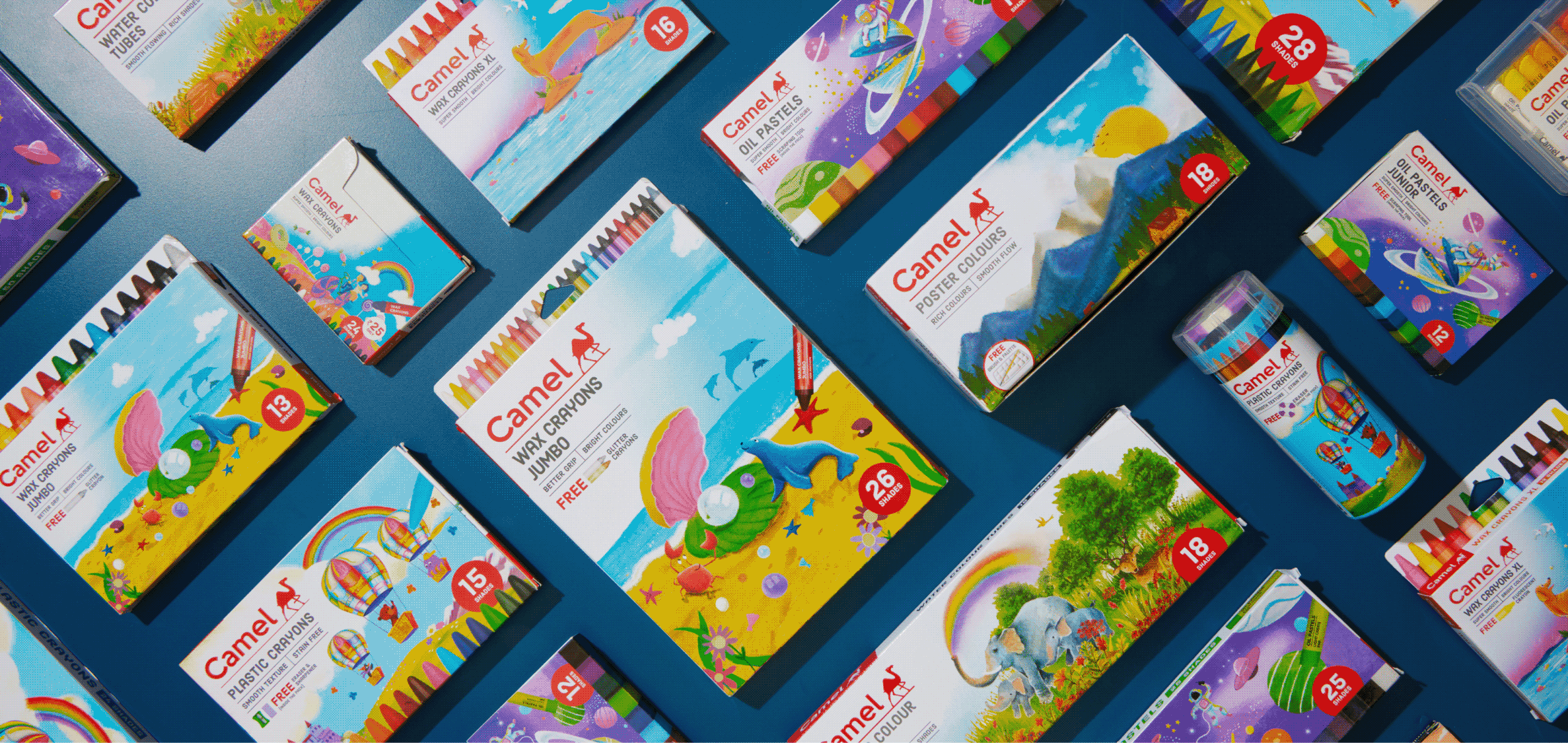
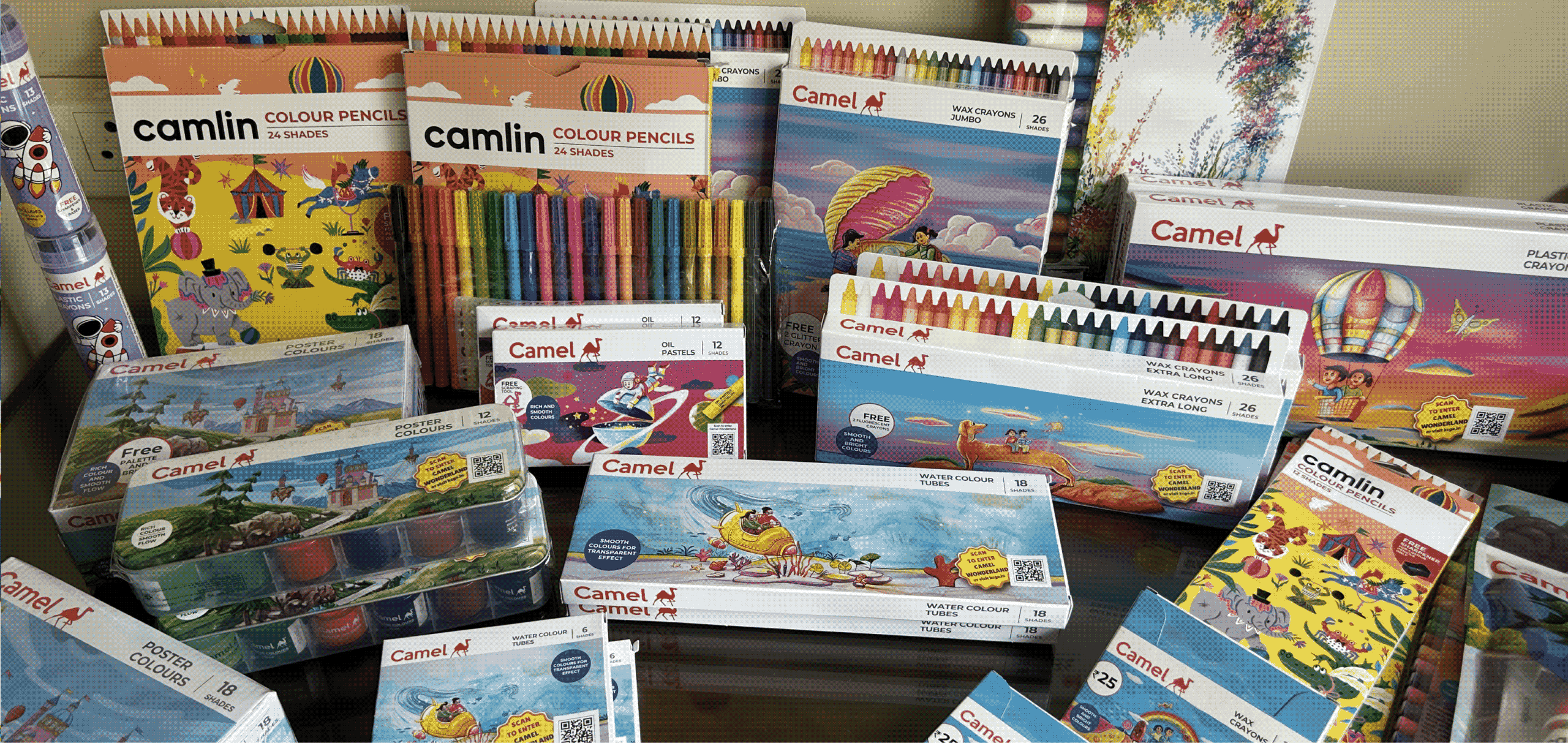
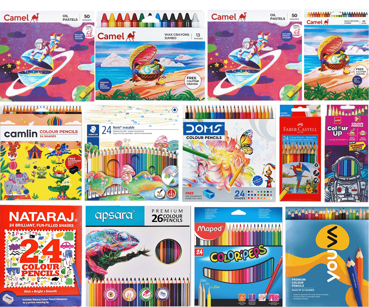
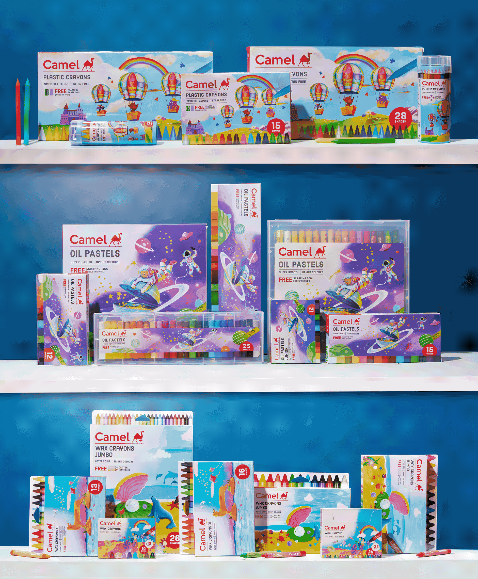
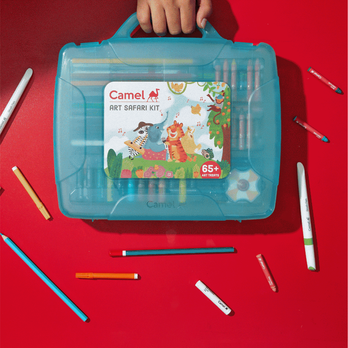
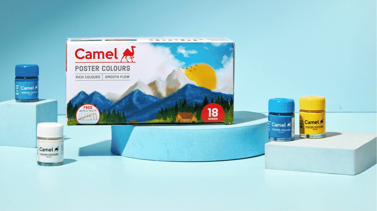
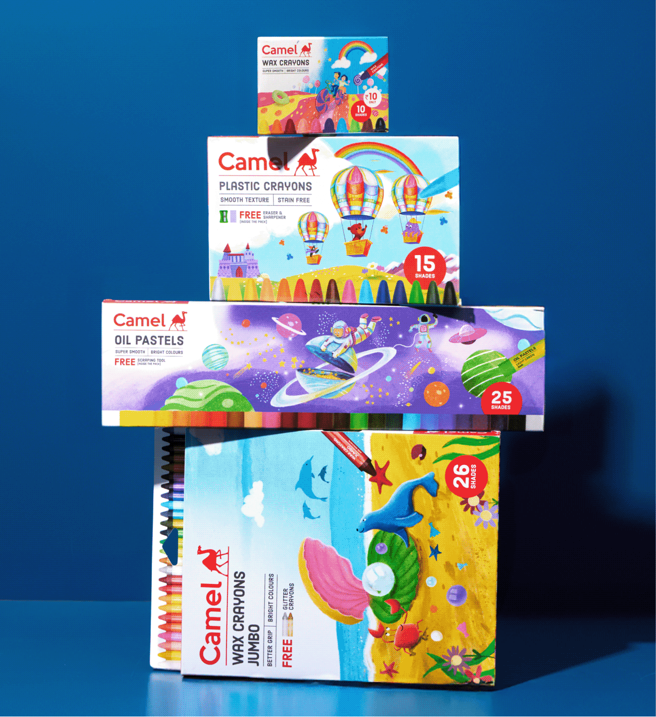
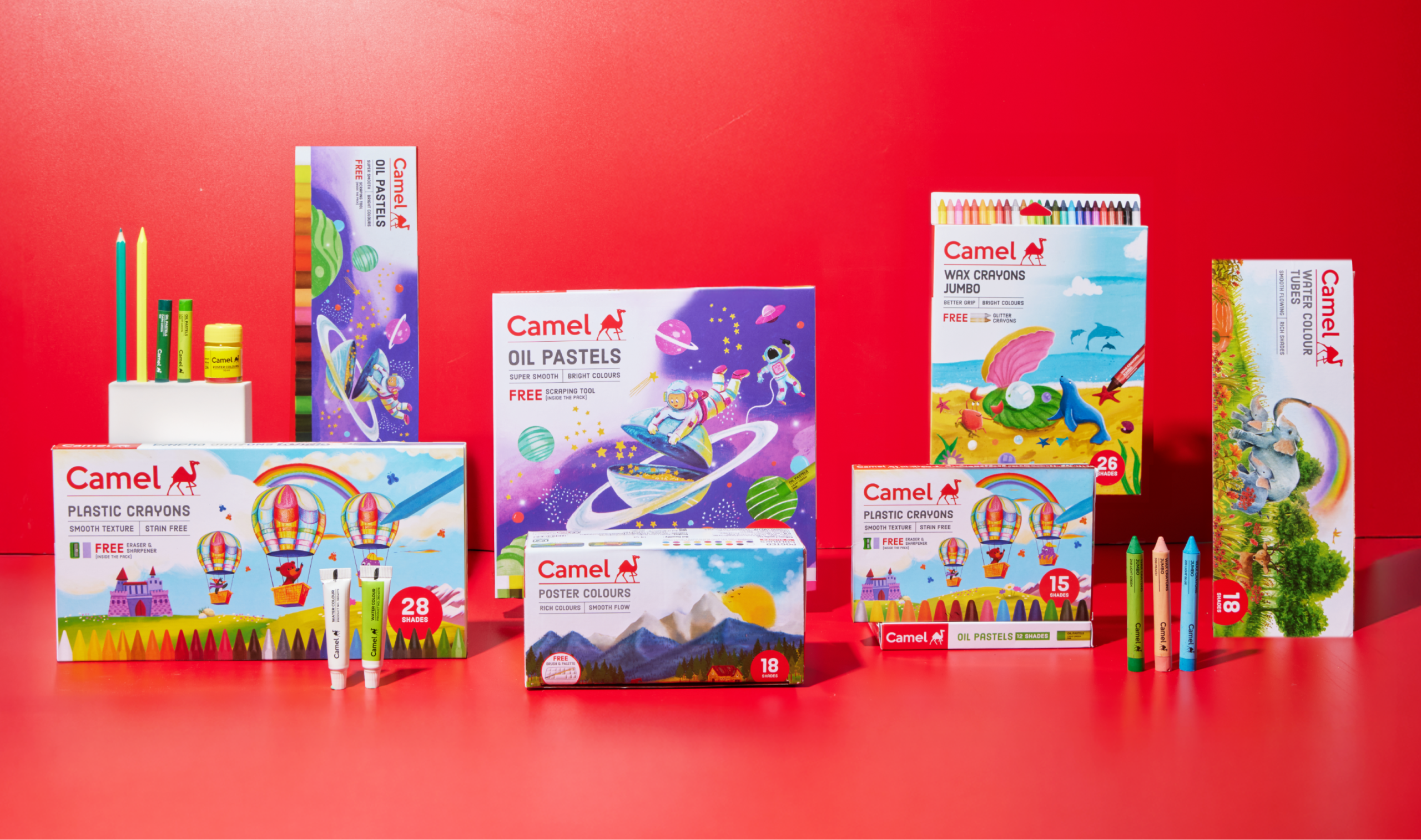
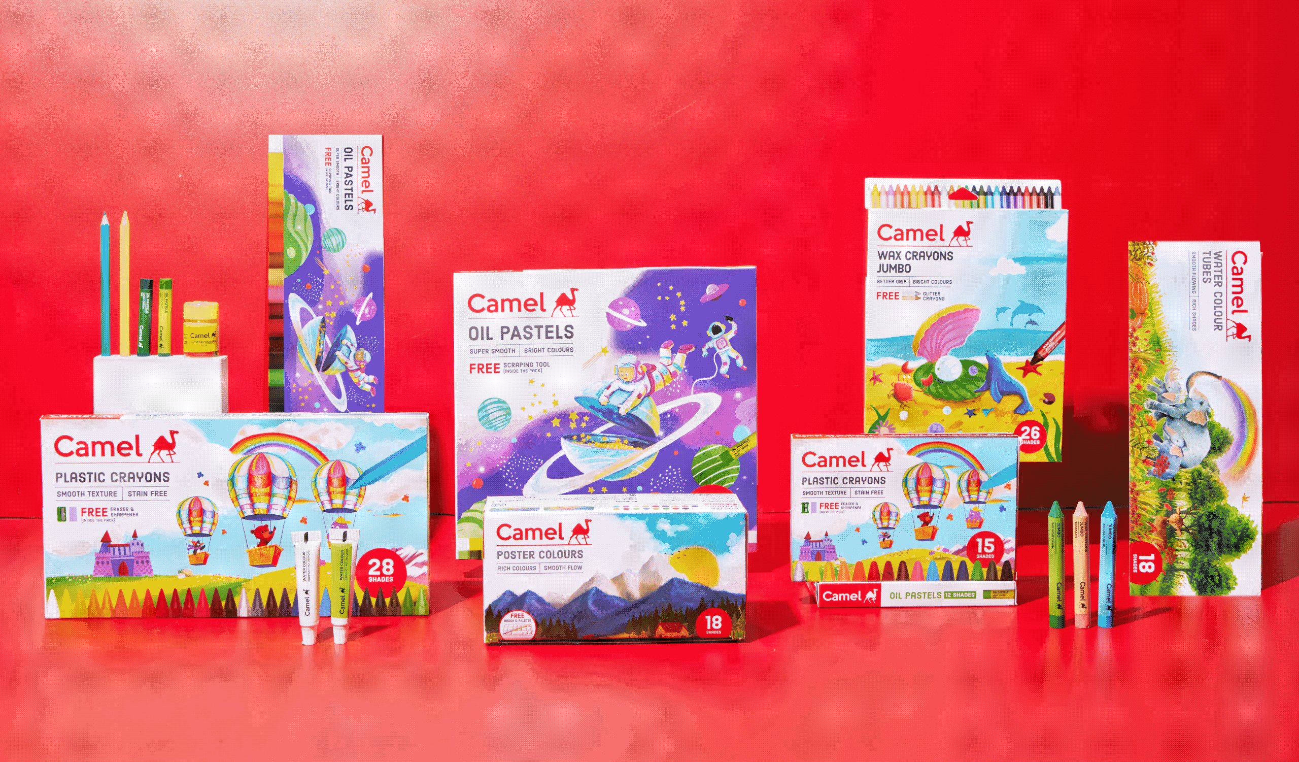
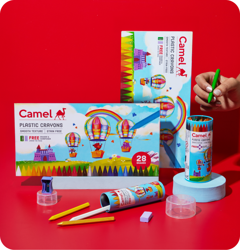
The brief was simple: change the packaging for the kids’ range. The answer was not. The project demanded extensive consumer study to understand why a child chooses a particular product, and what truly drives that decision. Almost a year later, that insight-led journey resulted in a refreshed and cohesive kids packaging range for Camel.
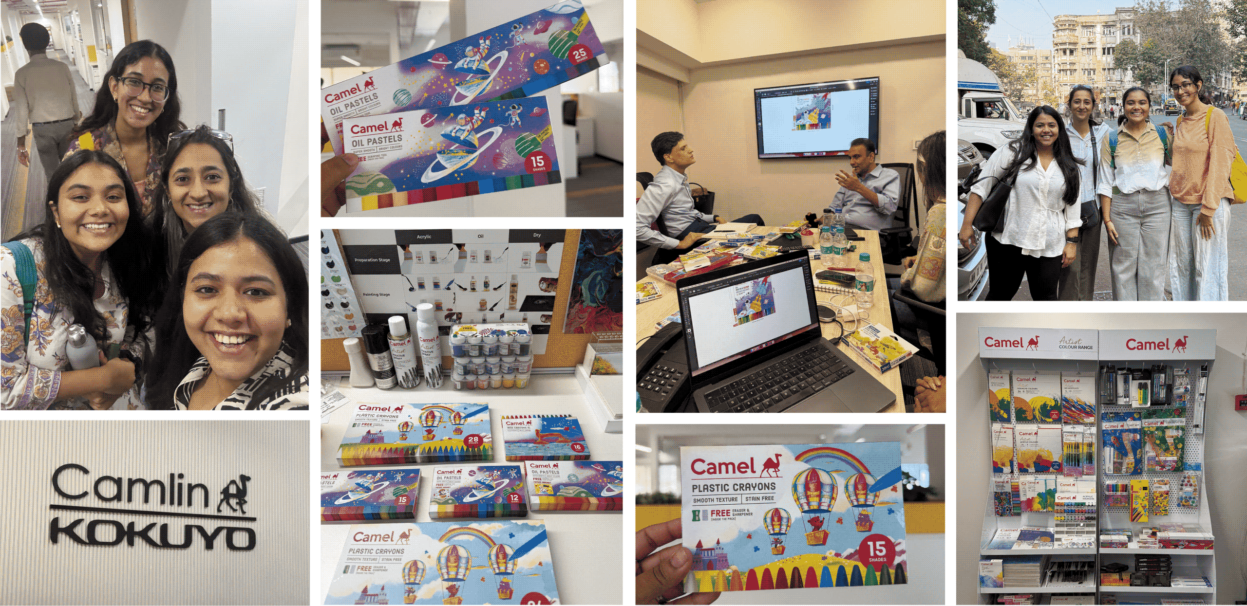
Brand Workshop & On Ground Research in Bombay With Team CC X Kokuyo Camlin
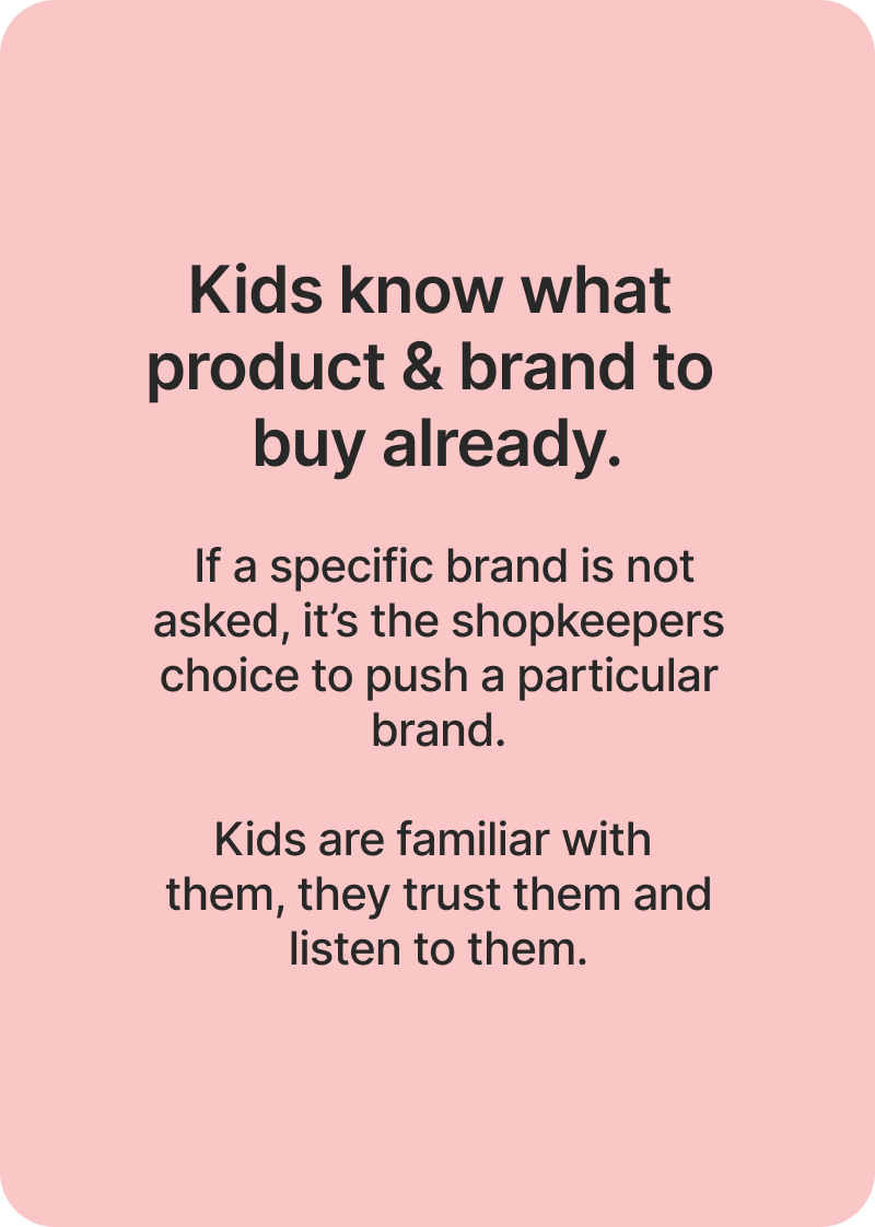
RESEARCH FINDINGS

44 Parents. 40 Kids. 28 Shopkeepers. 4 Metro Cities.

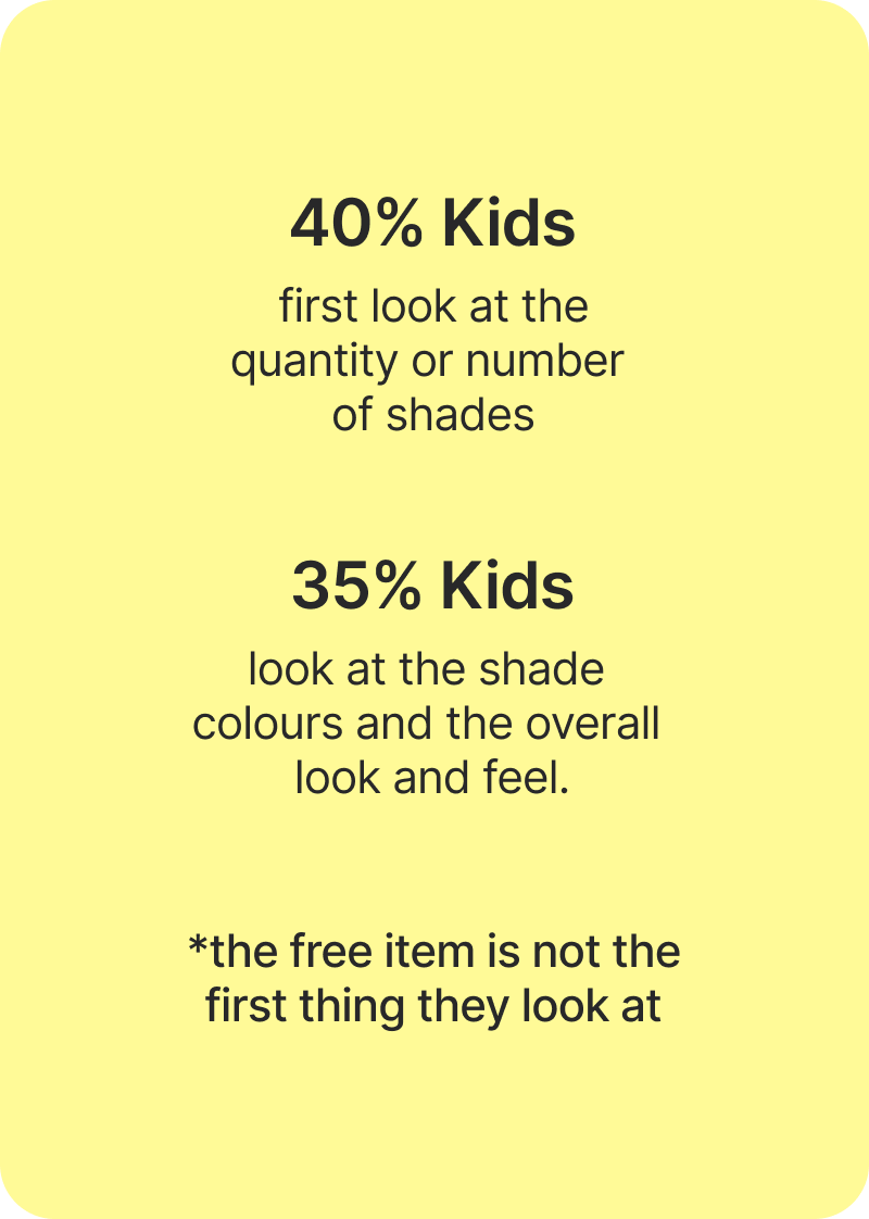
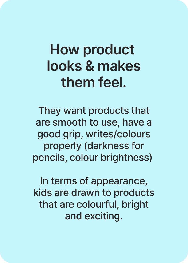
The decision isn’t made by the child alone, it is a triangular decision between the child, parent and shopkeeper.

The child makes the final choice but is heavily influenced by the other two, along with external triggers like friends or spotting something new at school or tuition. So, to understand the ‘WHY’, it is important to understand the purchase behaviour.
THE REAL TEST

The child makes the choice but not the decision.

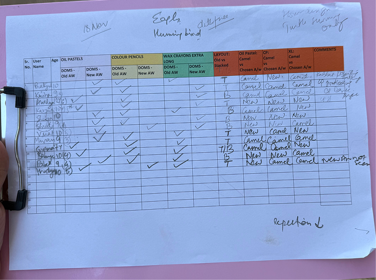
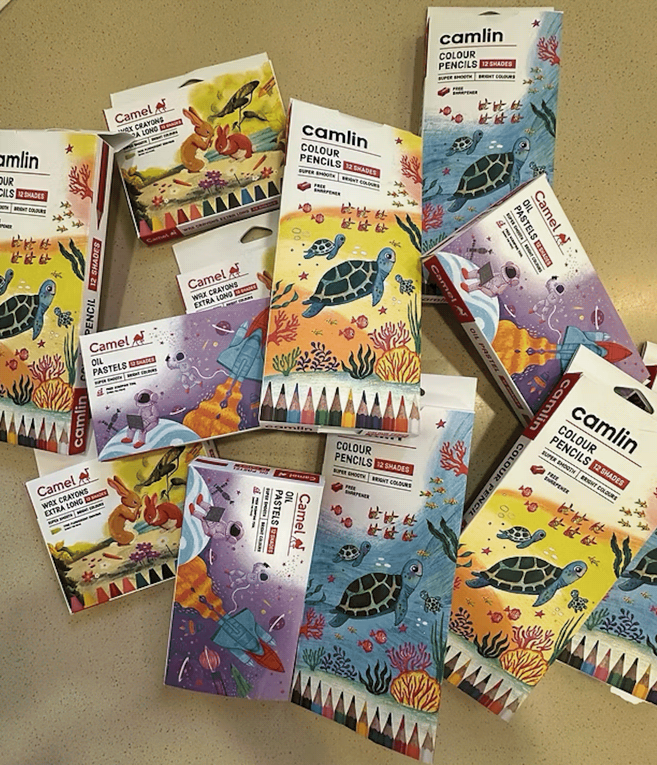
Before finalising, we took the new packaging to the real world to understand how parents, kids, shopkeepers responded.

We again interviewed 40 participants, used their feedback to perfect the design before finally launching. The response was reassuring, overwhelming and made us do a happy dance.
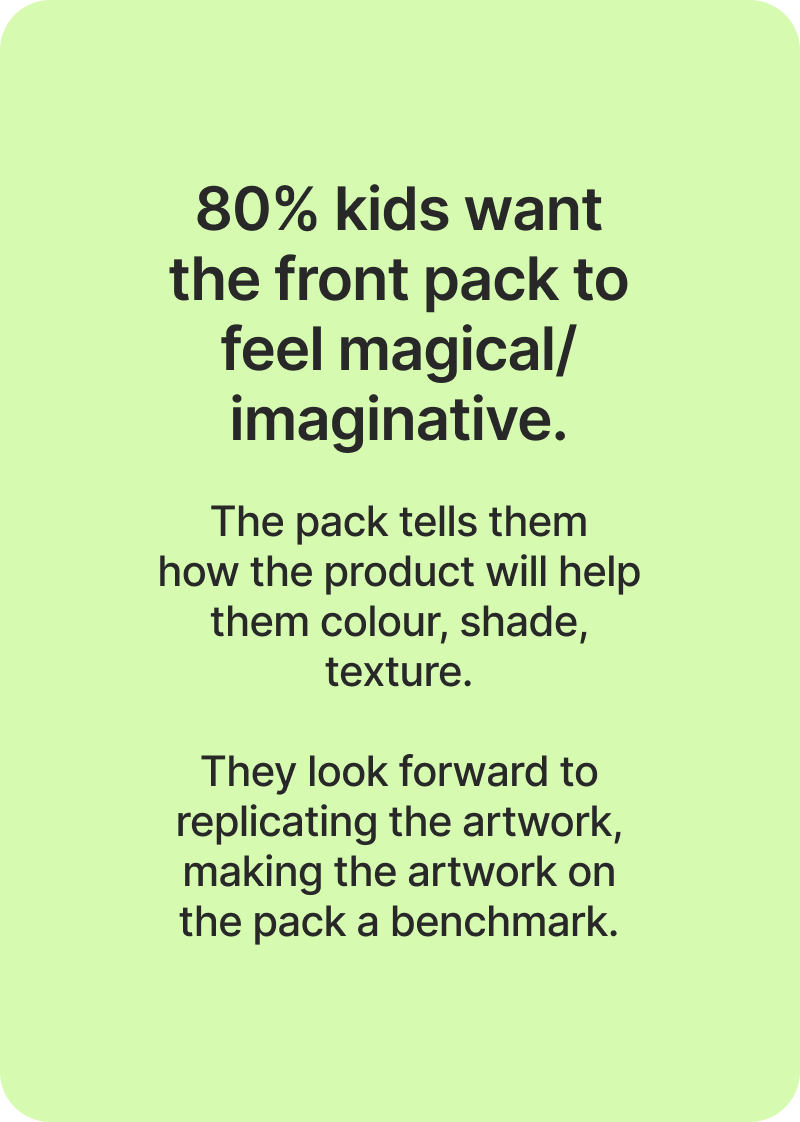
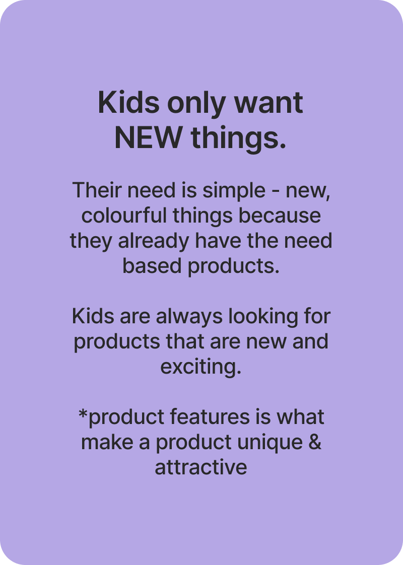
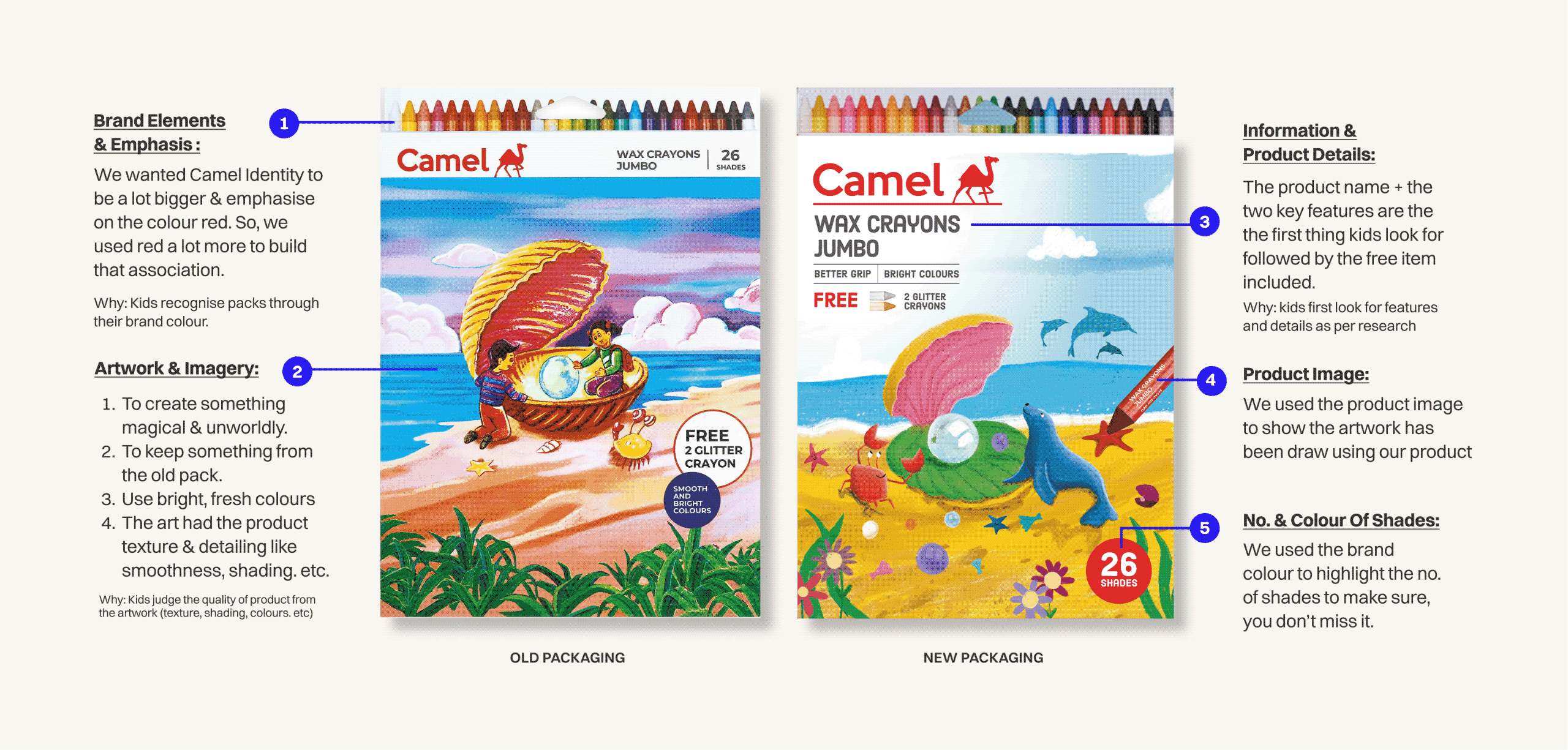
How did the research show up on the pack?

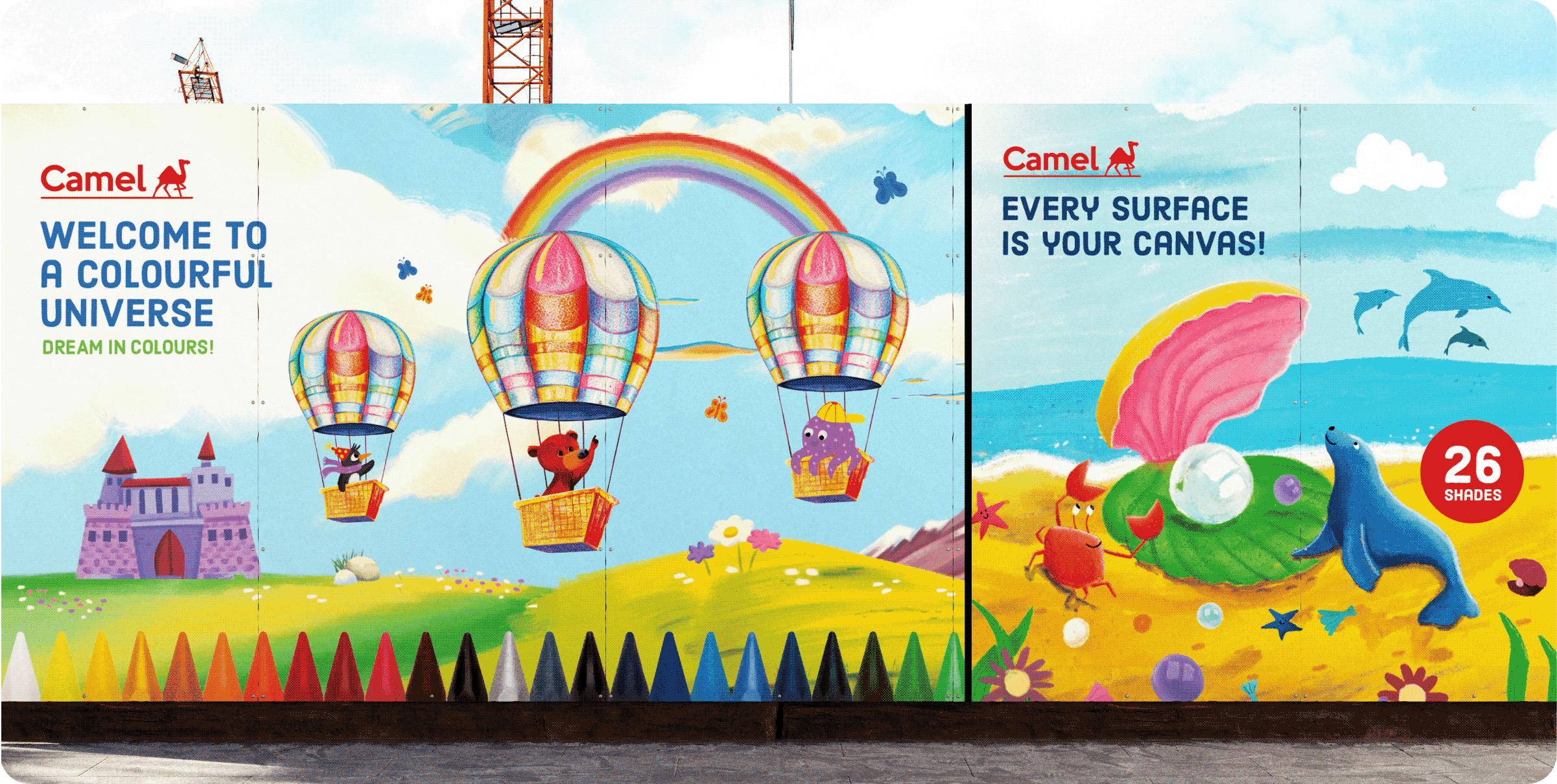
Each insight became a small change on the pack, enough to make the packaging feel researched without losing the child it was made for.
THE BEST PART

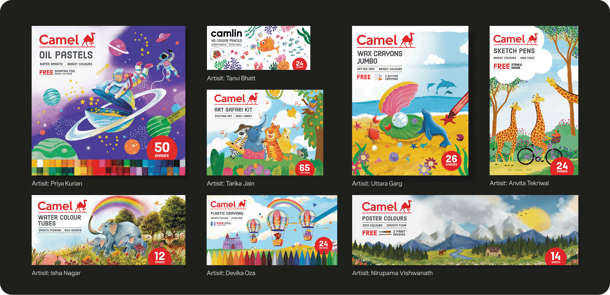
We collaborated with remarkable Indian artists.

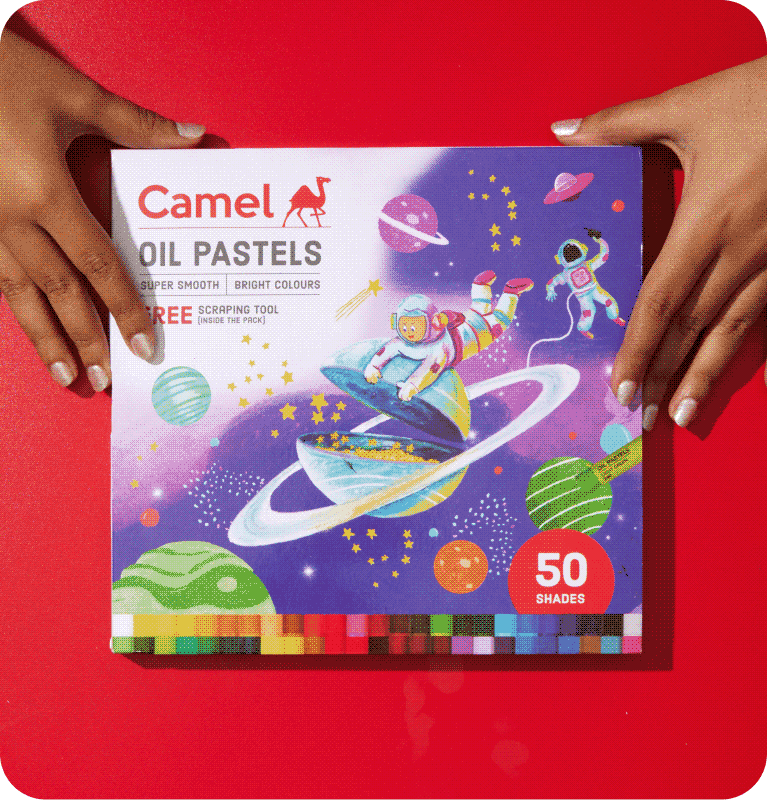
The research had already told us kids judge the quality of a product by the artwork on the pack. So we collaborated with Indian artists, each of whom grew up using Camel themselves.

We wanted the new generation kids to have real role models as artists, so each artwork was created by an Indian artist using the insights our research told us.
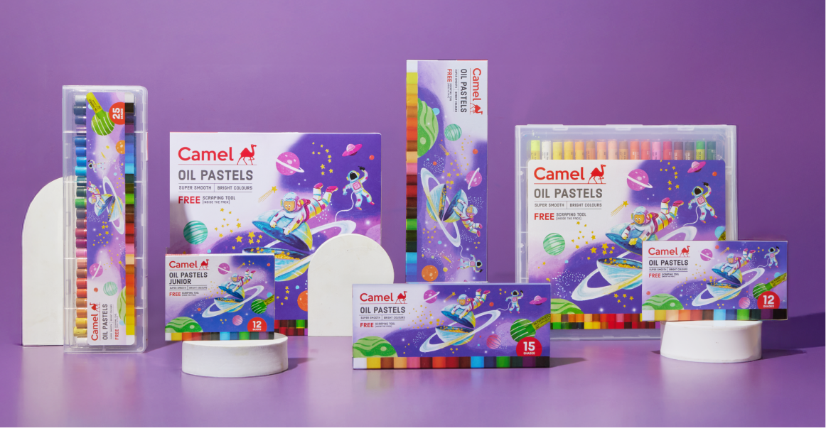
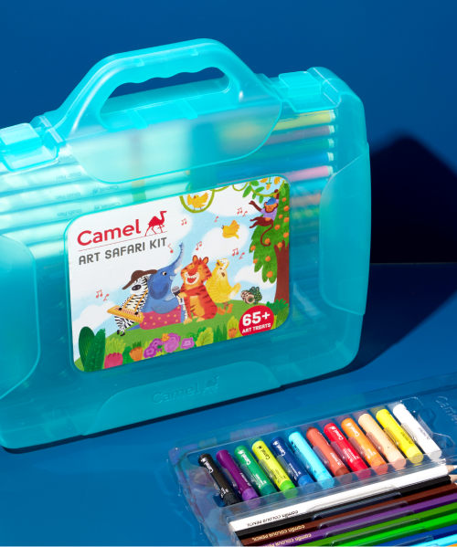
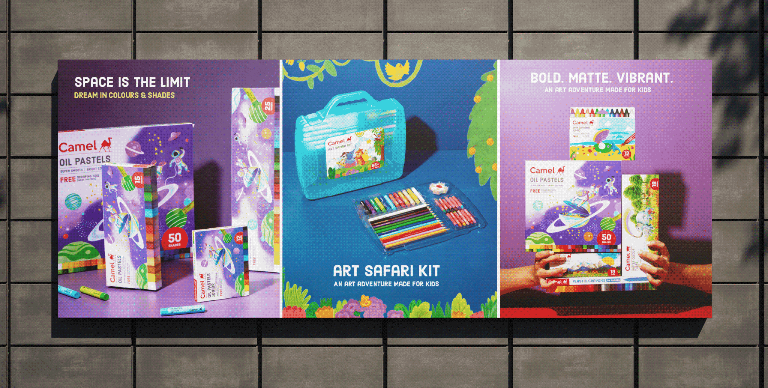
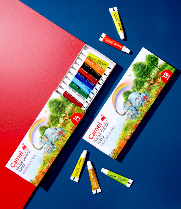
Introducing The New Camel Crayons For Kids!
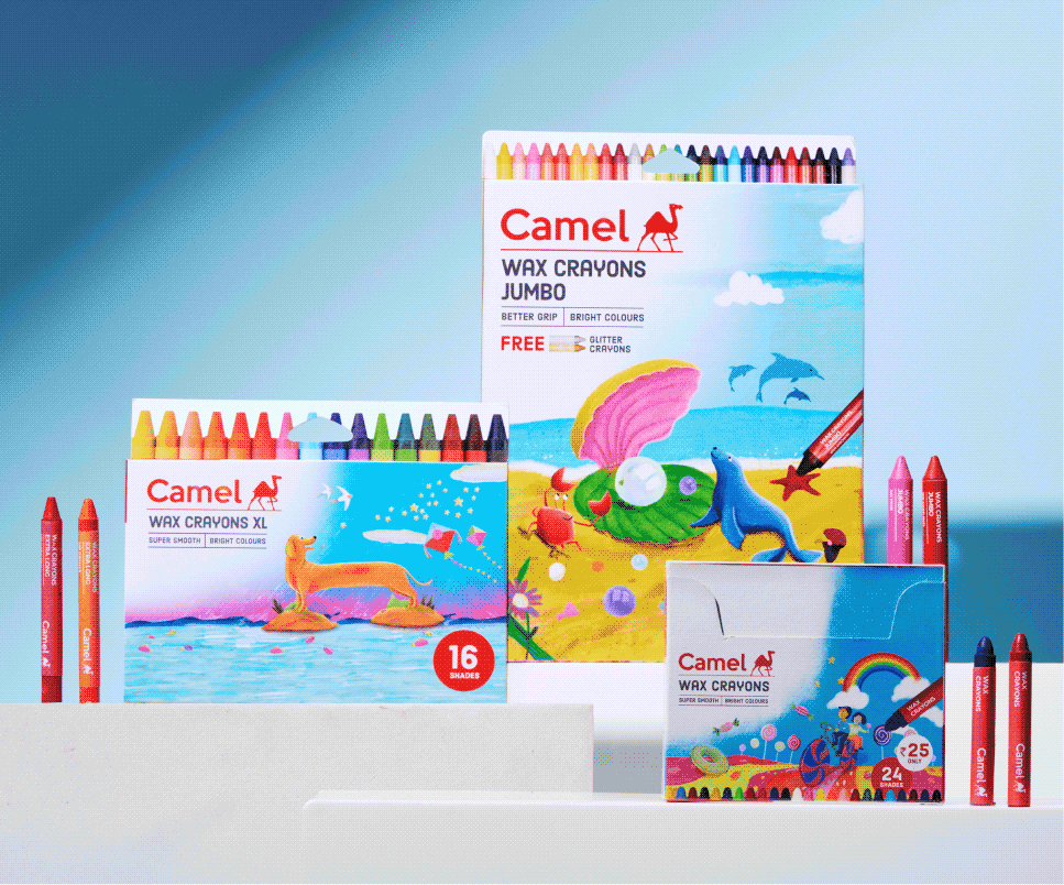
The messy, the fun, the not-so-pretty part of the project!
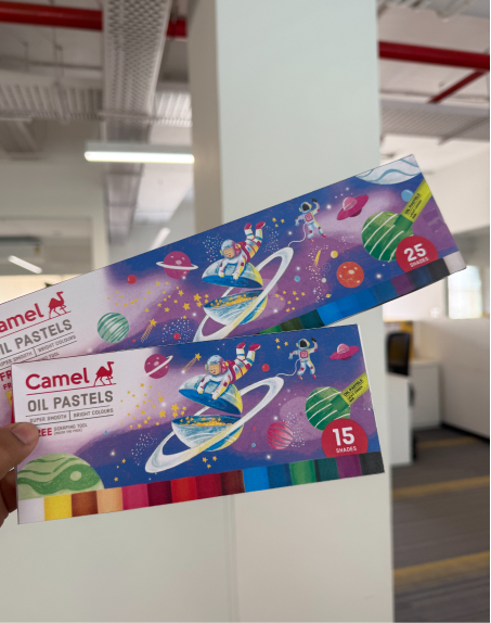
Collaborating with different Indian artists!
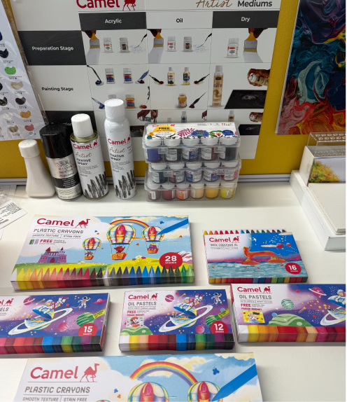
Seeing our design in print for the 1st time.
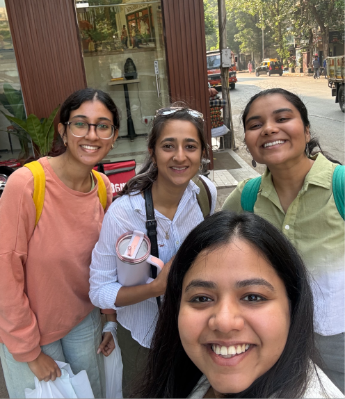
CC Reunion in Bombay!
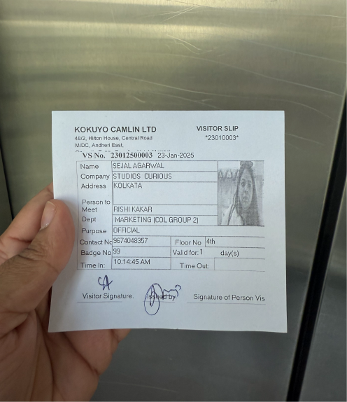
Visiting the Camlin office!
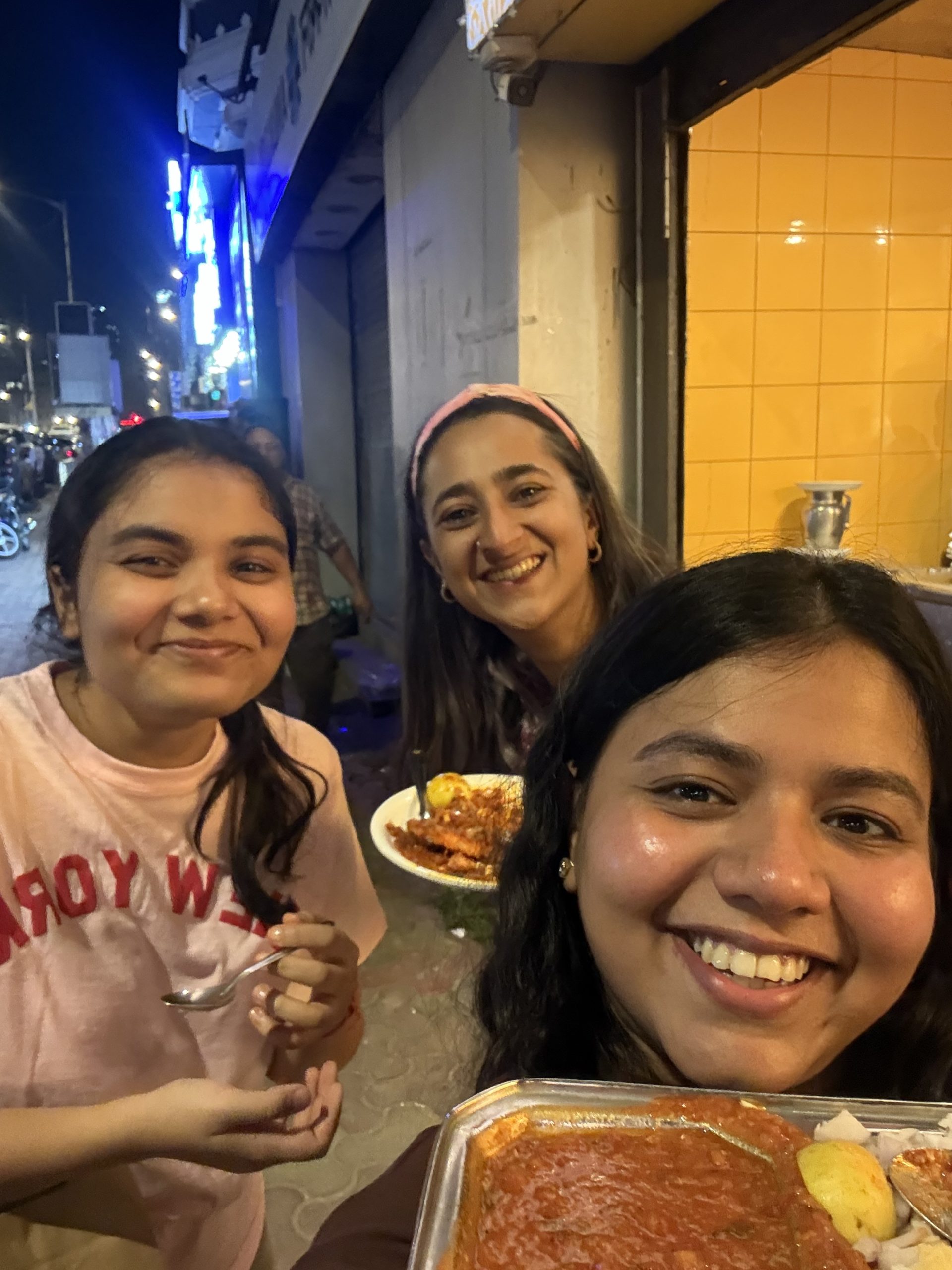
CC doing Bombay darshan!
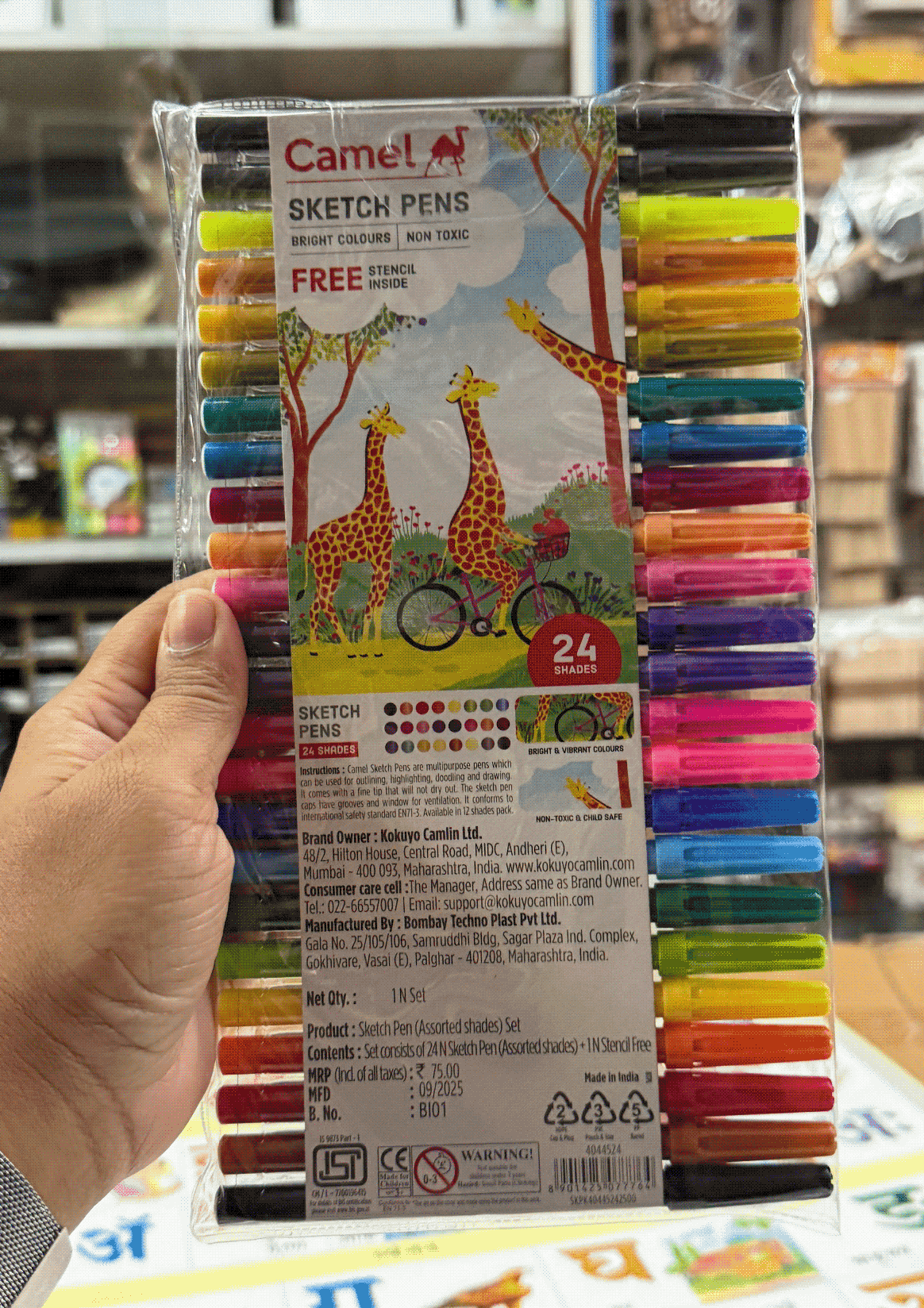
Spotting our work on the shelves!
A Space & Legacy Reimagined

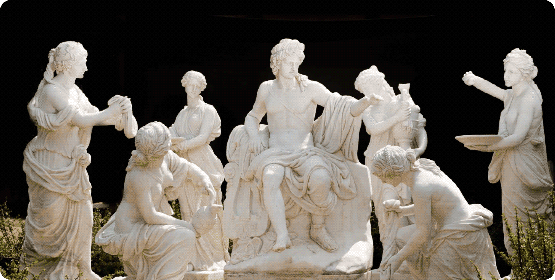
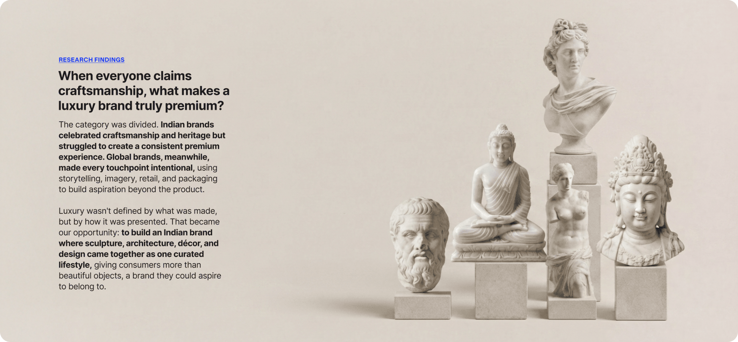
What makes people buy a sculpture instead of simply admiring it?

Scope Of Work: Market Research,
Brand Strategy, Consumer Understanding & Psychology, Brand Identity, Brand Messaging, and Product Packaging.

Luxury is rarely just about the object itself. Why do some pieces become heirlooms while others remain products? What makes people proudly talk about a brand long after they’ve made a purchase? And how do you build desire in a category people often consider optional?

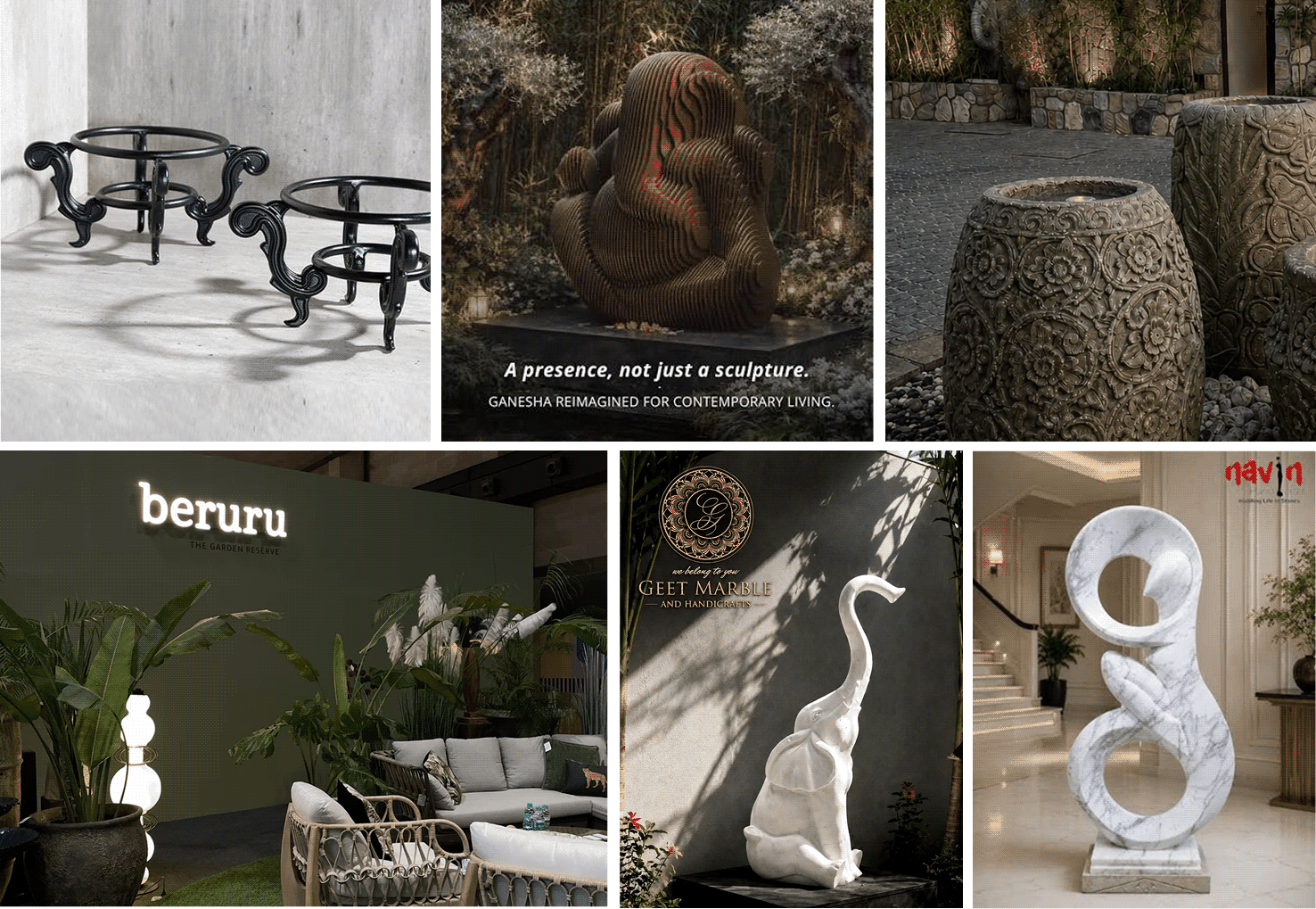
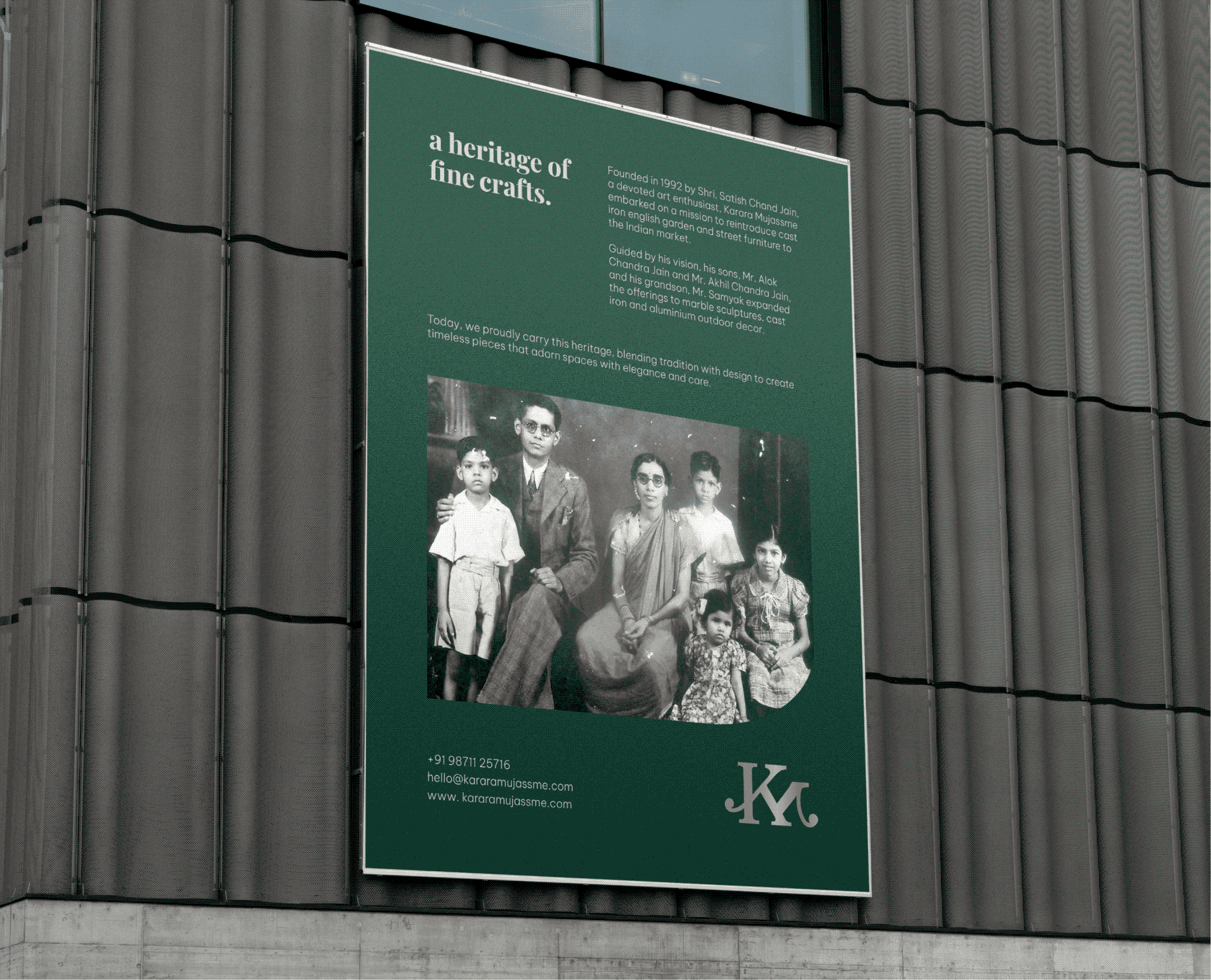
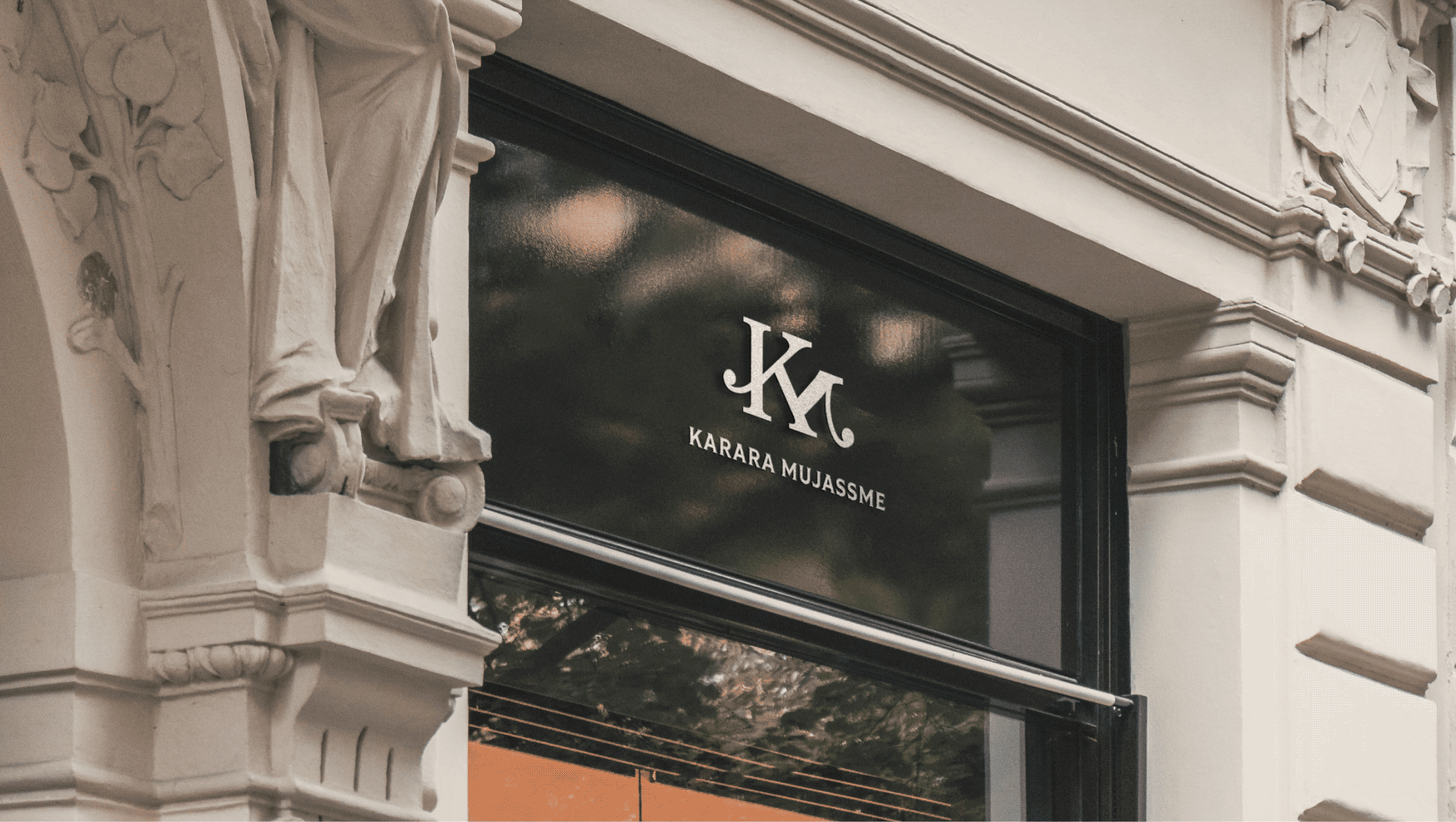
We explored these questions with Alok and Akhil while reimagining Karara Mujassme. As the brand evolved beyond bespoke sculptures into architectural and decorative pieces, it needed a purpose that extended beyond products.

The goal was to build a brand that went beyond products, one that celebrated artistry, craftsmanship, and timeless design while making every interaction feel considered and memorable.

MARKET INSIGHTS

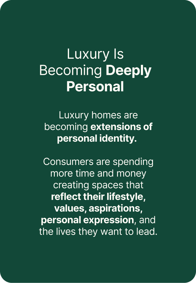
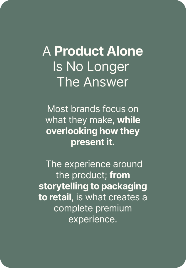
Luxury today is defined by experience, not just the product.

We looked beyond sculptures and furniture to understand how people buy luxury. What makes them trust one brand over another? What turns an object into something worth collecting? And what makes someone proudly recommend it?

The market revealed that consumers weren’t simply buying décor. They were investing in spaces that reflected their taste, lifestyle, and identity.

When products take centre stage, how do you build a brand people remember?

IDENTITY CONCEPT

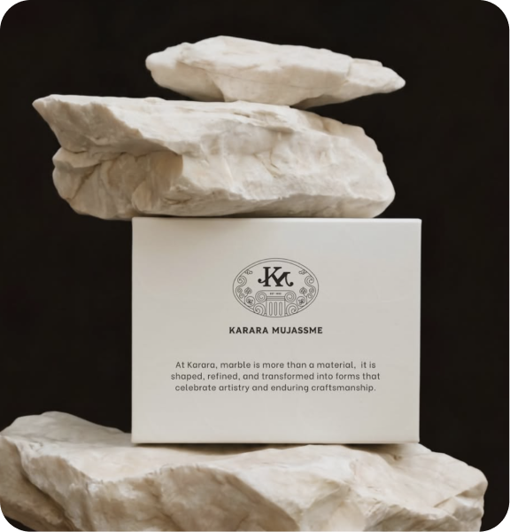
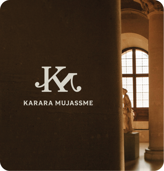
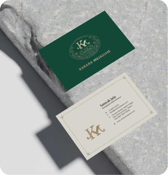
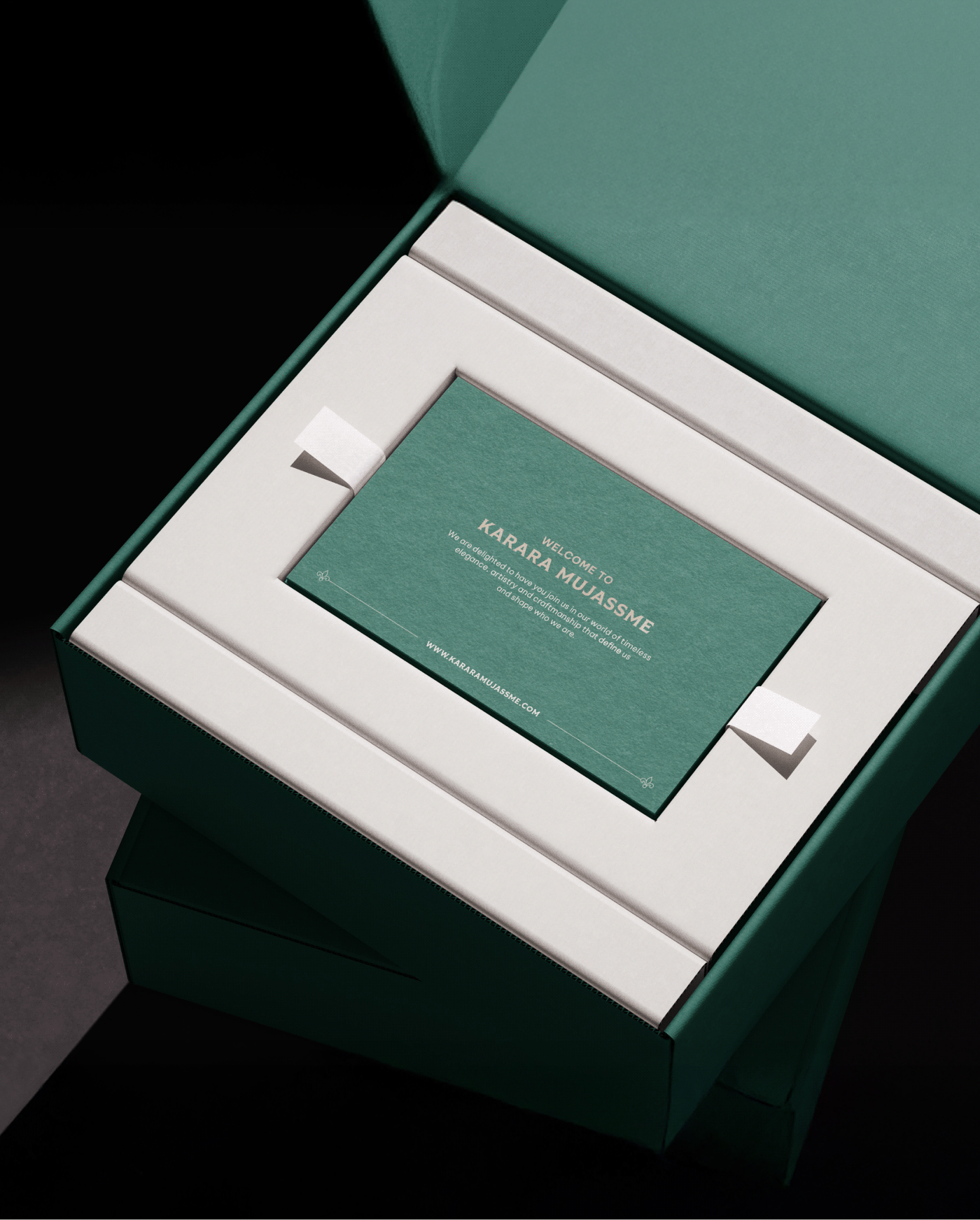
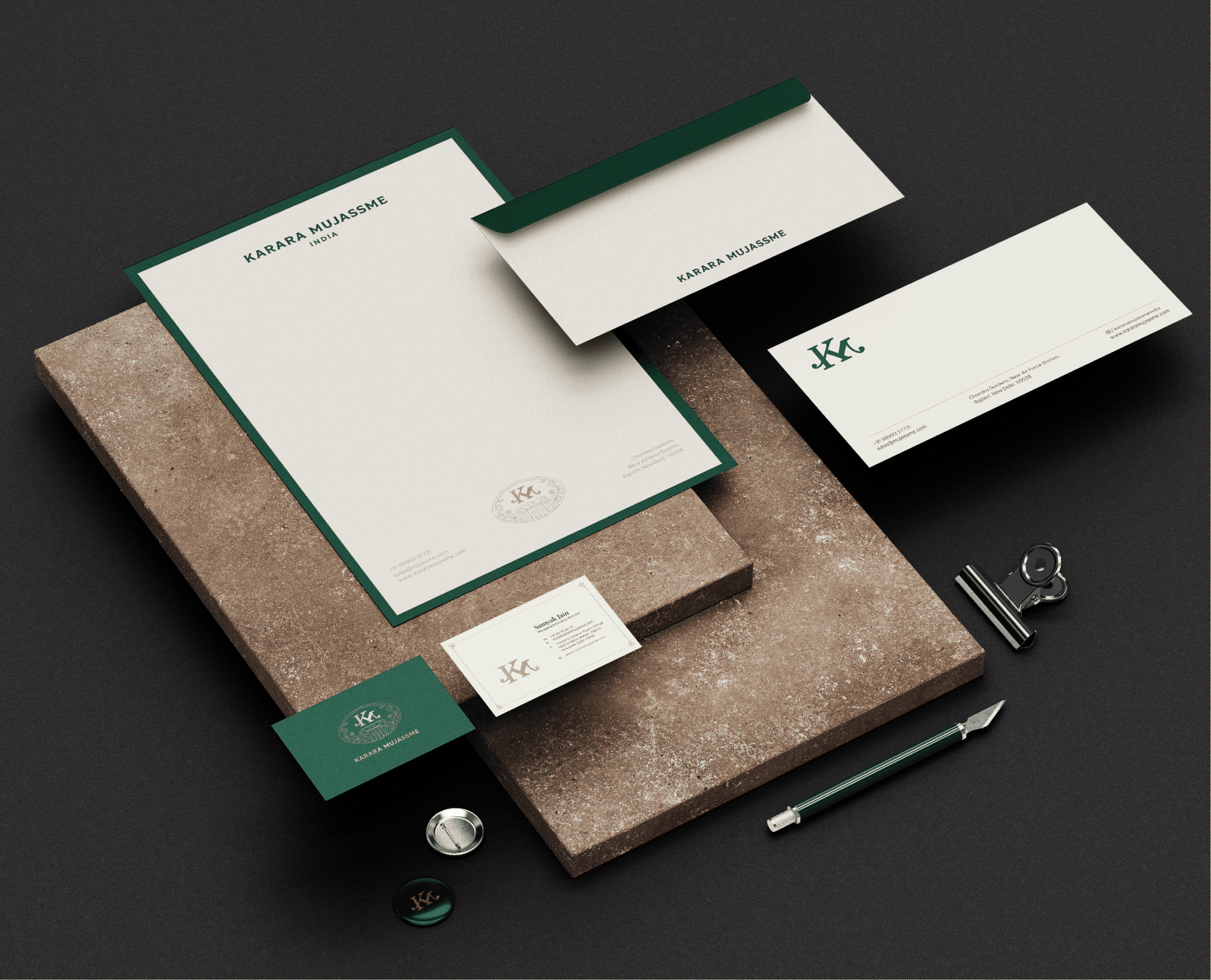
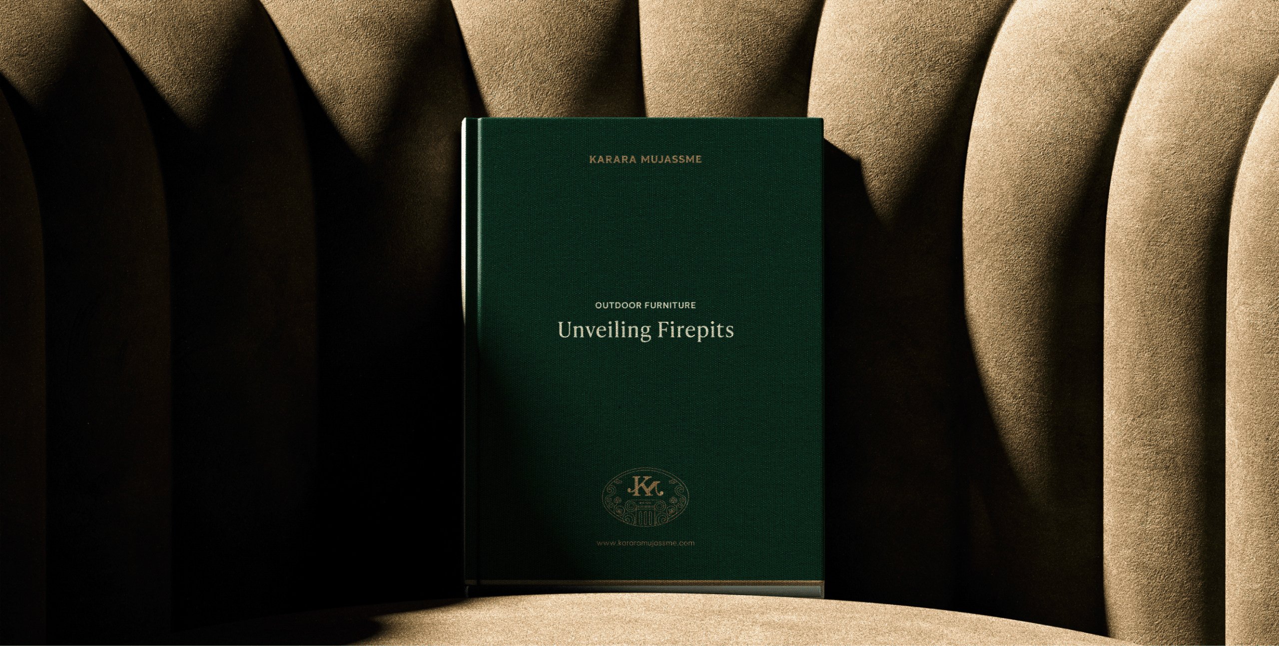
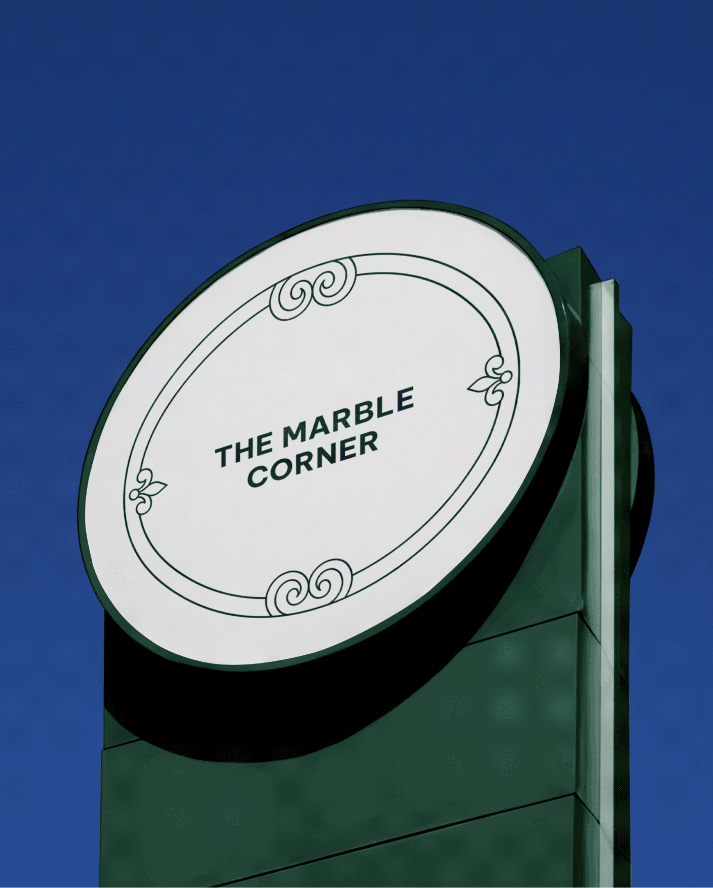
Introducing Karara Mujassme

A refined identity inspired by the craftsmanship, precision, and timeless quality behind every Karara creation.

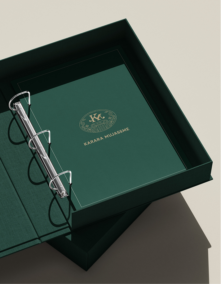
A distinctive seal that brings together trust, tradition, and luxury into one powerful visual.

A monogram, seal, and logotype working together as a unified identity that reflects the 
brand’s heritage while looking confidently towards the future.

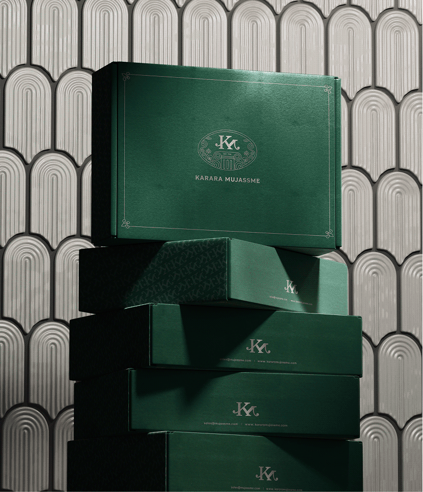
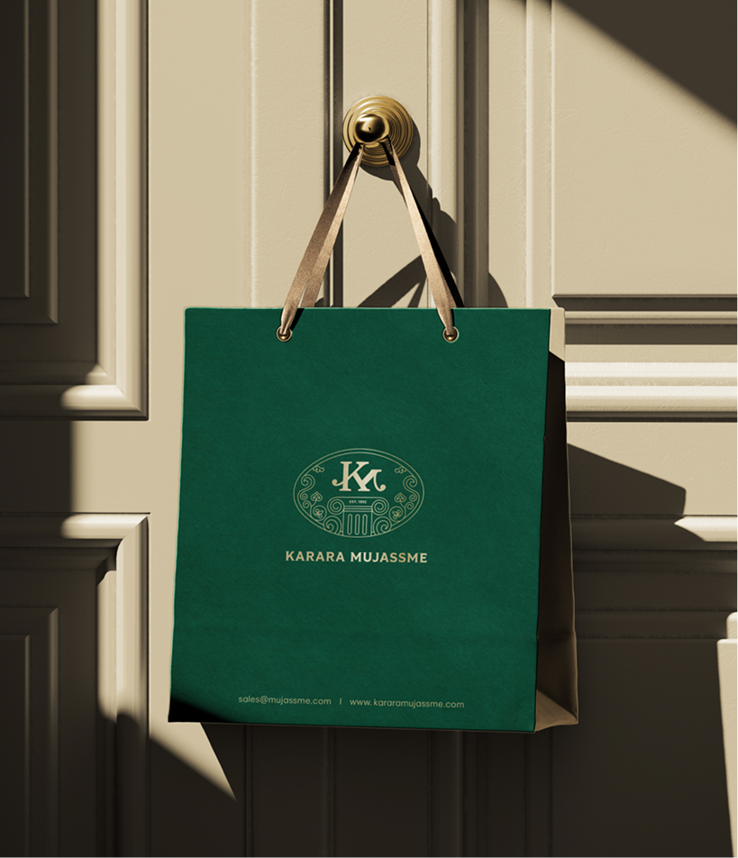
Product Packaging

A premium packaging system that transforms every purchase into a curated luxury experience; carrying Karara’s craftsmanship from the showroom to the moment it is unboxed.

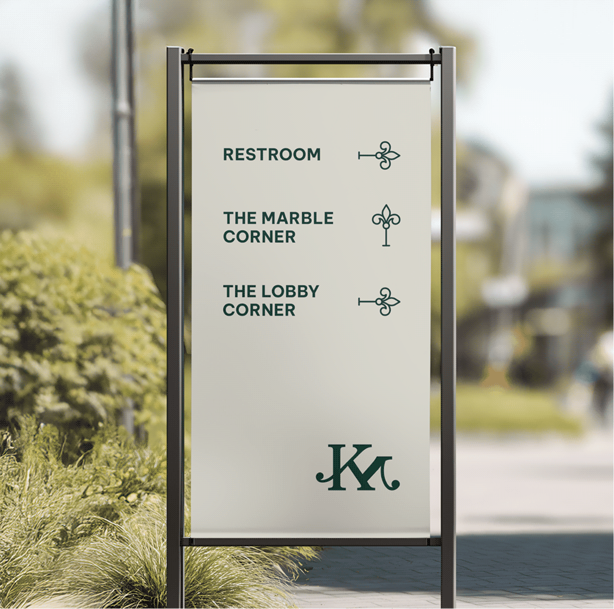
Space and Wayfinding Design

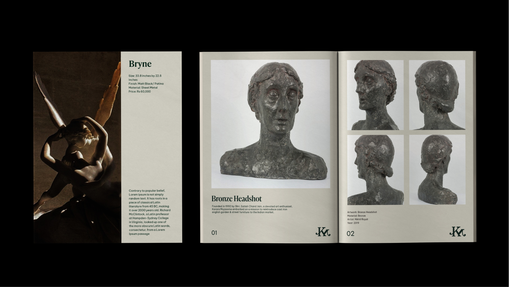
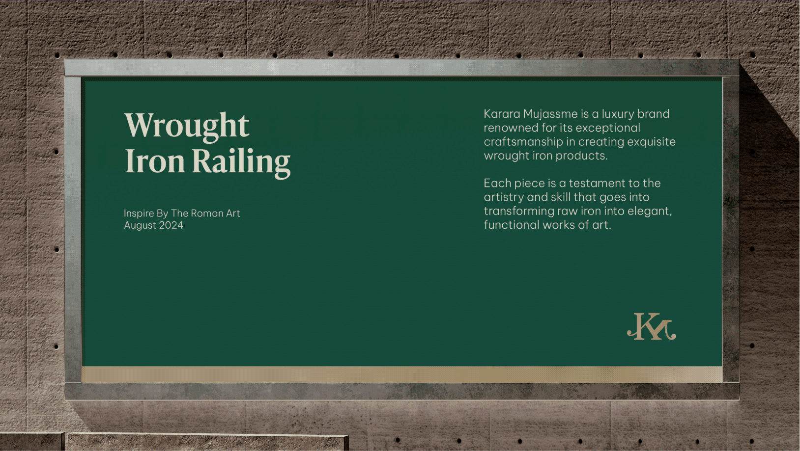
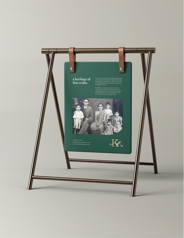
A cohesive environmental identity that carries the brand across every corner of the space; from wayfinding and storytelling to product communication and discovery.

Always By Your Side

Why should comfort begin and end with sleep?

Scope Of Work: Market Research, Strategy, Brand Identity, Packaging Design, Visual Language, Web Design, and Art Direction

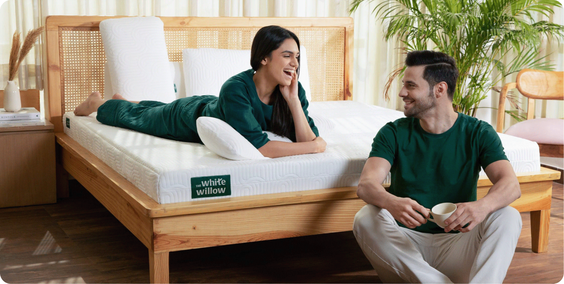
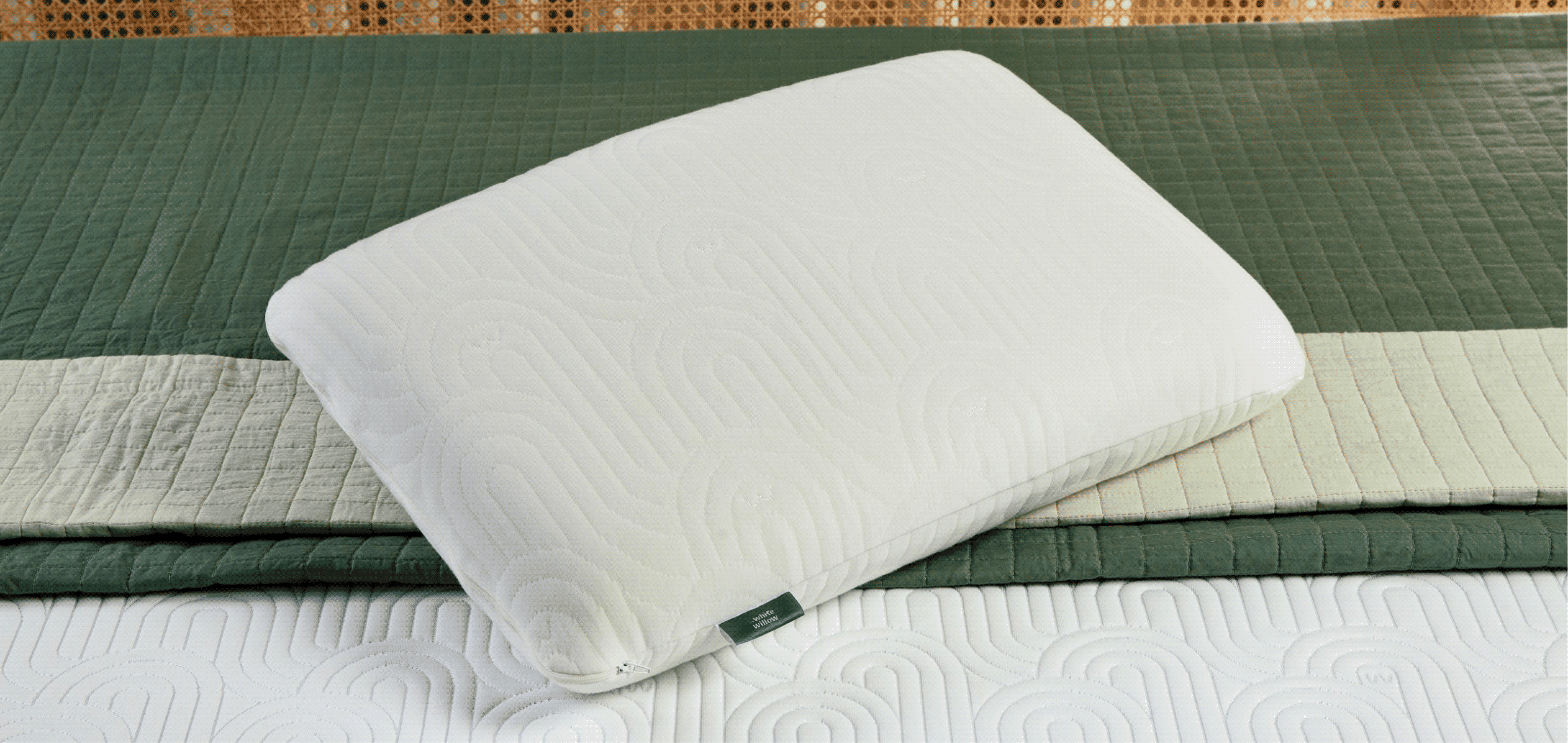
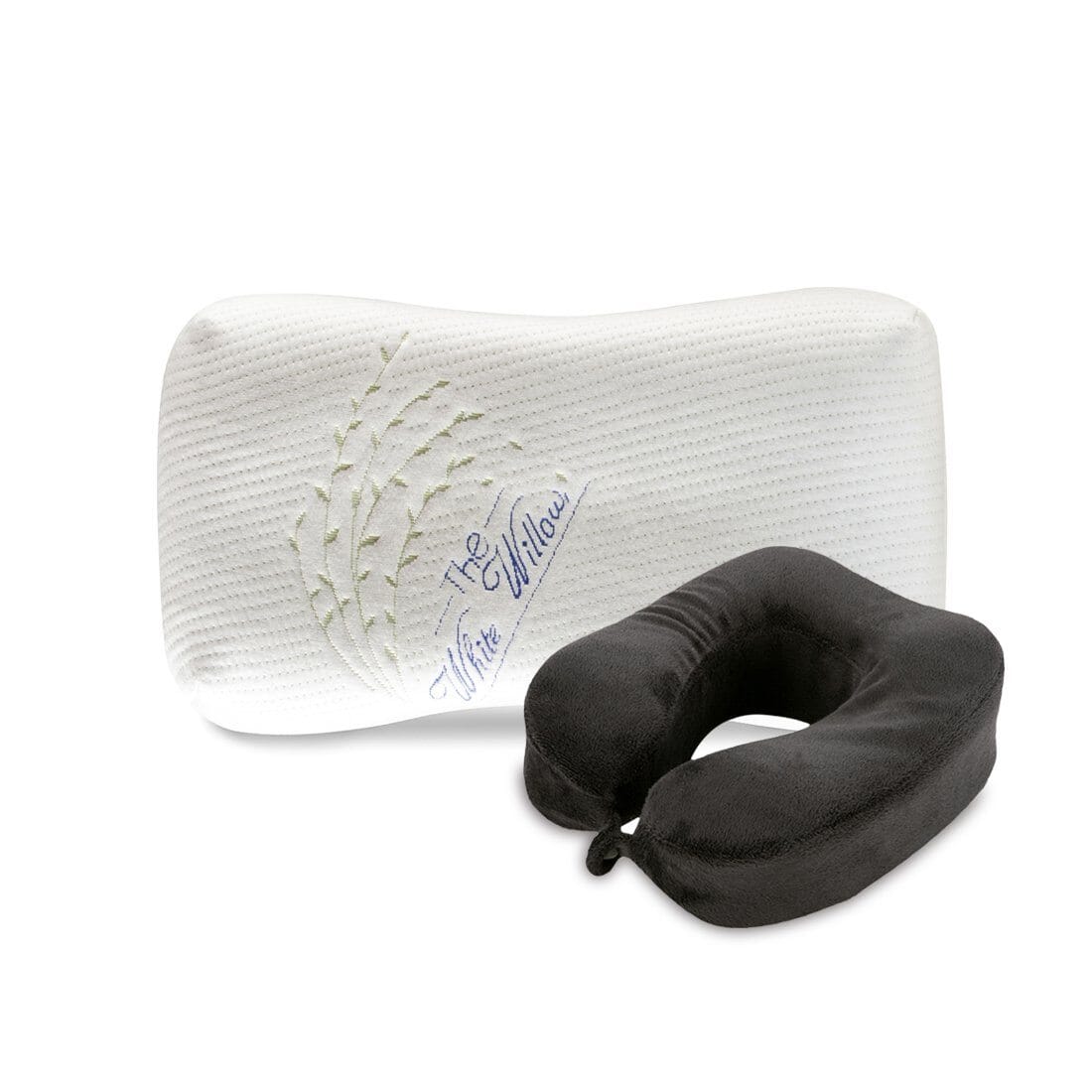
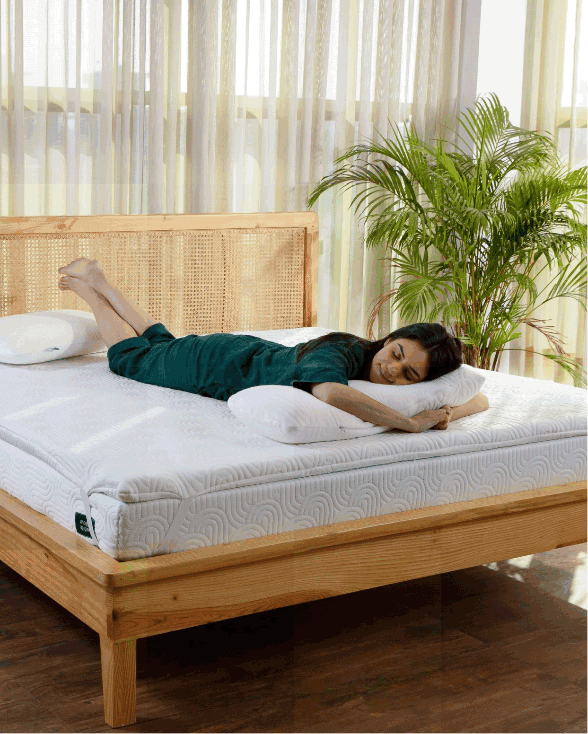
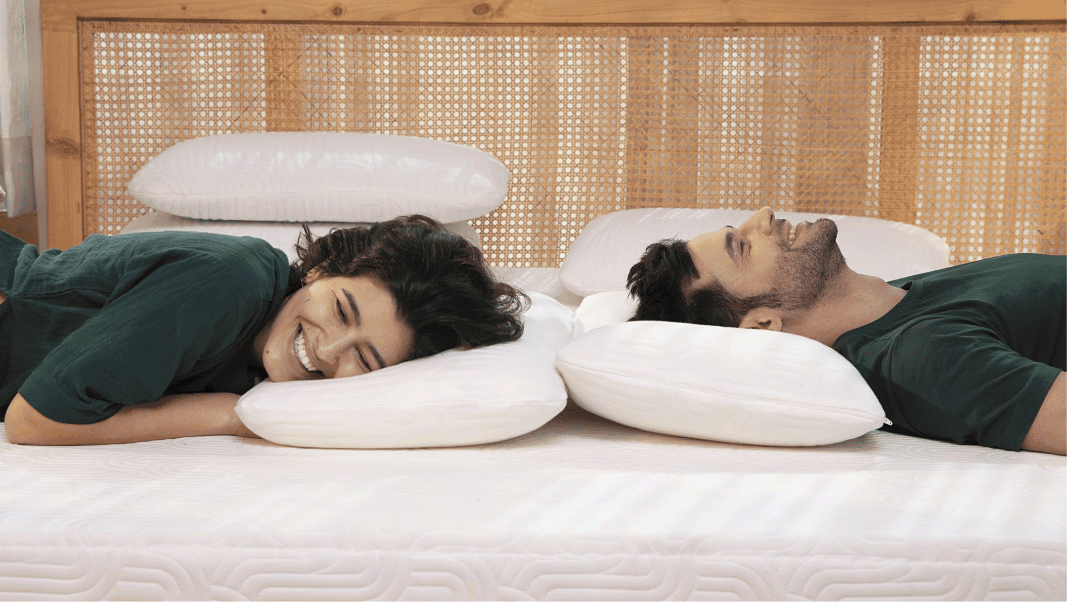
The White Willow had earned its reputation by understanding how people sleep, and what makes it better.

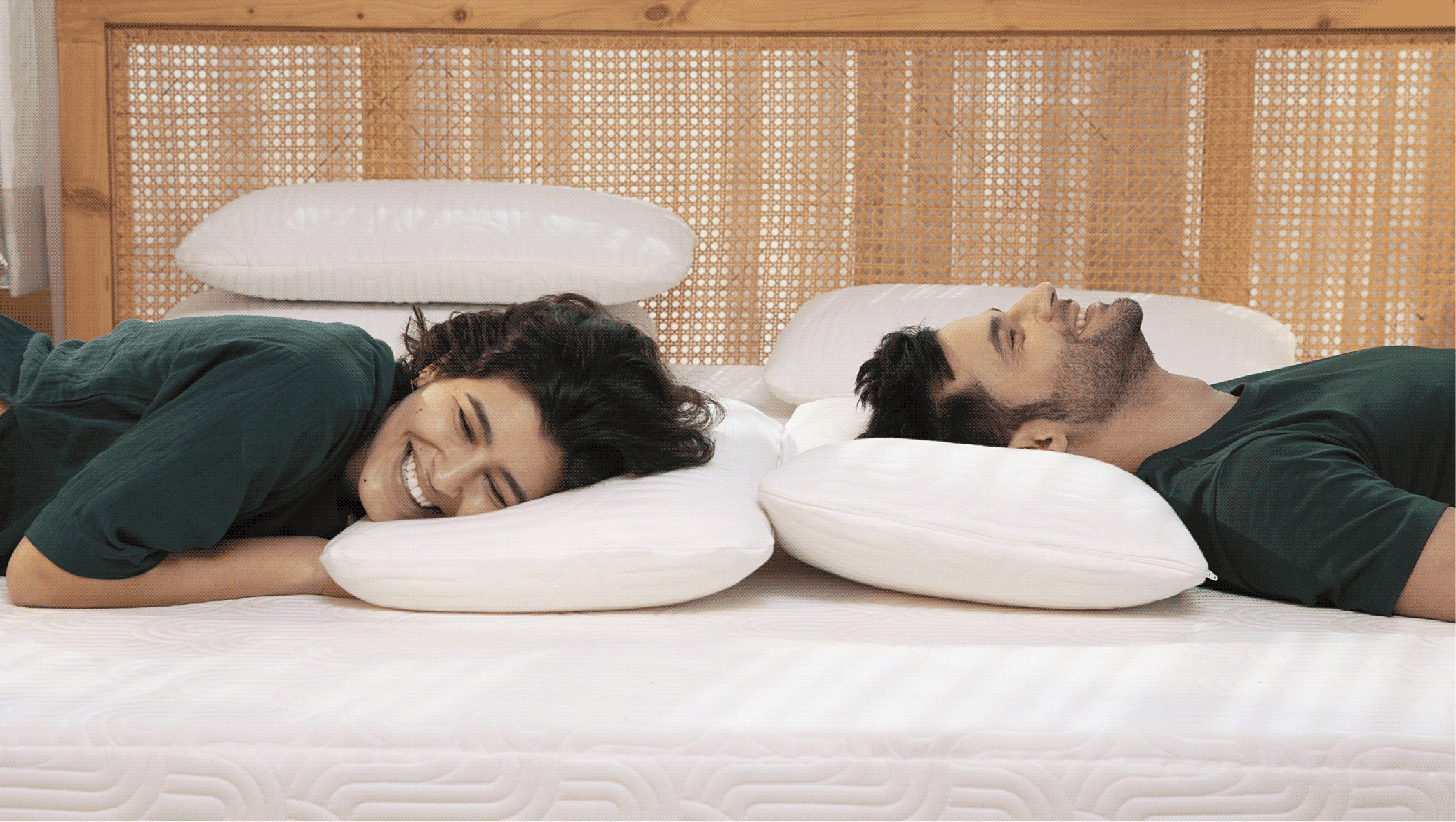
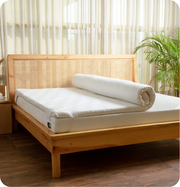
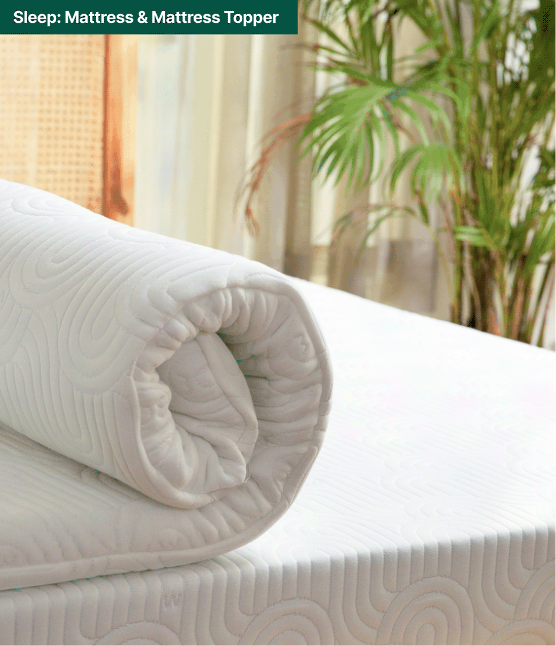
But as the brand expanded into mattresses, cushions, toppers and everyday essentials. One question emerged: if comfort improves our nights, shouldn’t it improve the rest of our day too?

We explored this idea with Abhishek and Meghna while repositioning The White Willow. Together, we reimagined the brand around a broader purpose that extended beyond the bedroom.

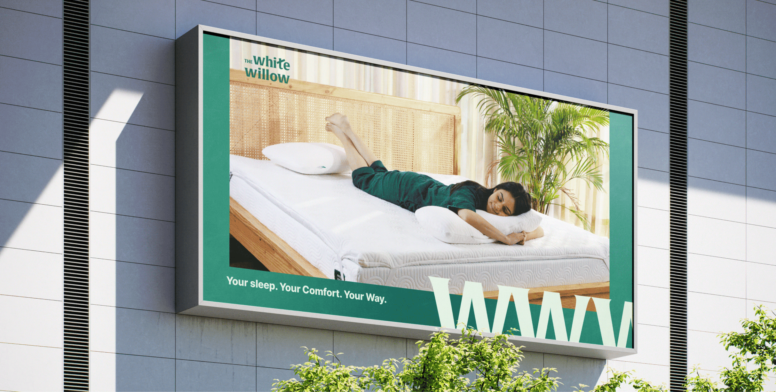
The goal was to move The White Willow from a pillow brand to a lifestyle brand that delivers comfort through the whole day.

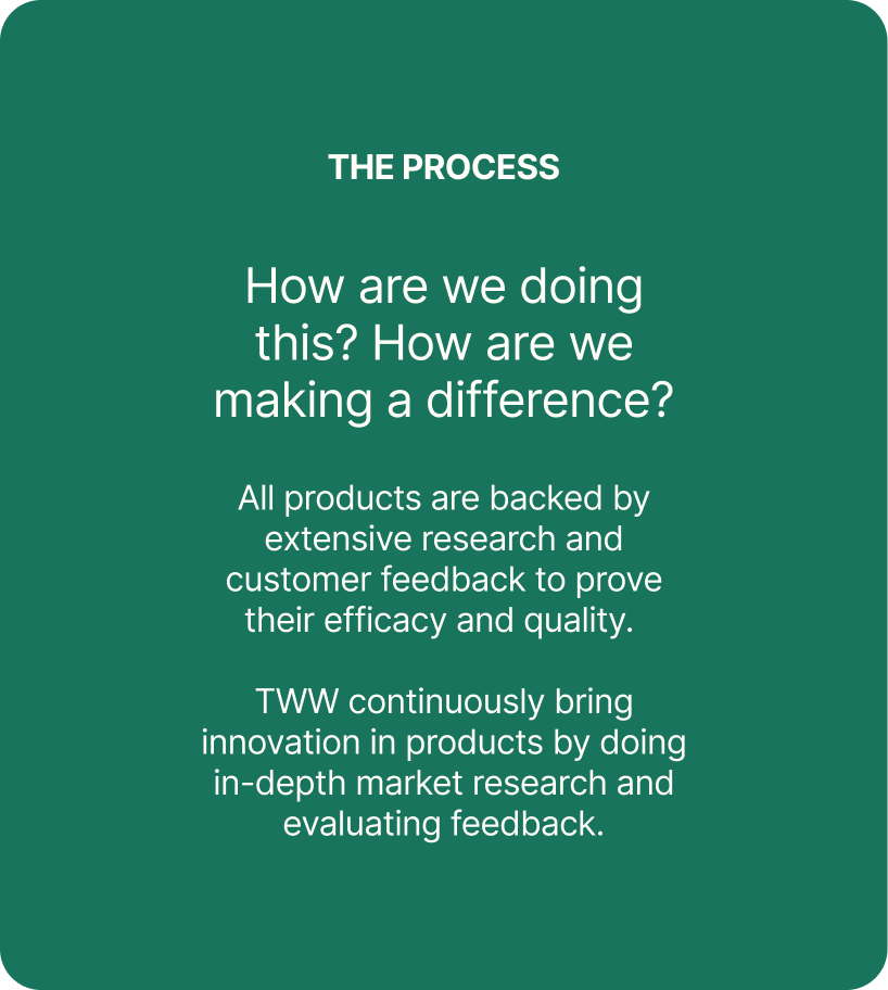
THE CONVICTION

Can comfort become a way of living, not just sleeping?

TWW had built its reputation by understanding how people sleep. As the brand expanded into everyday comfort products, its purpose naturally grew beyond pillows.


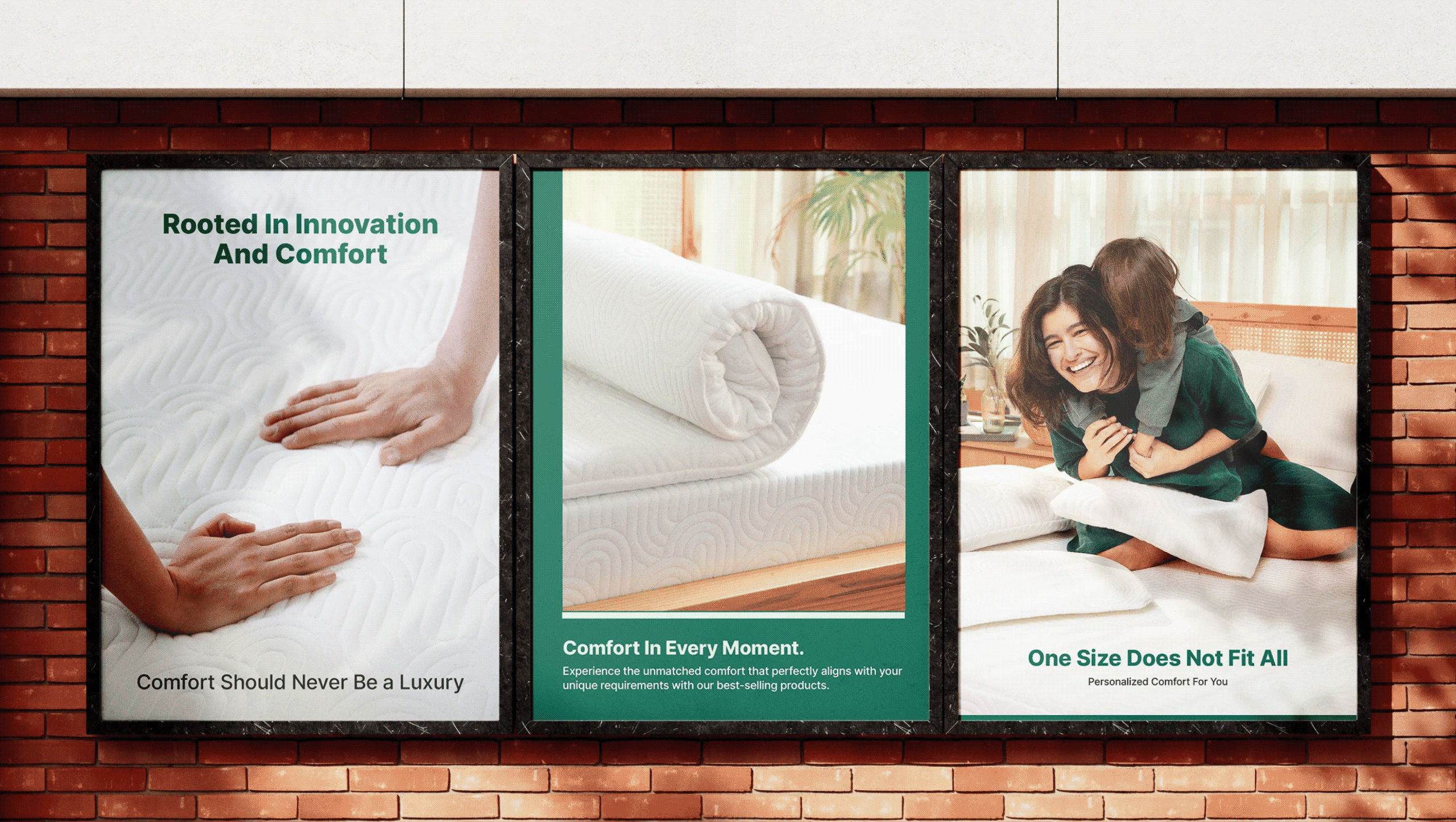
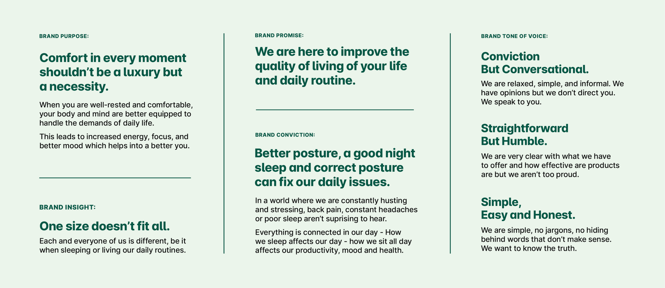
We shifted the positioning from a pillow brand to a lifestyle brand that believes in comfort in every moment and provides round the clock comfort. A brand that improves the quality of living of your daily life.

THE TURNING POINT

The products had evolved. The brand hadn't.

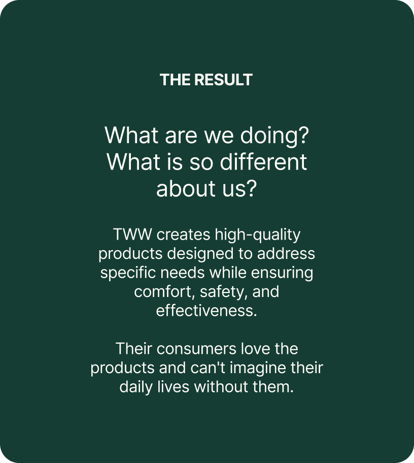
TWW had spent almost a decade perfecting comfort through thoughtful design, premium materials, and a deep understanding of how people rest & see comfort.

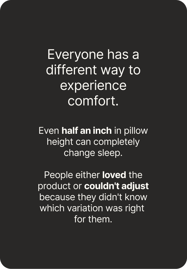
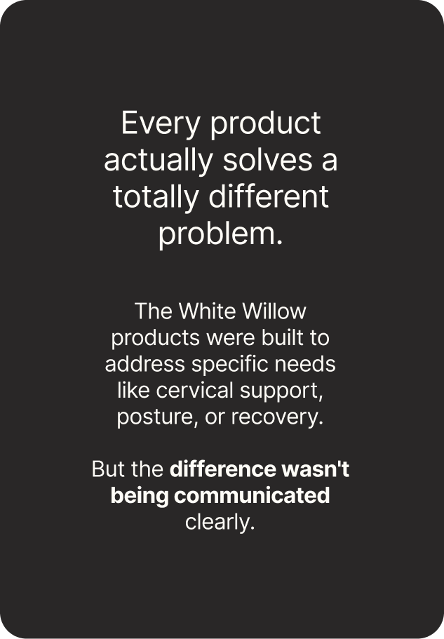
The challenge was to help people understand which product was right for them, what made it different, and how every category belonged to one clear brand.

Comfort in every moment shouldn’t be a luxury but necessity.

Introducing The White Willow

A round the clock brand, by your side through every moment. From waking up to 
winding down, we deliver comfort throughout your day.

THE FOUNDATION

A system designed to grow along with the brand.

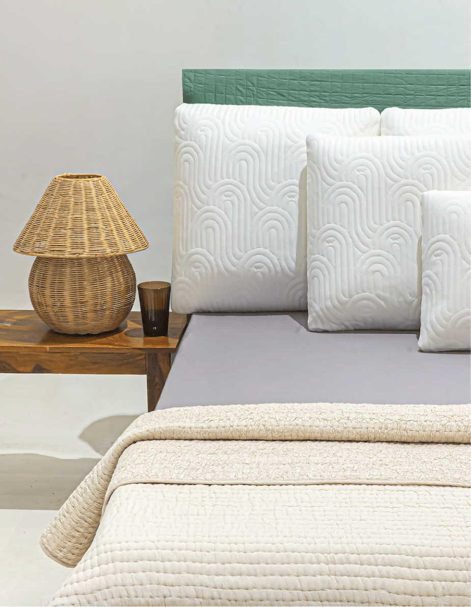
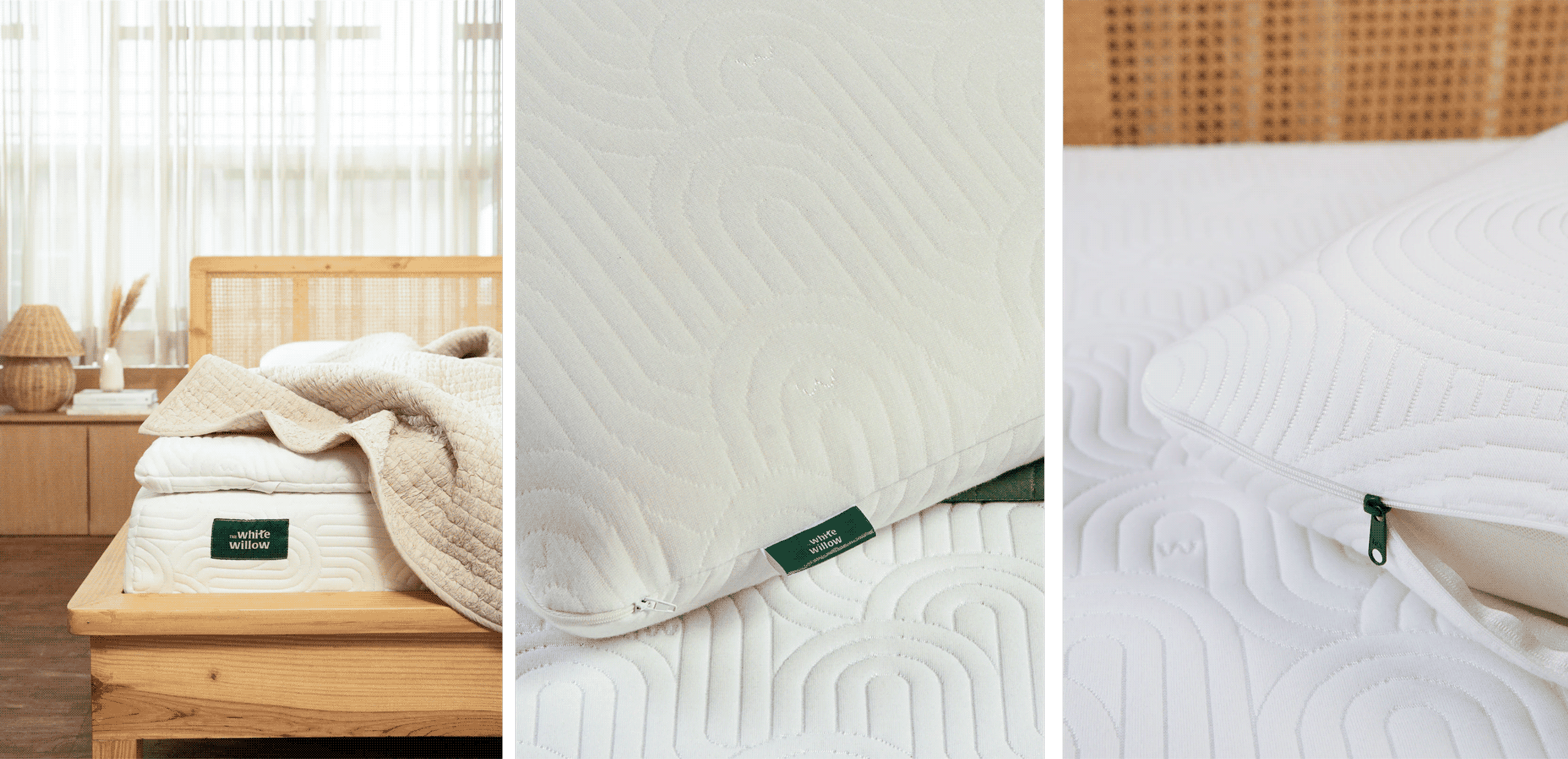
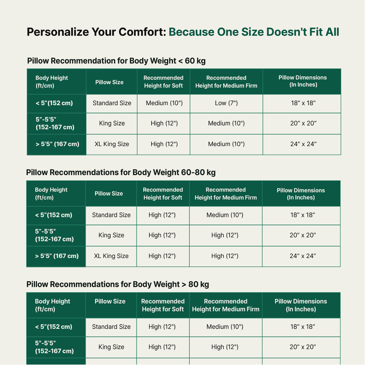
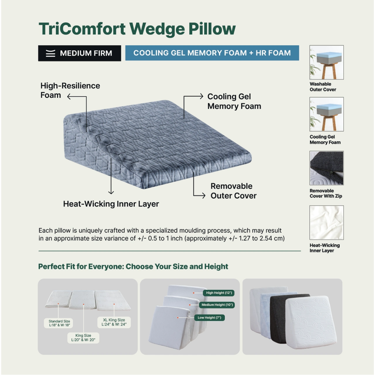
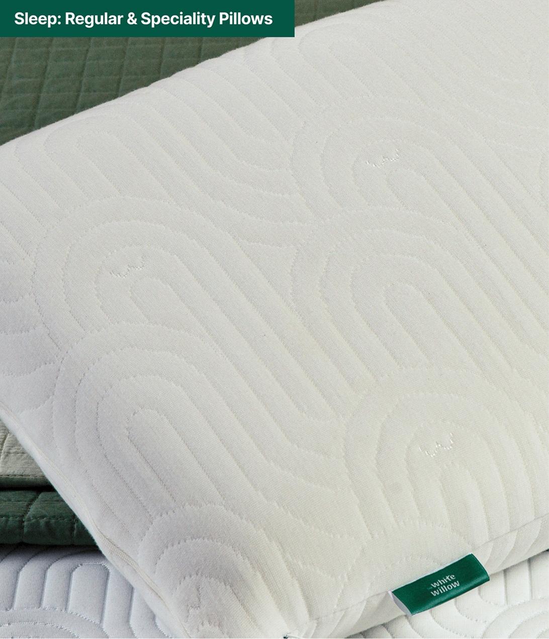
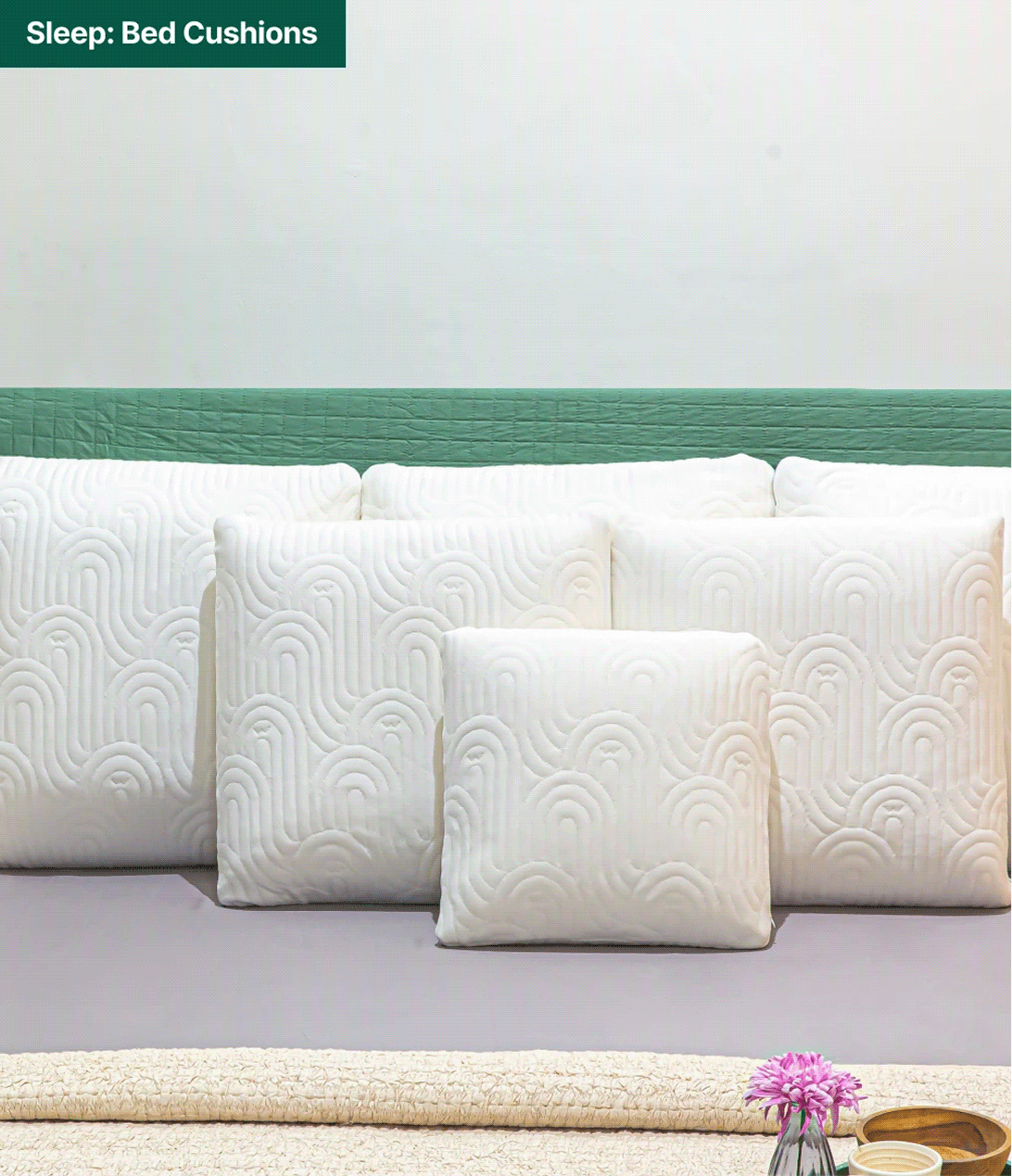
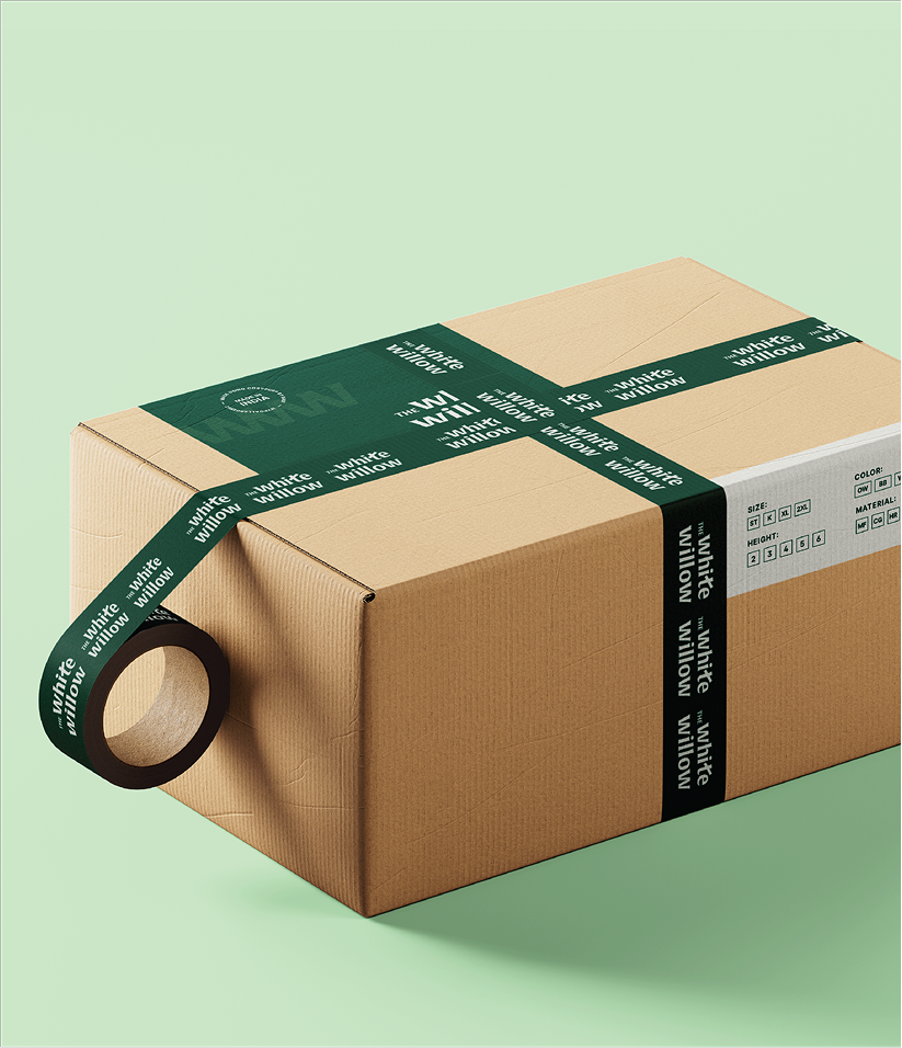
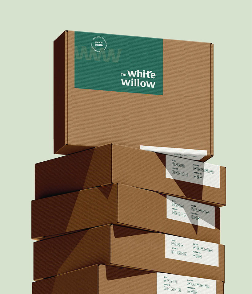
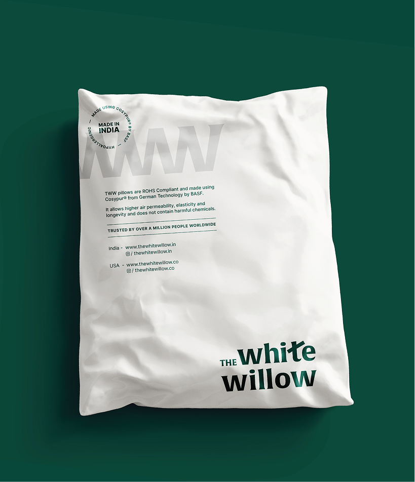
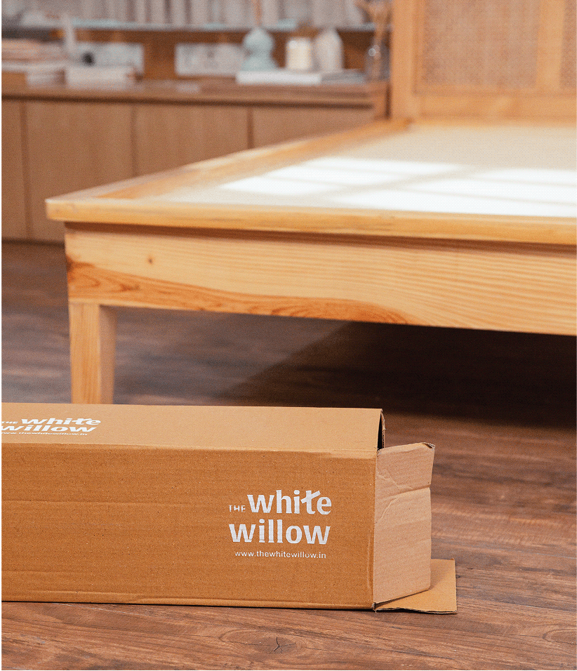
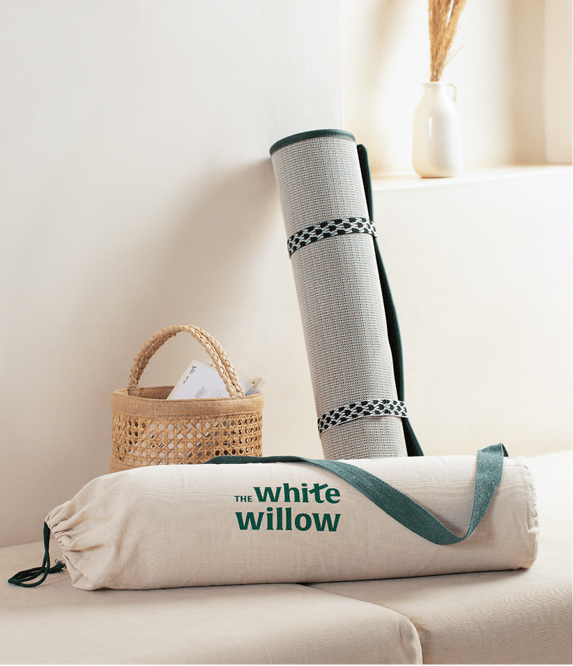
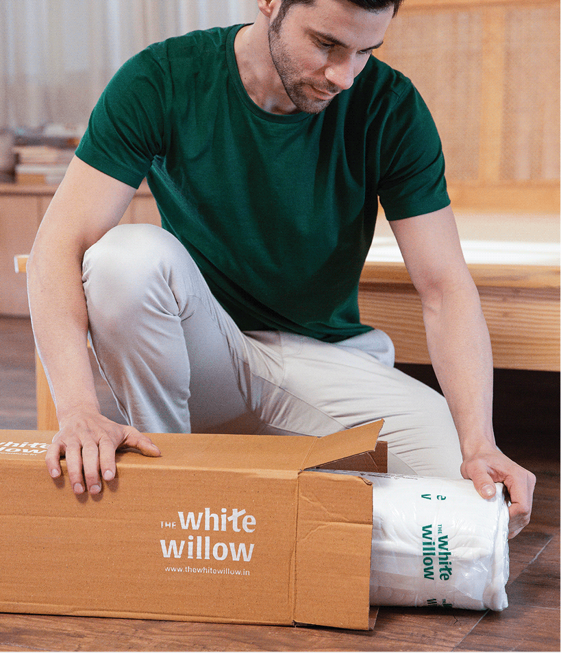
The White Willow’s expanding product range required more than individual packaging designs. We created a scalable identity system that could unify over 250 SKUs while giving every category its own place within the brand.


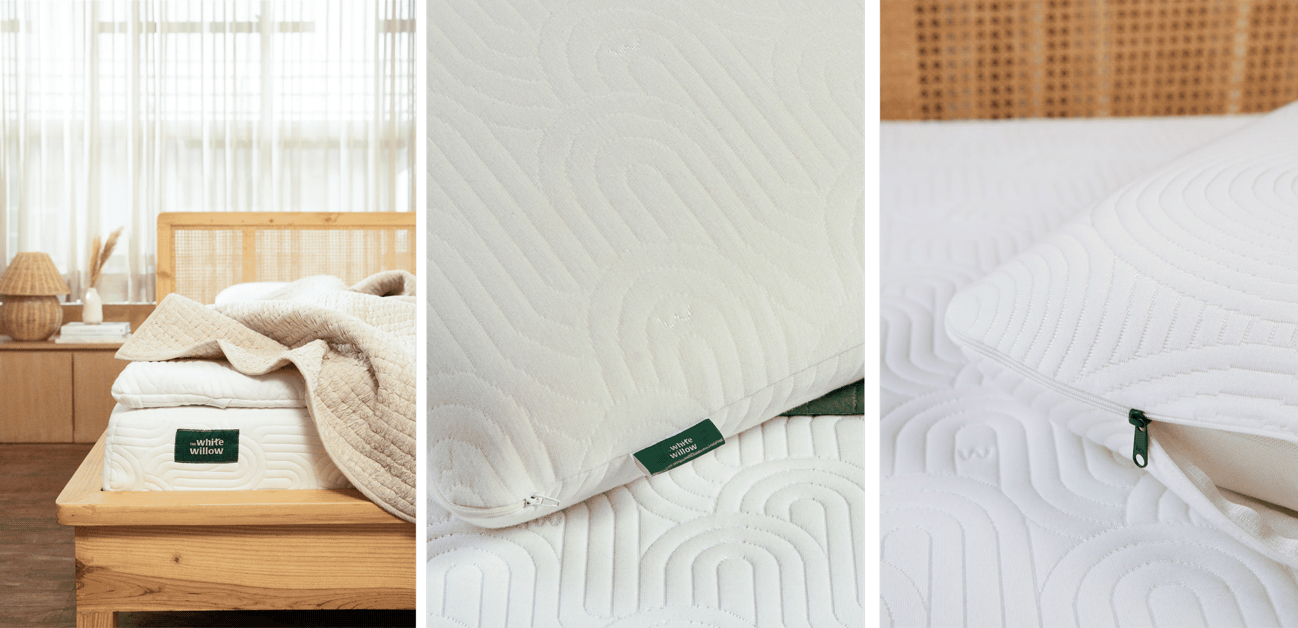
Calming custom patterns, a signature willow-inspired emerald green, and a modular packaging framework build a visual language that felt consistent, recognisable, and ready to evolve.

THE CLARITY

Good products deserve clear communication.

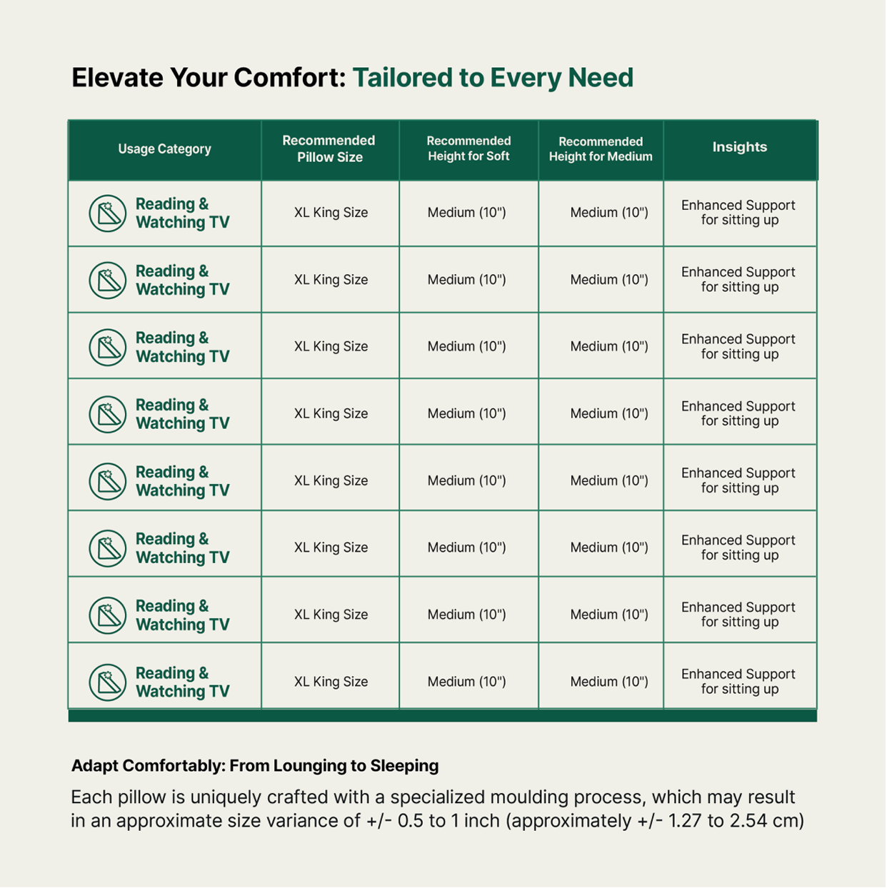
Every product solved a different need, but consumers found it difficult to understand the differences. We realised the problem wasn’t the range; it was how the range was being communicated.


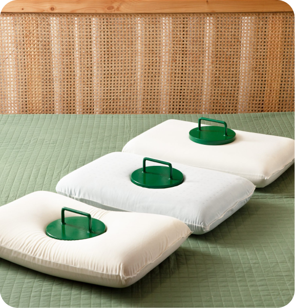
Clear product architecture, custom iconography and size guides turned a complex portfolio into something you could actually shop.

How do you deliver the same experience through different products?

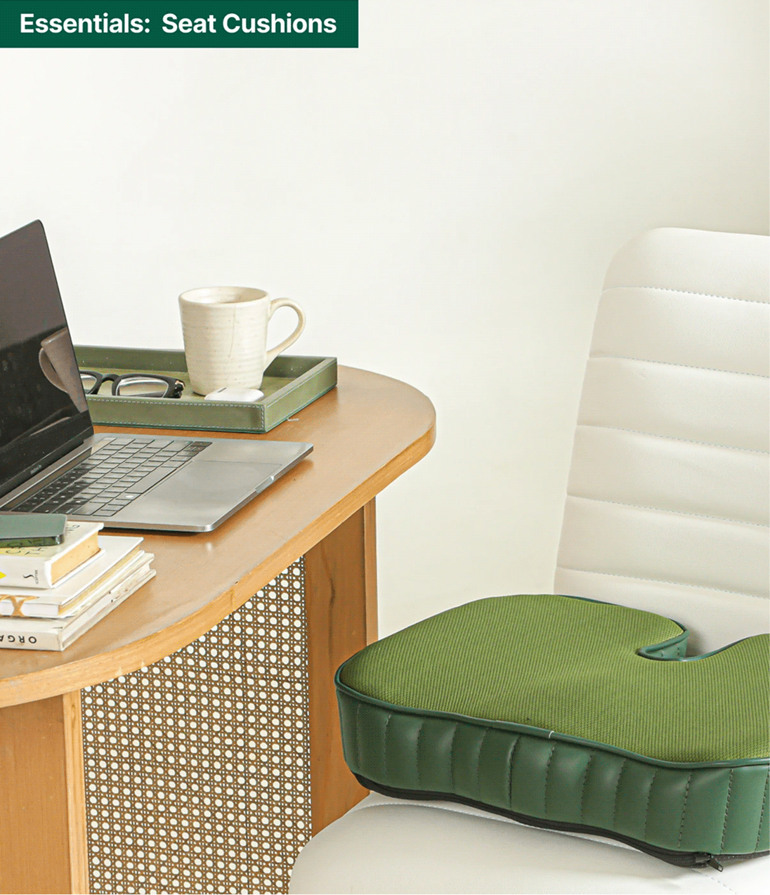
Each new category arrived with its own SKUs. So, we designed a cohesive visual language across White Willow’s expanding range; bringing consistency to every category, from sleep essentials to everyday comfort.

Evoking Emotions Through Spaces

What do people take home when they buy furniture?

Scope Of Work: Research, Strategy, Brand Identity, Brand Messaging, and Visual Extension.

Furniture brands often compete on craftsmanship, materials, or aesthetics. But a home is never remembered for just the furniture inside it. A home is remembered for the way it makes you feel inside.

We explored this with Aman while reimagining Art Collection. Together, we stepped back to rethink the brand’s purpose, evolving it from a furniture retailer into one that builds spaces people connect with emotionally.

The goal was to build a brand that views furniture not just as a product, but as an experience that shapes the way we live.

THE POSITIONING

How do you design spaces that people can connect with?

A beautiful home is rarely defined by furniture alone. It’s a balance of comfort, function, craftsmanship, and the stories behind every object that makes a space memorable.

We positioned it as more than a furniture brand; a curator of thoughtful spaces that collaborates with artists, designers, and makers to design spaces that are beautiful, functional, and made to be lived in.

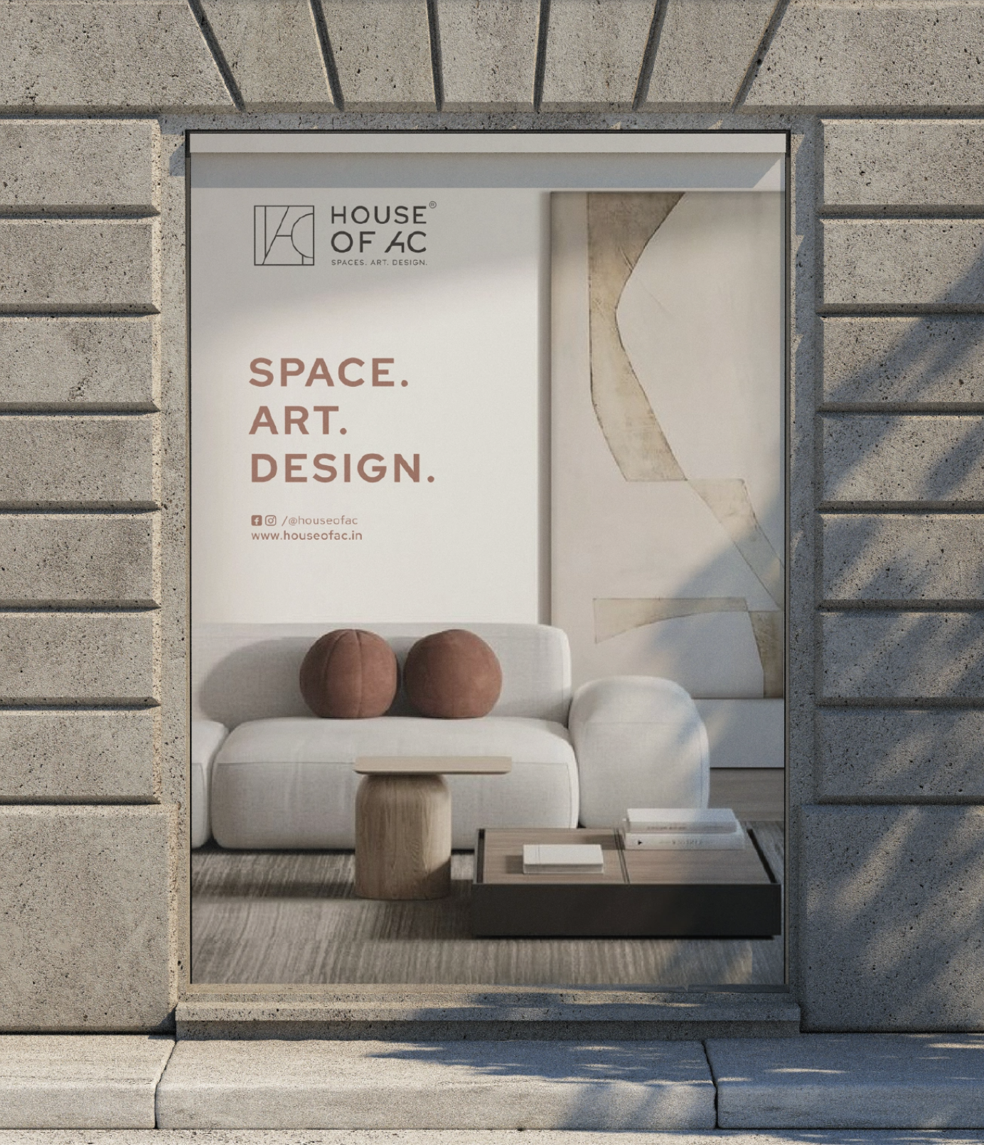
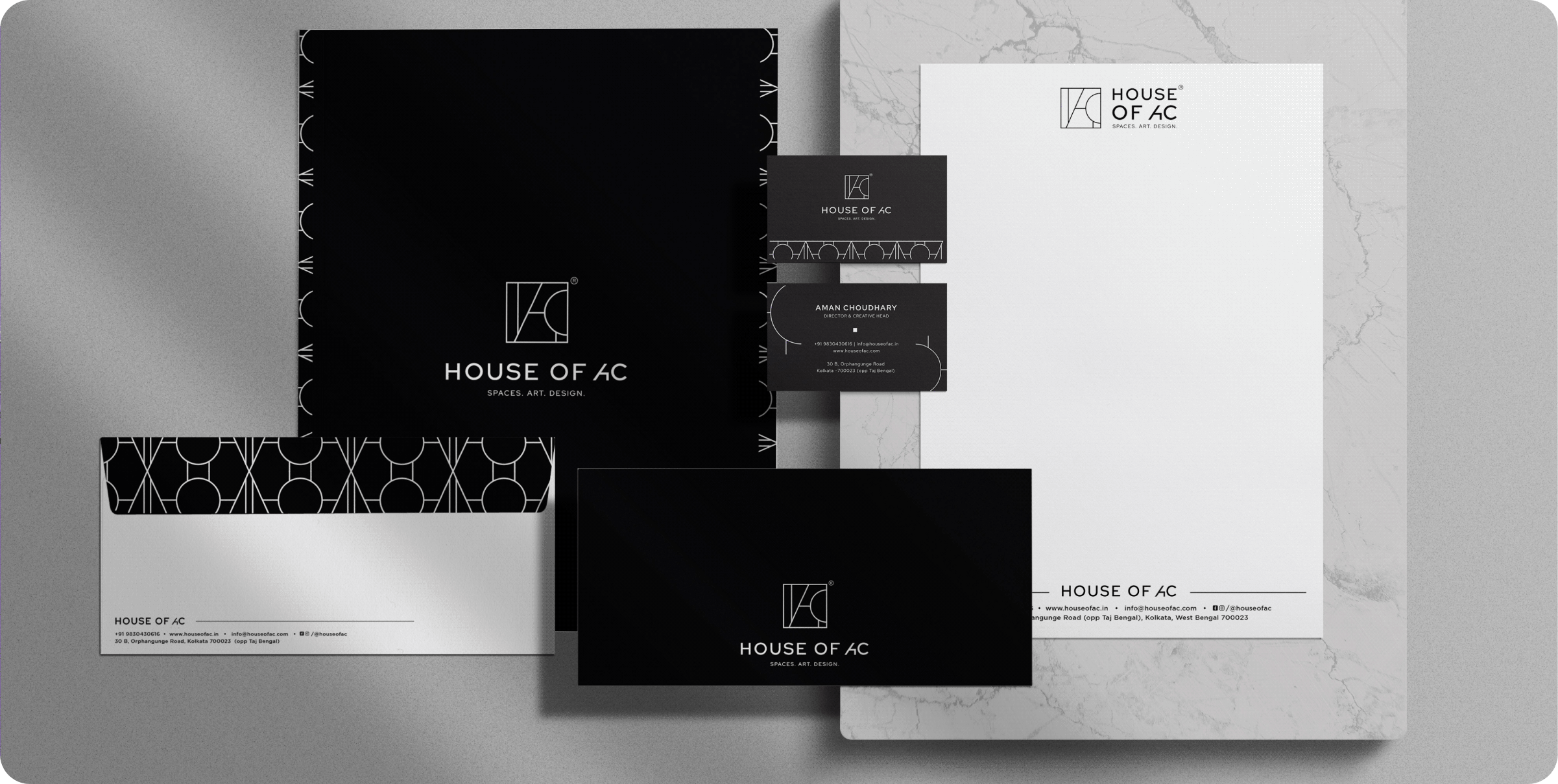
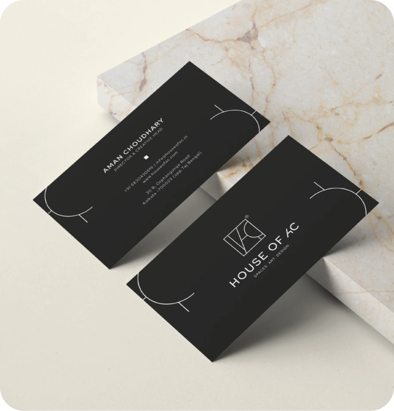
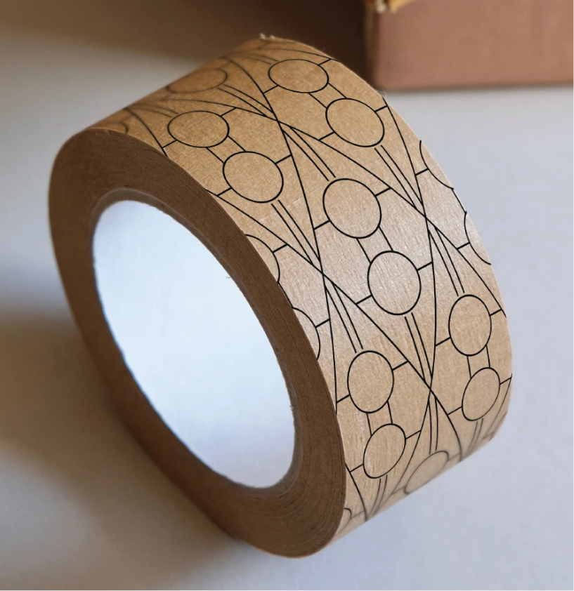
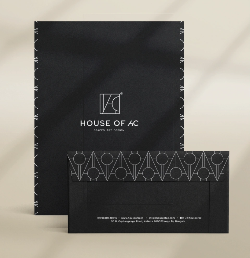
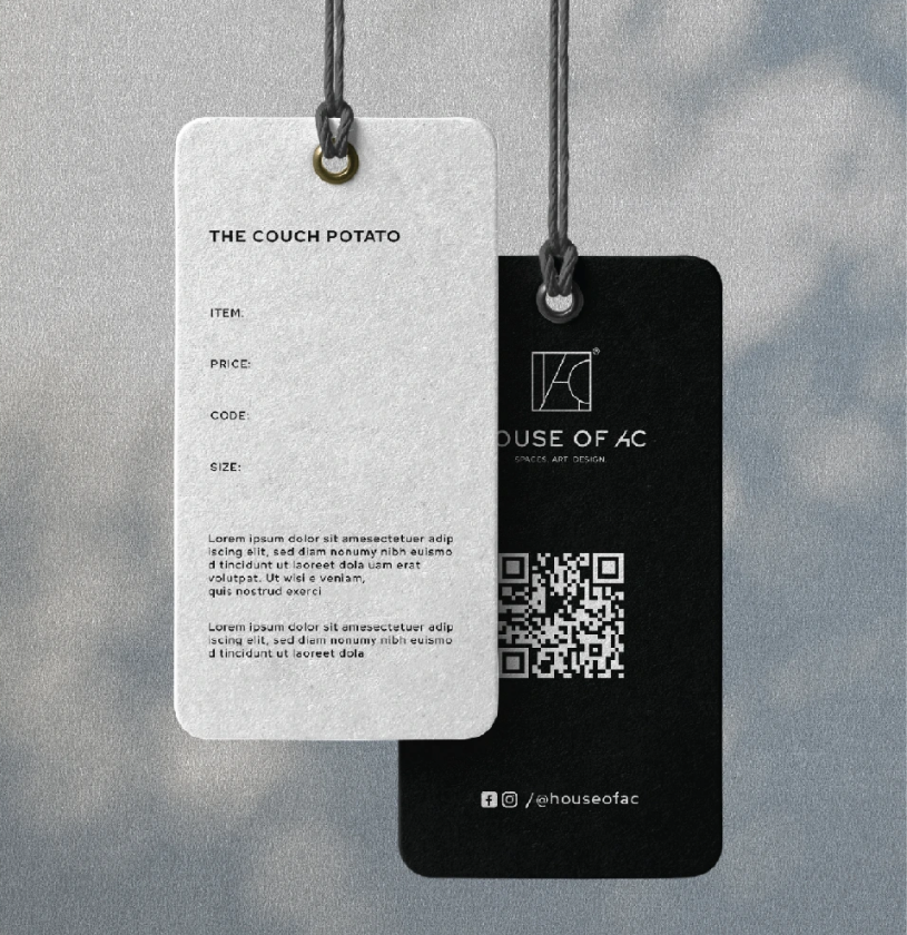
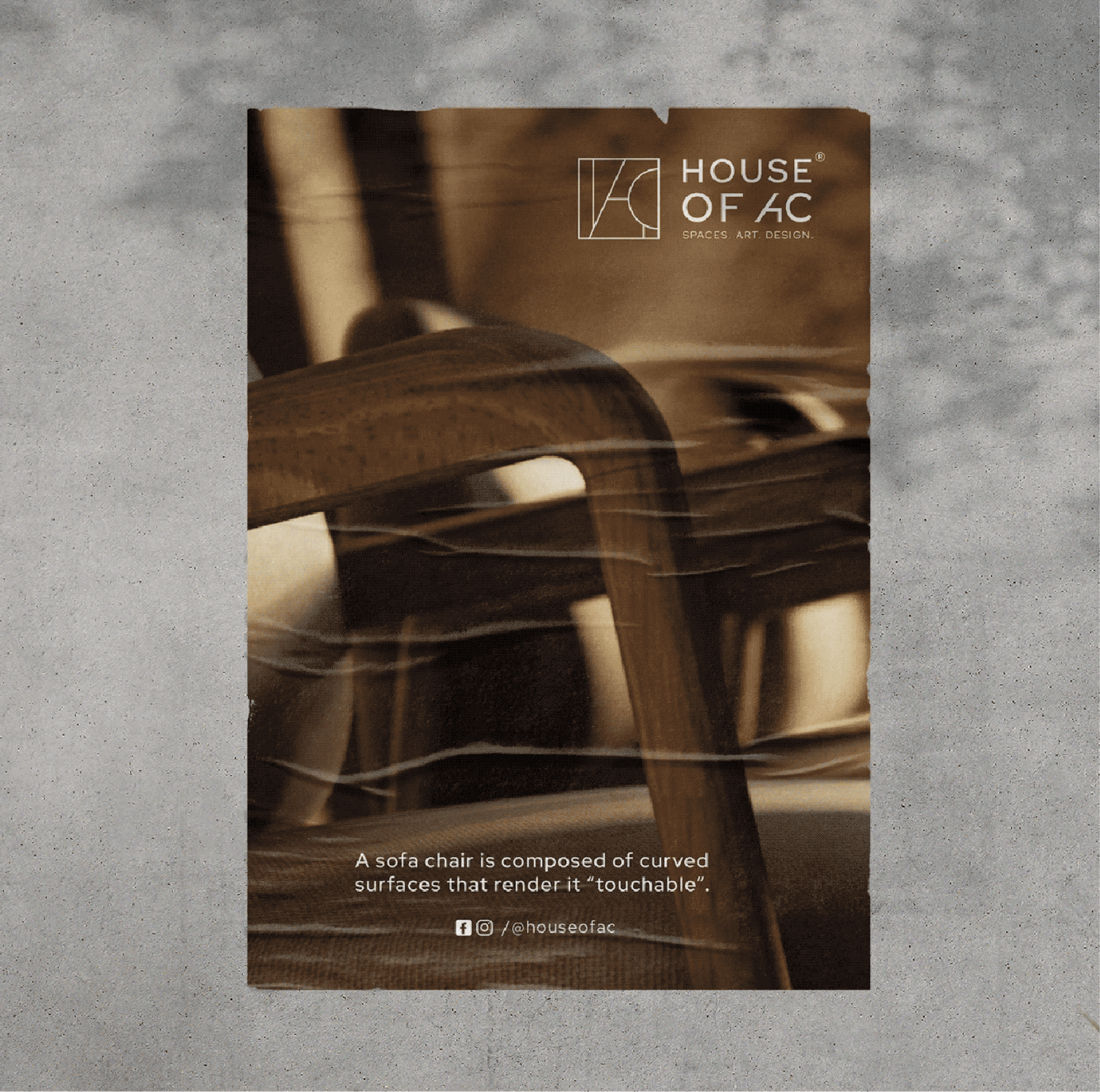
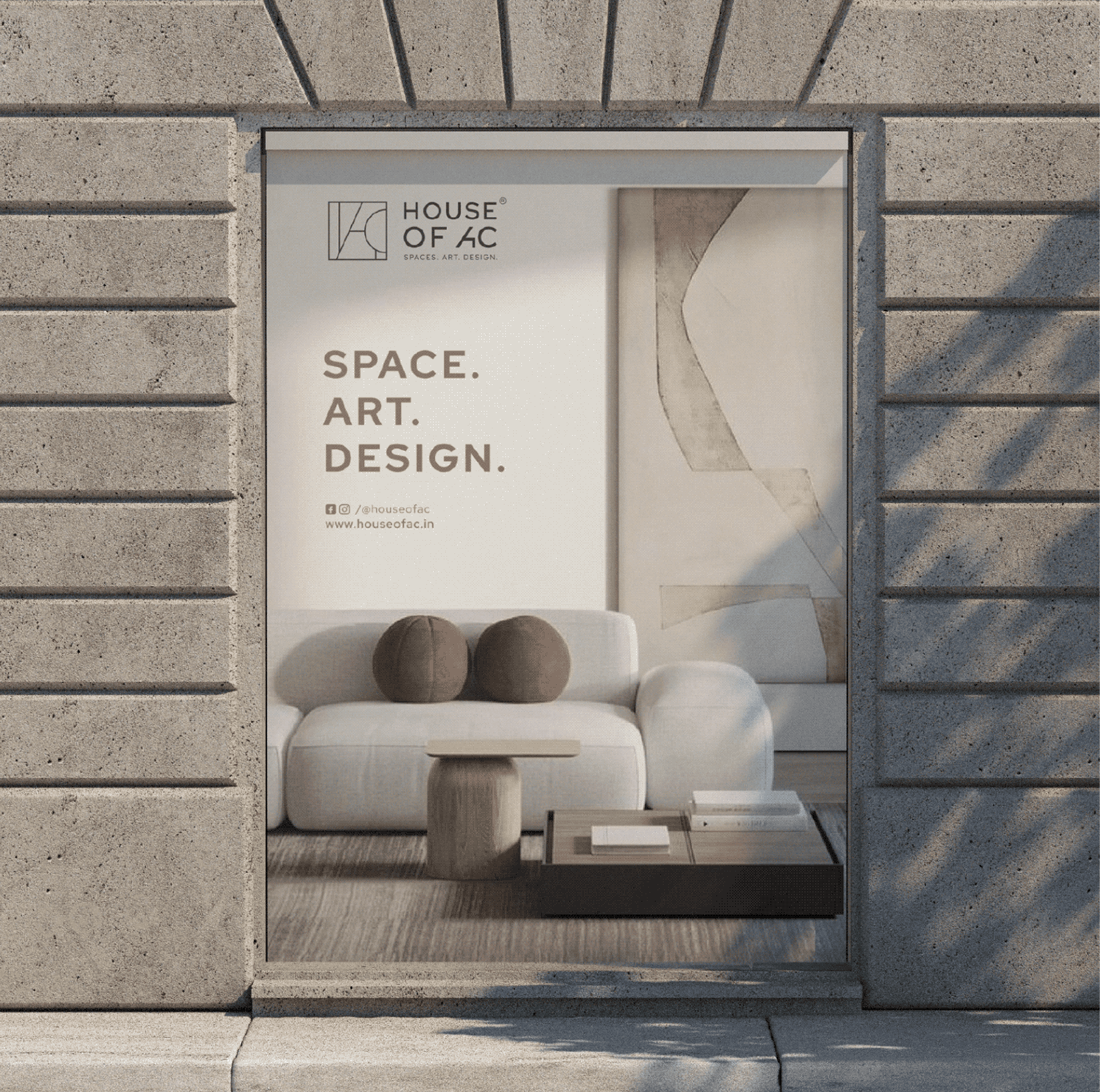
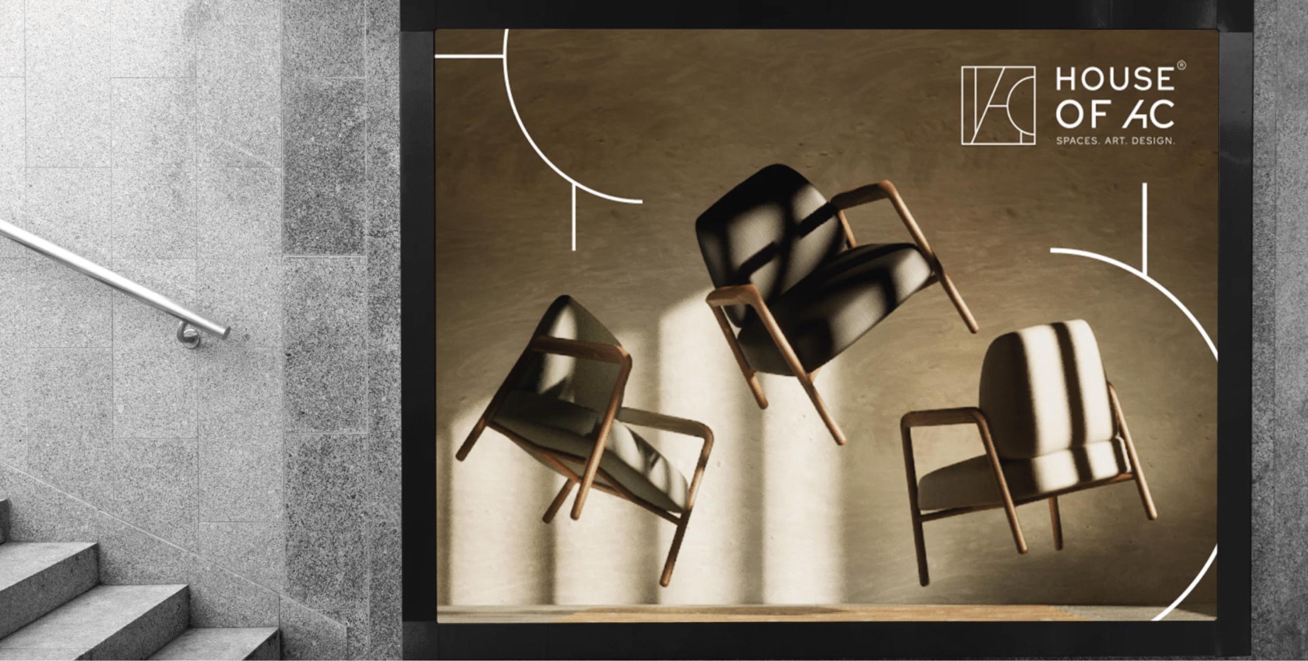
Introducing House Of AC

A brand built on the belief that design makes everyday life better and more meaningful, and makes you fall in love with the place you live.

THE EXTENSION

Choosing furniture shouldn’t feel like a guessing game.

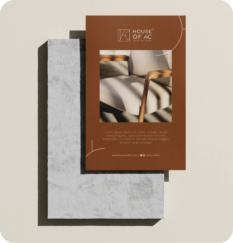
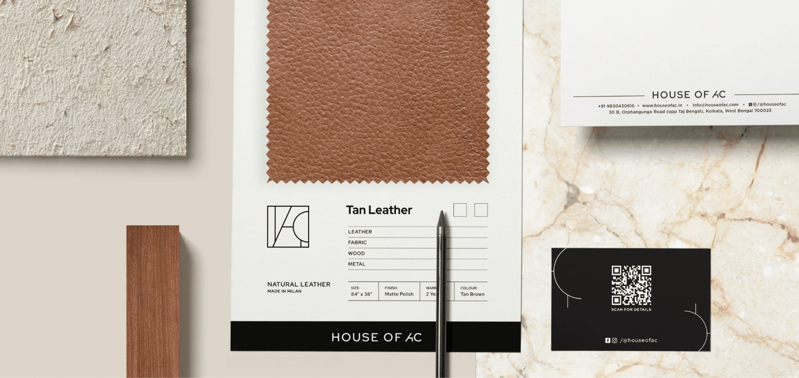
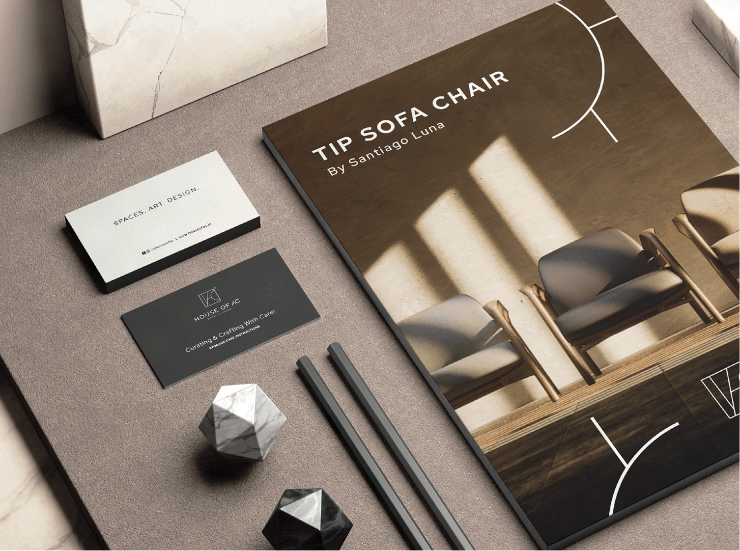
Every decision about furniture is tactile. People want to see, touch and compare before they make their final choices, so we designed material swatches and sample boards that let them do exactly that.

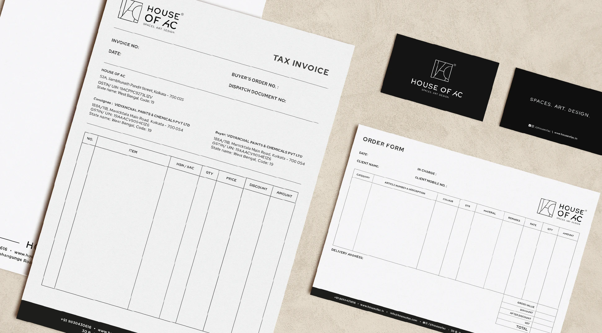
This created a consistent brand experience that felt considered long before and long after the purchase.