
The Crown Jewel Of Reliance

The Crown Jewel Of Reliance

Brand Identity & Visual Extension for Vantara

Fostering Education With Zipply

Fostering Education With Zipply

Brand Identity & UI For Zipply Platform

Smart Co-Working With 1Excel

Smart Co-Working With 1Excel

Identity & Visual Extension For A Co-Working Space

Can a superfood feel just as familiar as comfort food?

Scope Of Work: Packaging Design, Extension & Visual Language.

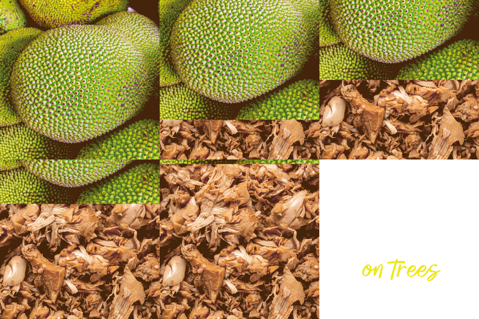
Jackfruit is a native superfood of India, yet most people are unfamiliar with it, or have reservations about it.

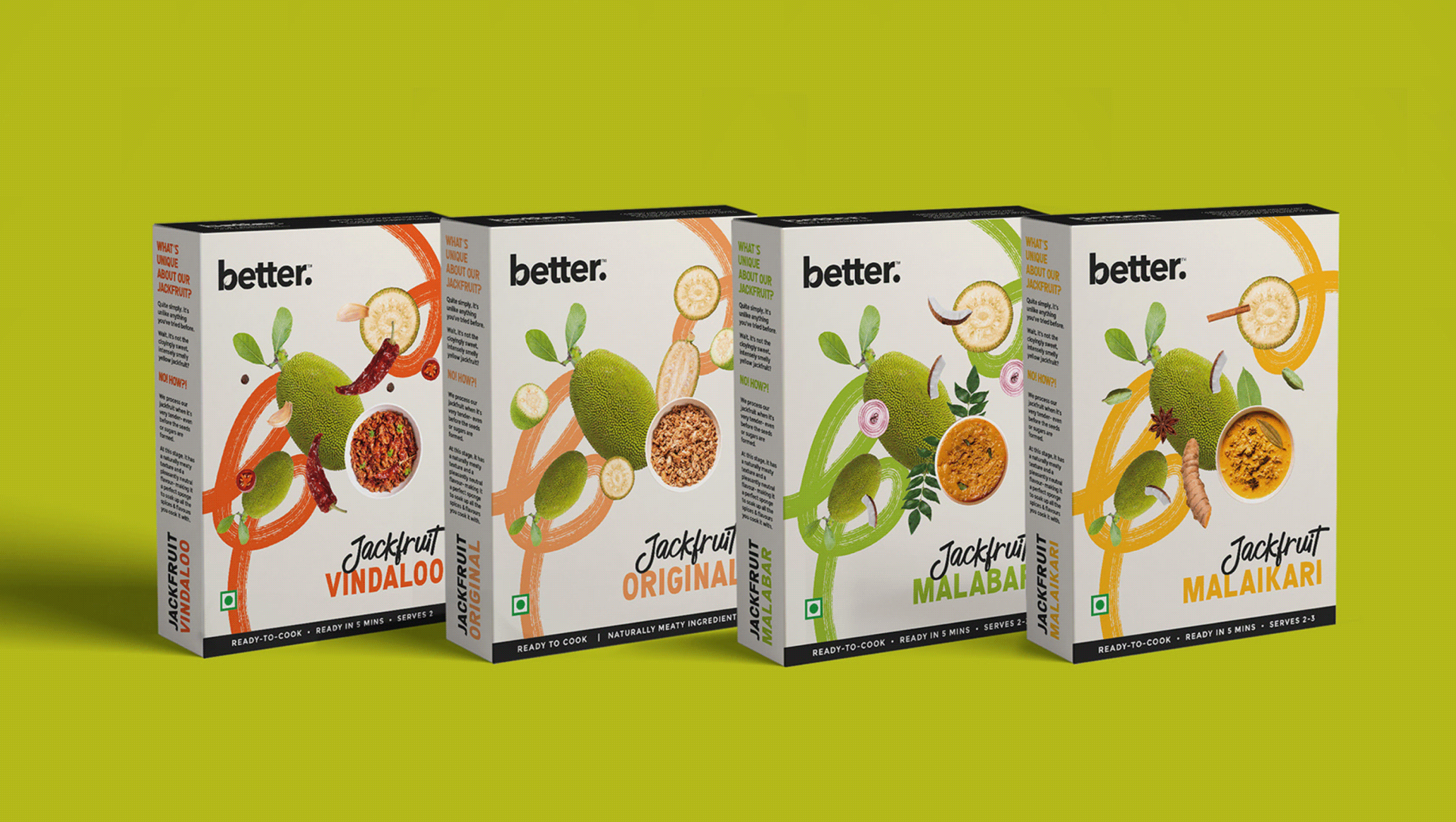
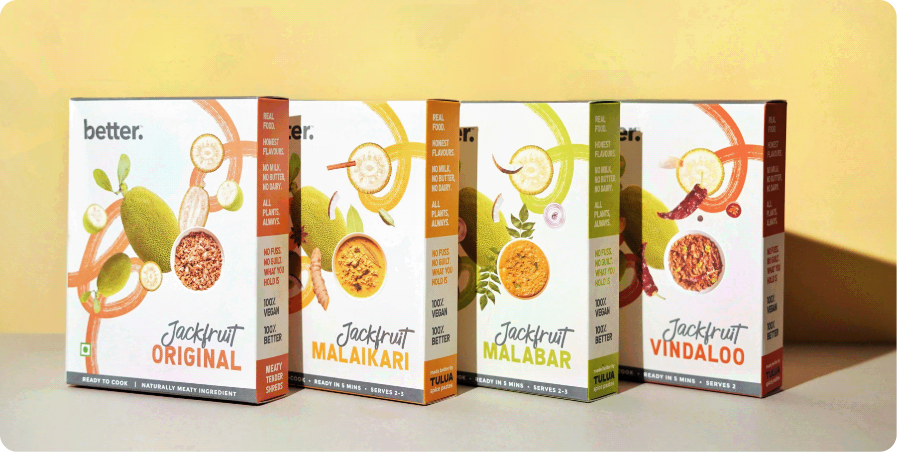
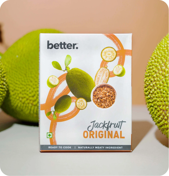
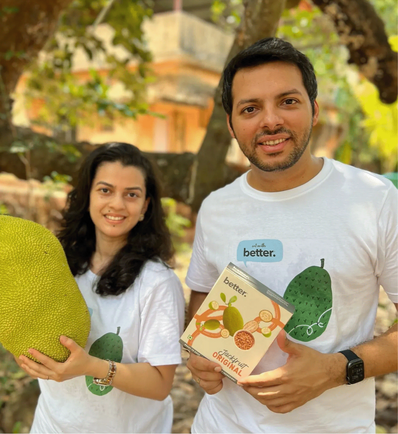
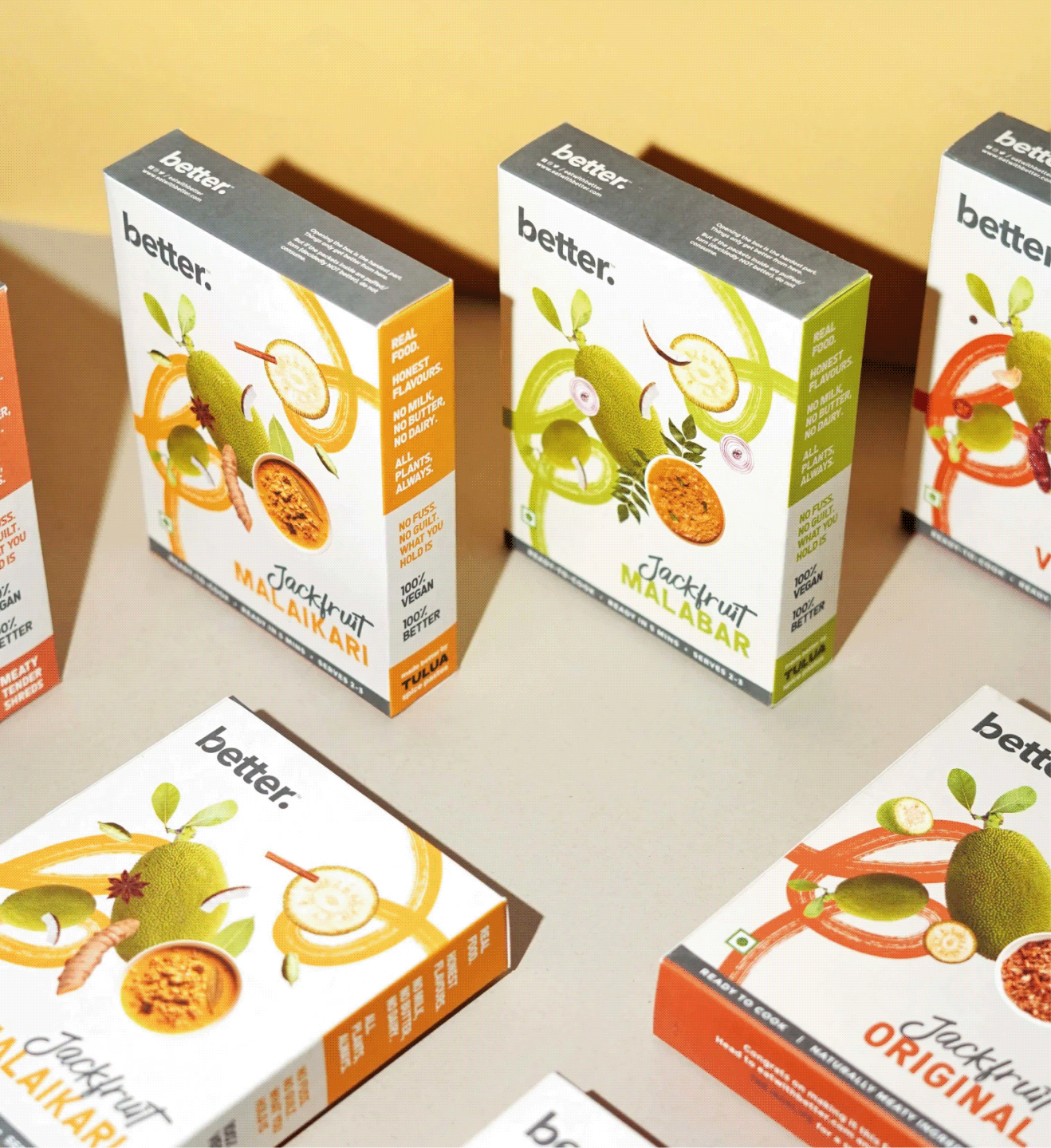
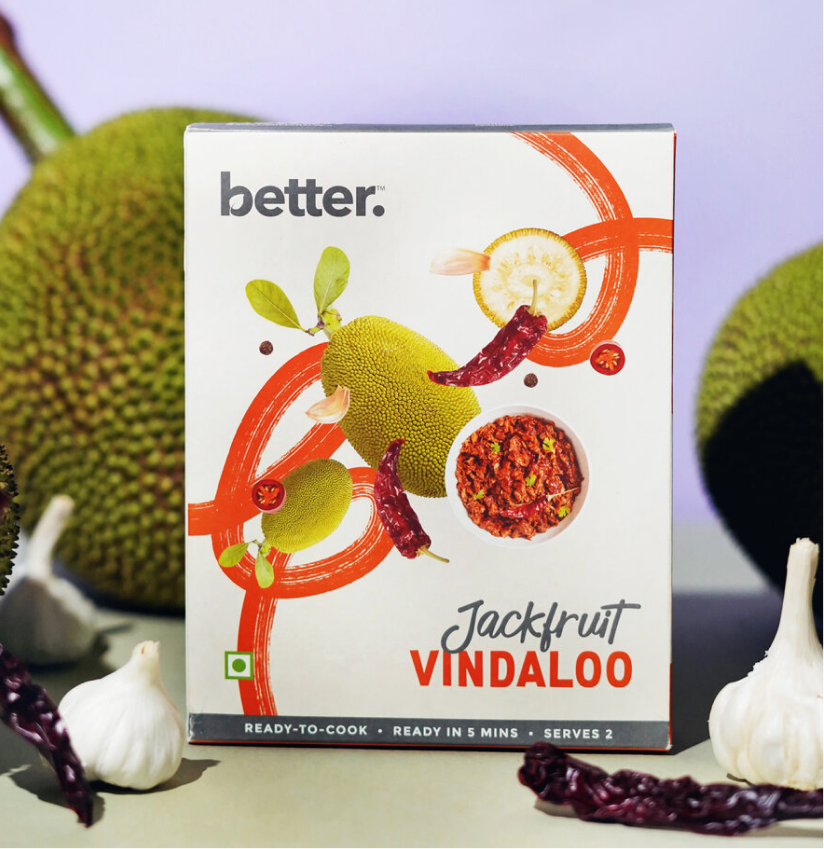
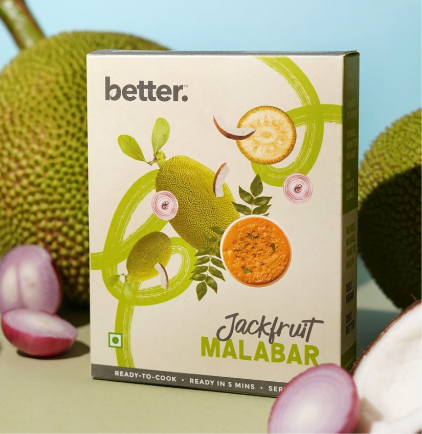
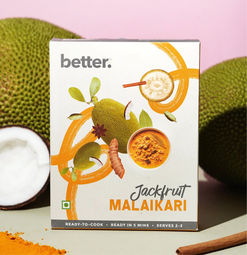
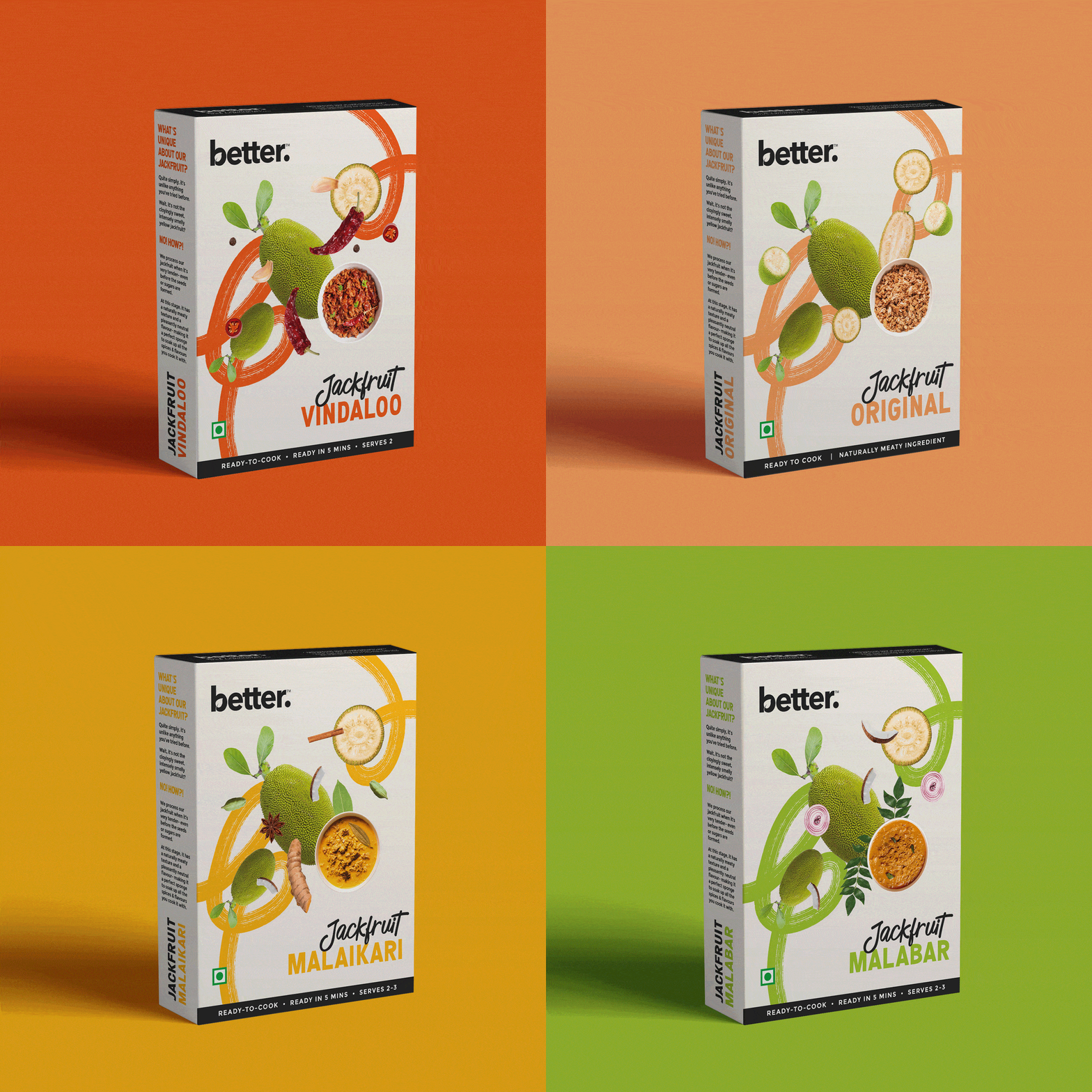
The opportunity wasn’t just to launch a new product; it was to make people curious enough to pick it up in the first place. Working with Karan and Keertida, we built a packaging system that felt vibrant, approachable, and consistent with the current brand language while celebrating local Indian flavours and conscious eating.

The goal was to make local Indian flavours feel joyful rather than aspirational.

THE CHALLENGE

How do you explain something people think they already know?

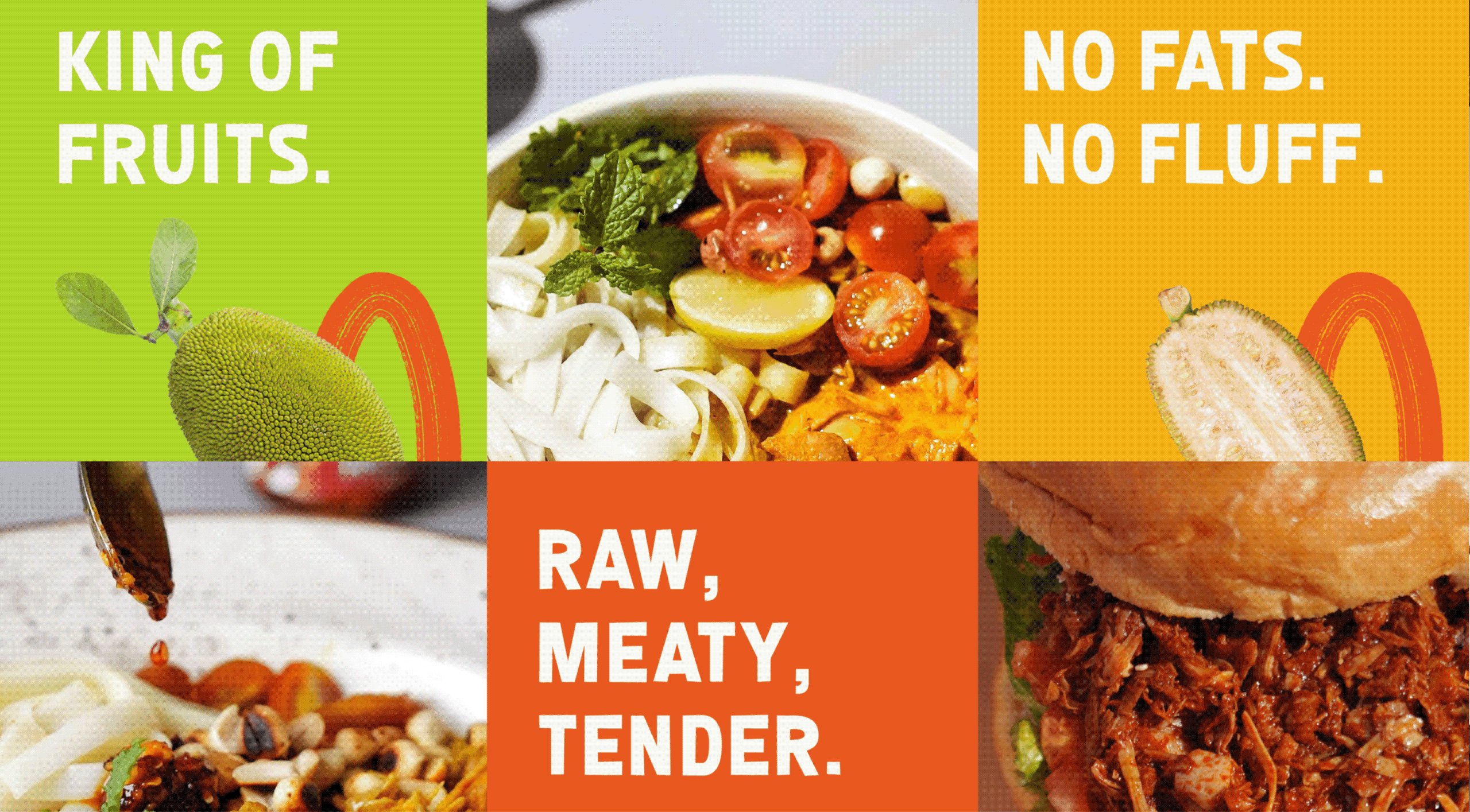
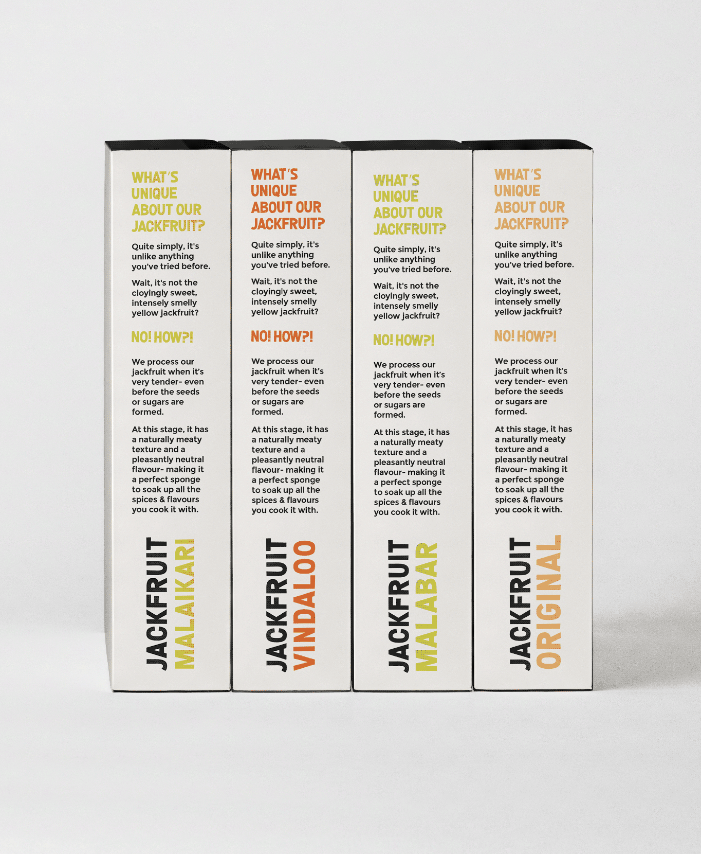
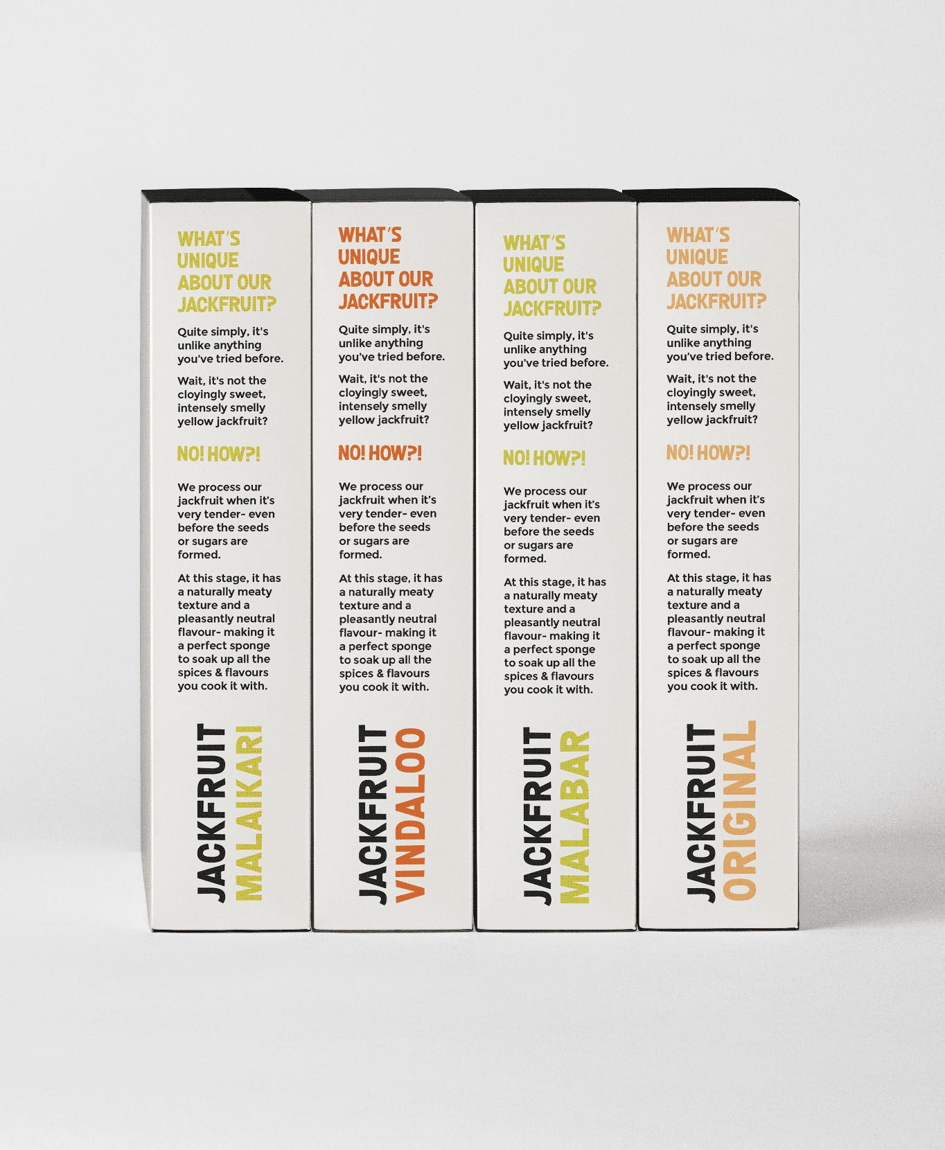
Most people still think of jackfruit as cloyingly sweet, smelly, or intensely yellow. Very few recognise its versatility as a savoury ingredient. 


Rather than simply making the packaging look appetising, we used it to introduce the product, simplify the story, and help consumers understand that this wasn’t the jackfruit they expected.

THE BEST PART

What if the words felt as bold as the flavours?

When introducing an unfamiliar product, the first challenge isn’t the flavour. It’s getting people to pay attention. Typography became one of our strongest tools to challenge perceptions before consumers even picked up the pack.

Confident headlines, oversized descriptors and handwritten details gave the range its voice. Every word had to make jackfruit easier to understand and worth getting excited about.

NEW LAUNCH

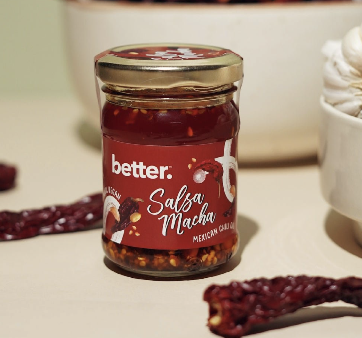
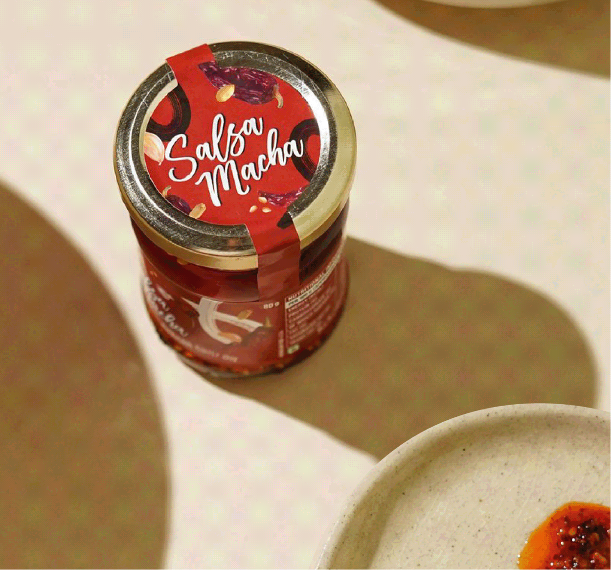
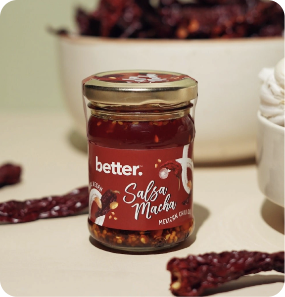
We also extended the visual language to Better’s Salsa Macha, a Mexican chilli oil made with five different chillies, peanuts, and sesame seeds. The packaging celebrates its bold personality through a visual identity that feels rich, vibrant, and full of flavour.

BEYOND THE PACK

Where does the pack stop being enough?

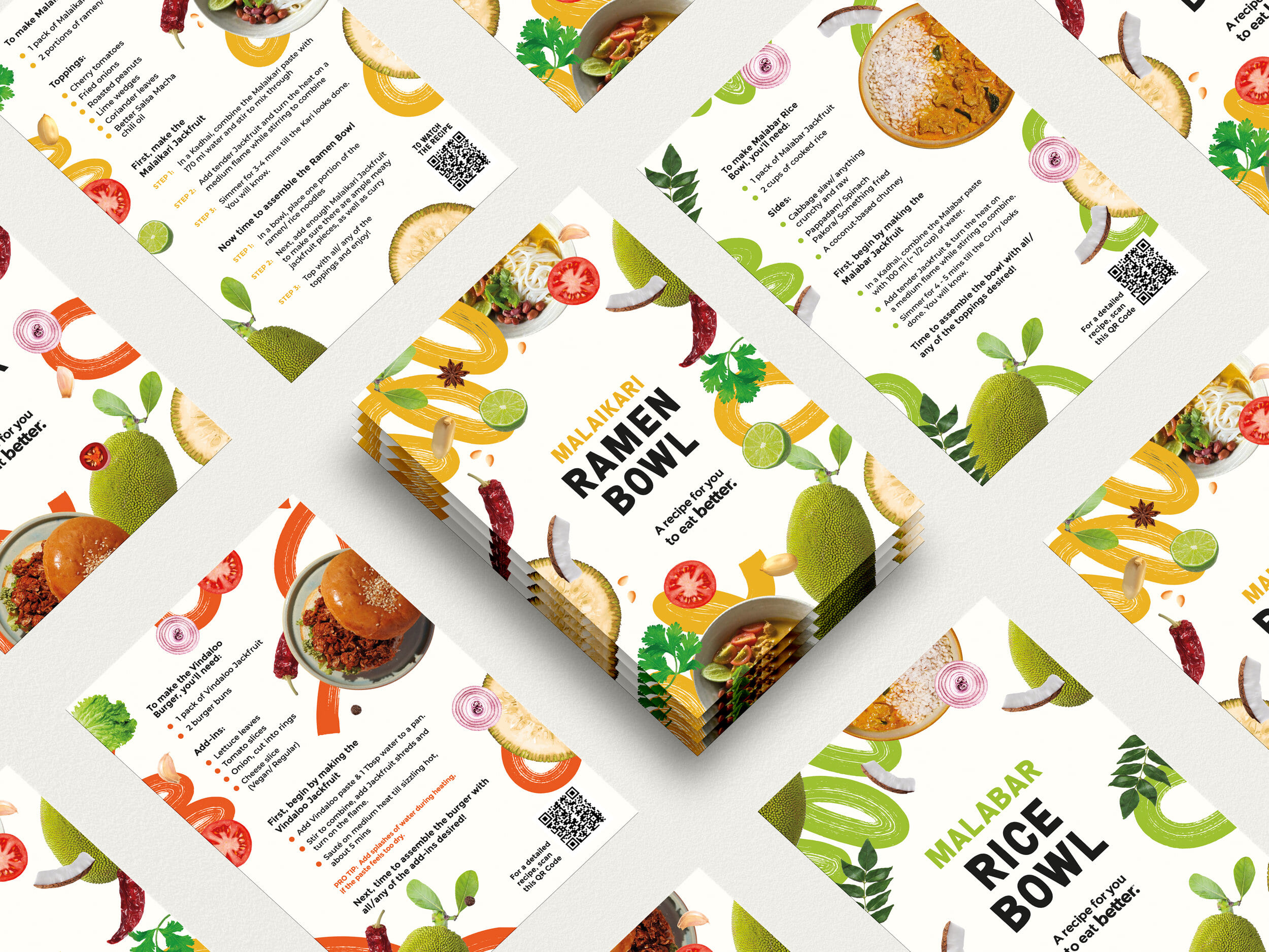
Introducing a new ingredient isn’t only about getting people to buy it. It’s about giving them the confidence to cook it.


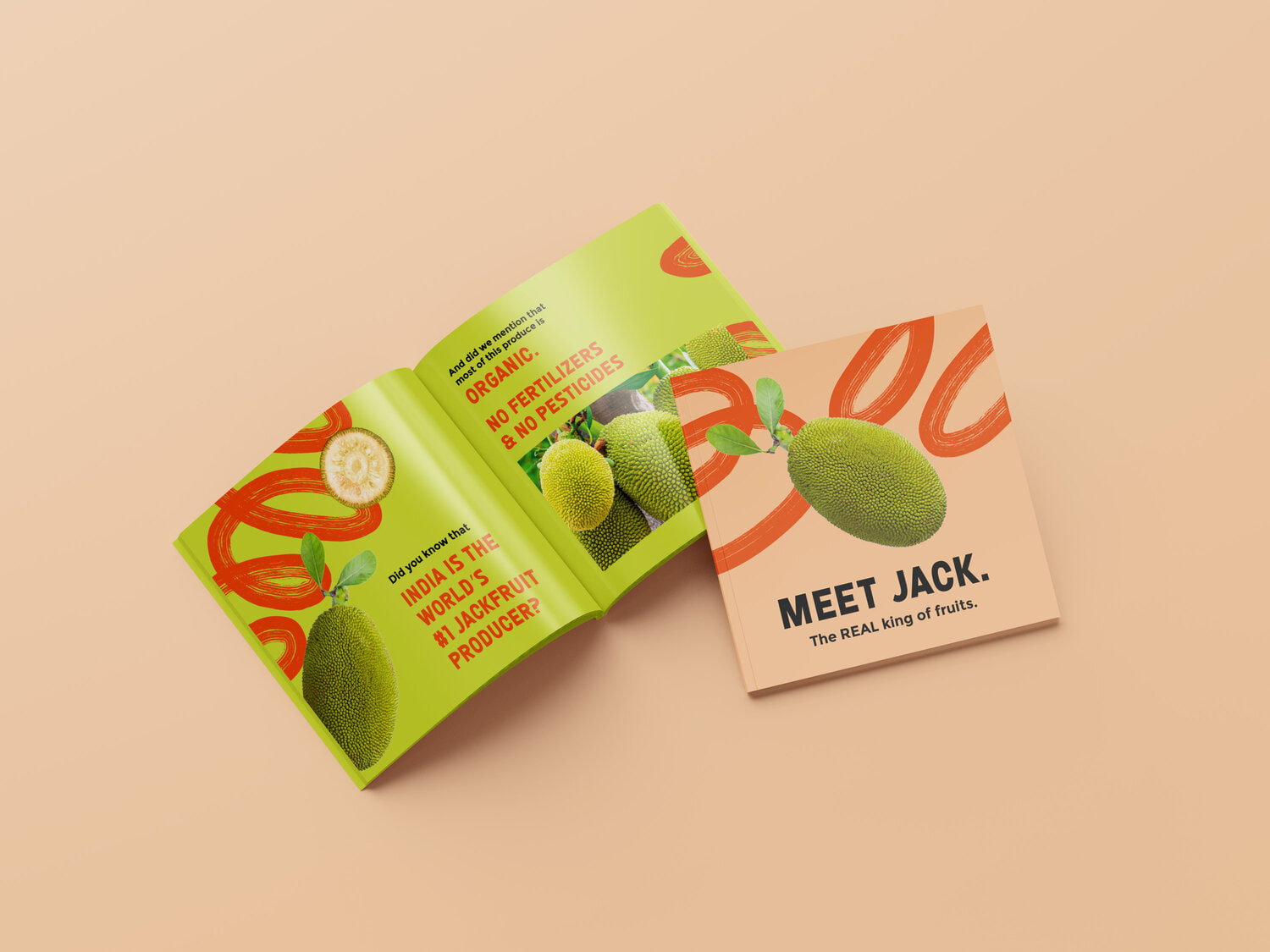
The recipe booklet became a simple guide filled with regional recipes, product stories, and educational snippets, making the journey from pack to plate feel easy, enjoyable, and unmistakably Better.