The Crown Jewel Of Reliance

The Crown Jewel Of Reliance

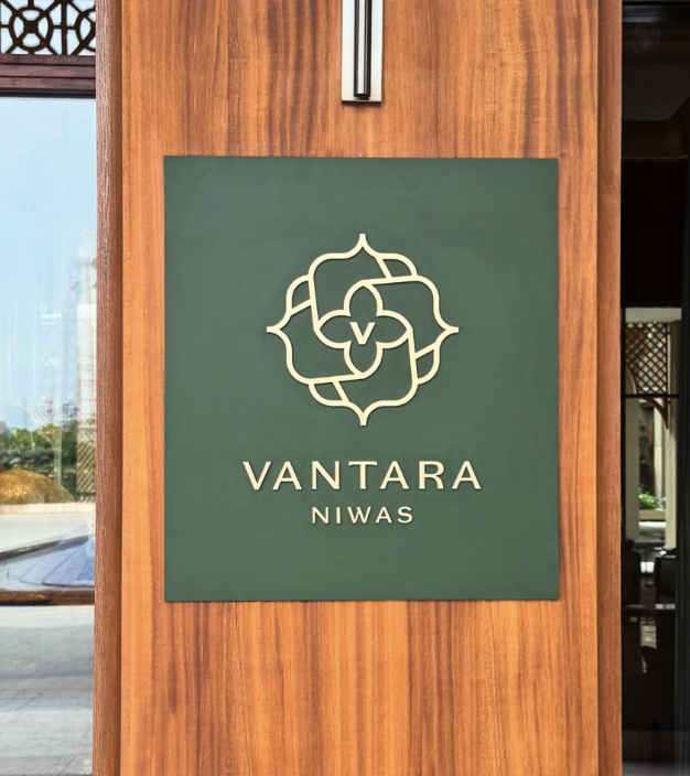
Brand Identity & Visual Extension for Vantara

Fostering Education With Zipply

Fostering Education With Zipply

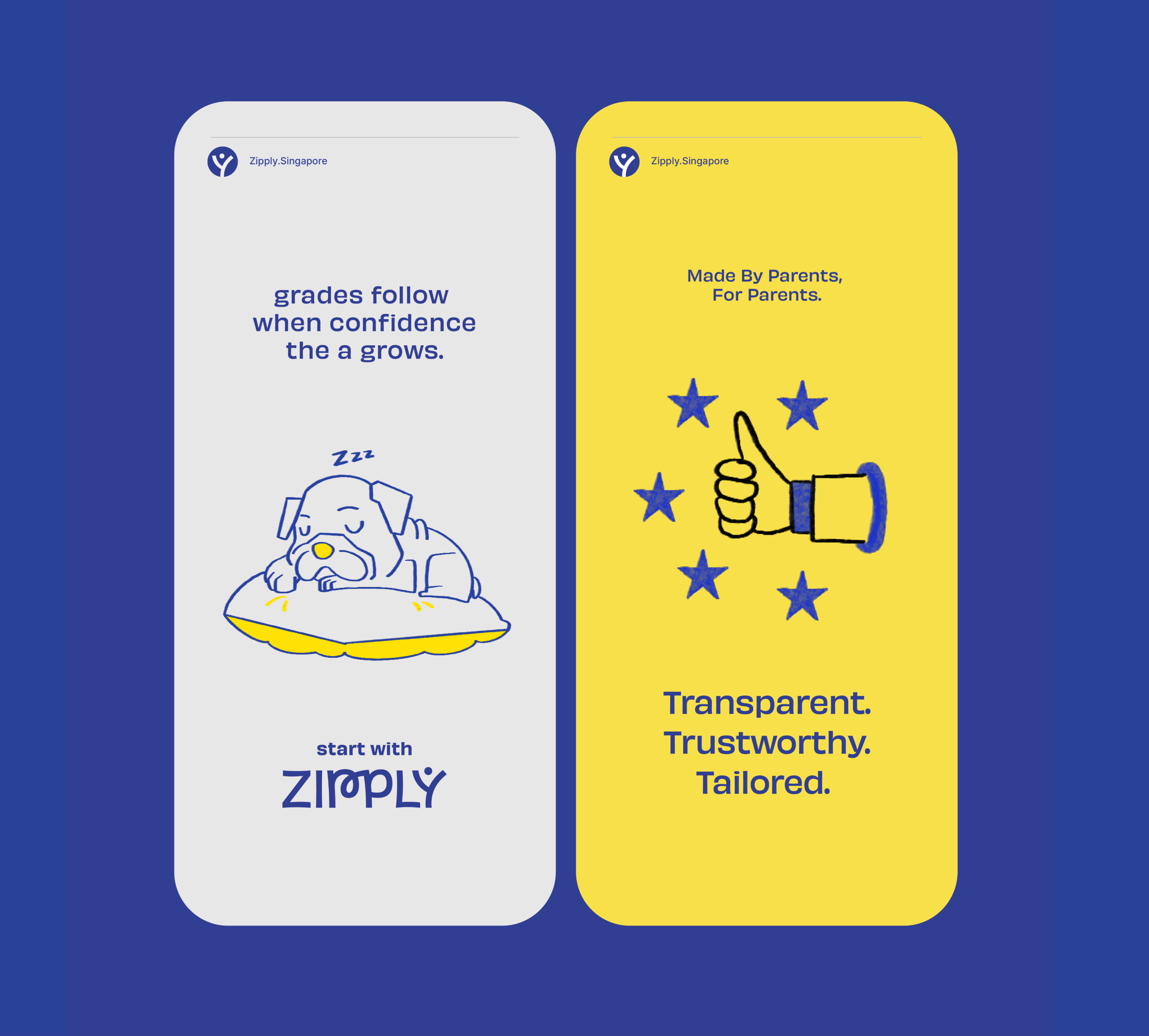
Brand Identity & UI For Zipply Platform

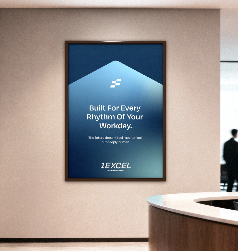
Smart Co-Working With 1Excel

Smart Co-Working With 1Excel

Identity & Visual Extension For A Co-Working Space

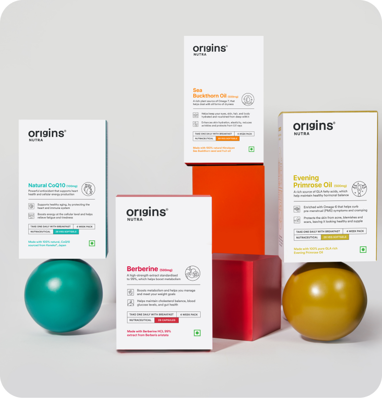
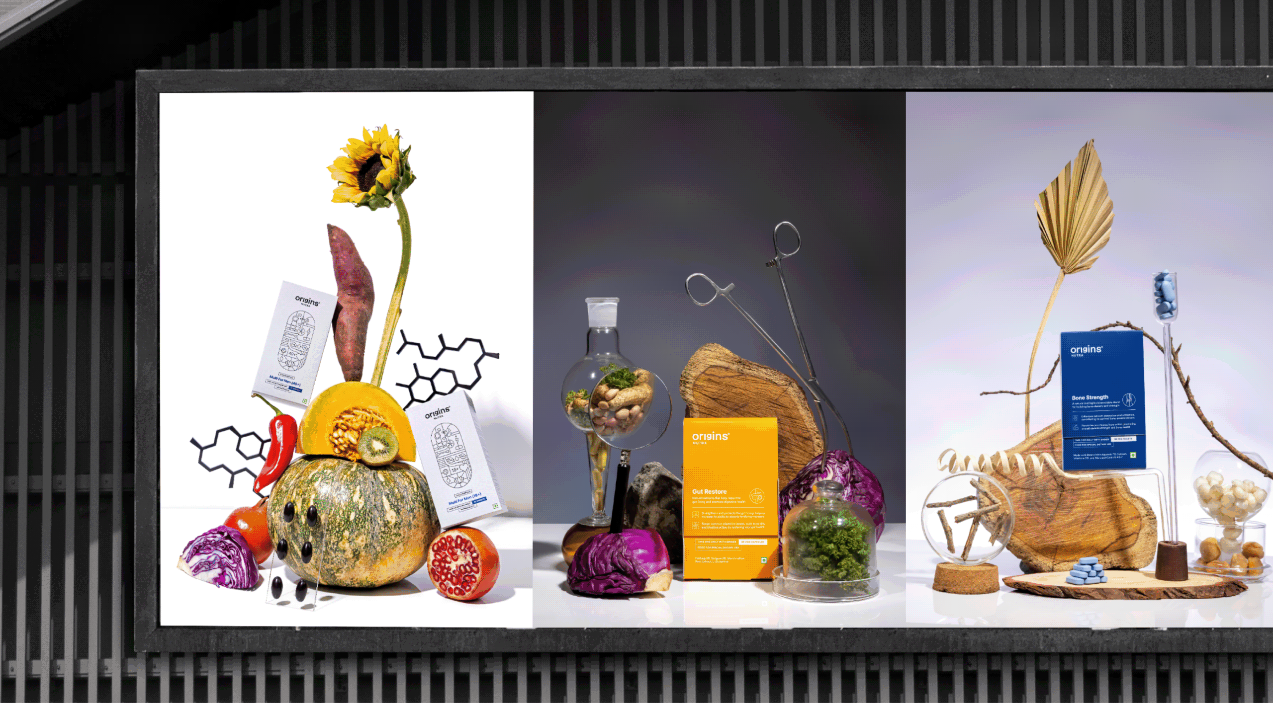
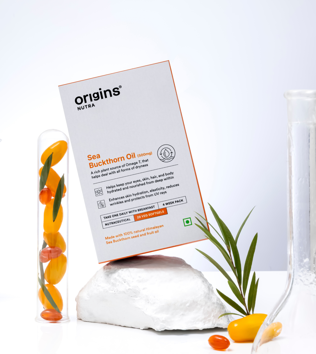
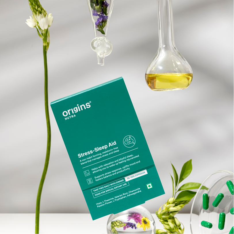
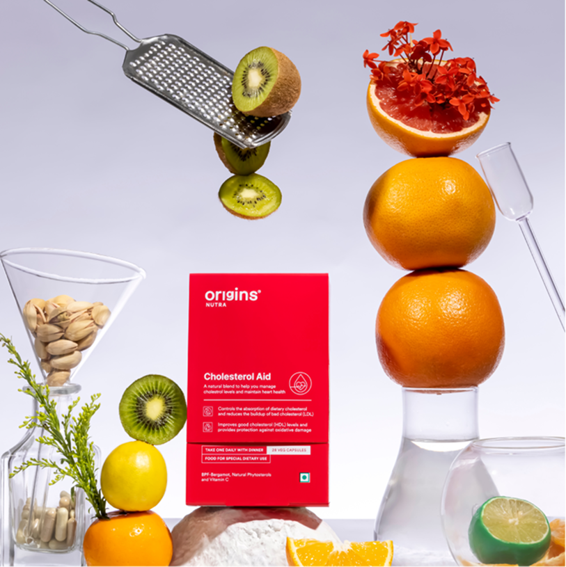
Origins, It Starts With You

Can health be made simple enough to become a habit?

Scope Of Work: Market Research, Brand Strategy, Brand Identity, Product Packaging, Art Direction and Web Design.

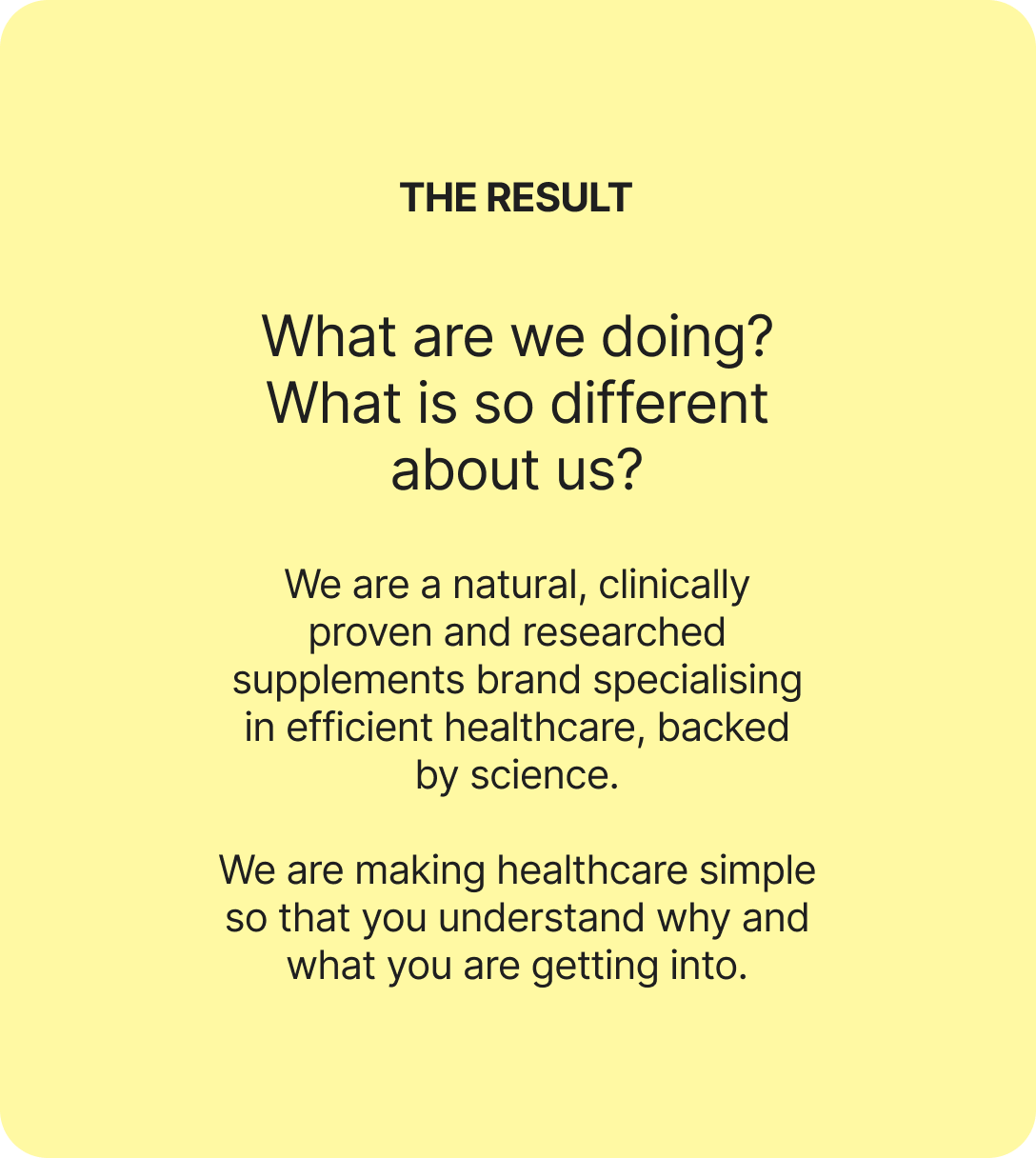
Is it just us, or does every supplement feel like a gimmick? Every nutraceutical brand says the same three things. Good for you. Clinically proven. Backed by science. So, how was Origins different?

We went at it from the other side with Surya. If supplements are meant to be preventive rather than curative, can they actually deliver on that? And what would a brand look like if it took the question seriously?

The goal was to build something easy, functional, and truly habit forming. Health, as simplified as we can follow.

We started questioning everything to build the origin of brand Origins.
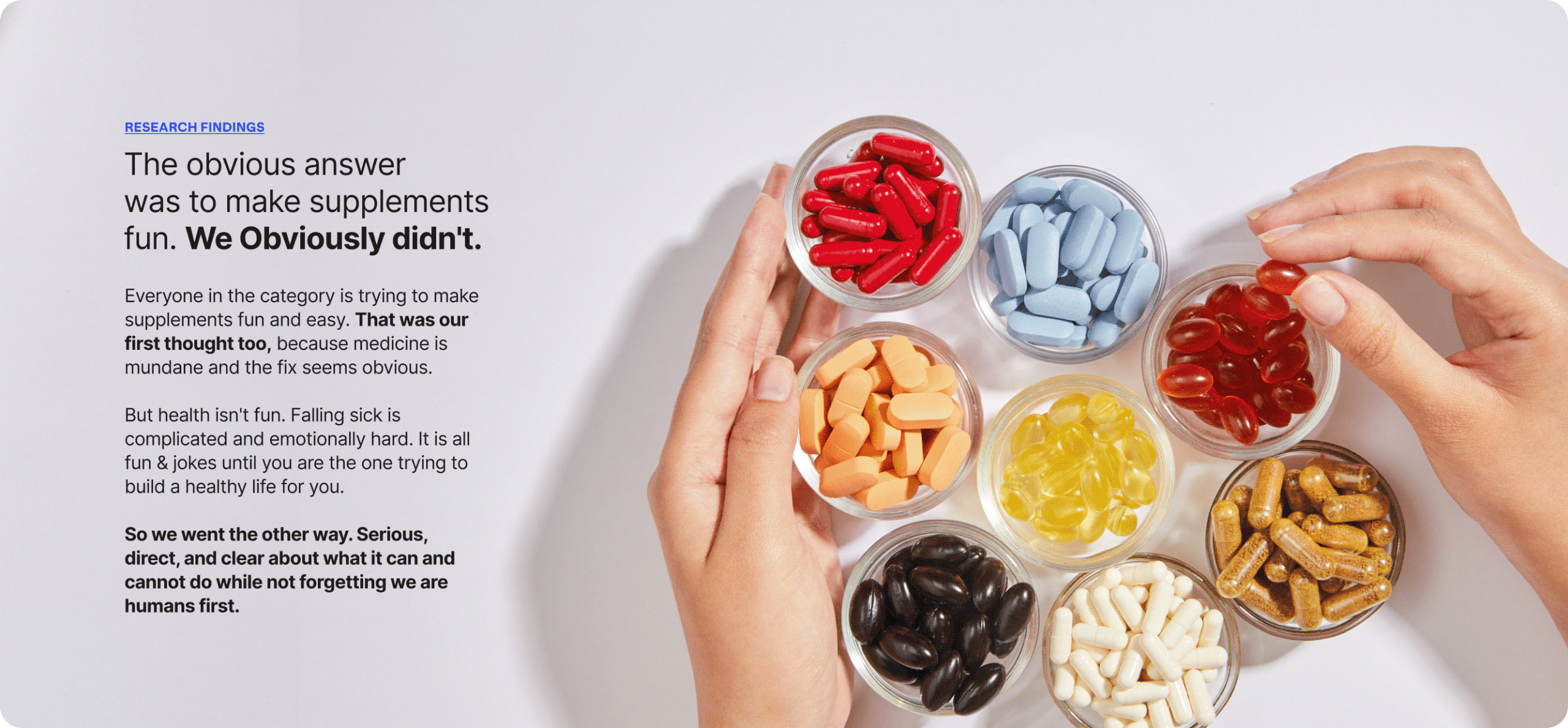
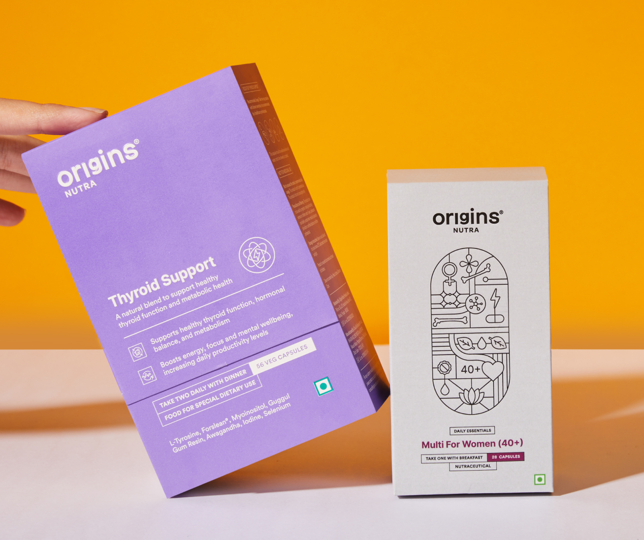
RESEARCH FINDINGS

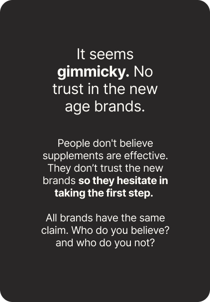
A category full of claims and empty of trust.

We spoke to people about their relationship with health and how they actually live with it. What they take, what they’ve quit, who they ask before buying anything.

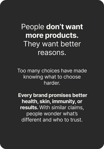
Given the age we’re in, the findings surprised us. Information is everywhere and almost none of it is verifiable. There’s no source anyone genuinely trusts. Somewhere in all of that, people stopped believing any of it.
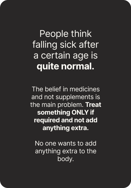
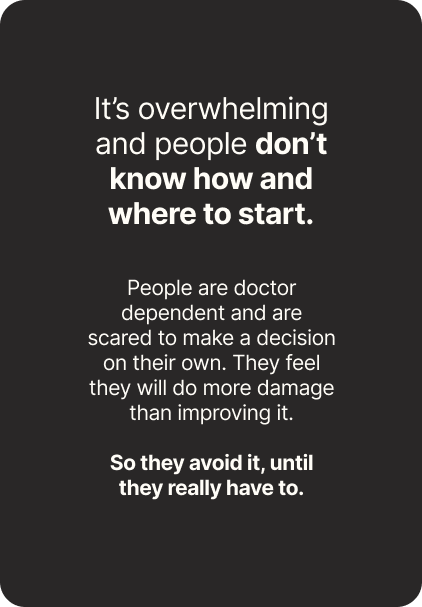
What if it stopped being a supplement brand?

Everyone is chasing a health goal. Eating better, moving more, losing weight. Nobody finds it easy. It’s complicated, and intimidating enough that most people give up in the first month.

Origins stopped being a supplement brand and became a coach. Not a cheerleader. The kind of coach who tells you what you need to hear, gives advice you didn’t ask for, and stays with you through the boring middle part.

Simple. Reliable. Built For Better Health & Everyday Life.
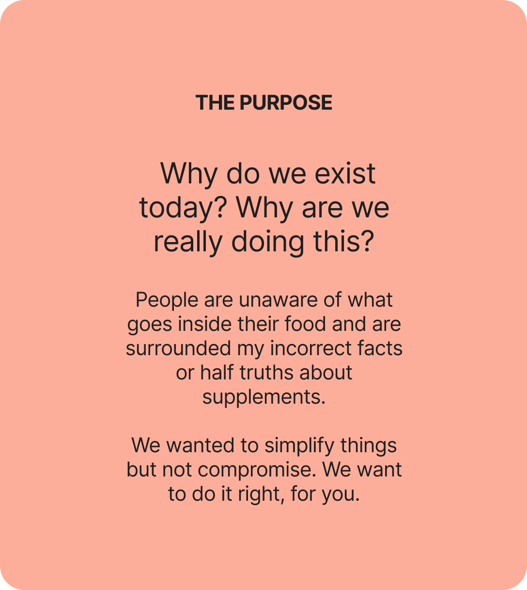
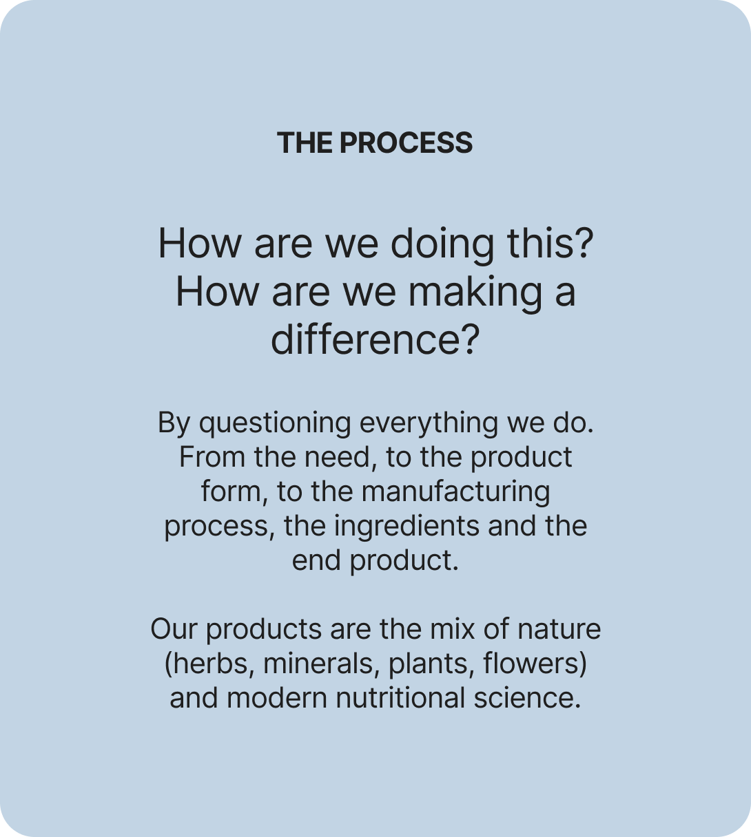
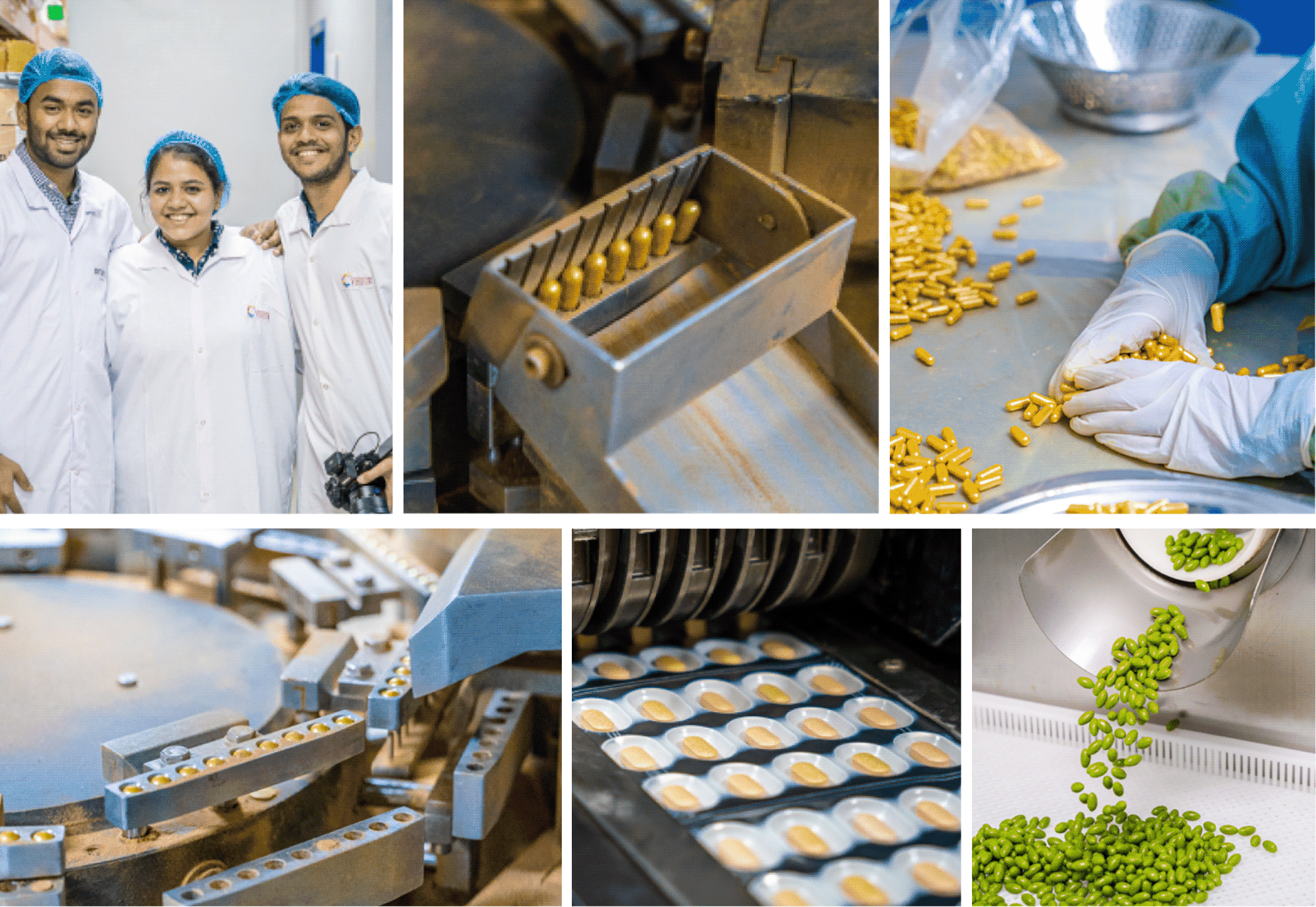
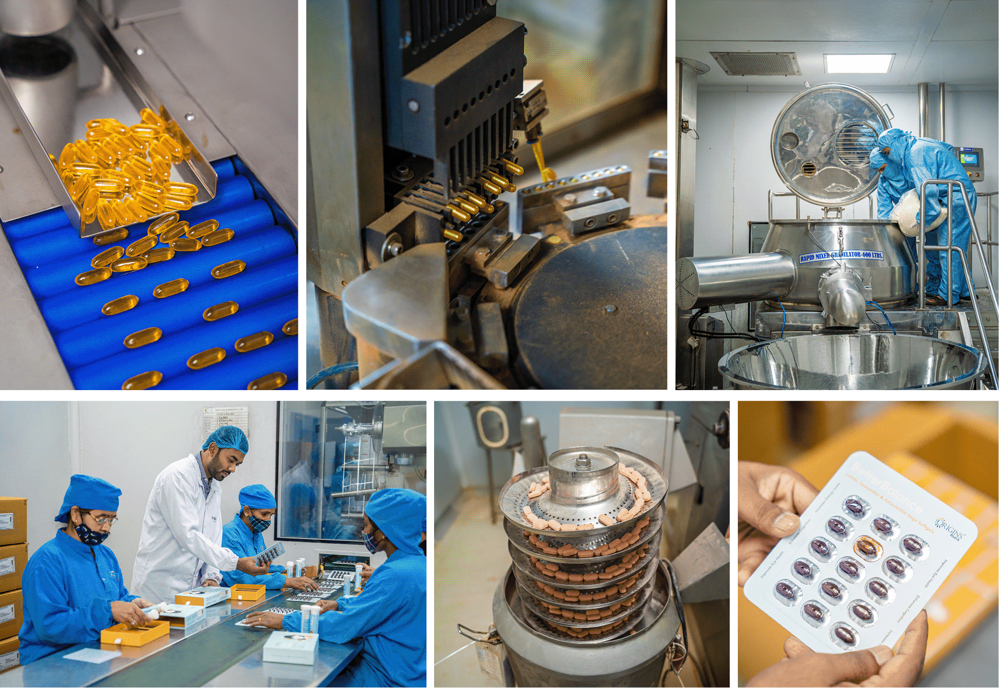
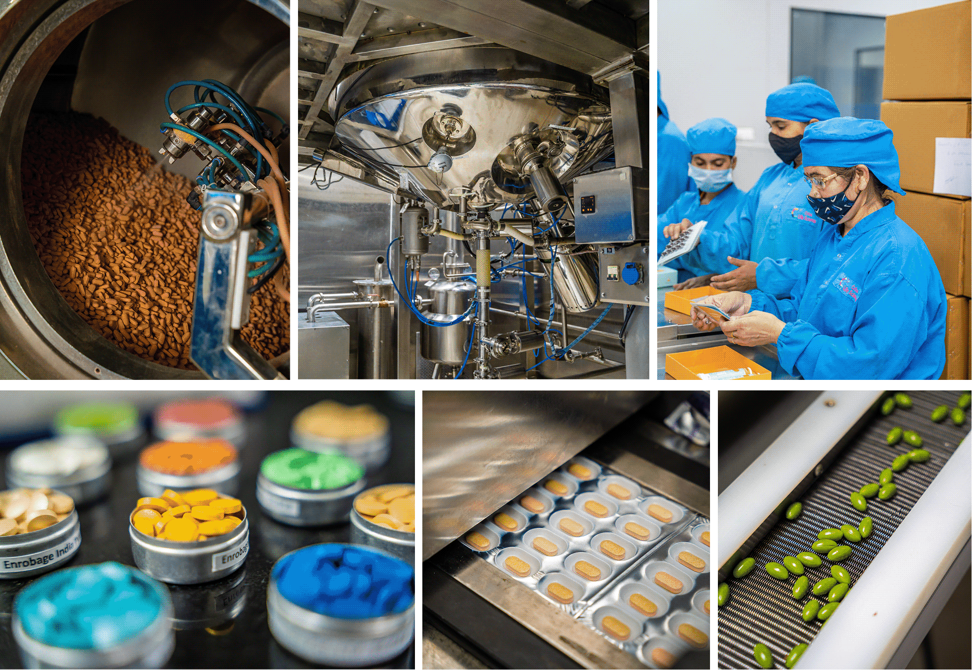
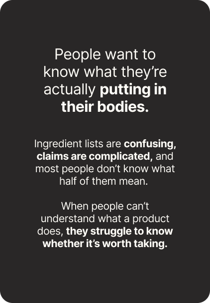
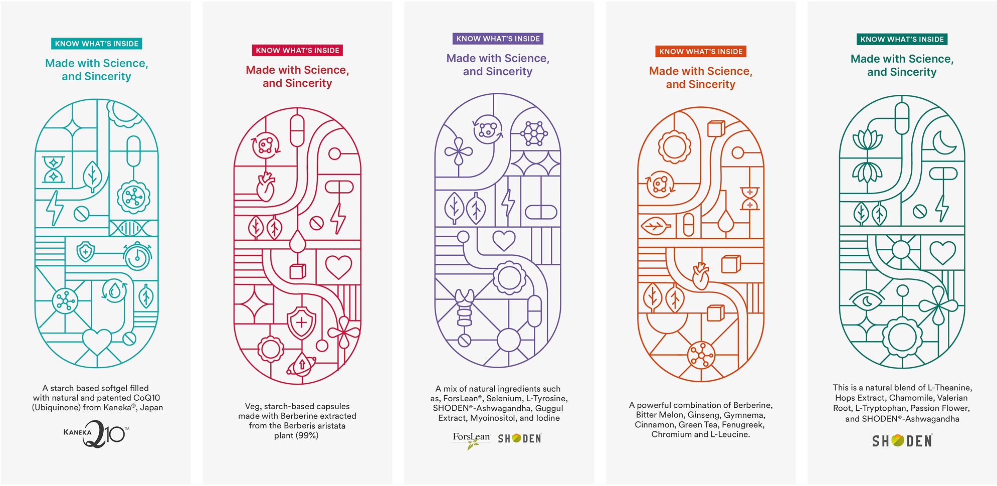
We addressed the most asked: What is really inside?

We built the entire brand on the basis on what’s inside the pill since everyone is skeptical about adding anything extra.

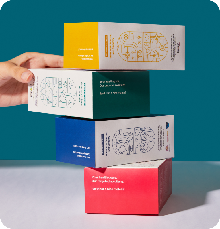
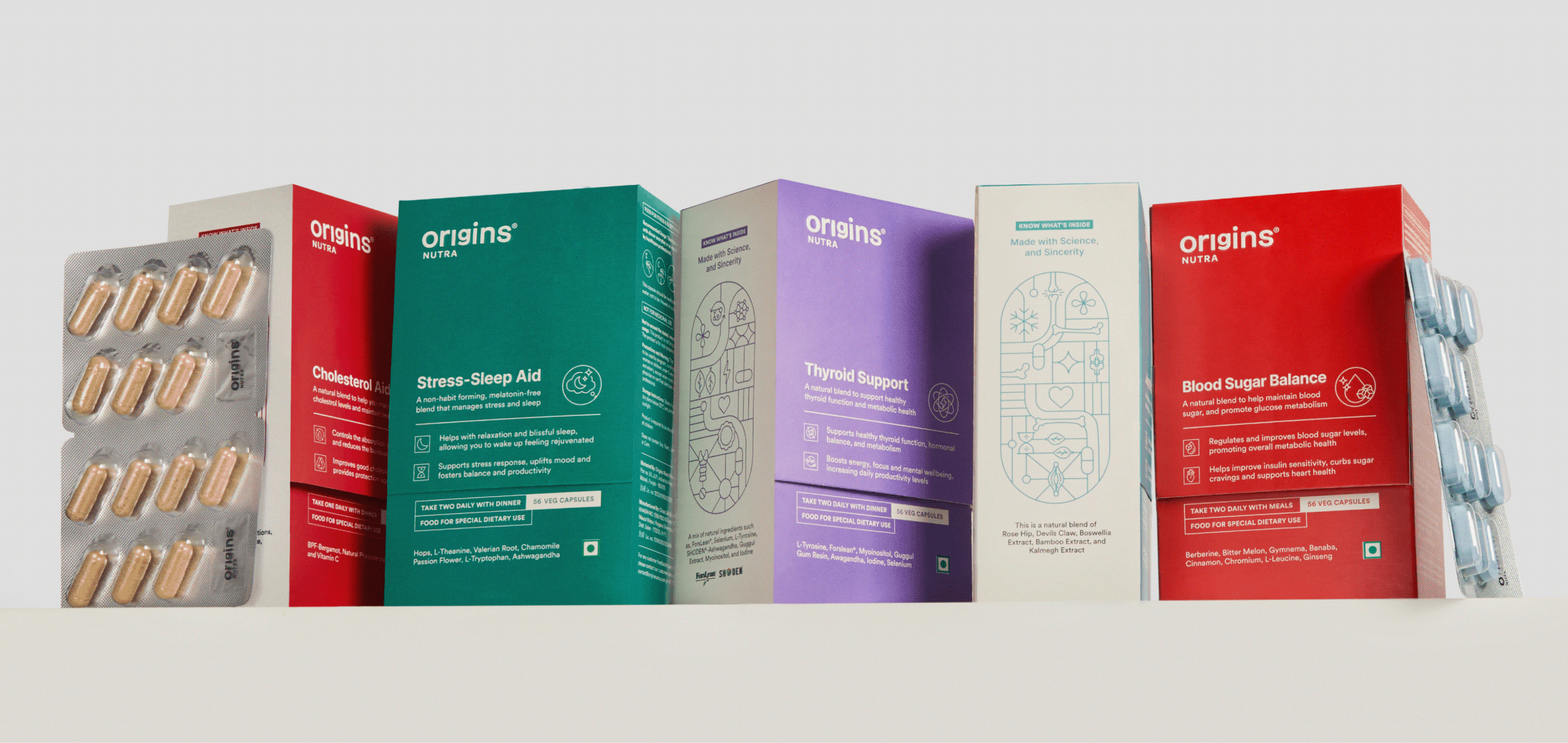
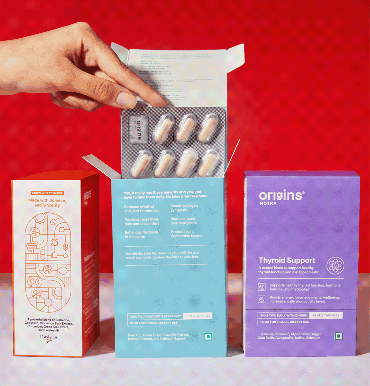
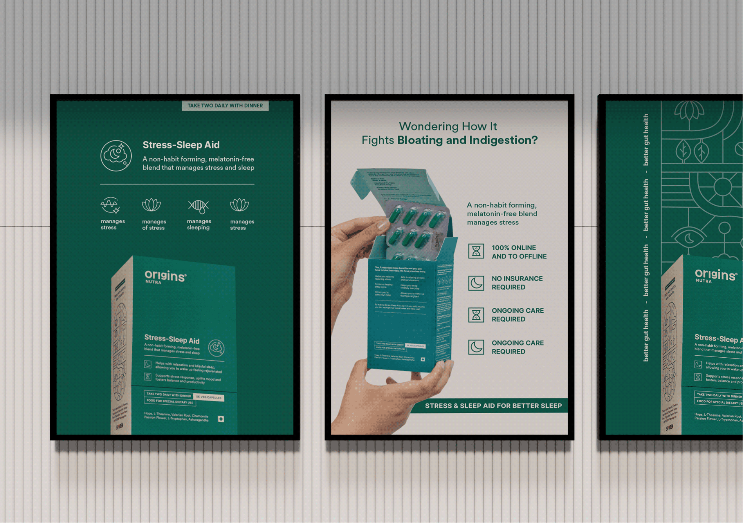
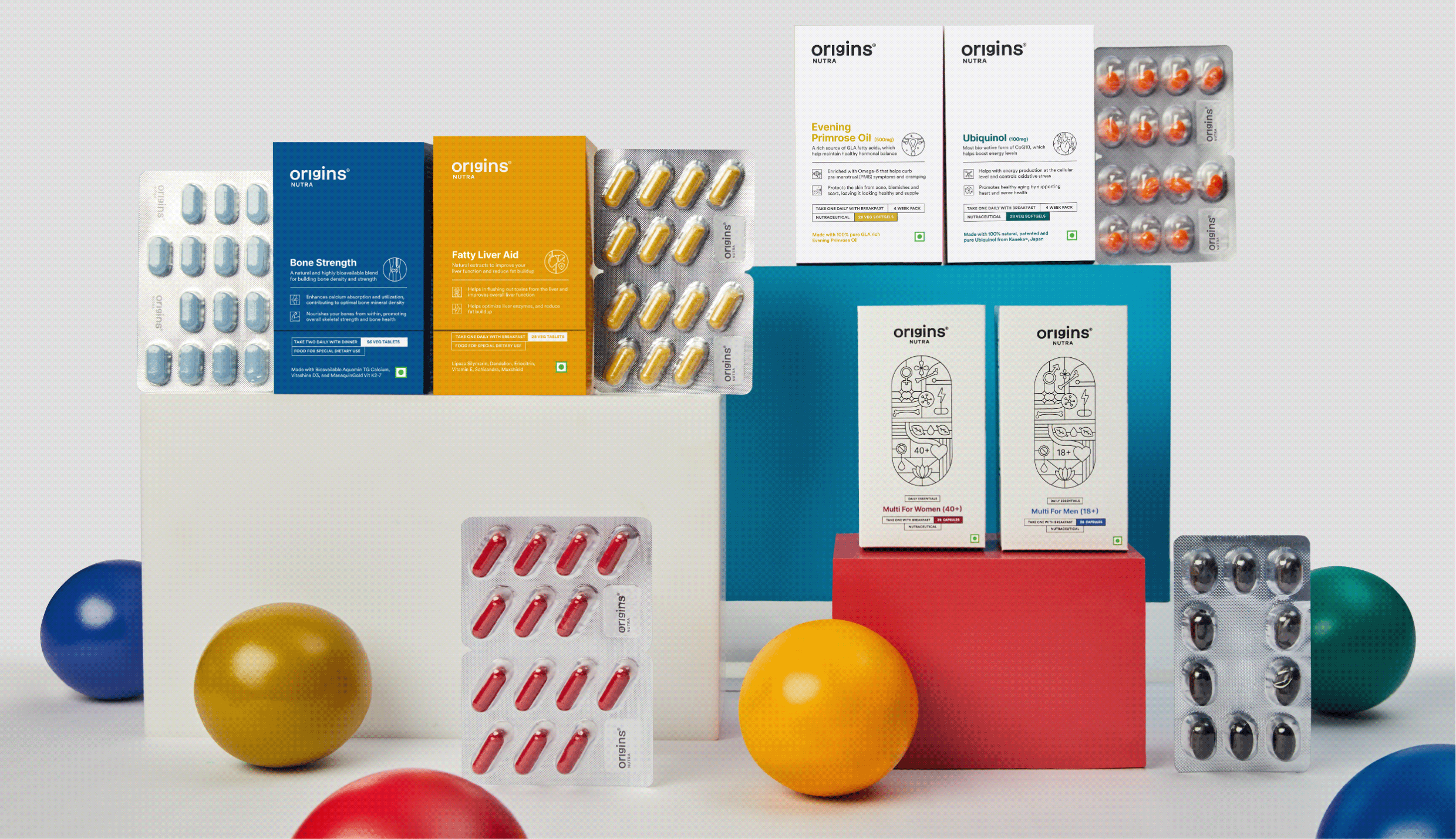
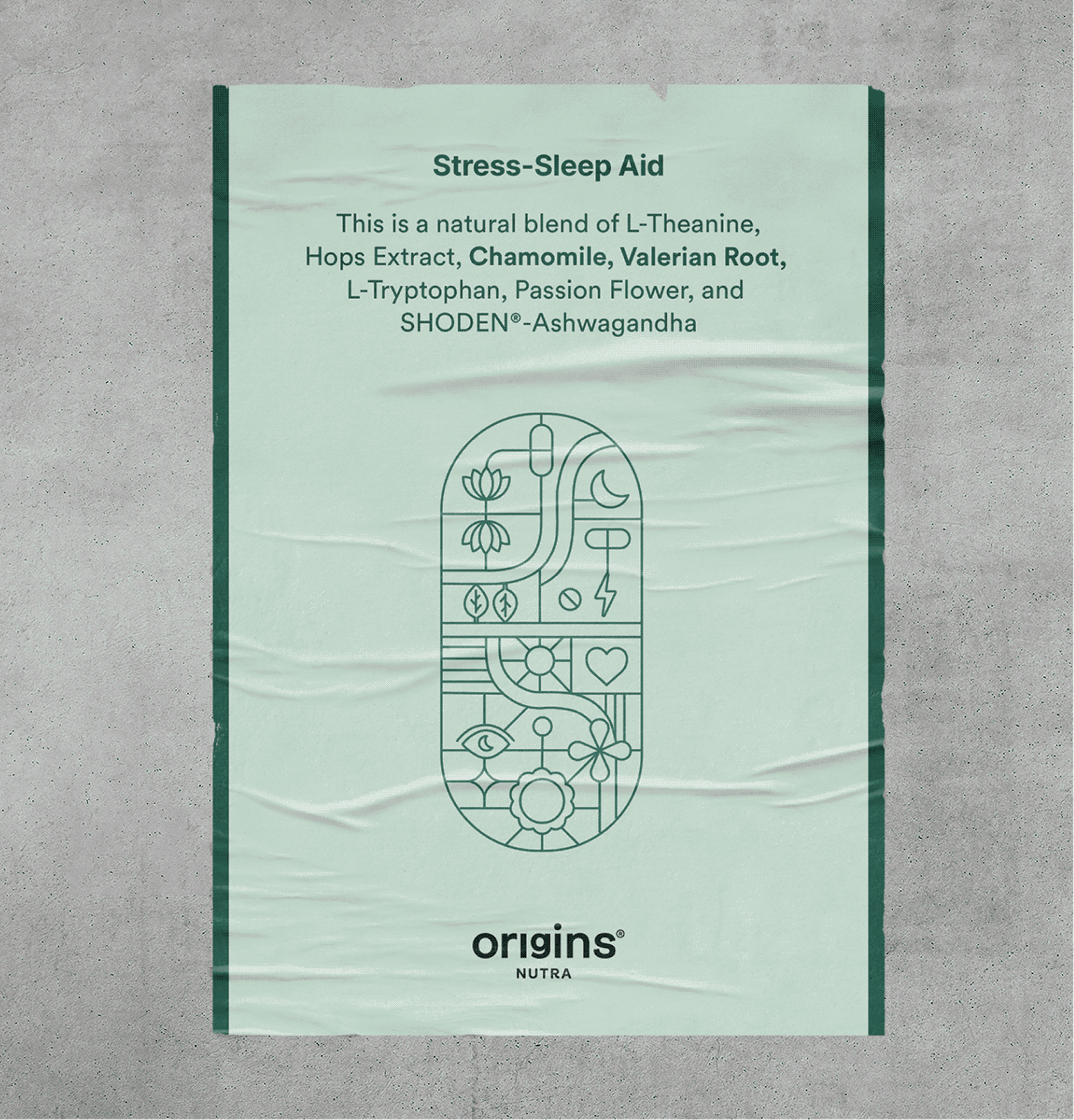
Each Illustration is a combination of benefits, ingredients, brand values and product details fit inside the shape of a pill.

This became the foundation of our visual language, strengthening our promise of honesty and transparency.
THE BRAND

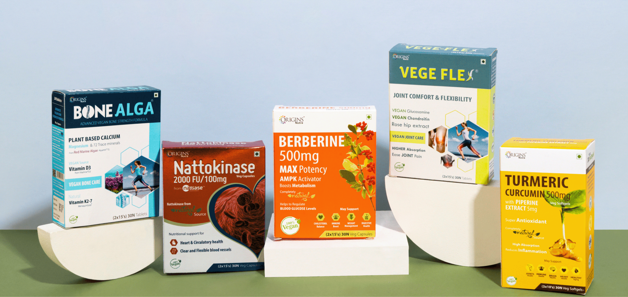
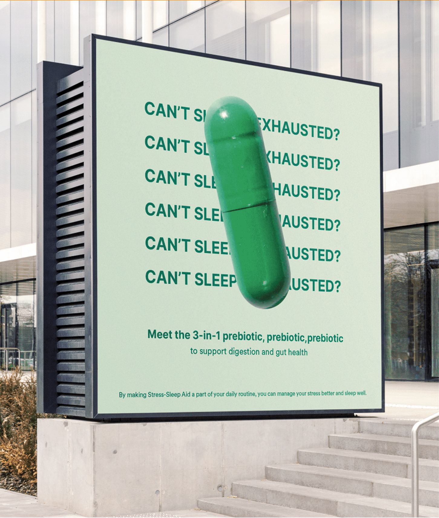
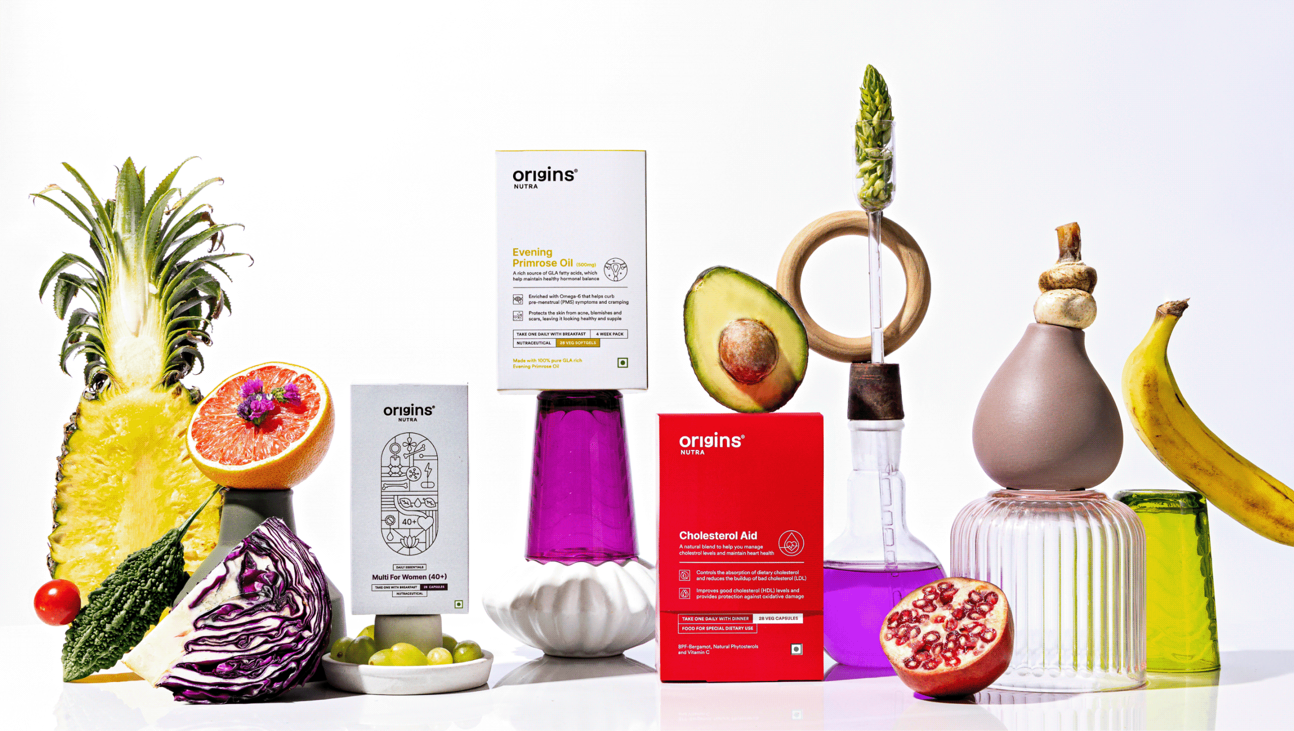
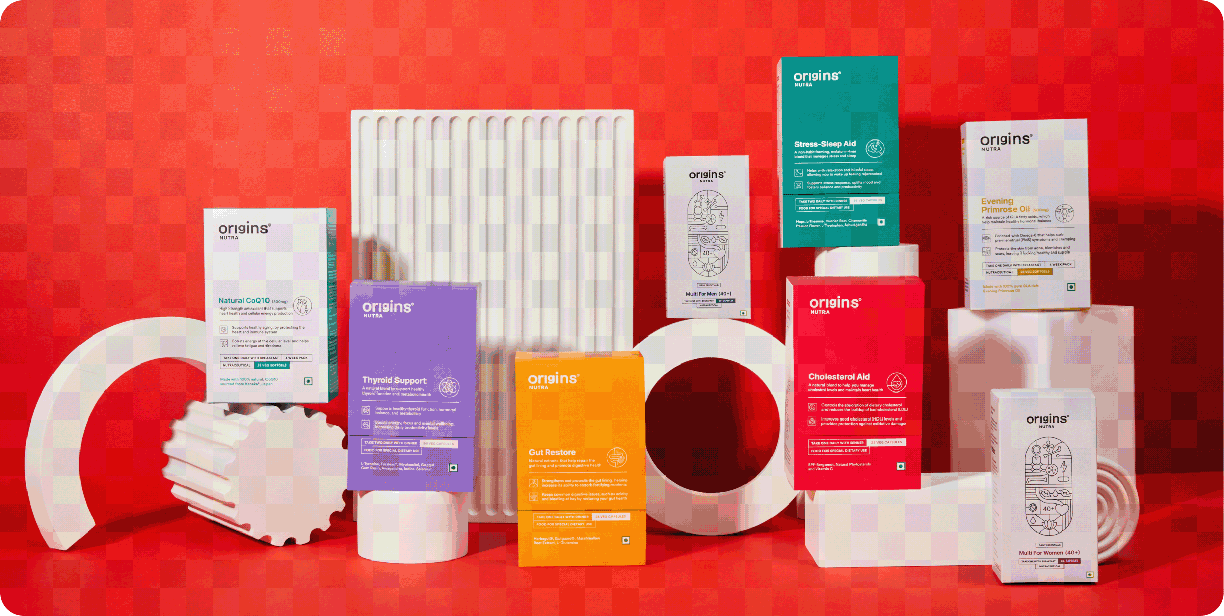
Introducing Origins Nutra 2.0

Preventive care isn’t just important, it’s essential. It truly starts with you, and at Origins, we’re with you every step of the way.

Everyone is chasing a health goal in their life that’s just how we humans are – eating better, moving more or losing weight. But being healthy or reaching that goal is not easy. It’s hard, complicated and intimidating.
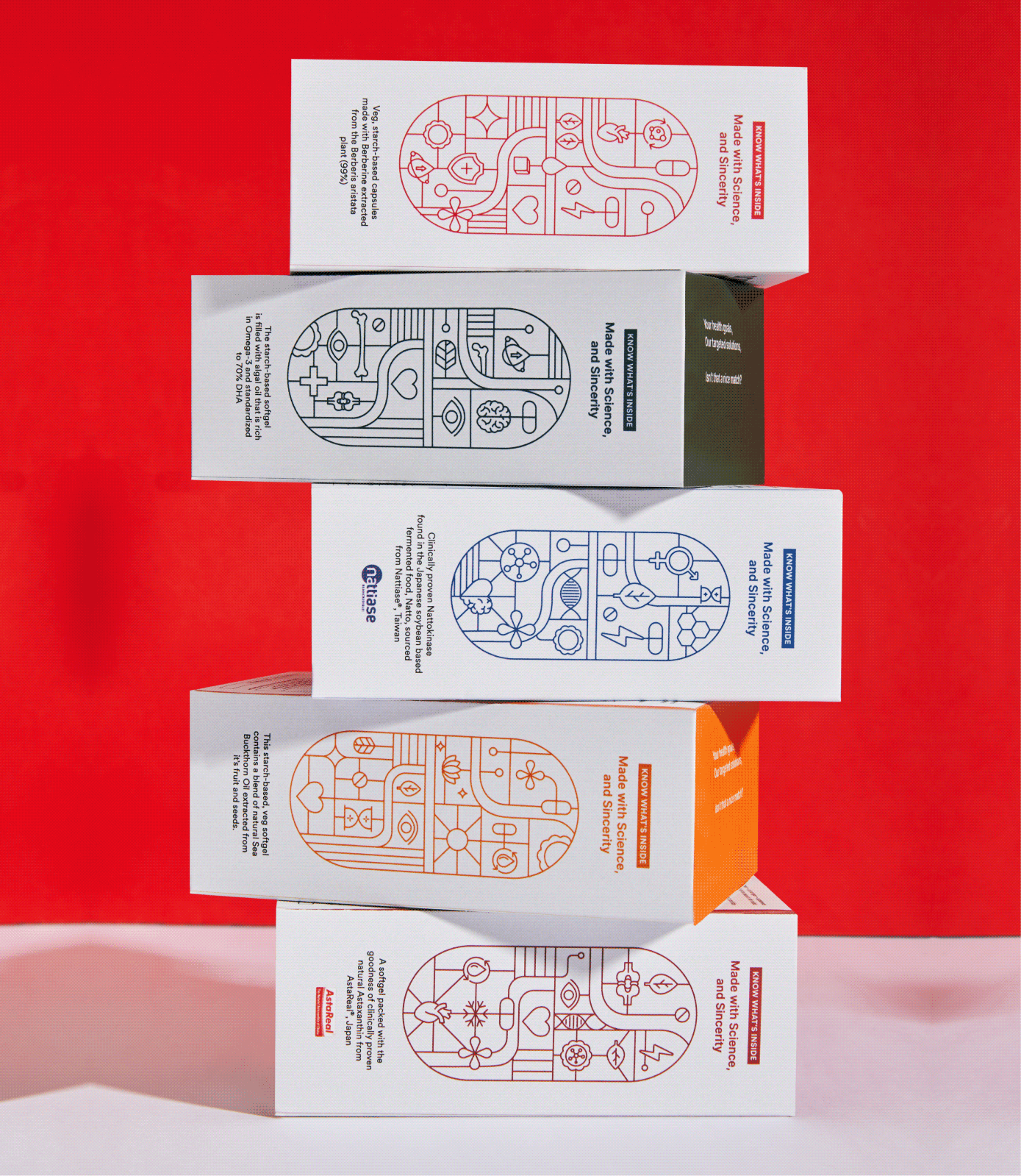
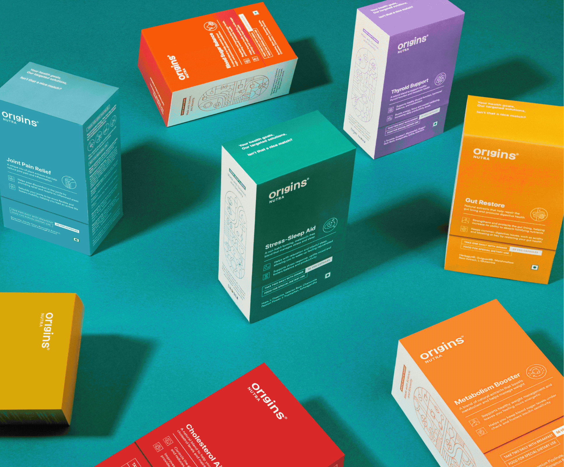
Starting is the hardest part, so we designed the box to do some of the coaching.

A new health routine is overwhelming, and most people quit before the first box is finished. So we built the coaching into the packaging instead of leaving it to the label.
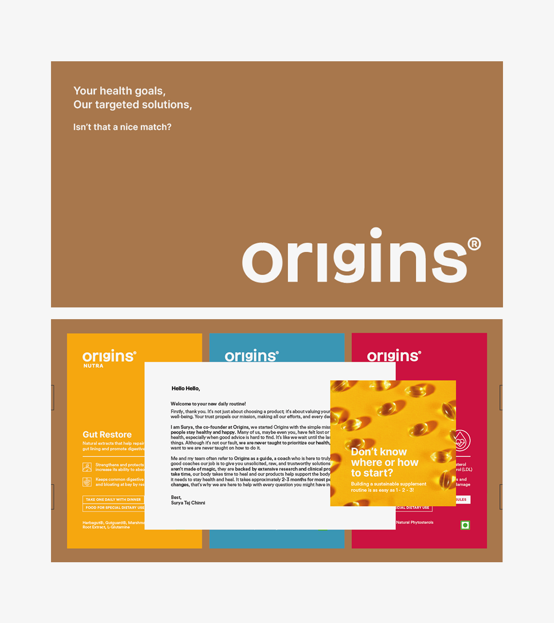
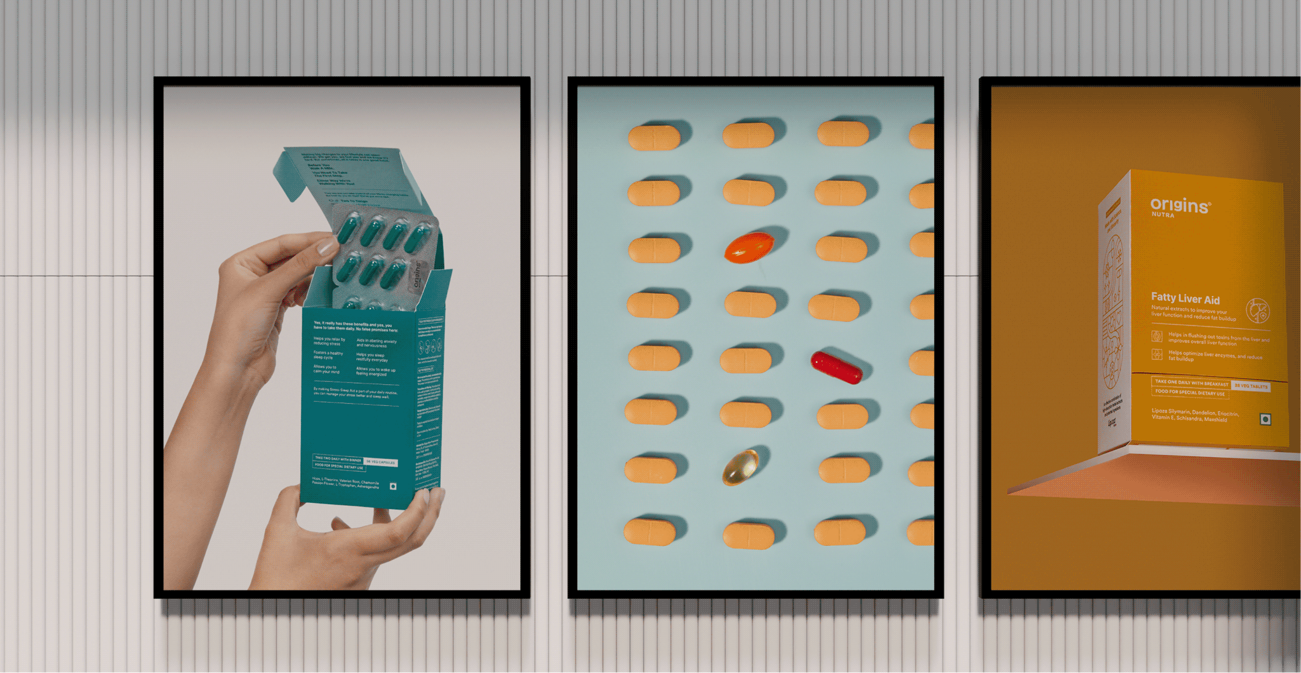
The products arrive in a brown corrugated box that opens to a founder’s note and a short brochure on how to begin. Both set expectations before the first capsule.
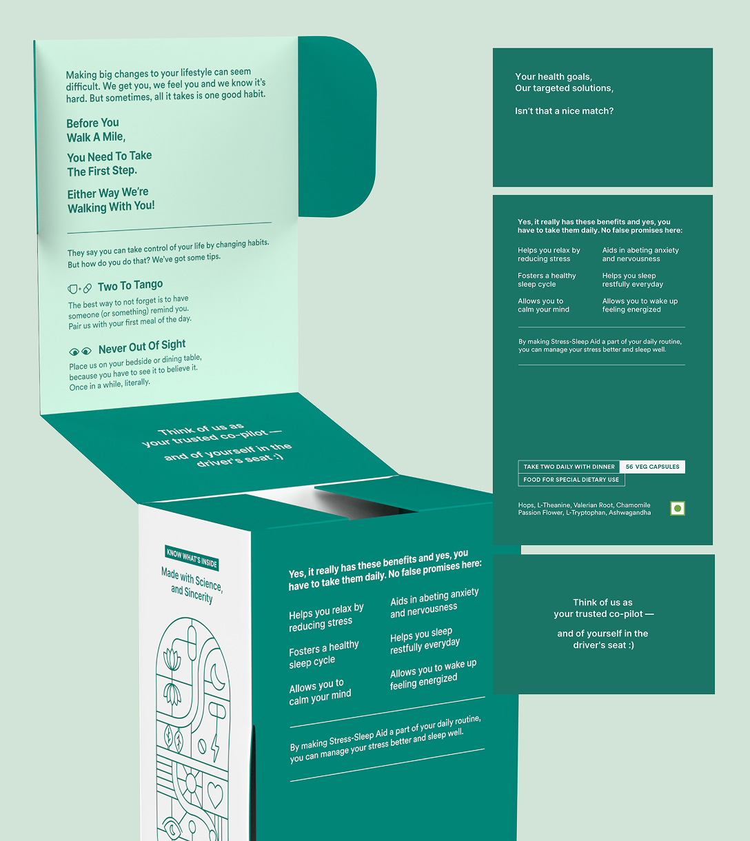
Habit formation is what makes the difference. Why consistency matters, what makes it easier, and clearly stated benefits so you know what to expect and roughly when.
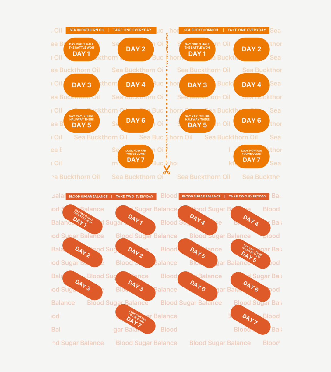
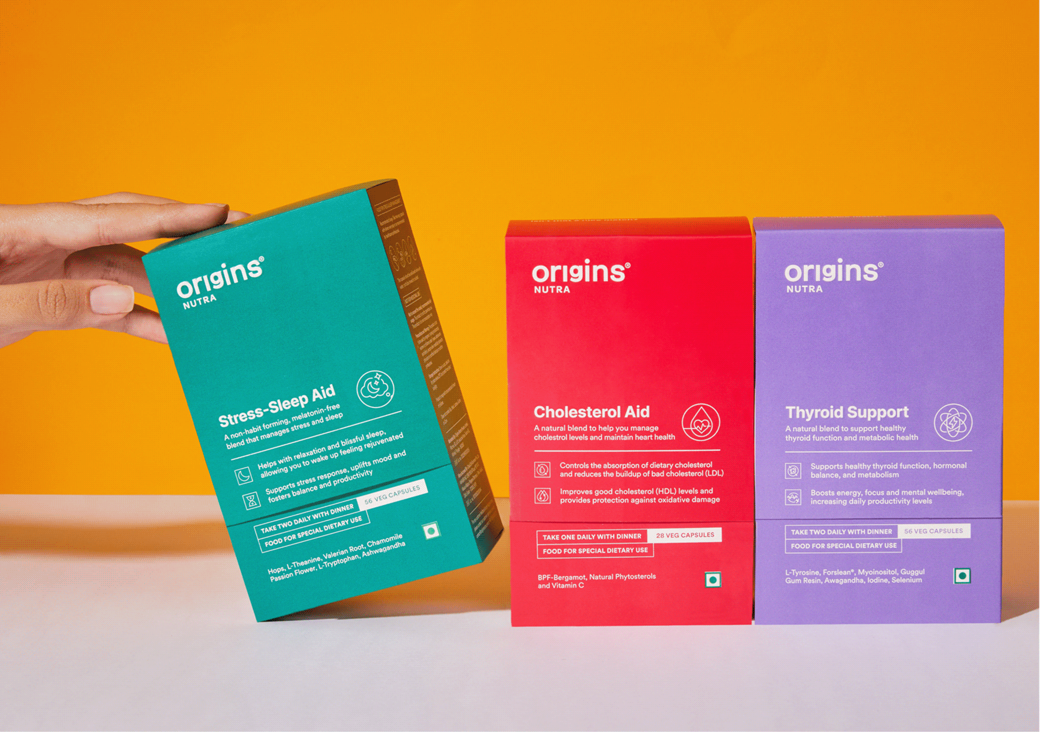
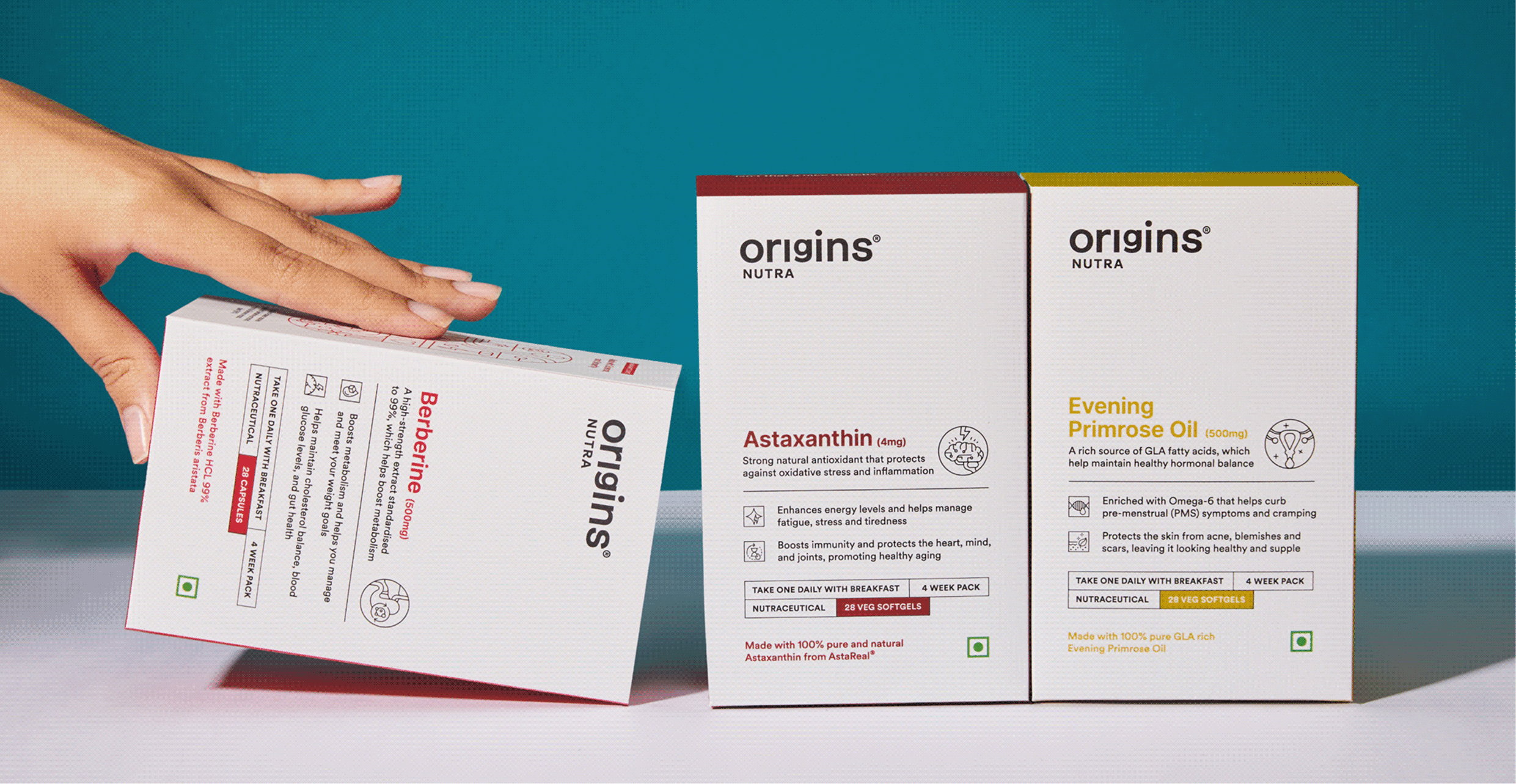
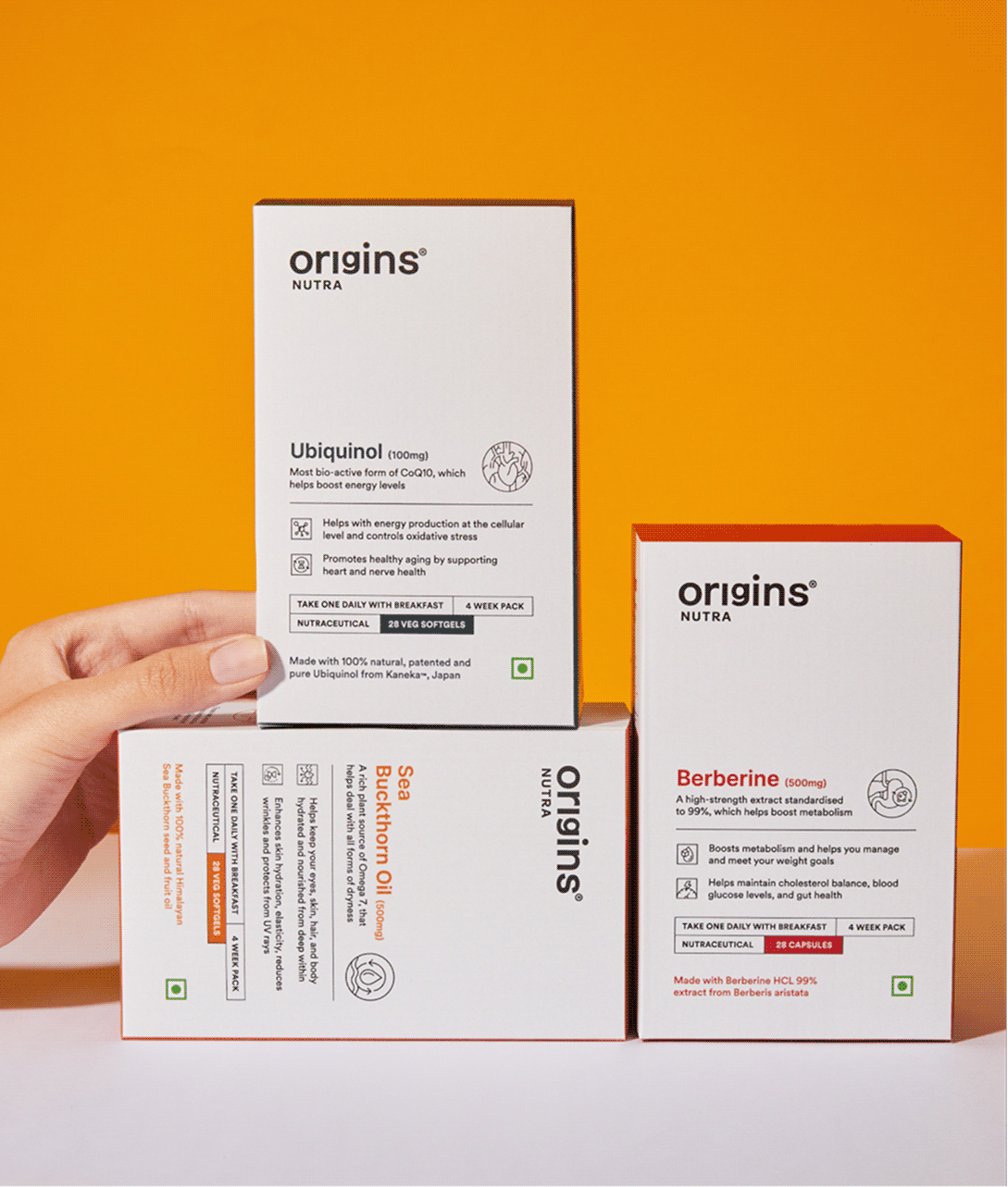
The pill strip stays with the consumer longer than anything else. So we divided it by day, giving each strip its own affirmation, colour, and name—making the right one easy to find at a glance.
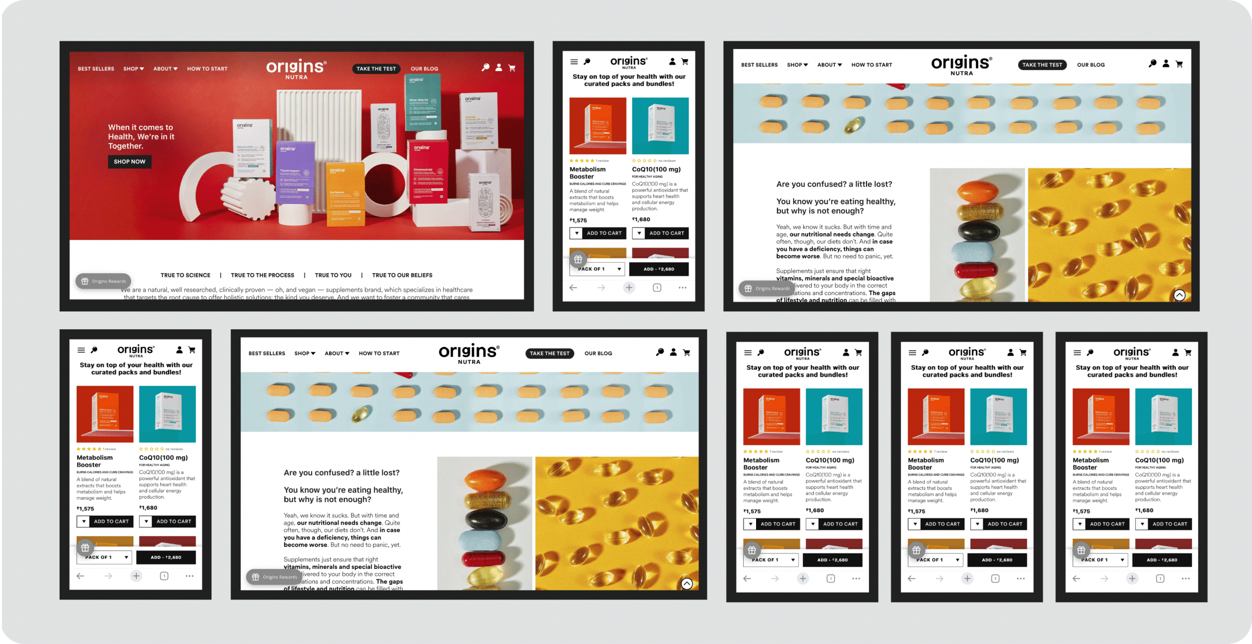
How do you build a website that delivers experience?

We designed the website just like a brick-and-mortar store.

Once you walk in the Origins store, it’s important to understand not just the product but a lot of other things

We addressed each and every question that you might have through your journey. It is crucial you understand everything before you make the right decision.
Meet Better Personal Care

Heyday, Meet Better Personal Care.

Scope Of Work: Research, Strategy, Consumer Understanding & Psychology, Visual Language, Product Packaging, Art Direction, and Web Design.

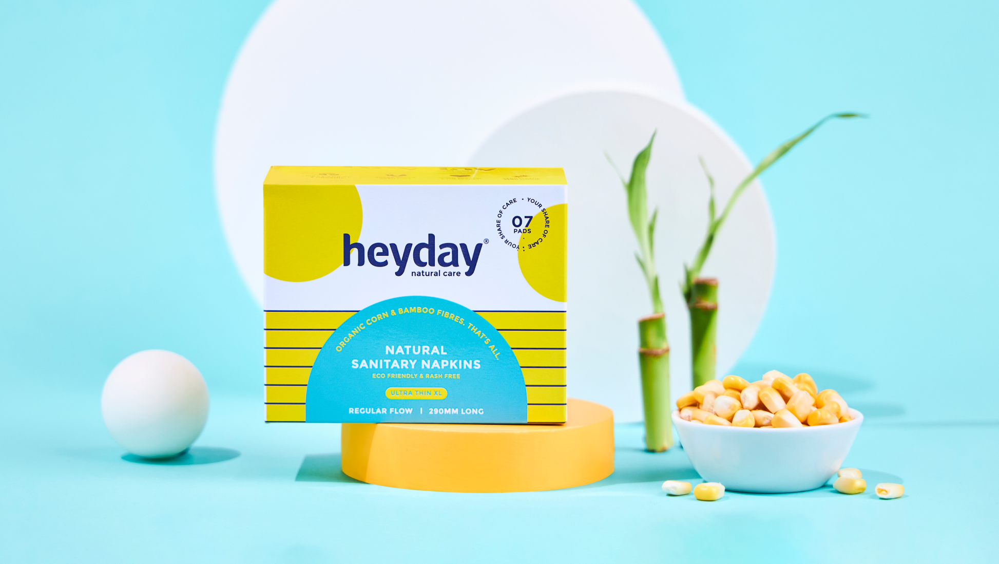
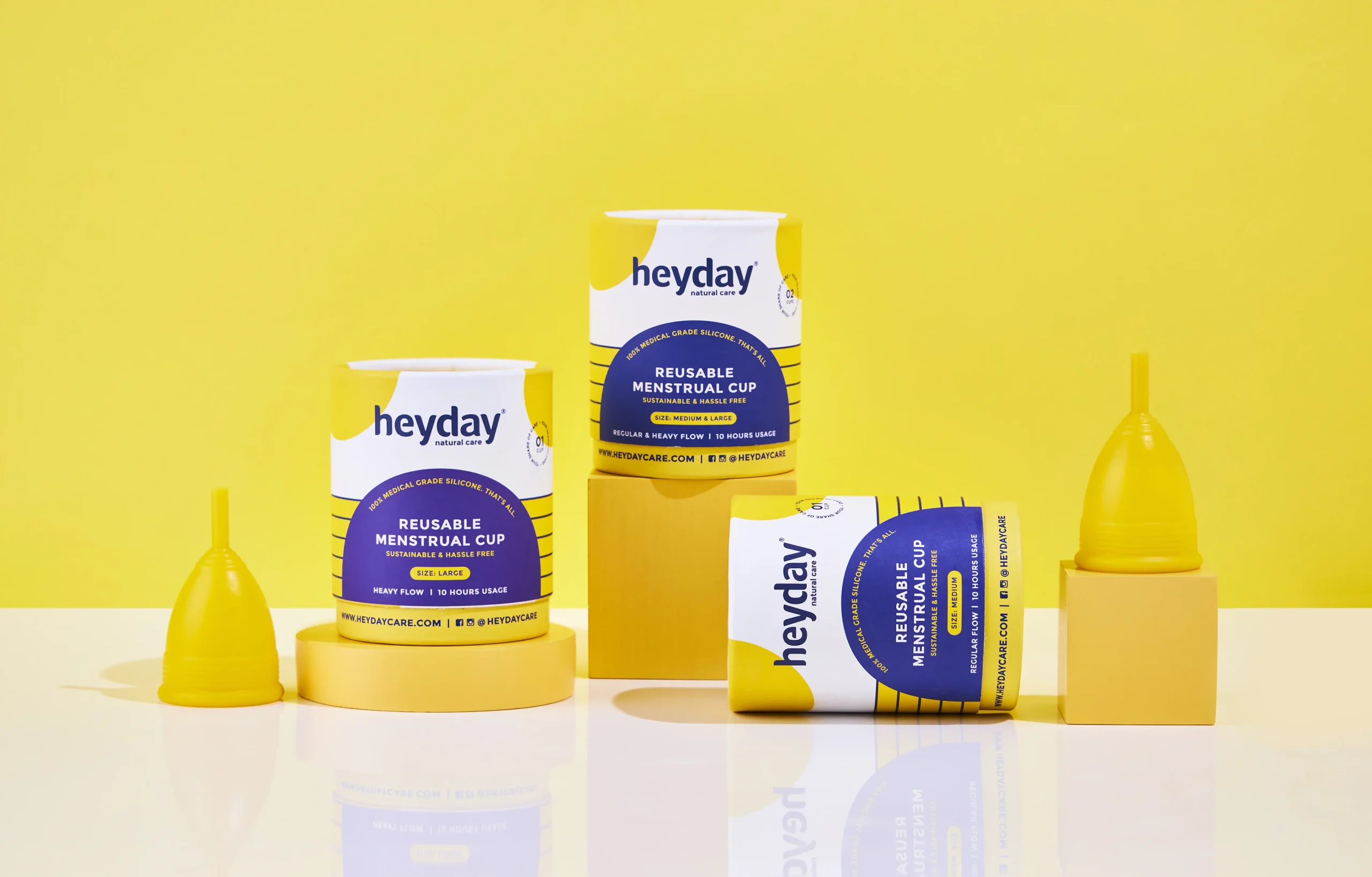
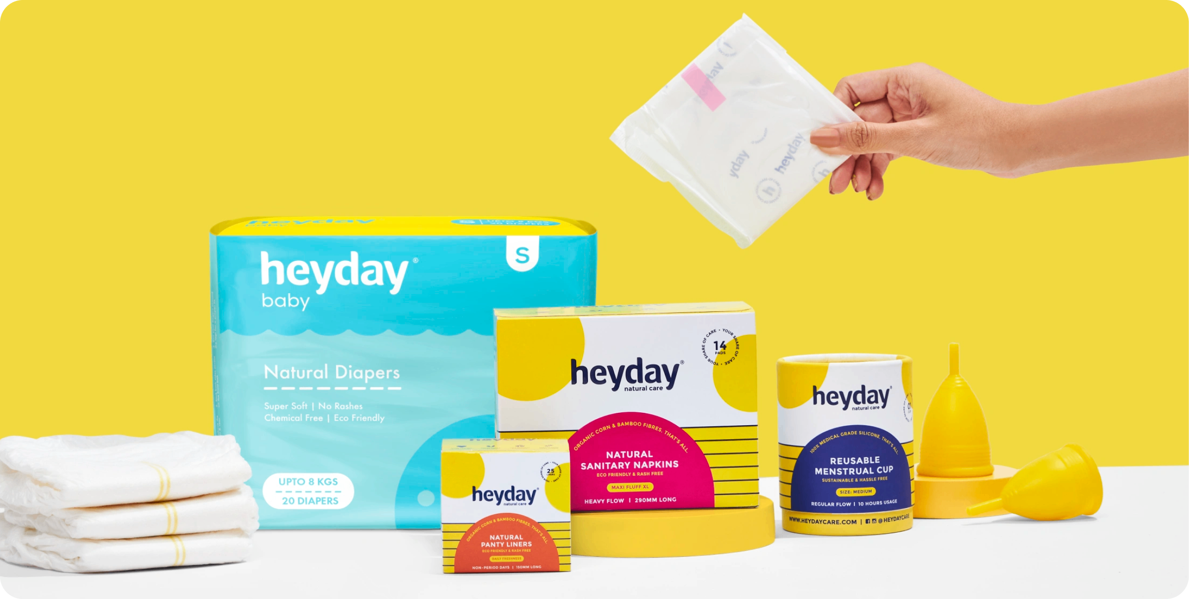
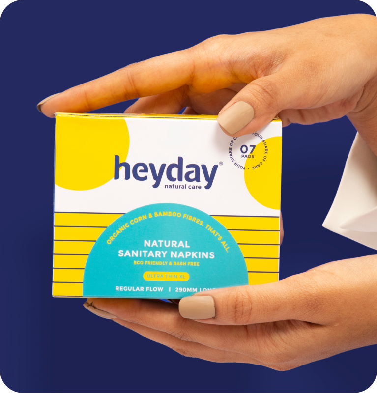
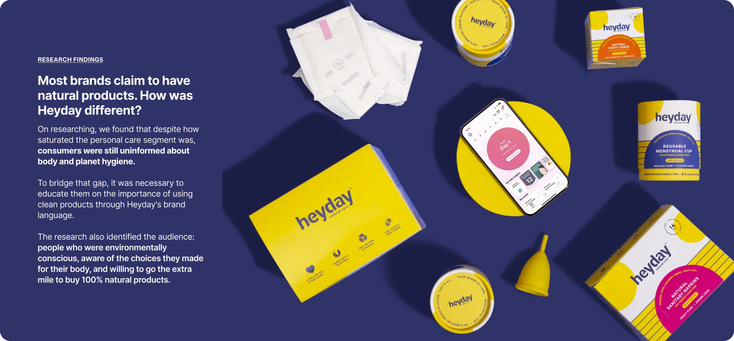
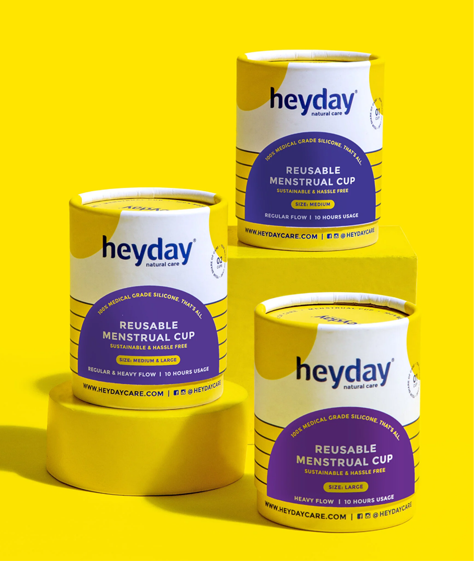
Heyday makes 100% natural and organic personal care products for women and babies. Every product is made without the harmful chemicals and plastics that are standard in the category.

Founded by Deepanjali Kanoria, the brand is built on one belief: the things we use every day should look after the two homes we all live in, our bodies and our planet.

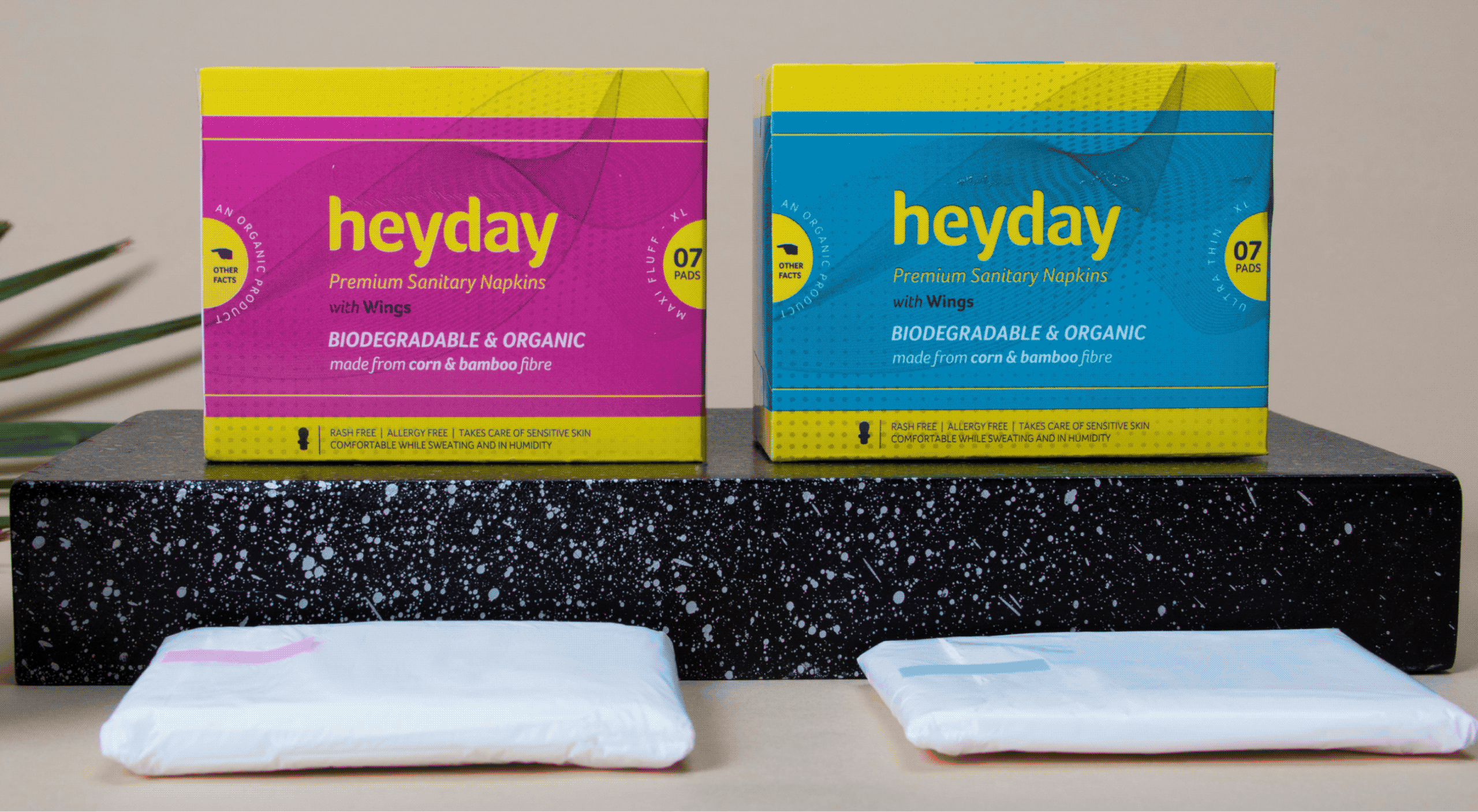
Heyday came to us with something rare and something common. The rare part was a brand people already trusted. The common part was packaging and language that weren’t telling anyone why.

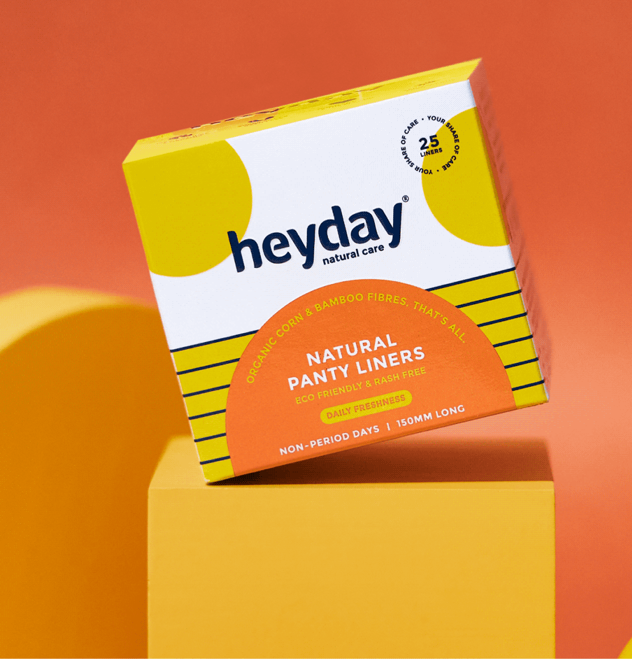
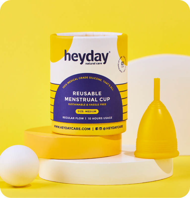
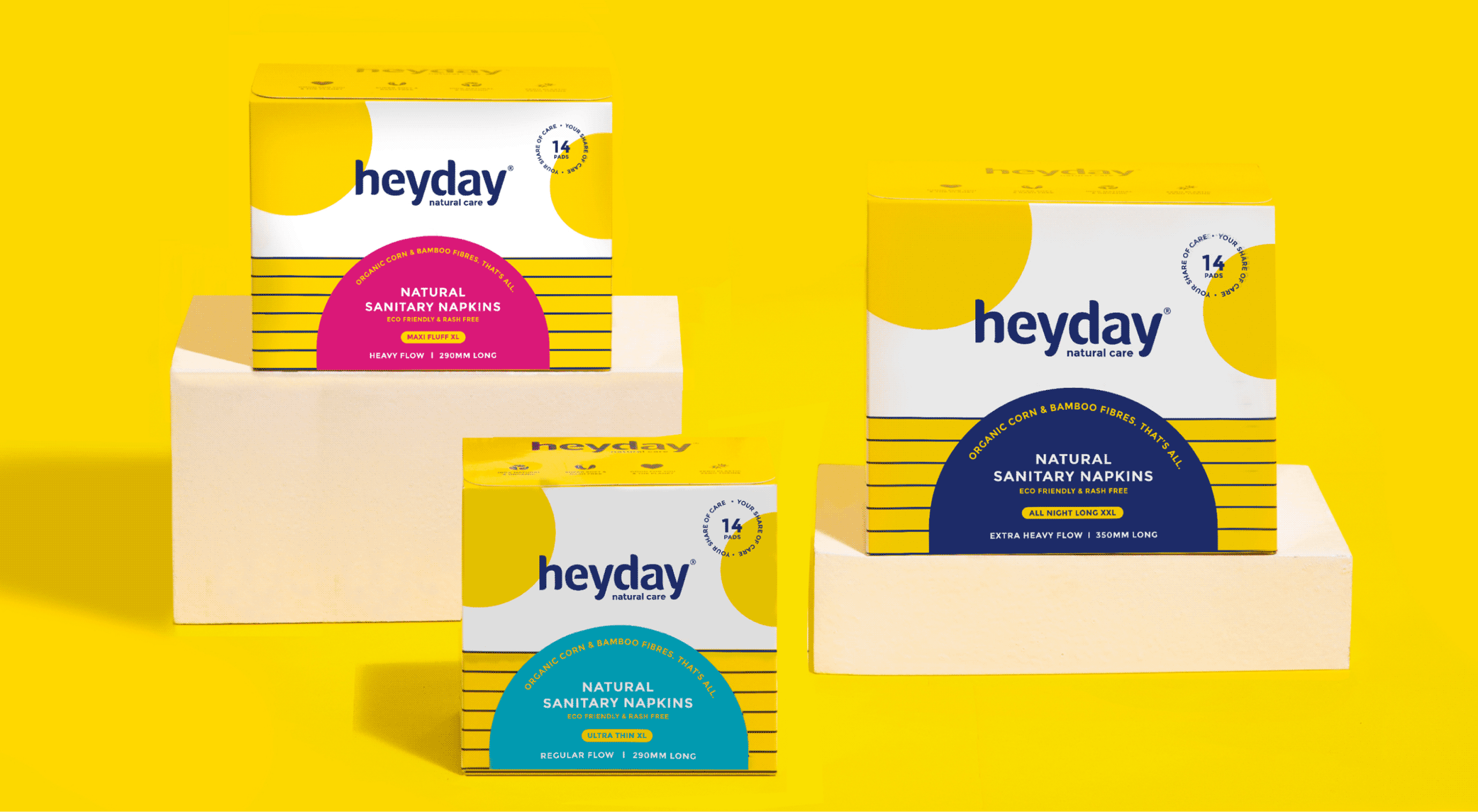
The result was a fresh brand language, identity, and repackage the full range, so that consumers could see the difference before we had to explain it.

THE WHY

How can we show consumers what is
good for them? Without sounding preachy?

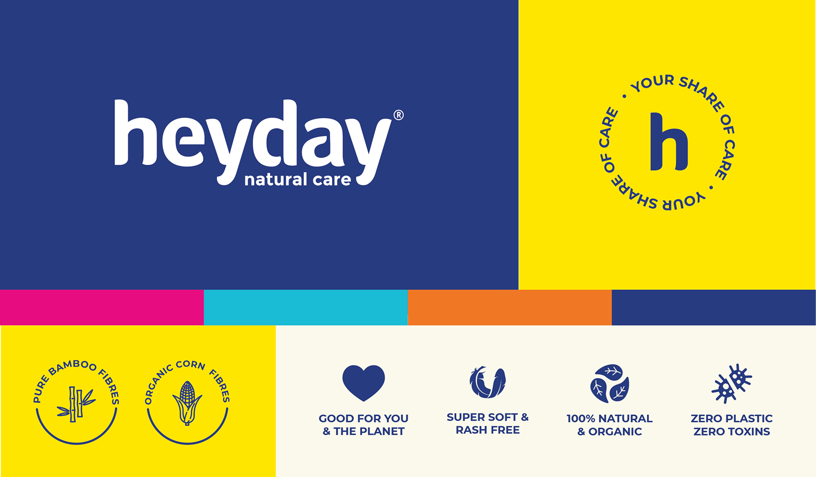
We refreshed their old identity and built a brand extension with a vibrant and fun colour palette and new brand icons, so consumers could celebrate womanhood and menstruation.
All of it sits under one purpose statement: Your Share of Care. Every woman deserves easy and safe access to period care.

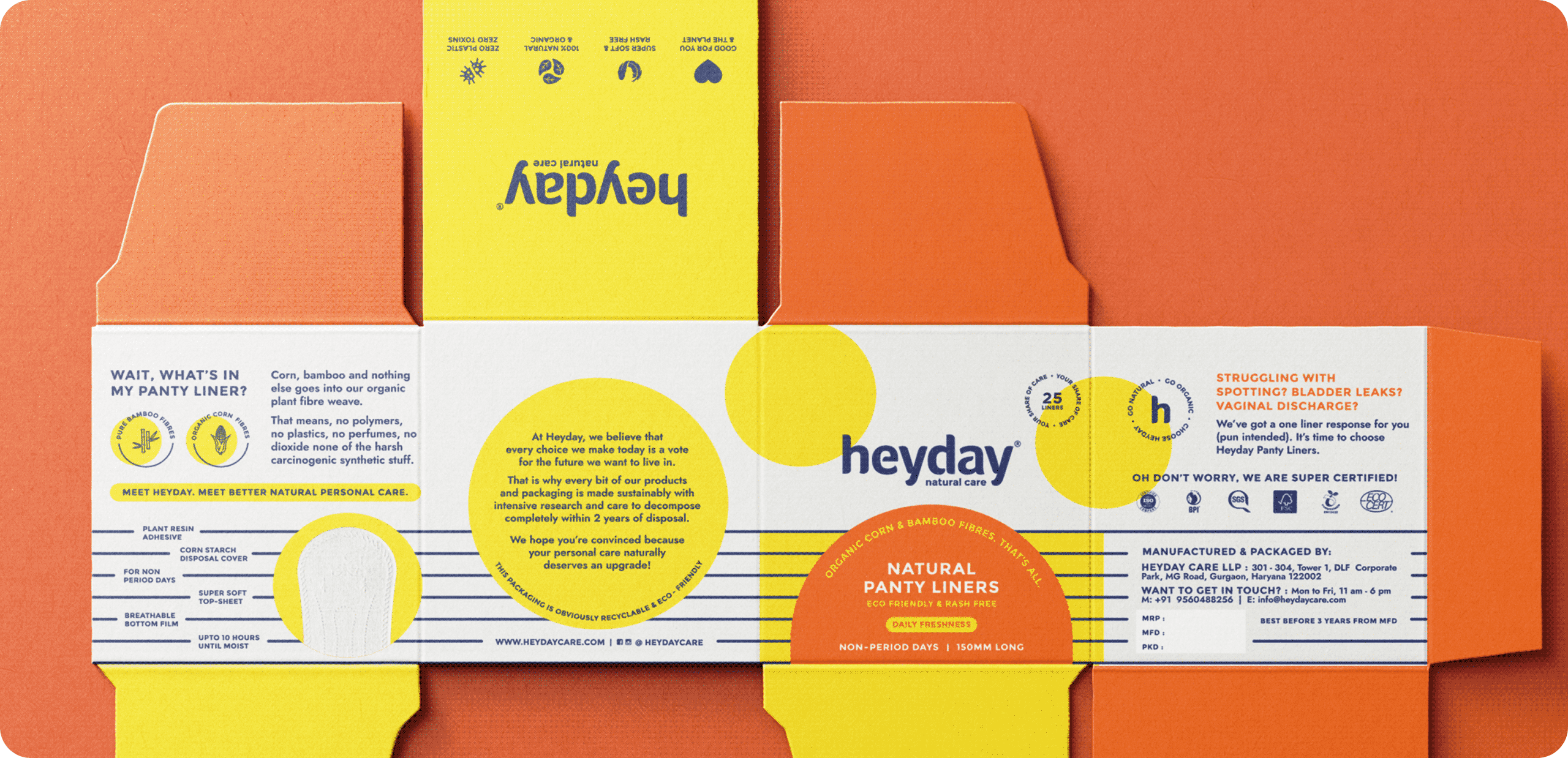
INFORMATION LAYOUT

How can a brand be fun, informative, and most importantly, stand out?

We had to be mindful of the brand’s familiarity and yet infuse a new personality to make it more relevant.

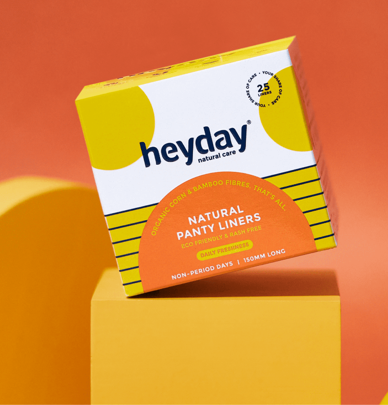
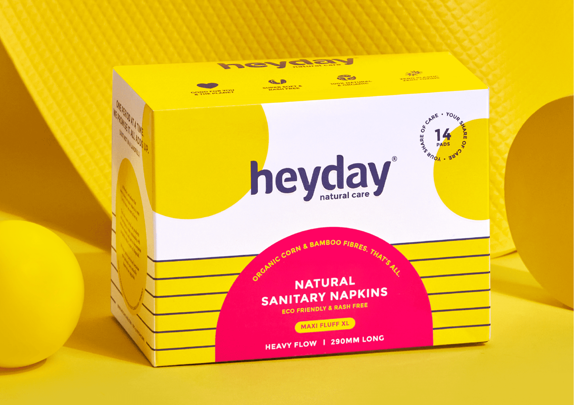
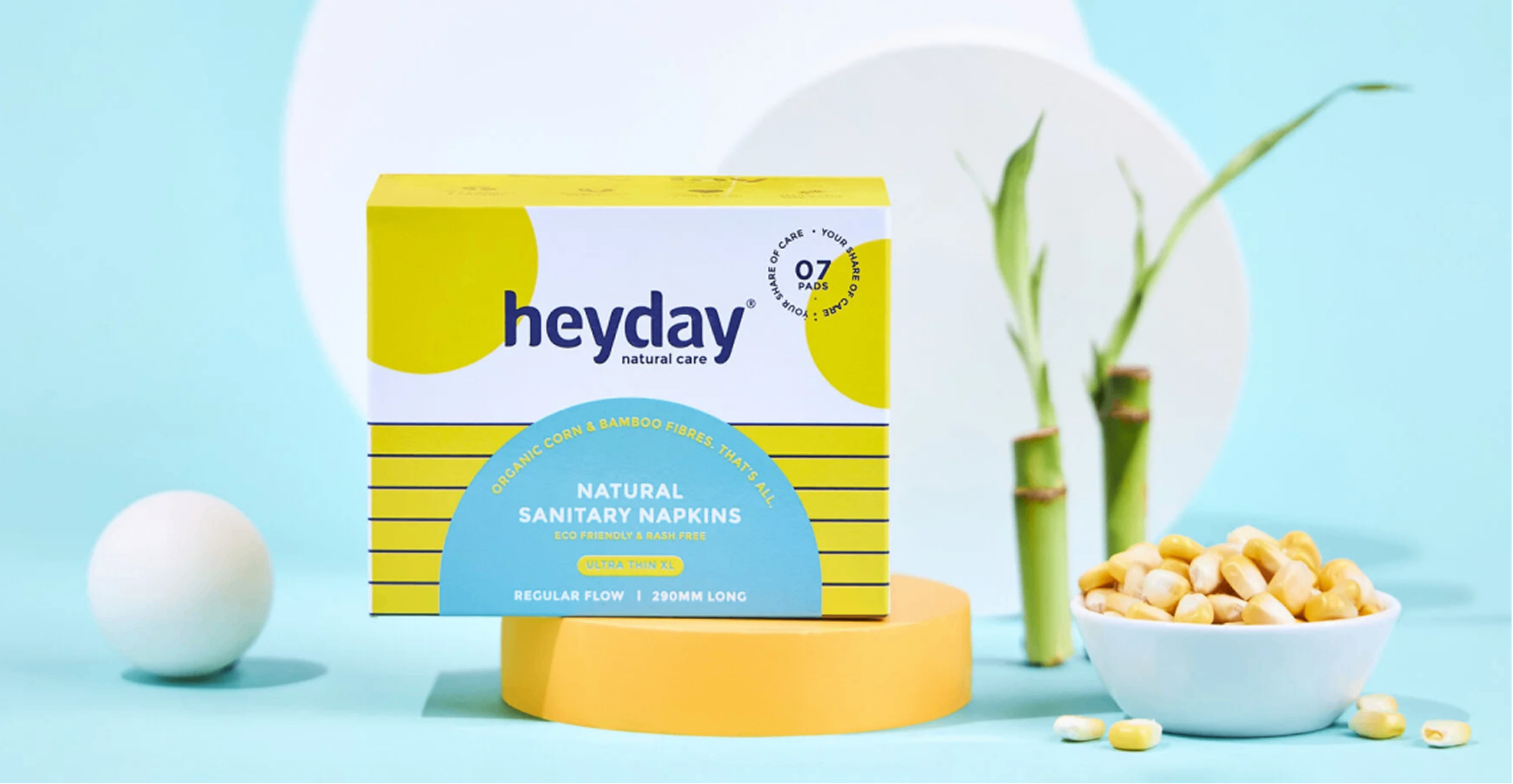
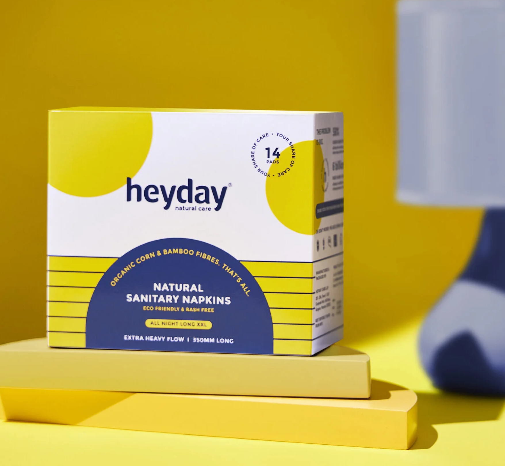
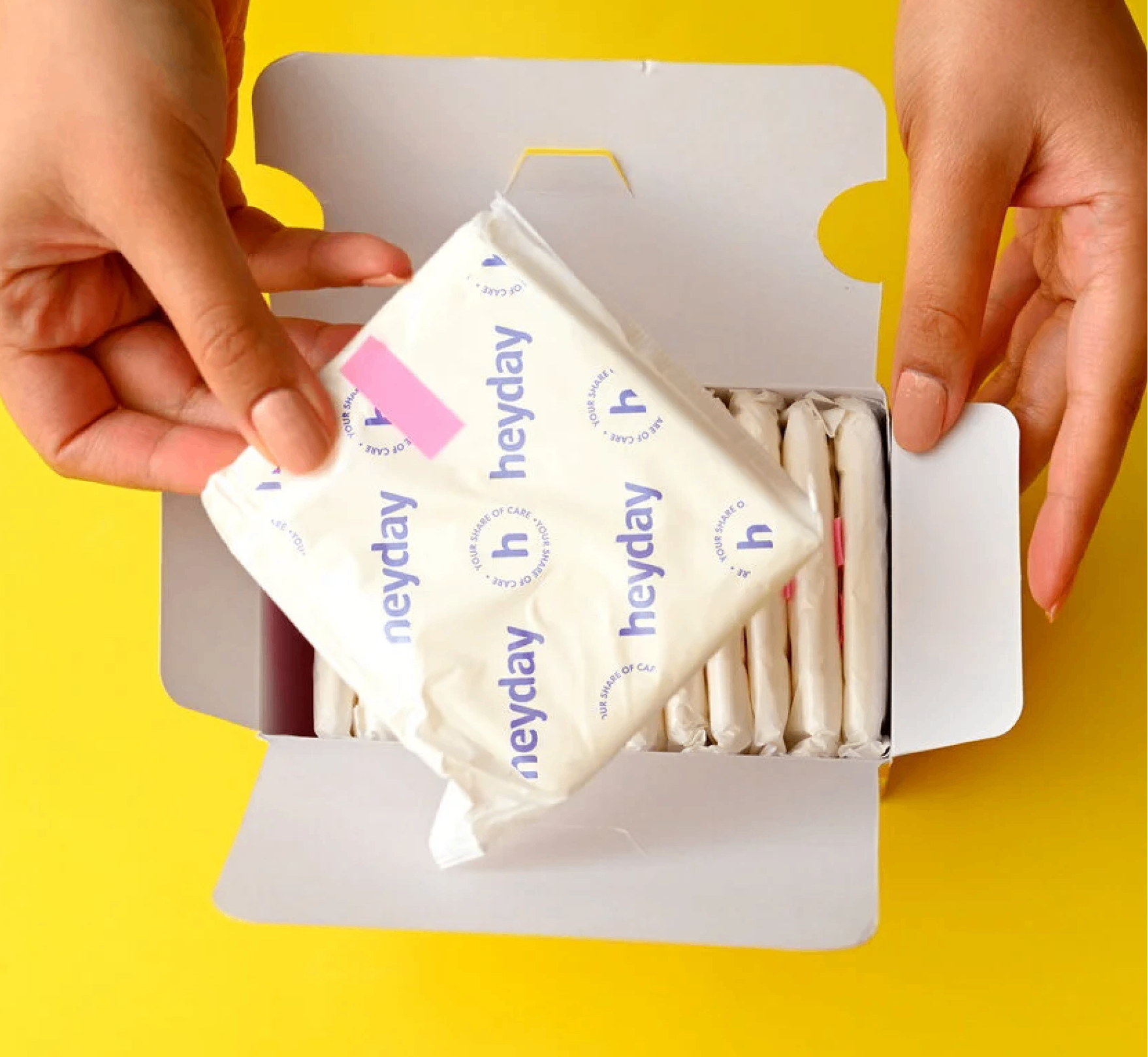
The market is filled with brands that use bright colourful packaging. So we switched, we used a lot of white to make sure the pack stands out from the crowd yet owns a colour.

We made sure the information was balanced with the brand elements consistently to keep brand remembrance.

How far does the promise have to go?

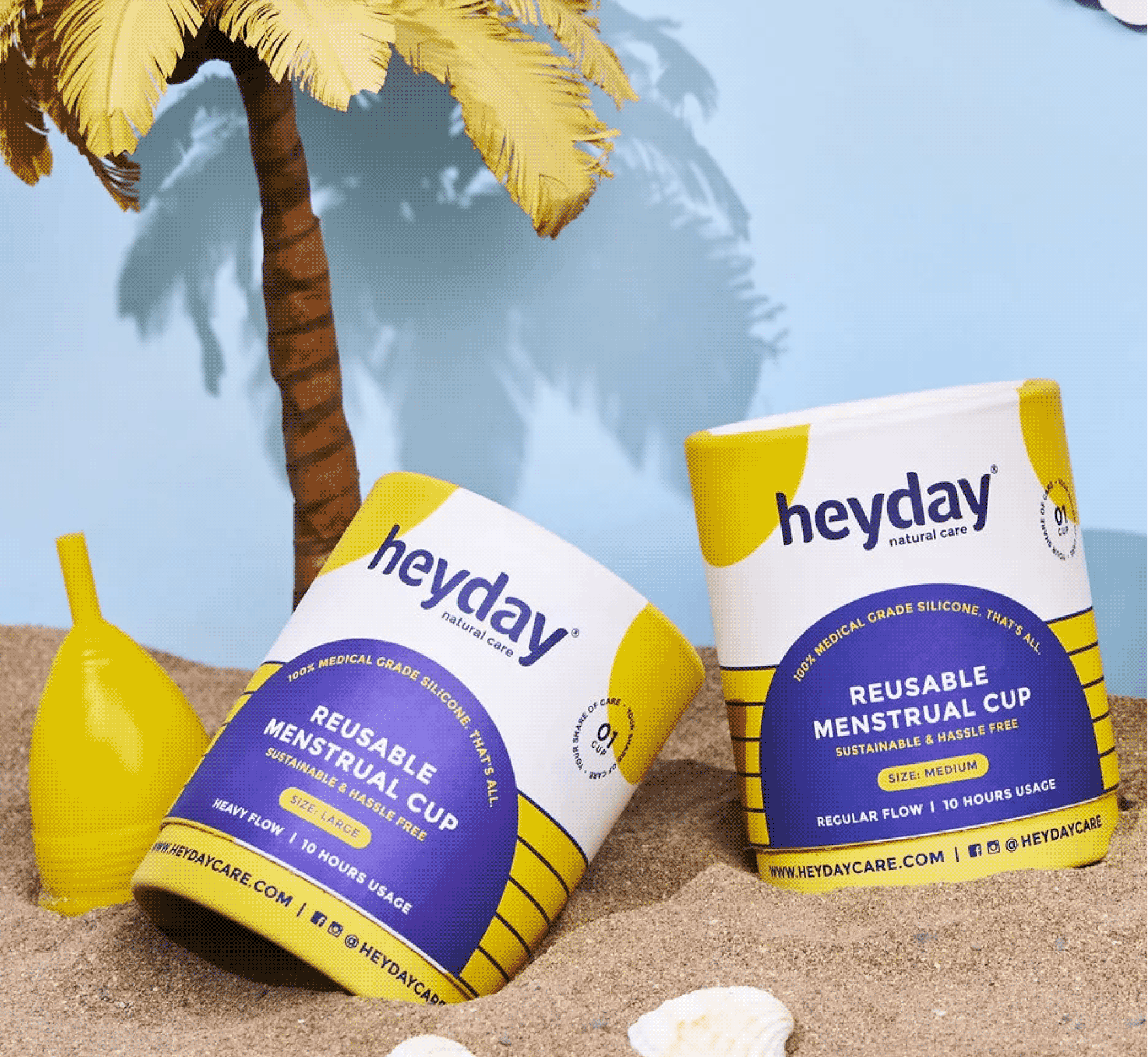
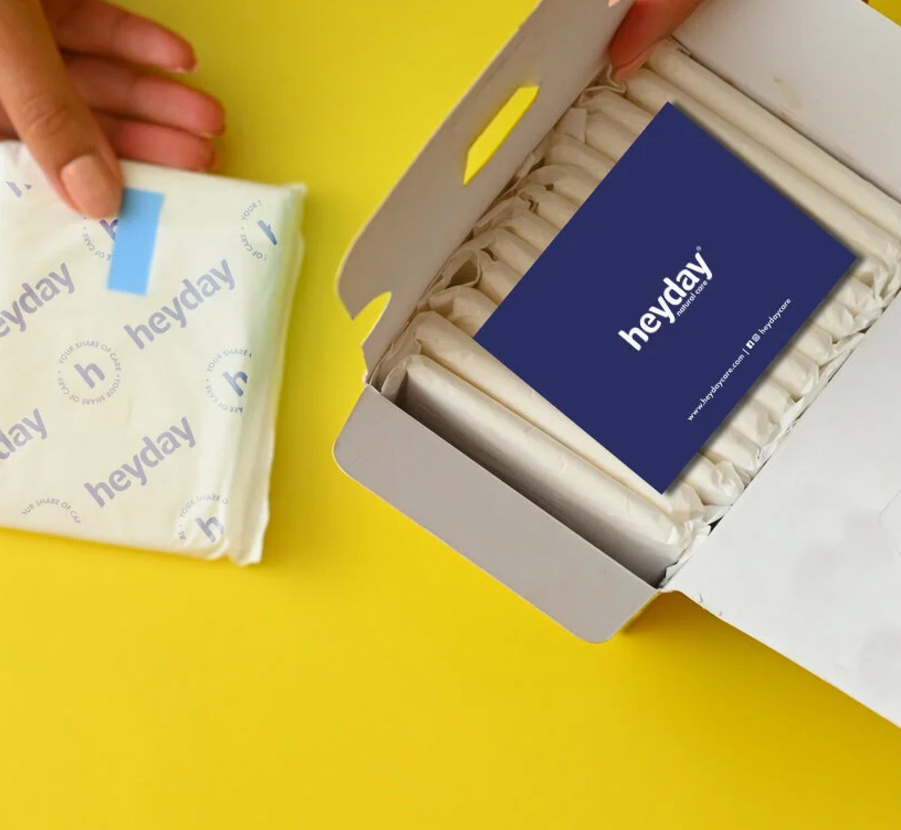
Heyday is truly an eco-friendly product, so instead of sending out the products in polythene bags, we sent them out in paper mono cartons.

We wanted the detail to run all the way through, our brand elements were carried onto the release paper, and a small thank you card was slipped into every order, reminding customers that they had saved themselves from harmful chemicals and plastics, and the environment along with them.

THE EXPERIENCE

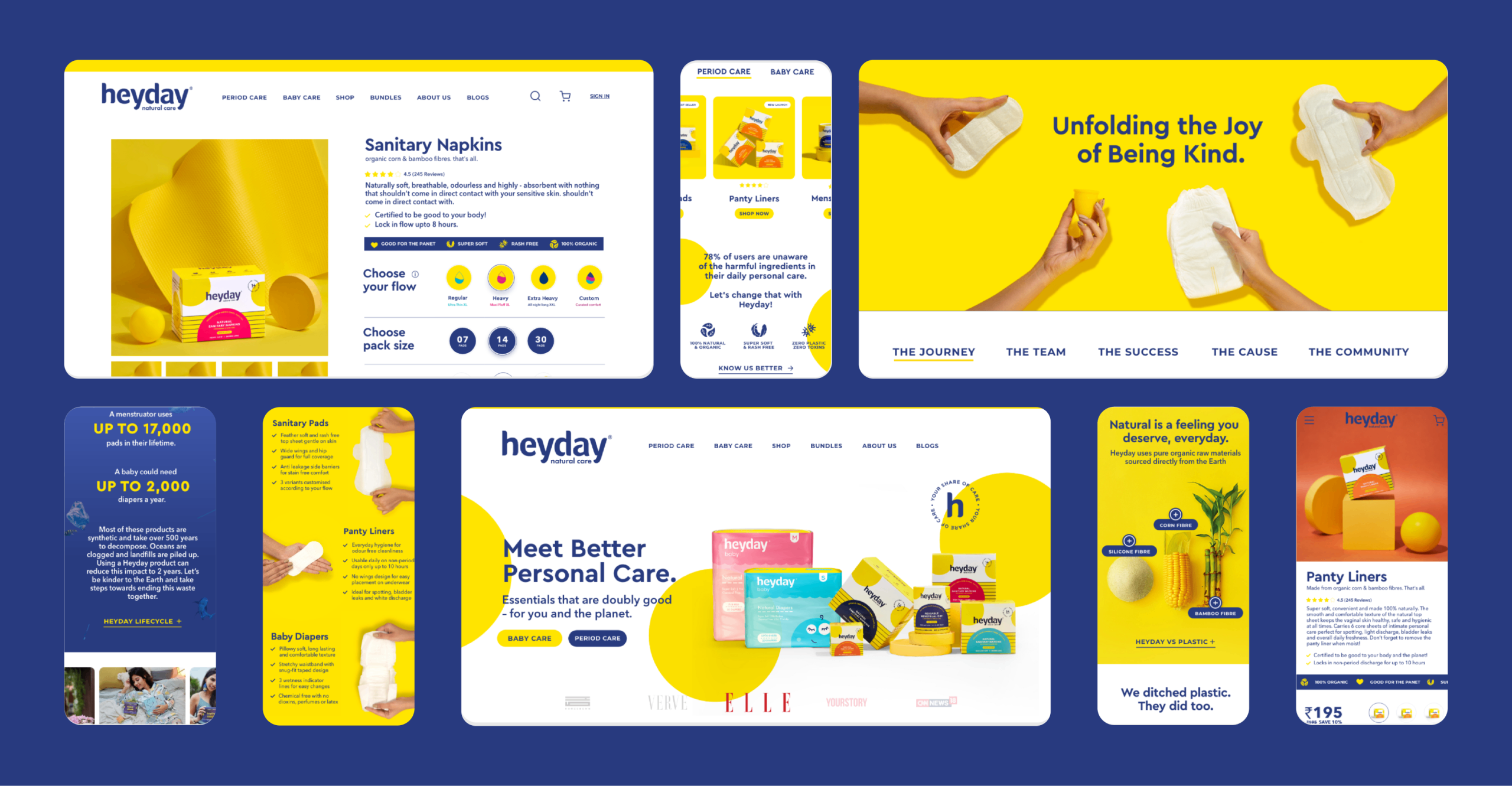
How do you translate the same feeling online?

We built on the same palette, the same elements and the same voice. One brand, whether you meet it on a shelf, inside a carton, or on a screen.

Redefining Vegan French Patisserie

Does being vegan make you feel like a compromise?

Scope Of Work: Market Research, Strategy, Brand Identity, Packaging Design, Visual Language, Web Design and Art Direction.
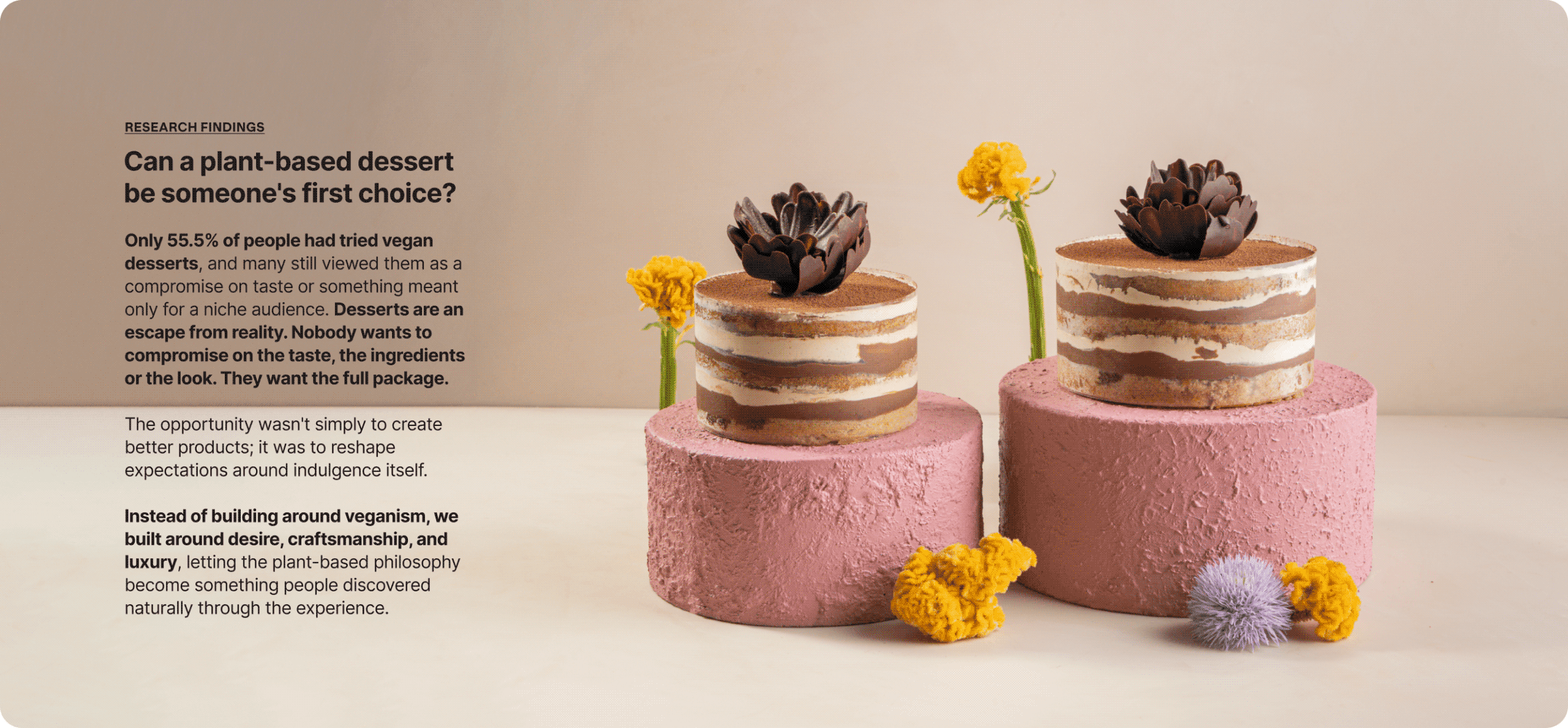
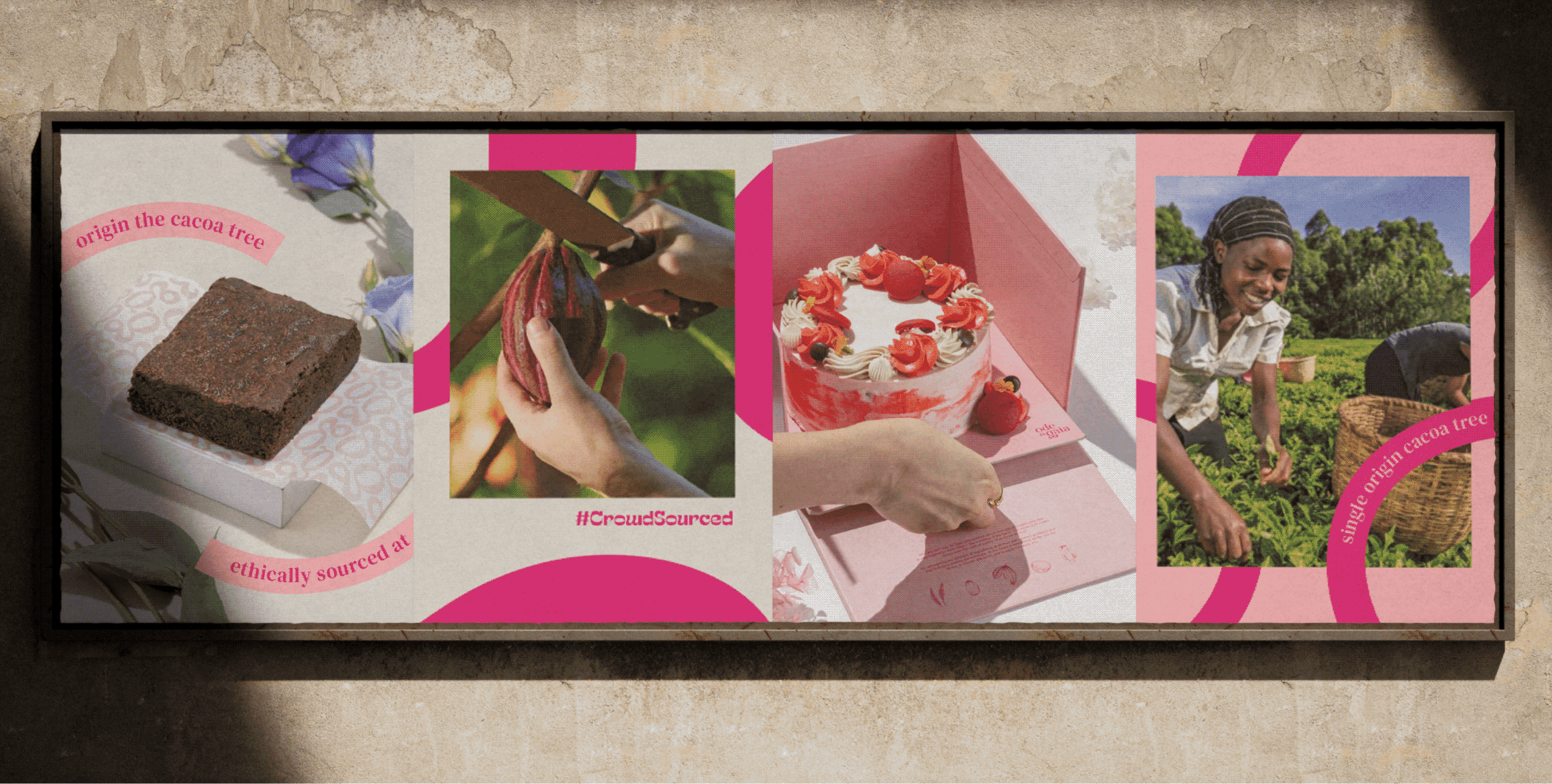
Plant-based food is often expected to be healthier, but rarely more desirable. Luxury patisserie, on the other hand, has always celebrated richness, craft, and indulgence. Could the two belong together?

We explored this question with Naimita. She wasn’t trying to create another vegan bakery; she wanted to build India’s first luxury plant-based patisserie that people chose for the experience, not just the ingredients.

The goal was to create a brand that changed perceptions, proving that conscious choices could feel every bit as luxurious, memorable, and delicious.

Inspire imagination with pastry, the way art or music would.

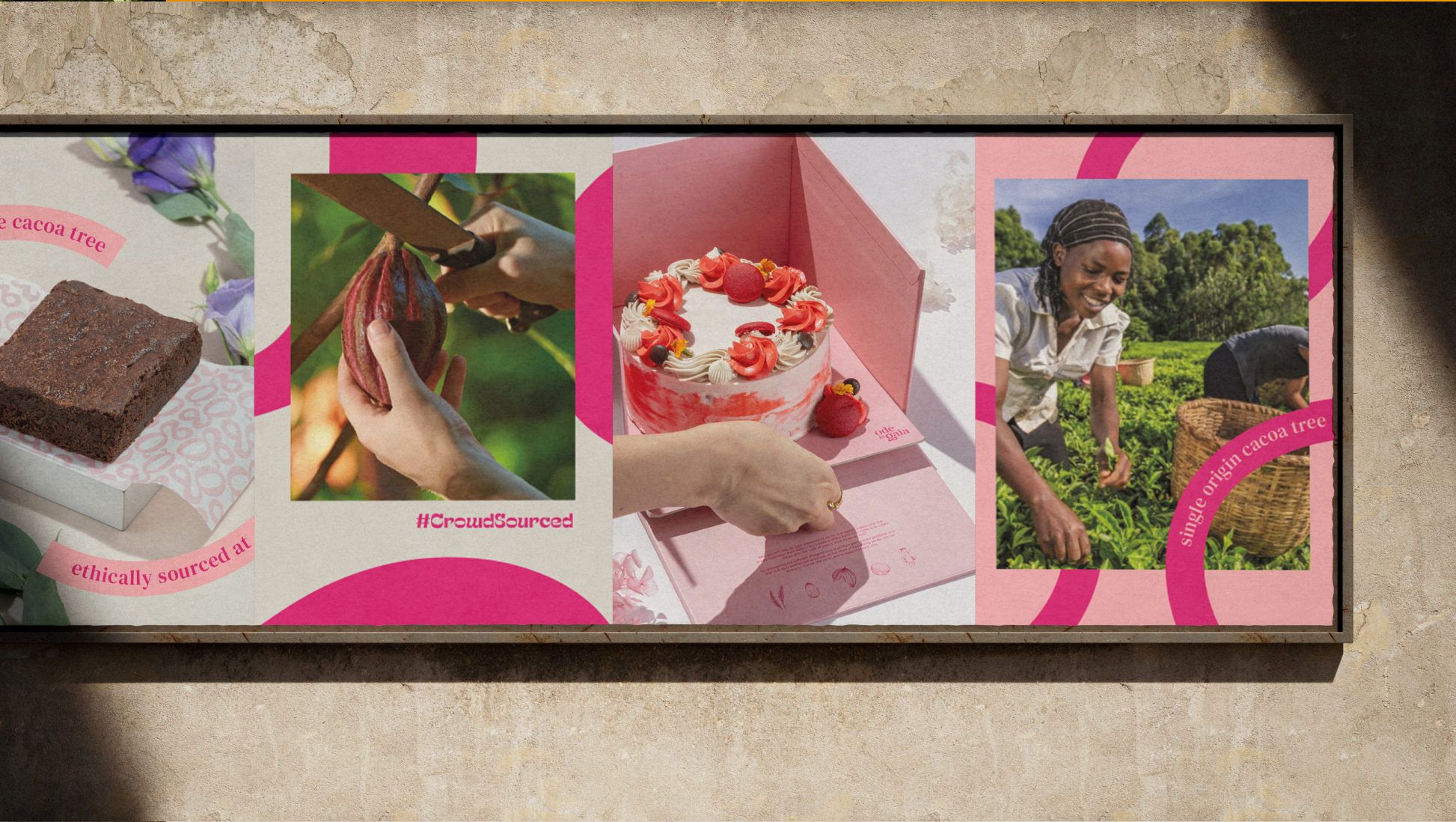
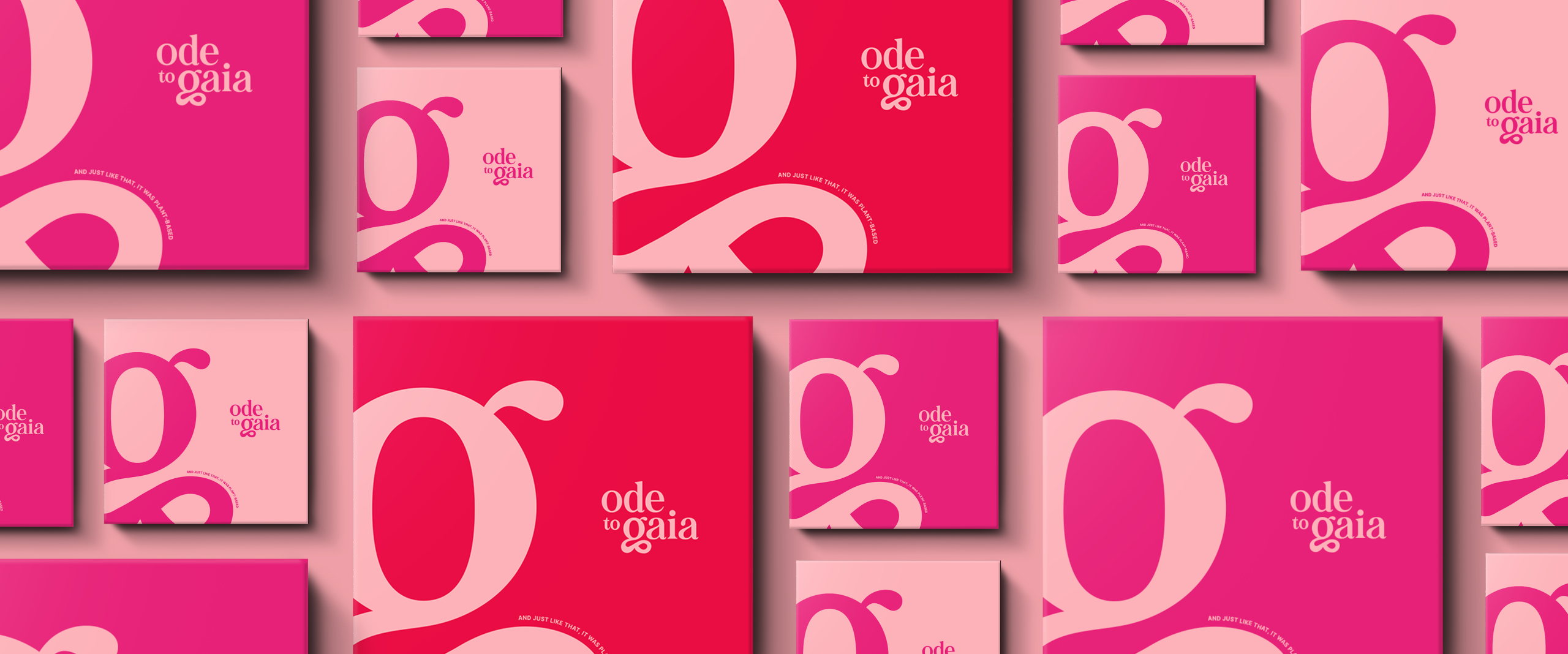
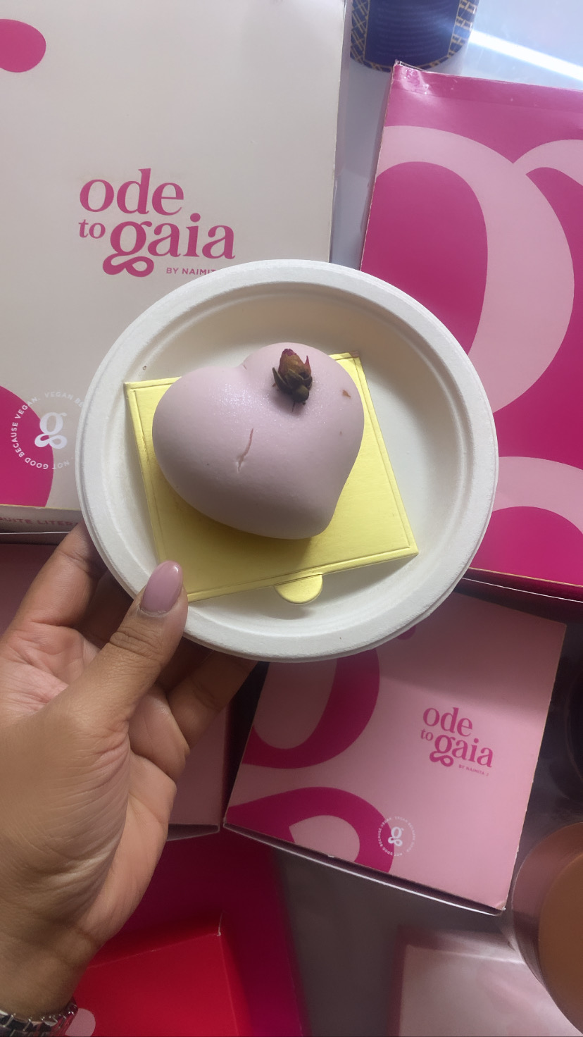
Ode To Gaia set out to redefine pastry with plant-based ingredients, driven by taste, technique and a little glam. No compromise anywhere in it.

THE BEST PART

Introducing Ode To Gaia

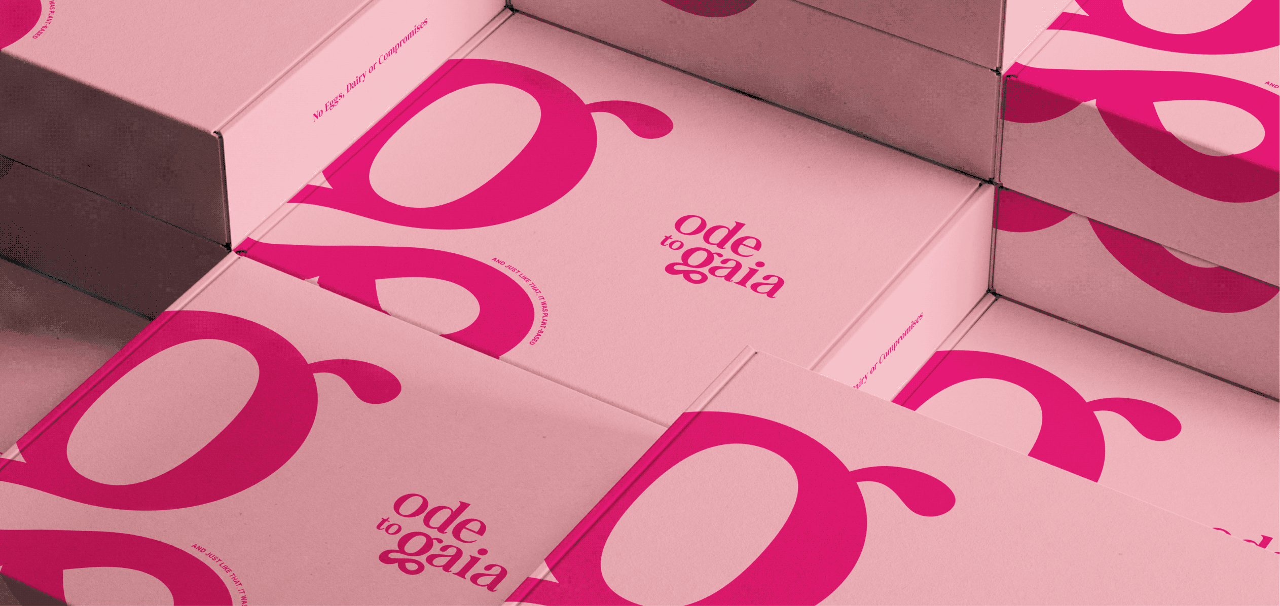
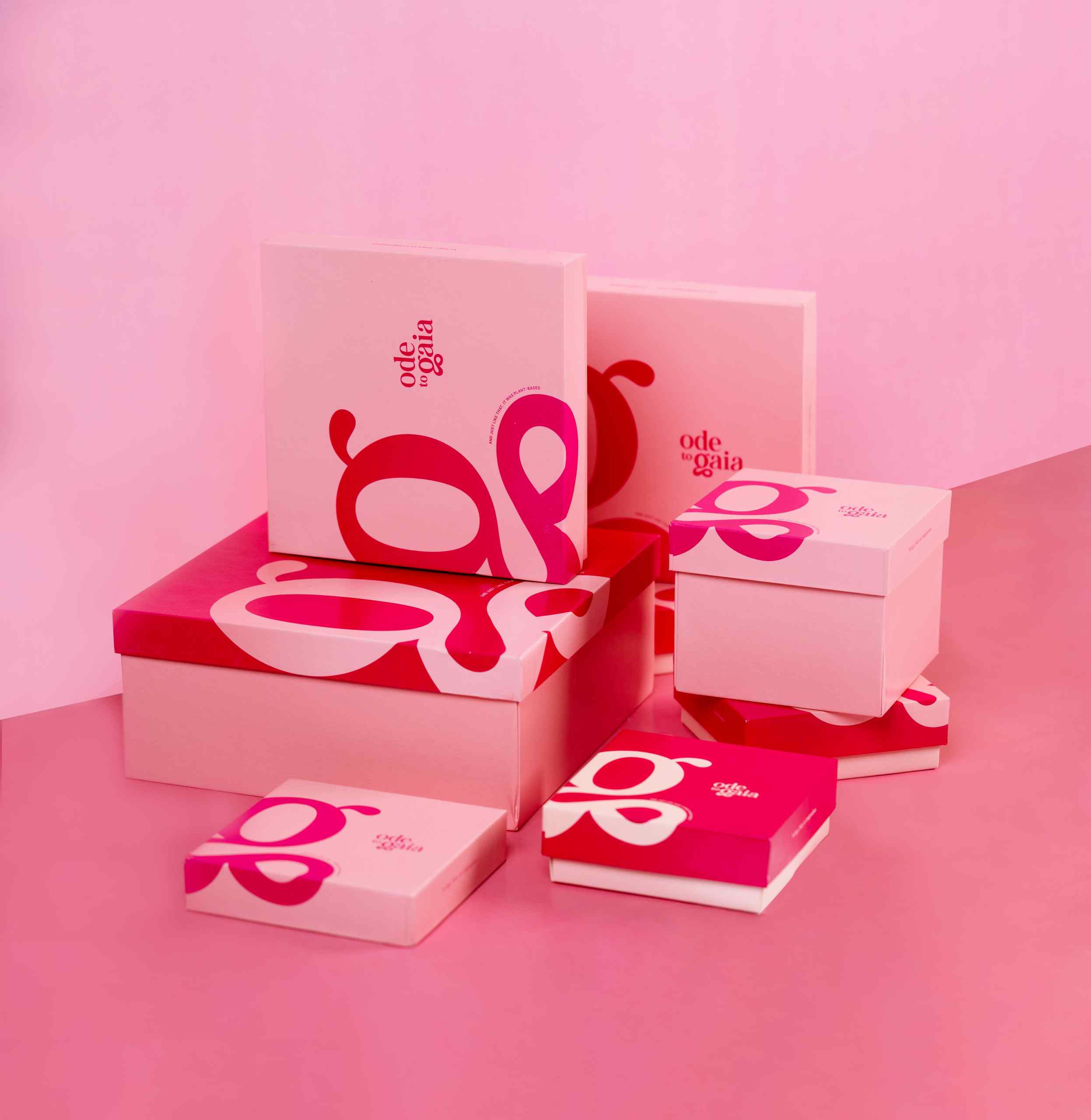
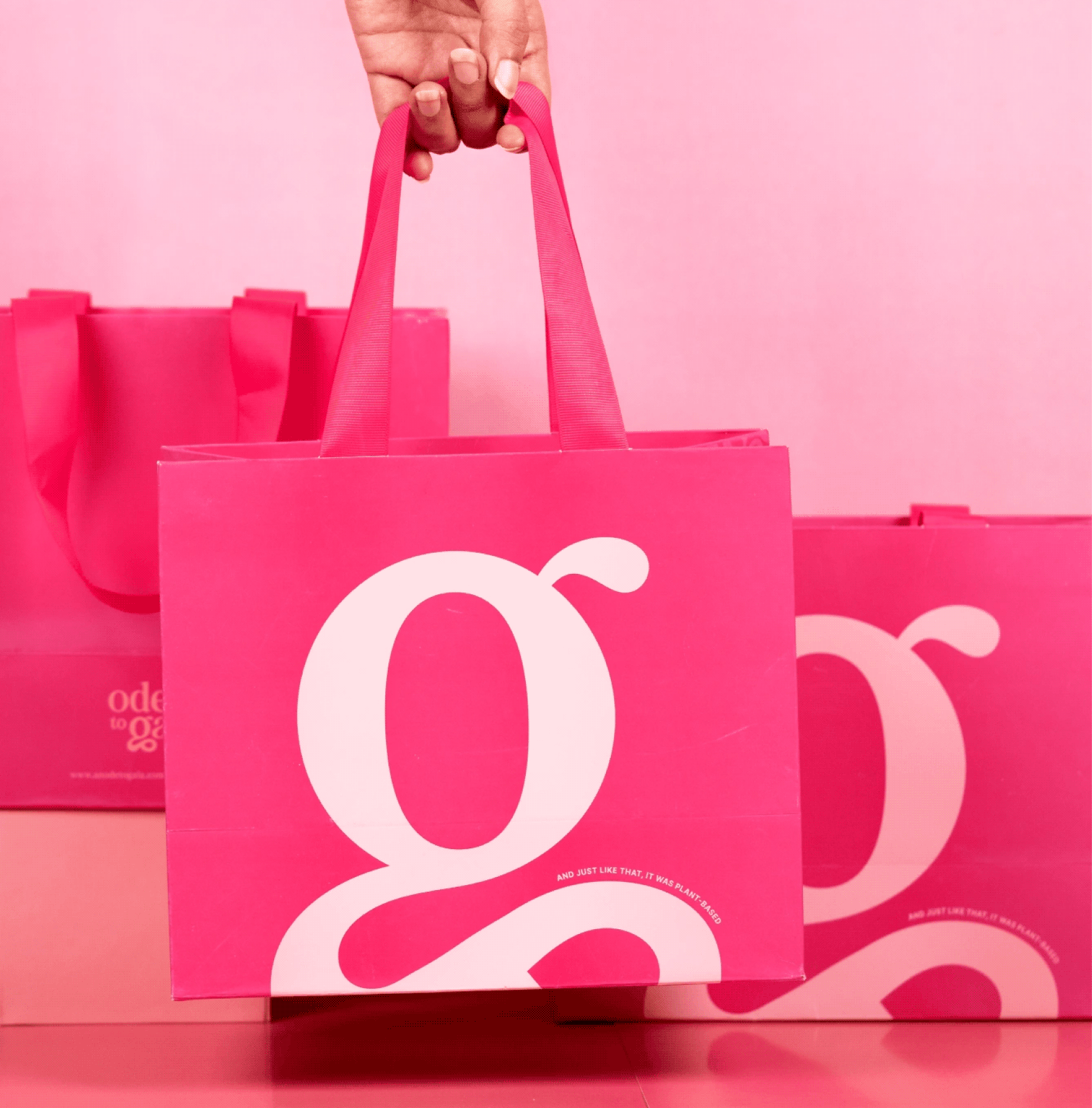
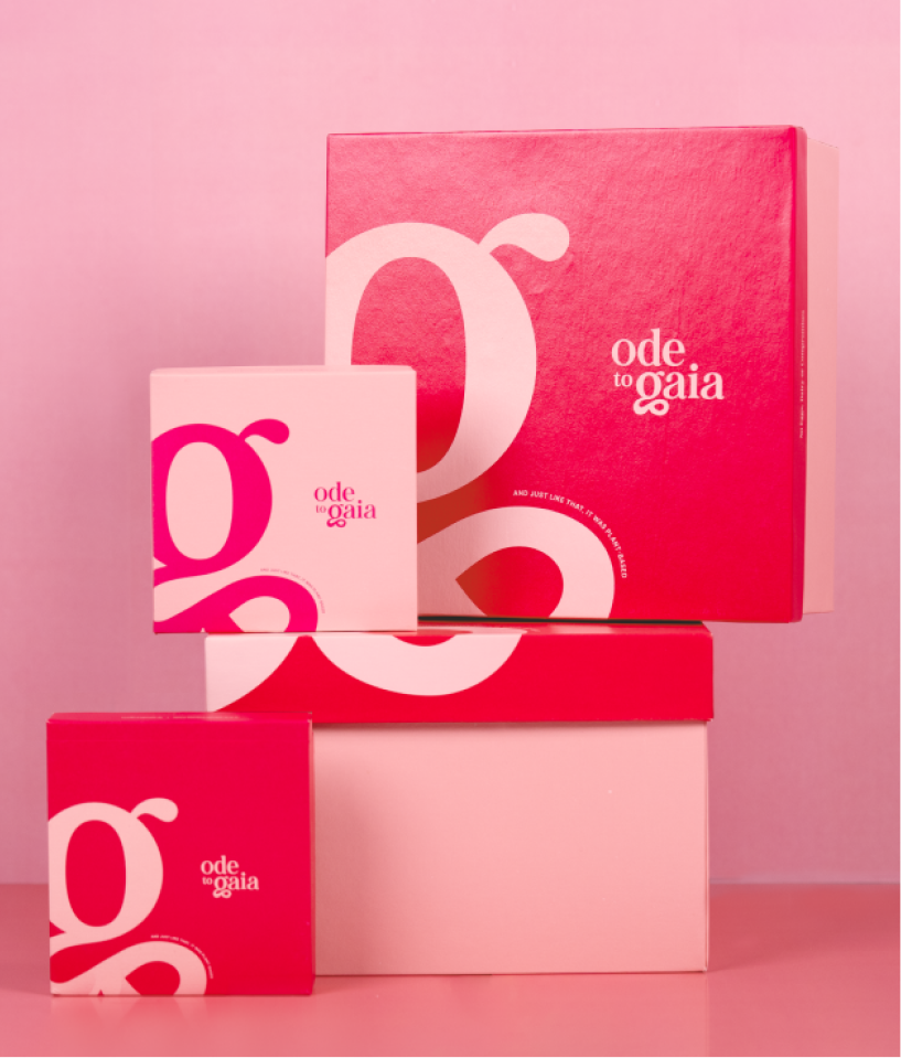
We built the new identity and visual language on that foundation. The G from Gaia is what keeps the brand grounded, yet adds the flair and sophistication it needed. We wanted the brand to be recognised for why it was started: the founder’s values, her ethos, her dedication to the earth. Her ode to Gaia is her patisserie.
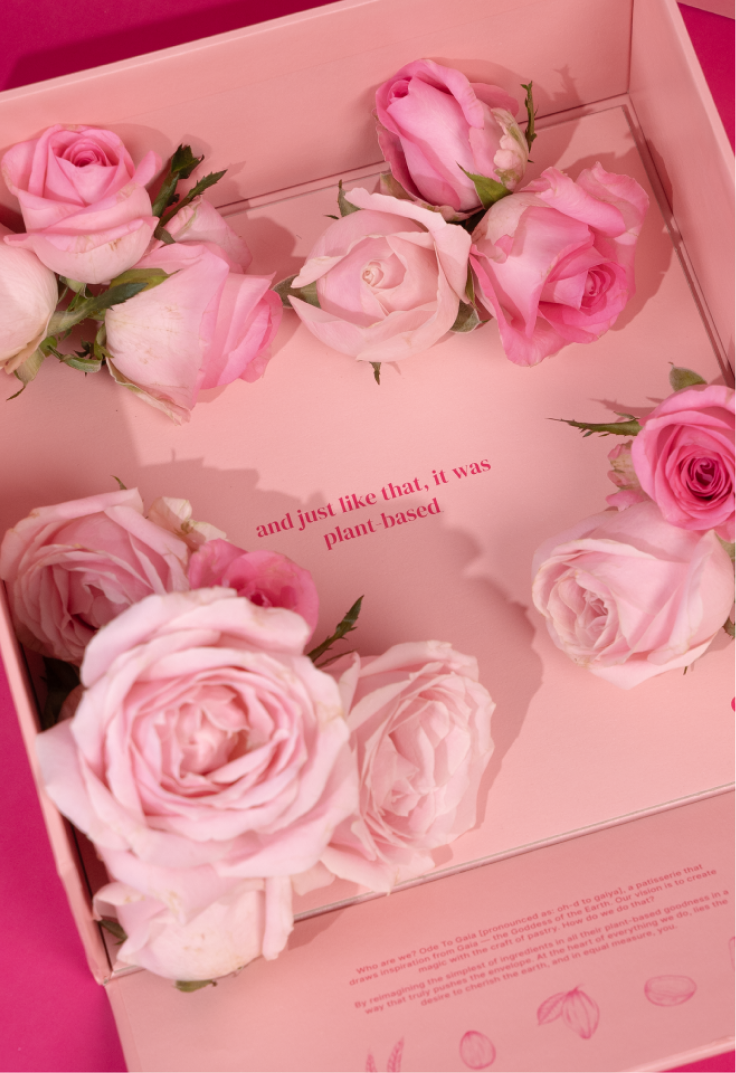
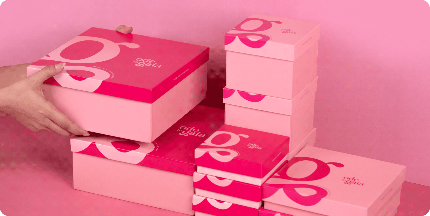
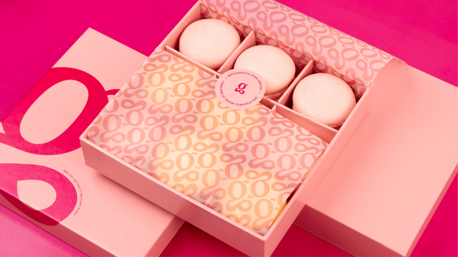
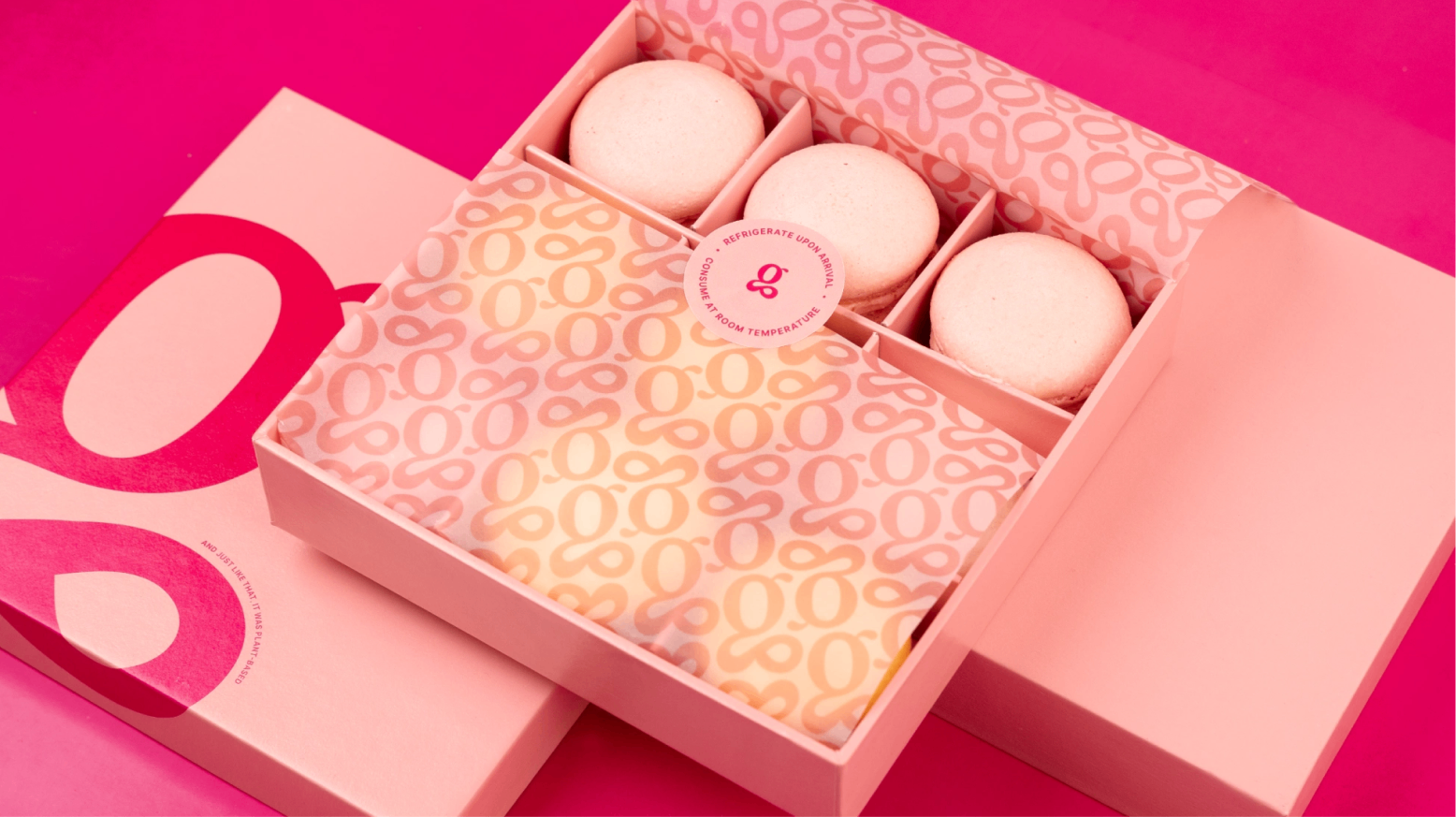
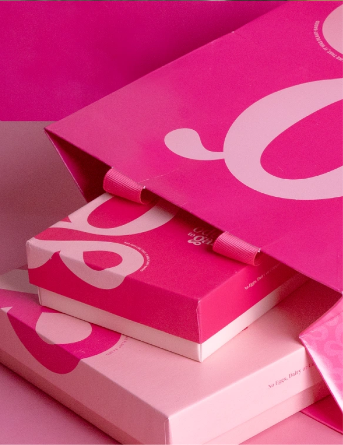
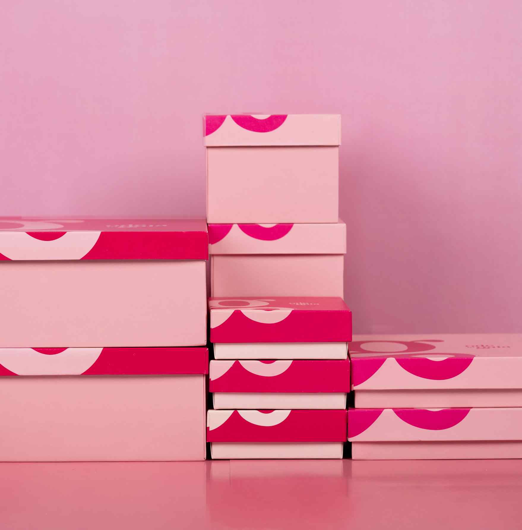
Can a dessert box start a conversation?

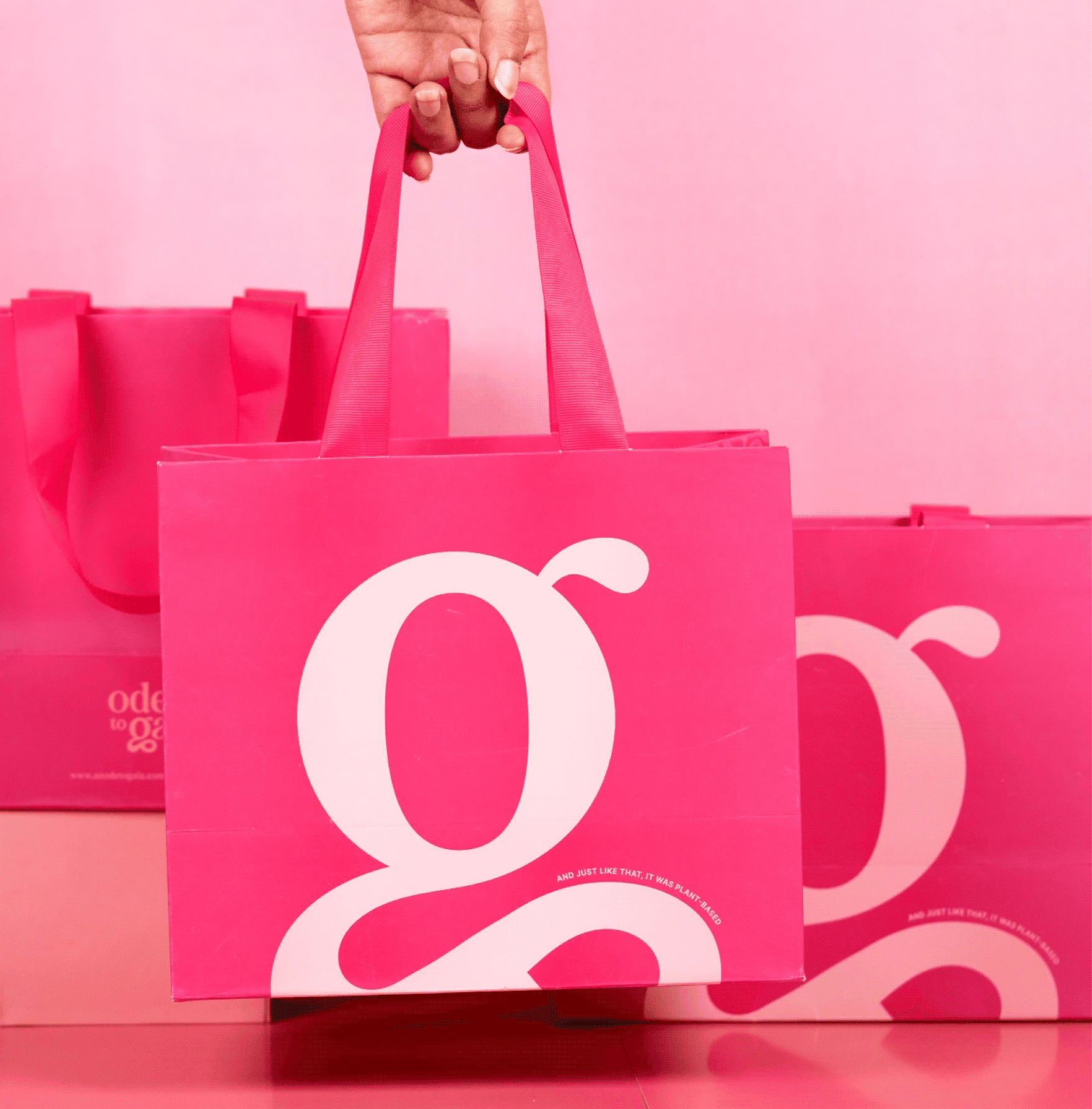
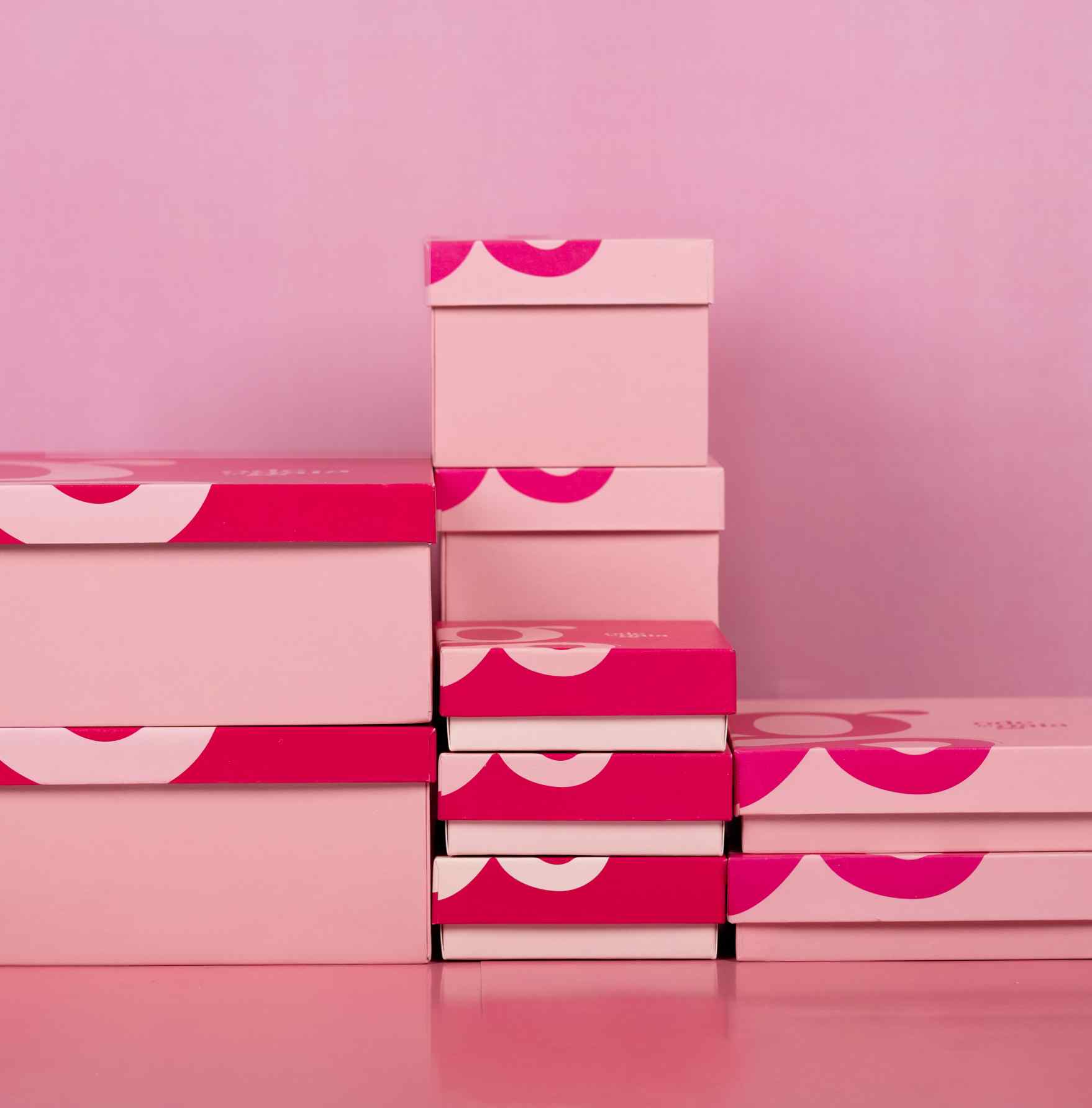
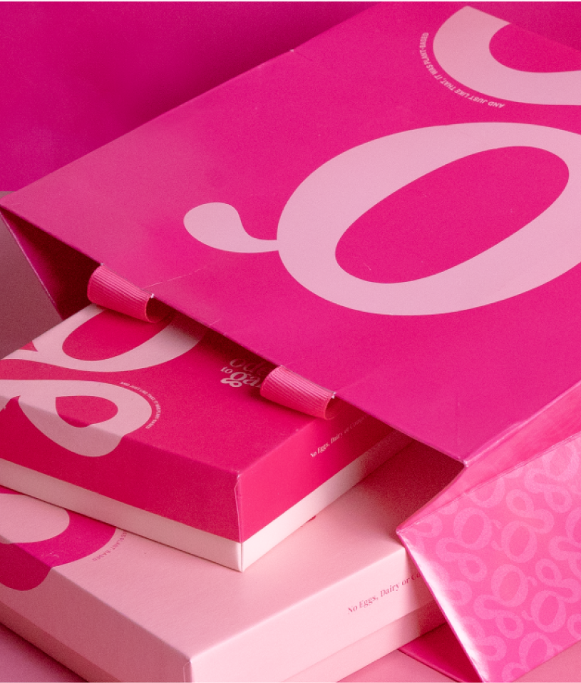
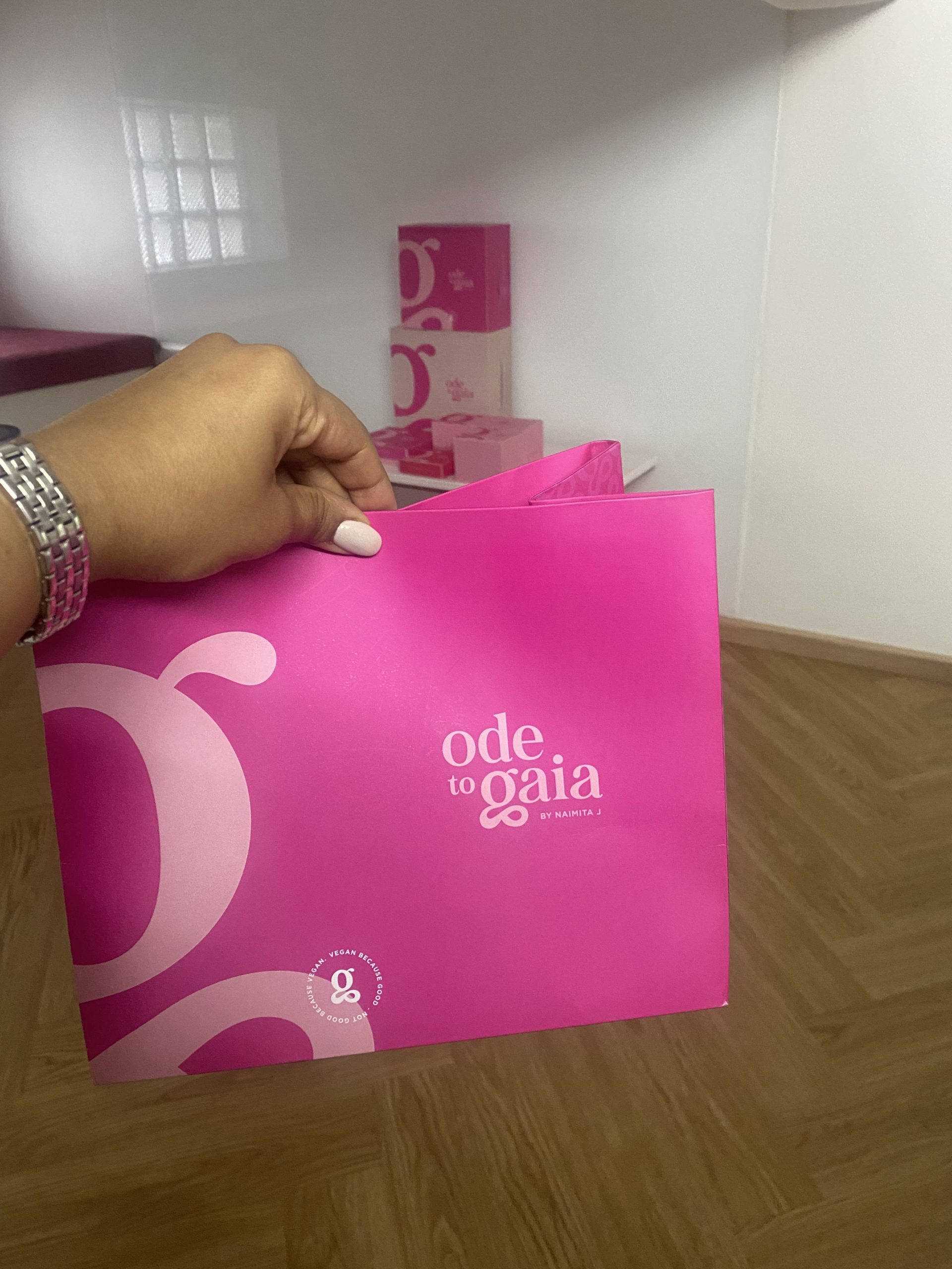
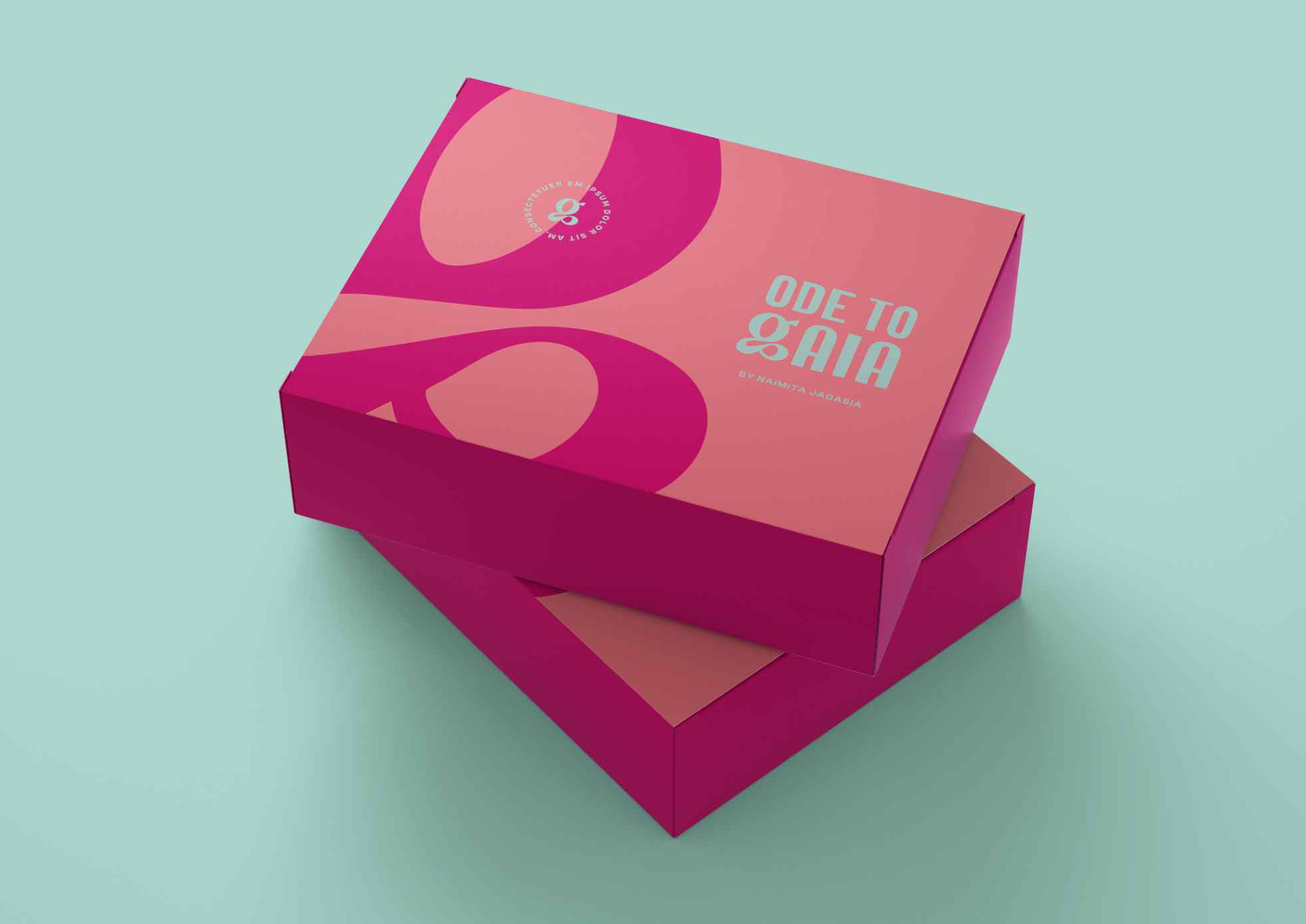
That was the ambition. Ode To Gaia was built to be loud and sassy, and still premium. The letter G carried a lot of character and the flair the brand needed, so the packaging could stay simple, sophisticated and let the G do the talking.
More than a logo, it reflects Naimita’s vision of creating a luxury patisserie deeply connected to the Earth.

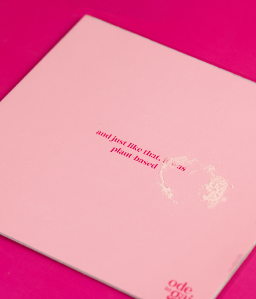
The messy, the fun, the not so pretty part of the project!

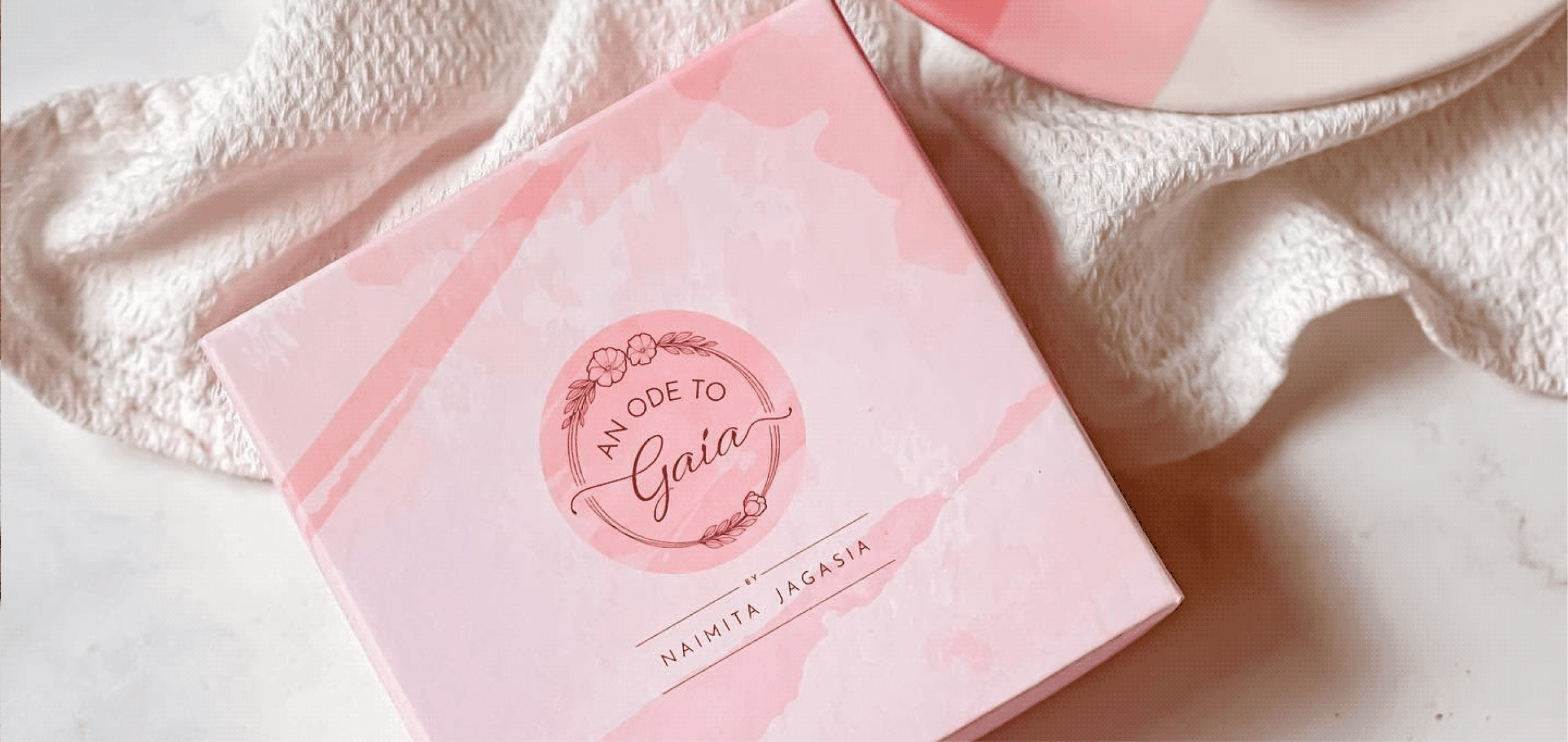
Finding the right shade of pink

Working with dessert brands has its perks

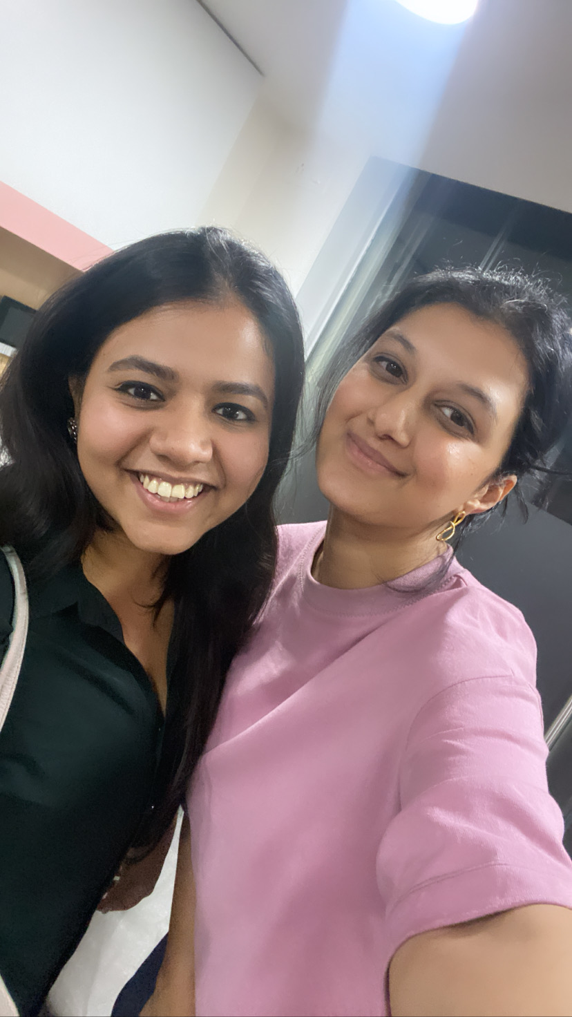
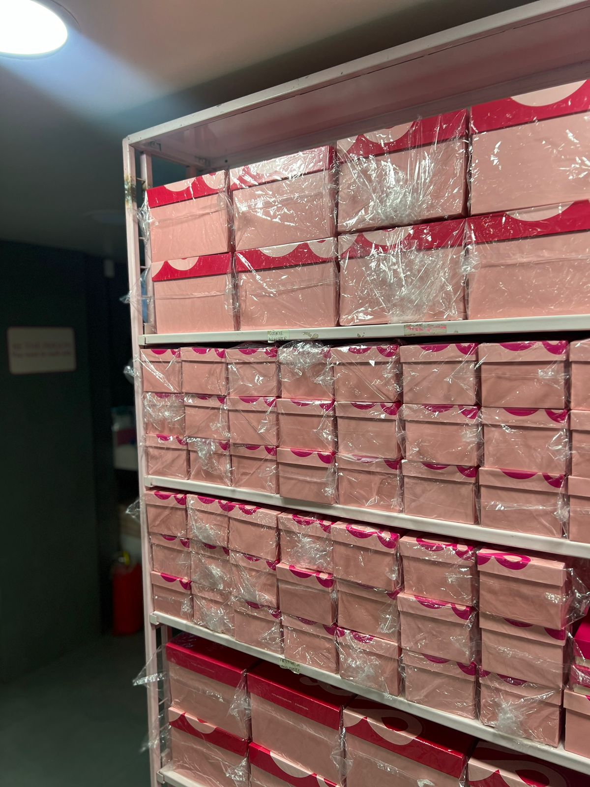
Visiting the OTG workshop

What dreams look like

One of the first rounds of packaging explorations

Always By Your Side

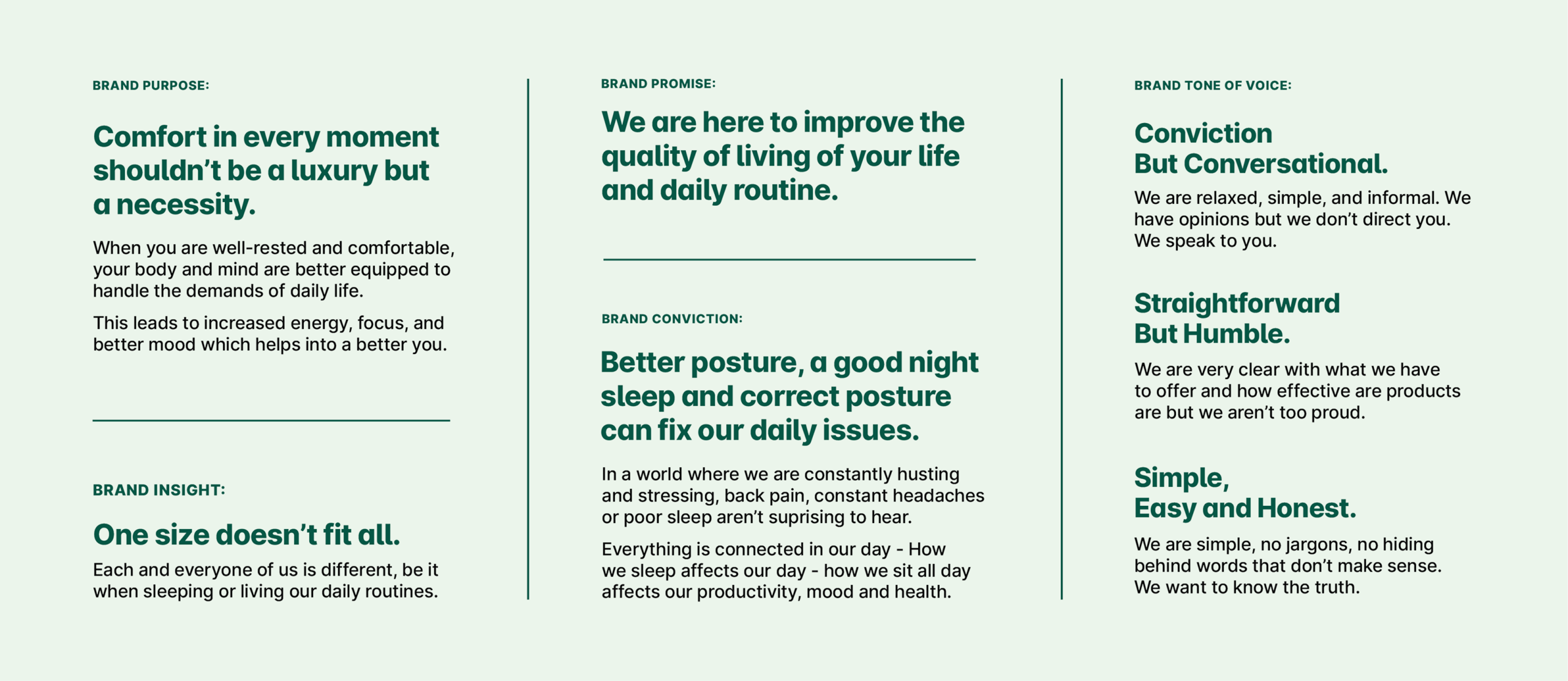
Why should comfort begin and end with sleep?

Scope Of Work: Market Research, Strategy, Brand Identity, Packaging Design, Visual Language, Web Design, and Art Direction

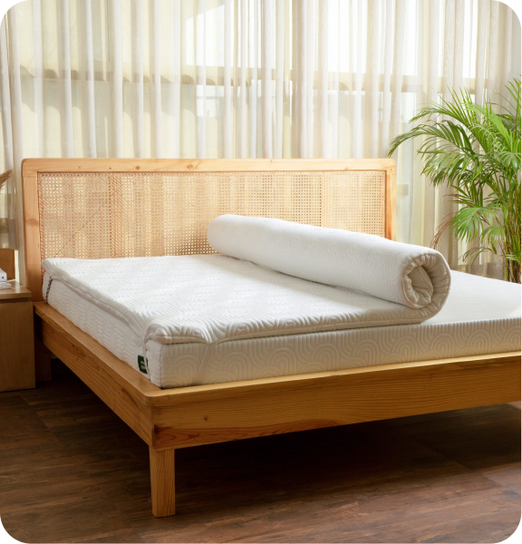
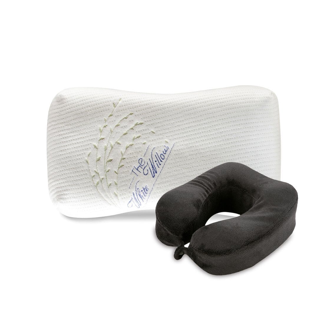
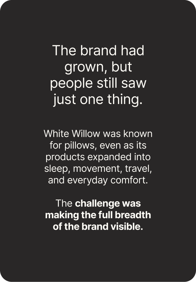
The White Willow had earned its reputation by understanding how people sleep, and what makes it better.

But as the brand expanded into mattresses, cushions, toppers and everyday essentials. One question emerged: if comfort improves our nights, shouldn’t it improve the rest of our day too?

We explored this idea with Abhishek and Meghna while repositioning The White Willow. Together, we reimagined the brand around a broader purpose that extended beyond the bedroom.

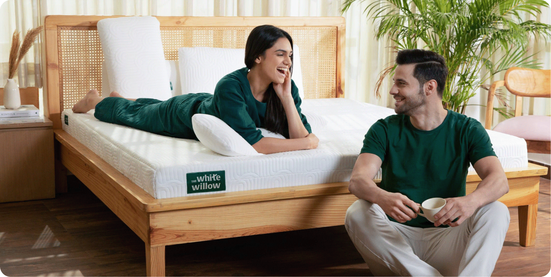
The goal was to move The White Willow from a pillow brand to a lifestyle brand that delivers comfort through the whole day.

THE CONVICTION

Can comfort become a way of living, not just sleeping?

TWW had built its reputation by understanding how people sleep. As the brand expanded into everyday comfort products, its purpose naturally grew beyond pillows.


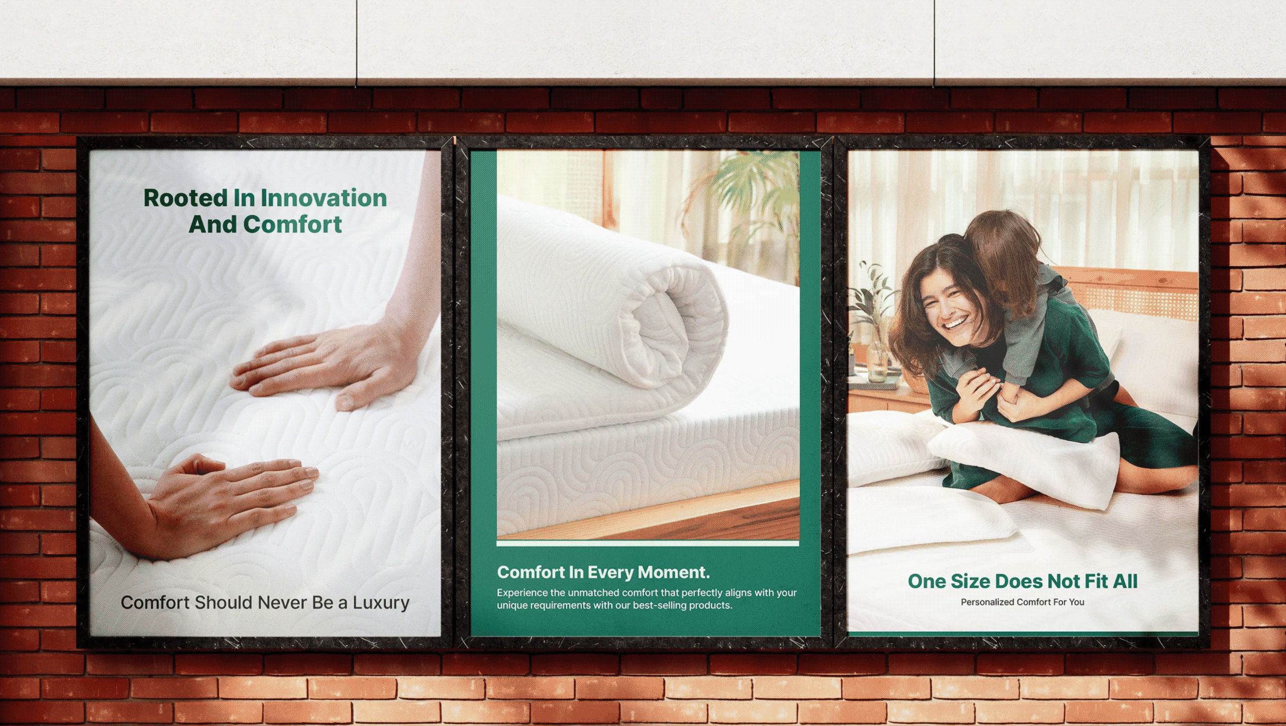
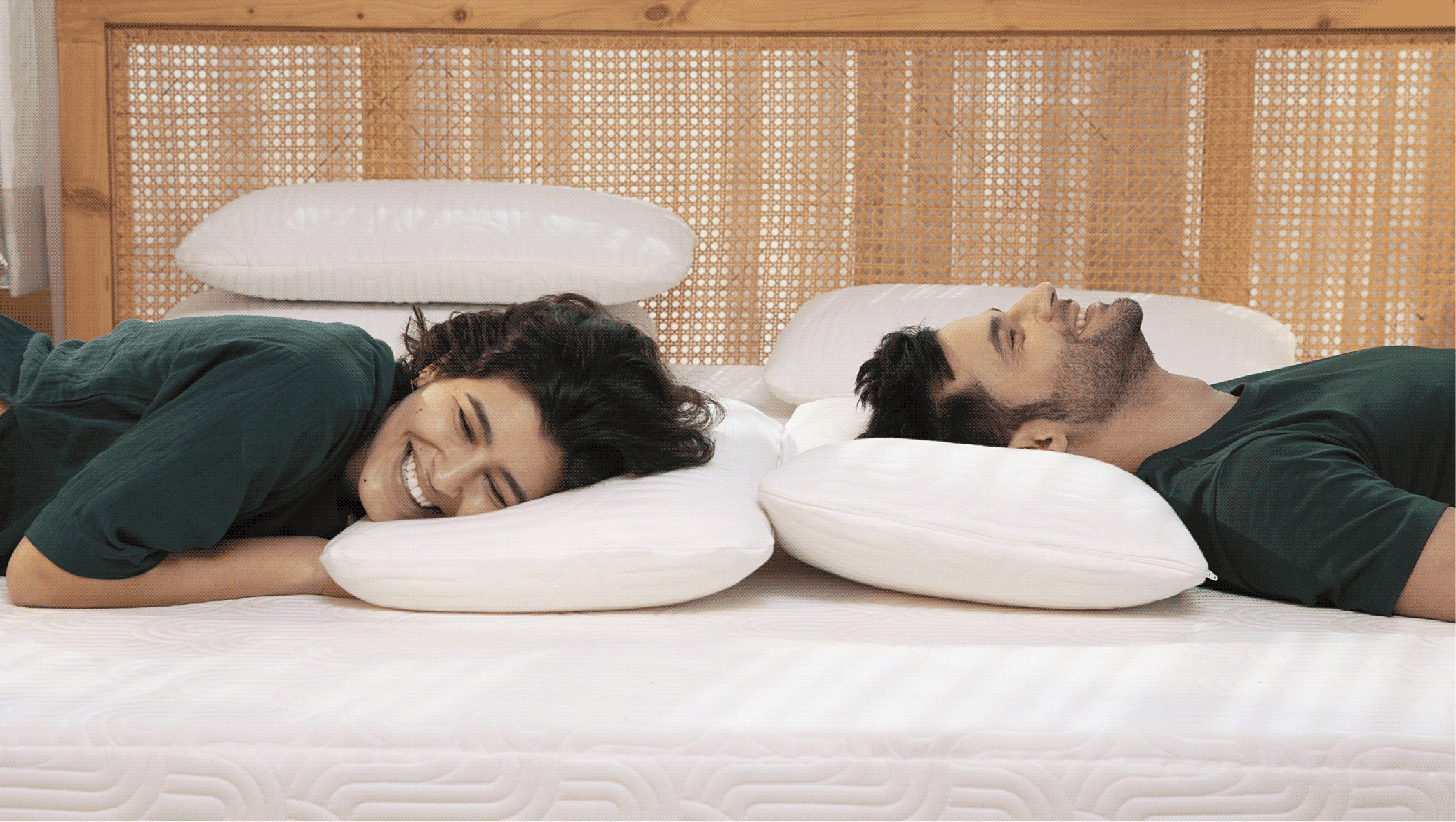
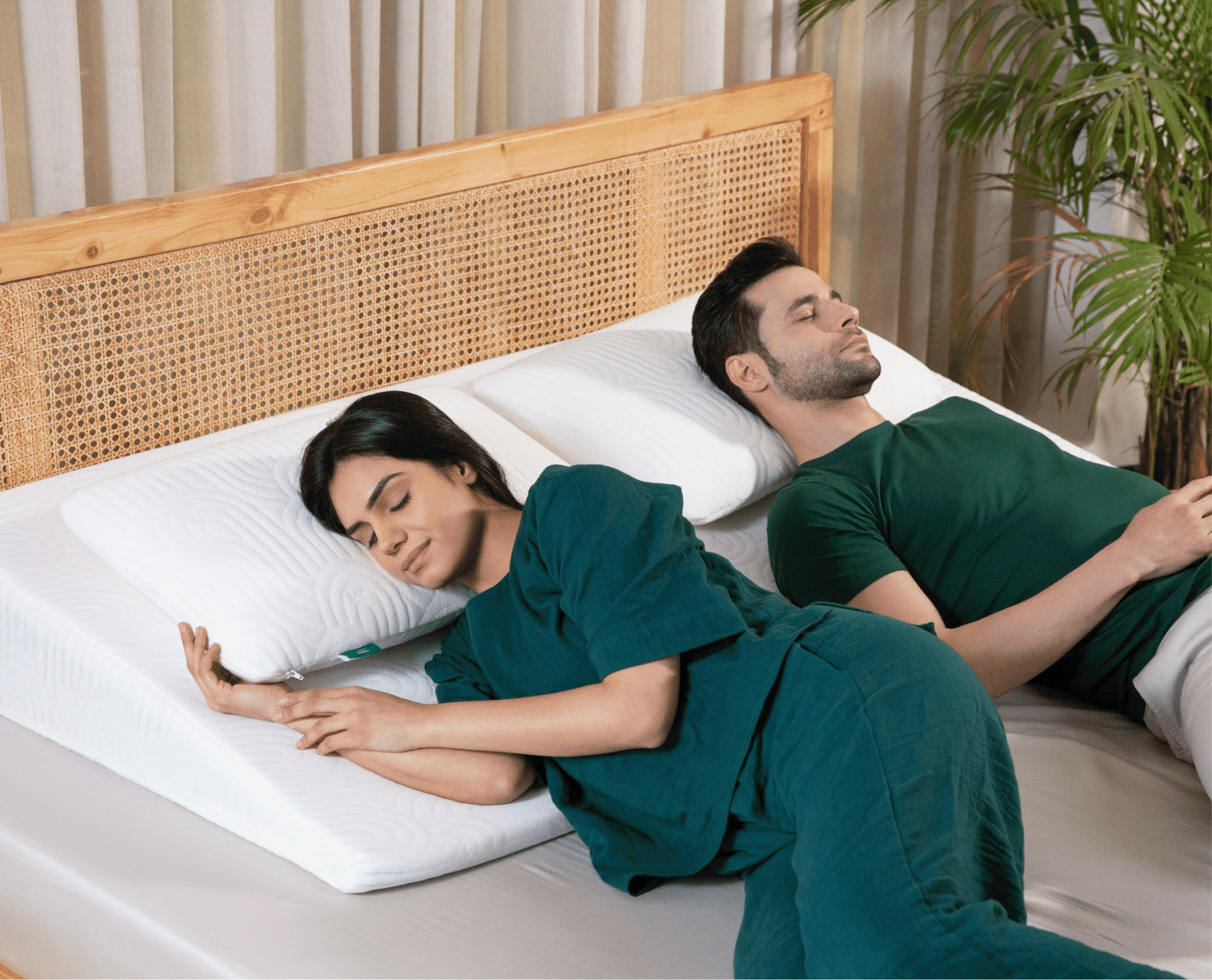
We shifted the positioning from a pillow brand to a lifestyle brand that believes in comfort in every moment and provides round the clock comfort. A brand that improves the quality of living of your daily life.

THE TURNING POINT

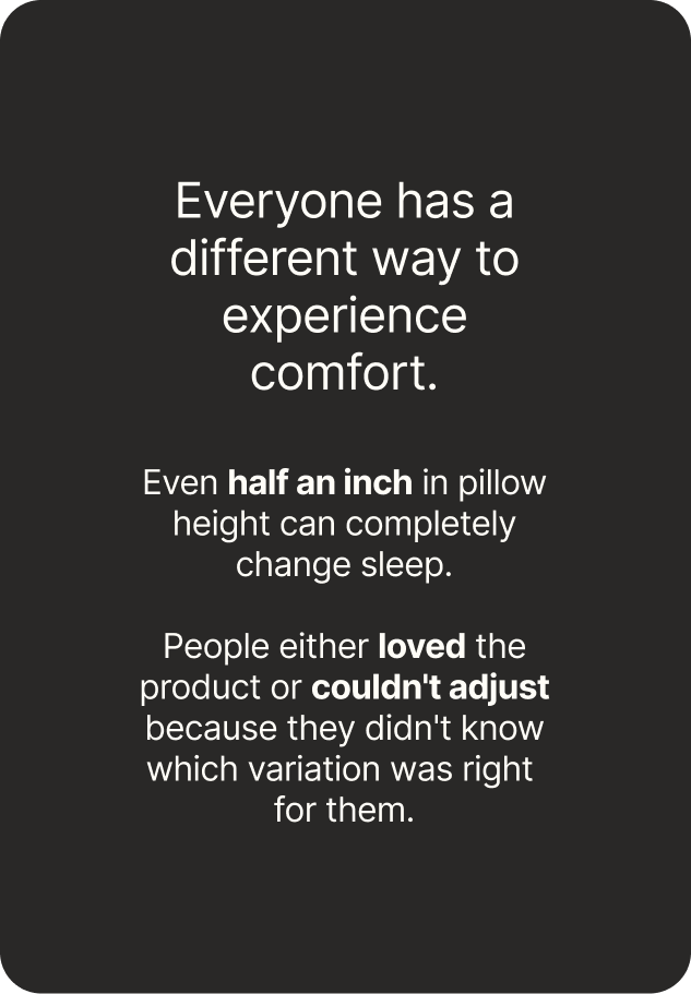
The products had evolved. The brand hadn't.

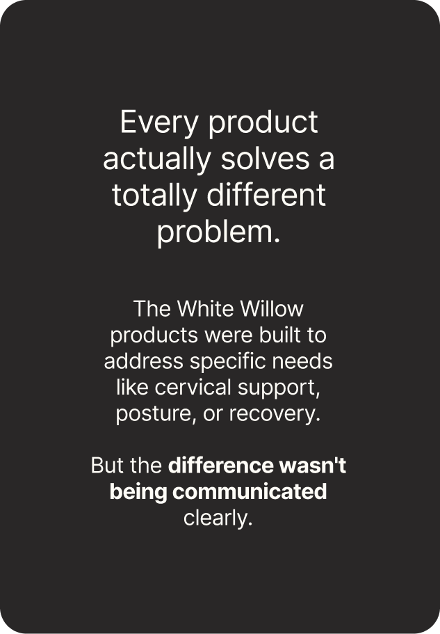
TWW had spent almost a decade perfecting comfort through thoughtful design, premium materials, and a deep understanding of how people rest & see comfort.

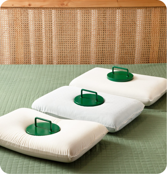
The challenge was to help people understand which product was right for them, what made it different, and how every category belonged to one clear brand.

Comfort in every moment shouldn’t be a luxury but necessity.

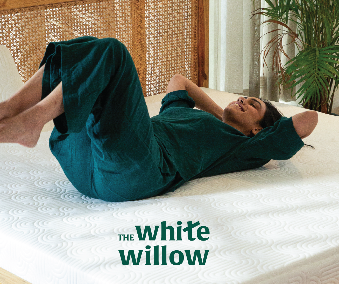
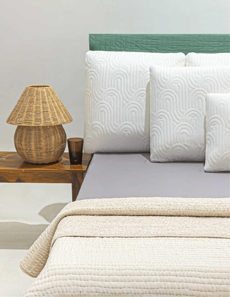
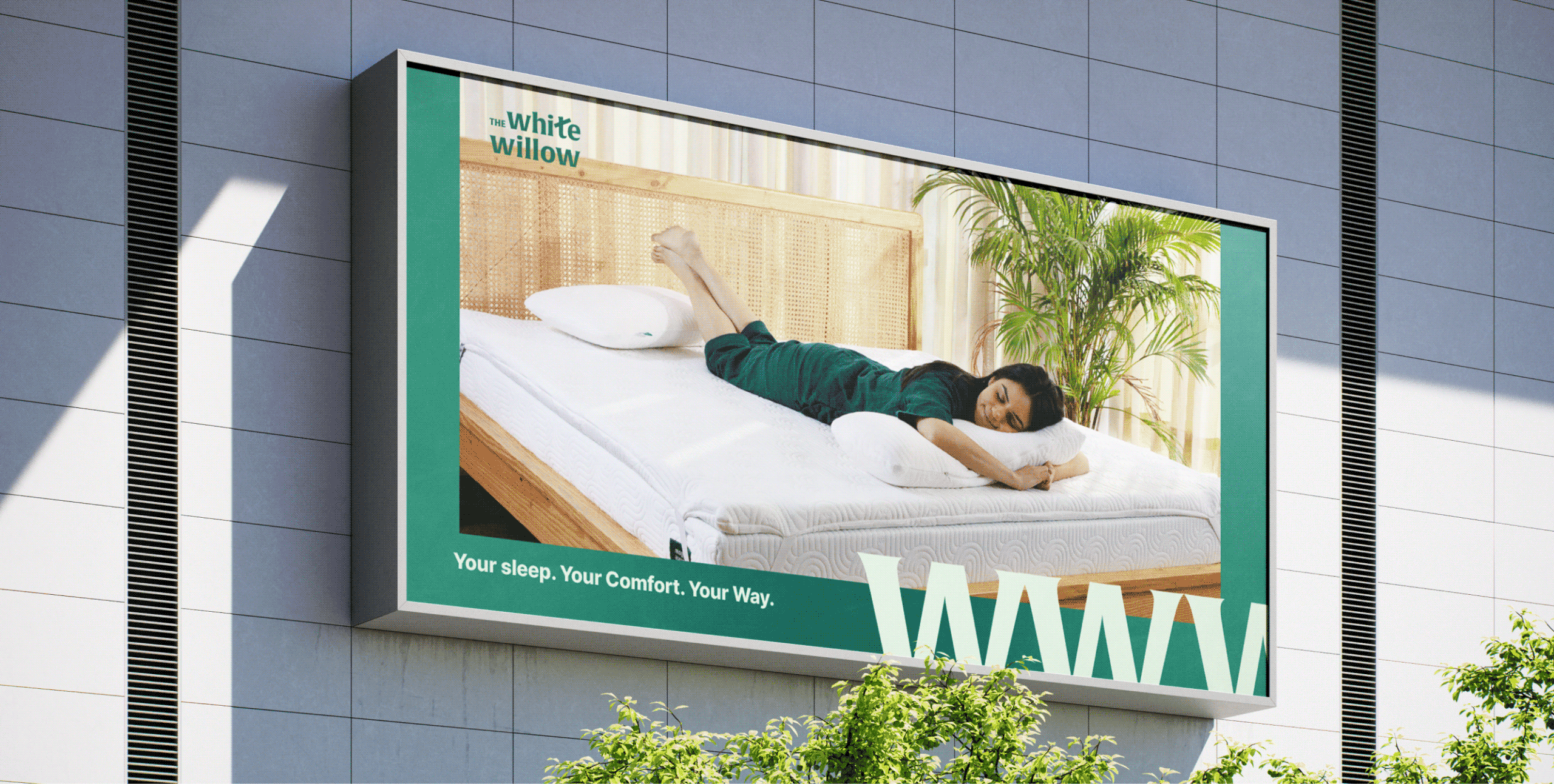
Introducing The White Willow

A round the clock brand, by your side through every moment. From waking up to 
winding down, we deliver comfort throughout your day.

THE FOUNDATION

A system designed to grow along with the brand.

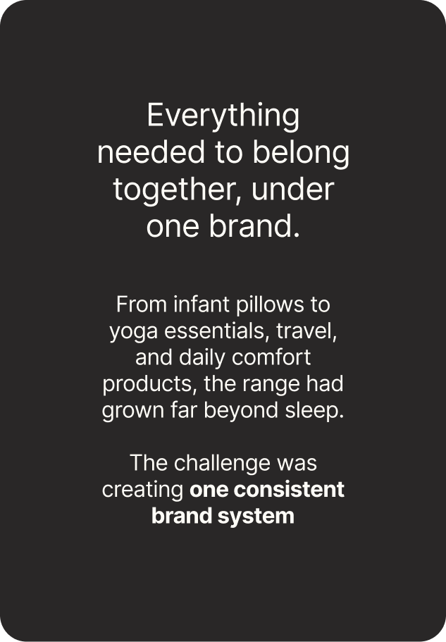
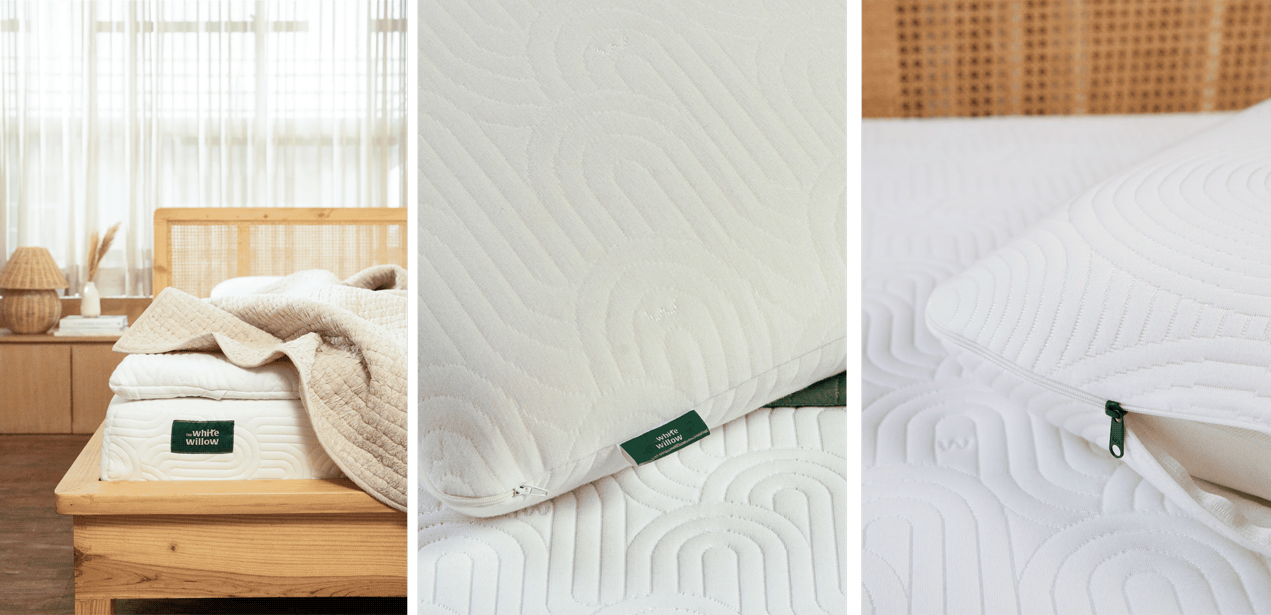
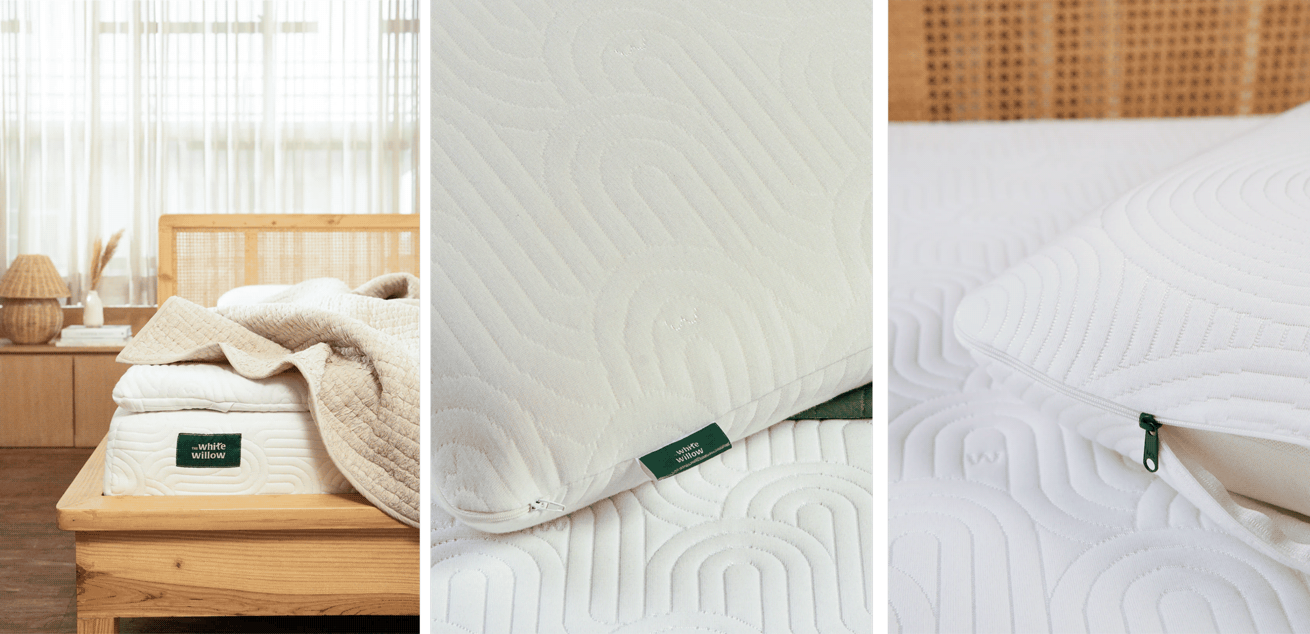
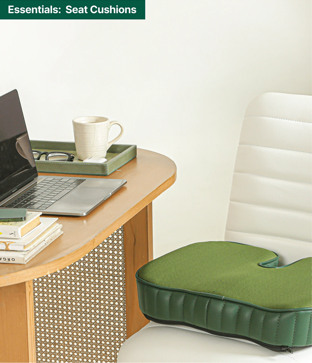
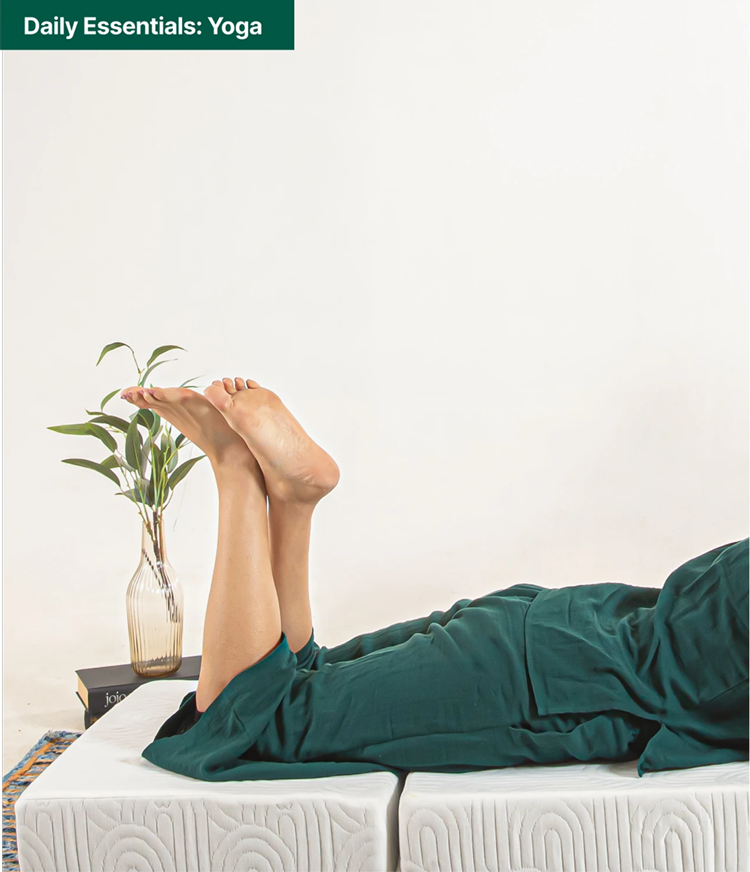
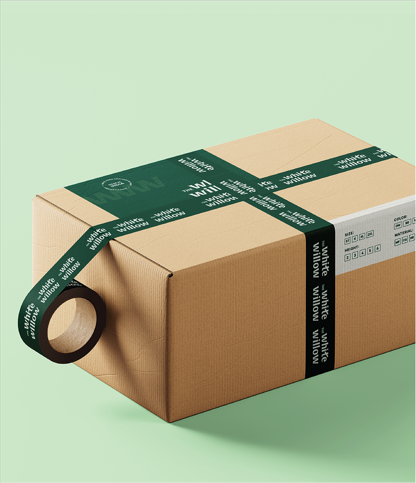
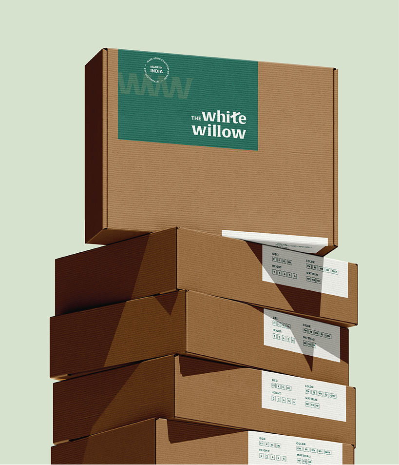
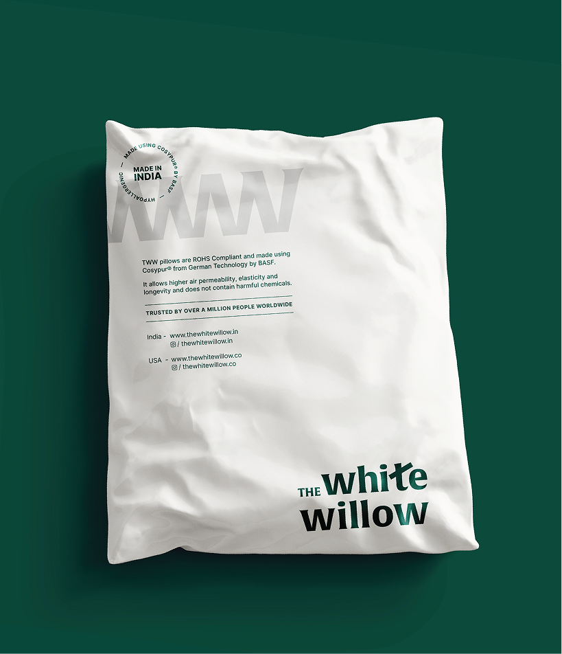
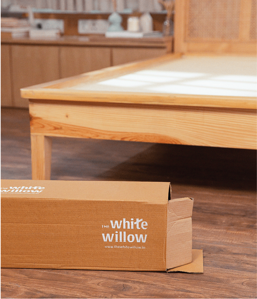
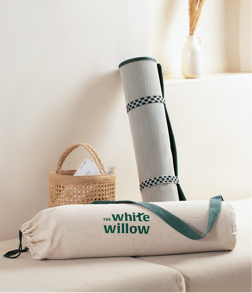
The White Willow’s expanding product range required more than individual packaging designs. We created a scalable identity system that could unify over 250 SKUs while giving every category its own place within the brand.


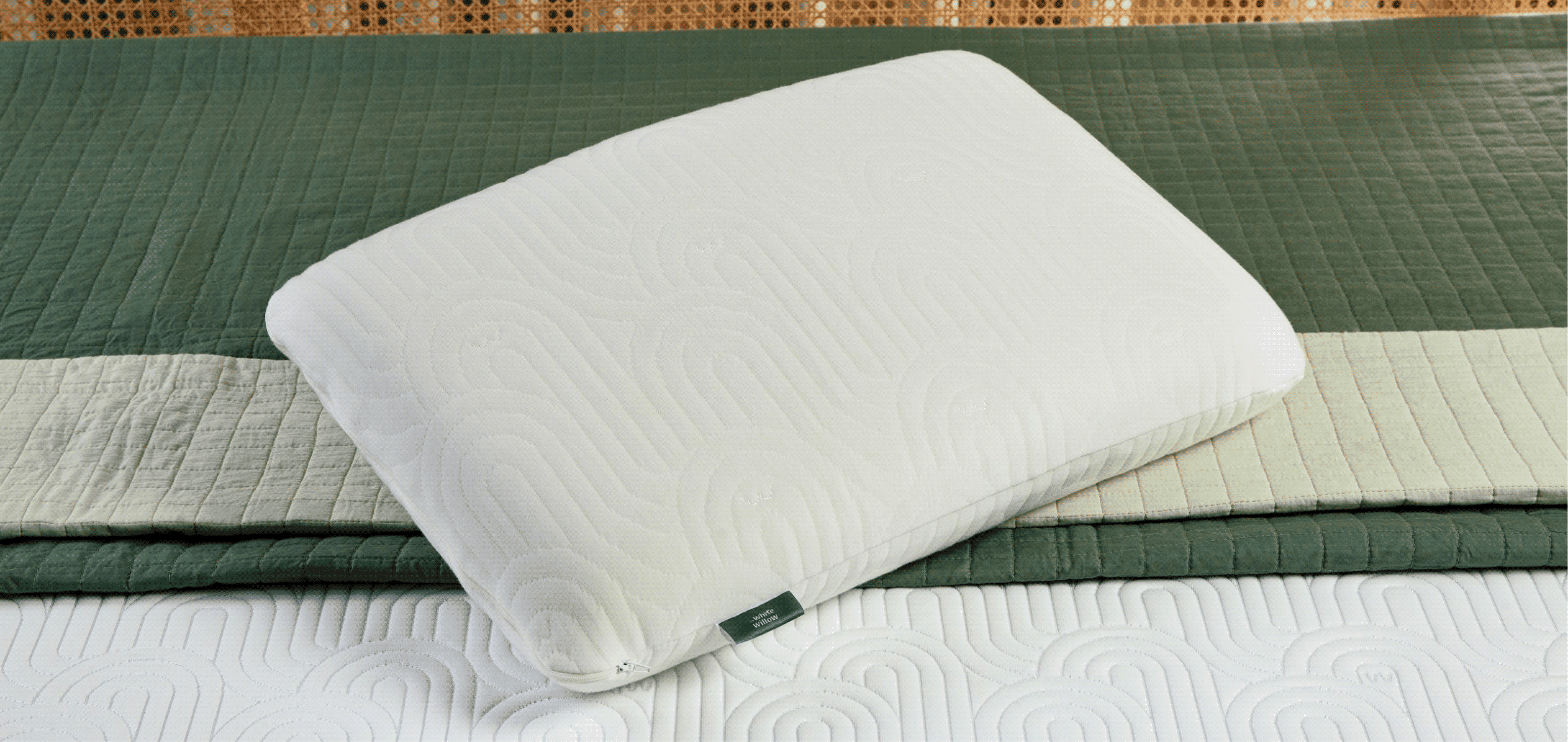
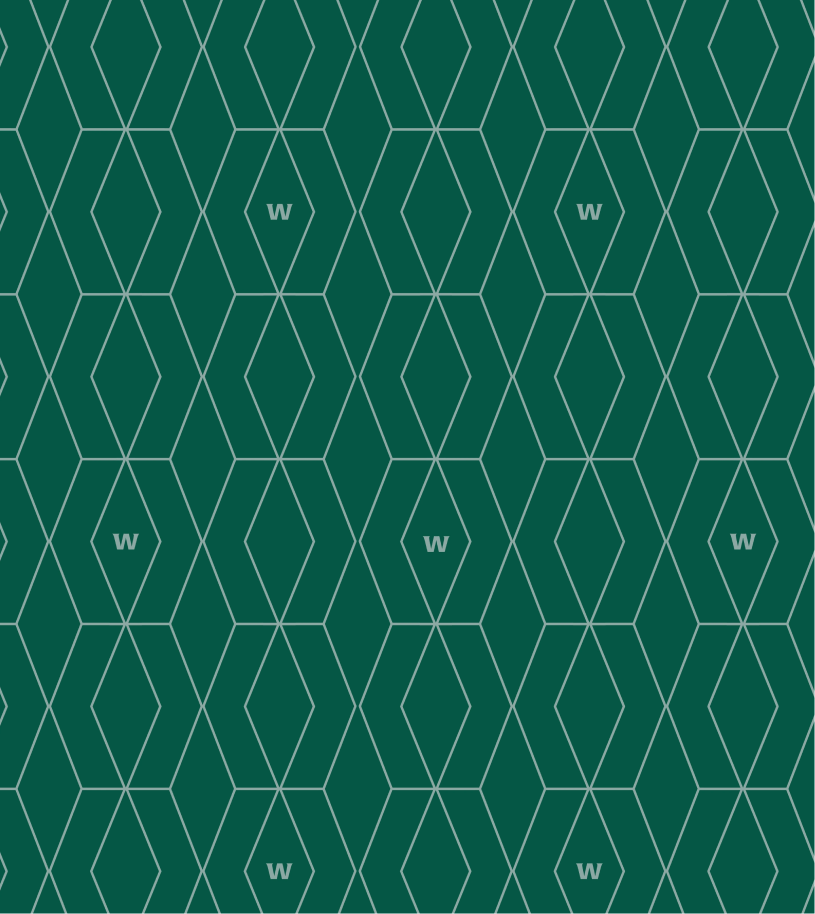
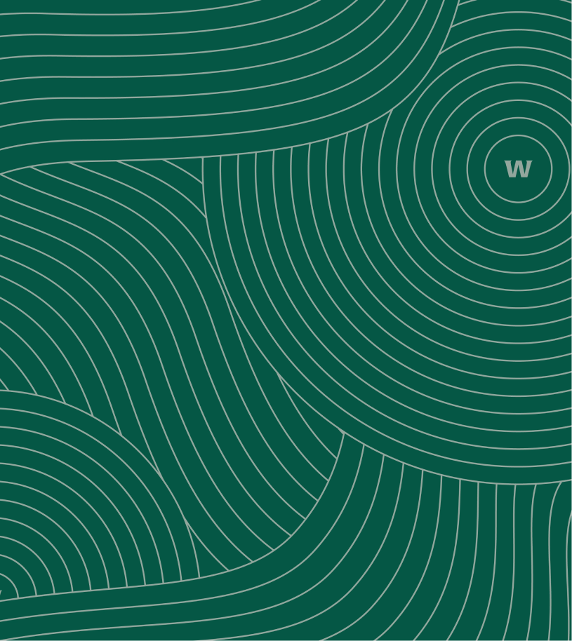
Calming custom patterns, a signature willow-inspired emerald green, and a modular packaging framework build a visual language that felt consistent, recognisable, and ready to evolve.

THE CLARITY

Good products deserve clear communication.
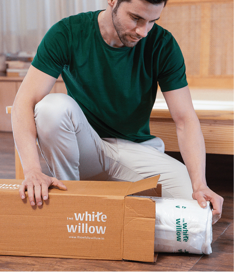
Every product solved a different need, but consumers found it difficult to understand the differences. We realised the problem wasn’t the range; it was how the range was being communicated.


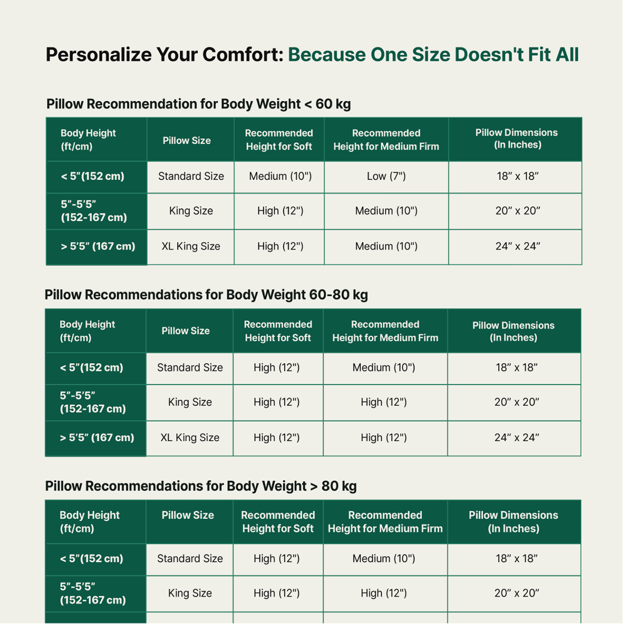
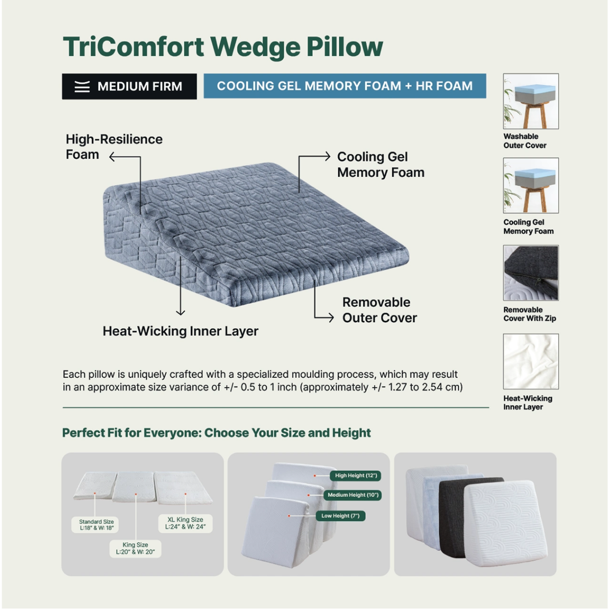
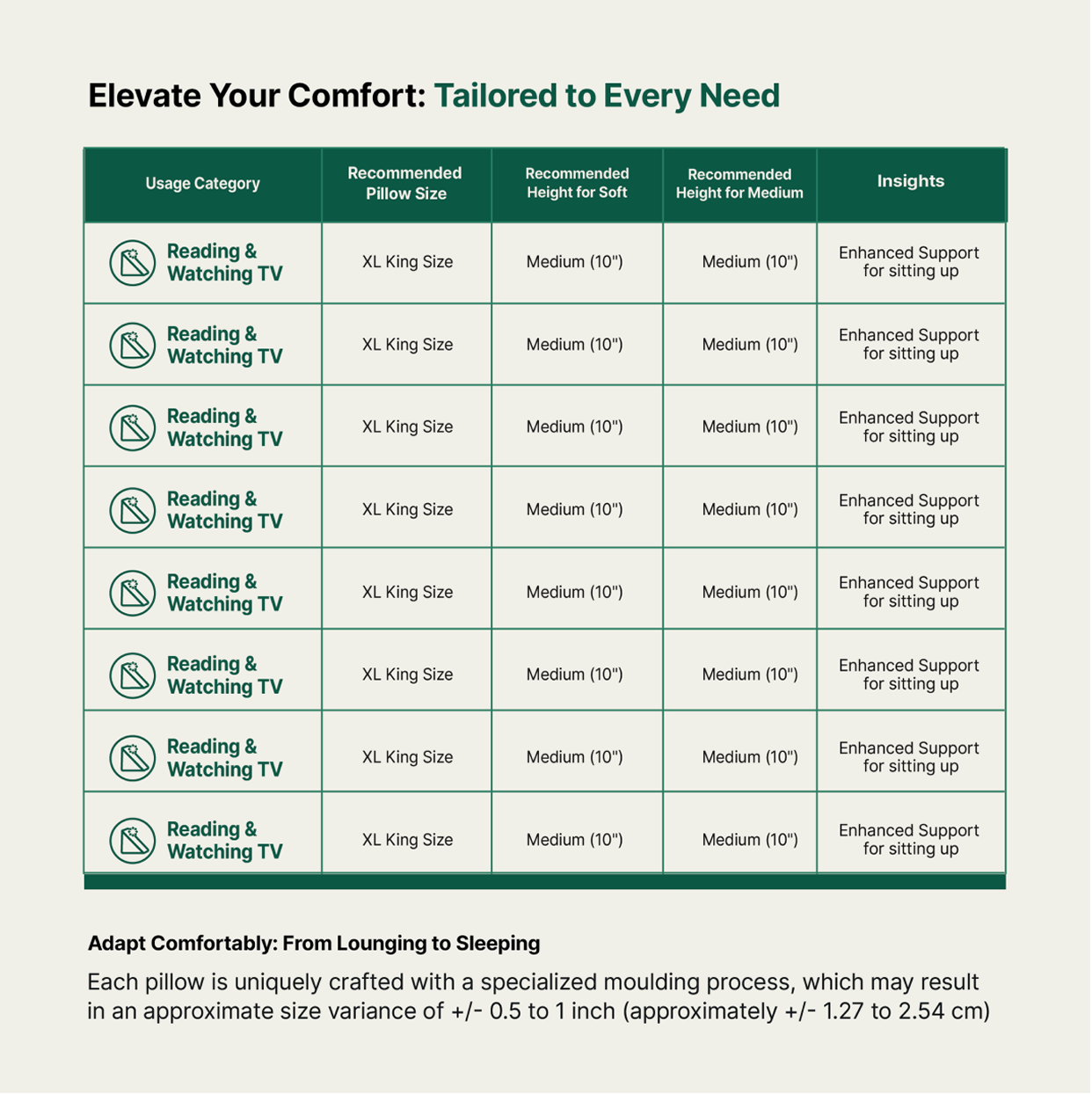
Clear product architecture, custom iconography and size guides turned a complex portfolio into something you could actually shop.

How do you deliver the same experience through different products?

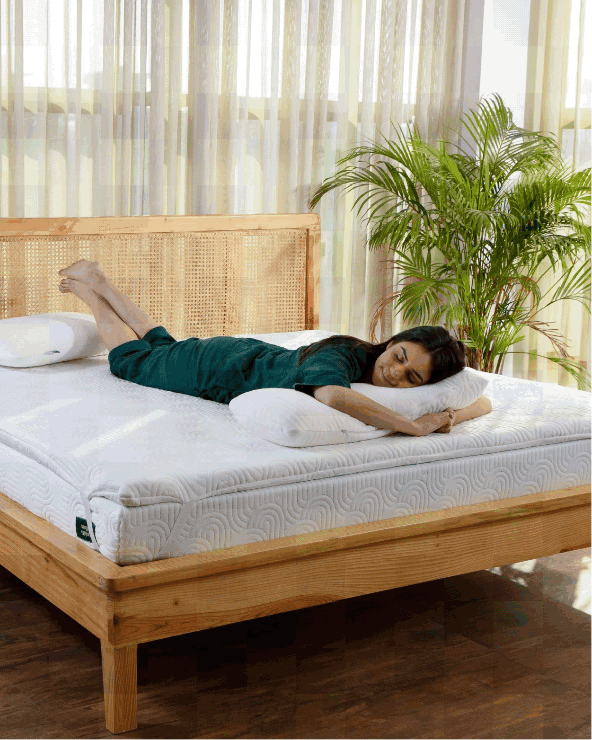
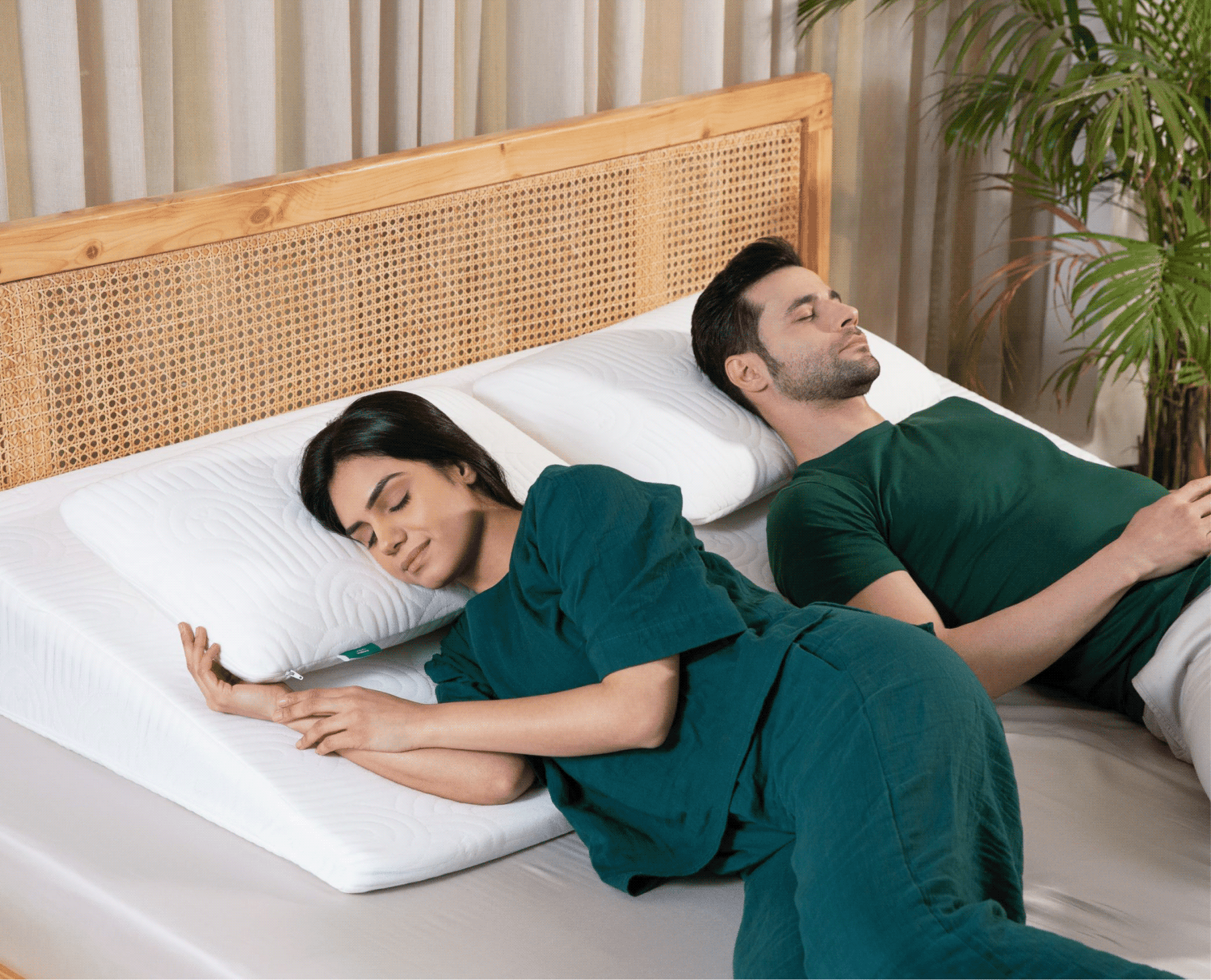
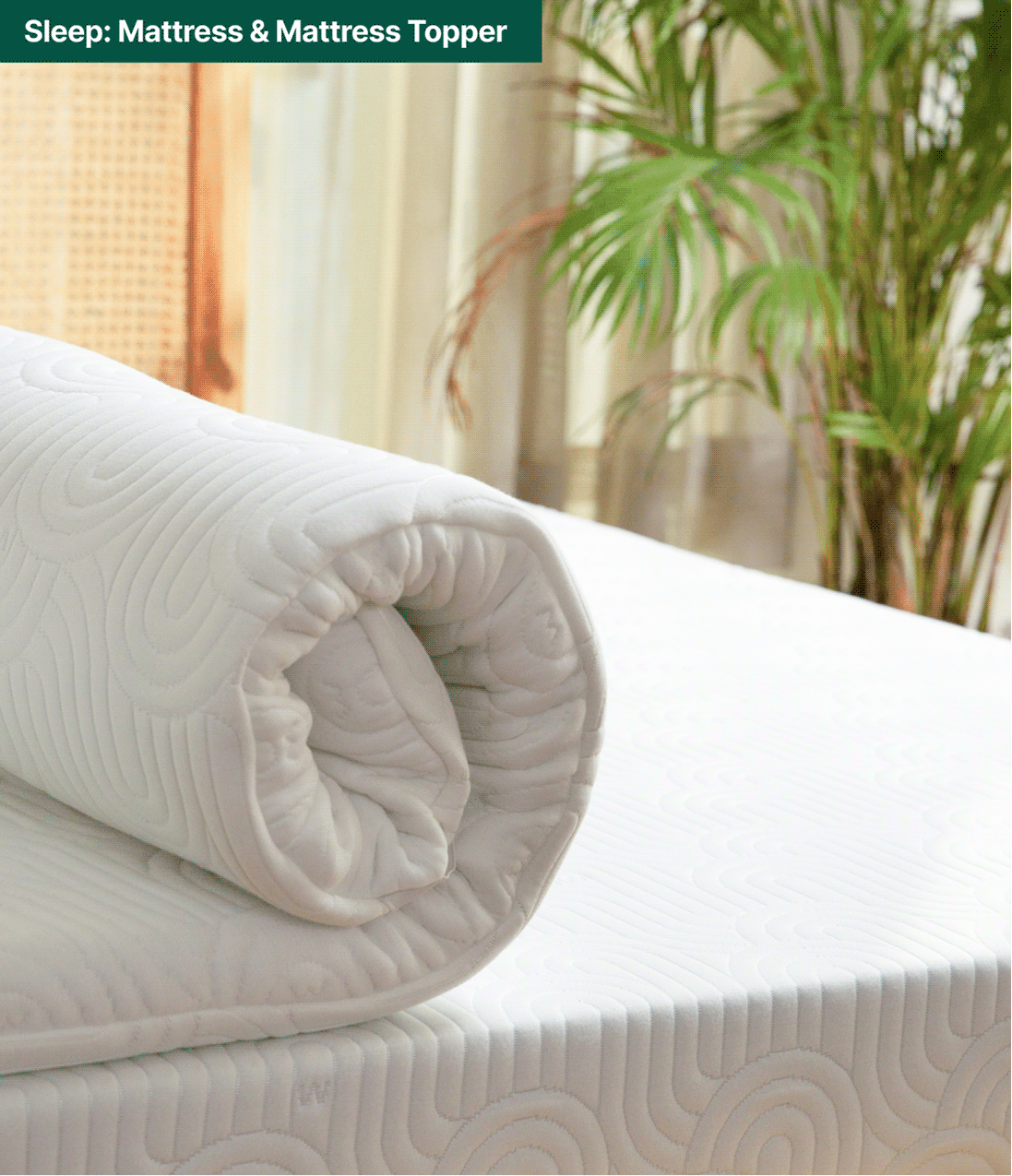
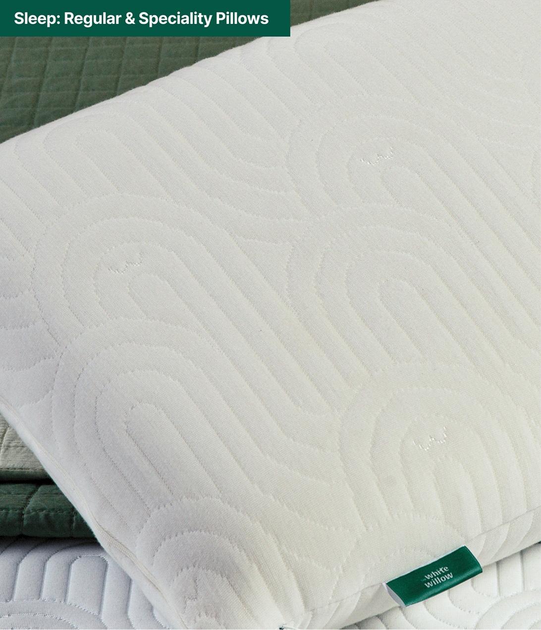
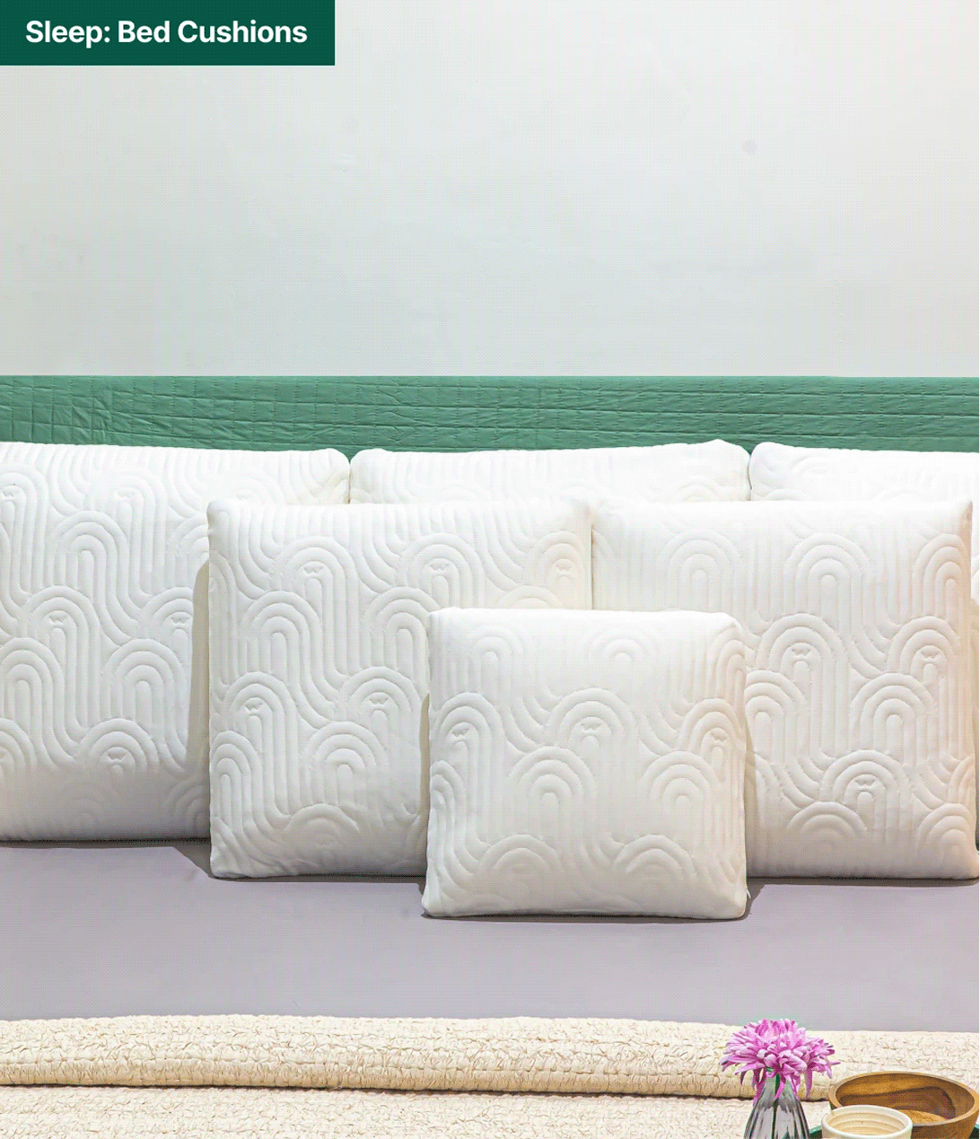
Each new category arrived with its own SKUs. So, we designed a cohesive visual language across White Willow’s expanding range; bringing consistency to every category, from sleep essentials to everyday comfort.

Klear The Stigma, Not Just Acne

Can a skincare brand clear the stigma, not just acne?

Scope Of Work: Research, Strategy, Brand Identity, Product Packaging, Visual Extension, and Web Design.
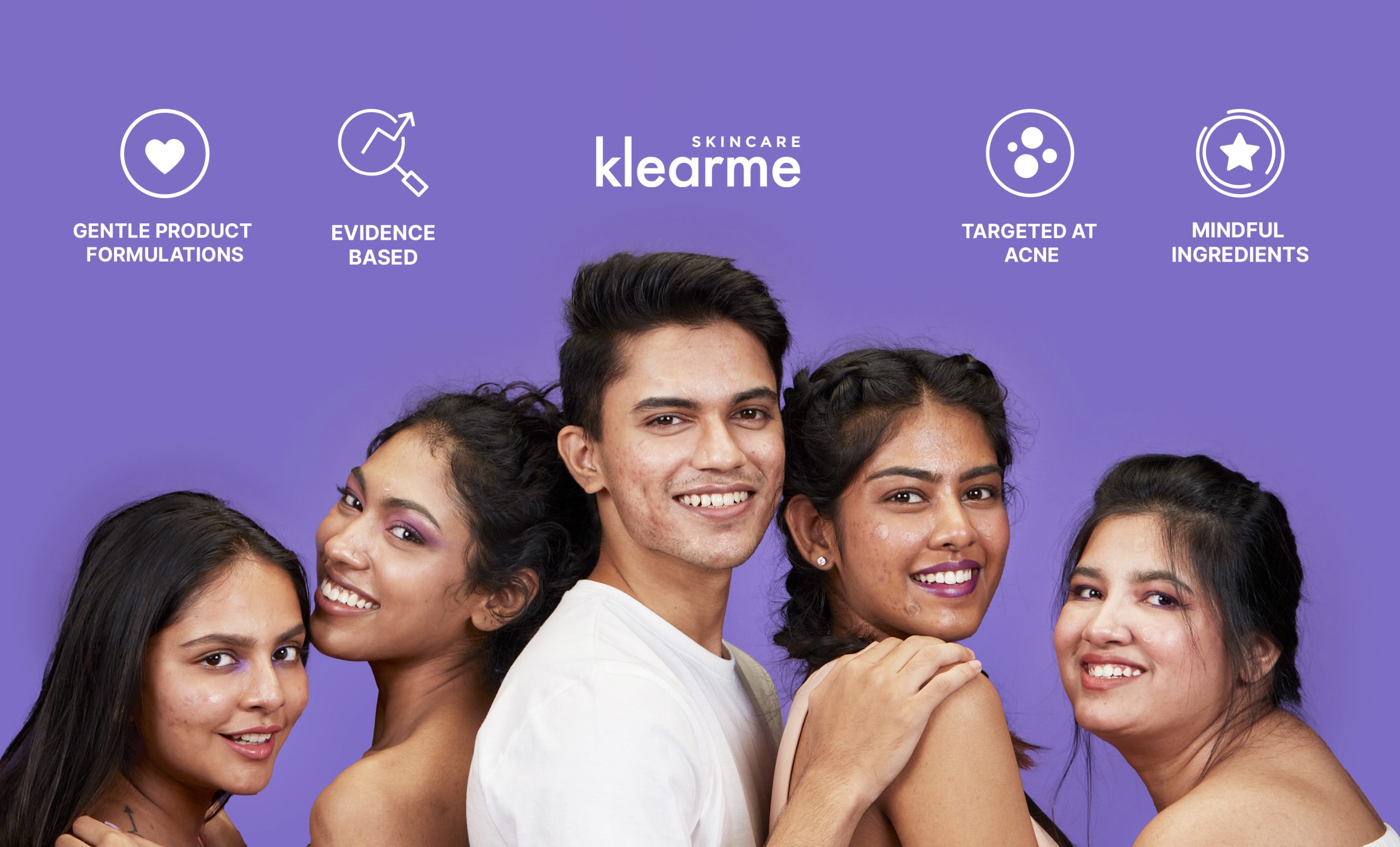
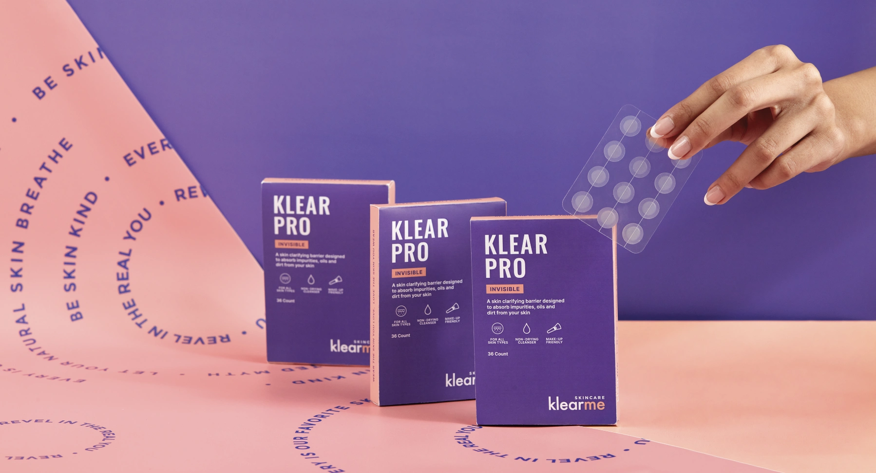
Acne is one of the most common skin concerns, yet most brands still communicate through flawless faces and impossible standards. If skincare is meant to build confidence, then why do so many brands make people feel the opposite?
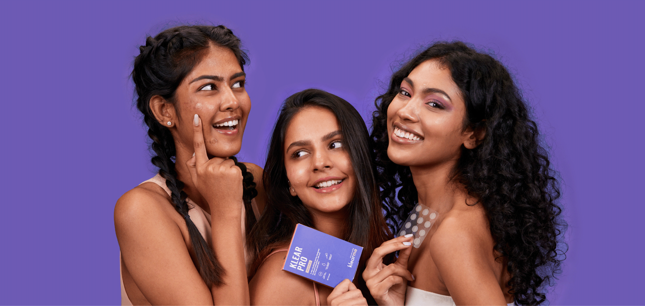

We explored this question with Anish while building Klearme. Together, we set out to build a brand that embraced real skin and made conversations around acne feel human, without giving up on the formulations.

The goal was to build a brand that treated acne with honesty, empathy, and confidence.

THE CHALLENGE

How do you make skincare feel less intimidating?

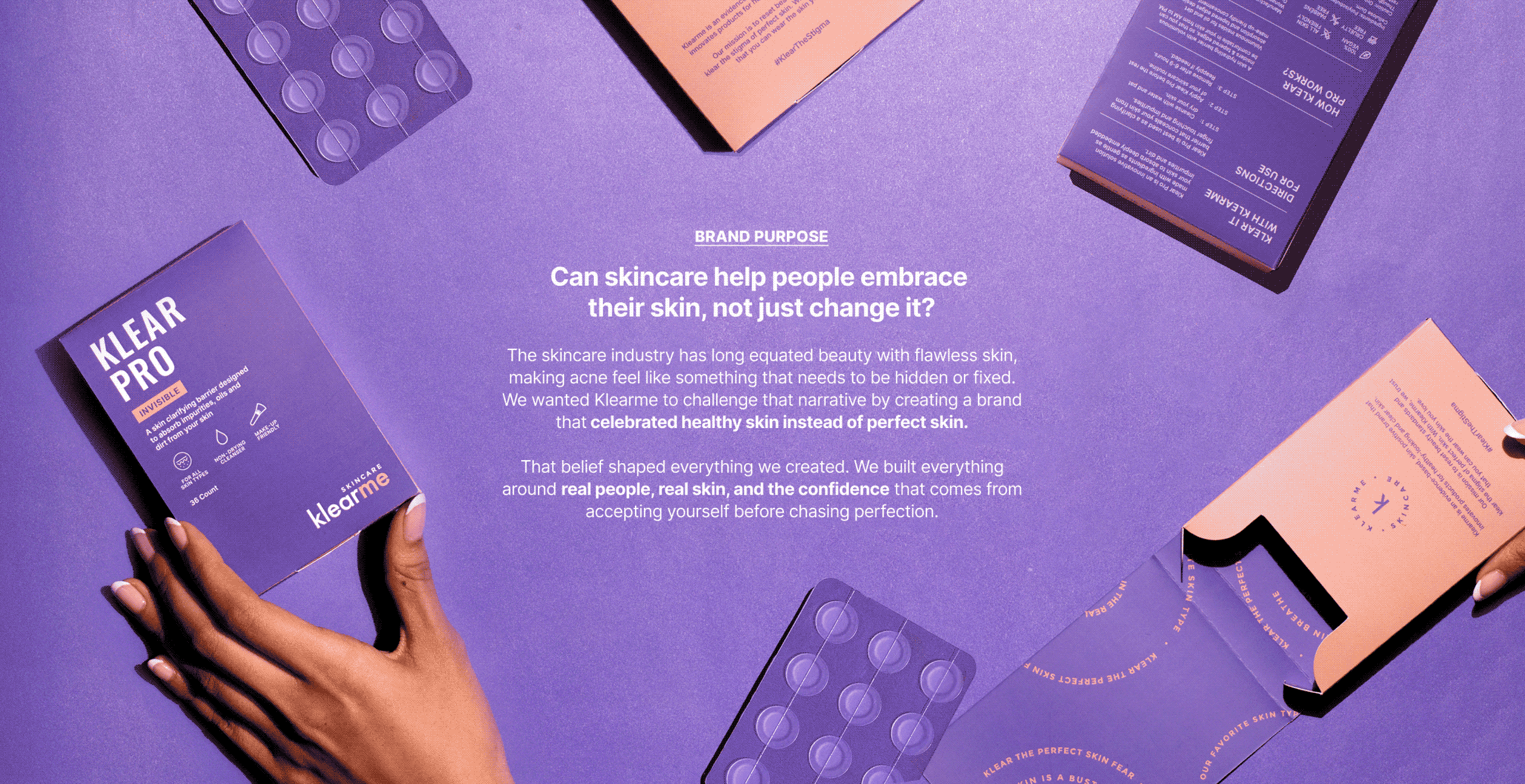
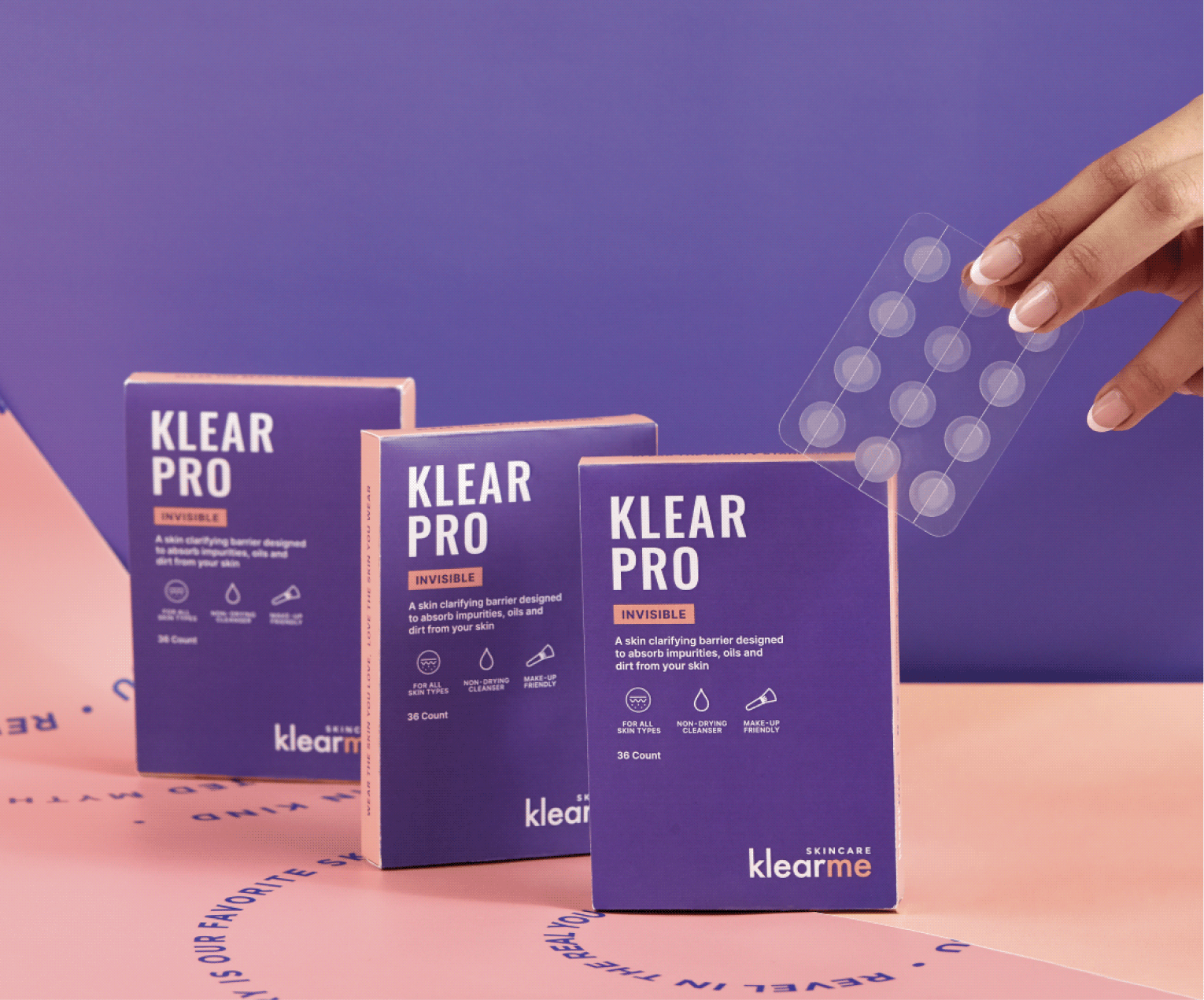
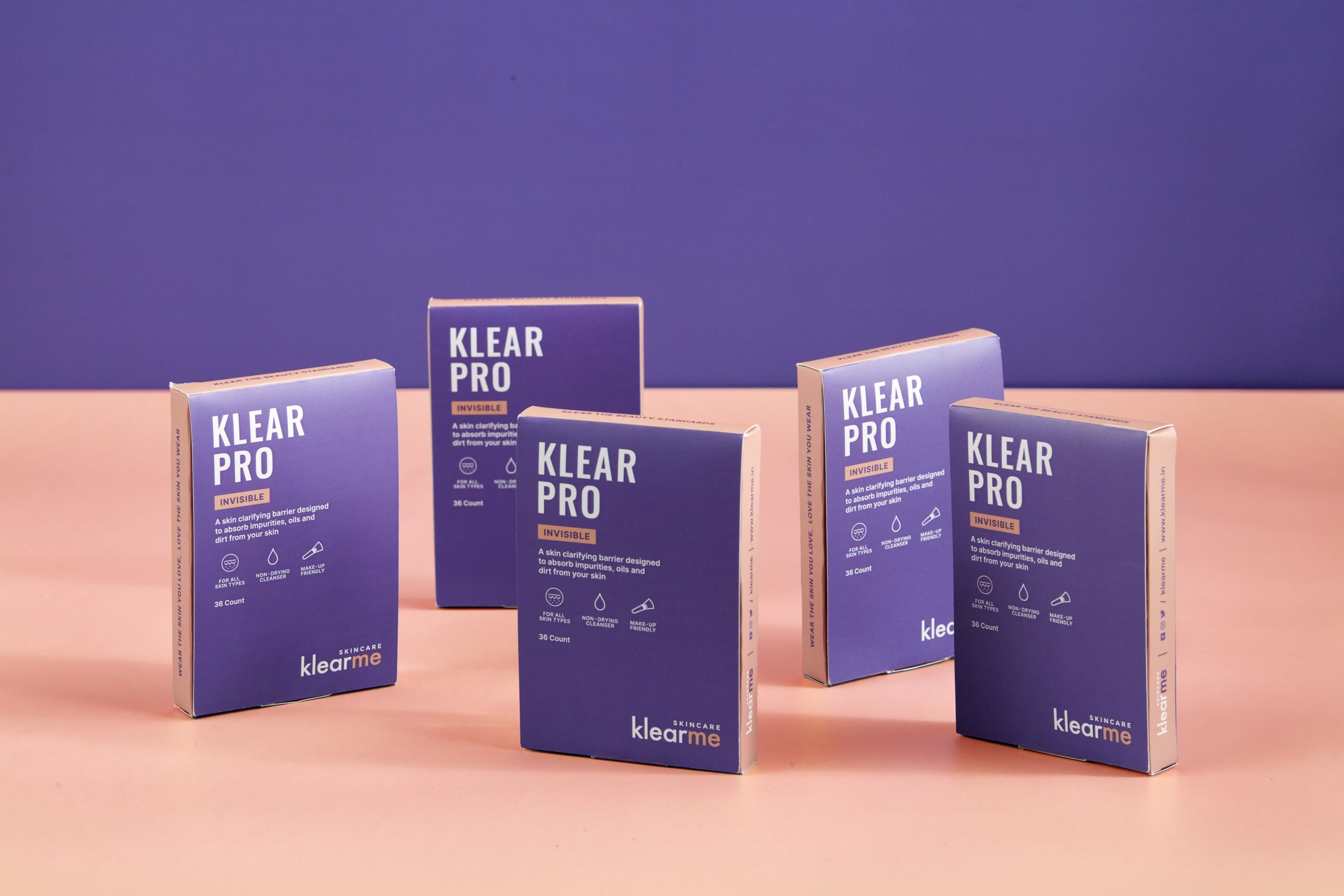
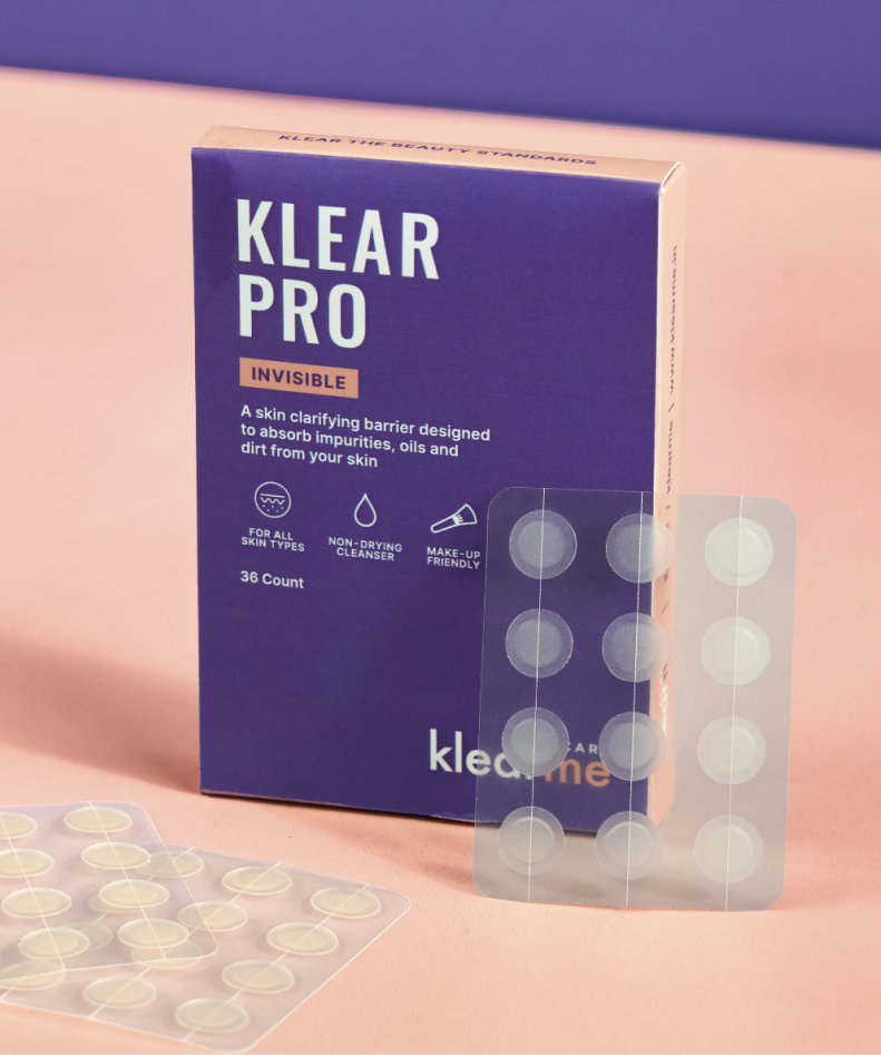
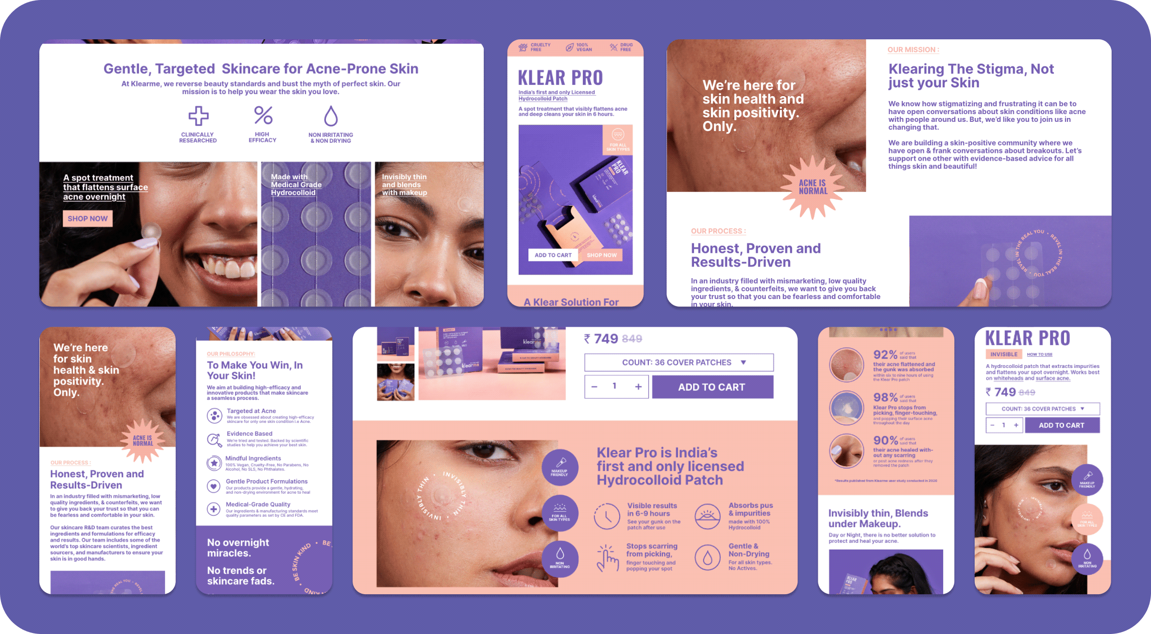
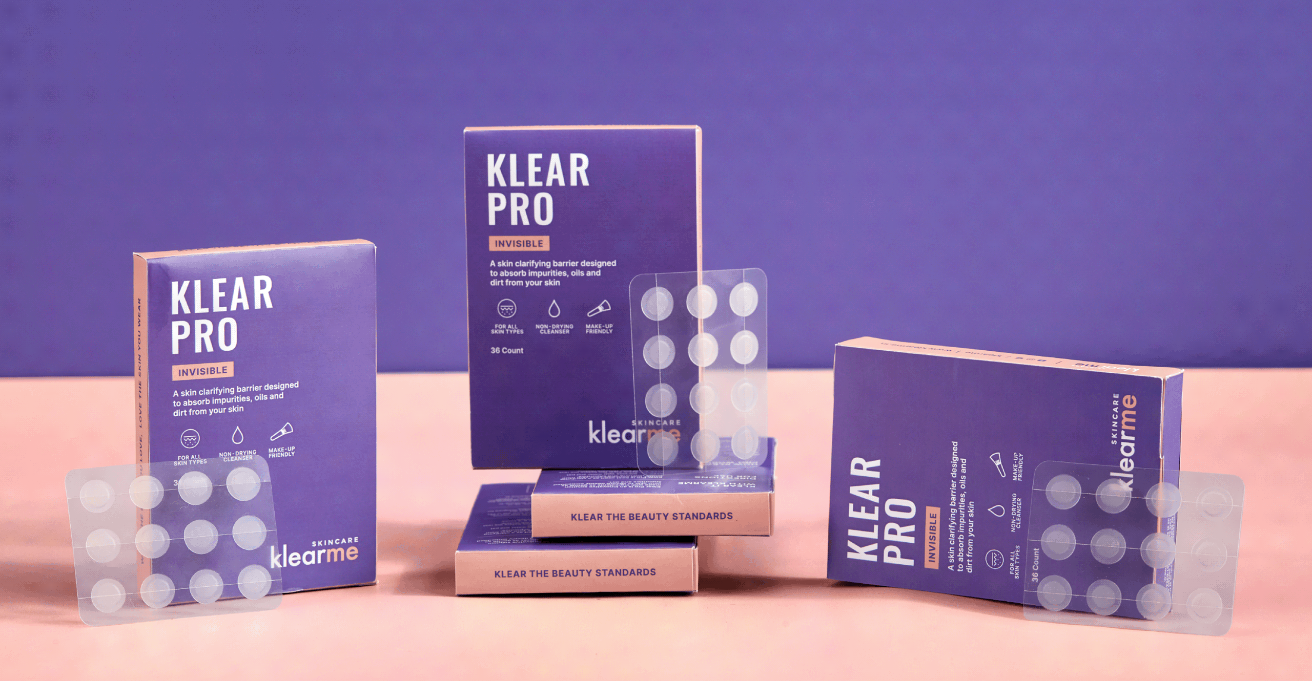
We built Klearme’s identity to feel approachable, optimistic, and easy to navigate. A clean editorial wordmark, contrasting colours, and a flexible visual system made the brand feel confident without becoming clinical.

Every extension, from icons and patterns to educational graphics, helped simplify acne care while reminding people that skincare is about understanding your skin, not hiding it.

THE BEST PART

Real People. Real Skin. Real Results.

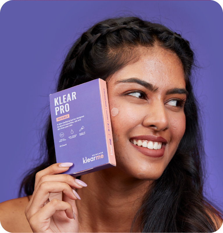
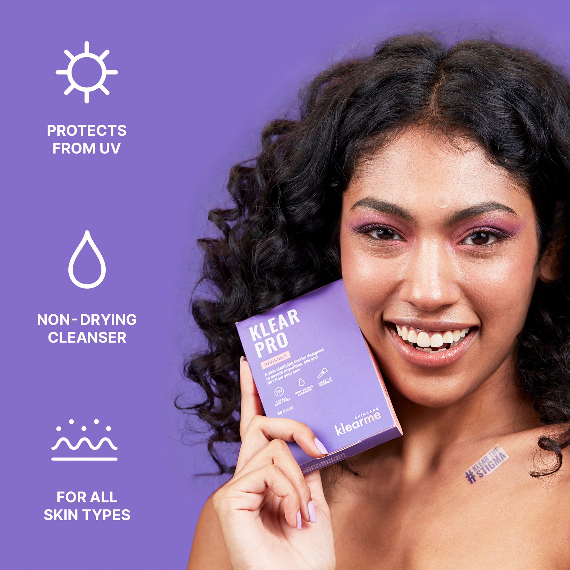
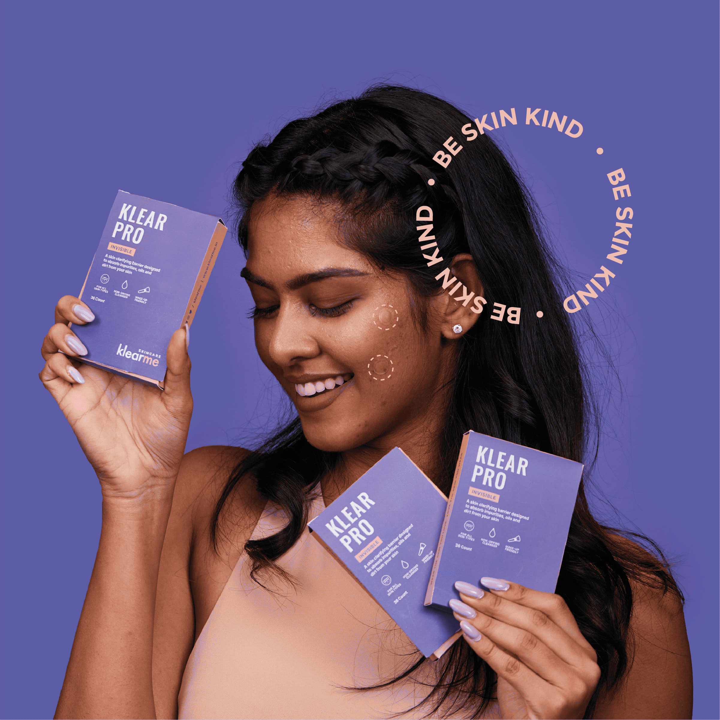
A brand that celebrates the real you. With Klearme, we wanted to clear the stigma of perfect skin and beauty standards. We wanted our consumers to celebrate their real skin and love the skin they wear.

The narrative was simple. There is no such thing as perfect skin. Healthy skin is beautiful skin, and that is what the images had to show: real people, comfortable.

What arrives before the product does?

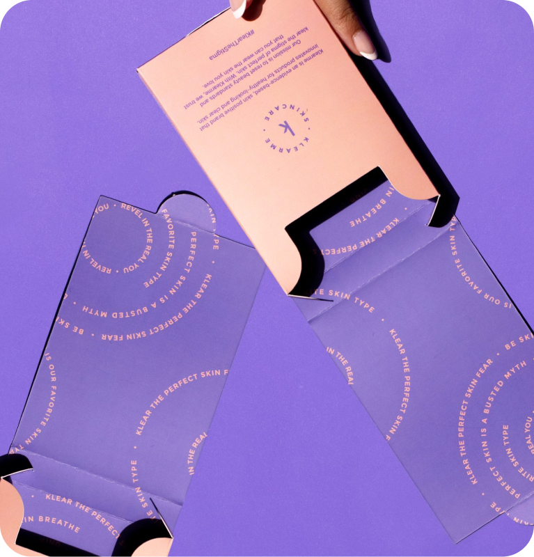
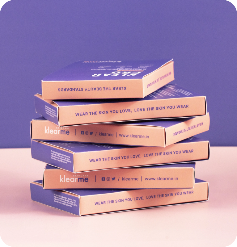
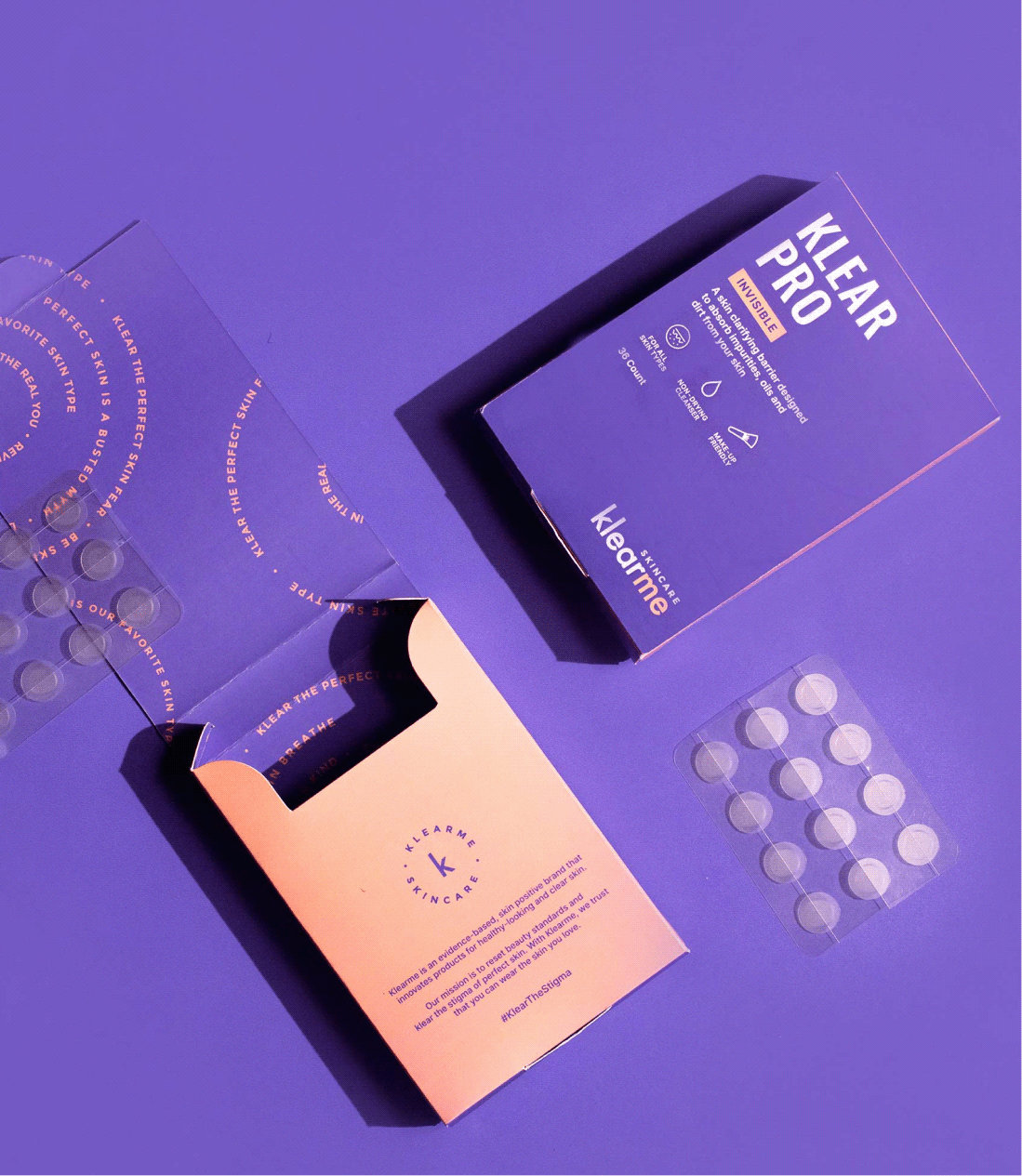
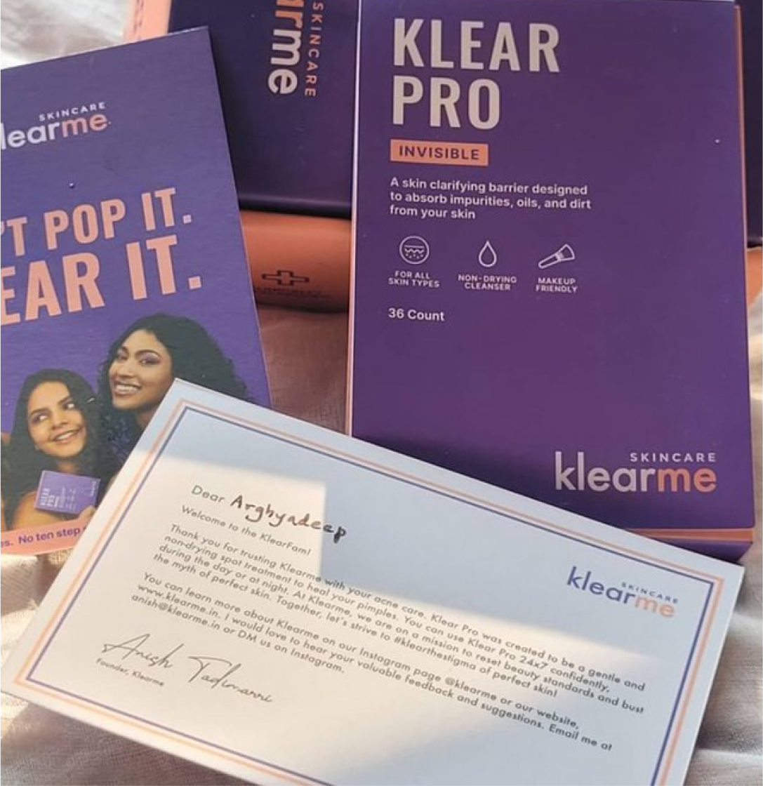
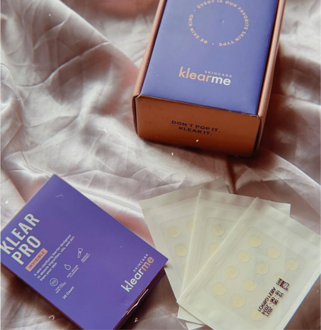
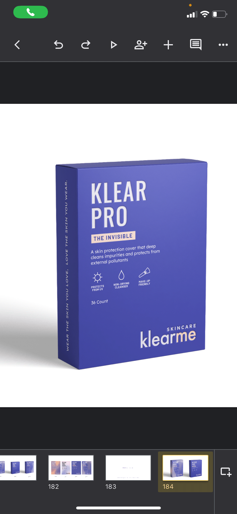
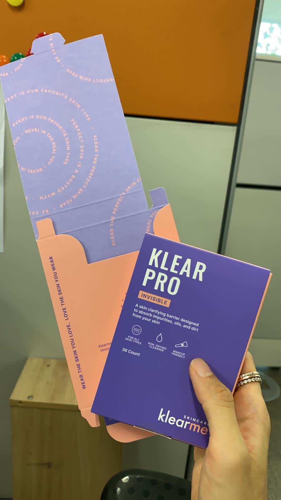
Skincare doesn’t end at the product, so neither did the experience. Clean secondary packaging and bold brand colours for contrast. Inside every box, a guide to using the product and a note from the founder.

You know what Klearme believes before you start.

THE EXPERIENCE

Could a website do more than sell products?

The brand believes acne is normal. We wanted the website to make that belief tangible. So, instead of building another product shelf, we built a space that helps people start loving their skin.

Because clear skin is a standard someone else set. The website challenges that standard and shifts the focus from fixing your skin to caring for the skin you already have.

The messy, the fun, the not so pretty part of the project!

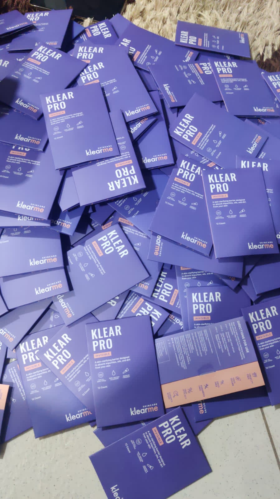
Our first round of trial packs

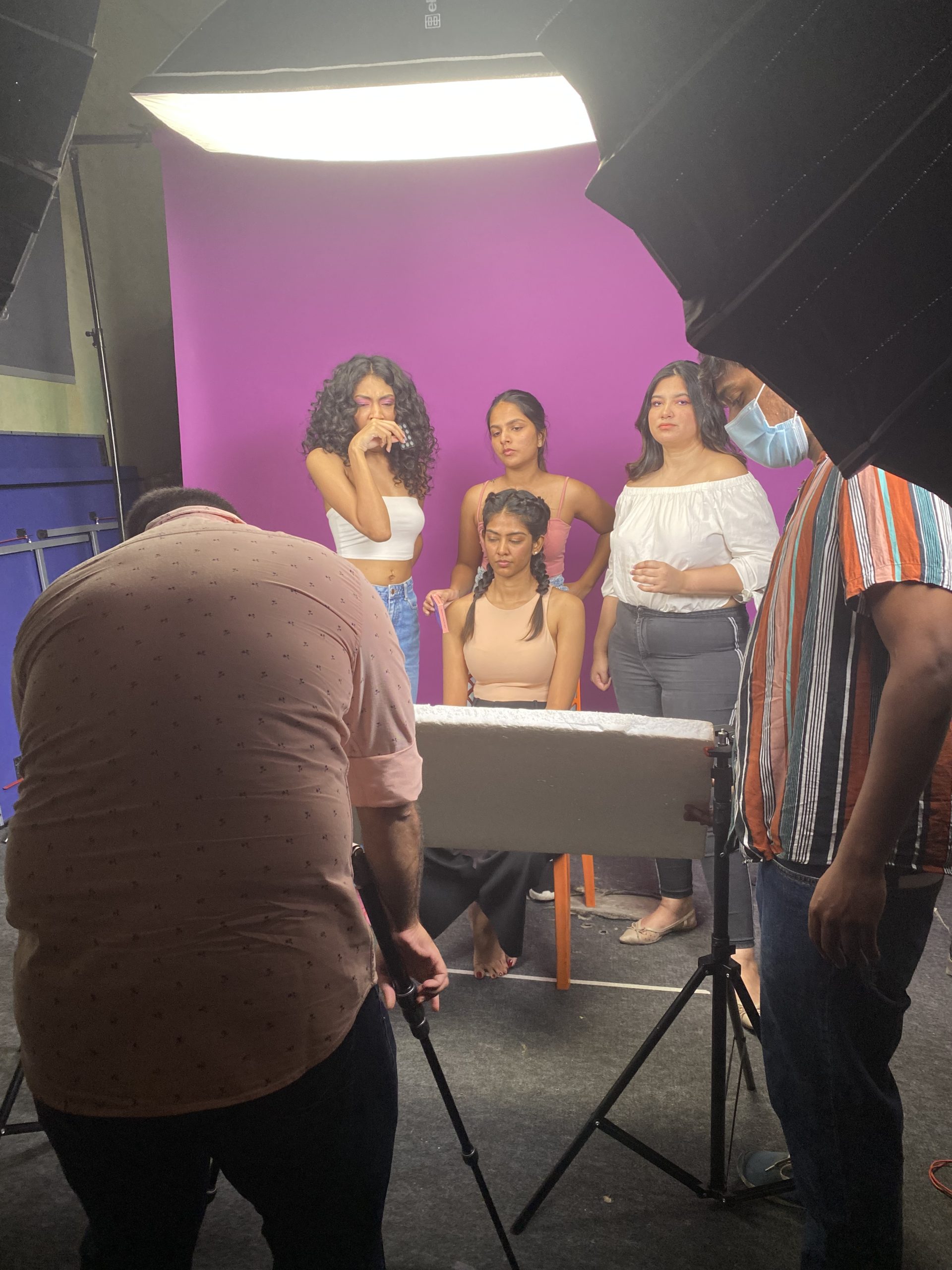
Behind the scenes at the shoot

Rounds of trials before finalising

In print, finally