The Crown Jewel Of Reliance

The Crown Jewel Of Reliance

Brand Identity & Visual Extension for Vantara

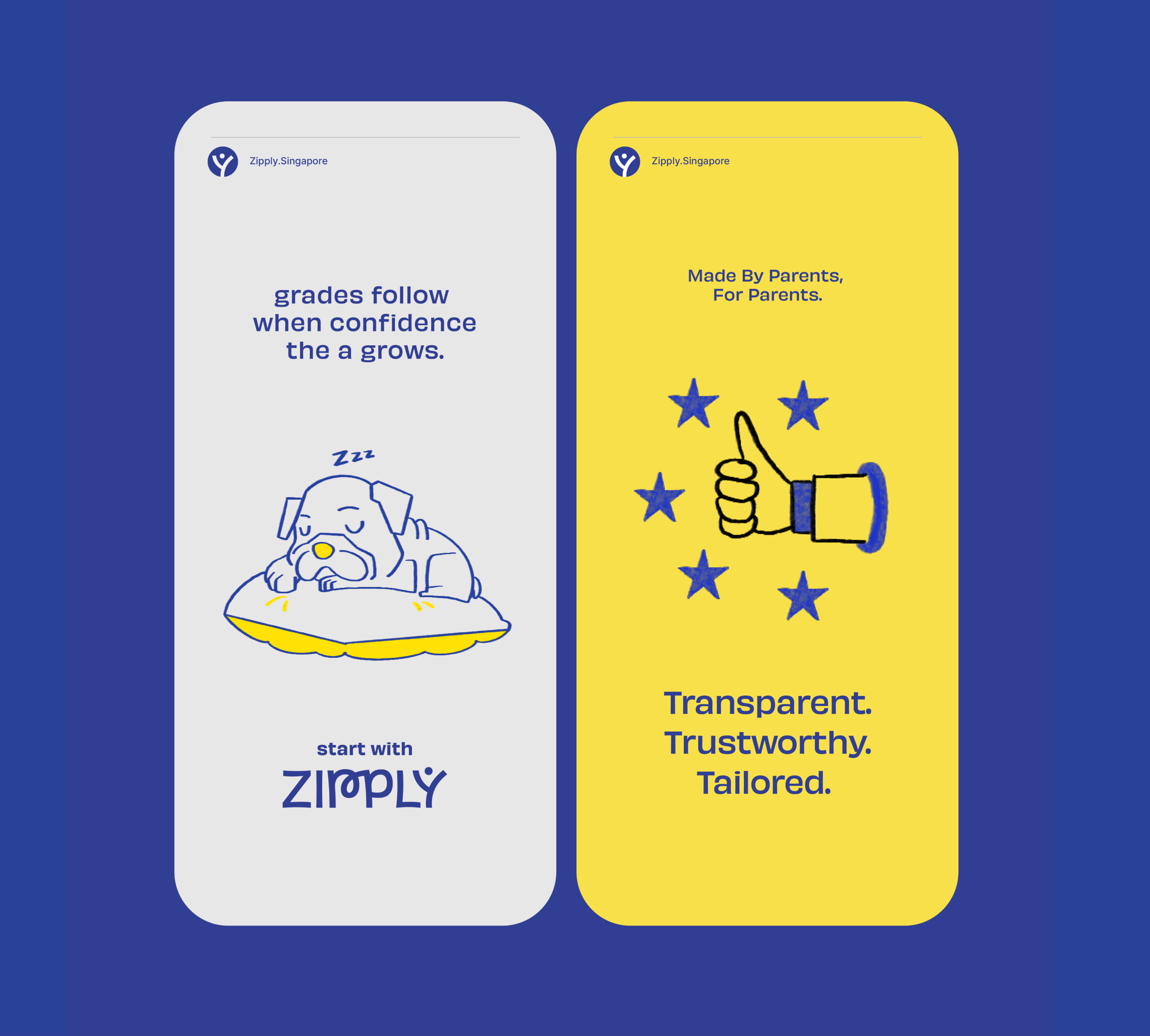
Fostering Education With Zipply

Fostering Education With Zipply

Brand Identity & UI For Zipply Platform

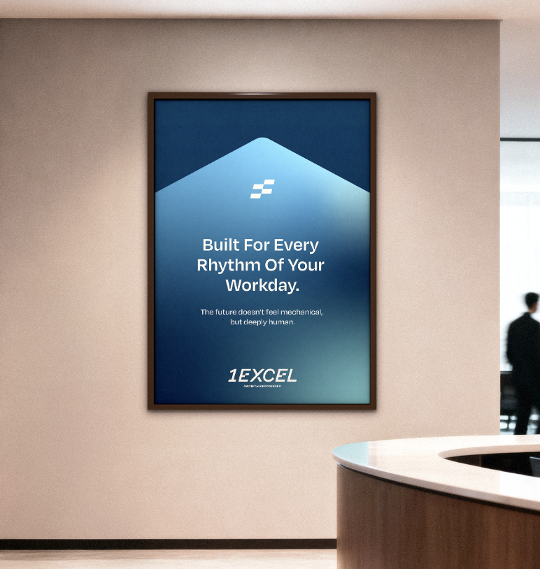
Smart Co-Working With 1Excel

Smart Co-Working With 1Excel

Identity & Visual Extension For A Co-Working Space

Always By Your Side

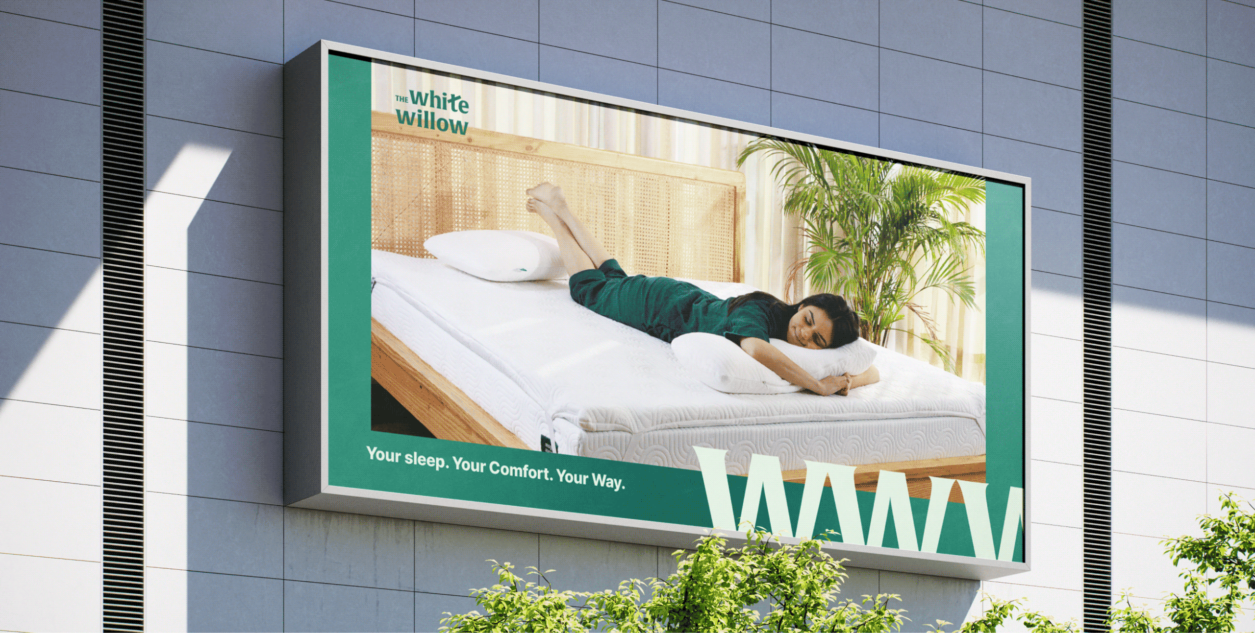
Why should comfort begin and end with sleep?

Scope Of Work: Market Research, Strategy, Brand Identity, Packaging Design, Visual Language, Web Design, and Art Direction

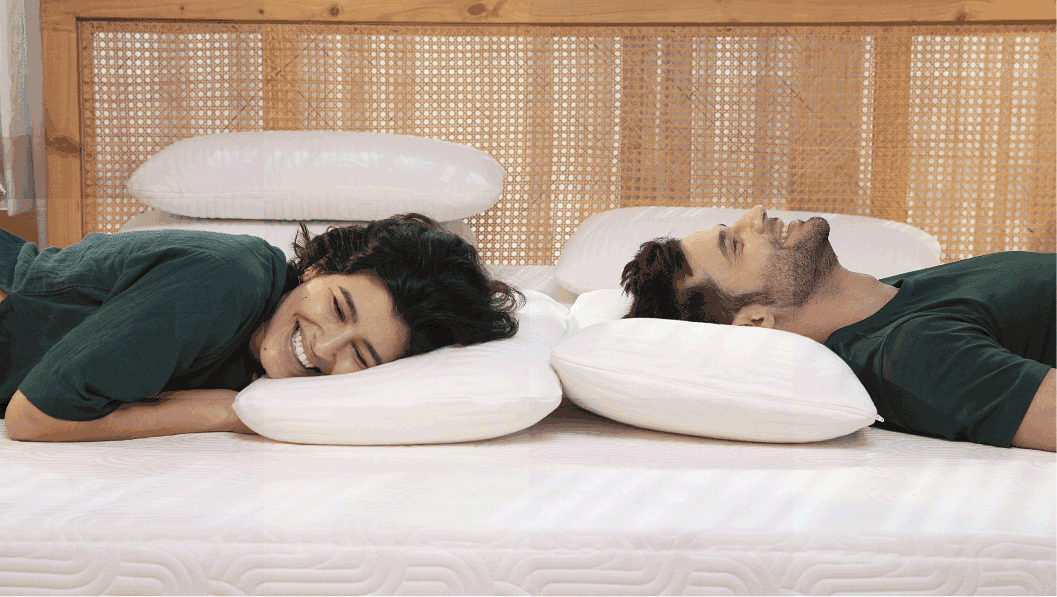
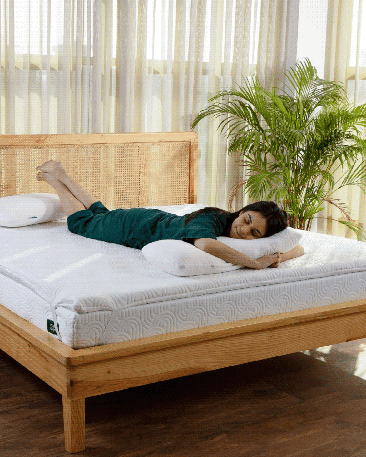
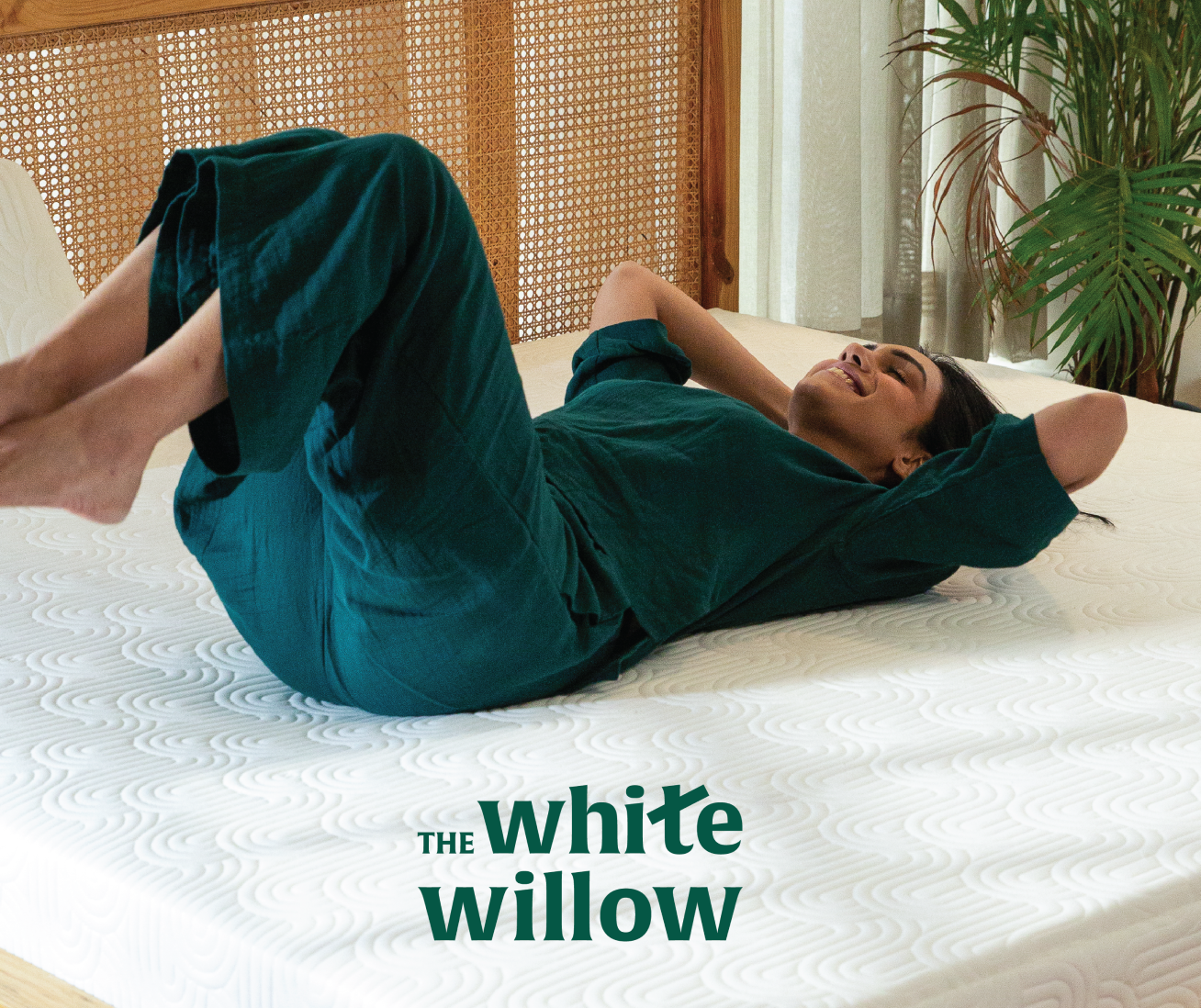
The White Willow had earned its reputation by understanding how people sleep, and what makes it better.

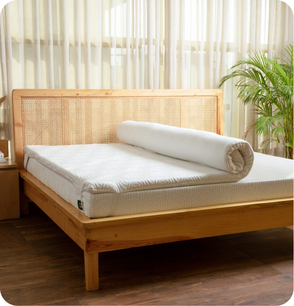
But as the brand expanded into mattresses, cushions, toppers and everyday essentials. One question emerged: if comfort improves our nights, shouldn’t it improve the rest of our day too?

We explored this idea with Abhishek and Meghna while repositioning The White Willow. Together, we reimagined the brand around a broader purpose that extended beyond the bedroom.

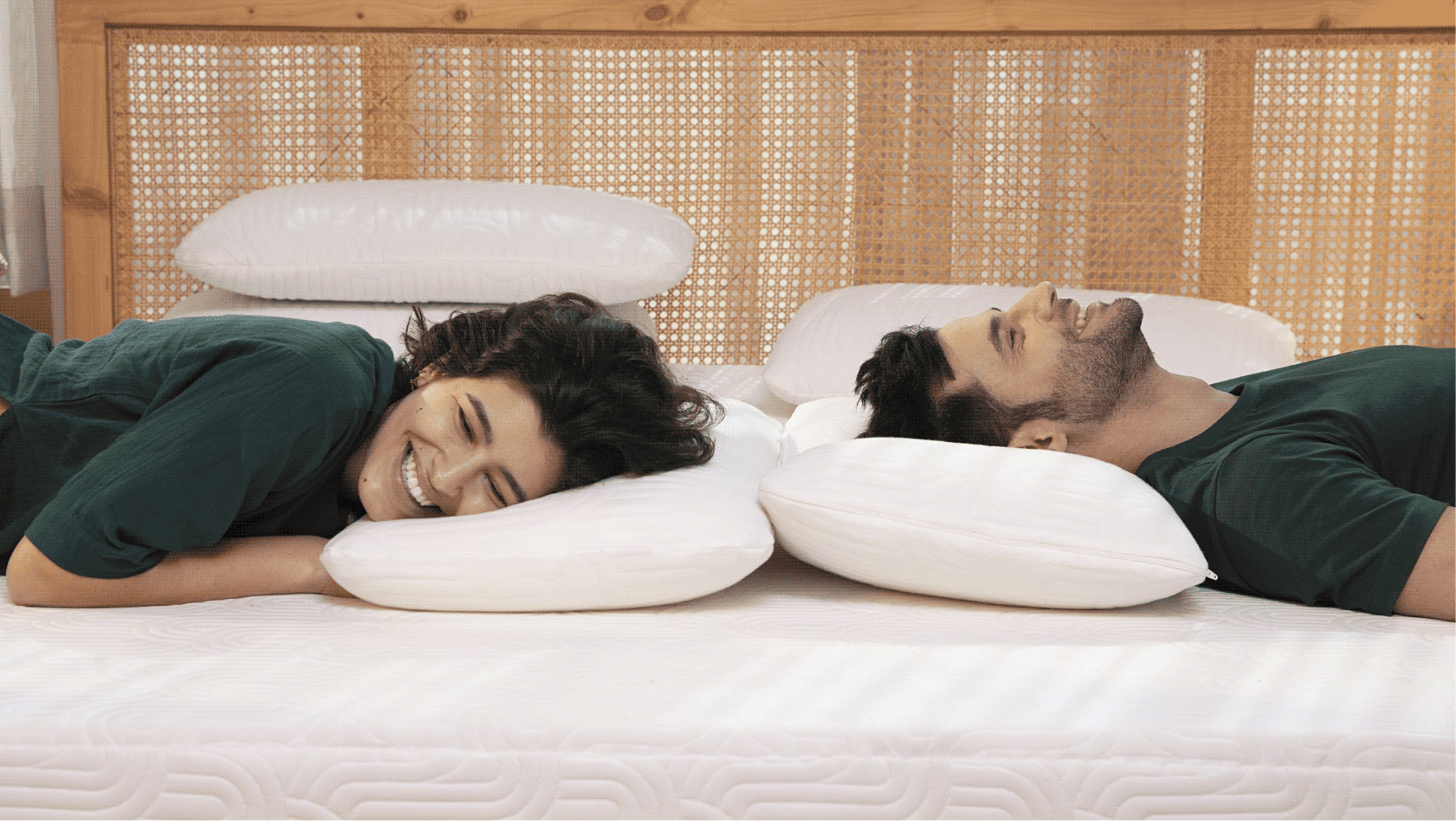
The goal was to move The White Willow from a pillow brand to a lifestyle brand that delivers comfort through the whole day.
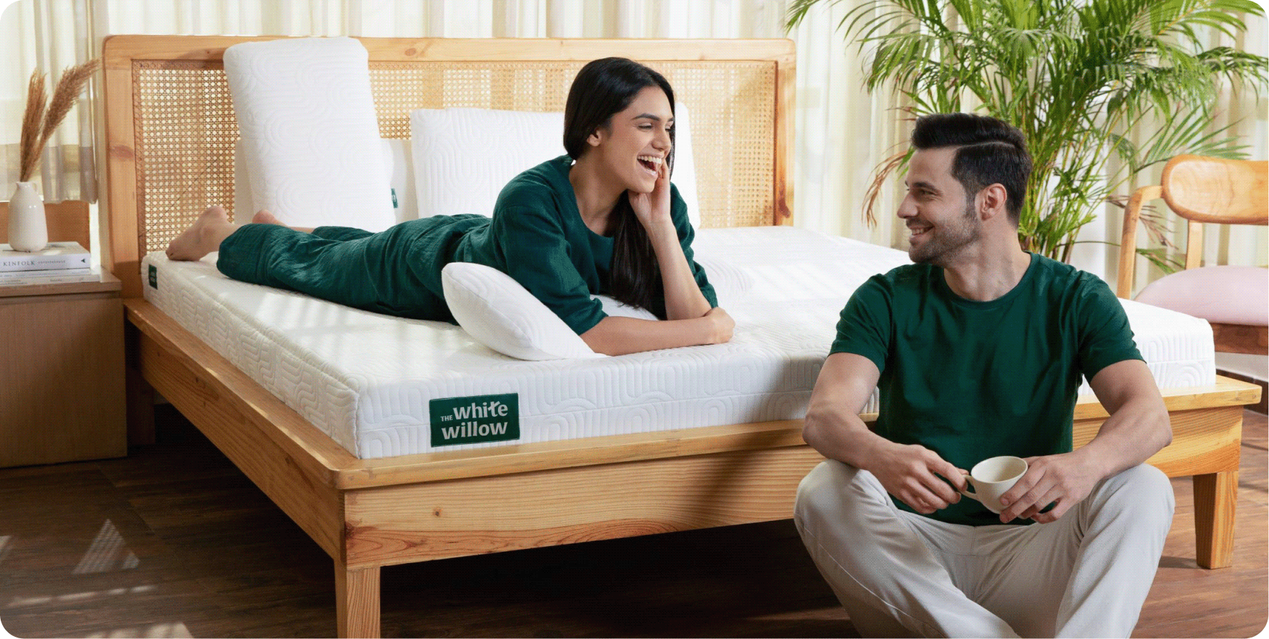
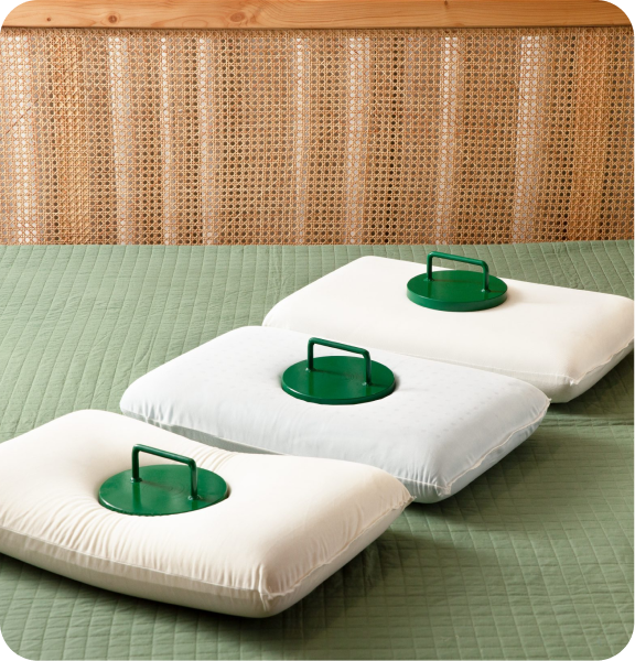
THE CONVICTION

Can comfort become a way of living, not just sleeping?

TWW had built its reputation by understanding how people sleep. As the brand expanded into everyday comfort products, its purpose naturally grew beyond pillows.


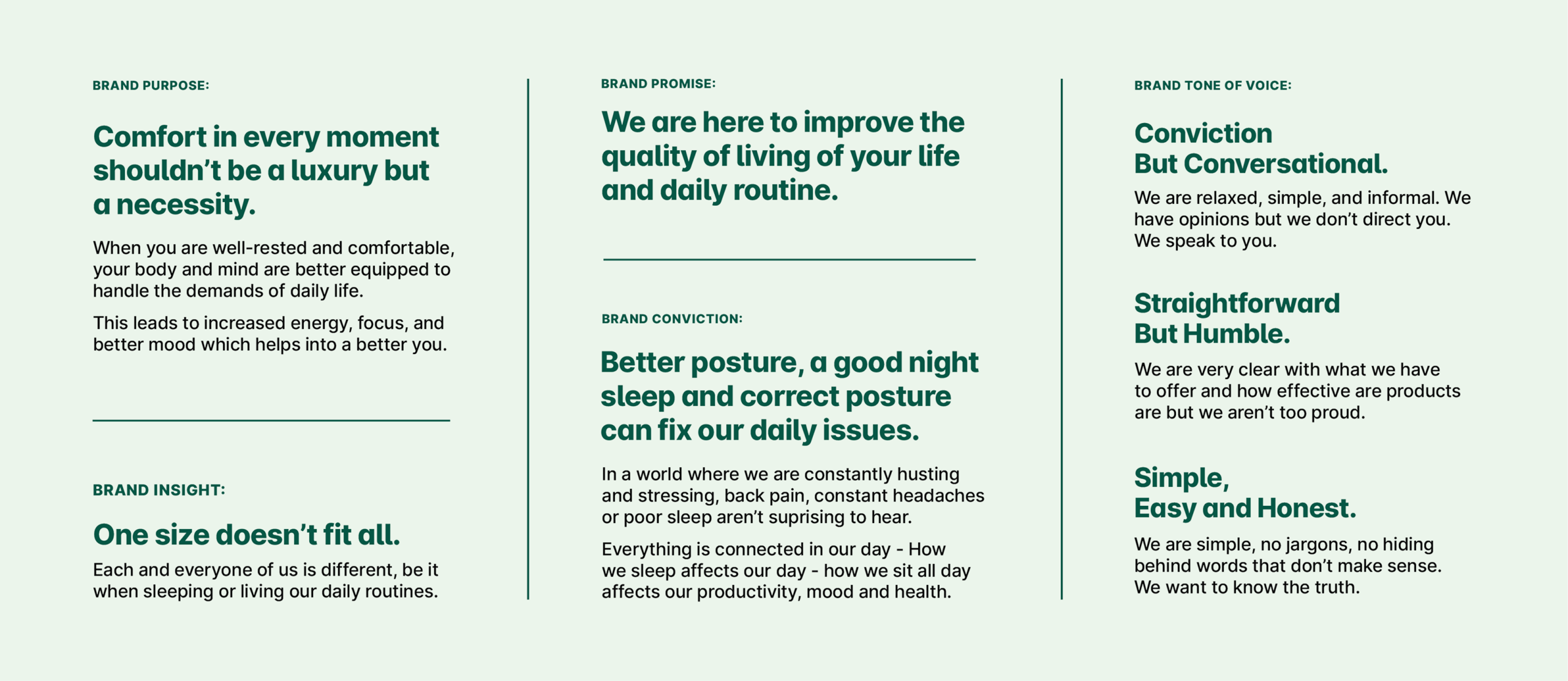
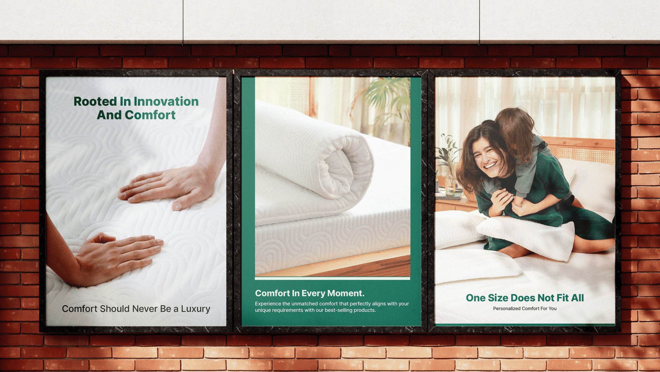
We shifted the positioning from a pillow brand to a lifestyle brand that believes in comfort in every moment and provides round the clock comfort. A brand that improves the quality of living of your daily life.
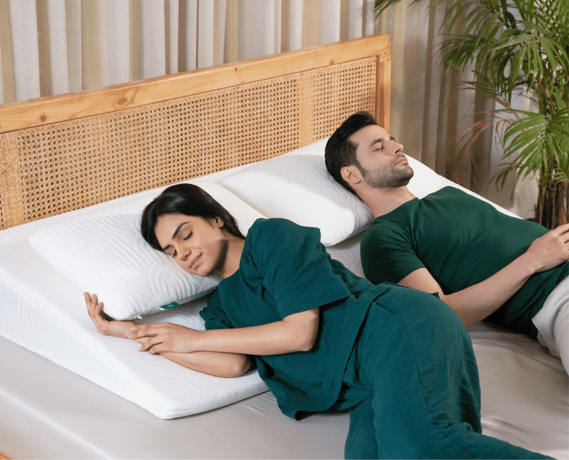
THE TURNING POINT

The products had evolved. The brand hadn't.

TWW had spent almost a decade perfecting comfort through thoughtful design, premium materials, and a deep understanding of how people rest & see comfort.

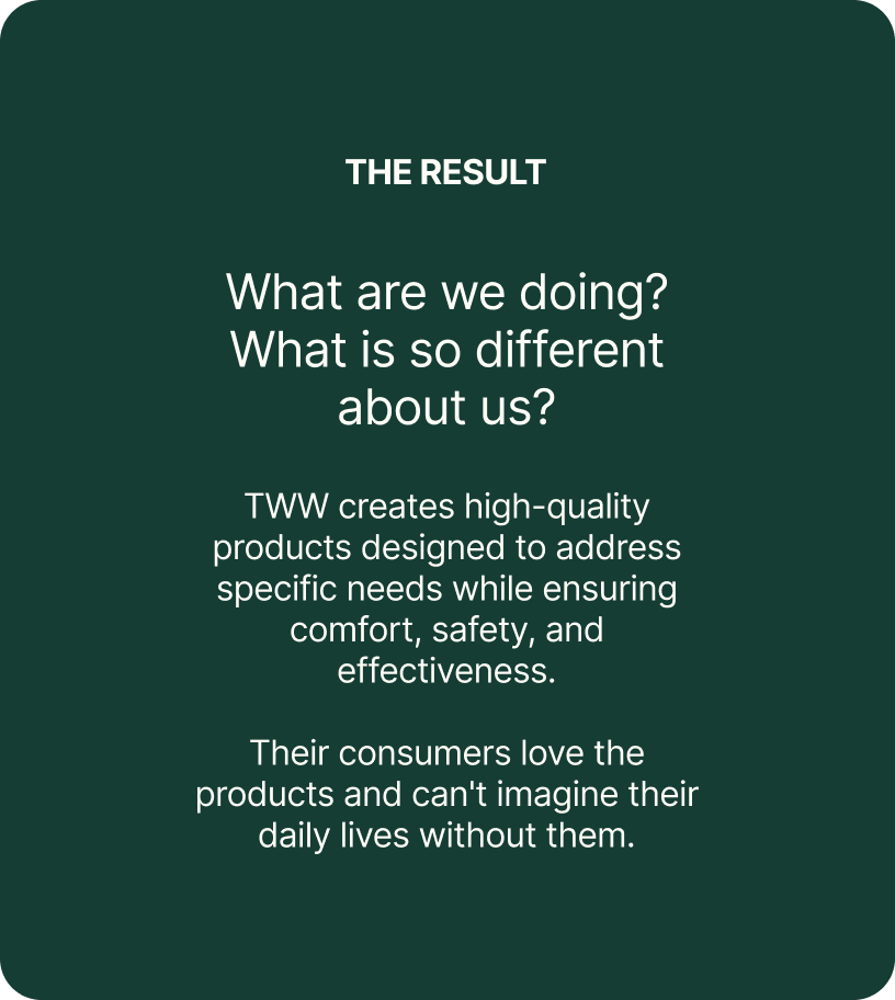
The challenge was to help people understand which product was right for them, what made it different, and how every category belonged to one clear brand.
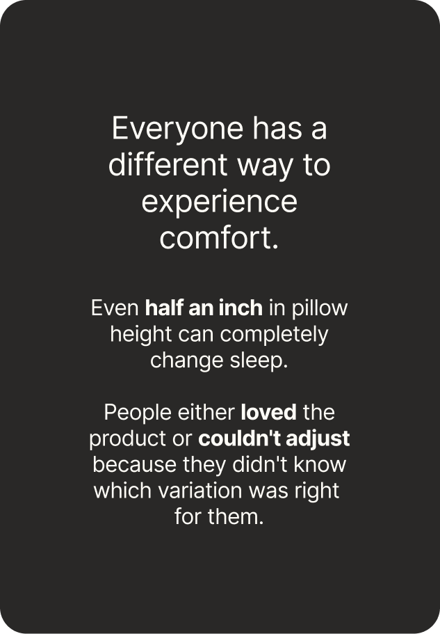
Comfort in every moment shouldn’t be a luxury but necessity.
Introducing The White Willow

A round the clock brand, by your side through every moment. From waking up to 
winding down, we deliver comfort throughout your day.

THE FOUNDATION

A system designed to grow along with the brand.

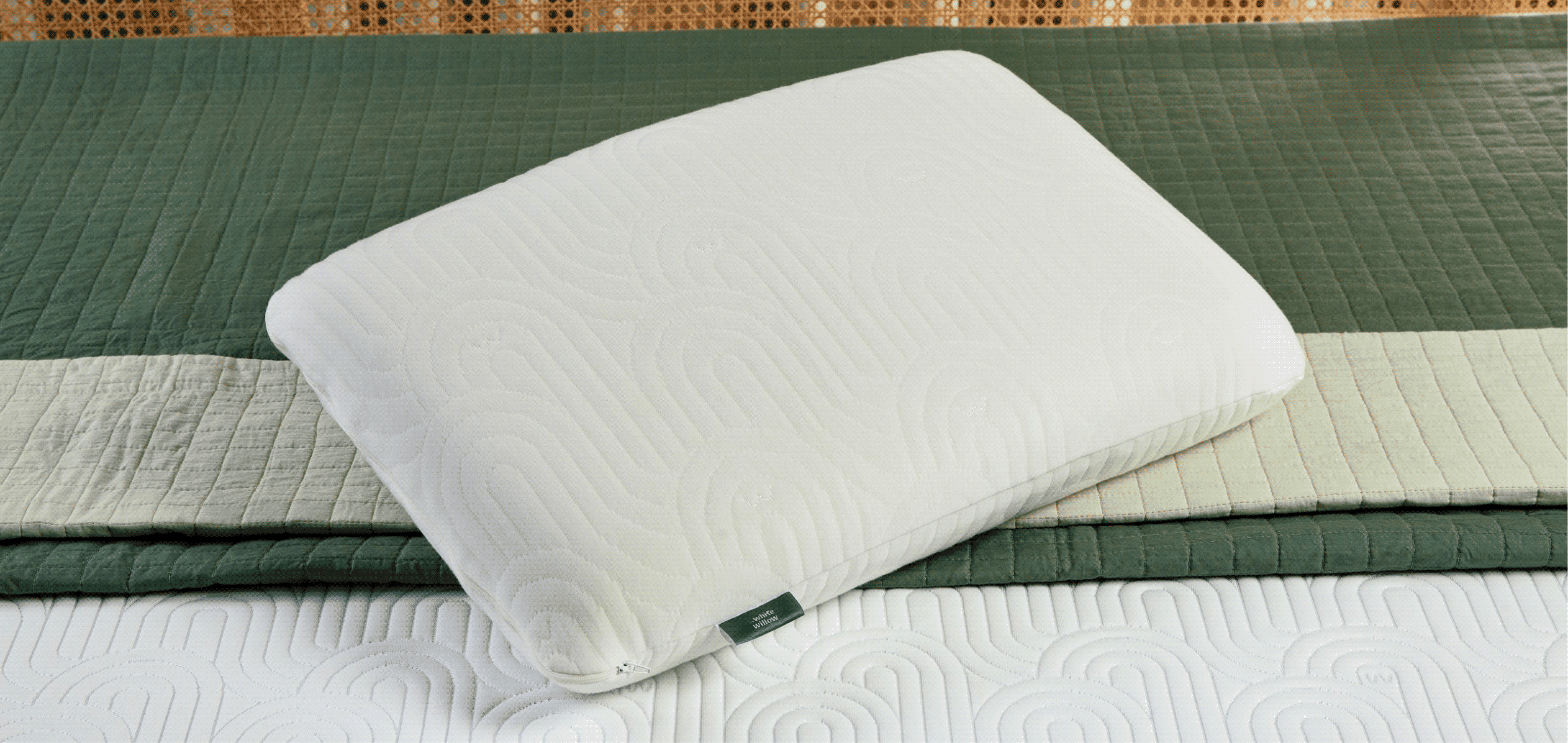
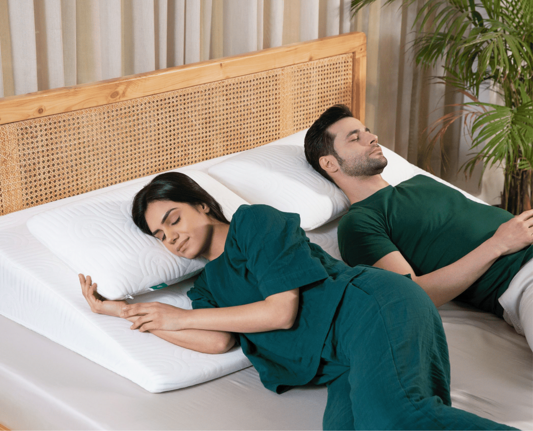
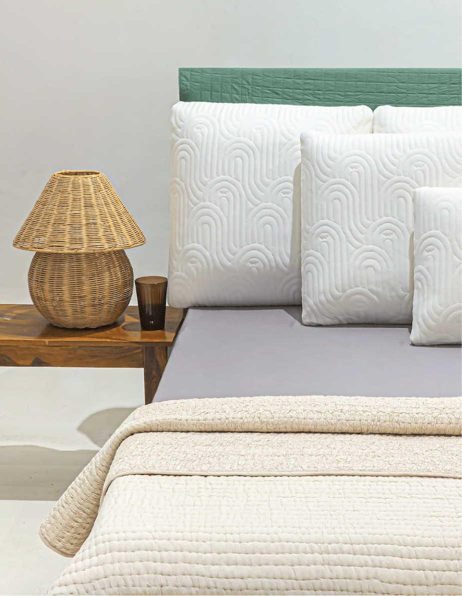
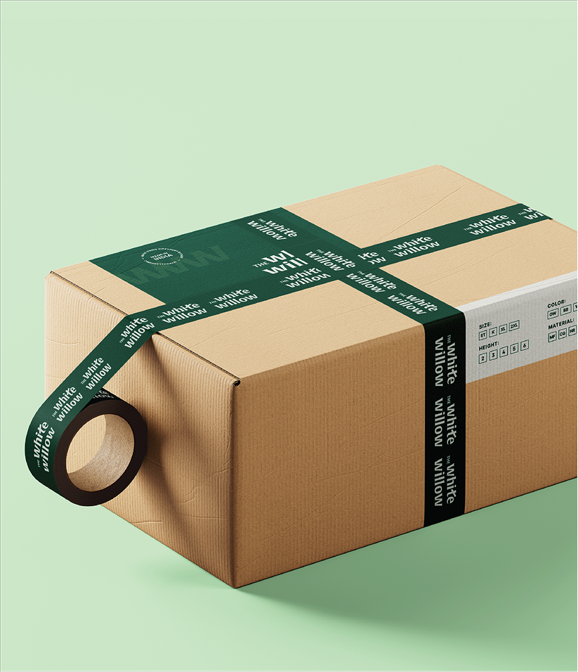
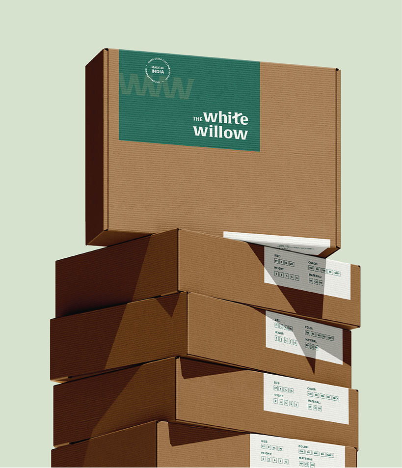
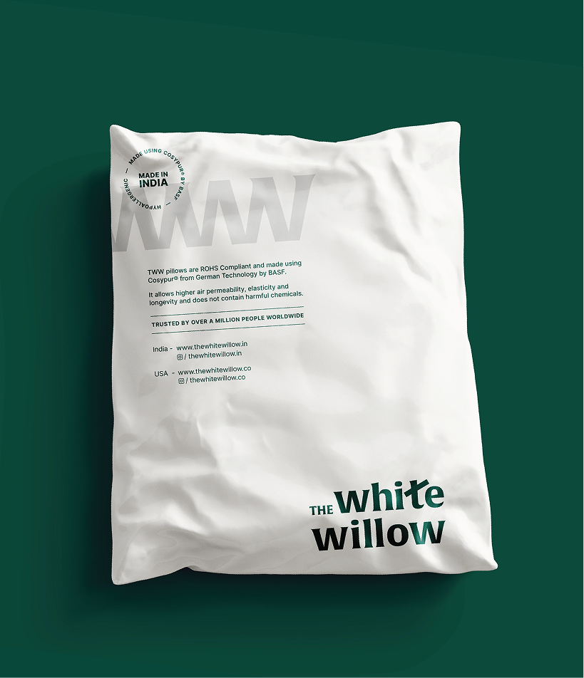
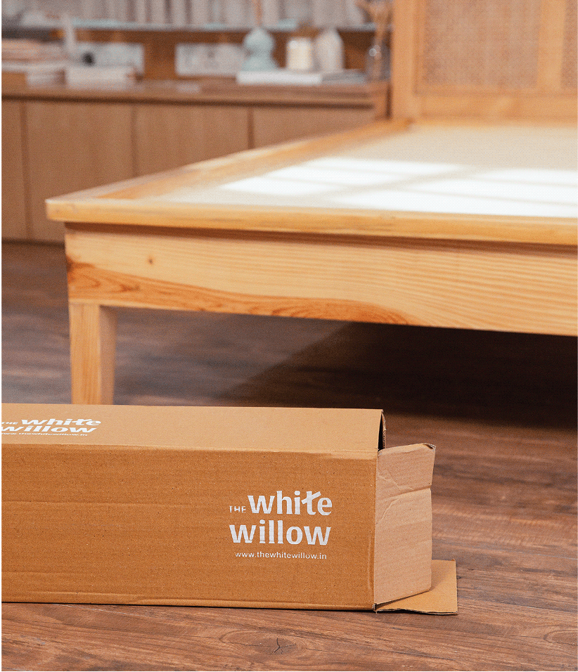
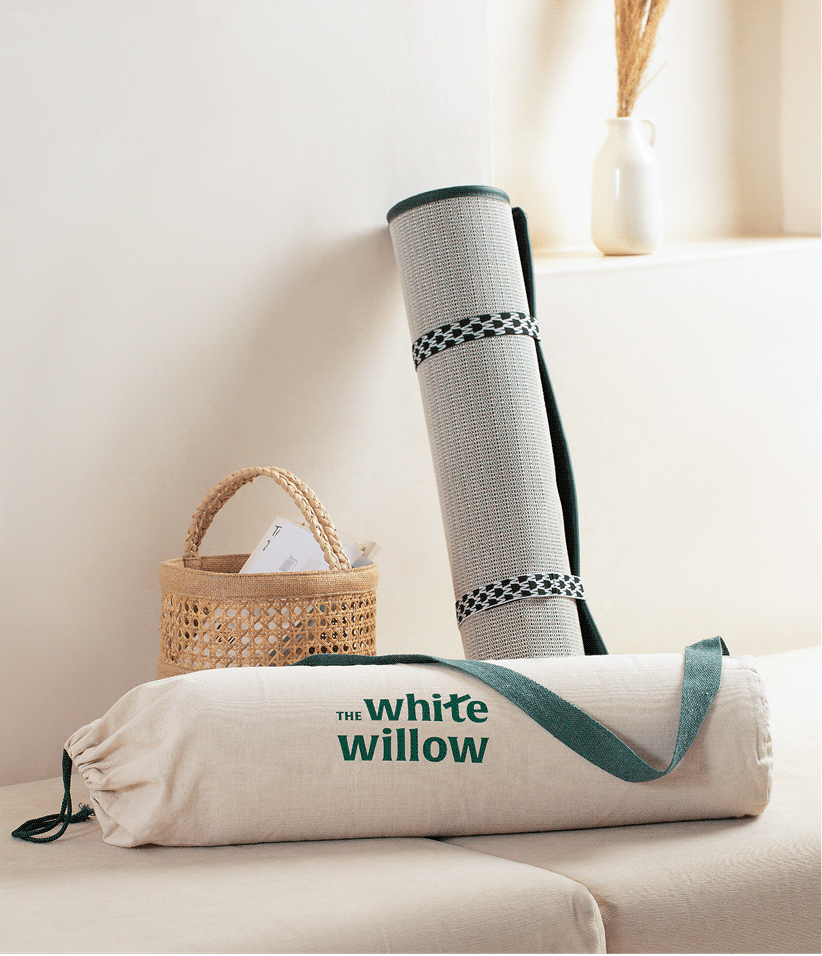
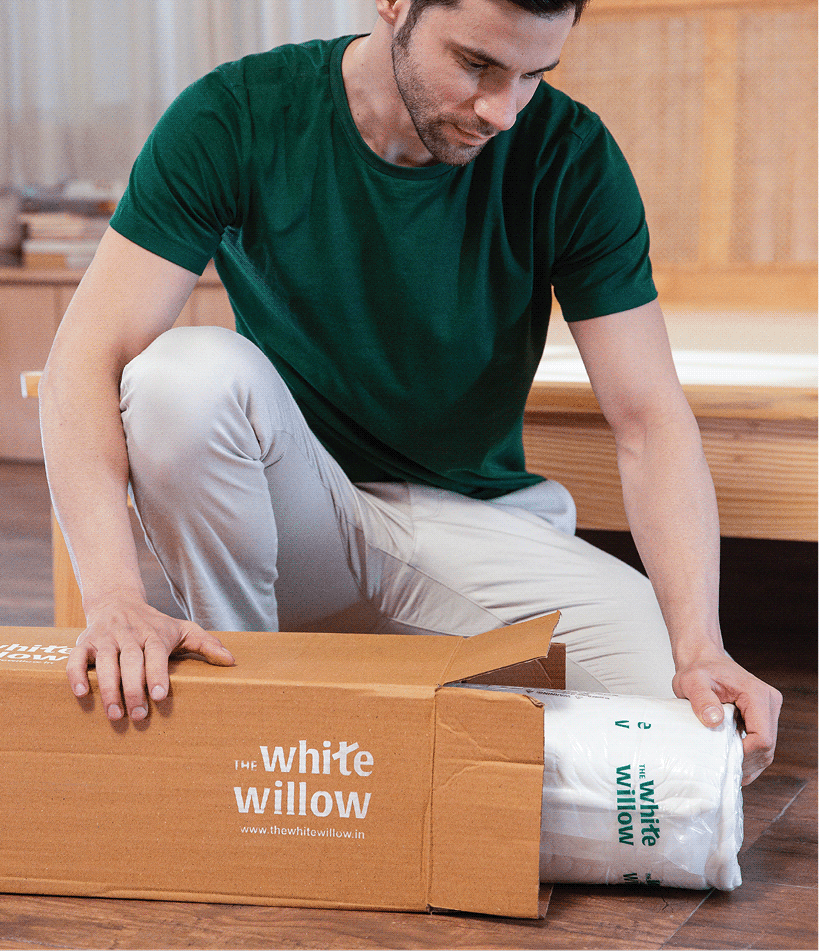
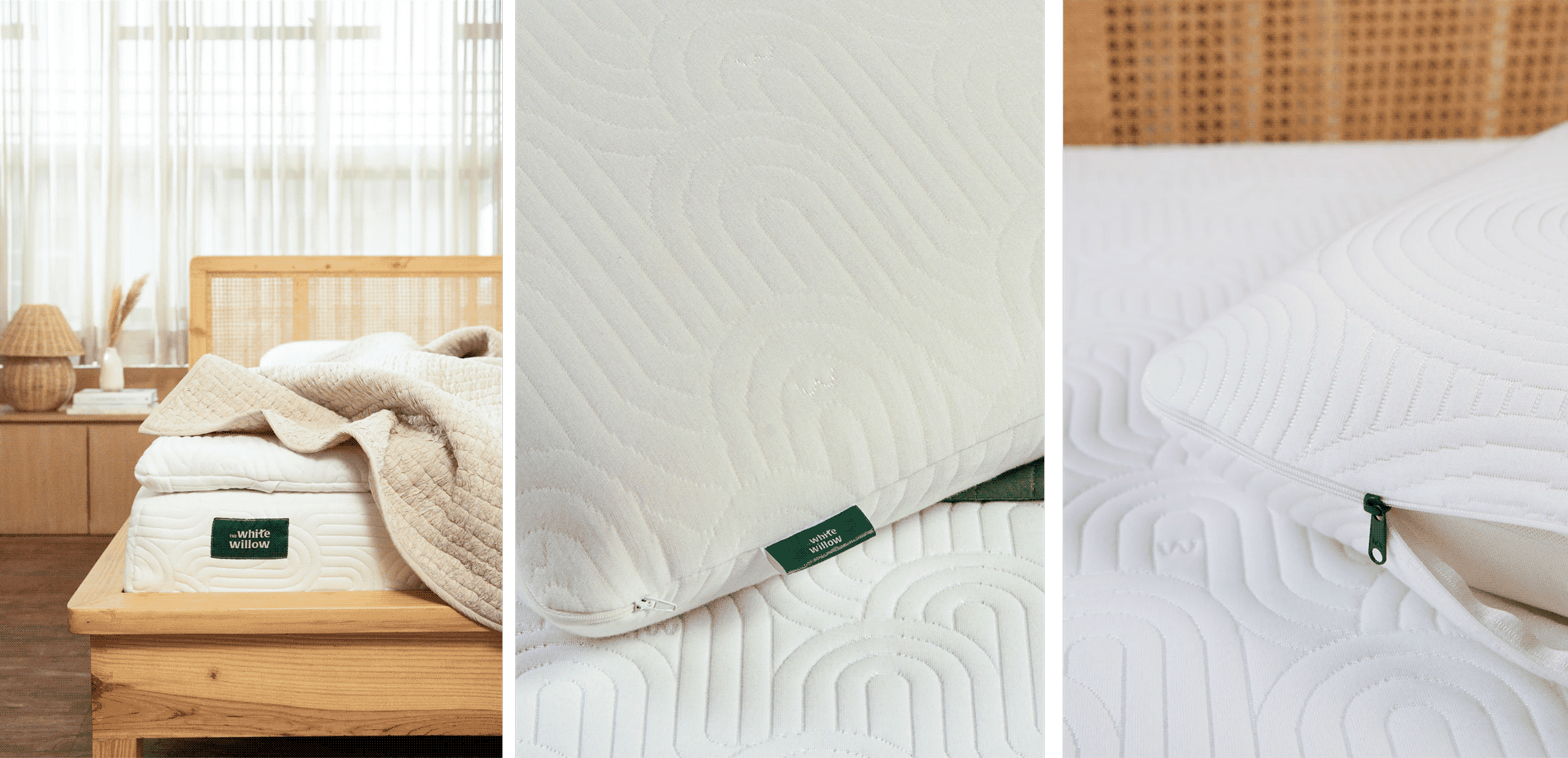
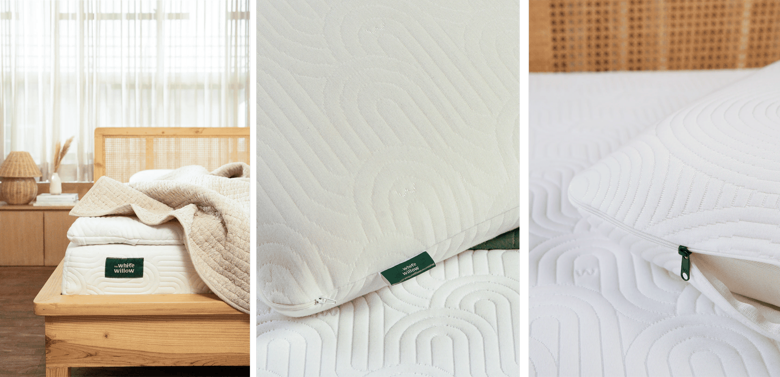
The White Willow’s expanding product range required more than individual packaging designs. We created a scalable identity system that could unify over 250 SKUs while giving every category its own place within the brand.


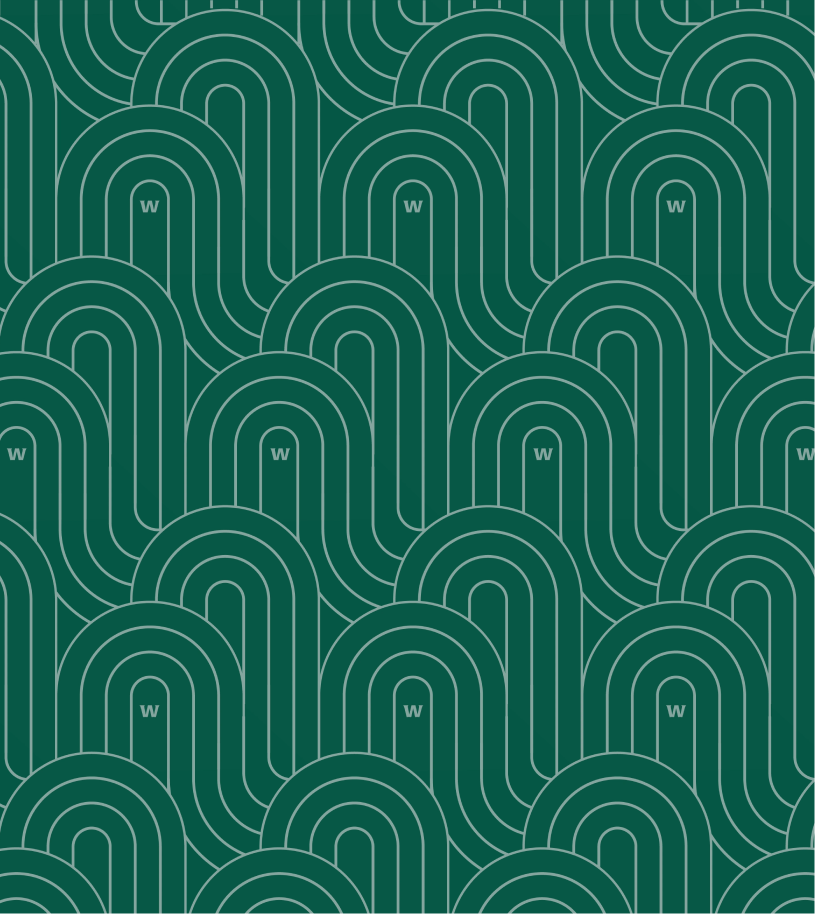
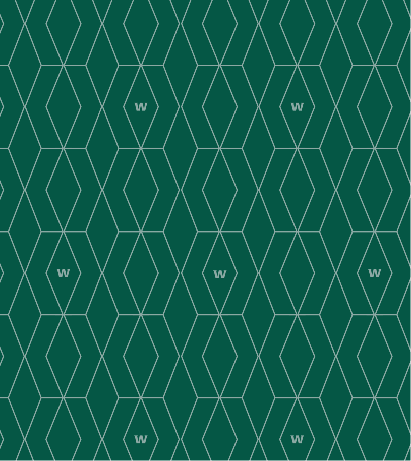
Calming custom patterns, a signature willow-inspired emerald green, and a modular packaging framework build a visual language that felt consistent, recognisable, and ready to evolve.
THE CLARITY

Good products deserve clear communication.

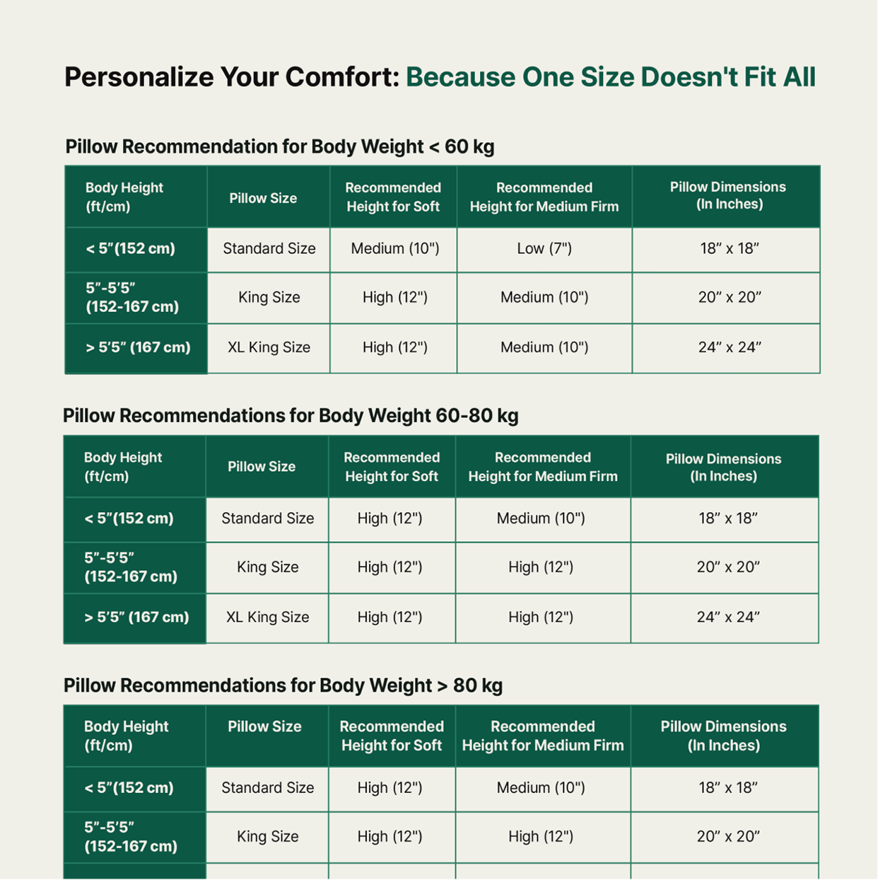
Every product solved a different need, but consumers found it difficult to understand the differences. We realised the problem wasn’t the range; it was how the range was being communicated.


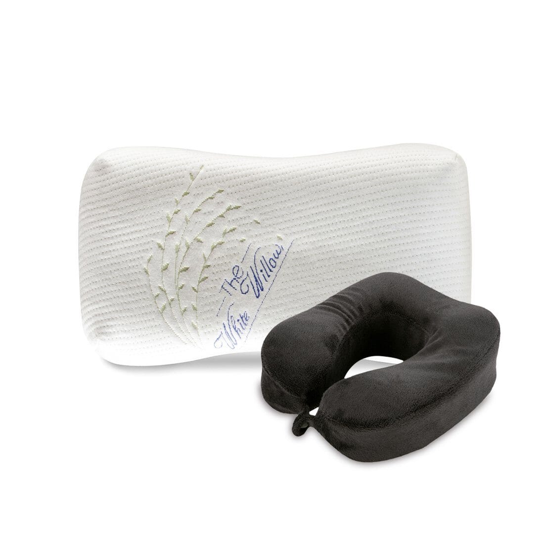
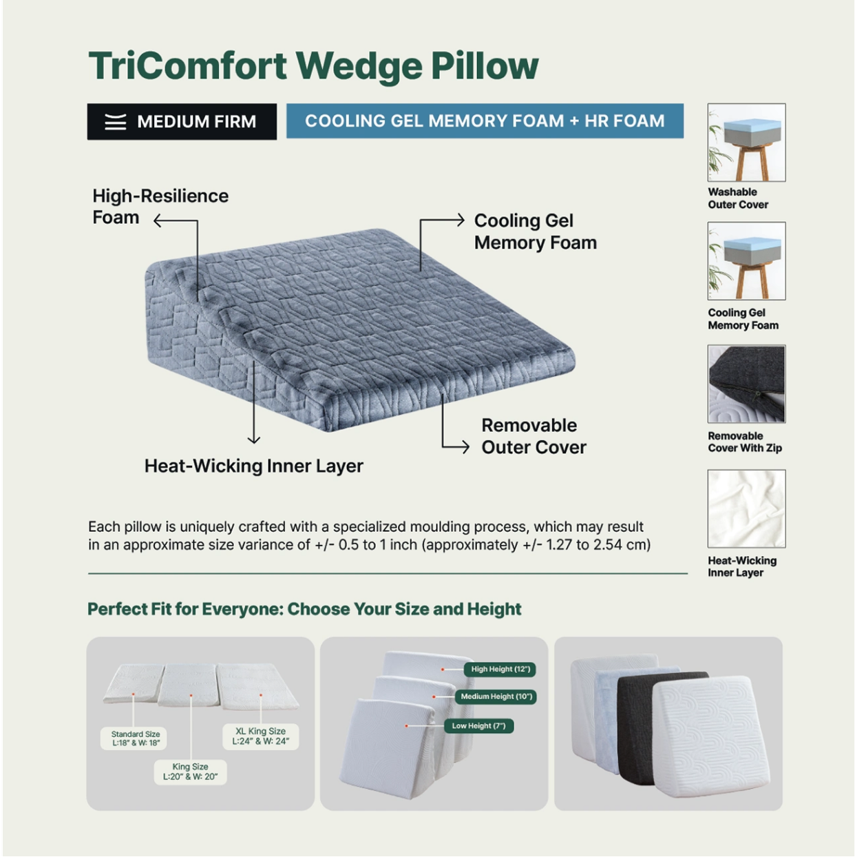
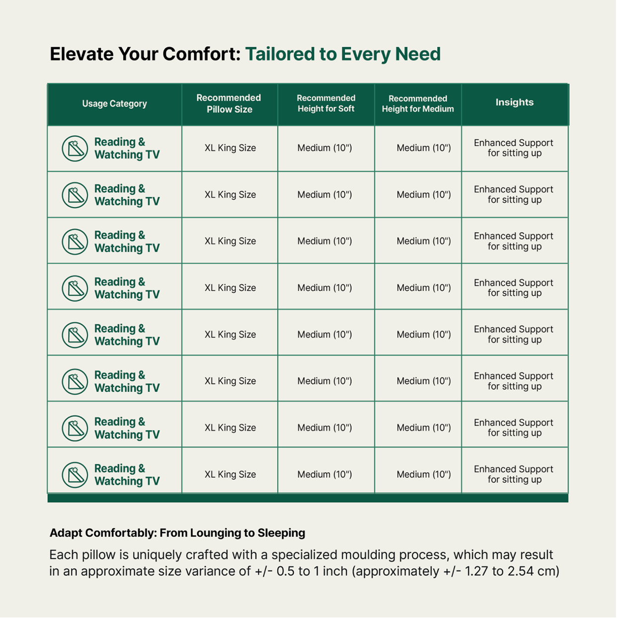
Clear product architecture, custom iconography and size guides turned a complex portfolio into something you could actually shop.
How do you deliver the same experience through different products?

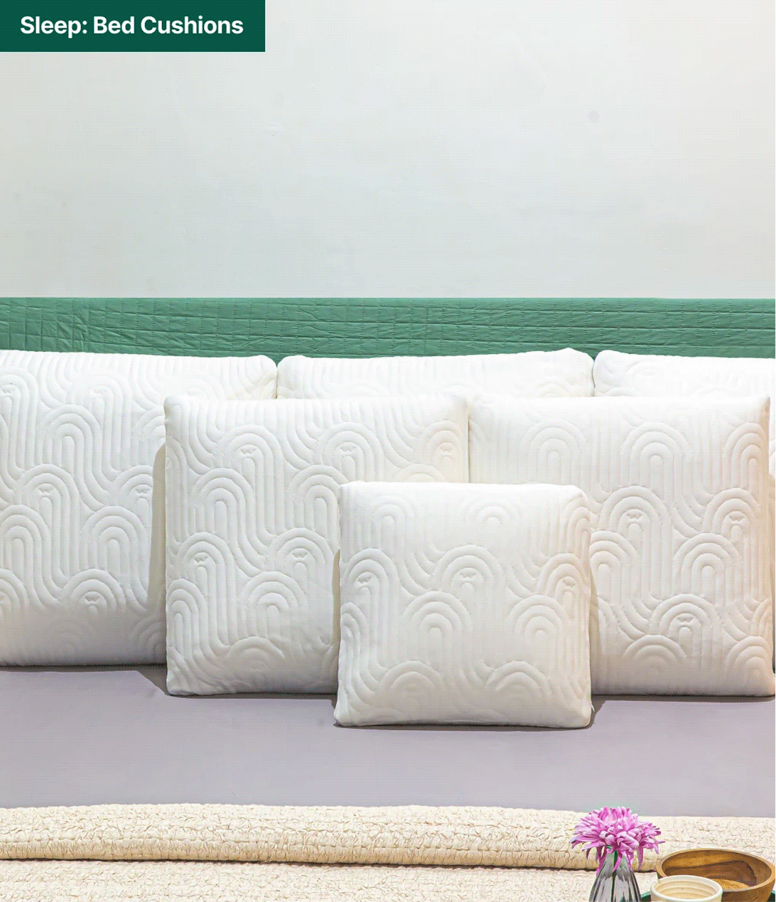
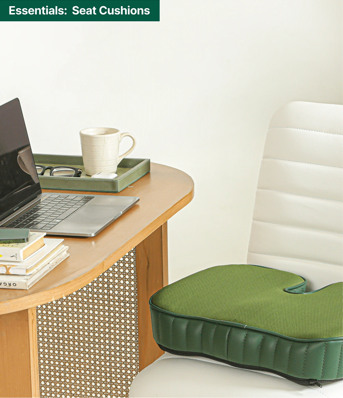
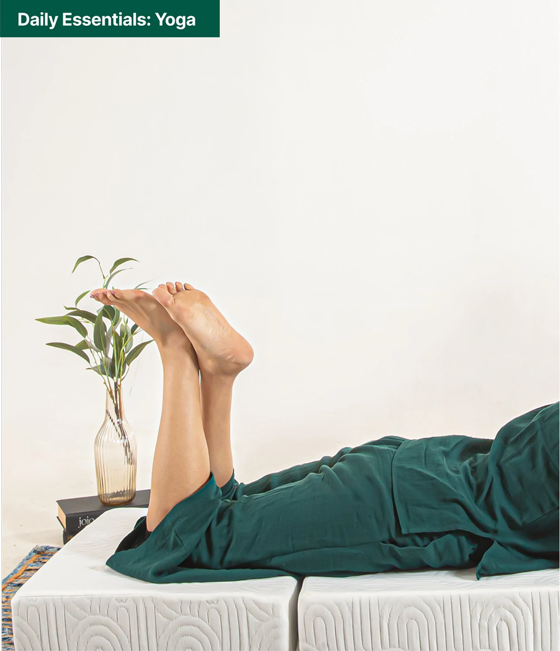
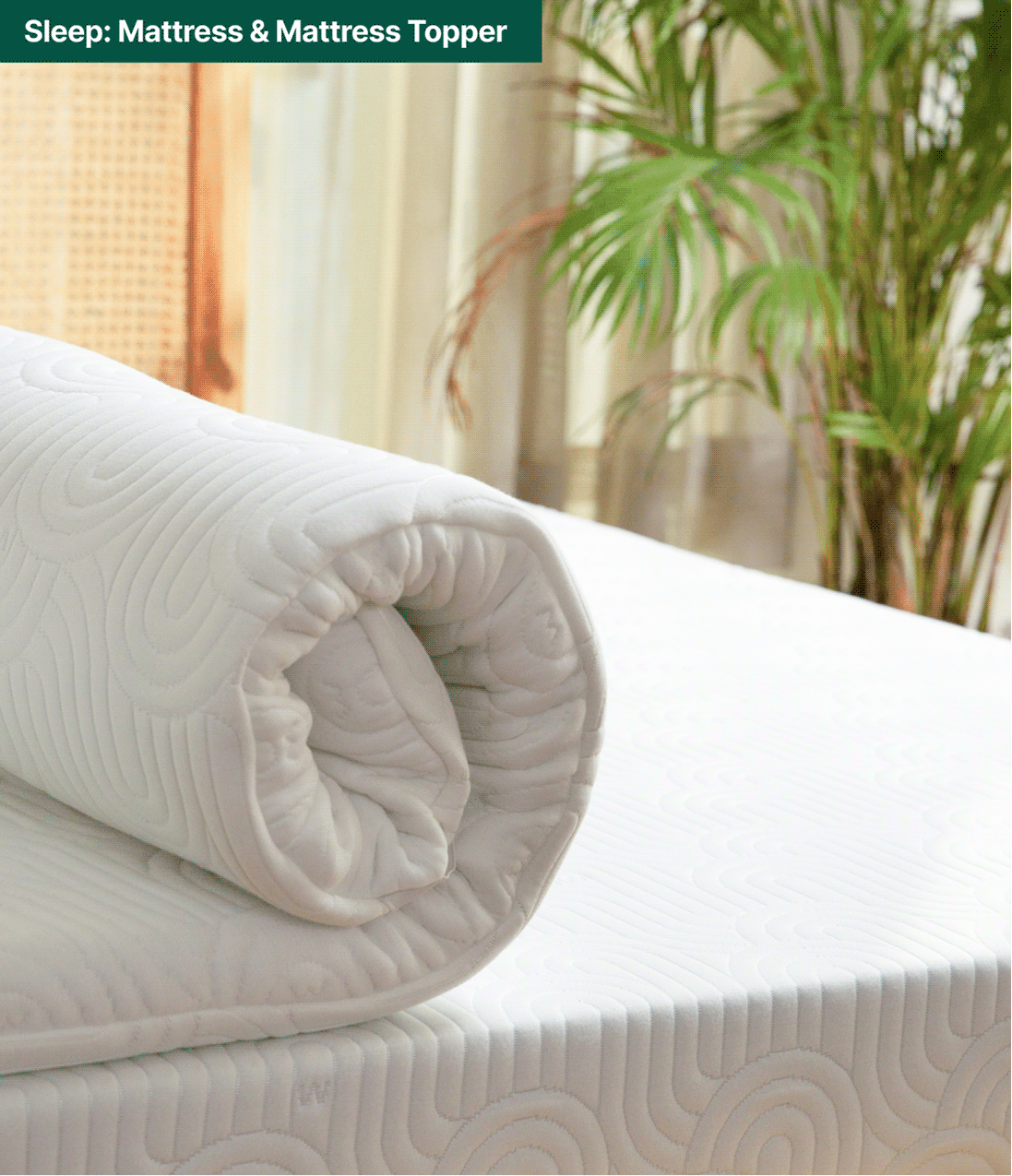
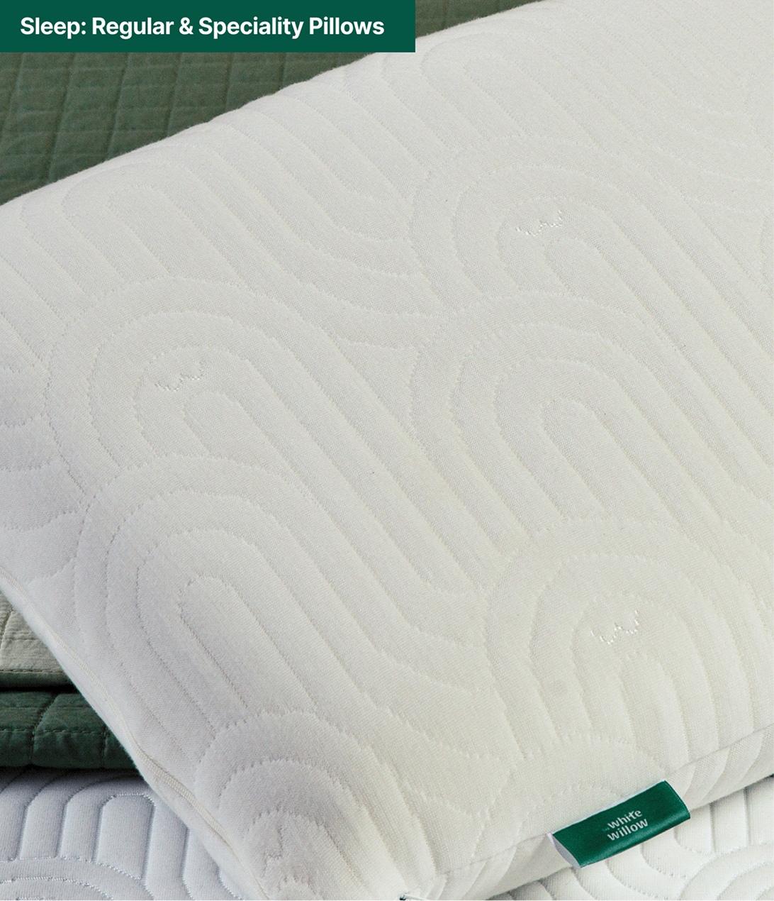
Each new category arrived with its own SKUs. So, we designed a cohesive visual language across White Willow’s expanding range; bringing consistency to every category, from sleep essentials to everyday comfort.
Put Simply, Skincare That Works

Can skincare be simplified even when it is scientific?

Scope Of Work: Market Research, Strategy, Brand Identity, Packaging Design, Visual Language, and Art Direction

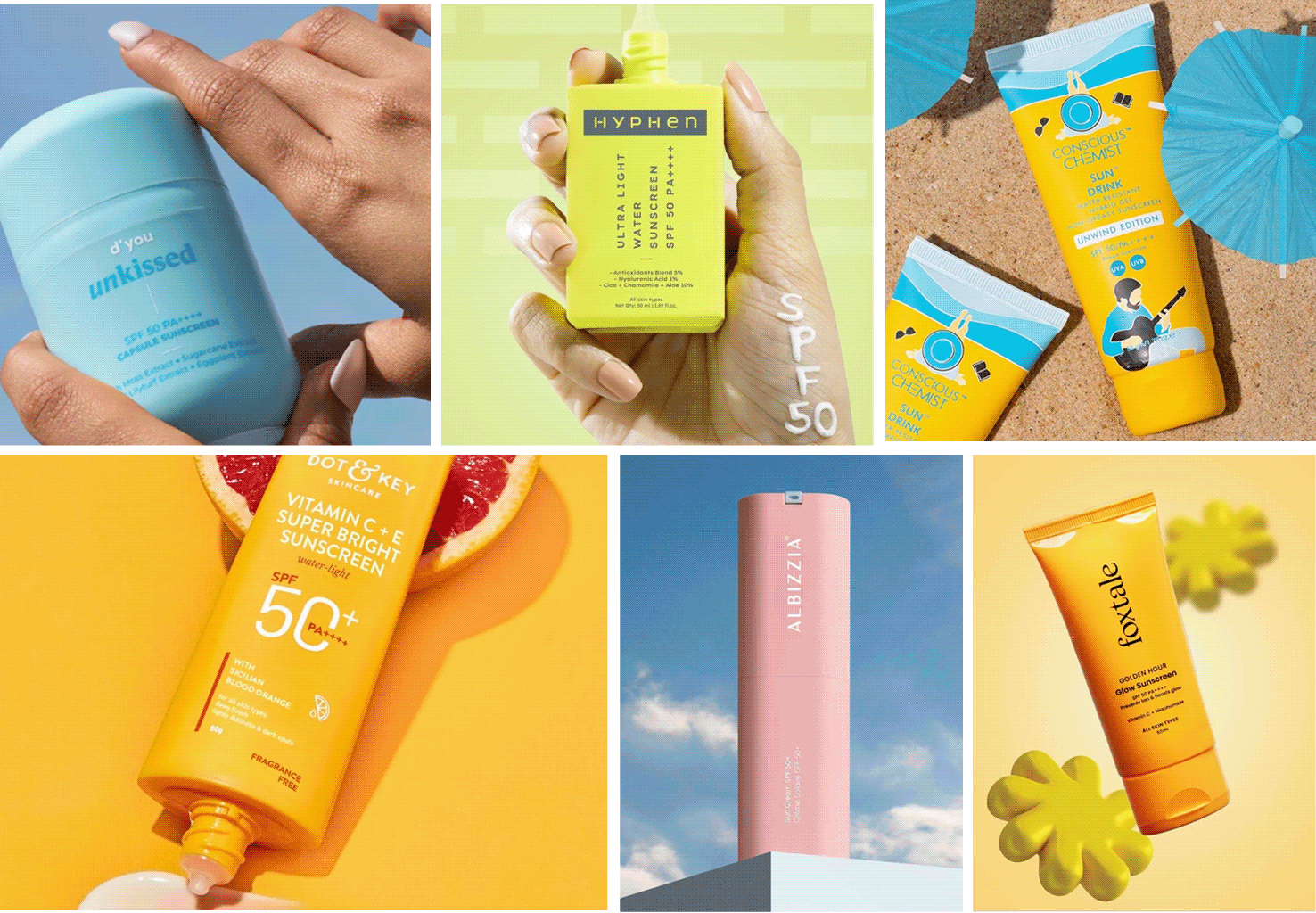
Walk down any skincare aisle and every brand promises clearer skin, stronger barriers, and miracle ingredients. Multi-step routines have become the norm, making skincare feel more confusing than caring. If products are meant to help your skin, why do they feel so complicated?


We explored this question with Anirudh while building Put Simply. Inspired by Korean skincare and adapted for Indian skin, the brand set out to create effective, sensitive-skin solutions without unnecessary complexity or clutter.


The goal was to build a brand that made skincare feel clear, approachable, and trustworthy. We started by questioning everything that made skincare complicated, to build the foundation of Put Simply.

Put Simply, it’s easy to use and hard to refuse.

THE BEST PART

Everything about the brand had to feel as simple as the routine.

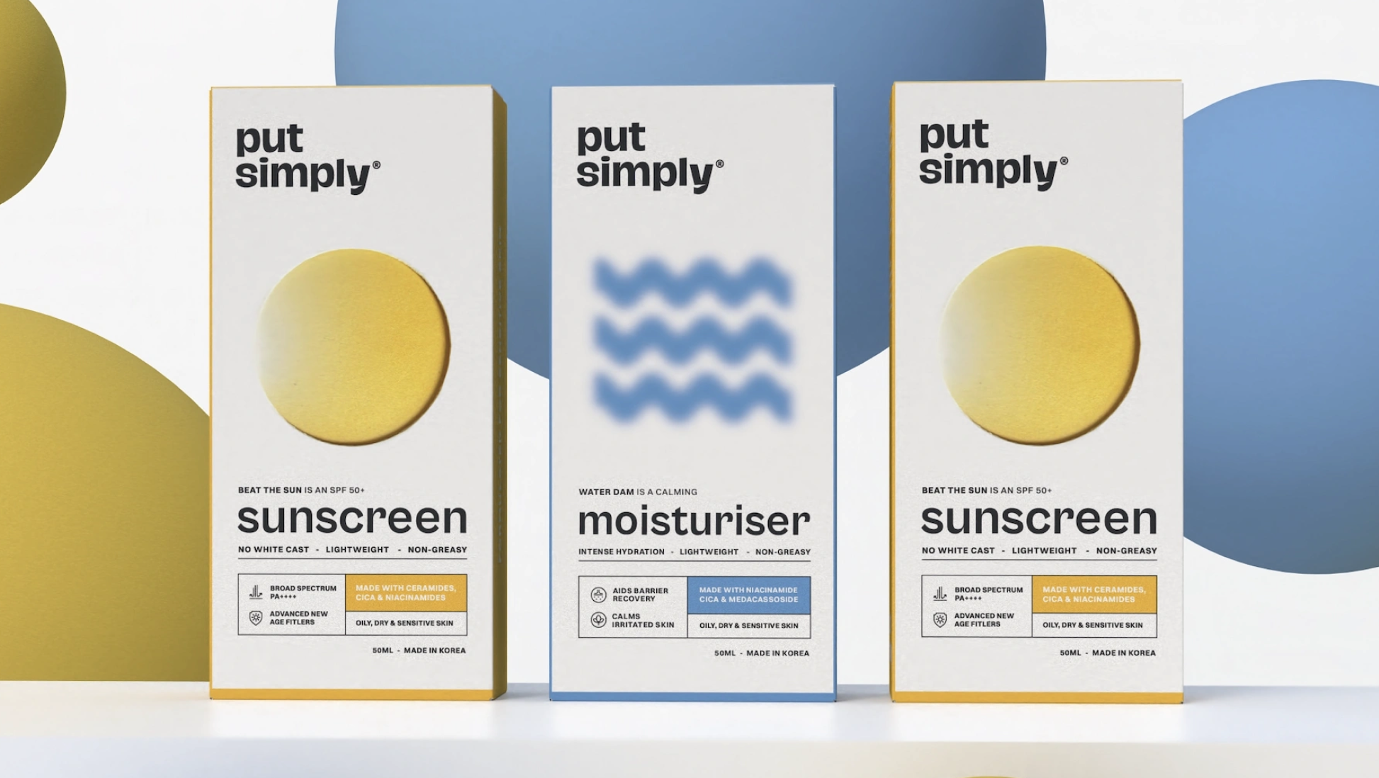
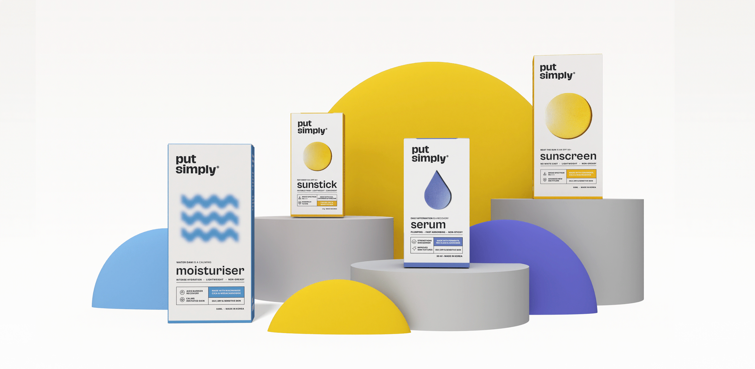
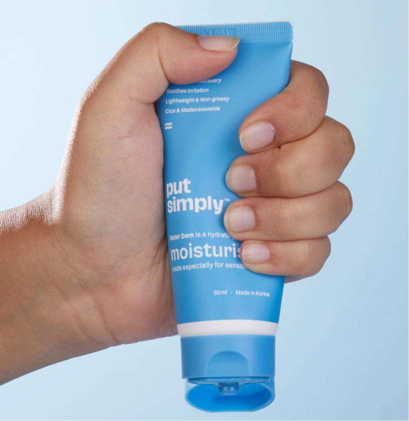
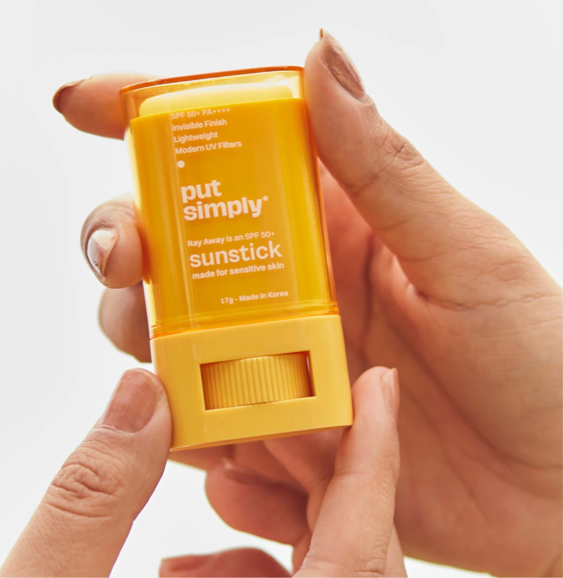
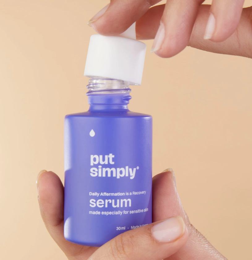
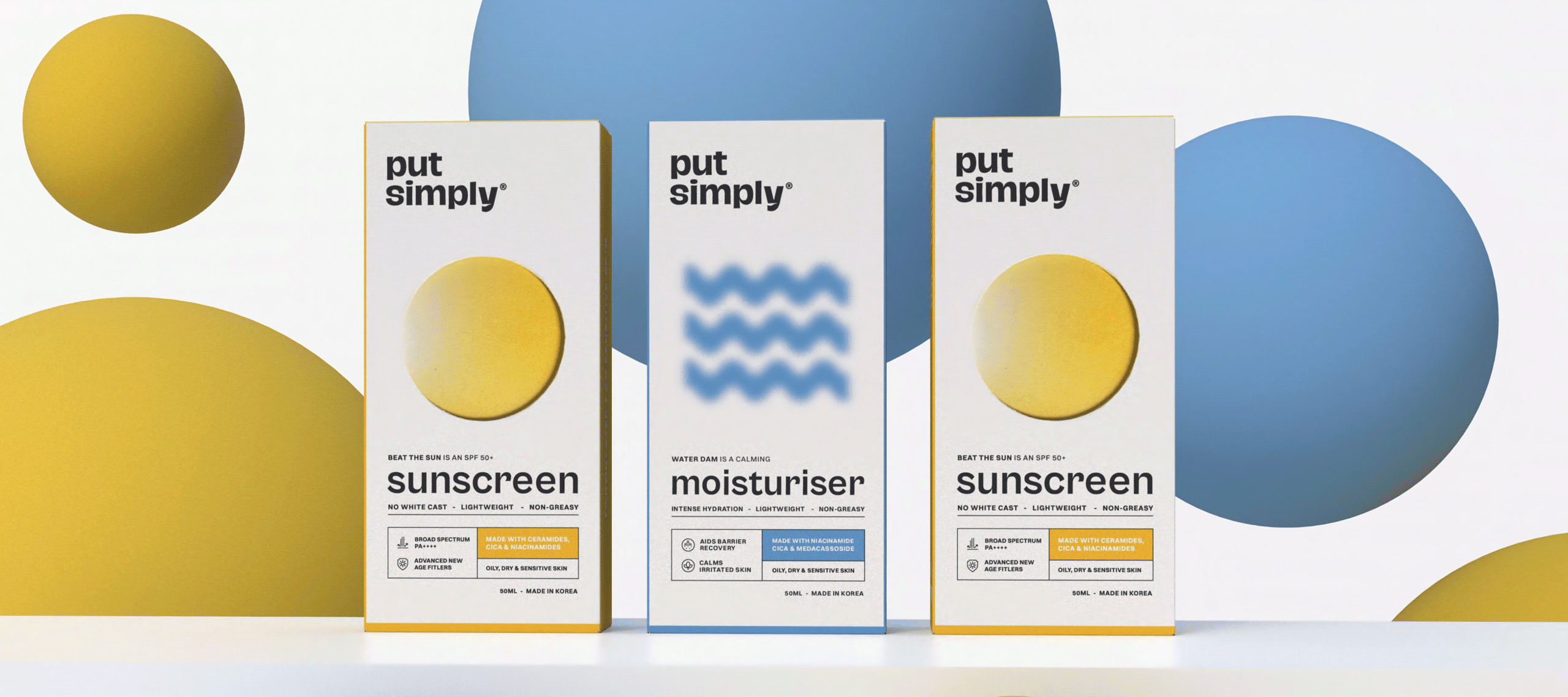
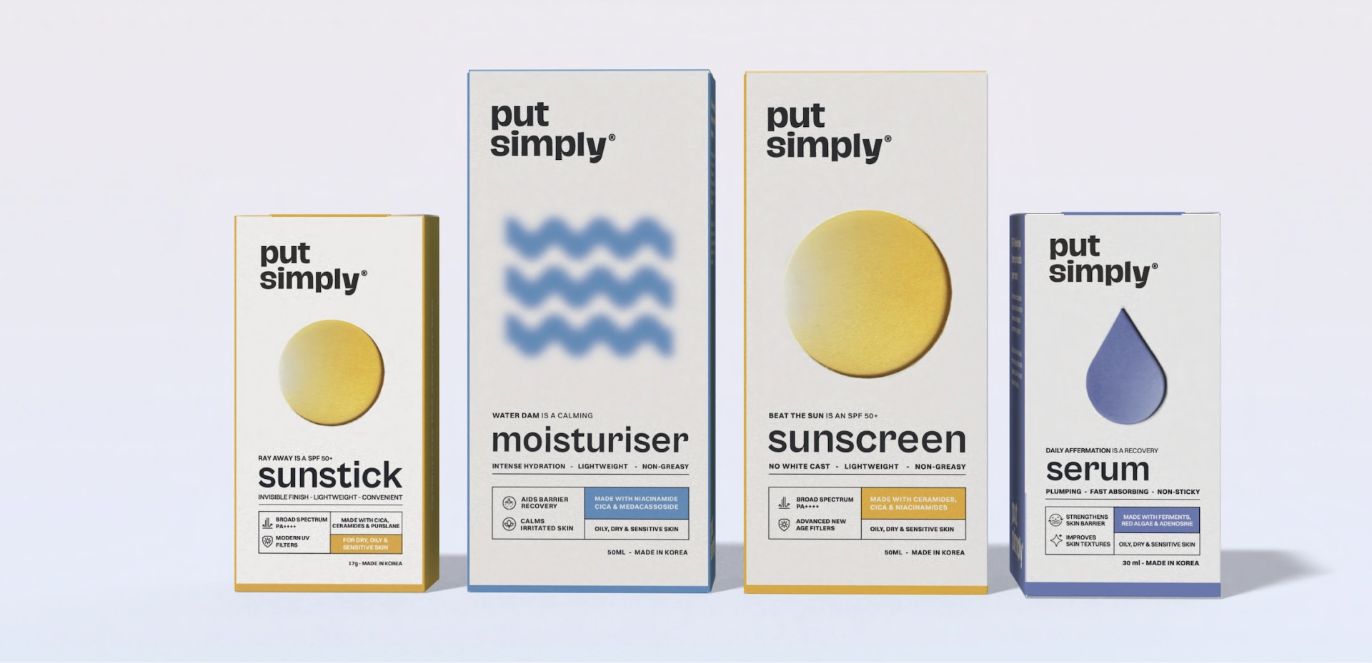
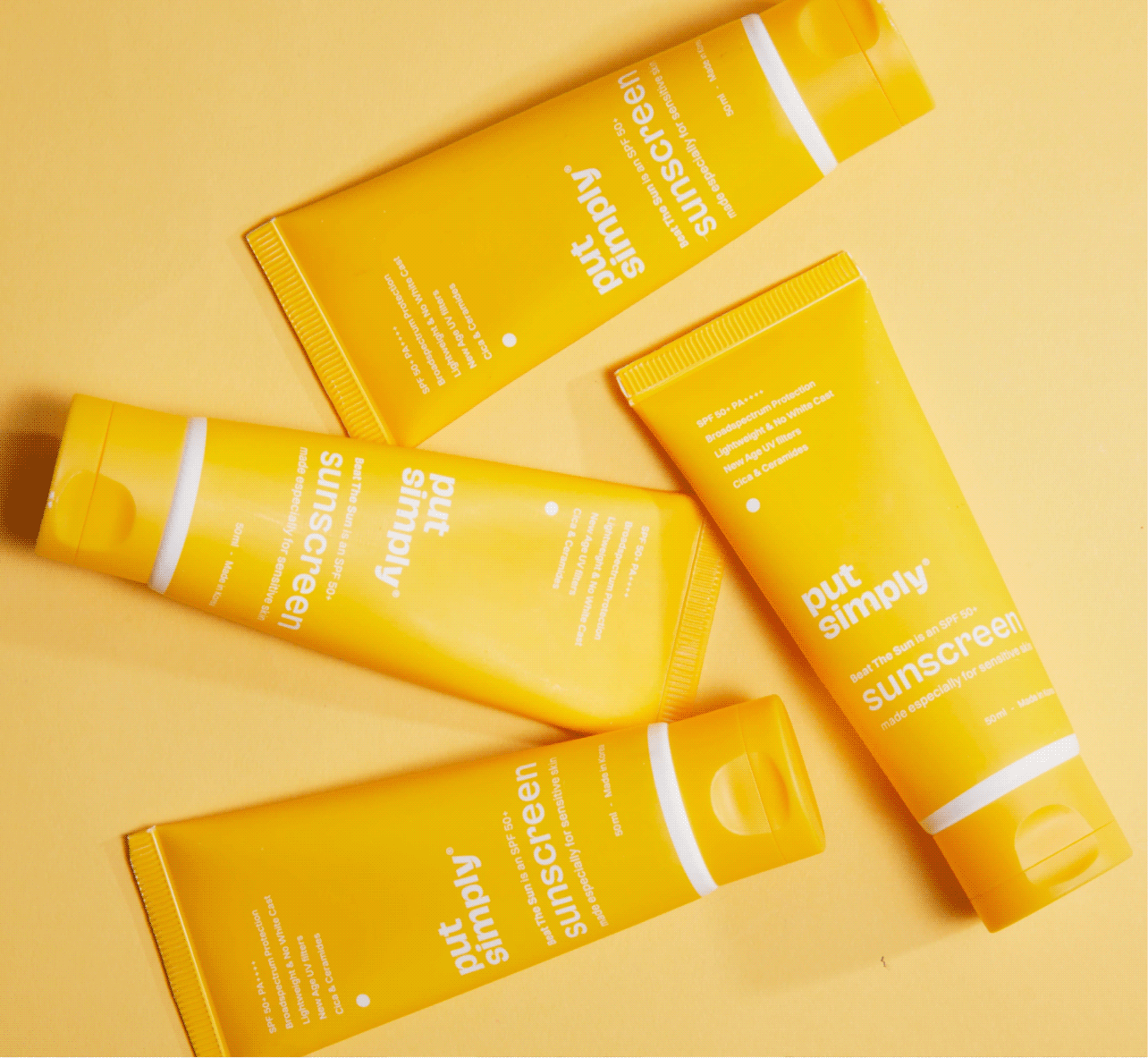
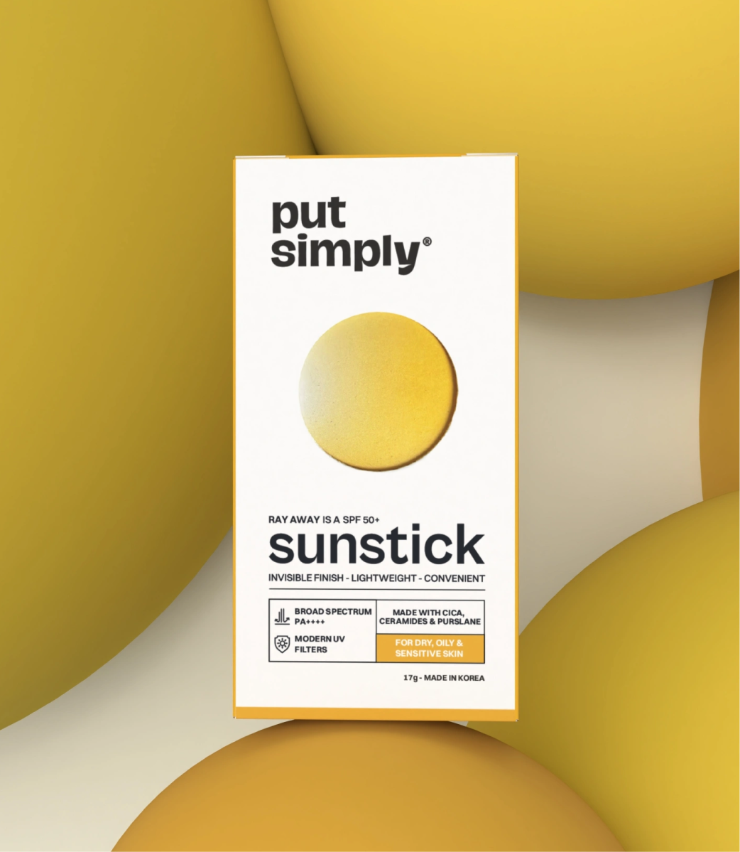
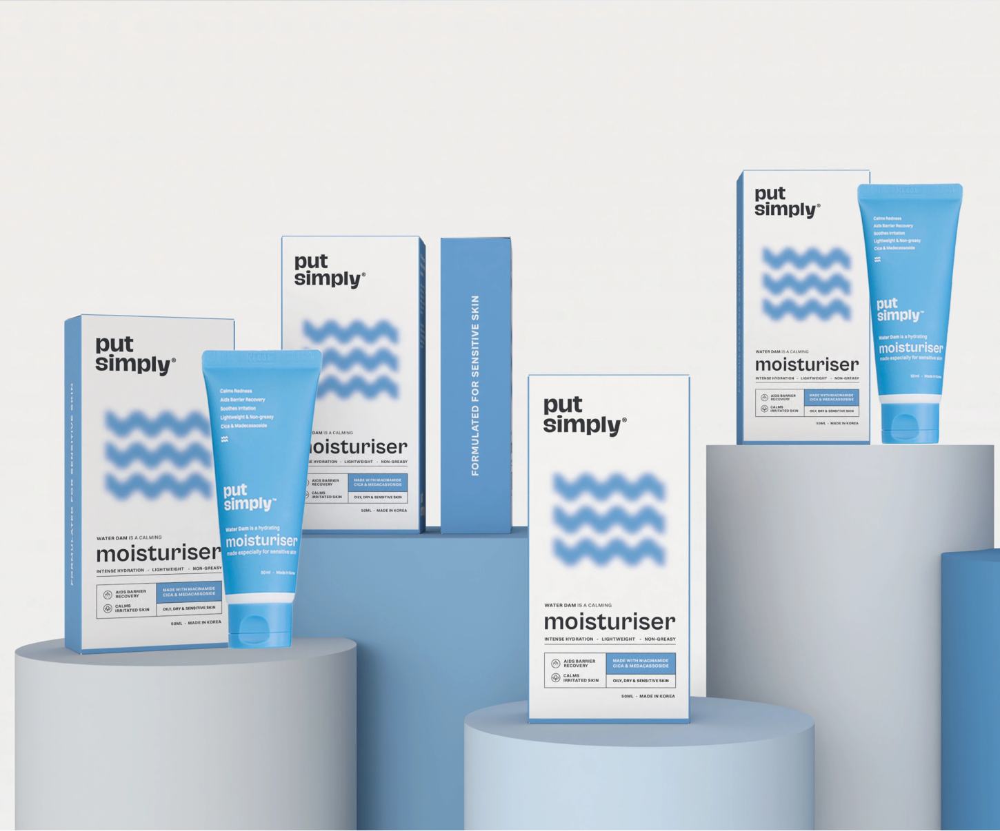
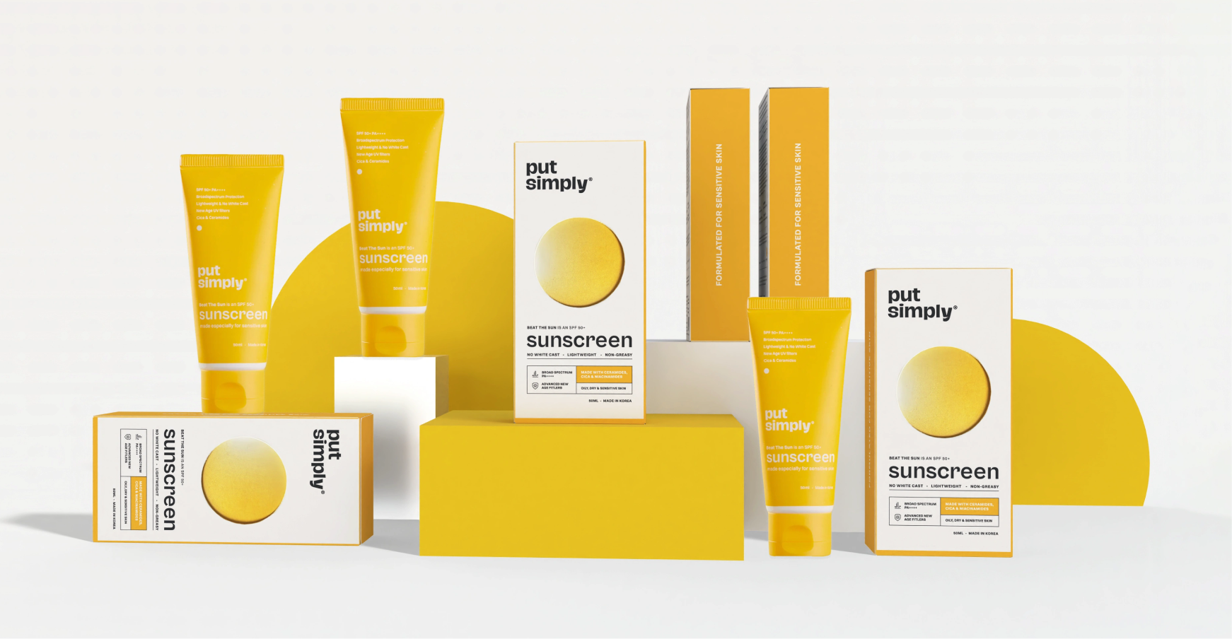
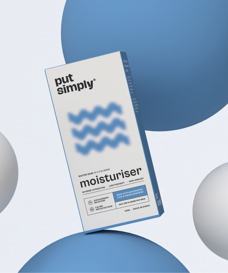
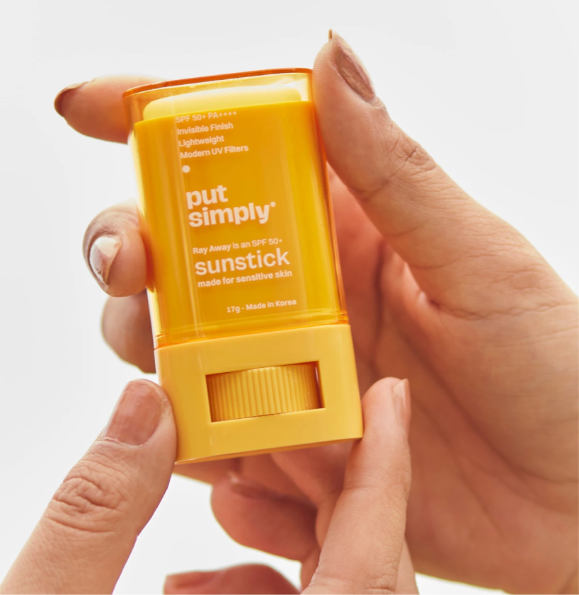
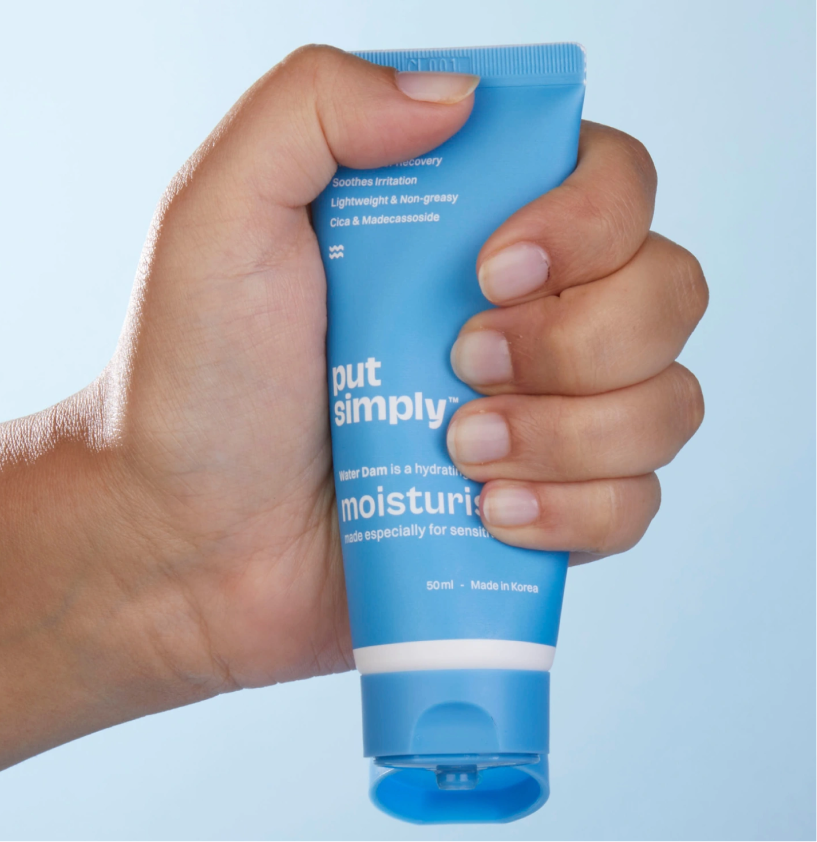
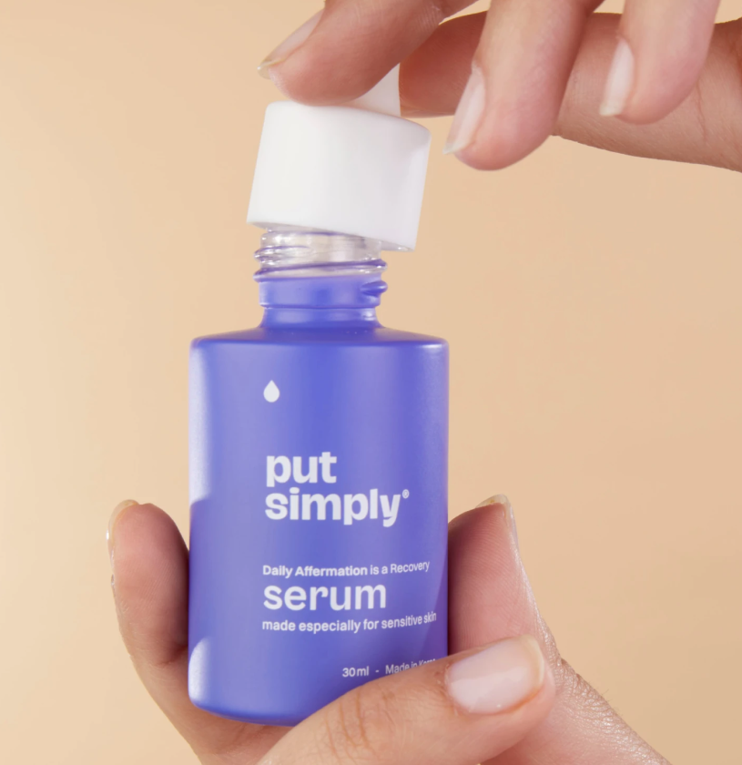
We built a visual language that feels as simple as the products themselves. Every pack uses bold bright colours, clean layouts, and distinctive cues that help consumers instantly identify what product does.


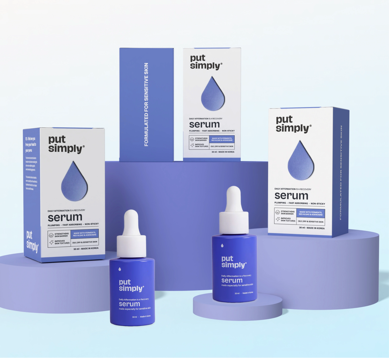
From the calming wave for the moisturiser to the radiant sun for sunscreen or the drop for the serum, every element communicates the product’s purpose before you even read 
the label.

Introducing Put Simply 2.0

A purpose driven intentional brand that makes you rethink your skincare routine. Put Simply wants to change how you think about your routine by making it straightforward, easy to understand, and affordable.

THE BEST PART

Put Simply is here to make you rethink your routine

We believe in being straightforward and knowledgeable, which is what makes the routine feel manageable rather than technical. Put Simply is modest and it is precise.

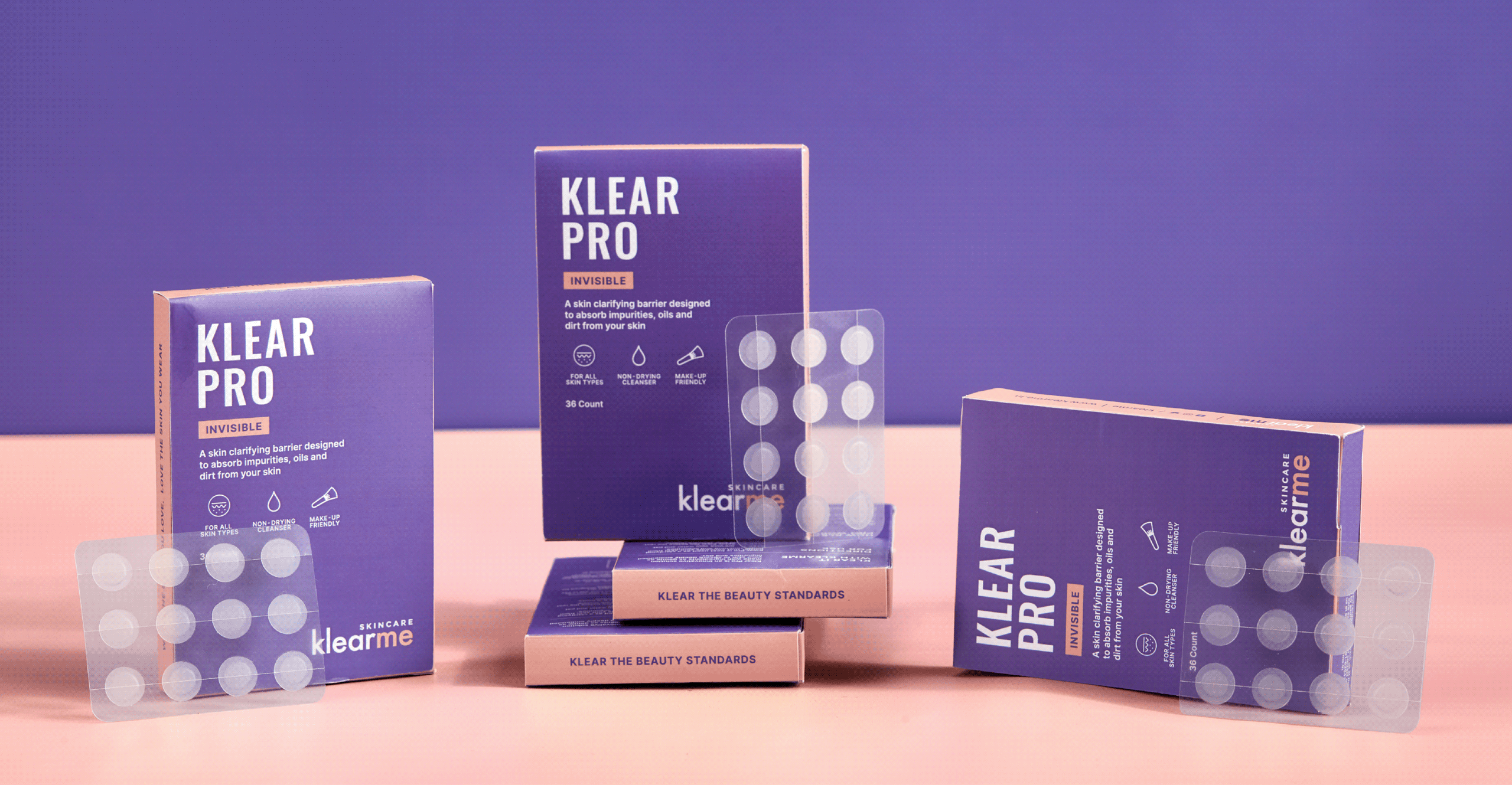
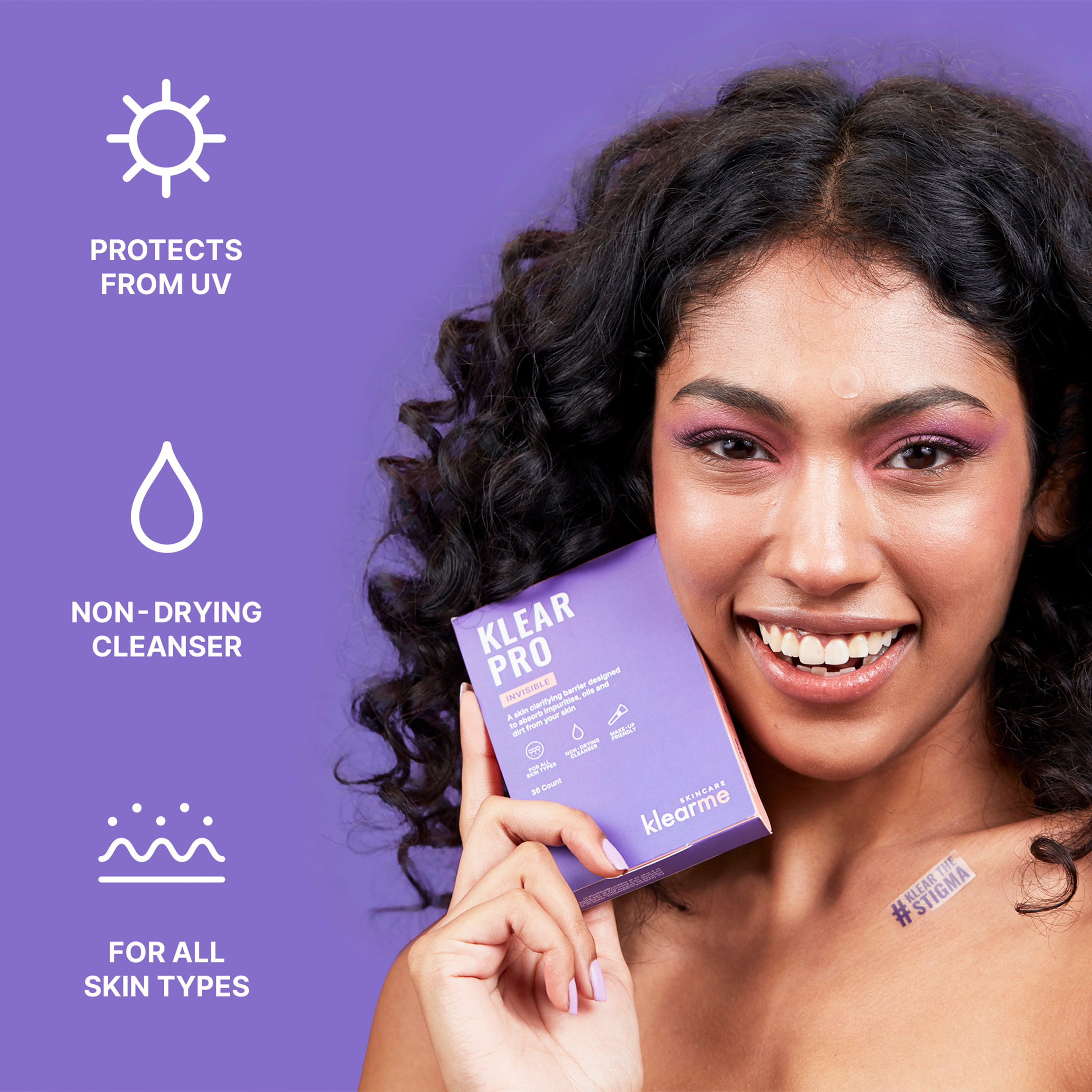
Klear The Stigma, Not Just Acne

Can a skincare brand clear the stigma, not just acne?

Scope Of Work: Research, Strategy, Brand Identity, Product Packaging, Visual Extension, and Web Design.

Acne is one of the most common skin concerns, yet most brands still communicate through flawless faces and impossible standards. If skincare is meant to build confidence, then why do so many brands make people feel the opposite?


We explored this question with Anish while building Klearme. Together, we set out to build a brand that embraced real skin and made conversations around acne feel human, without giving up on the formulations.

The goal was to build a brand that treated acne with honesty, empathy, and confidence.

THE CHALLENGE

How do you make skincare feel less intimidating?

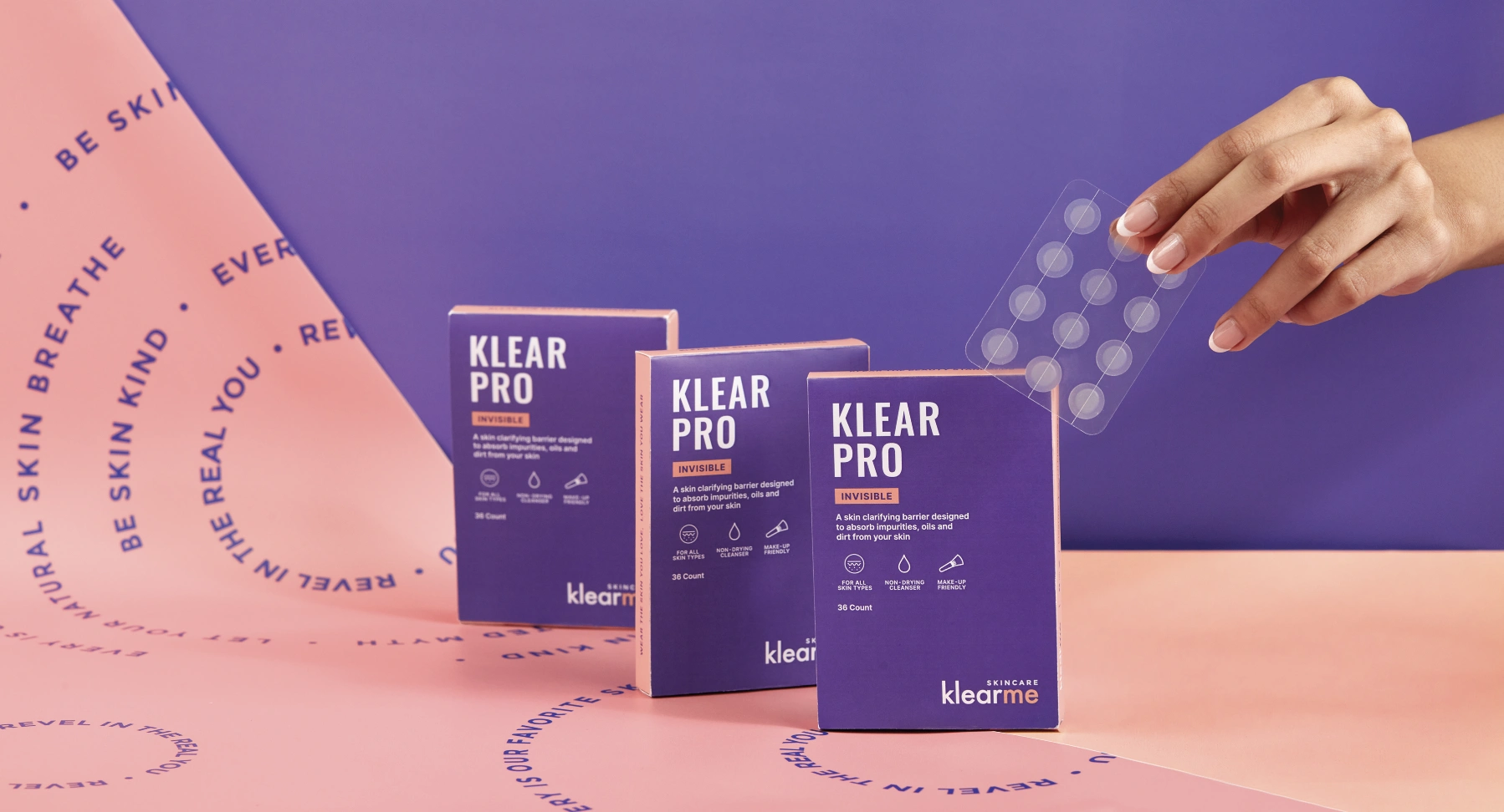
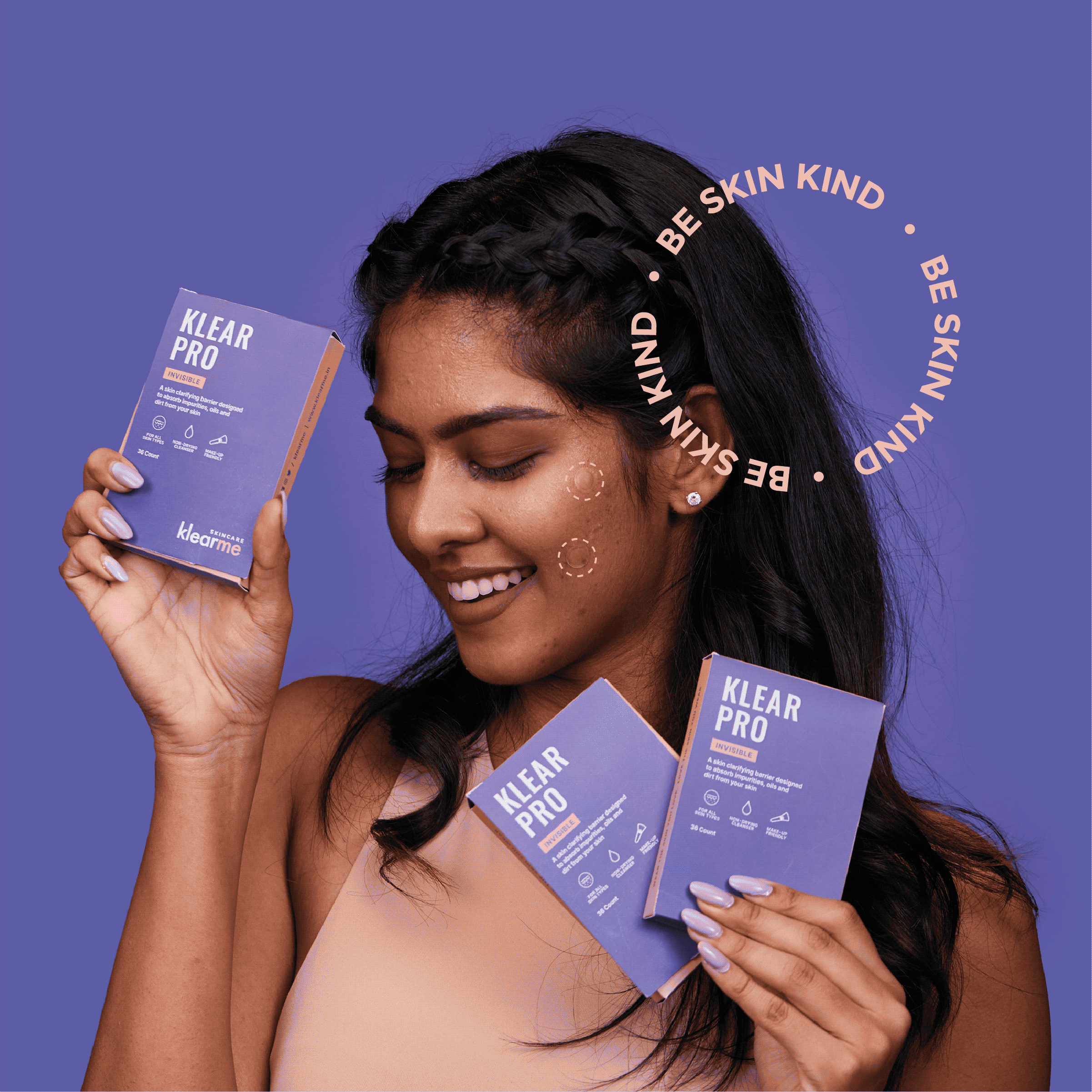
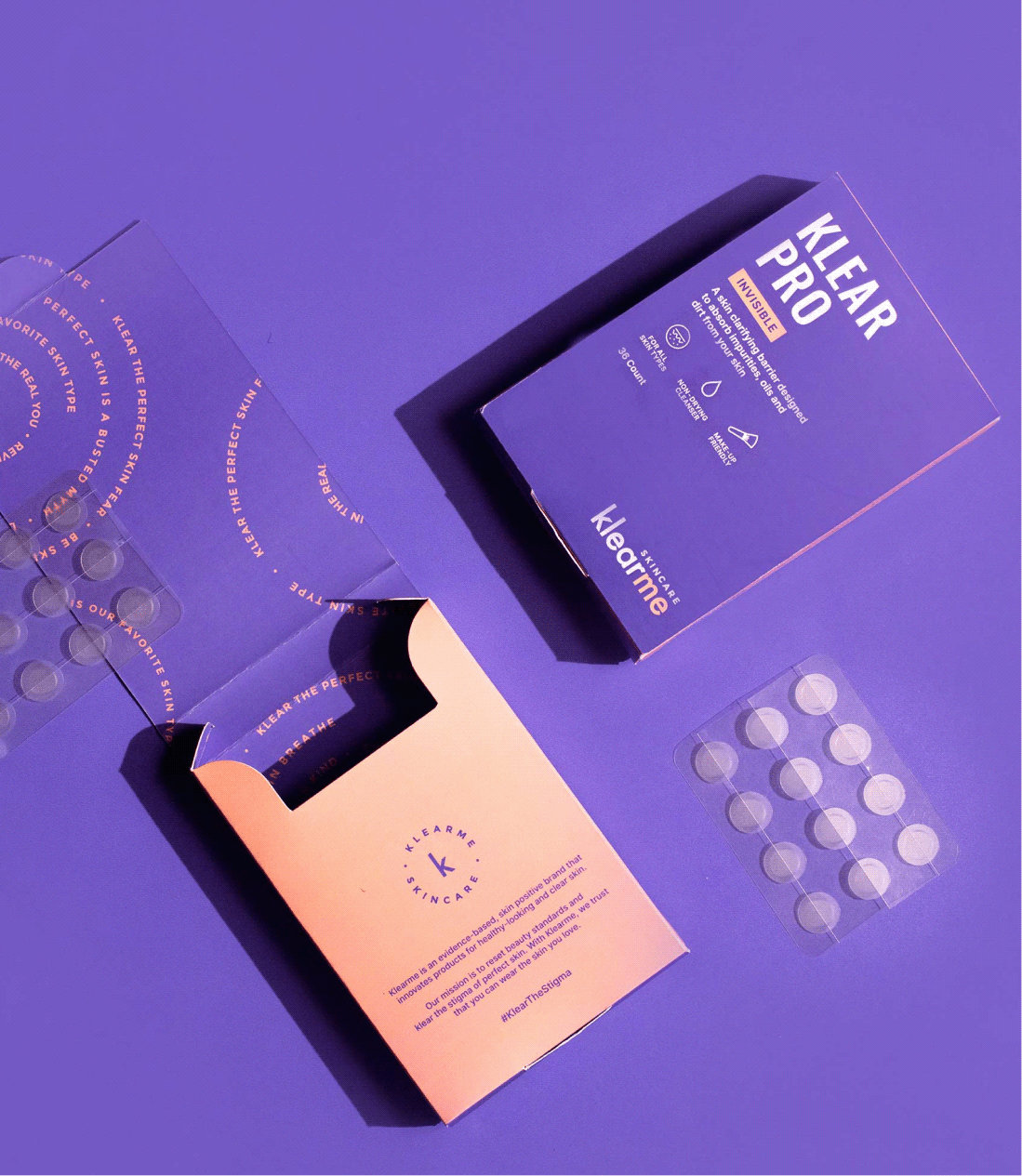
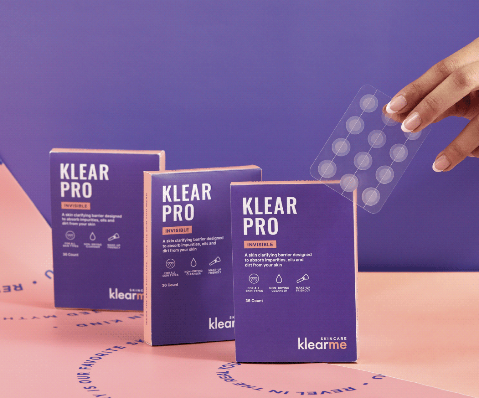
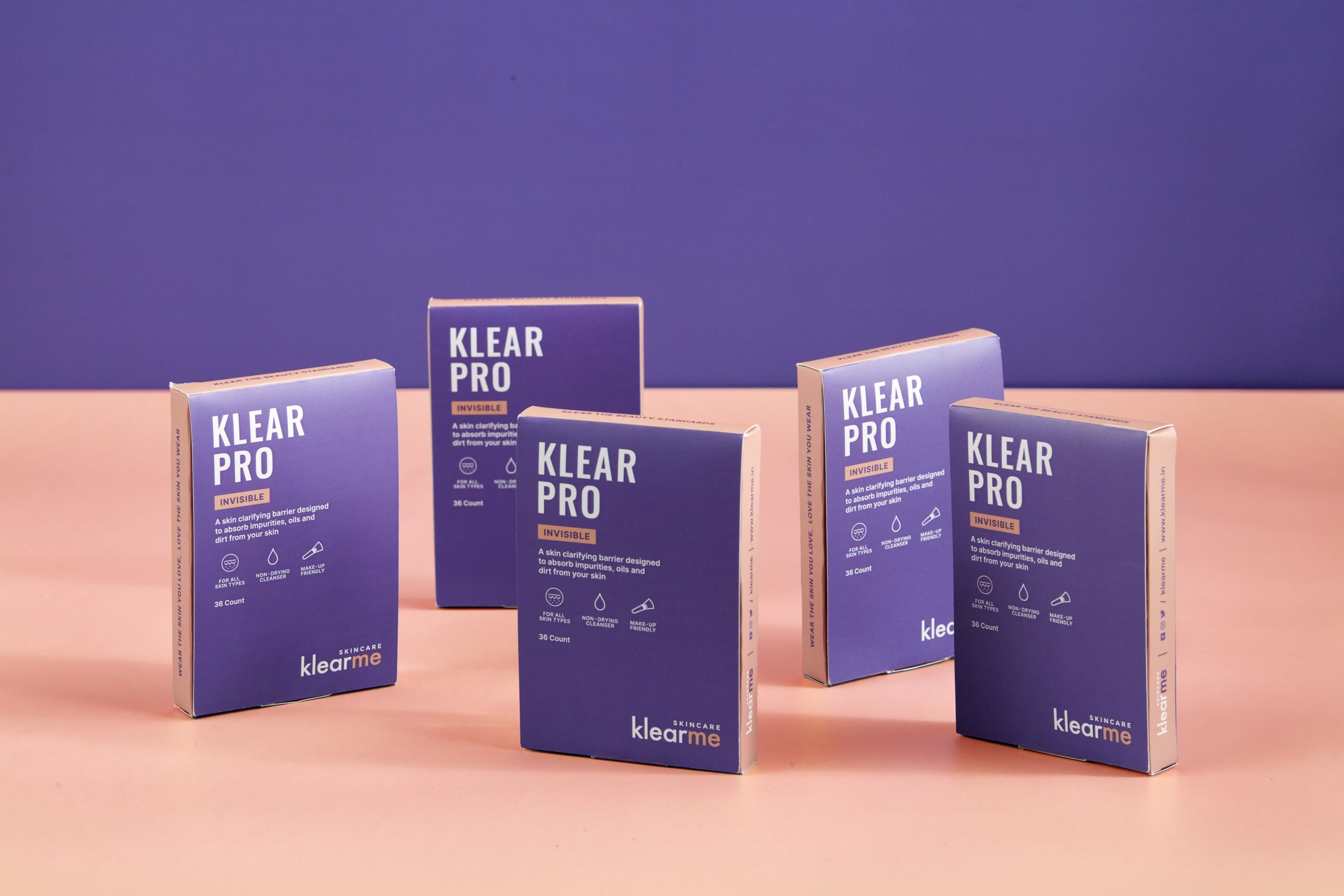
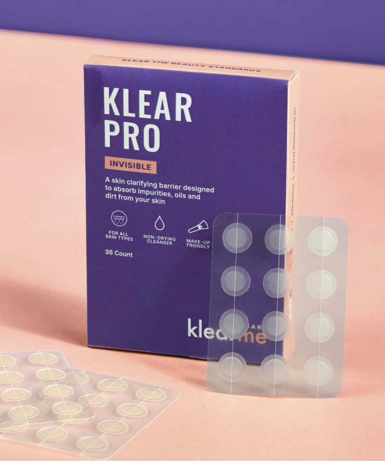
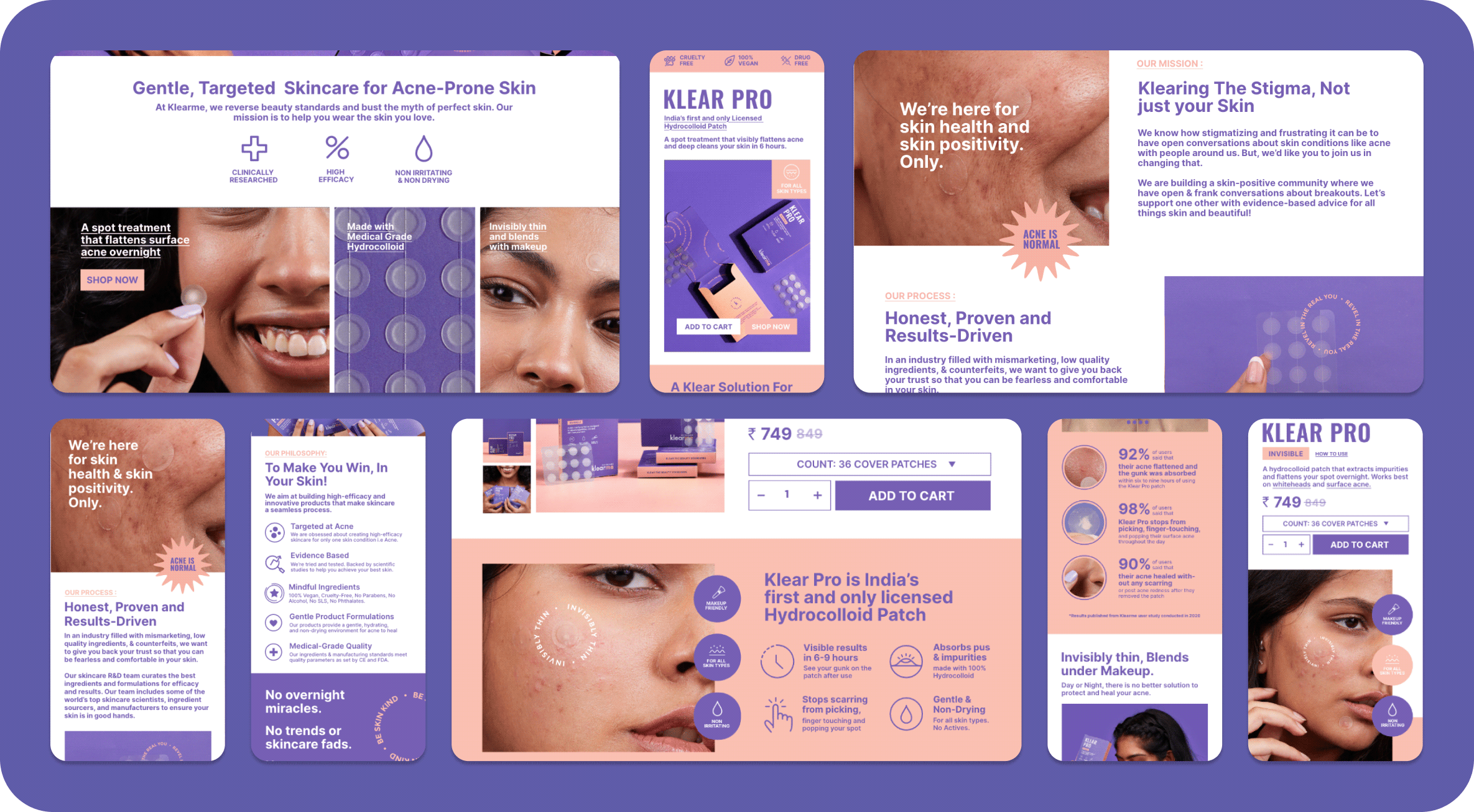
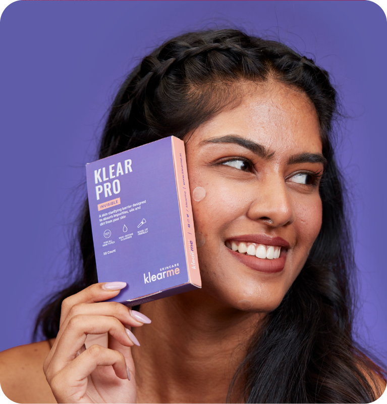
We built Klearme’s identity to feel approachable, optimistic, and easy to navigate. A clean editorial wordmark, contrasting colours, and a flexible visual system made the brand feel confident without becoming clinical.

Every extension, from icons and patterns to educational graphics, helped simplify acne care while reminding people that skincare is about understanding your skin, not hiding it.

THE BEST PART

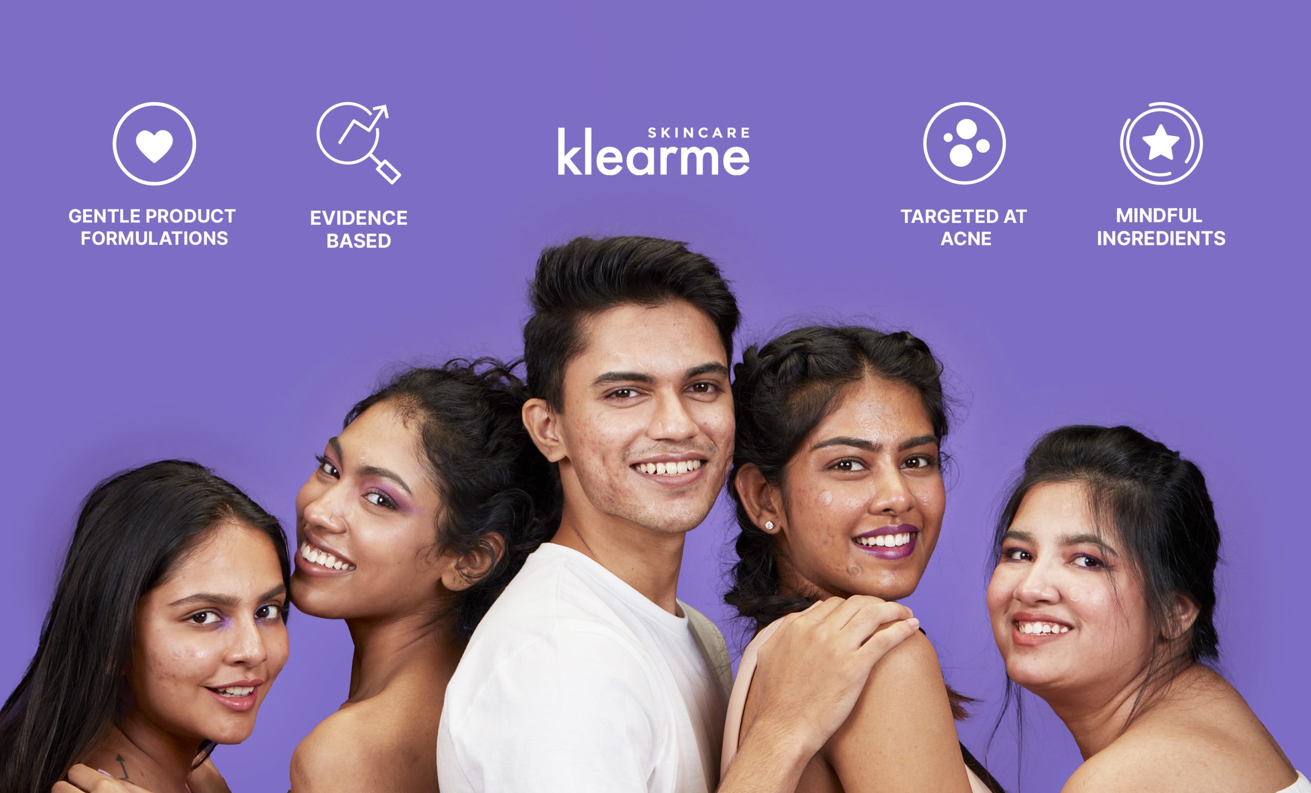
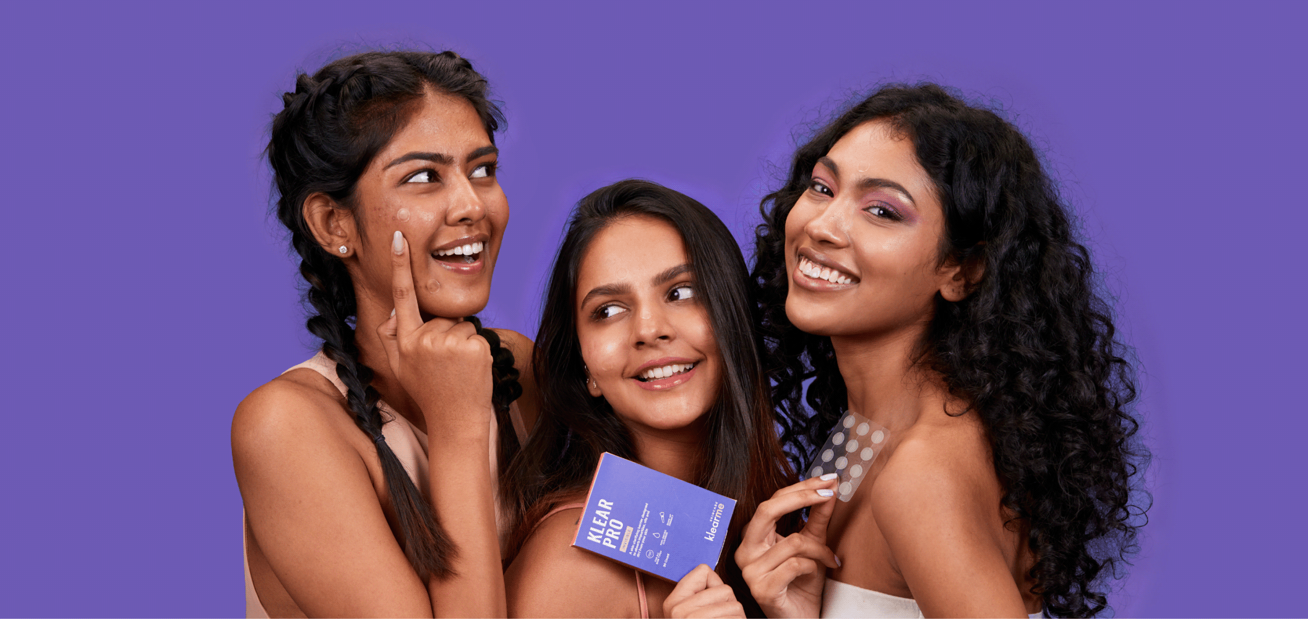
Real People. Real Skin. Real Results.

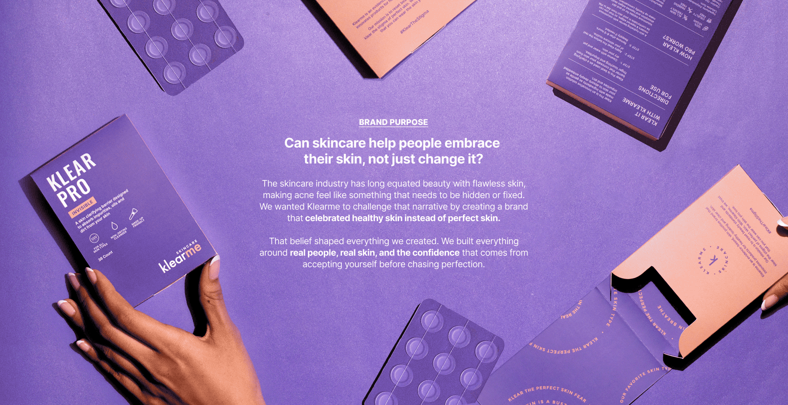
A brand that celebrates the real you. With Klearme, we wanted to clear the stigma of perfect skin and beauty standards. We wanted our consumers to celebrate their real skin and love the skin they wear.

The narrative was simple. There is no such thing as perfect skin. Healthy skin is beautiful skin, and that is what the images had to show: real people, comfortable.

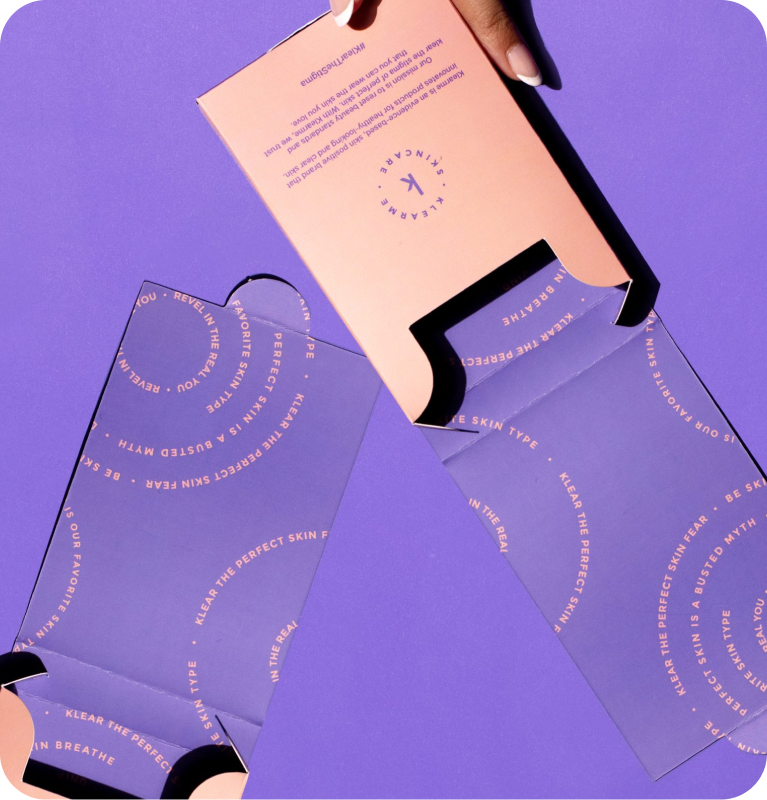
What arrives before the product does?

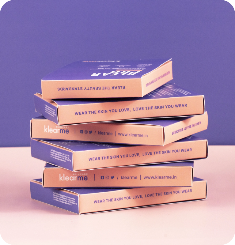
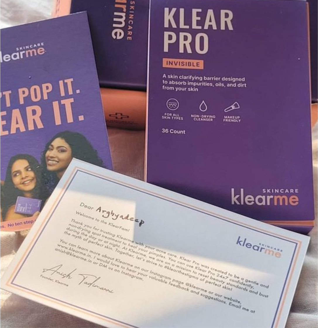
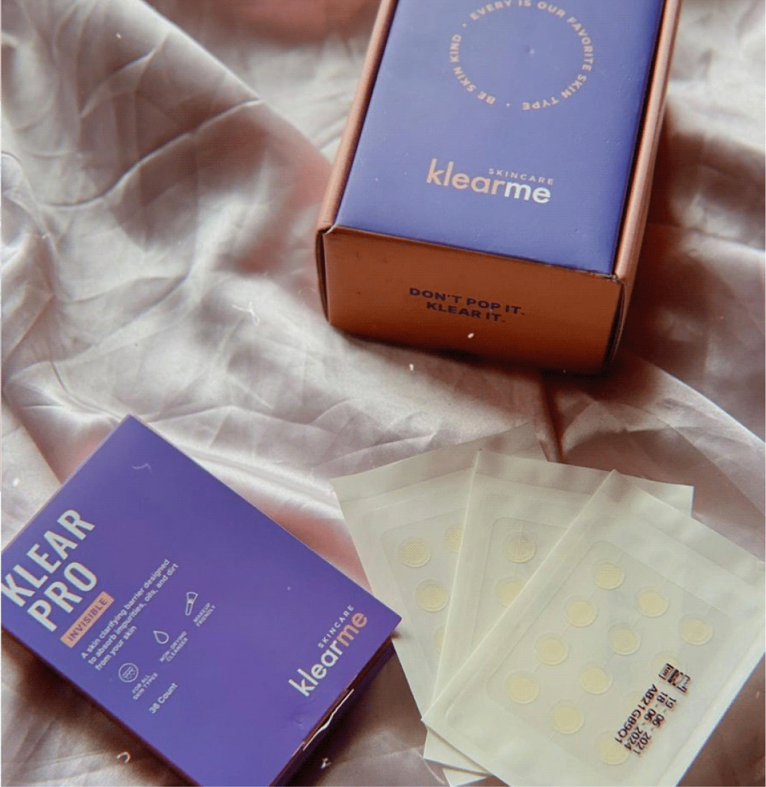
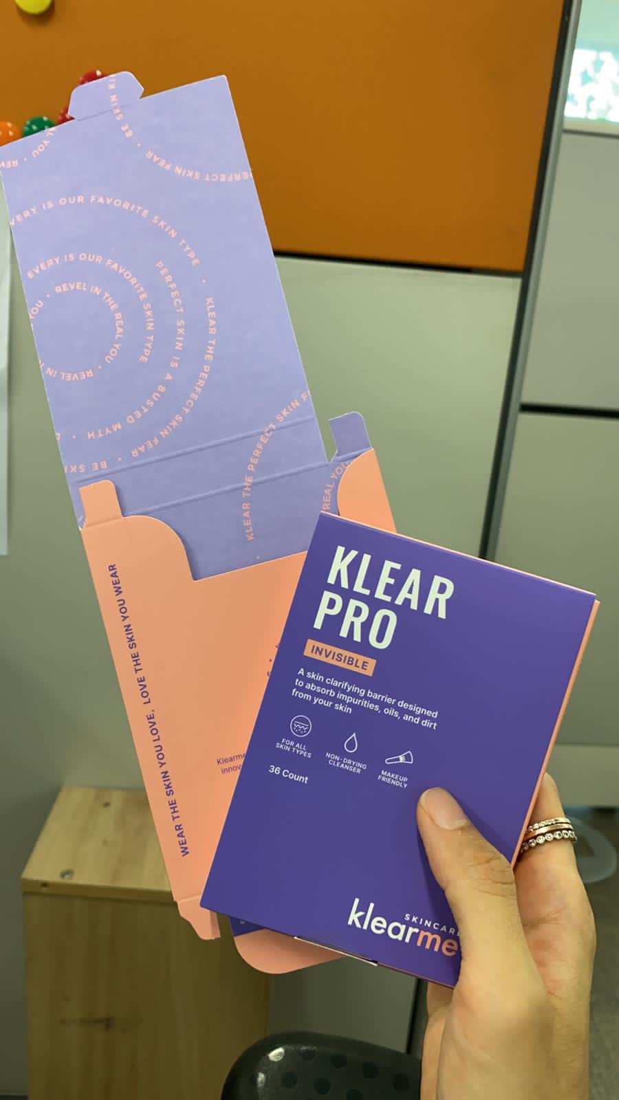
Skincare doesn’t end at the product, so neither did the experience. Clean secondary packaging and bold brand colours for contrast. Inside every box, a guide to using the product and a note from the founder.

You know what Klearme believes before you start.
THE EXPERIENCE

Could a website do more than sell products?

The brand believes acne is normal. We wanted the website to make that belief tangible. So, instead of building another product shelf, we built a space that helps people start loving their skin.

Because clear skin is a standard someone else set. The website challenges that standard and shifts the focus from fixing your skin to caring for the skin you already have.
The messy, the fun, the not so pretty part of the project!

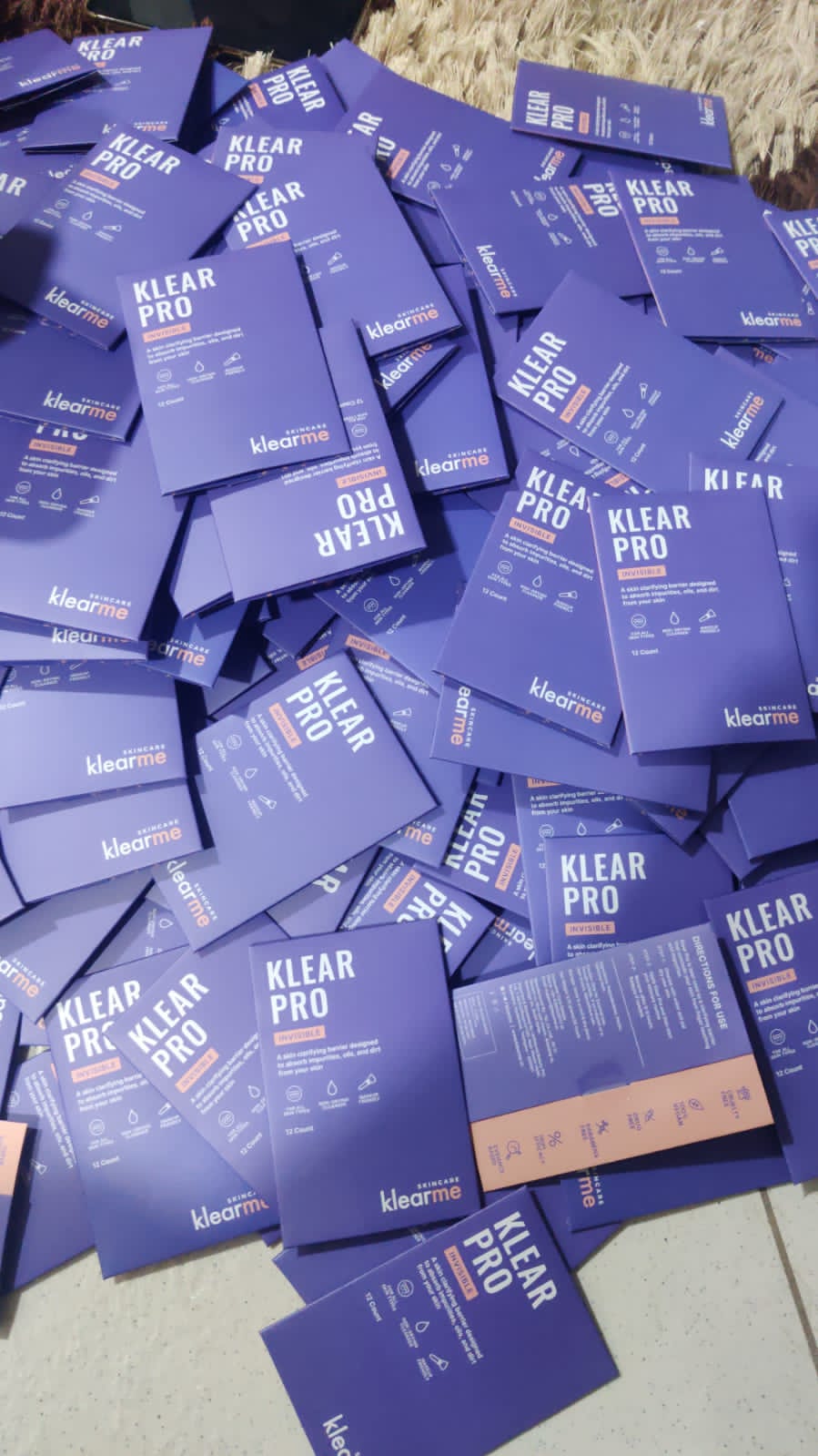
Our first round of trial packs

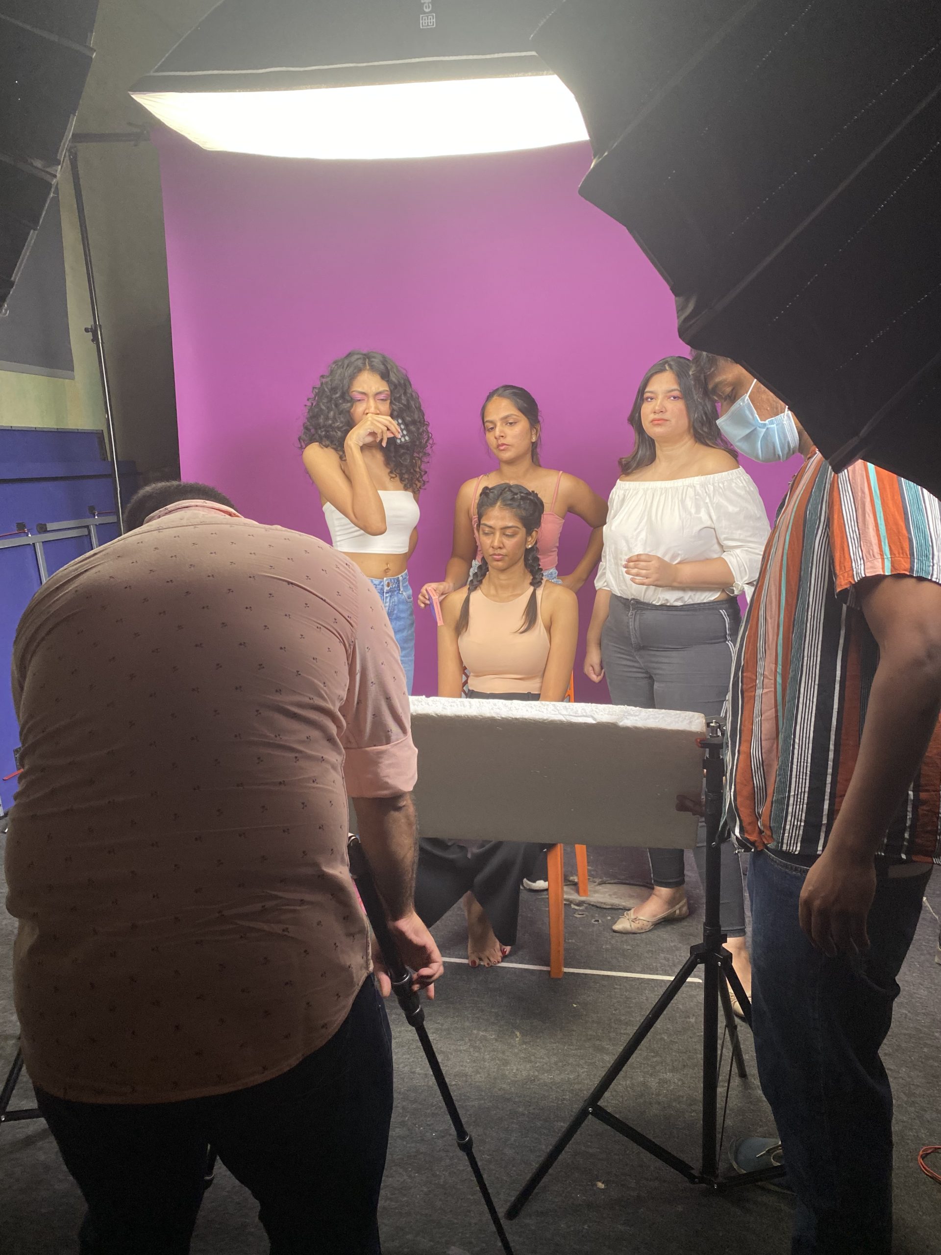
Behind the scenes at the shoot

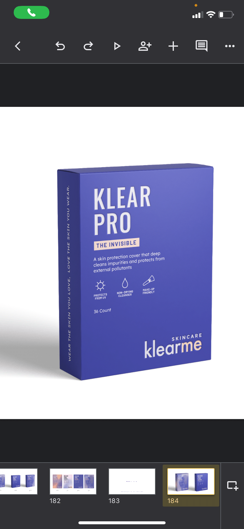
Rounds of trials before finalising

In print, finally

Reimagining Jackfruit

Can a superfood feel just as familiar as comfort food?

Scope Of Work: Packaging Design, Extension & Visual Language.

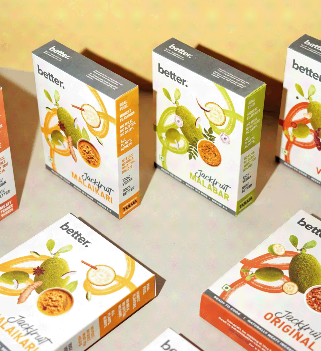
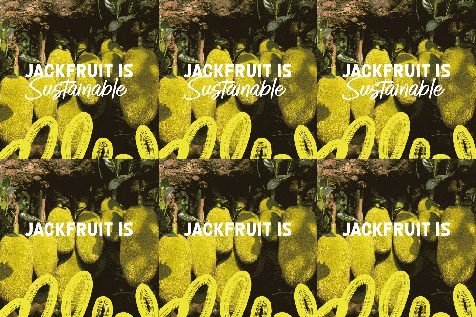
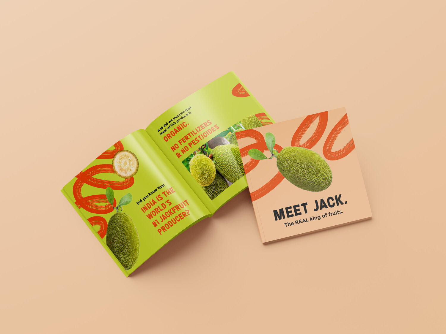
Jackfruit is a native superfood of India, yet most people are unfamiliar with it, or have reservations about it.

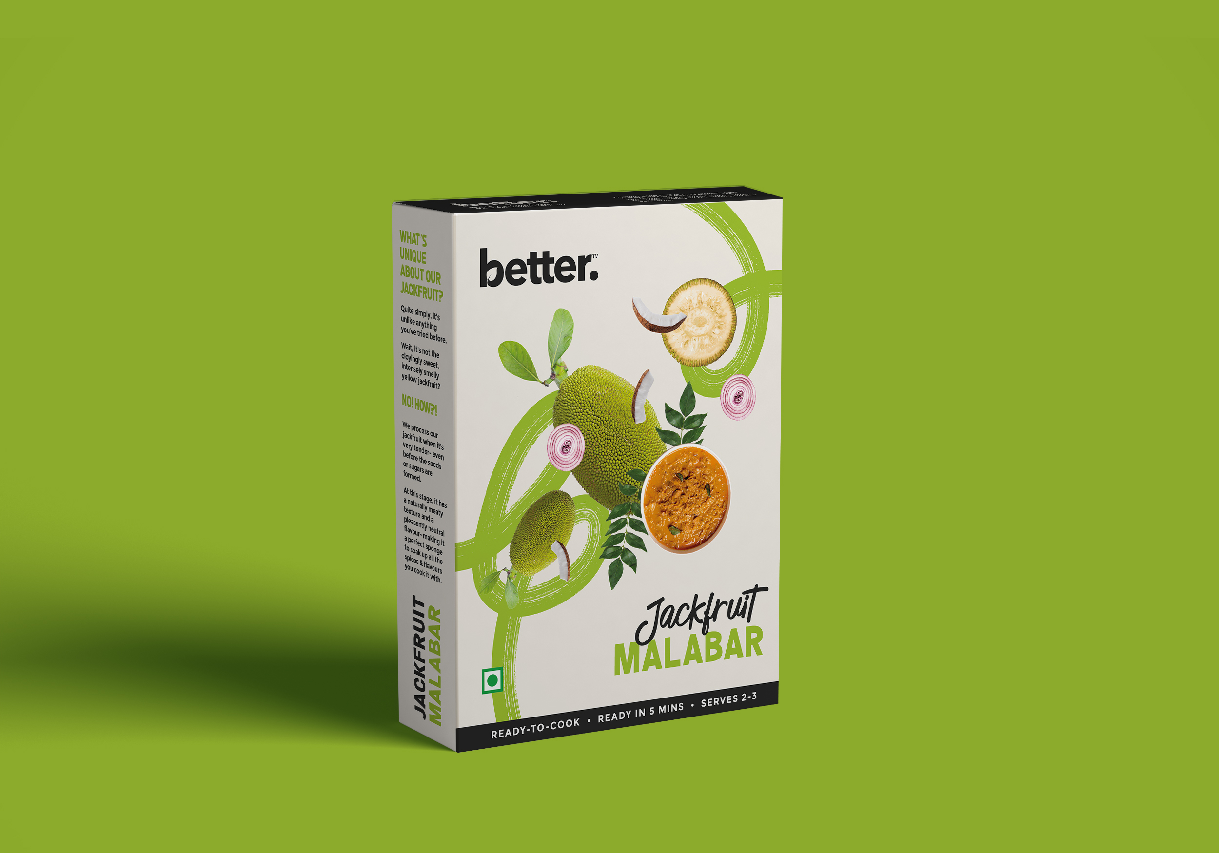
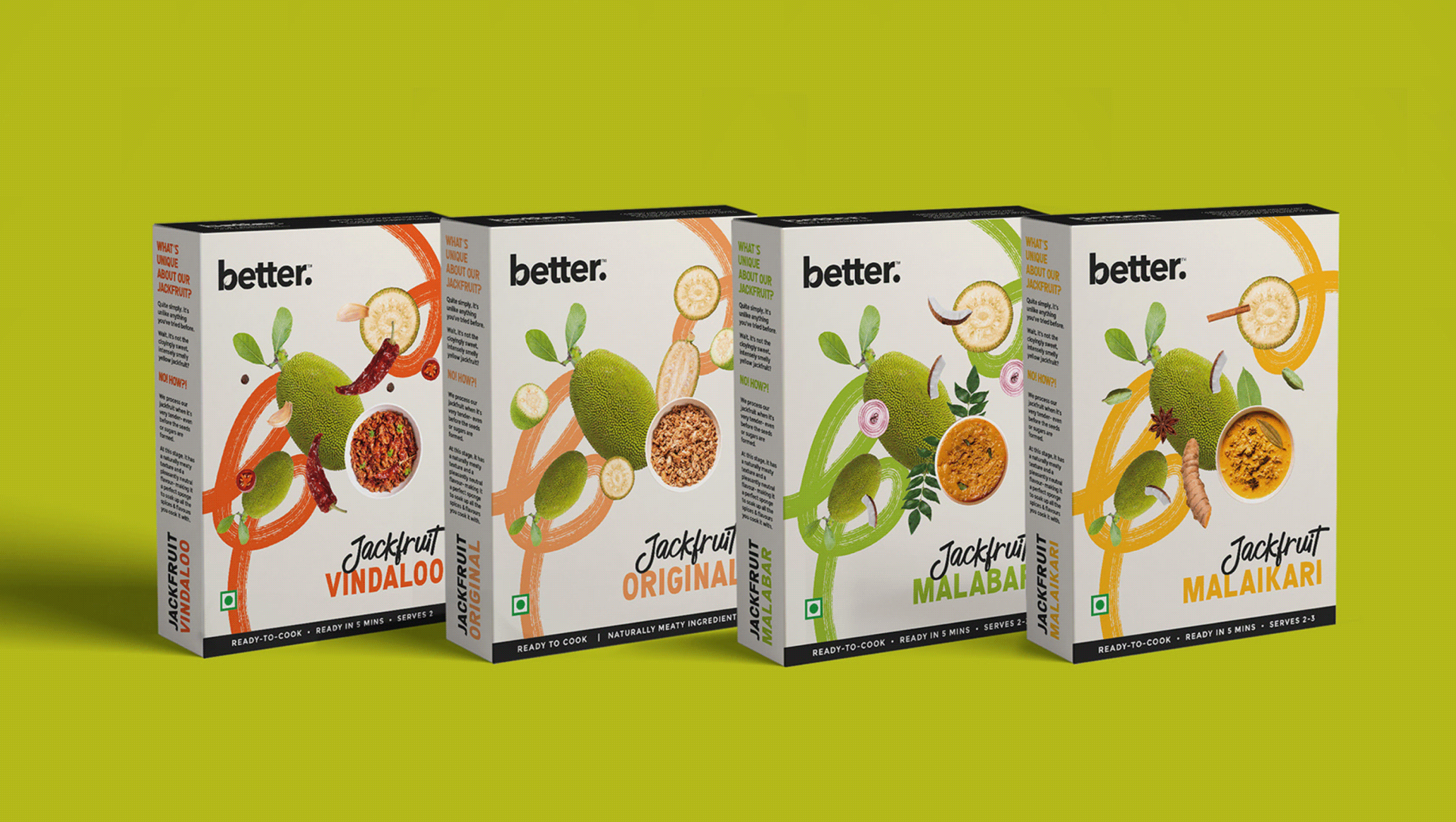
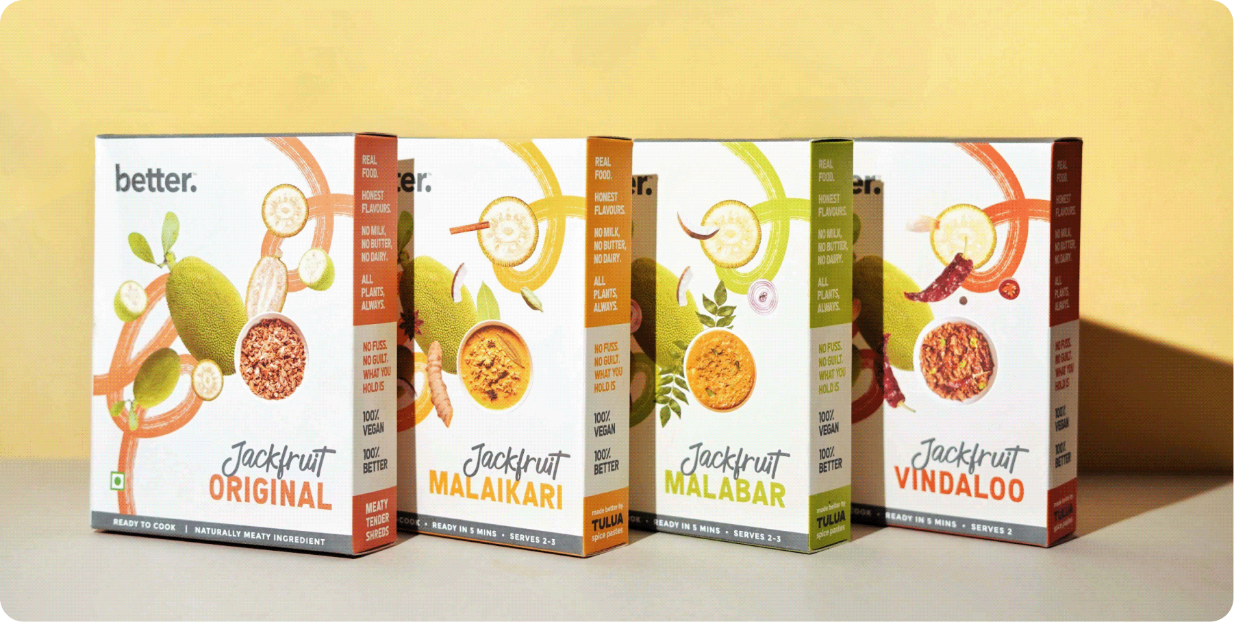
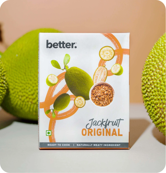
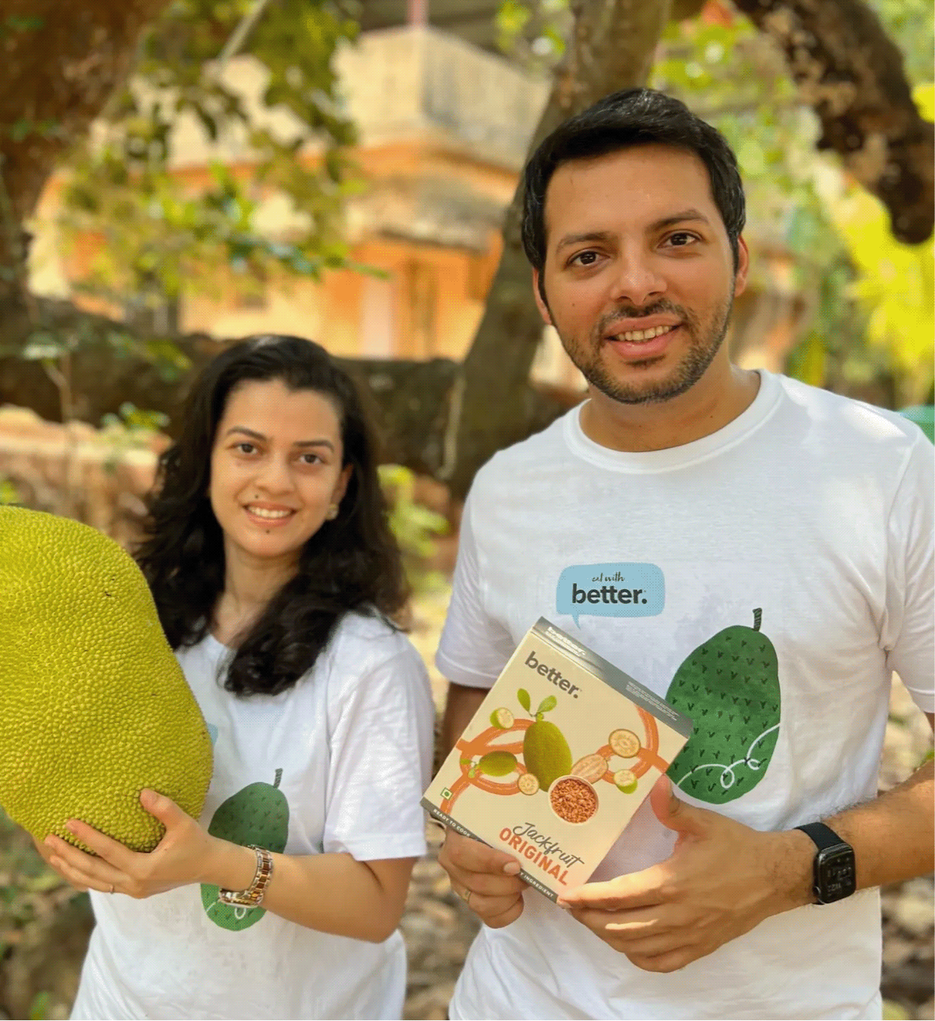
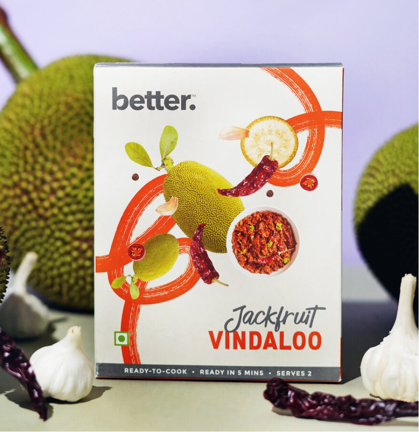
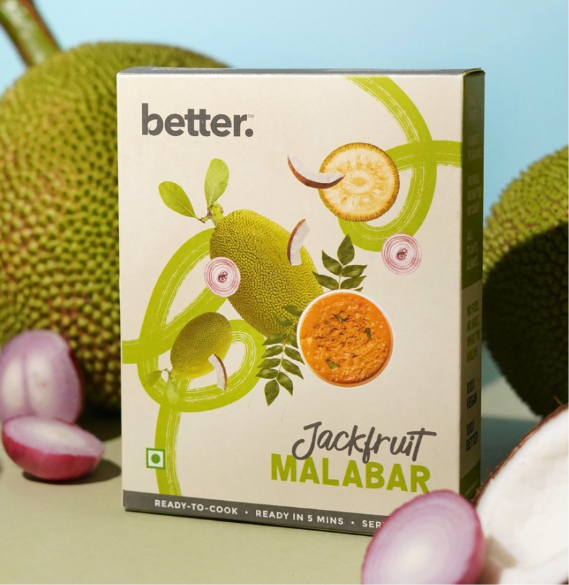
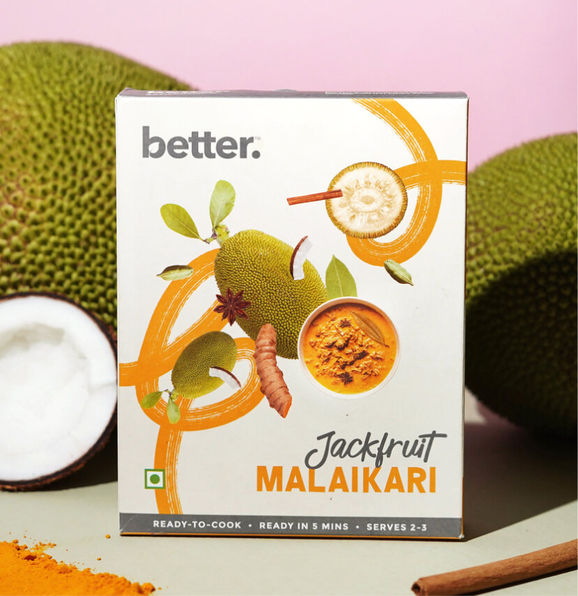
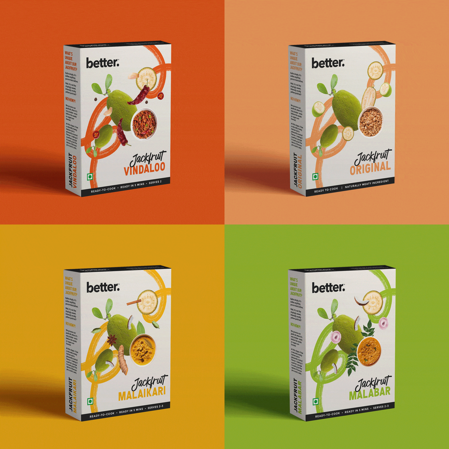
The opportunity wasn’t just to launch a new product; it was to make people curious enough to pick it up in the first place. Working with Karan and Keertida, we built a packaging system that felt vibrant, approachable, and consistent with the current brand language while celebrating local Indian flavours and conscious eating.

The goal was to make local Indian flavours feel joyful rather than aspirational.

THE CHALLENGE

How do you explain something people think they already know?

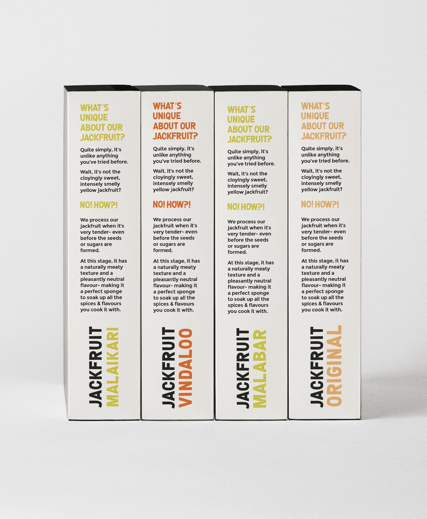
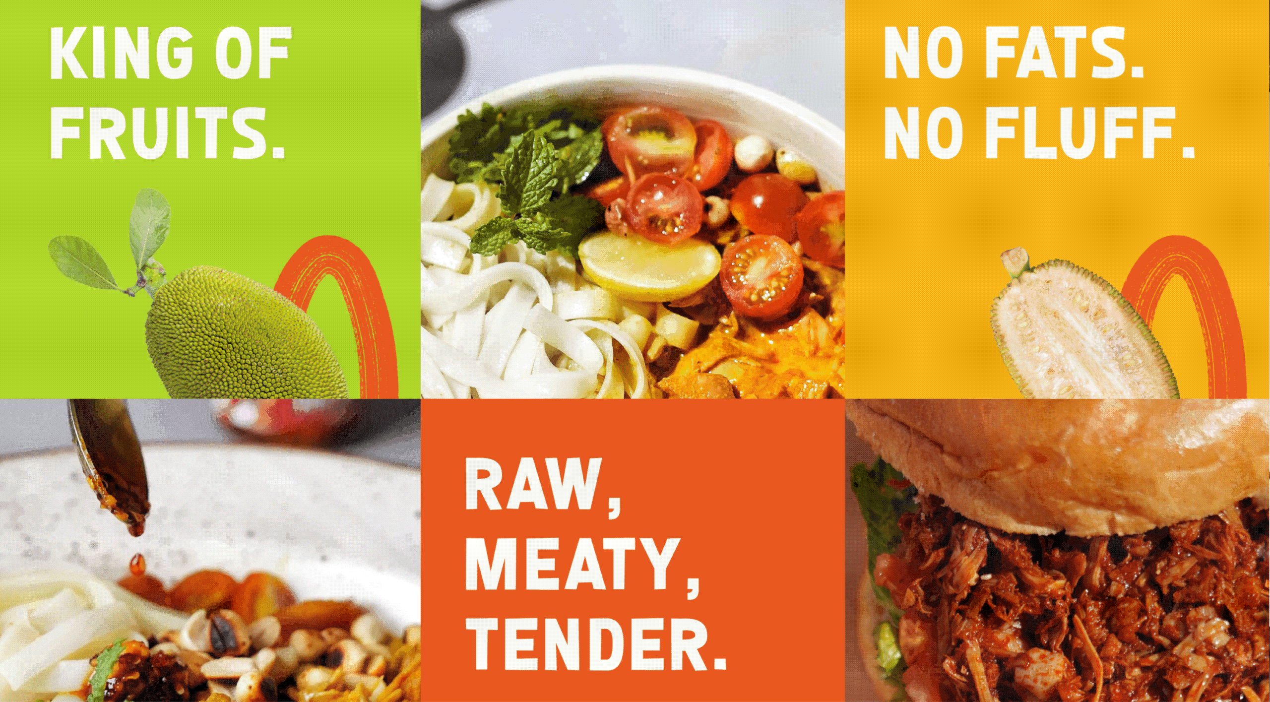
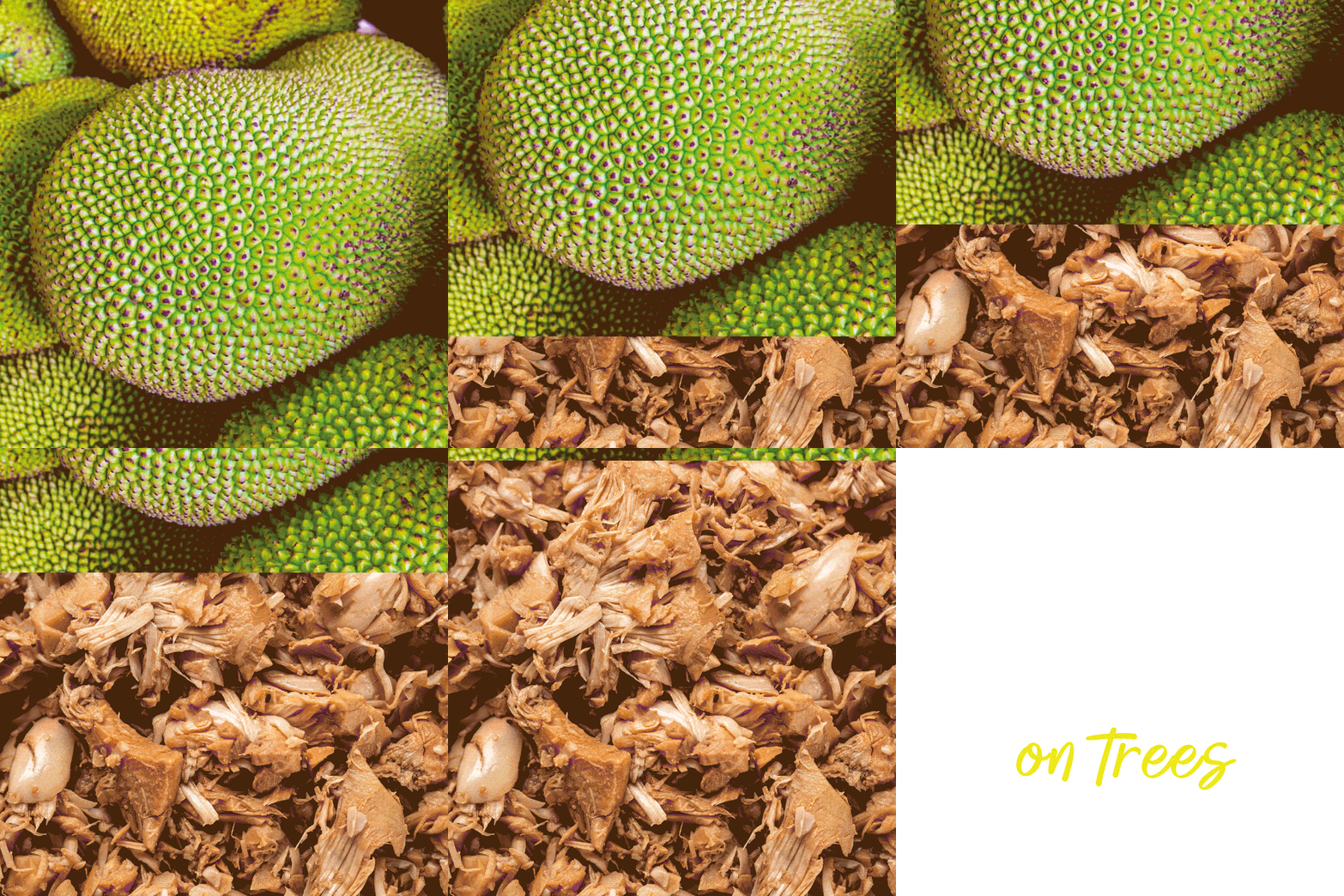
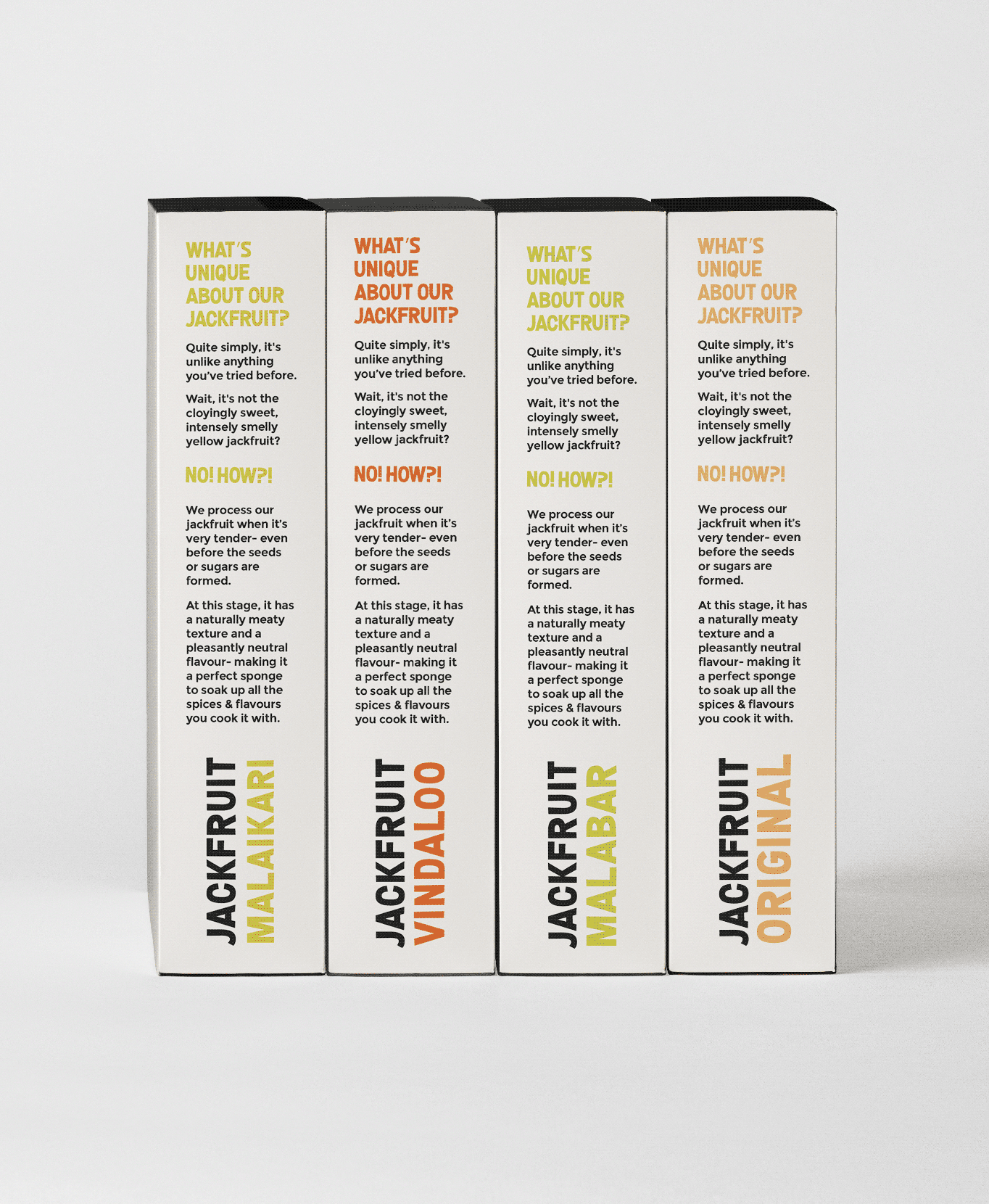
Most people still think of jackfruit as cloyingly sweet, smelly, or intensely yellow. Very few recognise its versatility as a savoury ingredient. 


Rather than simply making the packaging look appetising, we used it to introduce the product, simplify the story, and help consumers understand that this wasn’t the jackfruit they expected.

THE BEST PART

What if the words felt as bold as the flavours themselves?

When introducing an unfamiliar product, the first challenge isn’t the flavour. It’s getting people to pay attention. Typography became one of our strongest tools to challenge perceptions before consumers even picked up the pack.

Confident headlines, oversized descriptors and handwritten details gave the range its voice. Every word had to make jackfruit easier to understand & worth getting excited about.

NEW LAUNCH

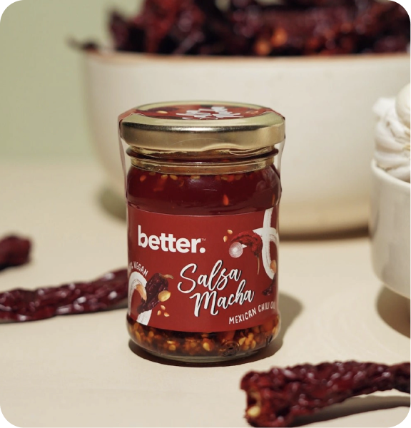
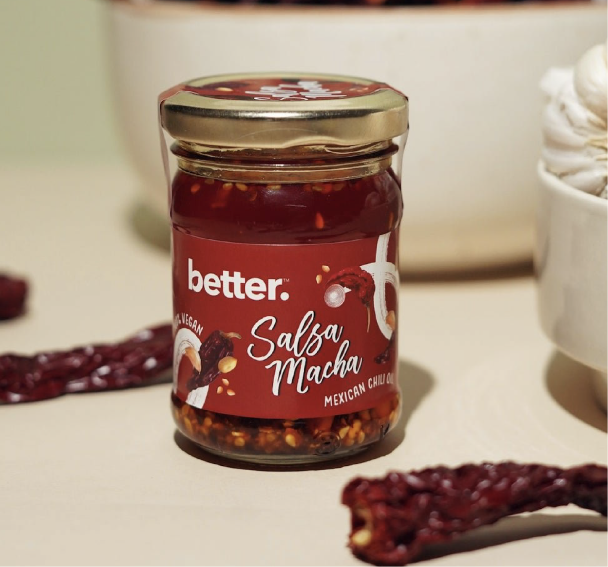
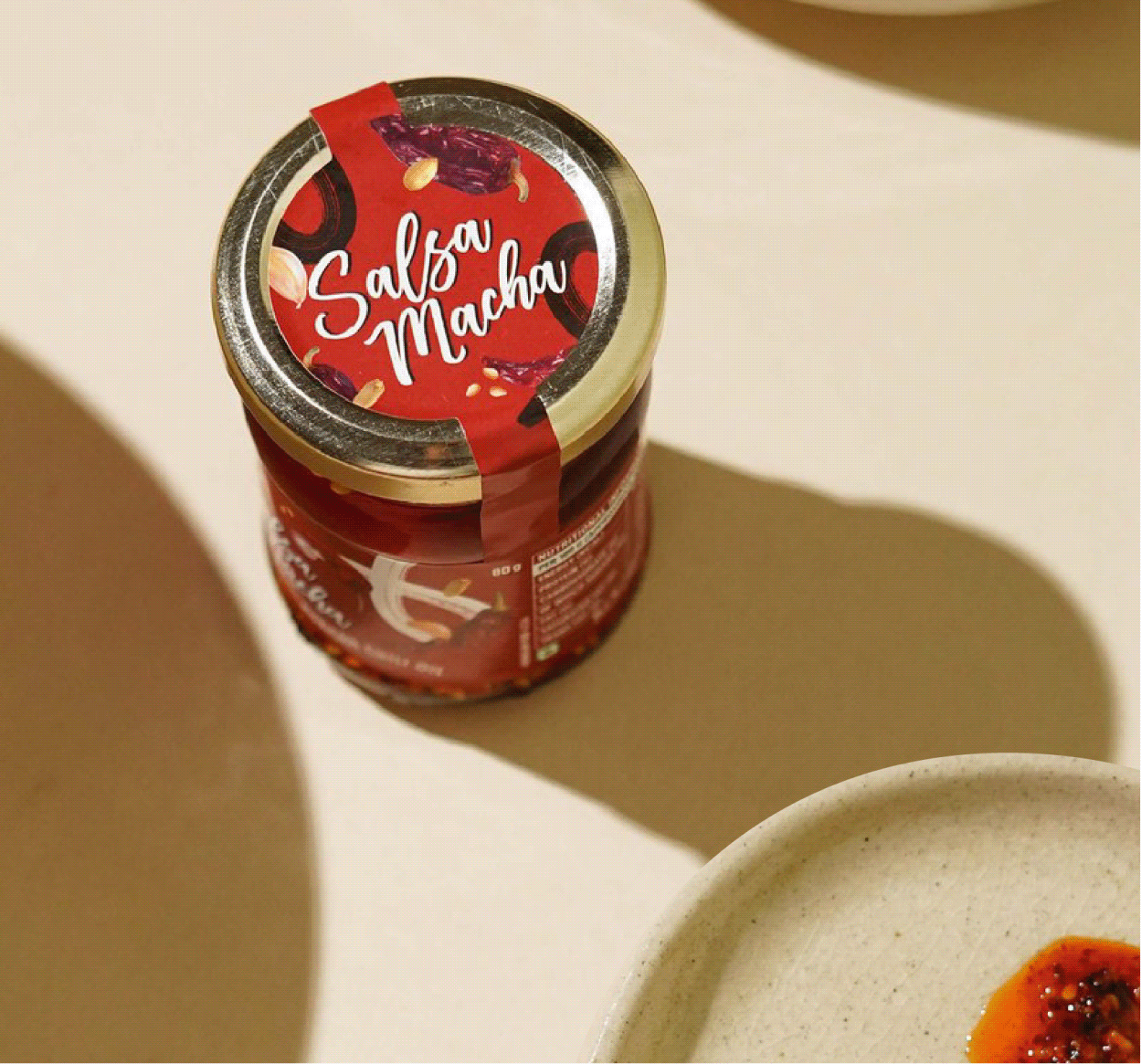
We also extended the visual language to Better’s Salsa Macha, a Mexican chilli oil made with five different chillies, peanuts, and sesame seeds. The packaging celebrates its bold personality through a visual identity that feels rich, vibrant, and full of flavour.

BEYOND THE PACK

A pack can start the story. It can’t finish it.

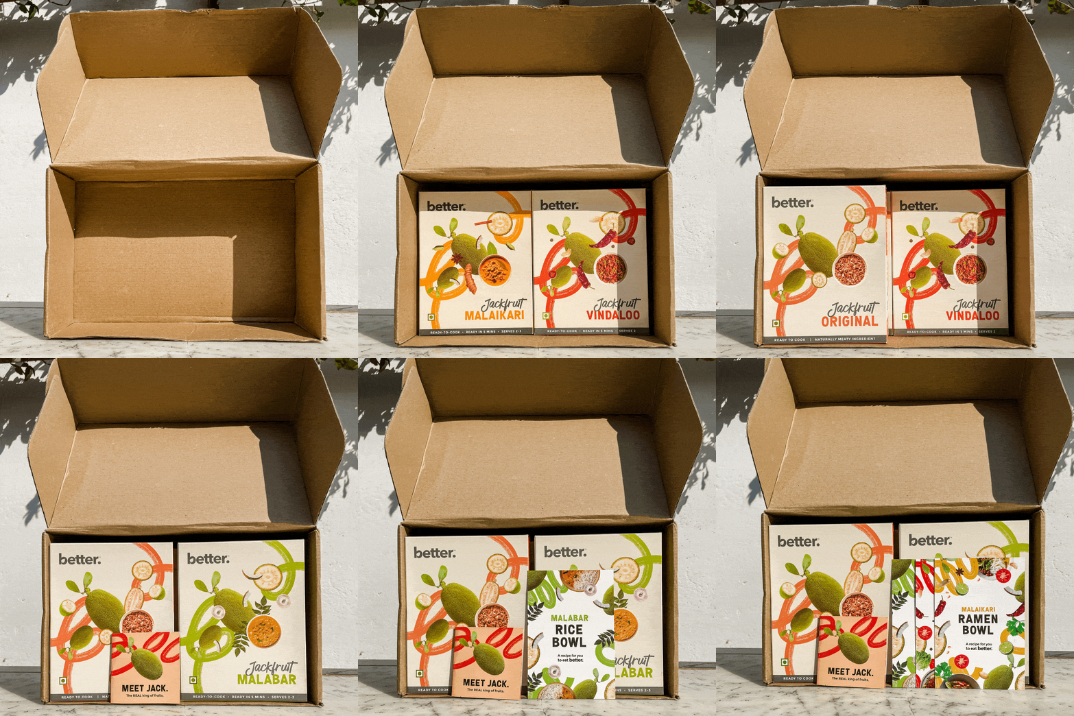
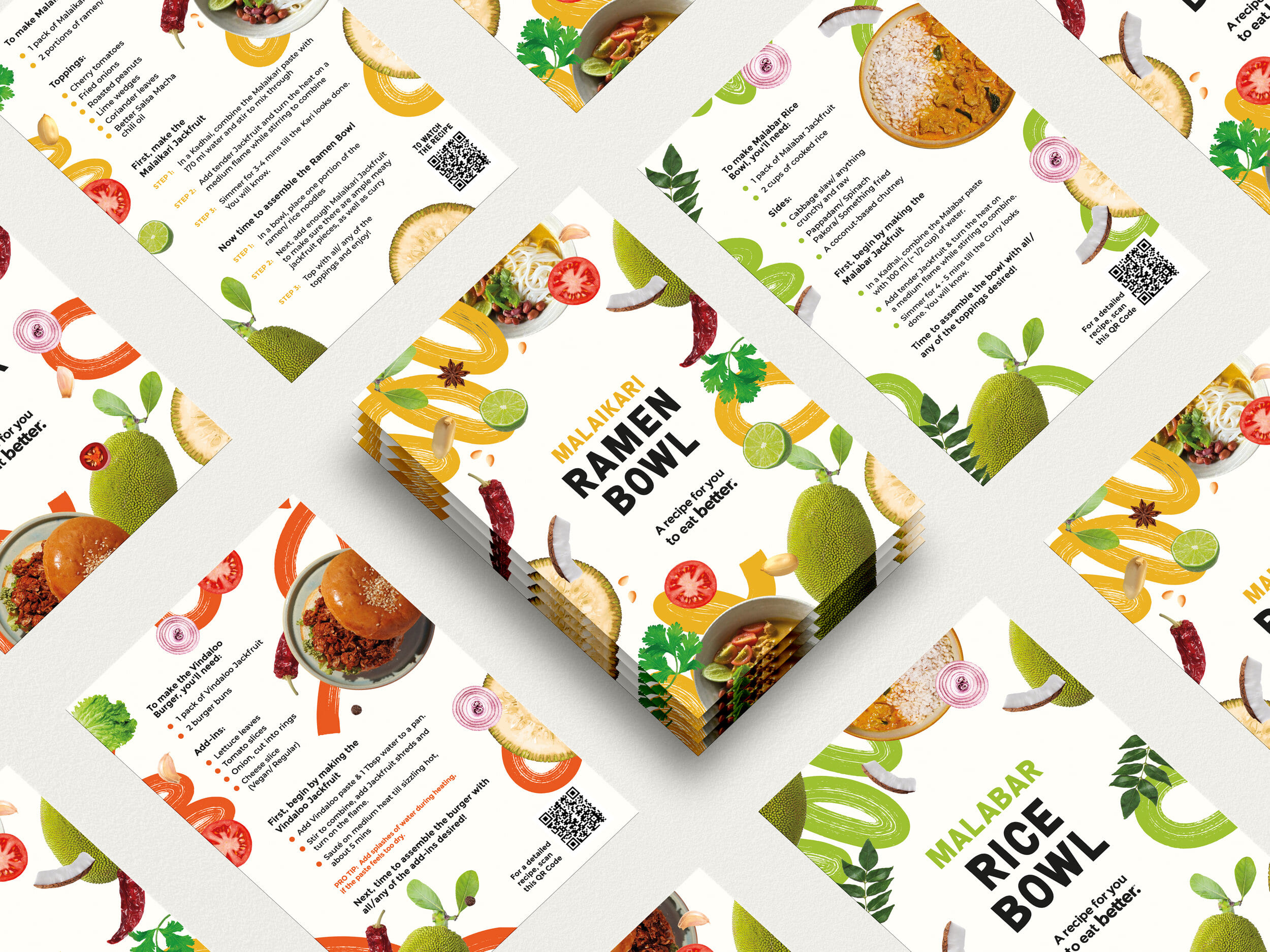
Introducing a new ingredient isn’t only about getting people to buy it—it’s about giving them the confidence to cook it.



The recipe booklet became a simple guide filled with regional recipes, product stories, and educational snippets, making the journey from pack to plate feel easy, enjoyable, and unmistakably Better.

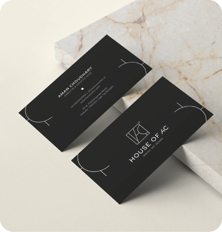
Evoking Emotions Through Spaces

What do people take home when they buy furniture?

Scope Of Work: Research, Strategy, Brand Identity, Brand Messaging, and Visual Extension.

Furniture brands often compete on craftsmanship, materials, or aesthetics. But a home is never remembered for just the furniture inside it. A home is remembered for the way it makes you feel inside.

We explored this with Aman while reimagining Art Collection. Together, we stepped back to rethink the brand’s purpose, evolving it from a furniture retailer into one that builds spaces people connect with emotionally.

The goal was to build a brand that views furniture not just as a product, but as an experience that shapes the way we live.

THE POSITIONING

How do you design spaces that people can connect with?

A beautiful home is rarely defined by furniture alone. It’s a balance of comfort, function, craftsmanship, and the stories behind every object that makes a space memorable.

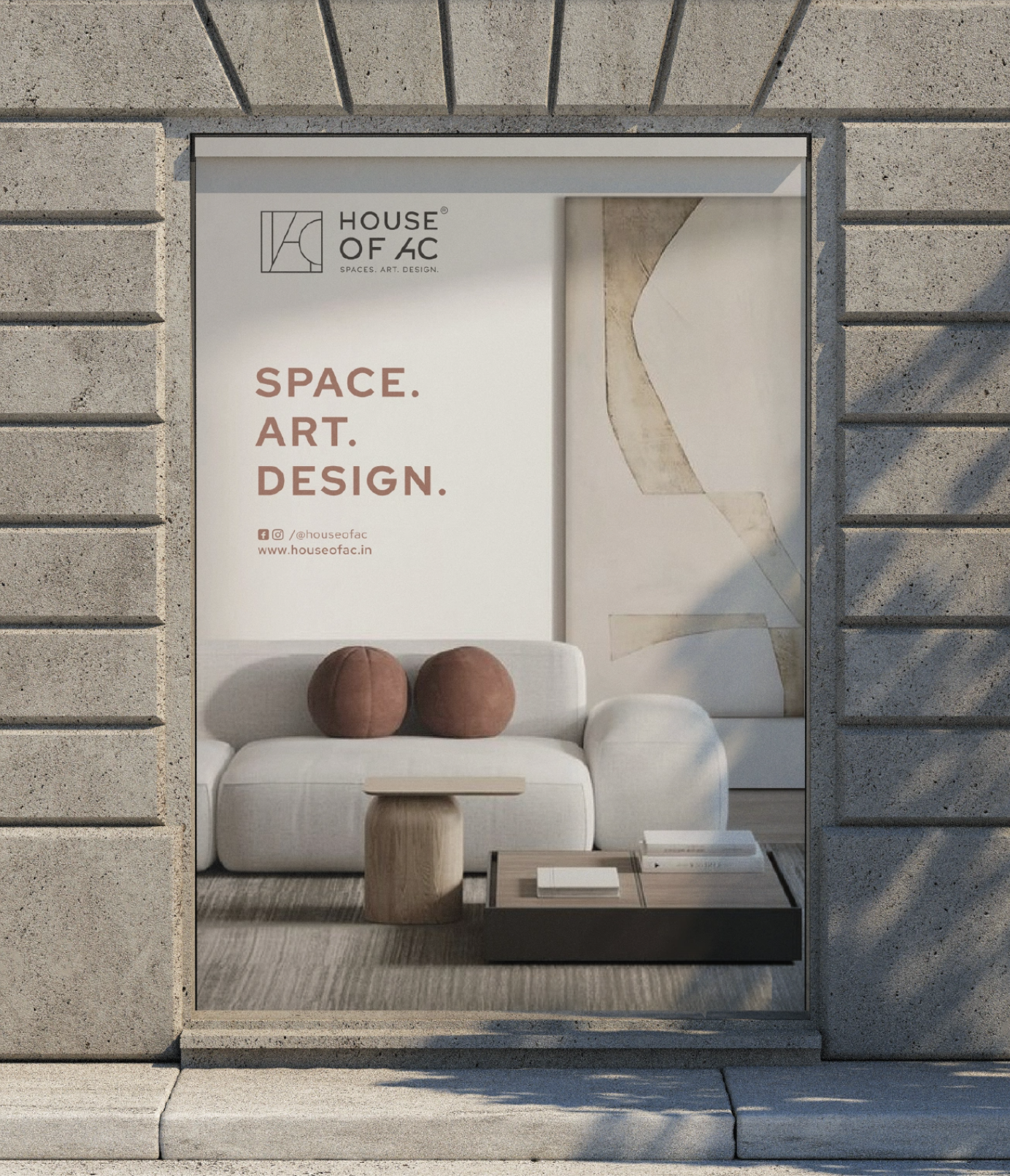
We positioned it as more than a furniture brand; a curator of thoughtful spaces that collaborates with artists, designers, and makers to design spaces that are beautiful, functional, and made to be lived in.

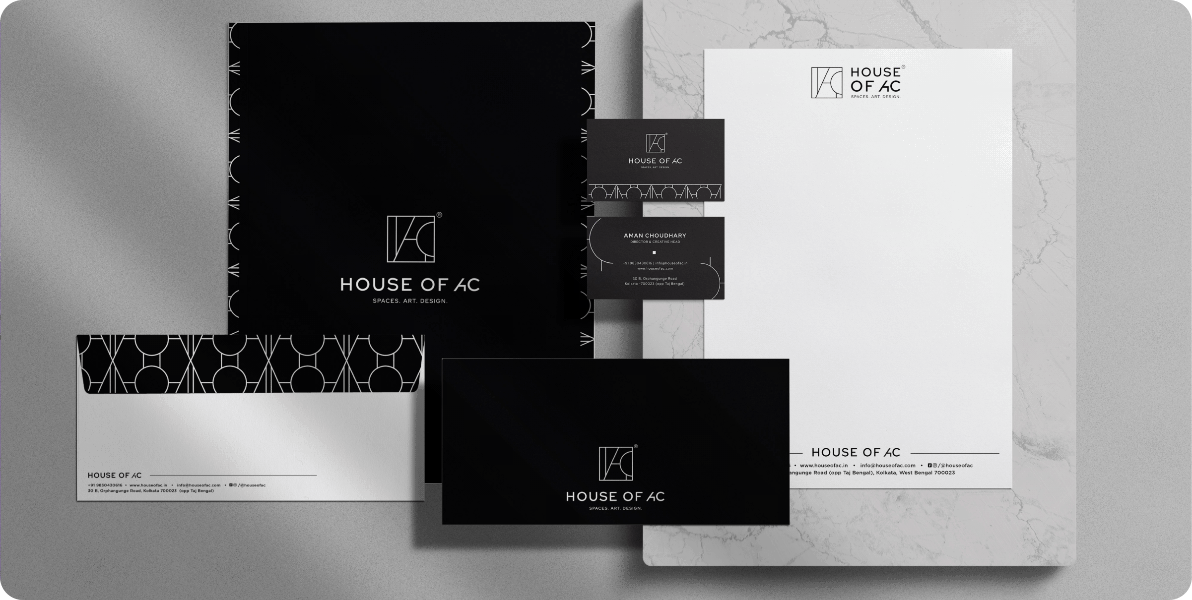
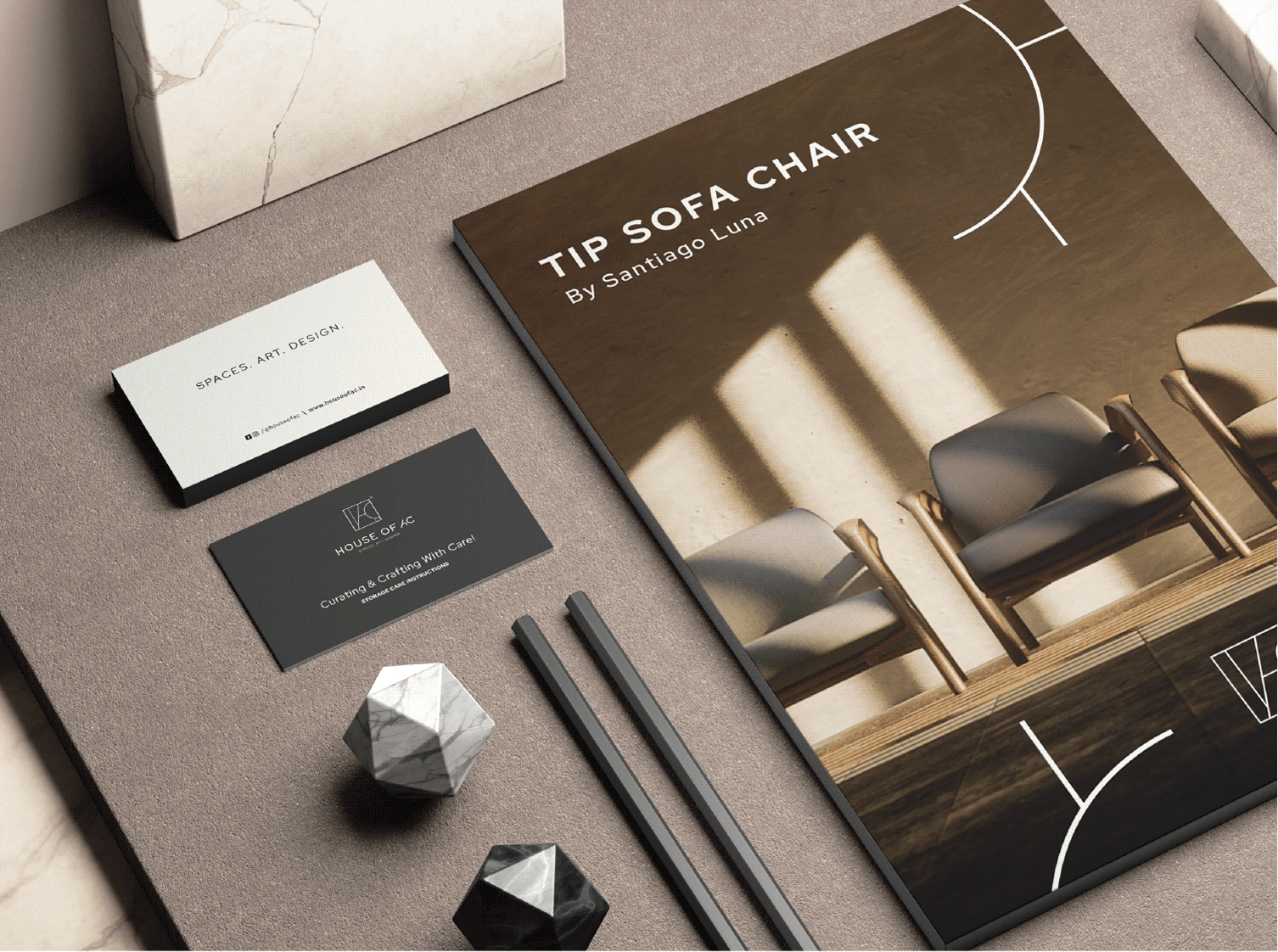
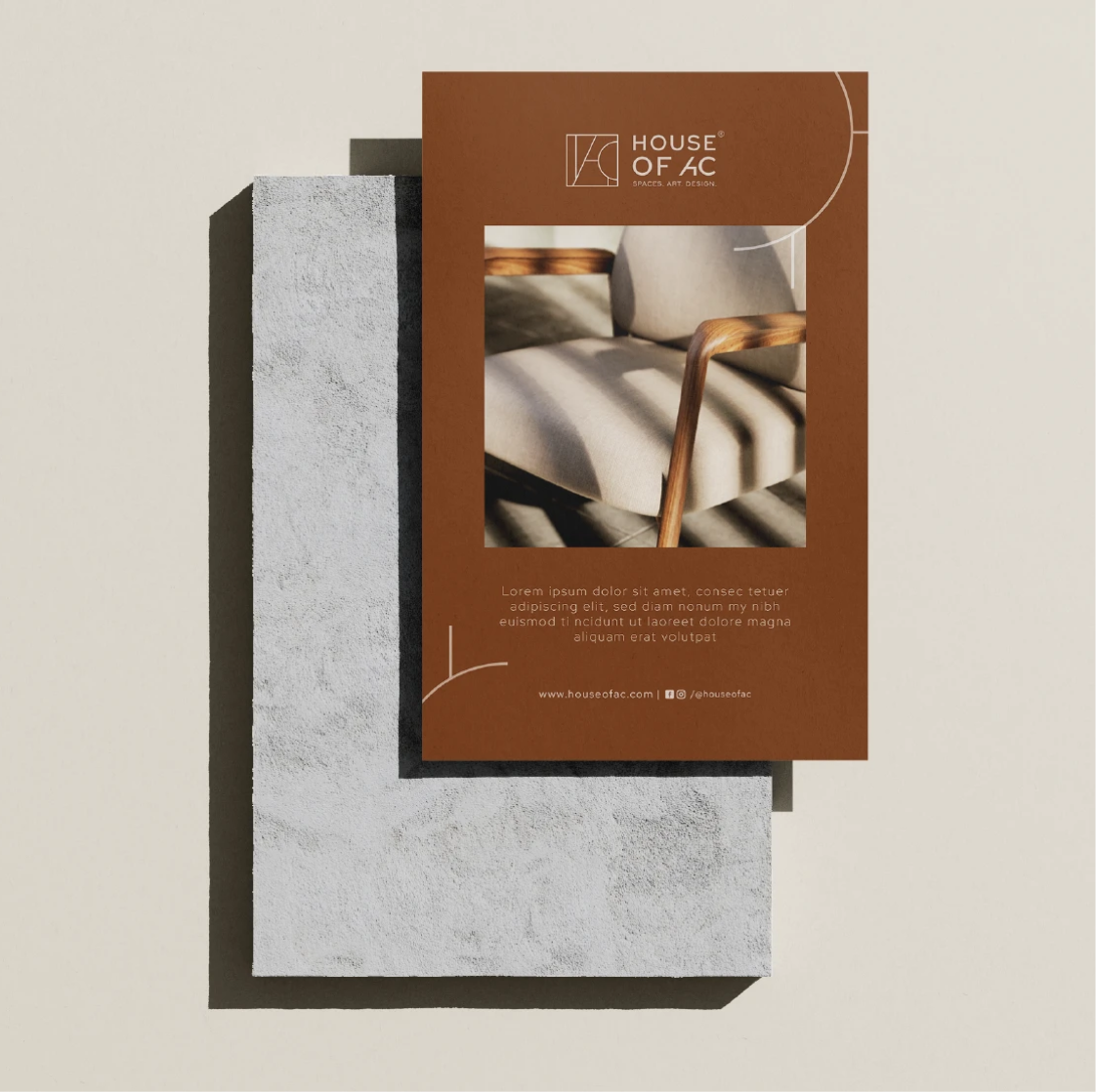
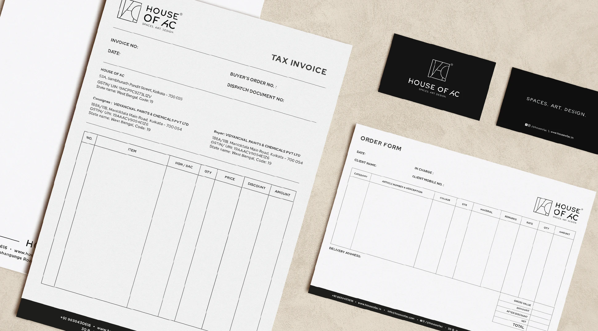
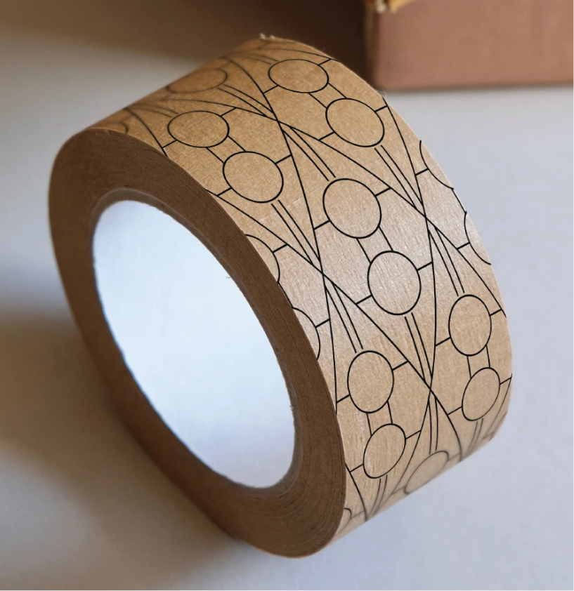
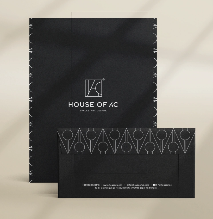
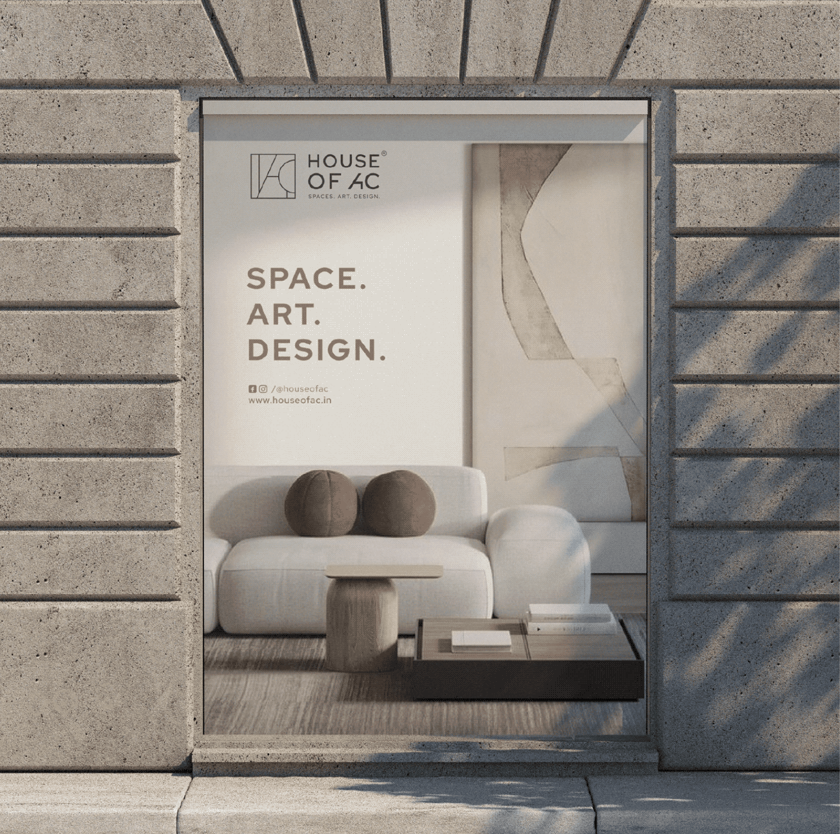
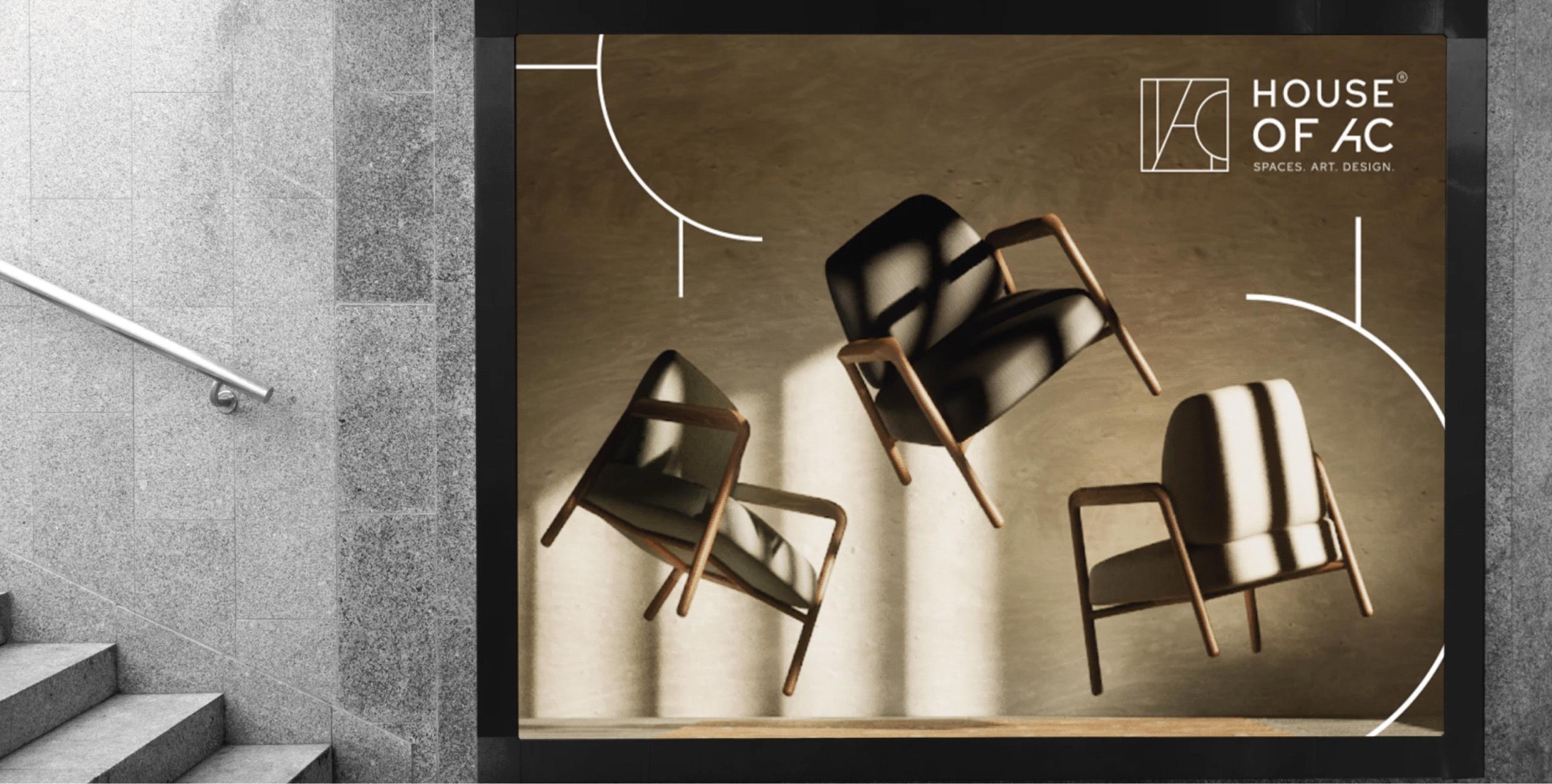
Introducing House Of AC

A brand built on the belief that design makes everyday life better and more meaningful, and makes you fall in love with the place you live.

THE EXTENSION

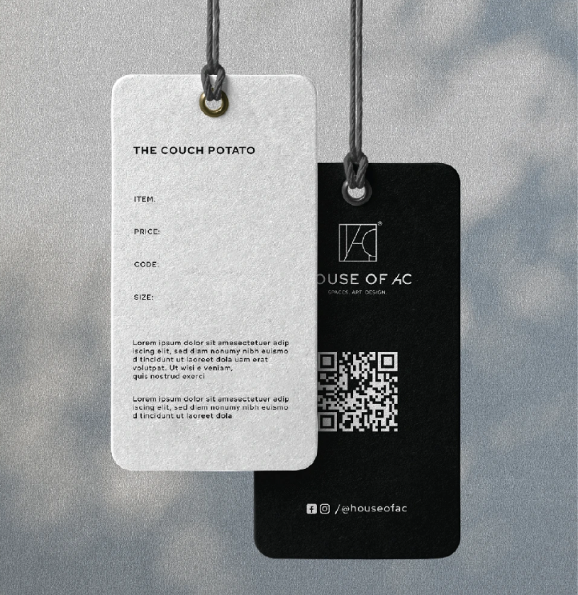
Choosing furniture shouldn’t feel like a guessing game.

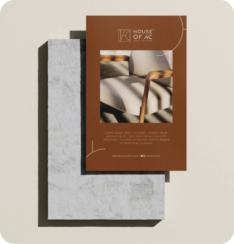
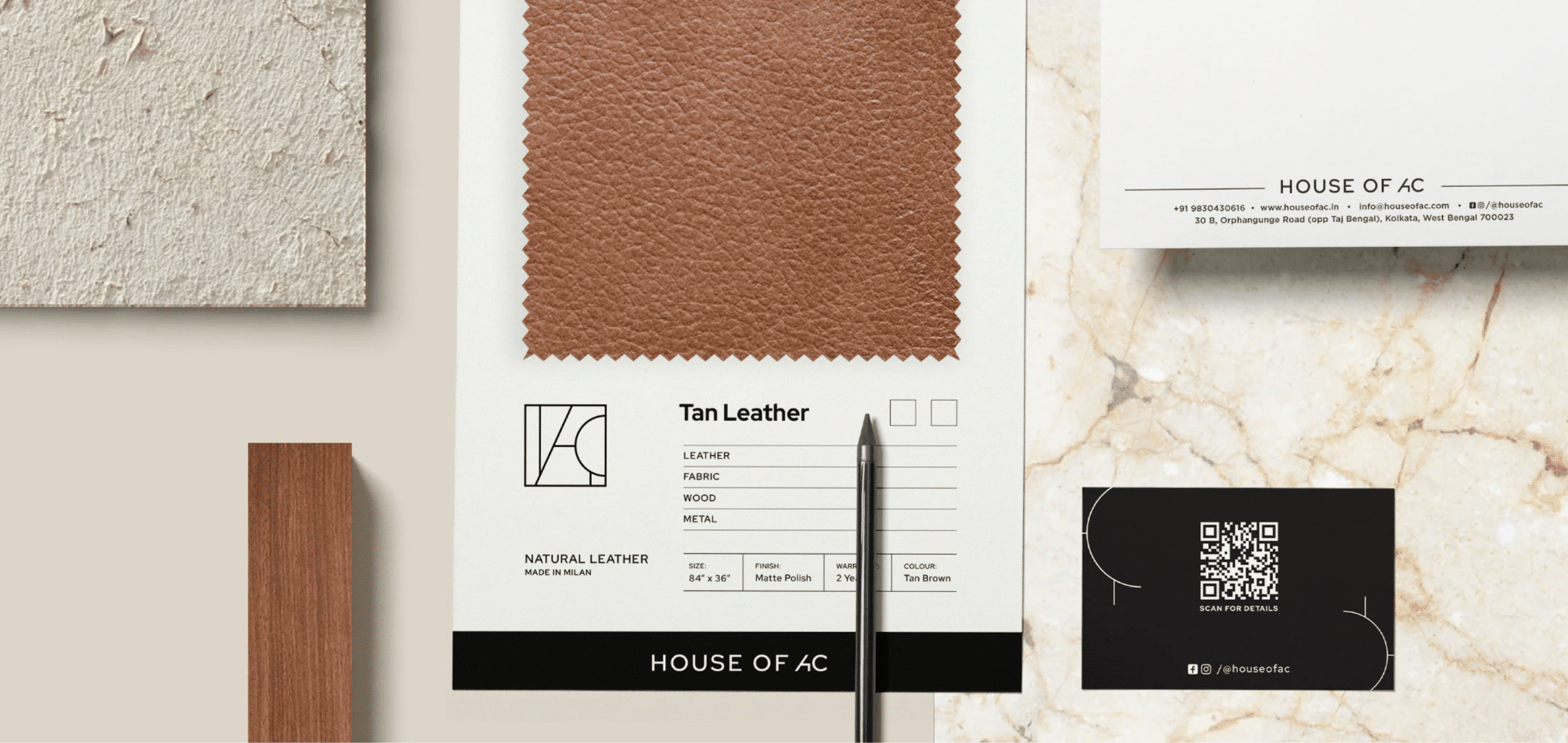
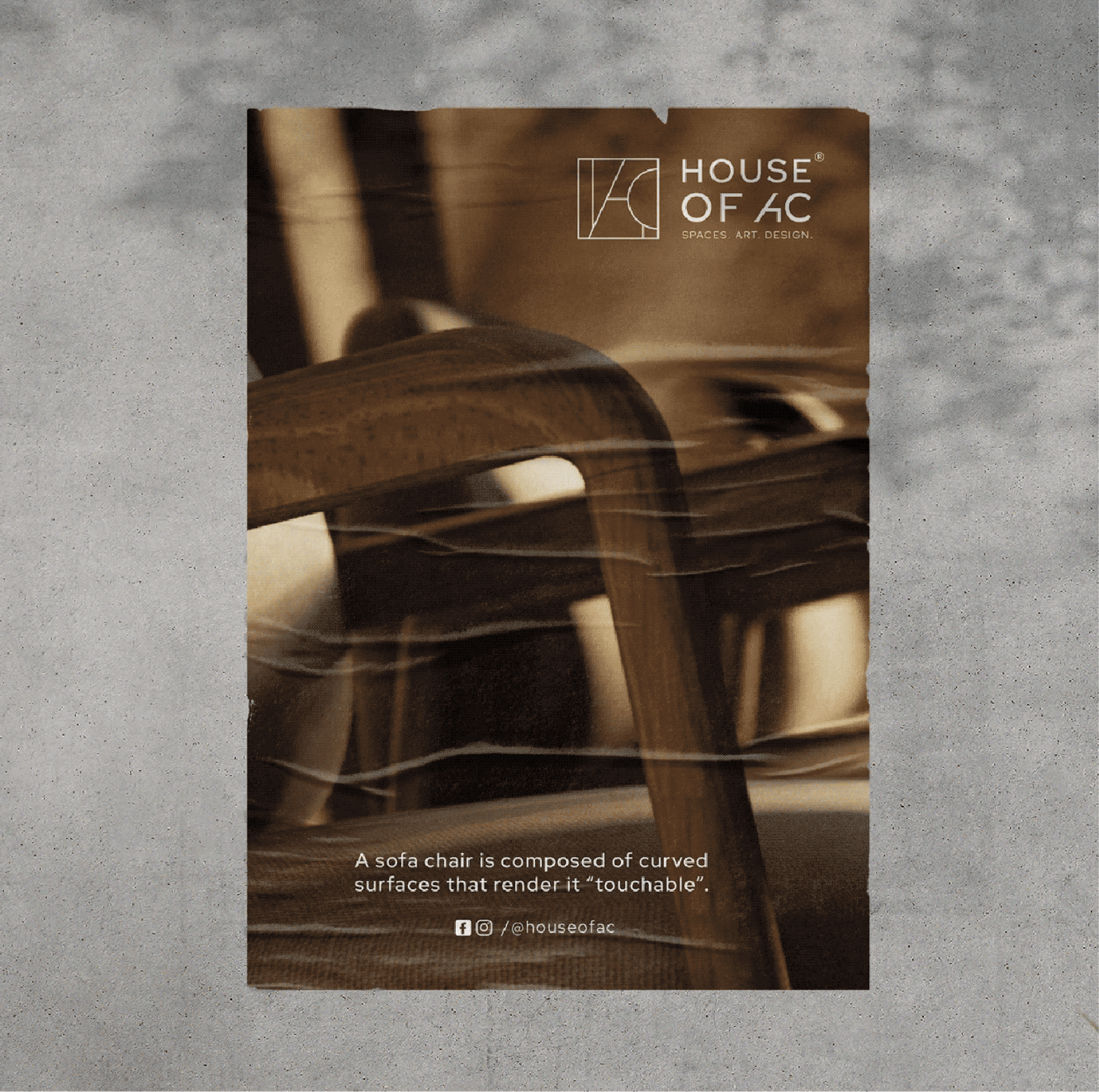
Every decision about furniture is tactile. People want to see, touch and compare before they make their final choices, so we designed material swatches and sample boards that let them do exactly that.

This created a consistent brand experience that felt considered long before and long after the purchase.