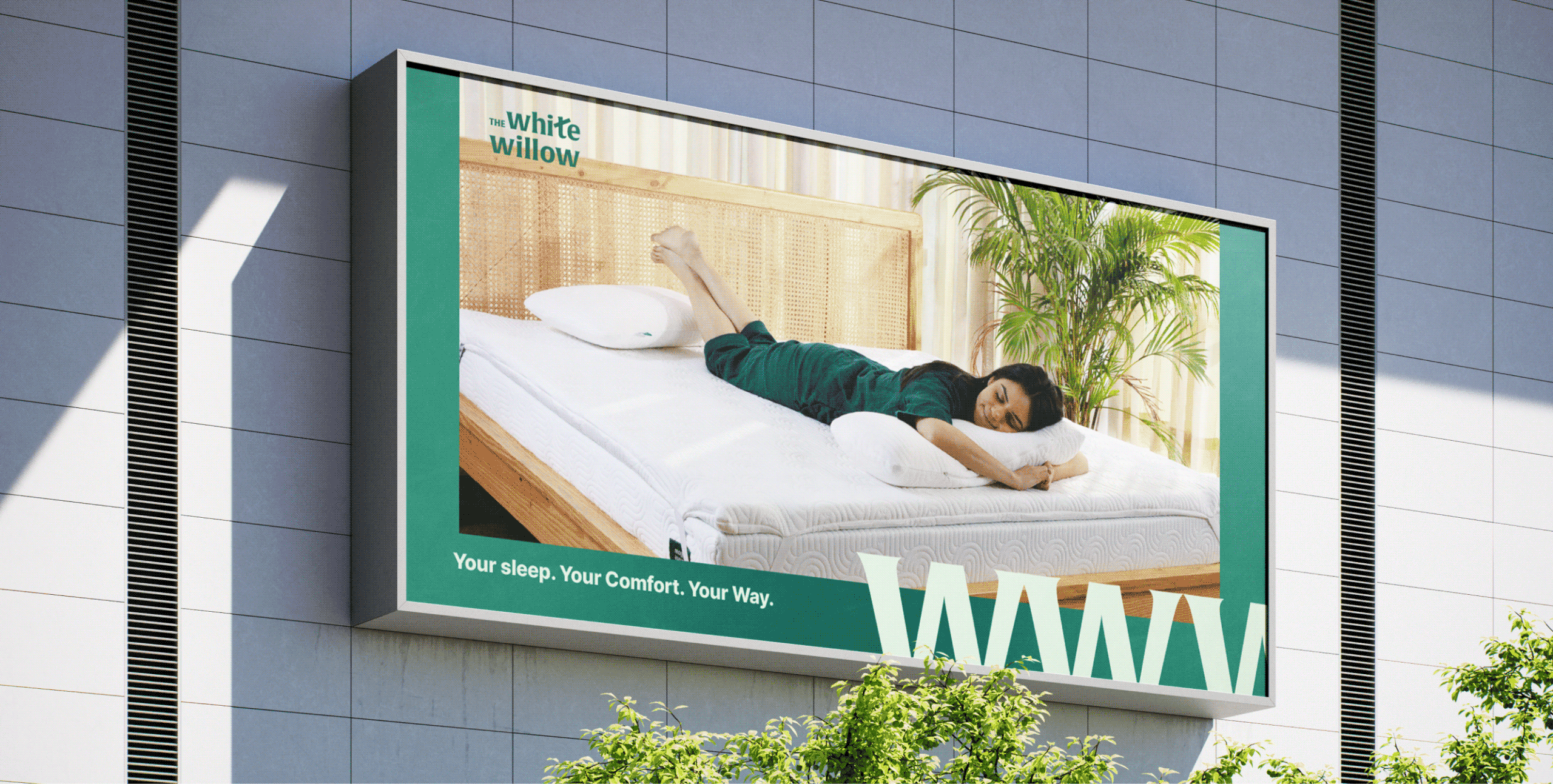

Why should comfort begin and end with sleep?
Scope Of Work: Market Research, Strategy, Brand Identity, Packaging Design, Visual Language, Web Design, and Art Direction
The White Willow had earned its reputation by understanding how people sleep, and what makes it better.
But as the brand expanded into mattresses, cushions, toppers and everyday essentials. One question emerged: if comfort improves our nights, shouldn’t it improve the rest of our day too?
We explored this idea with Abhishek and Meghna while repositioning The White Willow. Together, we reimagined the brand around a broader purpose that extended beyond the bedroom.
The goal was to move The White Willow from a pillow brand to a lifestyle brand that delivers comfort through the whole day.

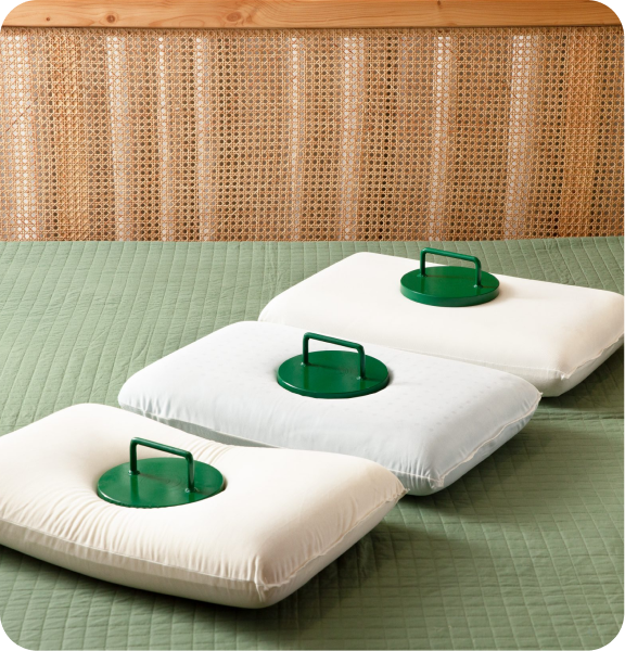


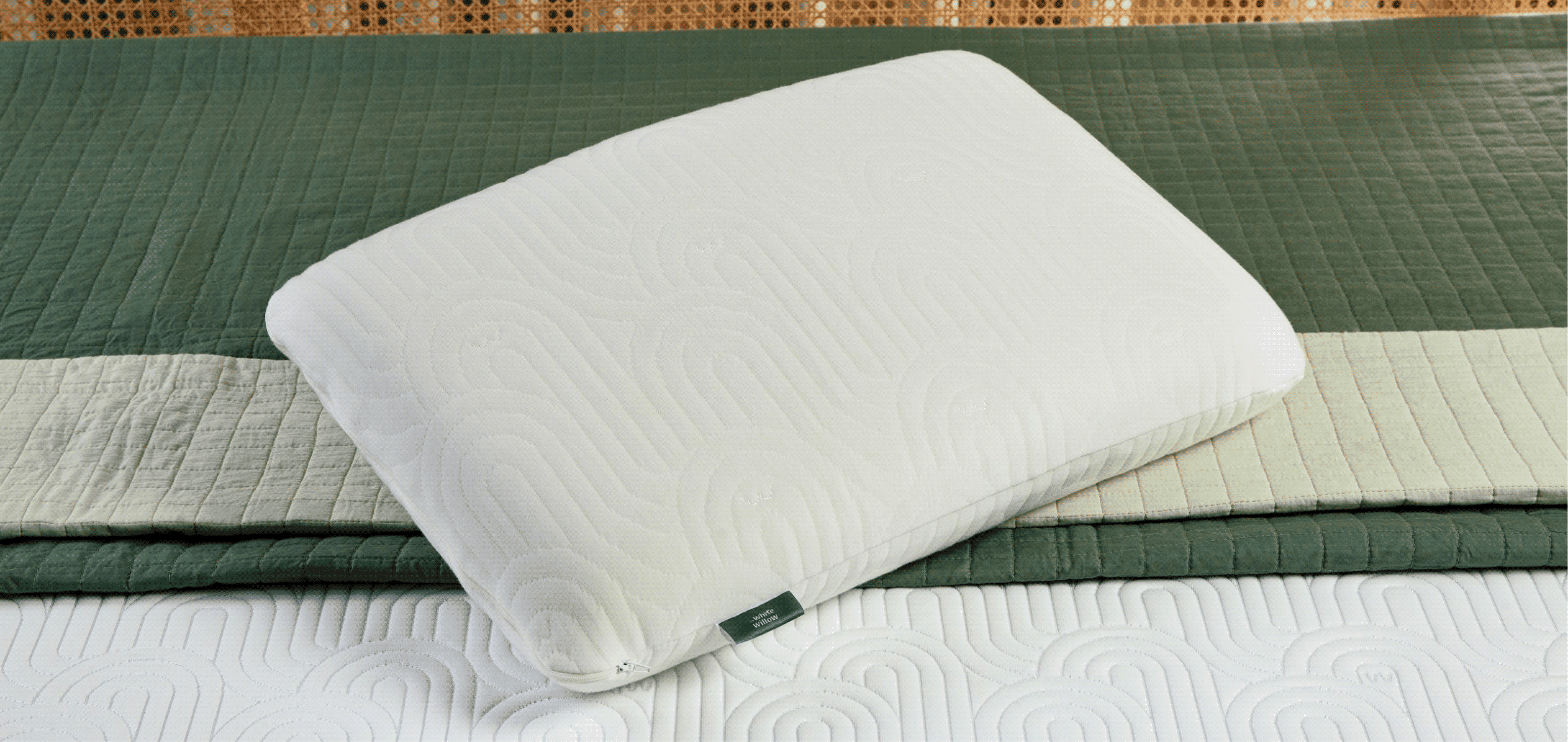
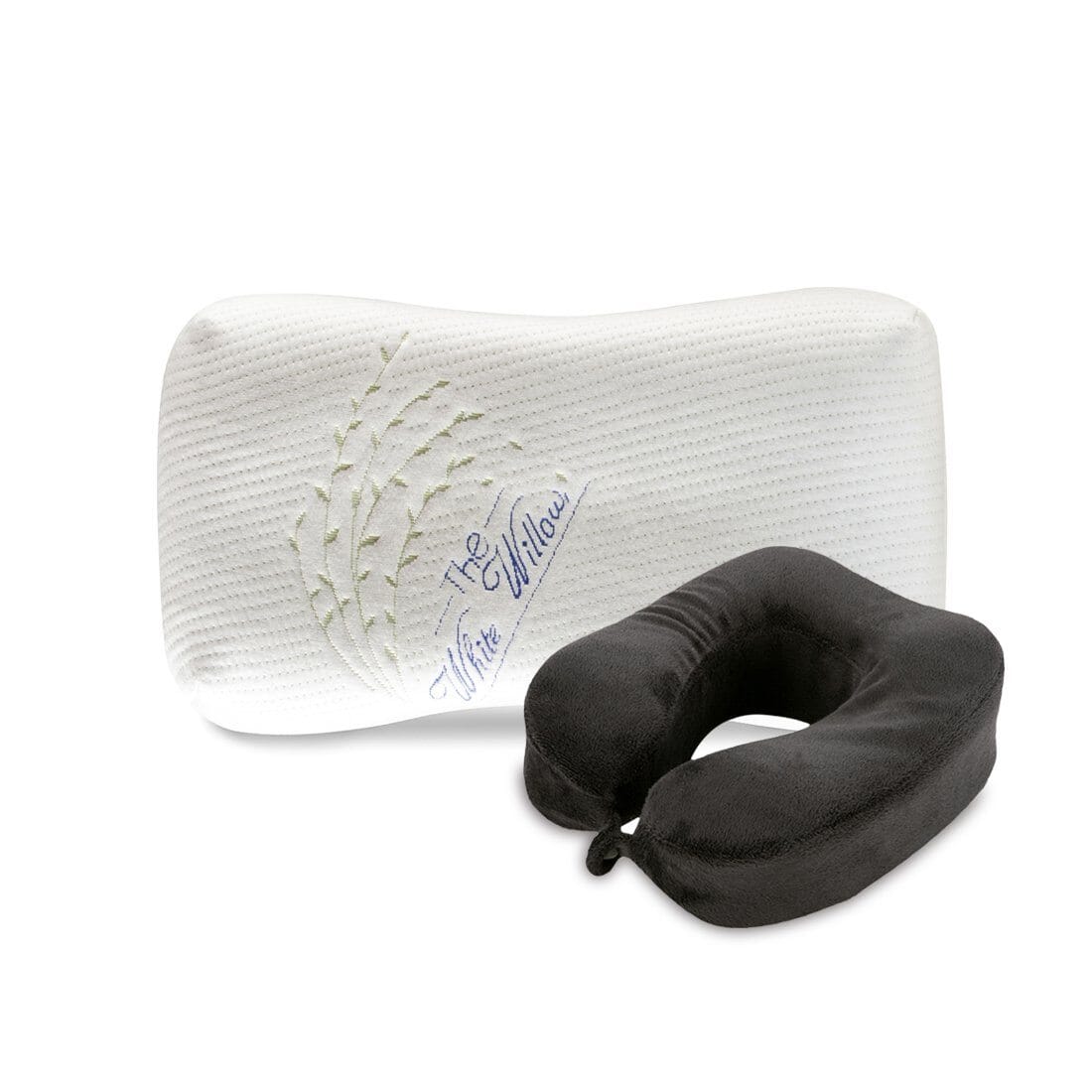
THE CONVICTION
Can comfort become a way of living, not just sleeping?
TWW had built its reputation by understanding how people sleep. As the brand expanded into everyday comfort products, its purpose naturally grew beyond pillows.
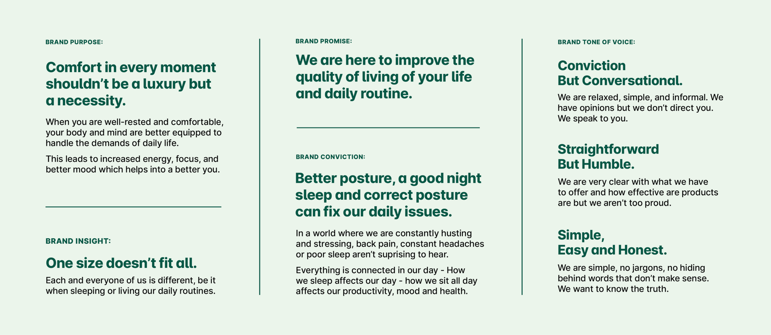
We shifted the positioning from a pillow brand to a lifestyle brand that believes in comfort in every moment and provides round the clock comfort. A brand that improves the quality of living of your daily life.

THE TURNING POINT
The products had evolved. The brand hadn't.
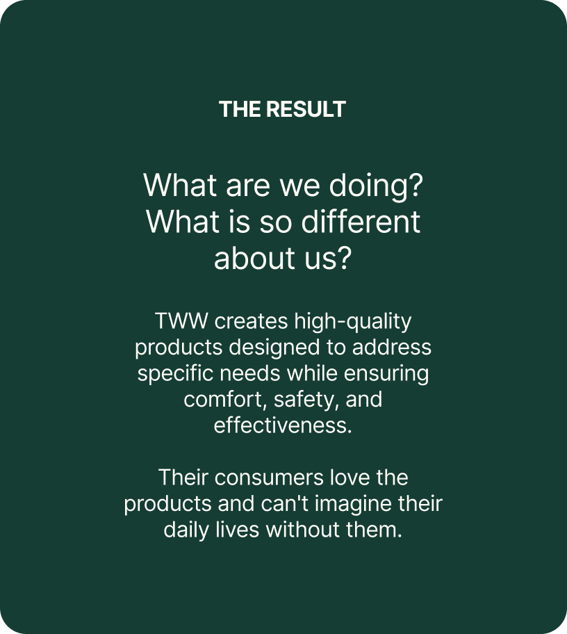
TWW had spent almost a decade perfecting comfort through thoughtful design, premium materials, and a deep understanding of how people rest & see comfort.
The challenge was to help people understand which product was right for them, what made it different, and how every category belonged to one clear brand.

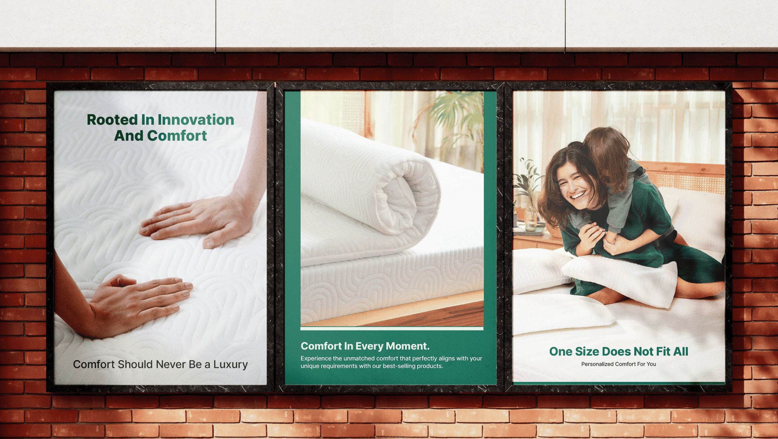
Comfort in every moment shouldn’t be a luxury but necessity.

Introducing The White Willow
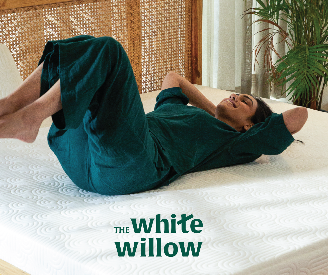
A round the clock brand, by your side through every moment. From waking up to winding down, we deliver comfort throughout your day.
THE FOUNDATION
A system designed to grow along with the brand.
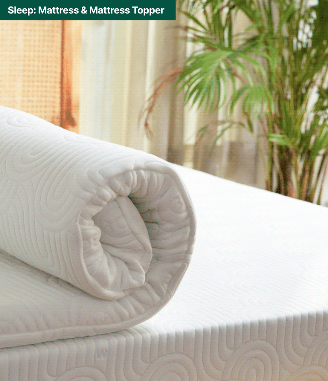
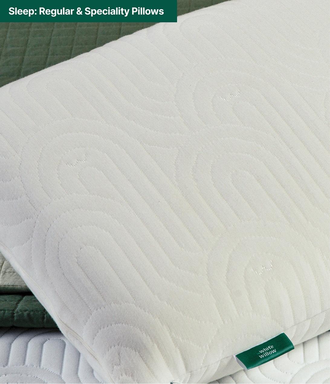
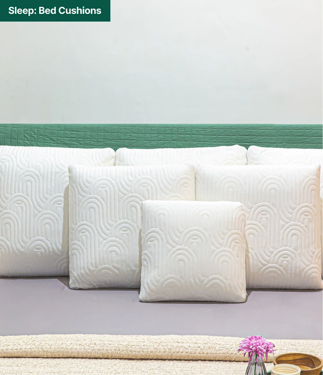
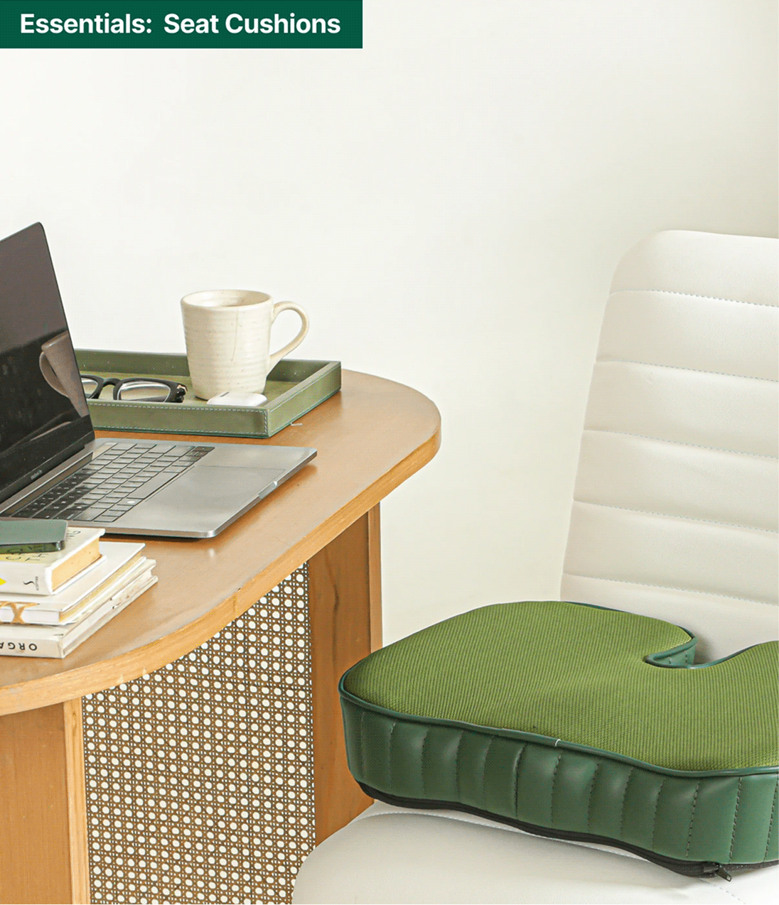
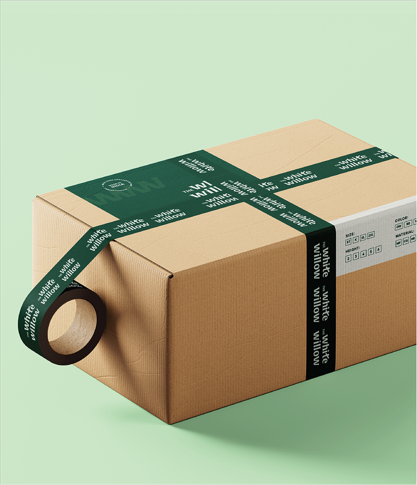
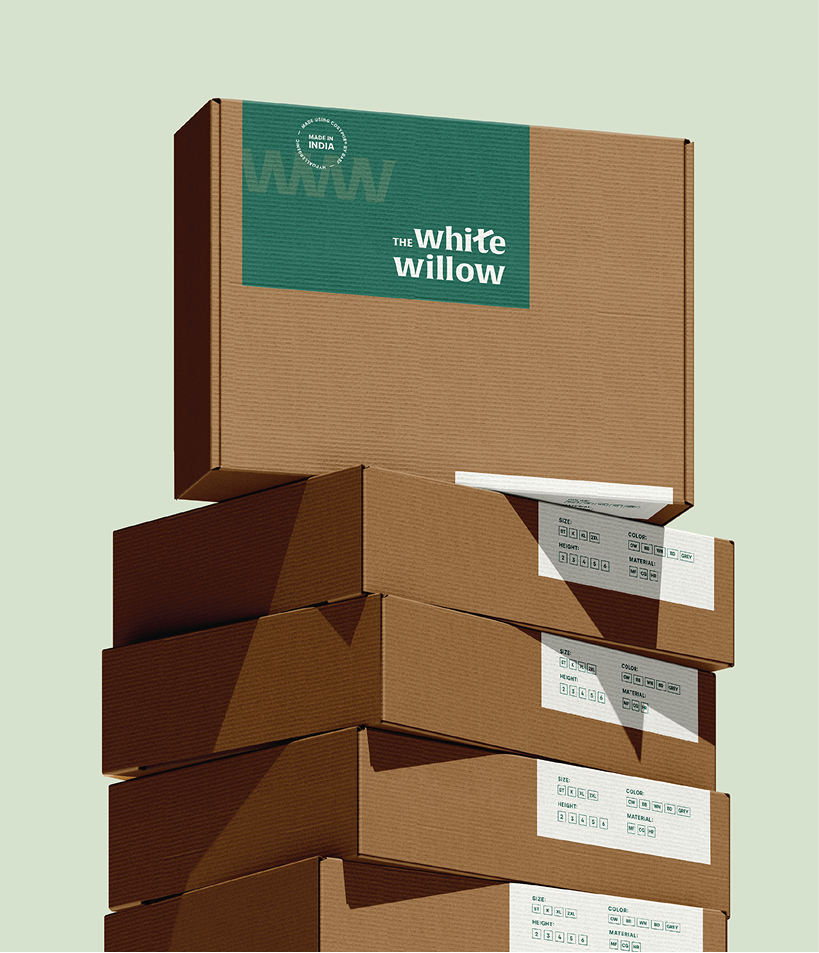
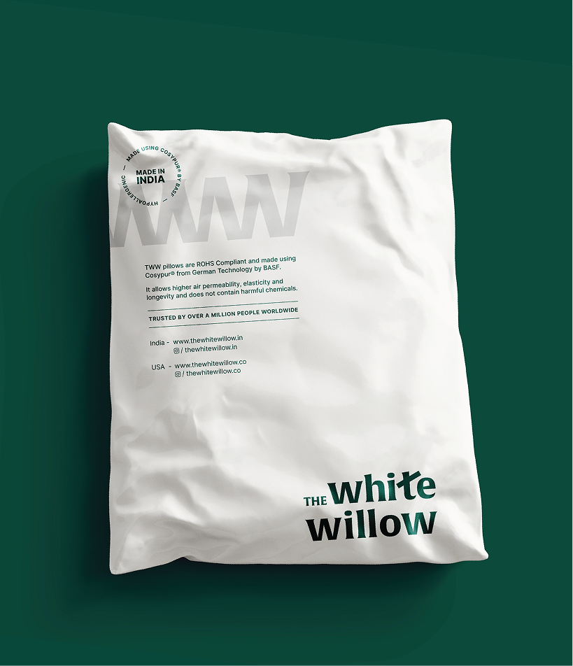
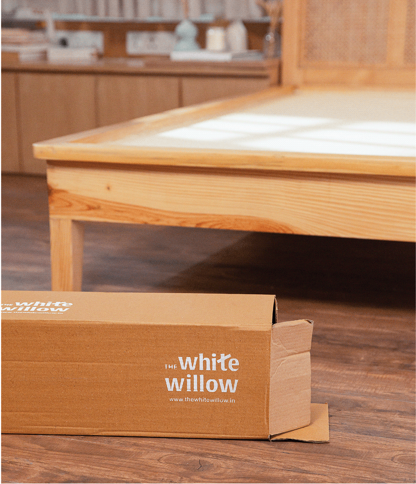
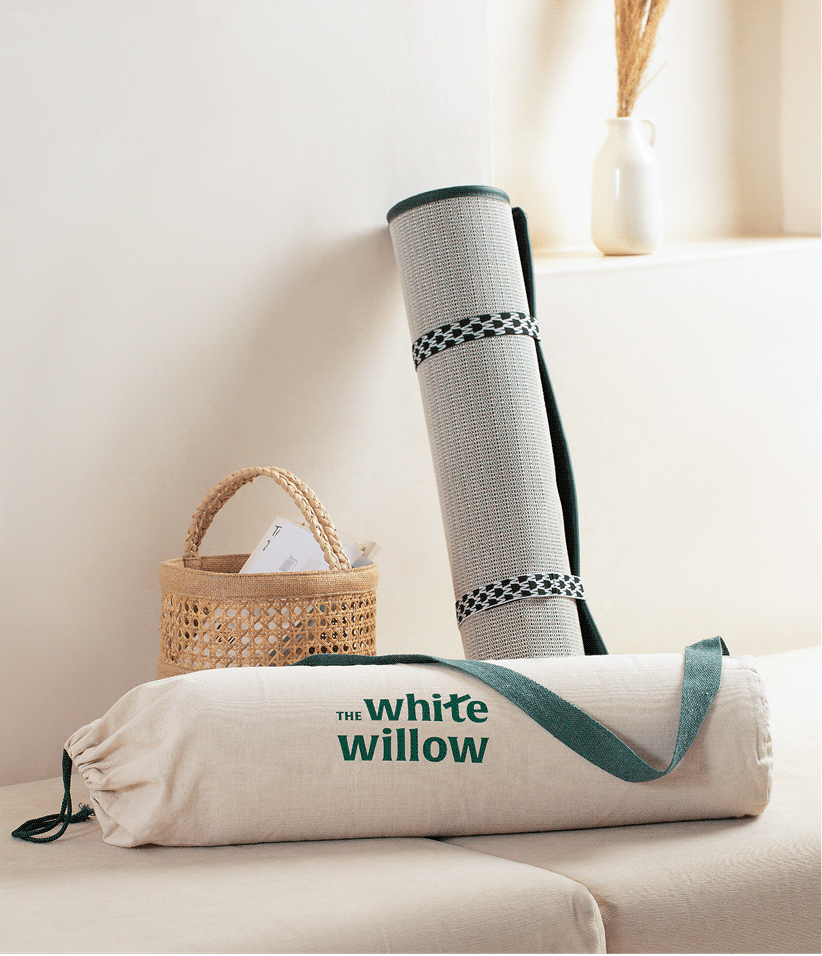
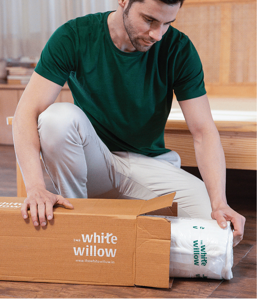
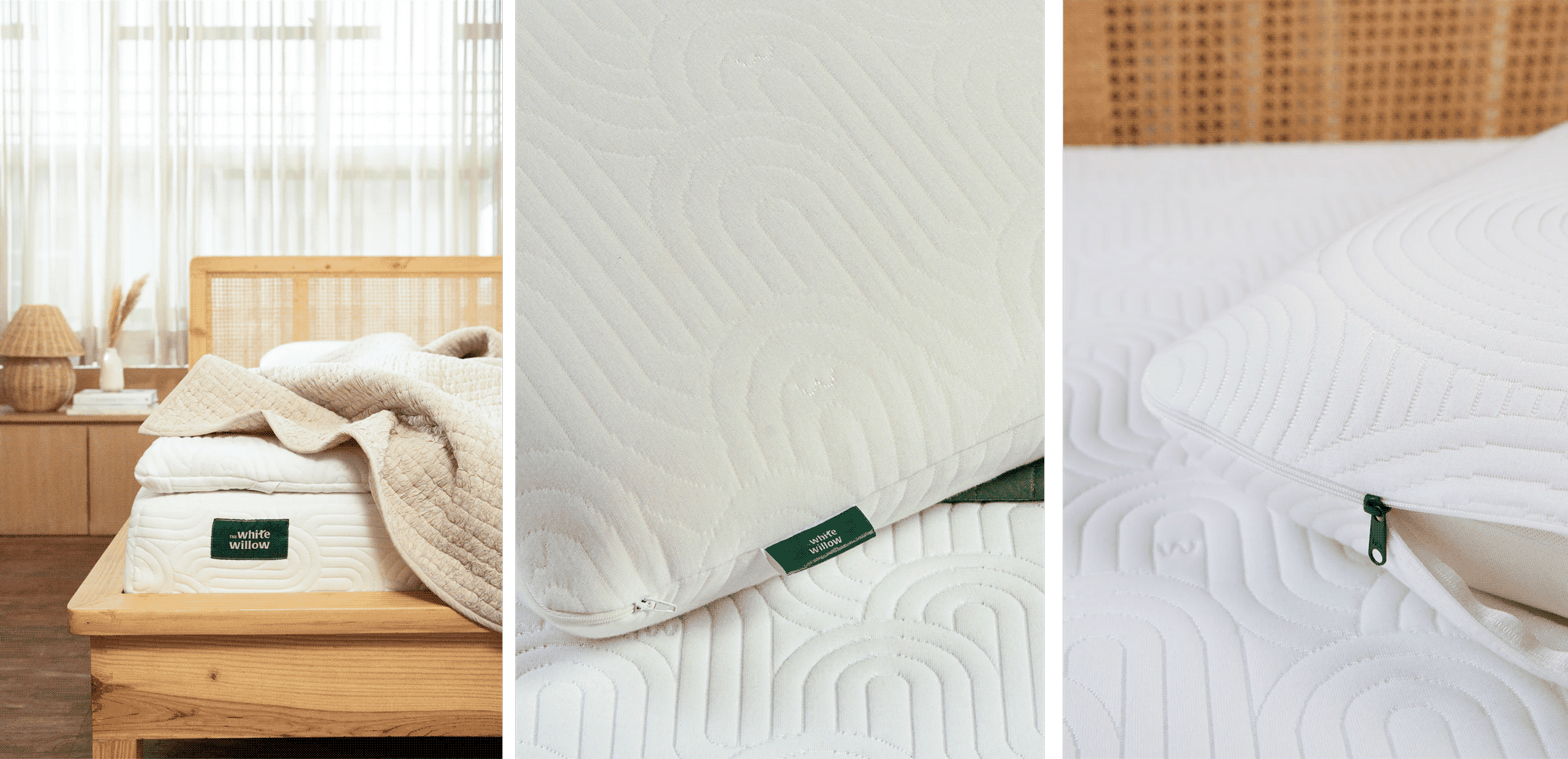
The White Willow’s expanding product range required more than individual packaging designs. We created a scalable identity system that could unify over 250 SKUs while giving every category its own place within the brand.
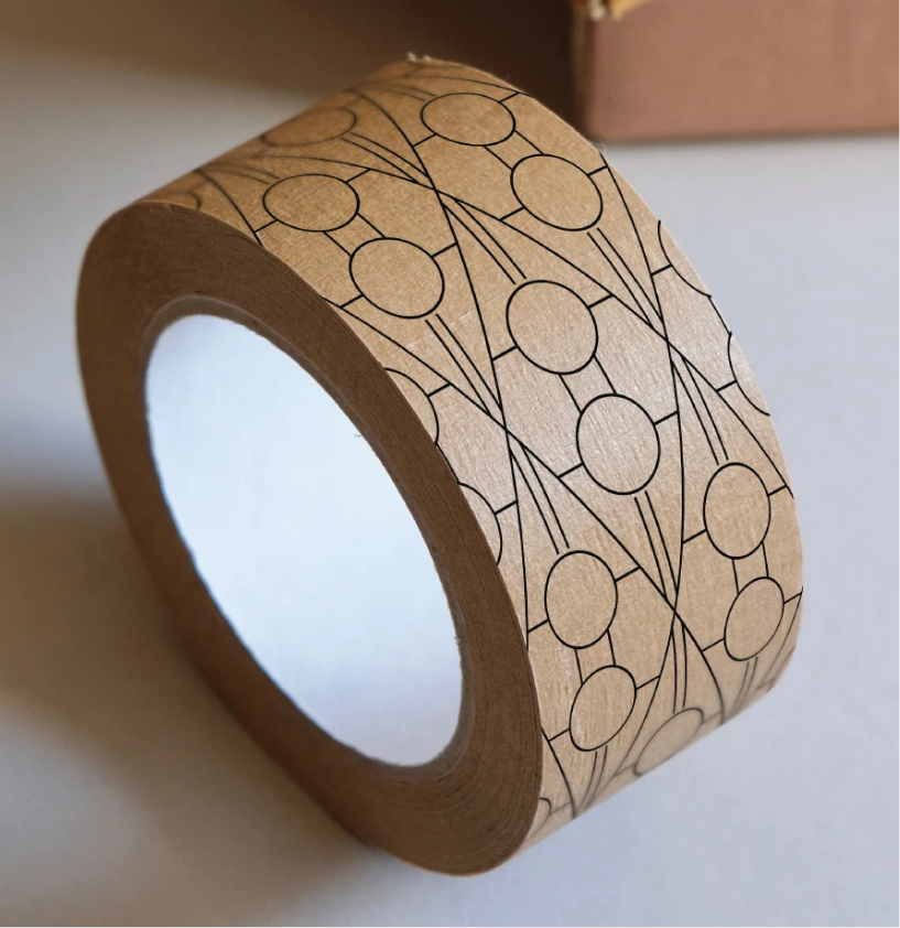
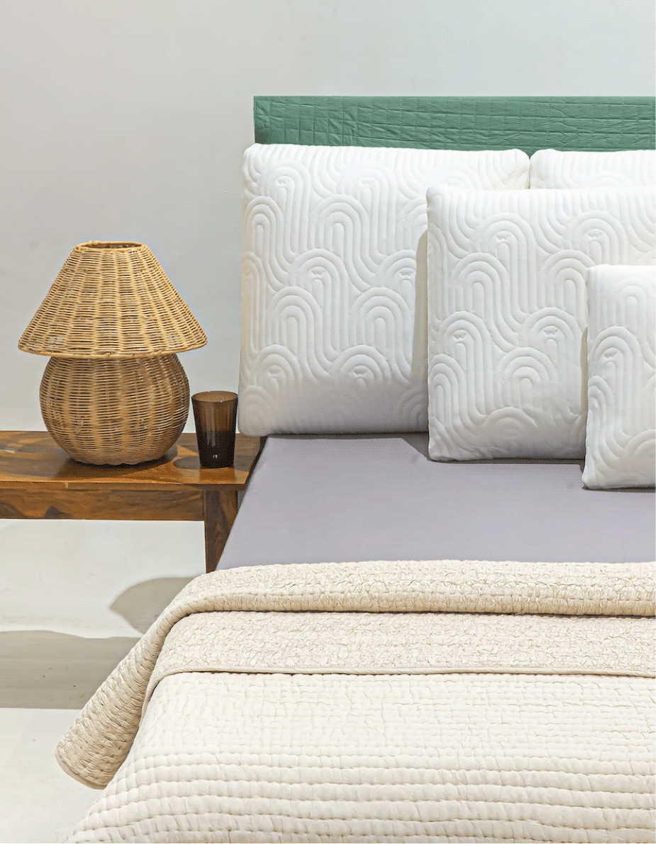
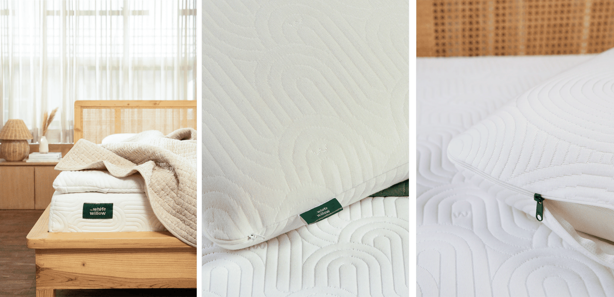
Calming custom patterns, a signature willow-inspired emerald green, and a modular packaging framework build a visual language that felt consistent, recognisable, and ready to evolve.






THE CLARITY
Good products deserve clear communication.
Every product solved a different need, but consumers found it difficult to understand the differences. We realised the problem wasn’t the range; it was how the range was being communicated.
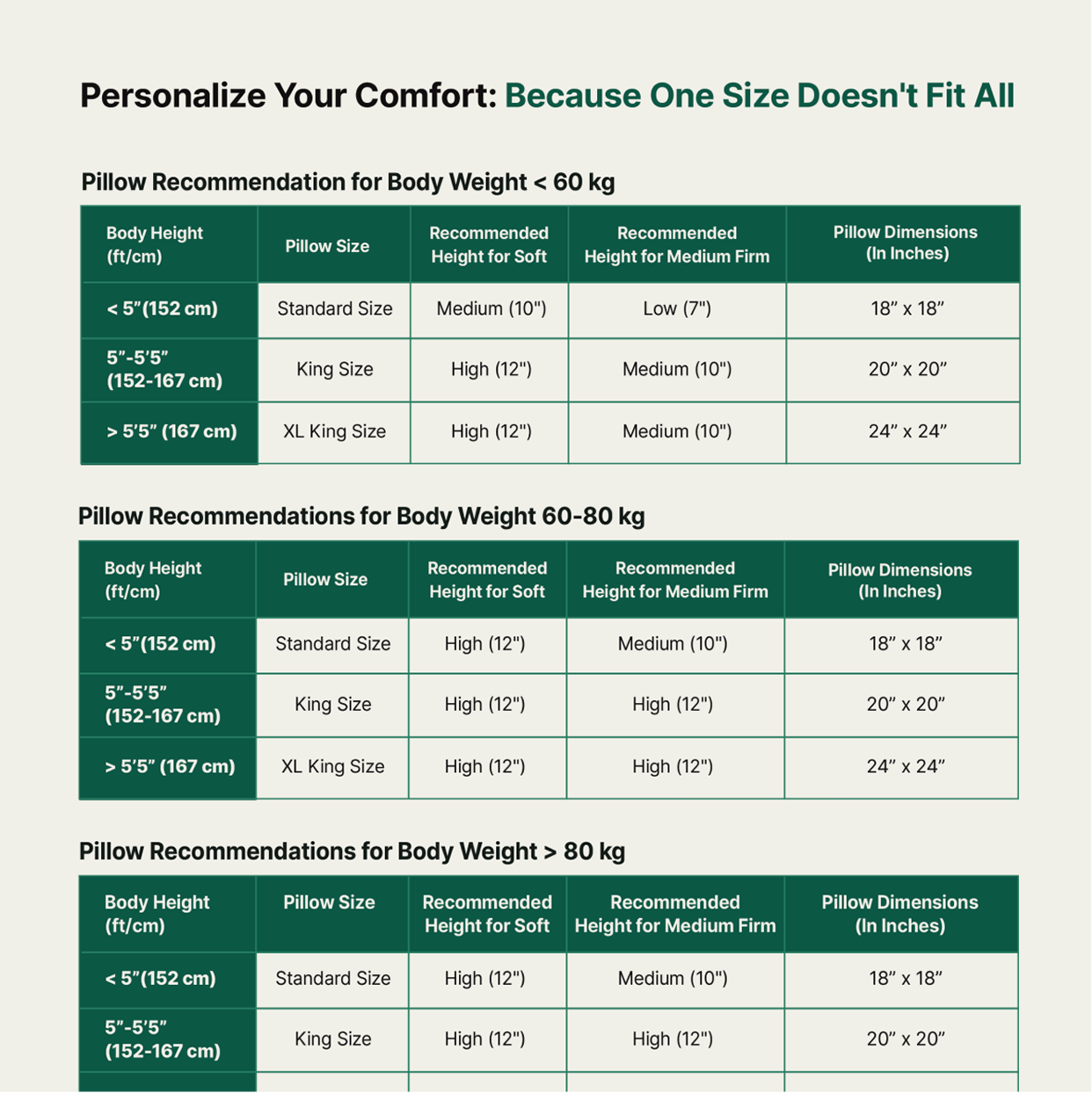
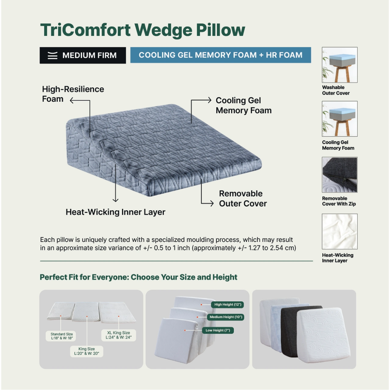
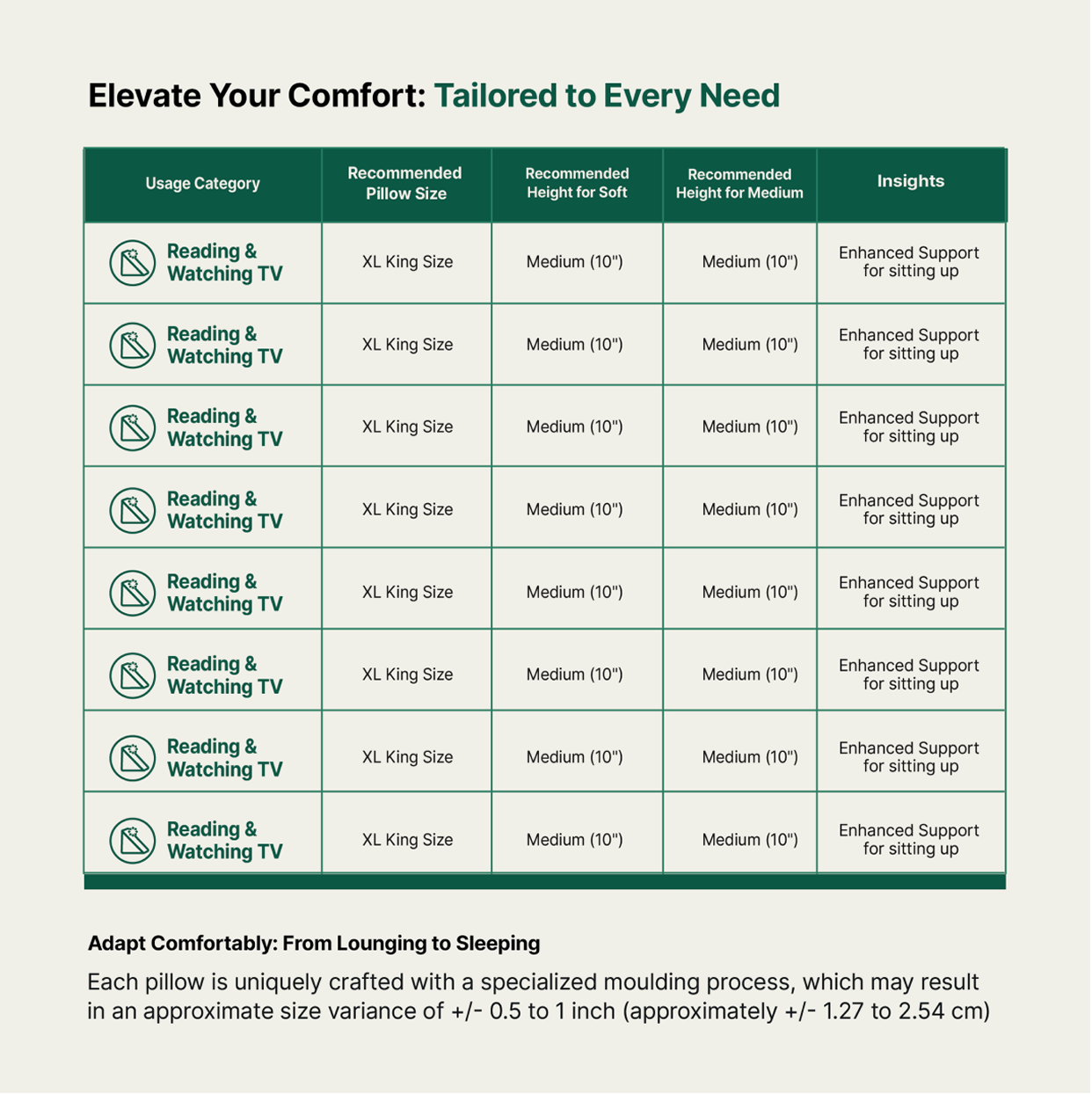
Clear product architecture, custom iconography and size guides turned a complex portfolio into something you could actually shop.
How do you deliver the same experience through different products?
Each new category arrived with its own SKUs. So, we designed a cohesive visual language across White Willow’s expanding range; bringing consistency to every category, from sleep essentials to everyday comfort.