Heyday makes 100% natural and organic personal care products for women and babies. Every product is made without the harmful chemicals and plastics that are standard in the category.
Founded by Deepanjali Kanoria, the brand is built on one belief: the things we use every day should look after the two homes we all live in, our bodies and our planet.
Heyday came to us with something rare and something common. The rare part was a brand people already trusted. The common part was packaging and language that weren’t telling anyone why.
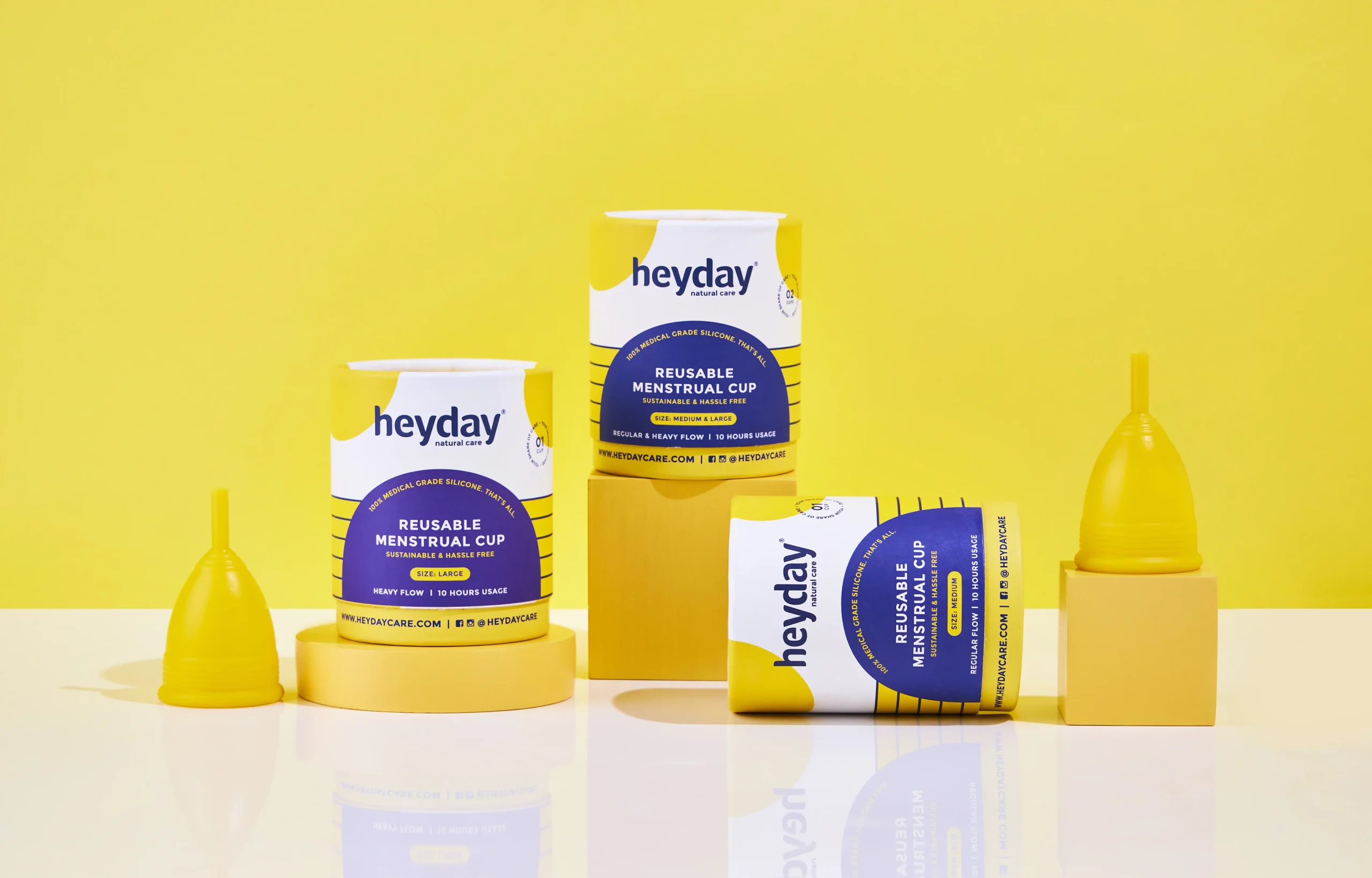
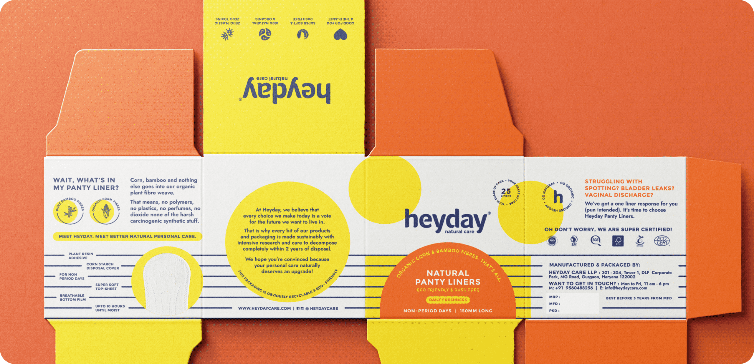
The result was a new brand language, a refreshed identity and a fresh packaging range, so consumers could see the difference before anyone had to explain it.
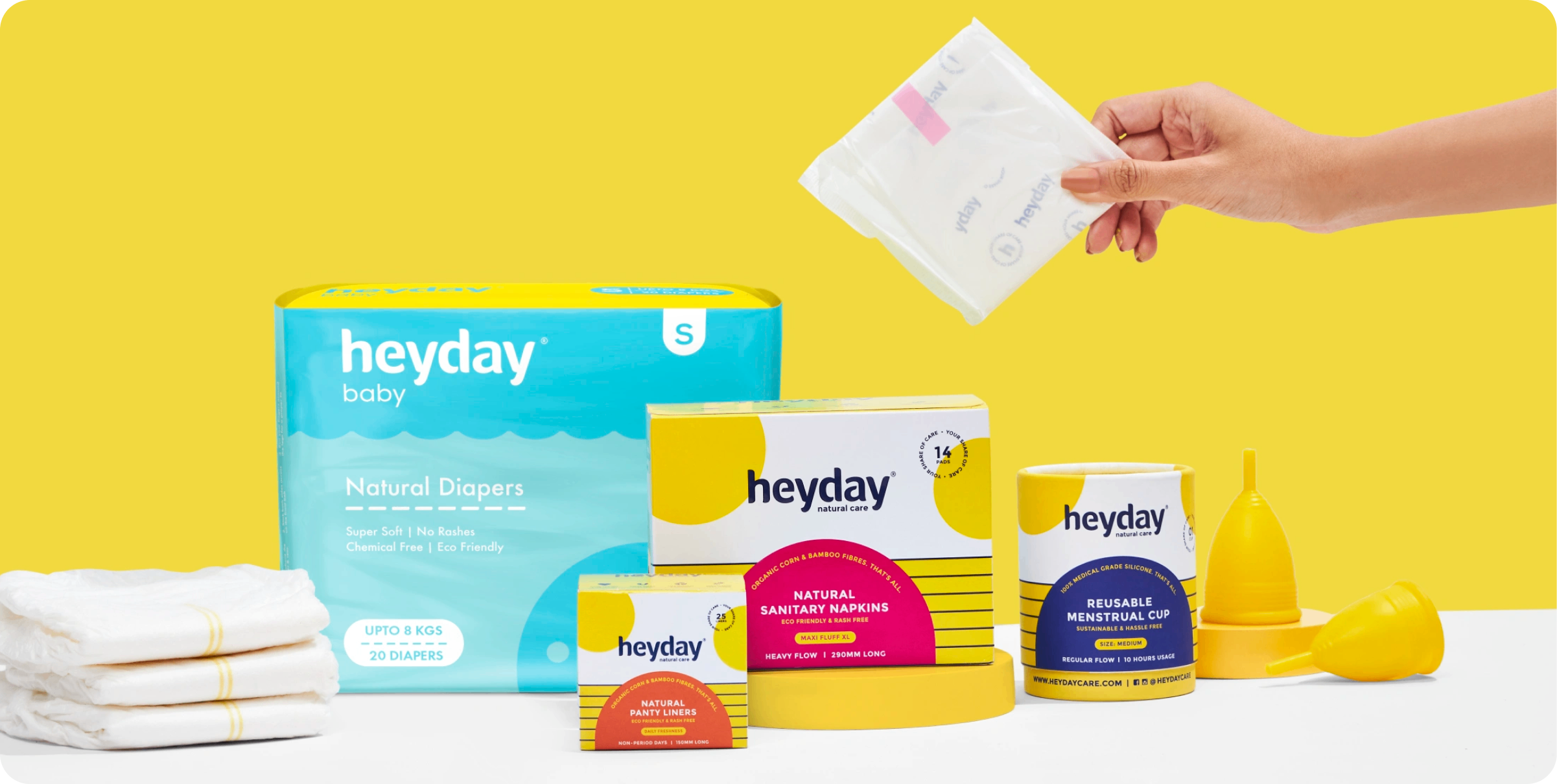
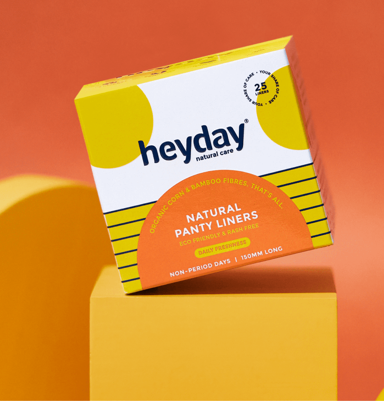
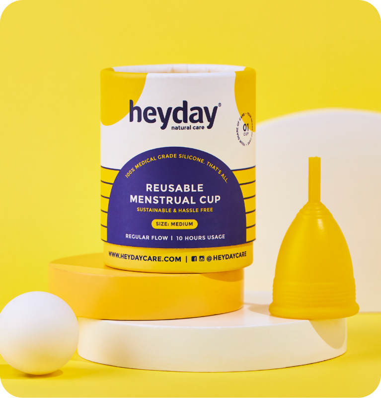
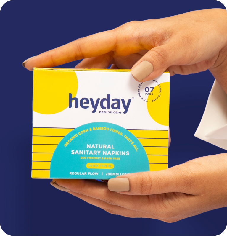
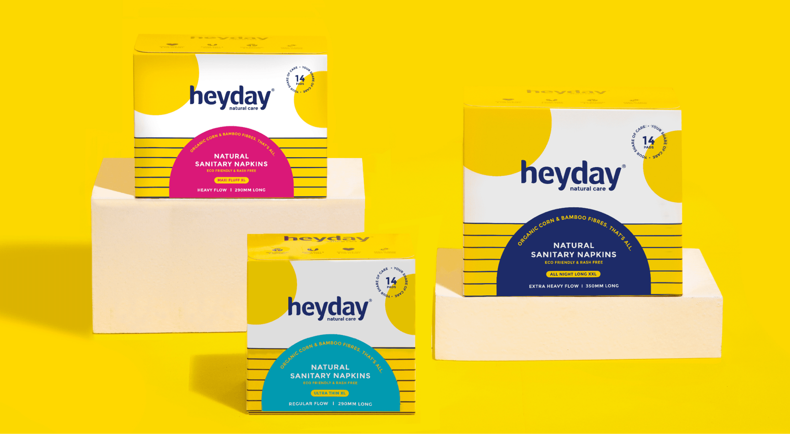
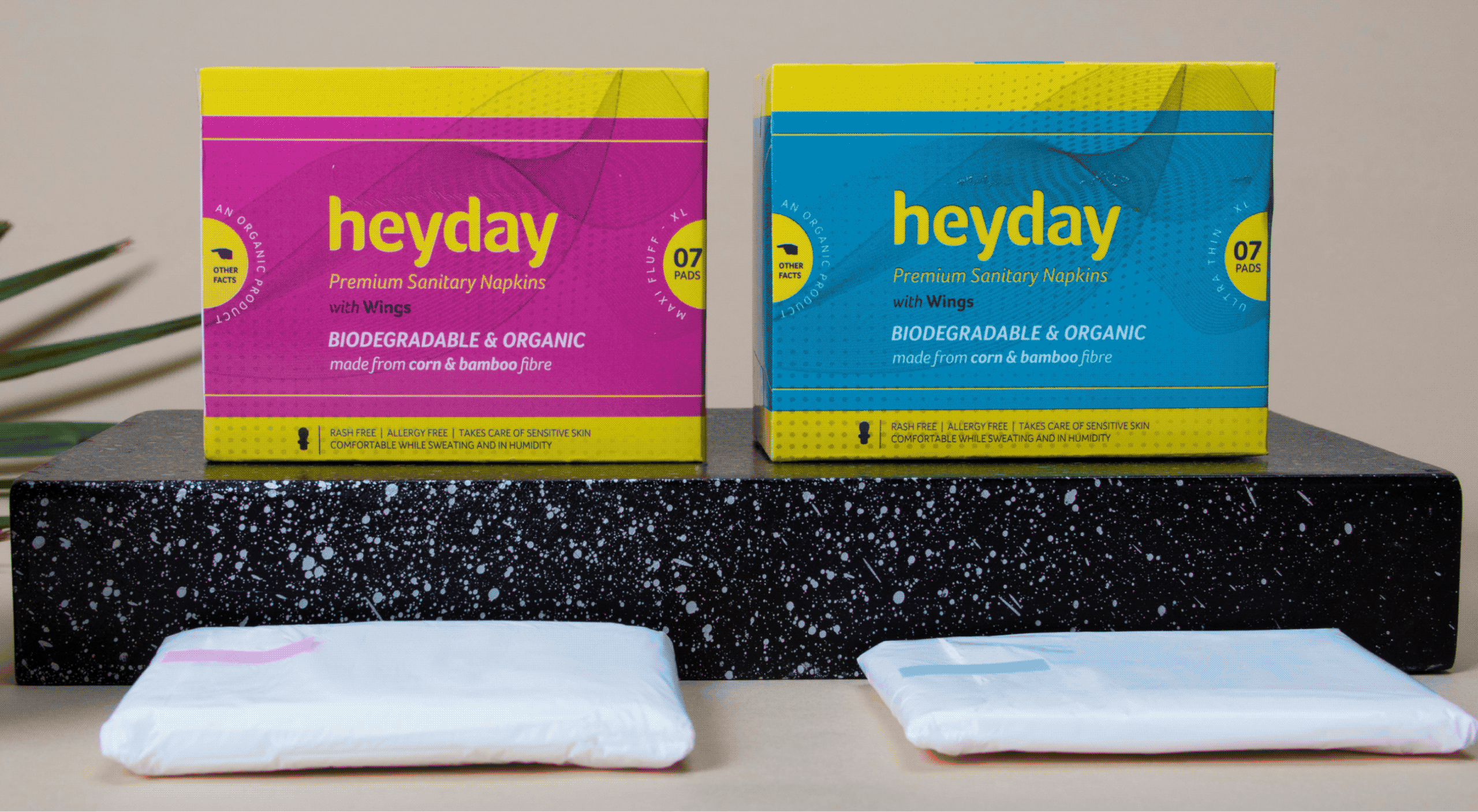
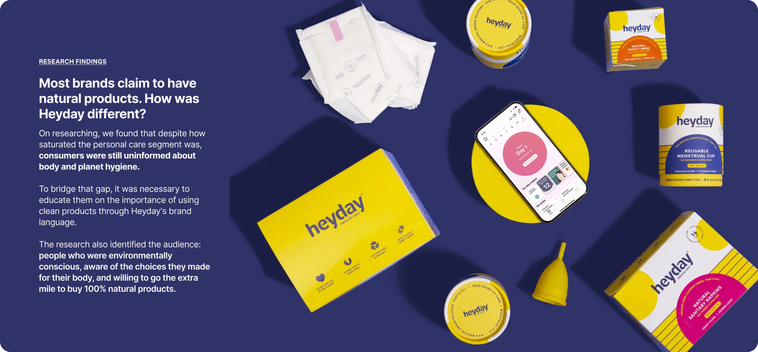
We refreshed their old identity and built a brand extension with a vibrant and fun colour palette and new brand icons, so consumers could celebrate womanhood and menstruation.
All of it sits under one purpose statement: Your Share of Care. Every woman deserves easy and safe access to period care.
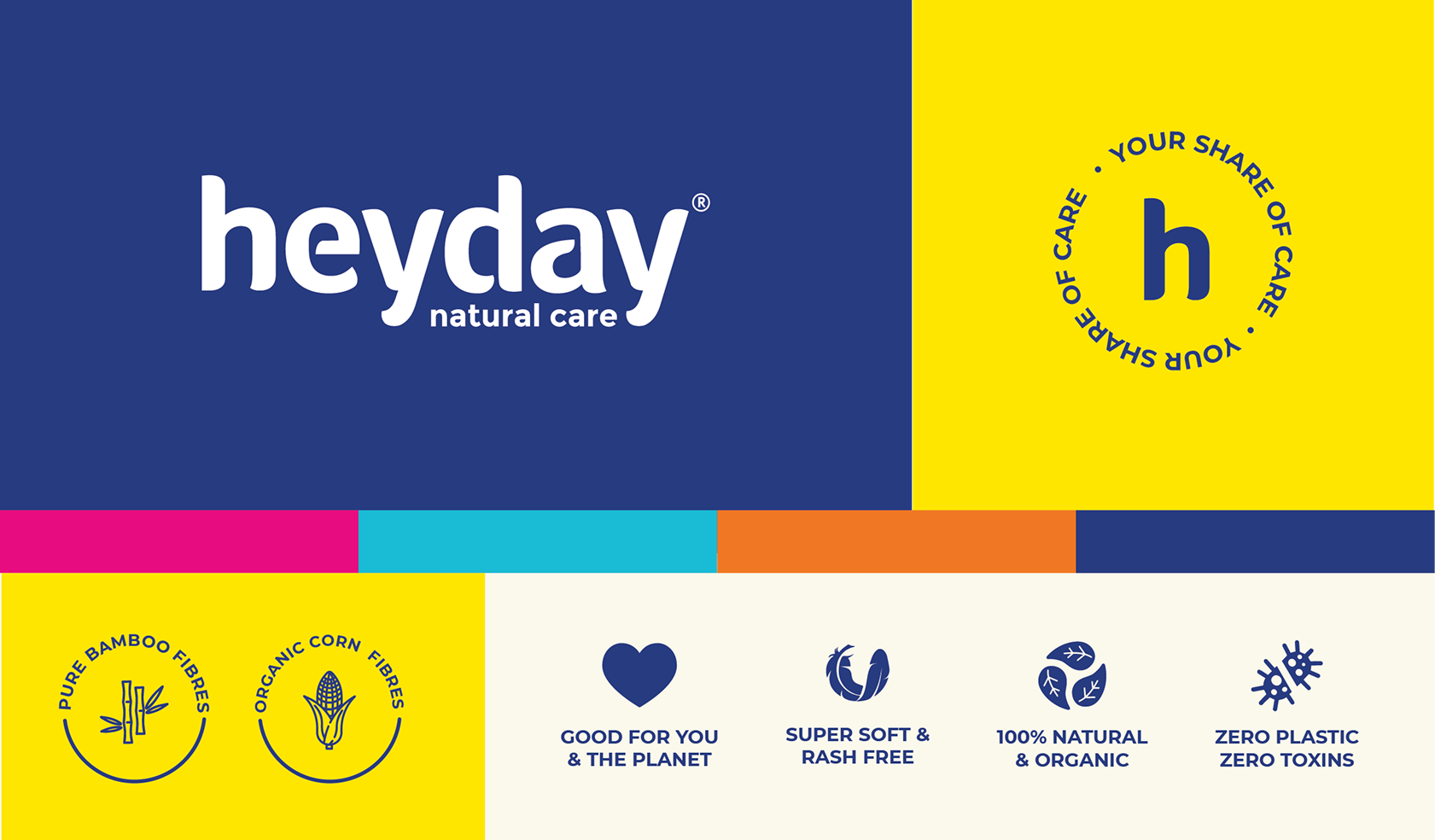
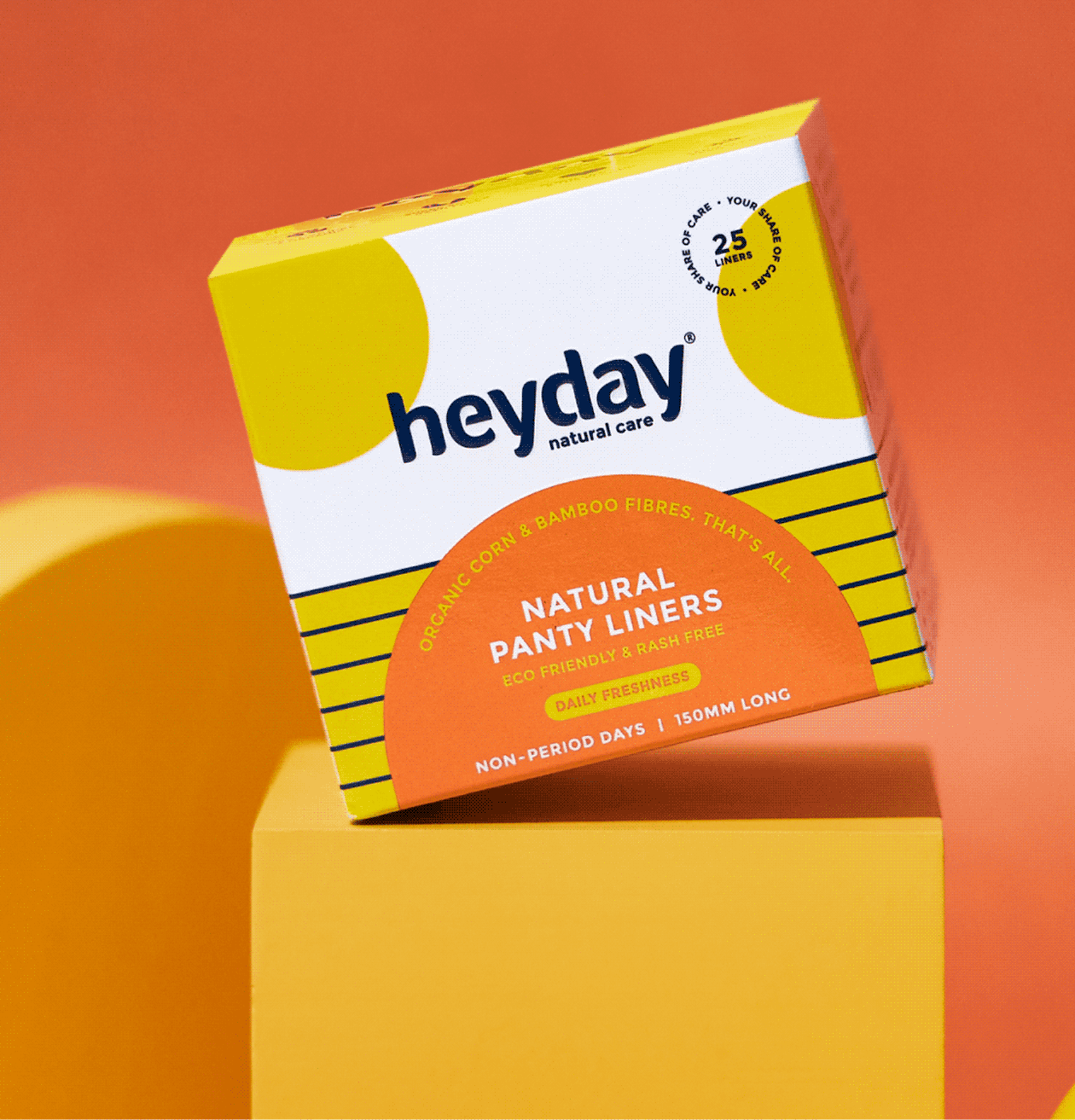
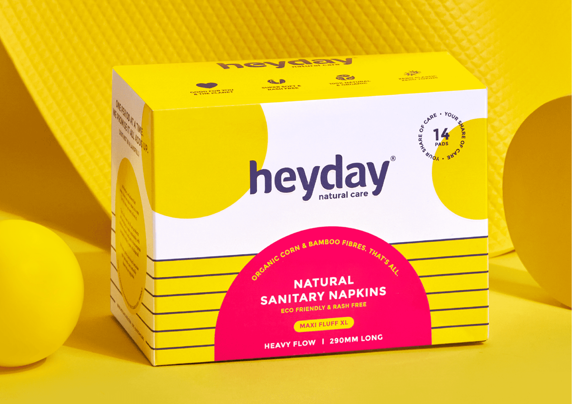
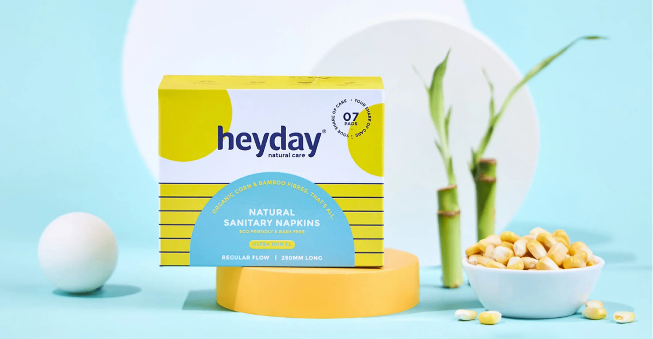
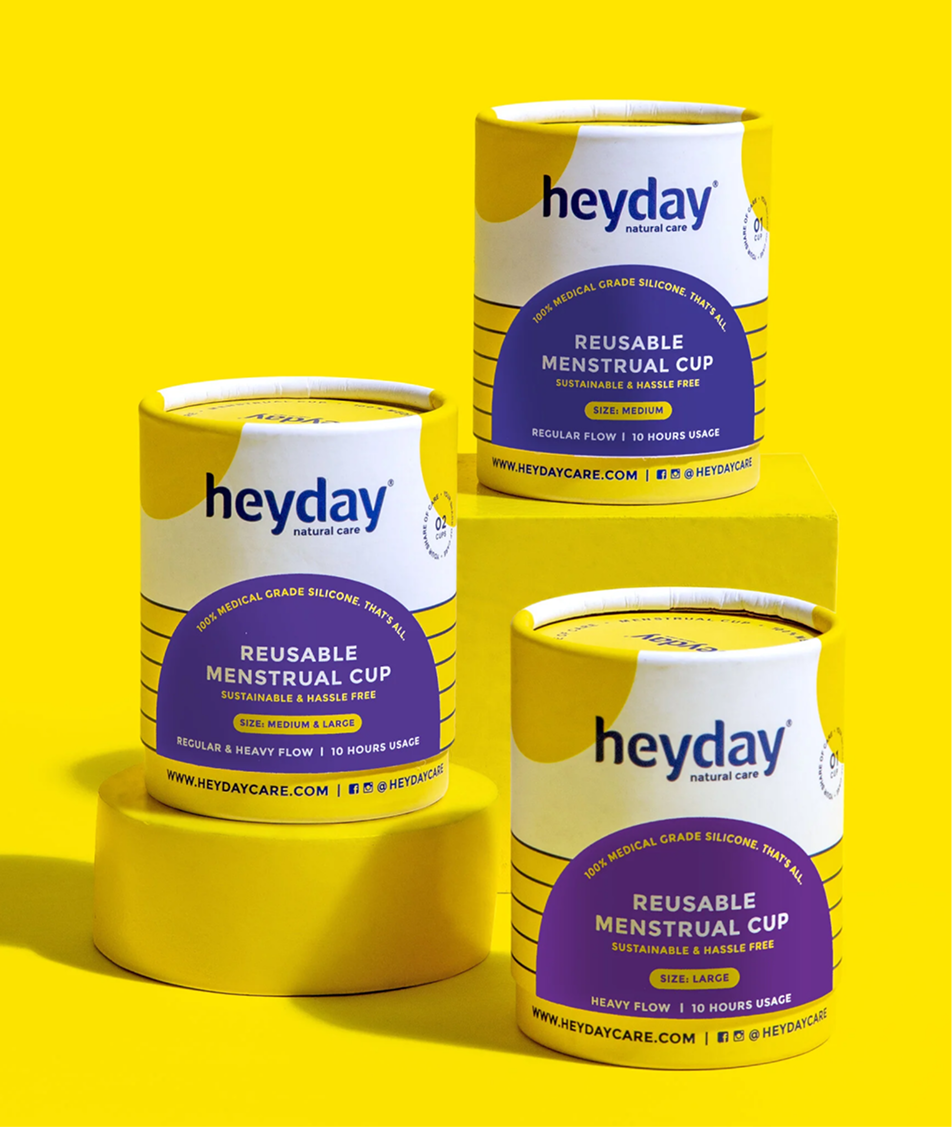
We had to be mindful of the brand’s familiarity and yet infuse a new personality to make it more relevant.
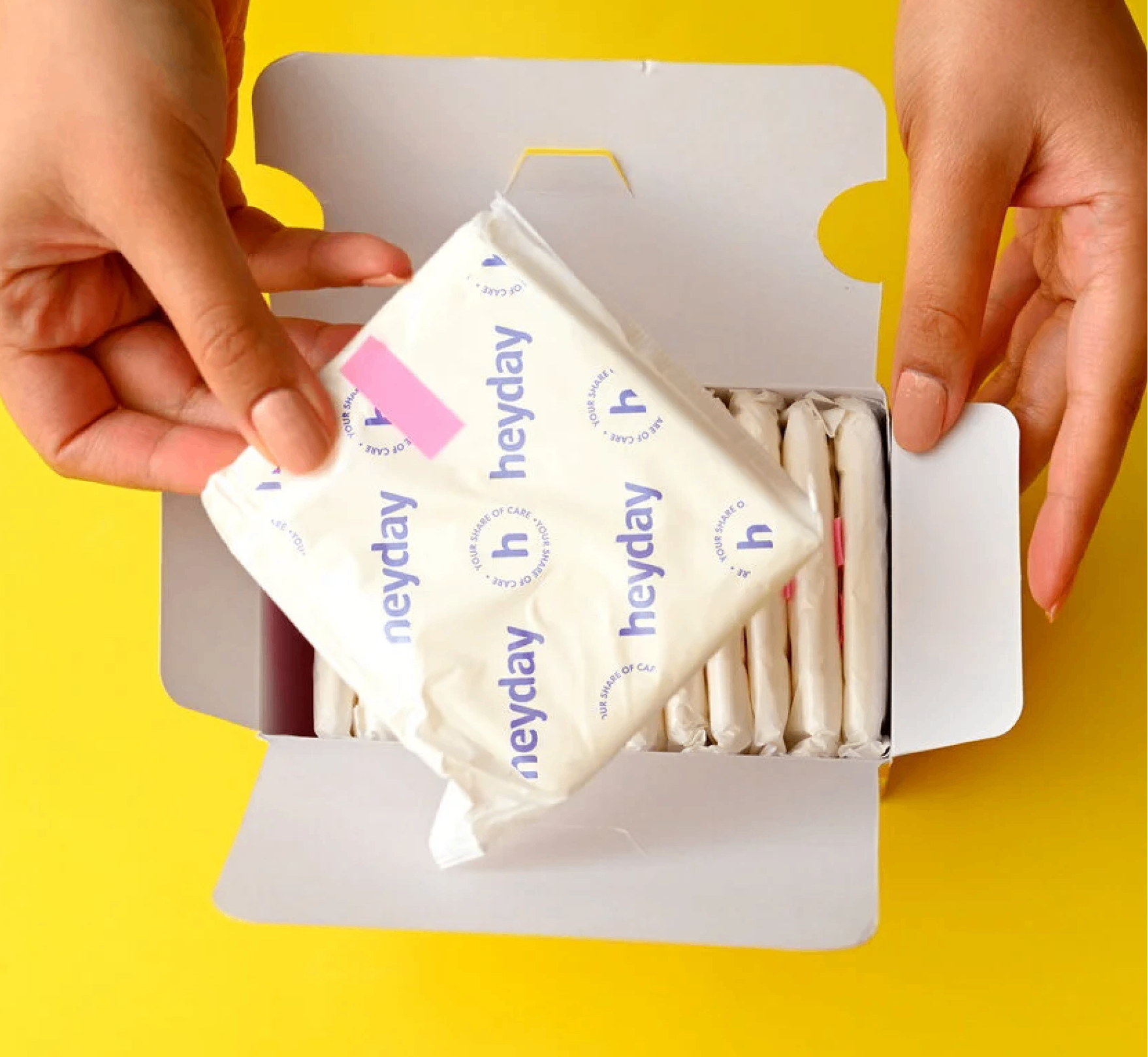
The category is crowded with bright, colourful packs. Heyday went the other way, mostly white, owning one colour instead of competing on all of them.
We made sure the information was balanced with the brand elements consistently to keep brand remembrance.
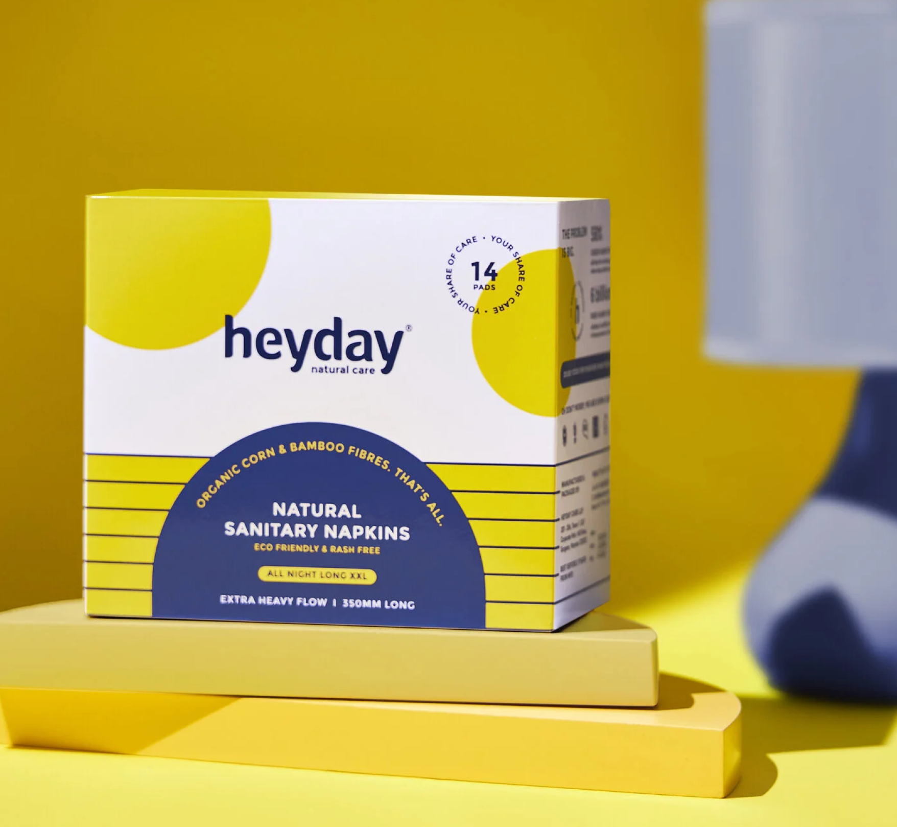
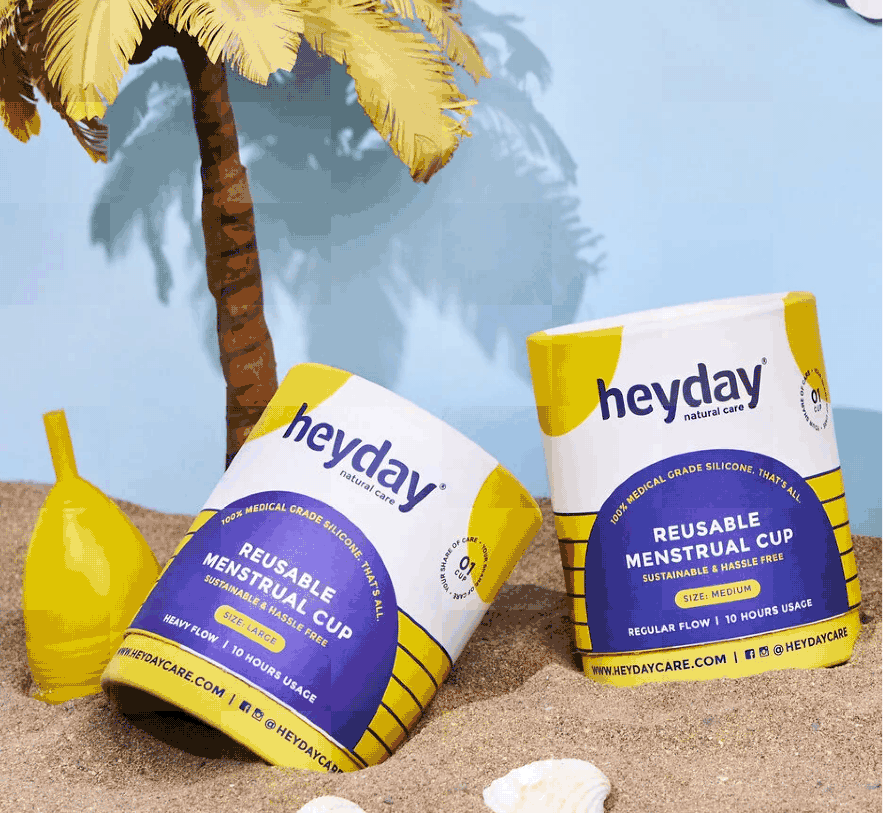
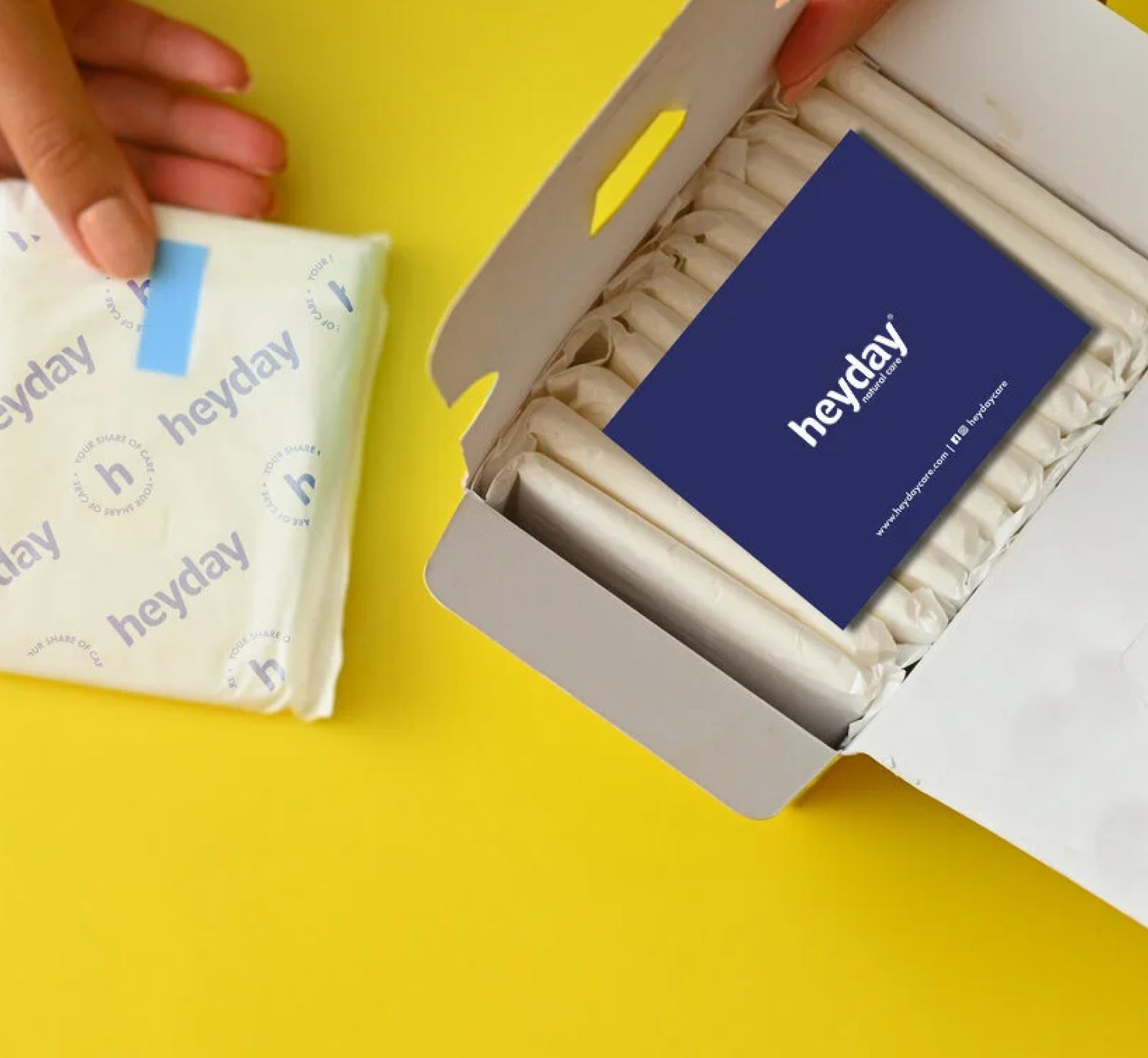
Heyday is truly an eco-friendly product, so instead of sending out the products in polythene bags, we sent them out in paper mono cartons.
We wanted the detail to run all the way through, our brand elements were carried onto the release paper, and a small thank you card was slipped into every order, reminding customers that they had saved themselves from harmful chemicals and plastics, and the environment along with them.
THE EXPERIENCE
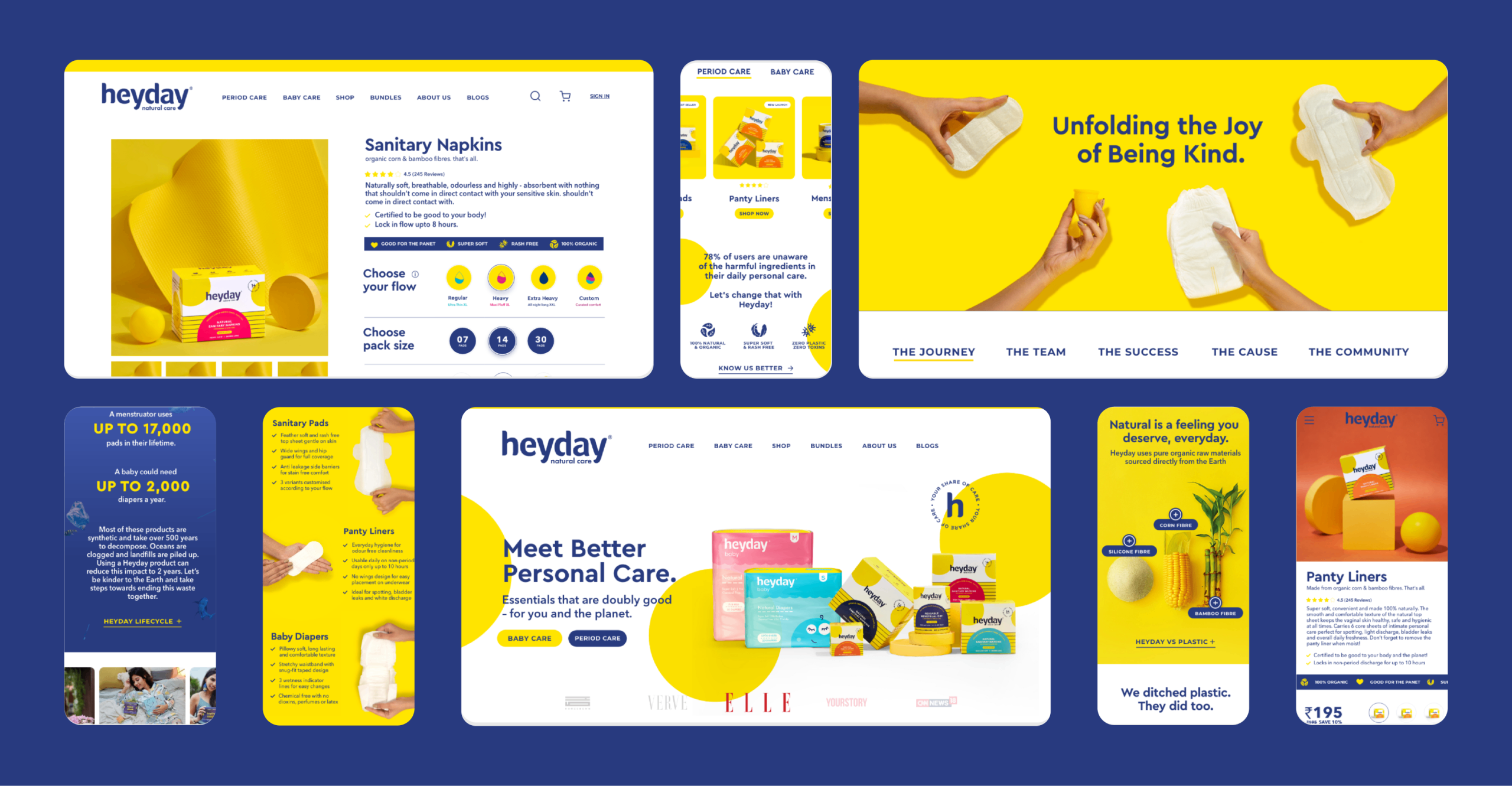
The site is built from the same palette and the same voice. One brand, whether you meet it on a shelf, inside a carton or on a screen.