The Crown Jewel Of Reliance

The Crown Jewel Of Reliance

Brand Identity & Visual Extension for Vantara

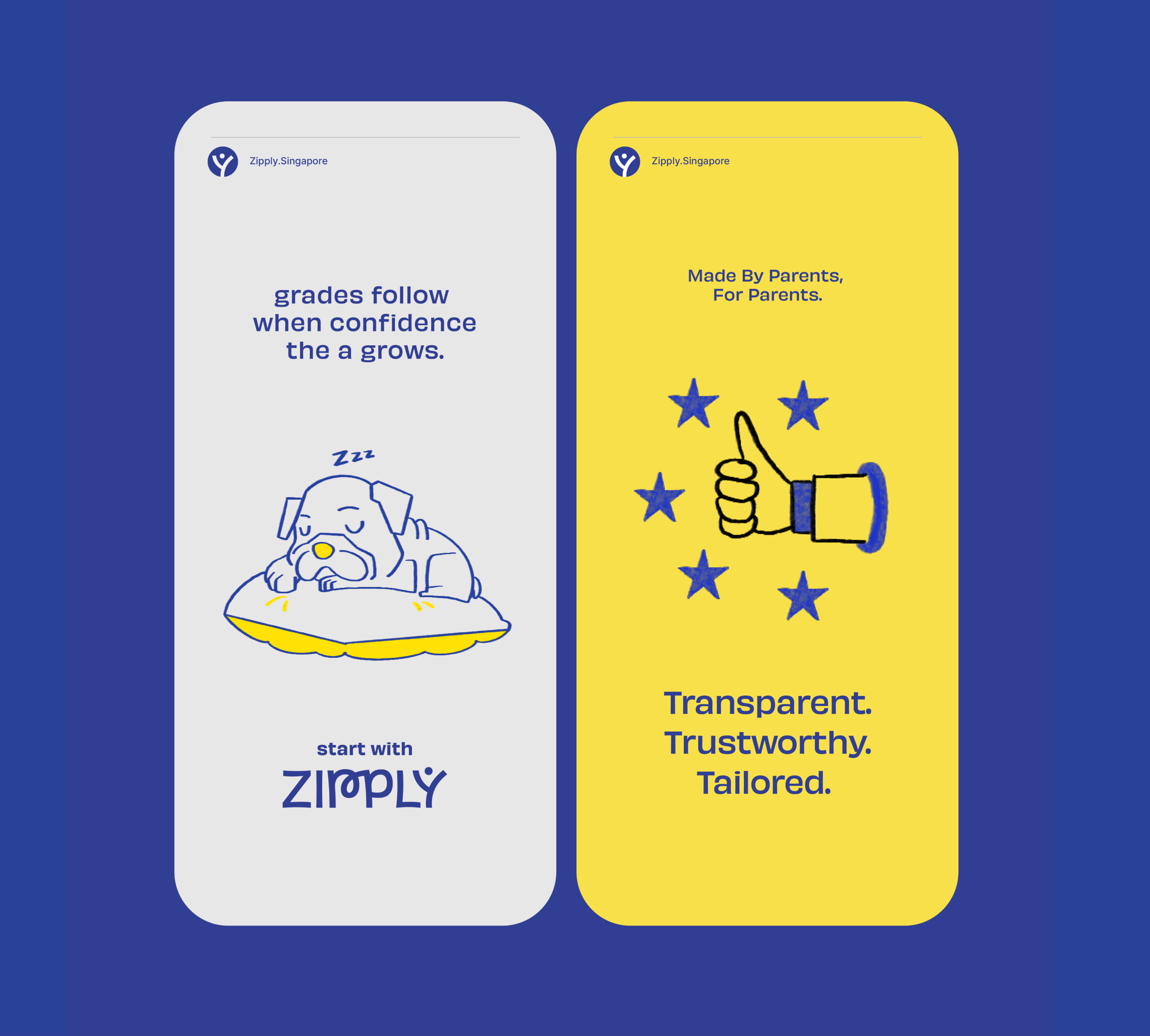
Fostering Education With Zipply

Fostering Education With Zipply

Brand Identity & UI For Zipply Platform

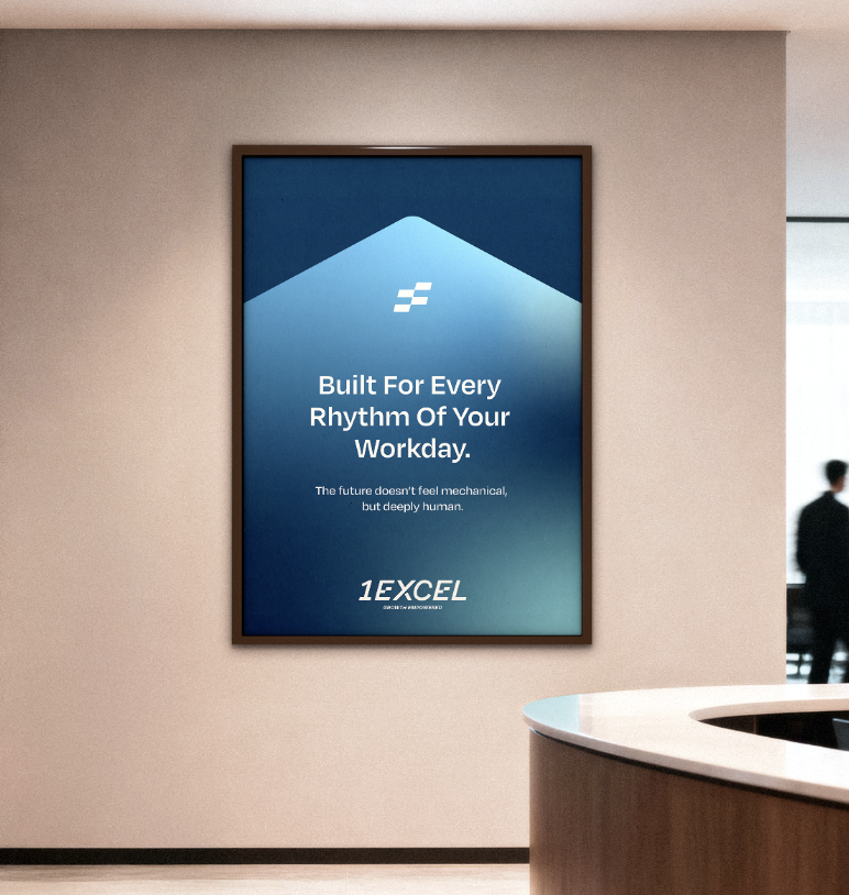
Smart Co-Working With 1Excel

Smart Co-Working With 1Excel

Identity & Visual Extension For A Co-Working Space

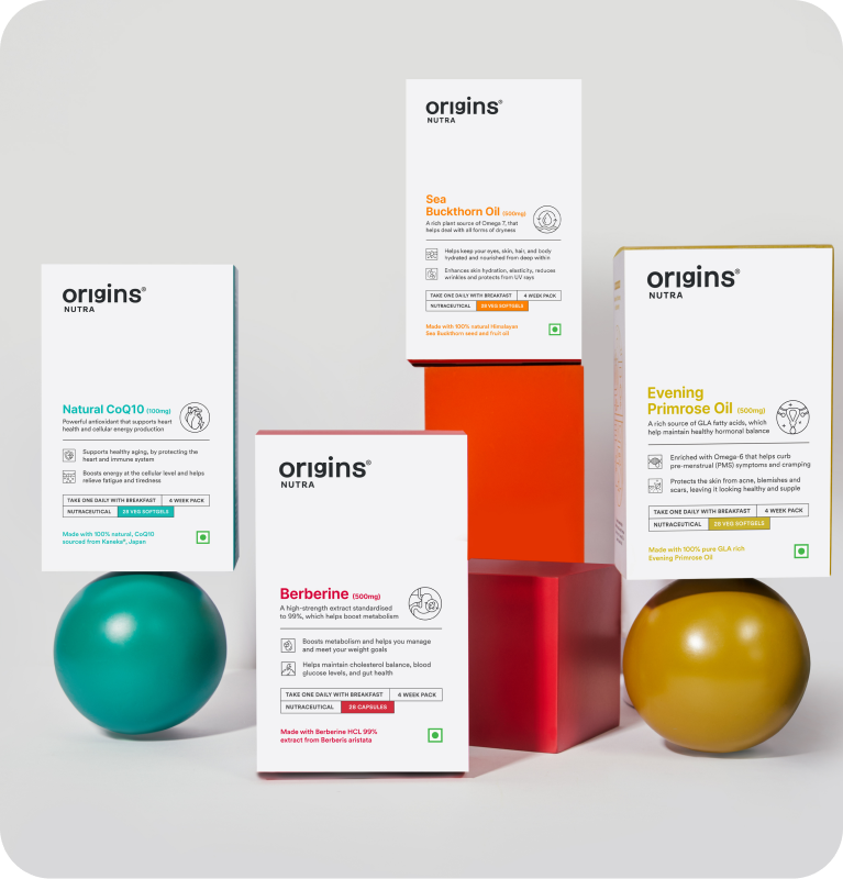
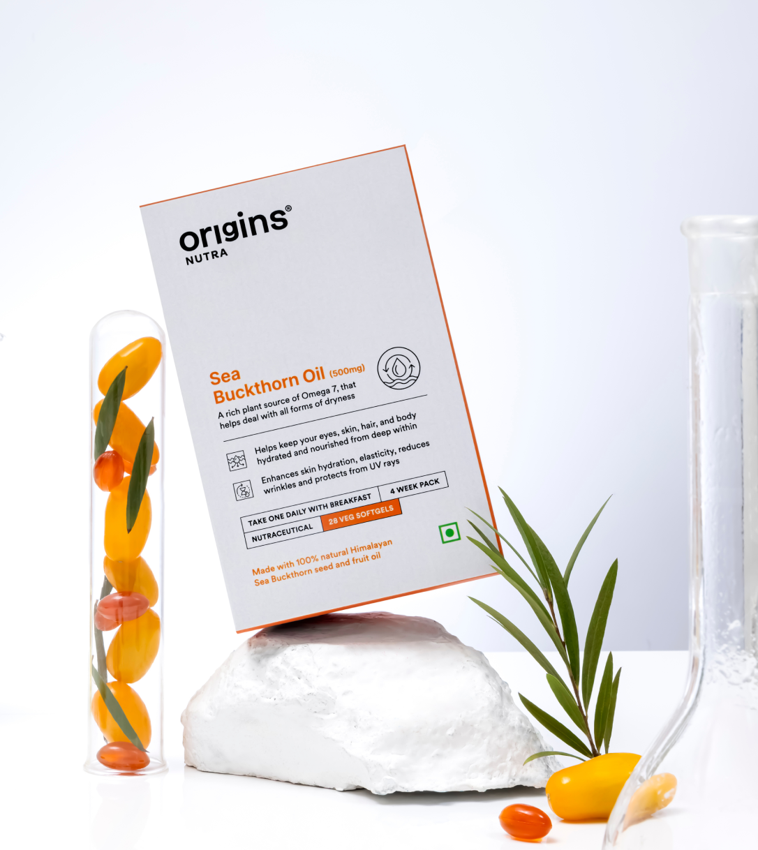
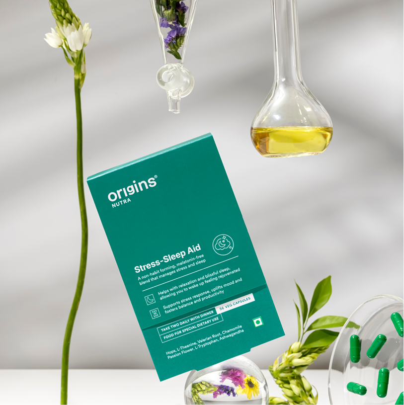
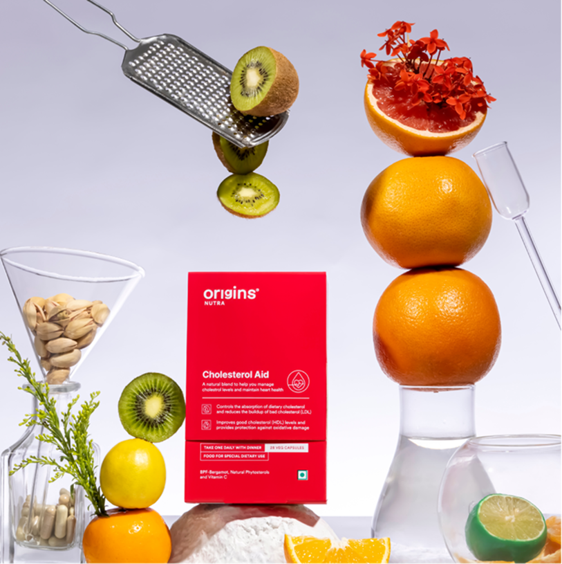
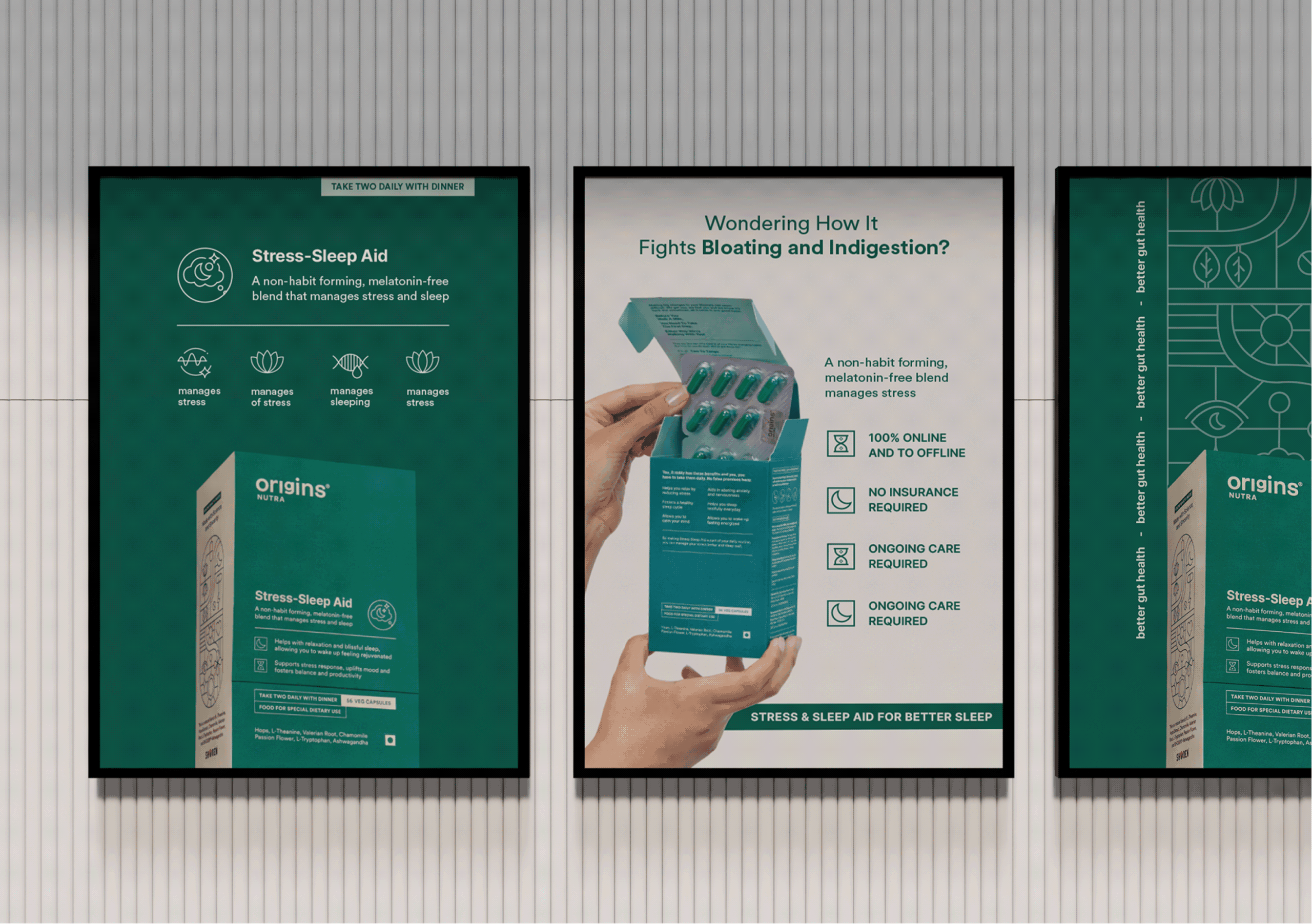
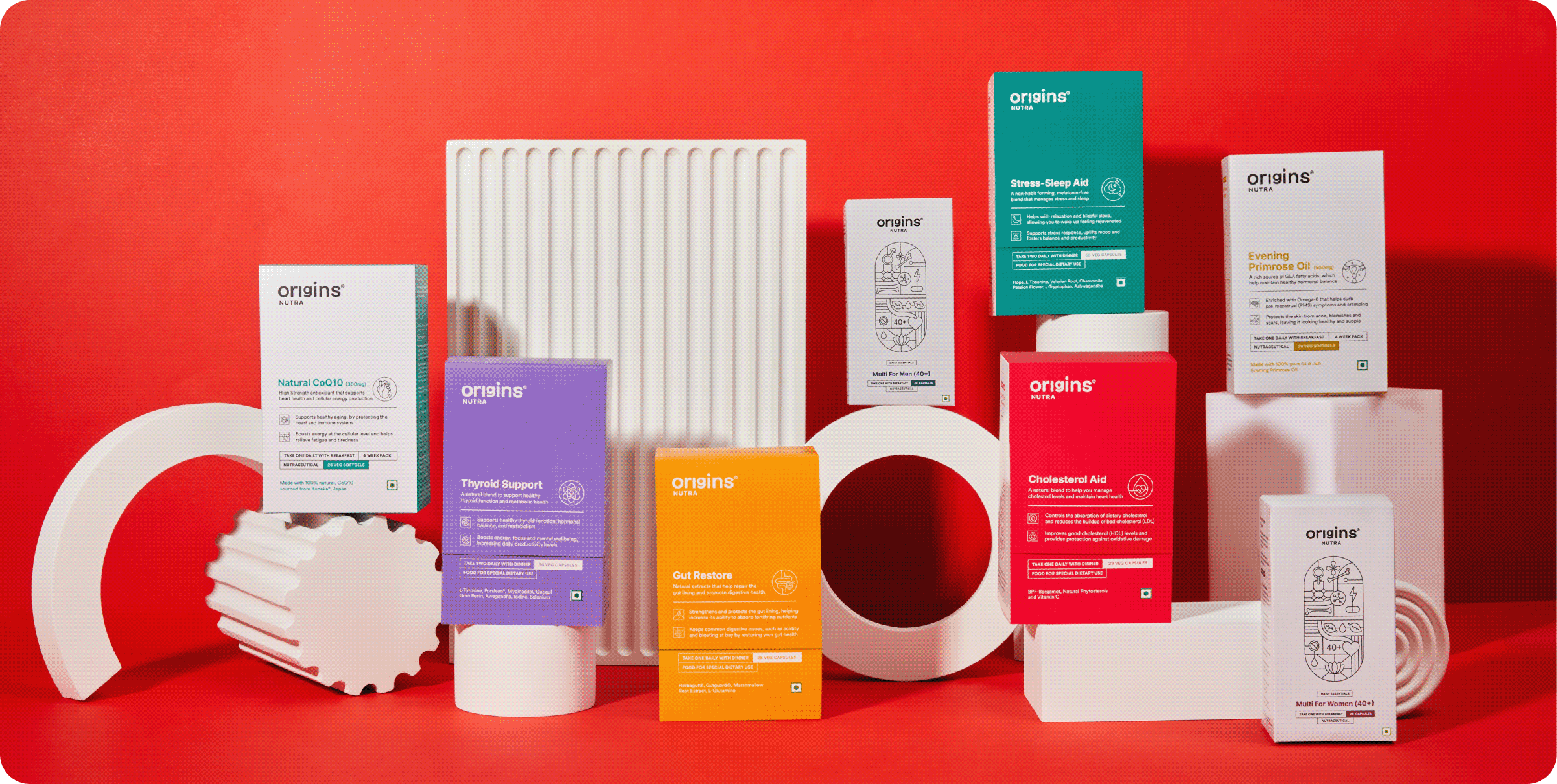
Origins, It Starts With You

Can health be made simple enough to become a habit?

Scope Of Work: Market Research, Brand Strategy, Brand Identity, Product Packaging, Art Direction and Web Design.

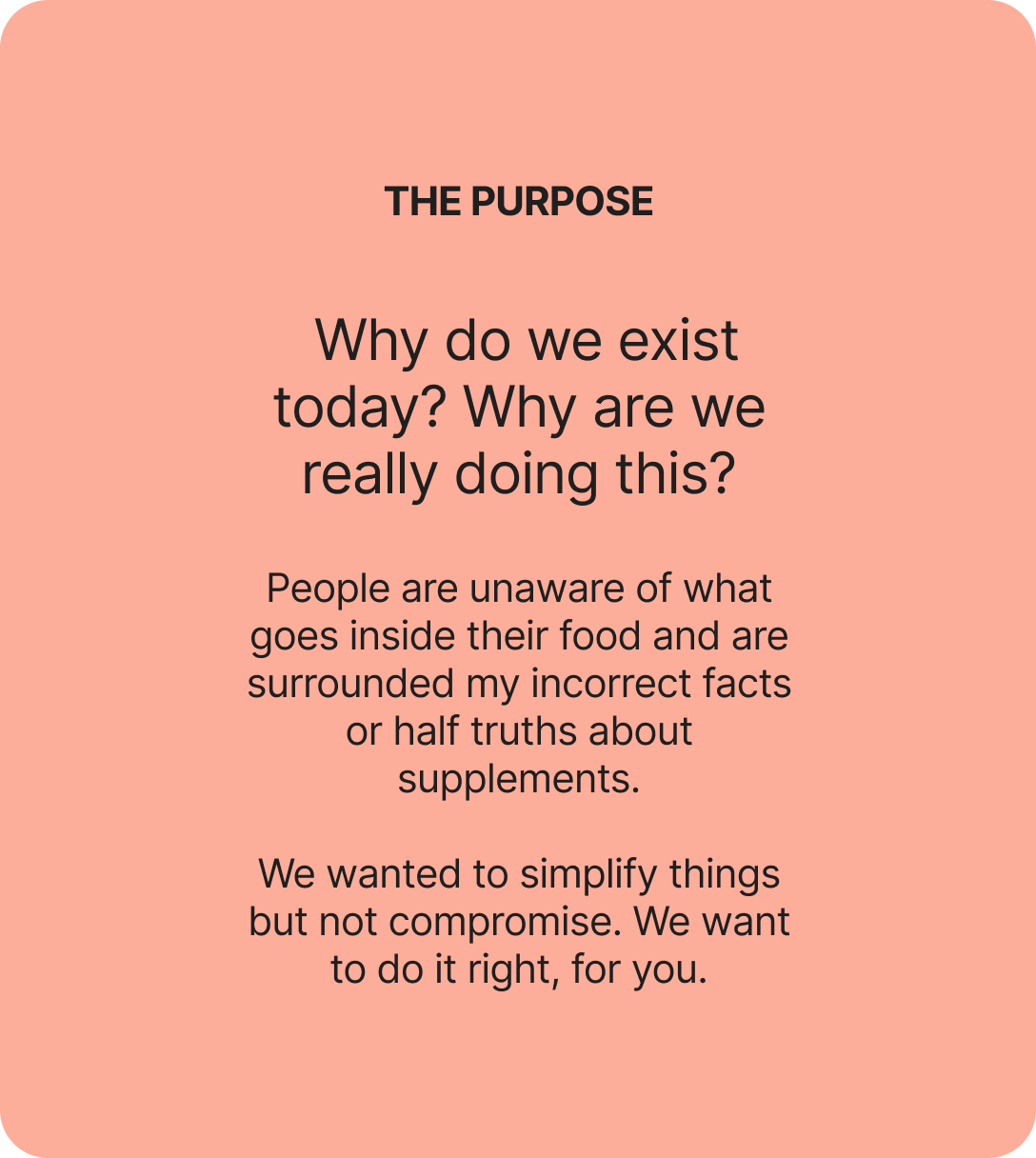
Is it just us, or does every supplement feel like a gimmick? Every nutraceutical brand says the same three things. Good for you. Clinically proven. Backed by science. So, how was Origins different?

We went at it from the other side with Surya. If supplements are meant to be preventive rather than curative, can they actually deliver on that? And what would a brand look like if it took the question seriously?

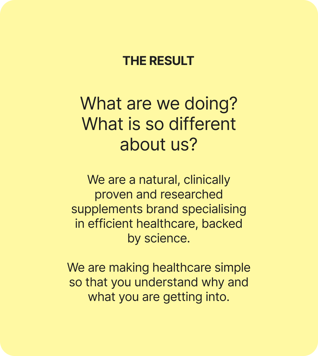
The goal was to build something easy, functional, and truly habit forming. Health, as simplified as we can follow.

We started questioning everything to build the origin of brand Origins.
RESEARCH FINDINGS

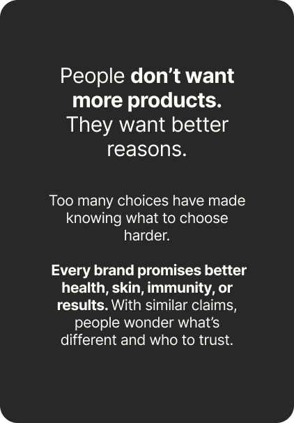
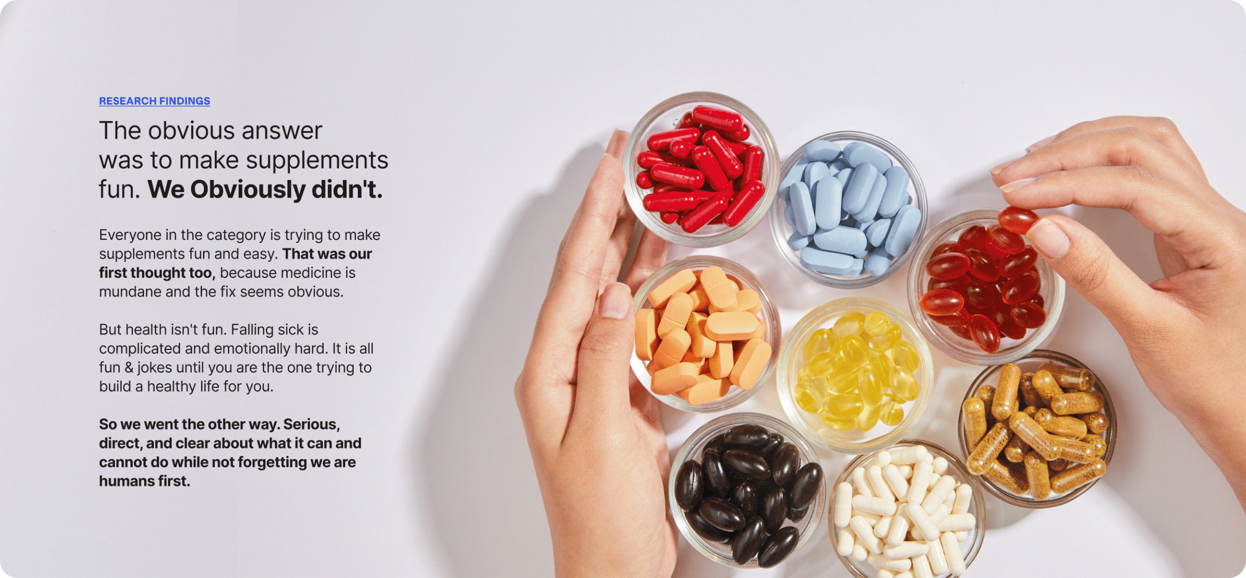
A category full of claims and empty of trust.

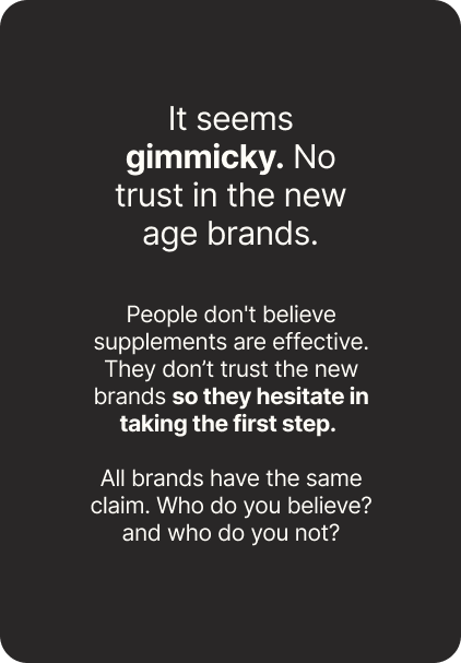
We spoke to people about their relationship with health and how they actually live with it. What they take, what they’ve quit, who they ask before buying anything.

Given the age we’re in, the findings surprised us. Information is everywhere and almost none of it is verifiable. There’s no source anyone genuinely trusts. Somewhere in all of that, people stopped believing any of it.
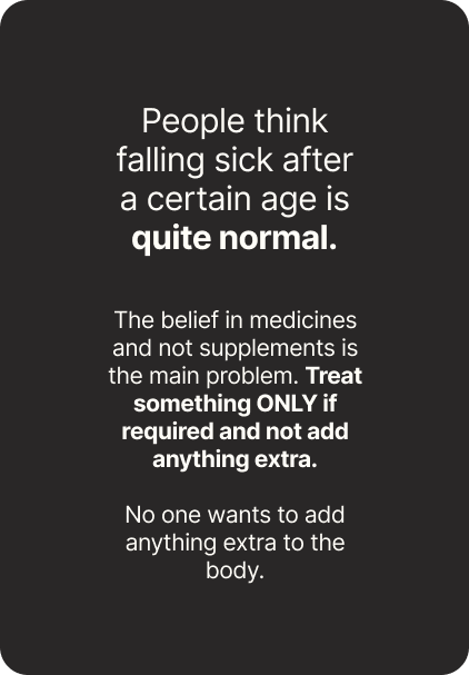
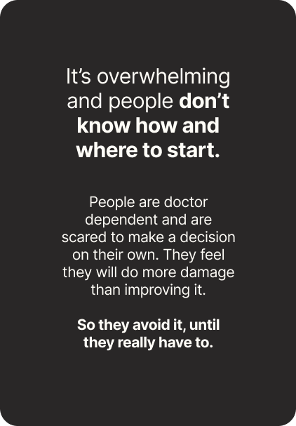
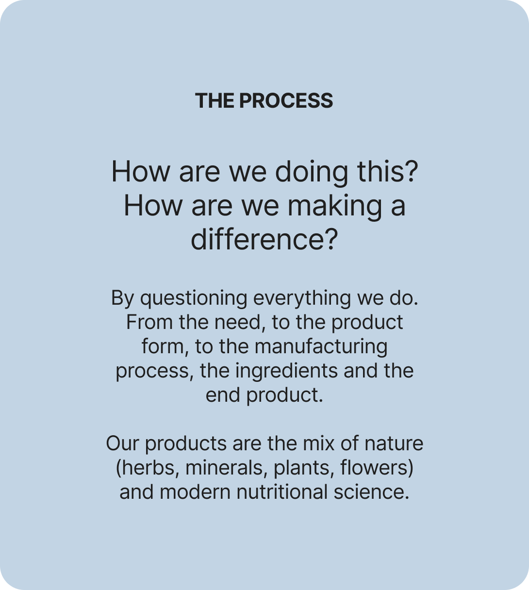
What if it stopped being a supplement brand?

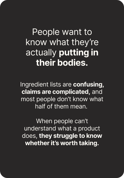
Everyone is chasing a health goal. Eating better, moving more, losing weight. Nobody finds it easy. It’s complicated, and intimidating enough that most people give up in the first month.

Origins stopped being a supplement brand and became a coach. Not a cheerleader. The kind of coach who tells you what you need to hear, gives advice you didn’t ask for, and stays with you through the boring middle part.

Simple. Reliable. Built For Better Health & Everyday Life.
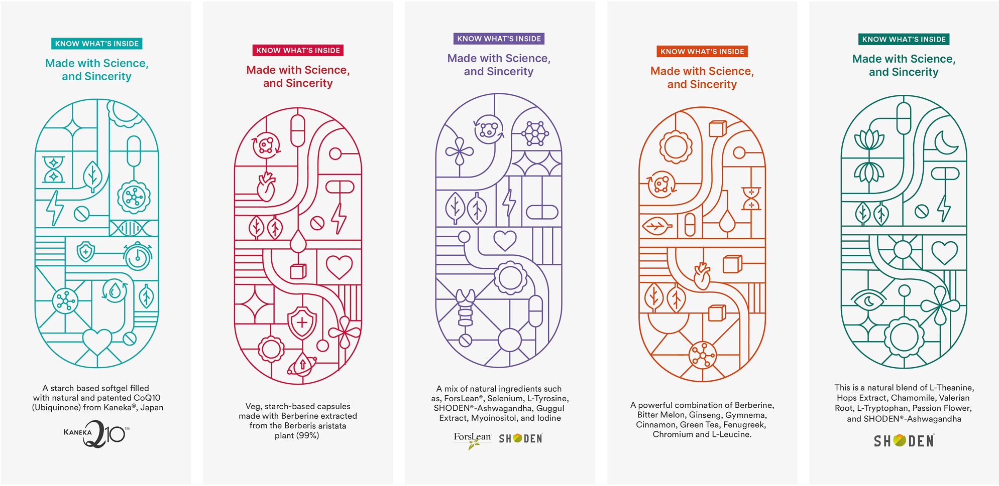
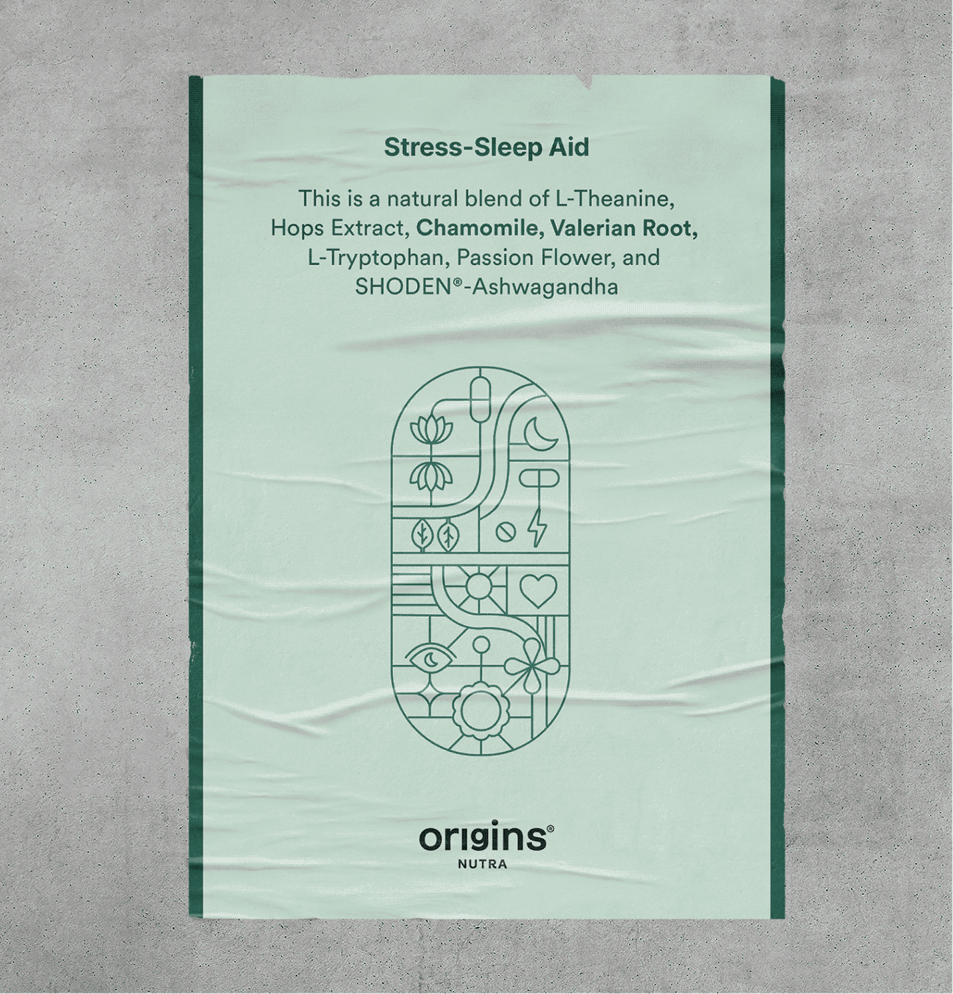
We addressed the most asked: What is really inside?

We built the entire brand on the basis on what’s inside the pill since everyone is skeptical about adding anything extra.

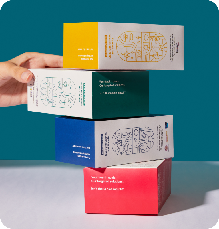
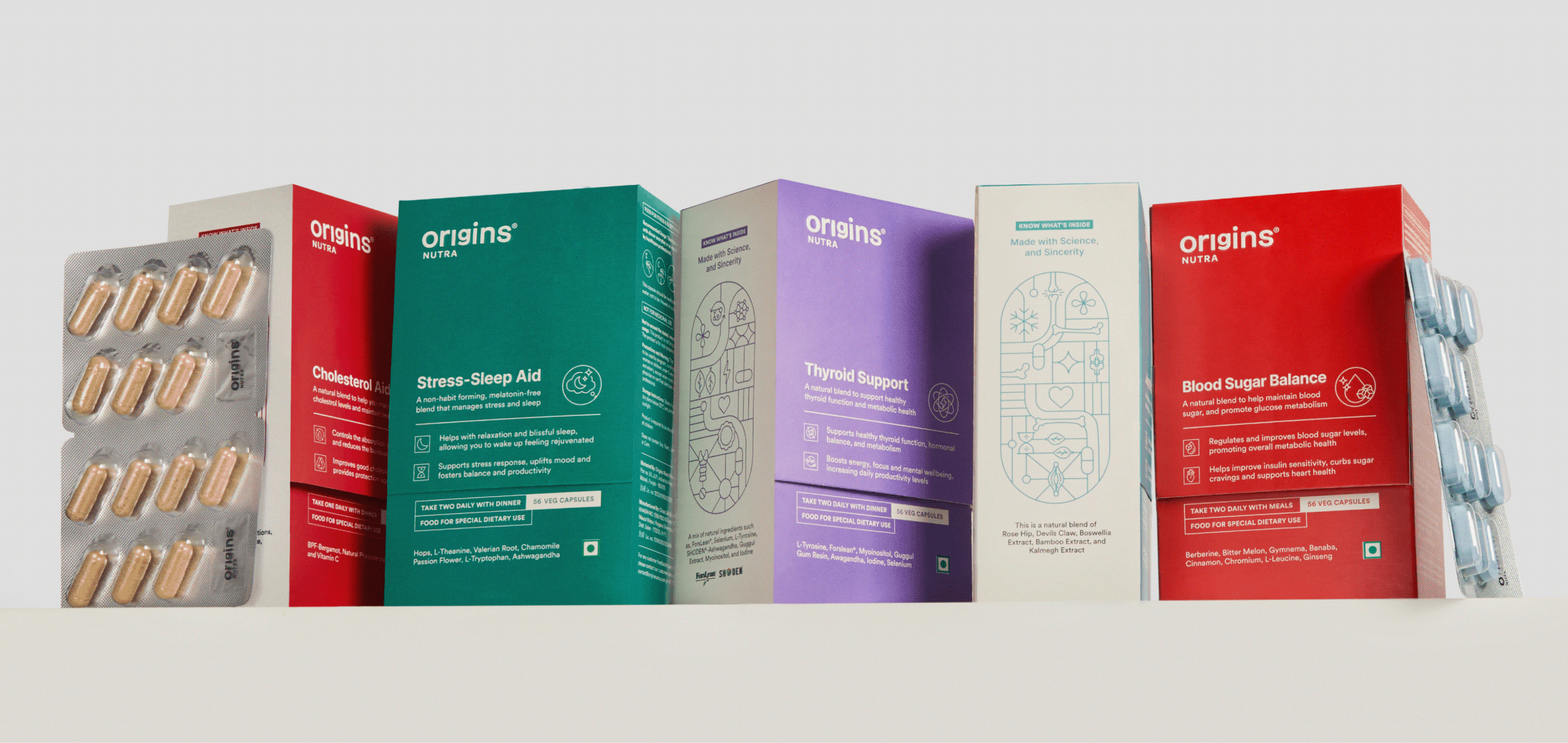
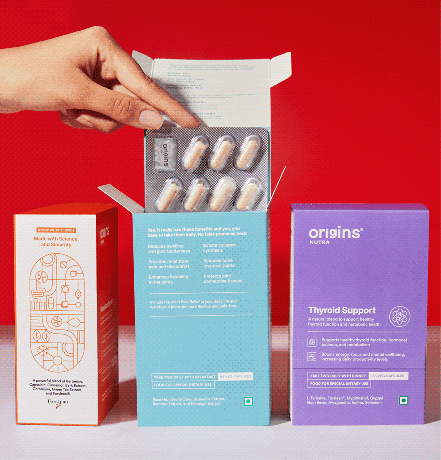
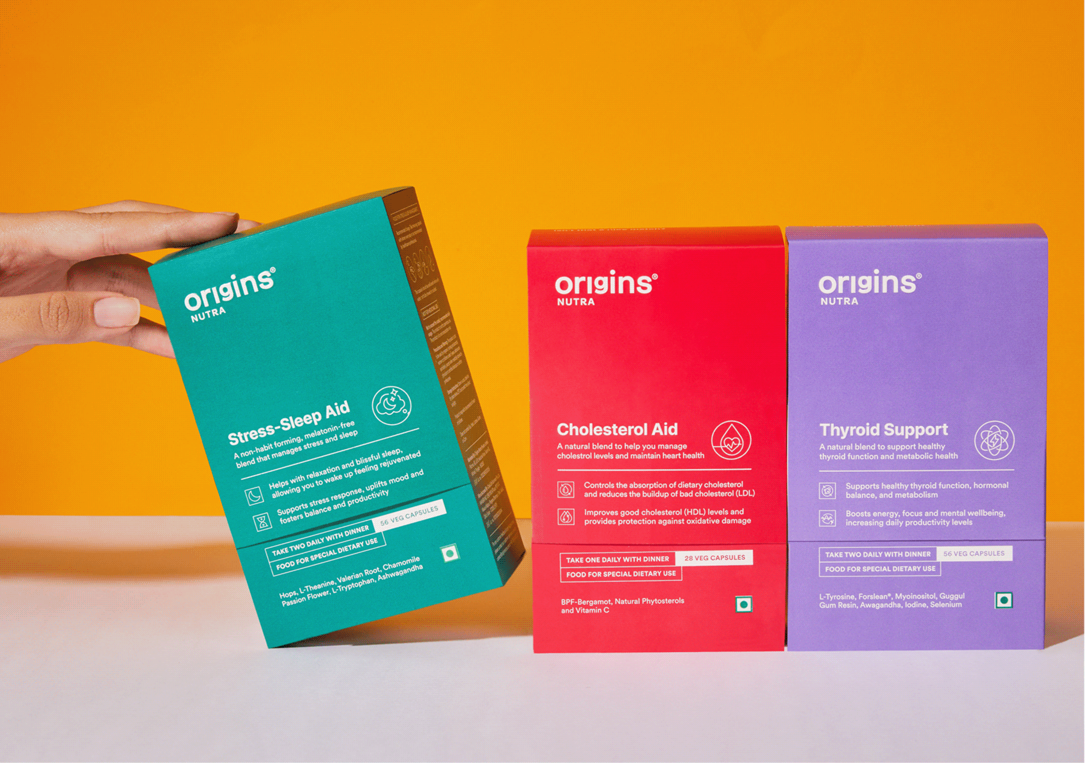
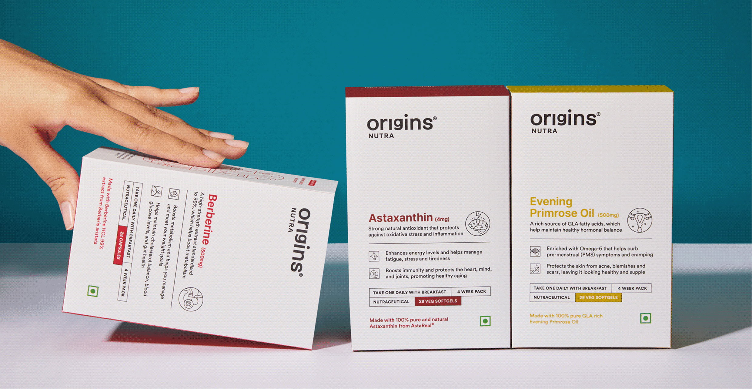
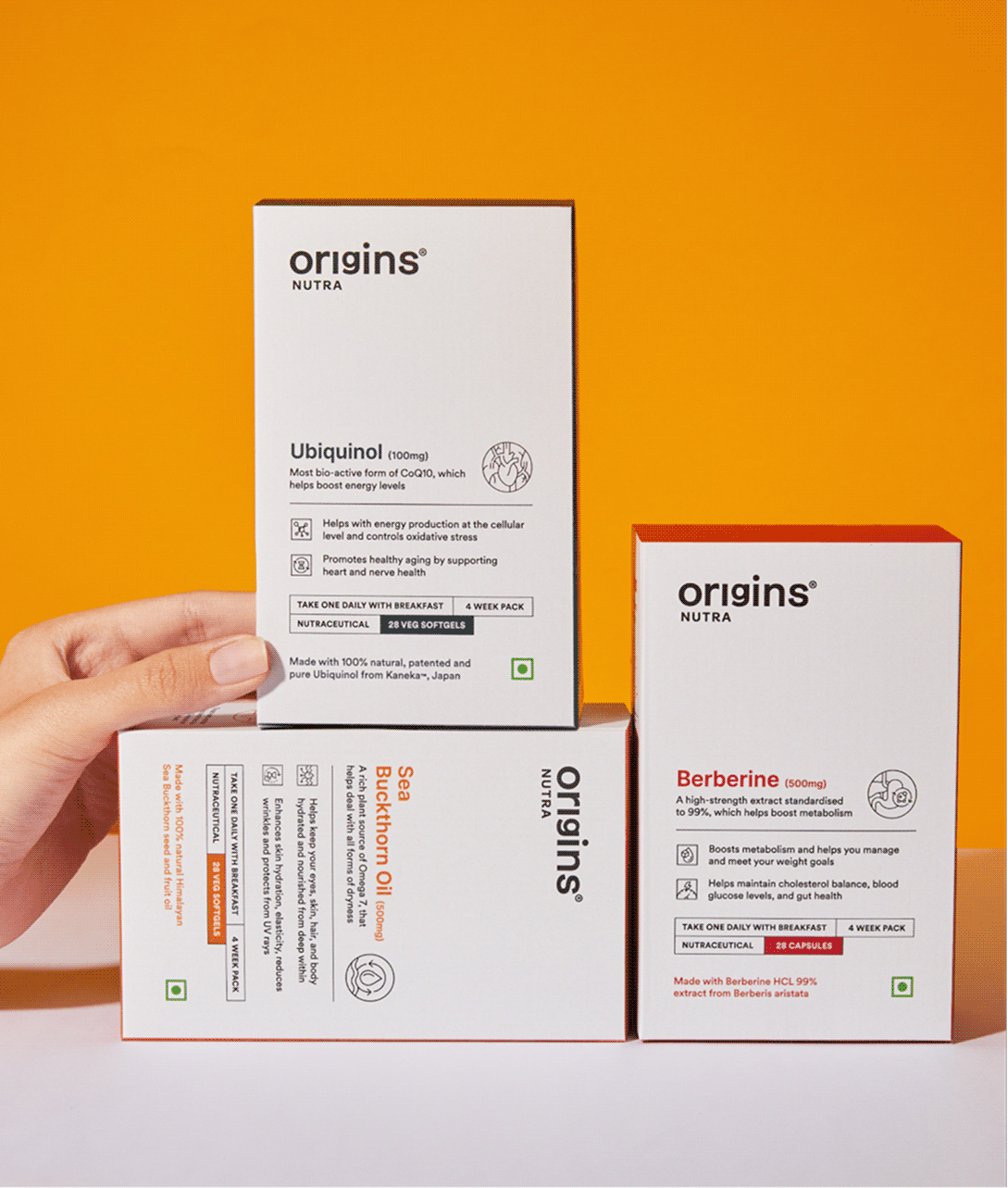
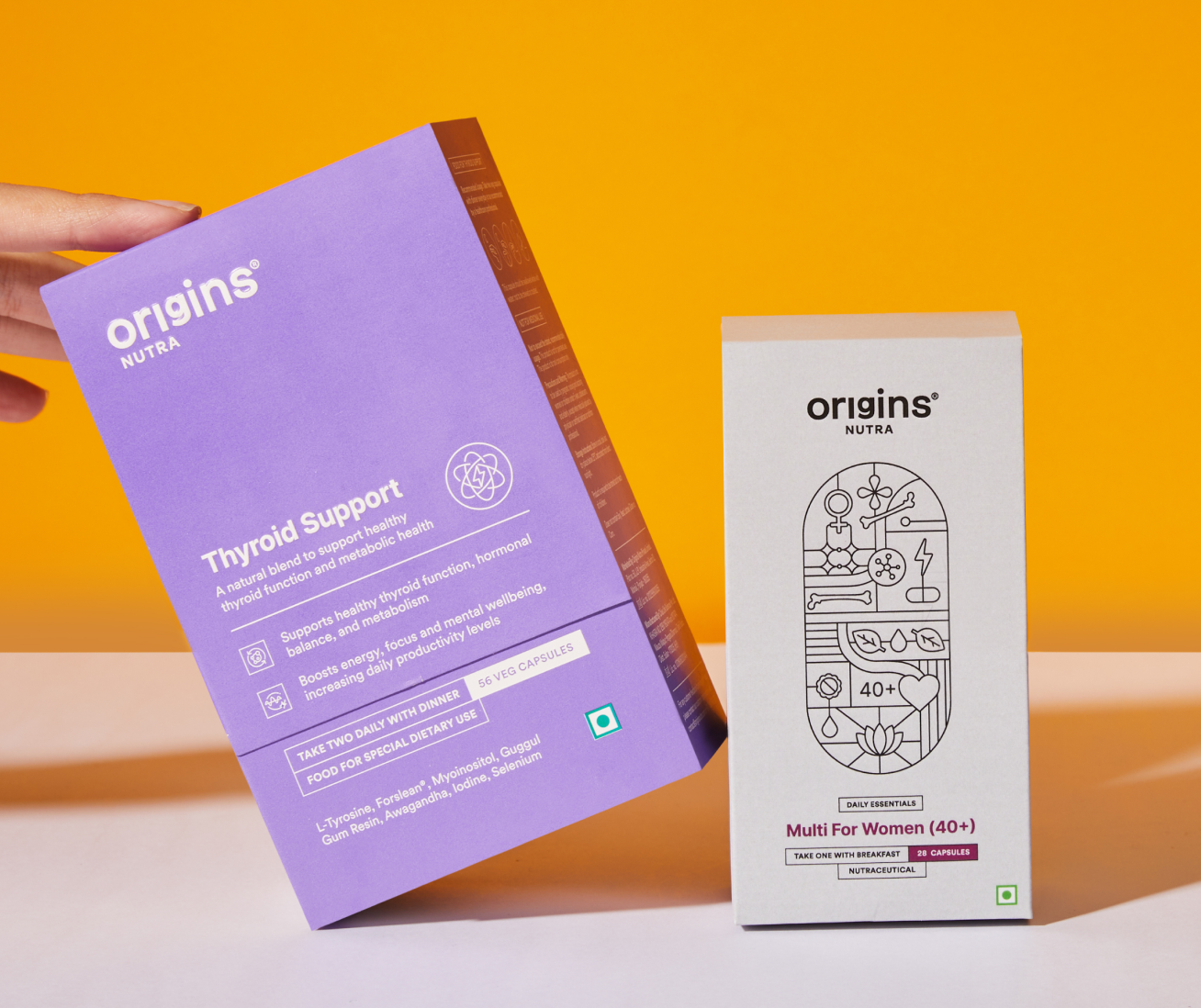
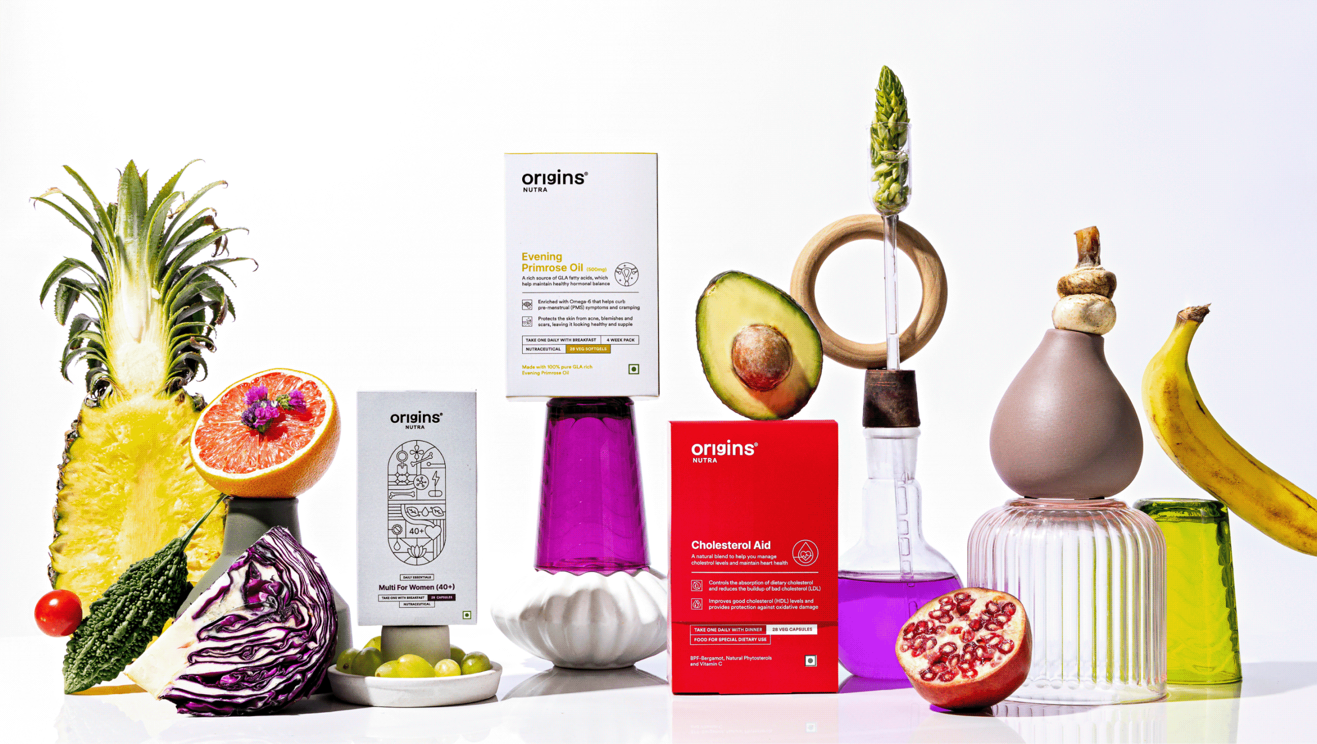
Each Illustration is a combination of benefits, ingredients, brand values and product details fit inside the shape of a pill.

This became the foundation of our visual language, strengthening our promise of honesty and transparency.
THE BRAND

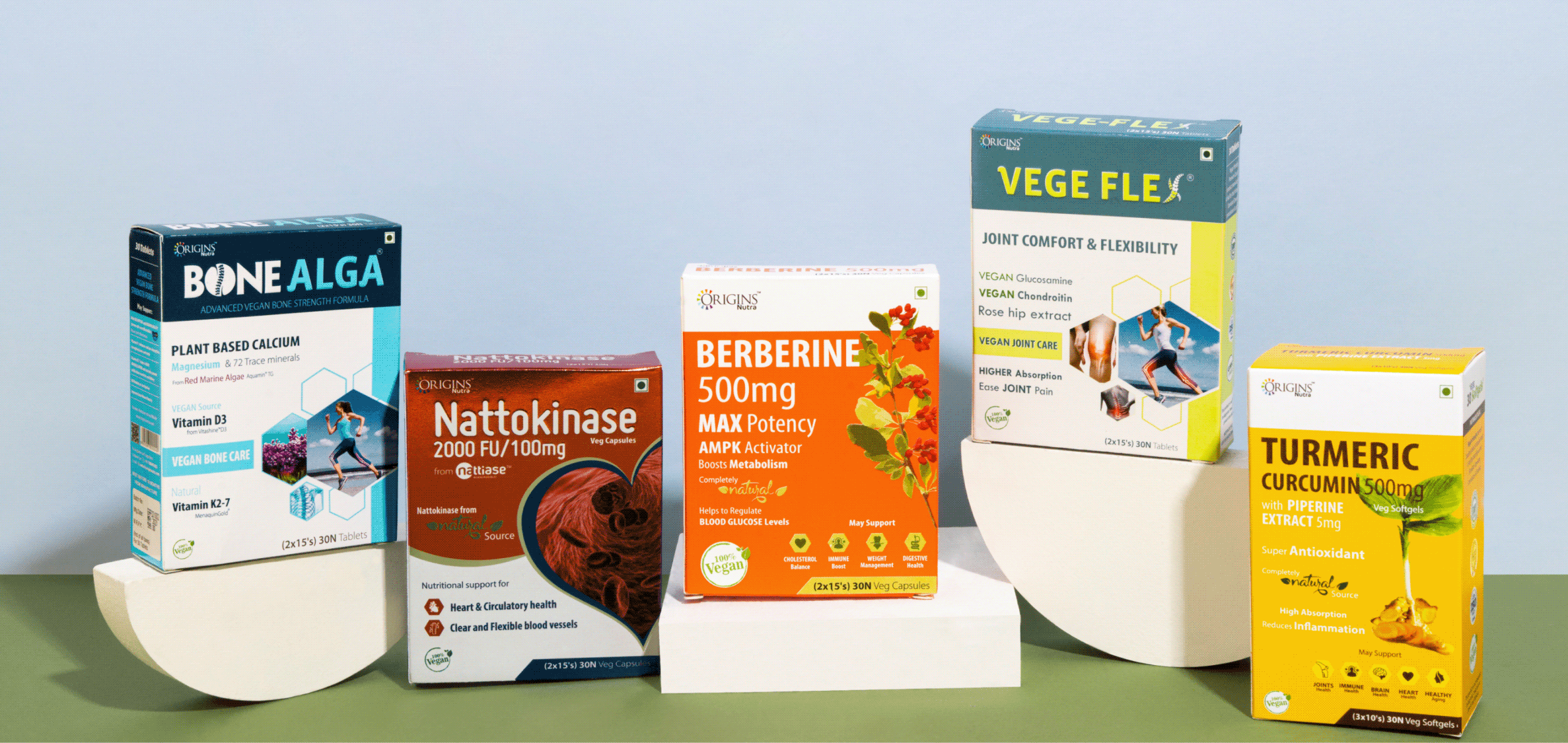
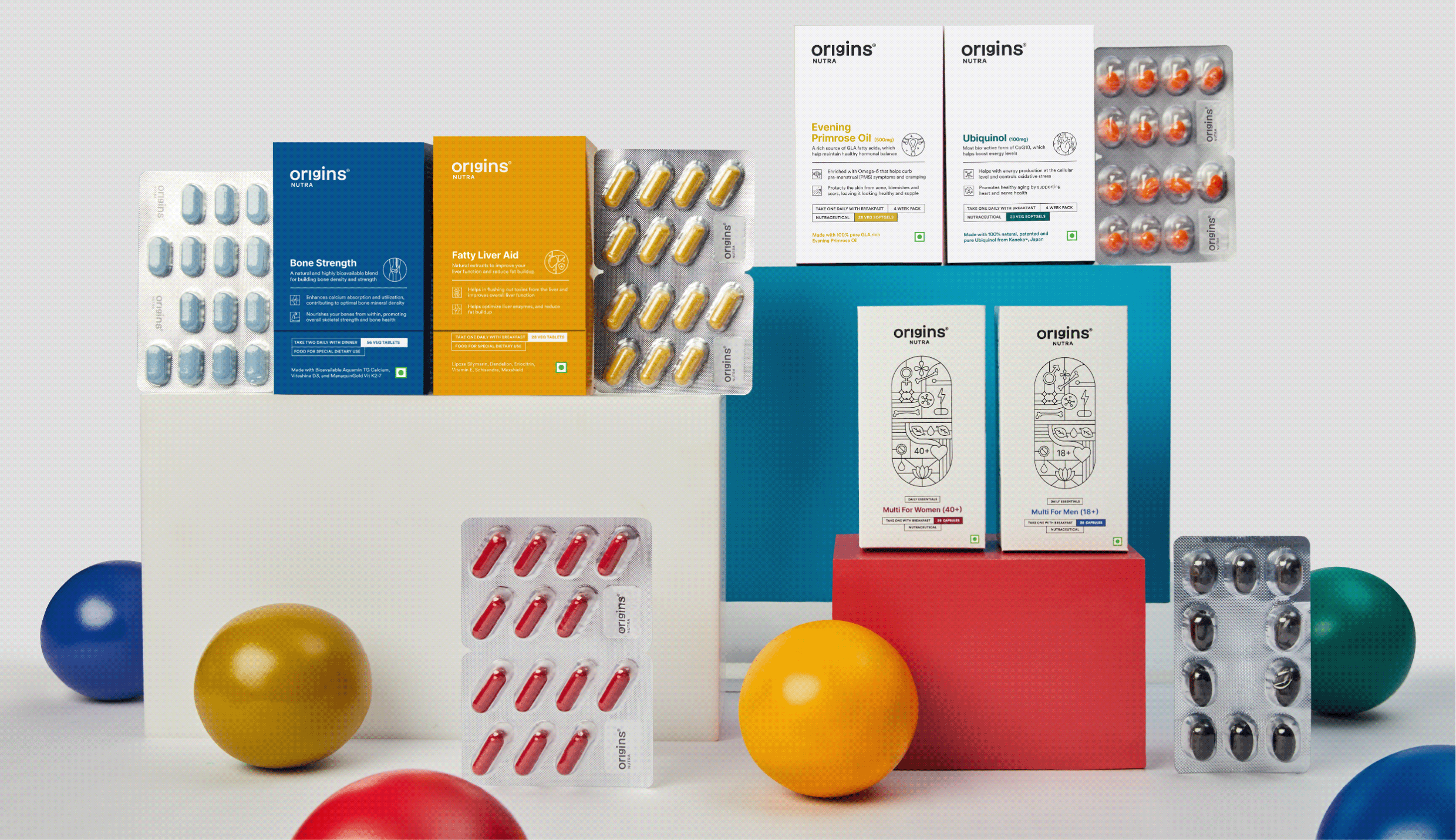
Introducing Origins Nutra 2.0

Preventive care isn’t just important, it’s essential. It truly starts with you, and at Origins, we’re with you every step of the way.

Everyone is chasing a health goal in their life that’s just how we humans are – eating better, moving more or losing weight. But being healthy or reaching that goal is not easy. It’s hard, complicated and intimidating.
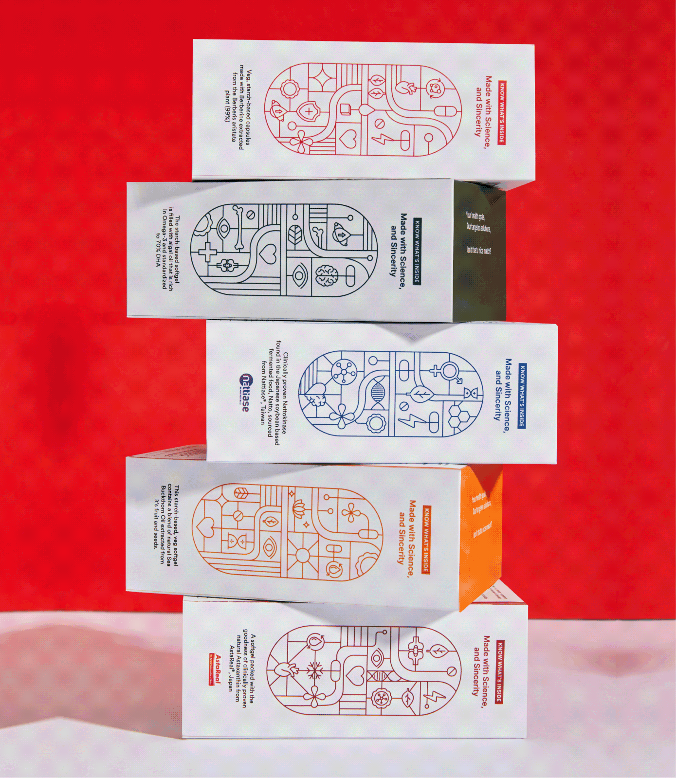
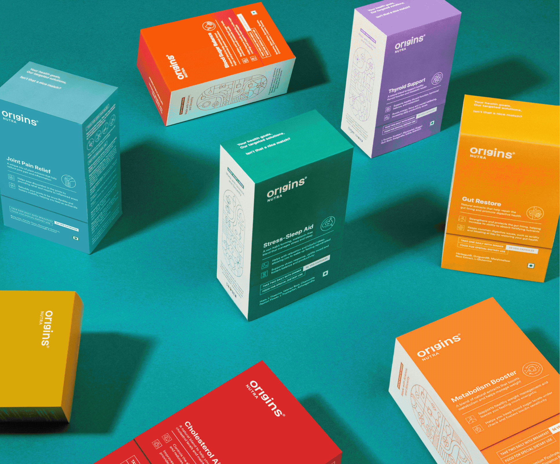
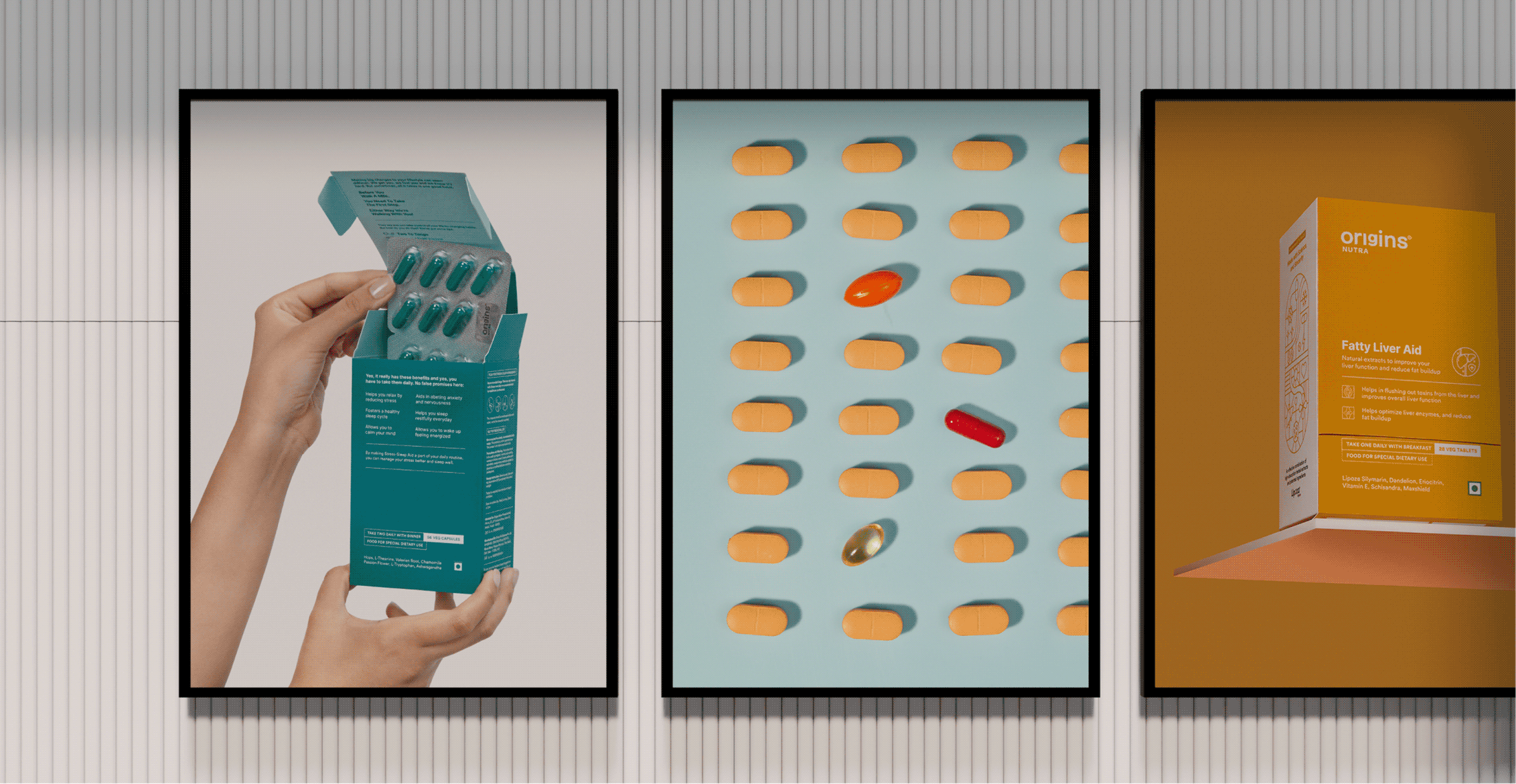
Starting is the hardest part, so we designed the box to do some of the coaching.

A new health routine is overwhelming, and most people quit before the first box is finished. So we built the coaching into the packaging instead of leaving it to the label.
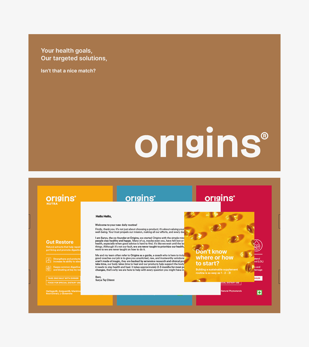
The products arrive in a brown corrugated box that opens to a founder’s note and a short brochure on how to begin. Both set expectations before the first capsule.
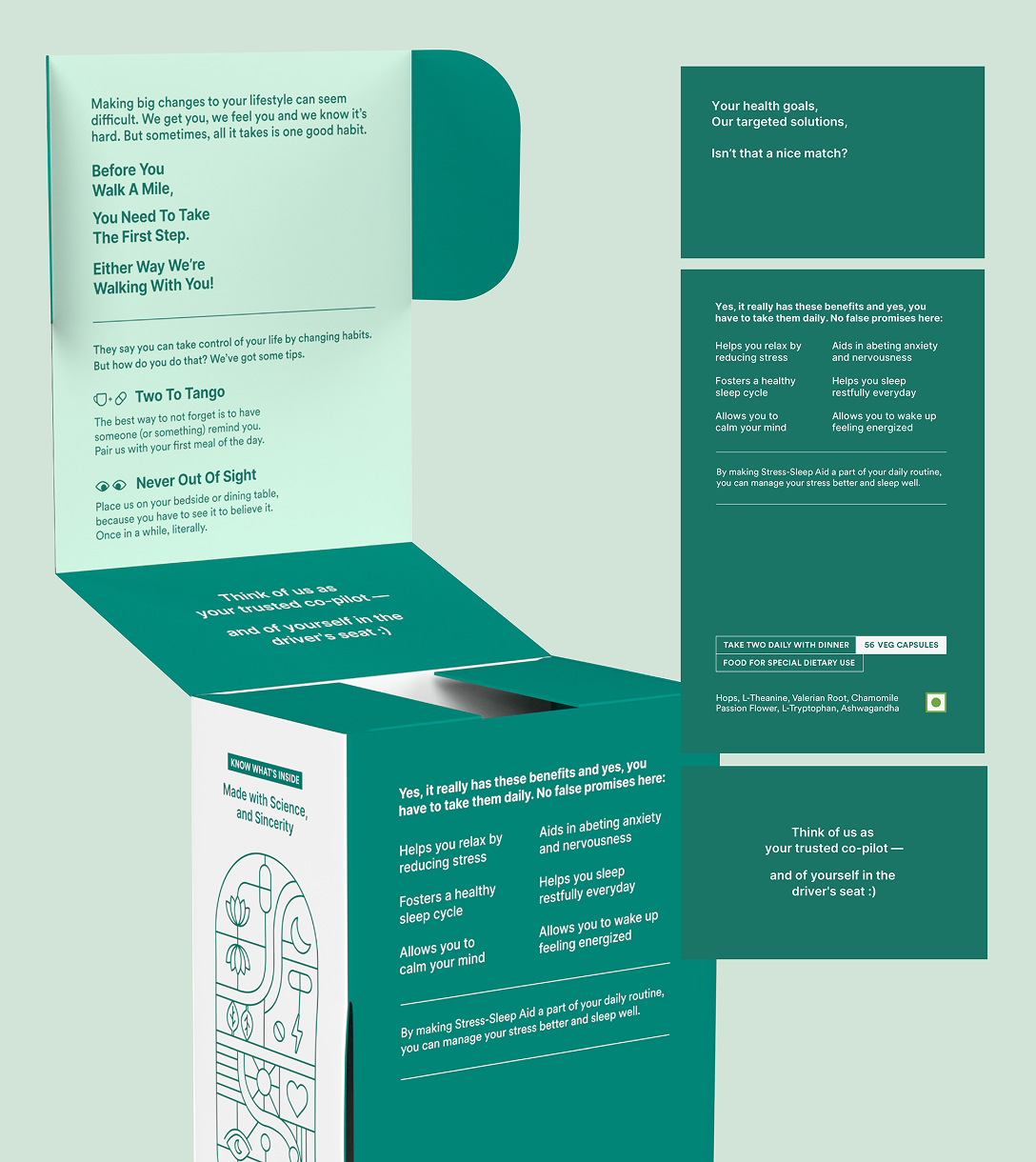
Habit formation is what makes the difference. Why consistency matters, what makes it easier, and clearly stated benefits so you know what to expect and roughly when.
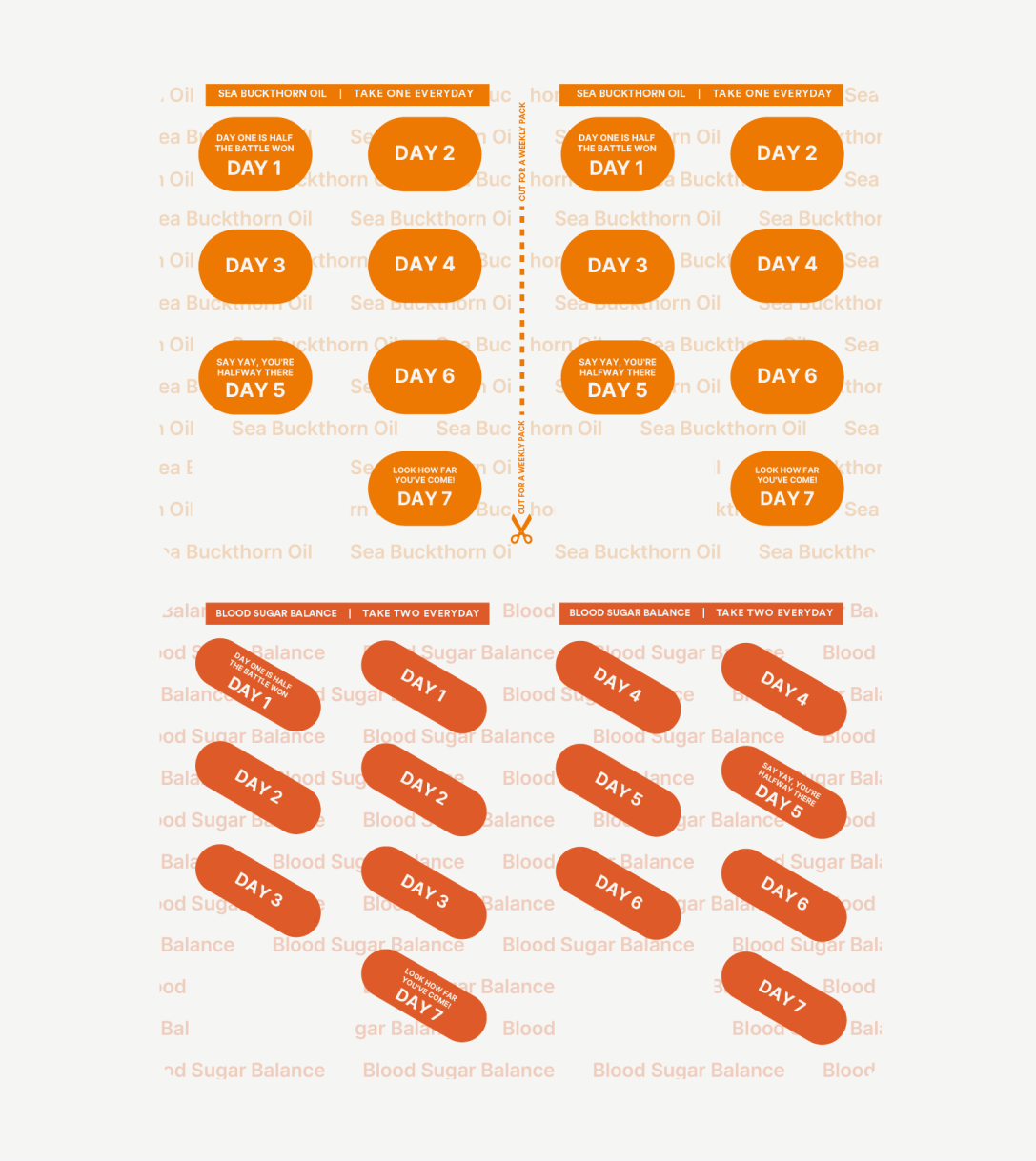
The pill strip stays with the consumer longer than anything else. So we divided it by day, giving each strip its own affirmation, colour, and name—making the right one easy to find at a glance.
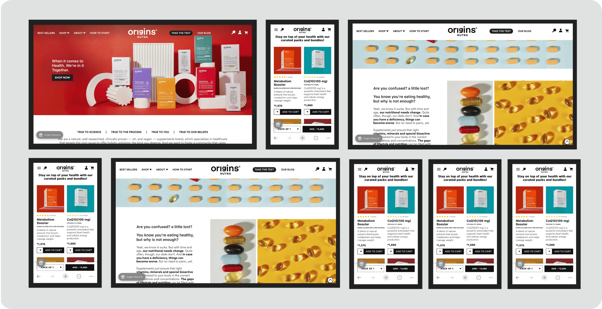
How do you build a website that delivers experience?

We designed the website just like a brick-and-mortar store.

Once you walk in the Origins store, it’s important to understand not just the product but a lot of other things

We addressed each and every question that you might have through your journey. It is crucial you understand everything before you make the right decision.
Meet Better Personal Care

Heyday, Meet Better Personal Care.

Scope Of Work: Research, Strategy, Consumer Understanding & Psychology, Visual Language, Product Packaging, Art Direction, and Web Design.

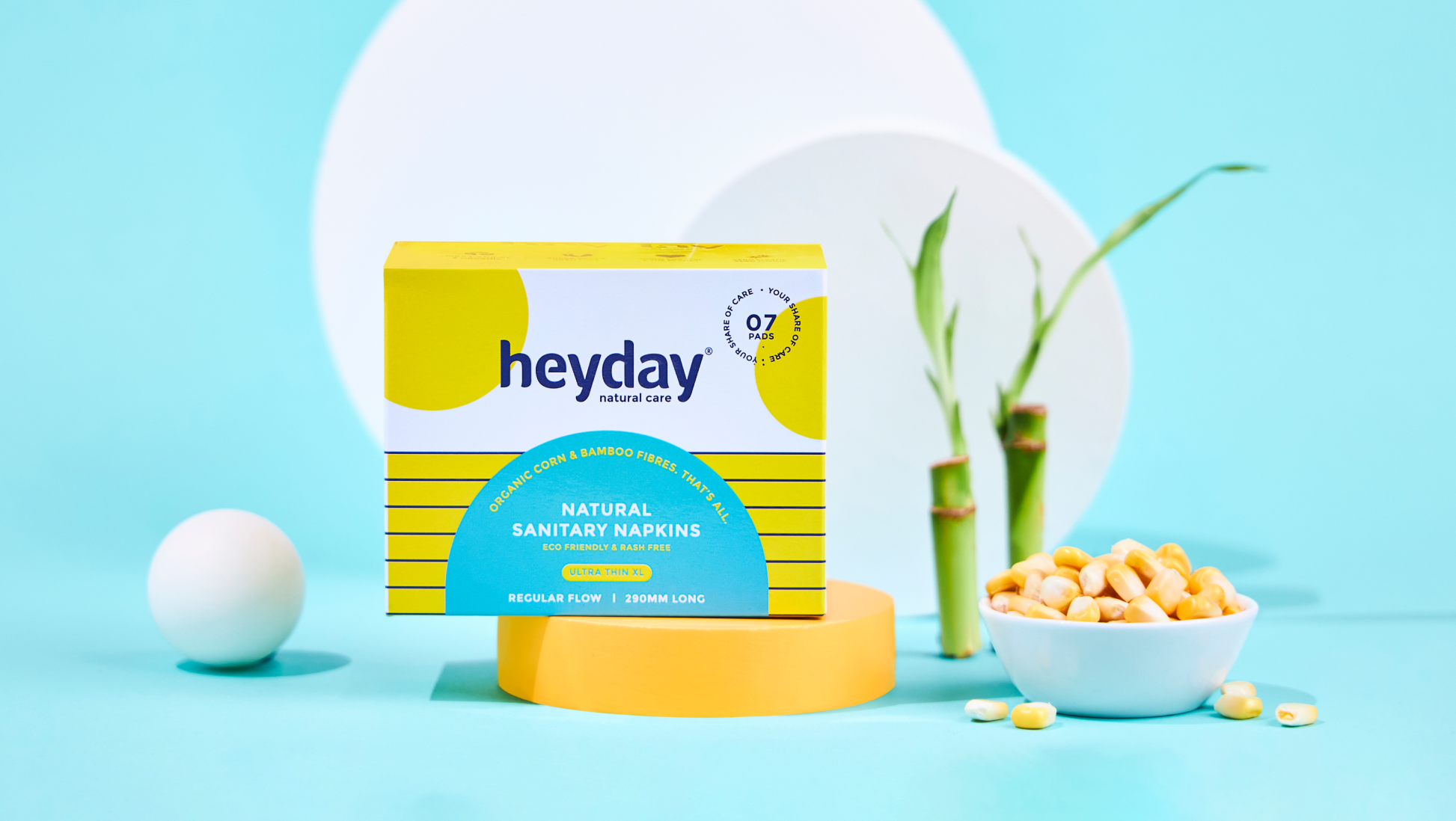
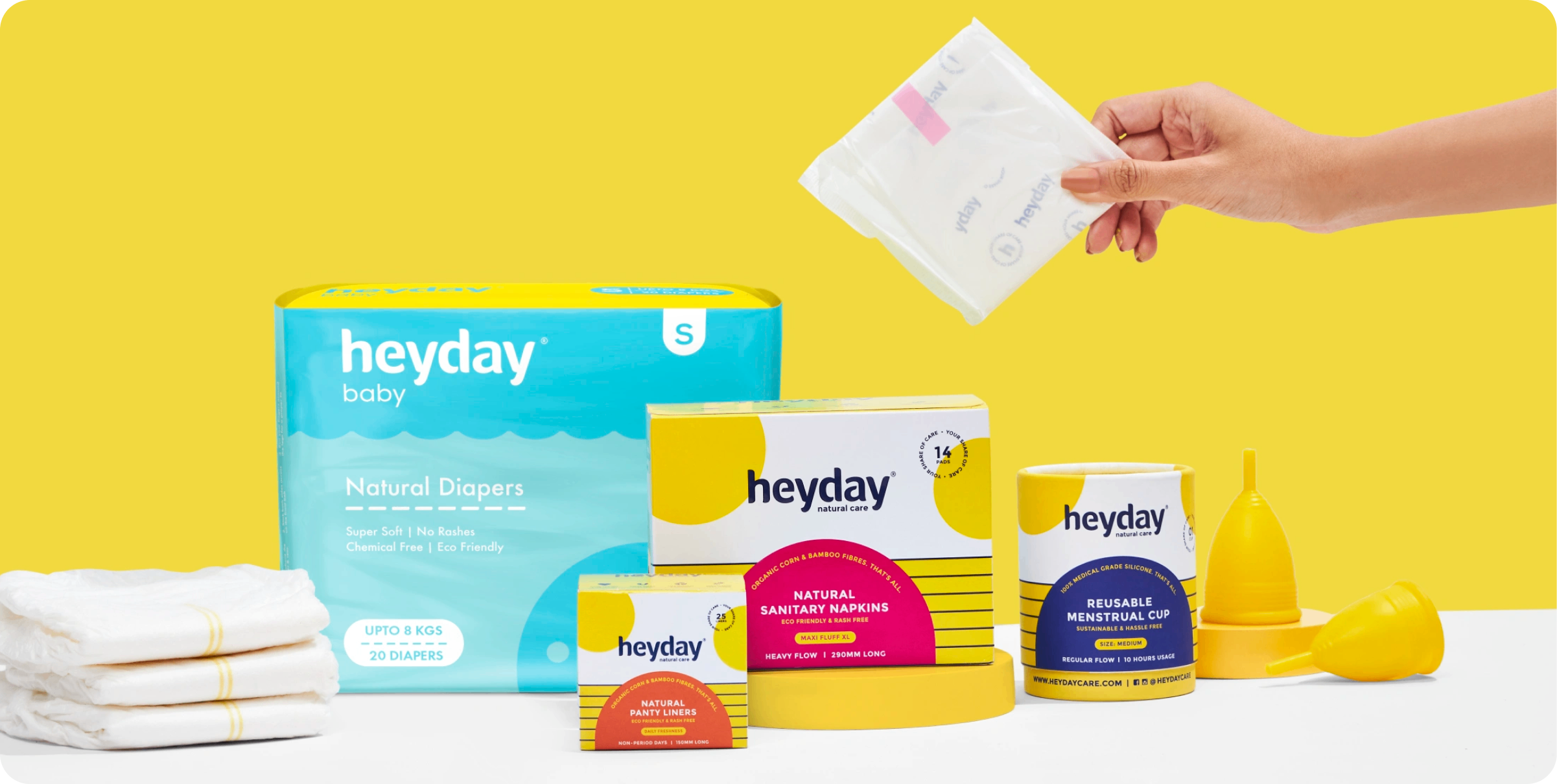
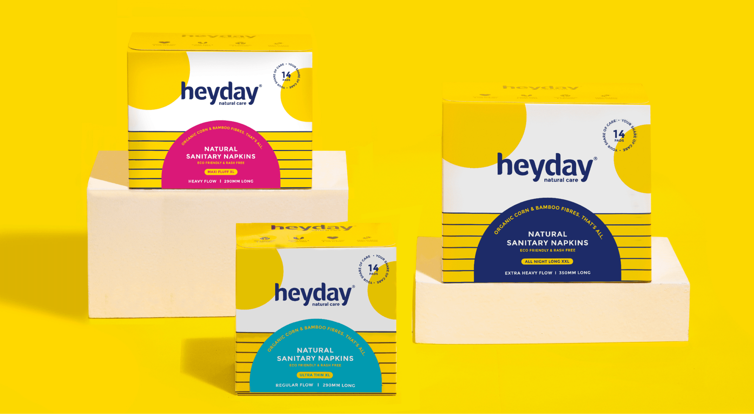
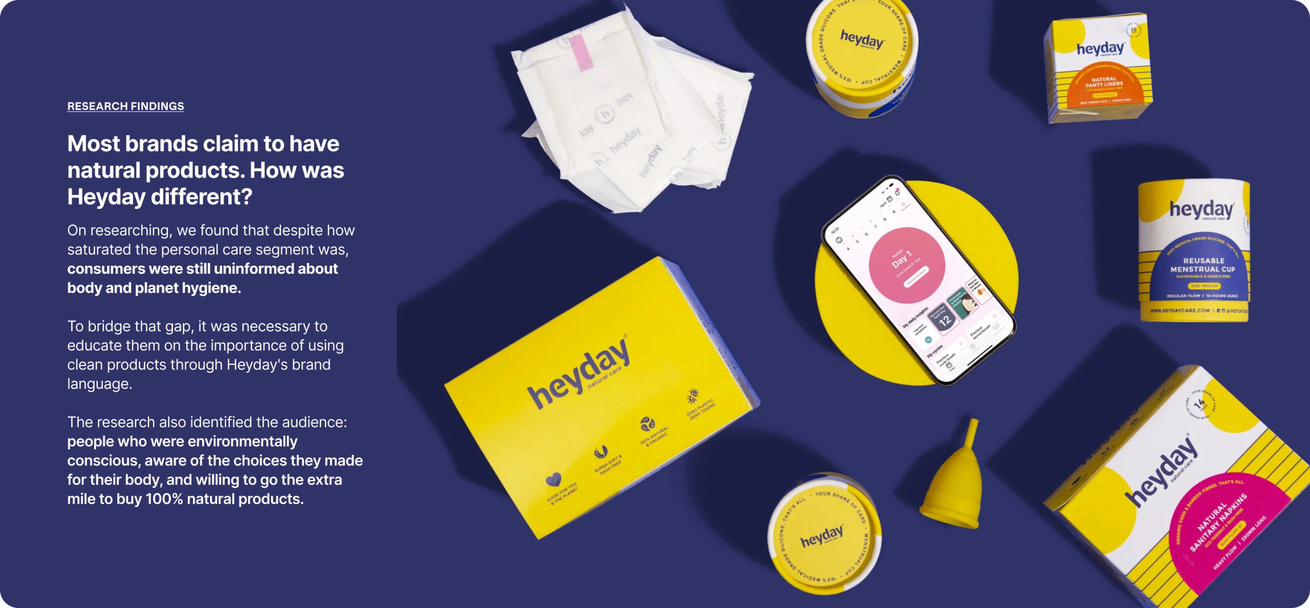
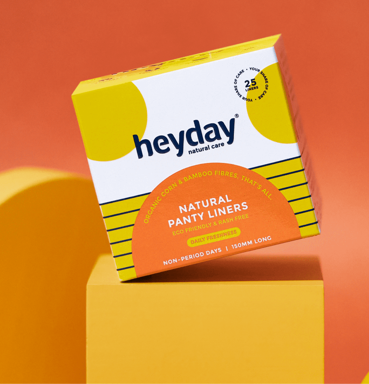
Heyday makes 100% natural and organic personal care products for women and babies. Every product is made without the harmful chemicals and plastics that are standard in the category.

Founded by Deepanjali Kanoria, the brand is built on one belief: the things we use every day should look after the two homes we all live in, our bodies and our planet.

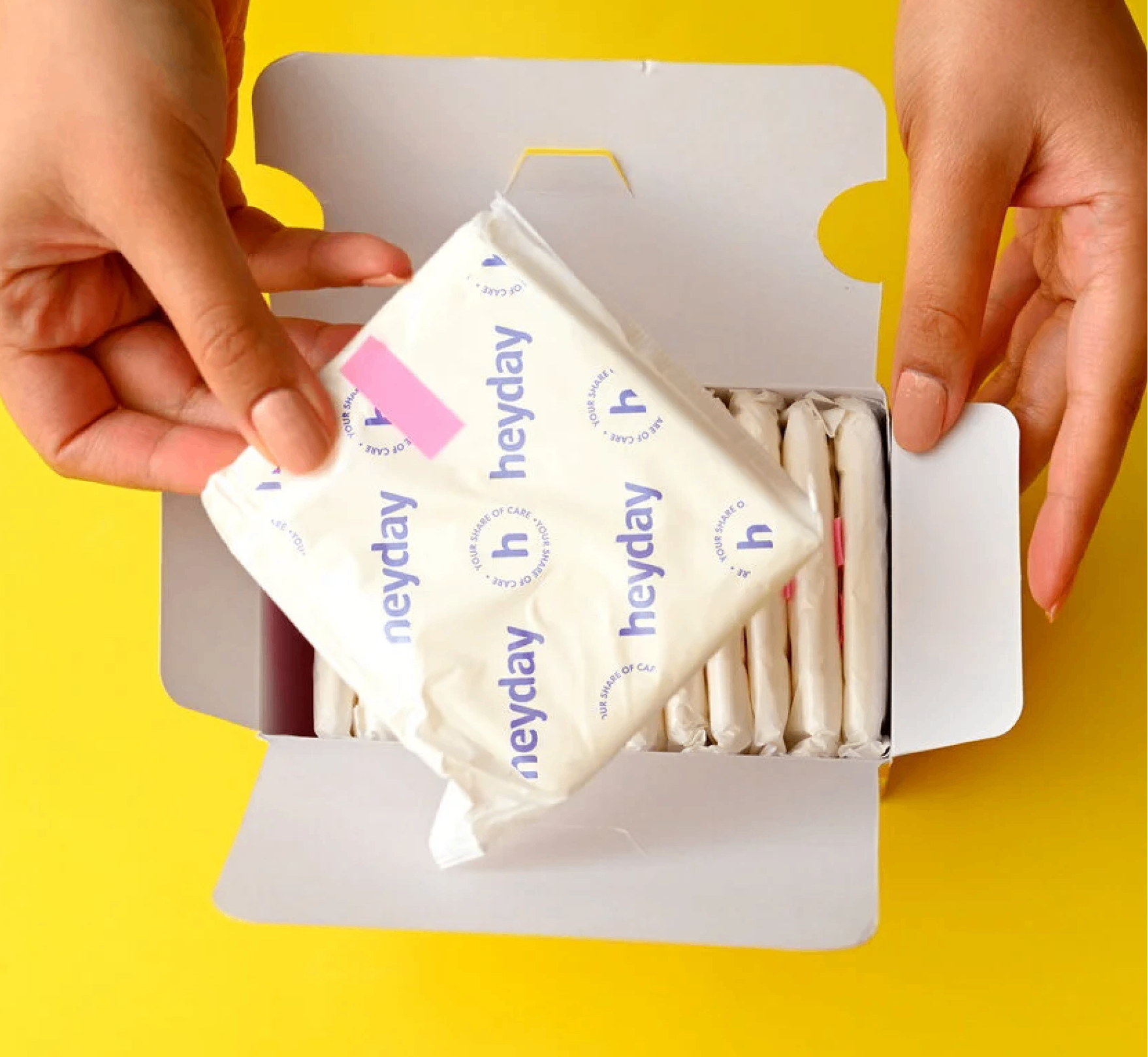
Heyday came to us with something rare and something common. The rare part was a brand people already trusted. The common part was packaging and language that weren’t telling anyone why.

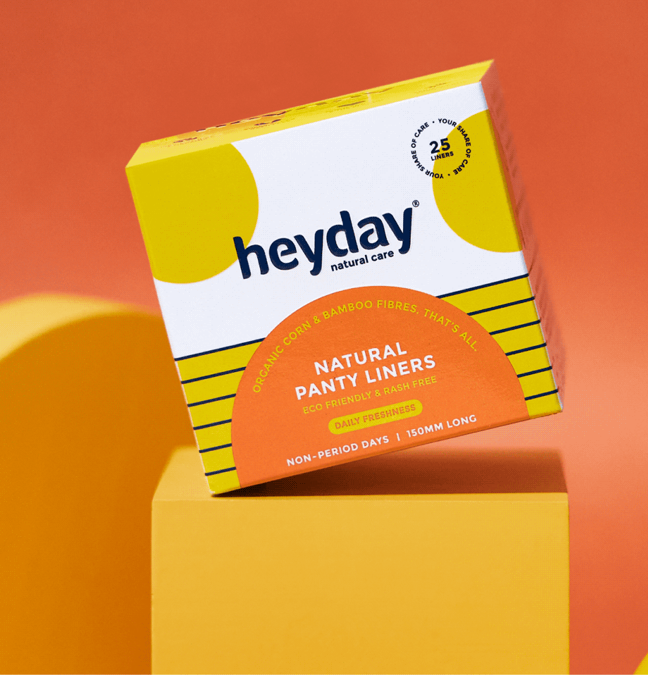
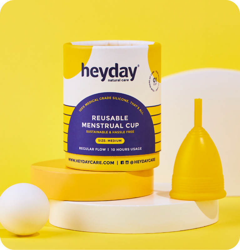
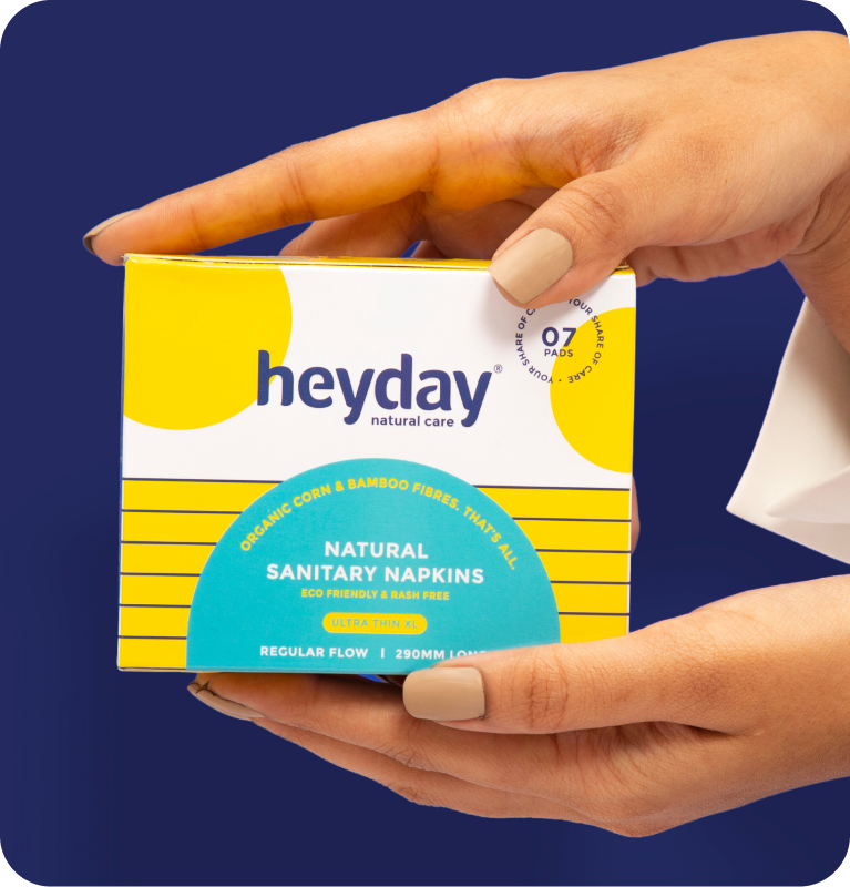
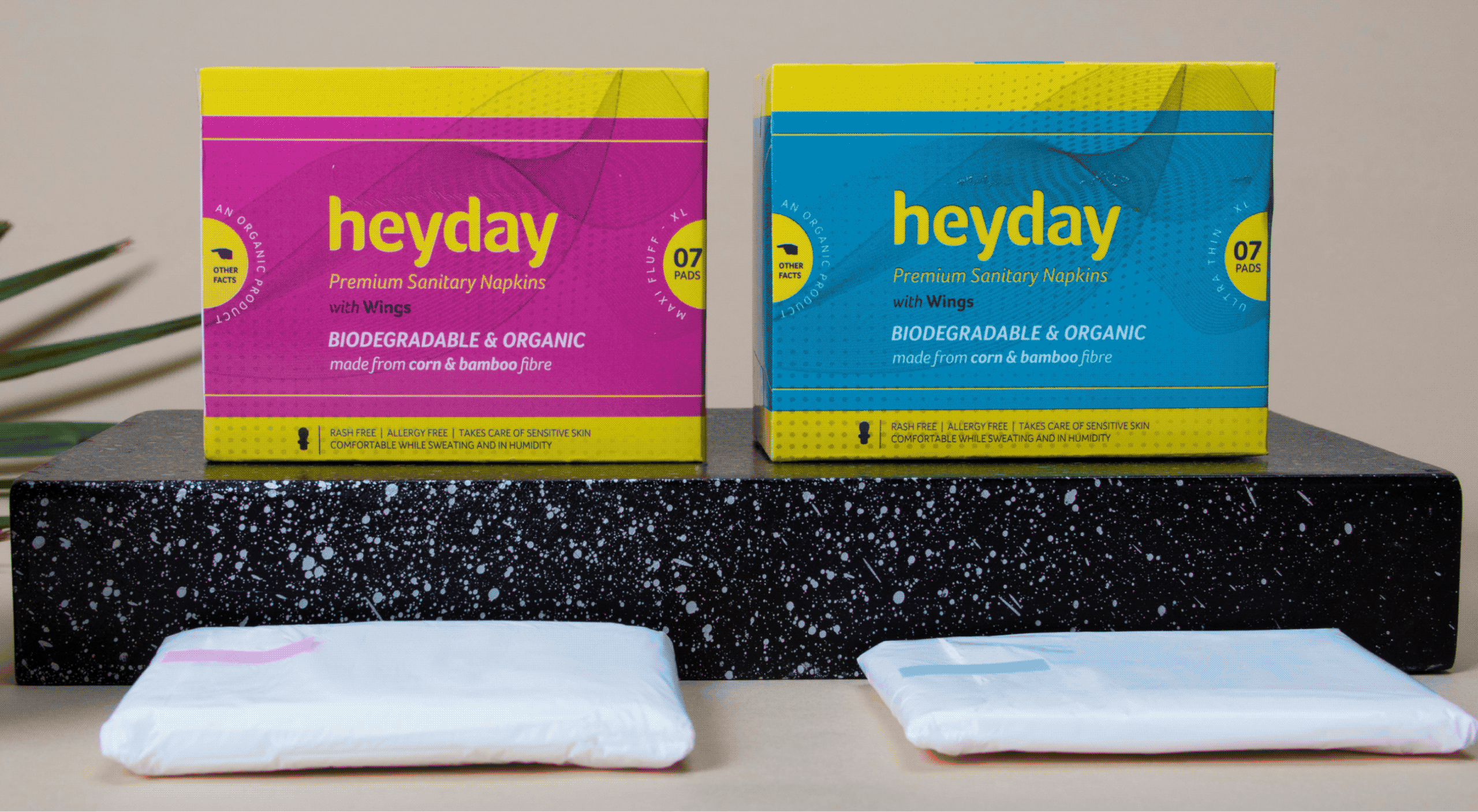
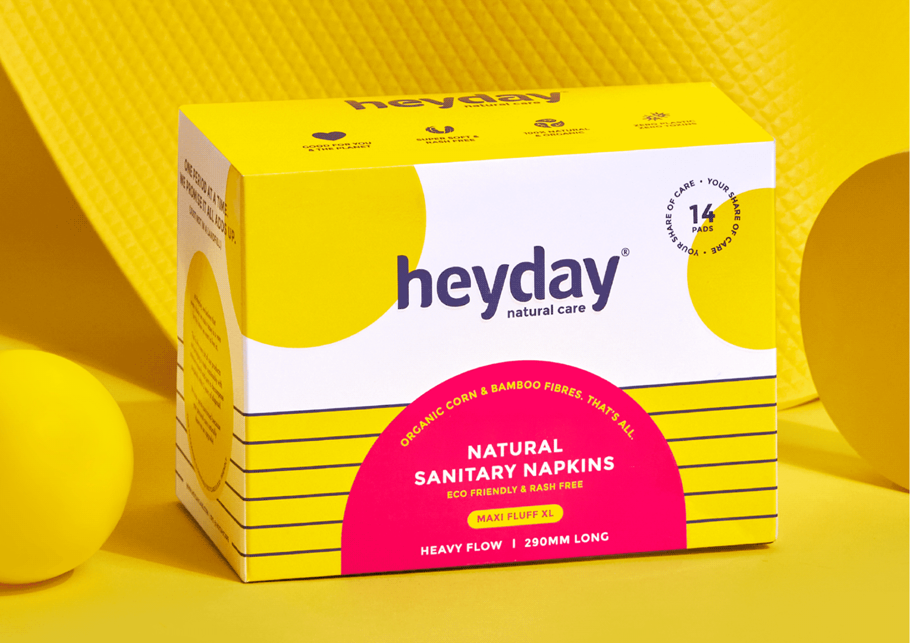
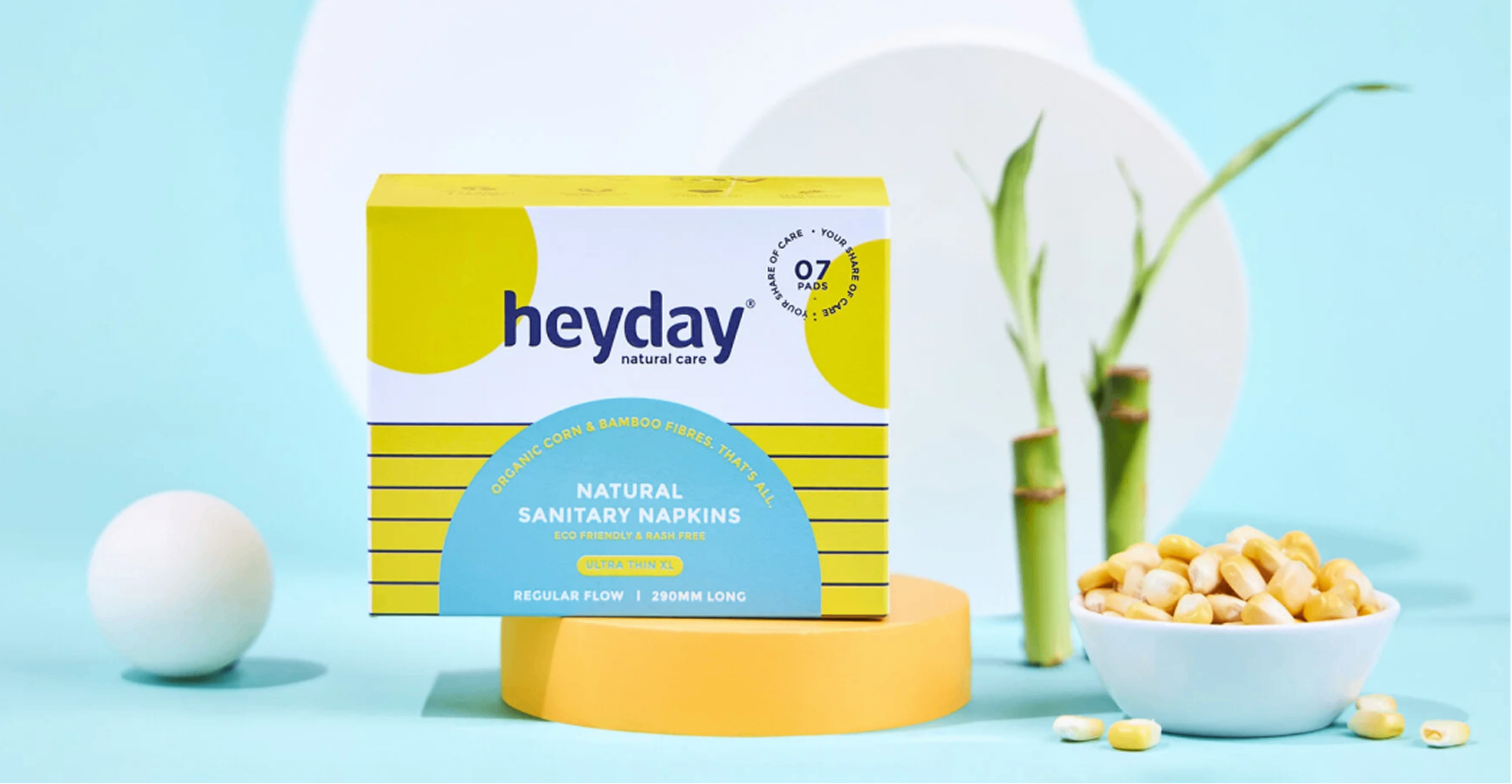
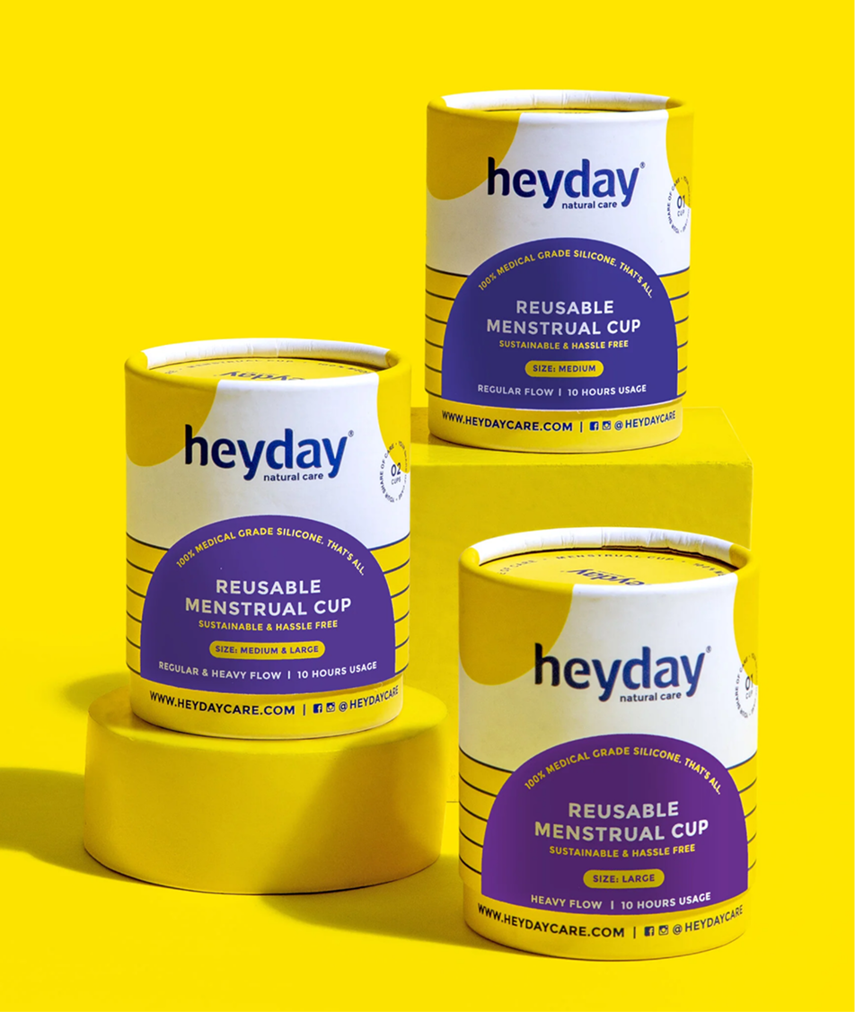
The result was a fresh brand language, identity, and repackage the full range, so that consumers could see the difference before we had to explain it.

THE WHY

How can we show consumers what is
good for them? Without sounding preachy?

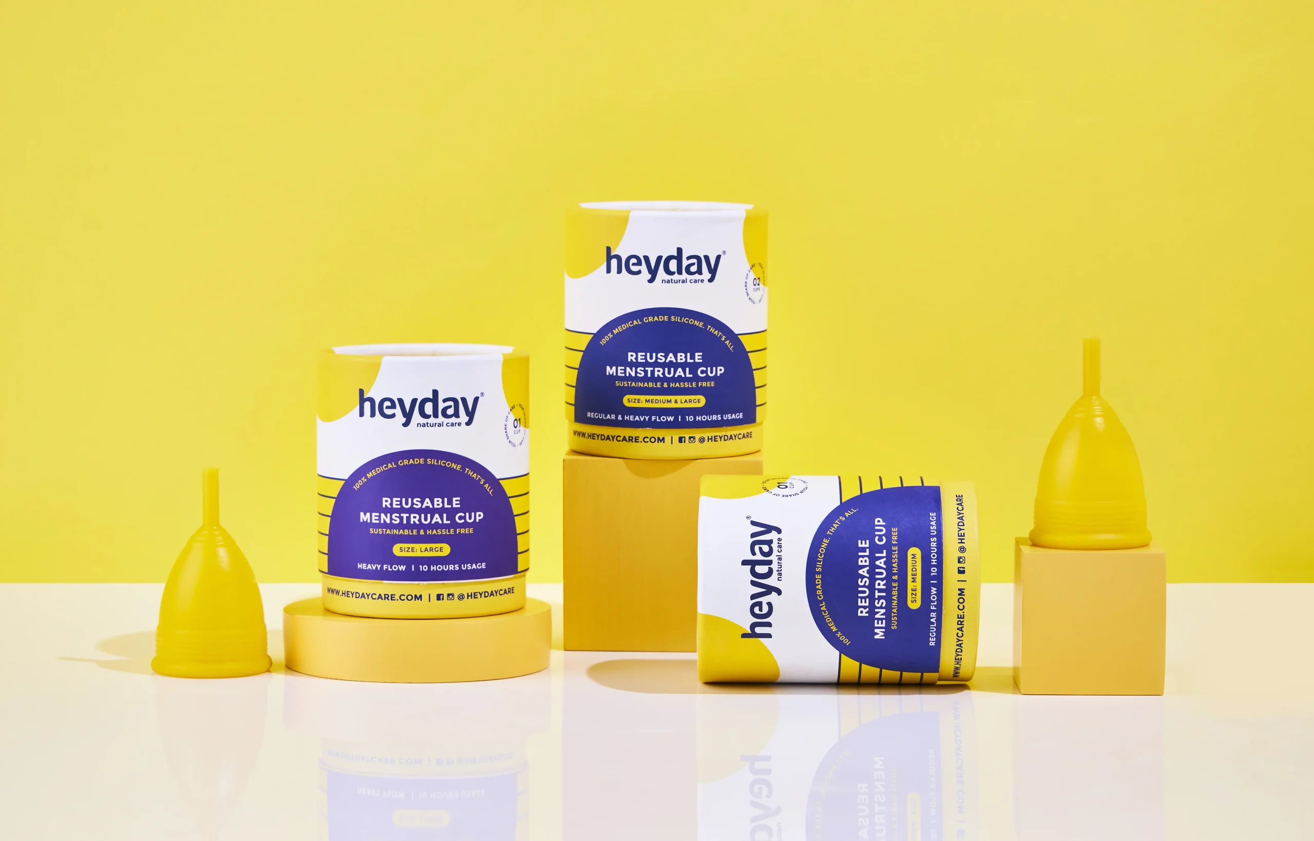
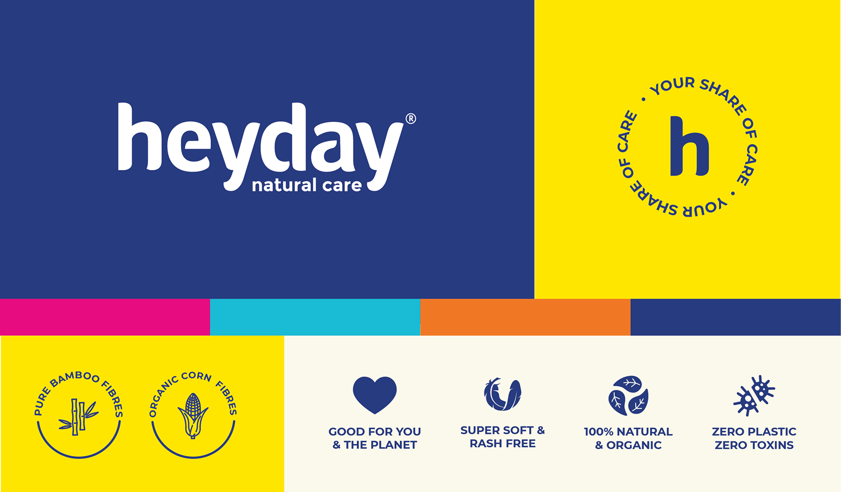
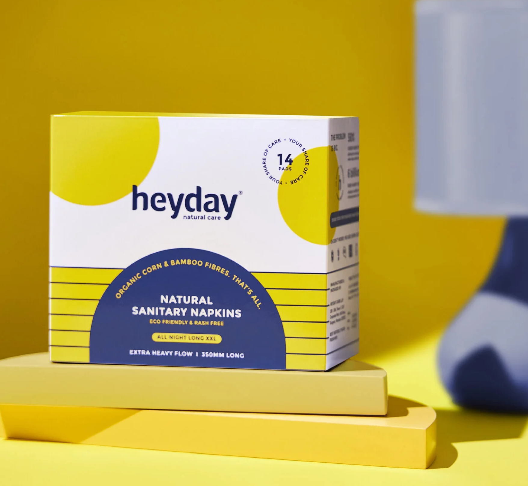
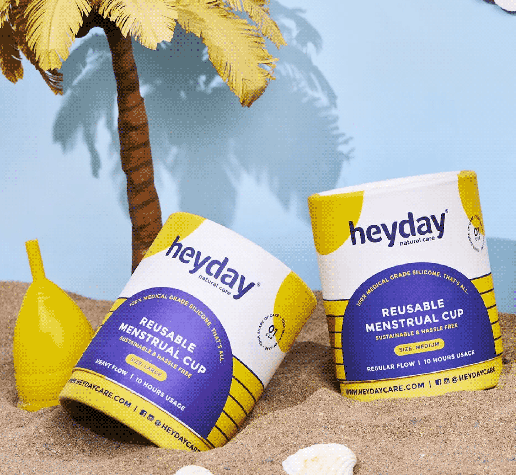
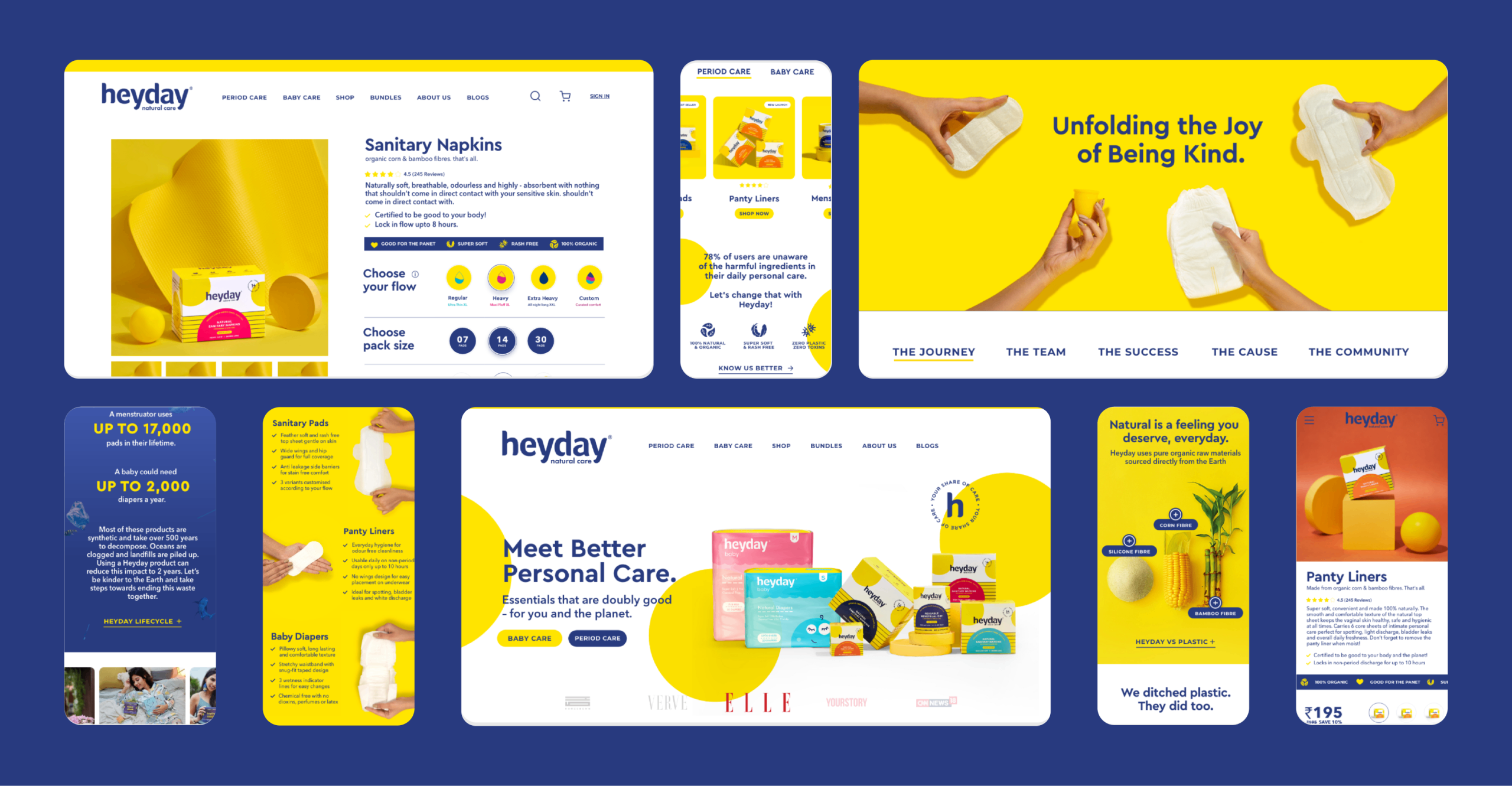
We refreshed their old identity and built a brand extension with a vibrant and fun colour palette and new brand icons, so consumers could celebrate womanhood and menstruation.
All of it sits under one purpose statement: Your Share of Care. Every woman deserves easy and safe access to period care.

INFORMATION LAYOUT

How can a brand be fun, informative, and most importantly, stand out?

We had to be mindful of the brand’s familiarity and yet infuse a new personality to make it more relevant.

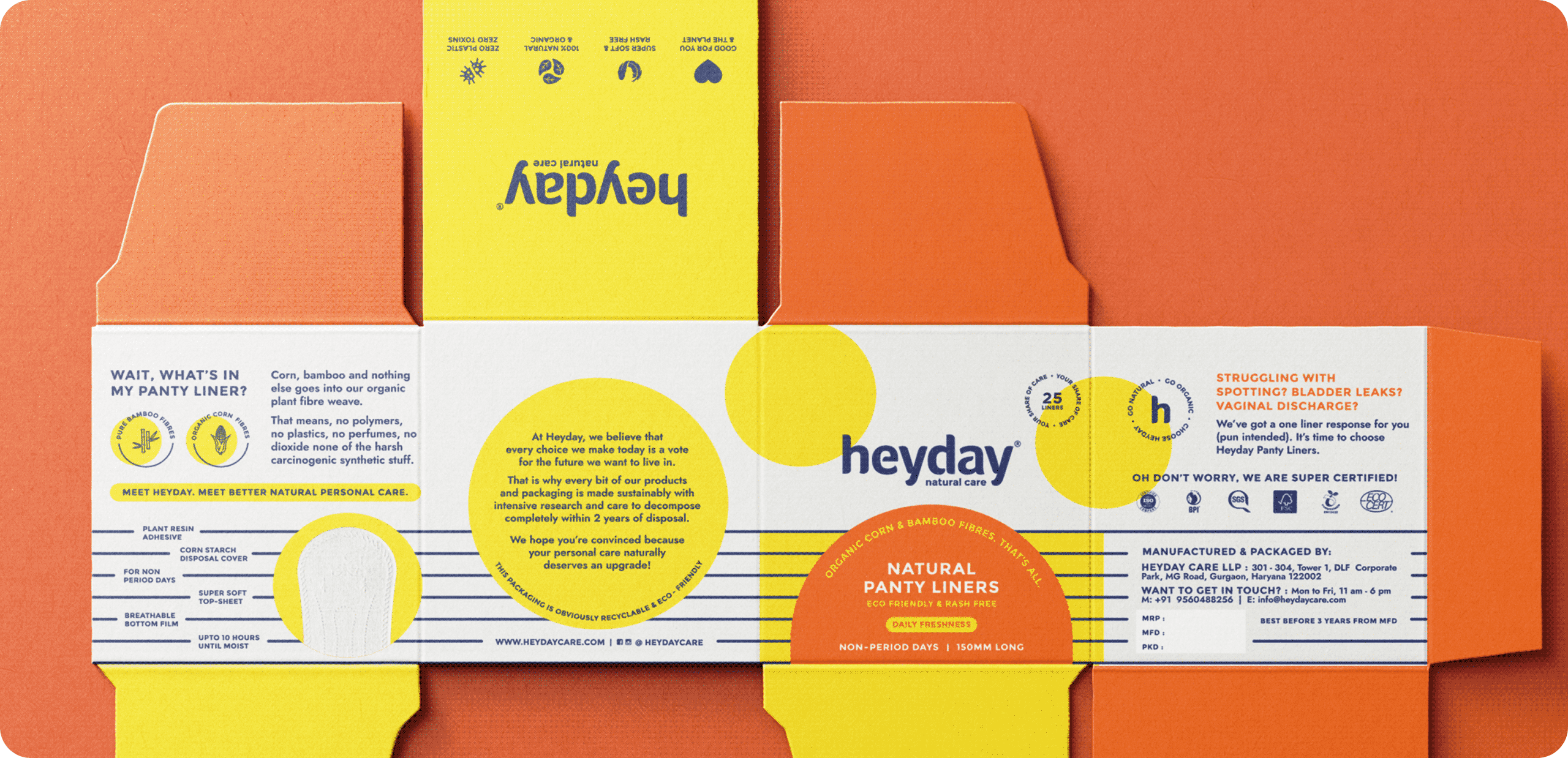
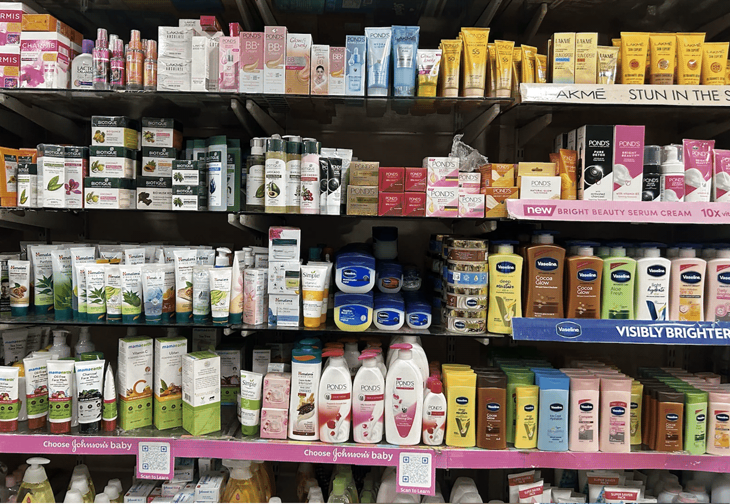
The market is filled with brands that use bright colourful packaging. So we switched, we used a lot of white to make sure the pack stands out from the crowd yet owns a colour.

We made sure the information was balanced with the brand elements consistently to keep brand remembrance.

How far does the promise have to go?

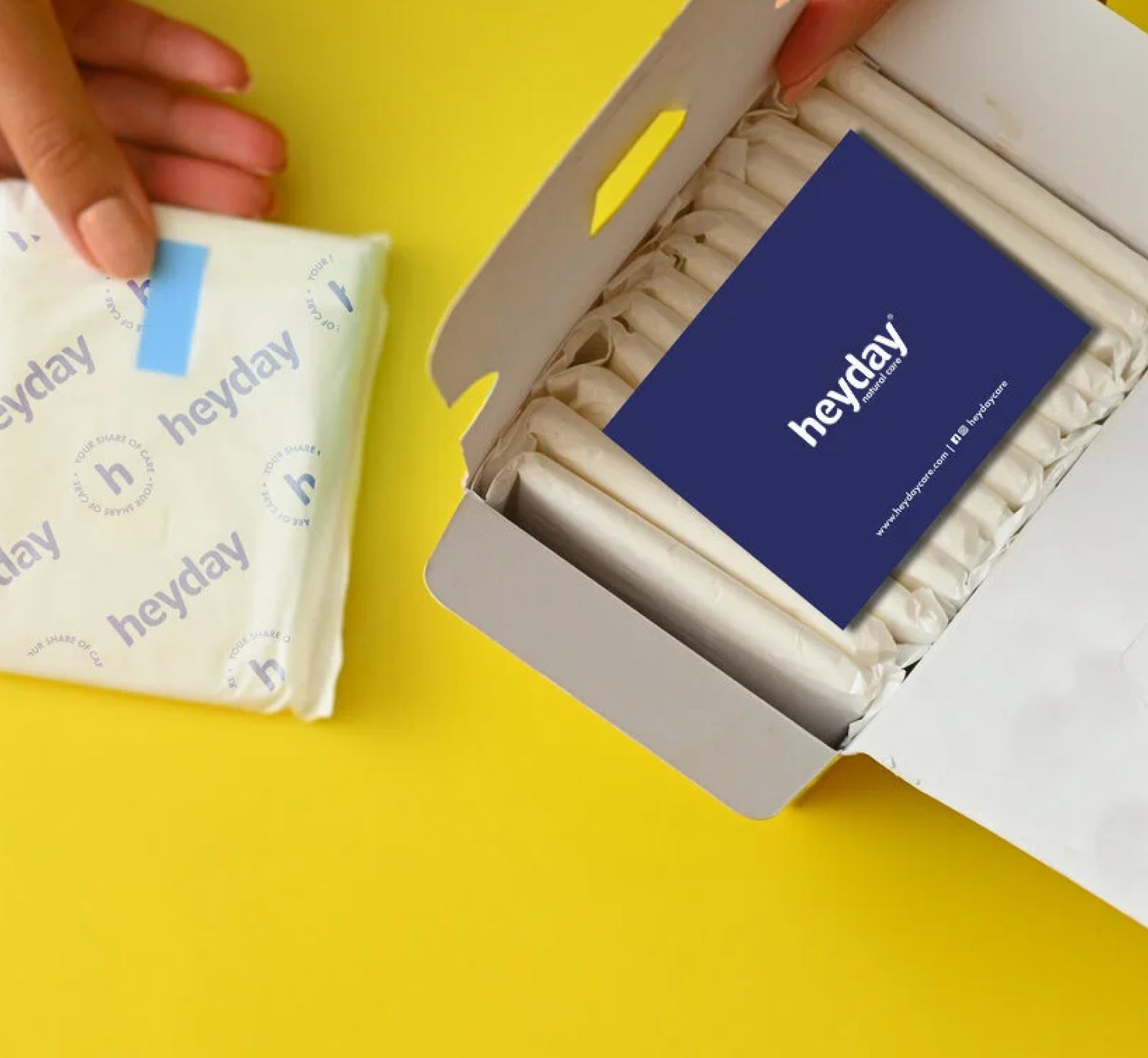
Heyday is truly an eco-friendly product, so instead of sending out the products in polythene bags, we sent them out in paper mono cartons.

We wanted the detail to run all the way through, our brand elements were carried onto the release paper, and a small thank you card was slipped into every order, reminding customers that they had saved themselves from harmful chemicals and plastics, and the environment along with them.

THE EXPERIENCE

How do you translate the same feeling online?

We built on the same palette, the same elements and the same voice. One brand, whether you meet it on a shelf, inside a carton, or on a screen.
Making Traditional Ingredients Relevant

What happened to the beauty rituals we grew up with?

Scope Of Work: Market Research, Brand Strategy, Consumer Psychology, and Product Packaging.
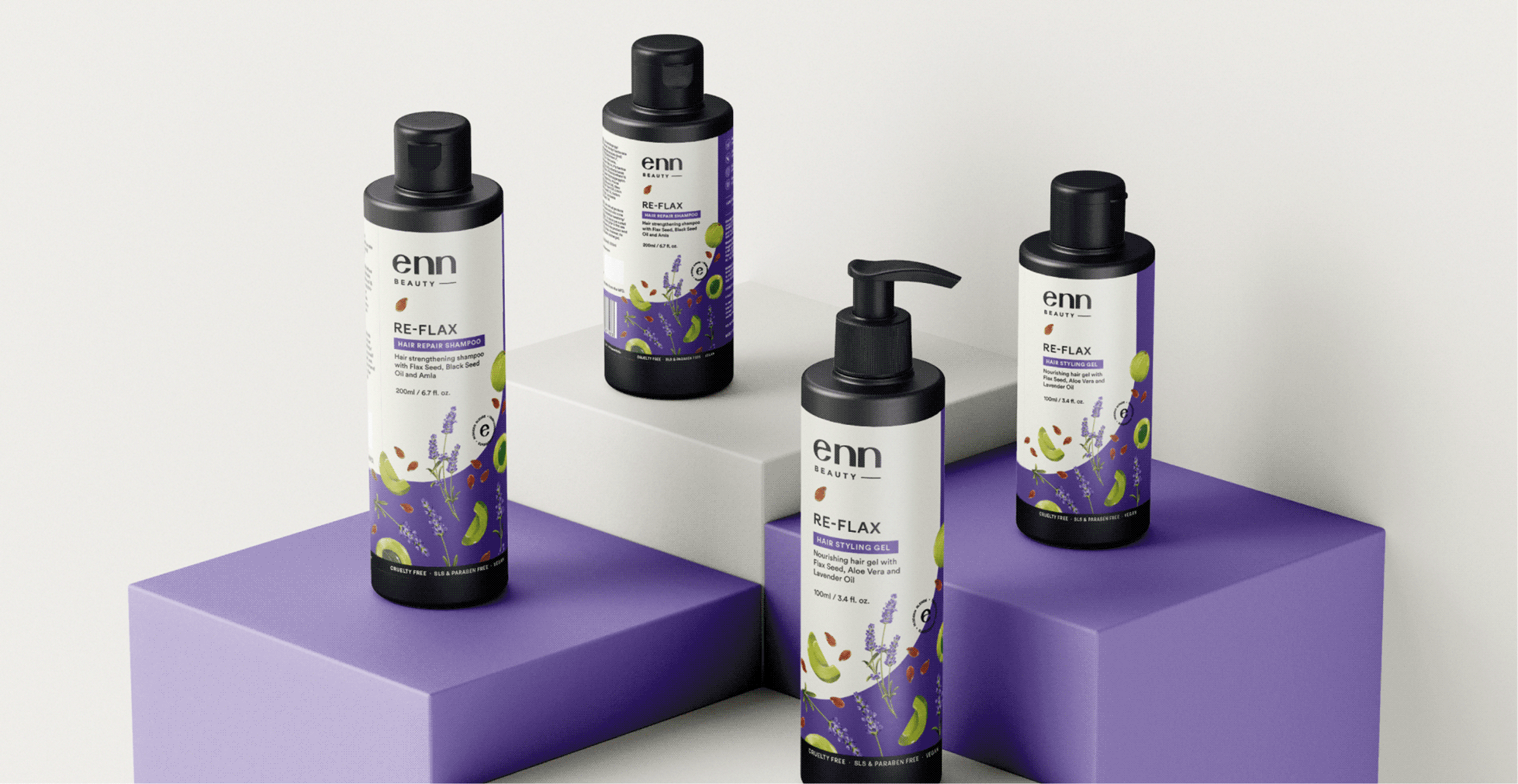
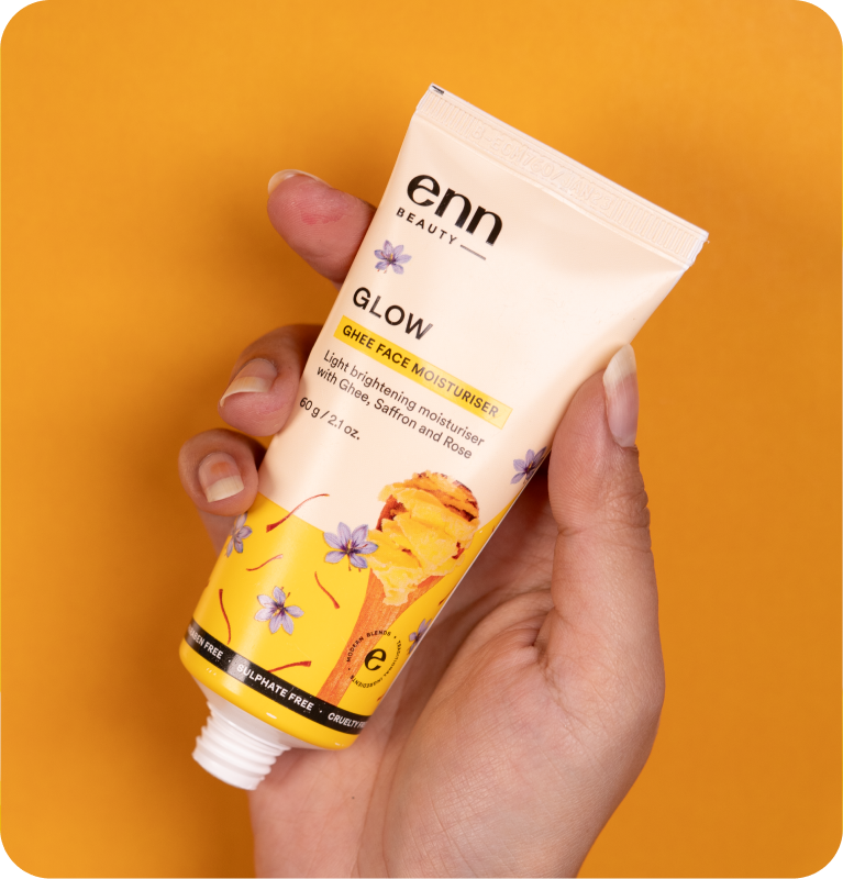
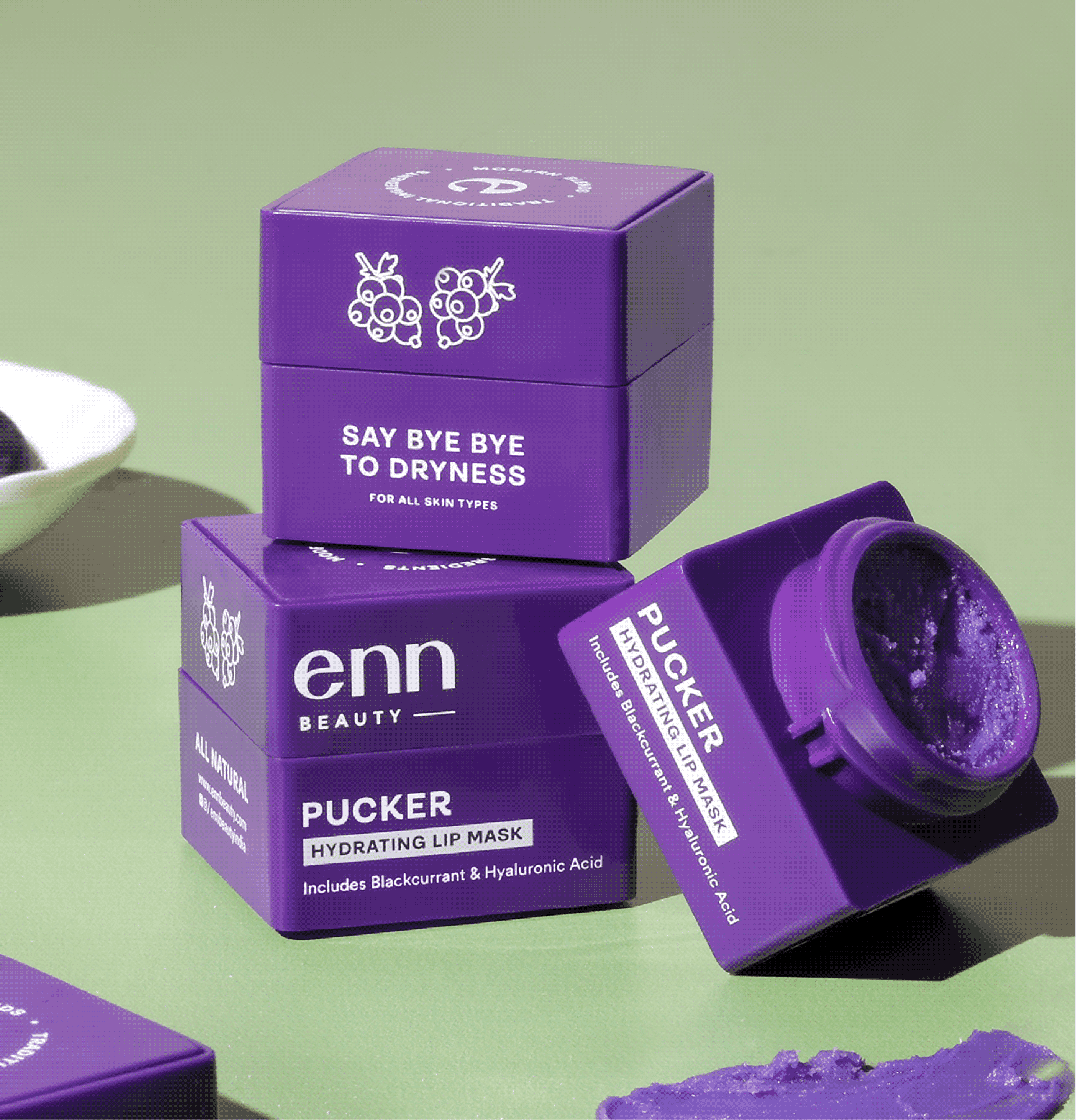
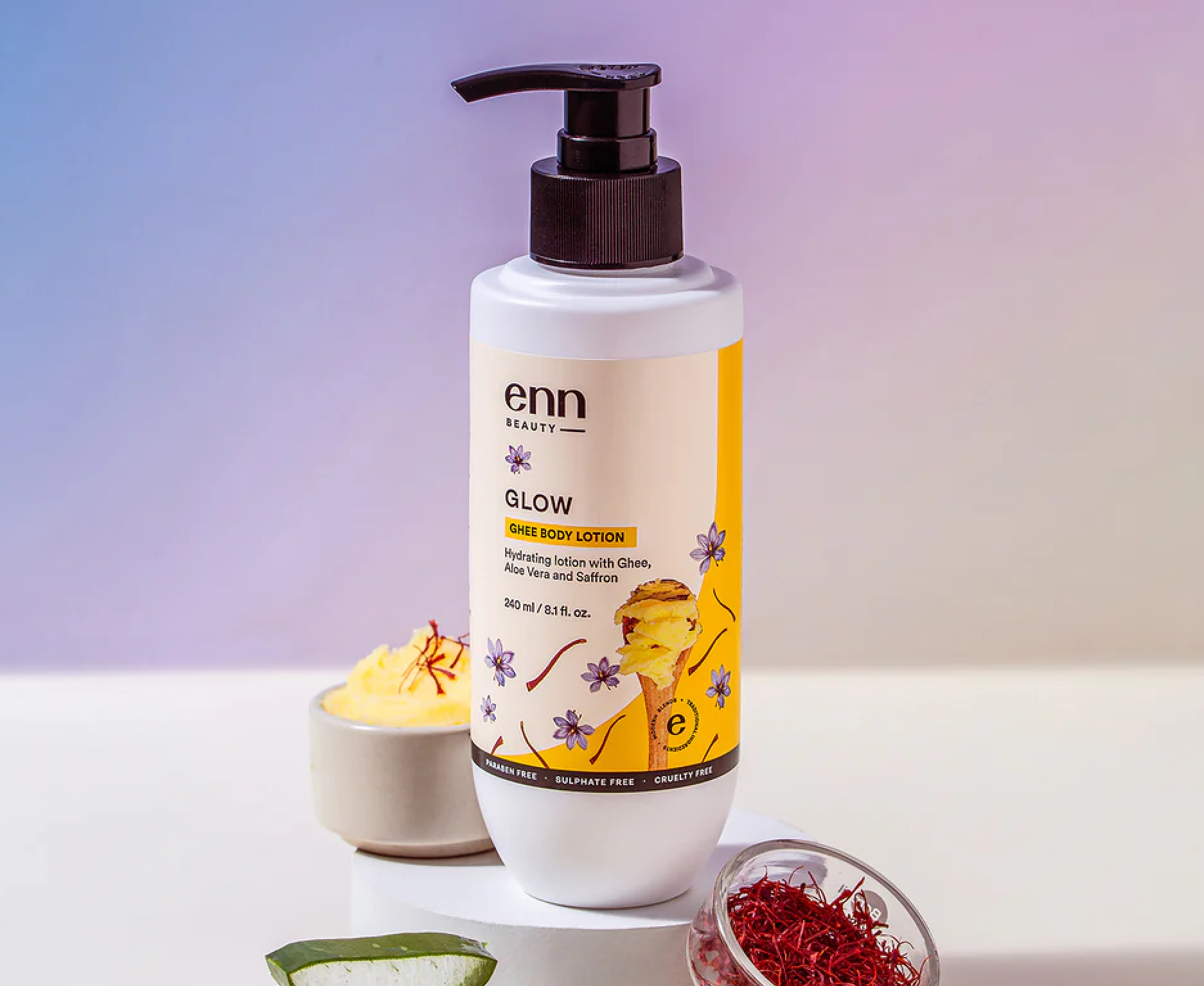
Growing up in India, we cherished practices like applying applying ghee, ubtan, haldi and amla all handed down by our grandparents. But why have these traditions faded today? In today’s time, we are spoiled for choice with an abundance of ingredients, and frankly, who has the time?

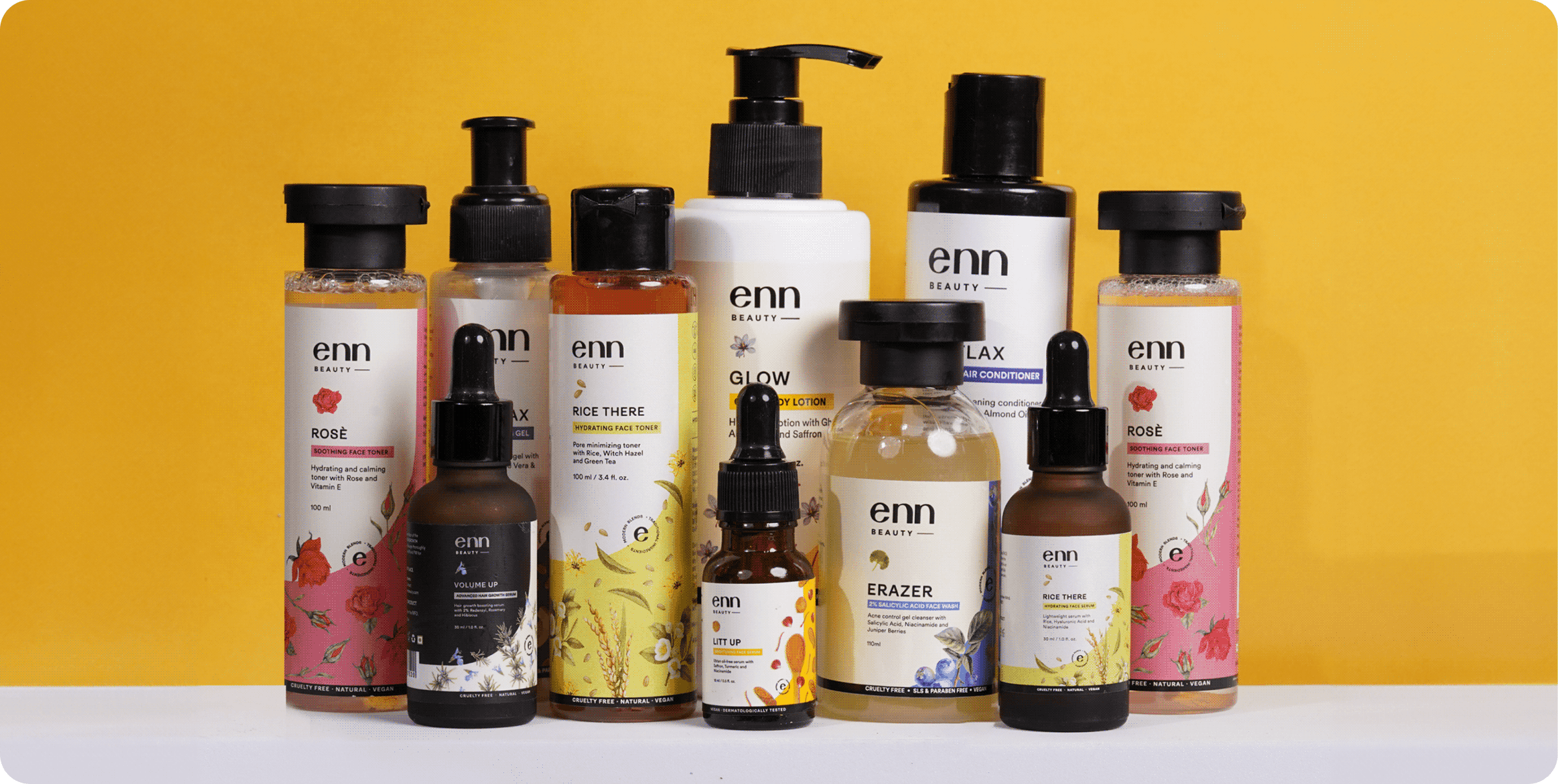
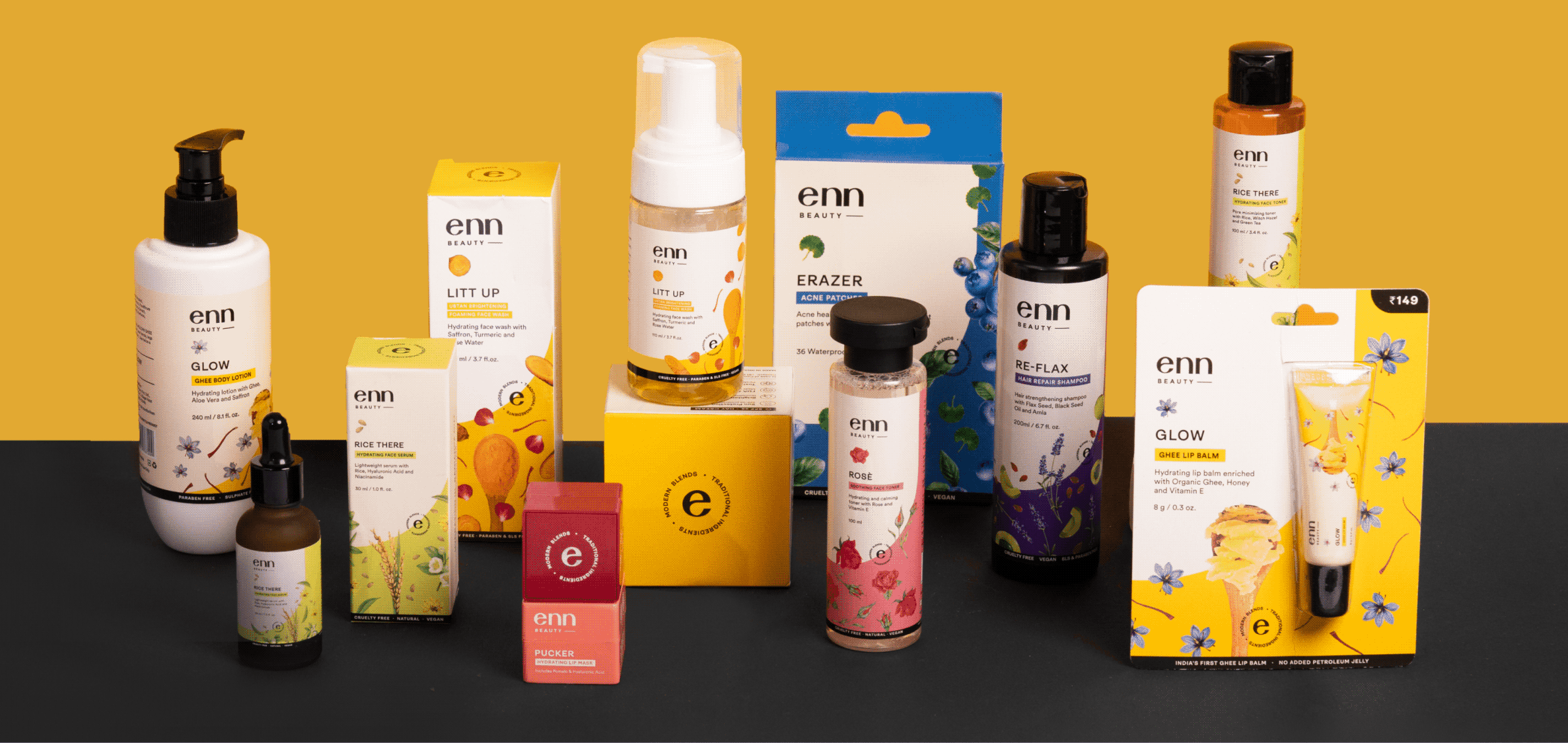
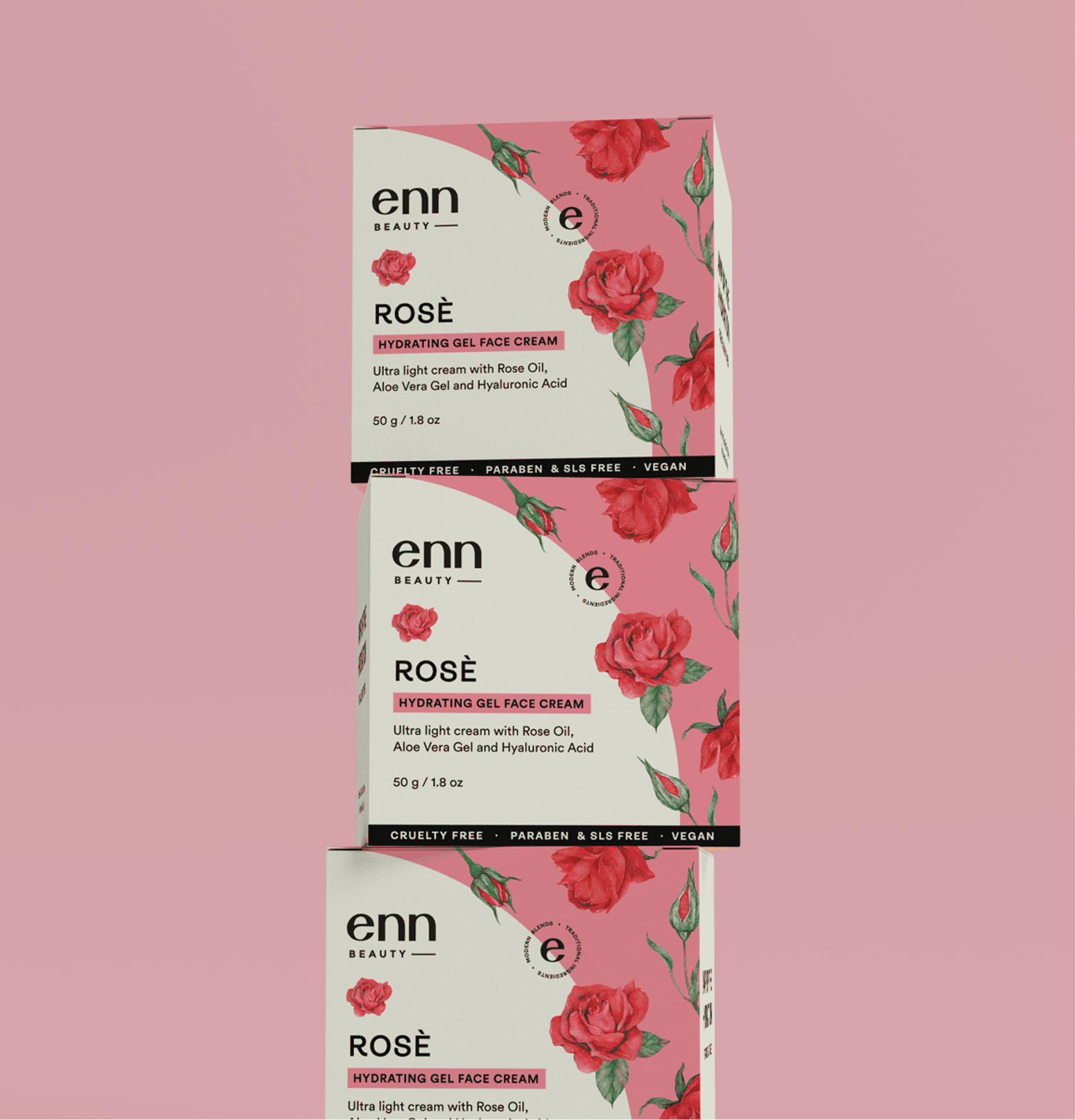
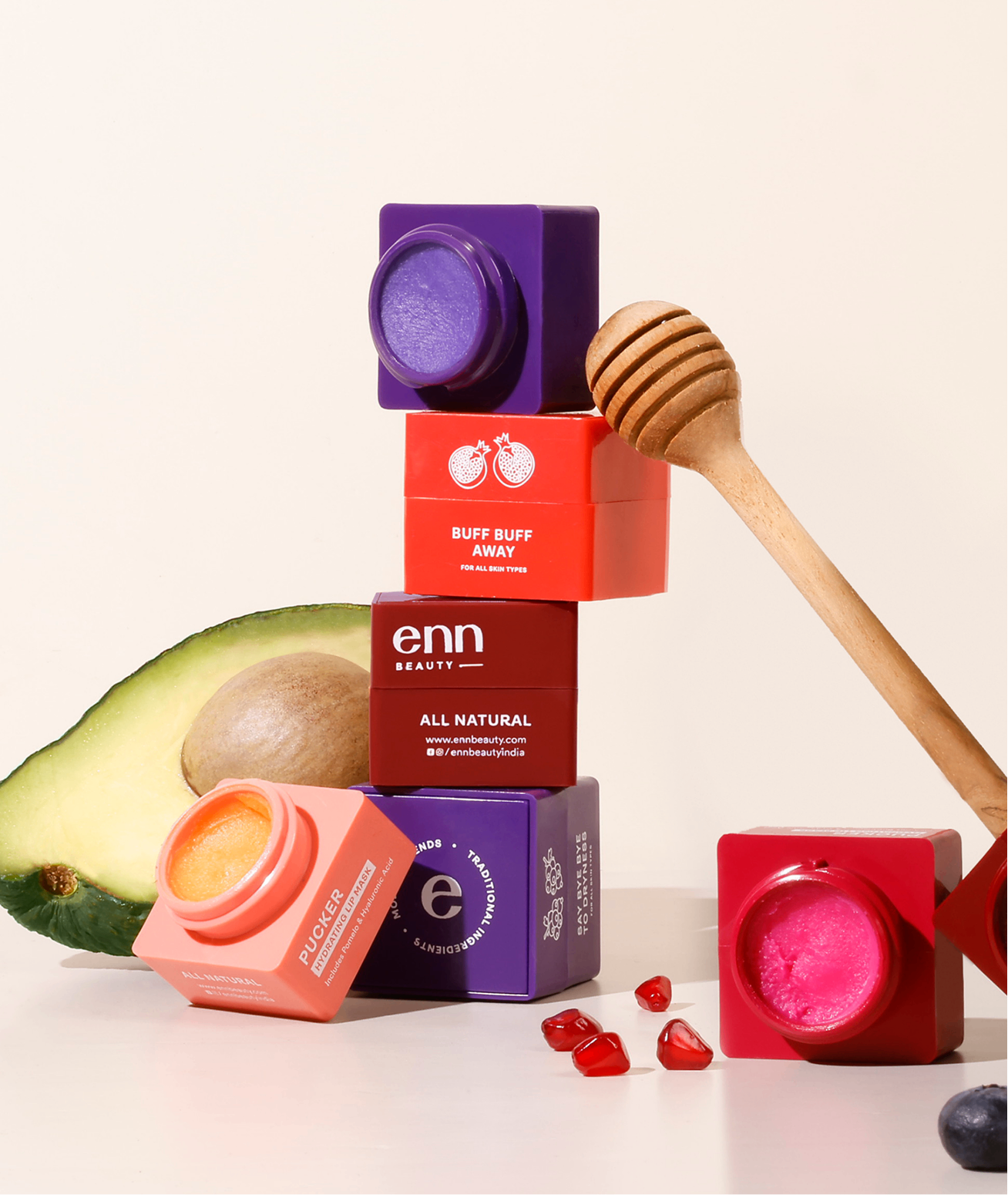
So when Nandeeta, founder of ENN, came to us to rebrand ENN as an Ingredient led brand that celebrated traditional formulas with a modern twist, we were excited to say the least. The vision was to make Enn Beauty a fun, approachable and an affordable skincare brand.

Is it possible to recognise a product without the name?

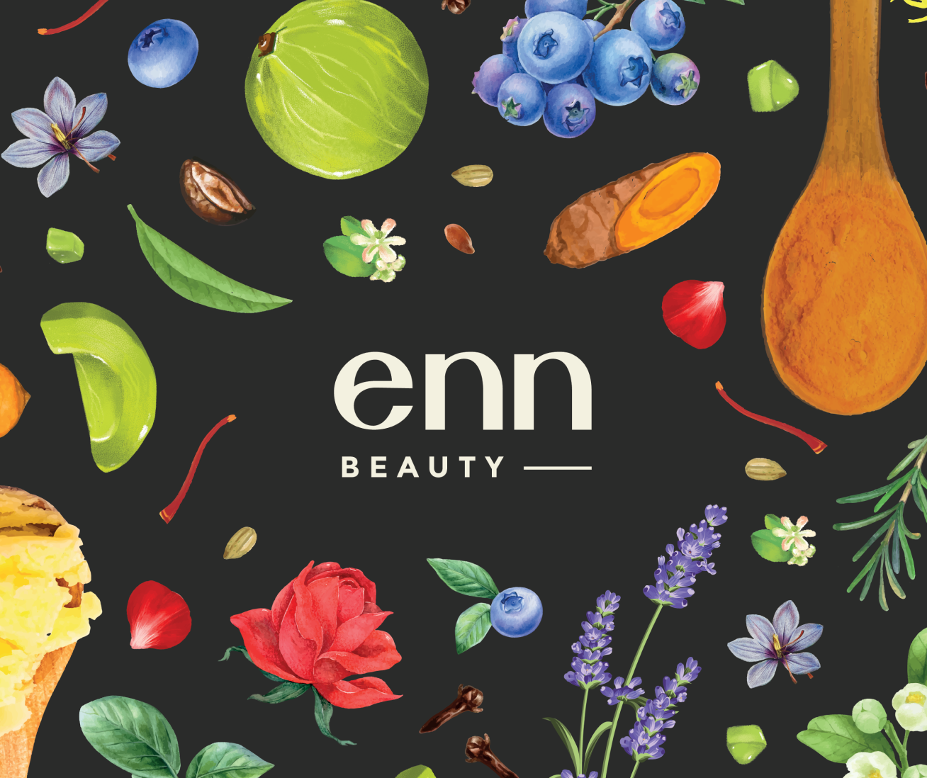
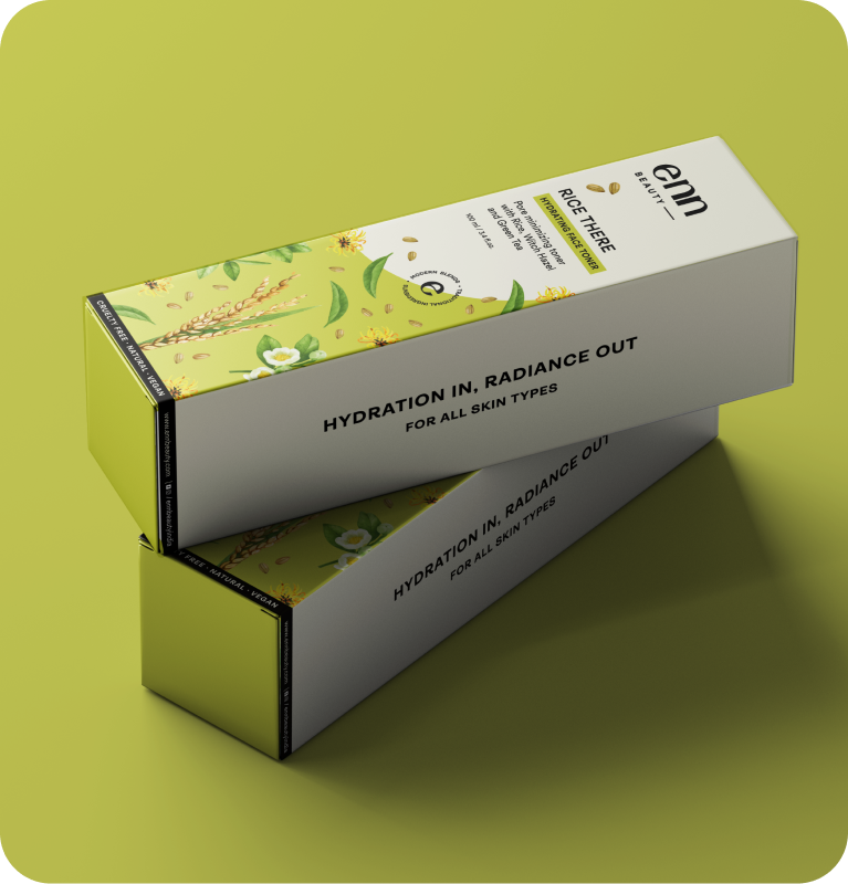
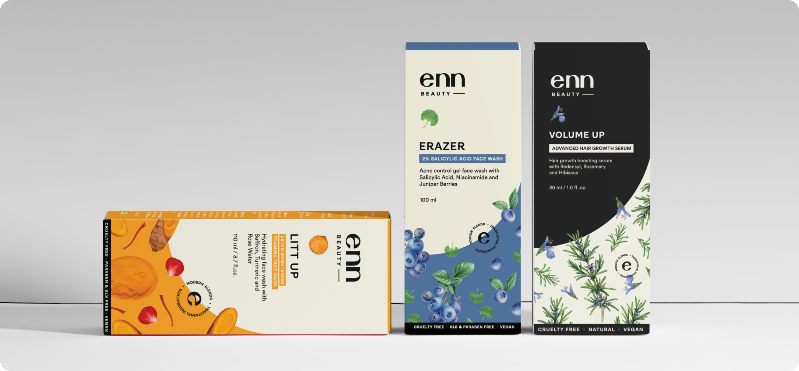

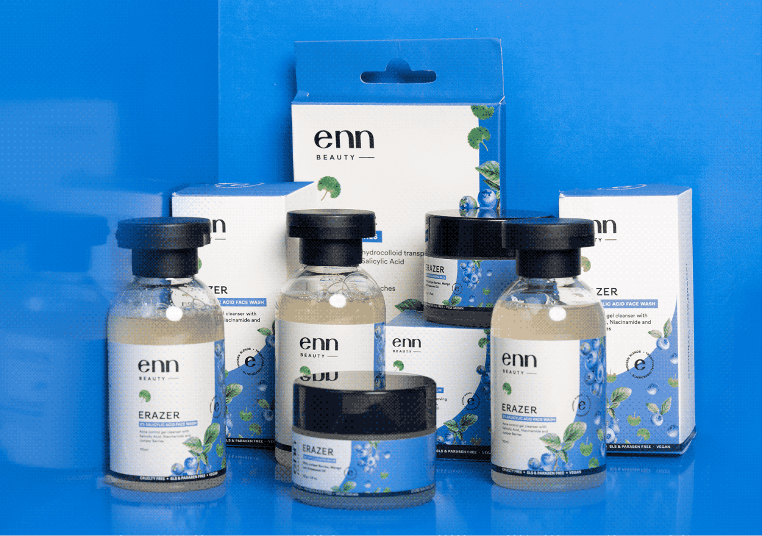
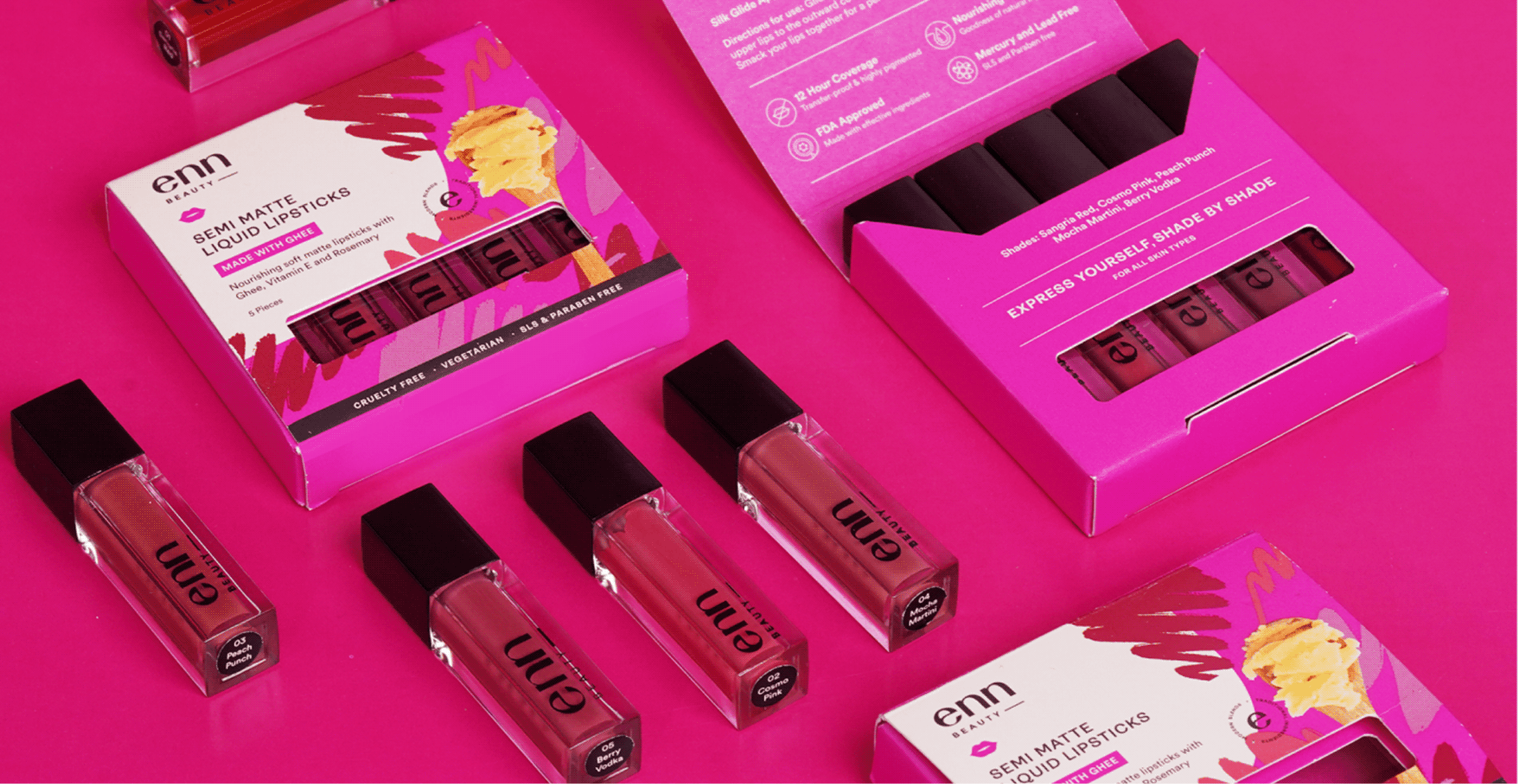
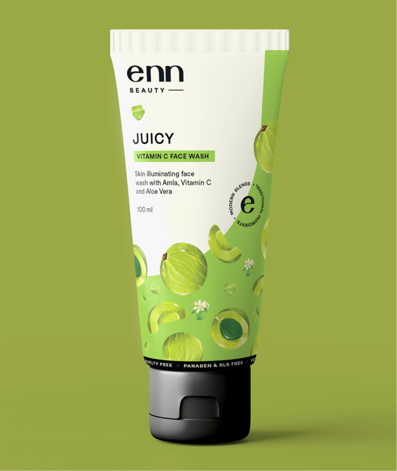
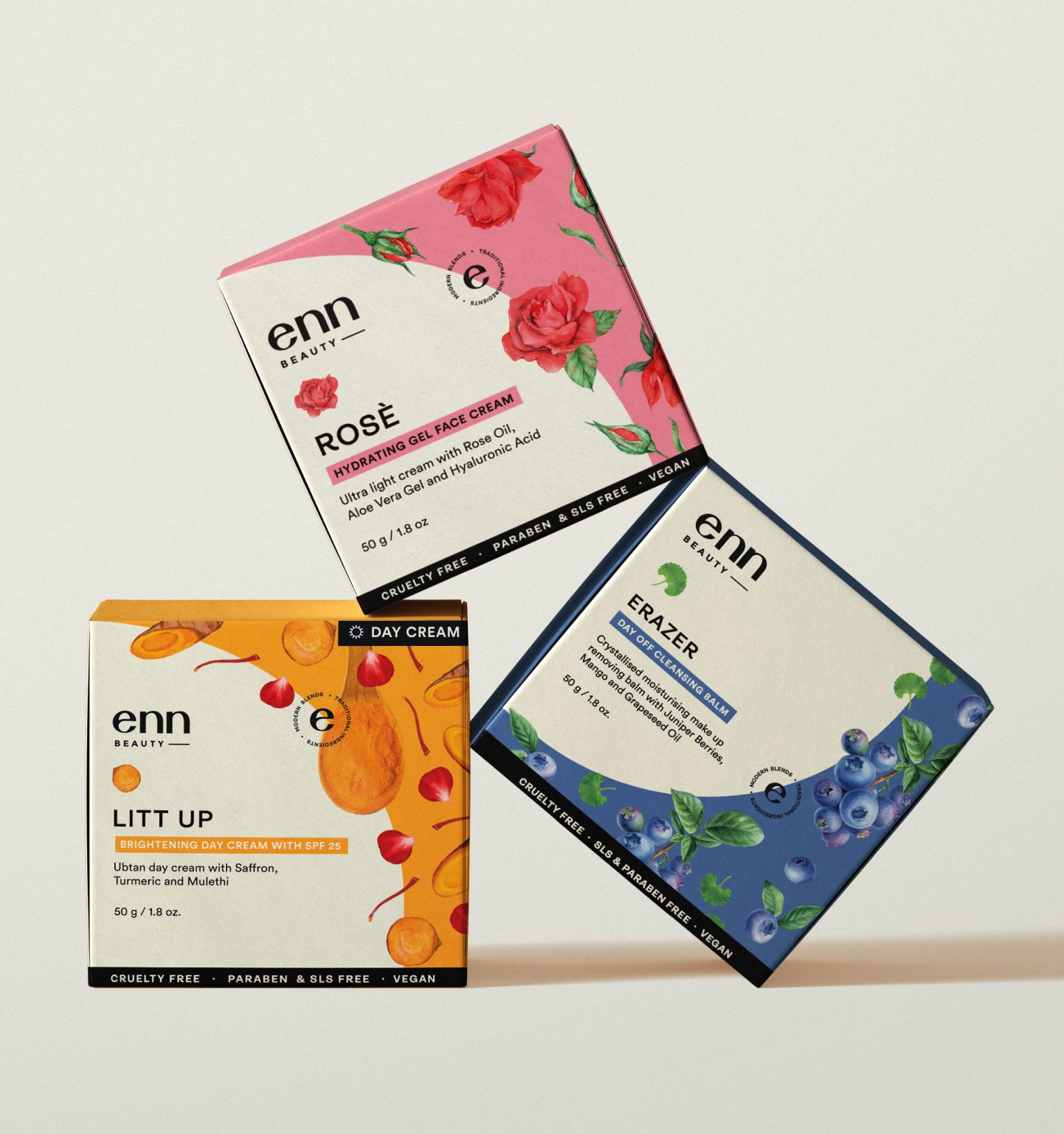
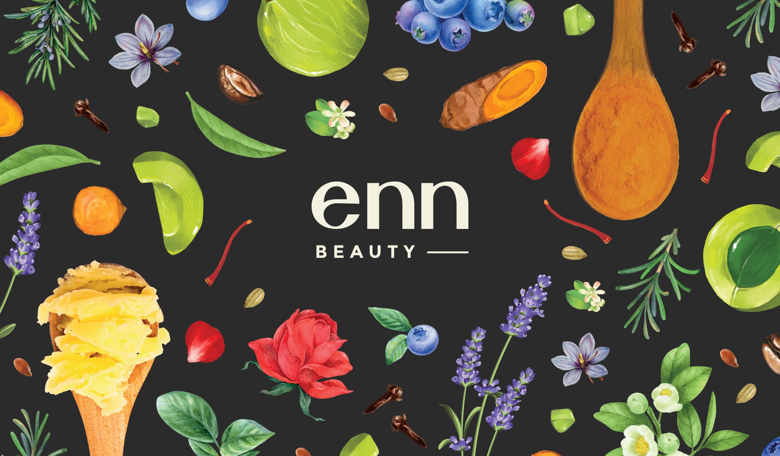
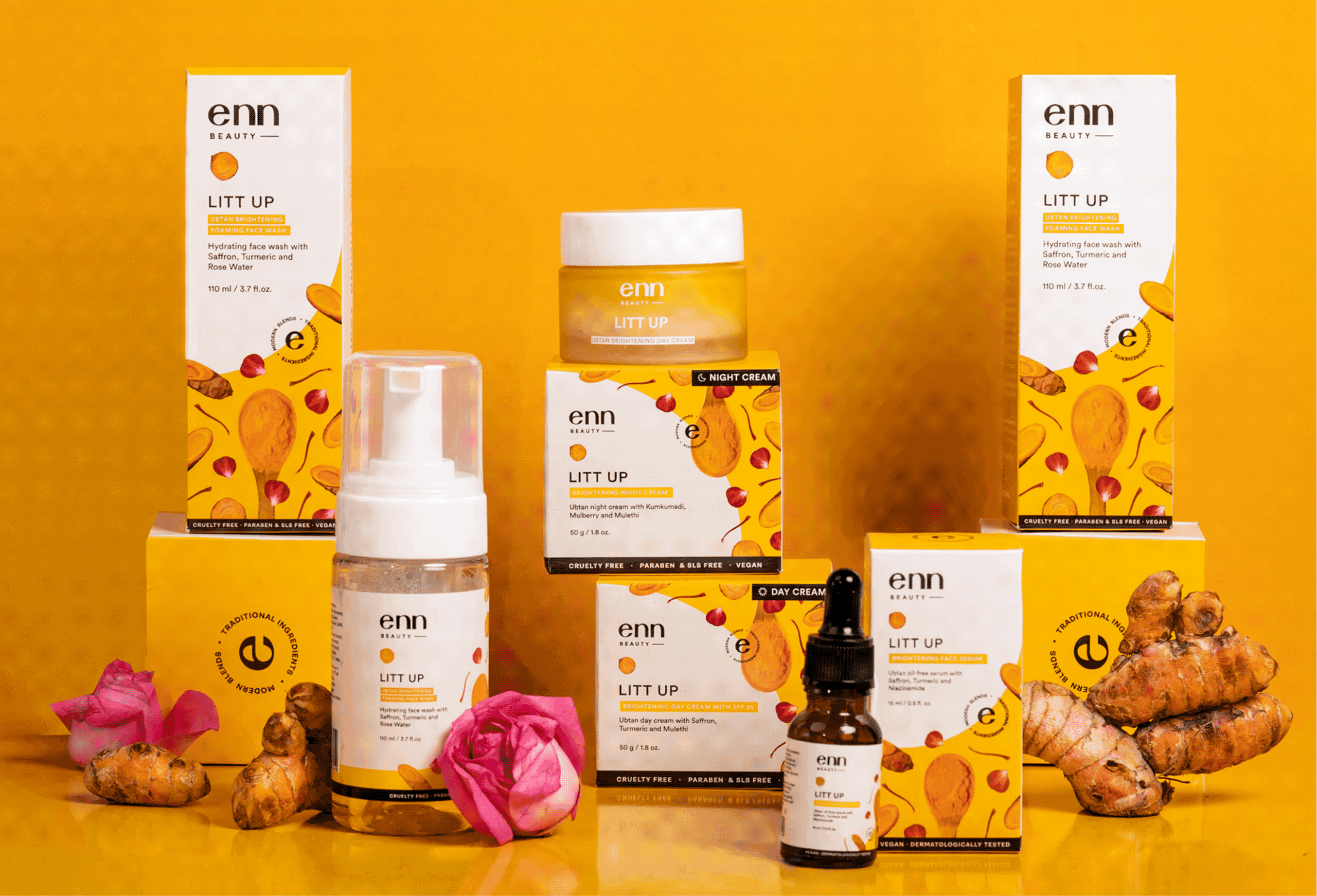
For Enn Beauty, ingredients are the hero element. The product, the brand, everything was built around a set of ingredient illustrations. So we complemented it with a clean, serious typeface with broad edges and simple curves.

RANGE WITH CHARACTER

Can each ingredient feel different and still feel like one?

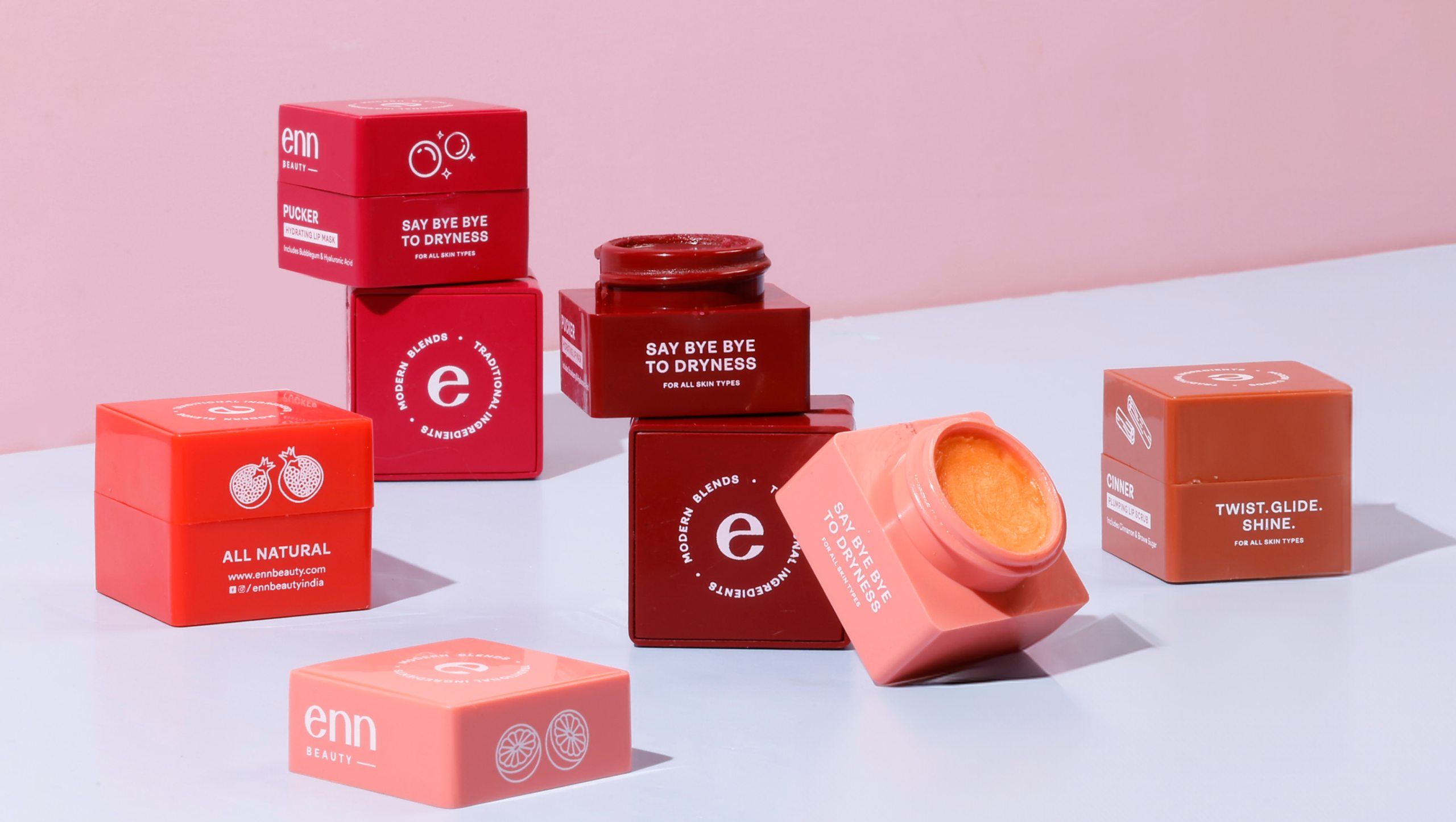
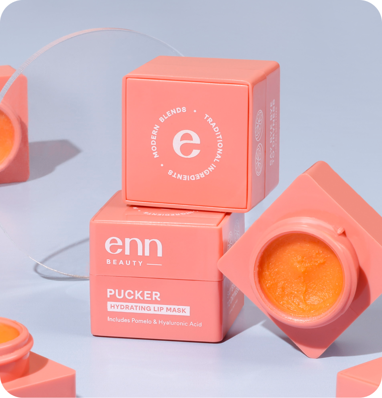
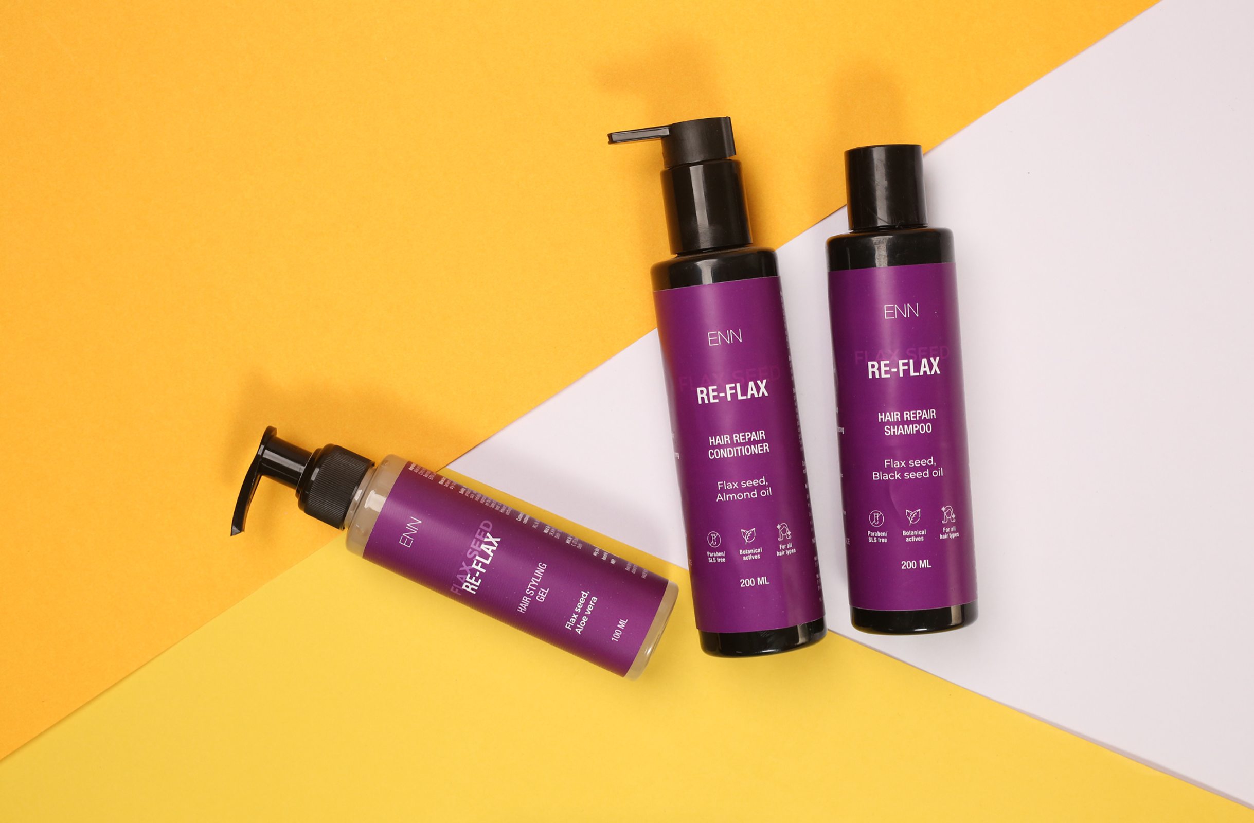
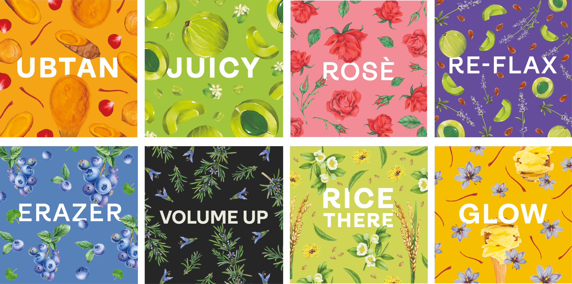
Enn’s products are divided into different ranges depending on the ingredient. The brand is centred around these ranges, which makes the brand not only fun but easy to remember.

We built each category to look distinct, have an individual character, yet have an overall synergy.

Put Simply, Skincare That Works

Can skincare be simplified even when it is scientific?

Scope Of Work: Market Research, Strategy, Brand Identity, Packaging Design, Visual Language, and Art Direction

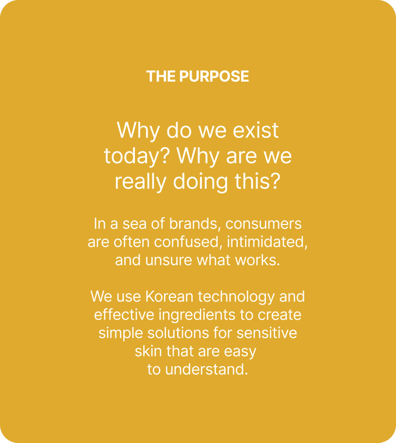
Walk down any skincare aisle and every brand promises clearer skin, stronger barriers, and miracle ingredients. Multi-step routines have become the norm, making skincare feel more confusing than caring. If products are meant to help your skin, why do they feel so complicated?


We explored this question with Anirudh while building Put Simply. Inspired by Korean skincare and adapted for Indian skin, the brand set out to create effective, sensitive-skin solutions without unnecessary complexity or clutter.


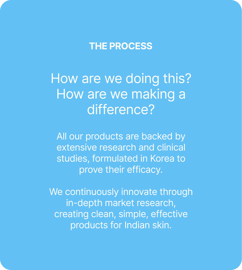
The goal was to build a brand that made skincare feel clear, approachable, and trustworthy. We started by questioning everything that made skincare complicated, to build the foundation of Put Simply.

Put Simply, it’s easy to use and hard to refuse.

THE BEST PART

Everything about the brand had to feel as simple as the routine.

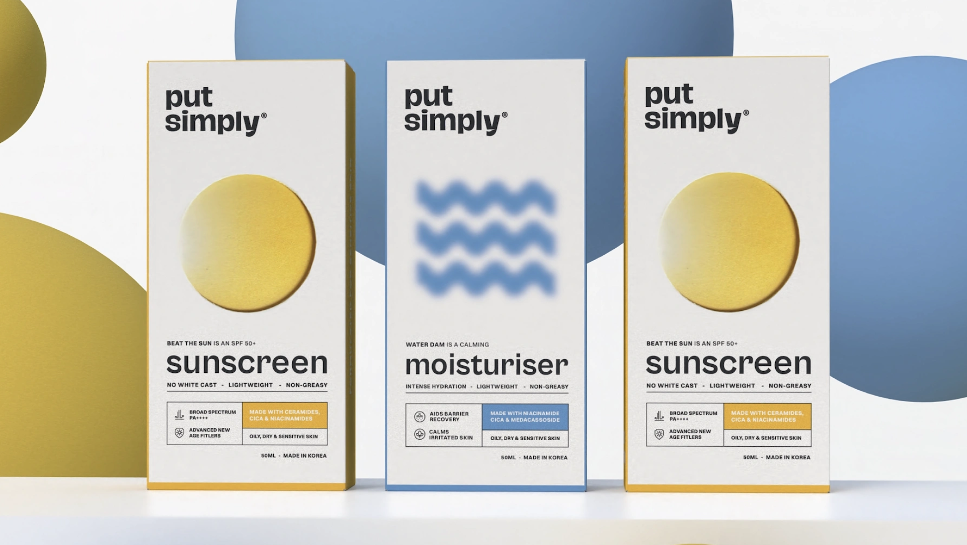
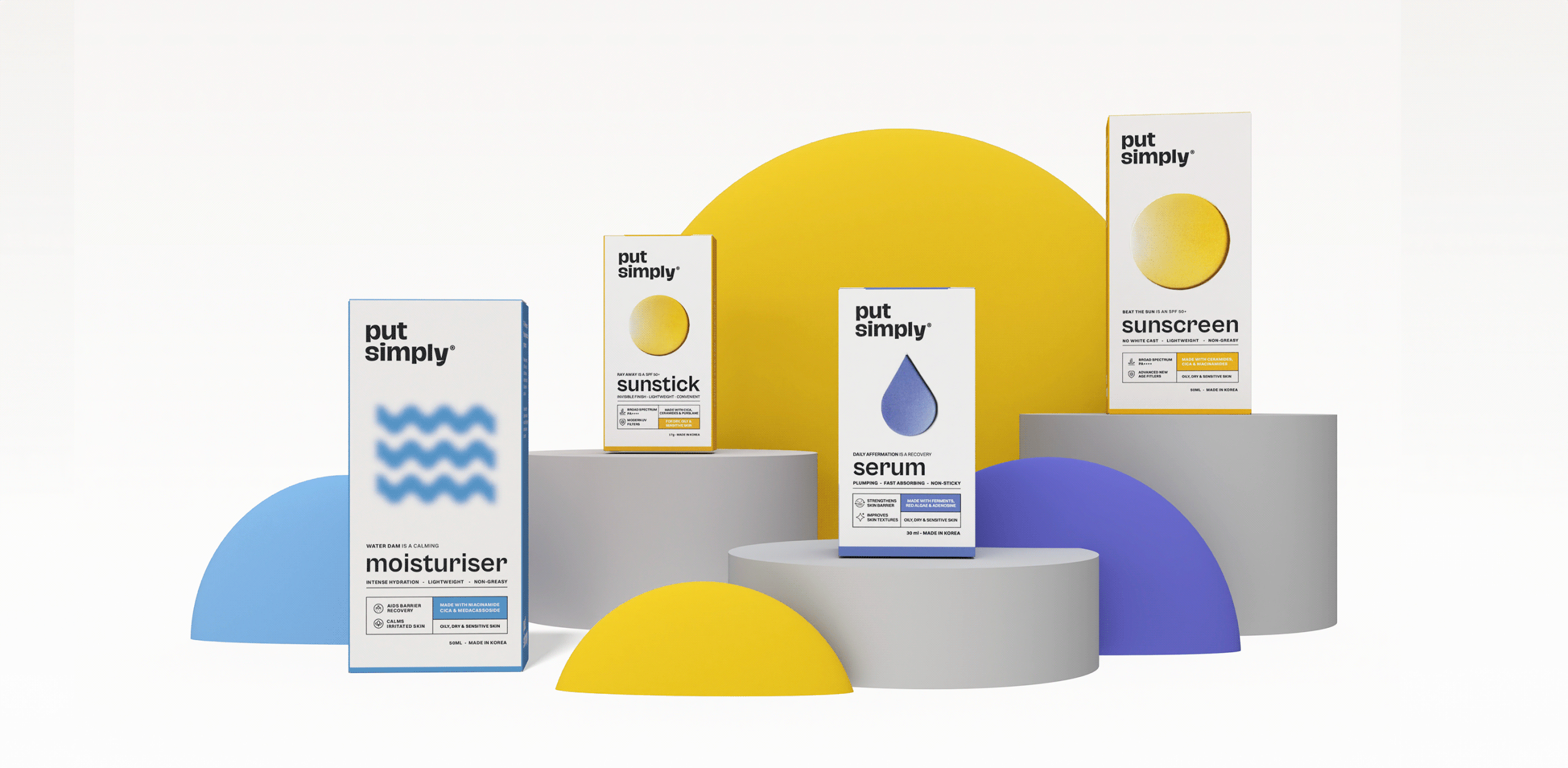
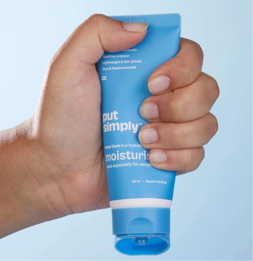
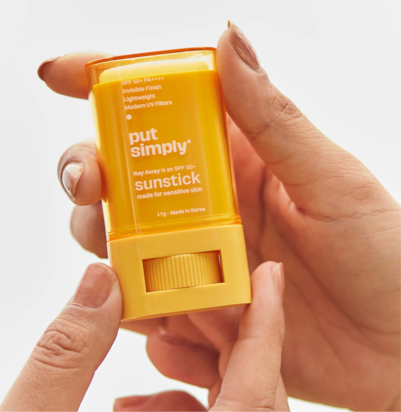
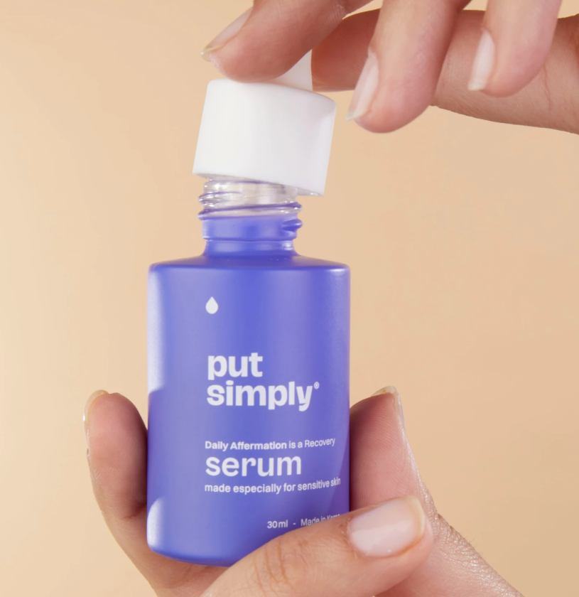
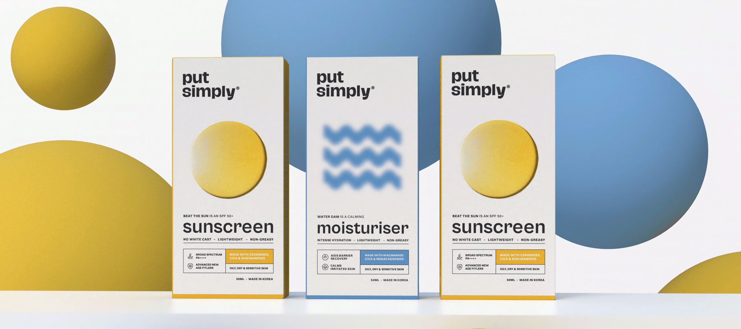
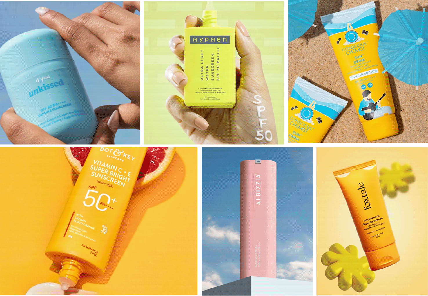
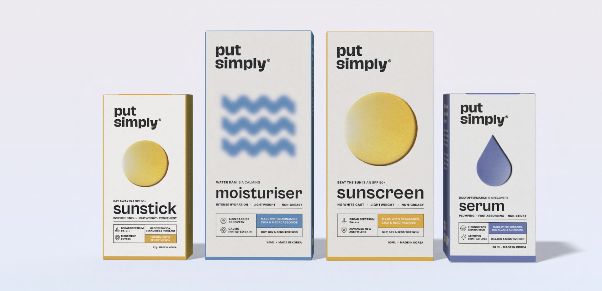
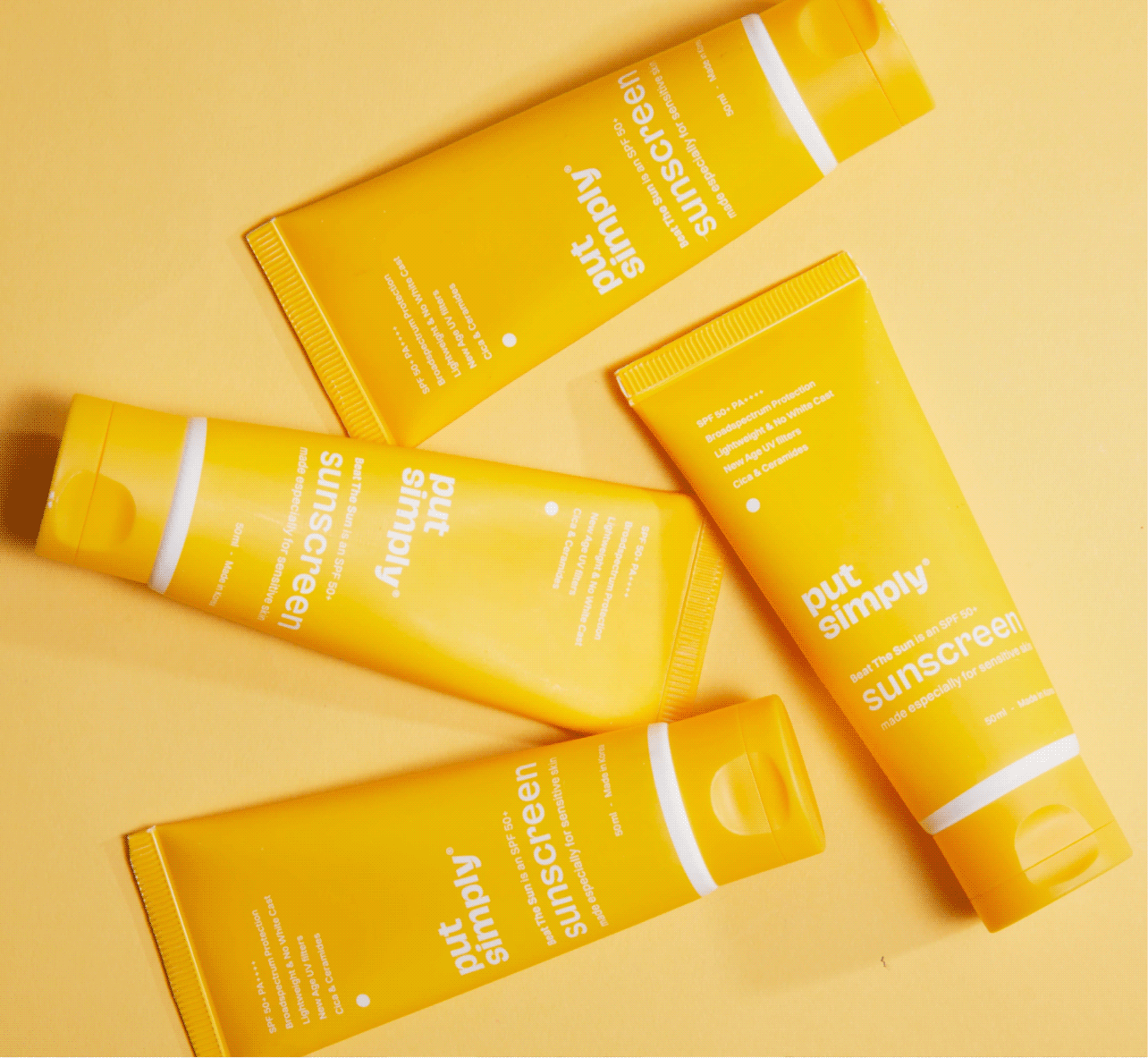
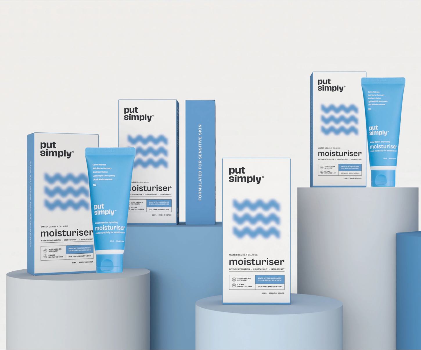
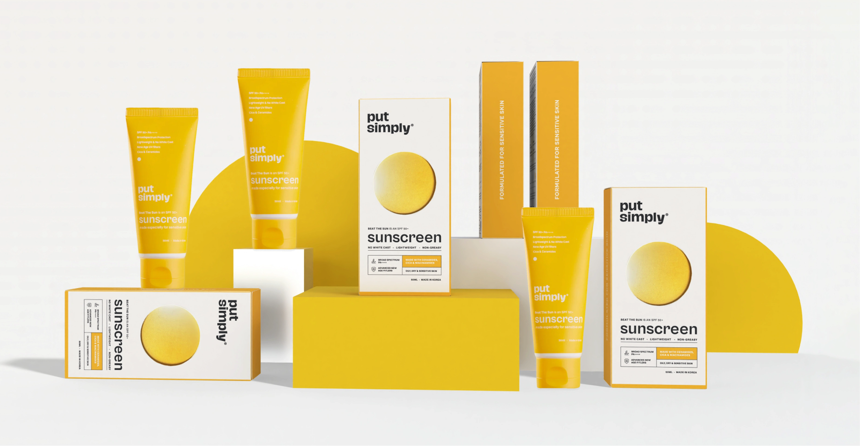
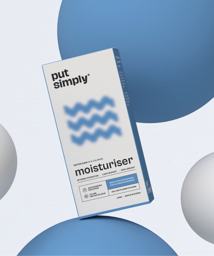
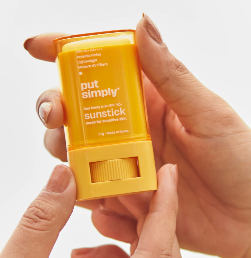
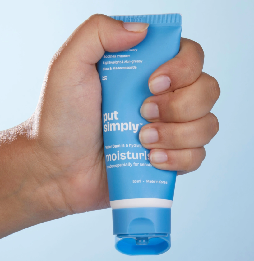
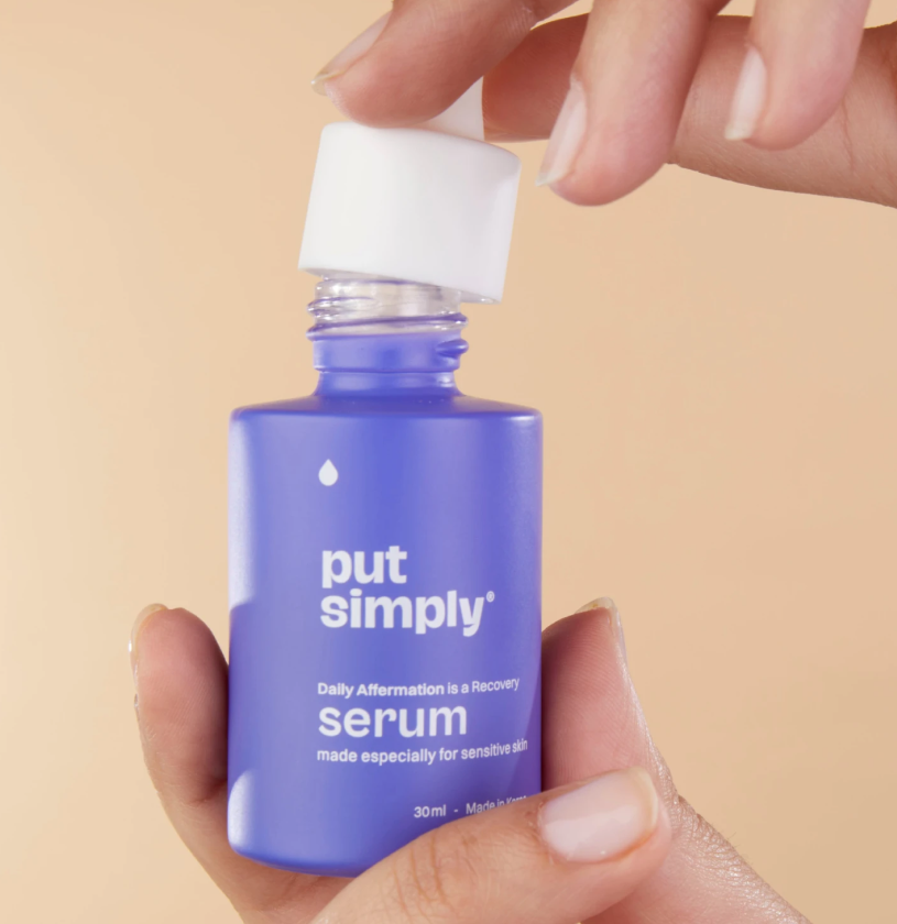
We built a visual language that feels as simple as the products themselves. Every pack uses bold bright colours, clean layouts, and distinctive cues that help consumers instantly identify what product does.


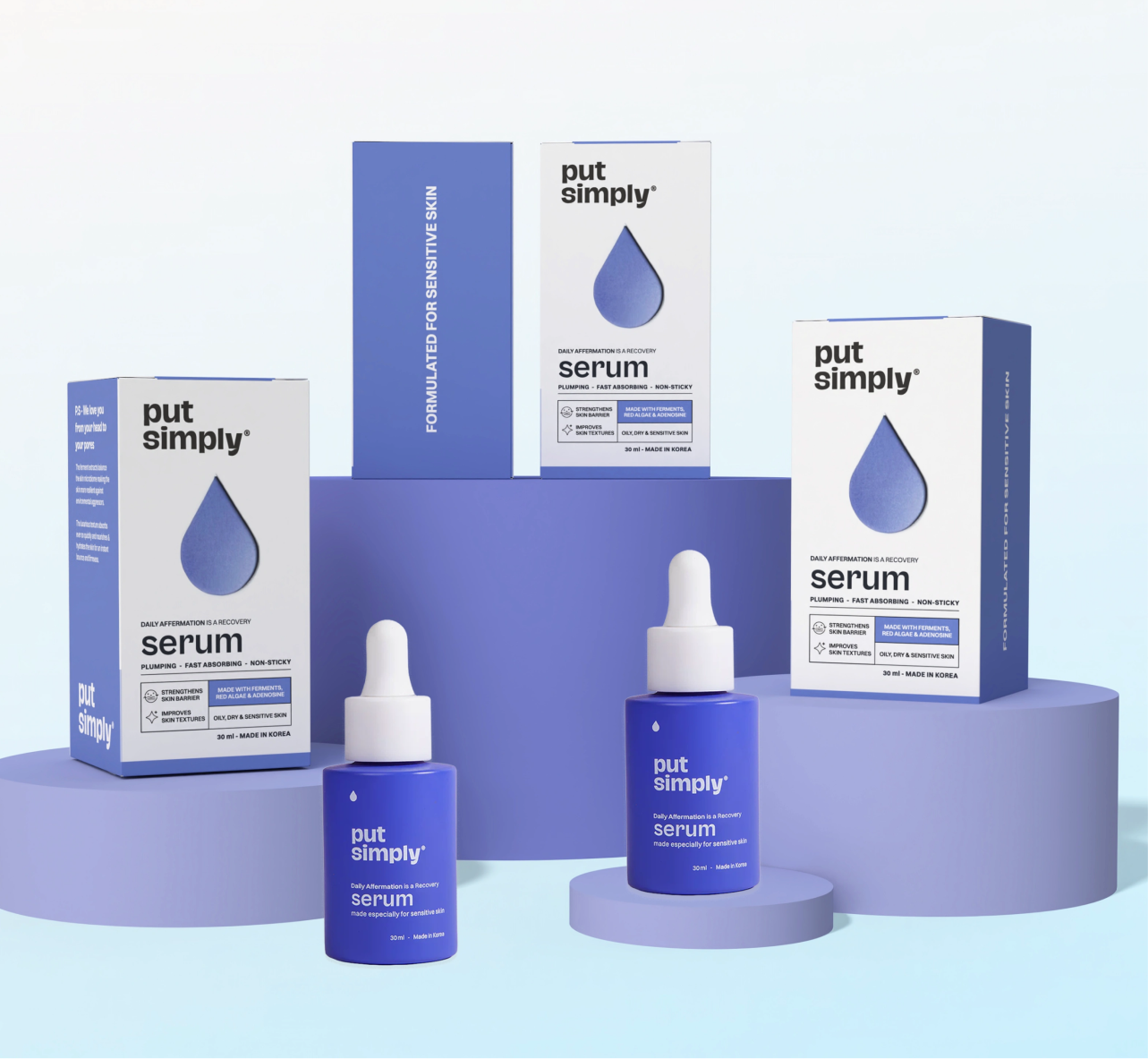
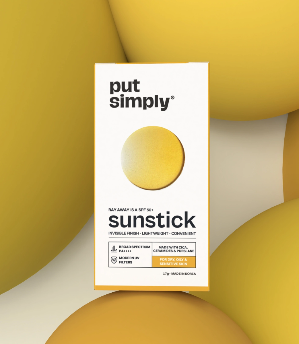
From the calming wave for the moisturiser to the radiant sun for sunscreen or the drop for the serum, every element communicates the product’s purpose before you even read 
the label.

Introducing Put Simply 2.0

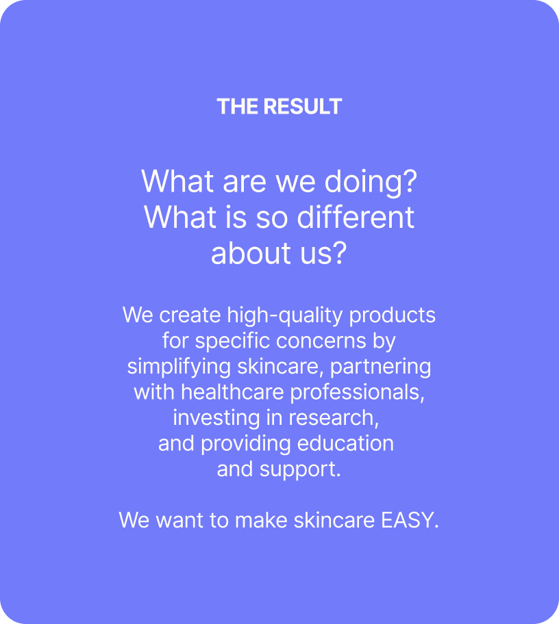
A purpose driven intentional brand that makes you rethink your skincare routine. Put Simply wants to change how you think about your routine by making it straightforward, easy to understand, and affordable.

THE BEST PART

Put Simply is here to make you rethink your routine

We believe in being straightforward and knowledgeable, which is what makes the routine feel manageable rather than technical. Put Simply is modest and it is precise.

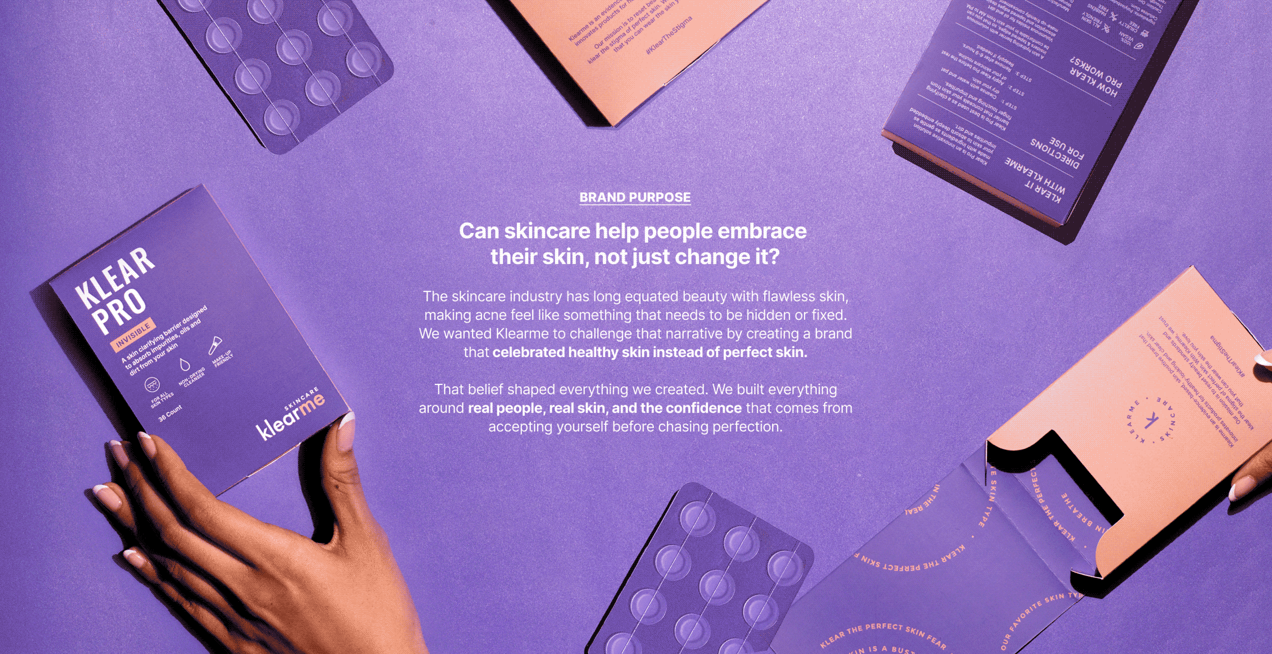
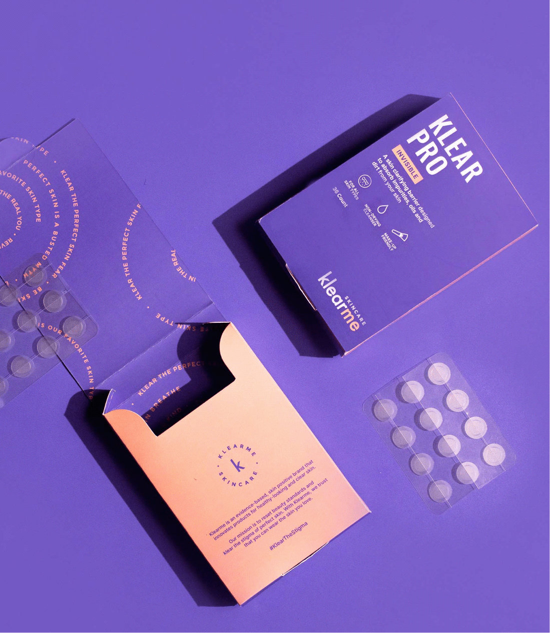
Klear The Stigma, Not Just Acne

Can a skincare brand clear the stigma, not just acne?

Scope Of Work: Research, Strategy, Brand Identity, Product Packaging, Visual Extension, and Web Design.

Acne is one of the most common skin concerns, yet most brands still communicate through flawless faces and impossible standards. If skincare is meant to build confidence, then why do so many brands make people feel the opposite?


We explored this question with Anish while building Klearme. Together, we set out to build a brand that embraced real skin and made conversations around acne feel human, without giving up on the formulations.

The goal was to build a brand that treated acne with honesty, empathy, and confidence.

THE CHALLENGE

How do you make skincare feel less intimidating?

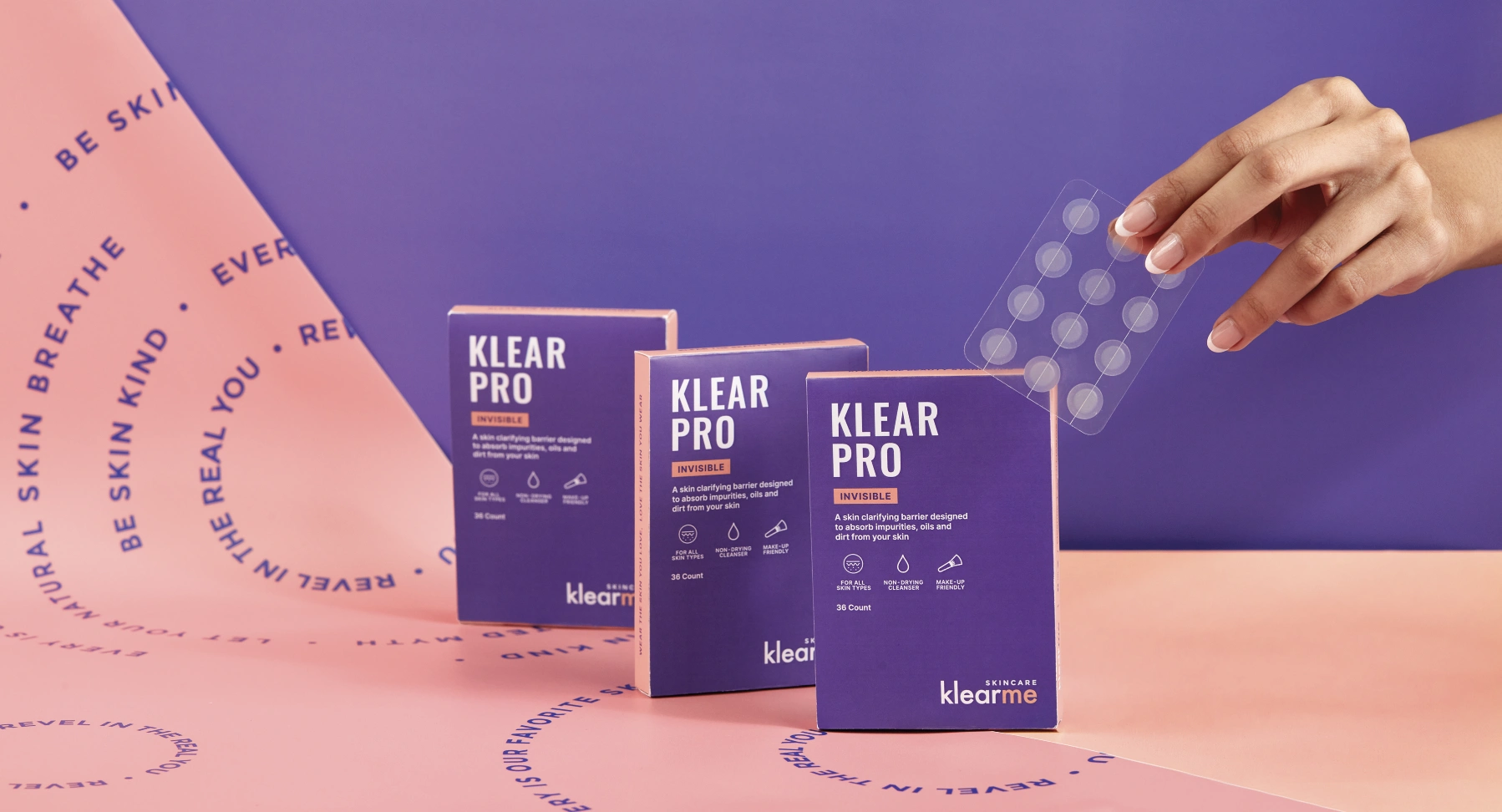
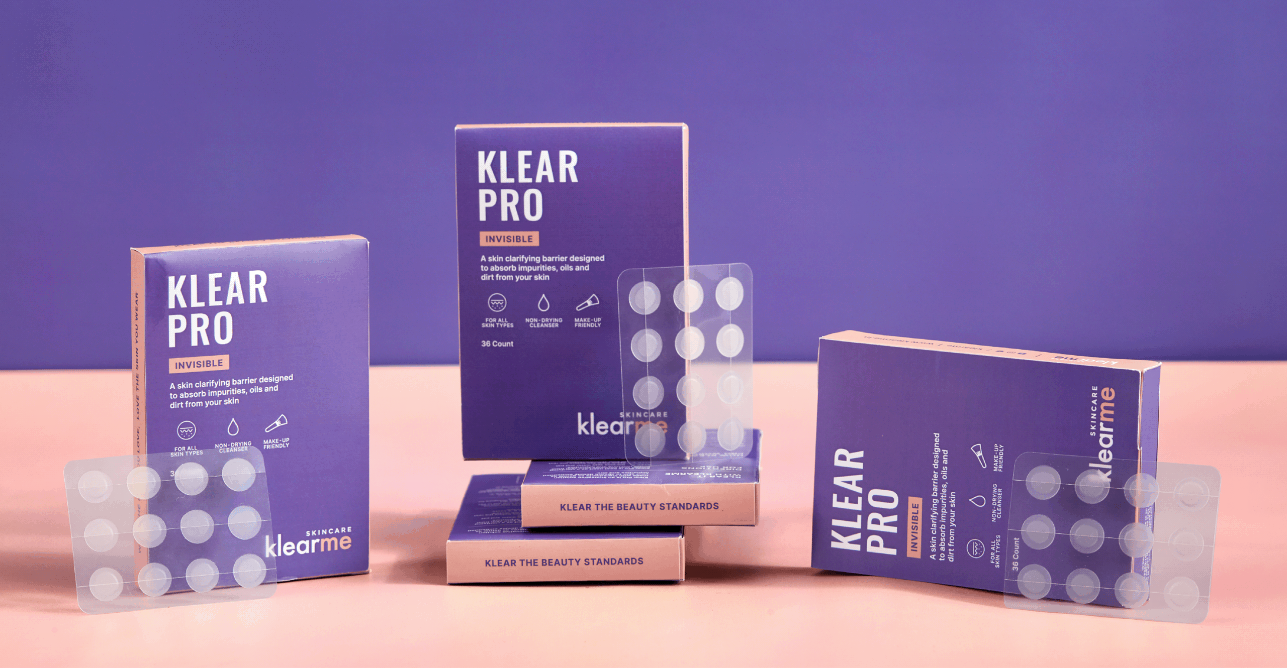
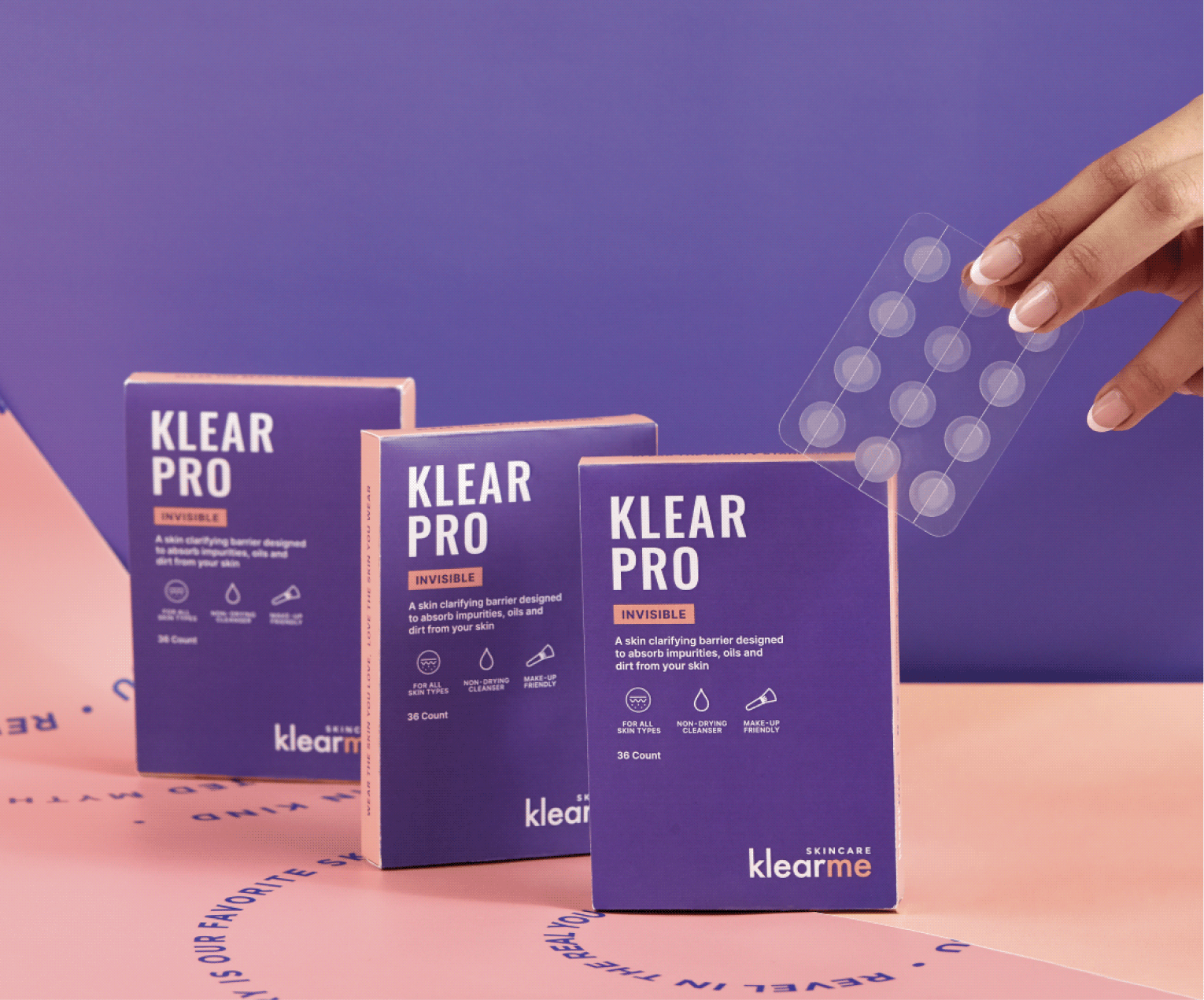
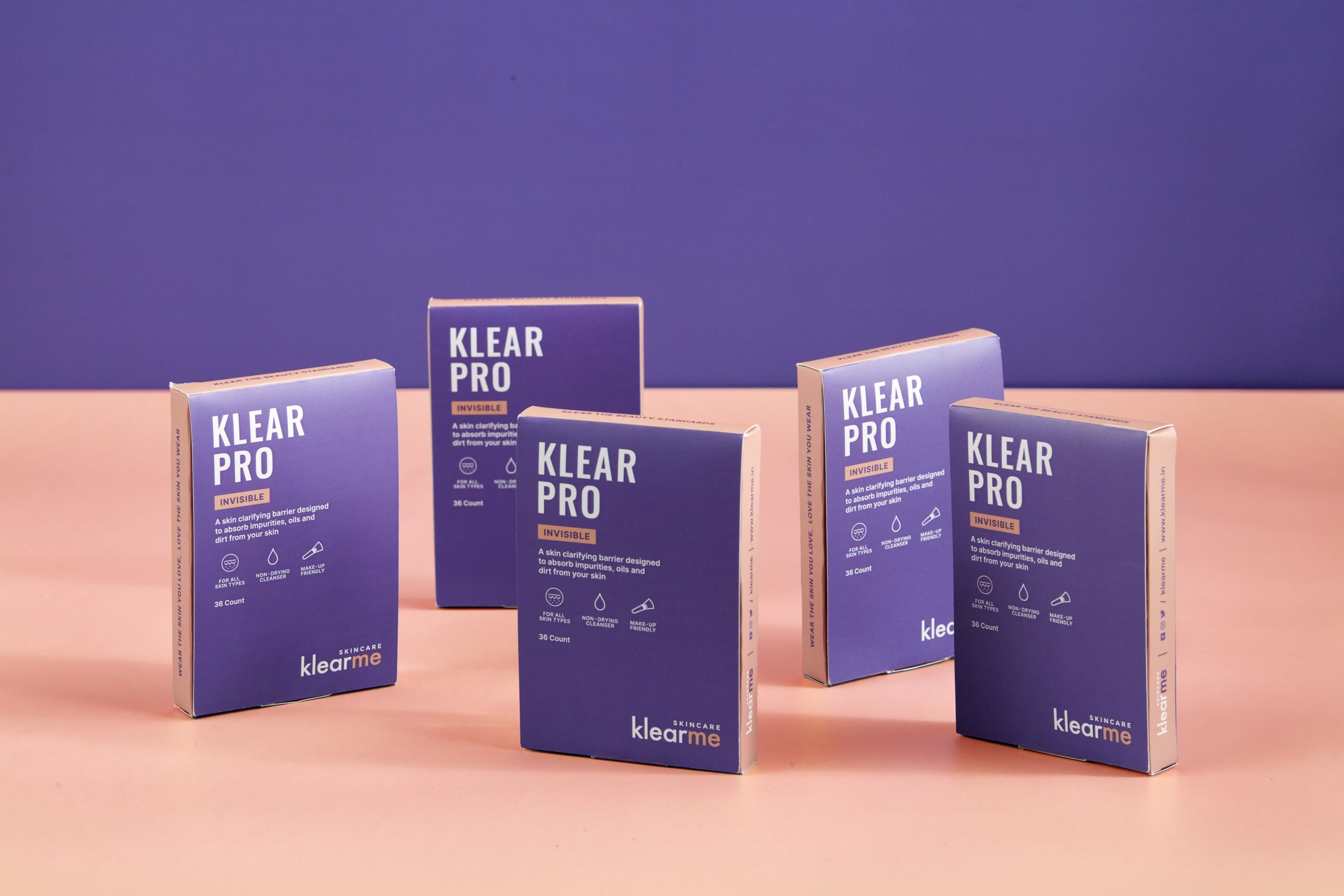
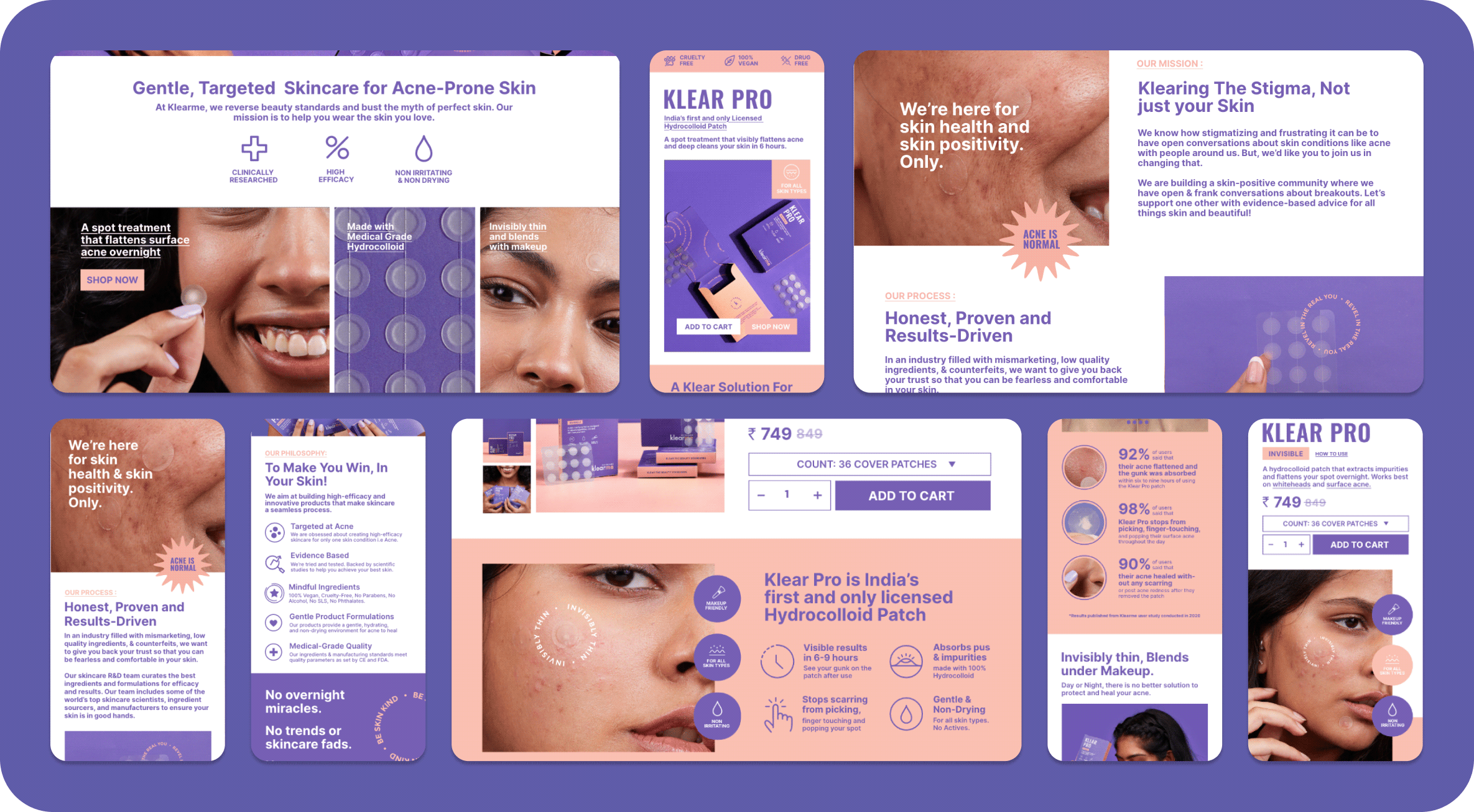
We built Klearme’s identity to feel approachable, optimistic, and easy to navigate. A clean editorial wordmark, contrasting colours, and a flexible visual system made the brand feel confident without becoming clinical.

Every extension, from icons and patterns to educational graphics, helped simplify acne care while reminding people that skincare is about understanding your skin, not hiding it.

THE BEST PART

Real People. Real Skin. Real Results.

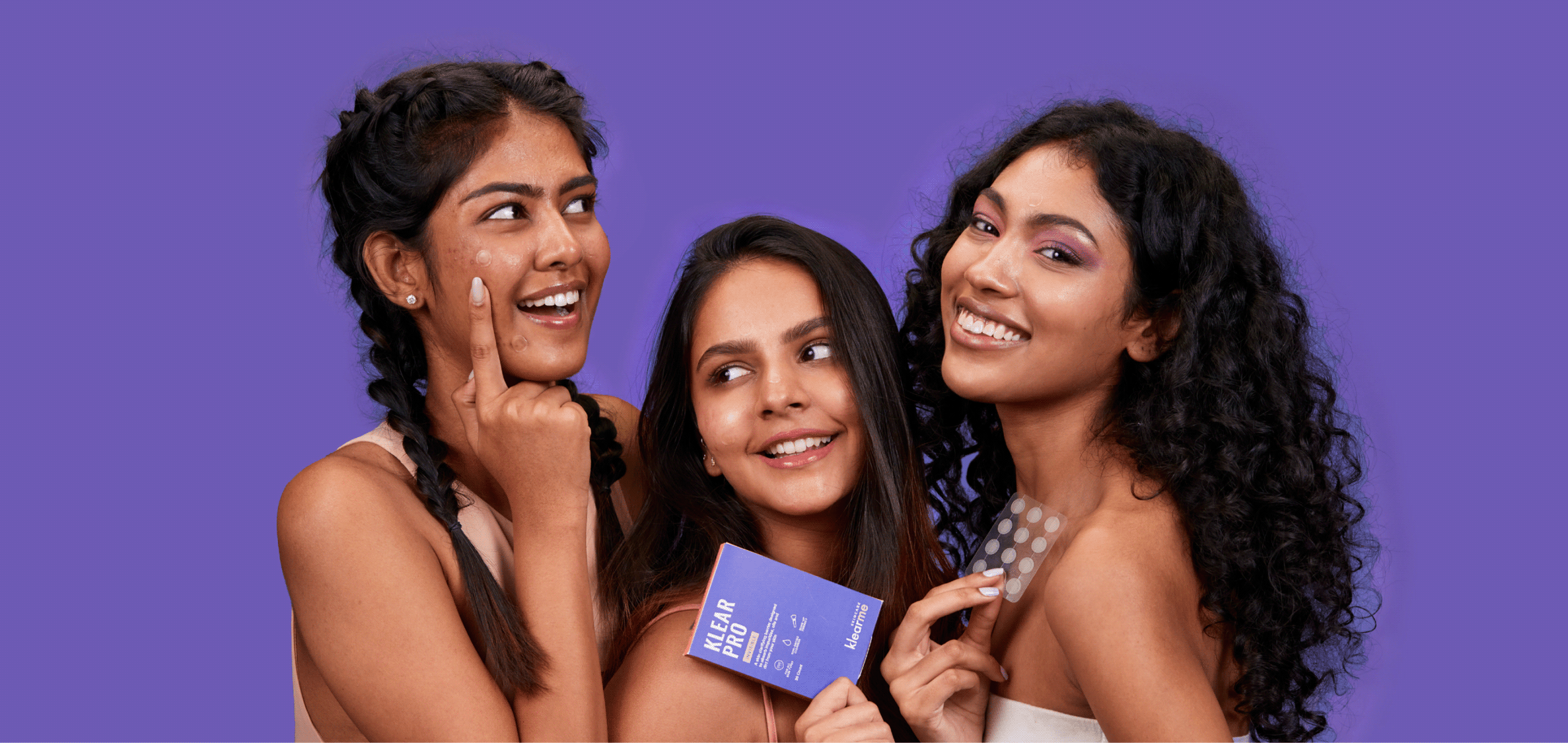
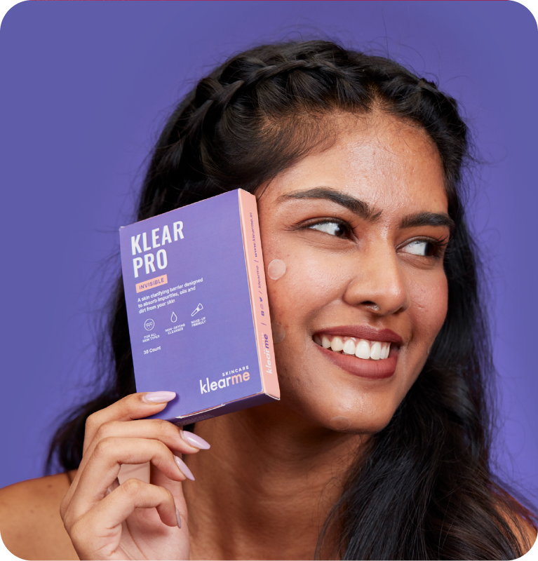
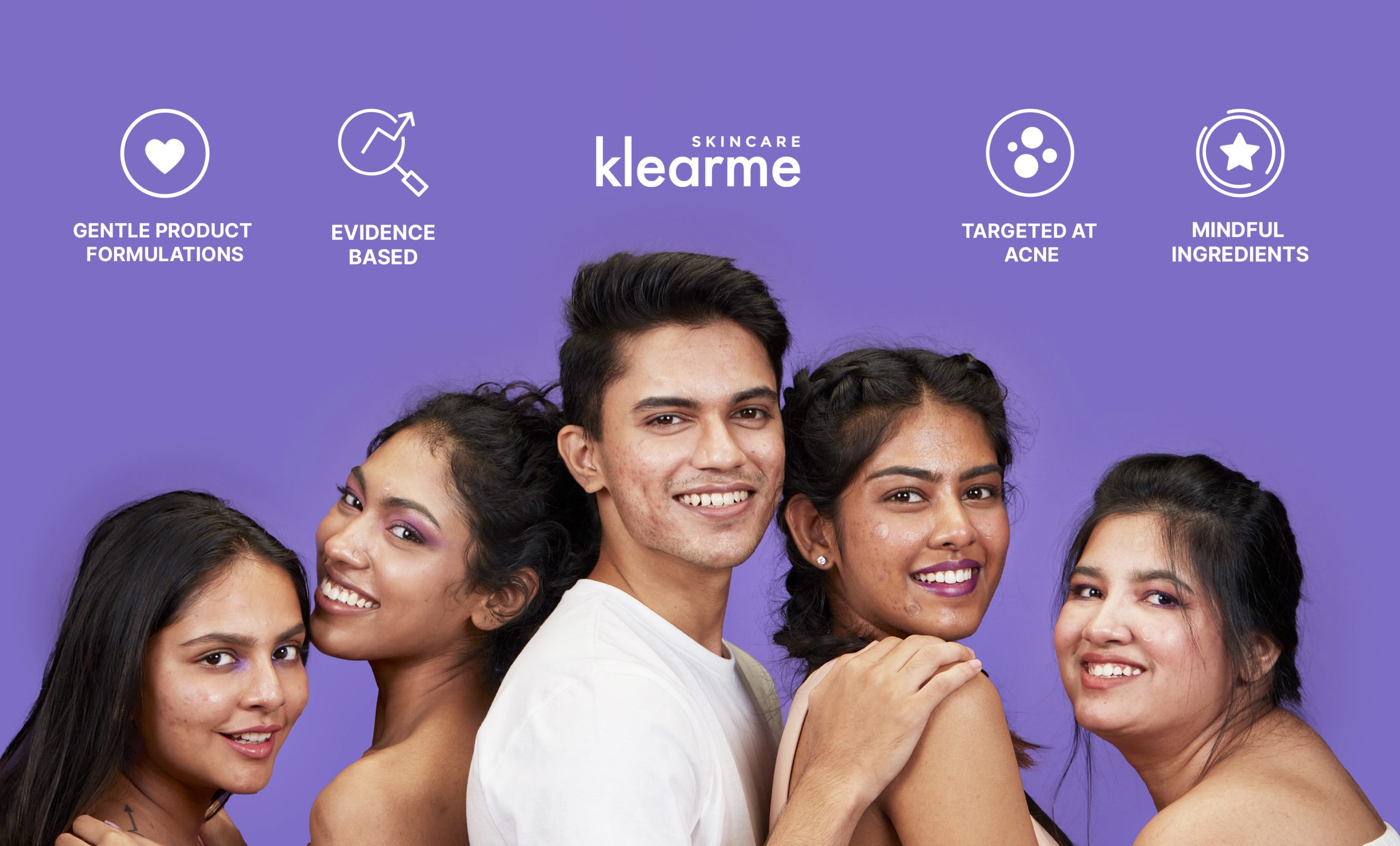
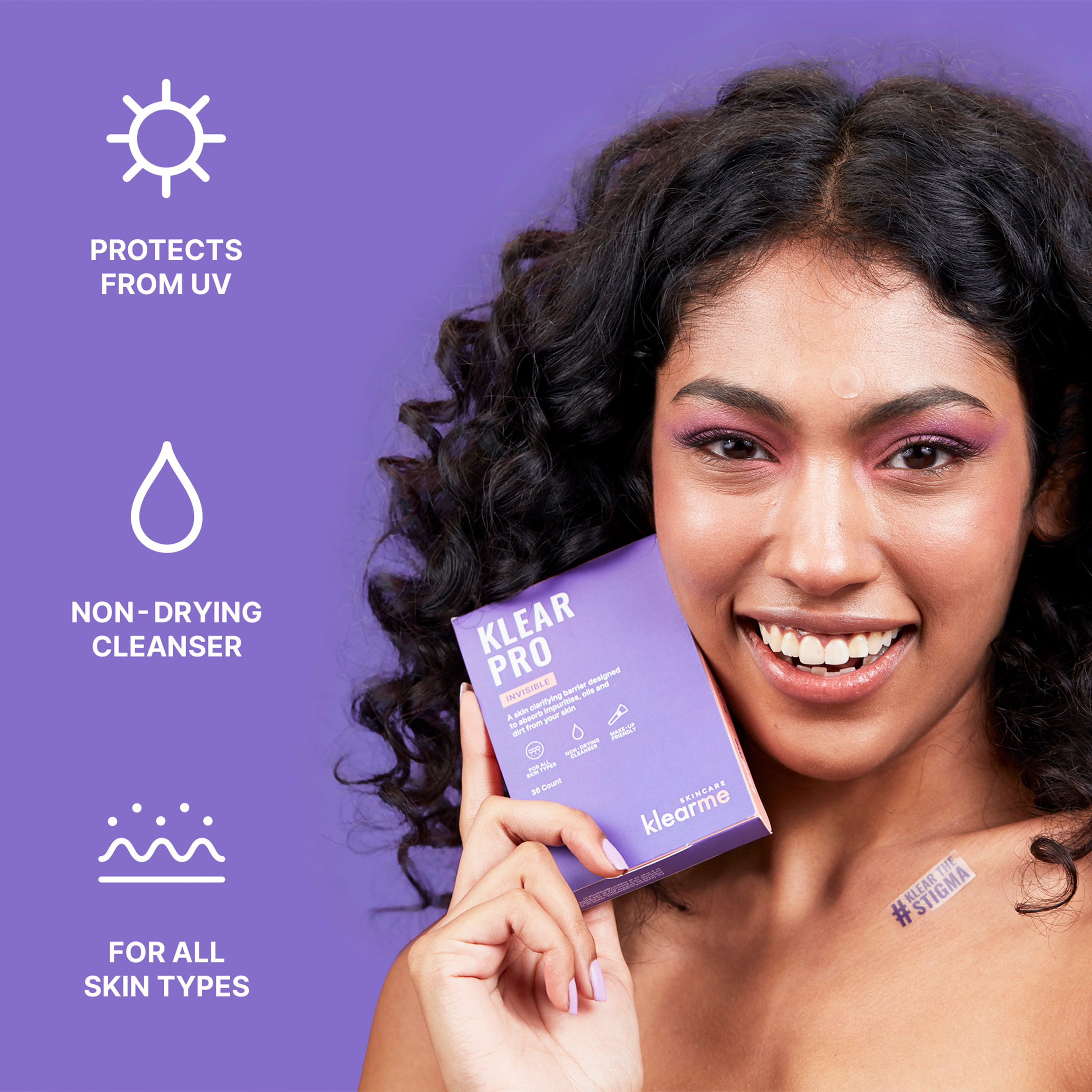
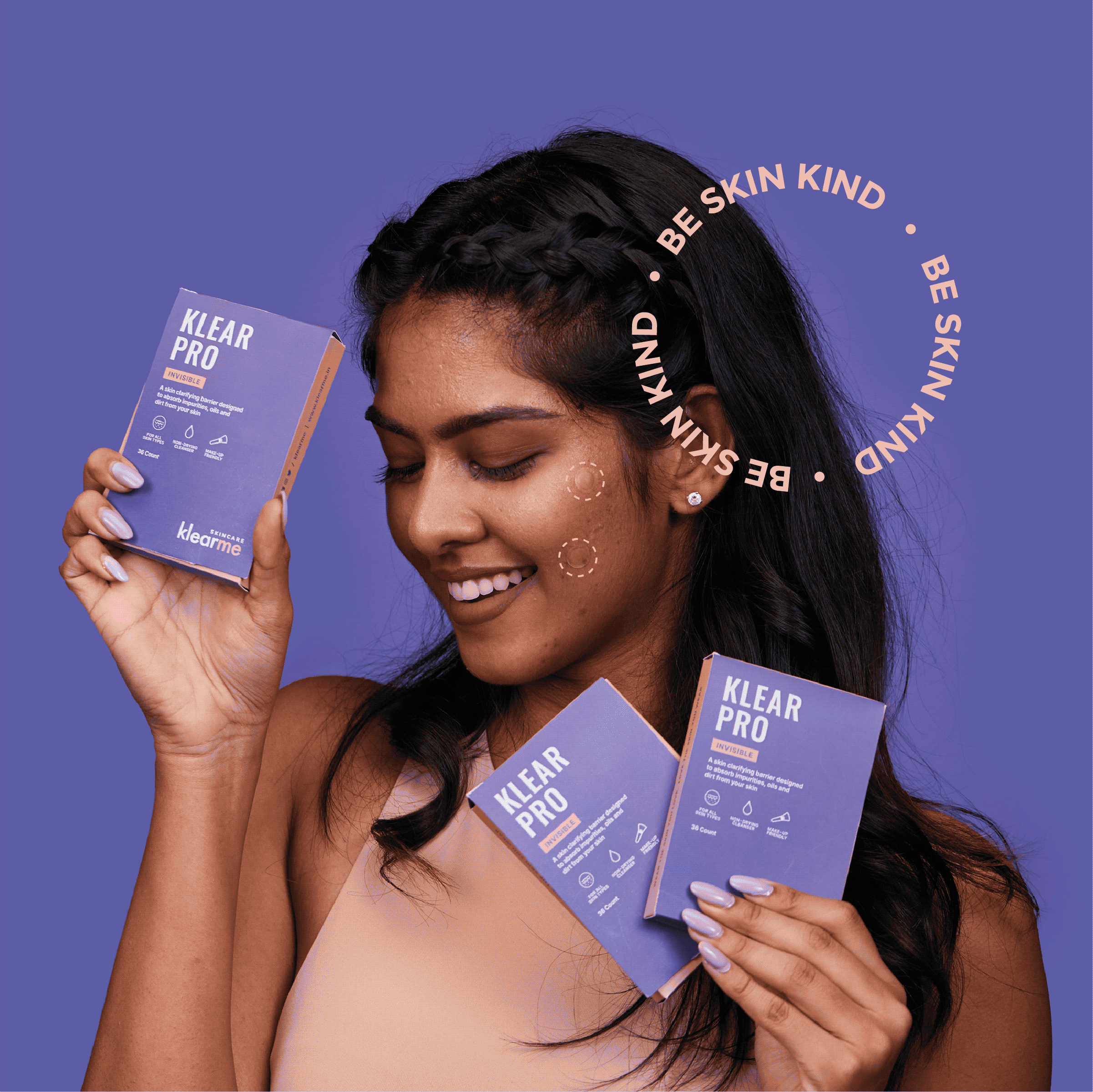
A brand that celebrates the real you. With Klearme, we wanted to clear the stigma of perfect skin and beauty standards. We wanted our consumers to celebrate their real skin and love the skin they wear.

The narrative was simple. There is no such thing as perfect skin. Healthy skin is beautiful skin, and that is what the images had to show: real people, comfortable.

What arrives before the product does?

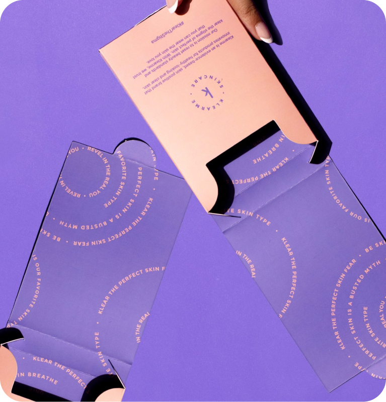
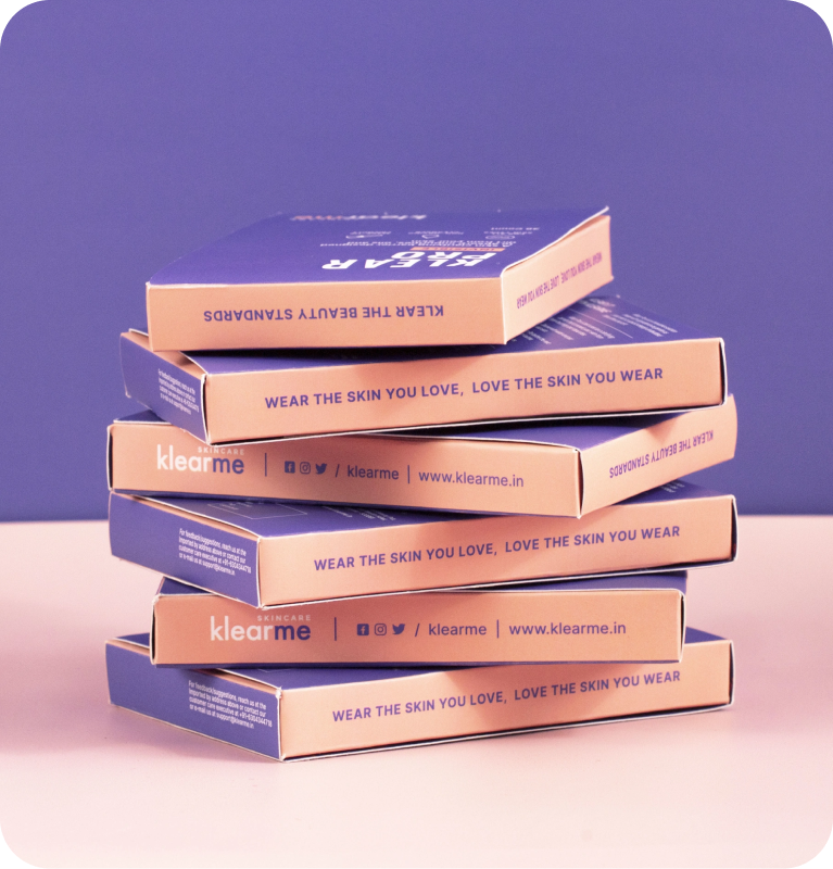
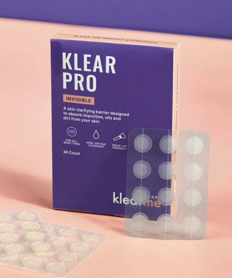
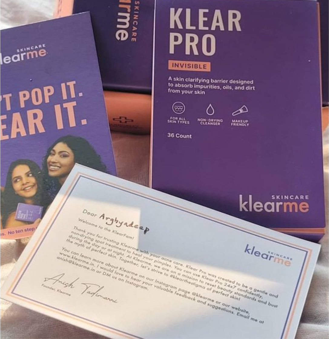
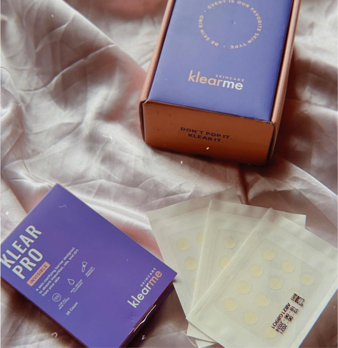
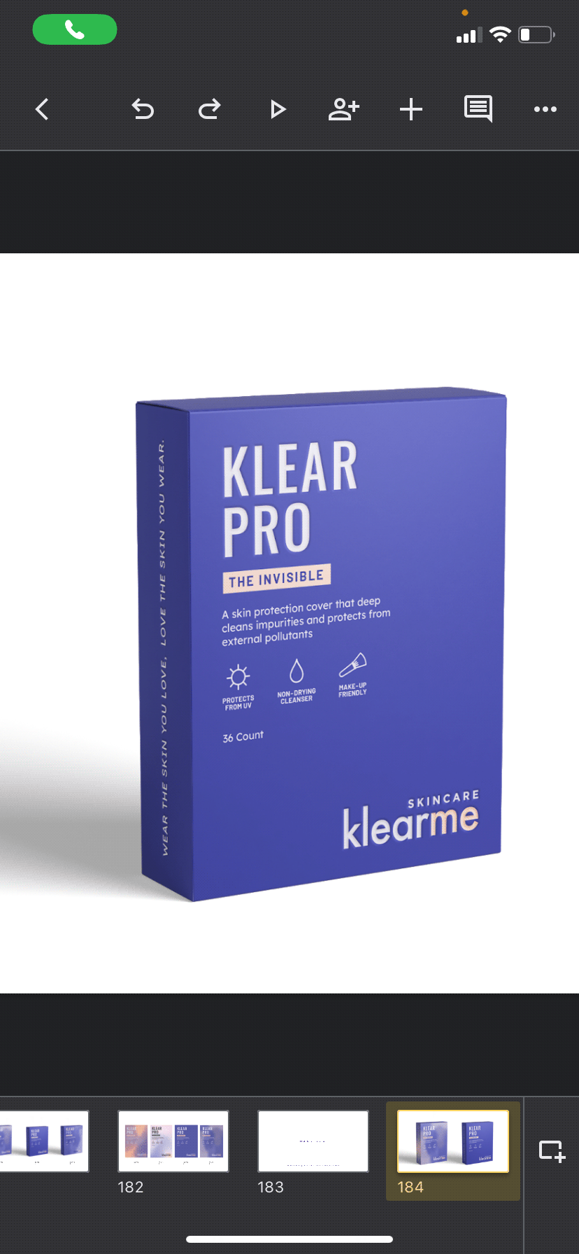
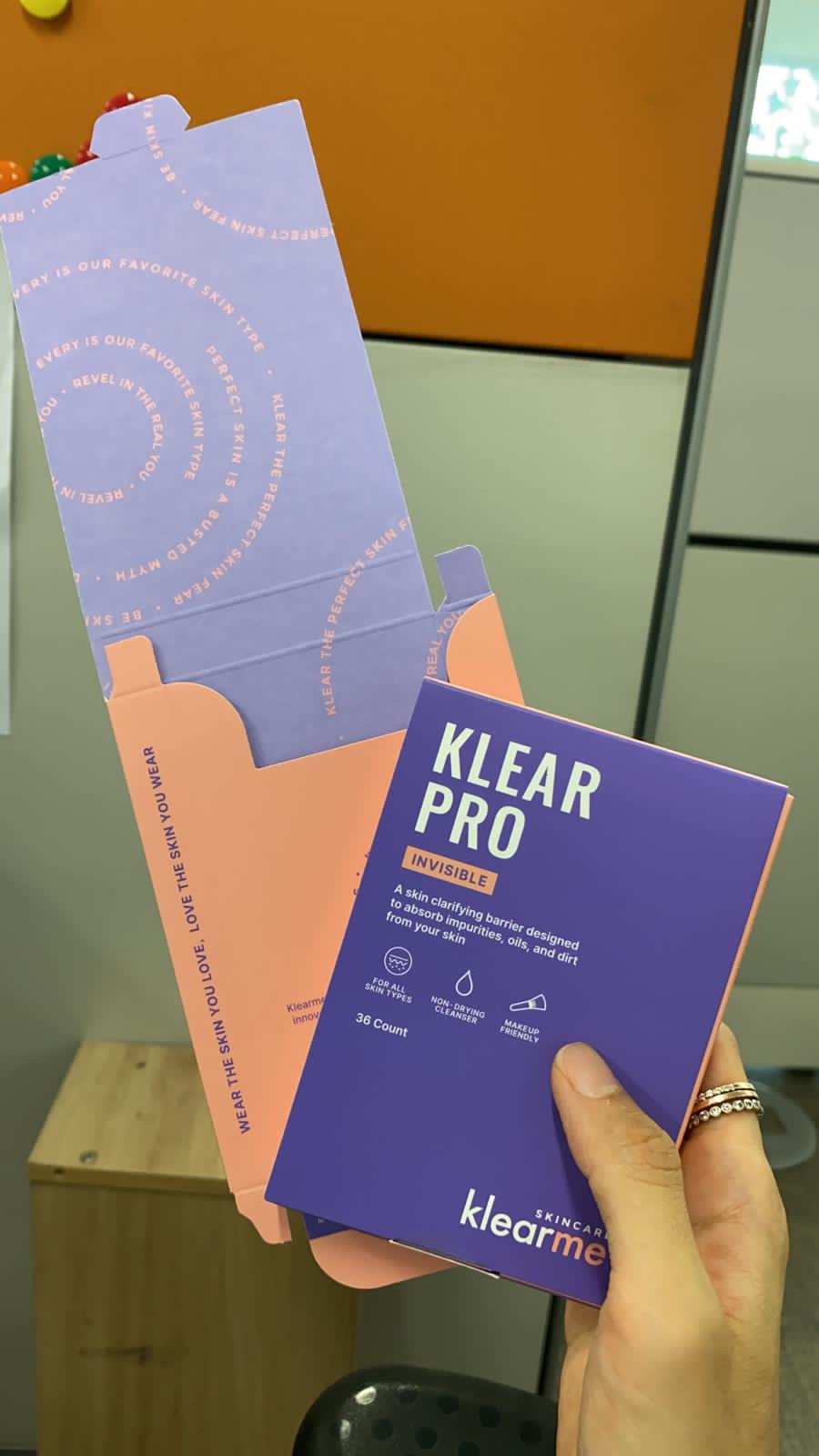
Skincare doesn’t end at the product, so neither did the experience. Clean secondary packaging and bold brand colours for contrast. Inside every box, a guide to using the product and a note from the founder.

You know what Klearme believes before you start.

THE EXPERIENCE

Could a website do more than sell products?

The brand believes acne is normal. We wanted the website to make that belief tangible. So, instead of building another product shelf, we built a space that helps people start loving their skin.

Because clear skin is a standard someone else set. The website challenges that standard and shifts the focus from fixing your skin to caring for the skin you already have.

The messy, the fun, the not so pretty part of the project!

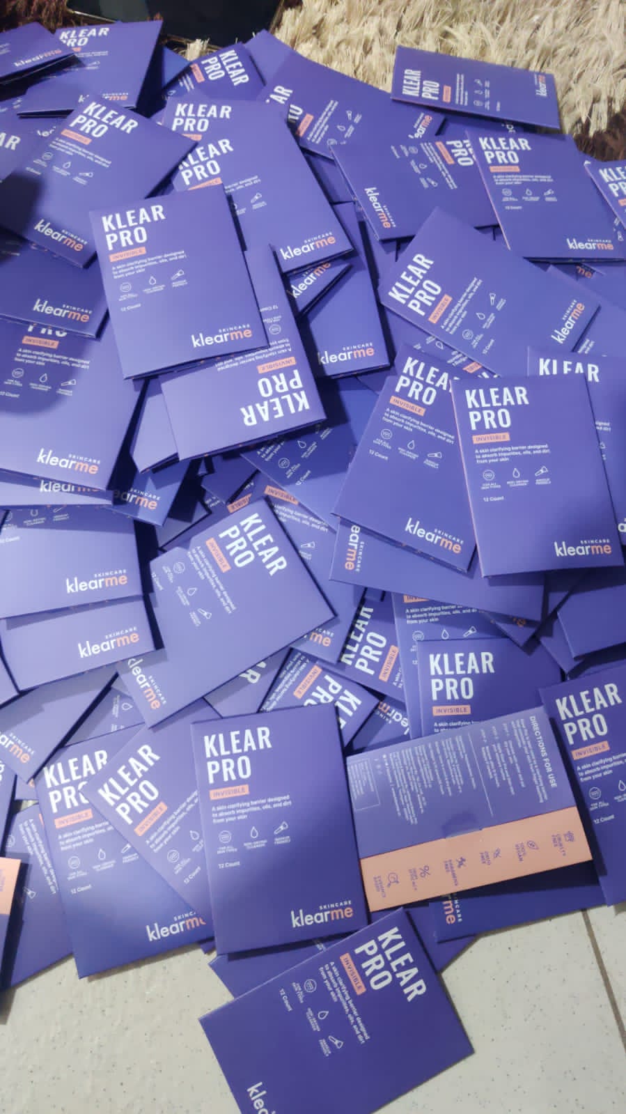
Our first round of trial packs

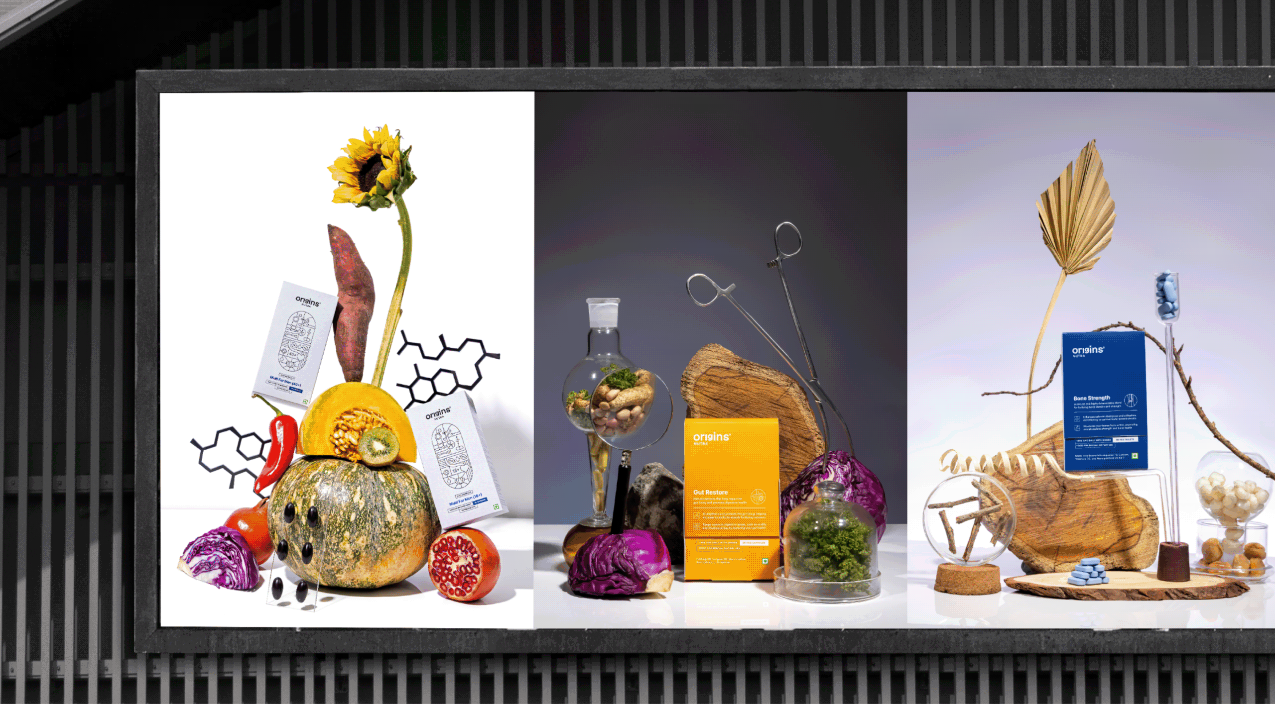
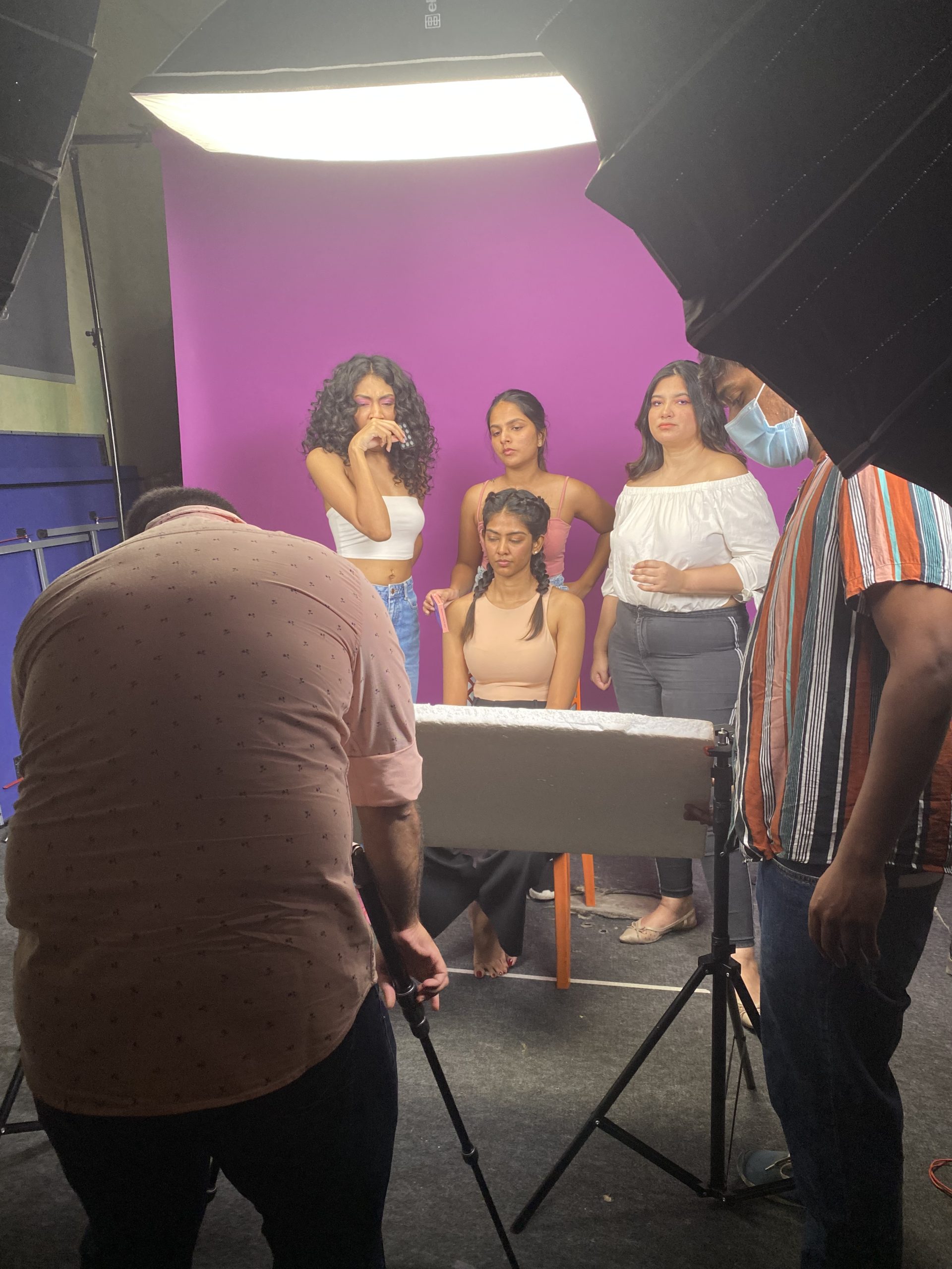
Behind the scenes at the shoot

Rounds of trials before finalising

In print, finally