The Crown Jewel Of Reliance

The Crown Jewel Of Reliance

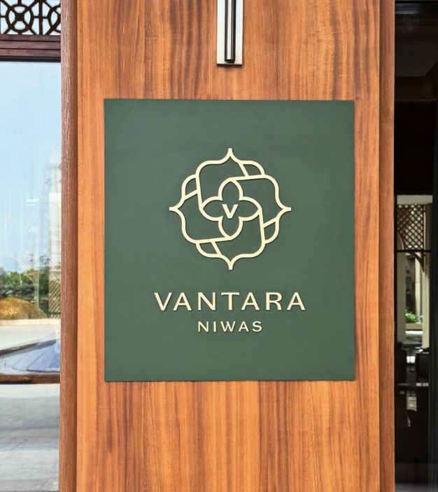
Brand Identity & Visual Extension for Vantara

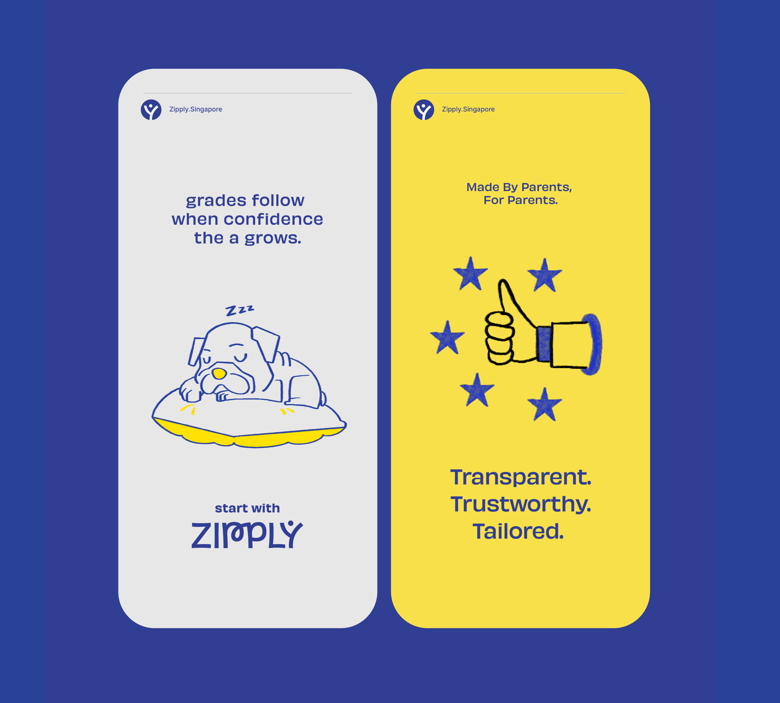
Fostering Education With Zipply

Fostering Education With Zipply

Brand Identity & UI For Zipply Platform

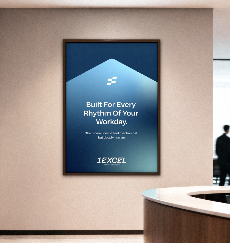
Smart Co-Working With 1Excel

Smart Co-Working With 1Excel

Identity & Visual Extension For A Co-Working Space

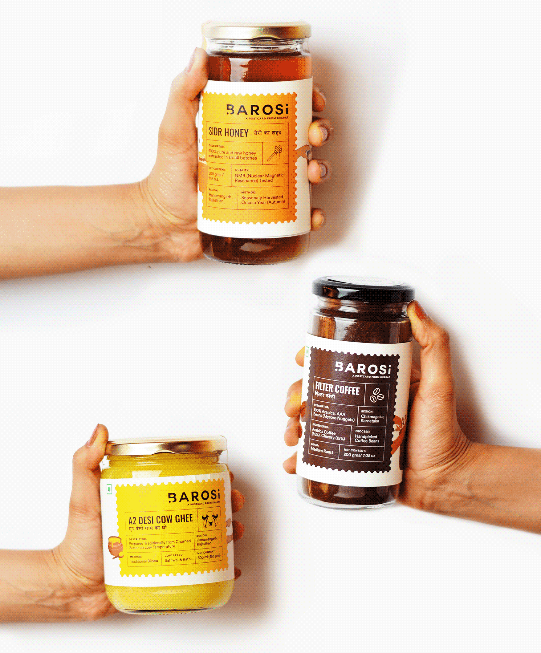
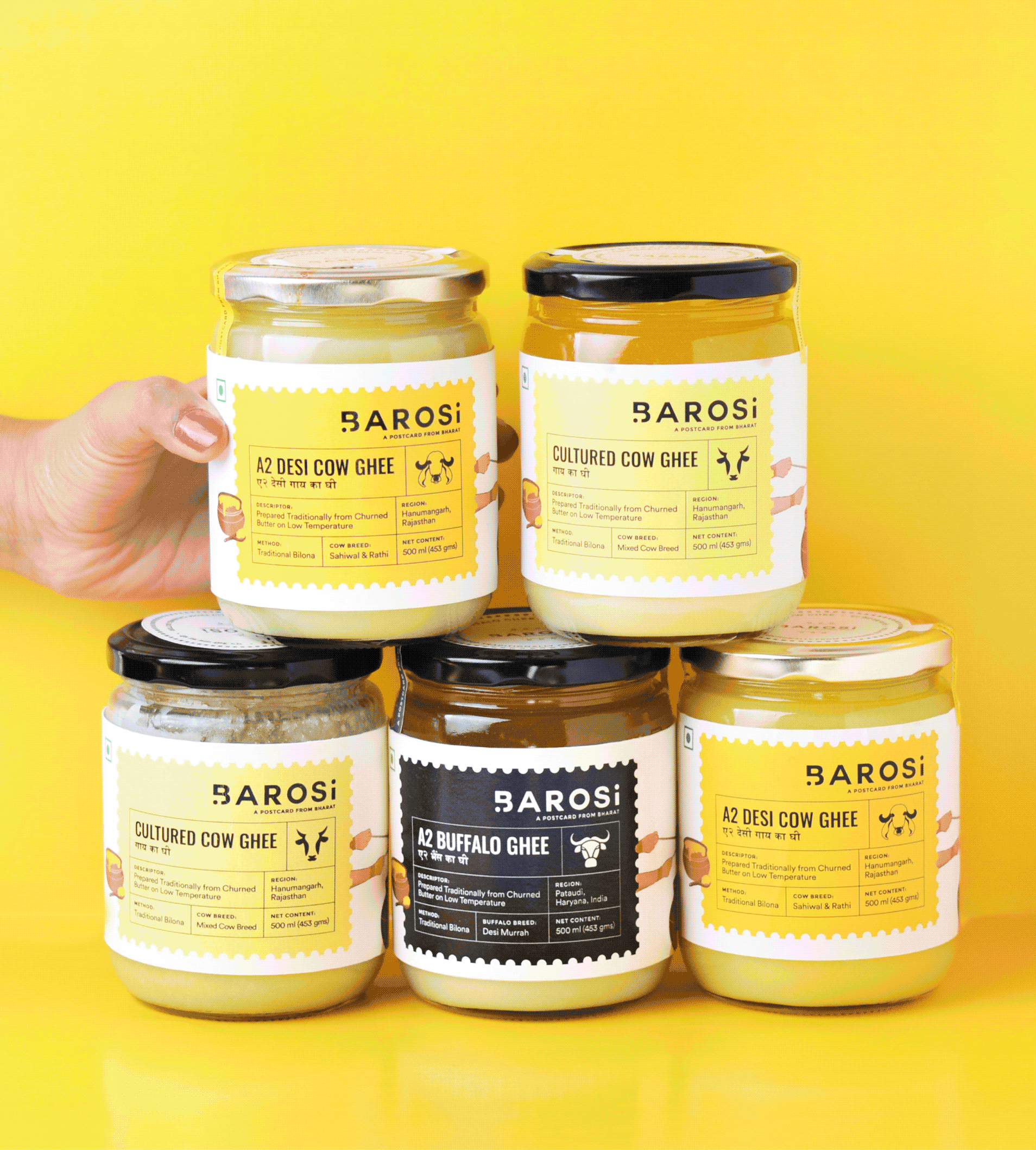
A Postcard From Bharat

Are rural and urban India really different?

Scope Of Work: Market Research, Brand Strategy, Understanding Consumer Psychology, Product Packaging and Brand Extension.

Coming from a rural background, Durlabh, the founder, always wanted to keep a connection with where he was from. Working in the city showed him what urban demand could do for the farmers he grew up around. That’s when he founded Barosi.

He wanted urban India to take a step back and enjoy the simple times of rural India through his products.

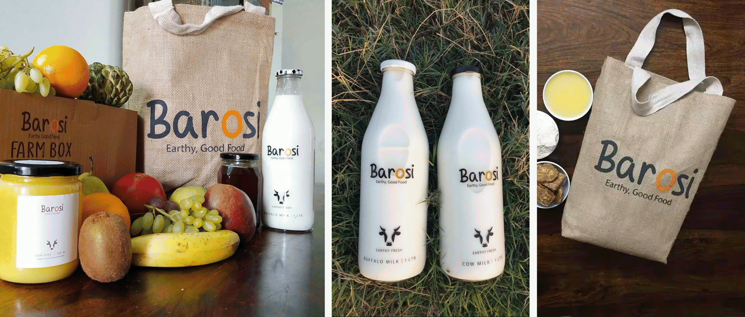
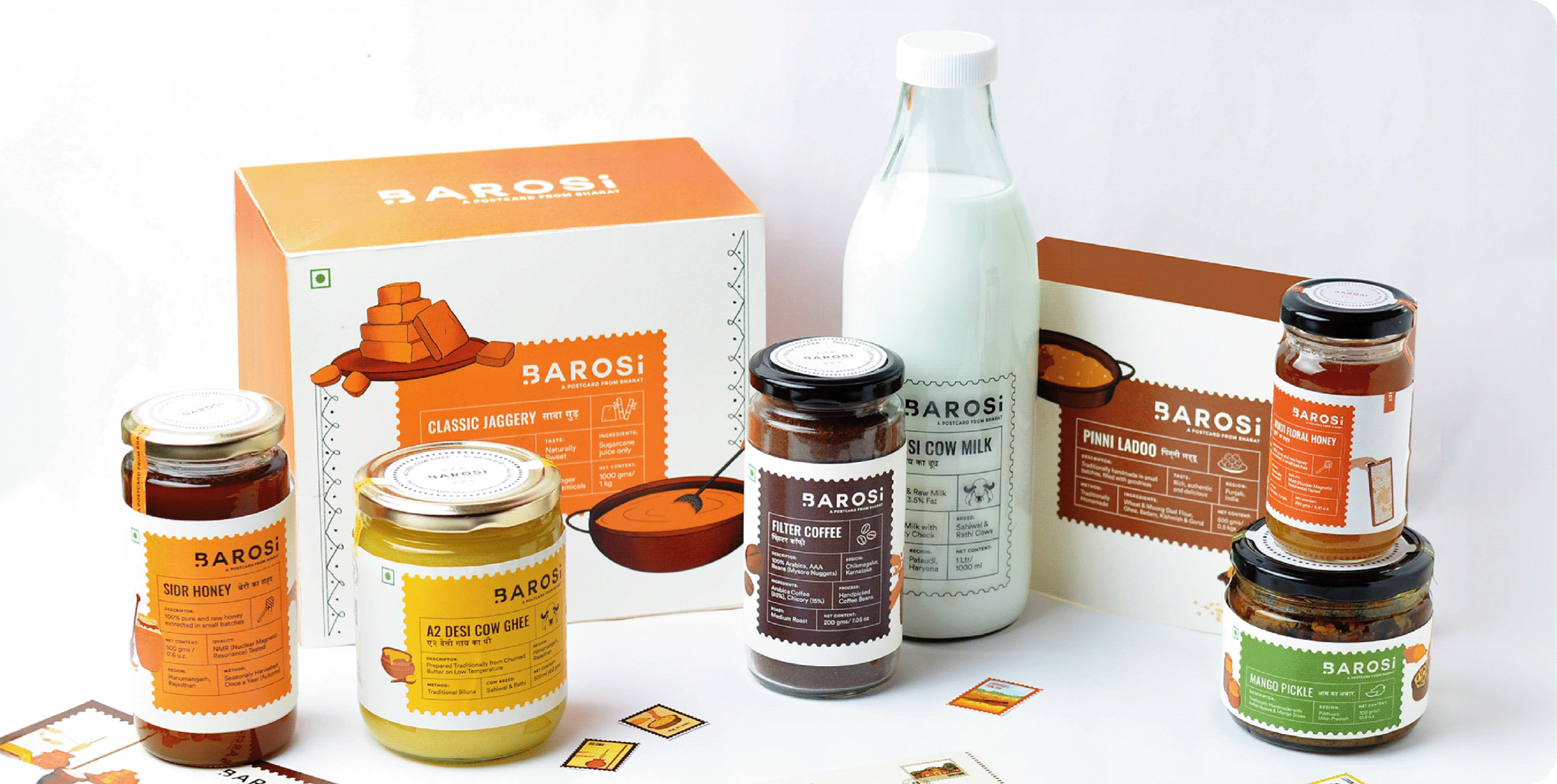
Barosi works with farms across rural India, making fresh and wholesome products rooted in local tradition and culture, brought to your kitchen in the most authentic way. So why did it need a rebrand?
IDENTITY CONCEPT

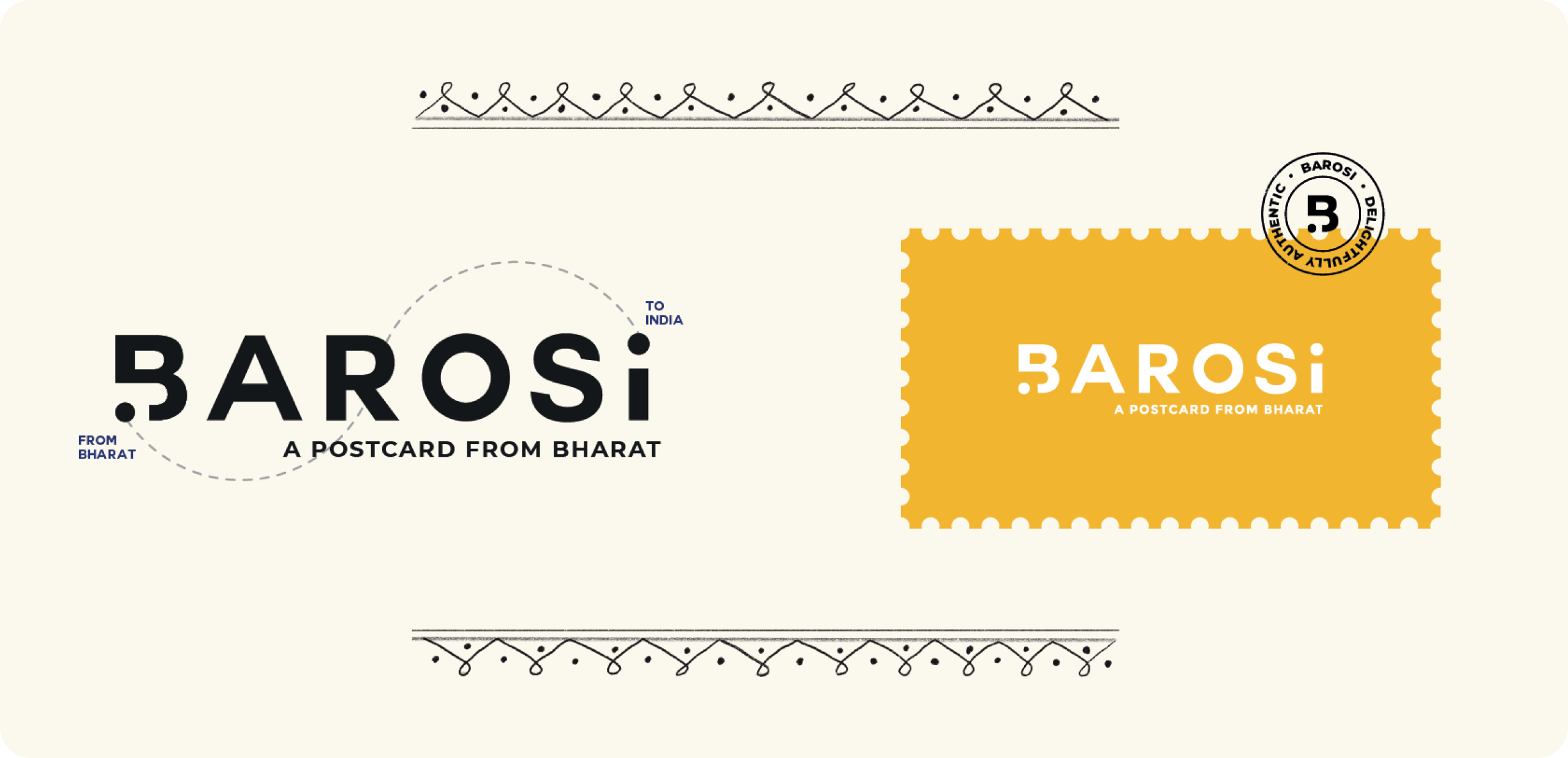
What if every product arrived like a postcard?

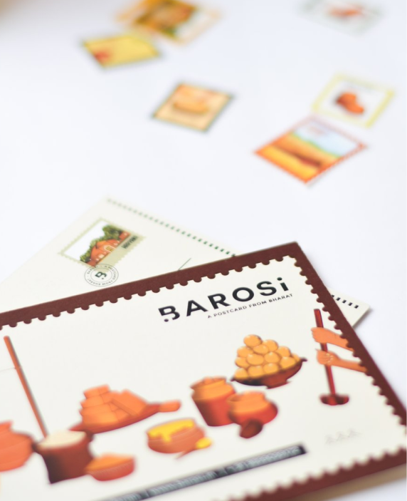
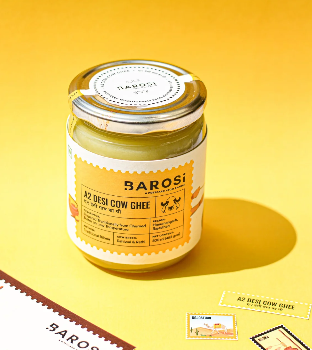
We wanted the identity to carry more than a name. Inspired by handwritten postcards and journeys across India, every visual element reminds consumers where their food comes from and who made it.


The moving dot becomes a symbol of that journey, connecting Bharat with India, while keeping Barosi’s roots visible at every touchpoint.
From the farms of Barosi to you!

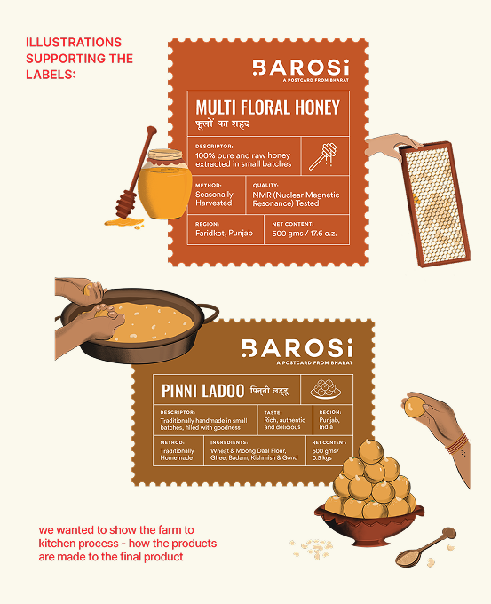
We built the entire brand around the idea of A Postcard From Bharat. Every product becomes a postcard, carrying stories, traditions, and flavours from a different corner of India, thoughtfully delivered by Barosi.

THE BEST PART

How do you convey these stories on the packaging?

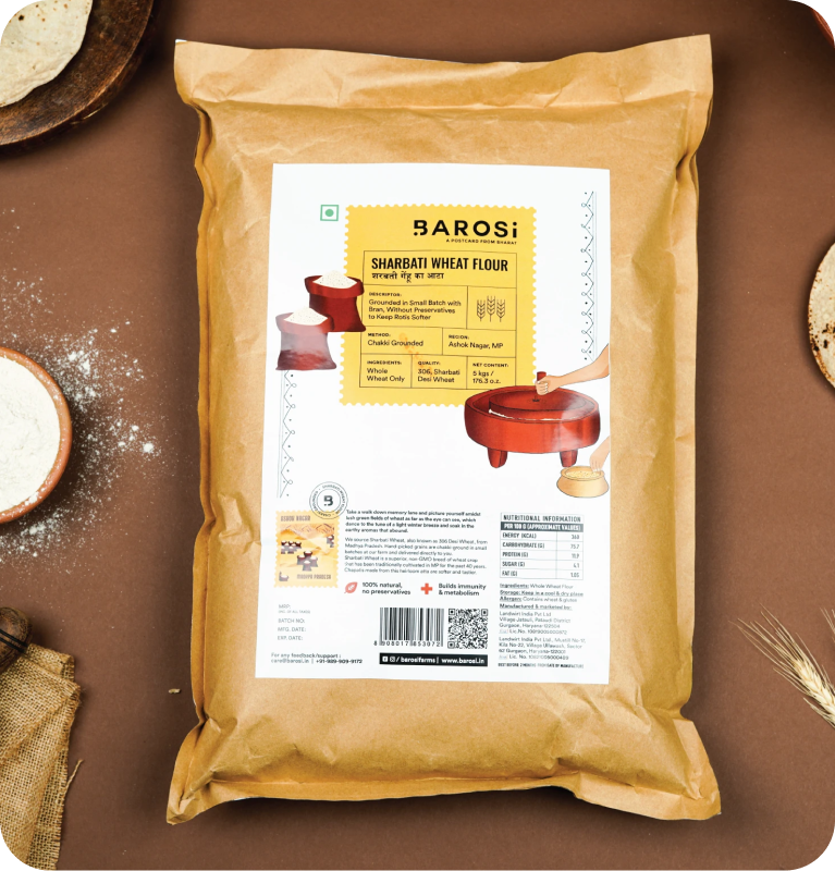
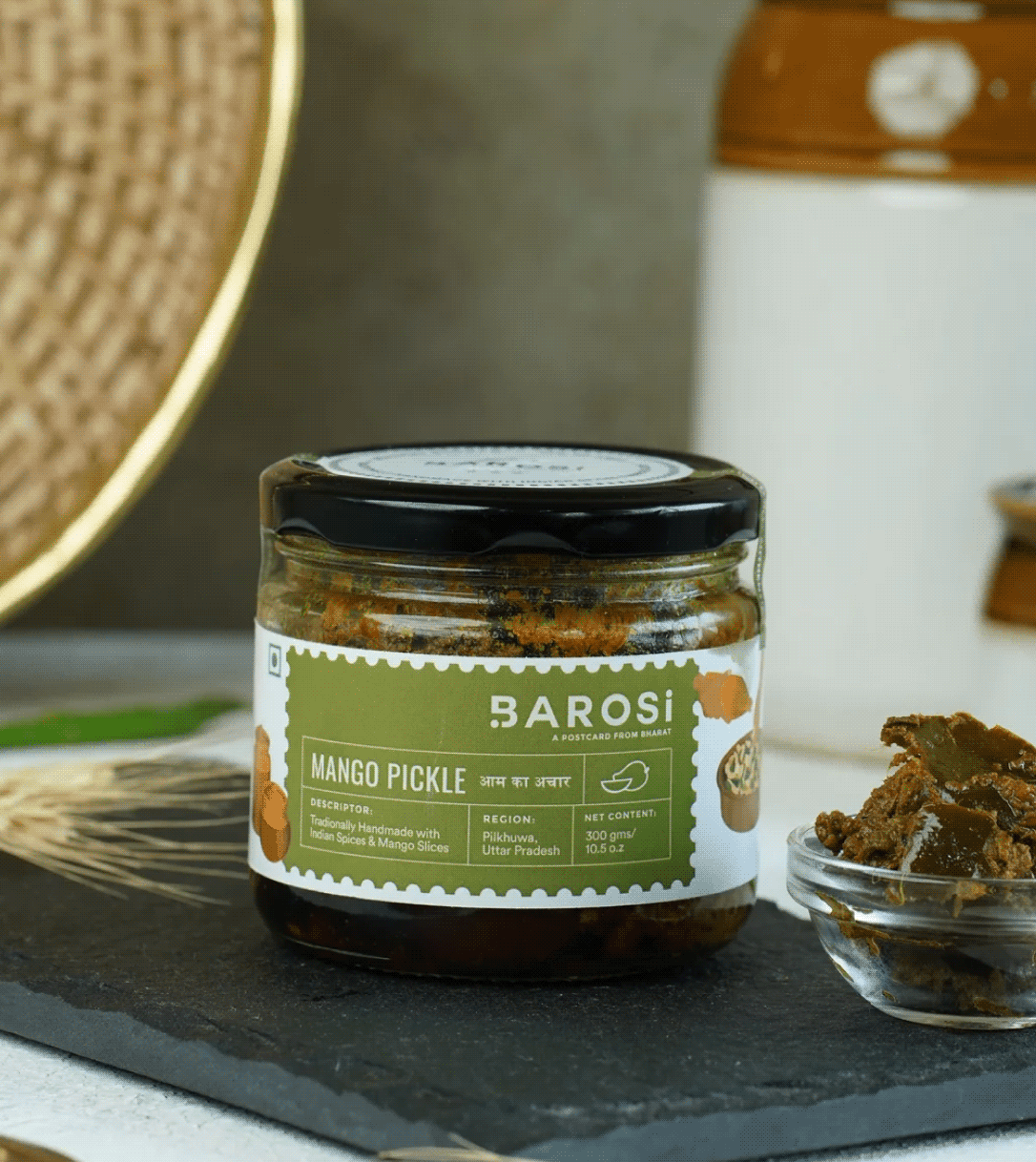
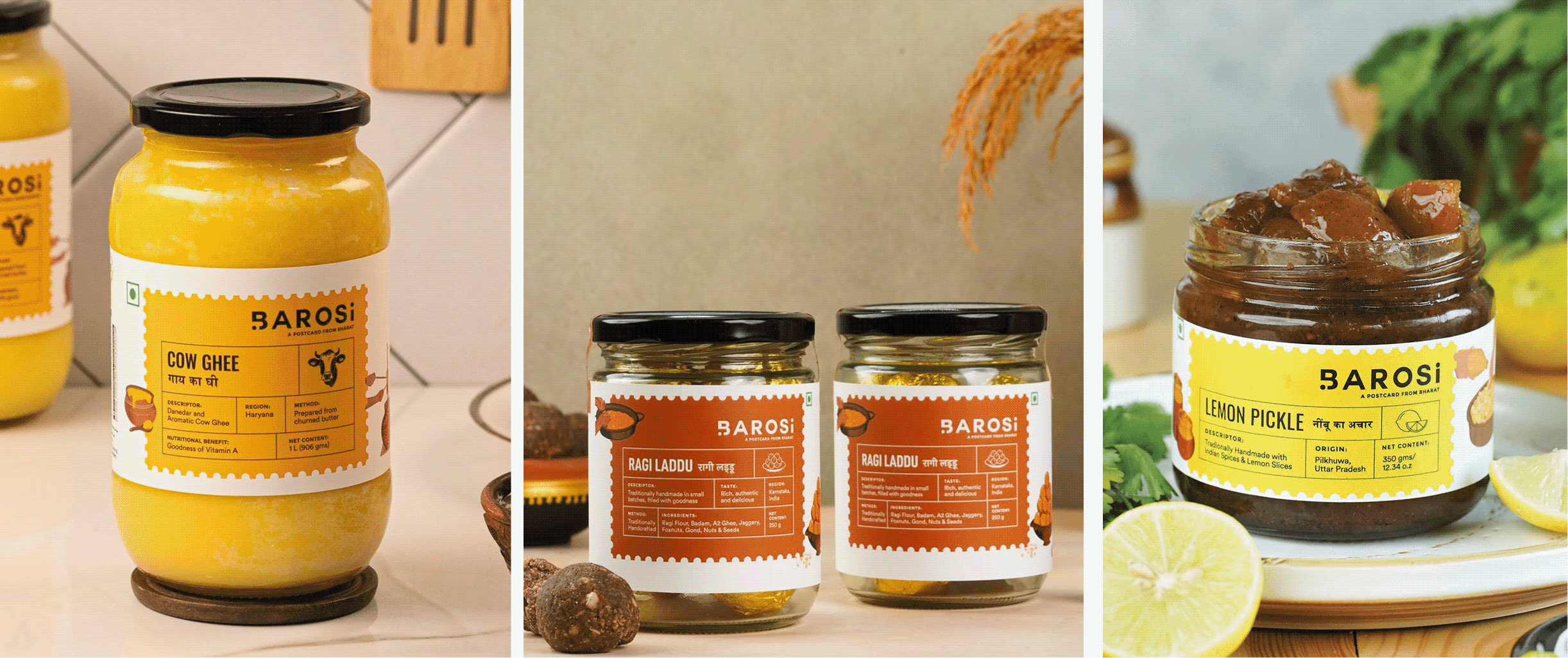
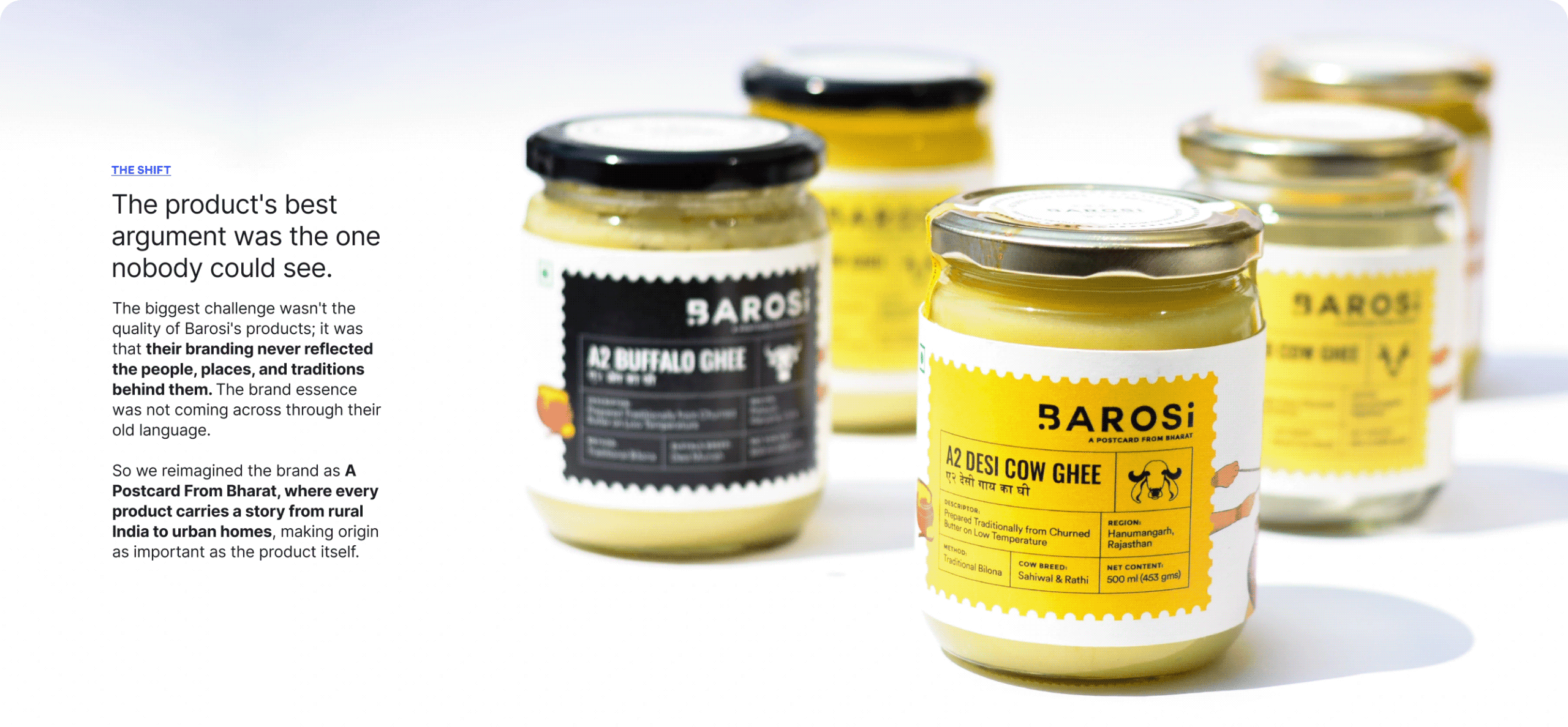
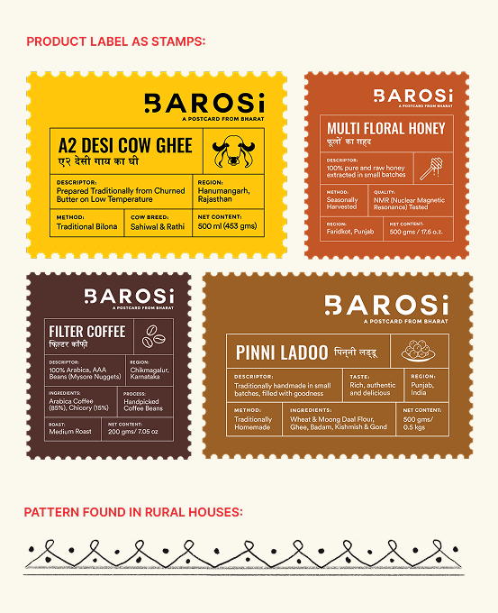
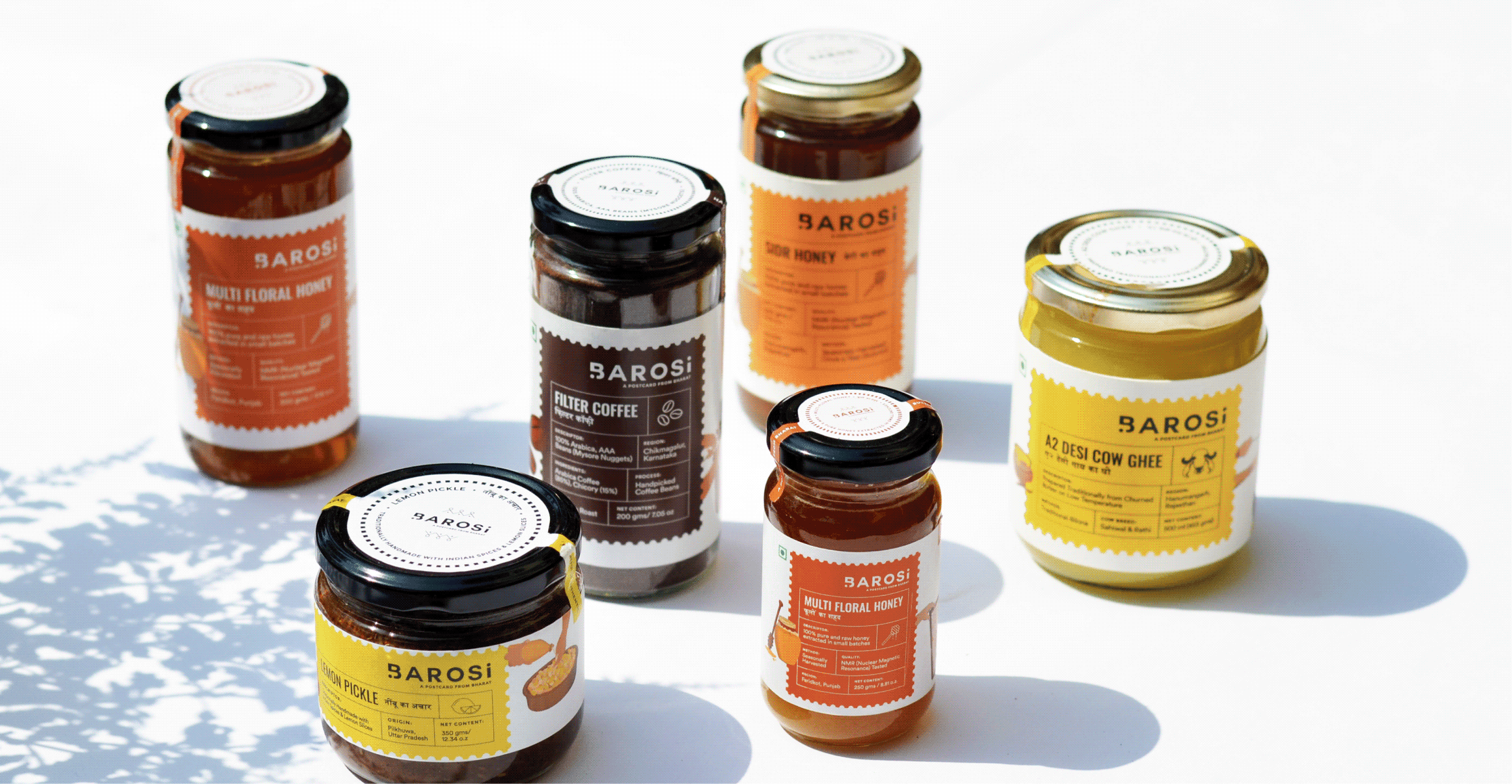
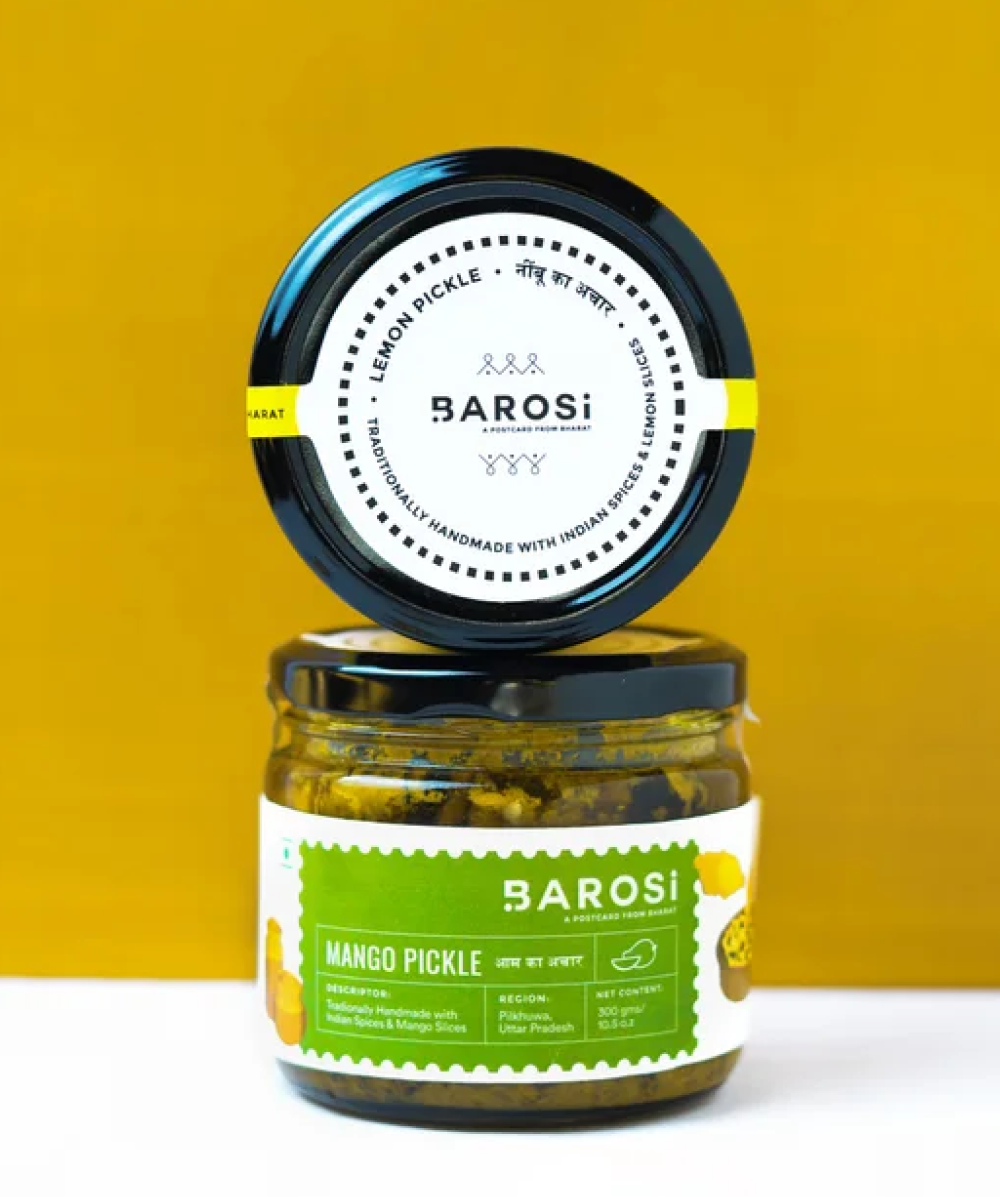
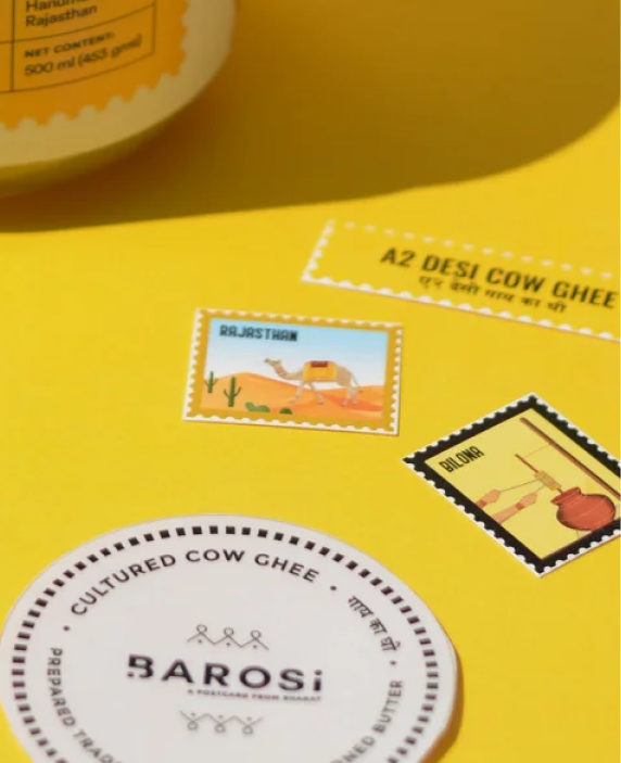
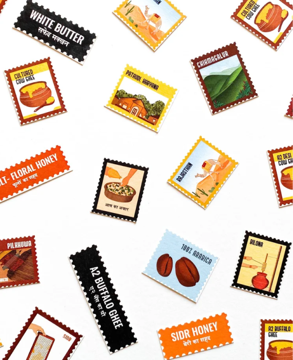
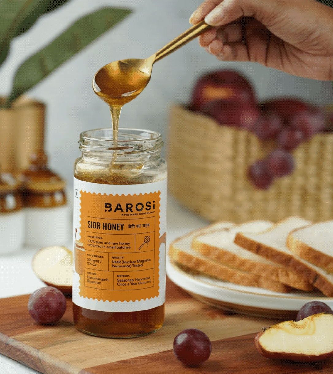
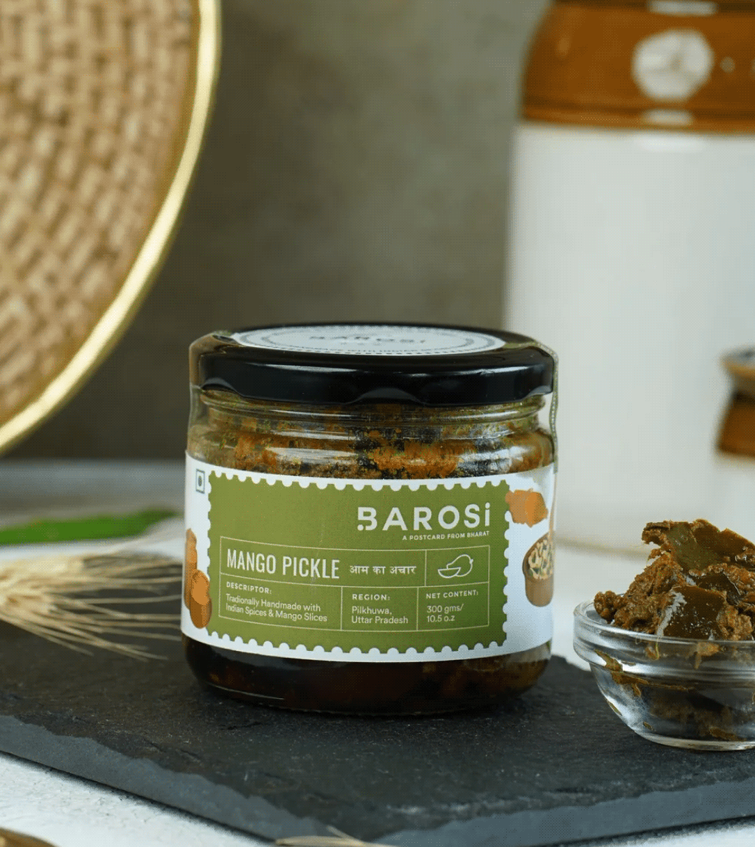
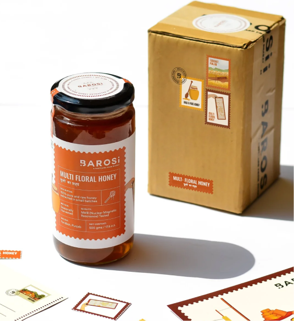
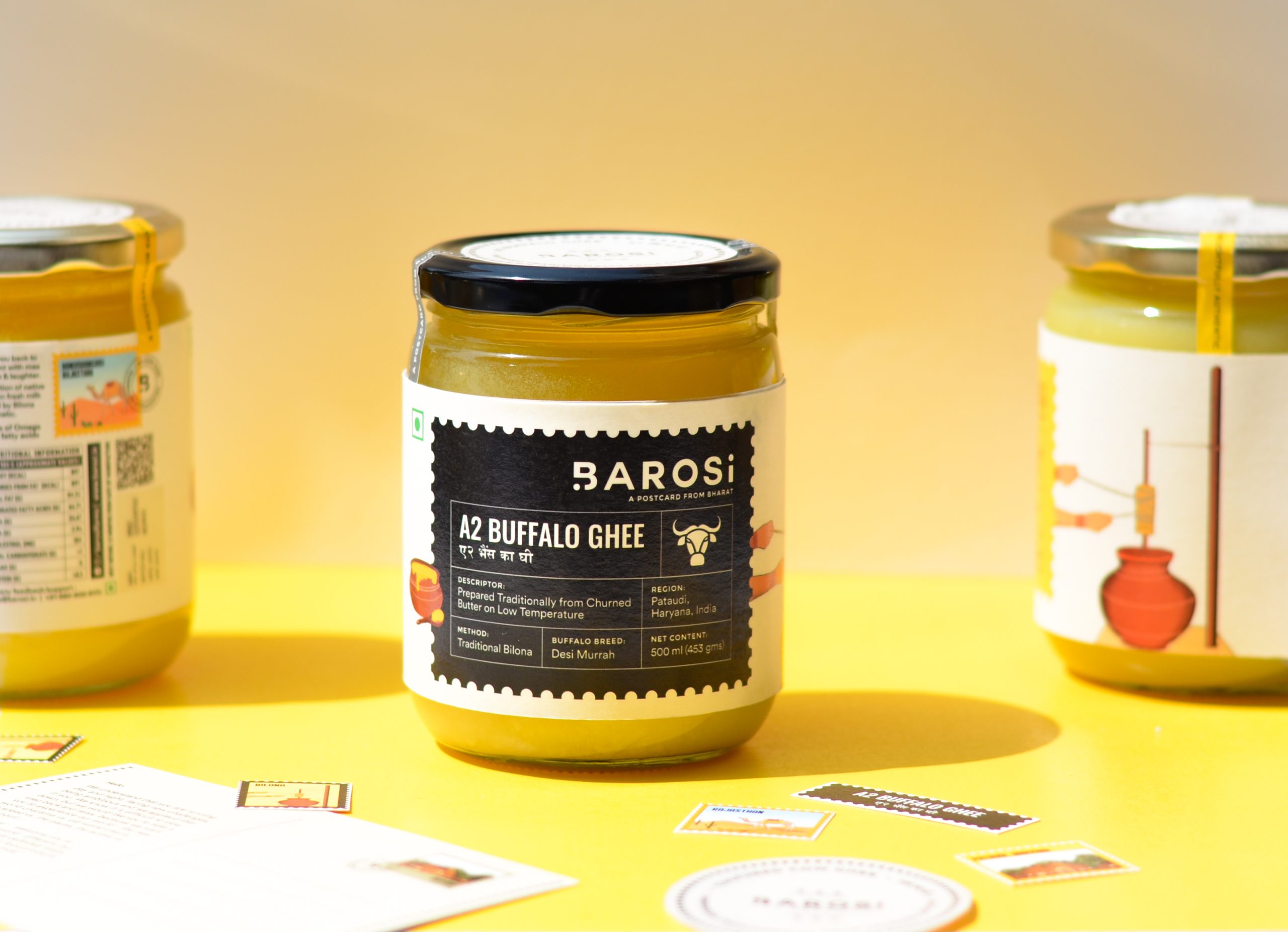
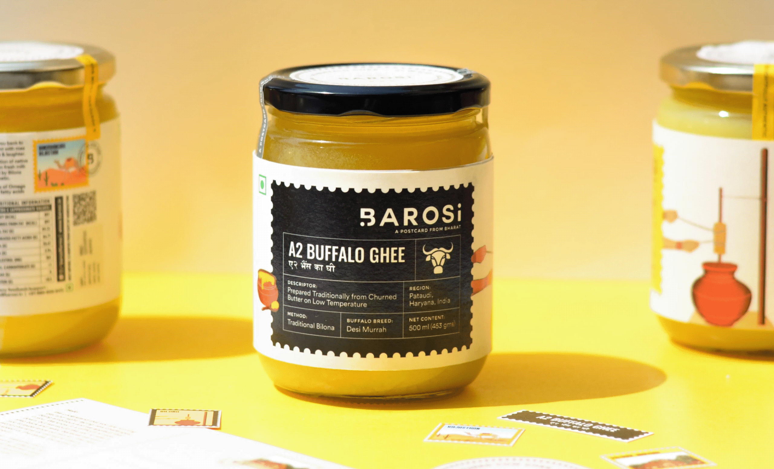
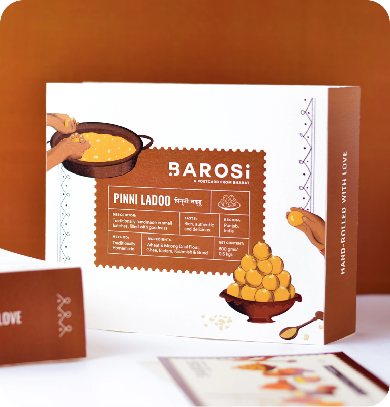
The packaging comes alive through postal stamps, traditional patterns, postcards, and origin labels. Every pack traces its roots, sharing where the product comes from, how it’s traditionally made, and the stories behind it.
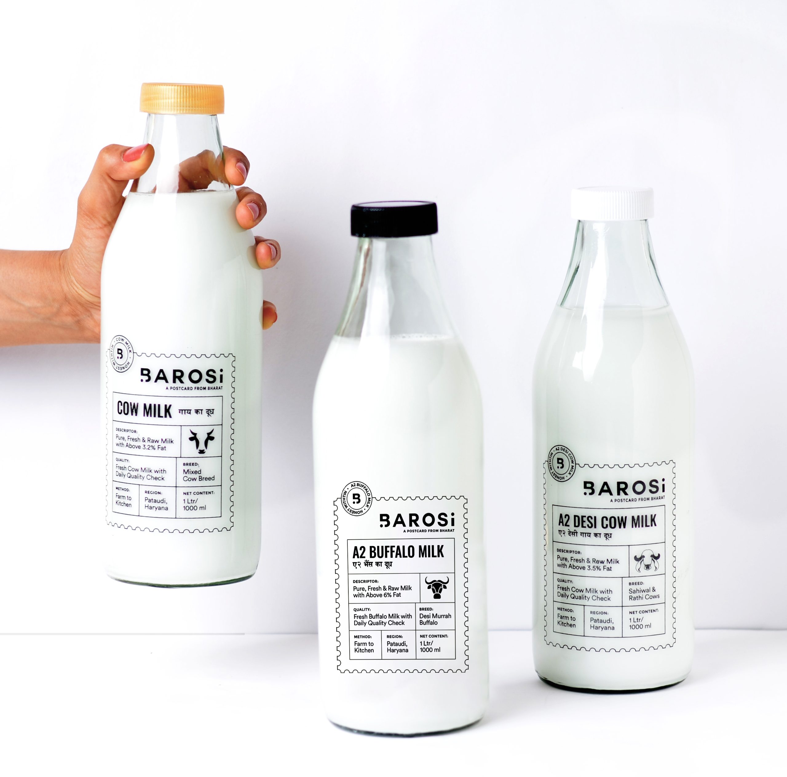
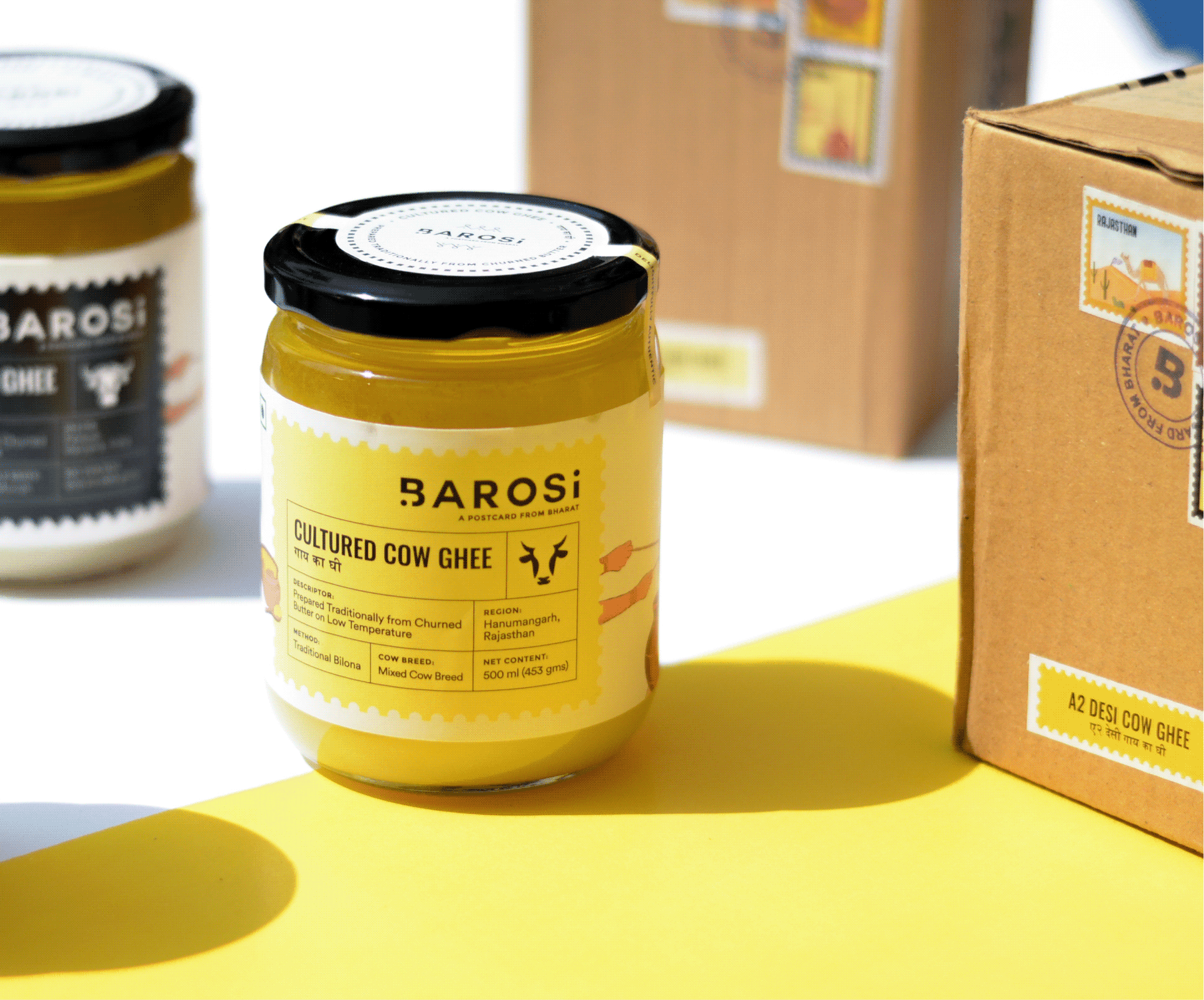
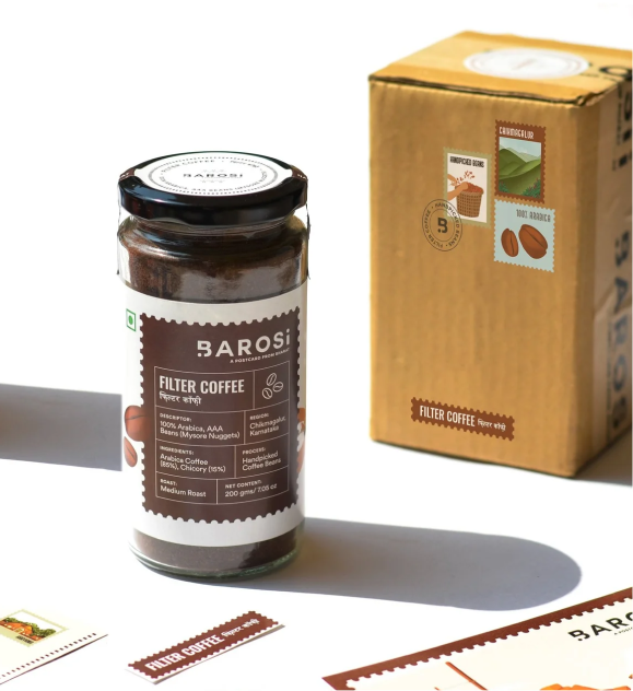
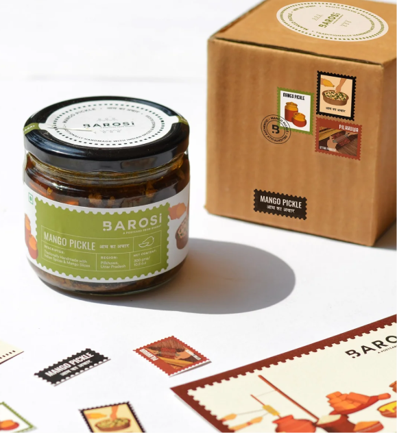
Can a brown box deliver a brand experience?

We want a sustainable approach for Baroi’s packaging. The products are packed in reusable glass jars and zero plastic is used. Since the brand only had the bandwidth to do brown carton boxes, we wanted to add something more to create a better experience.

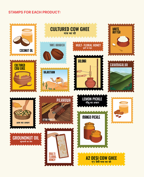
So, we designed four different stamps for each product: one for the origin, one for the product, one for how the product is made, and one with the product name. Each box had a different look but the same experience. Our goal was to create a thoughtful hand-crafted brand with a truly memorable consumer experience.
The messy, the fun, the not-so-pretty part of a project!
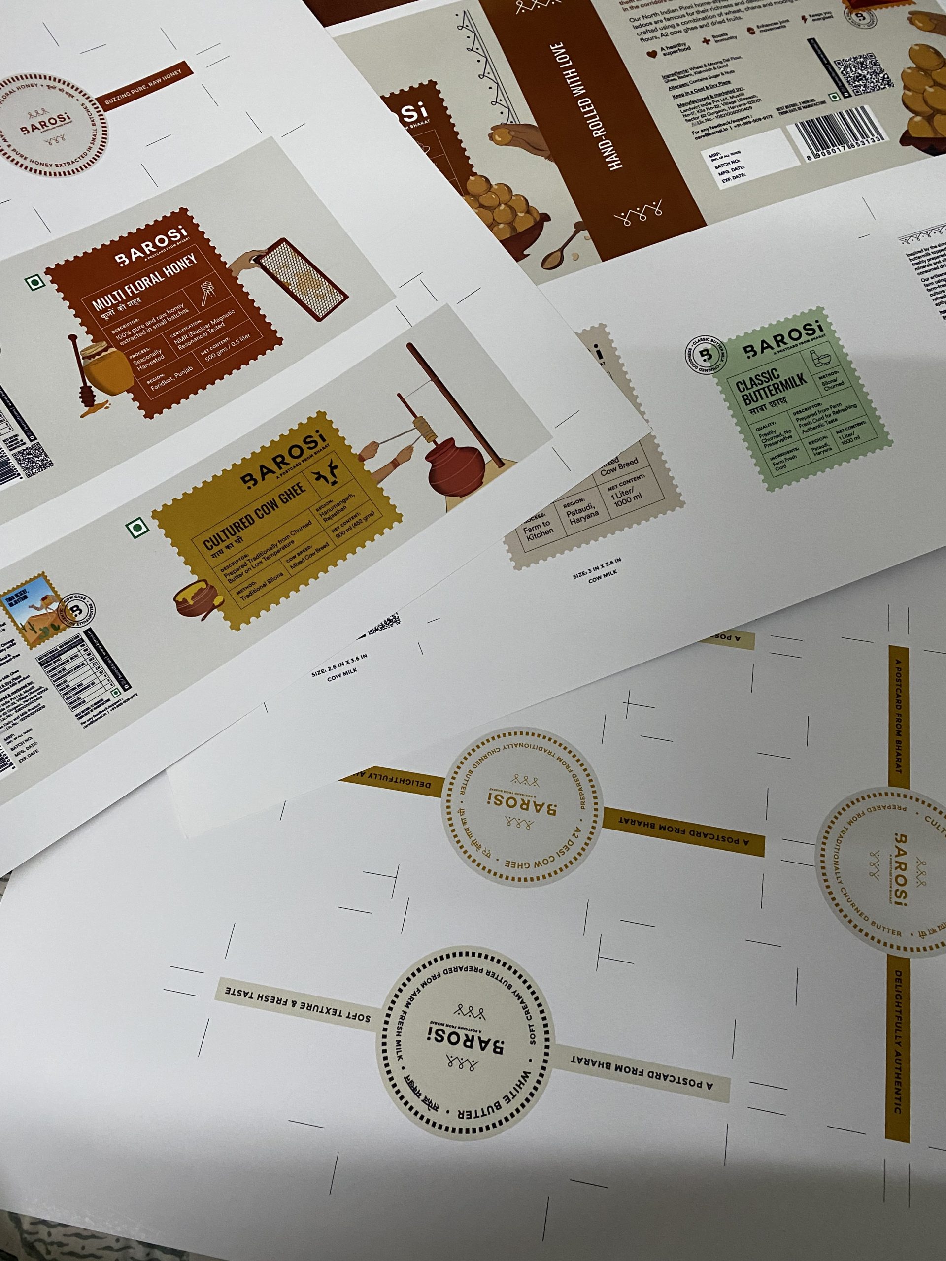
Print trials before production.
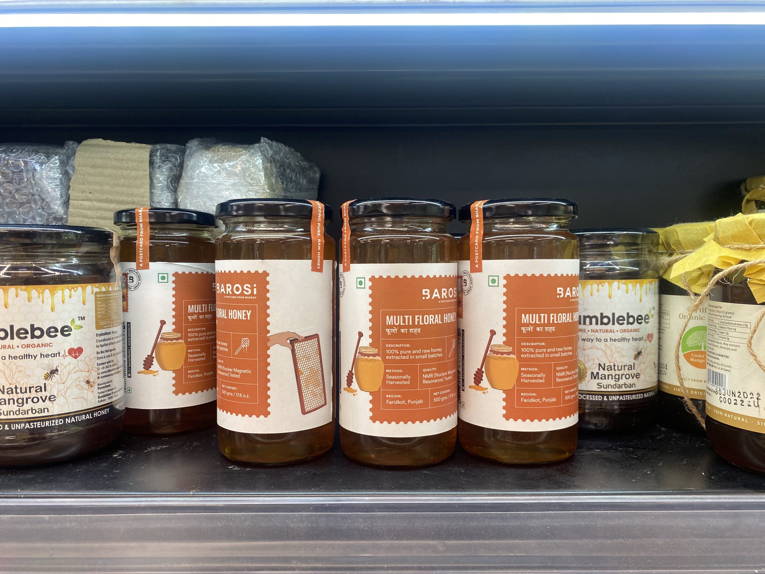
Seeing our work on the shelves.
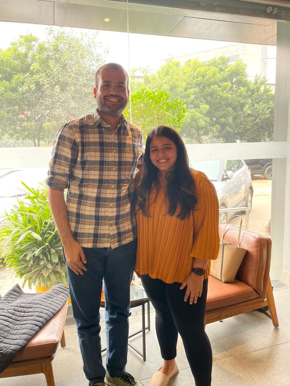
With the founder, Durlabh.
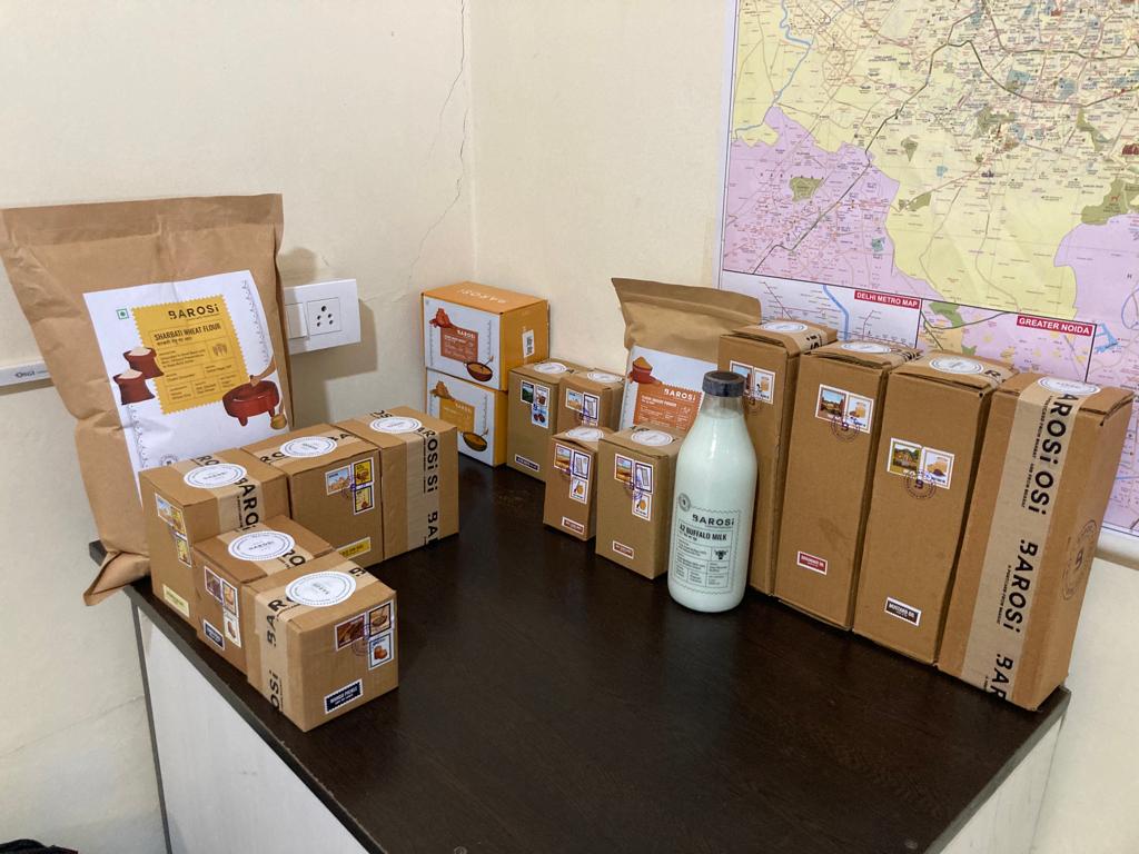
Seeing all the SKUs together (19SKUs).
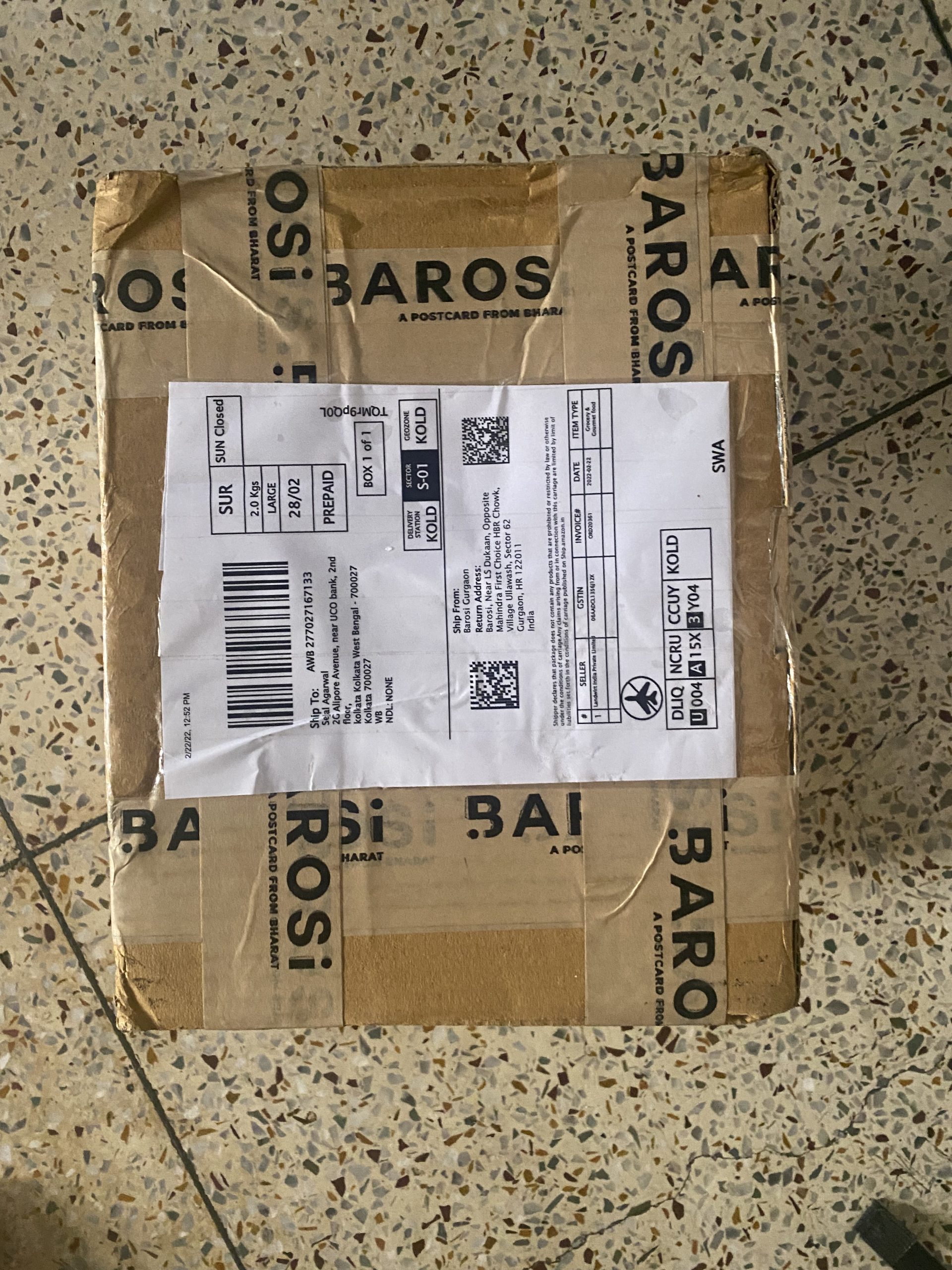
Happiness in a box.
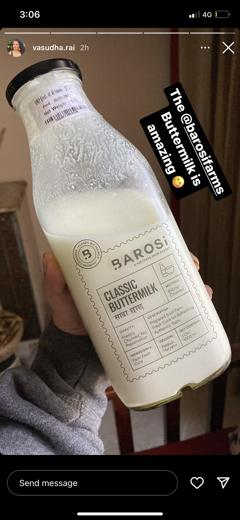
Seeing our work in the wild.
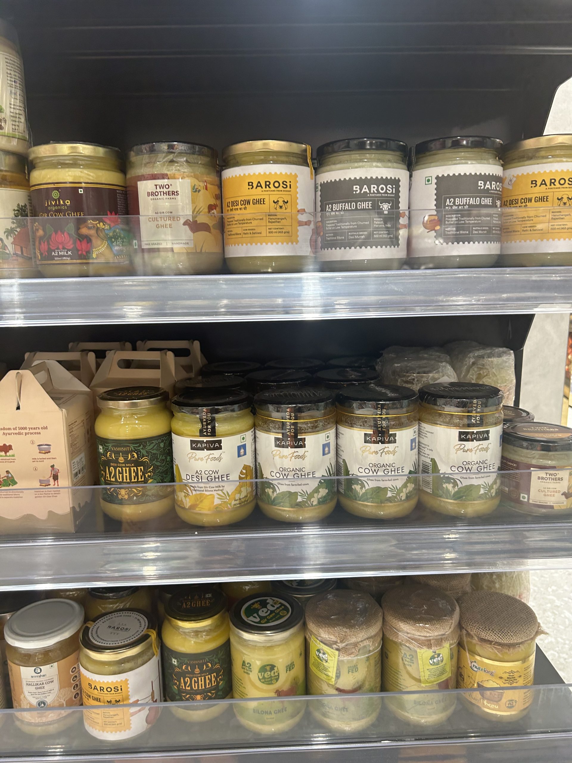
Does Barosi stand out to you?
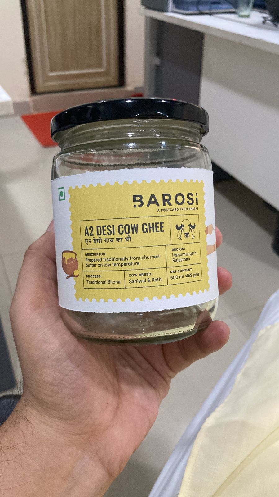
Sizing trials before production.
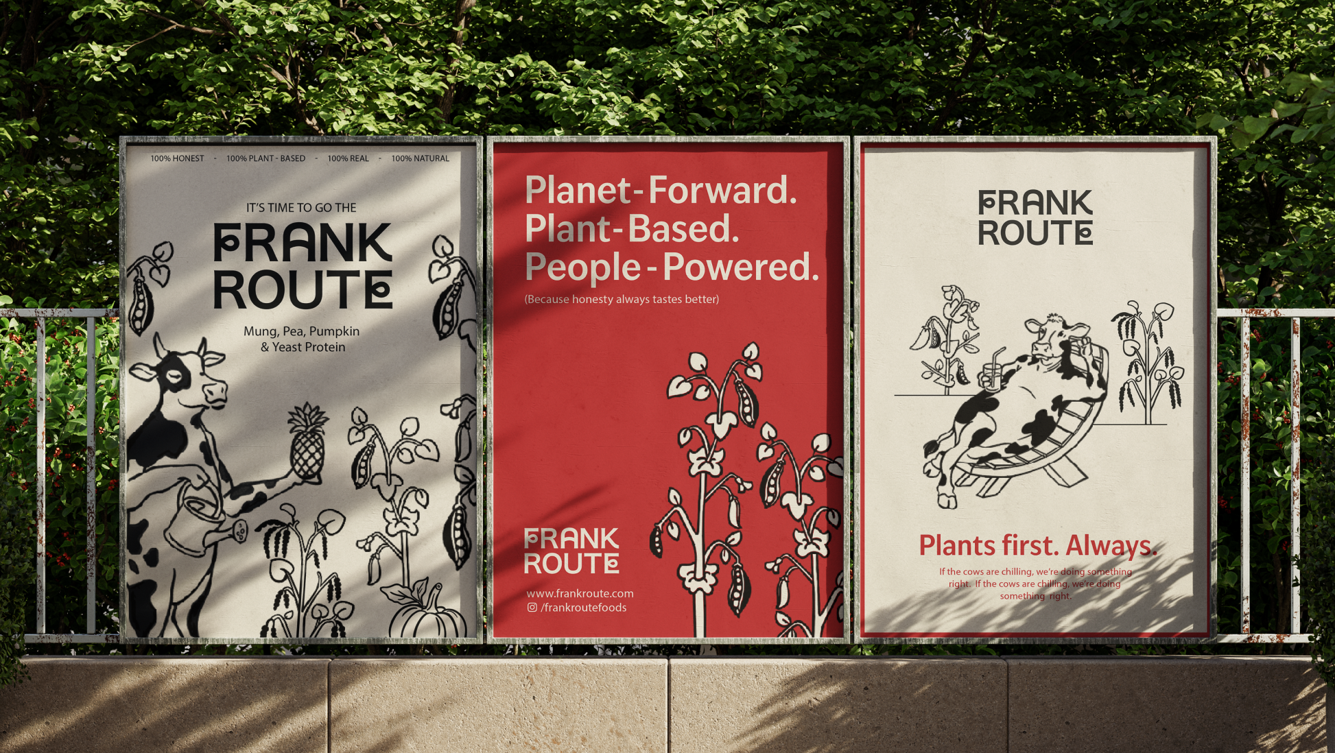
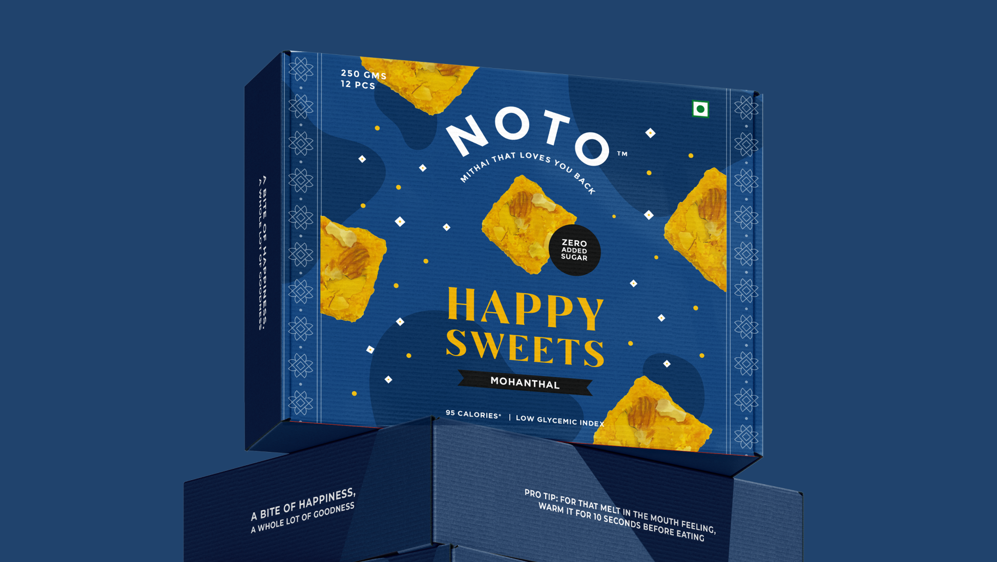
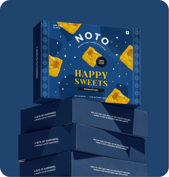
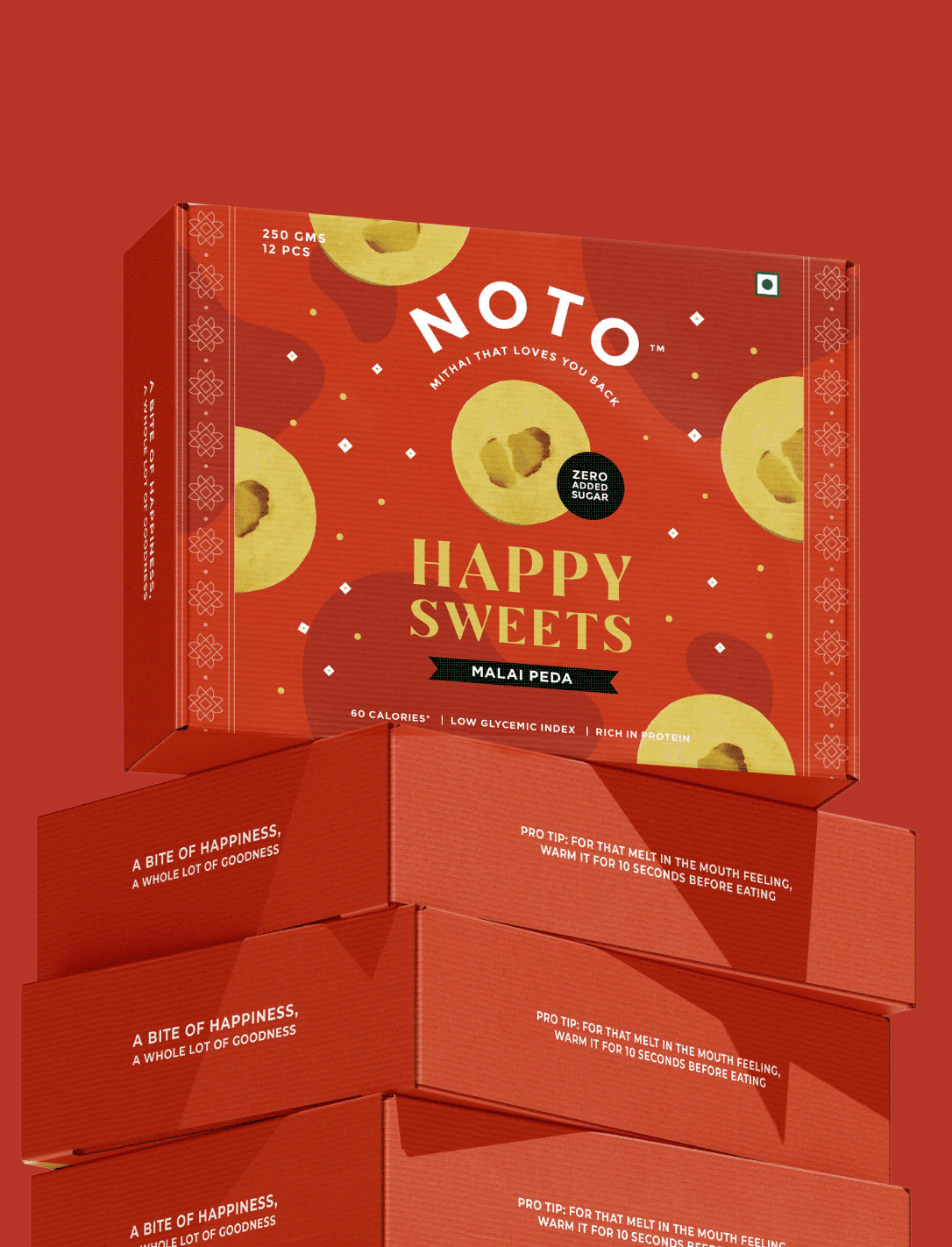
Mithai That Loves You Back

Can a dessert be good for you and also impossible to resist?

Scope Of Work: Research, Strategy, Product Packaging & Extension.

Healthy desserts have always been judged against the originals. Low-calorie ice cream. Sugar-free mithai. Most people expect them to compromise on taste long before they take the first bite.

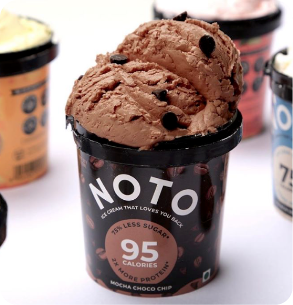
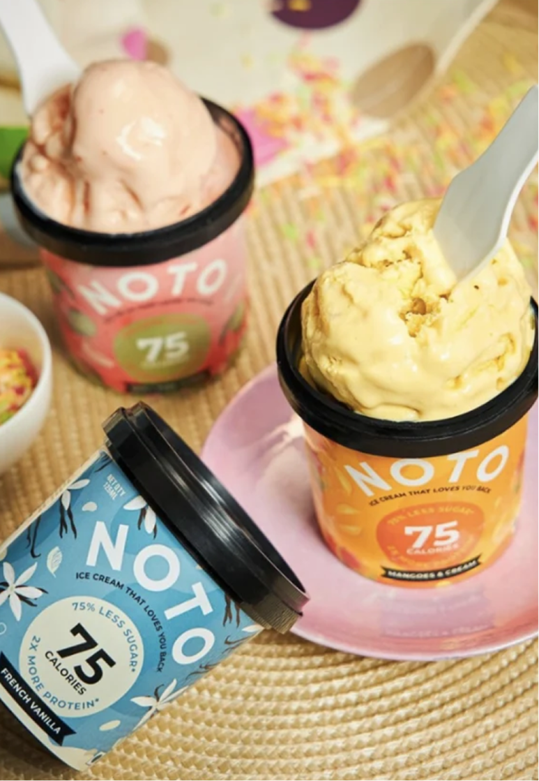
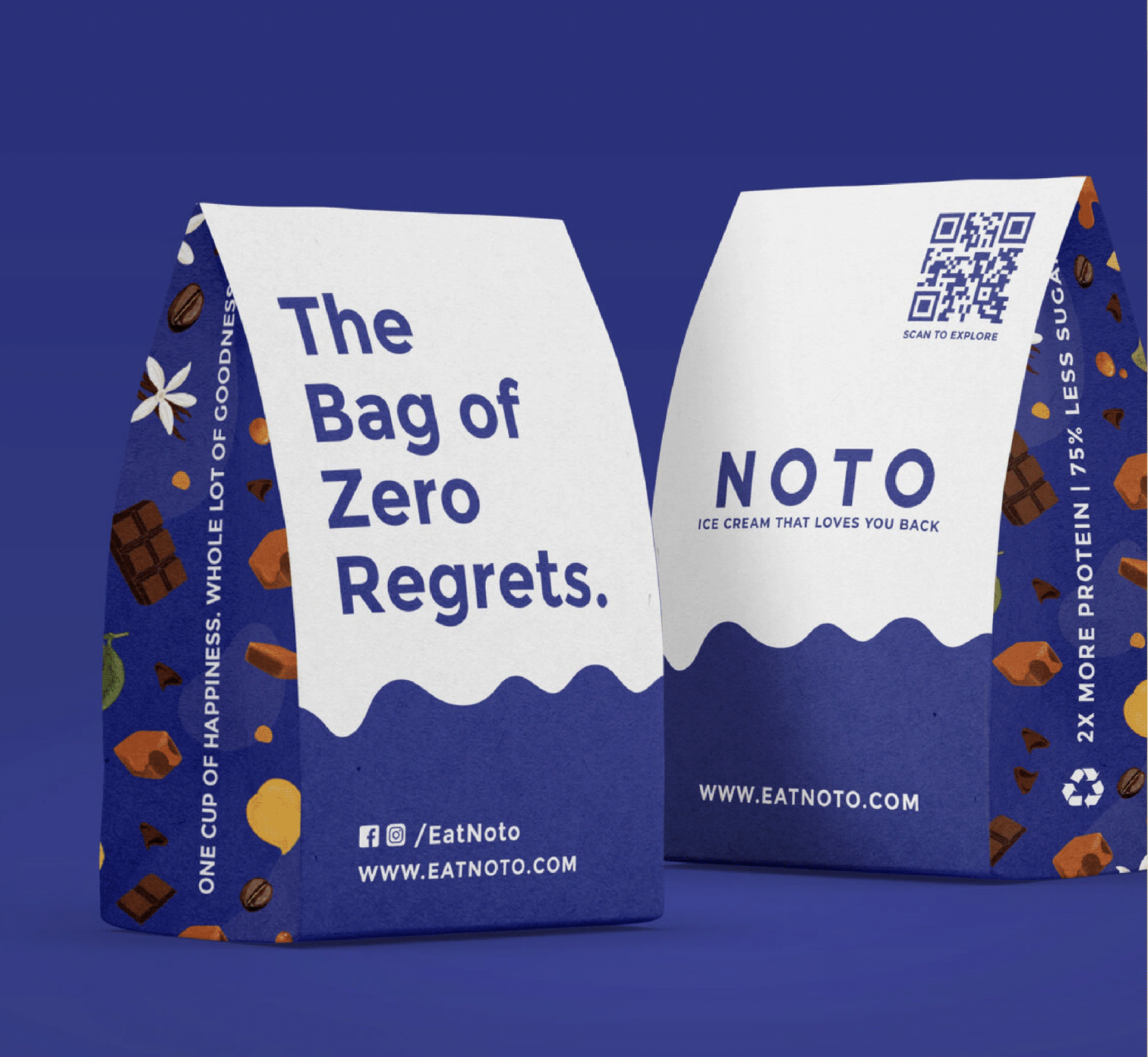
We explored this question with Varun and Ashni while designing packaging for Noto’s growing dessert portfolio. From indulgent ice creams to a guilt-free range of Indian mithai, every product challenged the idea that healthier choices had to feel like lesser ones.

The goal was to build packaging that celebrated flavour first and health second, making every dessert look just as irresistible as it tasted

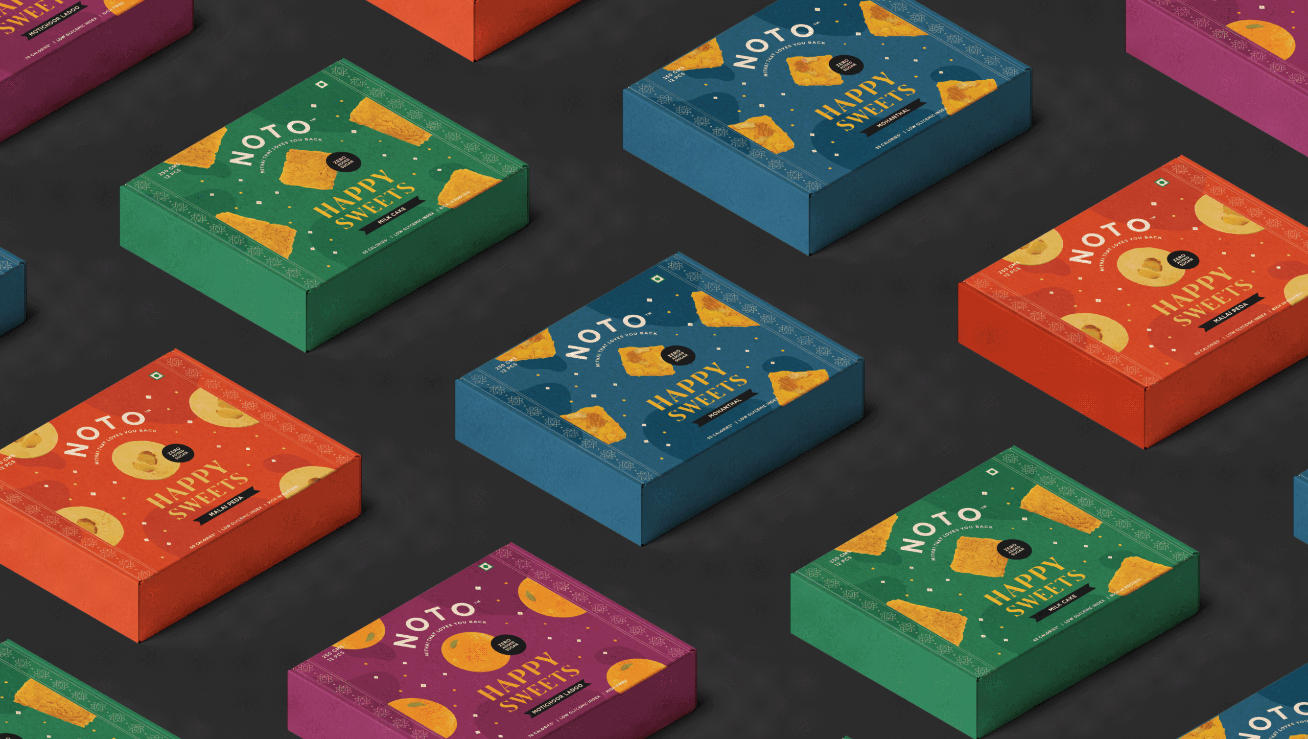
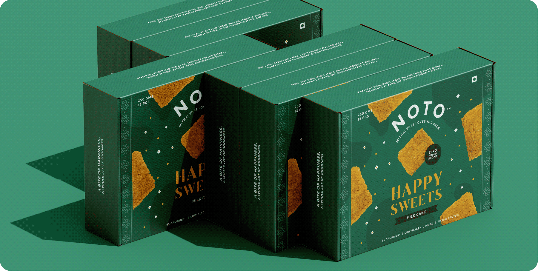
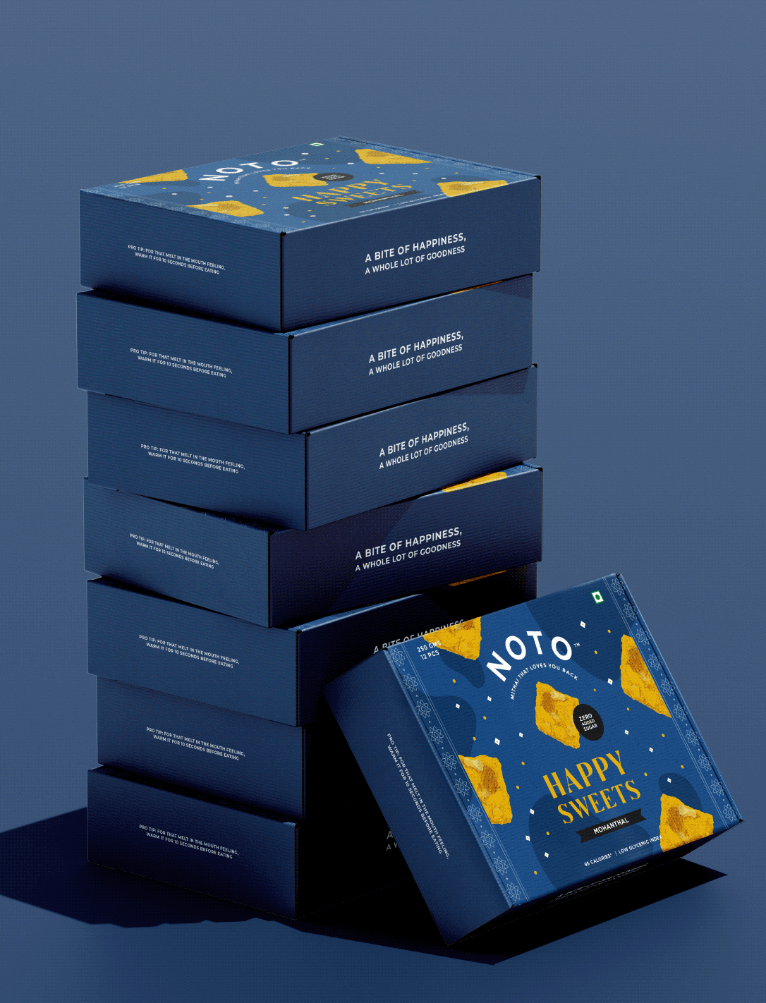
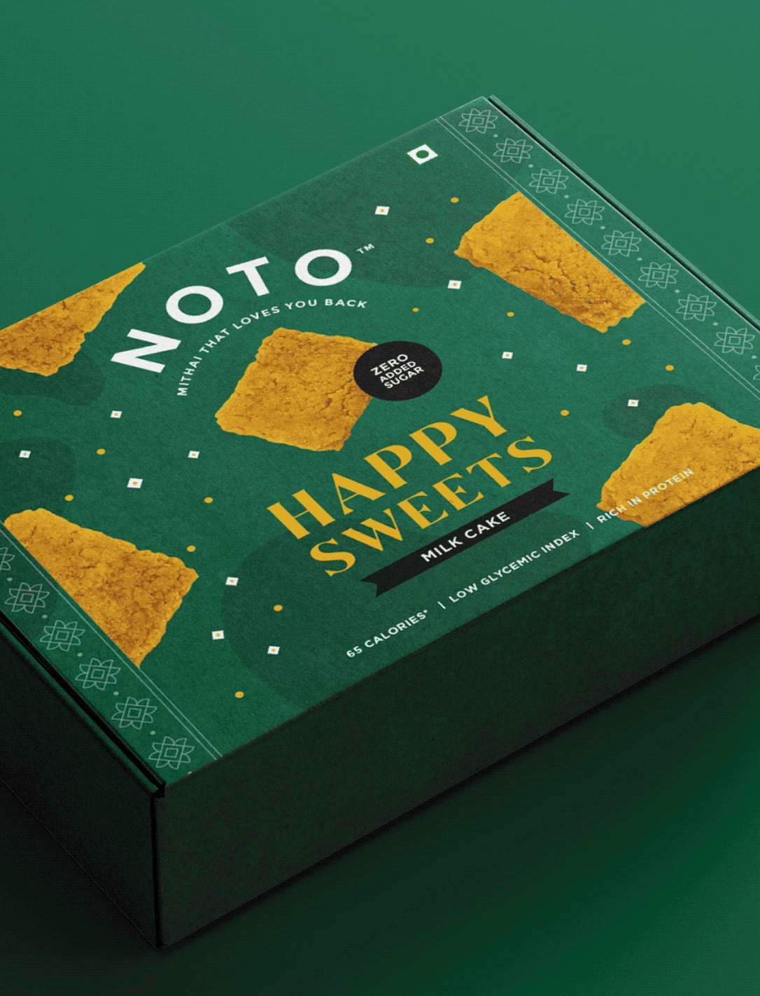
Happy Sweets: Mithai That Loves You Back!

VISUAL STRATEGY

How do you make a healthier dessert look as indulgent as it tastes?

Healthy desserts are often judged against their originals. People expect low-calorie ice creams and sugar-free mithai to compromise on taste before they even take the first bite.

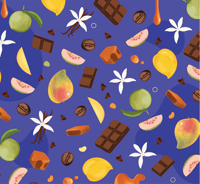
Rather than making health the hero, we made indulgence the hero, using bold typography, expressive details, and appetising visuals to make Noto feel irresistible first, and healthier second.

How do you make a small batch feel handcrafted at first glance?

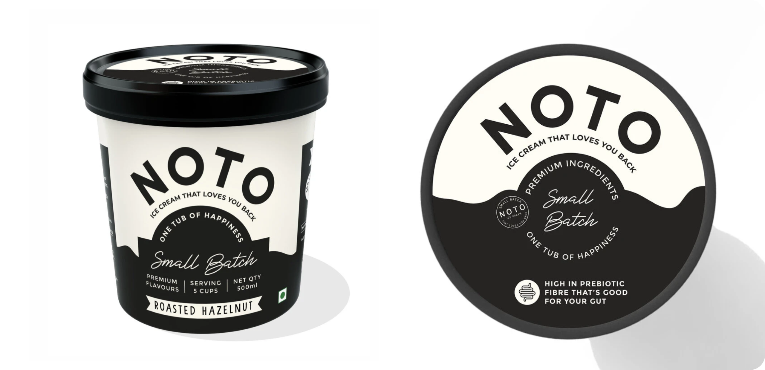
Noto later introduced a limited-edition featuring Roasted Hazelnut and Pistachio. While the flavours were new, the packaging had to remain unmistakably Noto.


We retained the signature black-and-white foundation, introducing subtle handcrafted details like stamped accents to give the range a more artisanal, exclusive feel without losing brand familiarity.

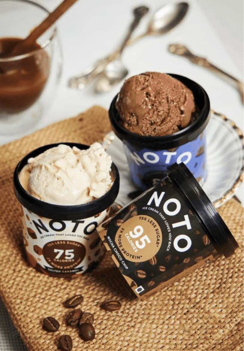
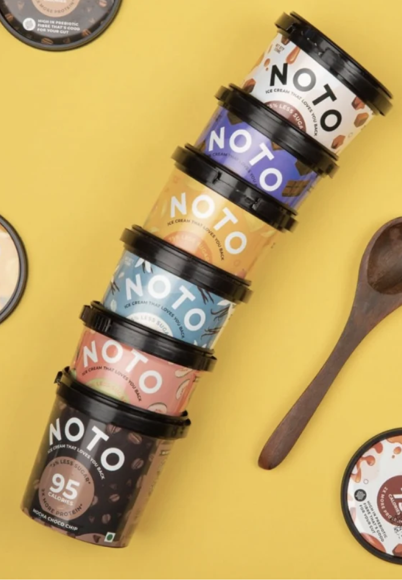
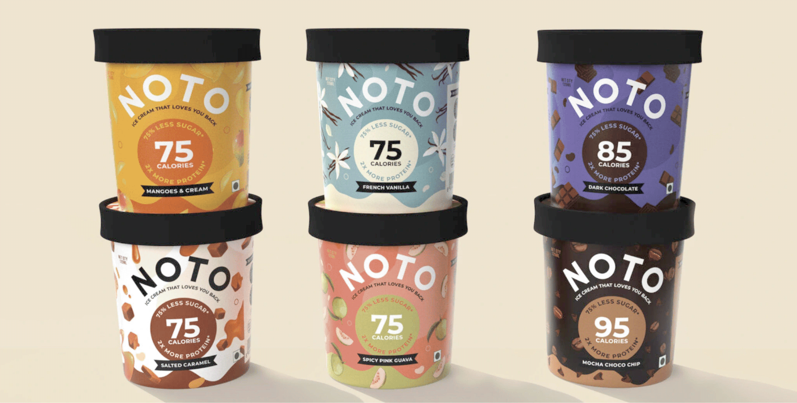
We designed the original range of Noto ice creams at Studio Glyph. The objective was to build a brand language that pushed the boundaries of perception of healthy foods within the consumer’s minds. 

We started with the nomenclature, tagline and also developed their Identity and packaging for their six different flavours using rich colours and Icons to convey the main aspects of the products.

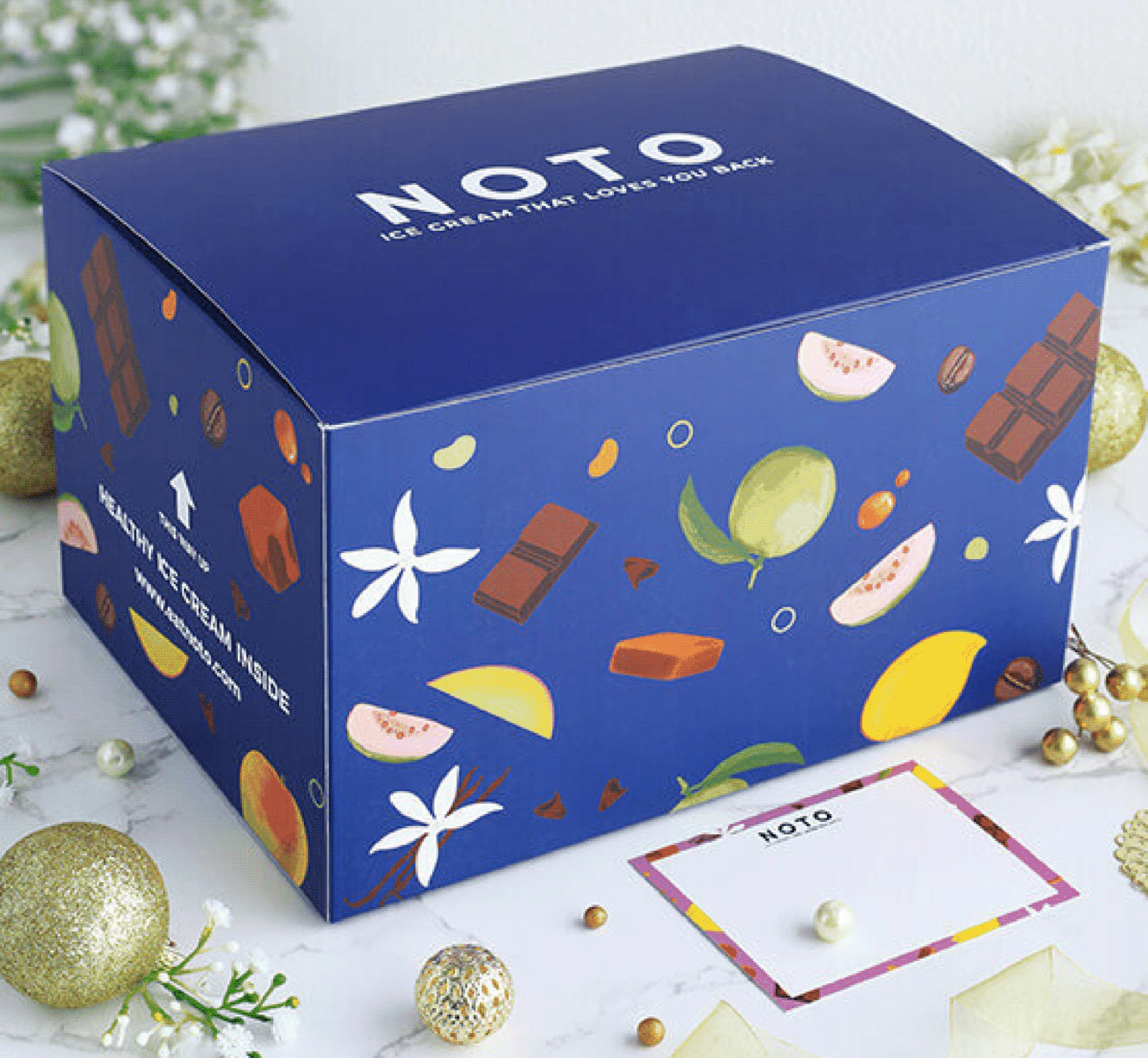
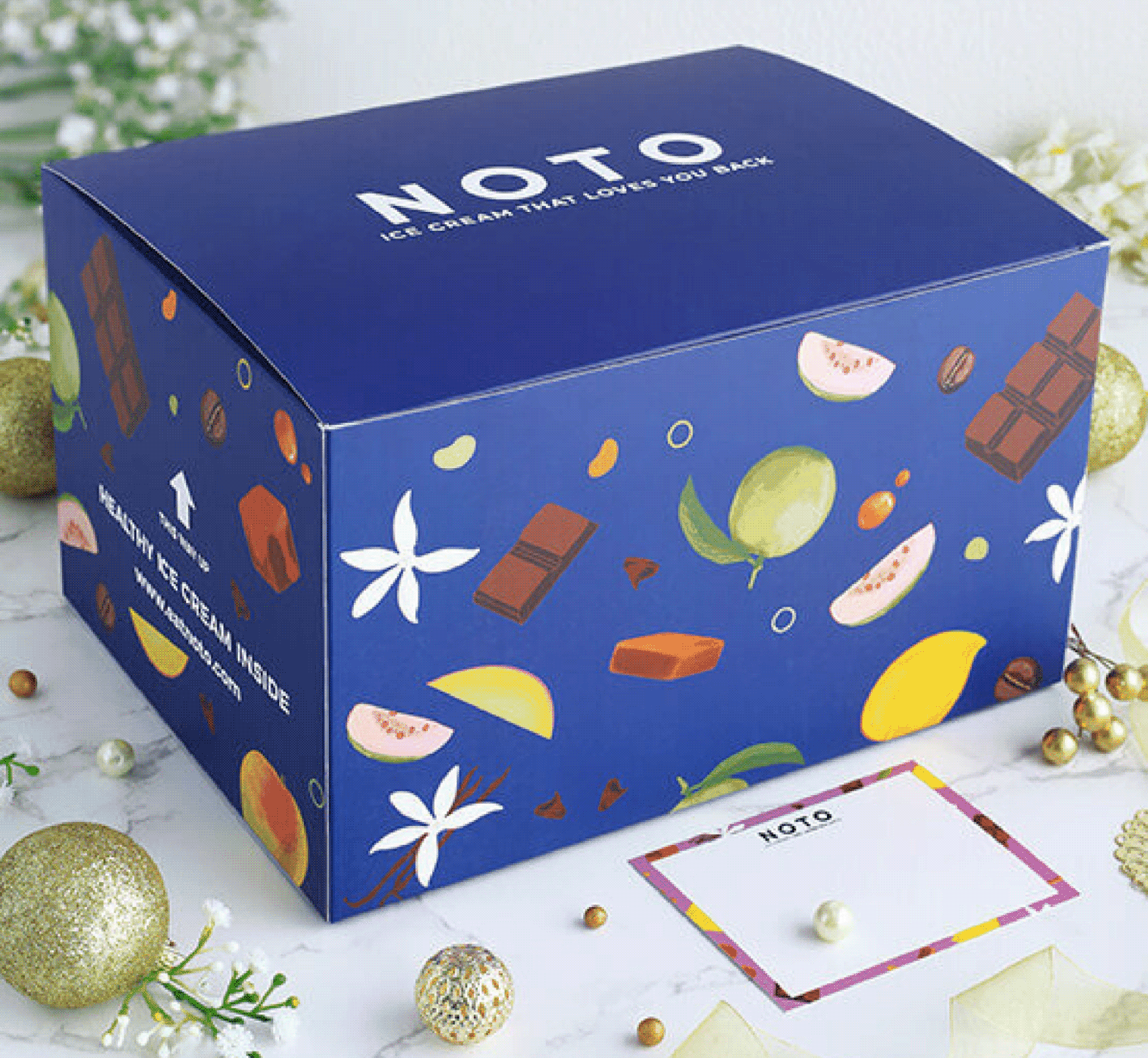
We carried the same visual language into the secondary and gifting packaging, ensuring every interaction with the brand felt cohesive and instantly recognisable.

Redefining Vegan French Patisserie

Does being vegan make you feel like a compromise?

Scope Of Work: Market Research, Strategy, Brand Identity, Packaging Design, Visual Language, Web Design and Art Direction.
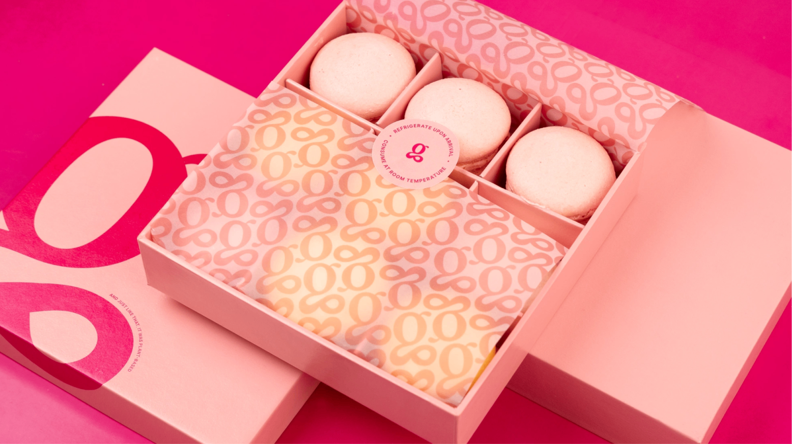
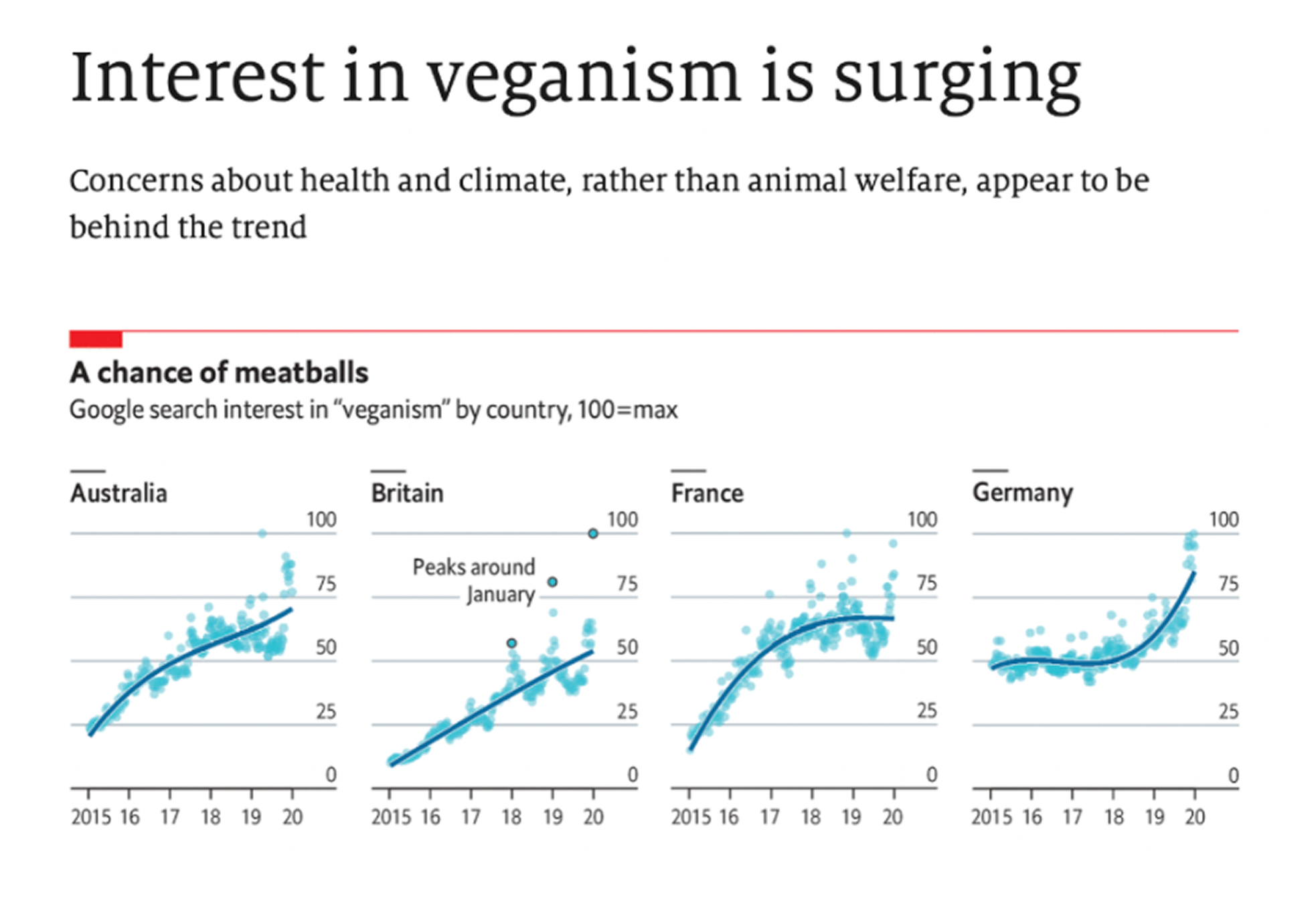
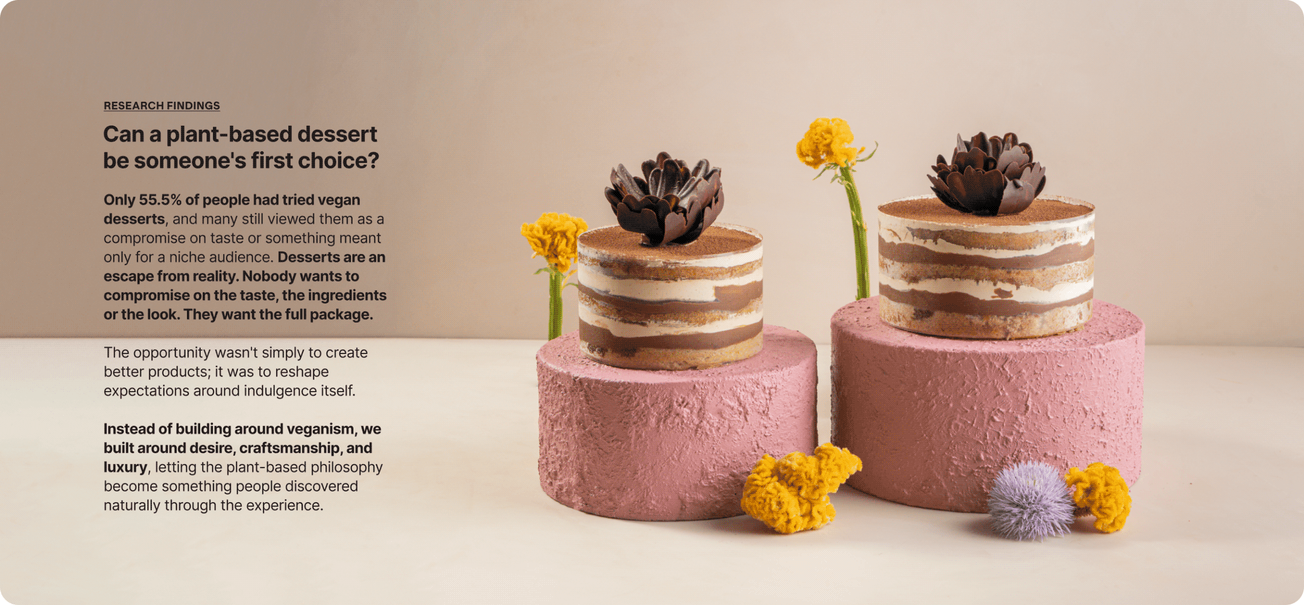
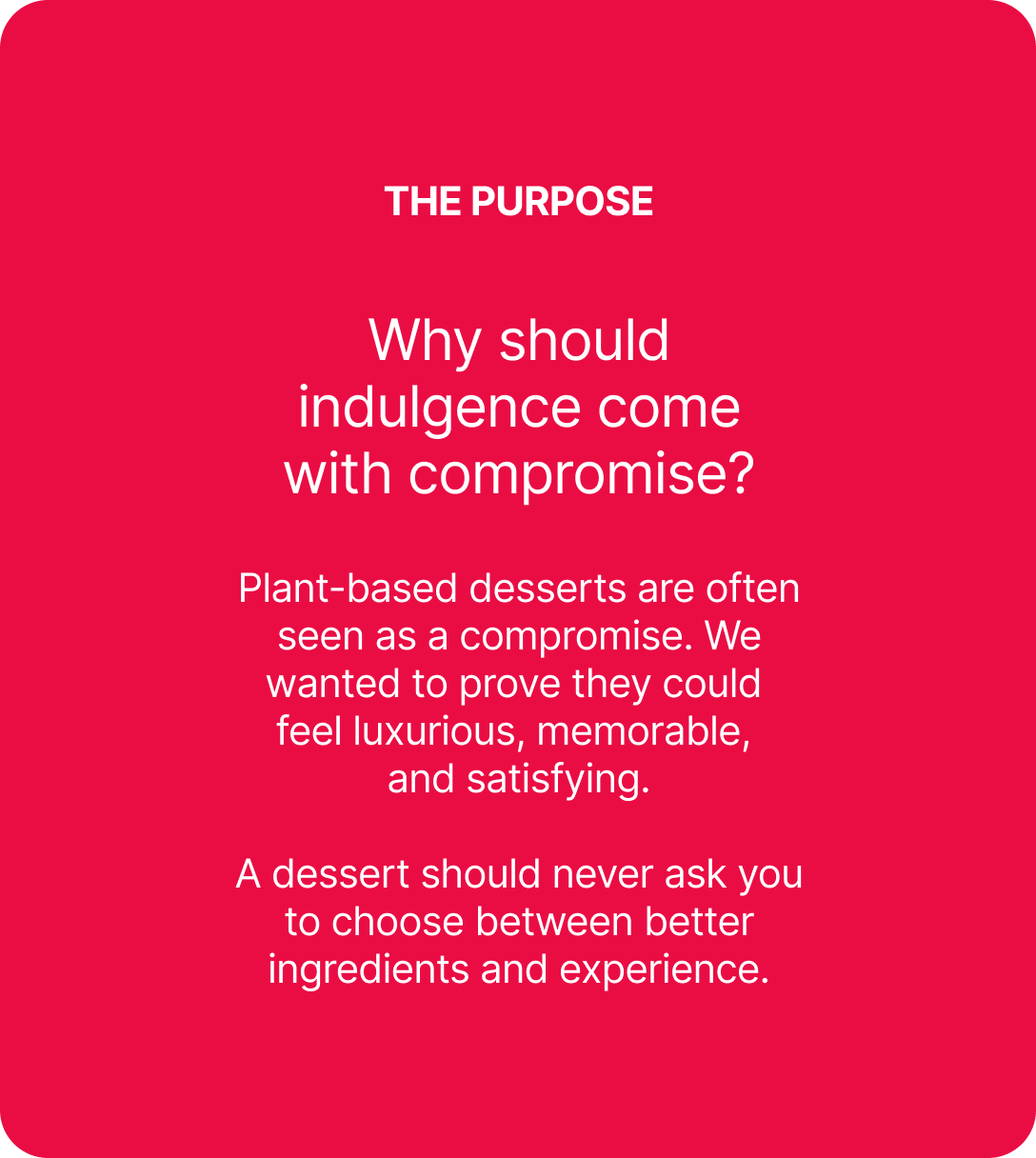
Plant-based food is often expected to be healthier, but rarely more desirable. Luxury patisserie, on the other hand, has always celebrated richness, craft, and indulgence. Could the two belong together?

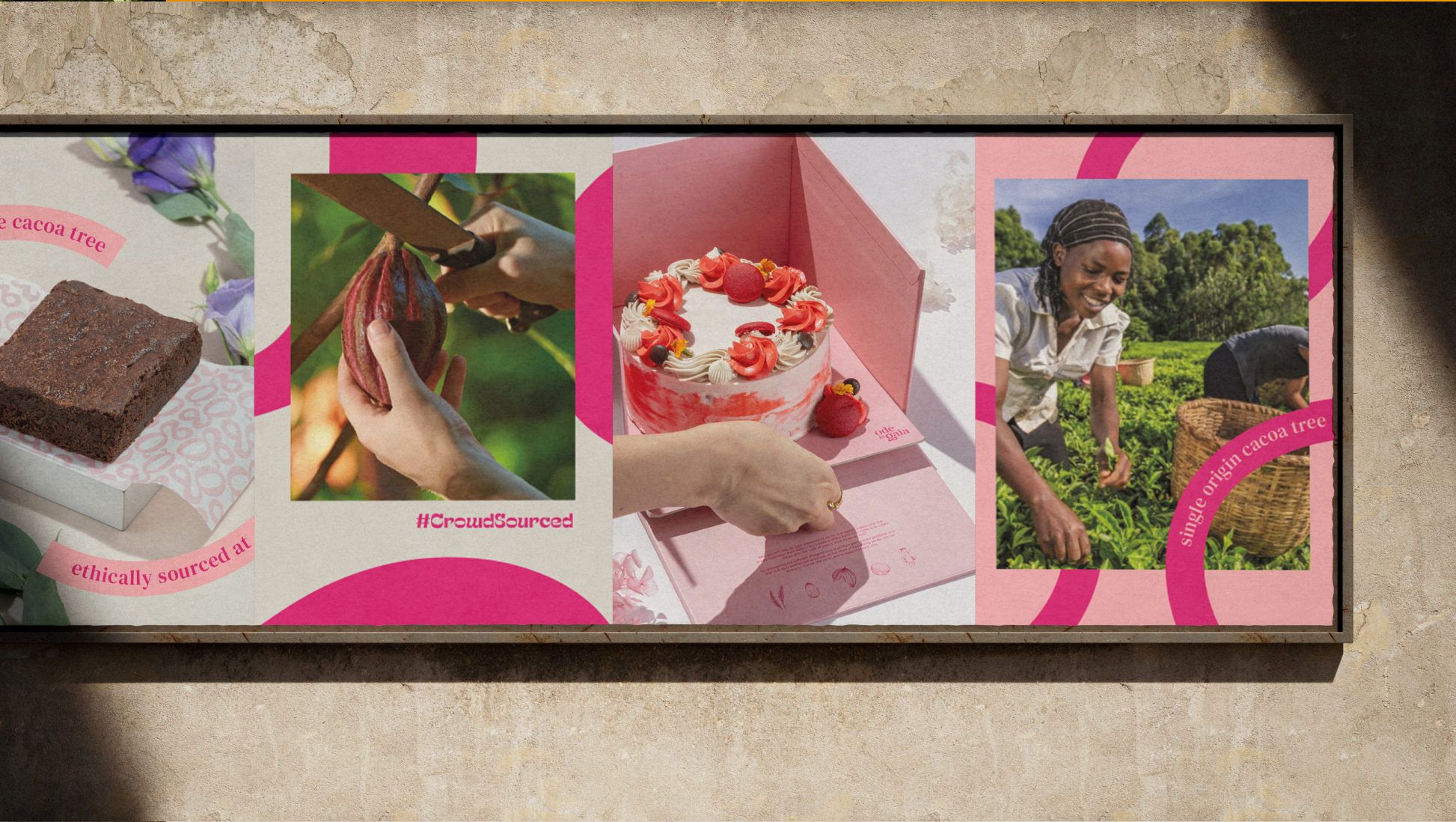
We explored this question with Naimita. She wasn’t trying to create another vegan bakery; she wanted to build India’s first luxury plant-based patisserie that people chose for the experience, not just the ingredients.

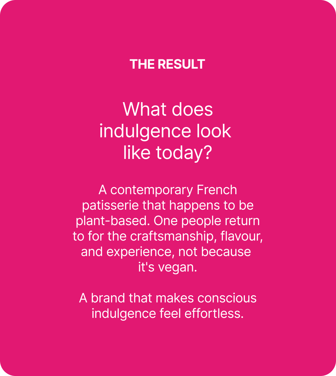
The goal was to create a brand that changed perceptions, proving that conscious choices could feel every bit as luxurious, memorable, and delicious.

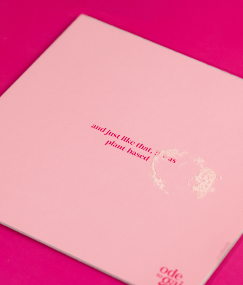
Inspire imagination with pastry, the way art or music would.

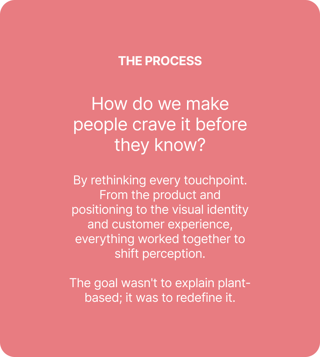
Ode To Gaia set out to redefine pastry with plant-based ingredients, driven by taste, technique and a little glam. No compromise anywhere in it.

THE BEST PART

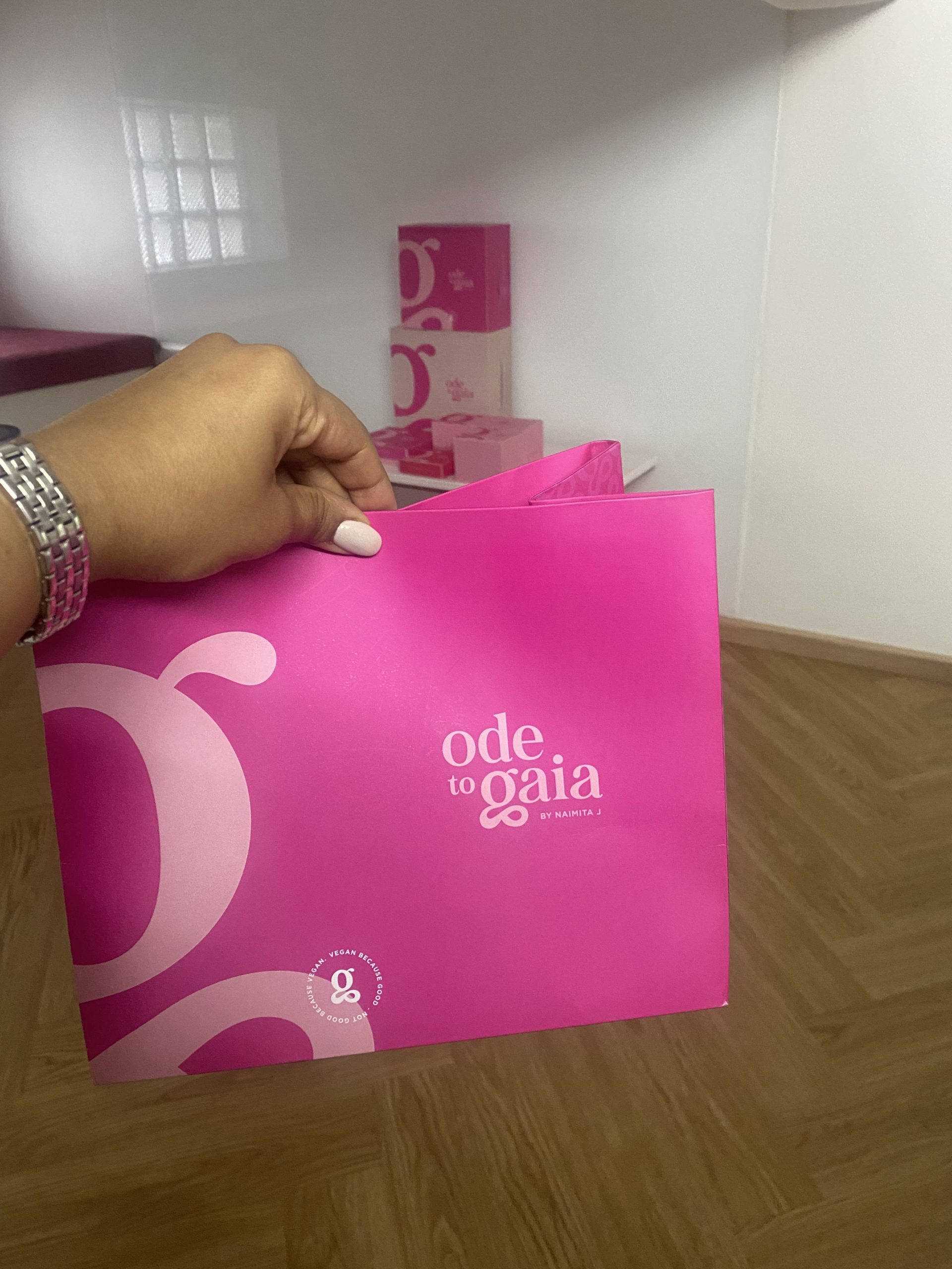
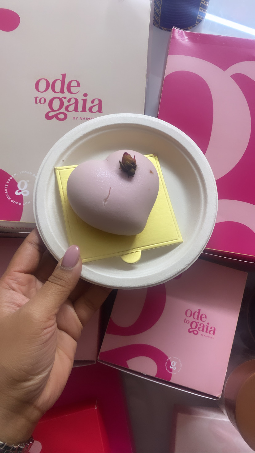
Introducing Ode To Gaia

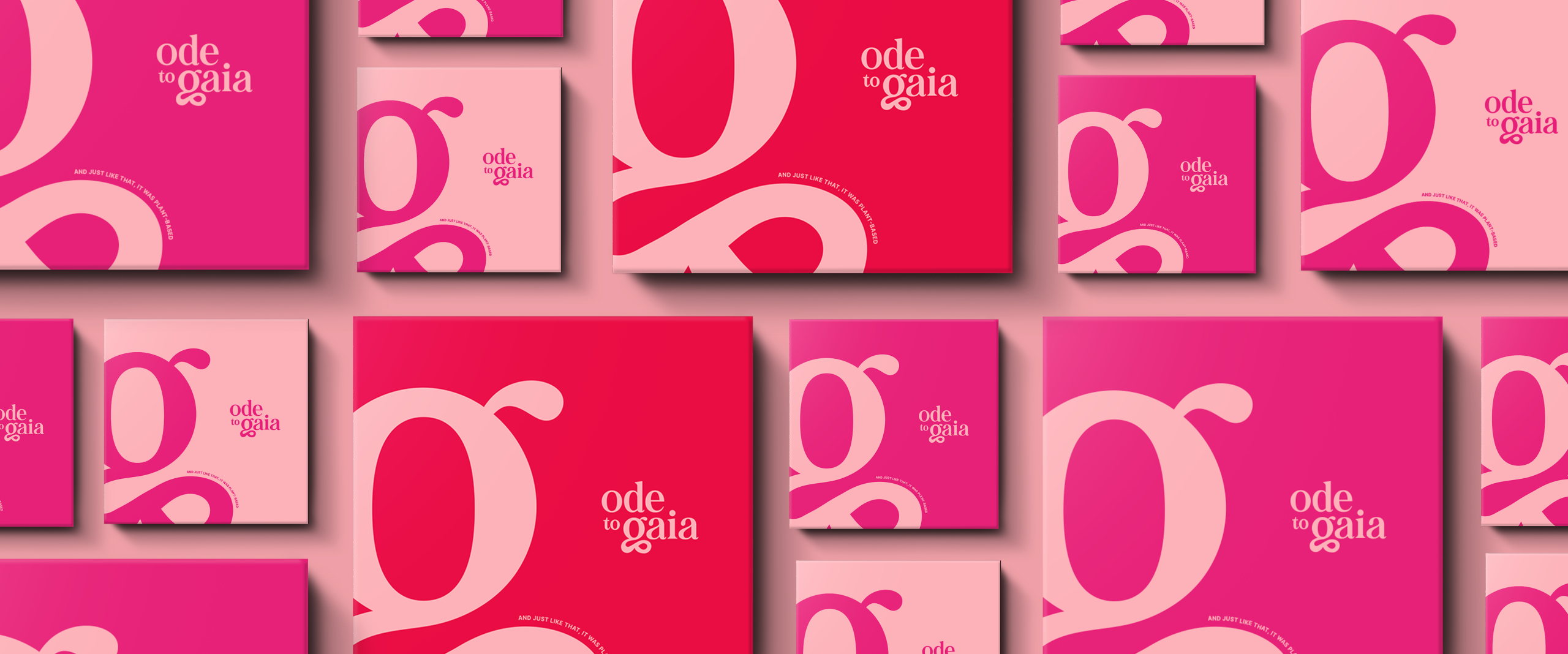
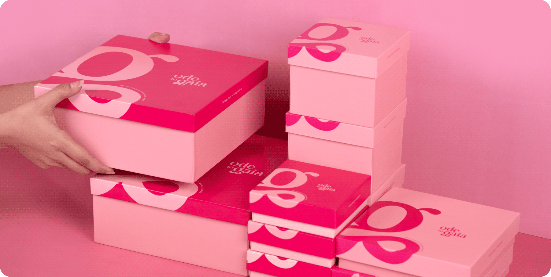
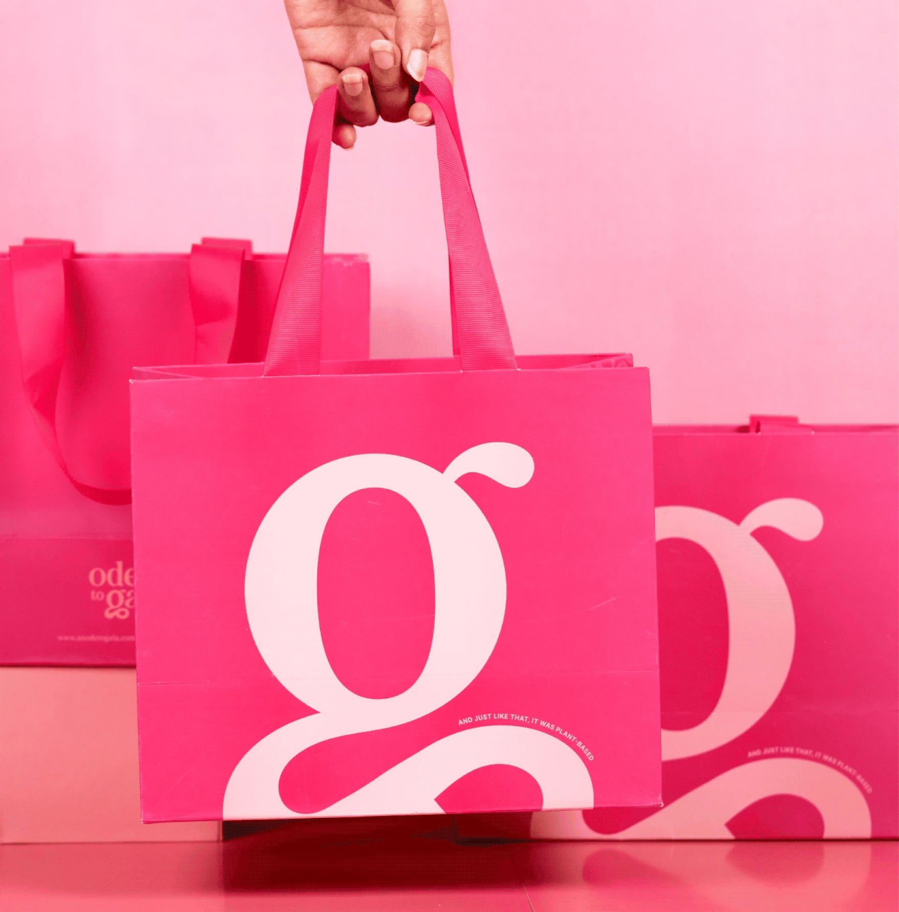
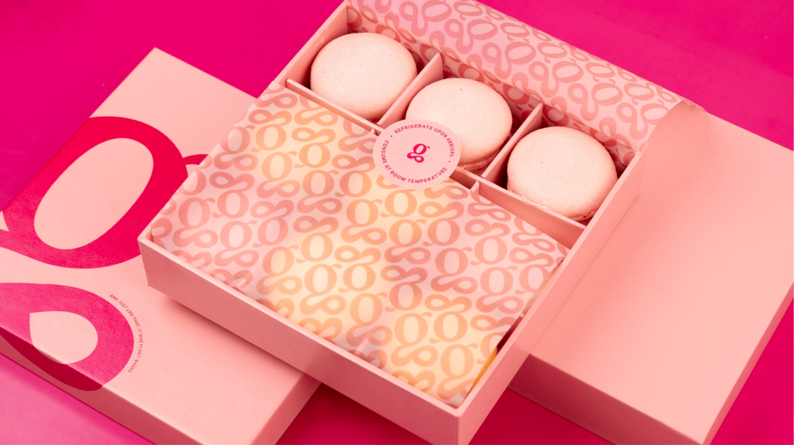
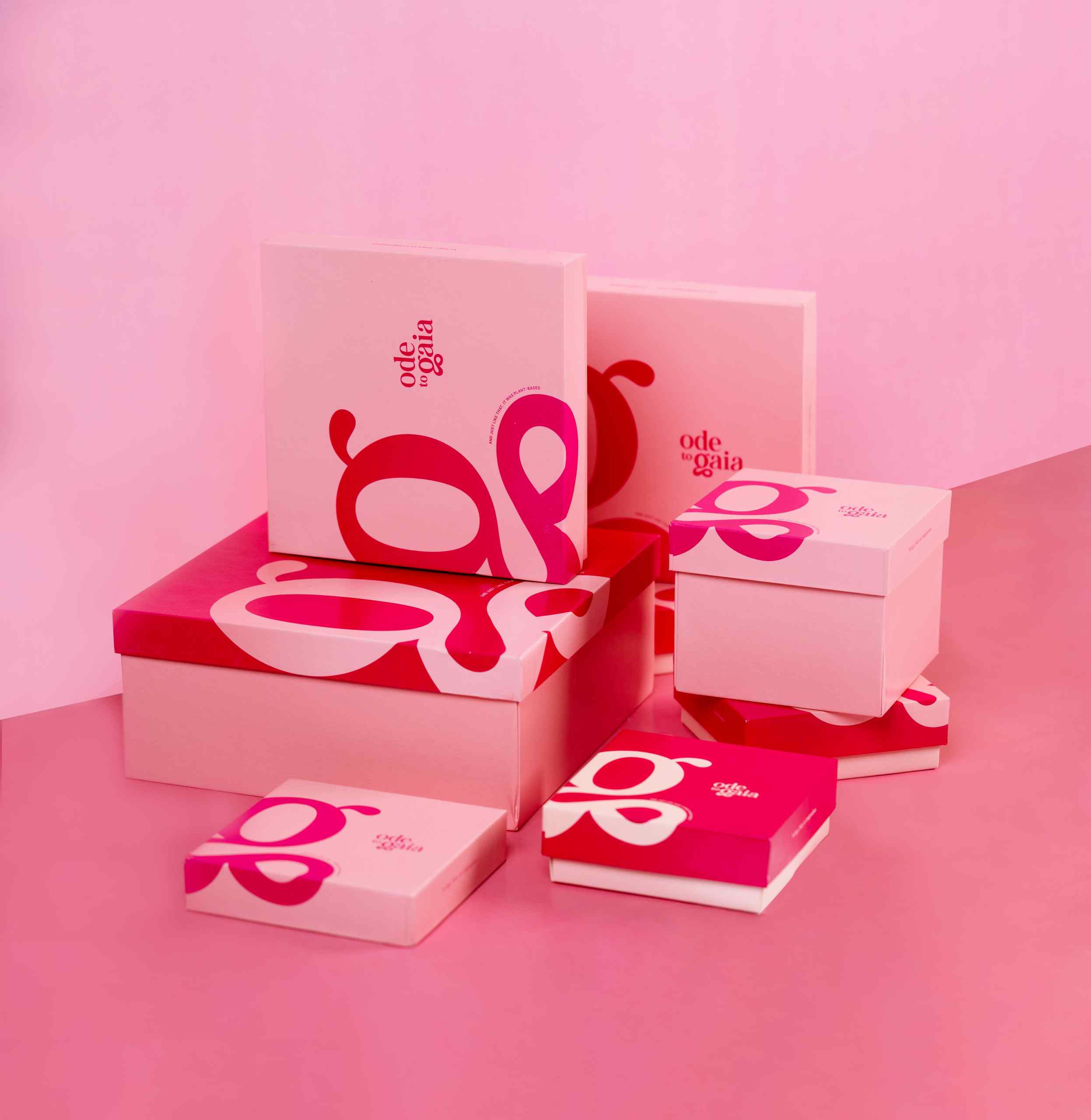
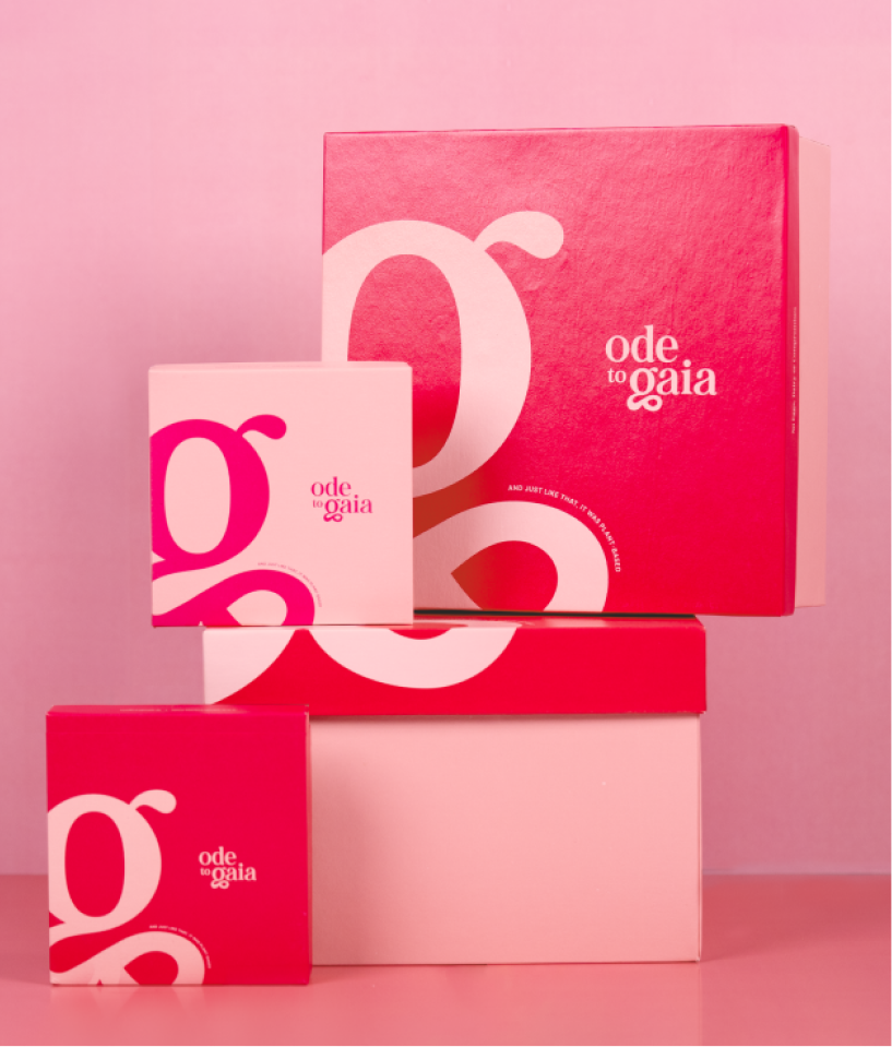
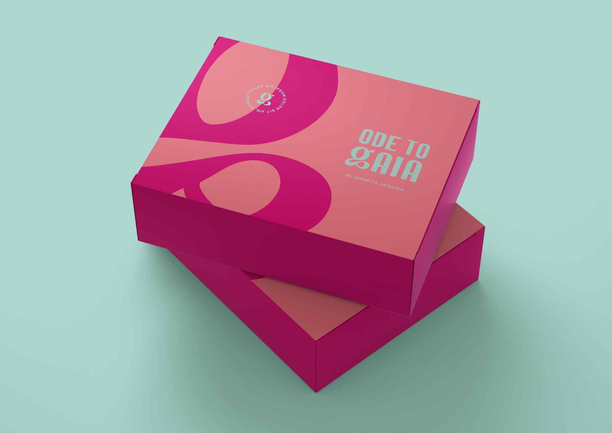
We built the new identity and visual language on that foundation. The G from Gaia is what keeps the brand grounded, yet adds the flair and sophistication it needed. We wanted the brand to be recognised for why it was started: the founder’s values, her ethos, her dedication to the earth. Her ode to Gaia is her patisserie.
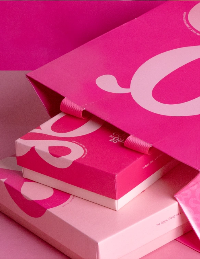
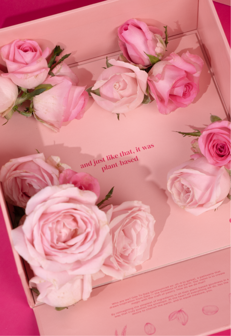
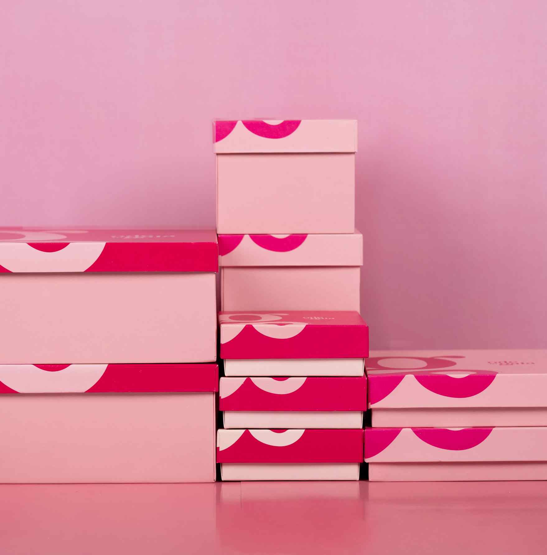
Can a dessert box start a conversation?

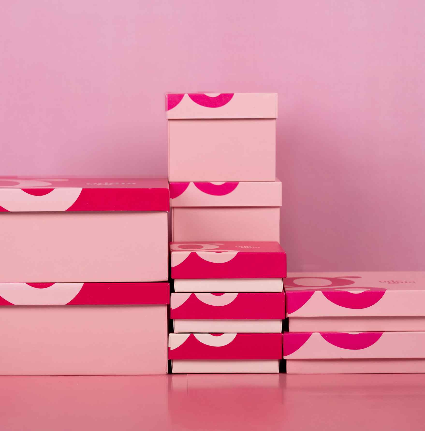
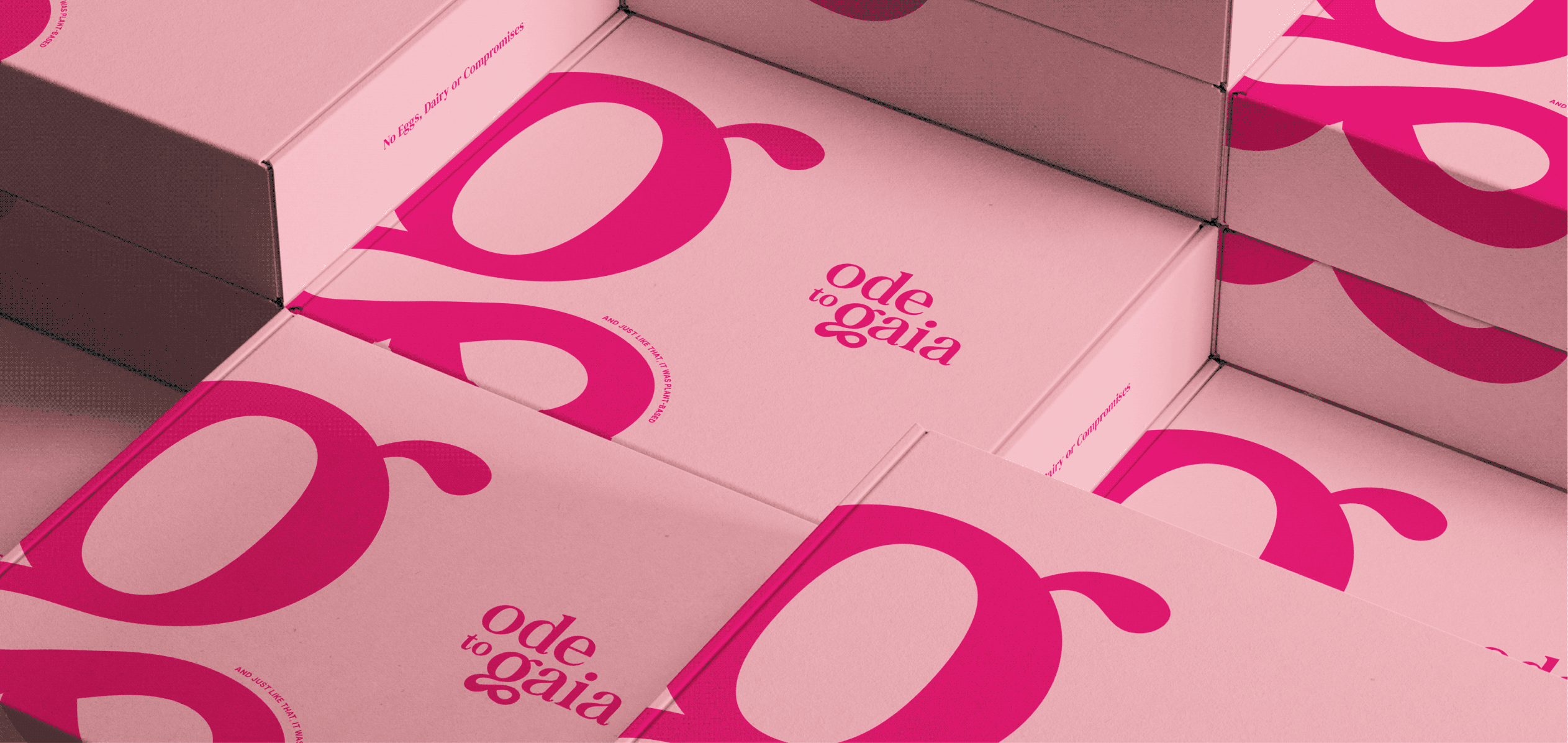
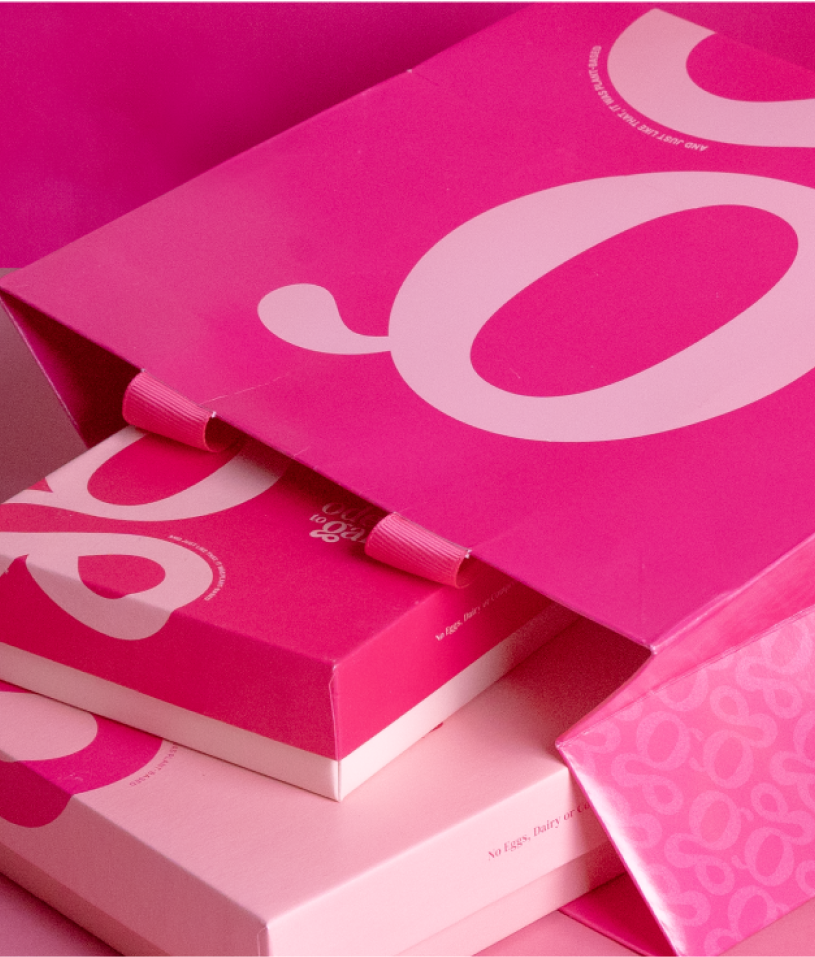
That was the ambition. Ode To Gaia was built to be loud and sassy, and still premium. The letter G carried a lot of character and the flair the brand needed, so the packaging could stay simple, sophisticated and let the G do the talking.
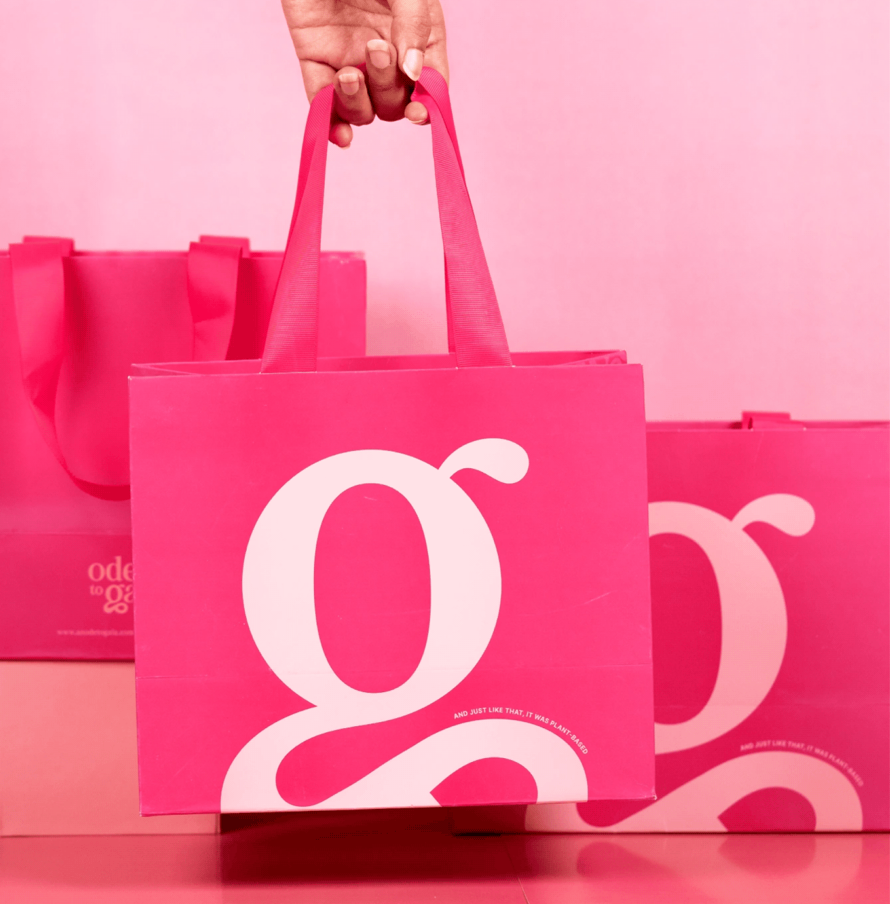
More than a logo, it reflects Naimita’s vision of creating a luxury patisserie deeply connected to the Earth.

The messy, the fun, the not so pretty part of the project!

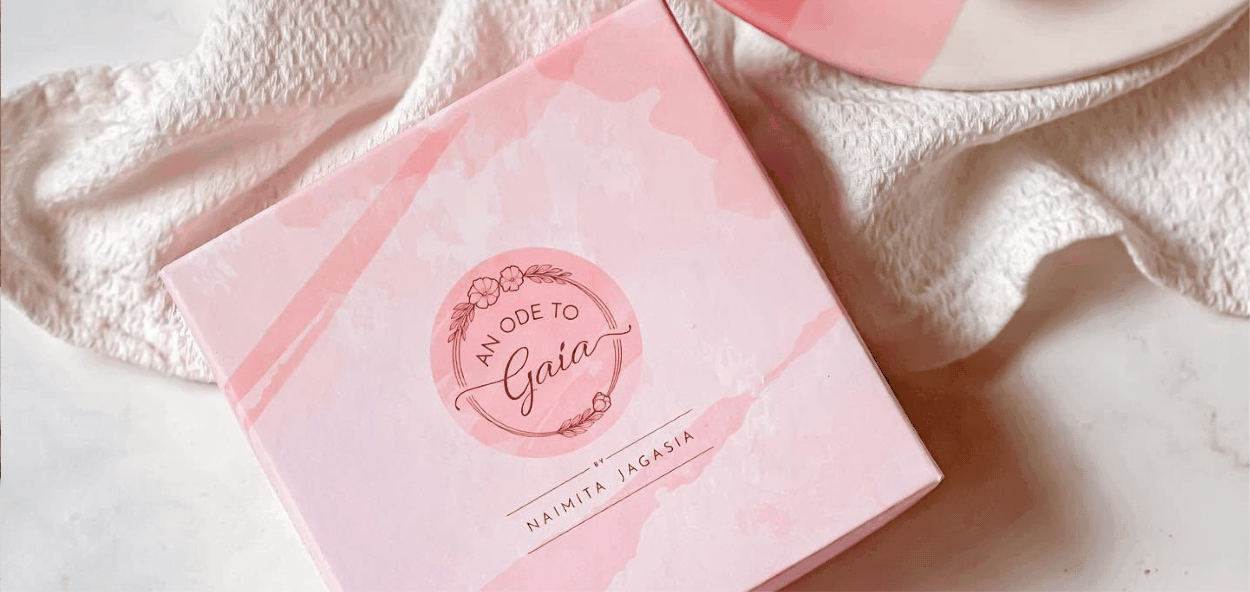
Finding the right shade of pink

Working with dessert brands has its perks

Visiting the OTG workshop

What dreams look like

One of the first rounds of packaging explorations

Reimagining Jackfruit

Can a superfood feel just as familiar as comfort food?

Scope Of Work: Packaging Design, Extension & Visual Language.

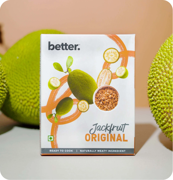
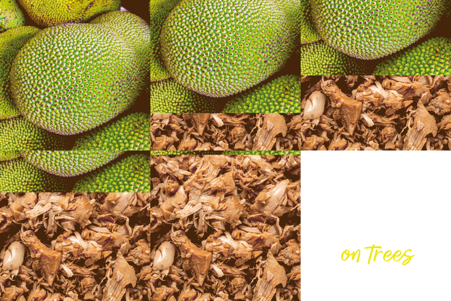
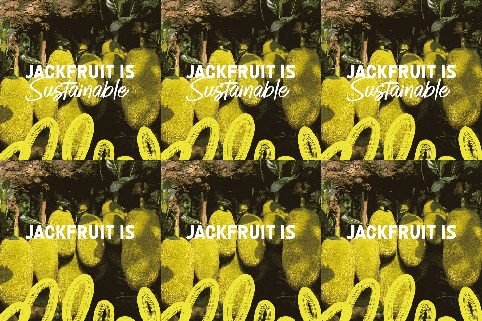
Jackfruit is a native superfood of India, yet most people are unfamiliar with it, or have reservations about it.

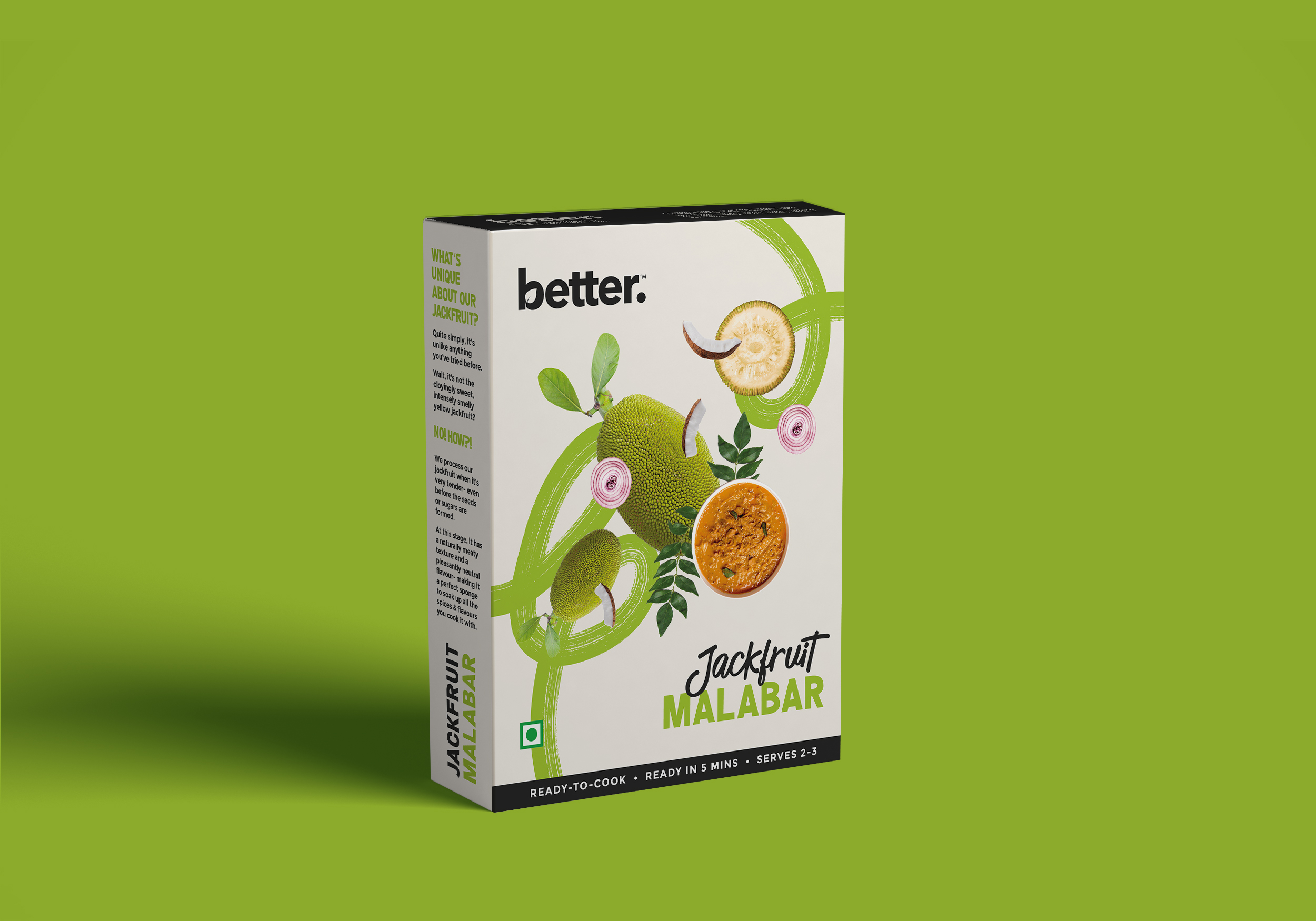
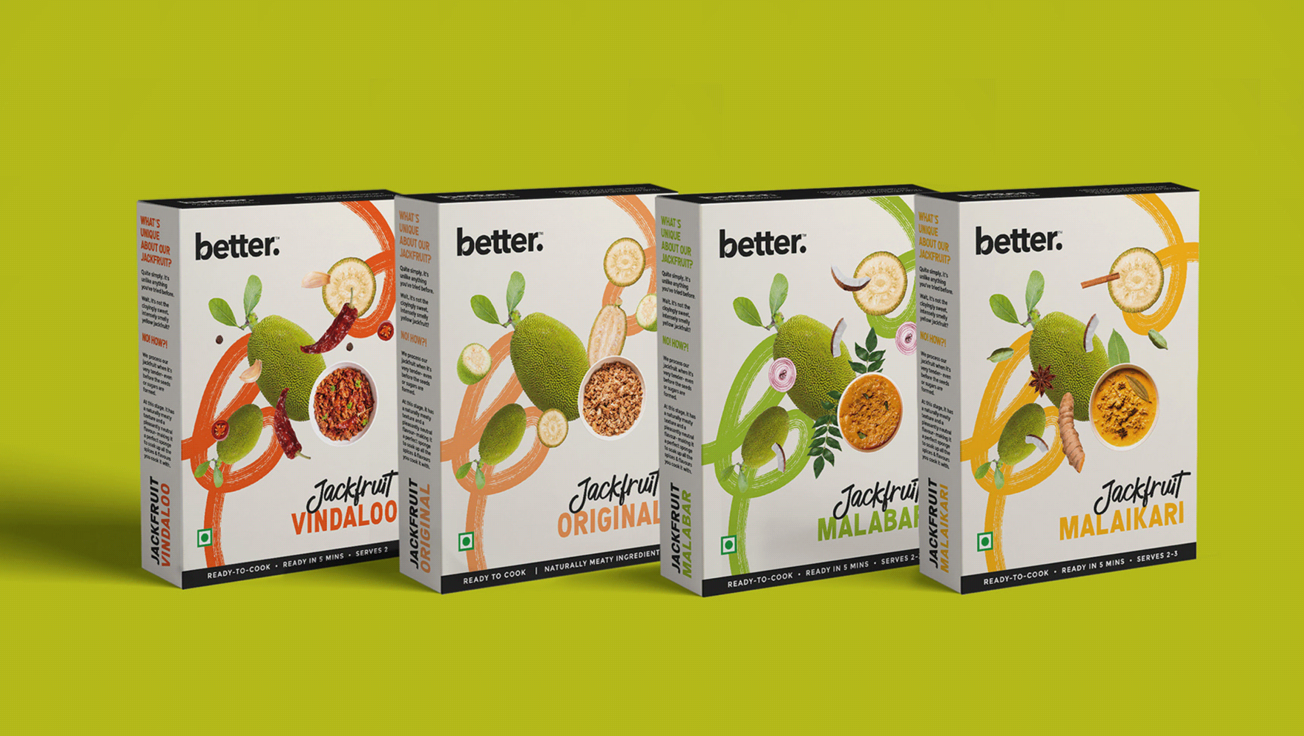
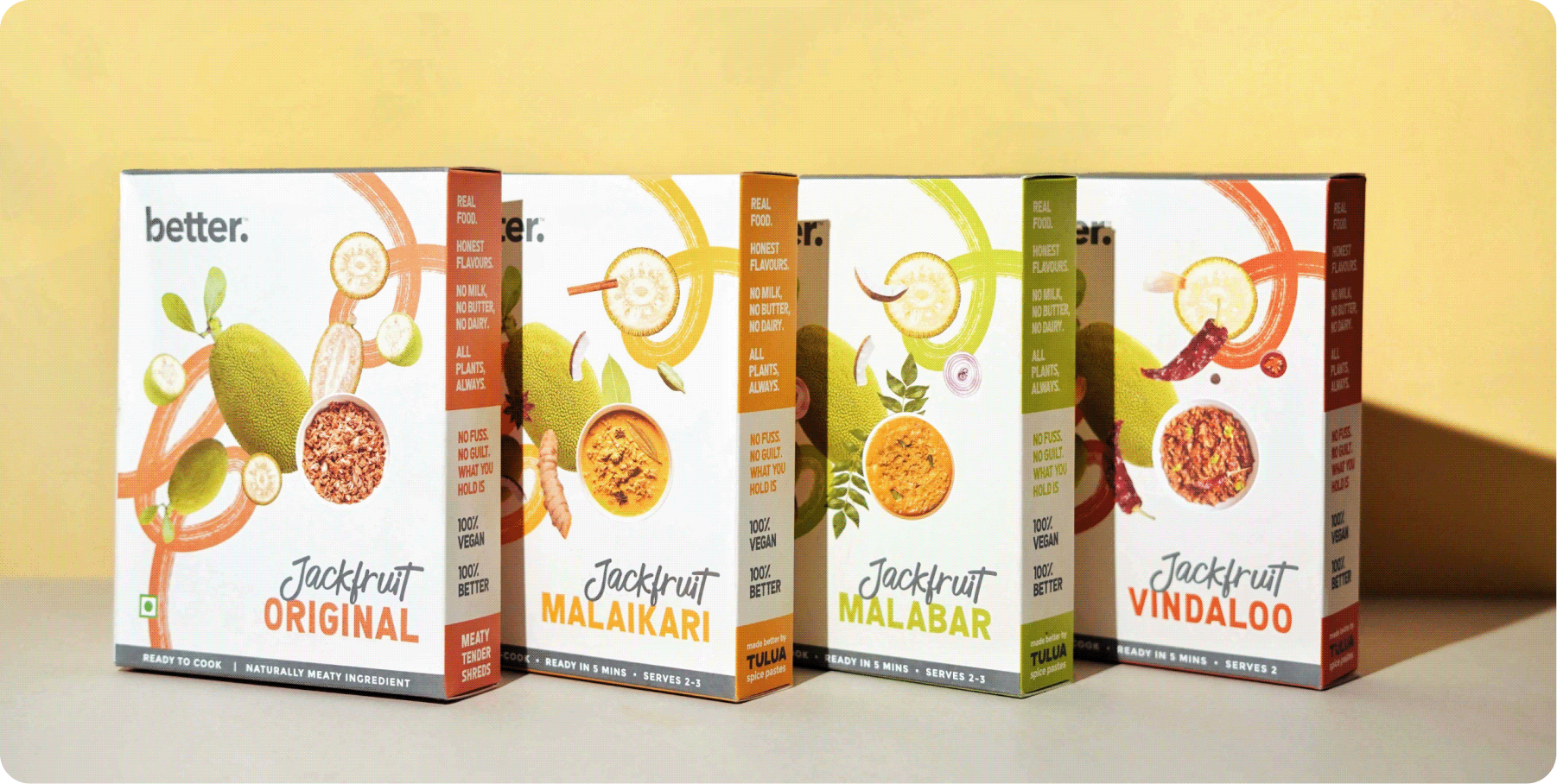
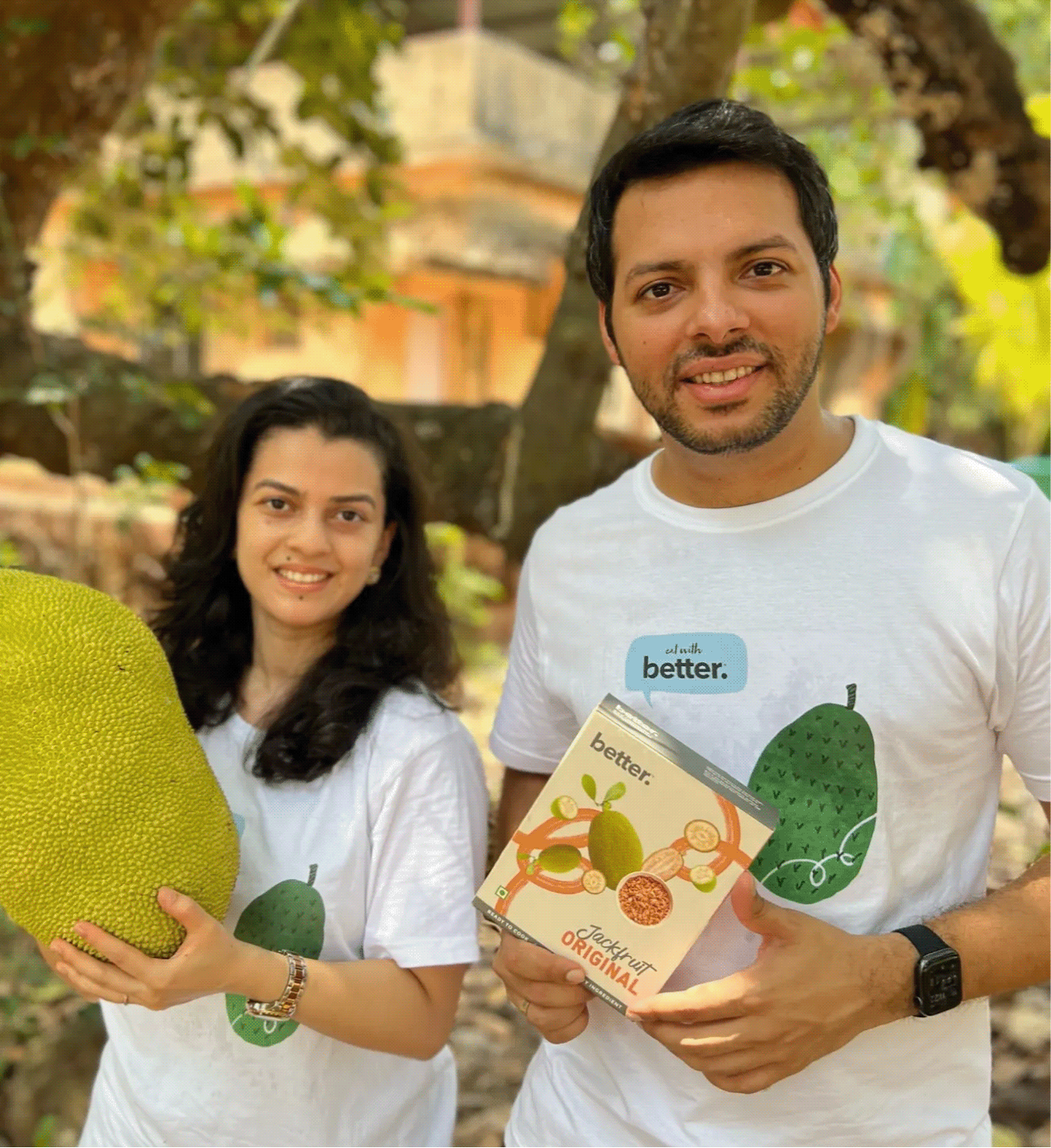
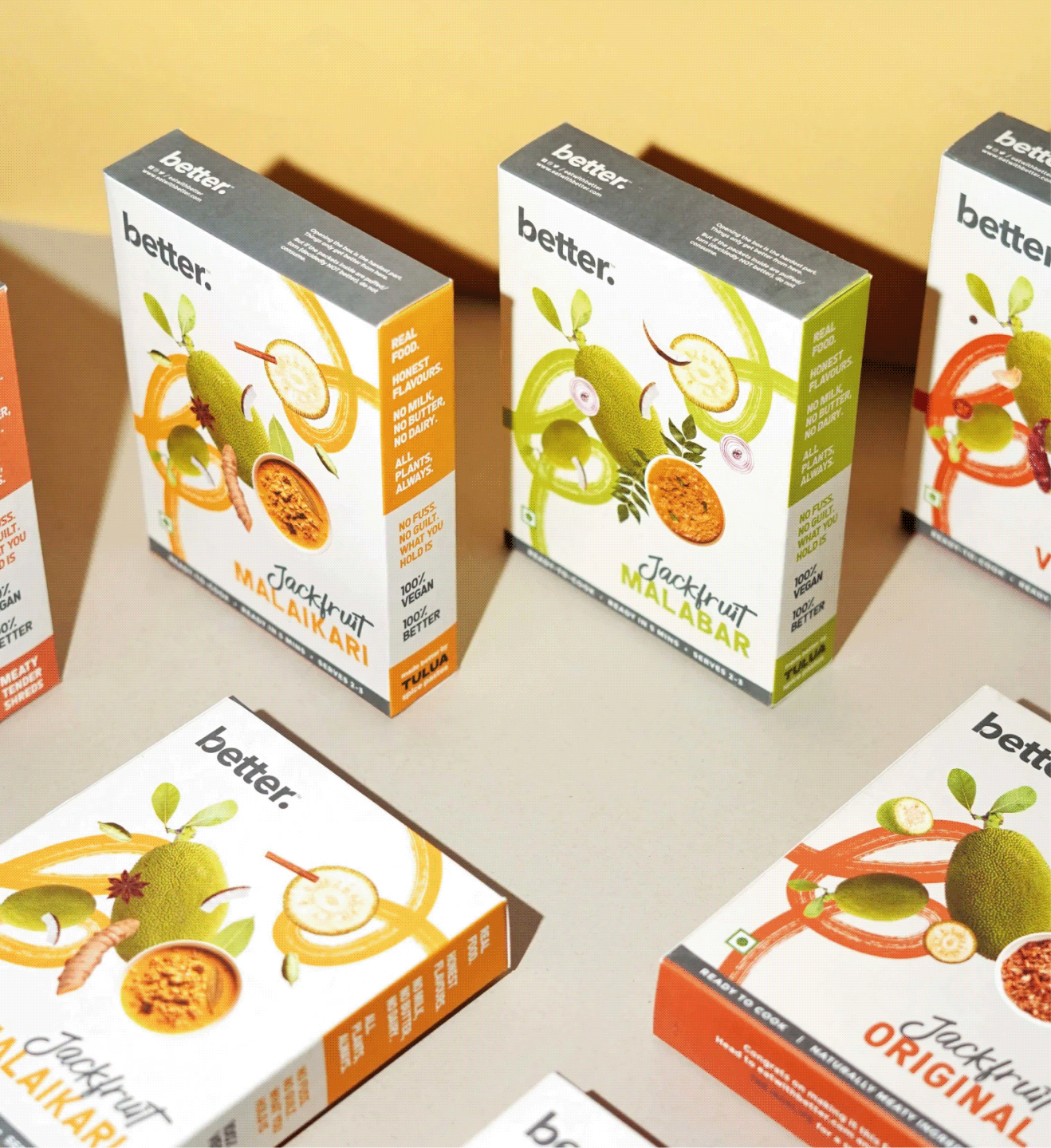
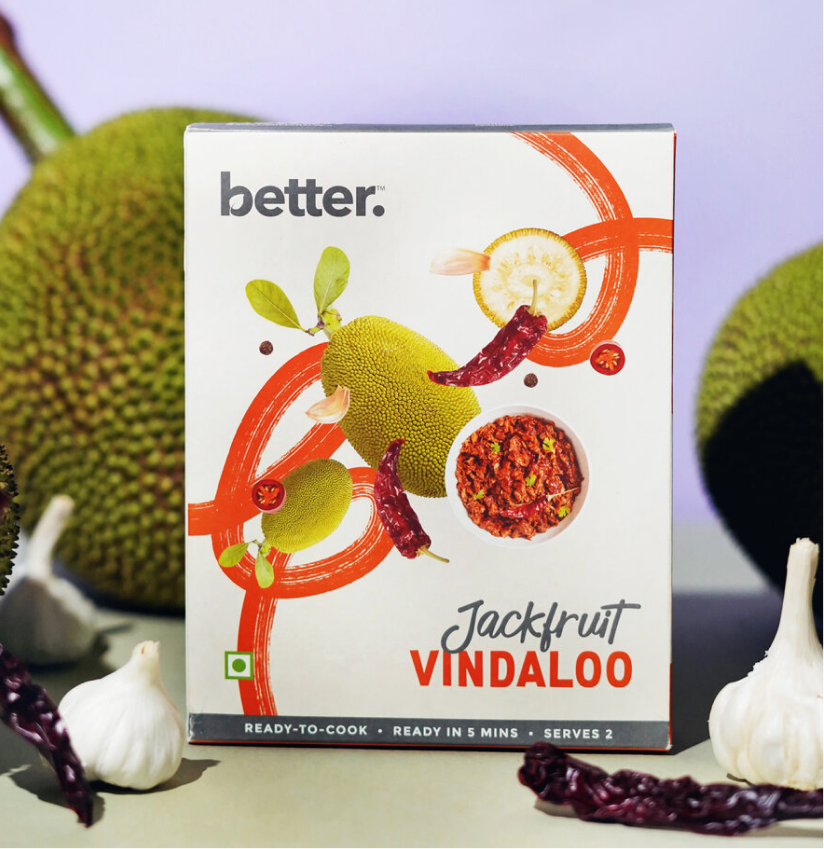
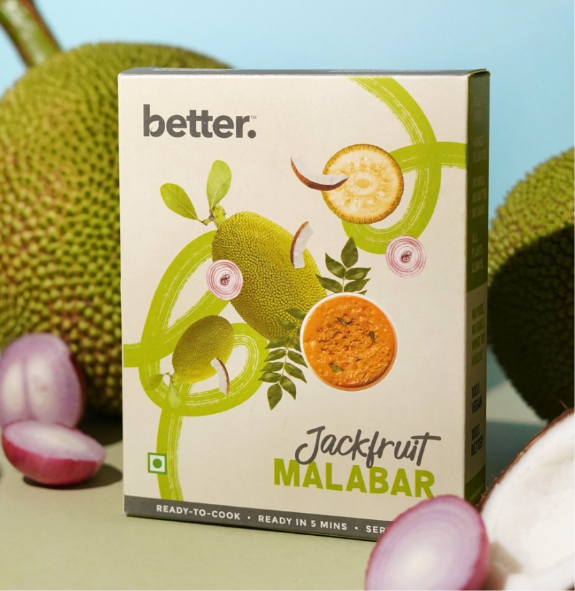
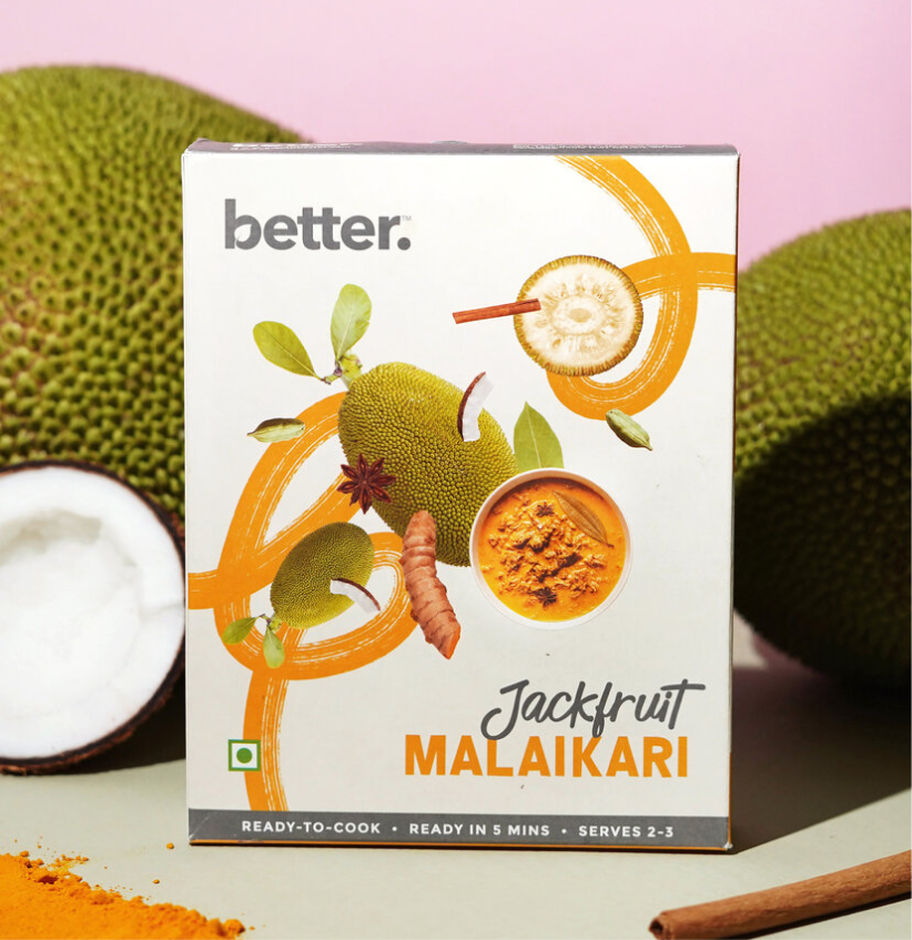
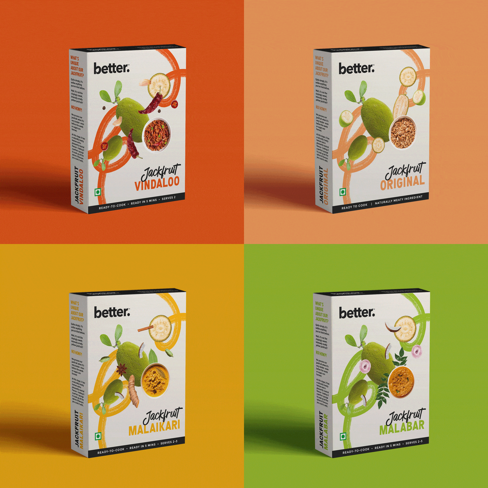
The opportunity wasn’t just to launch a new product; it was to make people curious enough to pick it up in the first place. Working with Karan and Keertida, we built a packaging system that felt vibrant, approachable, and consistent with the current brand language while celebrating local Indian flavours and conscious eating.

The goal was to make local Indian flavours feel joyful rather than aspirational.

THE CHALLENGE

How do you explain something people think they already know?

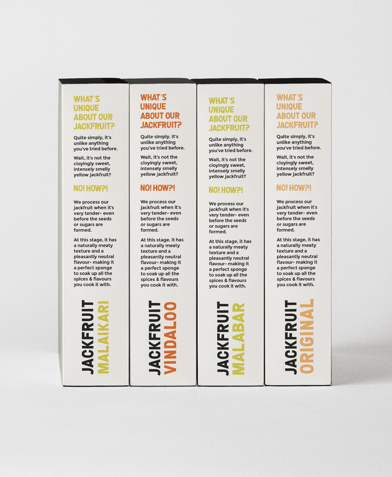
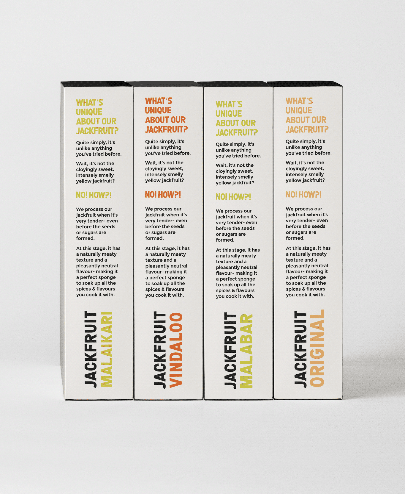
Most people still think of jackfruit as cloyingly sweet, smelly, or intensely yellow. Very few recognise its versatility as a savoury ingredient. 


Rather than simply making the packaging look appetising, we used it to introduce the product, simplify the story, and help consumers understand that this wasn’t the jackfruit they expected.

THE BEST PART

What if the words felt as bold as the flavours themselves?

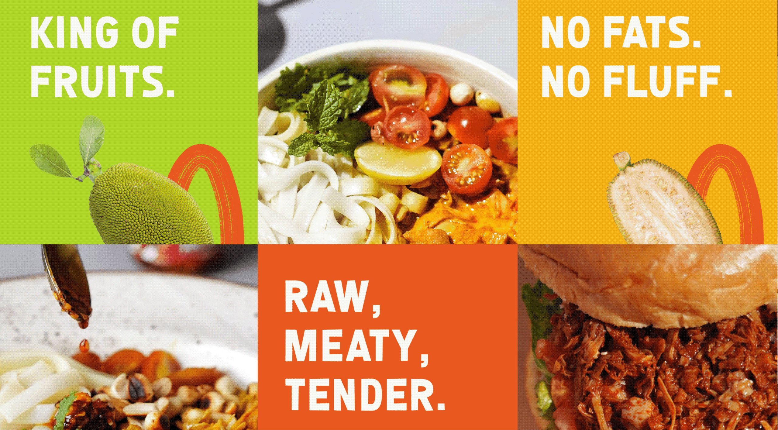
When introducing an unfamiliar product, the first challenge isn’t the flavour. It’s getting people to pay attention. Typography became one of our strongest tools to challenge perceptions before consumers even picked up the pack.
Confident headlines, oversized descriptors and handwritten details gave the range its voice. Every word had to make jackfruit easier to understand & worth getting excited about.

NEW LAUNCH

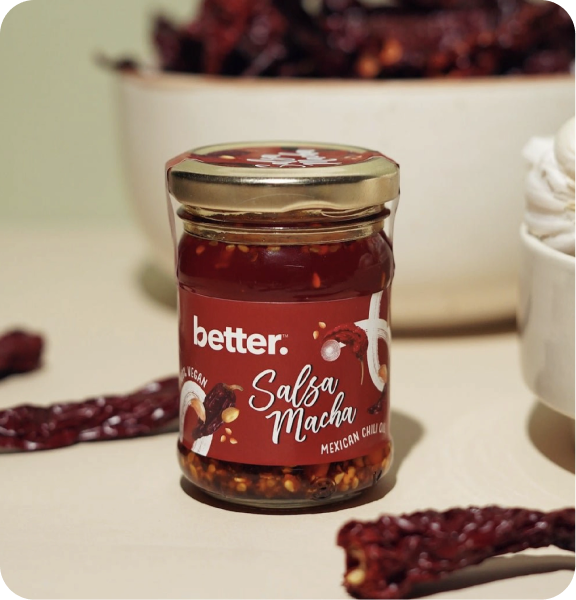
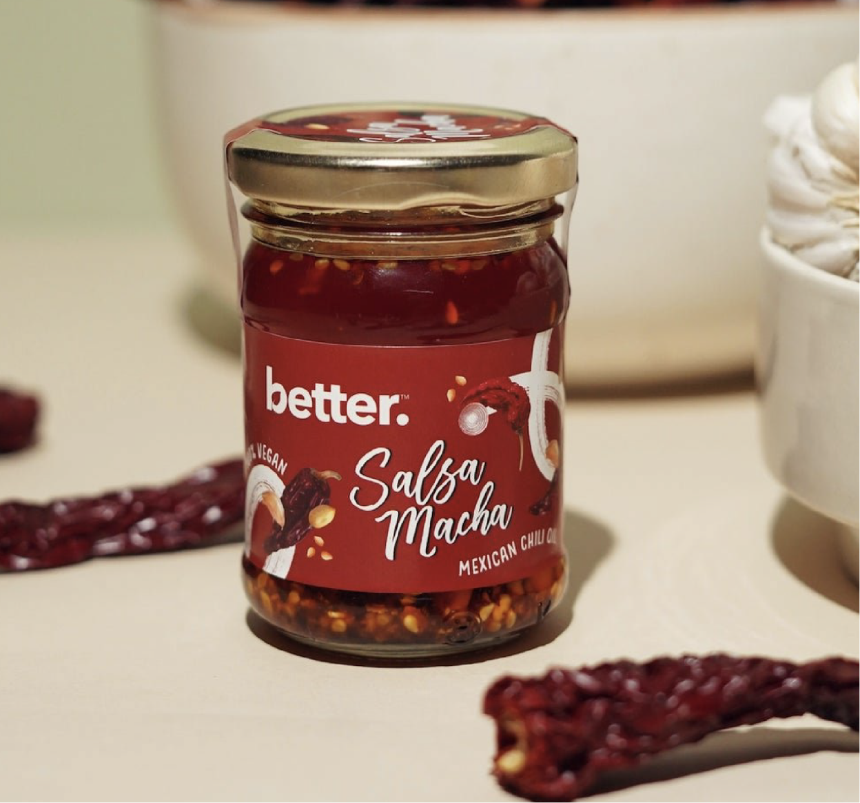
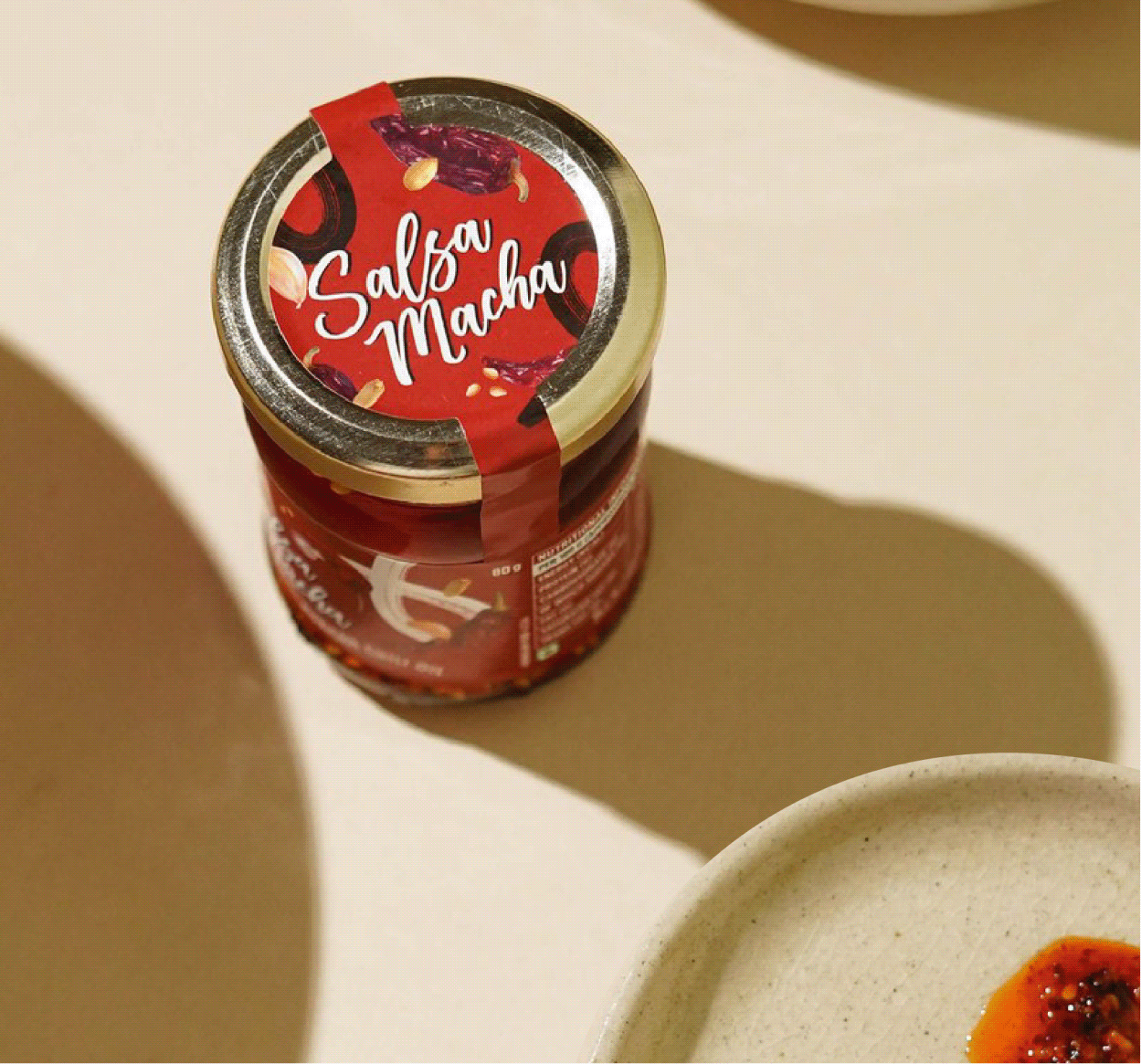
We also extended the visual language to Better’s Salsa Macha, a Mexican chilli oil made with five different chillies, peanuts, and sesame seeds. The packaging celebrates its bold personality through a visual identity that feels rich, vibrant, and full of flavour.

BEYOND THE PACK

A pack can start the story. It can’t finish it.

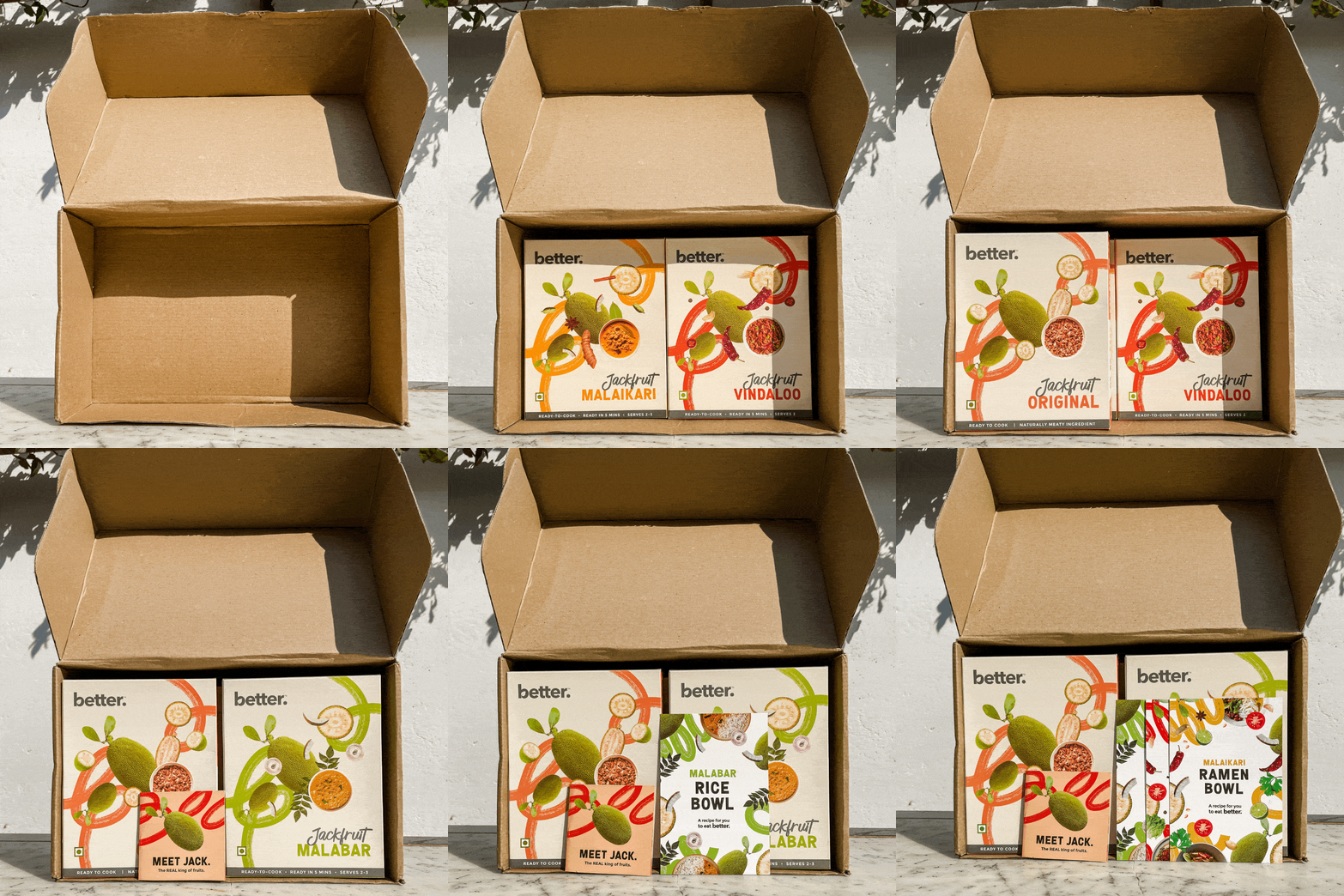
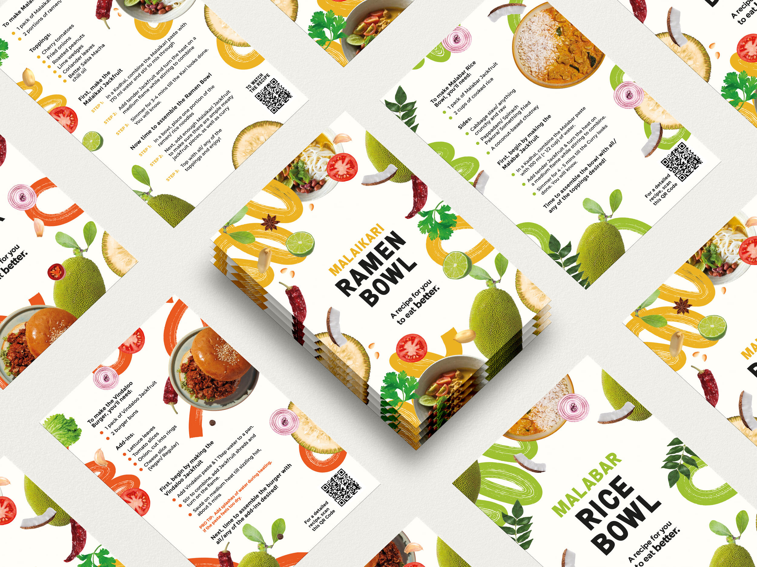
Introducing a new ingredient isn’t only about getting people to buy it—it’s about giving them the confidence to cook it.



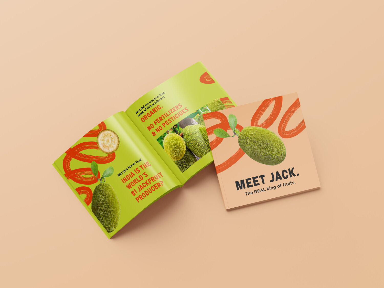
The recipe booklet became a simple guide filled with regional recipes, product stories, and educational snippets, making the journey from pack to plate feel easy, enjoyable, and unmistakably Better.