The Crown Jewel Of Reliance

The Crown Jewel Of Reliance

Brand Identity & Visual Extension for Vantara

Fostering Education With Zipply

Fostering Education With Zipply

Brand Identity & UI For Zipply Platform

Smart Co-Working With 1Excel

Smart Co-Working With 1Excel

Identity & Visual Extension For A Co-Working Space

The Crown Jewel Of Reliance

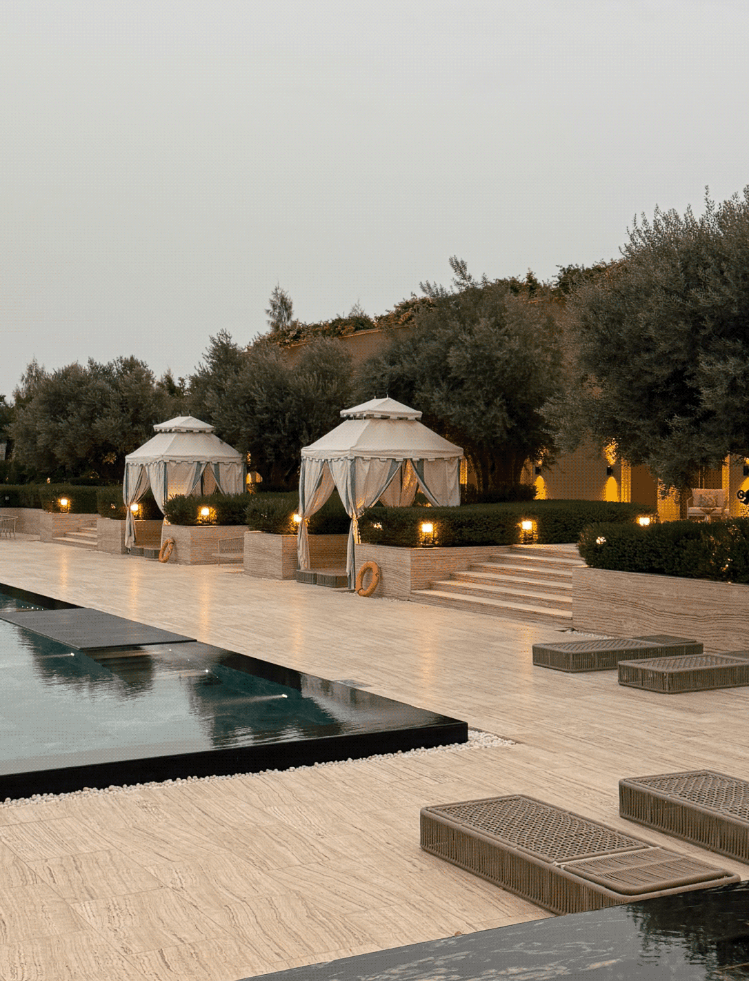
How do you give a luxury hotel a true sense of place?

Scope Of Work: Strategy, Brand Identity, Directional Signage, Visual Extension and Packaging.

Do luxury hotels often promise the same things? Heritage, detailing, elegance, exceptional service? If every hotel destination looks luxurious, what gives it a sense of place?

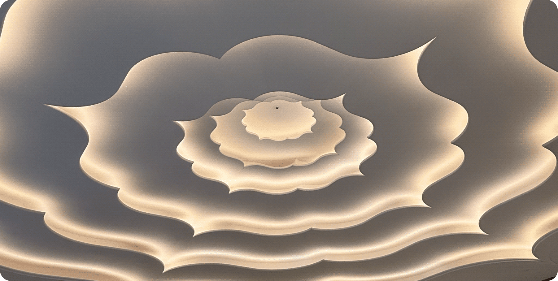
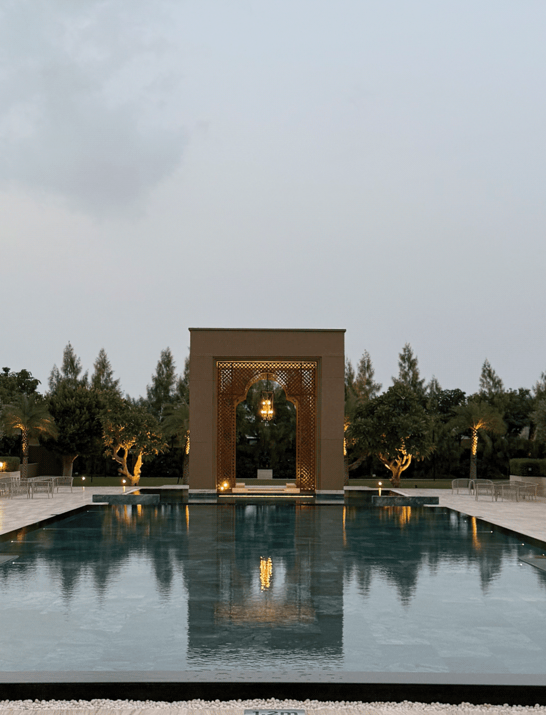
We explored this question with the team behind Vantara Niwas. Inspired by Saurashtra region’s architecture, cultural richness and craftsmanship, the opportunity was to design a brand that felt deeply connected to its surroundings.

The goal was to build an identity rooted in context rather than convention. We started by studying the region’s history and visual language to create a luxury experience that truly belongs and does justice to its place.
THE BRAND

A name rooted in nature. Refined through design.

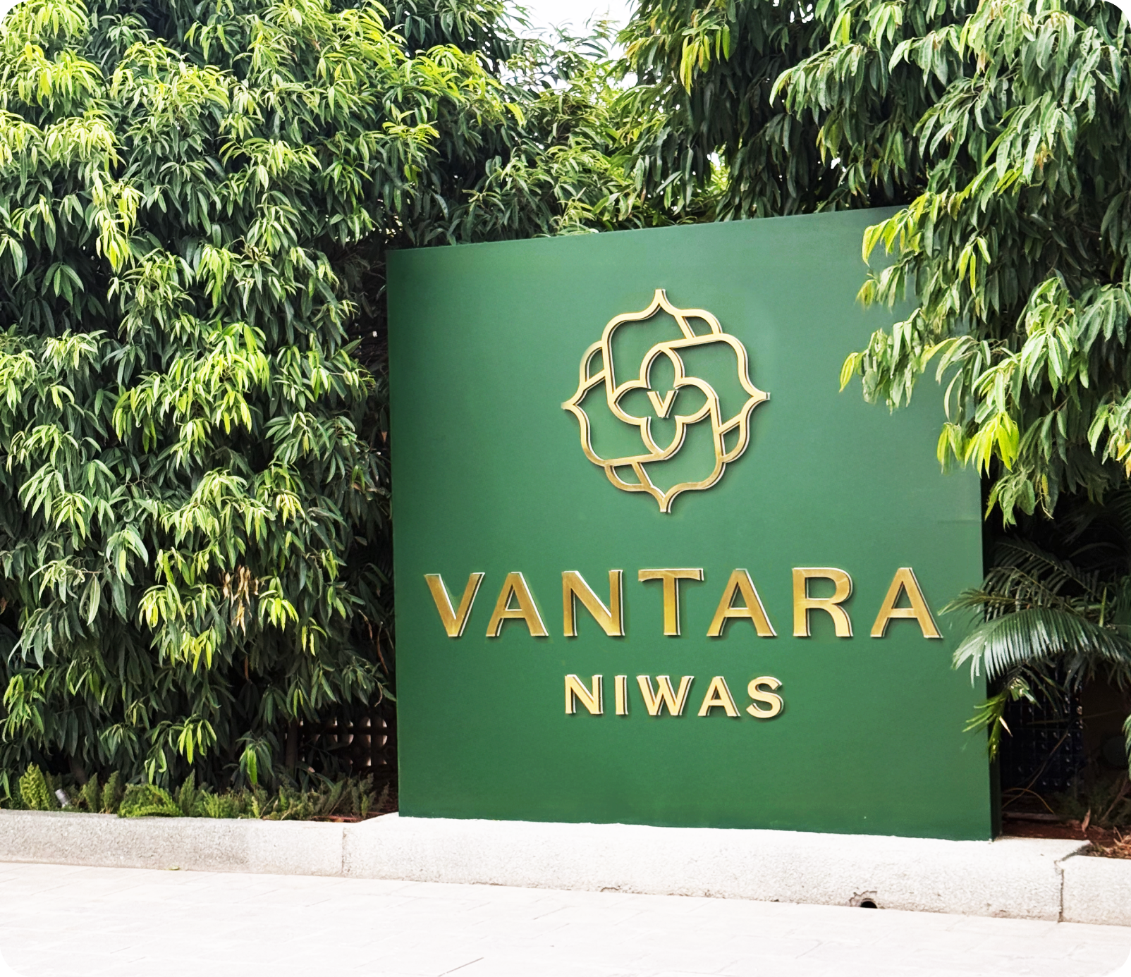
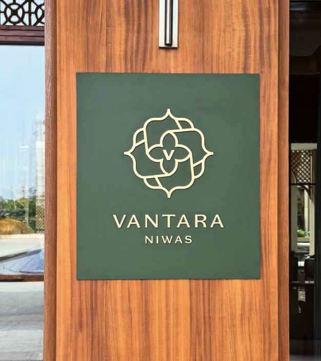
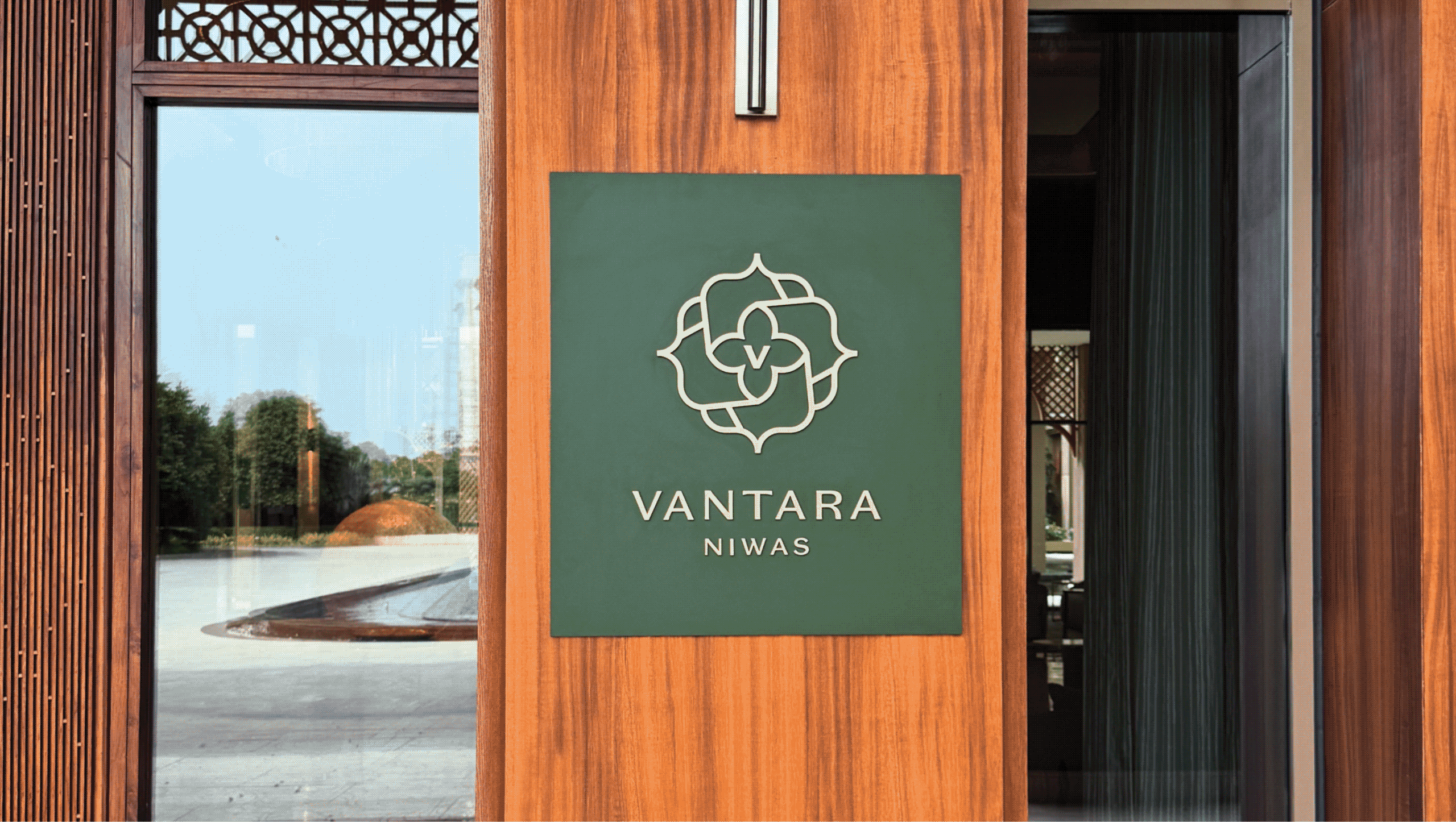
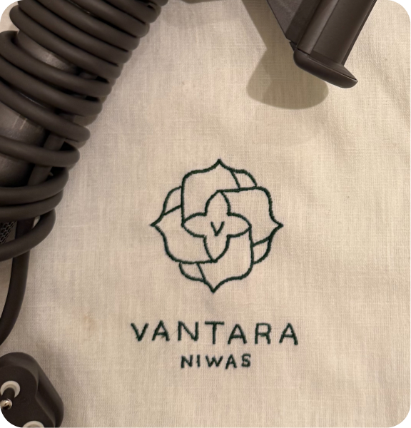
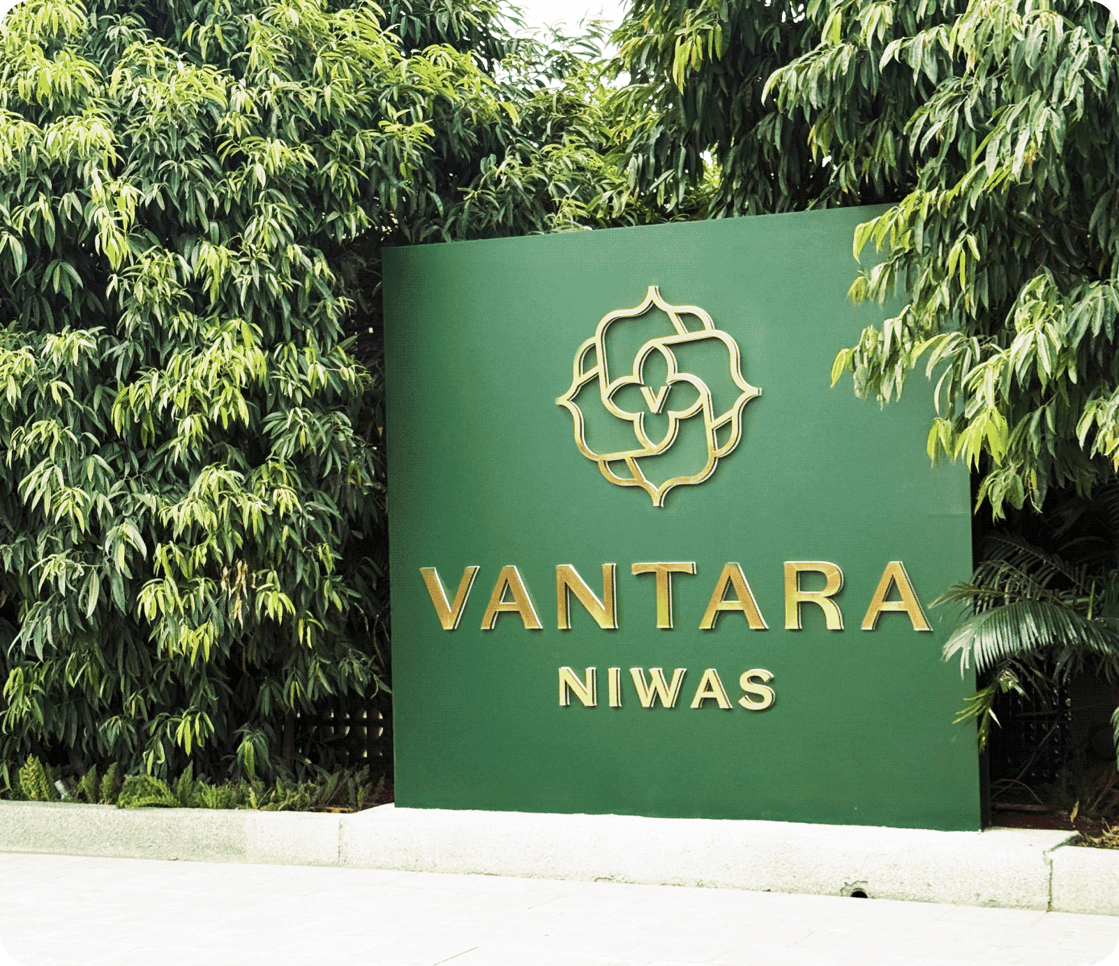
Vantara Niwas draws from the township’s wildlife conservation centre, Vantara. The word mark combines classic serif typography with clean lines and contemporary refinement.

Elegant proportions and carefully considered details create an identity that feels timeless, confident, and effortlessly luxurious.
THE BEST PART

Nature is not applied to the property, it is what the property was arranged around.

Vantara reflects a larger vision where luxury and the natural world hold together.

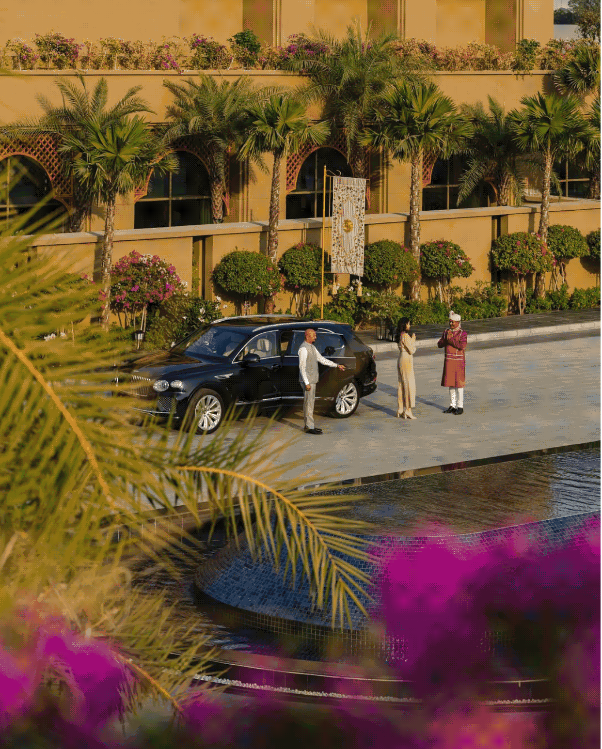
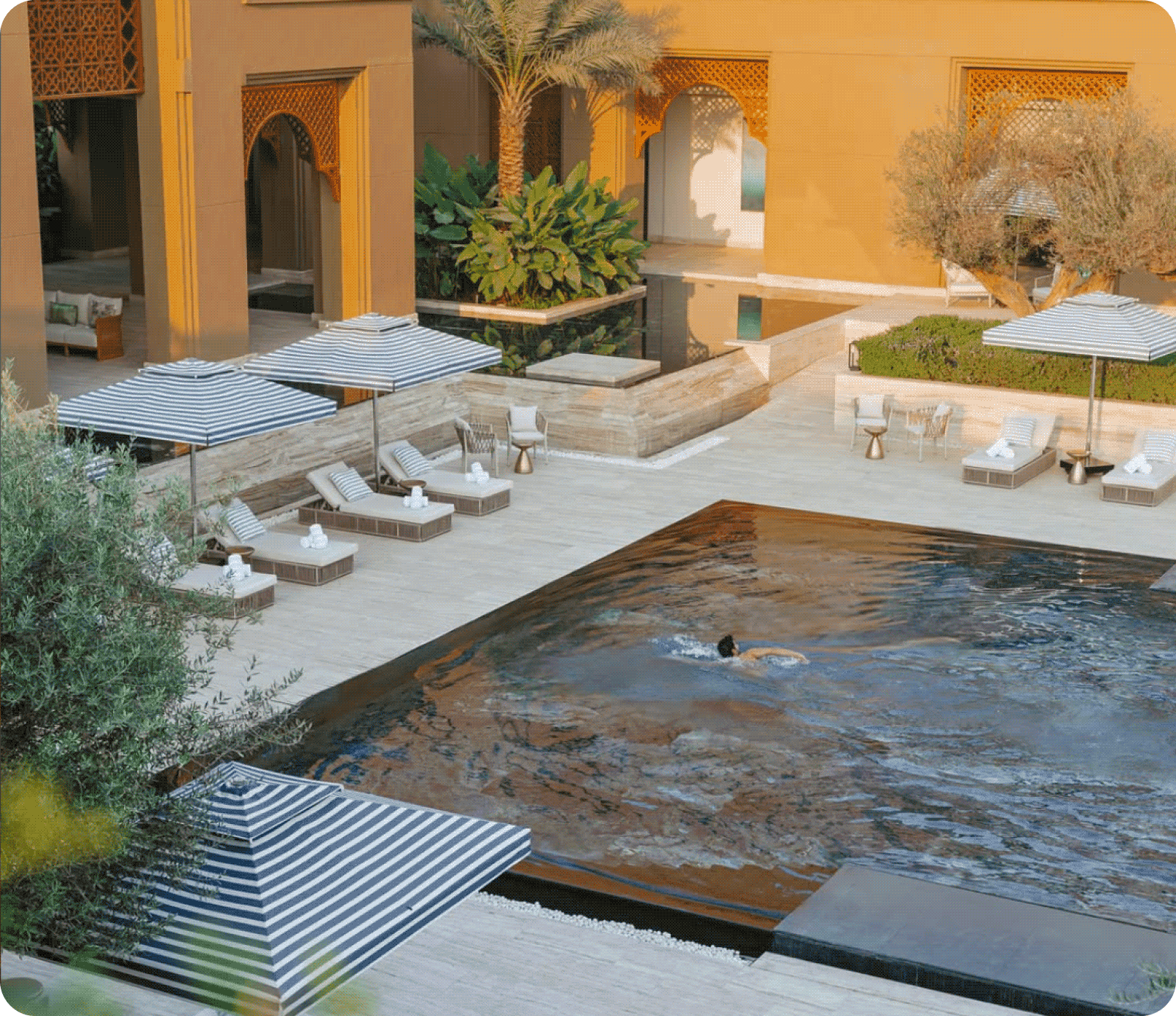
Nothing competes with what is already there: Indian motifs and commissioned art carry the interior vocabulary, rooms open outward to the forest, sound therapy and Ayurveda extend it past the visual, so the property is felt as much as seen.

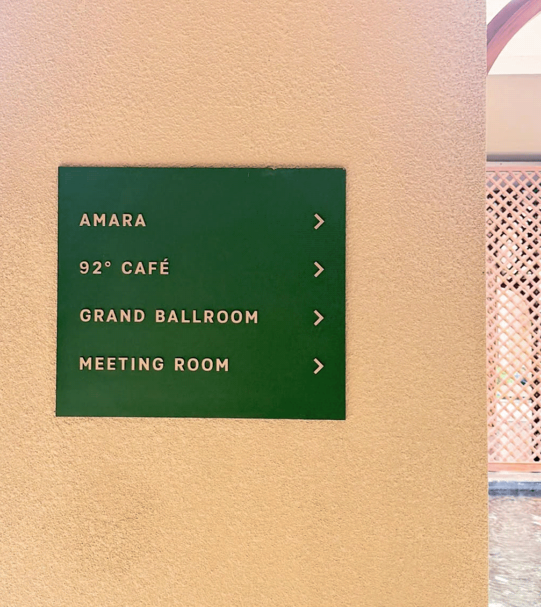
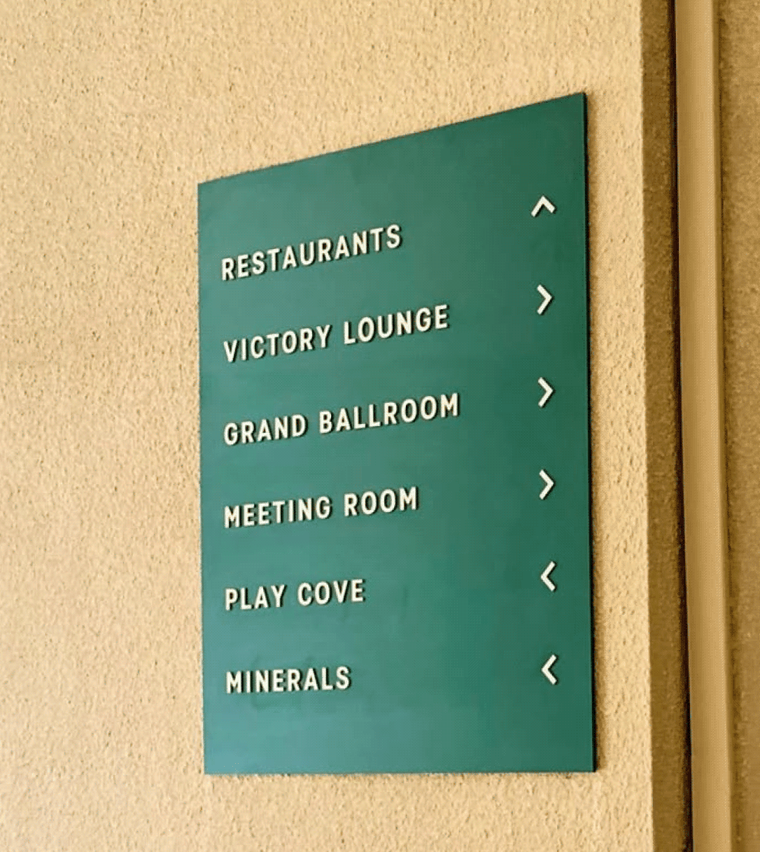
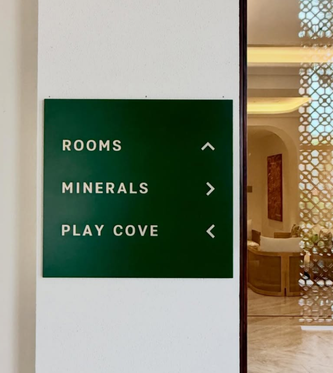
Clean type, minimal wayfinding, nothing that announces itself before the forest does. The walkthrough is built as a sequence rather than a lobby: guests arrive through the landscape, not past it.
THE EXTENSION

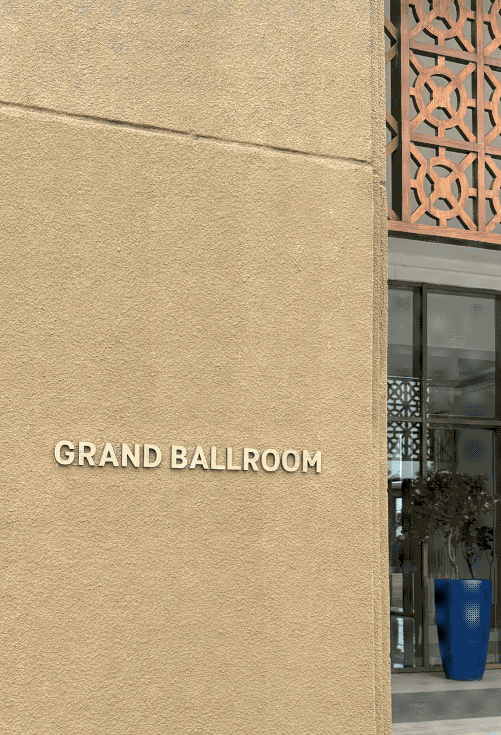
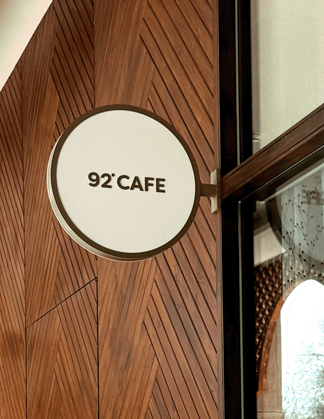
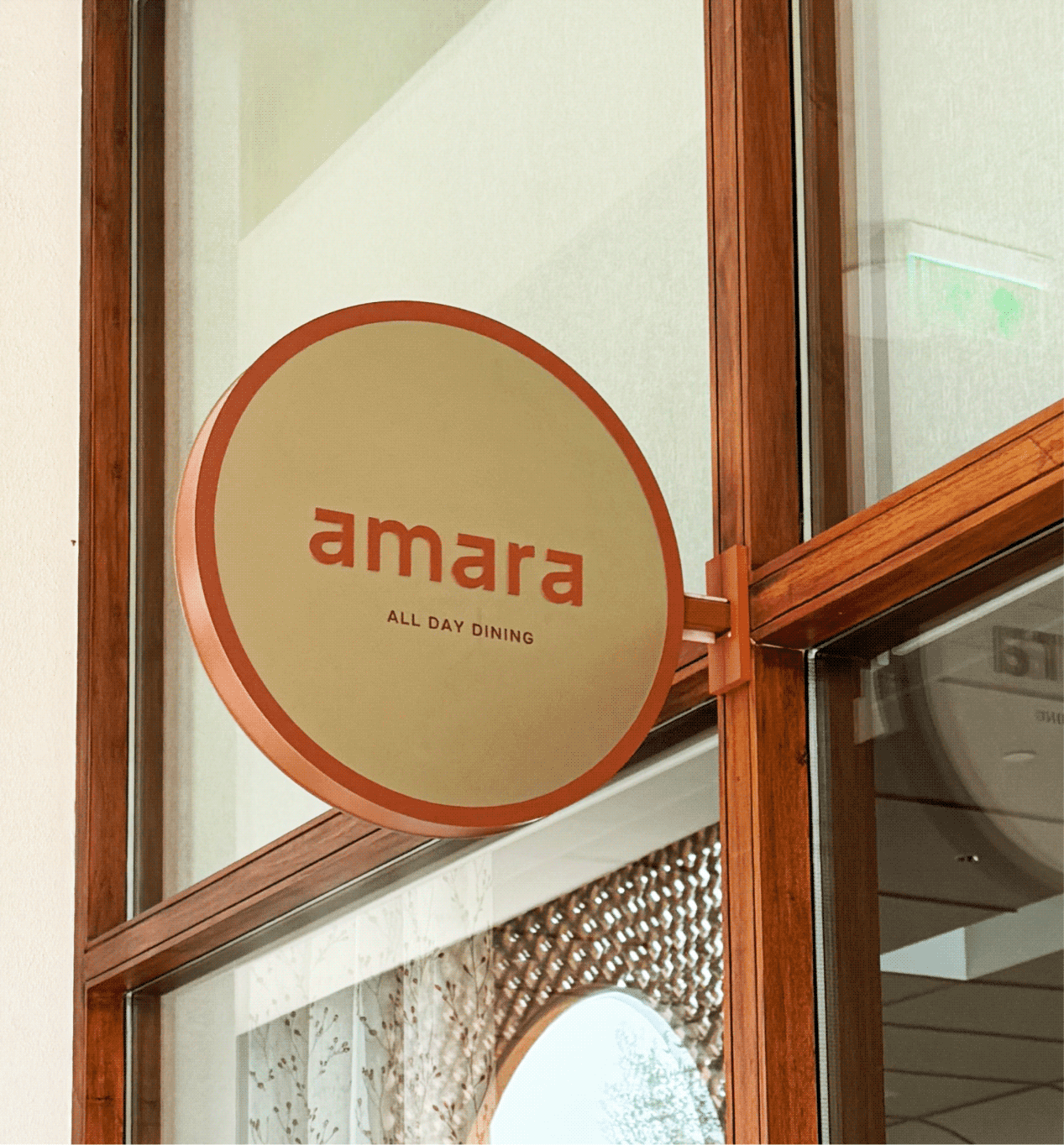
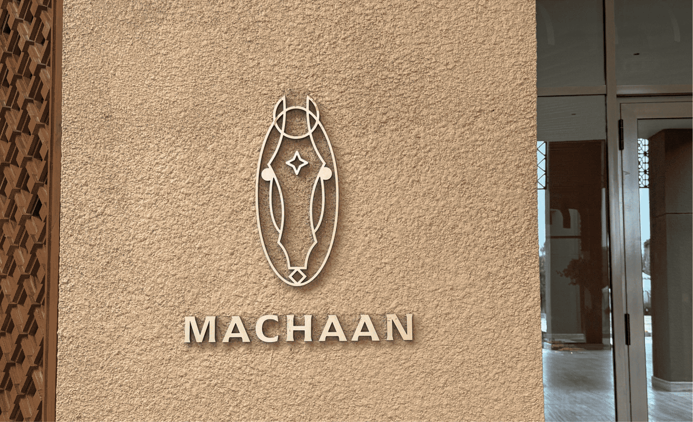
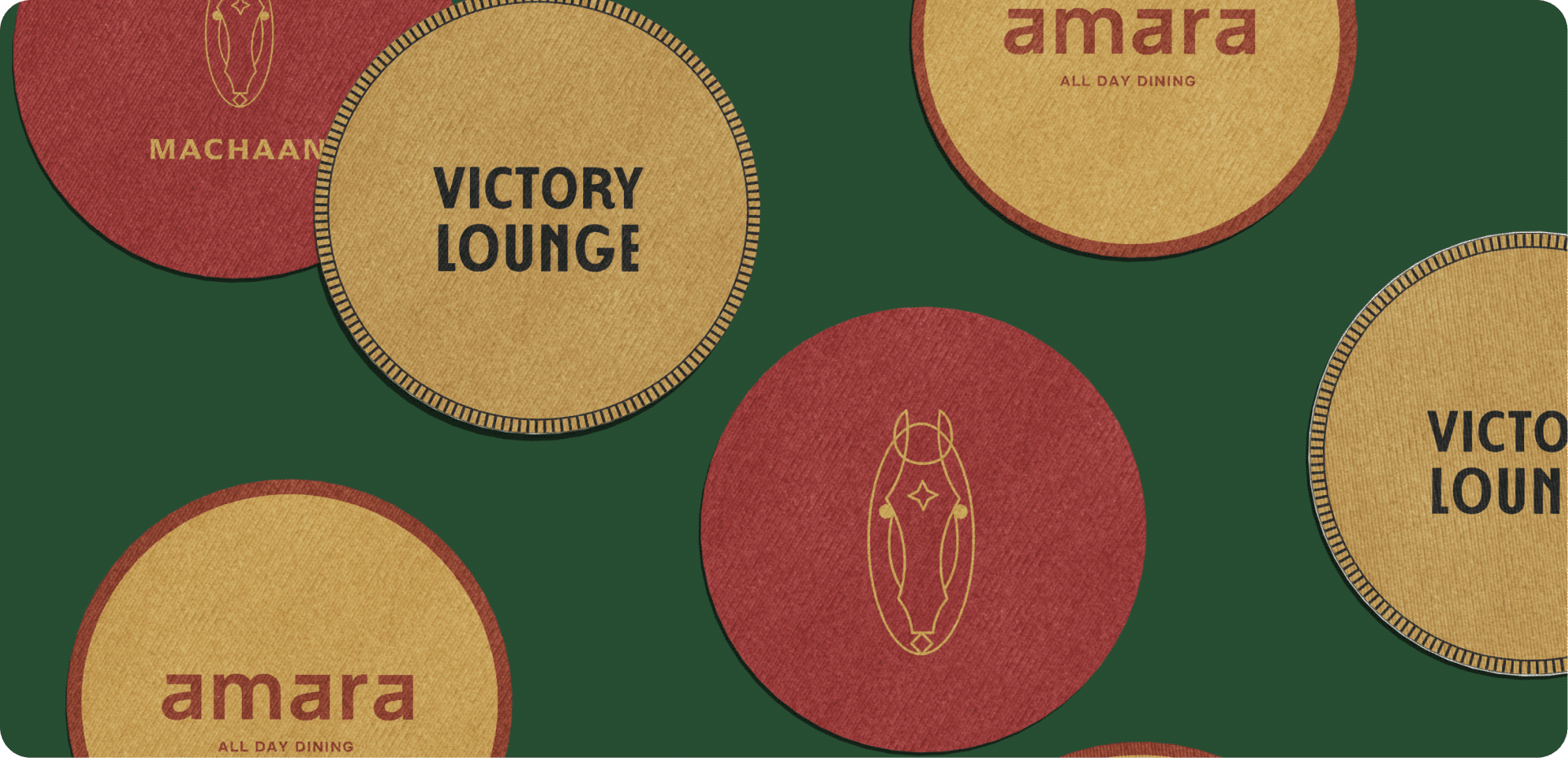
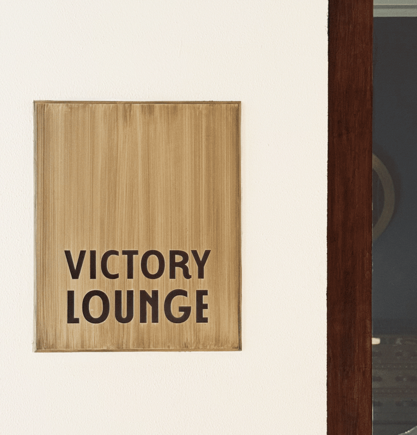
How do four restaurants become one hotel experience?

Each restaurant draws from a different narrative, from the Kathiawadi horse, Mumbai cricket culture to a relaxed all-day dining experience.

We translated these stories into distinct identities while grounding them in the hotel’s architectural language.

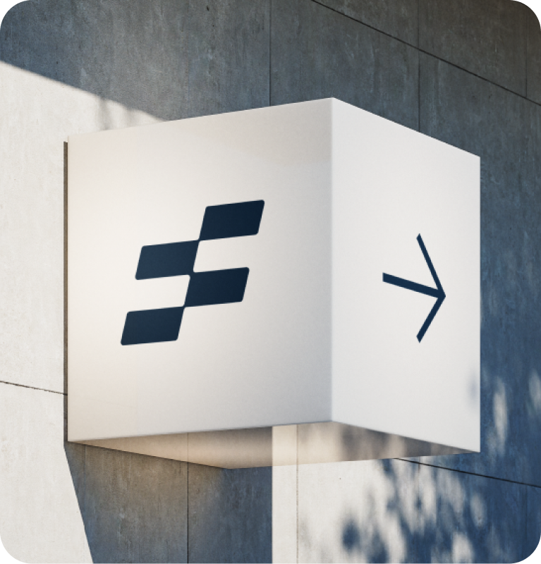
The recurring star motif, drawn from the identity system, creates continuity, allowing the brand to feel deeply integrated rather than simply applied. Together, they create a seamless experience.
The messy, the fun, the not-so-pretty part of a project!
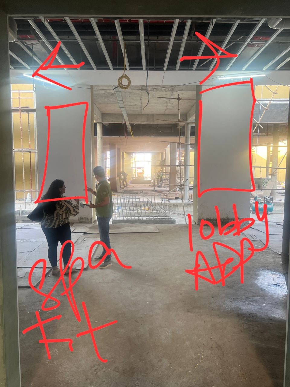
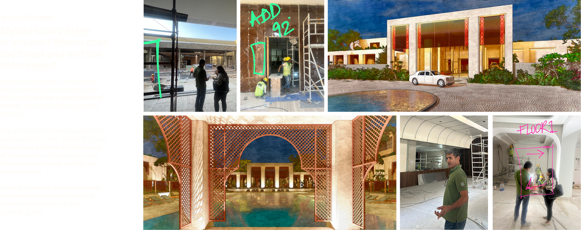
Planning the hotel walk-through
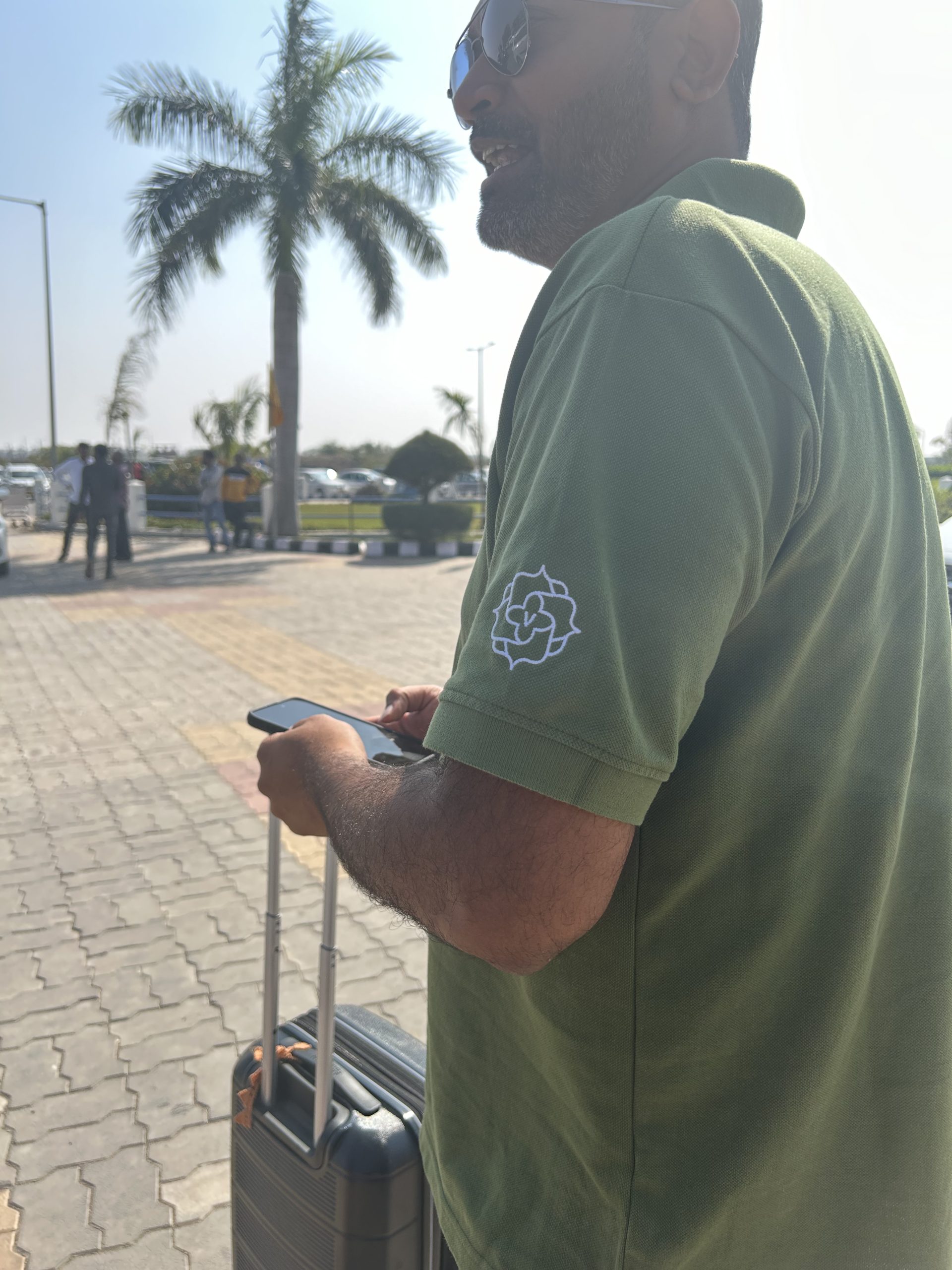
Spotting our logo during WIP trips
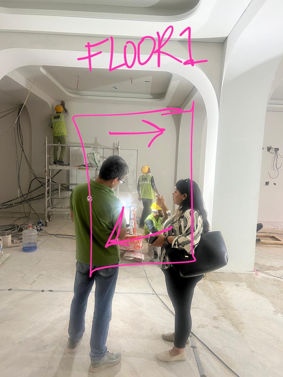
Marking each signage in person
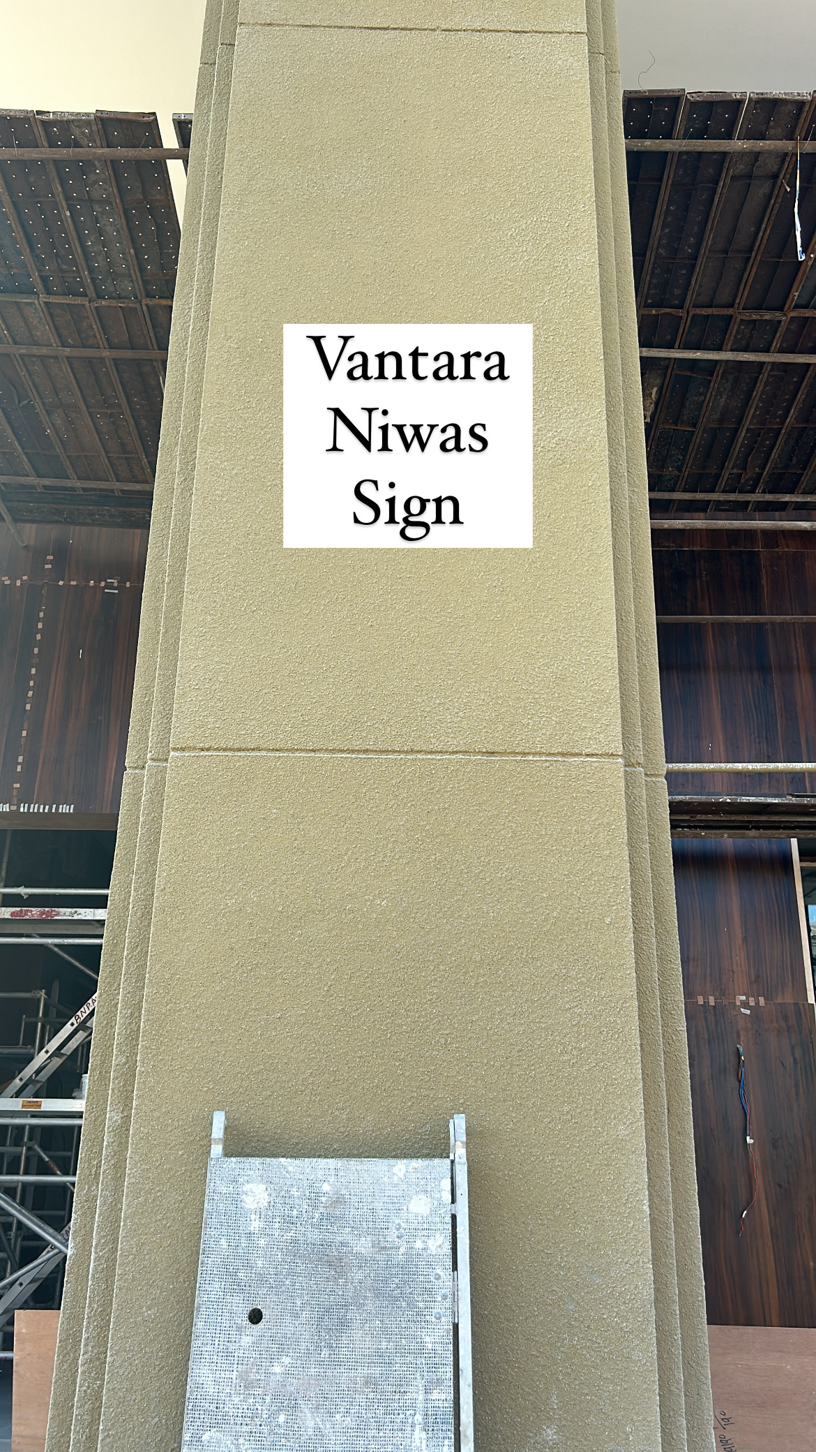
Planning sizes, shapes & materials
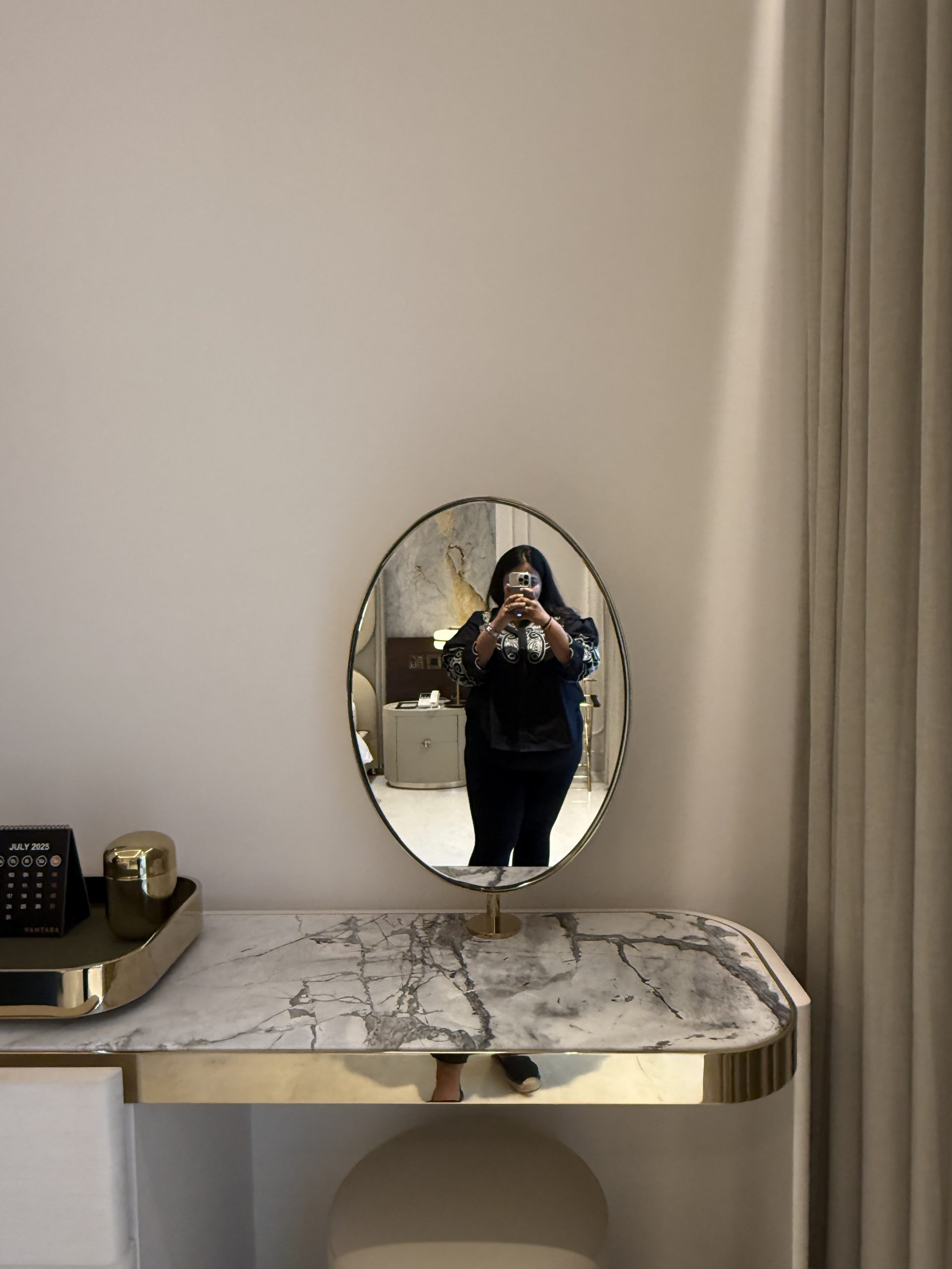
Admiring the little details
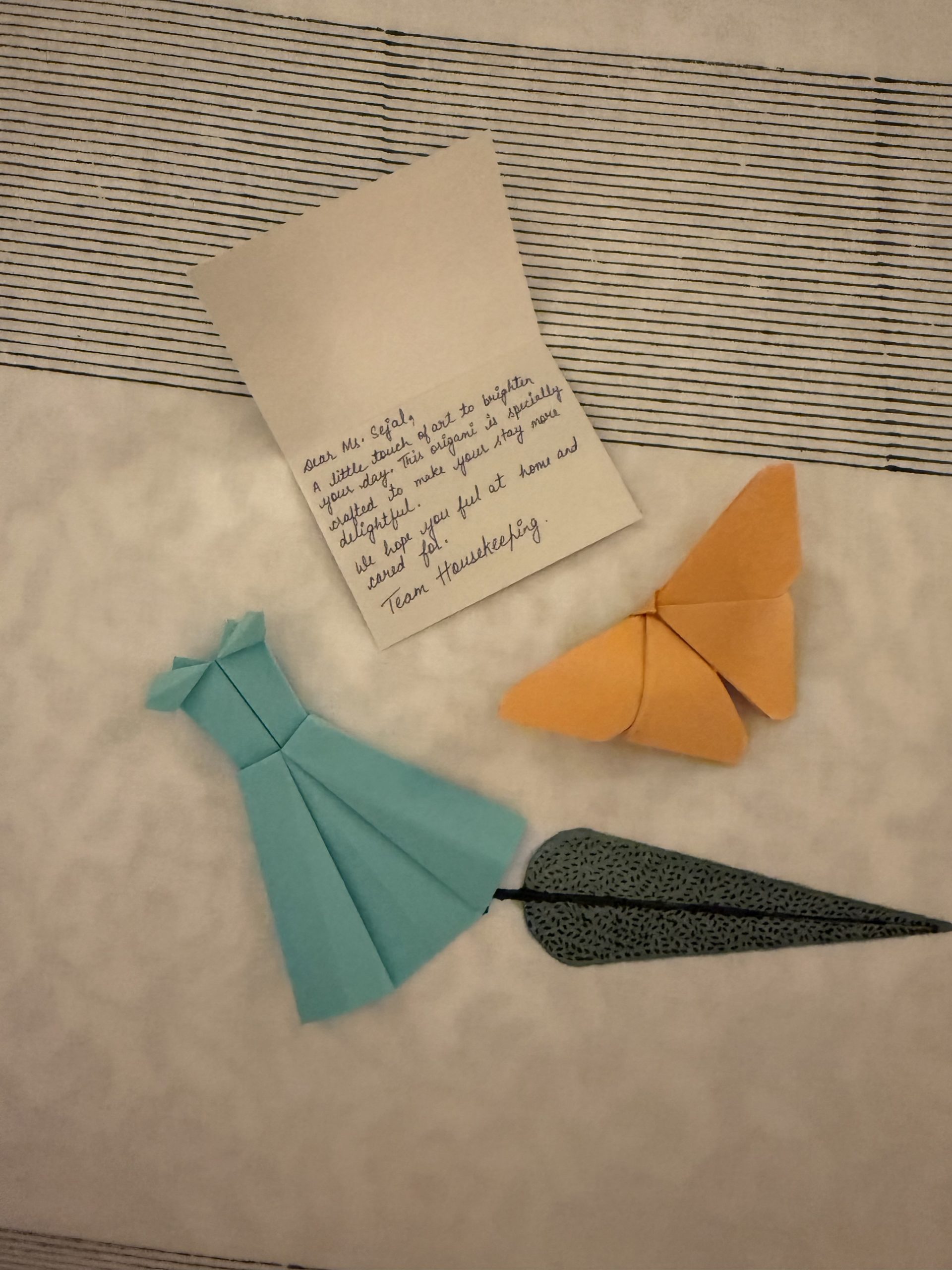
Ensuring the detailing goes beyond architecture
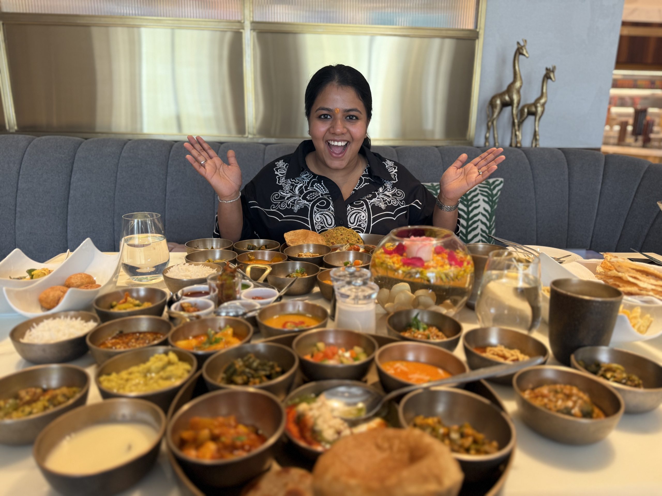
Blown away by the F&B team's hospitality
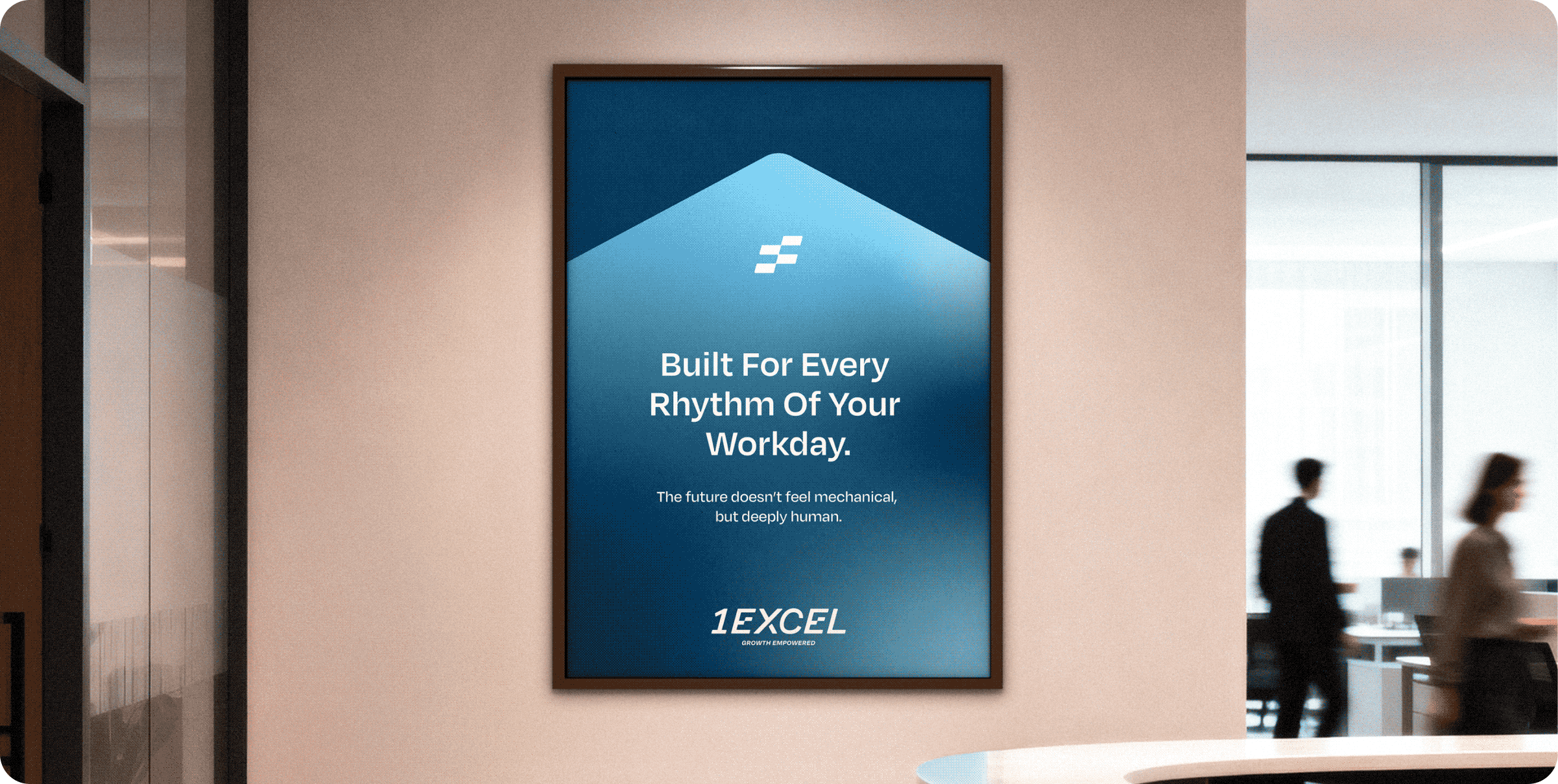
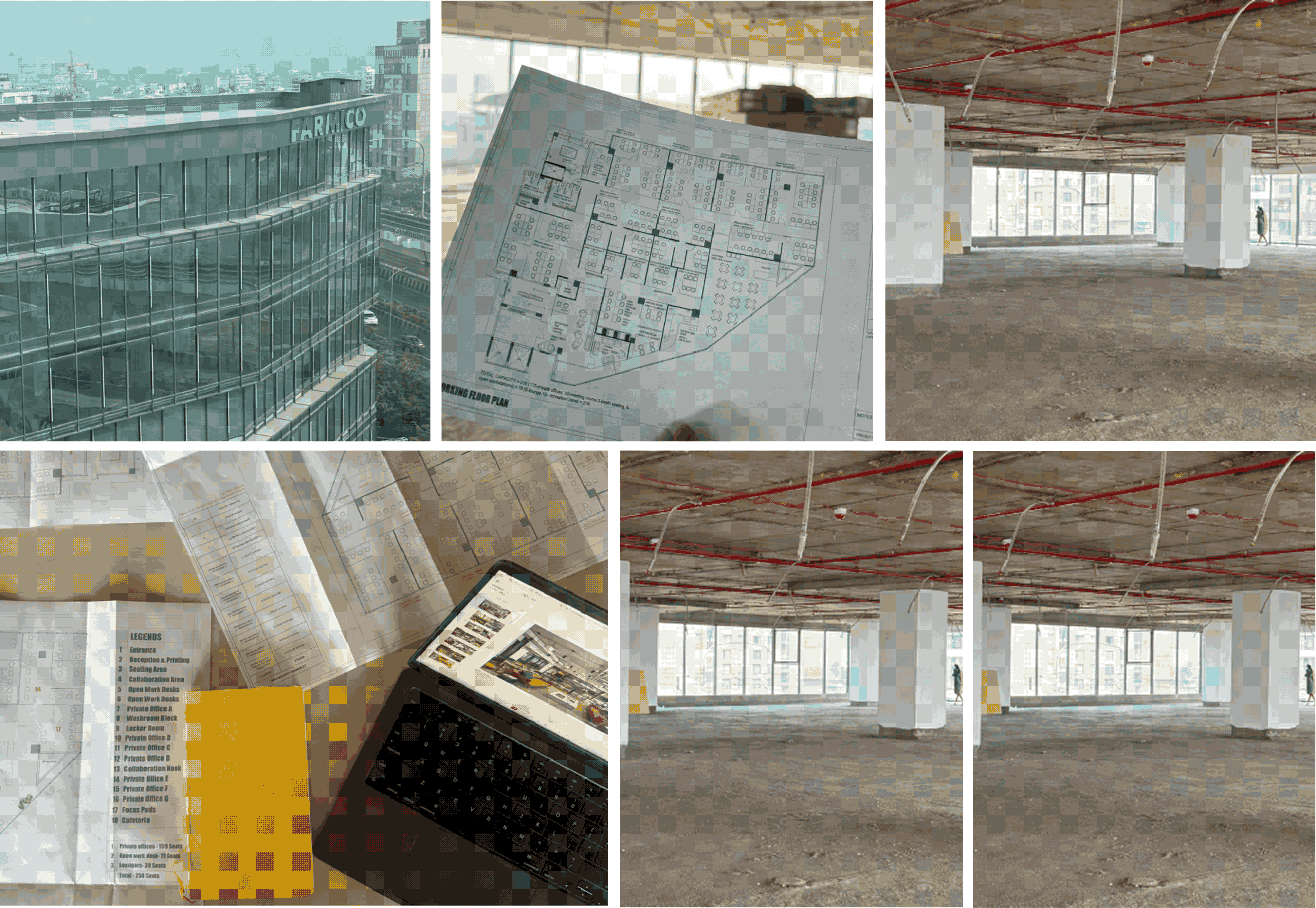
Smart Co-Working With 1Excel

What makes a workplace worth coming back to?

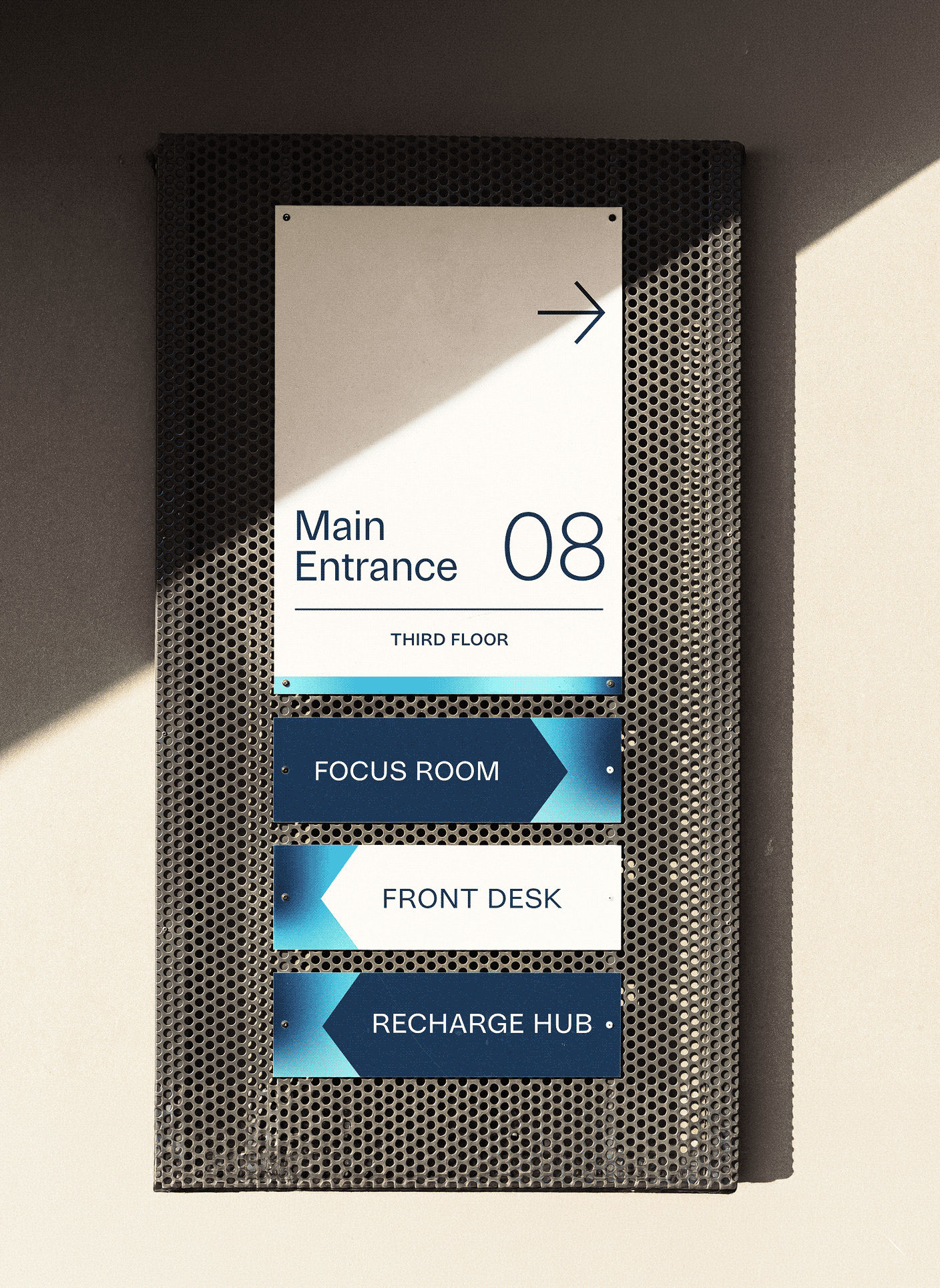
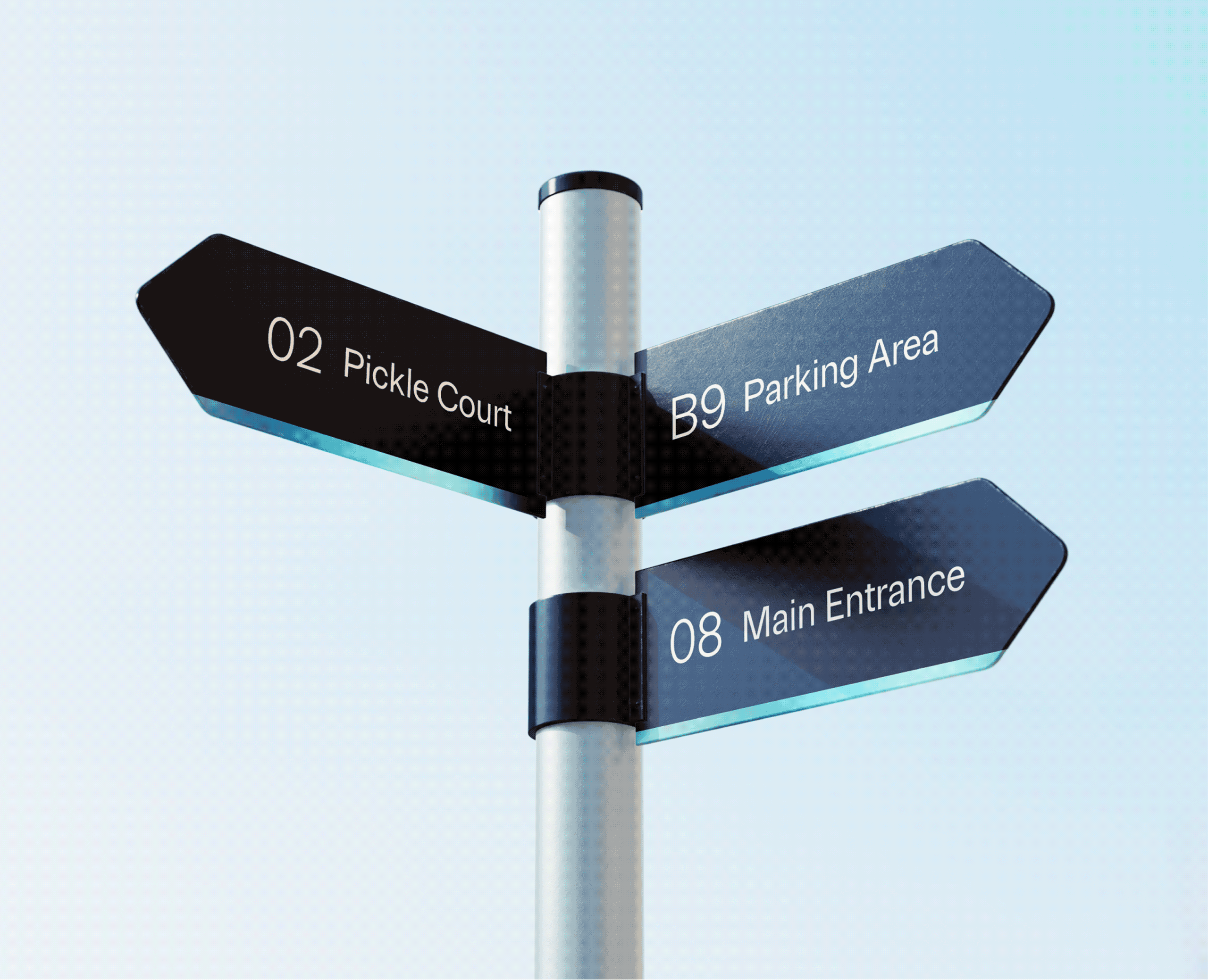
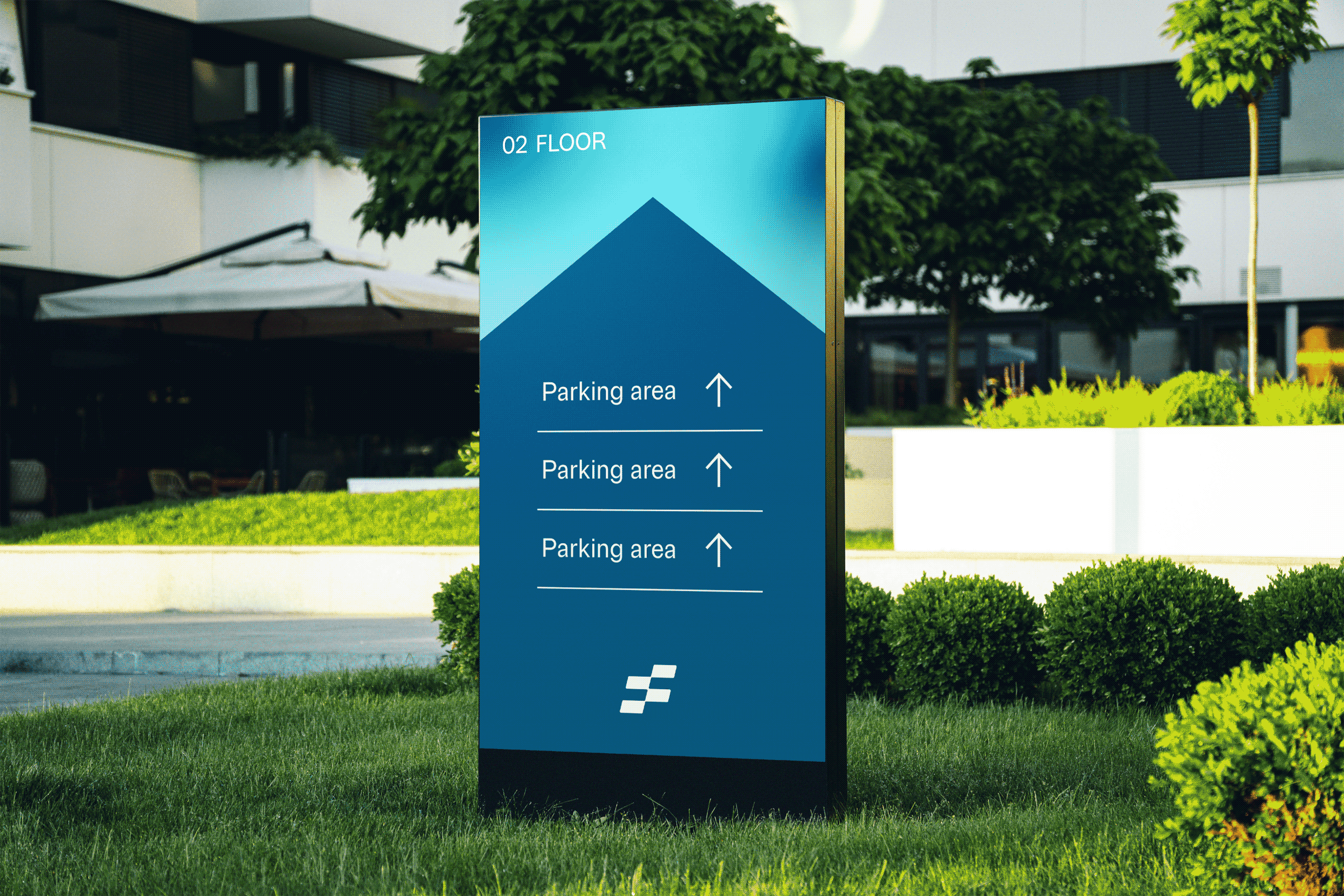
Scope Of Work: Market Research, Strategy, Brand Identity & Extension and Directional Signage.

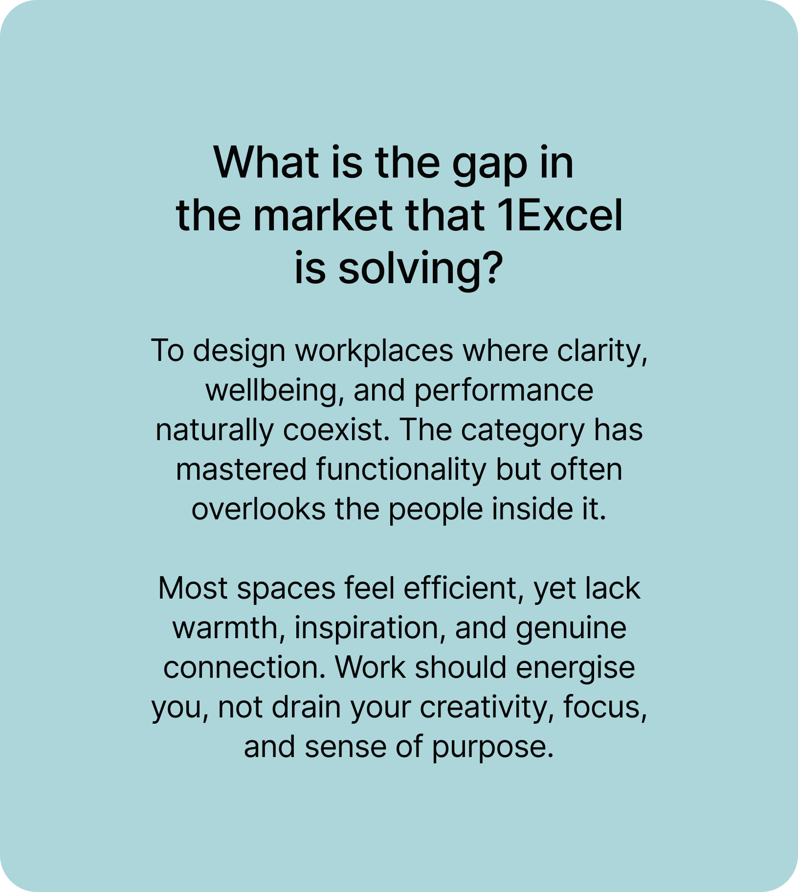
Does every co-working space promise the same thing? Flexible desks, fast Wi-Fi, great coffee and community. If everyone says the same thing, what actually makes a workplace better?

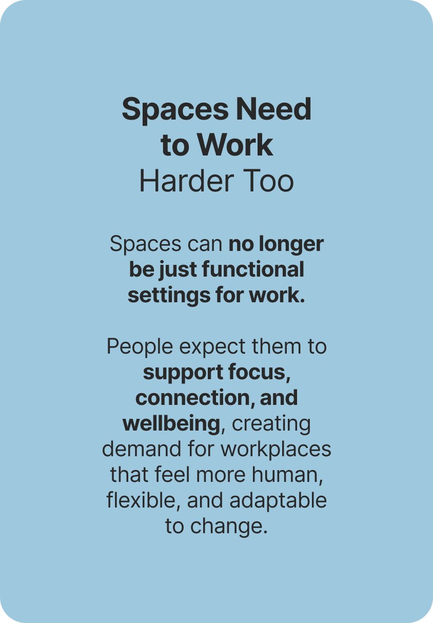
We explored this question with Sakshi. As work became more flexible after the pandemic, expectations shifted too. People weren’t just looking for a place to work; they were looking for spaces that inspired focus, supported wellbeing, and made coming to work feel worthwhile.

The goal was to build a brand that put people before processes and experience before amenities. We started by questioning what people really need from the places they work out of, in order to build the foundation of 1Excel.

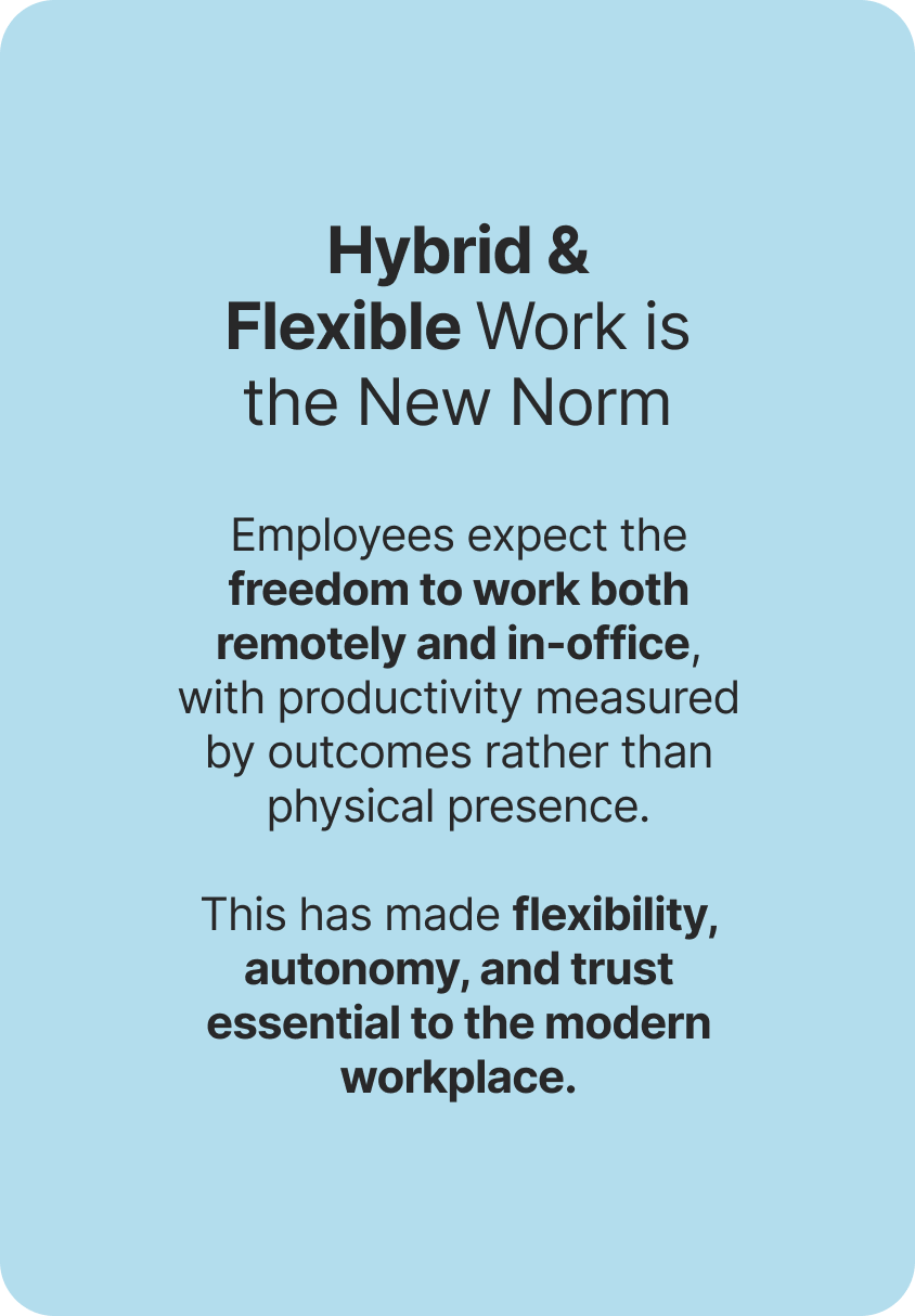
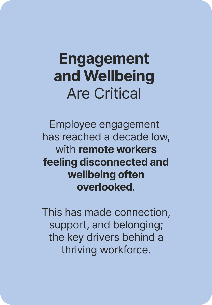
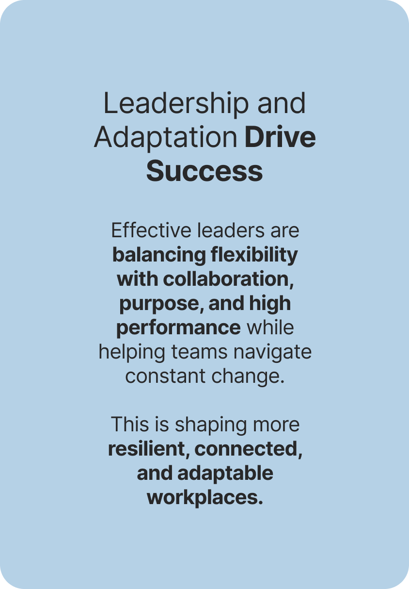
CHANGING LANDSCAPE

Work has found a new rhythm. Spaces needed one too.

We looked beyond workplaces and into the way people work today. How teams collaborate, what flexibility really means, and what people expect from a space they spend most time.

The future of work wasn’t defined by location, but by experience. Successful workplaces would need to be flexible, human-centred, and designed to evolve alongside the people using them.

People adapt to their workplaces. They shouldn’t have to.

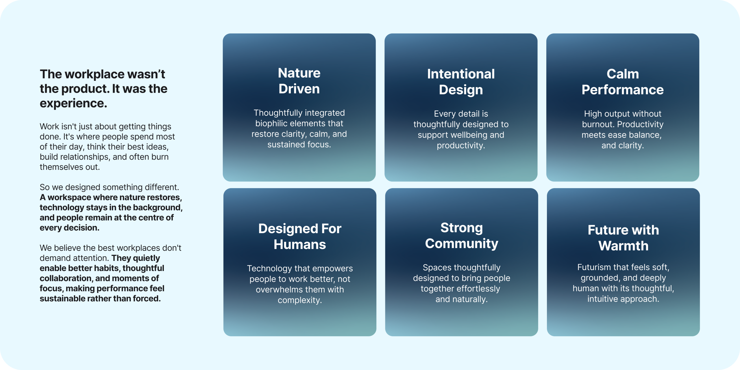
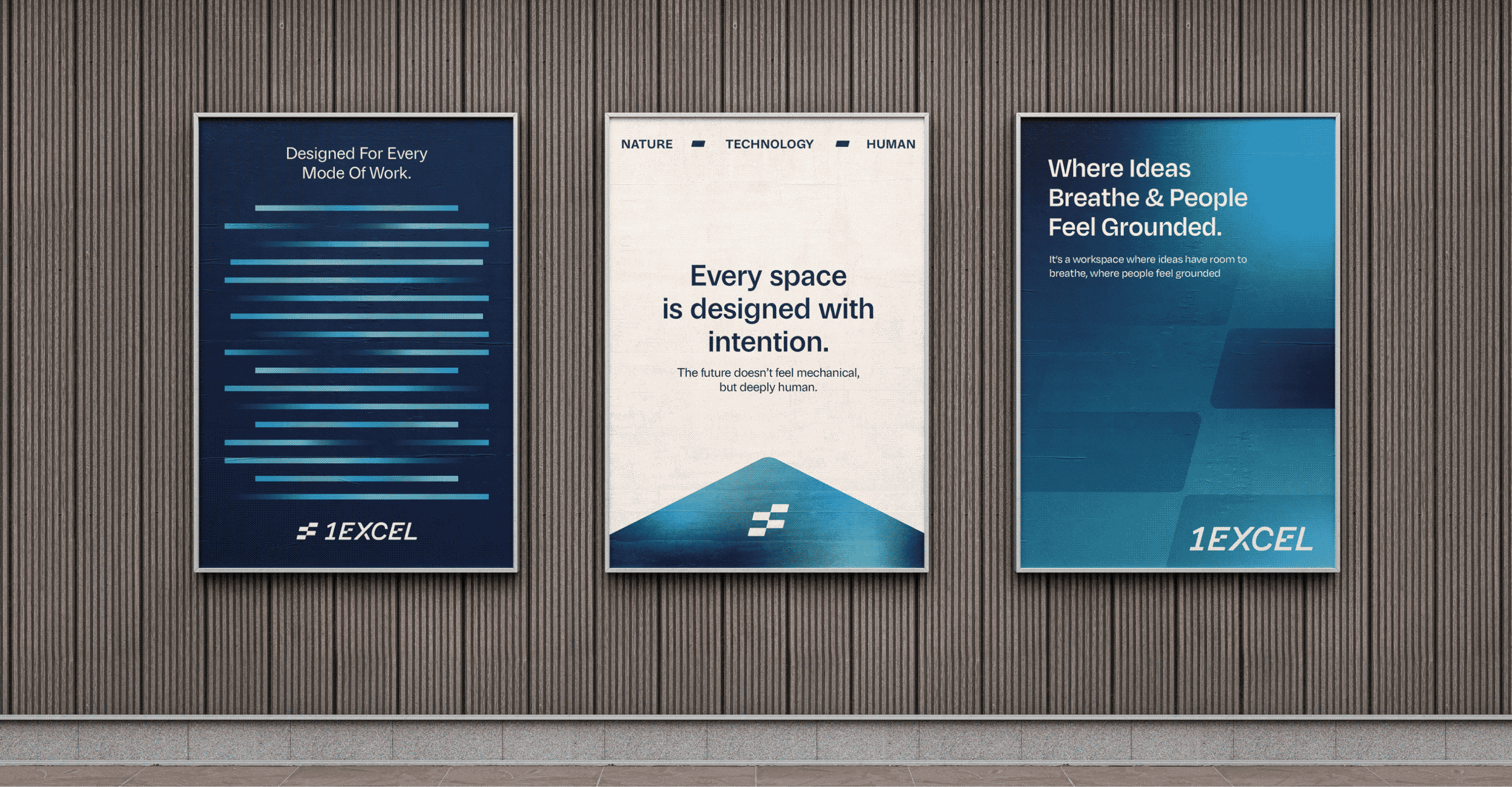
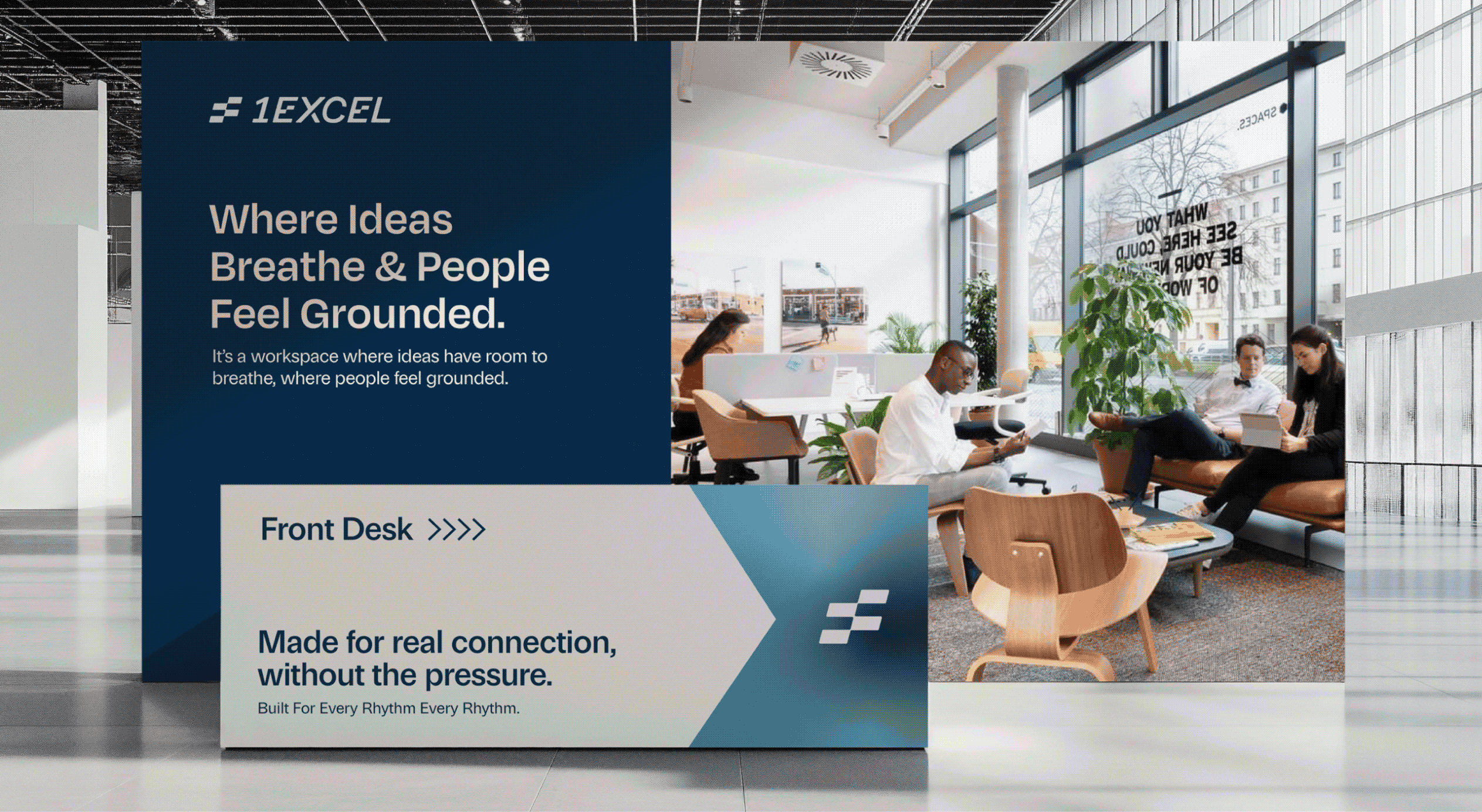
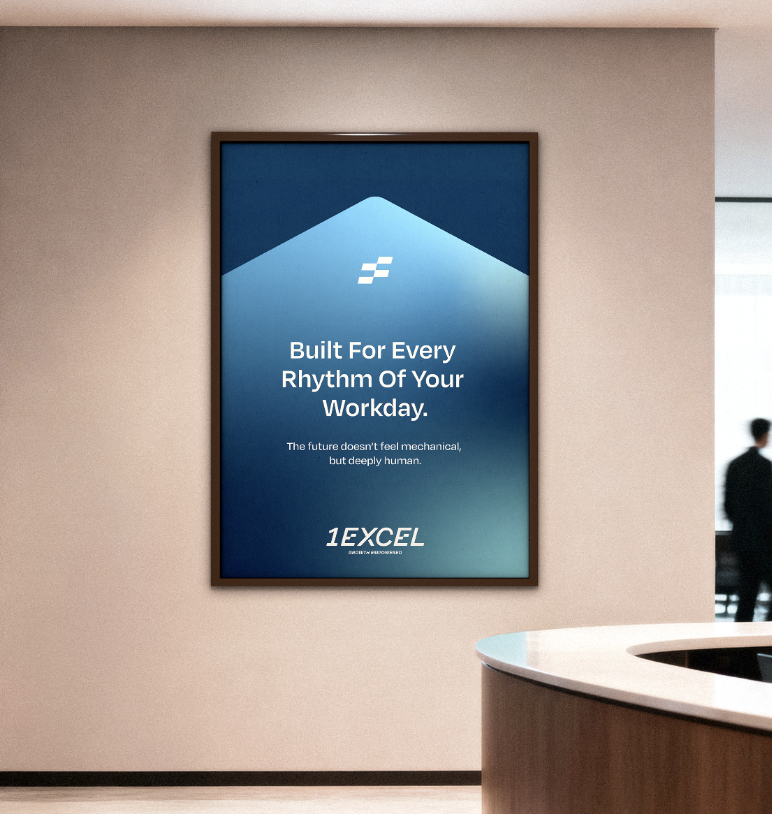
Introducing 1Excel: A space for humans & not just people! 

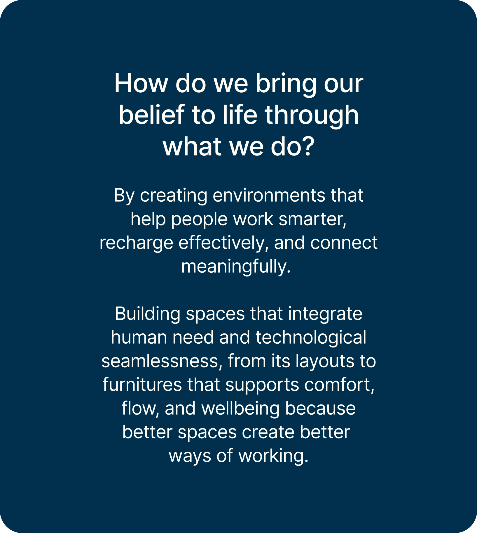
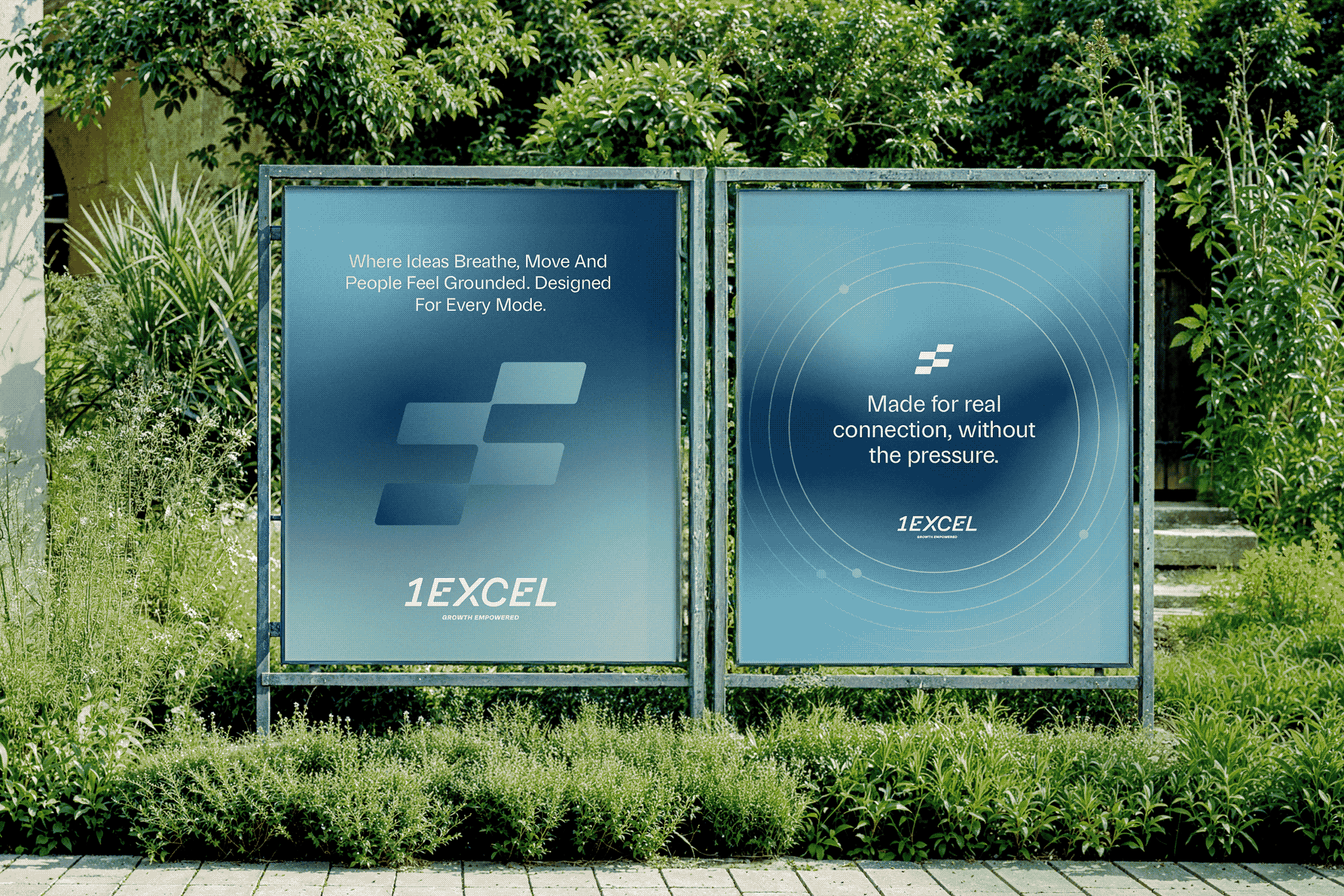
A Better way to work. Designed for human potential.

A calm, intelligently designed workspace where nature and technology work in harmony.


Creating environments where people feel grounded, focused, and inspired to do their best work.


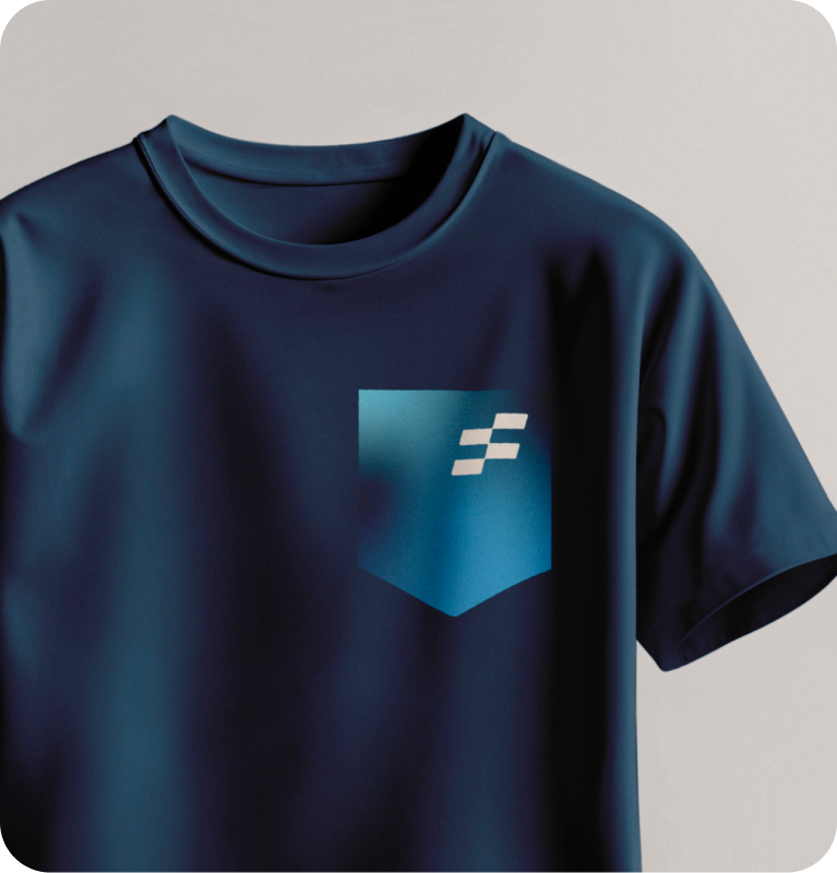
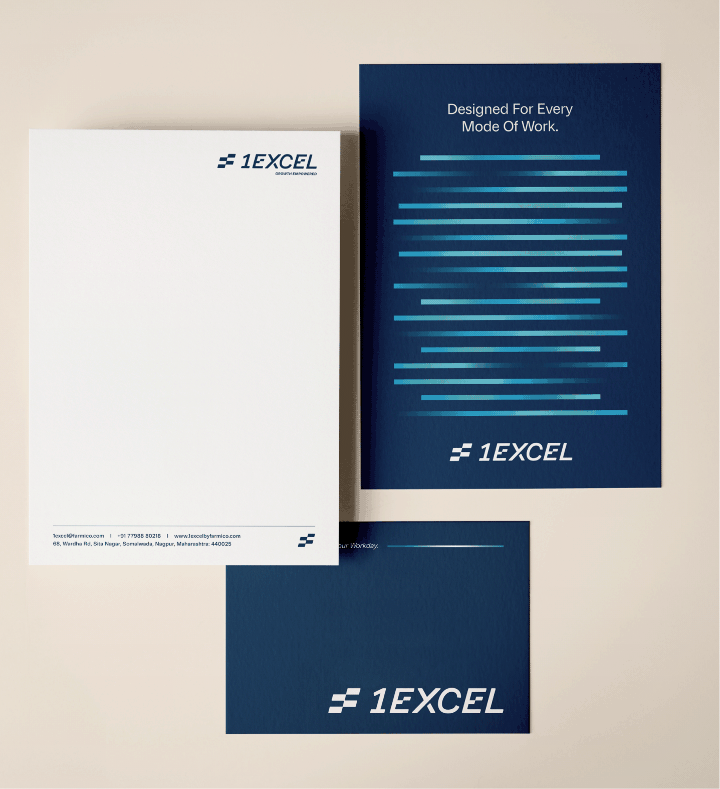
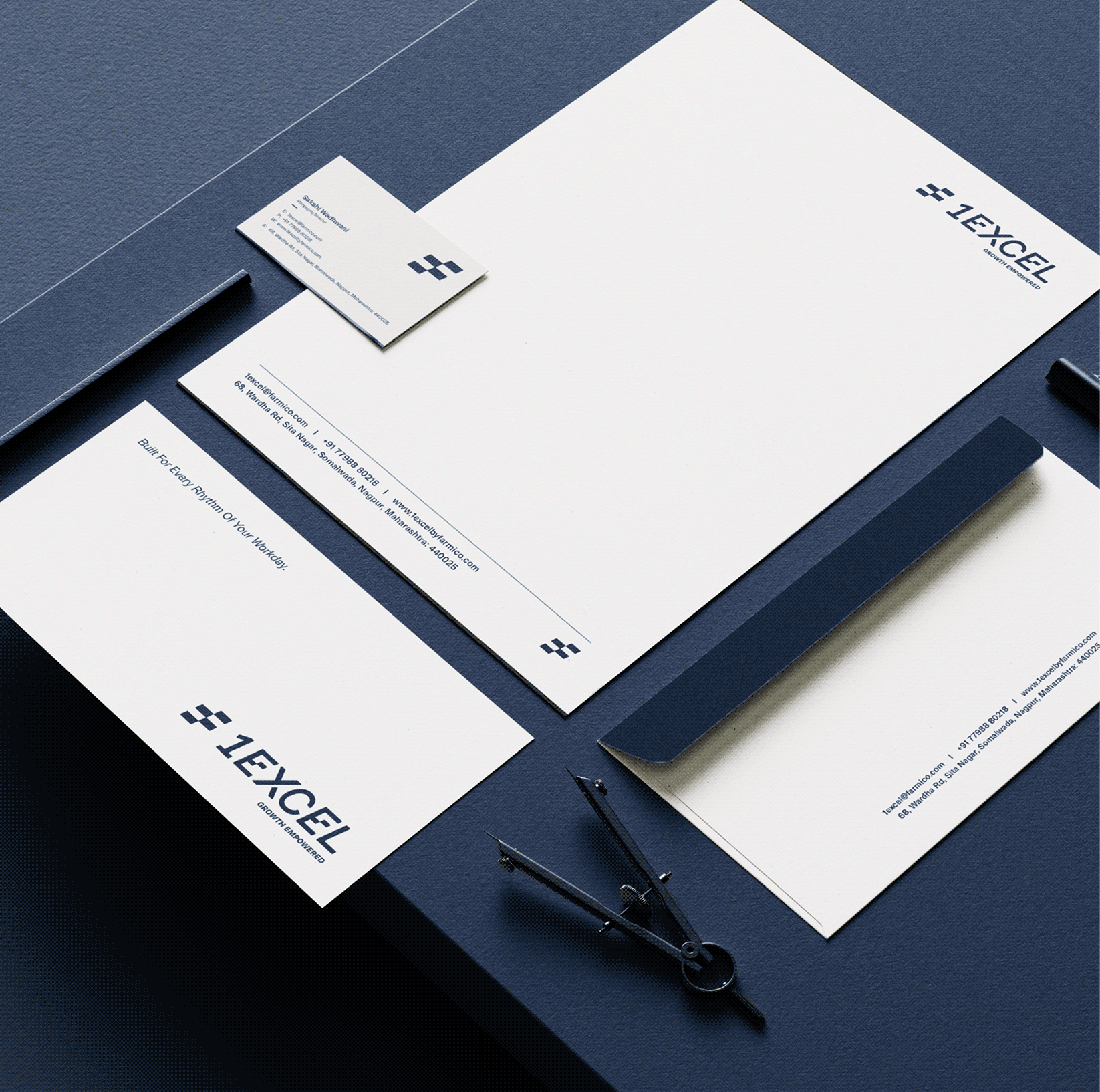
A flowing identity that reflects seamless workflows, effortless momentum, and human-centred productivity.

A Postcard From Bharat

Are rural and urban India really different?

Scope Of Work: Market Research, Brand Strategy, Understanding Consumer Psychology, Product Packaging and Brand Extension.

Coming from a rural background, Durlabh, the founder, always wanted to keep a connection with where he was from. Working in the city showed him what urban demand could do for the farmers he grew up around. That’s when he founded Barosi.

He wanted urban India to take a step back and enjoy the simple times of rural India through his products.

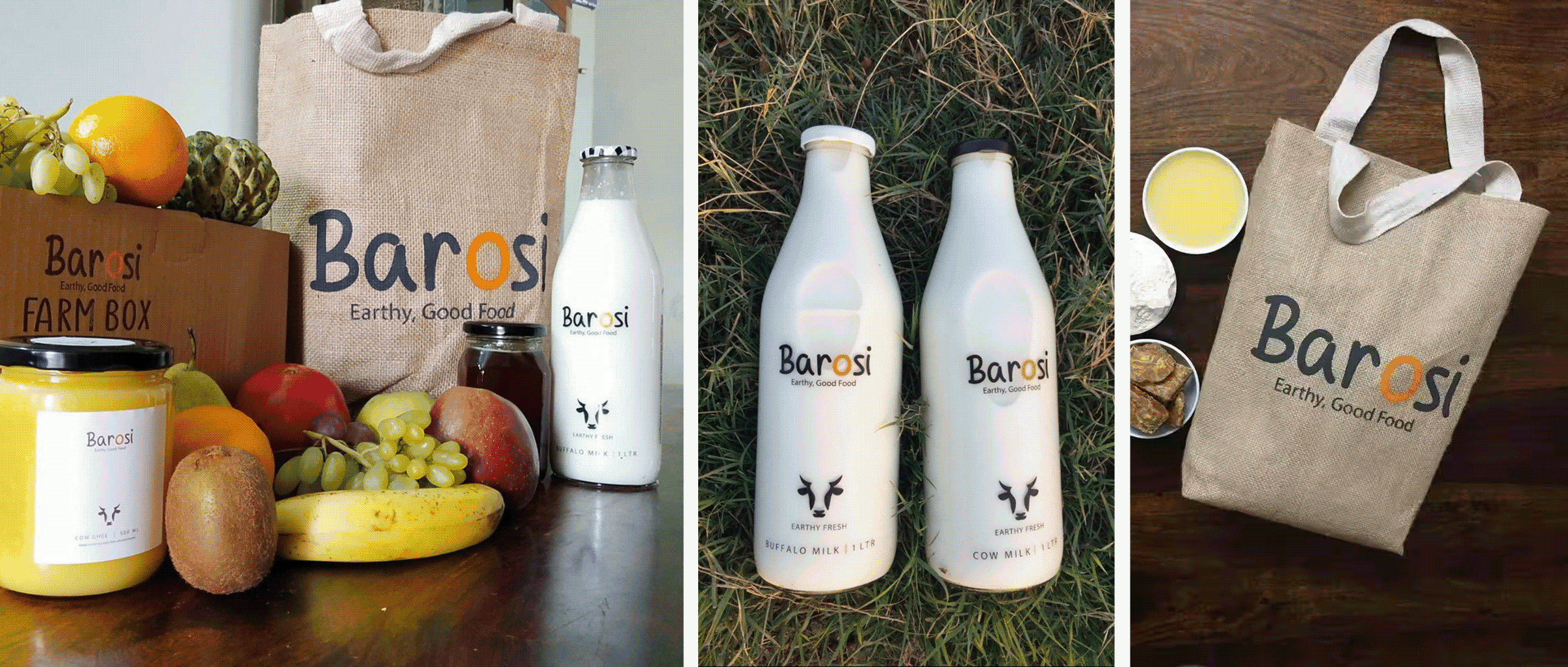
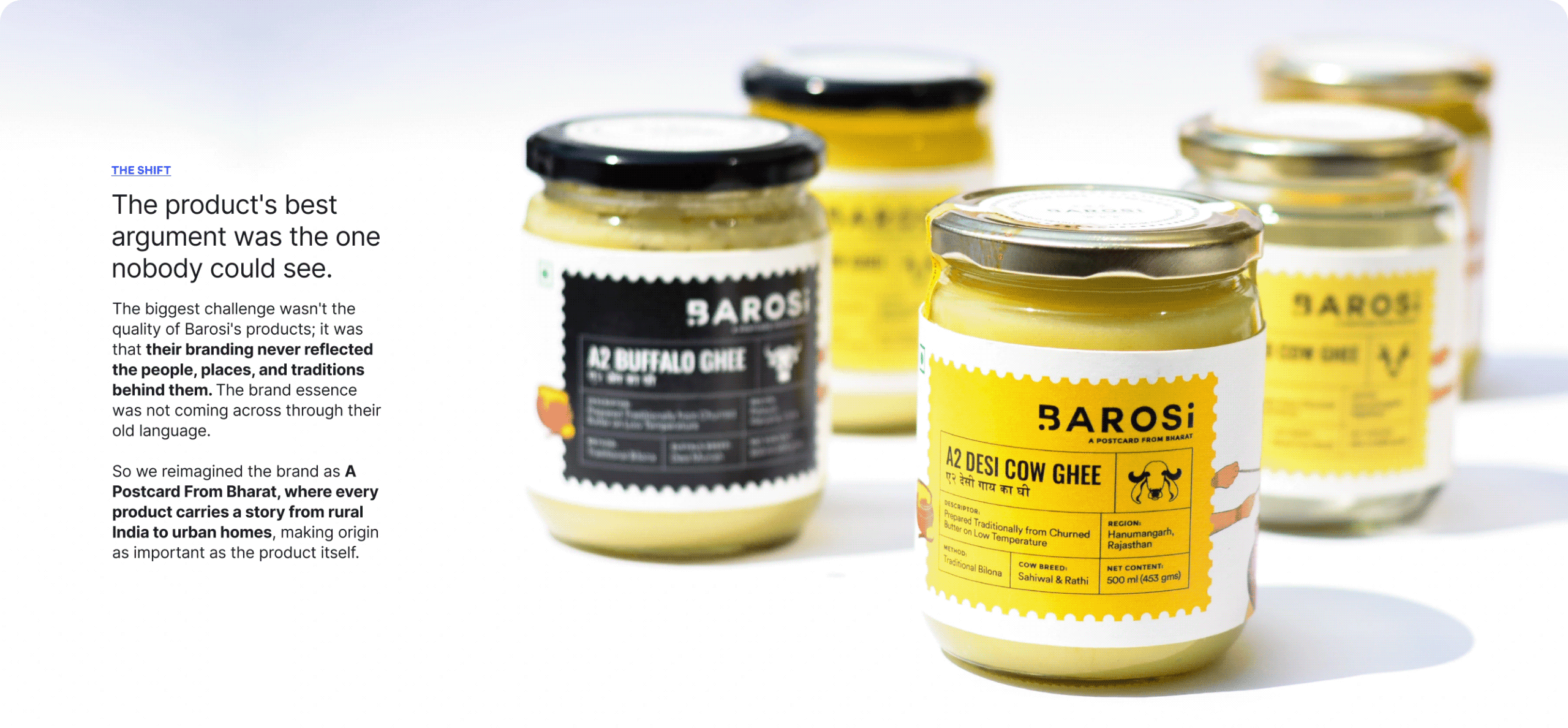
Barosi works with farms across rural India, making fresh and wholesome products rooted in local tradition and culture, brought to your kitchen in the most authentic way. So why did it need a rebrand?

IDENTITY CONCEPT

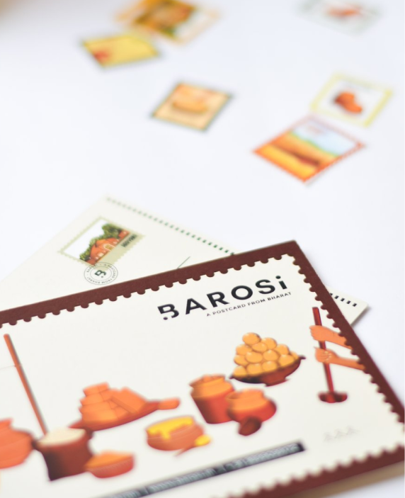
What if every product arrived like a postcard?

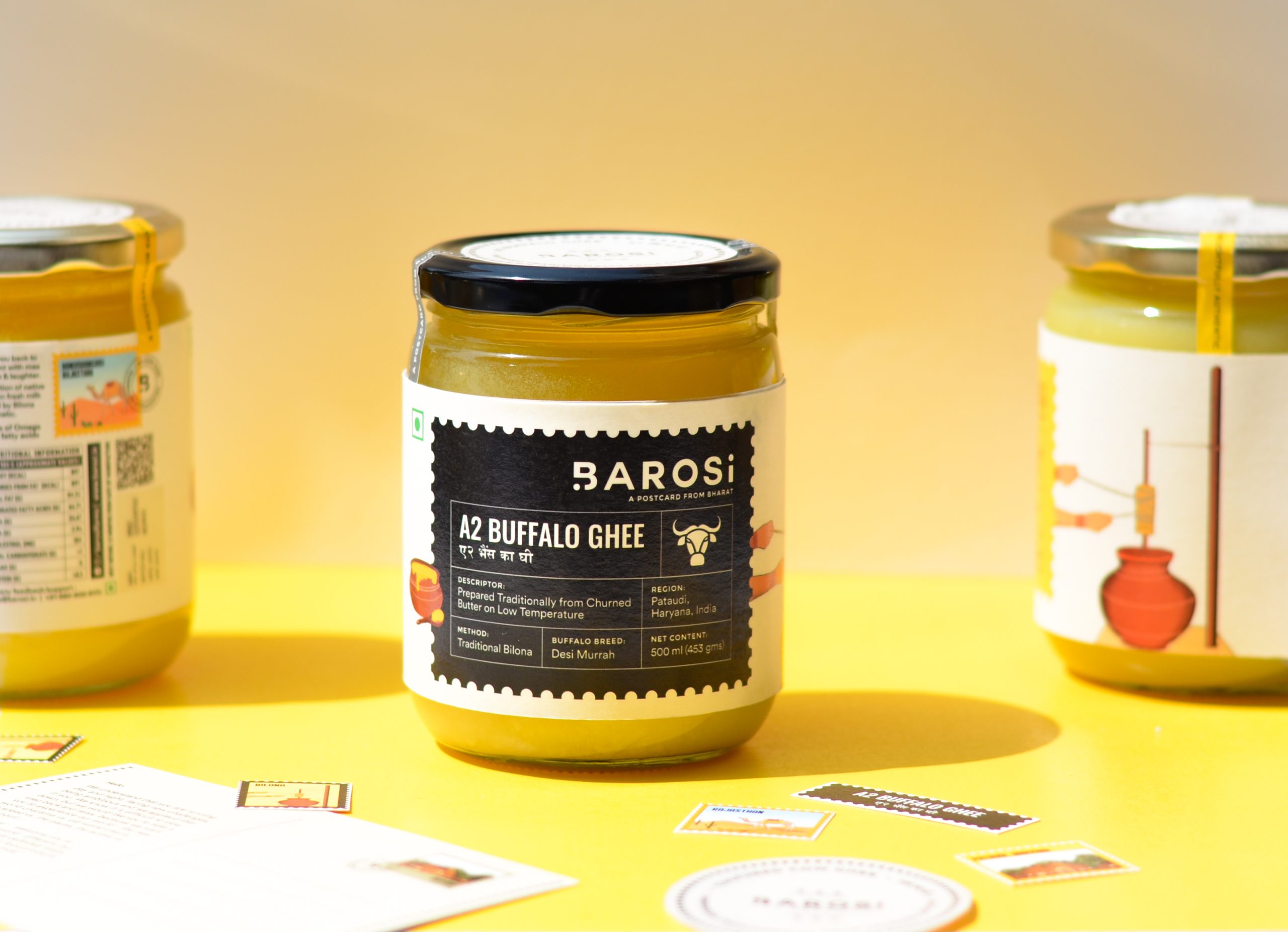
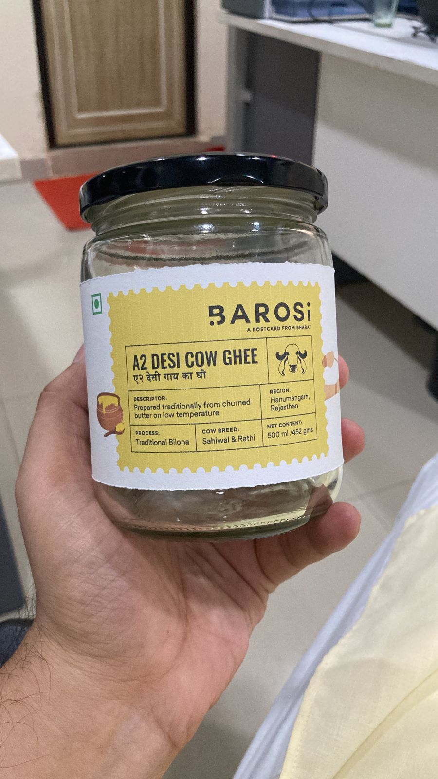
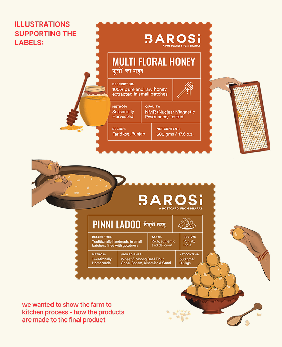
We wanted the identity to carry more than a name. Inspired by handwritten postcards and journeys across India, every visual element reminds consumers where their food comes from and who made it.


The moving dot becomes a symbol of that journey, connecting Bharat with India, while keeping Barosi’s roots visible at every touchpoint.

From the farms of Barosi to you!

We built the entire brand around the idea of A Postcard From Bharat. Every product becomes a postcard, carrying stories, traditions, and flavours from a different corner of India, thoughtfully delivered by Barosi.

THE BEST PART

How do you convey these stories on the packaging?

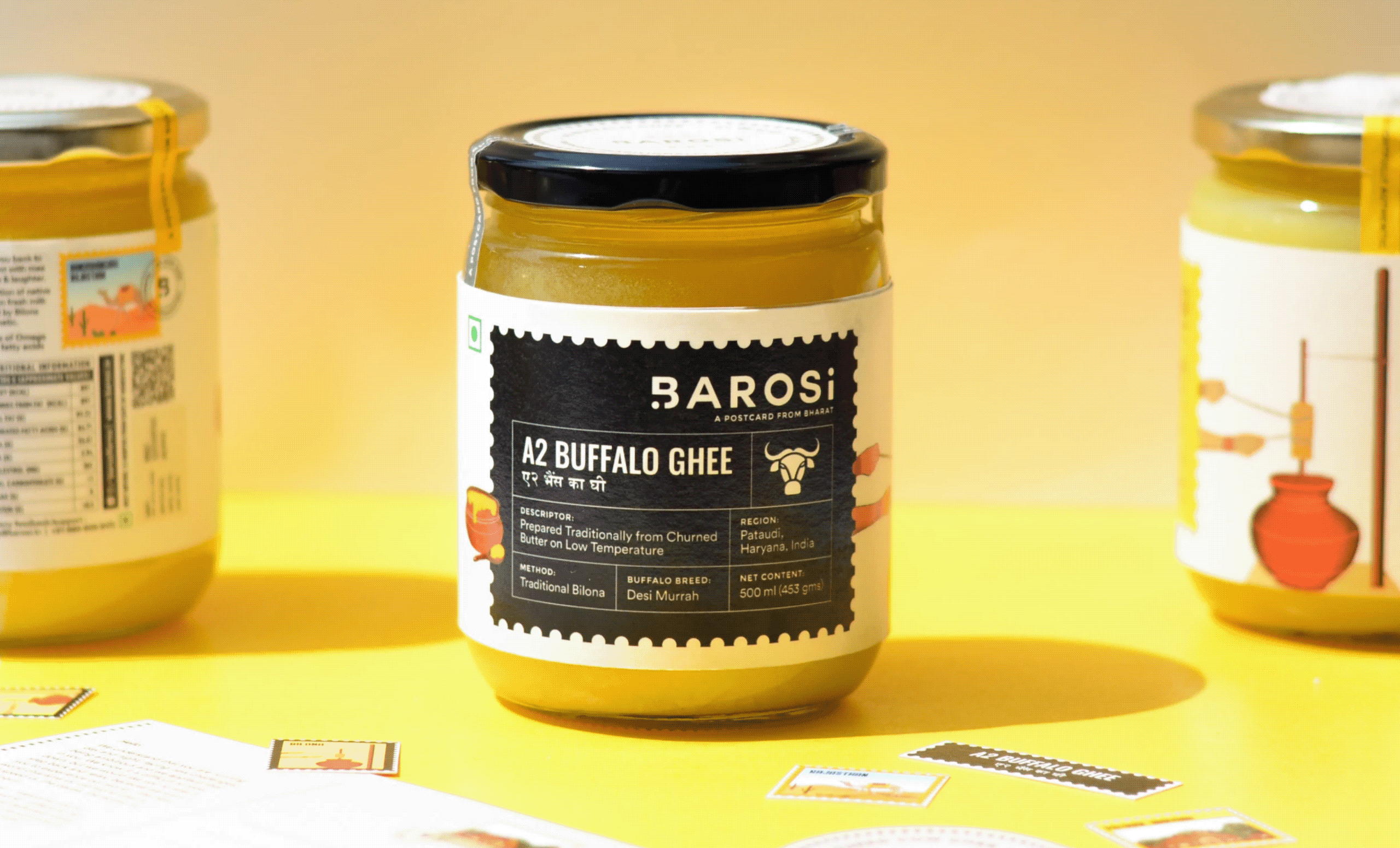
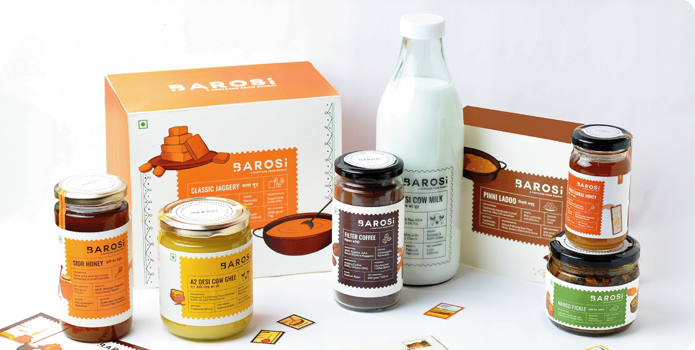
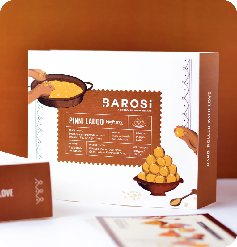
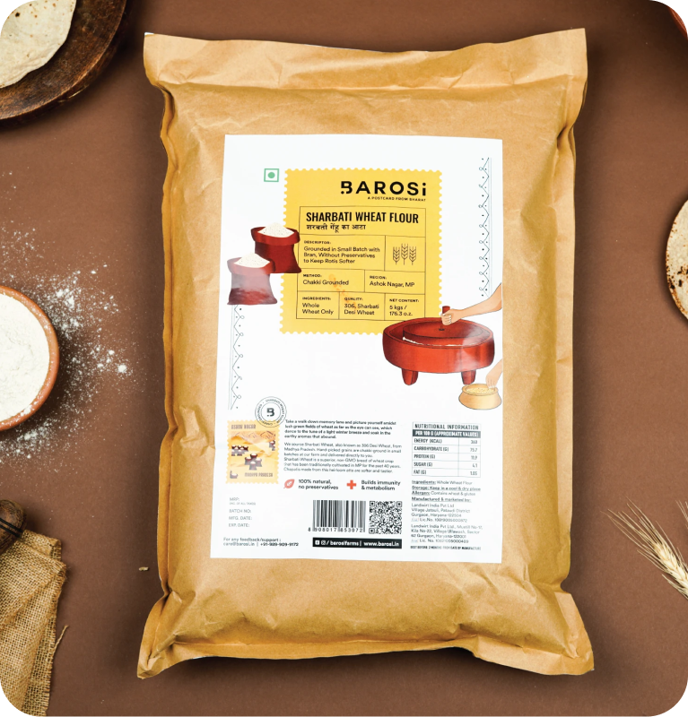
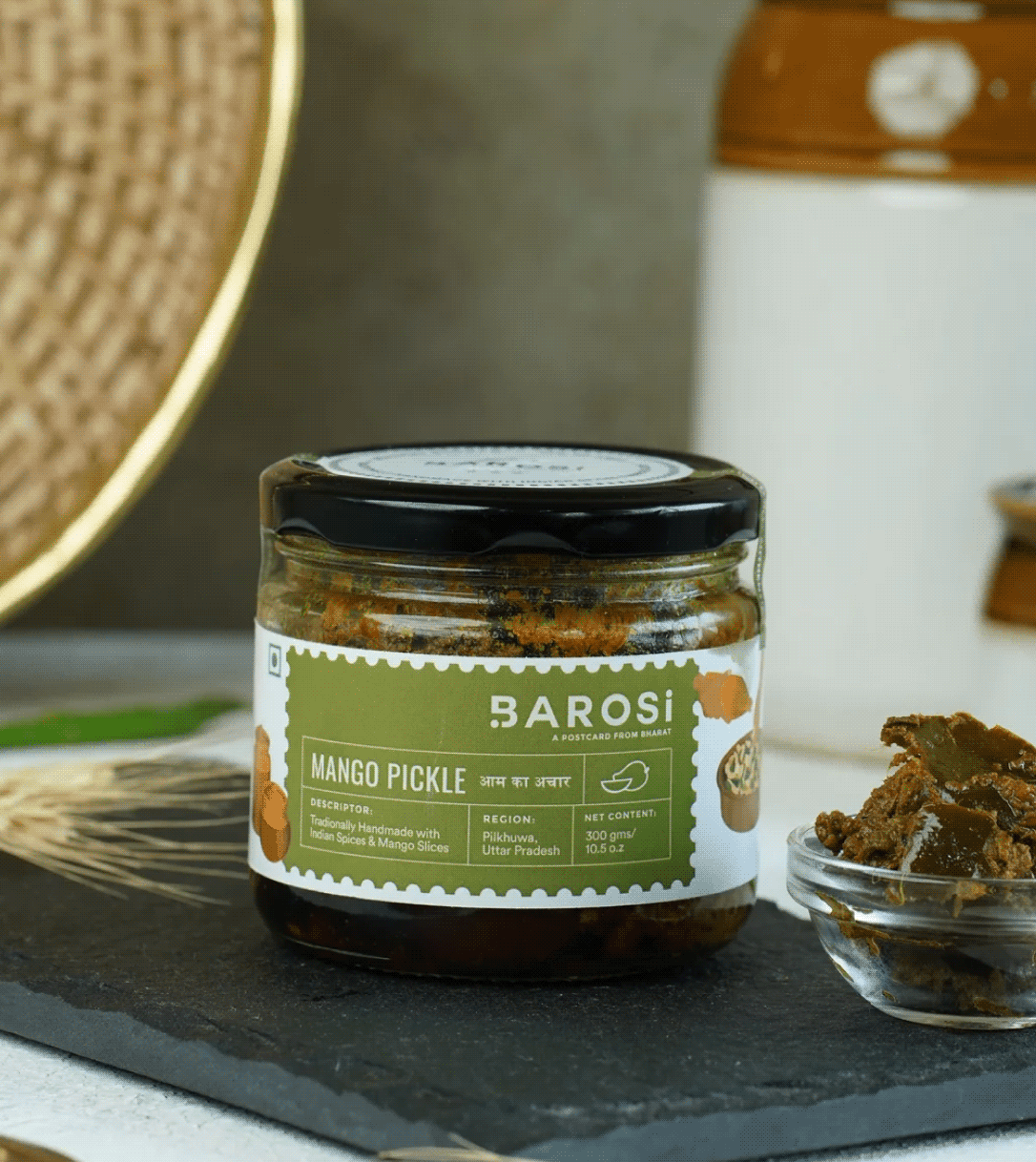
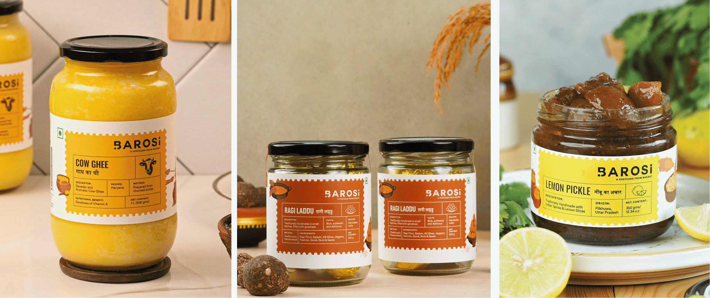
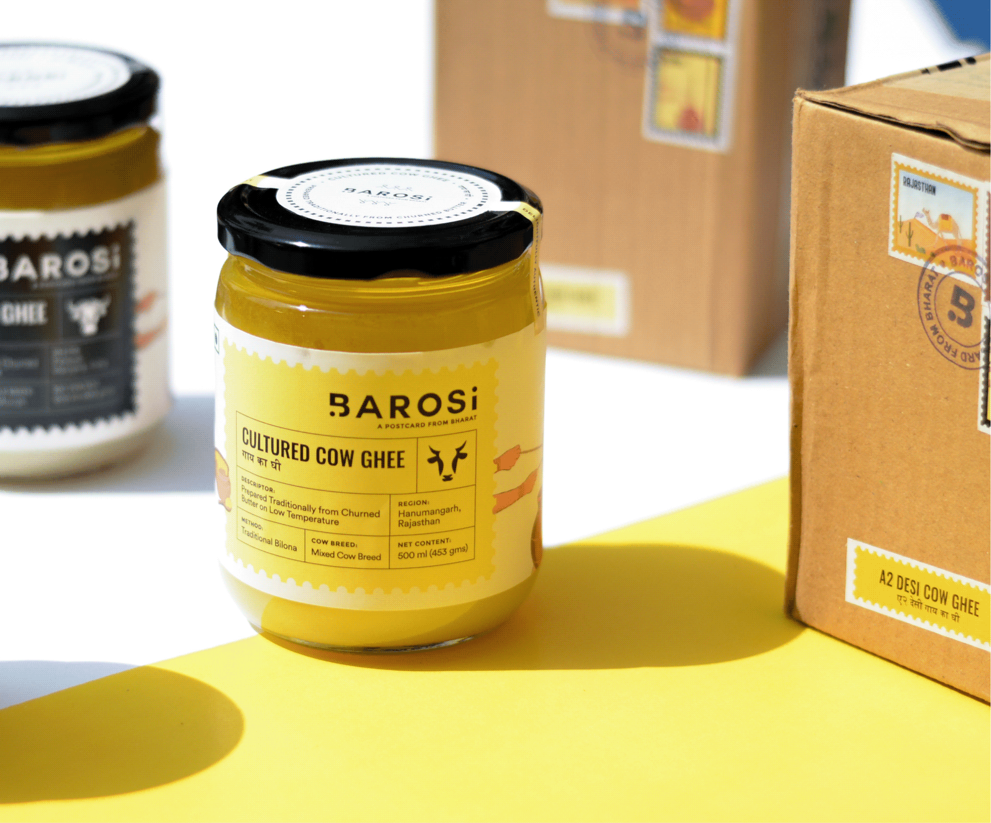
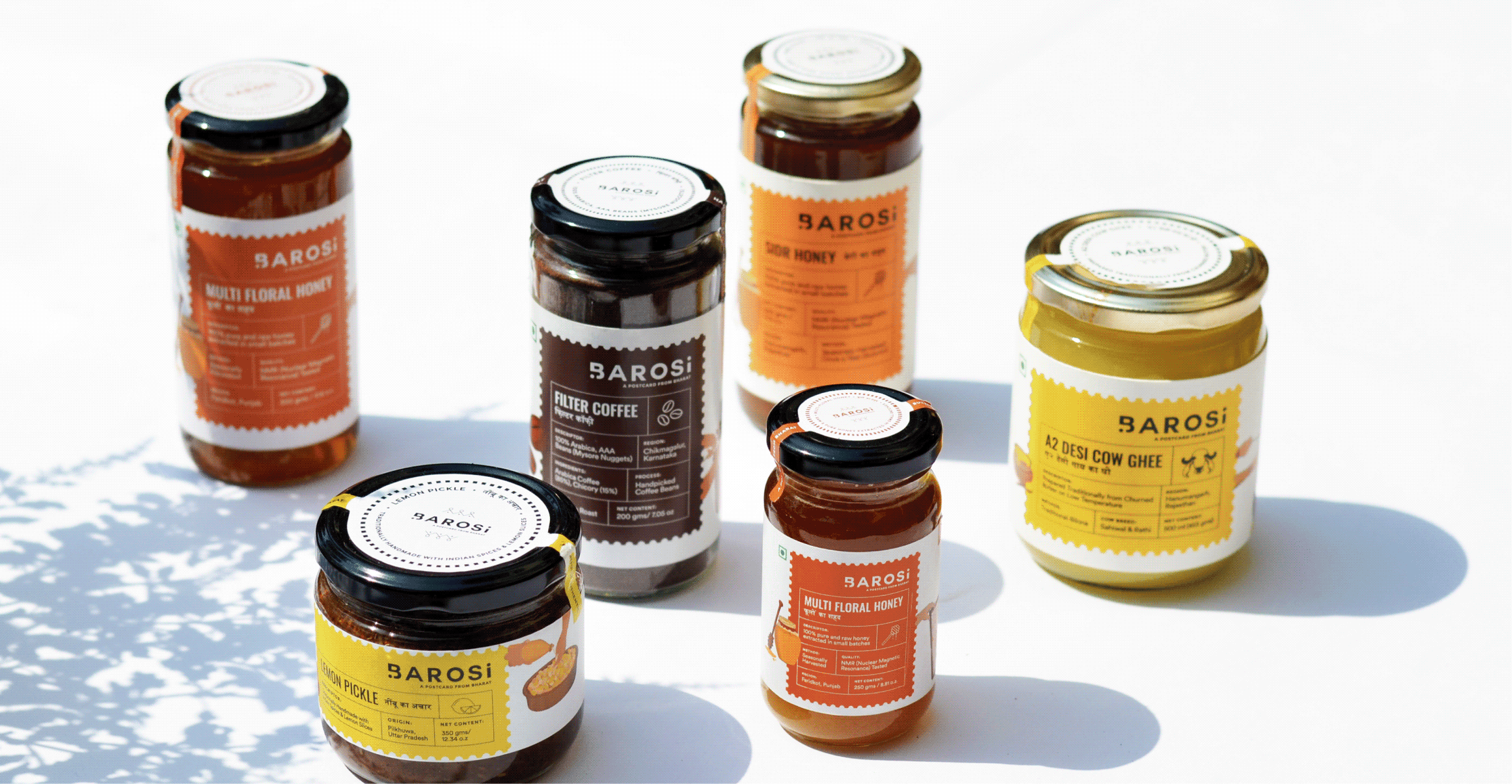
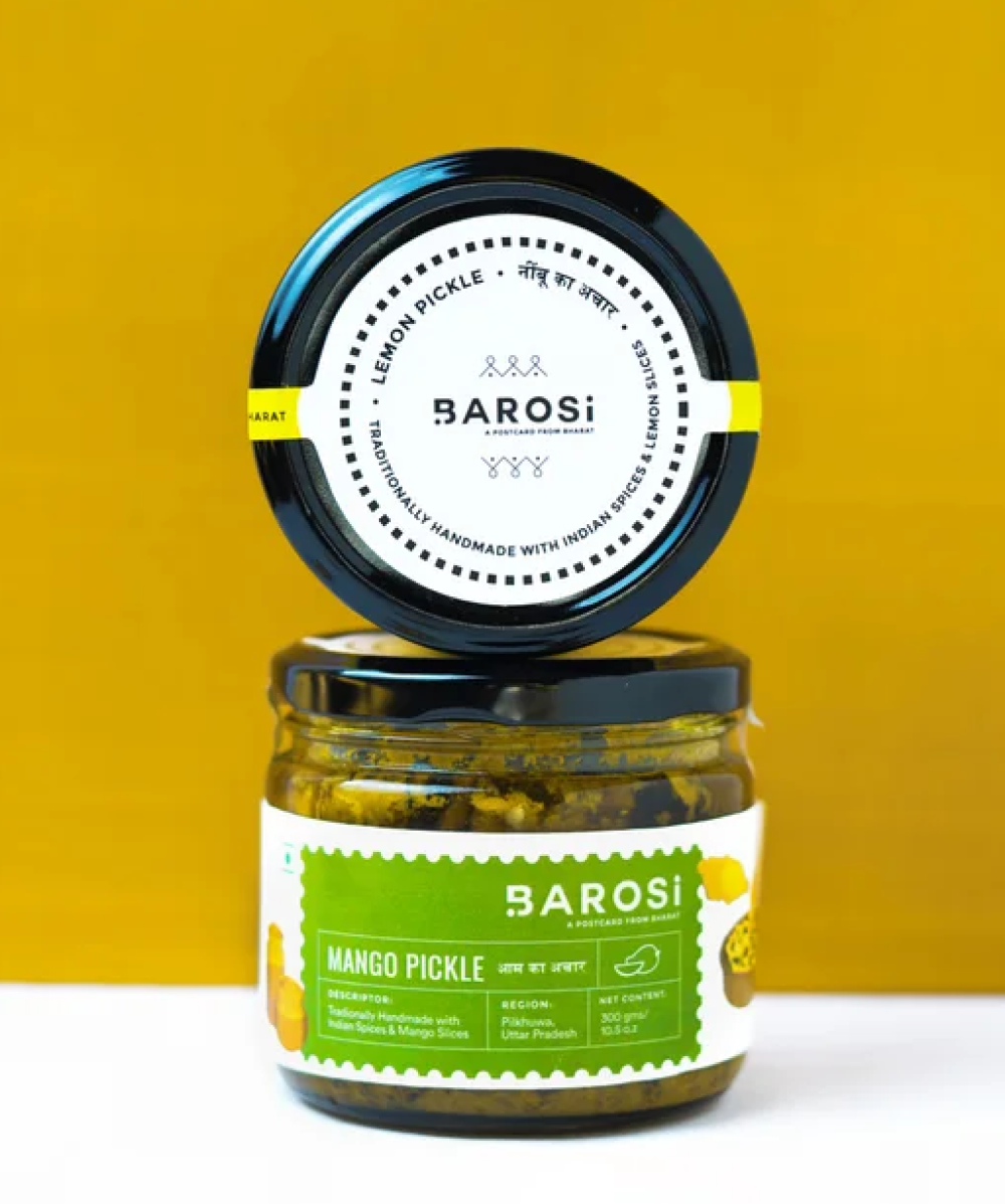
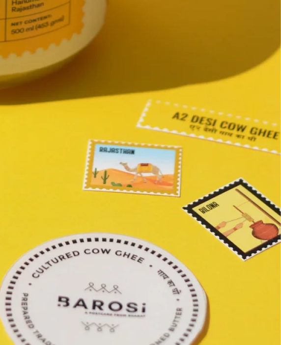
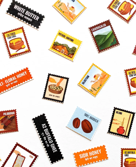
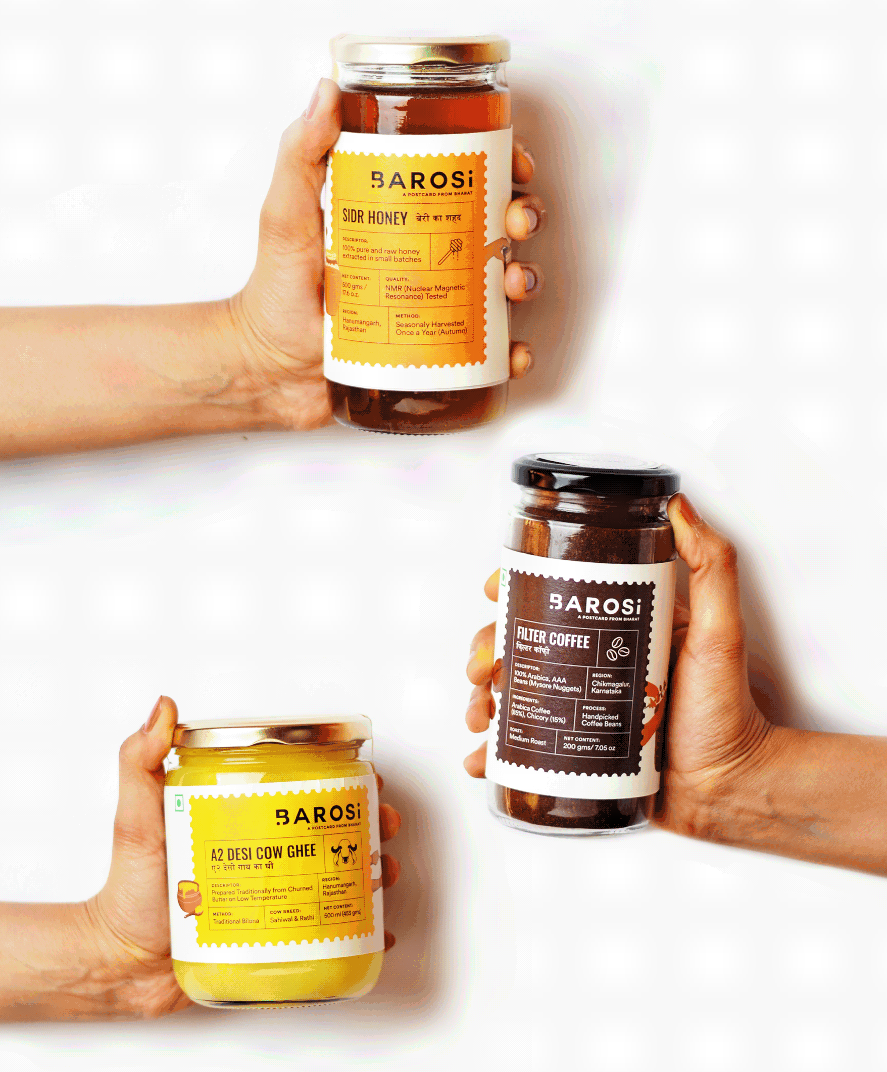
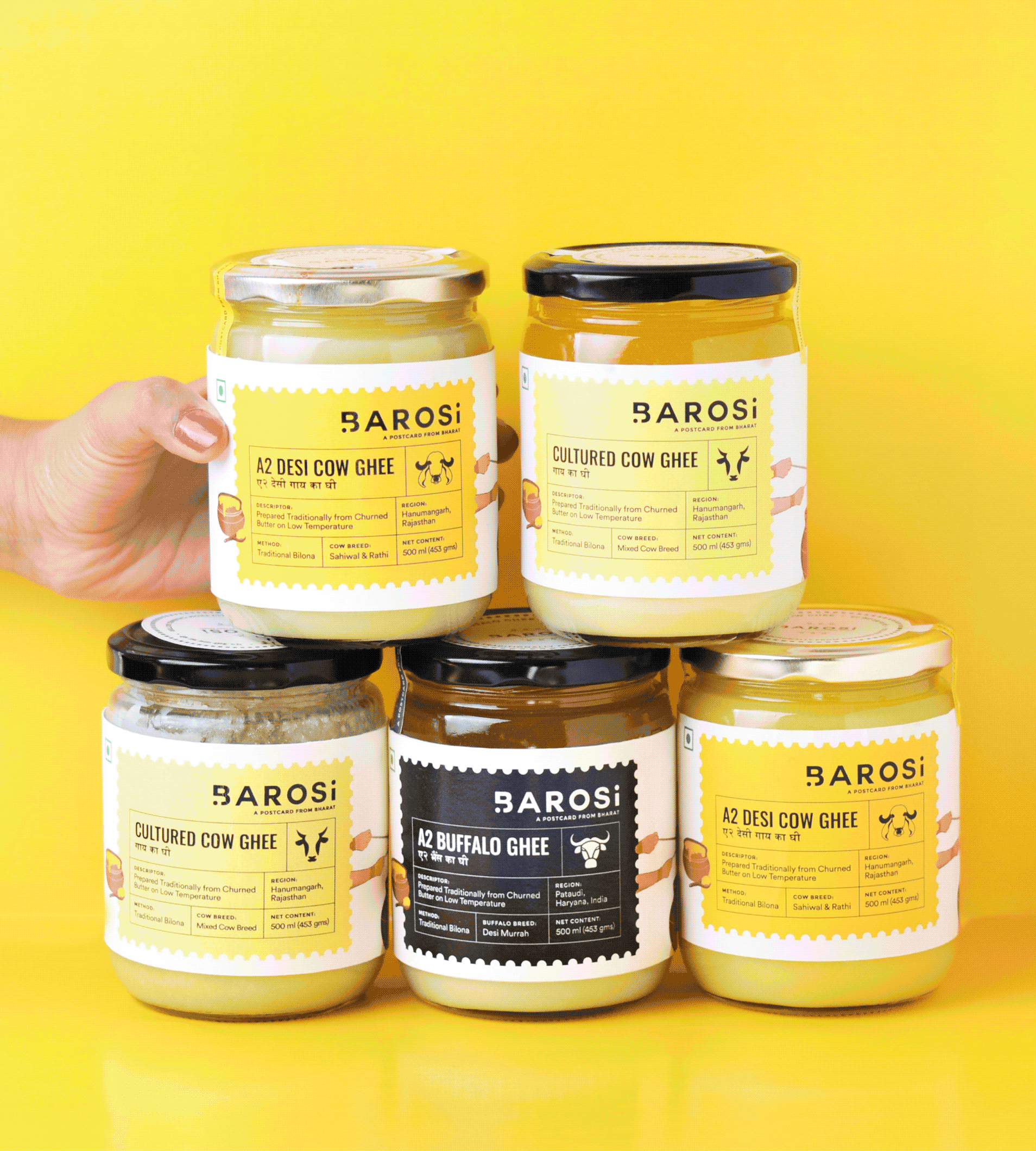
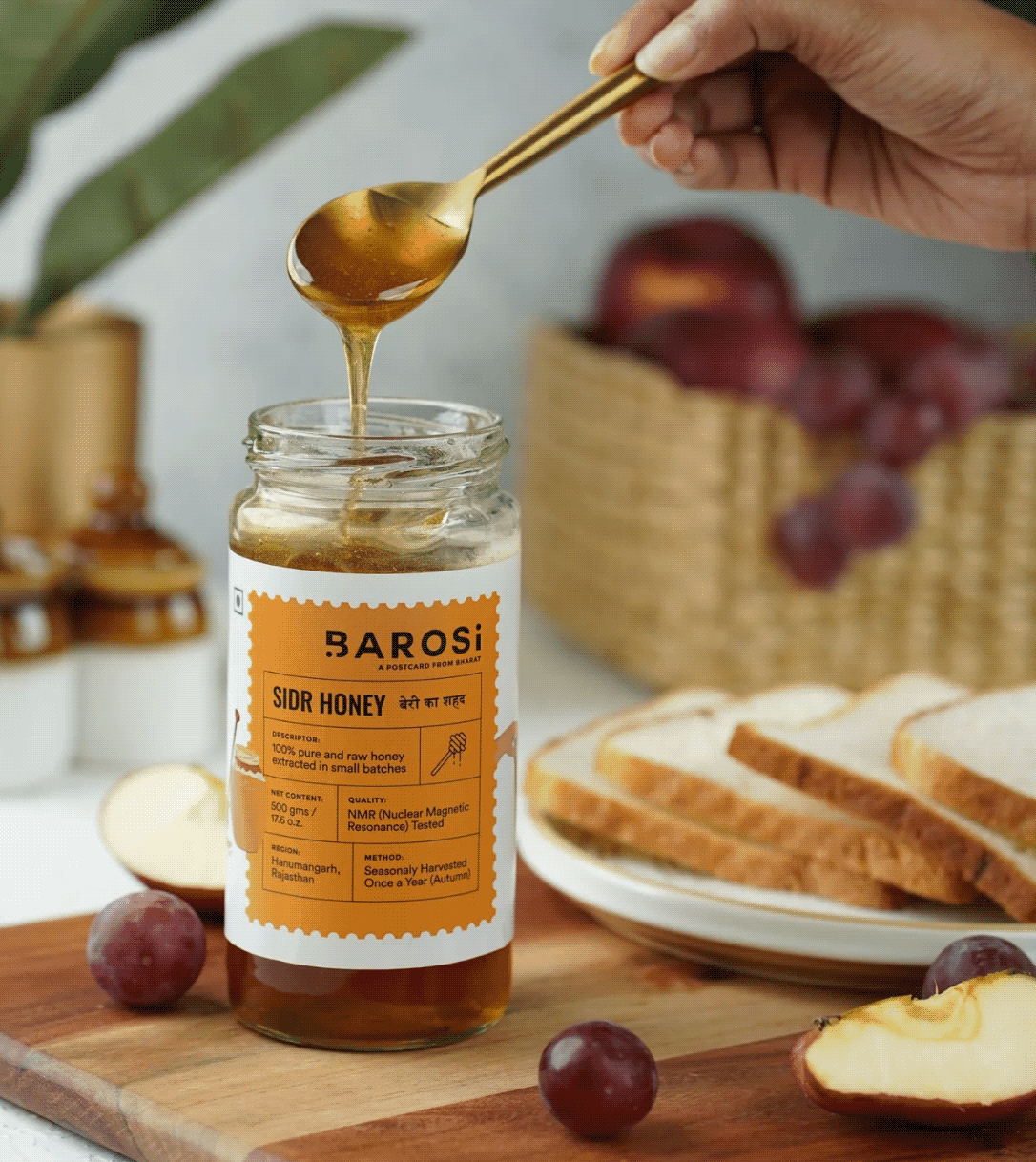
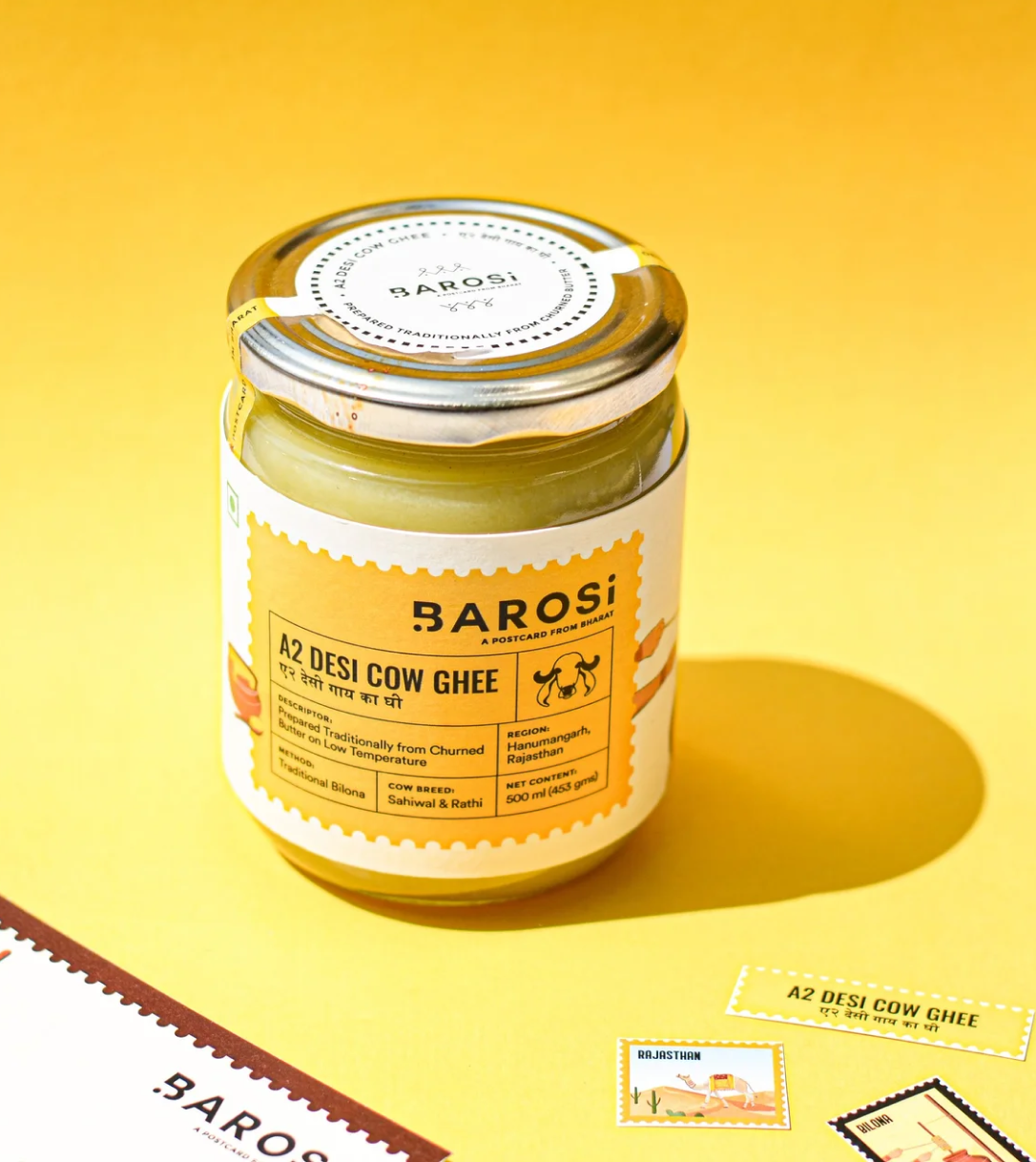
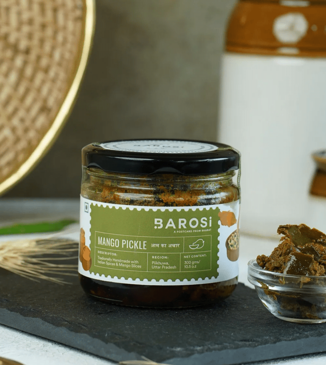
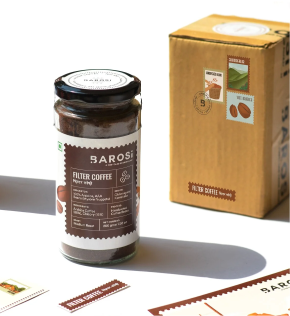
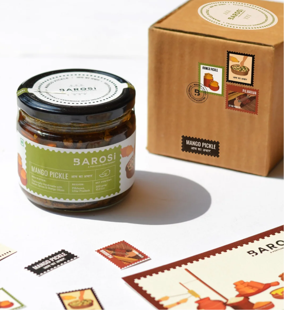
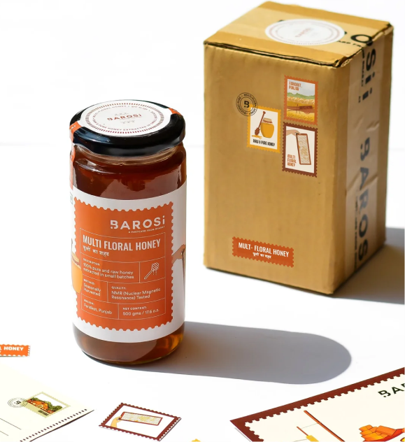
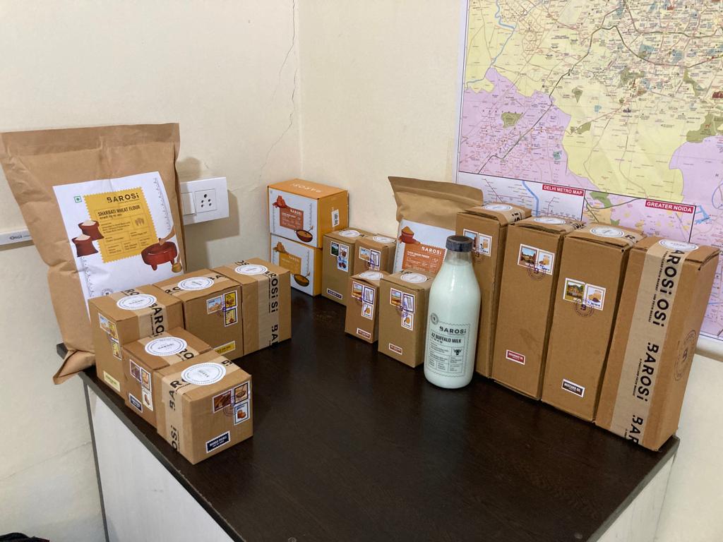
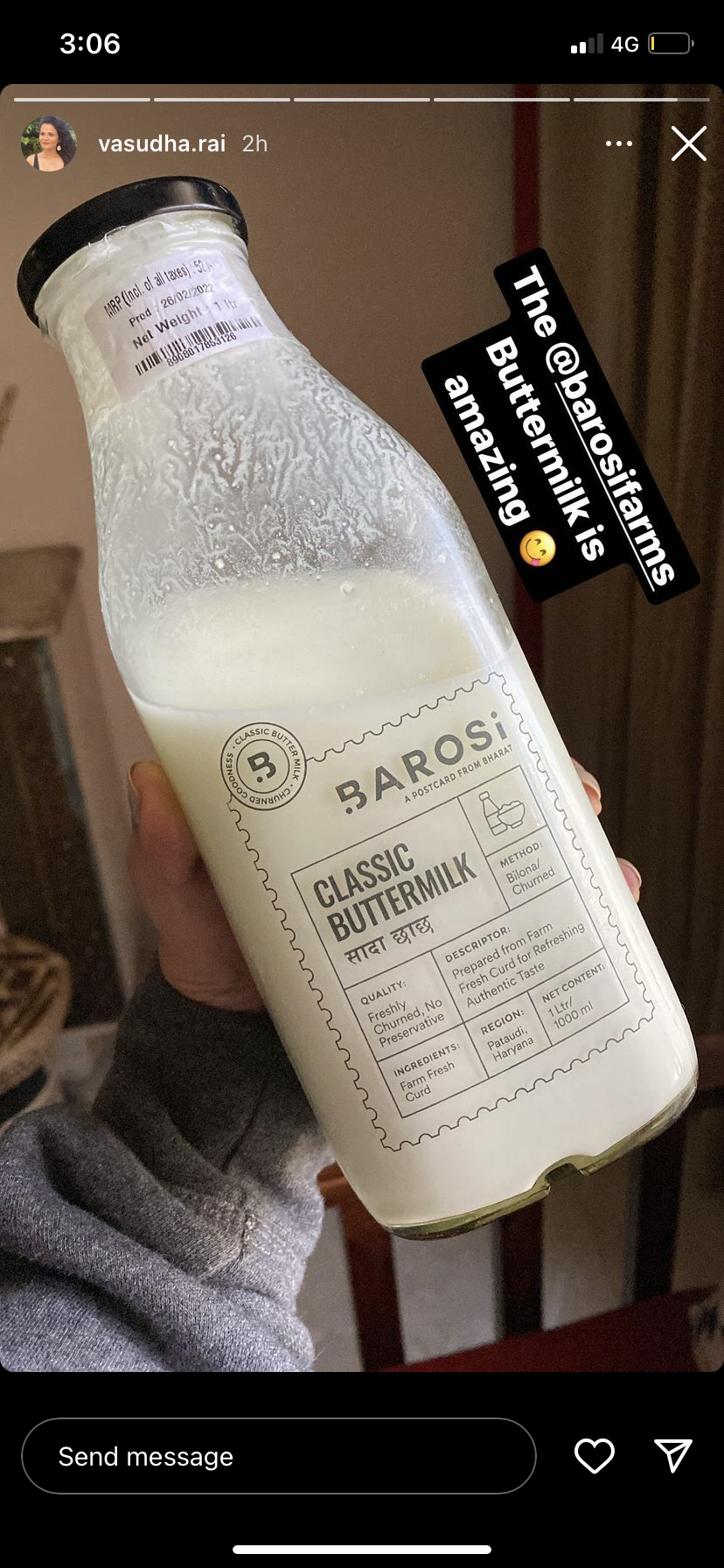
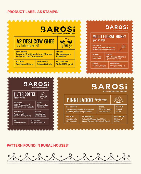
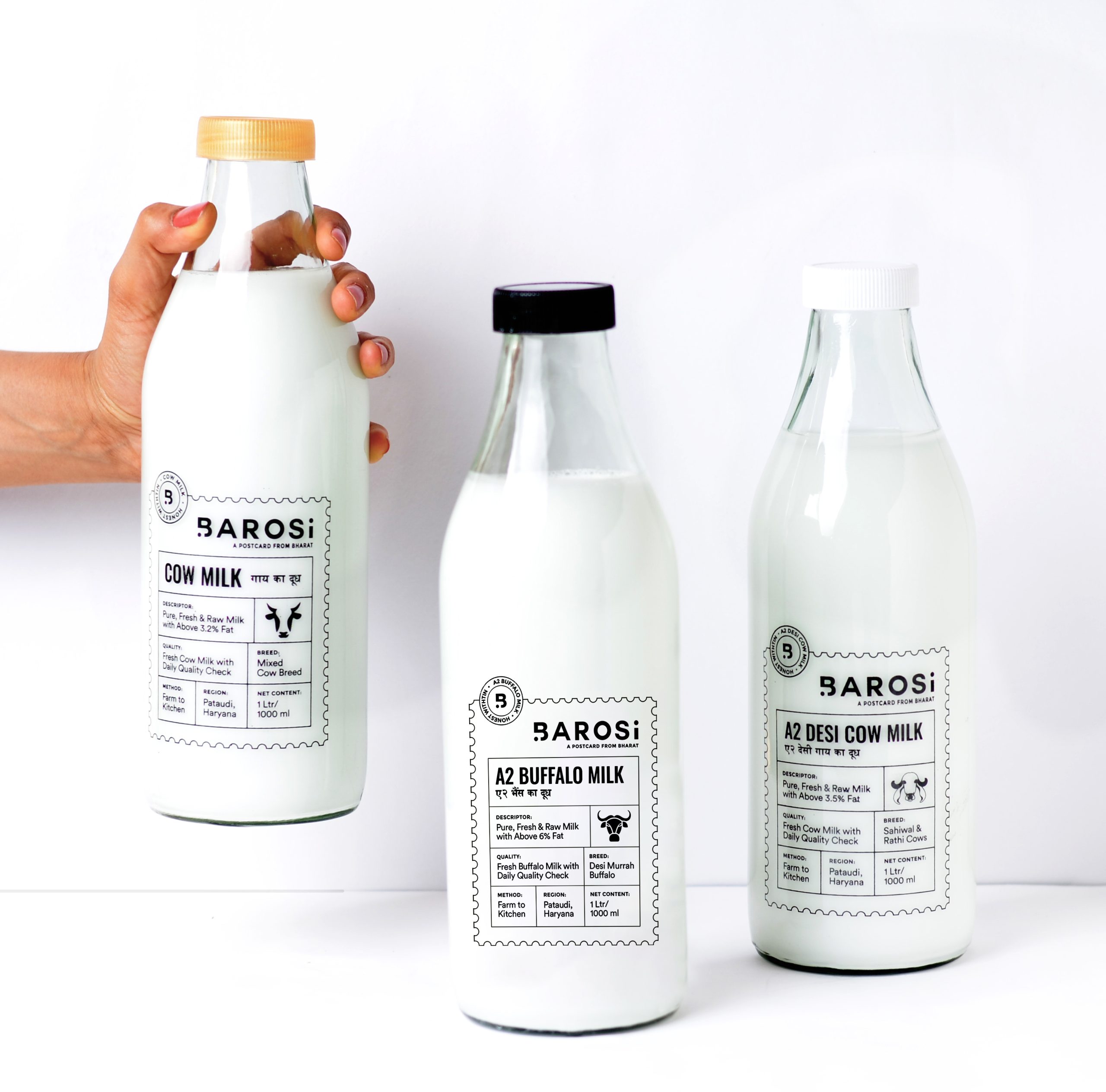
The packaging comes alive through postal stamps, traditional patterns, postcards, and origin labels. Every pack traces its roots, sharing where the product comes from, how it’s traditionally made, and the stories behind it.

Can a brown box deliver a brand experience?

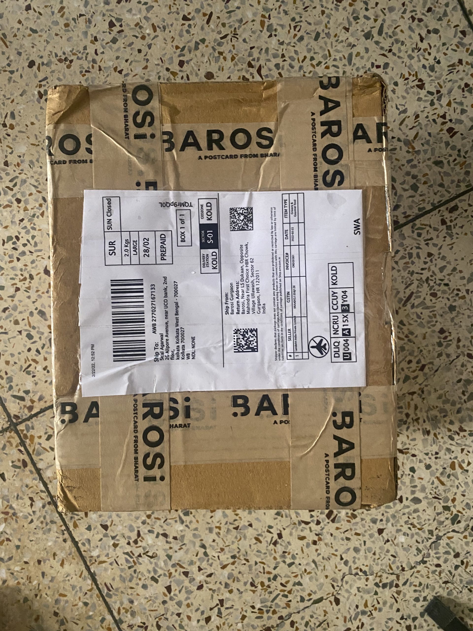
We want a sustainable approach for Baroi’s packaging. The products are packed in reusable glass jars and zero plastic is used. Since the brand only had the bandwidth to do brown carton boxes, we wanted to add something more to create a better experience.

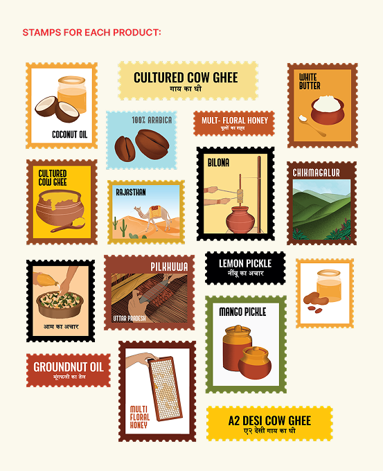
So, we designed four different stamps for each product: one for the origin, one for the product, one for how the product is made, and one with the product name. Each box had a different look but the same experience. Our goal was to create a thoughtful hand-crafted brand with a truly memorable consumer experience.

The messy, the fun, the not-so-pretty part of a project!

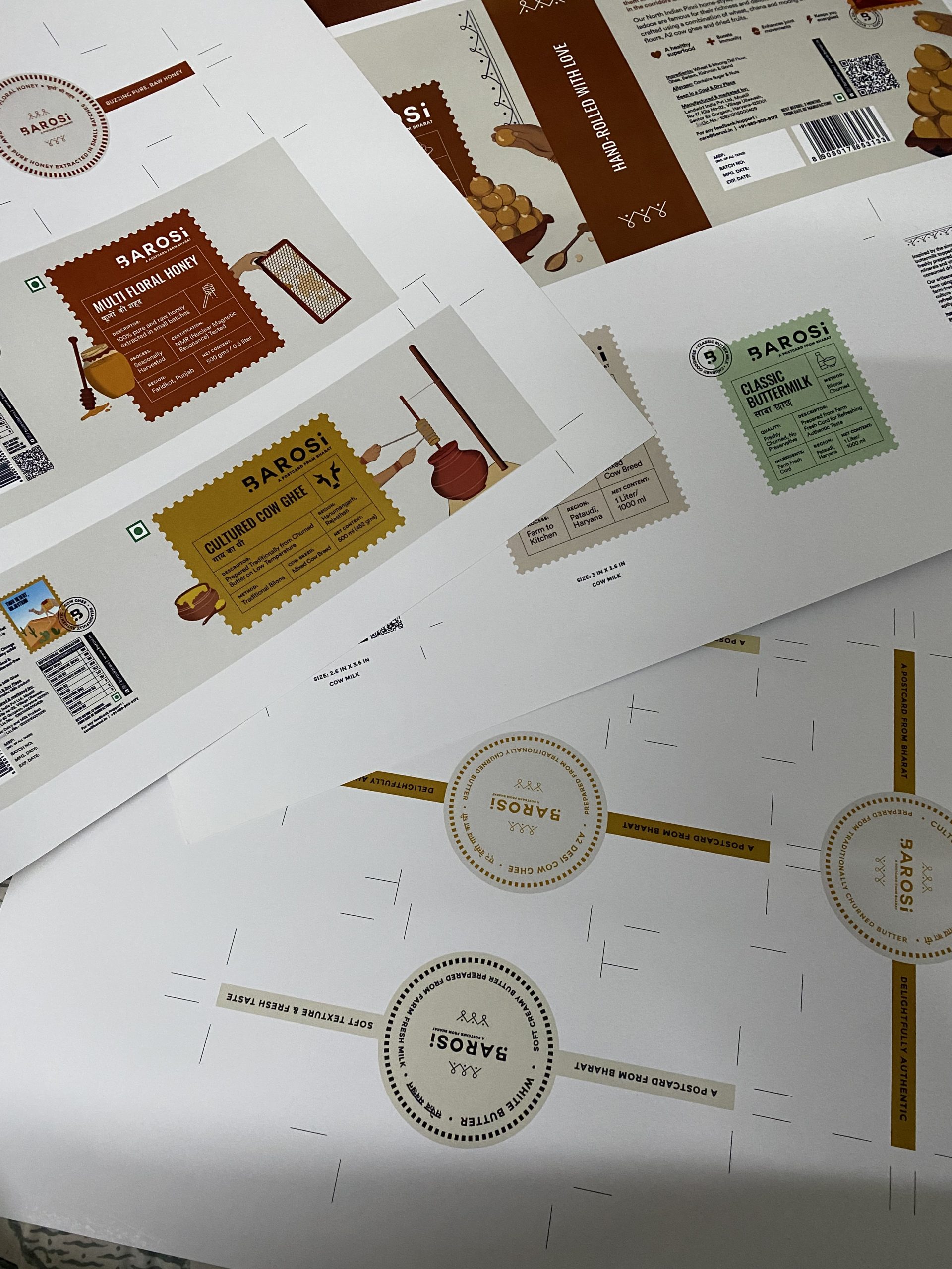
Print trials before production.

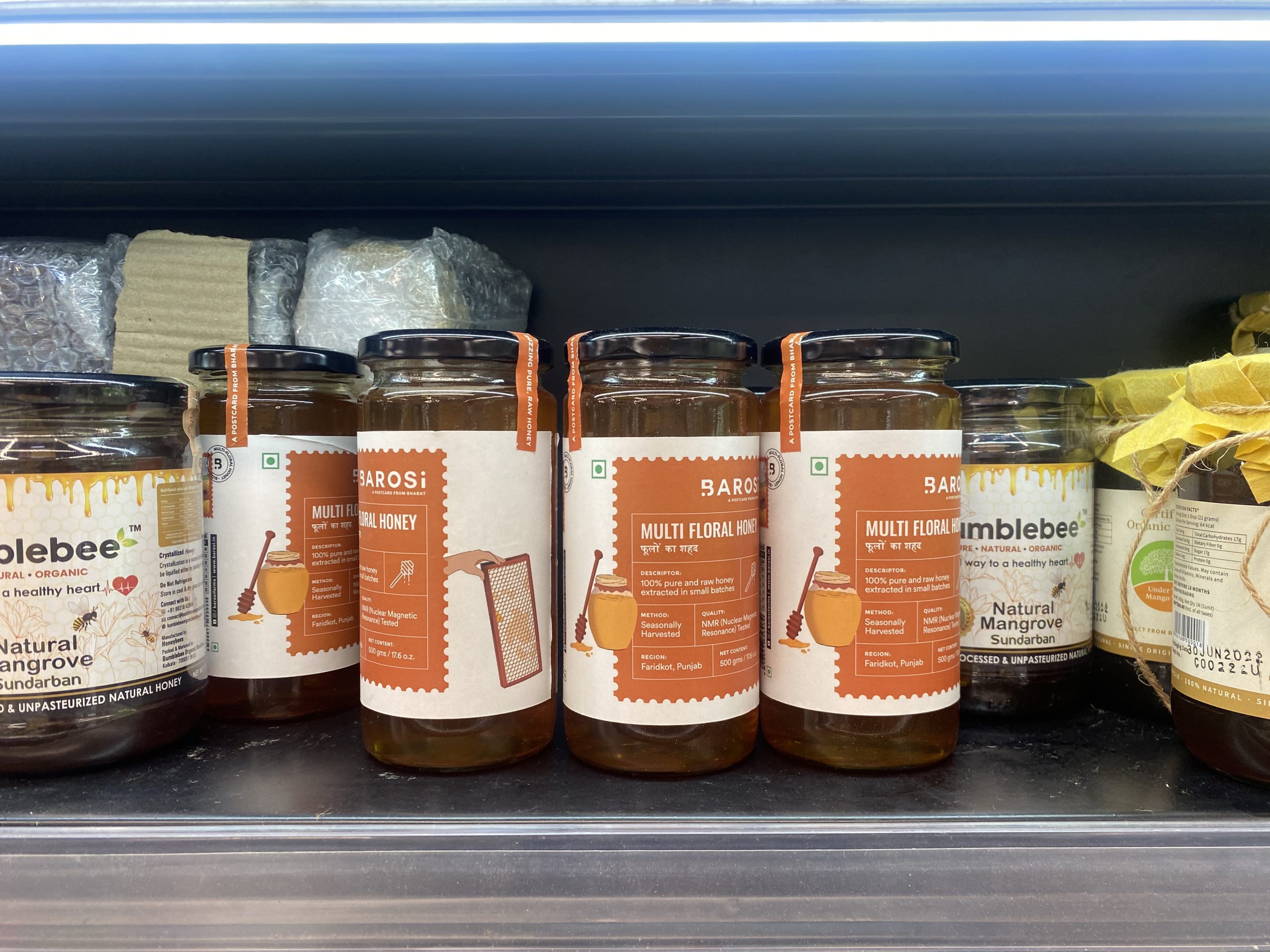
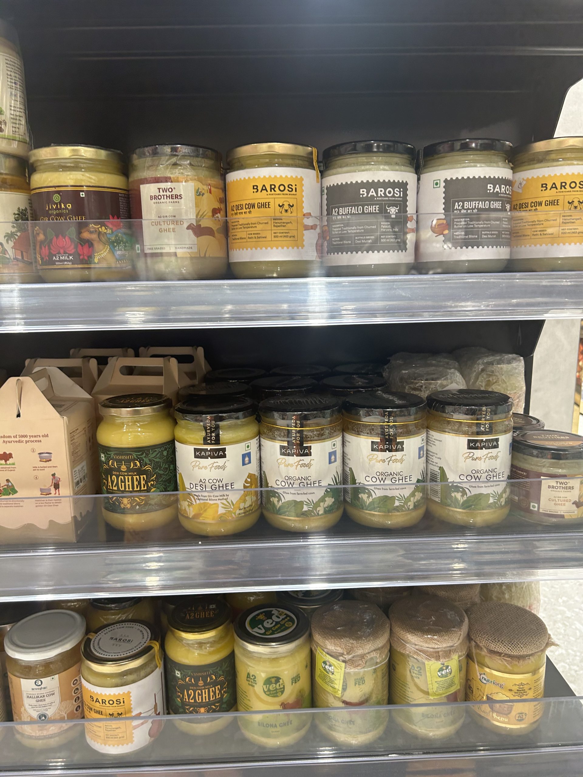
Seeing our work on the shelves.

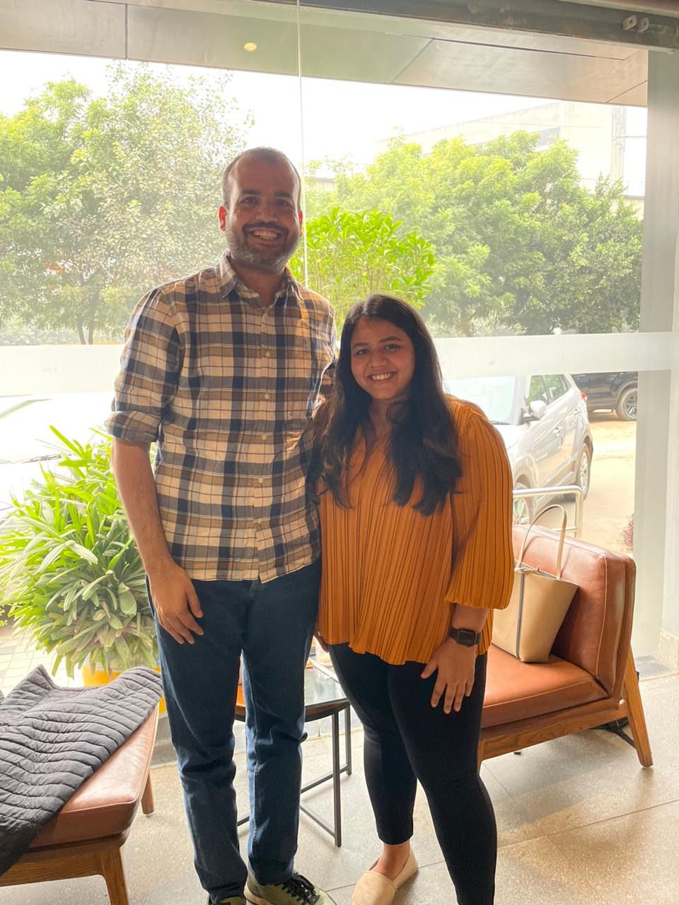
With the founder, Durlabh.

Seeing all the SKUs together (19SKUs).

Happiness in a box.

Seeing our work in the wild.

Does Barosi stand out to you?

Sizing trials before production.

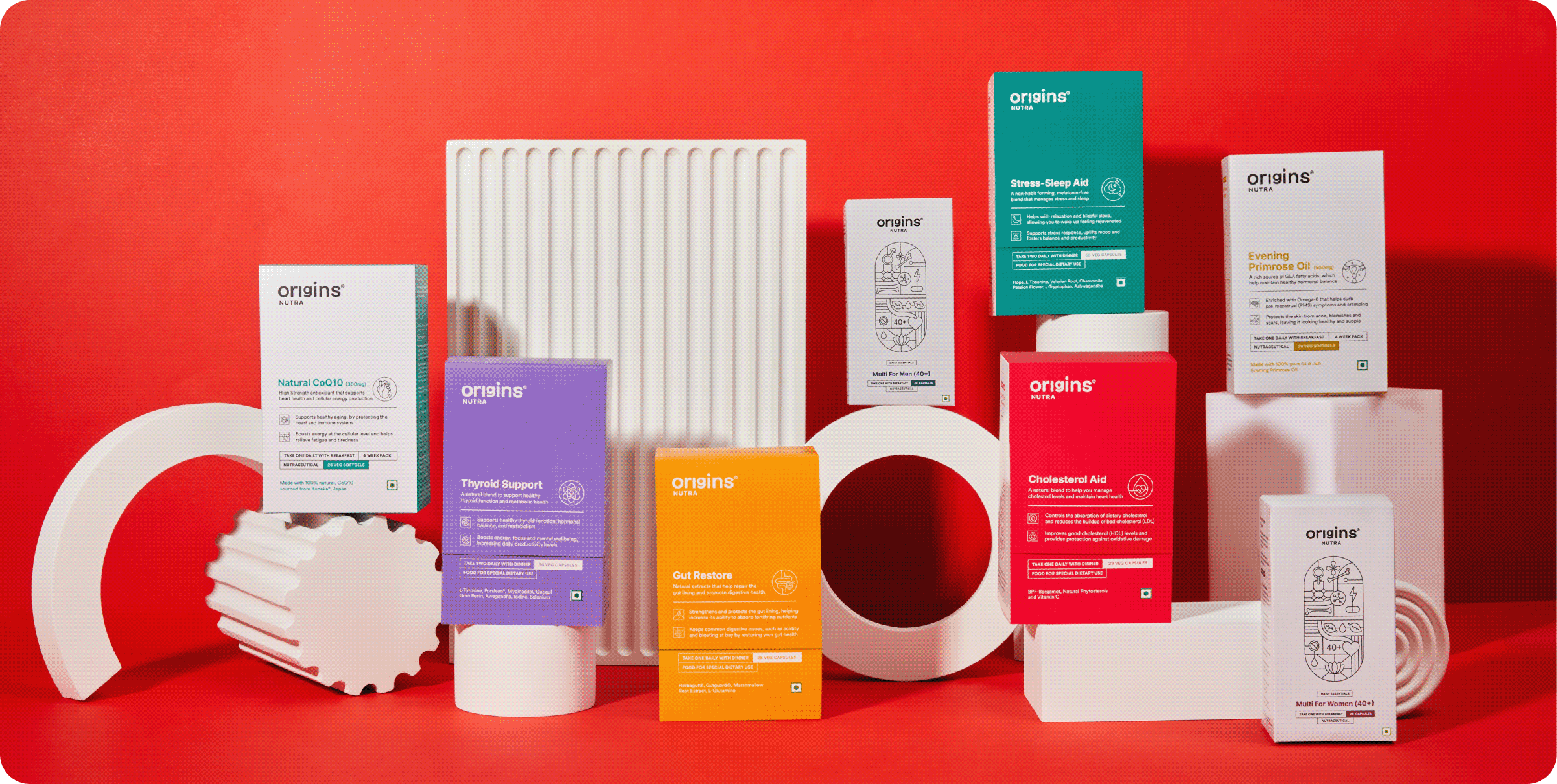
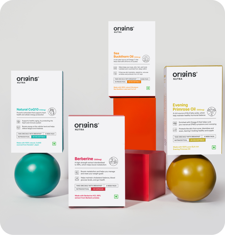
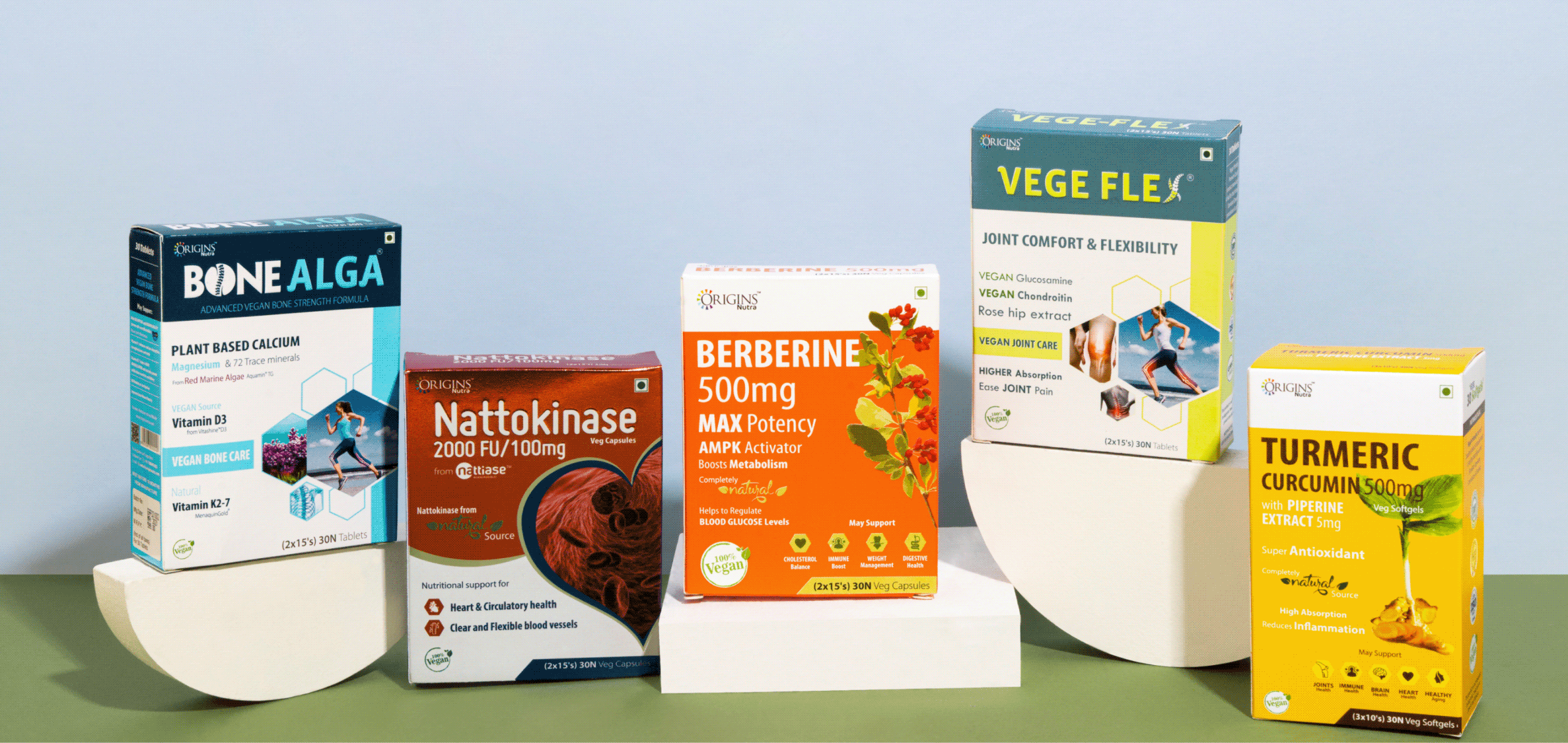
Origins, It Starts With You

Can health be made simple enough to become a habit?

Scope Of Work: Market Research, Brand Strategy, Brand Identity, Product Packaging, Art Direction and Web Design.

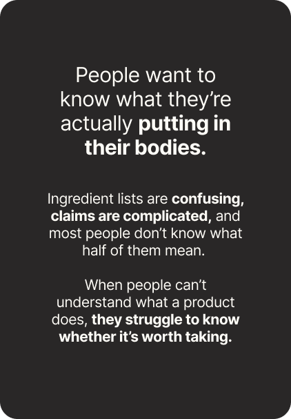
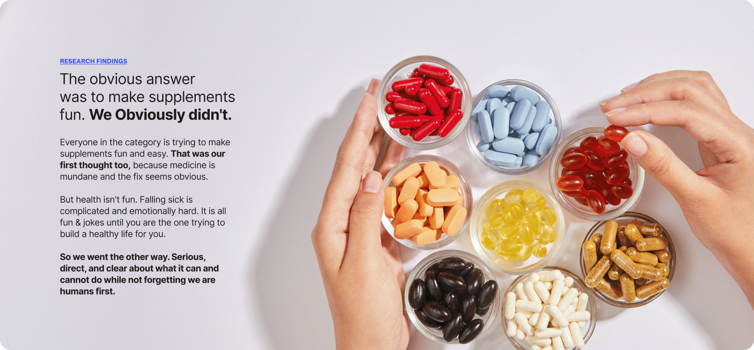
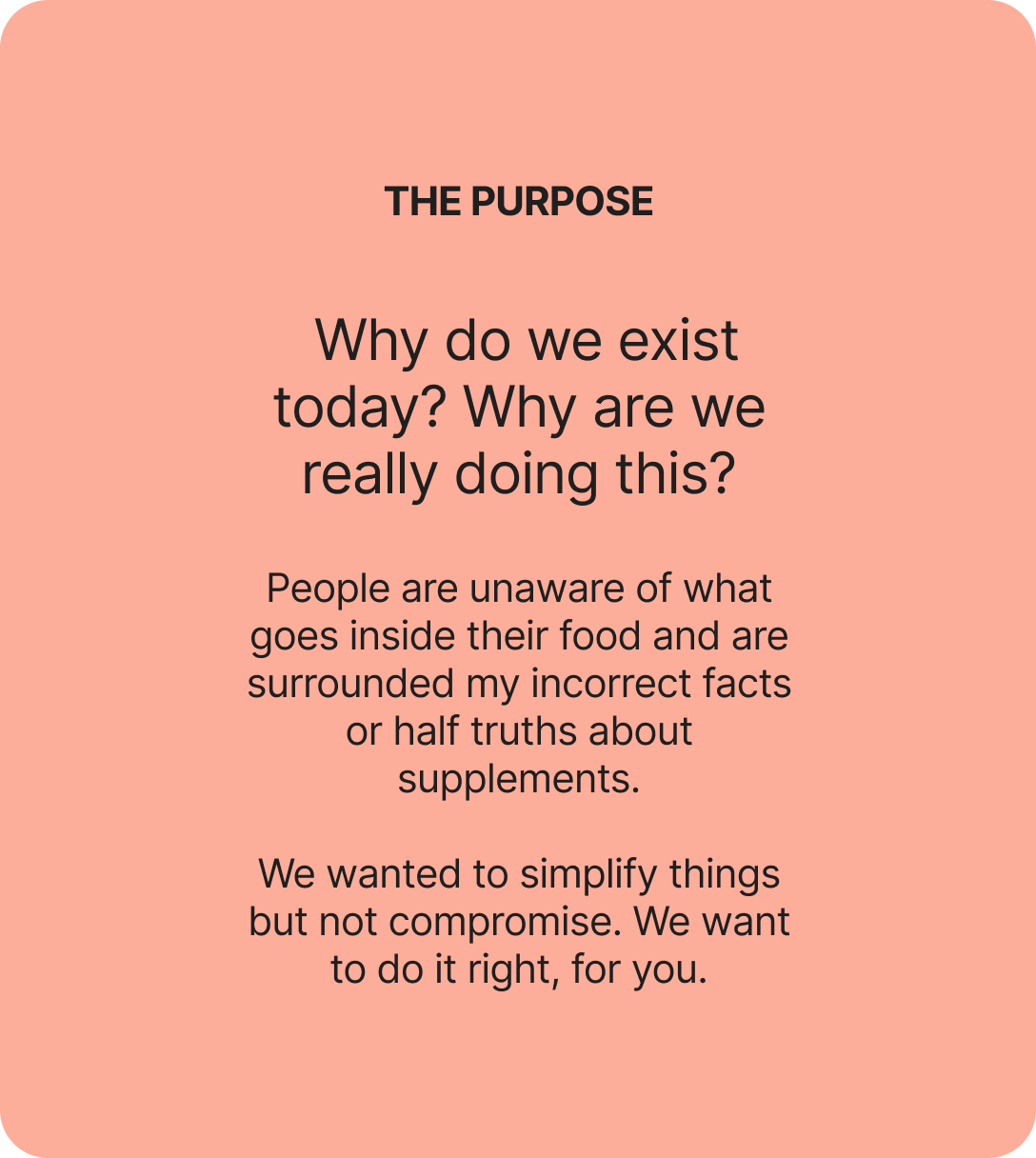
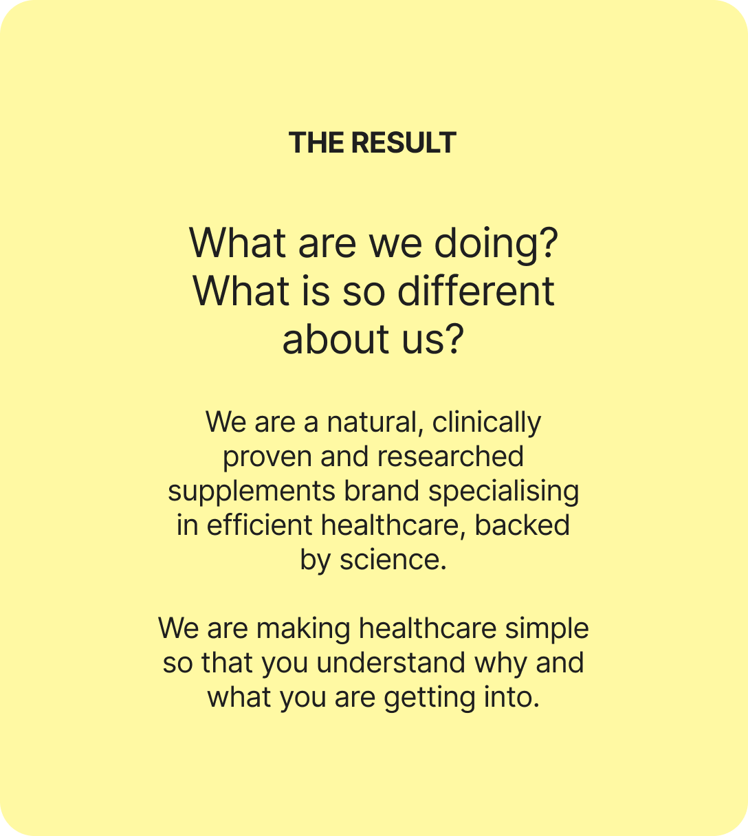
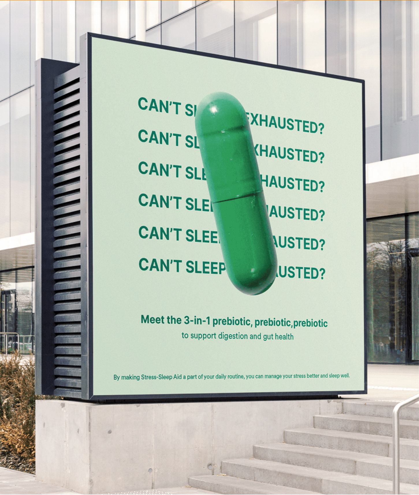
Is it just us, or does every supplement feel like a gimmick? Every nutraceutical brand says the same three things. Good for you. Clinically proven. Backed by science. So, how was Origins different?

We went at it from the other side with Surya. If supplements are meant to be preventive rather than curative, can they actually deliver on that? And what would a brand look like if it took the question seriously?

The goal was to build something easy, functional, and truly habit forming. Health, as simplified as we can follow.

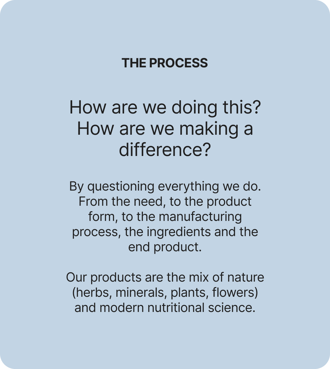
We started questioning everything to build the origin of brand Origins.

RESEARCH FINDINGS

A category full of claims and empty of trust.

We spoke to people about their relationship with health and how they actually live with it. What they take, what they’ve quit, who they ask before buying anything.

Given the age we’re in, the findings surprised us. Information is everywhere and almost none of it is verifiable. There’s no source anyone genuinely trusts. Somewhere in all of that, people stopped believing any of it.

What if it stopped being a supplement brand?

Everyone is chasing a health goal. Eating better, moving more, losing weight. Nobody finds it easy. It’s complicated, and intimidating enough that most people give up in the first month.

Origins stopped being a supplement brand and became a coach. Not a cheerleader. The kind of coach who tells you what you need to hear, gives advice you didn’t ask for, and stays with you through the boring middle part.

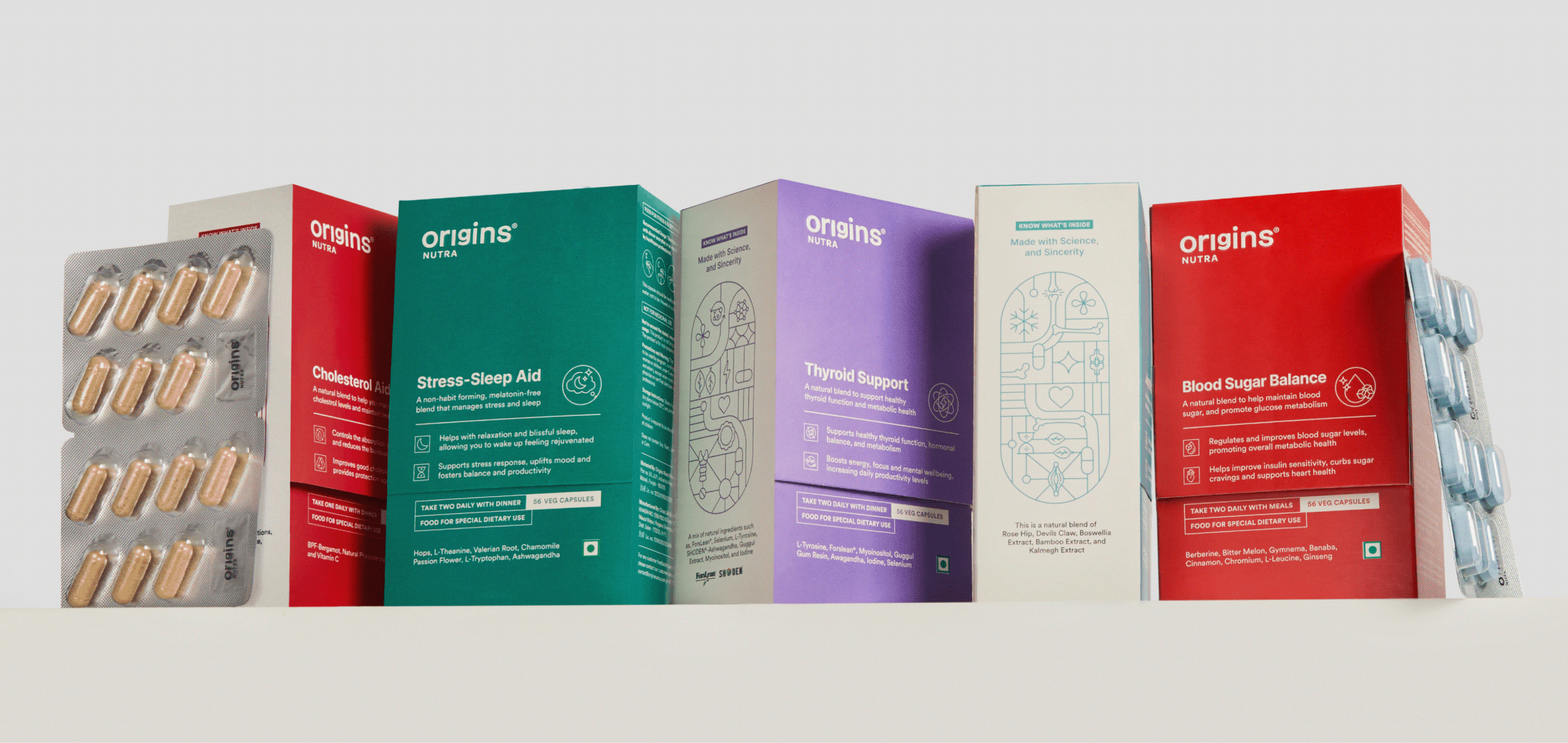
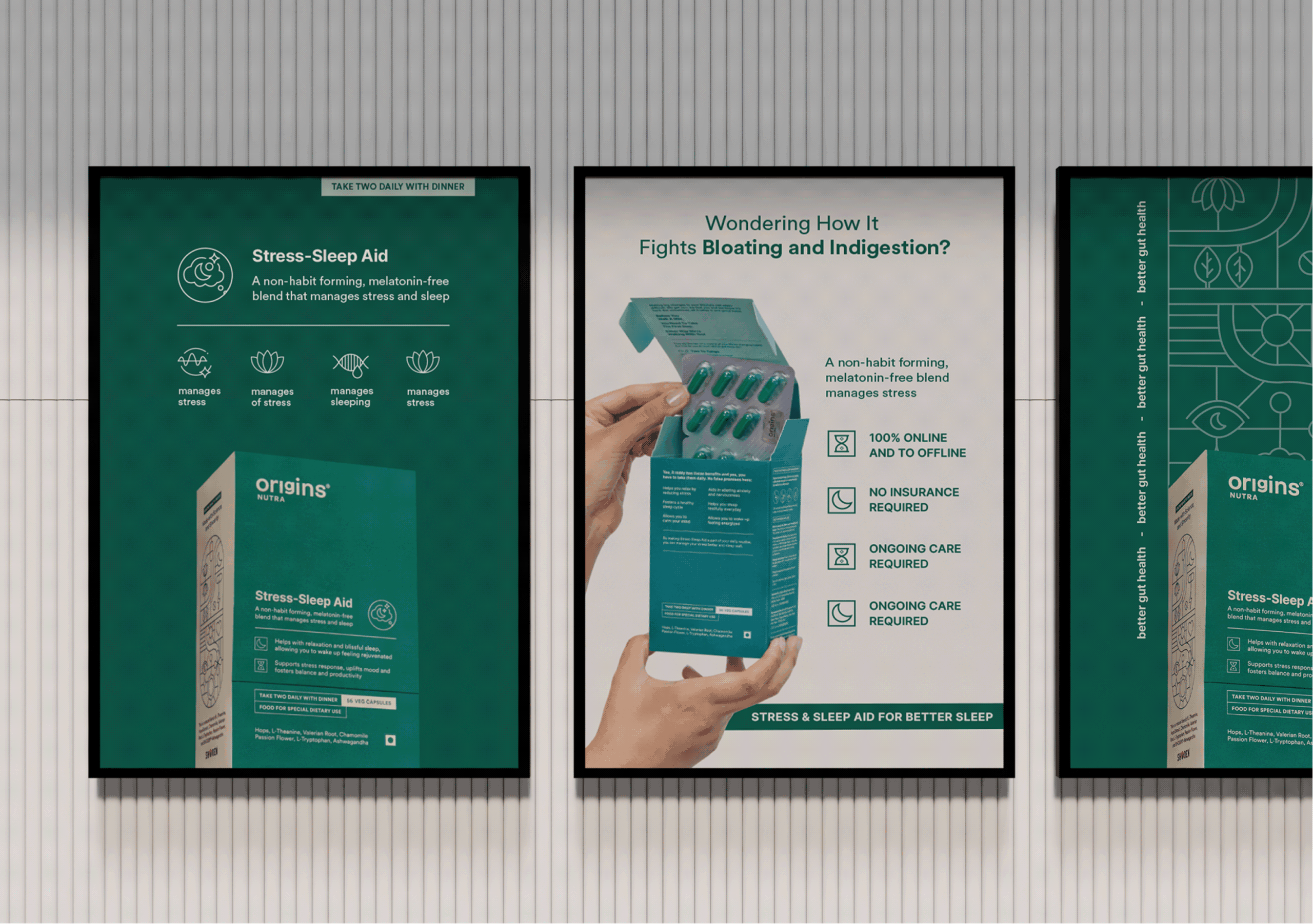
Simple. Reliable. Built For Better Health & Everyday Life.

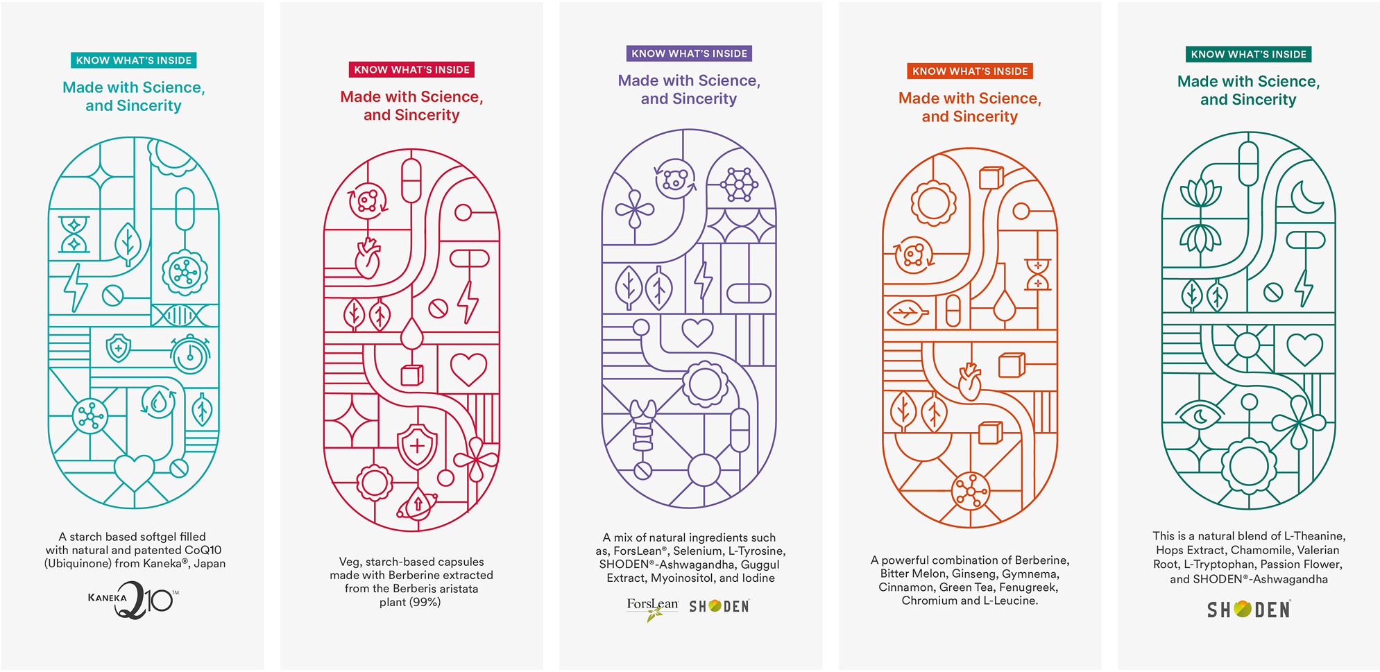
We addressed the most asked: What is really inside?

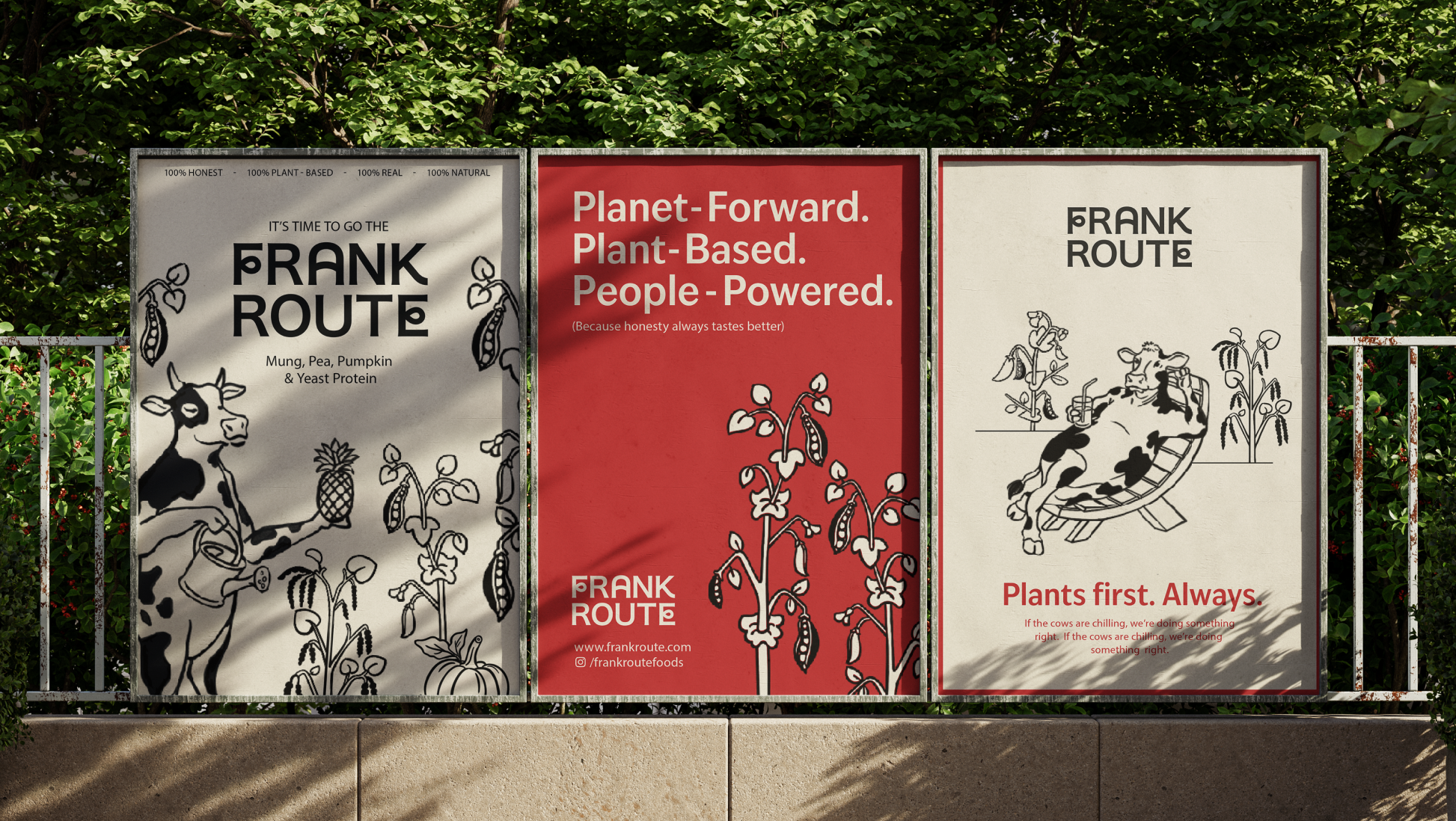
We built the entire brand on the basis on what’s inside the pill since everyone is skeptical about adding anything extra.

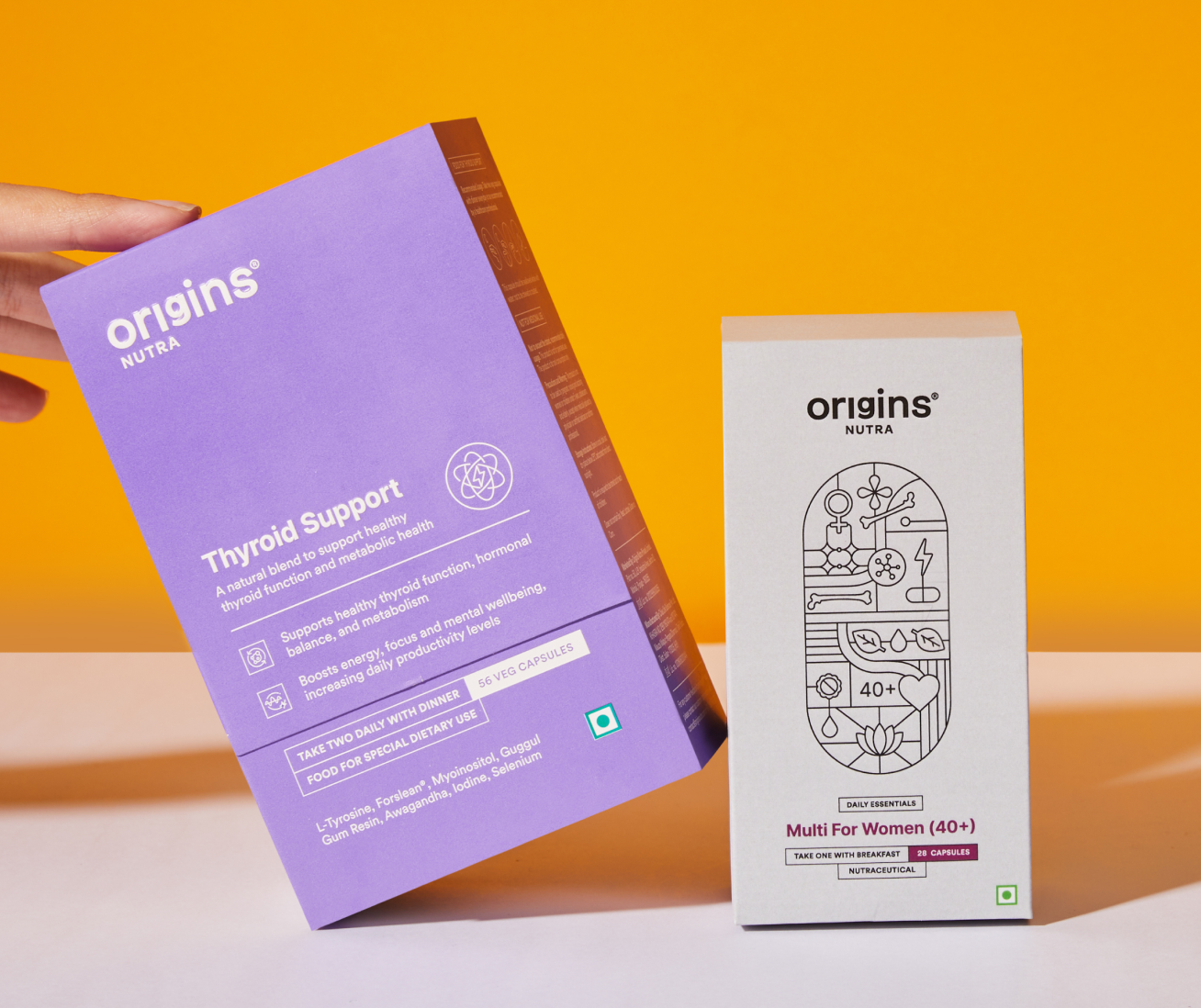
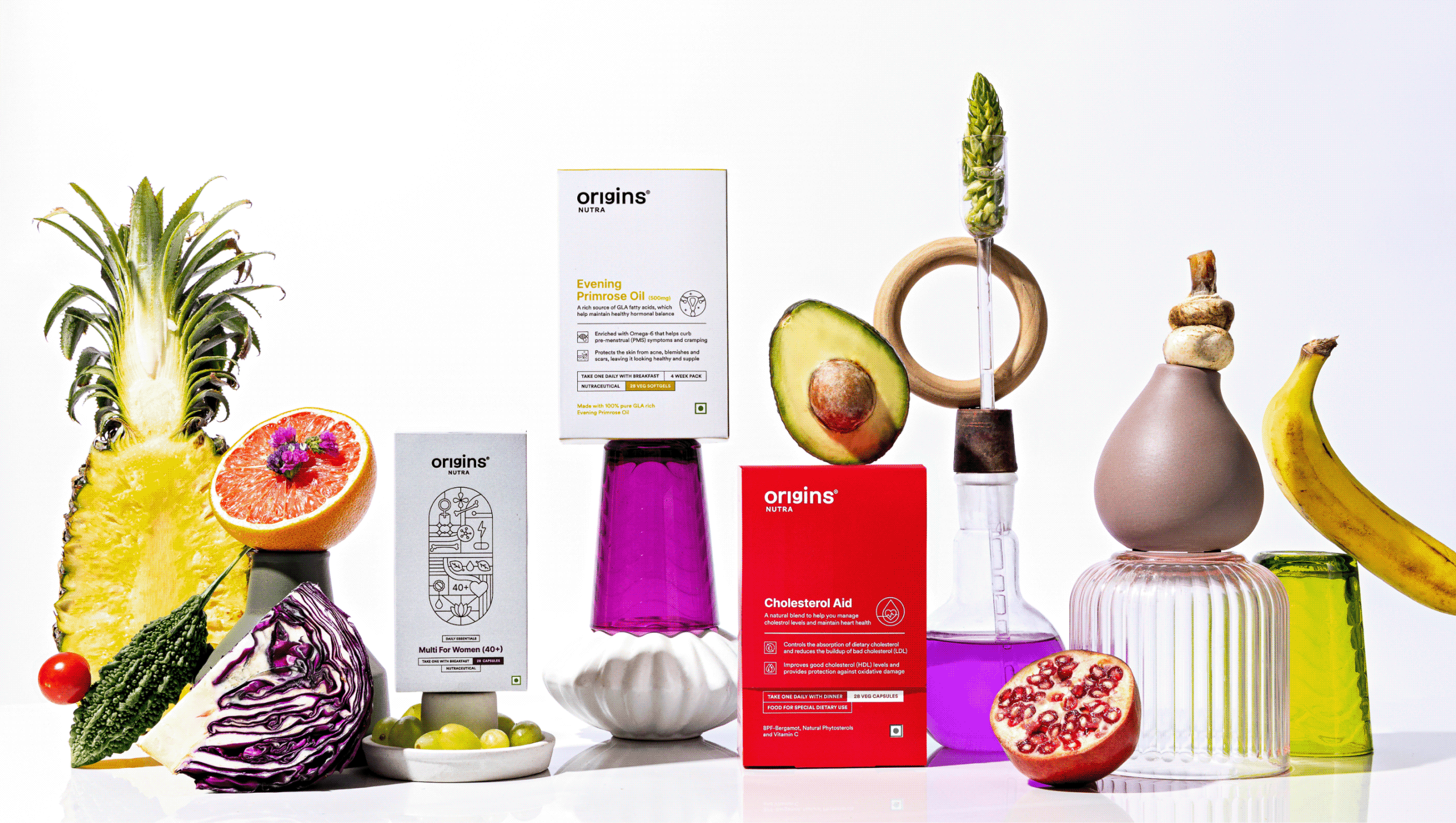
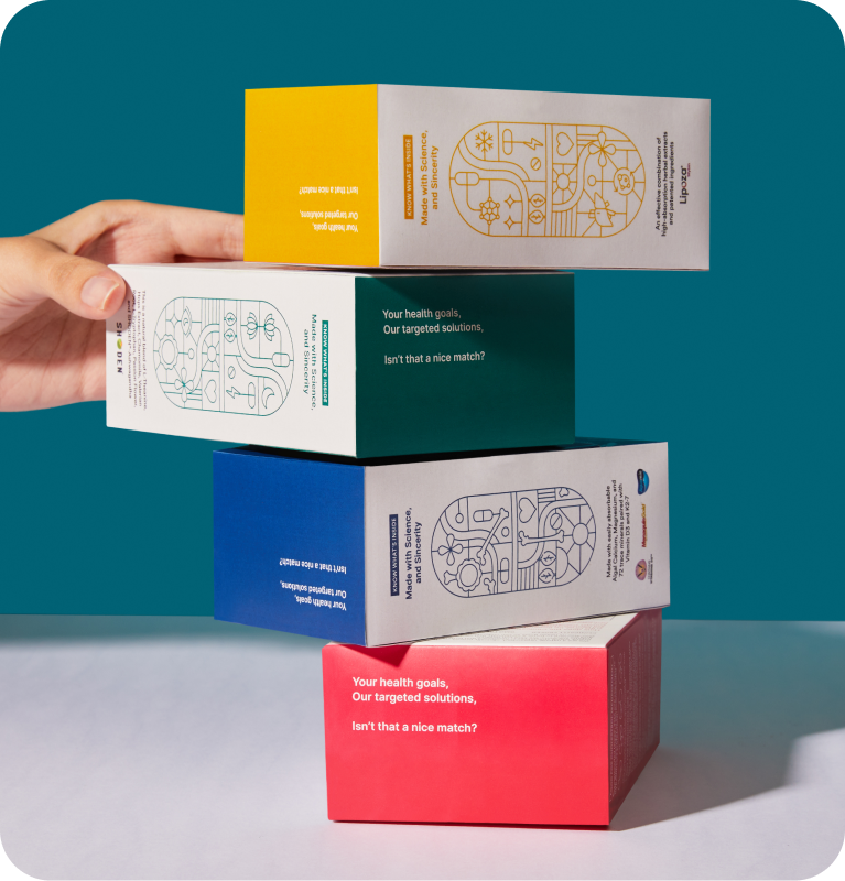
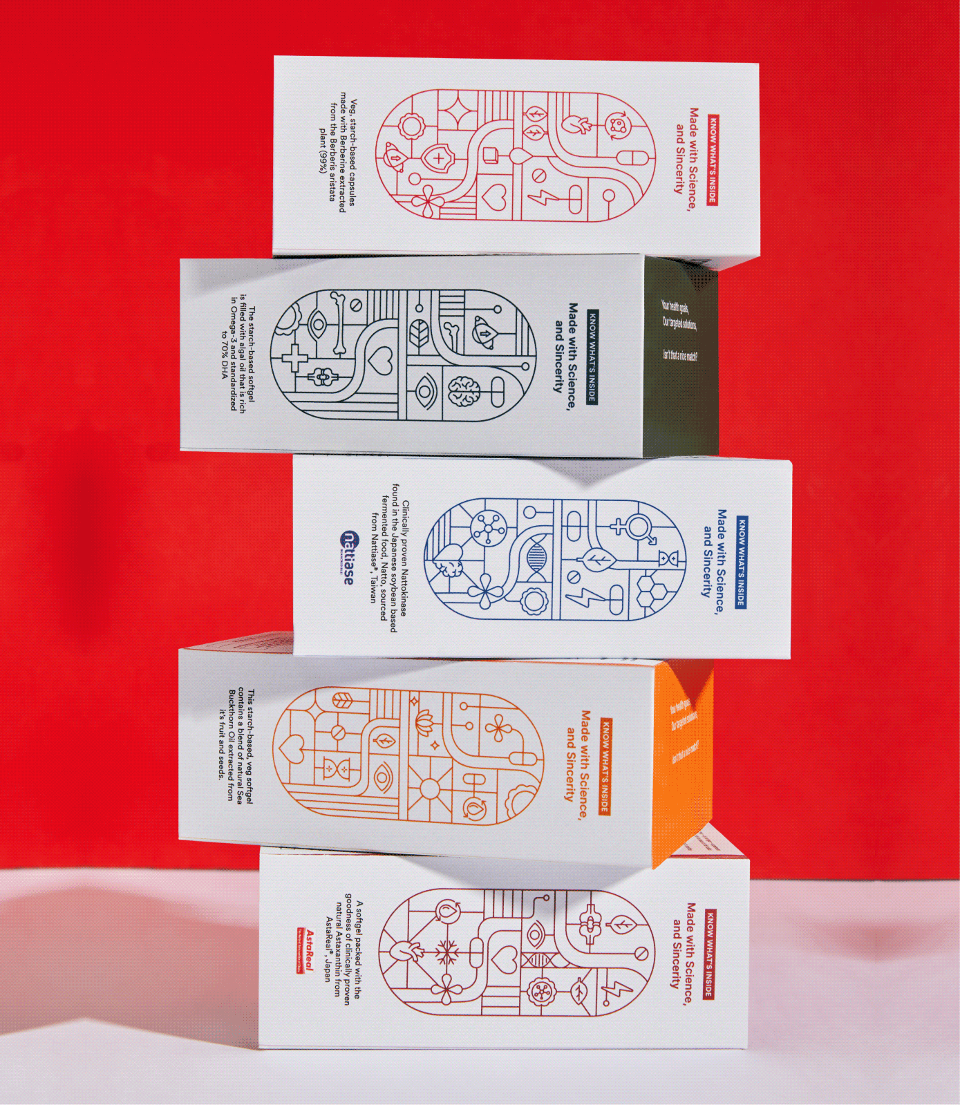
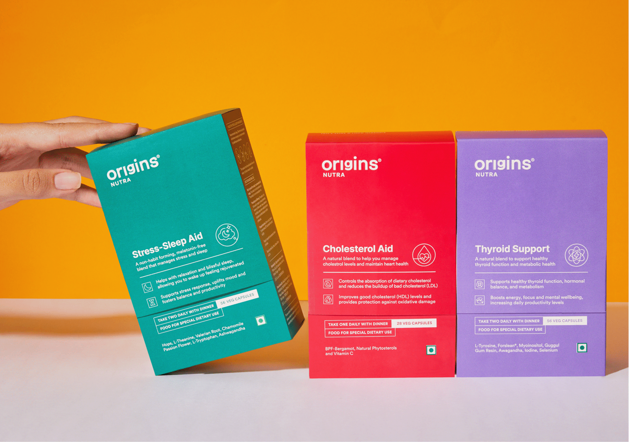
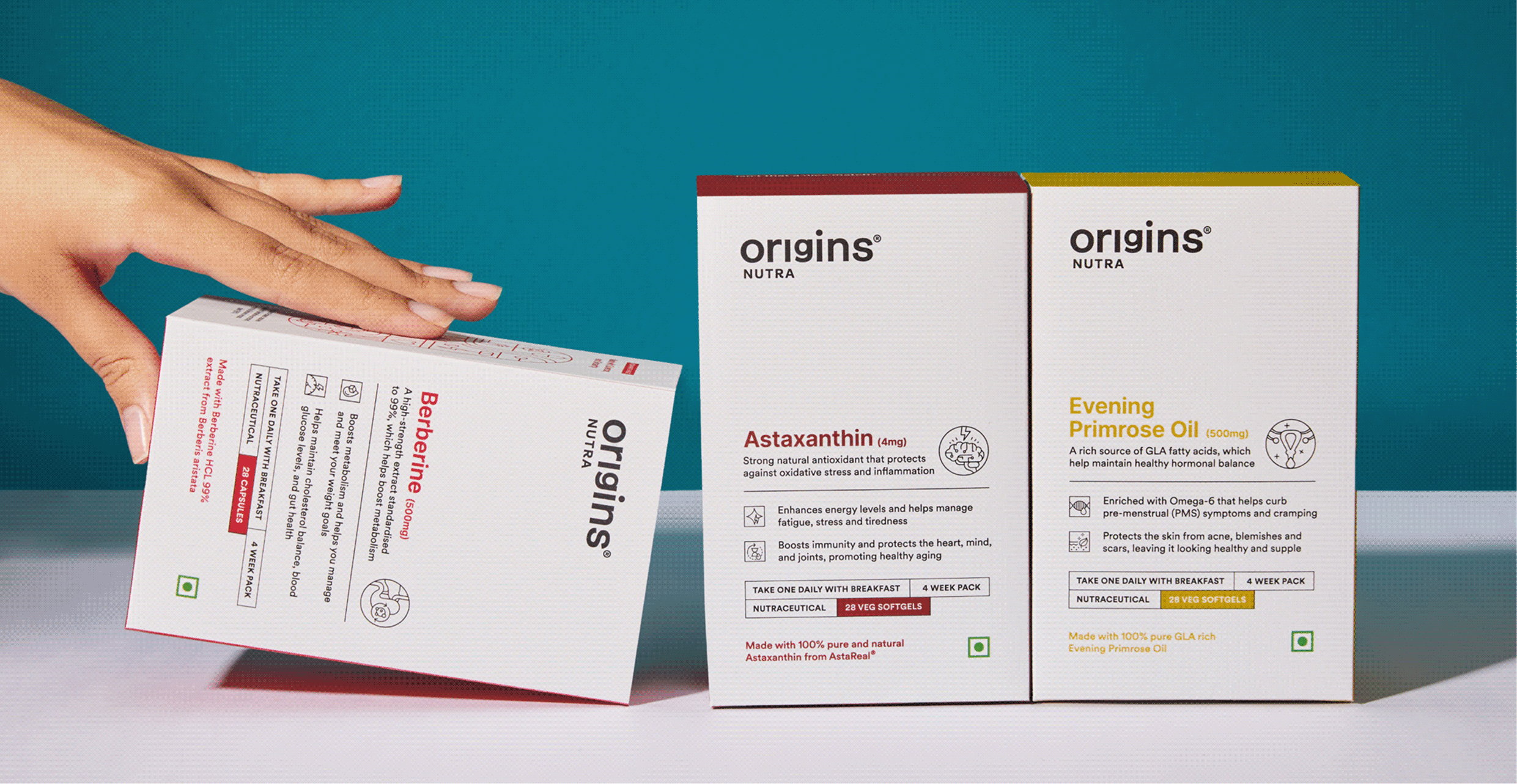
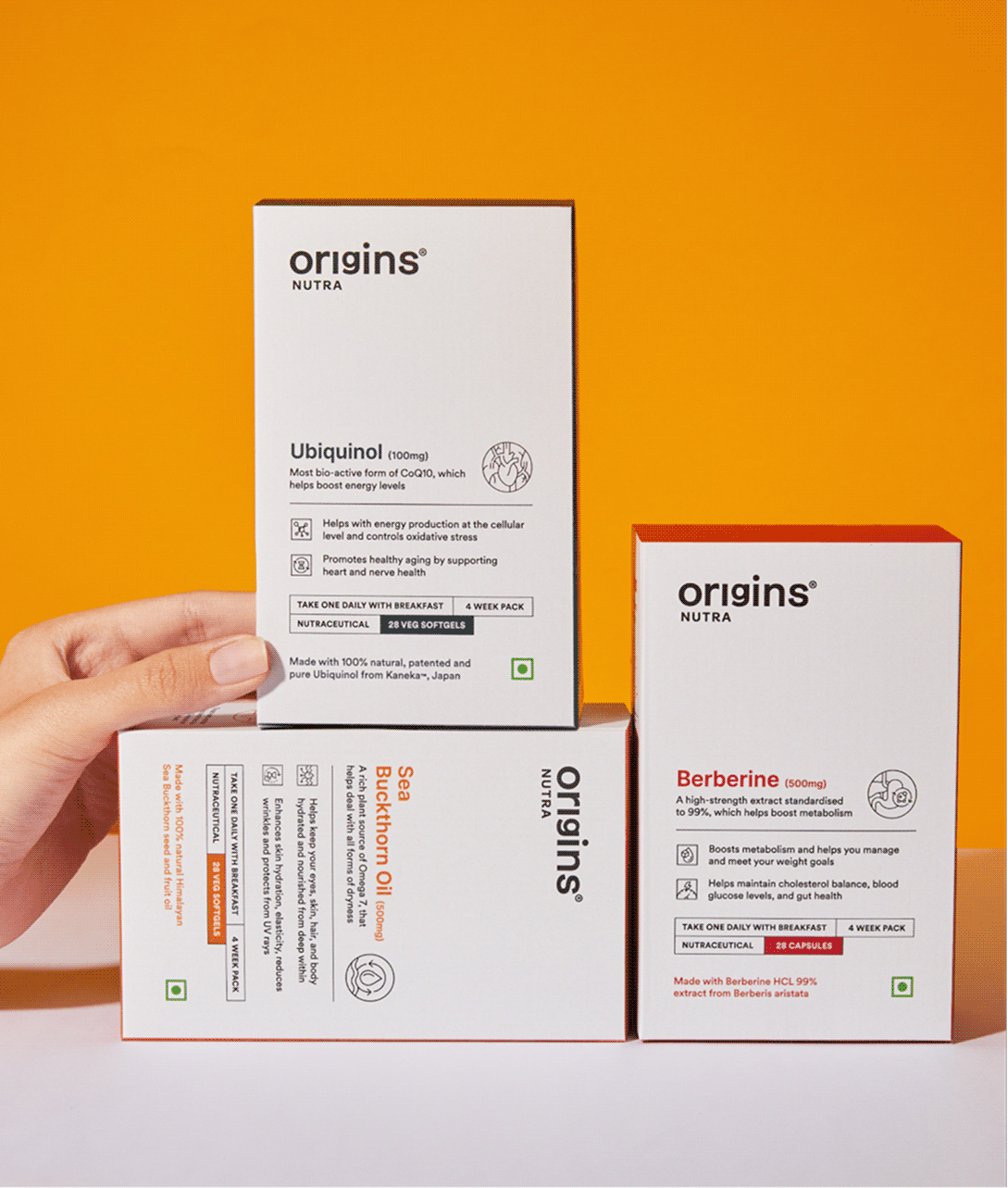
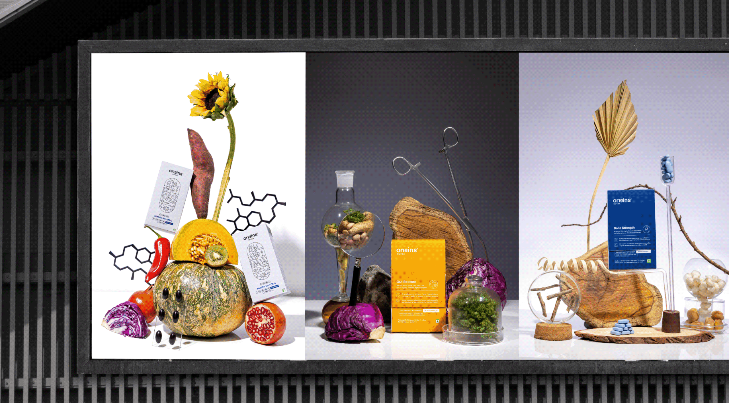
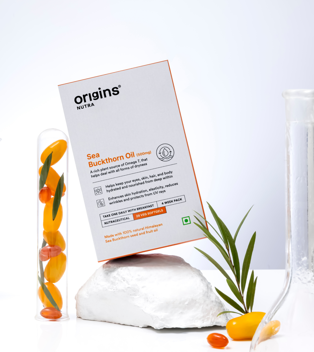
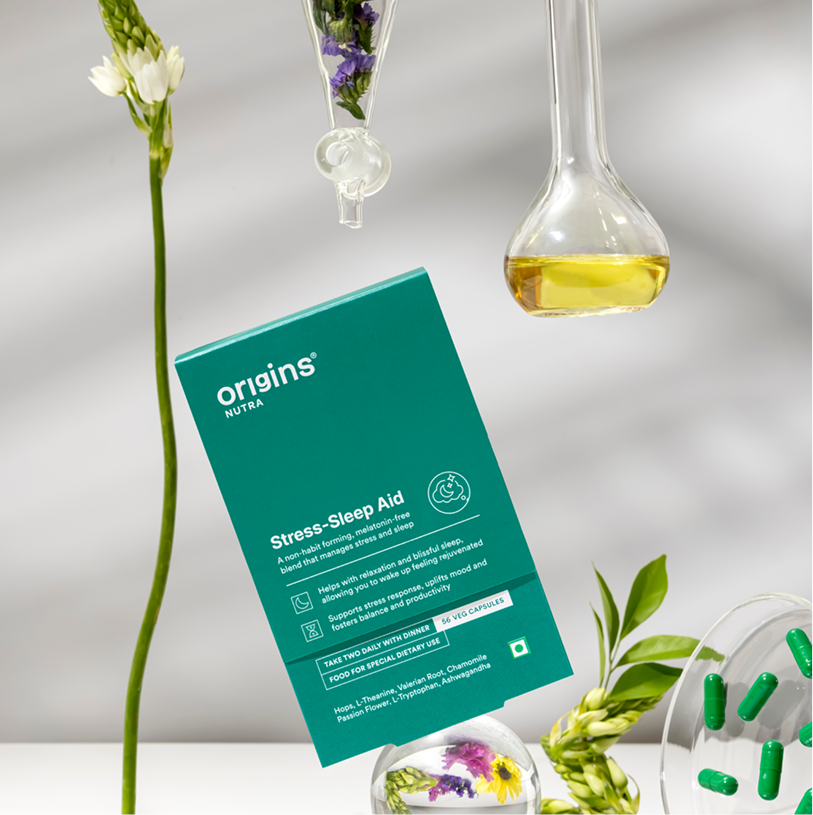
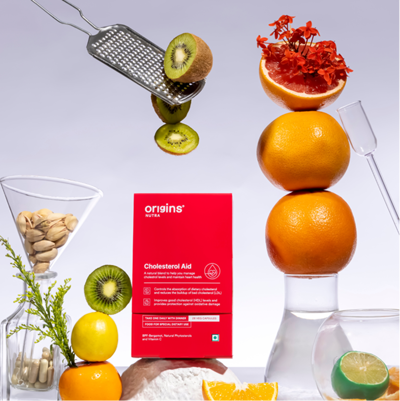
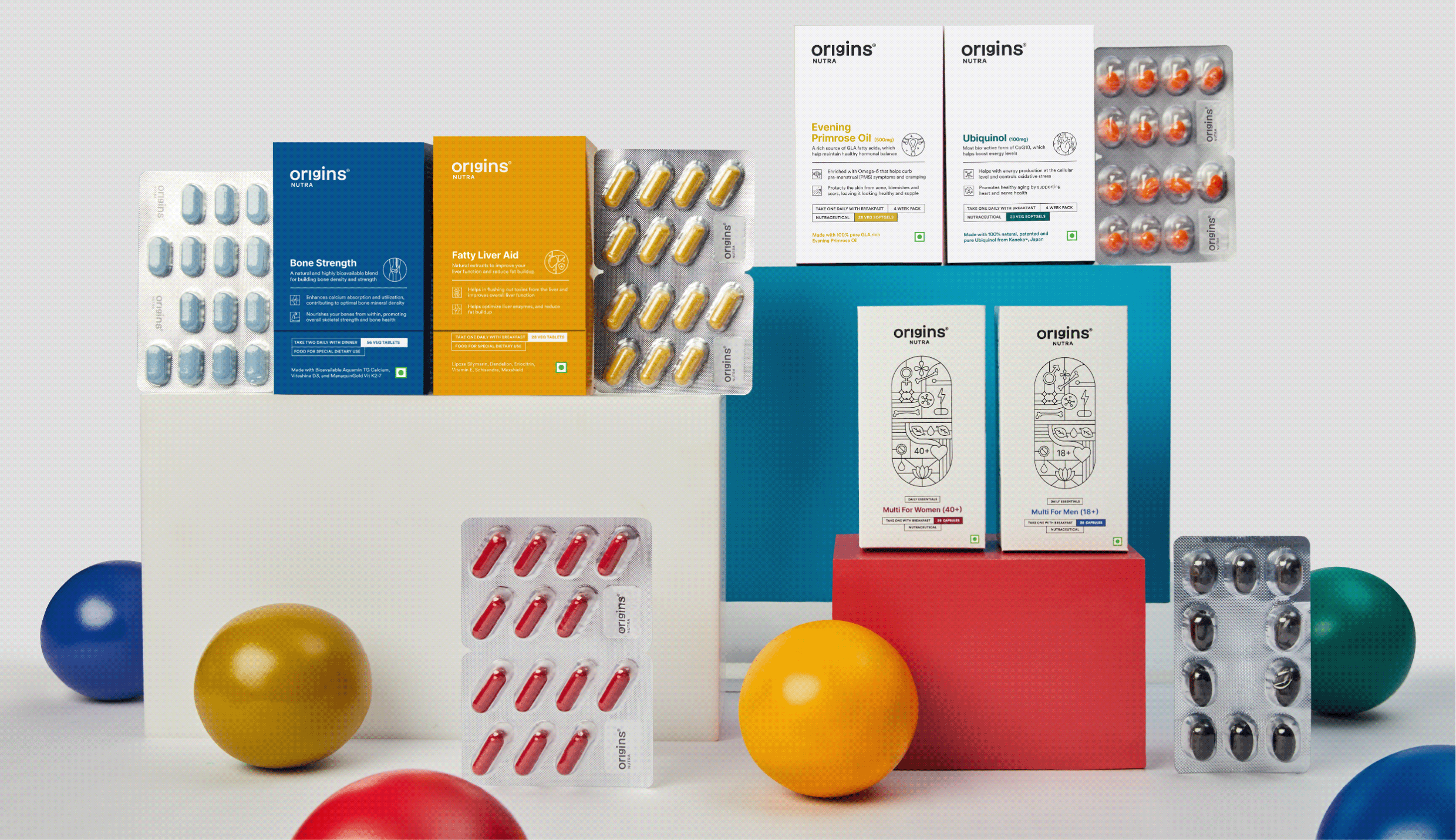
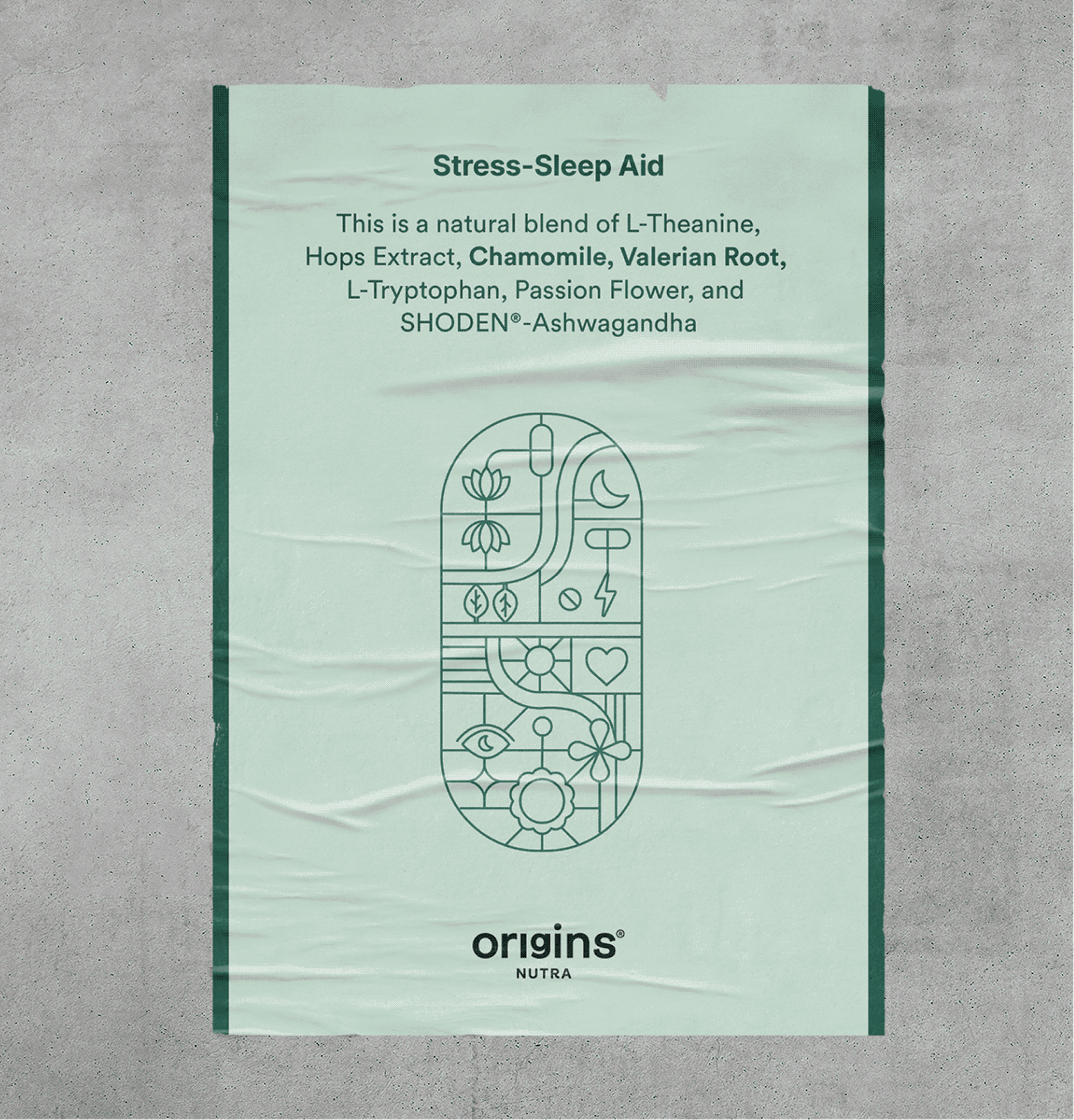
Each Illustration is a combination of benefits, ingredients, brand values and product details fit inside the shape of a pill.

This became the foundation of our visual language, strengthening our promise of honesty and transparency.

THE BRAND

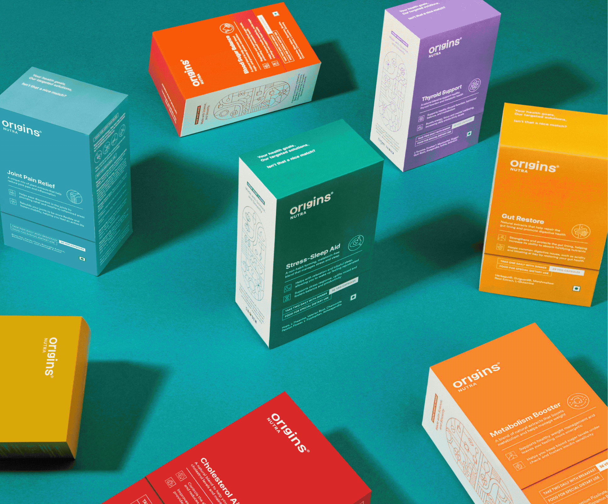
Introducing Origins Nutra 2.0

Preventive care isn’t just important, it’s essential. It truly starts with you, and at Origins, we’re with you every step of the way.

Everyone is chasing a health goal in their life that’s just how we humans are – eating better, moving more or losing weight. But being healthy or reaching that goal is not easy. It’s hard, complicated and intimidating.

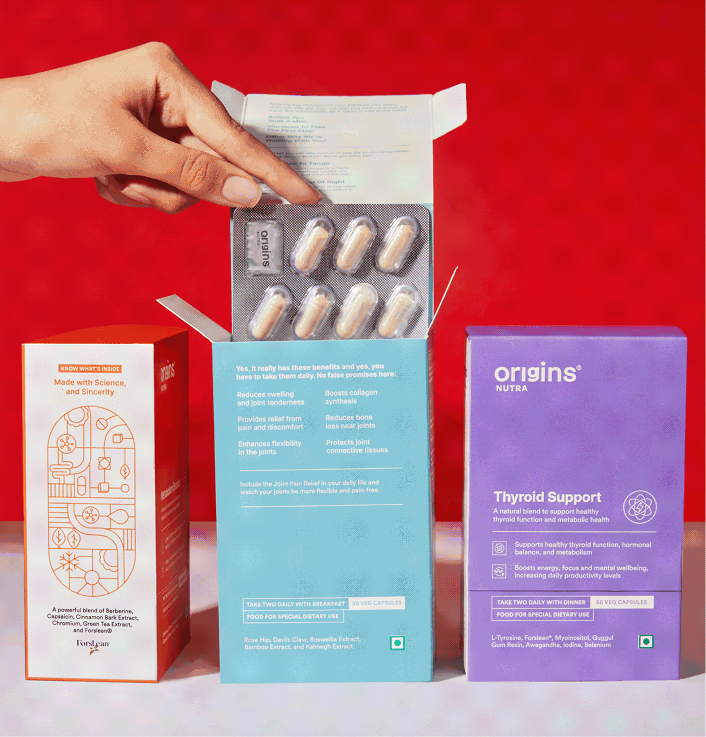
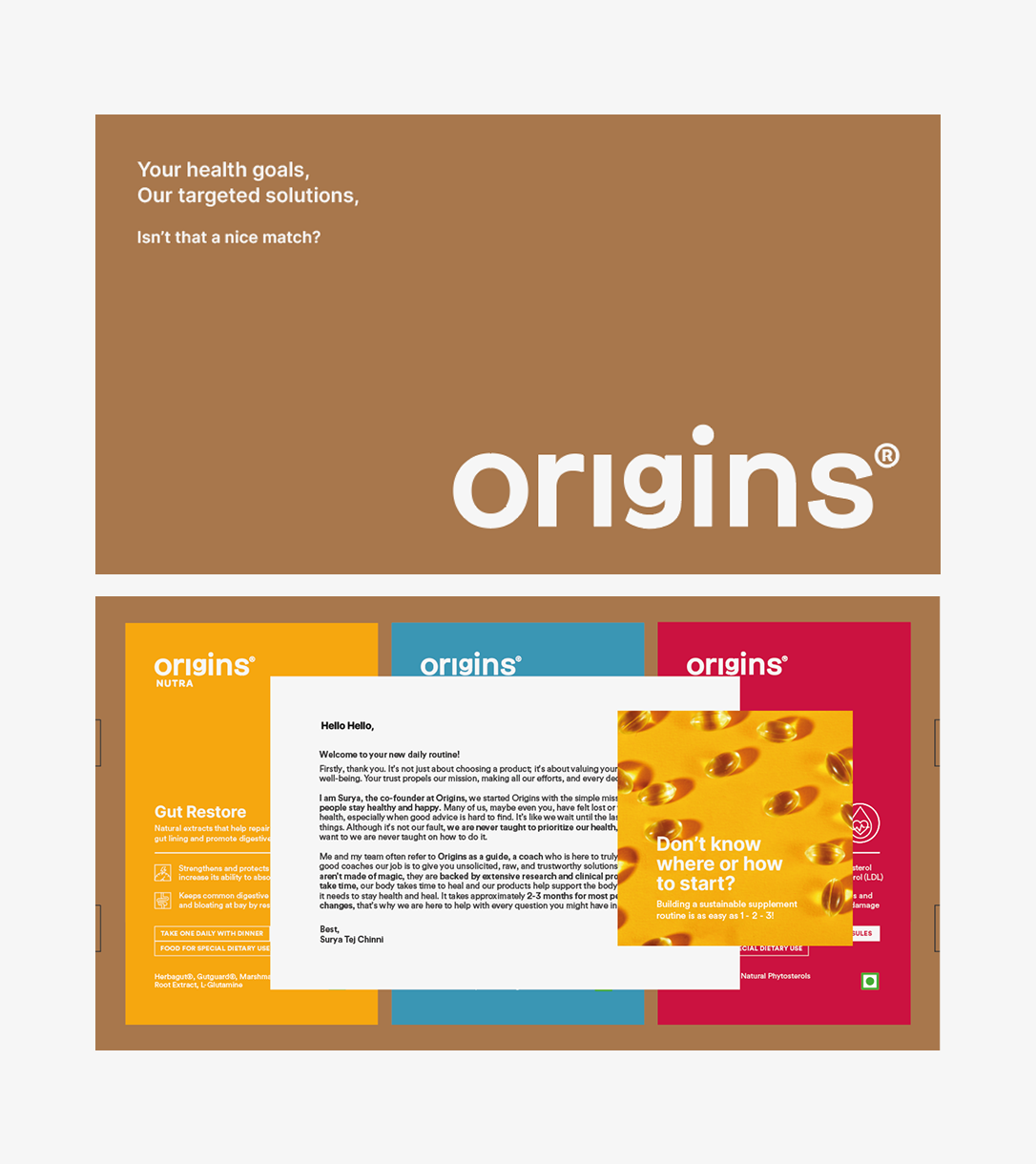
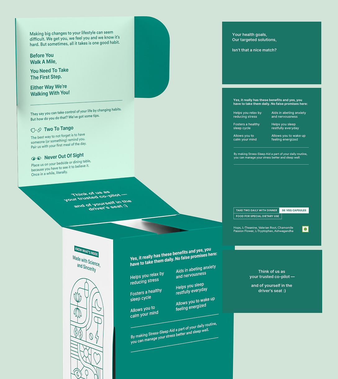
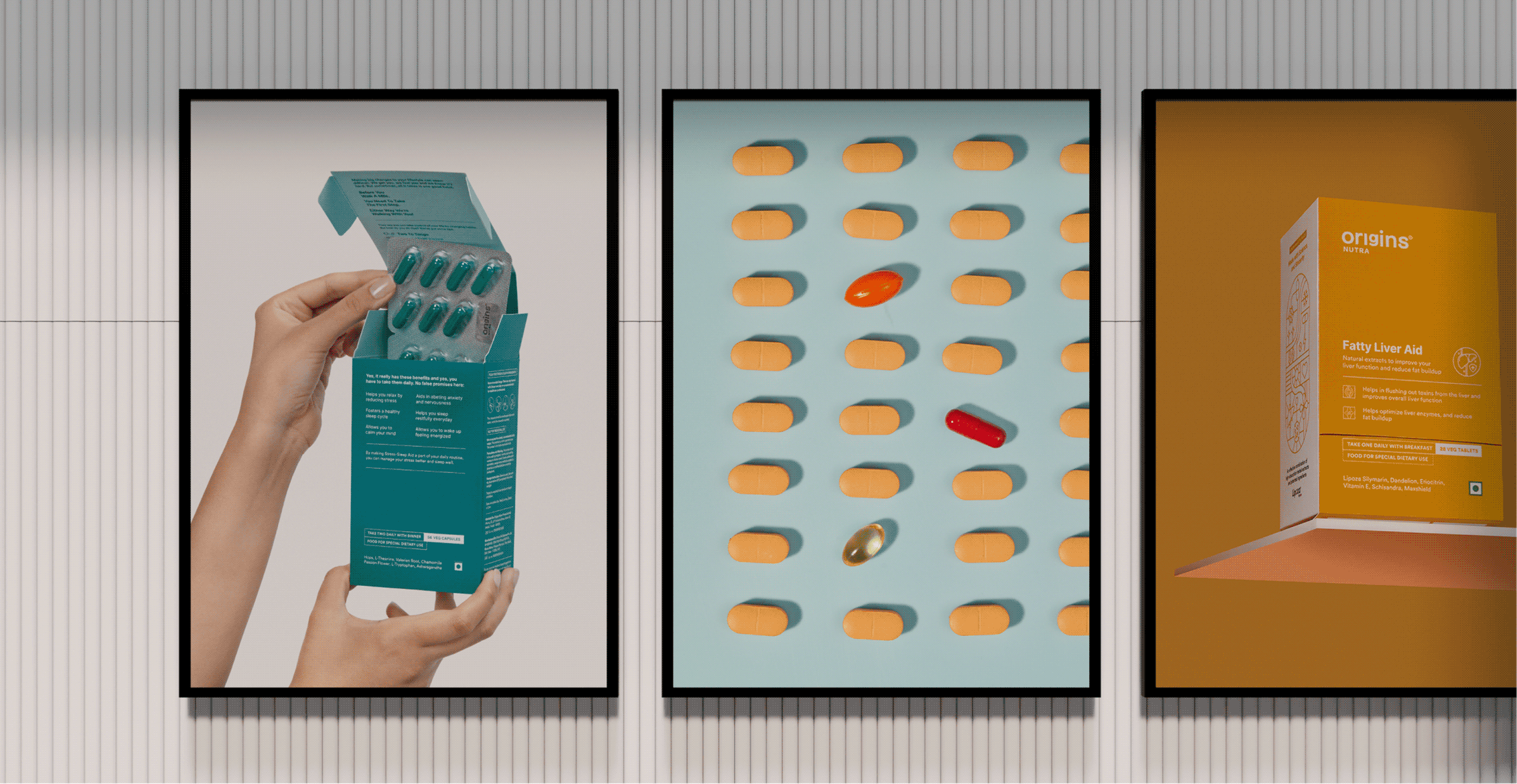
Starting is the hardest part, so we designed the box to do some of the coaching.

A new health routine is overwhelming, and most people quit before the first box is finished. So we built the coaching into the packaging instead of leaving it to the label.

The products arrive in a brown corrugated box that opens to a founder’s note and a short brochure on how to begin. Both set expectations before the first capsule.

Habit formation is what makes the difference. Why consistency matters, what makes it easier, and clearly stated benefits so you know what to expect and roughly when.

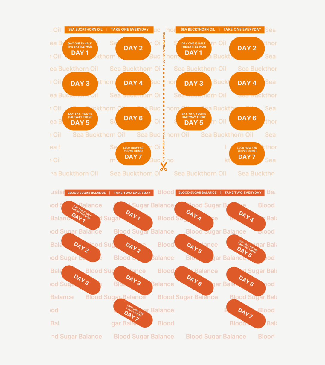
The pill strip stays with the consumer longer than anything else. So we divided it by day, giving each strip its own affirmation, colour, and name—making the right one easy to find at a glance.

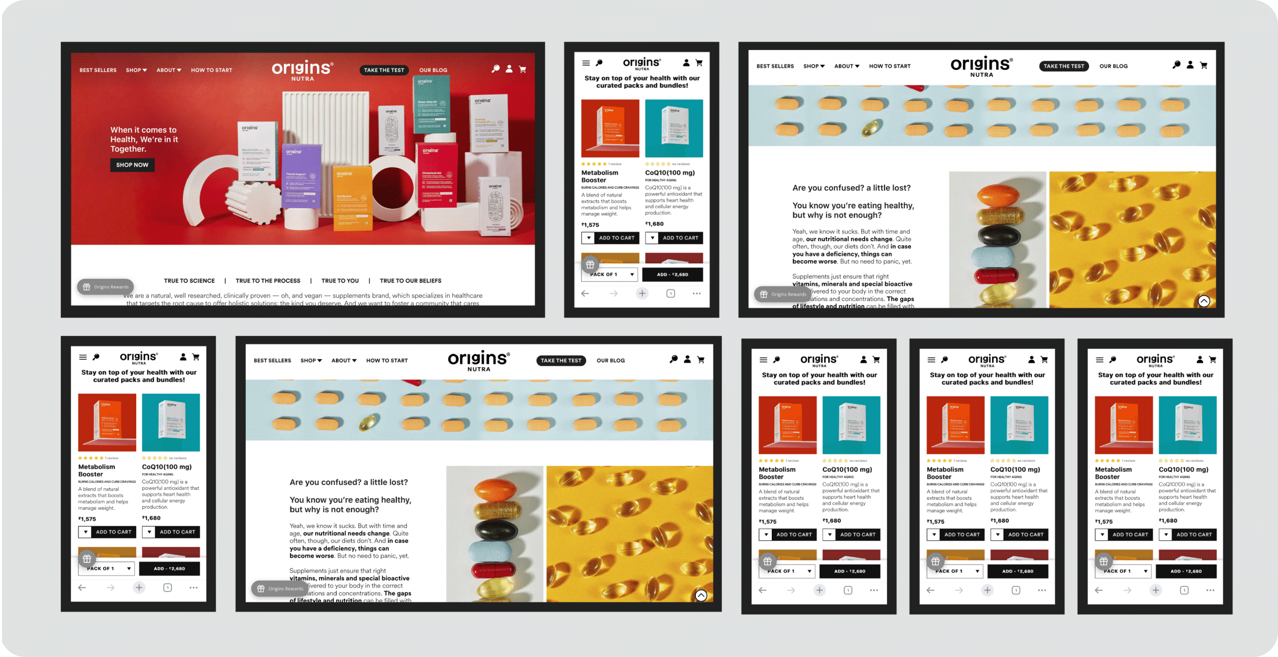
How do you build a website that delivers experience?

We designed the website just like a brick-and-mortar store.

Once you walk in the Origins store, it’s important to understand not just the product but a lot of other things

We addressed each and every question that you might have through your journey. It is crucial you understand everything before you make the right decision.

A Space & Legacy Reimagined

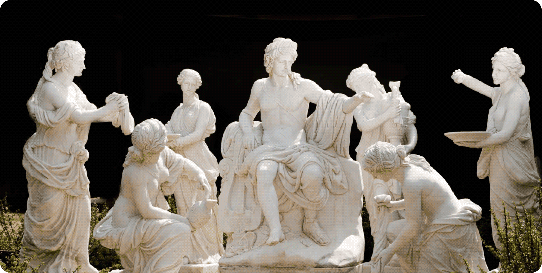
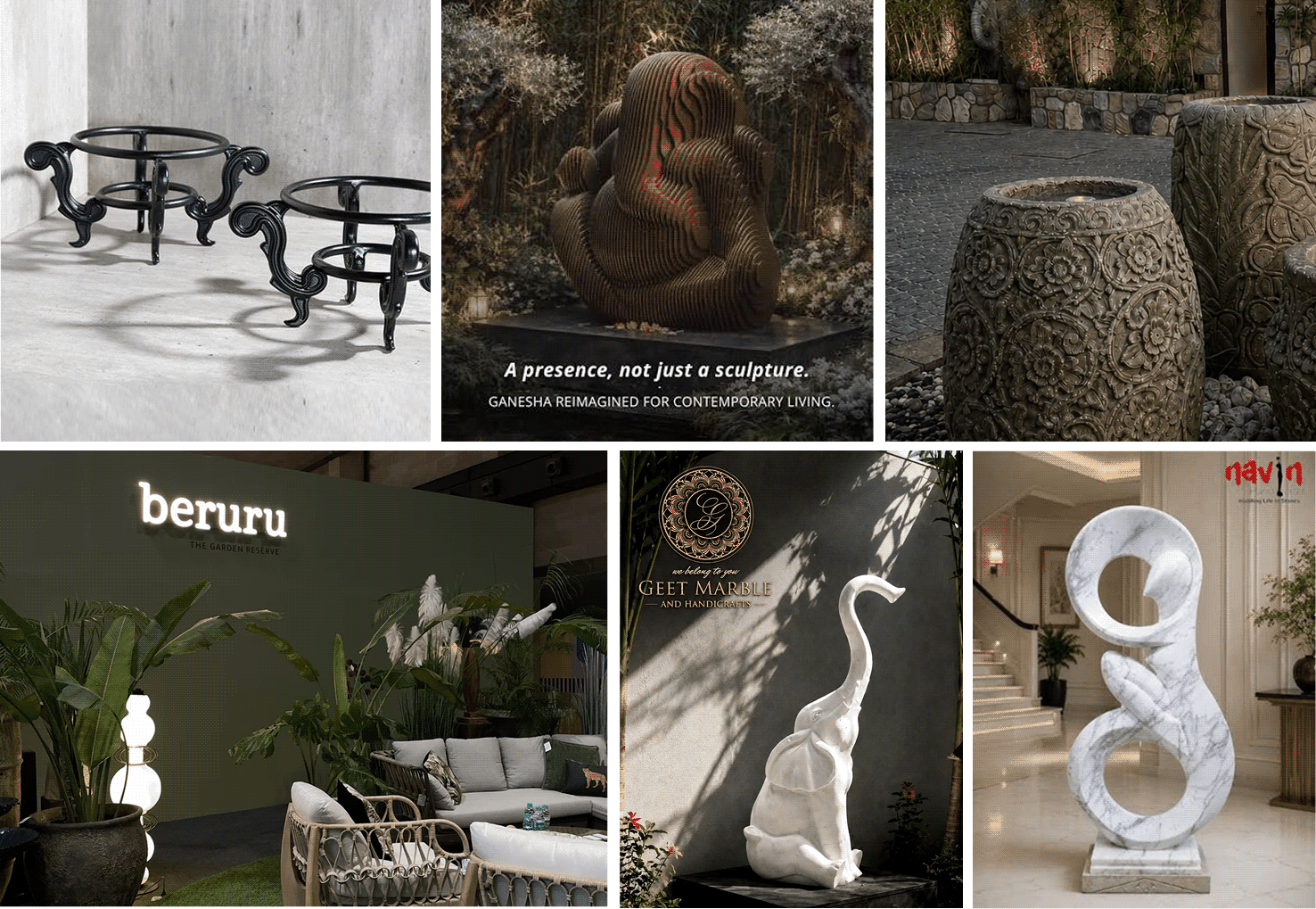
What makes people buy a sculpture instead of simply admiring it?

Scope Of Work: Market Research,
Brand Strategy, Consumer Understanding & Psychology, Brand Identity, Brand Messaging, and Product Packaging.

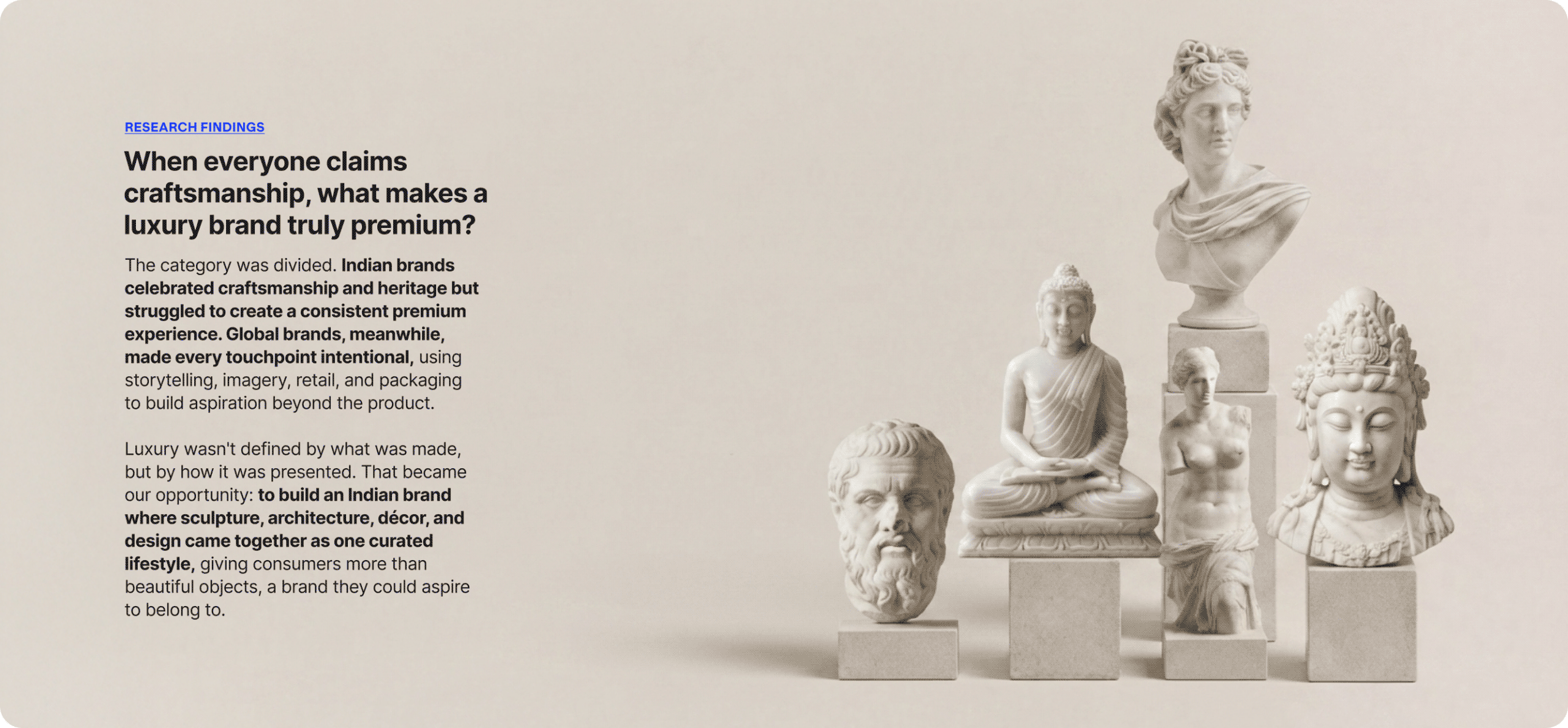
Luxury is rarely just about the object itself. Why do some pieces become heirlooms while others remain products? What makes people proudly talk about a brand long after they’ve made a purchase? And how do you build desire in a category people often consider optional?

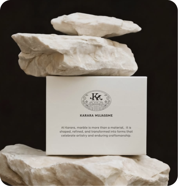
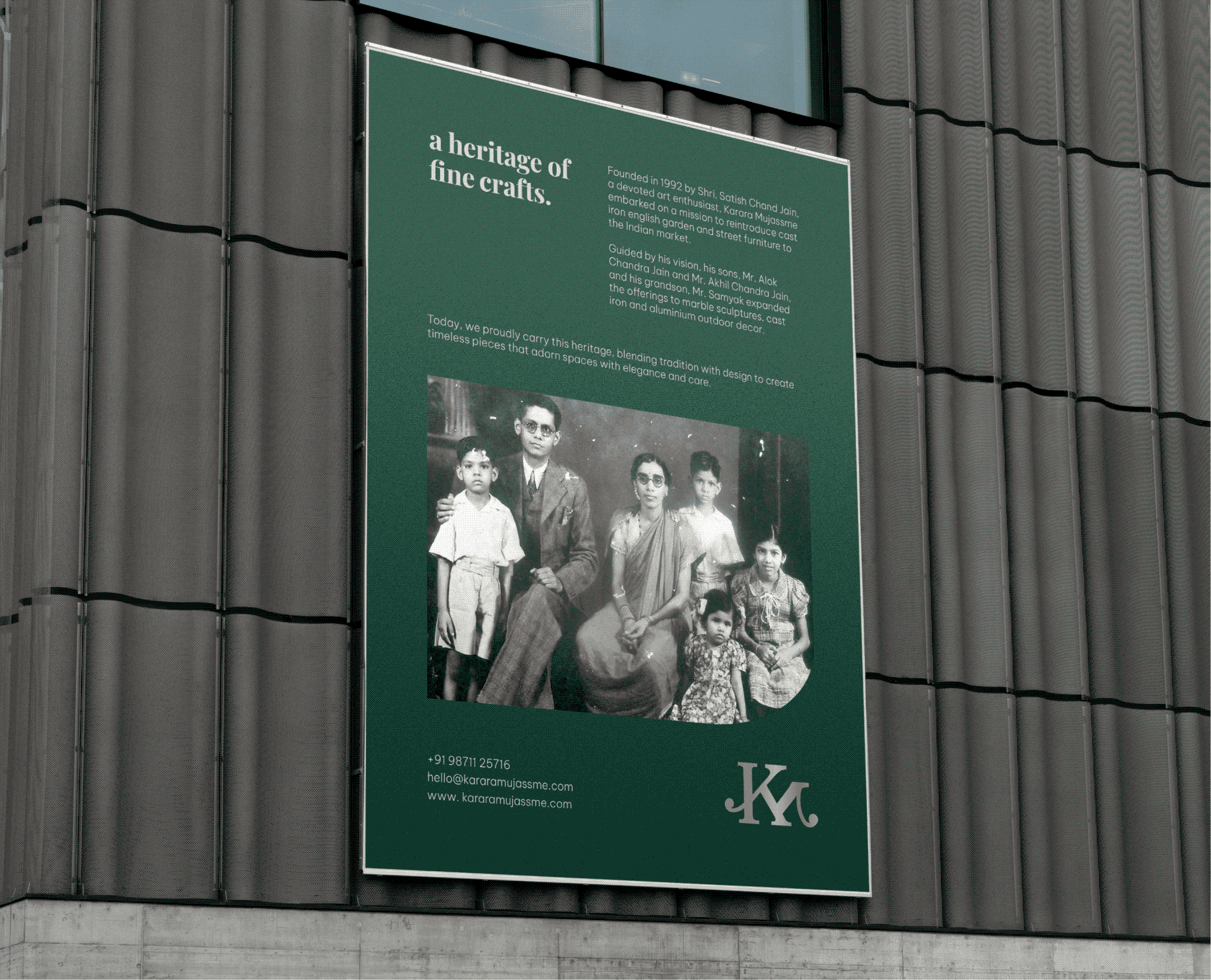
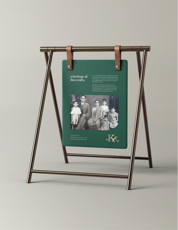
We explored these questions with Alok and Akhil while reimagining Karara Mujassme. As the brand evolved beyond bespoke sculptures into architectural and decorative pieces, it needed a purpose that extended beyond products.

The goal was to build a brand that went beyond products, one that celebrated artistry, craftsmanship, and timeless design while making every interaction feel considered and memorable.

MARKET INSIGHTS

Luxury today is defined by experience, not just the product.

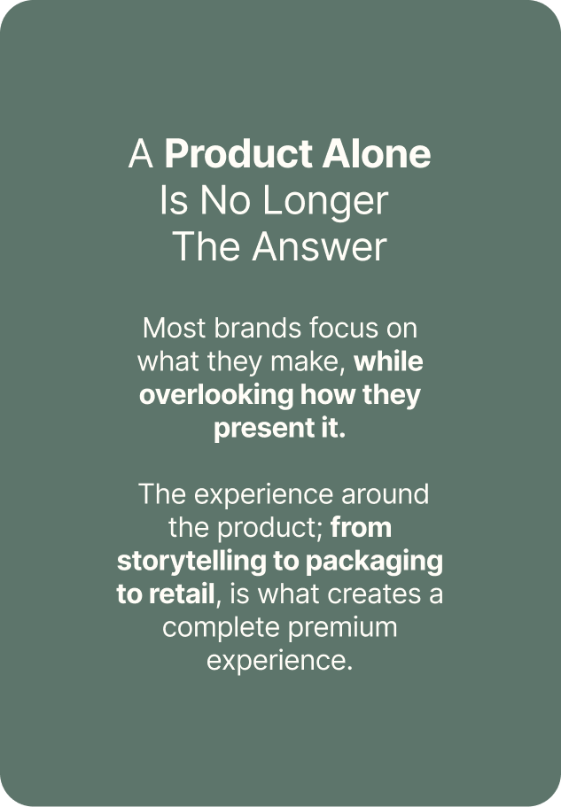
We looked beyond sculptures and furniture to understand how people buy luxury. What makes them trust one brand over another? What turns an object into something worth collecting? And what makes someone proudly recommend it?

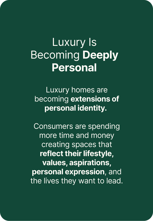
The market revealed that consumers weren’t simply buying décor. They were investing in spaces that reflected their taste, lifestyle, and identity.

When products take centre stage, how do you build a brand people remember?

IDENTITY CONCEPT

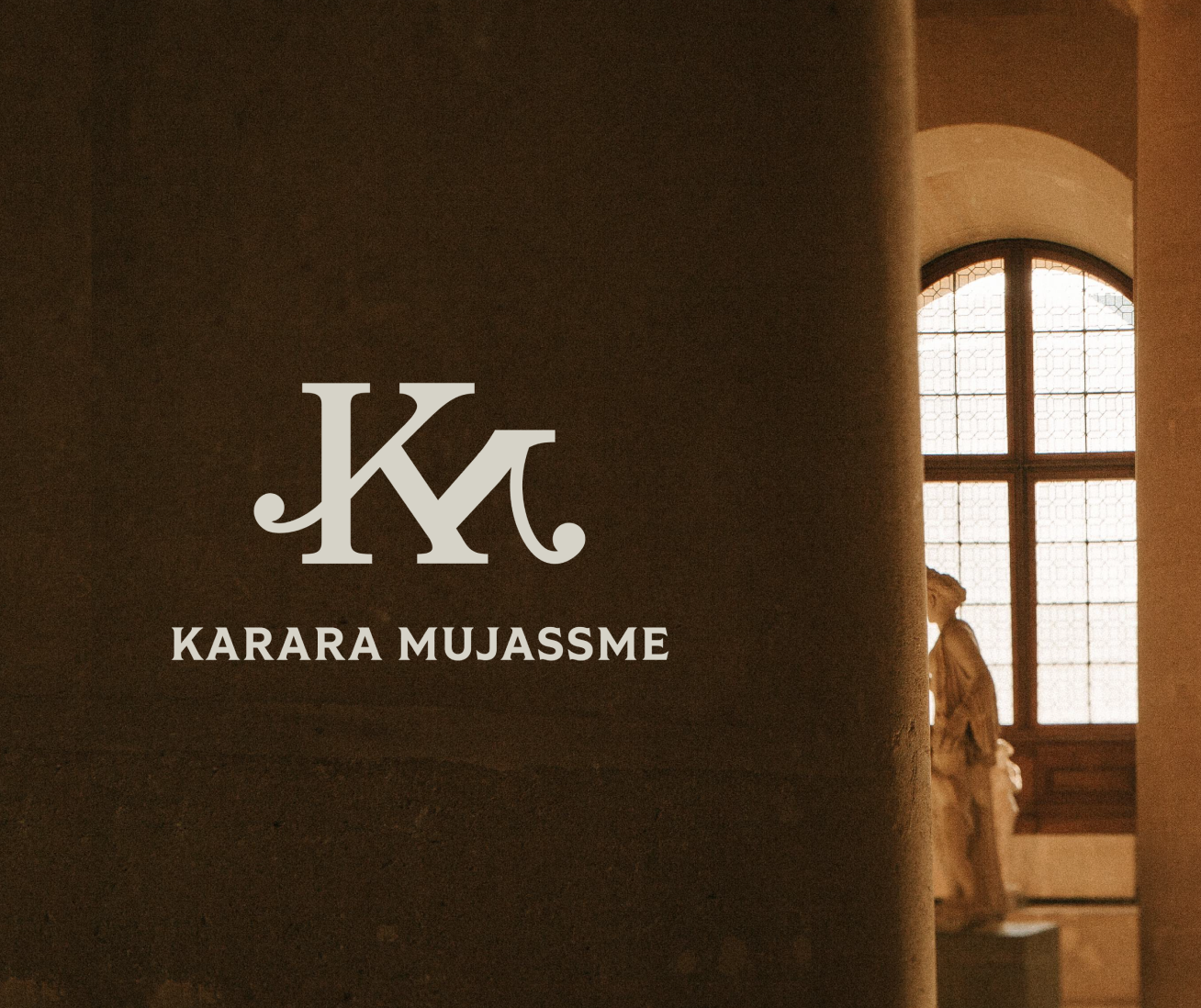
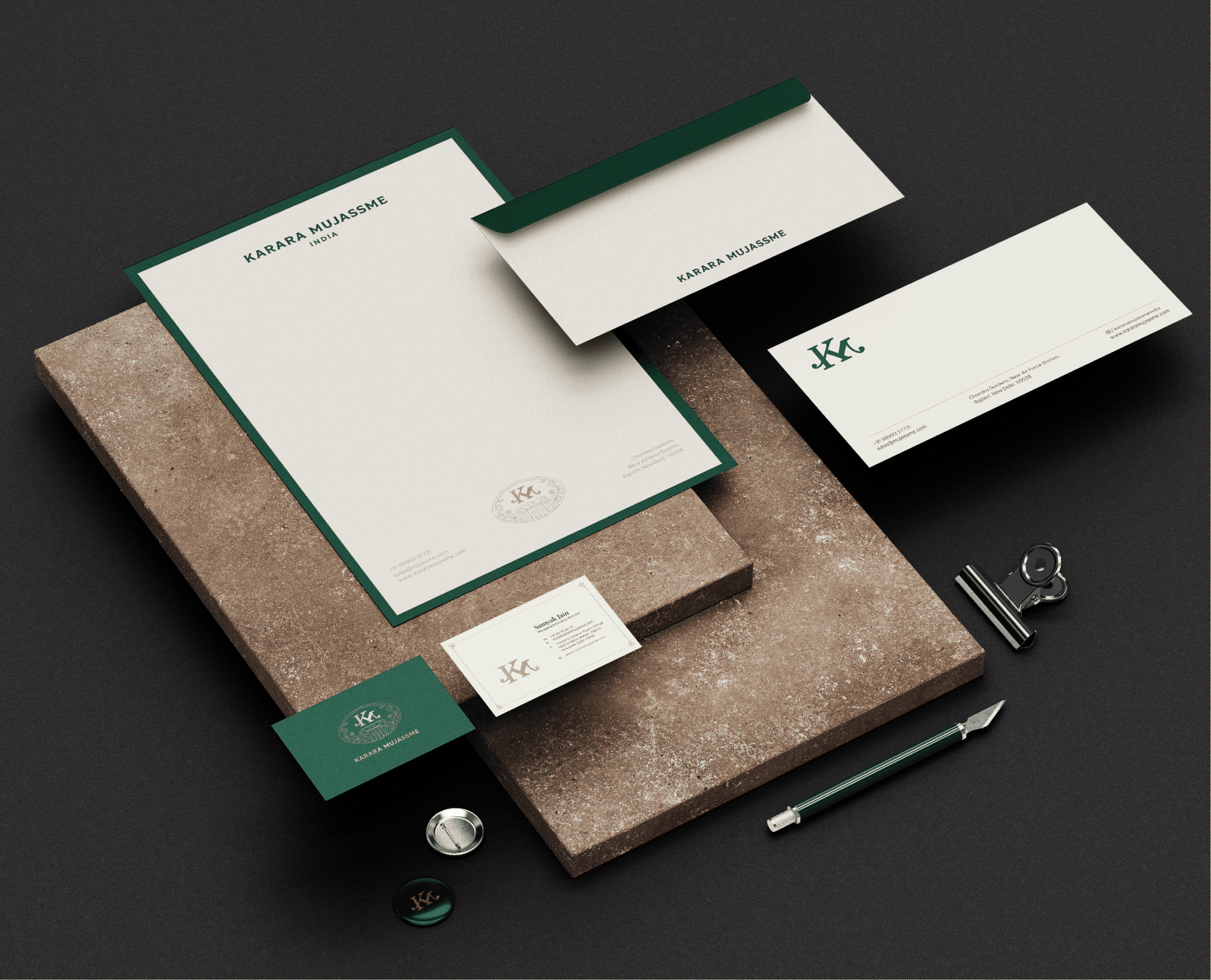
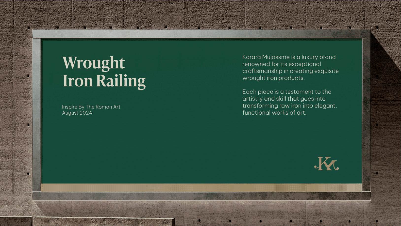
Introducing Karara Mujassme

A refined identity inspired by the craftsmanship, precision, and timeless quality behind every Karara creation.
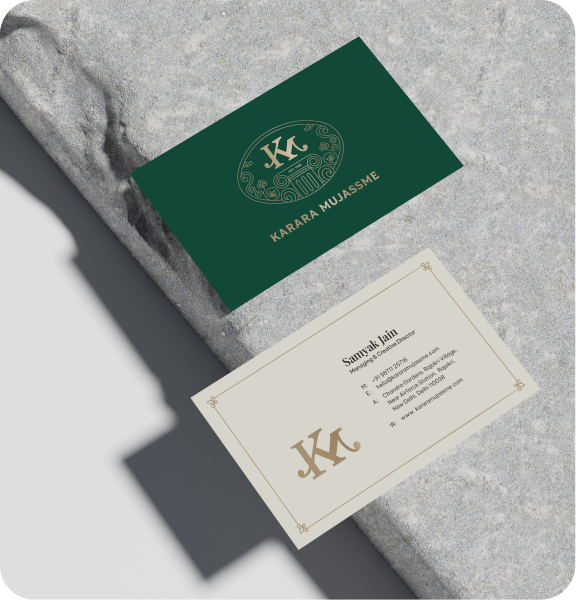
A distinctive seal that brings together trust, tradition, and luxury into one powerful visual.

A monogram, seal, and logotype working together as a unified identity that reflects the 
brand’s heritage while looking confidently towards the future.

Product Packaging

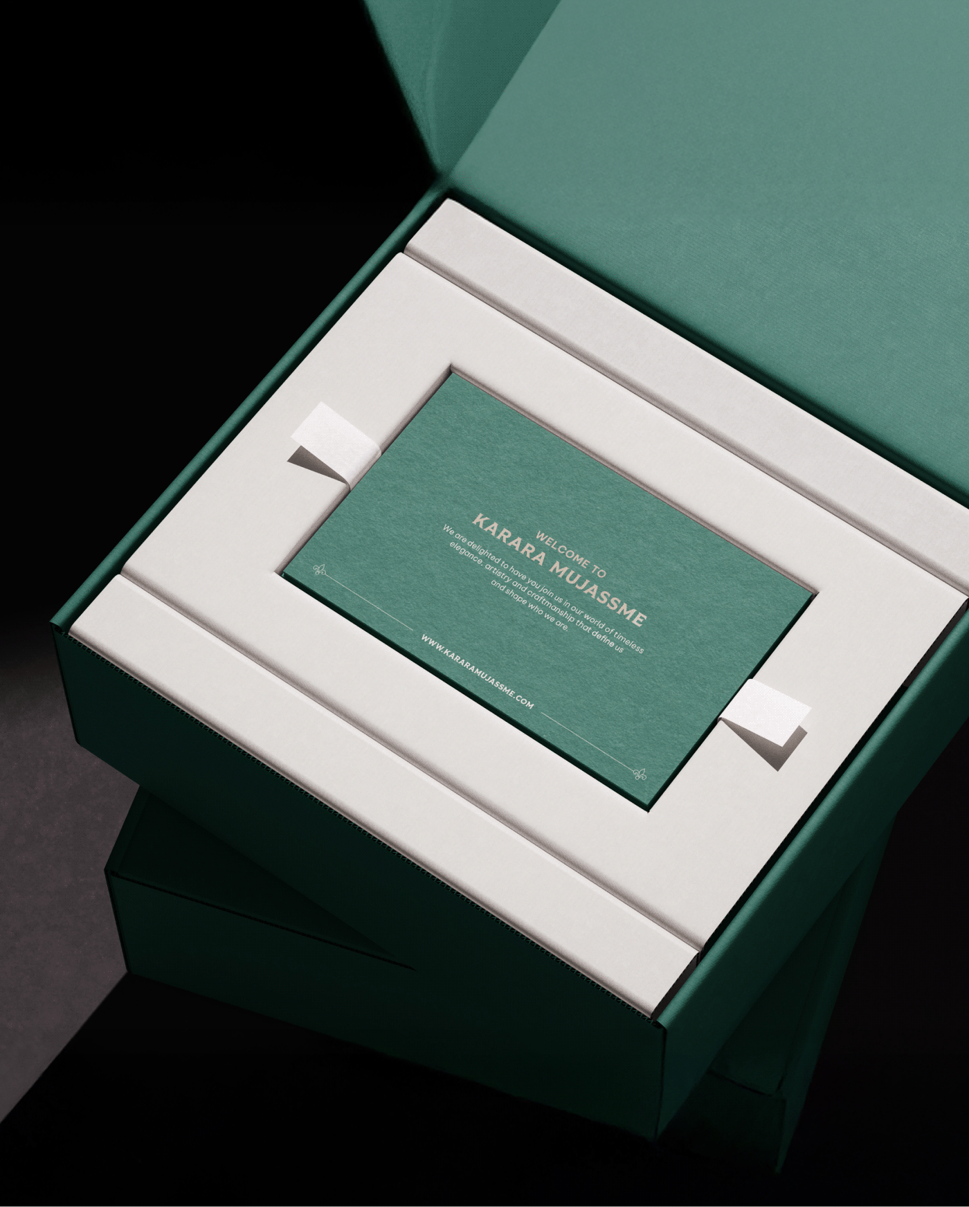
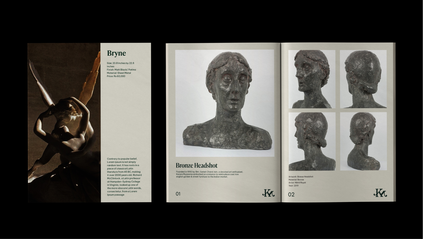
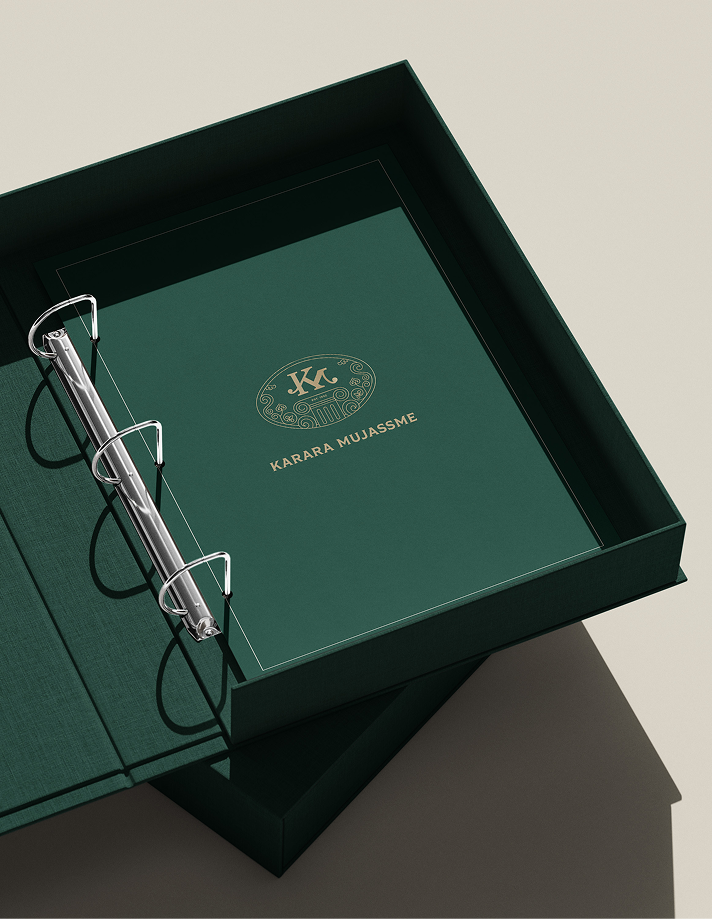
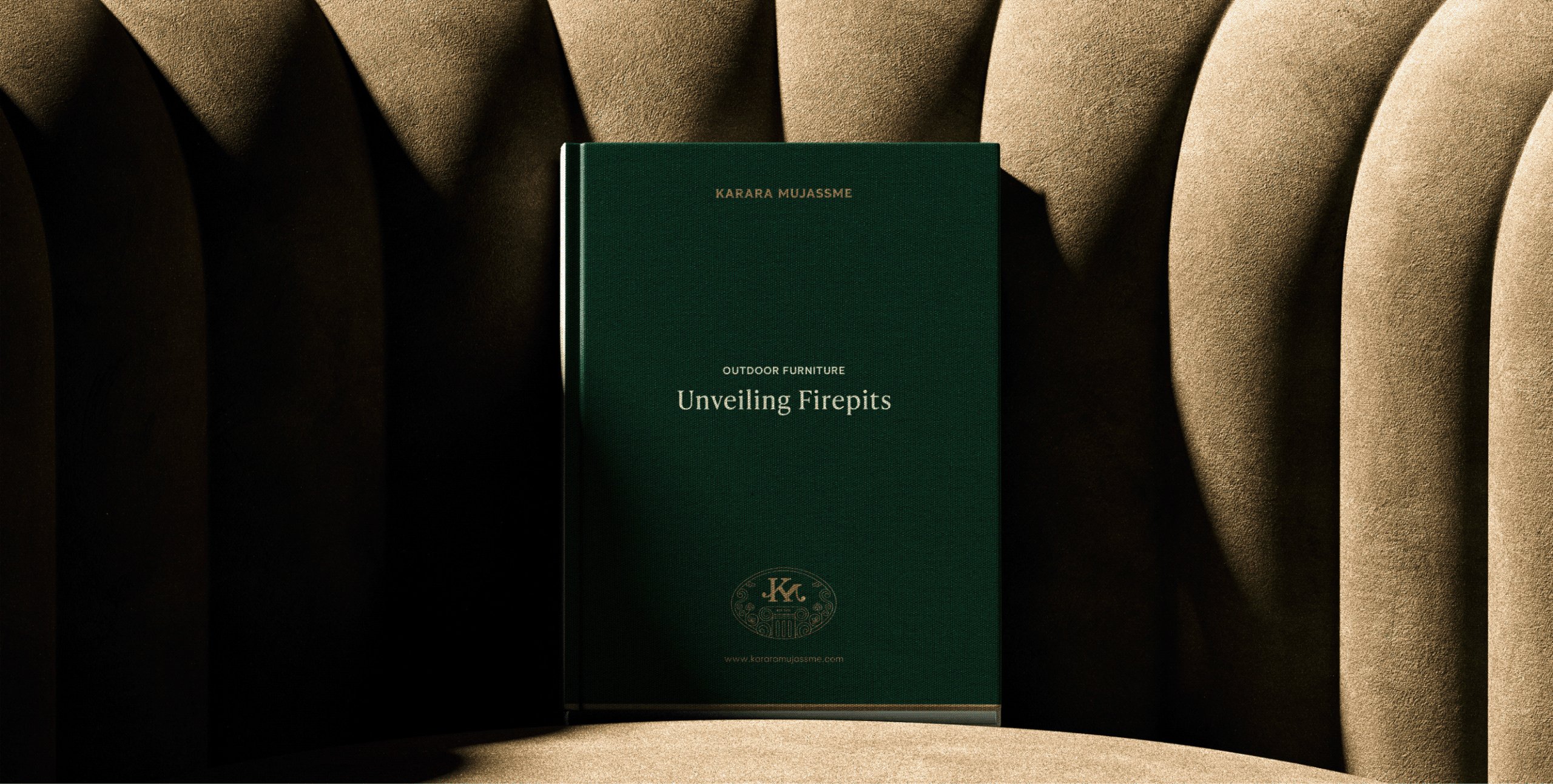
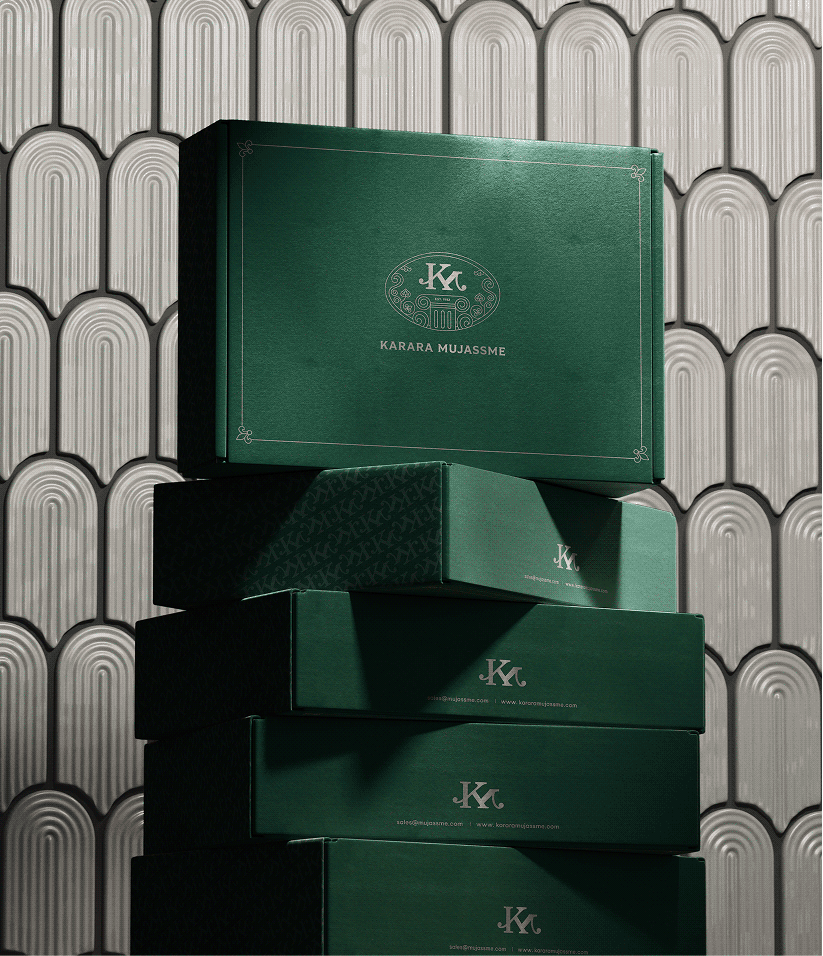
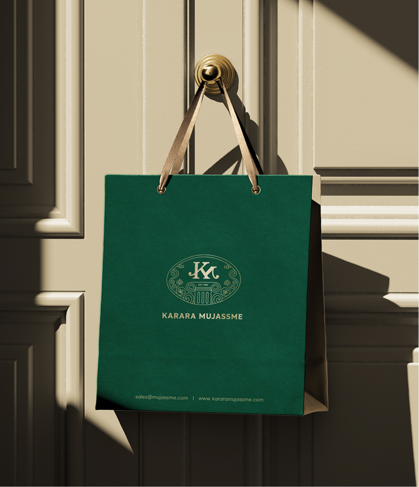
A premium packaging system that transforms every purchase into a curated luxury experience; carrying Karara’s craftsmanship from the showroom to the moment it is unboxed.

Space and Wayfinding Design

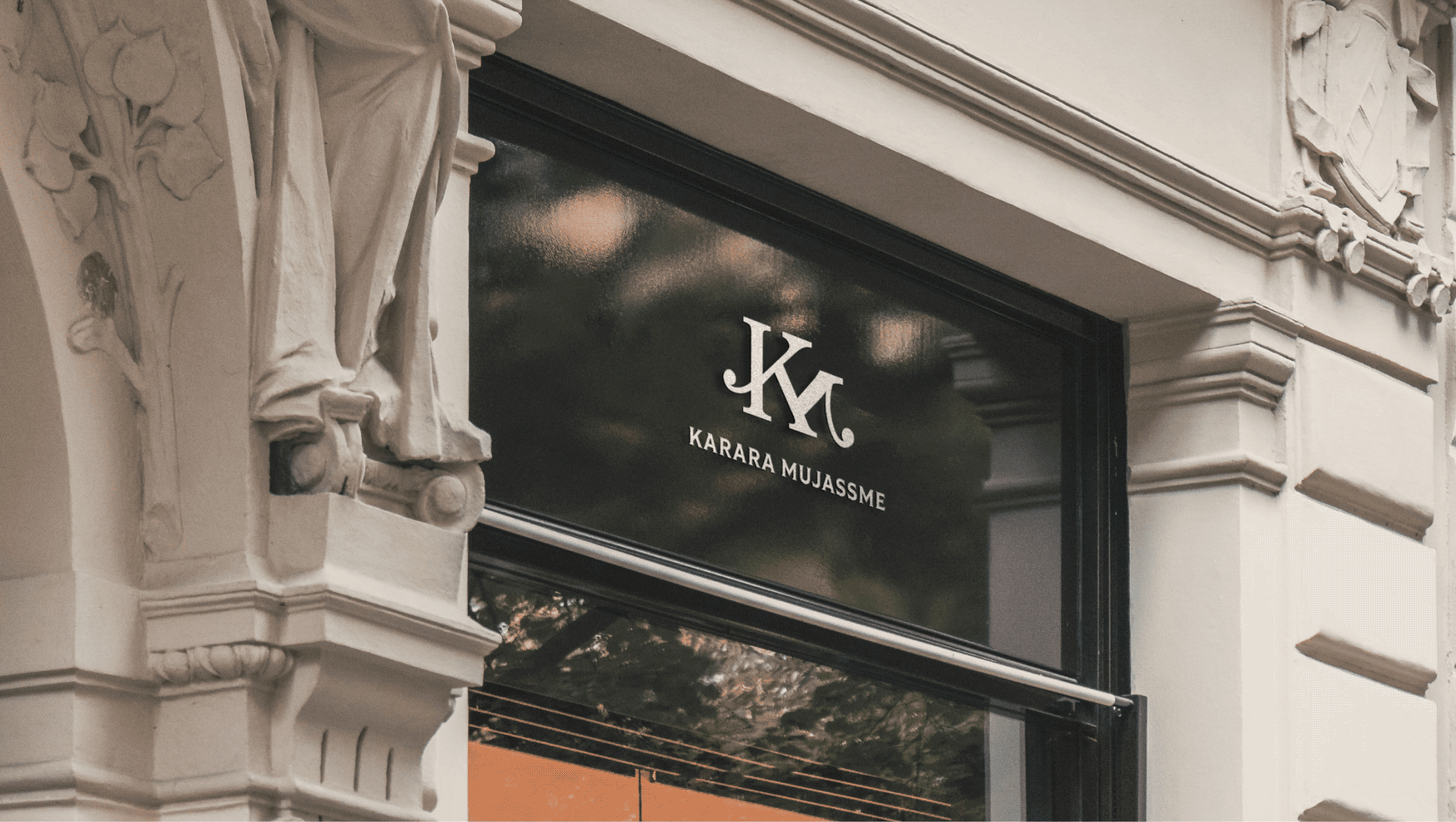
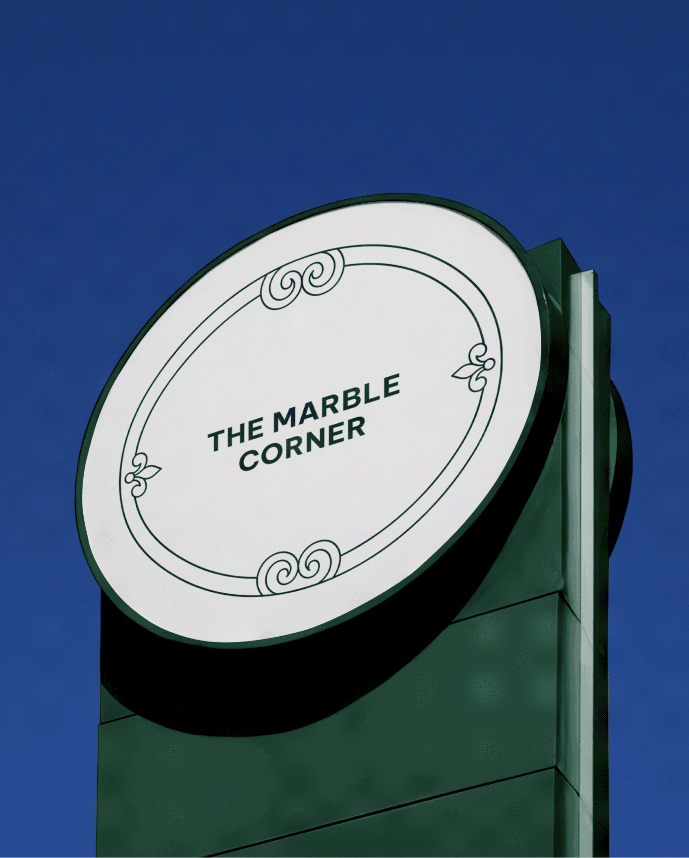
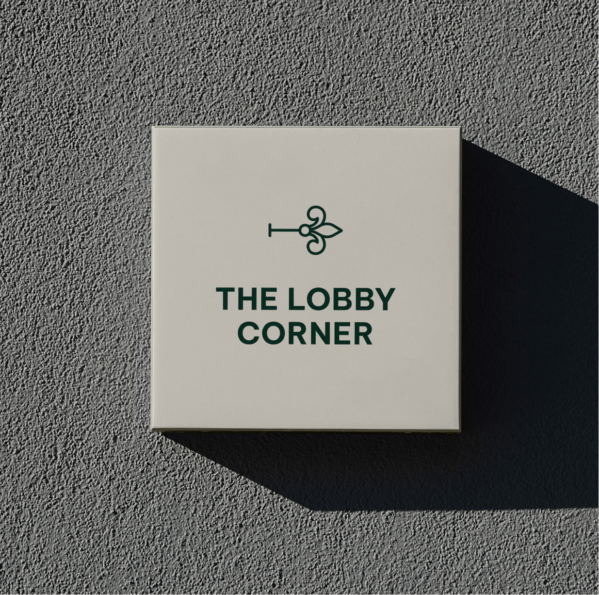
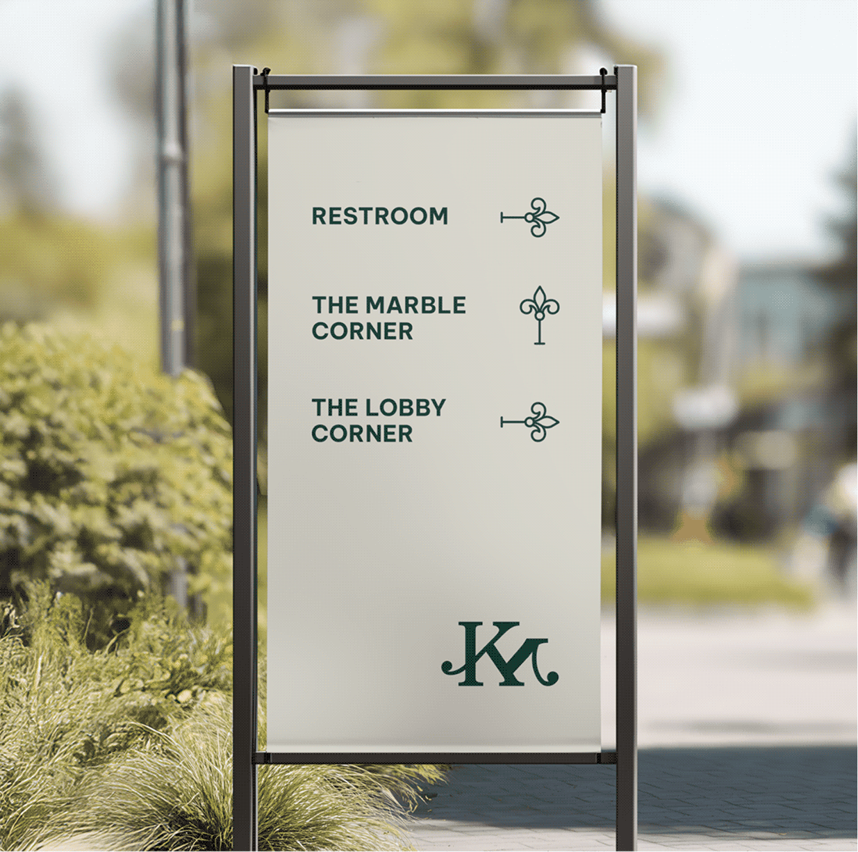
A cohesive environmental identity that carries the brand across every corner of the space; from wayfinding and storytelling to product communication and discovery.

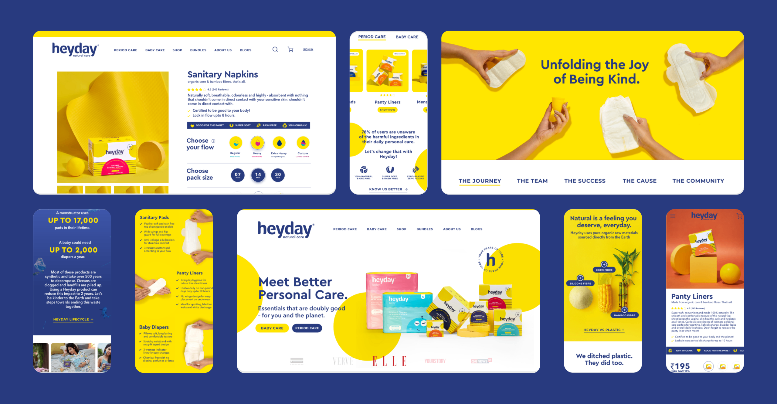
Meet Better Personal Care

Heyday, Meet Better Personal Care.

Scope Of Work: Research, Strategy, Consumer Understanding & Psychology, Visual Language, Product Packaging, Art Direction, and Web Design.

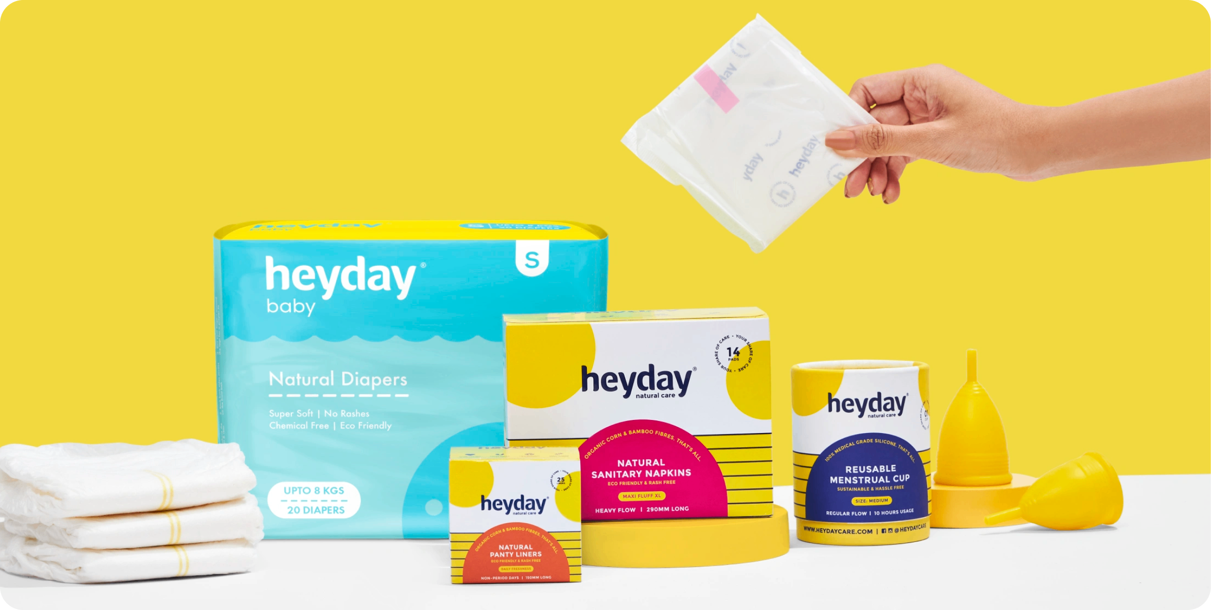
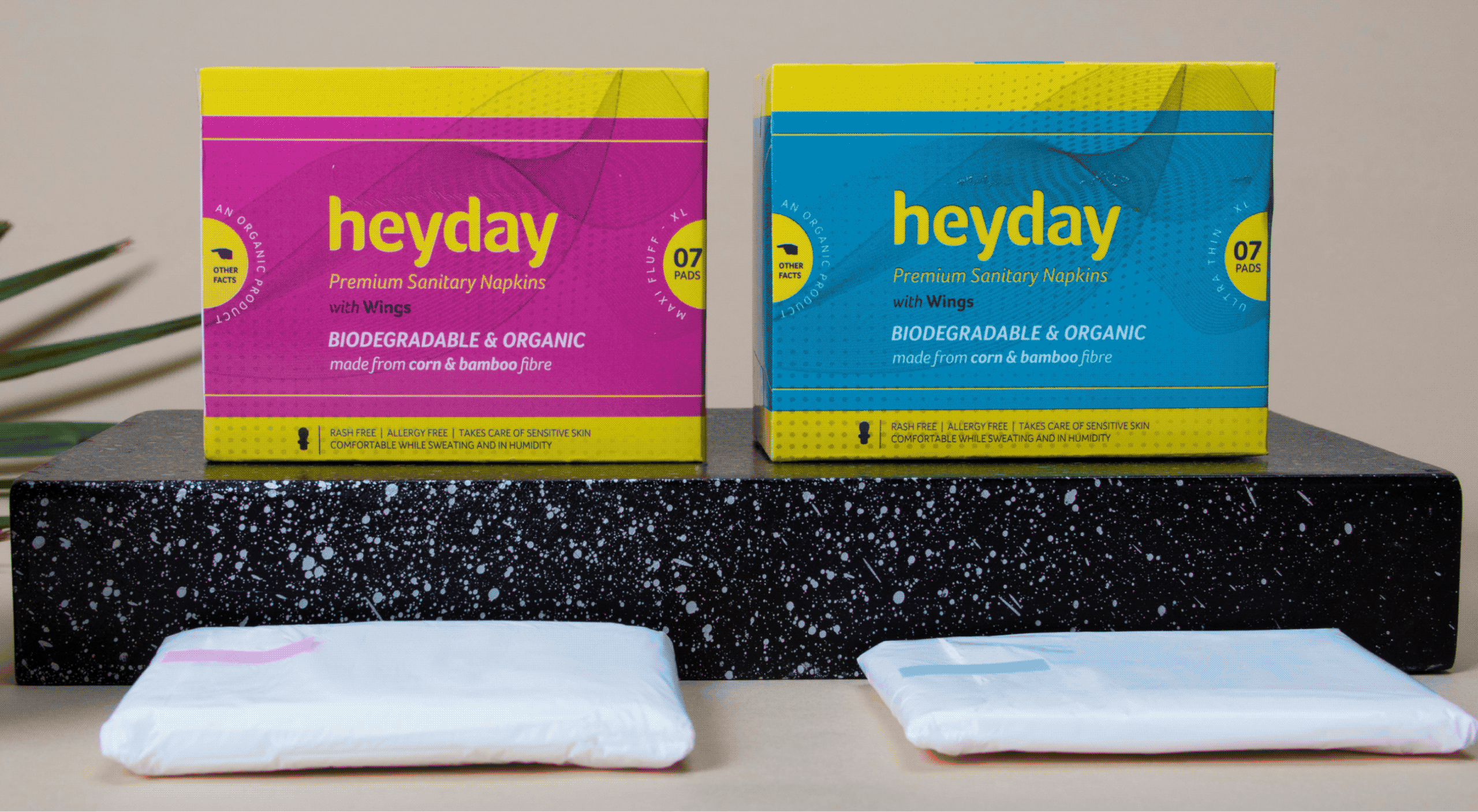
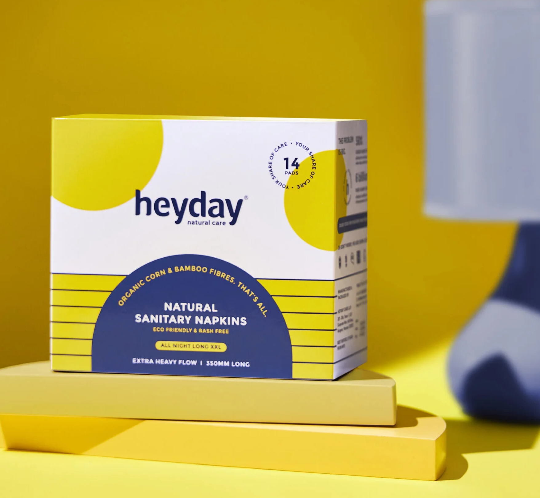
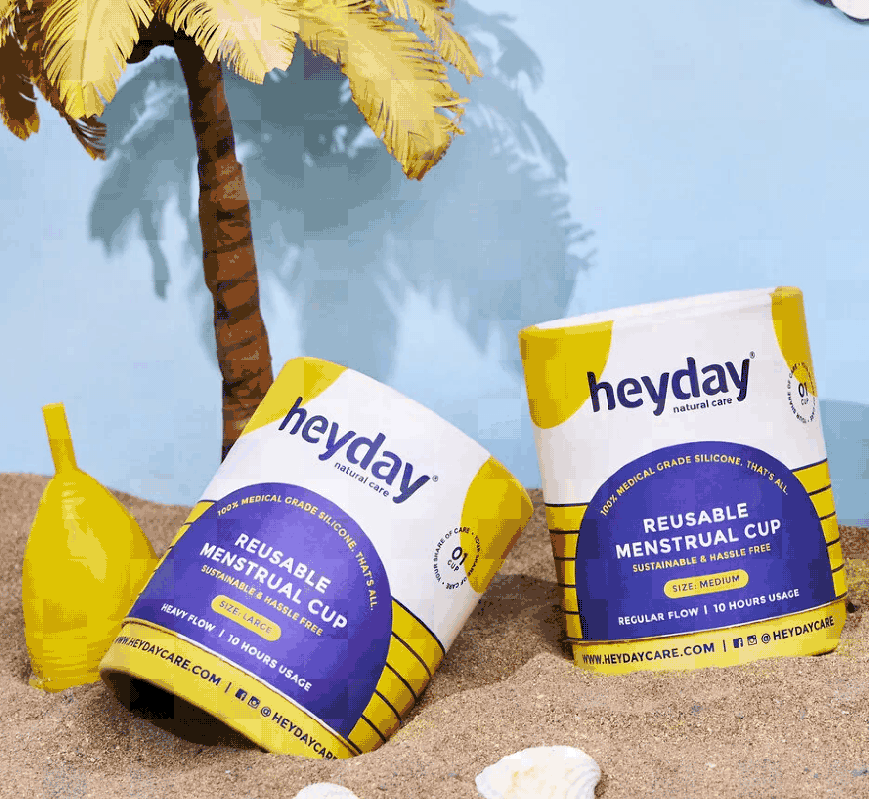
Heyday makes 100% natural and organic personal care products for women and babies. Every product is made without the harmful chemicals and plastics that are standard in the category.

Founded by Deepanjali Kanoria, the brand is built on one belief: the things we use every day should look after the two homes we all live in, our bodies and our planet.

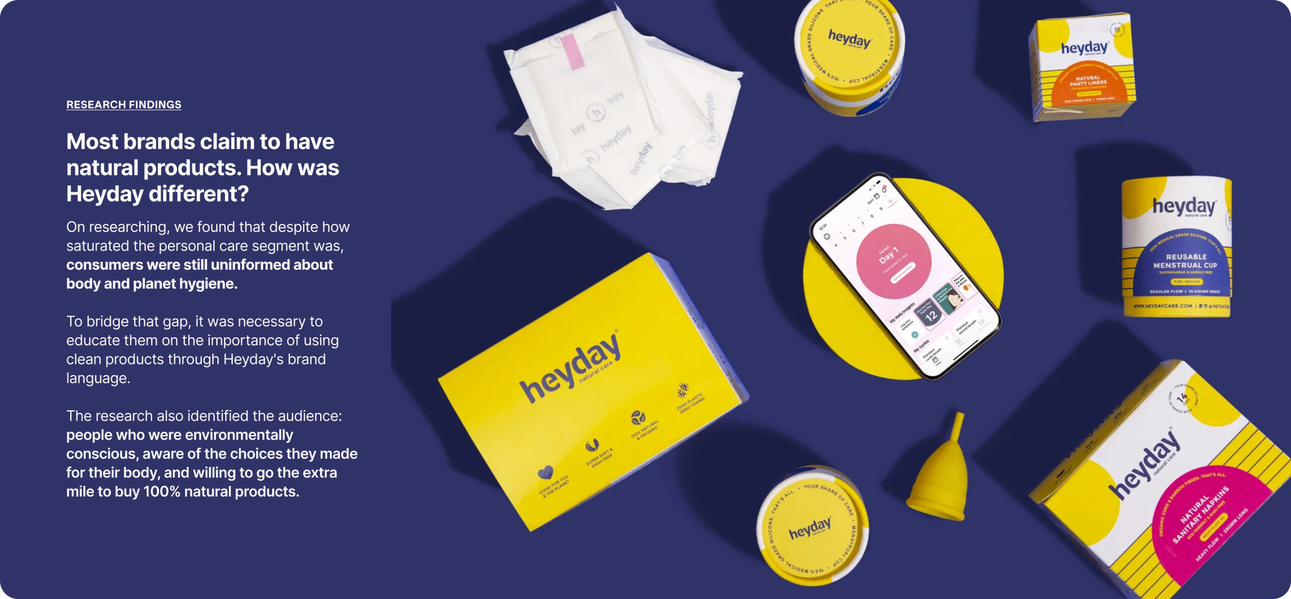
Heyday came to us with something rare and something common. The rare part was a brand people already trusted. The common part was packaging and language that weren’t telling anyone why.

The result was a fresh brand language, identity, and repackage the full range, so that consumers could see the difference before we had to explain it.

THE WHY

How can we show consumers what is
good for them? Without sounding preachy?

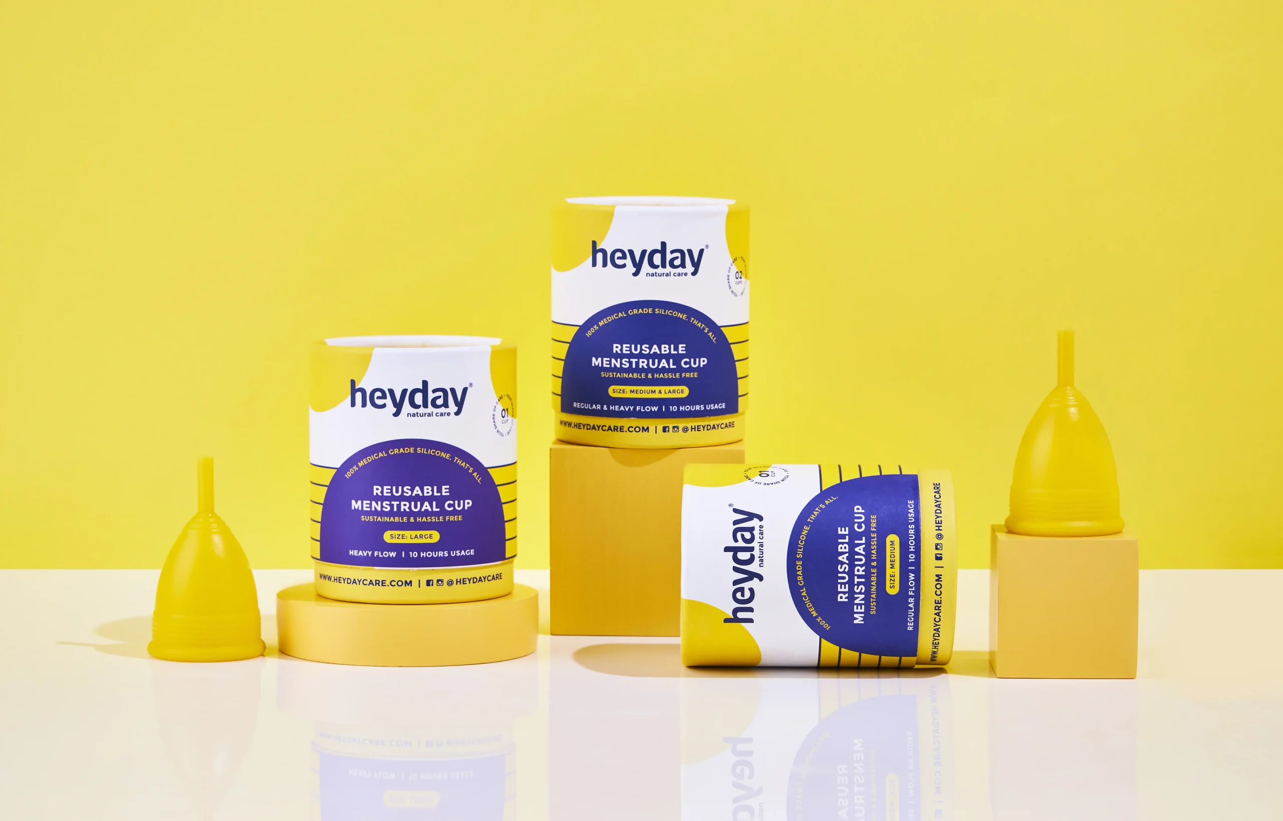
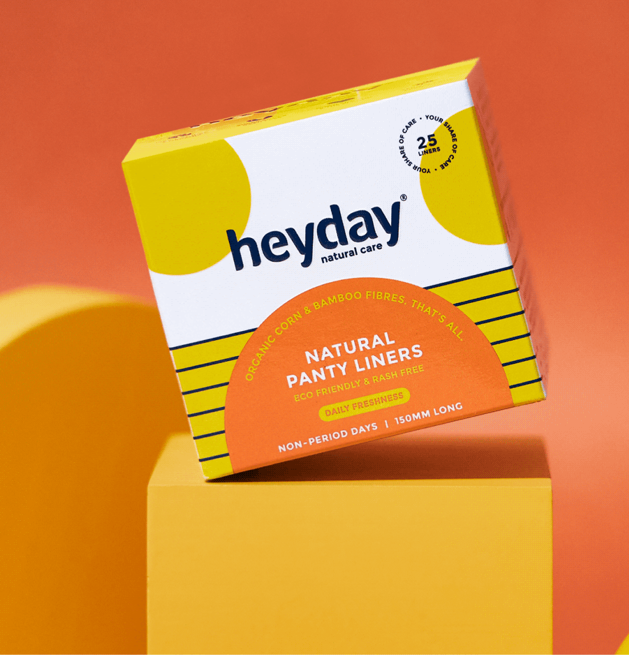
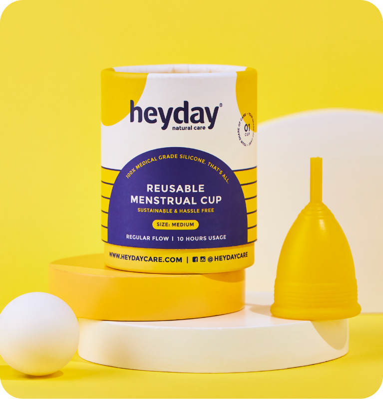
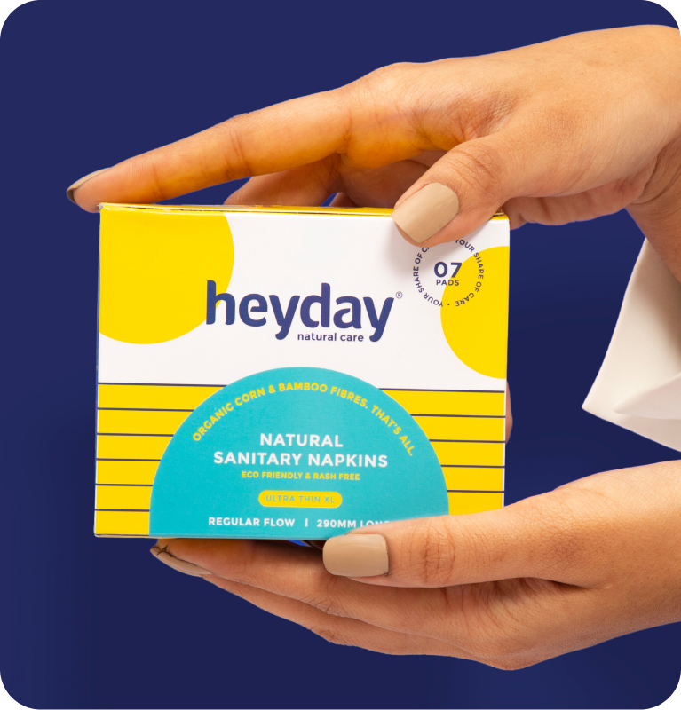
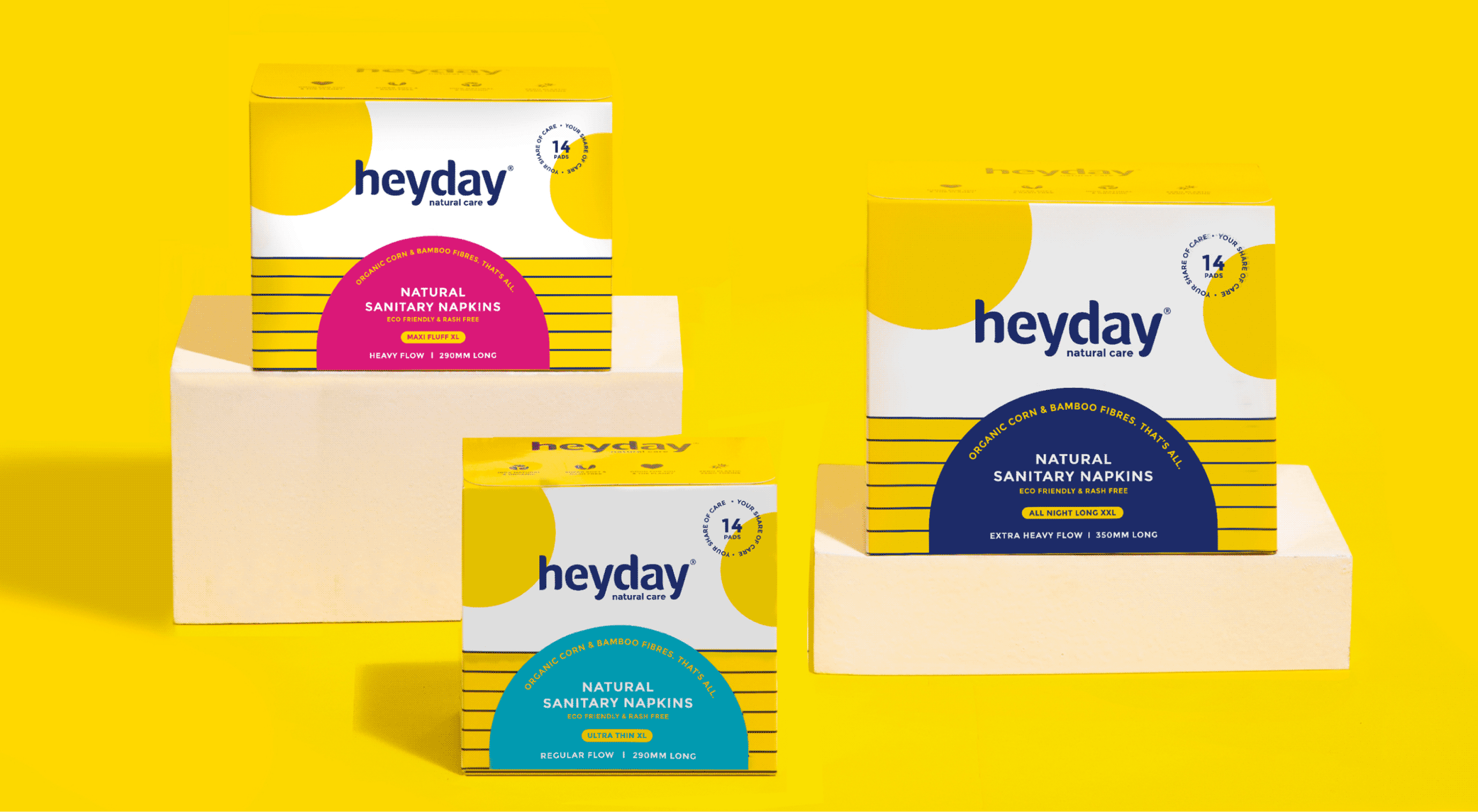
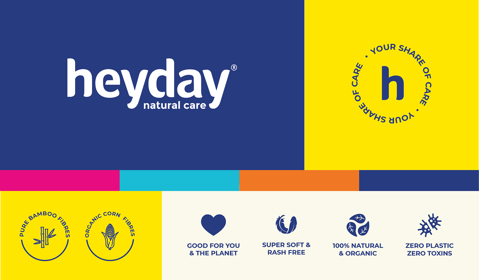
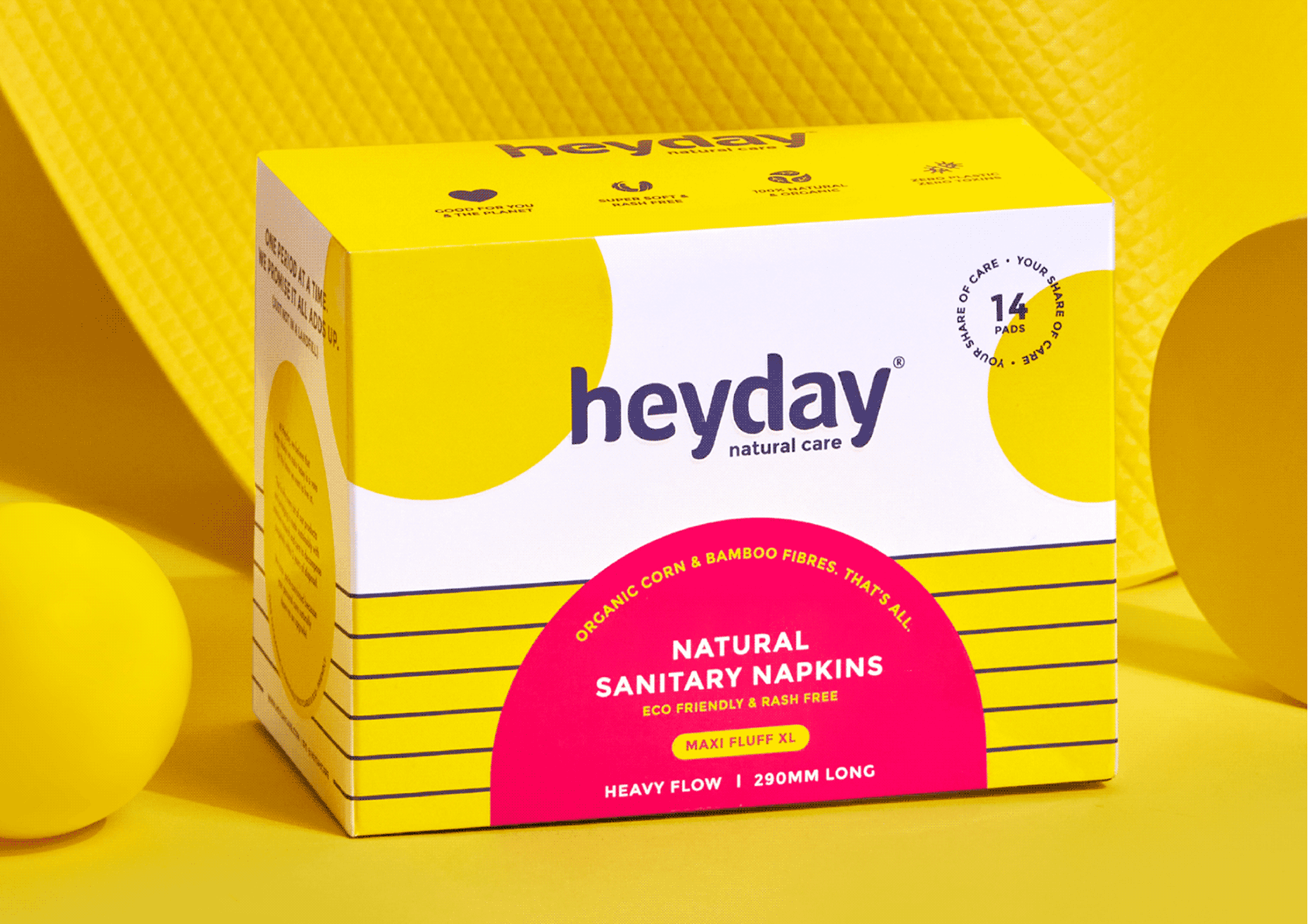
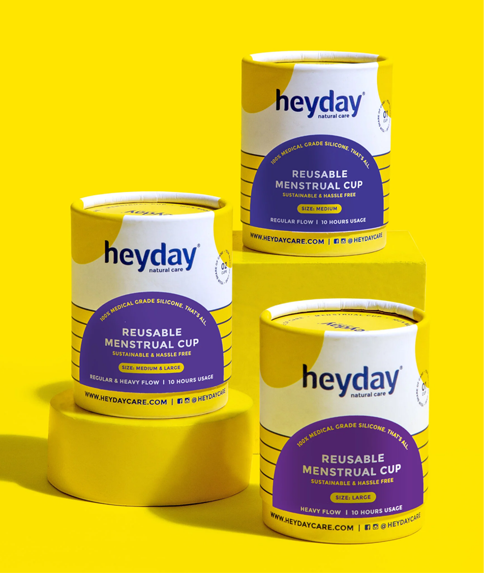
We refreshed their old identity and built a brand extension with a vibrant and fun colour palette and new brand icons, so consumers could celebrate womanhood and menstruation.

All of it sits under one purpose statement: Your Share of Care. Every woman deserves easy and safe access to period care.

INFORMATION LAYOUT

How can a brand be fun, informative, and most importantly, stand out?

We had to be mindful of the brand’s familiarity and yet infuse a new personality to make it more relevant.
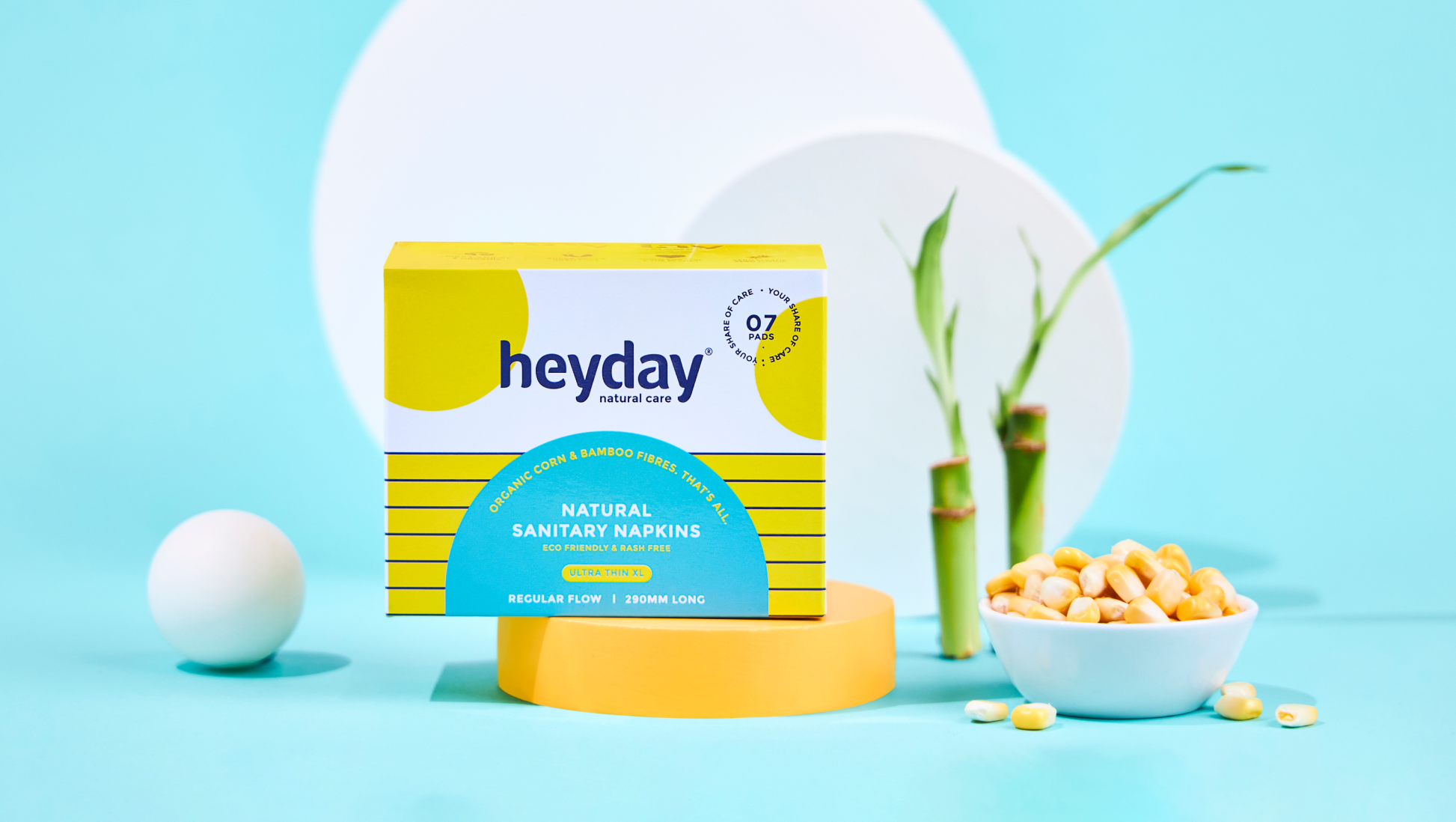
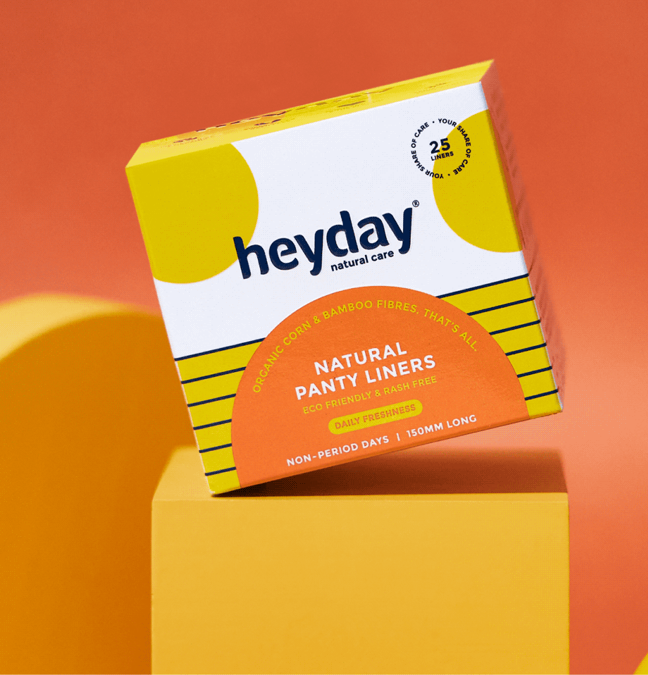
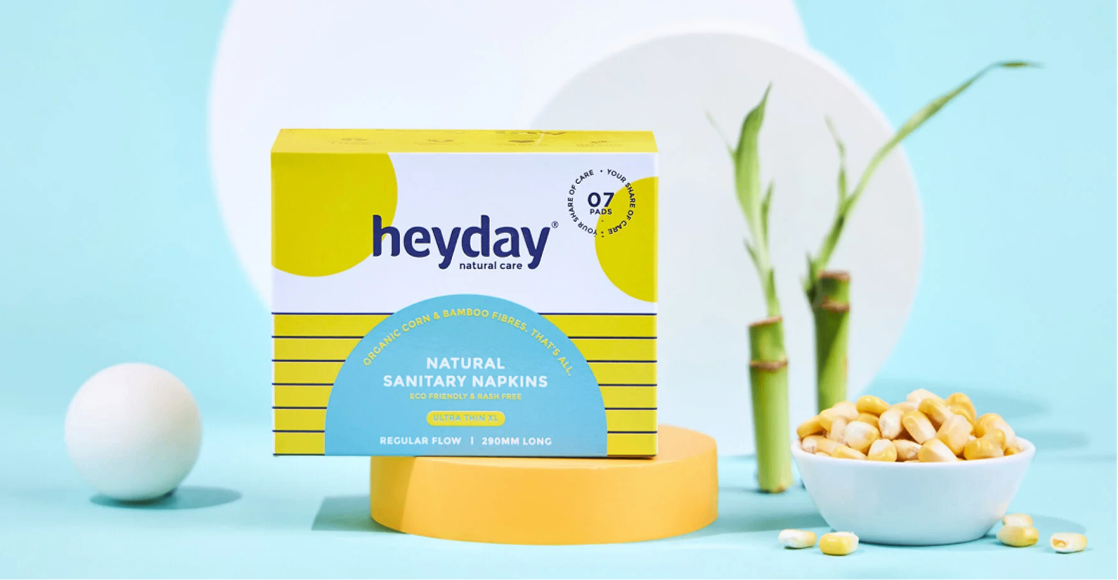
The market is filled with brands that use bright colourful packaging. So we switched, we used a lot of white to make sure the pack stands out from the crowd yet owns a colour.

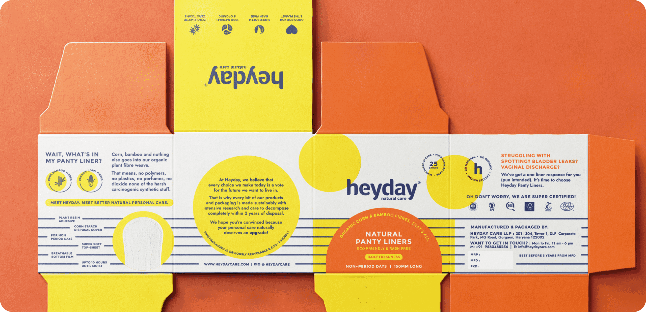
We made sure the information was balanced with the brand elements consistently to keep brand remembrance.

How far does the promise have to go?

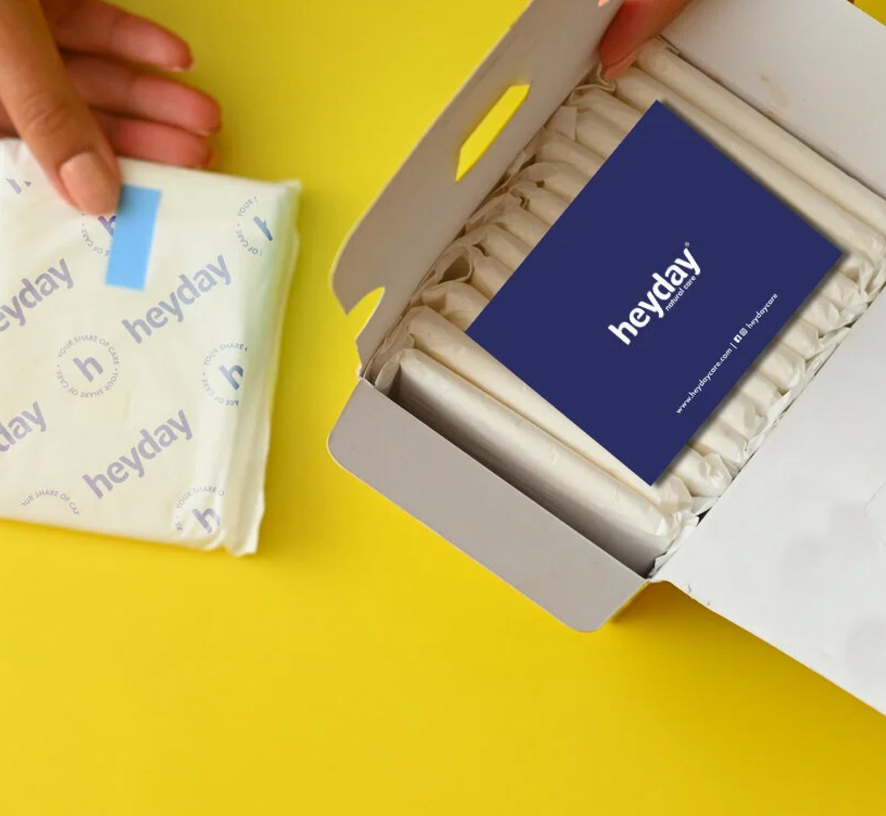
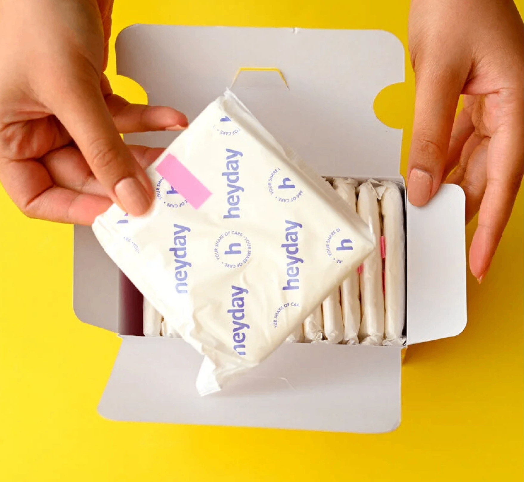
Heyday is truly an eco-friendly product, so instead of sending out the products in polythene bags, we sent them out in paper mono cartons.

We wanted the detail to run all the way through, our brand elements were carried onto the release paper, and a small thank you card was slipped into every order, reminding customers that they had saved themselves from harmful chemicals and plastics, and the environment along with them.

THE EXPERIENCE

How do you translate the same feeling online?

We built on the same palette, the same elements and the same voice. One brand, whether you meet it on a shelf, inside a carton, or on a screen.

Mithai That Loves You Back

Can a dessert be good for you and also impossible to resist?

Scope Of Work: Research, Strategy, Product Packaging & Extension.

Healthy desserts have always been judged against the originals. Low-calorie ice cream. Sugar-free mithai. Most people expect them to compromise on taste long before they take the first bite.

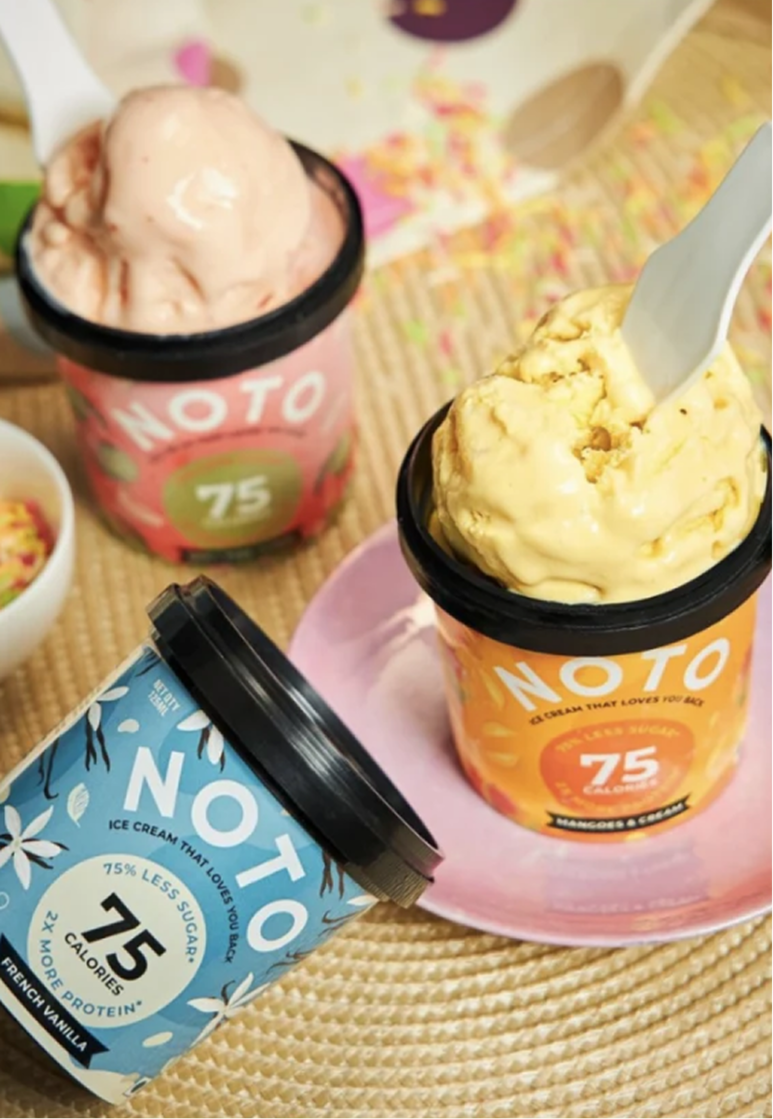
We explored this question with Varun and Ashni while designing packaging for Noto’s growing dessert portfolio. From indulgent ice creams to a guilt-free range of Indian mithai, every product challenged the idea that healthier choices had to feel like lesser ones.

The goal was to build packaging that celebrated flavour first and health second, making every dessert look just as irresistible as it tasted

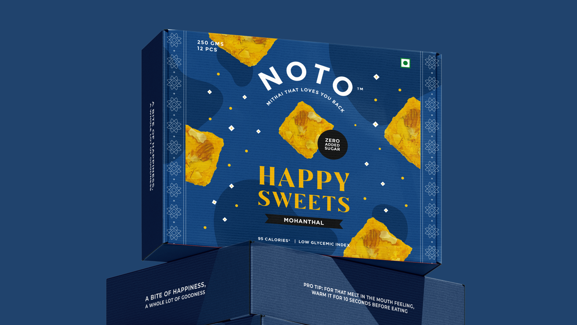
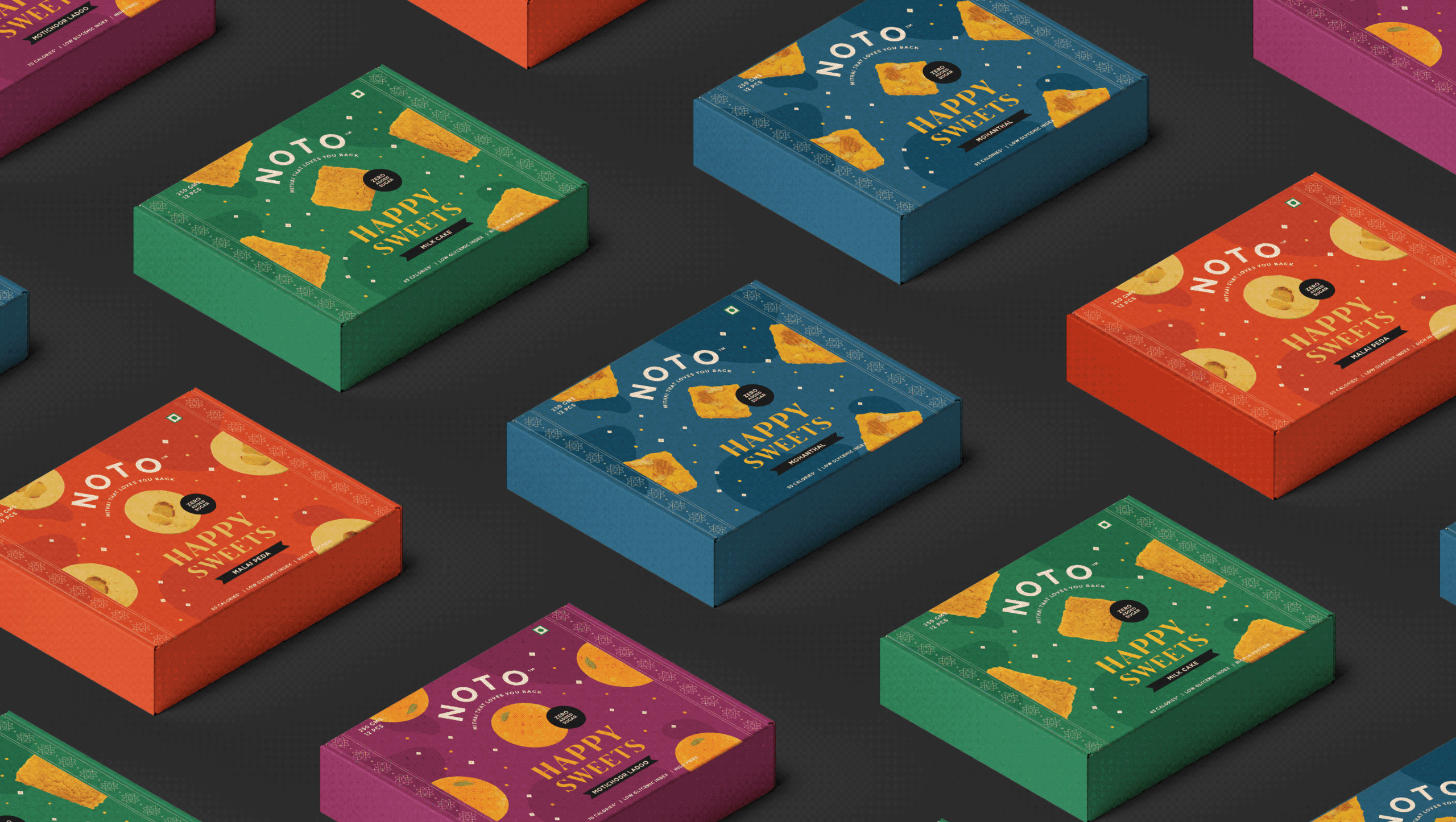
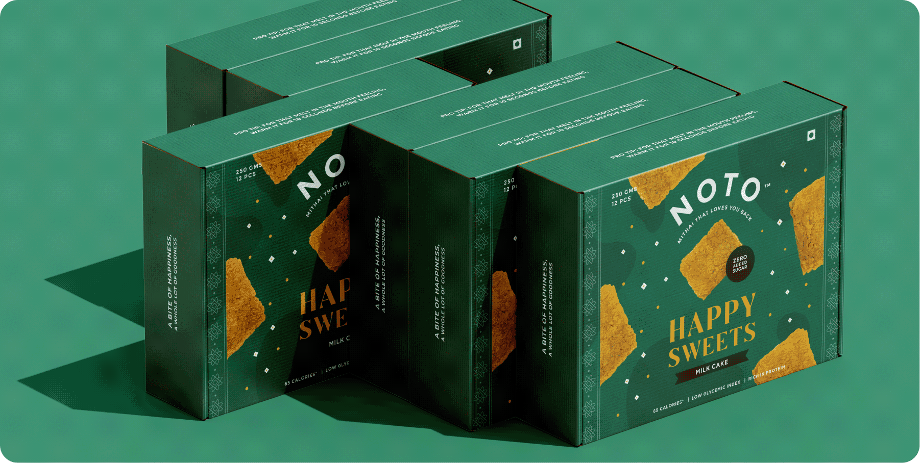
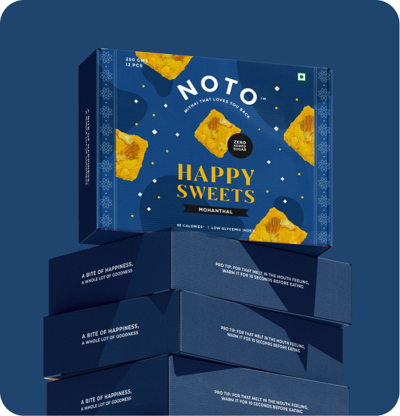
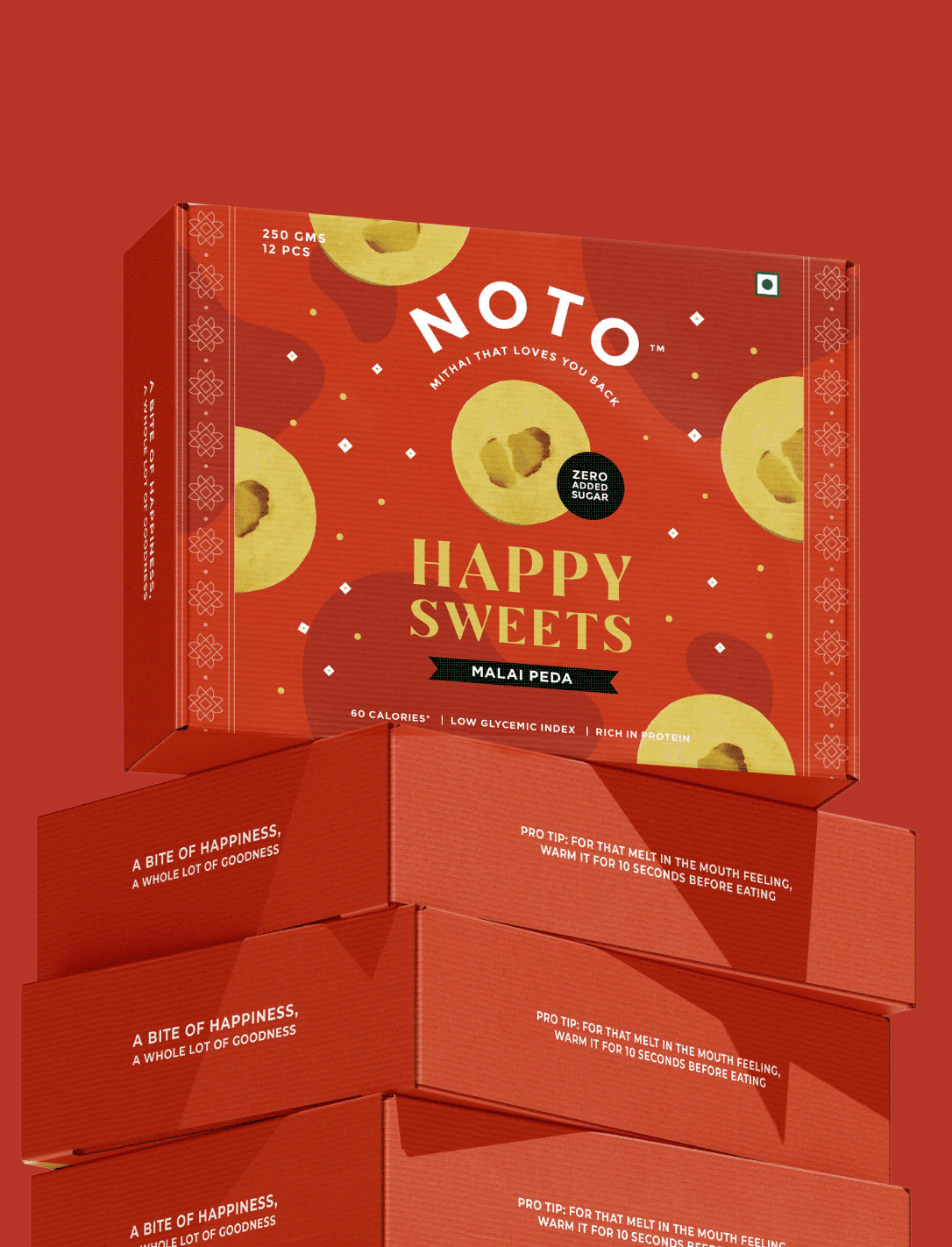
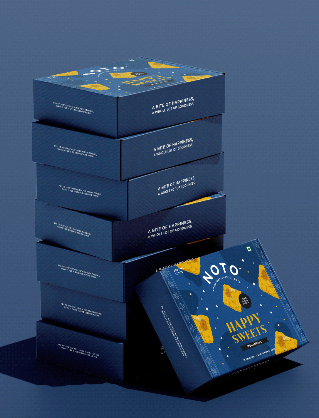
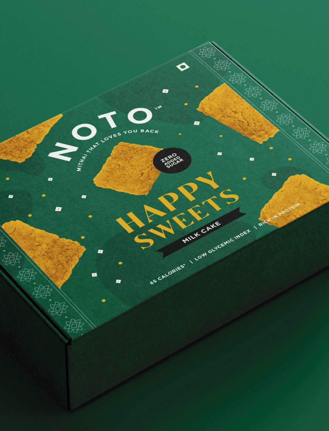
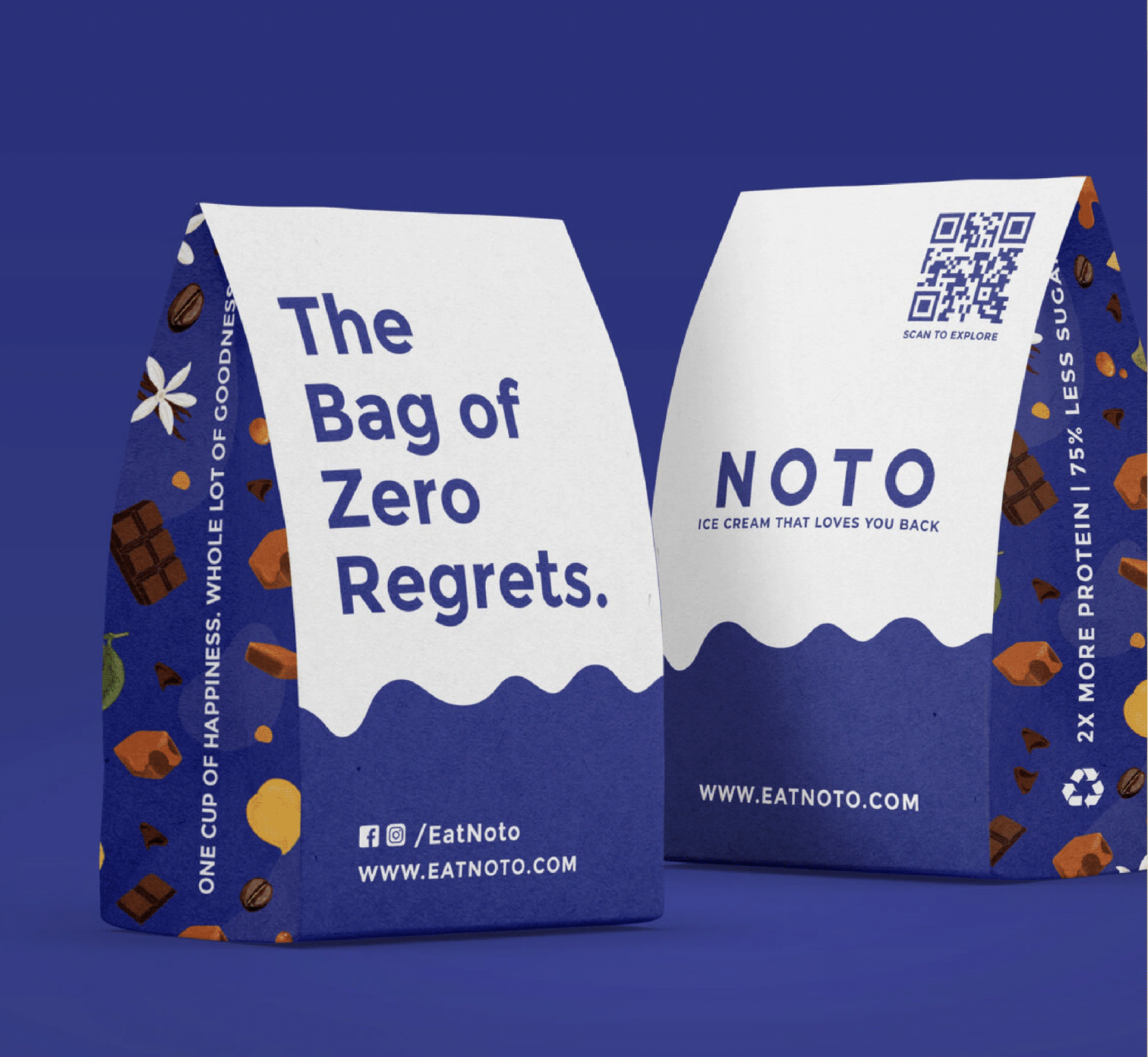
Happy Sweets: Mithai That Loves You Back!

VISUAL STRATEGY

How do you make a healthier dessert look as indulgent as it tastes?

Healthy desserts are often judged against their originals. People expect low-calorie ice creams and sugar-free mithai to compromise on taste before they even take the first bite.

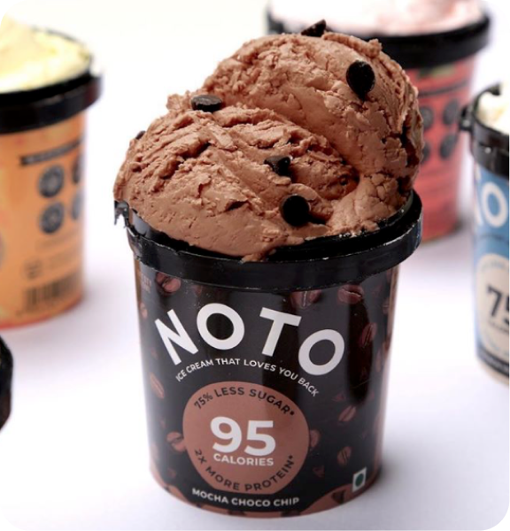
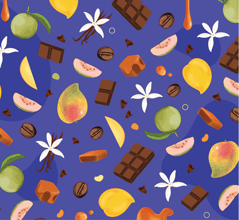
Rather than making health the hero, we made indulgence the hero, using bold typography, expressive details, and appetising visuals to make Noto feel irresistible first, and healthier second.

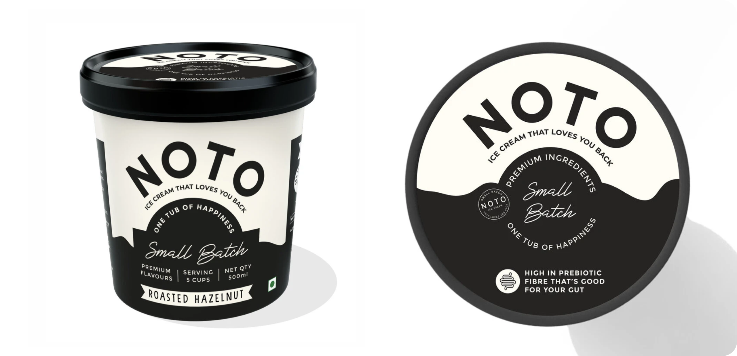
How do you make a small batch feel handcrafted at first glance?

Noto later introduced a limited-edition featuring Roasted Hazelnut and Pistachio. While the flavours were new, the packaging had to remain unmistakably Noto.


We retained the signature black-and-white foundation, introducing subtle handcrafted details like stamped accents to give the range a more artisanal, exclusive feel without losing brand familiarity.

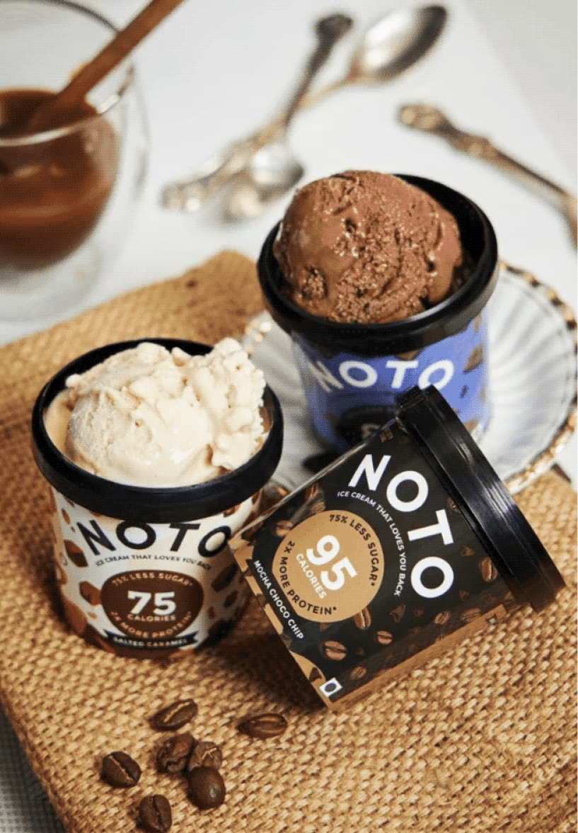
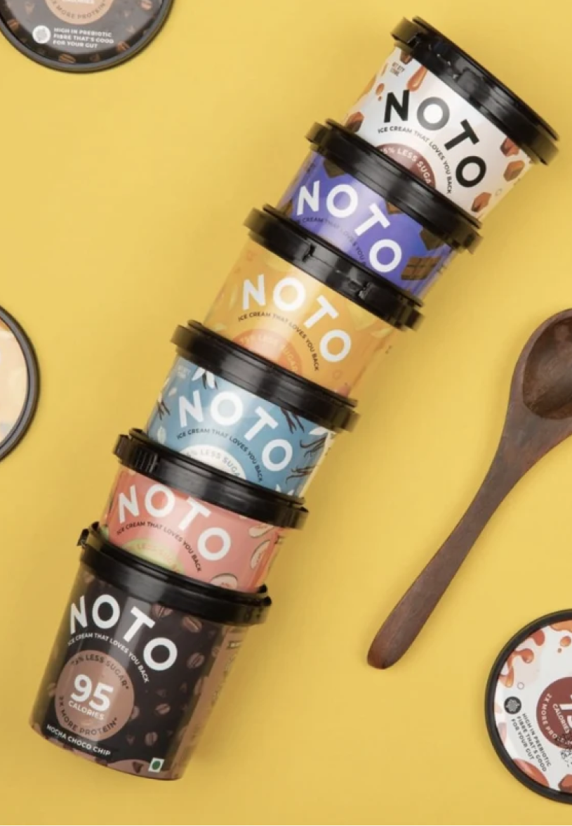
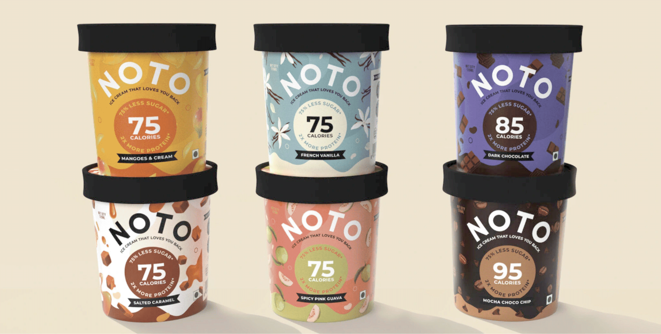
We designed the original range of Noto ice creams at Studio Glyph. The objective was to build a brand language that pushed the boundaries of perception of healthy foods within the consumer’s minds. 

We started with the nomenclature, tagline and also developed their Identity and packaging for their six different flavours using rich colours and Icons to convey the main aspects of the products.
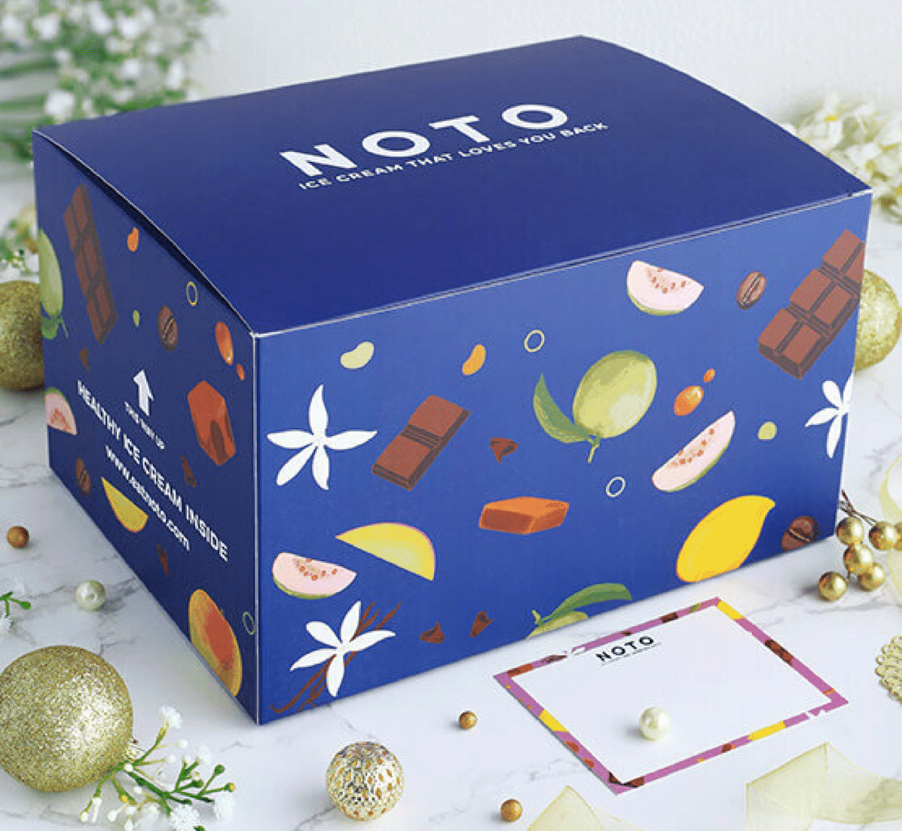
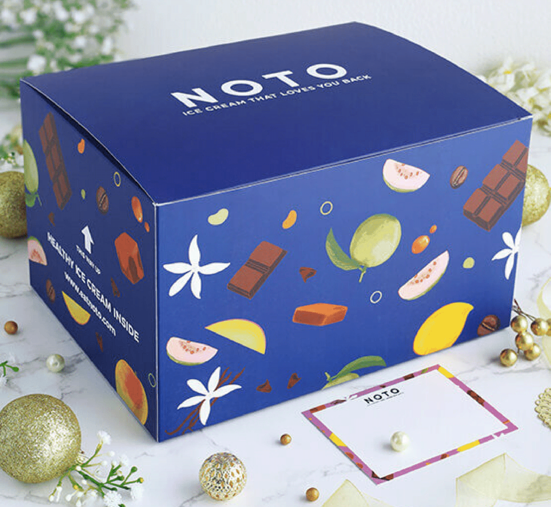
We carried the same visual language into the secondary and gifting packaging, ensuring every interaction with the brand felt cohesive and instantly recognisable.

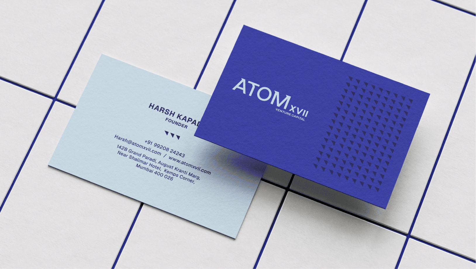
Atom, The Core Of Every Idea

What happens when 
everything begins at the centre?

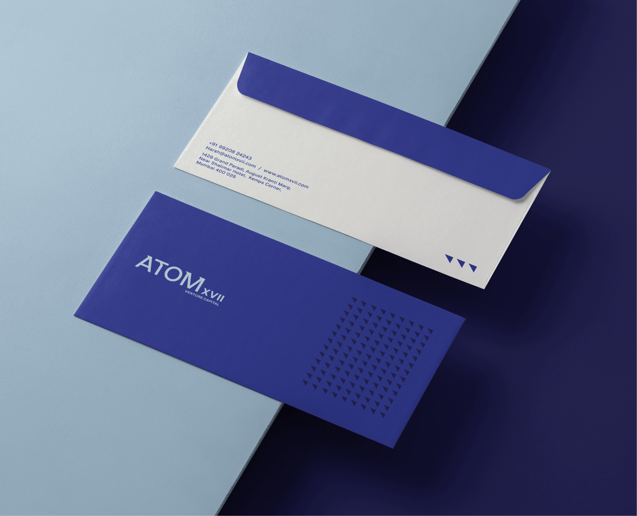
Scope Of Work: Market Research, Brand Identity, Brand Stationery, and Website Design.

After years in venture capital, Harsh noticed the same patterns repeated. Too much weight was placed on pedigree, familiar backgrounds, and conventional signals of success, often before the strength of an idea was truly understood.


He wanted to build a fund that looked beyond credentials and focused on what mattered most: the smallest idea with the potential to become something extraordinary.

THE TRANSLATION

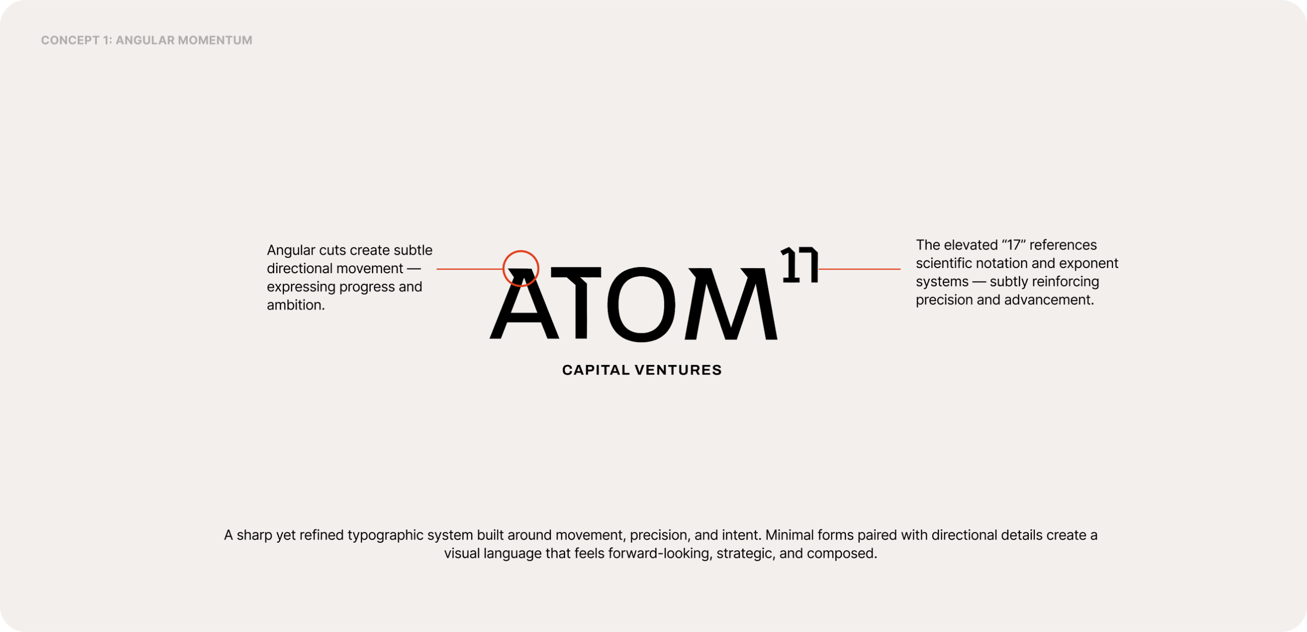
How do you give conviction a visual form?

The identity needed to feel precise without feeling cold or ambitious.
We explored visual directions that balanced structure with movement to capture clarity, momentum, and quiet confidence.

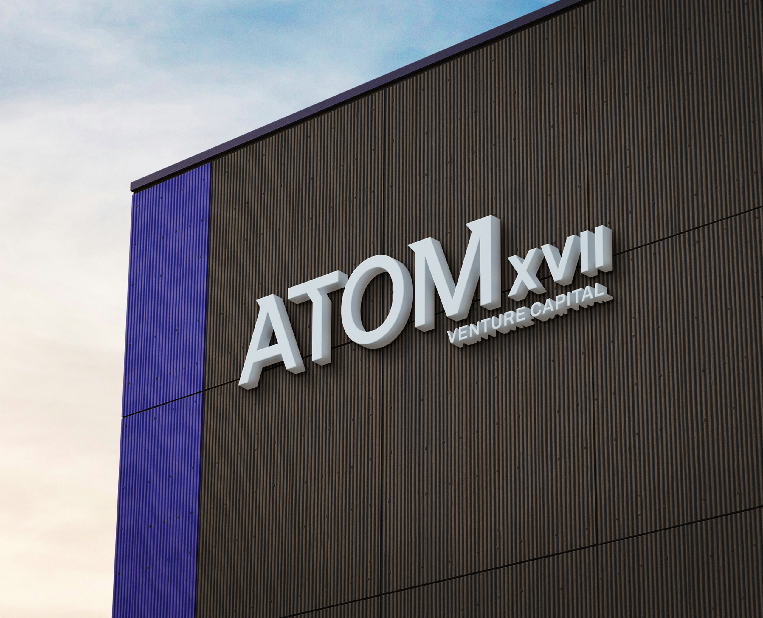
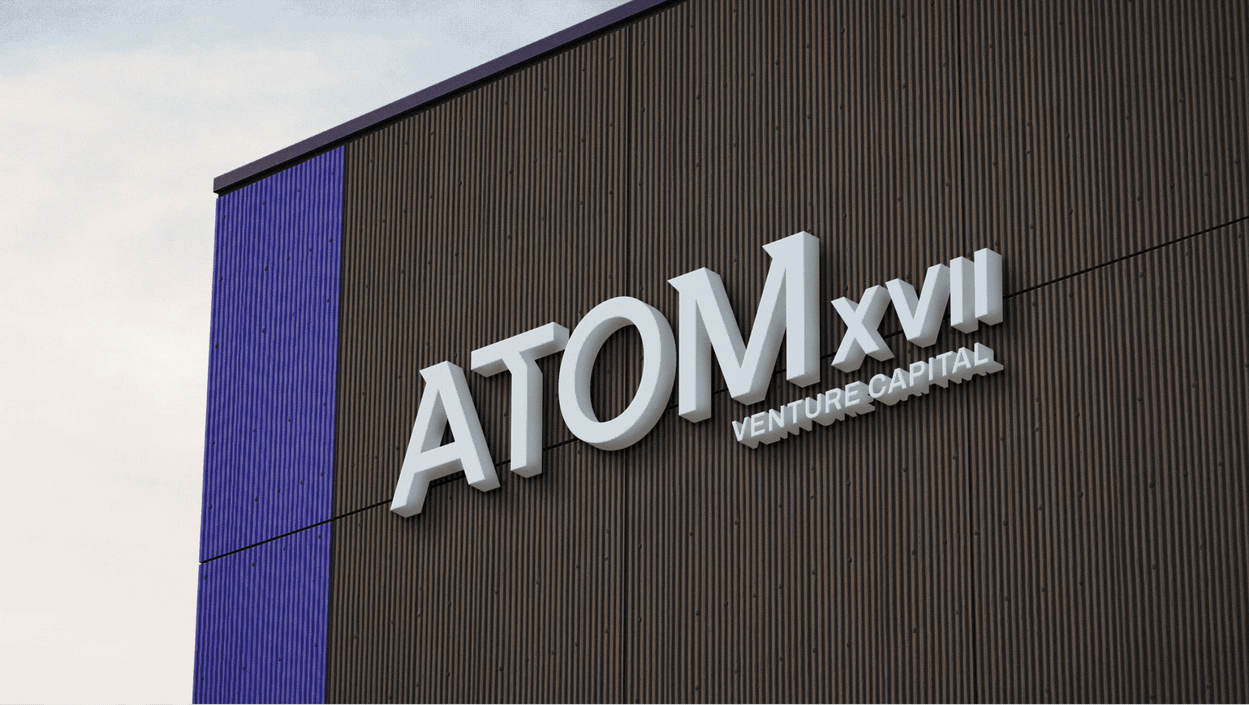
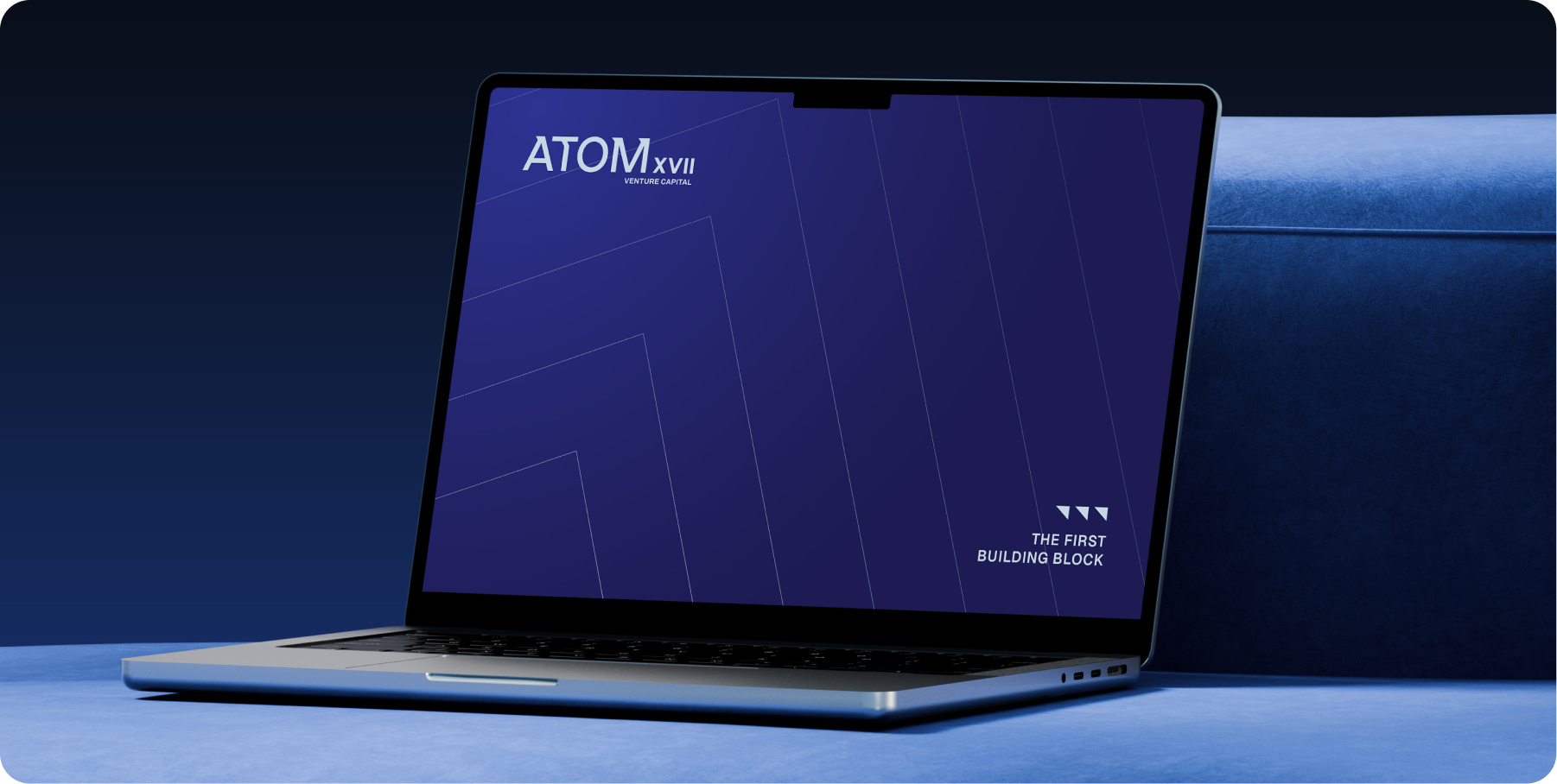
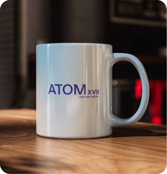
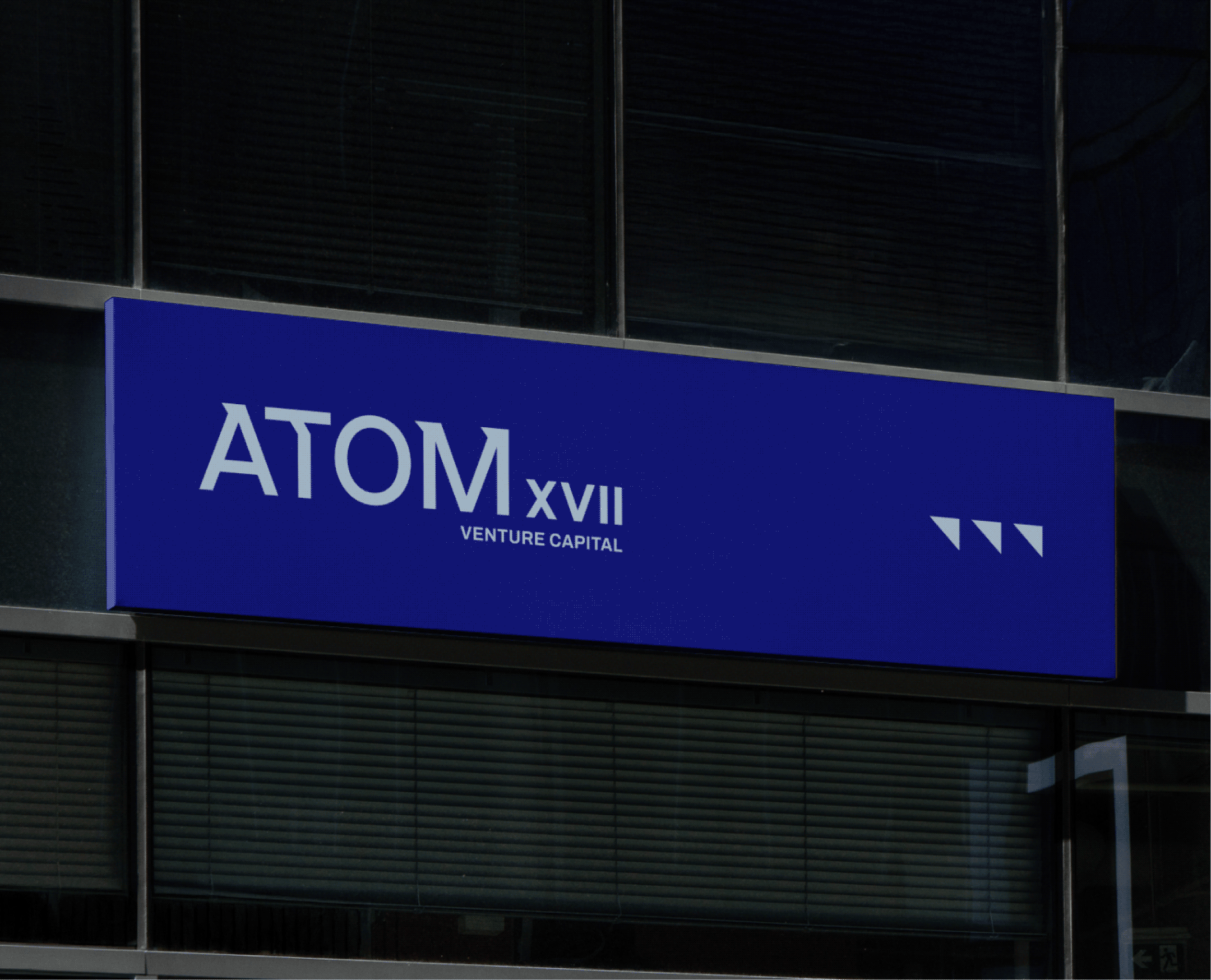
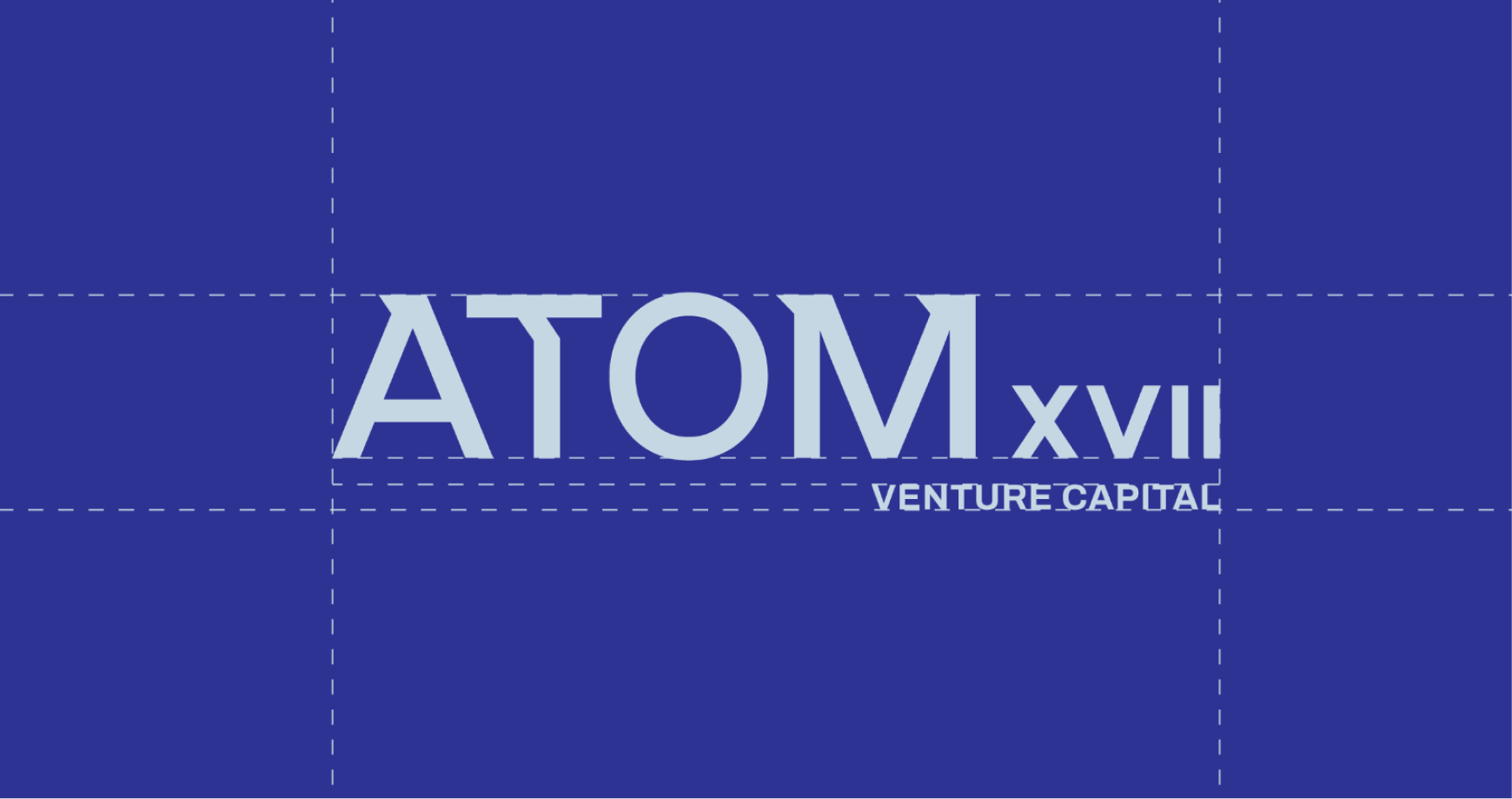
Introducing AtomXVII

A venture capital firm built to recognise potential early, support founders deeply, and
create lasting value through conviction rather than convention.

THE EXTENSION

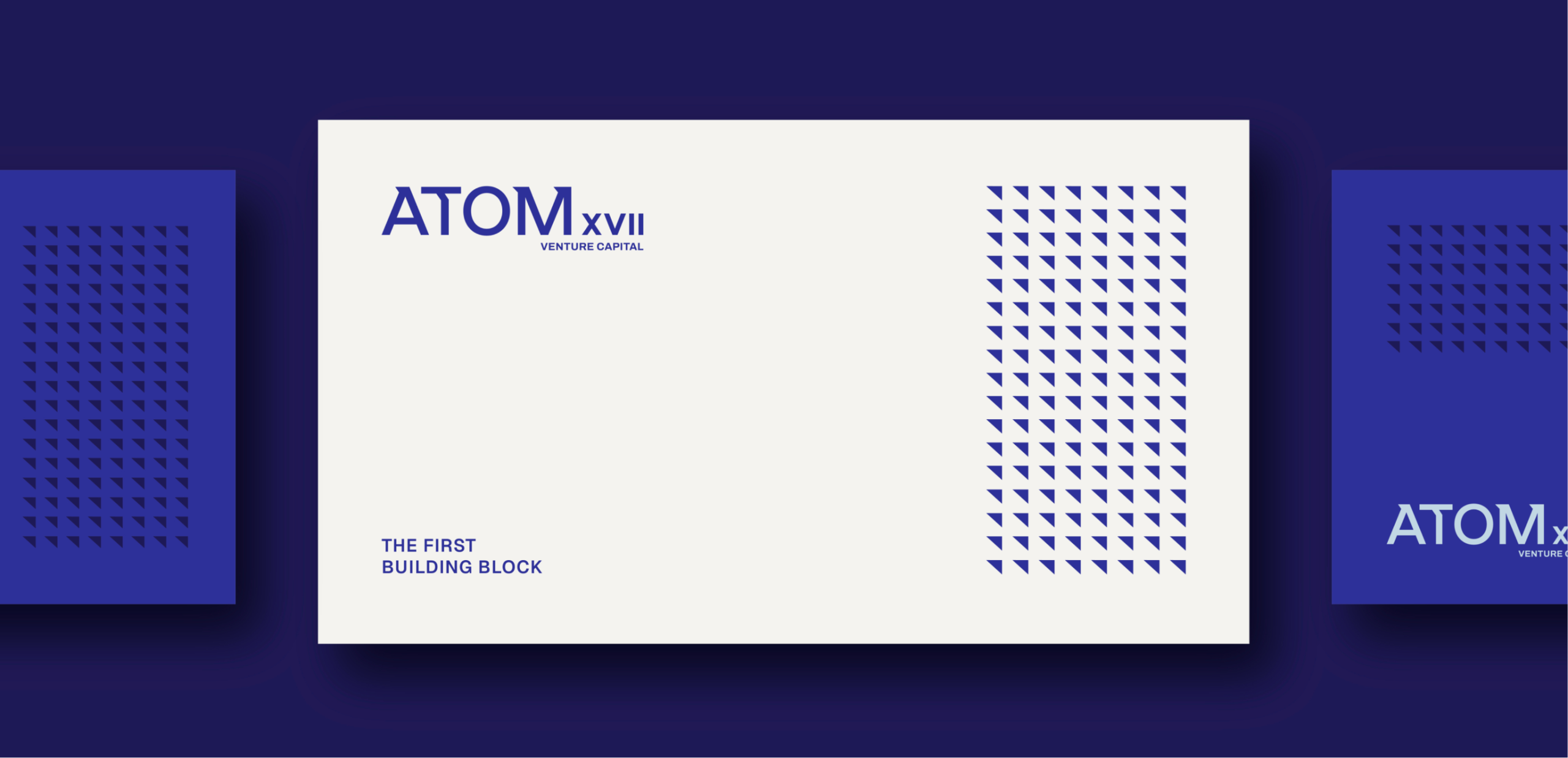
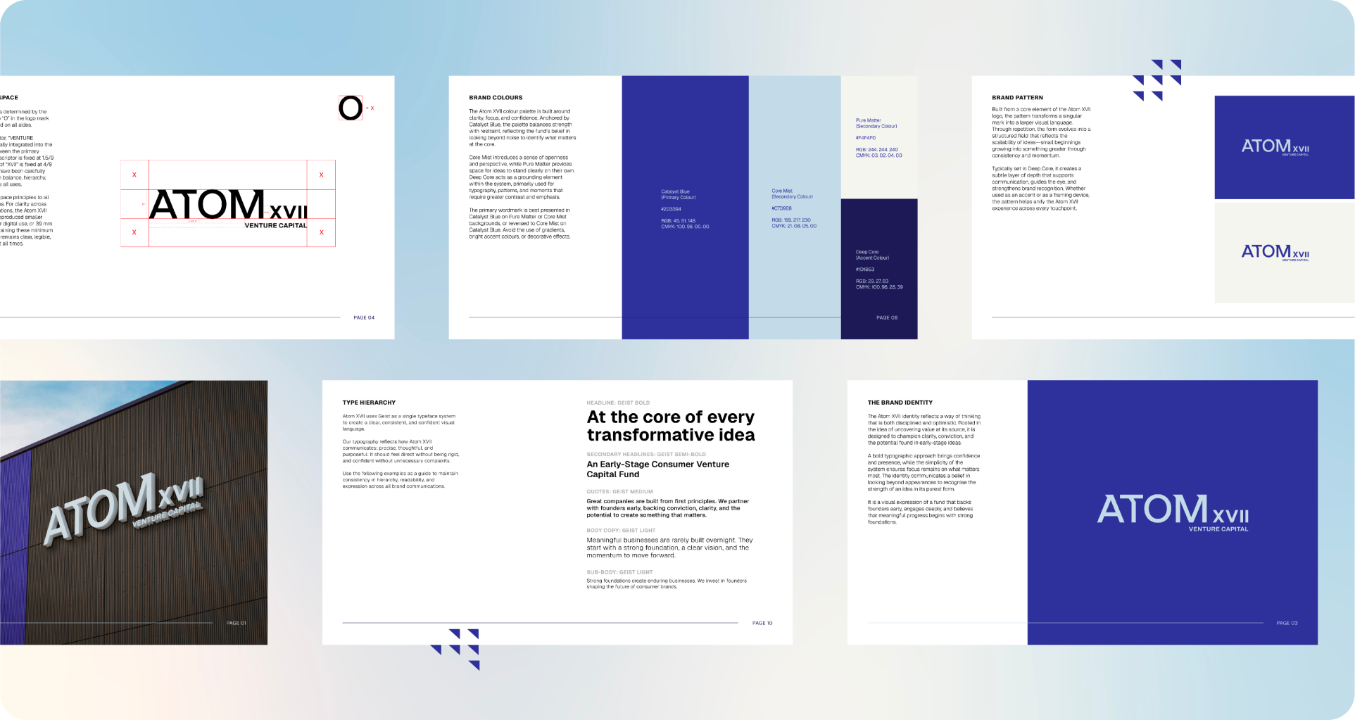
A brand is only as strong as its system and guideline.
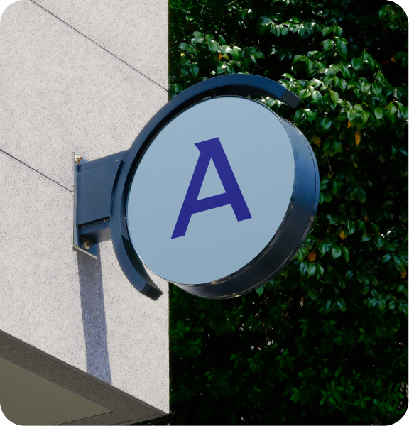
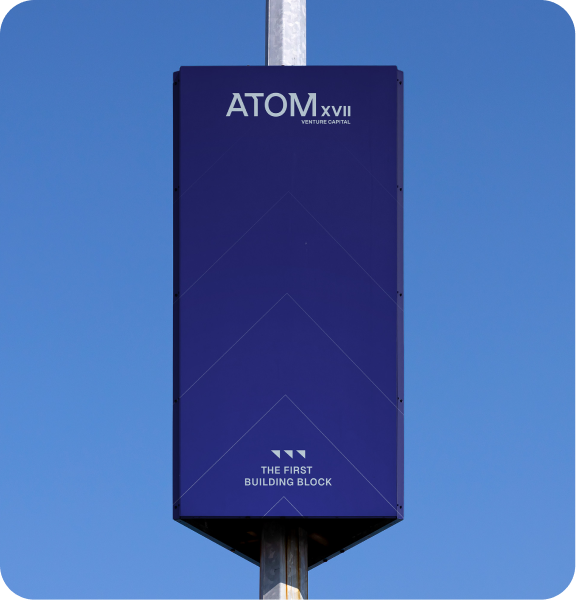
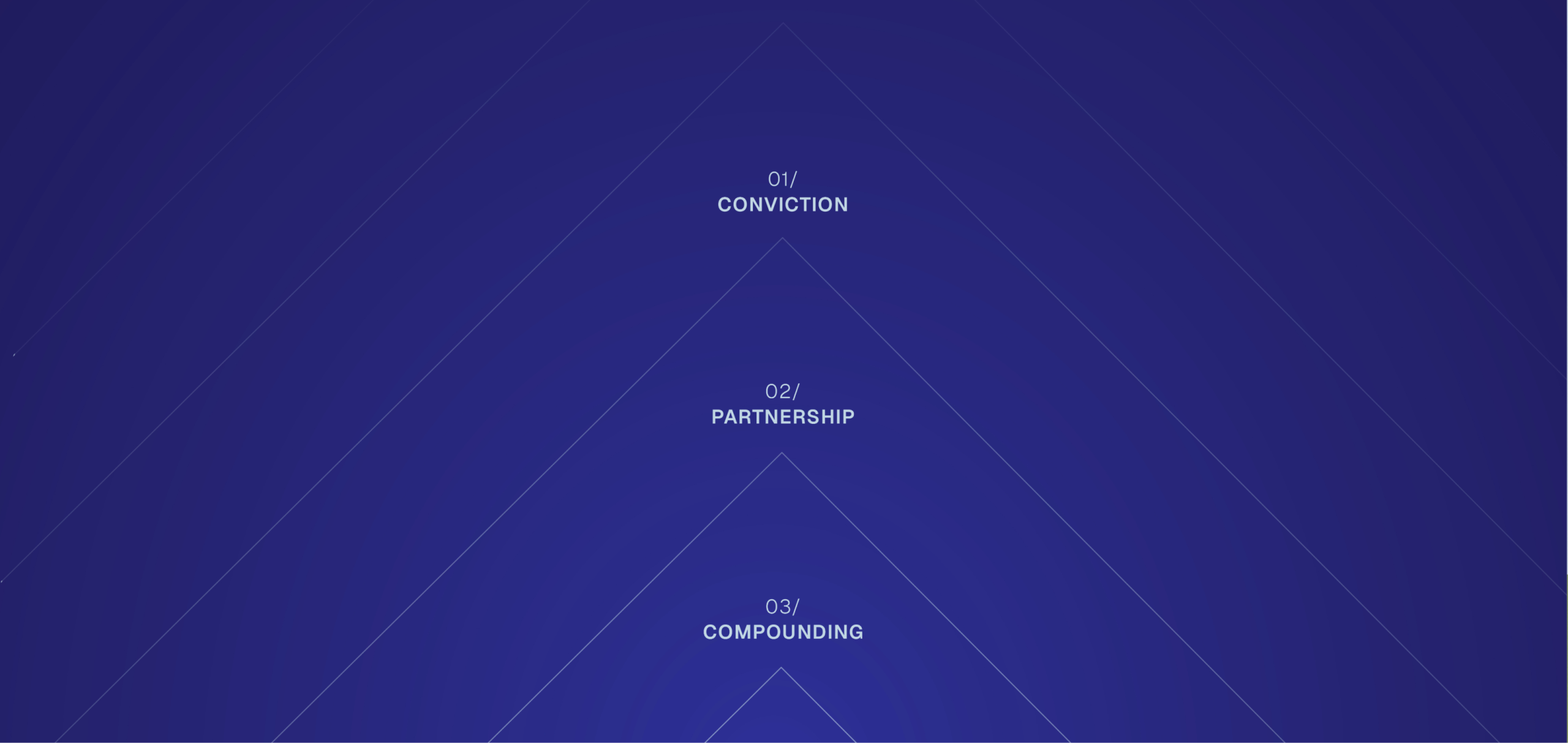
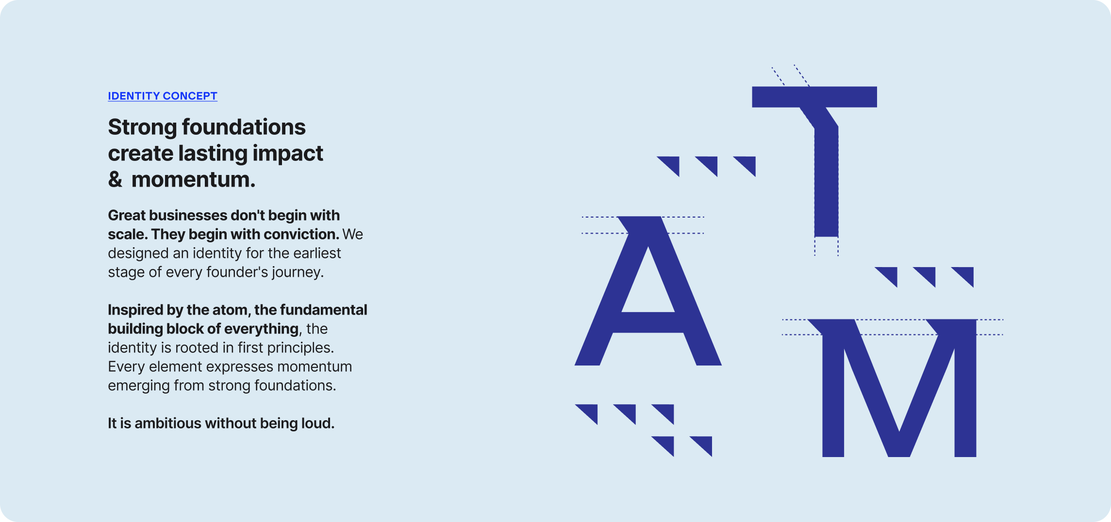
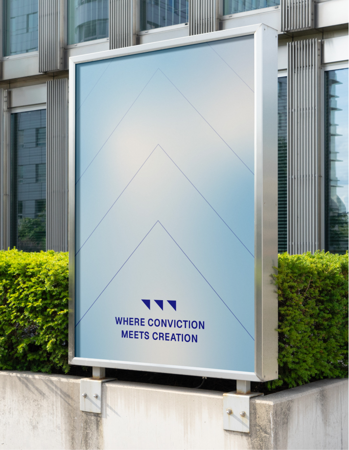
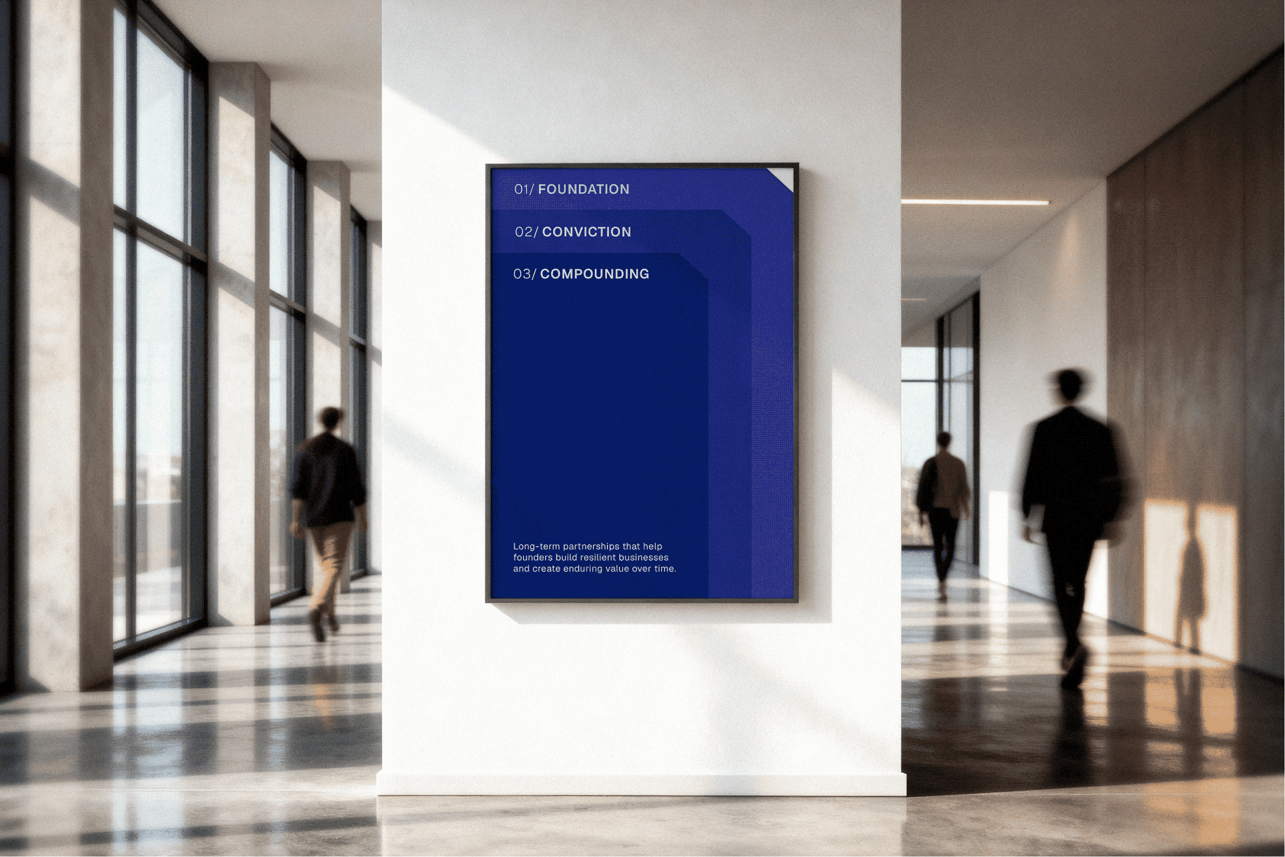
Rather than designing separate brand assets, we looked deeper into the logo itself. The smallest detail became the starting point for everything that followed.

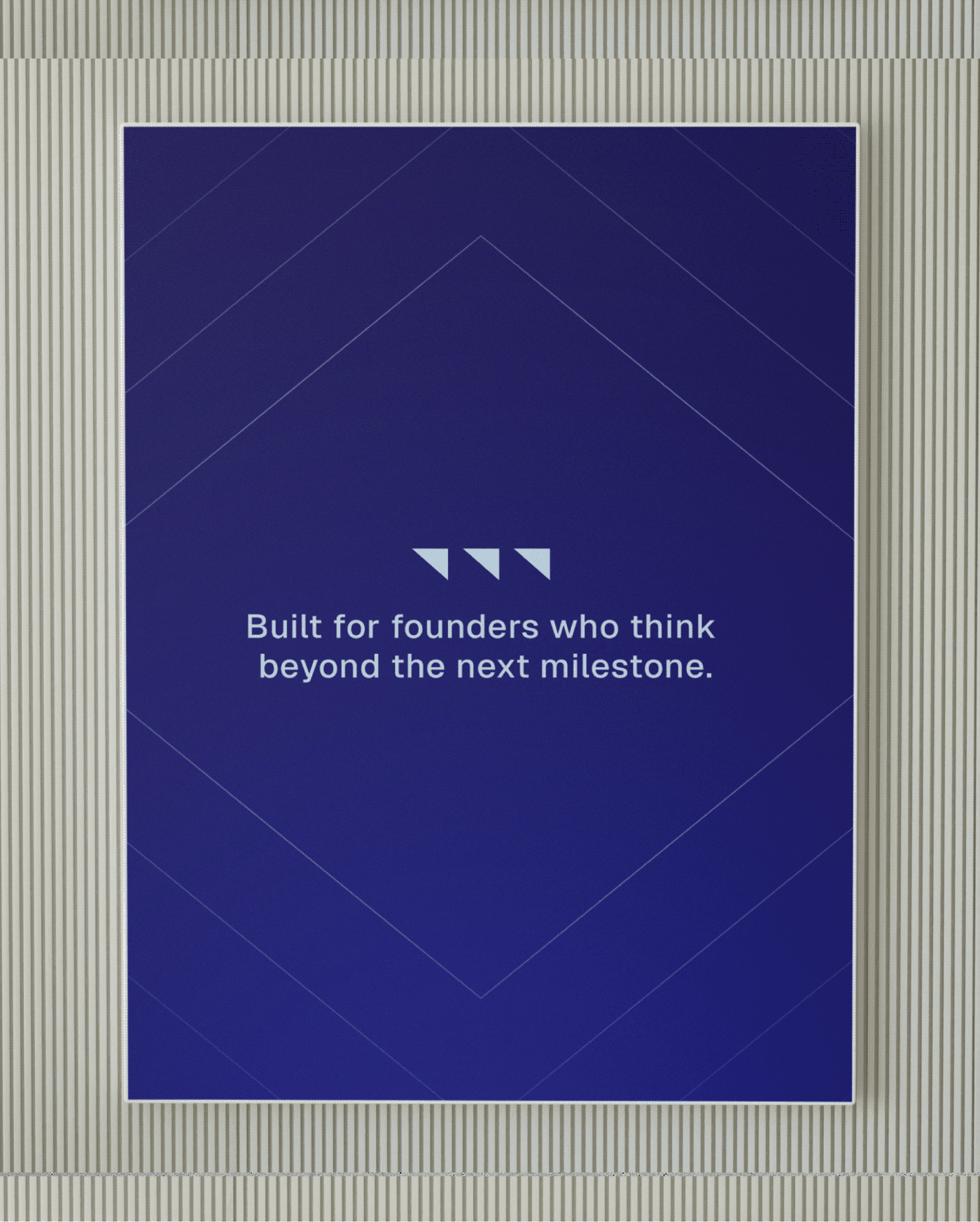
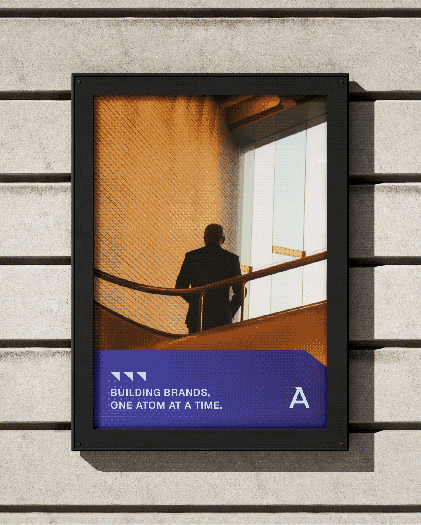
Extracted from the word mark, the triangular form expands into a flexible visual language. 
It creates rhythm, guides layouts, and reinforces the idea that meaningful growth begins with one strong foundation.